Global Cooling – Climate and Weather Forecasting.
Guest post by Dr. Norman Page
Introduction.
Over the last 10 years or so as new data have accumulated the general trend and likely future course of climate change has become reasonably clear. The earth is entering a cooling phase which is likely to last about 30 years and possibly longer. The major natural factors controlling climate change have also become obvious.Unfortunately the general public has been bombarded by the scientific and media and political establishments with anthropogenic global warming – anti CO2 propaganda based on the misuse and misrepresentation of already shoddy IPCC “science” for political ,commercial and personal ends.
The IPCC climate science community largely abandoned empirical Baconian inductive scientific principles and built worthless climate models based on unfounded assumptions designed to show that anthropogenic CO2 was the driving force behind changing climate. Most of the IPCC output is useless as a tool for predicting future climate trends and their impacts and in particular the IPCC Summaries for Policymakers can be safely ignored for practical purposes. The divergence between the IPCC Hansen projections and the observed trends is shown below.
Fig 1 ( From Prof. Jan-Erik Solheim (Oslo) )

Fortunately, however , the basic data is now easily available so that any reasonably intelligent person can check on line daily or monthly to see what the incoming empirical data actually is and draw ones own conclusions.
Here’s how to do it in a few simple steps. I have put in CAPITALS the main empirical observations on which one can draw conclusions re climate change ,its causes and future trends and also get a good idea of weather patterns and trends for the next year or so.
1. Check the Temperature Trends and Data.
Because of the Urban Heat Island effect ,the built in local variability of the NH land data and the thermal inertia of the oceans, Sea Surface Temperatures are the best measure of global temperature trends. These show that the global warming trend ended in about 2003. THERE HAS NOW BEEN NO NET WARMING SINCE 1997 -15 YEARS WITH CO2 RISING 8.5% WITH NO GLOBAL TEMPERATURE INCREASE. SINCE 2003 THE TREND IS NEGATIVE.
To check the past years go to
ftp://ftp.ncdc.noaa.gov/pub/data/anomalies/annual.ocean.90S.90N.df_1901-2000mean.dat
and for monthly updates go to.
ftp://ftp.ncdc.noaa.gov/pub/data/anomalies/monthly.ocean.90S.90N.df_1901-2000mean.dat
The 2012 average NCDC SST anomaly thru Sept was .4438 versus the 1997 annual anomaly of .4575.
The peak anomaly was .5207 in 2003.
An excellent site for reviewing all the basic temperature data is http://www.climate4you.com/
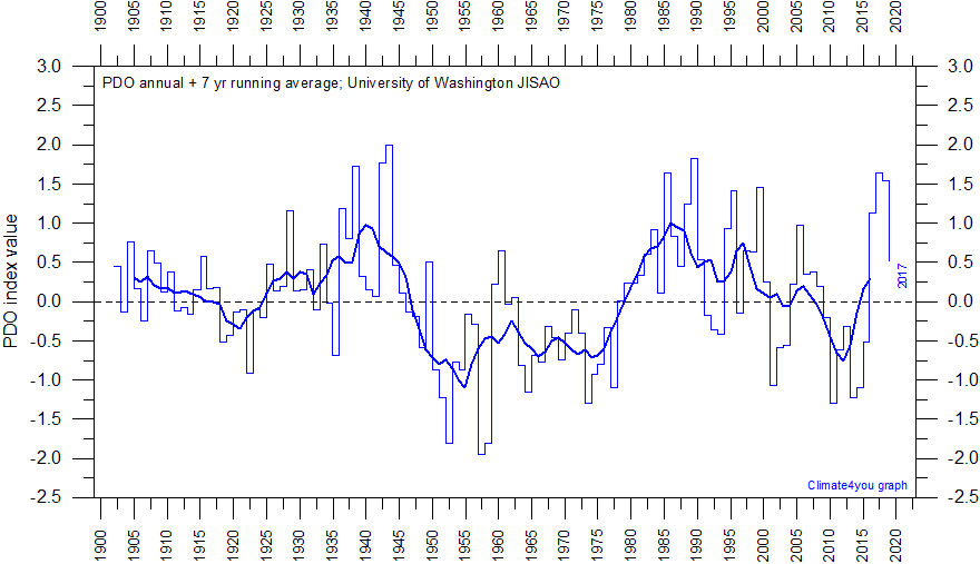
2. Check the current phase of the Pacific Decadal Oscillation.
Here is a plot and suggested projection based on the Hadley SST3 from Tallbloke.

(See: http://tallbloke.wordpress.com/2012/10/23/the-carbon-flame-war-final-comment/) He says “I have put together a simple model which replicates sea surface temperature (which drives global lower troposphere temperature and surface temperatures a few months later). The correlation between my model and the SST is R^2=0.874 from 1876 FOR MONTHLY DATA.” The model is shown with predictions to 2050 (blue) along with the HADsst3 (red).
I included Fig 2 because an approximate 60 year cycle is obvious by inspection and this coincides well with the 30 year +/- positive (warm) and 30year +/ negative (cold) phases of the Pacific Decadal Oscillation. Figure 2 shows warming from about 1910 – 1940-45 , cooling from then to about 1975 -.warming to about 2003-5 and cooling since then. Total warming during the 20th century was about 0.8 degrees C. For a complete discussion and review of the data relating the PDO to the other oceanic cycles and temperatures see
For latest PDO data see http://jisao.washington.edu/pdo/PDO.latest
IT IS CLEAR THAT WE ARE IN THE EARLY STAGES OF A THIRTY YEAR NEGATIVE (COOLING ) PDO CYCLE.

3. Check Solar Activity – where are we at?
The major ice age climate cycles are controlled by the sun – earth orbital eccentricity,and the earth’s obliquity and precession. These cycles are approximately 100,000, 41,000 and 21000 years in length respectively and are well documented in the ice core and geological record. It is useful to keep in mind that the warmest temperatures in the current interglacial occurred about 7500+/- years ago and the GENERAL TREND IS NOW A COOLING TOWARDS THE NEXT ICE AGE.
Fig 4 http://colli239.fts.educ.msu.edu/1999/07/11/vostok-1999/

These long term cycles are modulated by quasi cyclic trends in solar activity which may be decadal ,centennial or millennial in length.Of particular interest in deciding where we are with regard to the solar cycles is the approximately 1000 +/- year cycle which produced succesively the Roman Warm Period, the Dark Ages,the Medieval Warm Period, the Little Ice Age and the recent 20th century warming.
Fig 5 (From http://www.theregister.co.uk/2012/07/10/global_warming_undermined_by_study_of_climate_change/ )

The red line shows the continuing cooling trend from the Holocene optimum and the 1000yr +/- solar cycle is clearly seen.
NOTE – A REASONABLE CASE CAN BE MADE THAT THE WARMING PEAKS OF A 60 YEAR PDO CYCLE AND THE 1000 YEAR SOLAR CYCLE COINCIDED AT 2000 +/- AND WE ARE LIKELY ON THE COOLING SLOPE OF BOTH.
The clearest empirical measure of solar activity is the solar magnetic field strength. On an empirical basis Livingston and Penn have shown that the decline in solar magnetic field strength suggests that sunspots could disappear by about 2015 signalling THE START OF A NEW MAUNDER MINIMUM WITH SIGNIFICANT COOLING.
For a semi-empirical estimate of the possible cooling if a Maunder Minimum does develop see http://pubs.giss.nasa.gov/docs/2001/2001_Shindell_etal_1.pdf
Note the abstract of the Shindell paper (Mann is one of the et als) says “THIS LEADS TO COLDER TEMPERATURES OVER THE NORTHERN HEMISPHERE CONTINENTS ESPECIALLY IN WINTER (1 to 2 C), IN AGREEMENT WITH HISTORICAL RECORDS AND PROXY DATA FOR SURFACE TEMPEERATURES
“For a good review of the latest sunspot and magnetic data see
http://wattsupwiththat.com/2012/09/03/the-sun-still-slumping/ and to keep with the decline in solar magnetic field strength and the liklihood of a Maunder Minimum check monthly the Livingston and Penn thread at
http://solarcycle24com.proboards.com/index.cgi?board=general&action=display&thread=855
Perhaps the best indicator of the effect of the declining solar magnetic field can be seen in the Galactic Cosmic Ray flux.
This can be checked on a daily basis at http://cosmicrays.oulu.fi/#database
Fig 6 Neutron count since 1964 from the Oulu data base.

The Dec 2009 neutron maximum ( solar cycle 23 -24 minimum) is greater than anything seen previously and the neutron count is now (Nov 2012) higher than at any comparable time in previous cycles since we are only 12 -18 months away from the cycle 24 solar maximum.There was a secular change in solar magnetism in 2005 – check the WUWT link posted earlier. The neutron count ties to earths climate via cloud cover and albedo. Simply put – the lower the neutron count the lower the cloud cover and the warmer the temperature. Because of the enthalpy and thermal inertia of the oceans there is a 10 – 12 year lag between the neutron troughs and global SSTs. The short term temperature record is variable over shorter times than 12 years because of El Ninos and La Ninas and volcanic and lunar effects but the increasingly lower counts on the three troughs from 1970 – 1991 are well matched by the temperature rise from 1981 – 2003. THE RELATIVELY HIGH NEUTRON COUNT IN 2012 COMPARED WITH 1970 SUGGESTS THAT BY 2024 GLOBAL TEMPERATURES WILL BE BELOW THOSE OF 1970 WHICH WERE ALREADY BELOW 2012 BY ABOUT 0.36 C.
4. Check the Southern Oscillation Index.
Fig 7 http://www.bom.gov.au/climate/enso/

In Fig 7 values above +8 indicate La Ninas, values below -8 are El Ninos and values in betwen are neutral or La Nadas.
Figure 7 also has some predictive value relative to global temperatures. ( Mclean et al JGR 2009) Global temperatures appear to lag the SOI by about 7 months.
5. Climate , Weather and Extreme Events.
Sections 1 – 4 above show that the earth has entered a cooling trend which will continue for at least 30 years and perhaps longer. To get some idea of possible extreme weather events we might look at extremes found between the MWP and the Little Ice Age. It is unlikely however that any future extremes will be “unprecedented”.There is a large literature on this topic which interested parties can consult.Some general empirical observations can be made.
On a cooling earth there is a steeper temperature gradient from the Tropics to the Poles. This produces instabilities with the jet stream swinging meridionally further south and north. Thus blocking high pressure systems develop with extremes of cold and heat and sharp temperature gradients between air masses with for example Sandy type blizzards or tornado swarms. A cooler world will be a generally drier world with increasing droughts globally and in e.g the USA corn belt and in the USA in general When combined with shorter growing seasons and possible early and late frosts this is likely to threaten world food production as population increases.
The PDO and SOI indices are the main ocean climate and weather indicators.Obviously ,for regional analyses at particular times, the phases of other ocean systems relative to the first two – for the U.S for example the AMO and NAO need to be considered. These are easily checked by looking from time to time at the work of the best climate and weather interpreters Joe D’Aleo and Joe Bastardi on http://www.icecap.us/
6.Summary of some Future Trends and Policy Suggestions.
The empirical observations highlighted in CAPITALS above indicate that the global warming temperature trend has peaked .The peak is broad with only a little cooling to date but this will likely accelerate from 2015 or 2016 on reflecting the beginning of the increase in the cosmic ray count already seen from 2004 – 2009 in Fig 6. The cooling will last until 2030- 2040. Often the signal for a climate direction change is a see saw effect between Arctic and Antarctic sea ice. The Arctic is still reflecting the peak in the warming trend with low summer ice values.
The first indication of a cooling event is however the increase in Antarctic sea ice which has already occurred.
This alters the oceanic deep water circulation patterns and spreads the cooling world wide. The Arctic ice will begin to catch up in a five years or so.
With a cooling world sea levels will stop rising and begin to fall as glaciers and ice caps begin to increase and the oceans compress with cooling.Eventually the rate of CO2 increase will slow and may even reverse even if human emissions continue to rise .
Because the error bars in our rough estimates of natural temperature variations are larger than any possible
Leif, here is your original graph with multiple NM data. Again 3 of 5 look awfully similar to Oulu:
http://s852.beta.photobucket.com/user/etregembo/media/SRU_Graph.jpg.html
Here is Oulu:
http://s852.beta.photobucket.com/user/etregembo/media/oulu.gif.html
Maybe I’m wrong but it seems like the stations in the graph you supplied are in Africa, not Oulu? Please correct if wrong (we are all human, some more than others, I certainly have my moments).
If others have a similar curve to Oulu, it would imply that Oulu is not an outlier, but maybe inconvenient (if one is Oulu, as you stated previously, why are two of the others similar)?
The appropriate (scientific) thing to do would be to plot them all (all across the globe), normalize them, make a nominal/mean, and calculate STDEV of each series, to judge the “outlieryness” of the individual series.
Re: the “lsvalgaard says:
November 20, 2012 at 2:37 am
ed says:
November 19, 2012 at 9:38 pm
Would love to see a plot of all cosmic ray monitoring stations and thier locations to see which locations are similar to oulu and which are not. Geomagnetic variability by location?
leifs response: “You sound somewhat desperate. There are not many stations with unbroken data going back many decades. The issue is not geomagnetic variability, but simply stability of the instruments over time.”
”
When the answer is “you sound somewhat desperate”, no offense (ok a little) you might want to see a psychiatrist on that one…I sense issues…
Please fix all those commas. Thank you!
ed says:
November 20, 2012 at 6:07 pm
The appropriate (scientific) thing to do would be to plot them all (all across the globe), normalize them, make a nominal/mean, and calculate STDEV of each series, to judge the “outlieryness” of the individual series.
To repeat myself:
There are only a handful of stations with very long records. The longest one is Climax. In this plot, I normalize several long-running stations to have the same mean as Climax [so they can be compared]: http://www.leif.org/research/Cosmic%20Ray%20Count%20for%20Different%20Stations-Oulu.png
Then I divide Oulu’s counts by the mean of all the other stations and plot them as the triangles. It is clear to me that there is an upward drift in the triangles and that Oulu therefore is not representative for the overall cosmic ray intensity [whatever the reason for the drift, be it instrumental or not] measured at the surface of the Earth [which is presumably what some people think has effect on climate].
ed says:
November 20, 2012 at 6:07 pm
The appropriate (scientific) thing to do…
One of the contributing reasons for the upwards drift of Oulu is that [as with so many time series in the climate debate] the values have been ‘adjusted’ over time, so that, for example, the value for the year 2008 is now [in 2012] higher than the value for 2008 published in 2009 and so on. Such upwards adjustments will naturally produce an ever rising series.
Here are a few more plots with a recent rather high NM count:
http://s852.beta.photobucket.com/user/etregembo/media/SNAE.gif.html
http://s852.beta.photobucket.com/user/etregembo/media/modplotth.gif.html
http://s852.beta.photobucket.com/user/etregembo/media/mosc.gif.html
A comparison between Climax and Oulu…pretty good agreement (too bad the Climax data didn’t go up to present, but over quite a few cycles it tracks well).
http://s852.beta.photobucket.com/user/etregembo/media/crflux1.png.html
Great resource if anyone is interested for more stations than you’d ever want to pull up: http://cr0.izmiran.rssi.ru/common/links.htm
Leif, are you of the belief that when sunspot count drops to zero, that TSI and/or UV hits a floor? Or do you think it more likely that TSI/UV tracks the neutron monitor data (inversely)?
Reprise: Global Cooling Prediction from 2002
http://wattsupwiththat.com/2012/09/16/onset-of-the-next-glaciation/#comment-1079770
A full Ice Age is not required to hurt the developed world. More moderate global cooling could suffice.
Modern Western society is complex, so moderate global cooling, together with a crippling of our food and energy systems through green-energy nonsense, could have devastating effects. (Add a collapse of major global currencies due to excessive money-printing by central banks in the UK, Europe, the USA and Japan.)
We predicted global cooling by 2020-2030 in an article written in 2002. I think there is a reasonable probability that this cooling will be severe enough to affect the grain harvest. Urgent study of this question is appropriate, but the climate science community is so contaminated by warmist hysteria that it is apparently incapable of objective analysis.
Is this just more alarmist nonsense? Perhaps, but we have a strong predictive track record, unlike the warmists who have none.
__________________
Here are some background notes:
http://wattsupwiththat.com/2012/08/23/ar5-climate-forecasts-what-to-believe/#comment-1064602
[excerpts]
Prediction Number 9
In a separate article in the Calgary Herald, also published in 2002, I (we) predicted imminent global cooling, starting by 2020 to 2030. This prediction is still looking good, since there has been no net global warming for about a decade, and solar activity has crashed. If this cooling proves to be severe, humanity will be woefully unprepared and starvation could result.
This possibility (probability) concerns me.
8 Successful Predictions from 2002 (these all happened in those European countries that fully embraced global warming mania):
See article at
http://www.apegga.org/Members/Publications/peggs/WEB11_02/kyoto_pt.htm
Kyoto has many fatal flaws, any one of which should cause this treaty to be scrapped.
1. Climate science does not support the theory of catastrophic human-made global warming – the alleged warming crisis does not exist.
2. Kyoto focuses primarily on reducing CO2, a relatively harmless gas, and does nothing to control real air pollution like NOx, SO2, and particulates, or serious pollutants in water and soil.
3. Kyoto wastes enormous resources that are urgently needed to solve real environmental and social problems that exist today. For example, the money spent on Kyoto in one year would provide clean drinking water and sanitation for all the people of the developing world in perpetuity.
4. Kyoto will destroy hundreds of thousands of jobs and damage the Canadian economy – the U.S., Canada’s biggest trading partner, will not ratify Kyoto, and developing countries are exempt.
5. Kyoto will actually hurt the global environment – it will cause energy-intensive industries to move to exempted developing countries that do not control even the worst forms of pollution.
6. Kyoto’s CO2 credit trading scheme punishes the most energy efficient countries and rewards the most wasteful. Due to the strange rules of Kyoto, Canada will pay the former Soviet Union billions of dollars per year for CO2 credits.
7. Kyoto will be ineffective – even assuming the overstated pro-Kyoto science is correct, Kyoto will reduce projected warming insignificantly, and it would take as many as 40 such treaties to stop alleged global warming.
8. The ultimate agenda of pro-Kyoto advocates is to eliminate fossil fuels, but this would result in a catastrophic shortfall in global energy supply – the wasteful, inefficient energy solutions proposed by Kyoto advocates simply cannot replace fossil fuels.
[end of excerpts]
______
http://wattsupwiththat.com/2012/09/16/onset-of-the-next-glaciation/#comment-1090817
Allan MacRae says: September 26, 2012 at 3:32 am
So are you saying that the global cooling observed during the Maunder Minimum (circa 1645 to 1715) had nothing to do with reduced solar activity?
Leif Svalgaard says: September 26, 2012 at 5:09 am
Essentially, yes. As the Sun does not vary enough.
Dr Norman Page says: September 26, 2012 at 7:32 am
The Maunder minimum is almost certainly the result of reduced solar activity – specifically reduced solar magnetic field strength which leads to an increase in incoming GCRs and the resulting increase in cloudiness and albedo.
Allan says:
OK…… Glad we cleared that up.
Could possibly resolve this question through a scintillating game of rock, paper, scissors?
🙂
Leif said:
“Such upwards adjustments will naturally produce an ever rising series.”
This is simply a wrong bold statement. Oulu NM data has never been adjusted for anything but known changes of efficiency due to the change of the surroundings – see description at http://cosmicrays.oulu.fi/readme.html. It might happen that Leif discusses uncorrected Oulu data, but I cannot judge on that unless I know where and how exactly he obtained the data.
If one compares Oulu data with other polar NMs, it is totally consistent – see plots at
http://cosmicrays.oulu.fi/tmp/Oulu_vs_/
where plots have been simply copied from NMDB NEST tool => just to avoid any further ungrounded claims of purposeful “adjustments”. Interestingly enough,while Apaptity and Kerguelen with the geomegnetic rigidity cutoffs Rc close to that of Oulu Rc=0.8 GV show count variability nearly identical to Oulu, polar stations with the lower cutoff of 0.3 GV (Fort Smith, Inuvik and Nain) show even stronger “upward drift” than Oulu. If someone makes a plot similar to that presented by Leif (ratio of Oulu to other mid-latitude stations), but for another polar station, the result would be the same. This is typical not for Oulu but for most polar stations. Is it an indication of the polar-station-mafia’s secret and simultaneous adjustment of data? Thule and South Pole show a decreasing trend instead.
I was just looking at the ignorance and lack of basic Science on every other comment in this blog … then, suddenly realised why we are in the shit.
ed says:
November 20, 2012 at 9:17 pm
Here are a few more plots with a recent rather high NM count:
http://s852.beta.photobucket.com/user/etregembo/media/modplotth.gif.html
You barrel on without consideration. I showed you Thule and Oulu:
http://www.leif.org/research/Oulu-and-Thule.png the red curve is Oulu
Leif, are you of the belief that when sunspot count drops to zero, that TSI and/or UV hits a floor? Or do you think it more likely that TSI/UV tracks the neutron monitor data (inversely)?
During the Maunder [and the earlier Spoerer] Minimum cosmic rays were still modulated, so the sun’s magnetic cycle was still operating. Since TSI/UV vary because of varying solar magnetic field, TSI/UV would vary accordingly.The usual assumption is that zero sunspot number [e.g. during a Grand Minimum] means no magnetic cycle. This assumption may be wrong if Livingston & Penn are correct, see the Discussion in http://www.leif.org/research/TIEMS-Oslo-2012-Svalgaard.pdf
“Observations by Livingston & Penn since 1998 until the present show that the average magnetic field in sunspots has steadily decreased by 25% [Livingston et al., 2012], regardless of the fact that we are now again at the maximum of a solar cycle, so there has not been a solar-cycle-related reversal of the trend. Since their magnetic fields cool sunspots, a decreasing field means that sunspots are getting warmer and that their contrast with the surrounding photosphere is getting smaller, making the spots harder to see. There is a minimum field strength in visible spots of about 1500 Gauss [0.15 T] and as that 1500 G threshold is approached, magnetic fields appear at the solar surface which do not seem to form dark sunspots or pores. Owens et al. [2012] suggest that the photospheric flux emergence in such cases may take place in flux tubes with field too weak, or of too small a diameter, to form sunspots, citing Spruit [1977]. The observed distribution of number of spots vs. field strength has been shifting steadily towards that limit. If, and that is a big IF, this trend continues, the number of visible spots in the next cycle [and perhaps beyond] may fall to values not seen since the Maunder Minimum, but without dramatic changes in the emerging magnetic flux. Without the dark spots, Total Solar Irradiance might even be a bit higher. It is not clear what this will mean for the impact of solar activity on the Earth’s environment, if any, but it portends exciting times for solar physicists.”
Ilya Usoskin says:
November 21, 2012 at 3:10 am
This is simply a wrong bold statement. Oulu NM data has never been adjusted for anything but known changes of efficiency due to the change of the surroundings – see description at http://cosmicrays.oulu.fi/readme.html. It might happen that Leif discusses uncorrected Oulu data, but I cannot judge on that unless I know where and how exactly he obtained the data.
I got the ‘official’ data from Oulu’s website back in 2008 and again now in 2012. There is a smooth, progressive upwards change in the data over the period 1964-2012 of 2%.
The issue is not whether Oulu is right or wrong, but to what extent Oulu is representative of the modulation of the high-energy [10 GeV and up] cosmic rays that is thought be some to be active in climate change.
@logiclogiclogic says:
>>There is a third possibility which I have elected generally which is that these other factors are not accounted for in the models by the agw theory but that co2 has some effect. Given this possibly the 2 things compensate for each other so I see a third possibility that temps basically don’t go anywhere for 10 or 20 years.
I wouldn’t want to bet on that one, remembering that there has always been an uptick in CO2 levels found in ice core and ocean core samples before the onset of each major glaciation. The increase in CO2 seems to have always been part of the trend. I’m putting my money on much colder and dryer conditions in the future. And, it will all begin to happen before I check out.
In time the greenhouse effect will be rejected entirely as a climate driver.
Reposted from Tallbloke’s site:
Tracking graphs back and forth, I’ve just finished tracking locations back and forth. I think the latitude issue is moot. The locations are not mid-latitude versus artic latitudes as implied.
Leif has primarily used NOAA locations. Outside of normalization after station moves/construction NOAA does not mention ‘adjustments’.
Ilya used University of Delaware stations. Apparently all of these stations are normalized and ‘adjusted’ for efficiency.
Taken from: http://cosmicrays.oulu.fi/readme.html
What really puzzles me is why positive ‘efficiency‘ adjustments are used to normalize counts to pre 1985 periods. Am I missing something?
Anyway, Ilya is using University Of Delaware, Bartol Research Institute stations with efficiency adjustments and Leif is using NOAA apparently unadjusted for efficiency stations. So Oolu should have higher counts given their efficiency adjustments. Efficiency?
NOAA station info: http://ngdc.noaa.gov/stp/solar/cosmic.html
The point I was making with the neutron data was the secular change in solar activity in 2004/5.The Oulu data is pretty well confirmed and matched by the Ap index see http://wattsupwiththat.com/2012/09/03/the-sun-still-slumping/
For further confirmation see Abdussamatov http://www.ccsenet.org/journal/index.php/apr/article/view/14754
For the sun climate connection 1980 – 2008 see
Wang http://www.atmos-chem-phys.net/12/9581/2012/acp-12-9581-2012.pdf
Ilya Usoskin says:
November 21, 2012 at 3:10 am
This is simply a wrong bold statement.
I got the ‘official’ data from Oulu’s website back in 2008 and again now in 2012. [There is a smooth, progressive upwards change in the data over the period 1964-2012 of 2%.]
This was from eyeballing the graphs. A better determination using the actual counts shows a more jumpy change of 1.2%, with the main change in late 1985. So the efficiency changes were applied retroactively to 1985. Nothing wrong with that if the changes are justified.
atheok says:
November 21, 2012 at 7:35 am
Anyway, Ilya is using University Of Delaware, Bartol Research Institute stations with efficiency adjustments and Leif is using NOAA apparently unadjusted for efficiency stations.
No, I was using Oulu’s data from their website in 2008. The efficiency factors were apparently not applied then. But the issue is somewhat moot. The cosmic rays that are supposed to be active are the high-energy ones at mid- and low-latitudes.
Leif wrote: “I got the ‘official’ data from Oulu’s website back in 2008 and again now in 2012”
Now it’s cristal clear that what was ascribed to my ill-intentioned non-scientific “data adjustment” was in fact caused by Leif’s carelessness. the Oulu web-site provided, in 2008, data which were NOT corrected for the efficiency (changes of the local surrounding), and a user was expected to do it manually, as was explicitly stated at the web-page. In 2010, following numerous requests of users, careful enough to read the information on the web-page, we implemented this correction into the database. Thus, the data downloaded in 2012 are already corrected for the efficiency, as again explicitly stated at the web-site.
See a description of the correction at
http://cosmicrays.oulu.fi/readme.html
in the section “Efficiency Correction factor”.
Thus, what Leif compared was corrected-vs-uncorrected values (I_normalized vs I_measured), exactly as I suspected. Their ratio simply gives the correction factor as in Table at the
http://cosmicrays.oulu.fi/readme.html.
Leif, WHY DIDN’T YOU SIMPLY ASK ME ABOUT THIS, instead of blaming me???? The issue would be resolved within 5 minutes…
Ilya
HenryP says:
November 20, 2012 at 11:05 am
JimG says
the summer temperature graph looks sinusoidal to me,
“Henry says
just look at the right graph
http://blogs.24.com/henryp/2012/10/02/best-sine-wave-fit-for-the-drop-in-global-maximum-temperatures/”
Looked at it. Nothing there to indicate that it is the “right” graph. Whether right or wrong, I used the one the author is using. It continues to look sinusoidal to me.
Ilya Usoskin says:
November 21, 2012 at 8:37 am
Leif, WHY DIDN’T YOU SIMPLY ASK ME ABOUT THIS, instead of blaming me???? The issue would be resolved within 5 minutes…
I’m not blaming anybody, just using the data as it was presented. I used your plots from the website. In any event, Oulu and some polar stations are not representative of the high-energy cosmic rays that are supposed to be active in climate change. With or without ‘efficiency’ Oulu has an upward drift compared to the mid- and low-latitude stations [and even some high polar stations – Thule and South Pole] where the climate effects are supposed to happen. That was my point. All this anger is misplaced.
In the X-Y plot, the curve labelled “Predicted” should be labelled “Projected.” Though it makes projections, the IPCC does not make predictions. The IPCC’s projections are unsuitable for the task of falsifying the IPCC’s climate models.
Dr Page
“Because of the Urban Heat Island effect”
” all that really counts is the data and some ability in critical judgement and logical argument eg it’s colder at night and cooler in the shade and winter is colder than summer. Common sense and the obvious will carry one quite a long way and should not be set aside except for very good reasons.”
I spend a lot of time out after sunset with a telescope, and have become very interested in the daily drop in temp after the sunsets. This is a great time of year in the midwest to get a feel for wide swings in daily temps. The other night (clear skys, high of mid/low 50’s, minimal wind) I started to note the temps at sunset. I recorded a little over a 10 degree drop from sunset to 10:30 pm. Extrapolate the same rate out to sunrise for a total 26.5F drop in temps. The actual minimum temp I measured was 29.5F on the west side of my house about 40 minutes past sunrise, where it should have dropped to ~20F. The grass was covered with frost (so 2 state changes of water vapor), but exposed land (dirt, bricks, asphalt) no frost, and if you measure the ground temp, it’s still in the mid/low 30’s. At 11:45 the night before where I measured 33.8F, the weather station a few miles away in the bottom of a valley reported 32F, while the major airport ~30 miles away reported 41F (26F/38F/29.5 Valley/Airport/Backyard).
It seems obvious that there is no loss of nightly cooling ability, and land use (UHI) makes a huge difference.
I expanded my effort to the complete NCDC summary of days data which shows a global daily rise/fall of ~18F, which has no clear trend from the 1930-2011 (where I stopped working on it), nor is there hardly any difference between rise and fall on an annual basis, yet if you examine say north of 23 lat for each day, you can easily see the change due to the length of day changing. And variability vastly overwhelms any warming trend.
IMO, chasing some fraction of a degree change in a low quality data set is playing into their game, we need to show that what they’re doing is a distraction and is irrelevant.
It also means the models are worthless, we’re looking the wrong way, and I’m afraid you’re right it’s going to get real cold, and worse yet it’s going to take us by surprise.
Abstract
A reconstruction of oceanographic variability of the past 5800 years on the southeast Greenland shelf was obtained by analysing a combined marine sediment record based on two cores from the same site. Cores Fox04G/05R were retrieved from a side basin to a cross-shelf trough connecting the 900 m deep Sermilik Fjord with the Irminger Sea in the northwestern North Atlantic. The record was analysed in terms of grain size distribution, XRF and benthic and planktonic foraminiferal content and the chronology was obtained on the basis of 210Pb and 14C dating. The late-Holocene paleoceanographic variations in the record were characterised by a marked influence from the Irminger Current (IC) at the onset of the record at 5800 cal. yr BP and the regional Holocene Climatic Optimum between 5200 and 4200 cal. yr BP. After 3600 cal. yr BP Neoglacial cooling with increased influence of polar waters from the East Greenland Current (EGC) diminished the influence from the IC. Between 1500 and 700 cal. yr BP, the environment was highly dominated by cold low-salinity water masses characterised by sea ice forming locally and/or transported with an intensified EGC. At 700 cal. yr BP, concordant with the onset of the ‘Little Ice Age’, inflow of IC water masses intensified, notably during short-lived warming episodes of the North Atlantic Current most likely related to a contracted subpolar gyre. At the same time, the EGC polar water transport also intensified leading to a stratified water column on the shelf and this may have favoured entrainment of warm subsurface IC waters. Alternatively, the relatively warm rim of the eastern subpolar gyre may have promoted intense submarine melting of extended Southeast Greenland outlet glaciers at this time, producing enhanced meltwater outflow which favoured estuarine circulation processes maintaining the inflow of IC water masses.
http://hol.sagepub.com/content/early/2012/10/10/0959683612460789.abstract
Cooling this year? Probably…
Abstract
A reconstruction of oceanographic variability of the past 5800 years on the southeast Greenland shelf was obtained by analysing a combined marine sediment record based on two cores from the same site. Cores Fox04G/05R were retrieved from a side basin to a cross-shelf trough connecting the 900 m deep Sermilik Fjord with the Irminger Sea in the northwestern North Atlantic. The record was analysed in terms of grain size distribution, XRF and benthic and planktonic foraminiferal content and the chronology was obtained on the basis of 210Pb and 14C dating. The late-Holocene paleoceanographic variations in the record were characterised by a marked influence from the Irminger Current (IC) at the onset of the record at 5800 cal. yr BP and the regional Holocene Climatic Optimum between 5200 and 4200 cal. yr BP. After 3600 cal. yr BP Neoglacial cooling with increased influence of polar waters from the East Greenland Current (EGC) diminished the influence from the IC. Between 1500 and 700 cal. yr BP, the environment was highly dominated by cold low-salinity water masses characterised by sea ice forming locally and/or transported with an intensified EGC. At 700 cal. yr BP, concordant with the onset of the ‘Little Ice Age’, inflow of IC water masses intensified, notably during short-lived warming episodes of the North Atlantic Current most likely related to a contracted subpolar gyre. At the same time, the EGC polar water transport also intensified leading to a stratified water column on the shelf and this may have favoured entrainment of warm subsurface IC waters. Alternatively, the relatively warm rim of the eastern subpolar gyre may have promoted intense submarine melting of extended Southeast Greenland outlet glaciers at this time, producing enhanced meltwater outflow which favoured estuarine circulation processes maintaining the inflow of IC water masses.
http://hol.sagepub.com/content/early/2012/10/10/0959683612460789.abstract
Part of the attenuation of cosmic rays by sea level, by the time of reaching surface stations like Oulu, comes from the mass shielding of Earth’s atmosphere: ten tons per square meter.
For example, between 15 km altitude and sea level, radiation dosage to humans from cosmic rays (in mSv) drops vastly, by two orders of magnitude. In that extreme case, while the Earth’s magnetic field causes a difference of several times in the exposure rate at 15 km altitude at the equator (around 20 mSv/yr) versus at the poles (around 50 – 120 mSv/yr), a huge difference of orders of magnitude occurs from mass shielding for that altitude versus near sea level, which is why the world’s population averages only 0.4 mSv/yr of cosmic ray exposure.
(While more commonly expressed in a rate per hour rather than per year, the greater flux of cosmic rays at higher altitude is particularly well known from influencing the dosage received by airline pilots).
While the 15 km altitude illustration is a more extreme example than directly relevant, a lesser but still significant effect occurs for more moderate altitudes versus sea level. For instance, the city of Denver, although at only a mere 1.6 km above sea level (on a plateau), receives about double as many mSv/yr from cosmic rays as typical for a city closer to sea level.
Even a fairly low altitude cloud a mere 3 km above sea level (as opposed to high altitude clouds like those at 7 km), about double the height of Denver, still has significantly less mass shielding above it than the surface does. For a given chance of reaching even such as 3 km altitude, less cosmic ray energy is required than to reach the surface at the same rate at that latitude. In fact, a hypothetical cosmic ray detector in a balloon at cloud altitude could be at significantly lower latitude than the Oulu surface station and yet be reached by as many or more cosmic rays of a given energy range. As illustrated in my comments (and their images linked) in http://wattsupwiththat.com/2012/11/06/solar-cycle-24-continues-weakly-perhaps-weakest-of-the-space-age/ , Oulu, Thule, Sanae, and a number of other detectors show cosmic ray flux near the surface at their locations was different for the last solar minimum than for the solar minimums before within the Space Age, which would also be the case at cloud altitudes; that is what is plausible when the solar magnetic field was not identical between those minimums.
[snip – I’m going to give you a chance to reword this and resubmit it for your own good – Anthony]
I notice you pick 2003 as your “start” year to find a negative trend in SST.
Do you think a “start” year should be an outlier year?
Was there a specific reason you chose 2003?
Was it because it is a year that allows you to make draw a particular conclusion?
Can you imagine what would be the response if real scientists engaged in this kind of activity?
According to predictions made by David Archibald, this year was to have been a year of cooling, cooler than any year since 1954.
Will we get to the point at some stage where we treat these “cooling” predictions with the grain of salt they deserve?
There is quite simply no sign of any “cooling” in the observations. For there to be “cooling” there would have to be a “step down” in temperatures at least as significant as the “step up”: that occurred in the late ’90’s.
There is no sign of any such “step down” occurring and no reason I know of why it should be expected.
Dr. Craig Thomas:
Without exception that is known to me, David Archibald’s “predictions” are “projections.” Predictions are falsifiable. Projections are not.