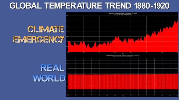
Pro: Official Government Data Shows an Alarming Rapid Rise in Temperature Over 140 years
NASA’s Goddard Institute for Space Studies (GISS) is the original organization to raise the warning on global temperature increases, due to increasing carbon dioxide in Earth’s atmosphere, during an address to the U.S. Senate by Dr. James Hansen in June 19881.
NASA GISS maintains a website where the data and graphs derived from that data are publicly available. They say:
The GISS Surface Temperature Analysis ver. 4 (GISTEMP v4) is an estimate of global surface temperature change. Graphs and tables are updated around the middle of every month using current data files from NOAA GHCN v4 (meteorological stations) and ERSST v5 (ocean areas), combined as described in our publications Hansen et al. (2010) and Lenssen et al. (2019). These updated files incorporate reports for the previous month and also late reports and corrections for earlier months.
They offer a graph of global temperature for each year from 1880 to the present as seen below.
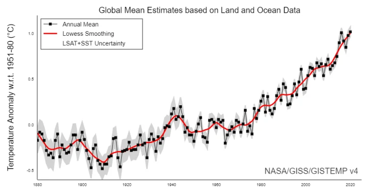
This particular graph (Figure 2) is the most cited and referenced graph of its kind in the world, depicting a sharp rise in global temperature over the 140 years from 1880 to 2020. It shows that we are in a runaway warming trend that constitutes a “climate emergency”.
Media outlets understand and have adopted the term “climate emergency” and use it more frequently in headlines. In a 2019 article, seen below, they use data from NASA GISS to inform their readers.
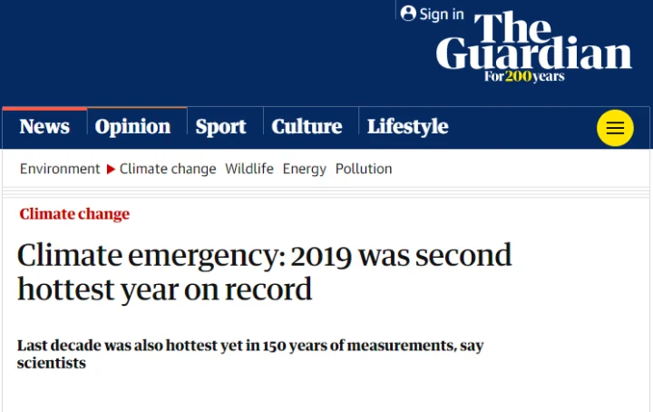
The average temperature in 2019 was about 1.1C above the average from 1850-1900, before large-scale fossil fuel burning began. The world’s scientists have warned that global heating beyond 1.5C will significantly worsen extreme weather and suffering for hundreds of millions of people.https://www.theguardian.com/environment/2020/jan/15/climate-emergency-2019-was-second-hottest-year-on-record

The term “climate emergency” has seen a surge in use ever since its awareness grew after being used by the media to describe what appears to be a rapid global temperature rise.
From Wikipedia:
Oxford Dictionary chose climate emergency as the word of the year 2019 and defines the term as “a situation in which urgent action is required to reduce or halt climate change and avoid potentially irreversible environmental damage resulting from it.” Usage of the term soared more than 10,000% between September 2018 and September 2019.https://en.wikipedia.org/wiki/Climate_emergency_declaration#Terminology
The steep slope of the graph makes clear that Earth’s temperature is rising so quickly that it constitutes an emergency requiring immediate action.
Con: The widely cited NASA global temperature graph is highly magnified and visually misleading
Note that the Guardian article cites:
“The average temperature in 2019 was about 1.1C above the average from 1850-1900, before large-scale fossil fuel burning began.”
The entire graph and temperature data set from NASA GISS is displaying just the small change of 1.1°C of temperature, which is highly magnified to show the trend. Because this small temperature change is magnified, it gives the false impression of having a steep rising slope. For the unobservant, that steep slope looks like a dangerous trend that would constitute a “climate emergency”.
Note the two graphs below. Figure 4 shows how global warming is depicted in the media from NASA GISS data (such as seen above in the Guardian article), plotting a narrow temperature range to show a magnified graph.
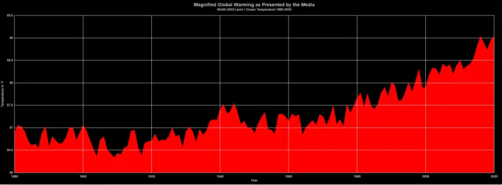
Figure 5 below shows the exact same data when plotted on the scale of human temperature experience, such as the range of temperature we experience yearly from winter to summer. This is done by removing the anomaly calculation from the GISS data, using the agreed upon baseline temperature:
For the global mean, the most trusted models produce a value of roughly 14°C, i.e. 57.2°Fhttps://data.giss.nasa.gov/gistemp/faq/abs_temp.html
Simply using an Excel Spreadsheet allows us to add that 57.2°F temperature back to the NASA GISS anomaly data value. You can download and examine the spreadsheet here for yourself:
GISSinabsolute2020.xlsxDownload
The result of that process gives you Figure 2:
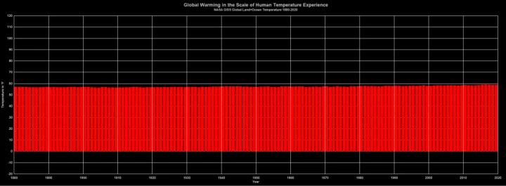
Figure 5 shows a slow, and gradual temperature rise in actual absolute temperatures over the last 140 years. The difference with figure 1 is striking, and doesn’t look alarming at all.
If you were presented figure 5 as proof of an impending “climate emergency” would it be as concerning as figure 4 or the NASA GISS graph commonly cited in the media?
In the article Lessons on How to Lie with Statistics by Will Koehrsen Jul 28, 2019 he makes the following point:
How to Lie With Statistics2 is a 65-year-old book that can be read in an hour and will teach you more practical information you can use every day than any book on “big data” or “deep learning.”
…
Always Look at the Axes on a Chart
Adjusting the axes of a graph to make a point is a classic technique in manipulating charts. As a first principle, the y-axis on a bar chart should always start at 0. If not, it’s easy to prove an argument by manipulating the range, by for example, turning minor increases into massive changes:https://towardsdatascience.com/lessons-from-how-to-lie-with-statistics-57060c0d2f19

Just like in the GISS temperature graph that uses a non-zero starting point for the Y-axis, the first figure 6 graph on the left suggests interest rates are rising dramatically. But, when plotted in the full context of the data, on the right, the rise in interest rates does not look concerning at all.
The same misleading process is on display with NASA GISS temperature graph comparison in figures 1 and 2.
Magnified and scary looking temperature data aside, many scientists don’t believe we have a “climate emergency” at all even though high-schooler Greta Thunberg is impassioned enough to present her concerns to the United Nations3.
But some 500 scholars and scientists say there’s no “climate emergency” at all.
On the [same day] that Greta Thunberg made an impassioned speech to the United Nations about her fears of a climate emergency, a group of 500 prominent scientists and professionals, led by the CLINTEL co-founder Guus Berkhout, sent this registered letter to the United Nations Secretary-General stating that there is no climate emergency and climate policies should be designed to benefit the lives of people. Here’s the press release, here’ the list of 500 signees.https://www.aei.org/carpe-diem/there-is-no-climate-emergency-say-500-experts-in-letter-to-the-united-nations/comment-page-1/
Clearly, the global temperature data does not support the idea of a “climate emergency”, because when you view it on the proper scale of normal human experience, the steep rise in temperature disappears. And clearly, 500 knowledgeable people of science say there’s no need to worry.
References:
- Global Warming Has Begun, Expert Tells Senate. The New York Times, June 24th, 1988. https://www.nytimes.com/1988/06/24/us/global-warming-has-begun-expert-tells-senate.html
- How to Lie With Statistics Darrell Huff, (1954) (illust. I. Geis), Norton, New York, ISBN 0-393-31072-8
- Greta Thunberg tells world leaders ‘you are failing us’, as nations announce fresh climate action, United Nations Department of Economic and Social Affairs, 24 September 2019, https://www.un.org/development/desa/youth/news/2019/09/greta-thunberg/
You must be logged in to post a comment.