Global Cooling – Climate and Weather Forecasting.
Guest post by Dr. Norman Page
Introduction.
Over the last 10 years or so as new data have accumulated the general trend and likely future course of climate change has become reasonably clear. The earth is entering a cooling phase which is likely to last about 30 years and possibly longer. The major natural factors controlling climate change have also become obvious.Unfortunately the general public has been bombarded by the scientific and media and political establishments with anthropogenic global warming – anti CO2 propaganda based on the misuse and misrepresentation of already shoddy IPCC “science” for political ,commercial and personal ends.
The IPCC climate science community largely abandoned empirical Baconian inductive scientific principles and built worthless climate models based on unfounded assumptions designed to show that anthropogenic CO2 was the driving force behind changing climate. Most of the IPCC output is useless as a tool for predicting future climate trends and their impacts and in particular the IPCC Summaries for Policymakers can be safely ignored for practical purposes. The divergence between the IPCC Hansen projections and the observed trends is shown below.
Fig 1 ( From Prof. Jan-Erik Solheim (Oslo) )

Fortunately, however , the basic data is now easily available so that any reasonably intelligent person can check on line daily or monthly to see what the incoming empirical data actually is and draw ones own conclusions.
Here’s how to do it in a few simple steps. I have put in CAPITALS the main empirical observations on which one can draw conclusions re climate change ,its causes and future trends and also get a good idea of weather patterns and trends for the next year or so.
1. Check the Temperature Trends and Data.
Because of the Urban Heat Island effect ,the built in local variability of the NH land data and the thermal inertia of the oceans, Sea Surface Temperatures are the best measure of global temperature trends. These show that the global warming trend ended in about 2003. THERE HAS NOW BEEN NO NET WARMING SINCE 1997 -15 YEARS WITH CO2 RISING 8.5% WITH NO GLOBAL TEMPERATURE INCREASE. SINCE 2003 THE TREND IS NEGATIVE.
To check the past years go to
ftp://ftp.ncdc.noaa.gov/pub/data/anomalies/annual.ocean.90S.90N.df_1901-2000mean.dat
and for monthly updates go to.
ftp://ftp.ncdc.noaa.gov/pub/data/anomalies/monthly.ocean.90S.90N.df_1901-2000mean.dat
The 2012 average NCDC SST anomaly thru Sept was .4438 versus the 1997 annual anomaly of .4575.
The peak anomaly was .5207 in 2003.
An excellent site for reviewing all the basic temperature data is http://www.climate4you.com/
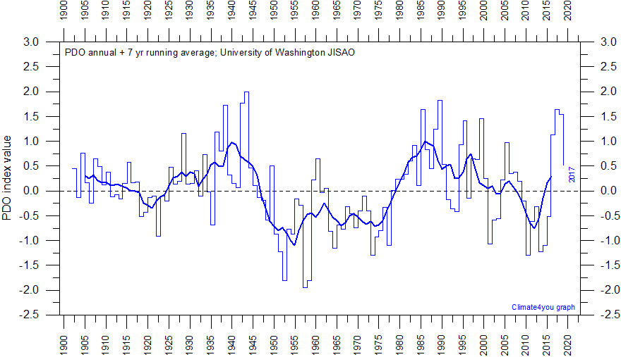
2. Check the current phase of the Pacific Decadal Oscillation.
Here is a plot and suggested projection based on the Hadley SST3 from Tallbloke.

(See: http://tallbloke.wordpress.com/2012/10/23/the-carbon-flame-war-final-comment/) He says “I have put together a simple model which replicates sea surface temperature (which drives global lower troposphere temperature and surface temperatures a few months later). The correlation between my model and the SST is R^2=0.874 from 1876 FOR MONTHLY DATA.” The model is shown with predictions to 2050 (blue) along with the HADsst3 (red).
I included Fig 2 because an approximate 60 year cycle is obvious by inspection and this coincides well with the 30 year +/- positive (warm) and 30year +/ negative (cold) phases of the Pacific Decadal Oscillation. Figure 2 shows warming from about 1910 – 1940-45 , cooling from then to about 1975 -.warming to about 2003-5 and cooling since then. Total warming during the 20th century was about 0.8 degrees C. For a complete discussion and review of the data relating the PDO to the other oceanic cycles and temperatures see
For latest PDO data see http://jisao.washington.edu/pdo/PDO.latest
IT IS CLEAR THAT WE ARE IN THE EARLY STAGES OF A THIRTY YEAR NEGATIVE (COOLING ) PDO CYCLE.

3. Check Solar Activity – where are we at?
The major ice age climate cycles are controlled by the sun – earth orbital eccentricity,and the earth’s obliquity and precession. These cycles are approximately 100,000, 41,000 and 21000 years in length respectively and are well documented in the ice core and geological record. It is useful to keep in mind that the warmest temperatures in the current interglacial occurred about 7500+/- years ago and the GENERAL TREND IS NOW A COOLING TOWARDS THE NEXT ICE AGE.
Fig 4 http://colli239.fts.educ.msu.edu/1999/07/11/vostok-1999/

These long term cycles are modulated by quasi cyclic trends in solar activity which may be decadal ,centennial or millennial in length.Of particular interest in deciding where we are with regard to the solar cycles is the approximately 1000 +/- year cycle which produced succesively the Roman Warm Period, the Dark Ages,the Medieval Warm Period, the Little Ice Age and the recent 20th century warming.
Fig 5 (From http://www.theregister.co.uk/2012/07/10/global_warming_undermined_by_study_of_climate_change/ )

The red line shows the continuing cooling trend from the Holocene optimum and the 1000yr +/- solar cycle is clearly seen.
NOTE – A REASONABLE CASE CAN BE MADE THAT THE WARMING PEAKS OF A 60 YEAR PDO CYCLE AND THE 1000 YEAR SOLAR CYCLE COINCIDED AT 2000 +/- AND WE ARE LIKELY ON THE COOLING SLOPE OF BOTH.
The clearest empirical measure of solar activity is the solar magnetic field strength. On an empirical basis Livingston and Penn have shown that the decline in solar magnetic field strength suggests that sunspots could disappear by about 2015 signalling THE START OF A NEW MAUNDER MINIMUM WITH SIGNIFICANT COOLING.
For a semi-empirical estimate of the possible cooling if a Maunder Minimum does develop see http://pubs.giss.nasa.gov/docs/2001/2001_Shindell_etal_1.pdf
Note the abstract of the Shindell paper (Mann is one of the et als) says “THIS LEADS TO COLDER TEMPERATURES OVER THE NORTHERN HEMISPHERE CONTINENTS ESPECIALLY IN WINTER (1 to 2 C), IN AGREEMENT WITH HISTORICAL RECORDS AND PROXY DATA FOR SURFACE TEMPEERATURES
“For a good review of the latest sunspot and magnetic data see
http://wattsupwiththat.com/2012/09/03/the-sun-still-slumping/ and to keep with the decline in solar magnetic field strength and the liklihood of a Maunder Minimum check monthly the Livingston and Penn thread at
http://solarcycle24com.proboards.com/index.cgi?board=general&action=display&thread=855
Perhaps the best indicator of the effect of the declining solar magnetic field can be seen in the Galactic Cosmic Ray flux.
This can be checked on a daily basis at http://cosmicrays.oulu.fi/#database
Fig 6 Neutron count since 1964 from the Oulu data base.

The Dec 2009 neutron maximum ( solar cycle 23 -24 minimum) is greater than anything seen previously and the neutron count is now (Nov 2012) higher than at any comparable time in previous cycles since we are only 12 -18 months away from the cycle 24 solar maximum.There was a secular change in solar magnetism in 2005 – check the WUWT link posted earlier. The neutron count ties to earths climate via cloud cover and albedo. Simply put – the lower the neutron count the lower the cloud cover and the warmer the temperature. Because of the enthalpy and thermal inertia of the oceans there is a 10 – 12 year lag between the neutron troughs and global SSTs. The short term temperature record is variable over shorter times than 12 years because of El Ninos and La Ninas and volcanic and lunar effects but the increasingly lower counts on the three troughs from 1970 – 1991 are well matched by the temperature rise from 1981 – 2003. THE RELATIVELY HIGH NEUTRON COUNT IN 2012 COMPARED WITH 1970 SUGGESTS THAT BY 2024 GLOBAL TEMPERATURES WILL BE BELOW THOSE OF 1970 WHICH WERE ALREADY BELOW 2012 BY ABOUT 0.36 C.
4. Check the Southern Oscillation Index.
Fig 7 http://www.bom.gov.au/climate/enso/

In Fig 7 values above +8 indicate La Ninas, values below -8 are El Ninos and values in betwen are neutral or La Nadas.
Figure 7 also has some predictive value relative to global temperatures. ( Mclean et al JGR 2009) Global temperatures appear to lag the SOI by about 7 months.
5. Climate , Weather and Extreme Events.
Sections 1 – 4 above show that the earth has entered a cooling trend which will continue for at least 30 years and perhaps longer. To get some idea of possible extreme weather events we might look at extremes found between the MWP and the Little Ice Age. It is unlikely however that any future extremes will be “unprecedented”.There is a large literature on this topic which interested parties can consult.Some general empirical observations can be made.
On a cooling earth there is a steeper temperature gradient from the Tropics to the Poles. This produces instabilities with the jet stream swinging meridionally further south and north. Thus blocking high pressure systems develop with extremes of cold and heat and sharp temperature gradients between air masses with for example Sandy type blizzards or tornado swarms. A cooler world will be a generally drier world with increasing droughts globally and in e.g the USA corn belt and in the USA in general When combined with shorter growing seasons and possible early and late frosts this is likely to threaten world food production as population increases.
The PDO and SOI indices are the main ocean climate and weather indicators.Obviously ,for regional analyses at particular times, the phases of other ocean systems relative to the first two – for the U.S for example the AMO and NAO need to be considered. These are easily checked by looking from time to time at the work of the best climate and weather interpreters Joe D’Aleo and Joe Bastardi on http://www.icecap.us/
6.Summary of some Future Trends and Policy Suggestions.
The empirical observations highlighted in CAPITALS above indicate that the global warming temperature trend has peaked .The peak is broad with only a little cooling to date but this will likely accelerate from 2015 or 2016 on reflecting the beginning of the increase in the cosmic ray count already seen from 2004 – 2009 in Fig 6. The cooling will last until 2030- 2040. Often the signal for a climate direction change is a see saw effect between Arctic and Antarctic sea ice. The Arctic is still reflecting the peak in the warming trend with low summer ice values.
The first indication of a cooling event is however the increase in Antarctic sea ice which has already occurred.
This alters the oceanic deep water circulation patterns and spreads the cooling world wide. The Arctic ice will begin to catch up in a five years or so.
With a cooling world sea levels will stop rising and begin to fall as glaciers and ice caps begin to increase and the oceans compress with cooling.Eventually the rate of CO2 increase will slow and may even reverse even if human emissions continue to rise .
Because the error bars in our rough estimates of natural temperature variations are larger than any possible
Massimo PORZIO says:
November 19, 2012 at 4:19 pm
So what?
No, no, no!
Can’t believe that, here in Italy this night the news just told me that in 2060 there will be no difference between winters and summers!
Dr. Page is surely wrong, TV media can’t lie on that.
(It’s sarcastic of course, this morning we get a nice +3°C nearby Milan)
Ah but did they forget to mention it will be an ice age!
Politisite says:
November 19, 2012 at 4:53 pm
If you want the weather to change, hang around for like 30 – 70 years
I have but it hasn’t changed yet!
****
Bill Illis says:
November 19, 2012 at 7:51 pm
It looks like the Sun is slowing down (but the TSI numbers are just slightly below that expected and, technically, our Sun is a very, very stable Star). Its surface temperature only varies between 5,779.5K and 5,780.5K. I don’t see the Sun having the type of impact needed to produce a significant cooling trend.
****
Lucky to have such a star, eh? (It’s not a coincidence)
I agree, not enough change, unless some undefined positive feedback is invoked (such as attempted w/CO2). I see many possibilities mentioned, but nothing straightforward or data-supportable, despite the efforts. OTOH, regional insolation changes from orbital mechanics causing climate change is well supported over thousands of yr timescales.
Bob Tisdale says:
November 19, 2012 at 6:46 pm
The PDO is inversely related to the sea surface temperature anomalies of the North Pacific over decadal timescales so there cannot be cause and effect based on the PDO.
Agreed. My study found the AMO was a bigger factor than the Pacific. However, this may be because excess heat from the Pacific gets pumped round Africa and up into the Arctic via the north Atlantic.
Norman Page’s projections are similar to those of:
1) Nicola Scafetta (see graphs of forecasts vs current temperature at the bottom,
Scafetta N., 2012. Testing an astronomically based decadal-scale empirical harmonic climate model versus the IPCC (2007) general circulation climate models. (Science and Public Policy Institute).
and of
2) Don Easterbrook:
D’Aleo, J. and Easterbrook, D.J., 2011, Relationship of multidecadal global temperatures to multidecadal oceanic oscillations: in Easterbrook, D.J., ed., Evidence-Based Climate Science, Elsevier Inc., p. 161-184
3) Syun-Ichi Akasofu
On the recovery from the Little Ice Age , Natural Science, Vol.2, No.11, 1211-1224 (2010) doi:10.4236/ns.2010.211149 http://www.scirp.org/journal/NS/
OssQss says:
November 19, 2012 at 8:19 pm
….With respect to the meridional jets in your other post,,,,,,, was the Russian Heat Wave, that some claimed were the worst for 1,000 years in that area, some of the same symptom?
>>>>>>>>>>>>>>>>>>>>>>>>>>>>>>>
Yes it was caused by a Blocking High. From NOAA
For the layperson:
If the jets are meridional in flow then you can expect weather extremes as the winds alternately suck polar and tropical air into the same region, it is just that simple.
This PDF Indicates a link to the North Atlantic Oscillation (NAO graph.) So Climate scientists are well aware that the NH will be seeing more extreme weather hence the change from CAGW to “Dirty Weather”
If you have followed what has been happening to the Jet Stream over the USA for the last couple of decades, this switch from zonal to meridional over the last couple of years is very apparent. (My business demands very accurate weather forecasts so I watch the jets closely.)
This was posted at Bob Tisdale’s blog. Can anyone name the author/source and what it represents exactly?
http://i161.photobucket.com/albums/t231/Occam_bucket/ModelvsObs.jpg
ln reply to Jim
ln recent years to jet stream has been making more wave movement towards the north and the south. Here in the UK the summers since 2007 have been rather dull and wet because of the southward push of the jet. The Polar jet is the zone between the warm air and the cold.lts along this zone where much of the cloud and rain form. So if this zone extends over a lager area then its very likely that there will be a increase in cloud cover
Sorry it should of been “larger” not “lager” 🙂
Hoser says:
Sorry… I can’t resist… Just don’t be a culo.
OK not a phrase used in UK, I had to google “culo”
now I have
Does my Bum look big on WUWT? : >)
taxed says:
November 20, 2012 at 6:27 am
Sorry it should of been “larger” not “lager” 🙂
Lager area describes northern Europe quite well actually.
By the way “should of been” should have been ‘should have been’.
Is this what we are in for? http://devconsultancygroup.blogspot.co.uk/2012/11/cold-wave-roundup-record-temperature.html
The key idea behind my blogpost (see original at climatesense-norpag.blogspot.com ) was to encourage people engaged in the climate wars to avoid argument by reference to consensus or authority or peoples motives or funding sources or political affiliations It says :
“Fortunately, however , the basic data is now easily available so that any reasonably intelligent person can check on line daily or monthly to see what the incoming empirical data actually is and draw ones own conclusions. ”
It seems to me the “solar activity” ( which besides solar magnetic field strength, also includes changes in TSI ,EUV radiation, CME frequencies and proton storms which produce Forbush effects ) translates into regional climate and weather via the great ocean and atmospheric current systems. Certain configurations of these systems are more common on a cooling world than a warming world but they are not simply chaotic ie we can make regional predictions based on past configurations . It is these regional predictions over time which suggest useful local policy reactions within the framework of an overall warming or cooling scenario. The whole thing is like a Russian Egg with circles of relevance from a global to local scale.
eco-geek says:
November 19, 2012 at 5:15 pm
The horrific extent of the crimes of the warmists/alarmists are likely to become apparent within a decade. The deceit based diversion of political will to carbon dioxide emission reduction from preparations for the coming major fall in global temperature will cost many lives, possibly hundreds of millions or more, should a Maunder minimum be about to descend upon us.
It will soon become clear that grain production in the Northern hemisphere is about to collapse as the growing zones move southward hundreds of kilometres. It will be clear that the recent “good years” surpluses should have been preserved and stored for the decades of low food production which lie on our immediate horizon. Instead the cupboard is bare and we may only have wind generators to keep us warm. Its just a shame they don’t burn – the wind generators, that is.
Stay cool….
The problem is that the Malthusians and Greens want people to die they consider humanity is a disease of Gaia. So the fact that a child dies every 5 seconds at current levels of famine means that things are going the way they want. Food riots would play right into the ideals of the Fabian progressives who want to see total anarchy and a break down of current society to allow the ascendance of their Agenda 21 envisioned ‘Global Governance’. Strangely, the Fabian Progressives always consider that they should be the ones taking charge, and the Greens and Malthusians feel that other less equal humans should die rather than them or their families. But hypocrisy seems to come naturally to these ‘people’.
I have been pointed to this discussion by someone who got surprised by Leif Svalgaard’s claims on the drifts in Oulu NM data. I am the PI of the Oulu NM and am quite surprised that this issue, including direct cliams of my misqualification, are discussed here without contacting me first!
Oulu NM is regularly checked for the stabiity of electronics and counters and is regarded by experts as one of the most stable station of the world network. No aging is observed. Moroever, as Leif claims, Oulu is counting MORE cosmic ray than Thule, but this cannot be due to aging, unless this is aging of Thule. Aging can lead only to decreasing count rate!
Comparing Oulu to mid- and low-latitude stations is incorrect as the modulation during the cycle 23-24 is known to be more energy dependent than before. Moreover, Oulu data is totally consistent with most of the high-latitude stations (Apatity, McMurdo, Kerguelen, Terre-Adelia etc. – see http://www.nmdb.eu/nest/search.php ), except only two – Thule and even greater difference with the South Pole, the latter both showing a decreasing trend, absent in other stations. Moreover, McMurdo being counting even more than Oulu during the last years.
Thus, I consider Leif’s comments ungrounded and offensive as publicly discussed behind my back. I advice everyone to ask experts first if you think some data are wrong, not just claiming the data wrong because they don’t support someone’s idea.
Please don’t reply to me here, I am not reading this forum. If you have any questions, write to me directly (contact info is at http://cc.oulu.fi/~usoskin/ ).
Sincerely yours,
Ilya Usoskin
I am looking at a global monthly temperature temperature series, (I’m using the one from BEST) and trying to find the change in trend in the recent years. Although I see a change in slope, it does not seem radical to me, and the scatter does not appear as though there is any difference. I may be seeing a step-change down with a resumed slope. Is there a paper or reference available that looks at the data and performs statistical analyses to establish that the trend did or did not change in a statistically significant way?
In my circle there were ’13-’14’s; ’14-’15’s; and I/me at ’15-’16 — I see from article I am no longer singular and which serves as a type of confirmation. Time will tell and 2015-2016 will be its own confirmation. rkh
There are notable researches that conclude the Maunder Minimum began significantly later than the start of the Little Ice Age.
My thought is that though the LIA was not caused by the MM, the MM might possibly have contributed somewhat to a cooling that was already well developed from other causes.
That does not provide support for any argument saying if we are going into a MM like solar event then we are going into a LIA. But although it does not preclude the possibility that we are starting a LIA-like event, it leaves me with just a shrug as to putting importance on the idea of being at the start of a new LIA.
John
Ron Manley says
There seems to be a growing understanding in the wider climate science community that temperature increases have been driven mainly by CO2
Henry says
You are not joking? Clearly, temps. have been driven up by increasing energy coming in:
http://blogs.24.com/henryp/2012/10/02/best-sine-wave-fit-for-the-drop-in-global-maximum-temperatures/
but this trend has reversed since 1995
Increasing temps. going up from 1950 have driven up CO2:
remember there are giga tons of HCO3- dissolved in the oceans:
heat+ HCO3- => CO2 (g) + OH-
(when you boil a kettle, what smoke comes out first?)
The summer temperature graph looks sinusoidal to me, in which case there are some more years of warming left even though the long term trend line may be downward. Though I am an AGW skeptic, warm is better than cold for all things other than AGW skepticism and skiing.
_Jim says: @ur momisugly November 19, 2012 at 8:59 pm
______________________________
The work of Jaworowski, Segalstad, and Beck among others. Reading how Mauna Loa data is manipulated. The crazy assumption that CO2 is ‘well mixed’ when there are continuous sinks, sources all changing and major day night fluctuations and numerous records that showing that CO2 is NOT constant/well mixed.
Why the heck would you take it as given that the CO2 record is pristine after we have seen how frecked-up the global temperature record is and how the temperature records has been continually gamed? After all the CO2 record is as important as the temperature record in perpetuating the scam. BOTH records must be shown to rise together. Heck look at the effort to explain away the 800 year lag between CO2 and temperature found in the ice core records. The paper was evasculated here on WUWT not too long ago.
Callendar’s cherry picking should have been the first really big clue.
graph
Closup graph
Here is the Ice Hockey Stick graph as shown in the link I used the FIRST TIME.
Day By Day says:
November 19, 2012 at 10:04 pm
I totally agree with you that a warmist of the religious type – not the original ones that knew what they were doing – but the 40 year olds and younger that have had the mantra played to them so often that in their minds it is totally real – they are going to go through all sorts of logical dissonance.
As they watch the Mississippi glacier calving ice into the frozen wastes of the Gulf of Mexico, they will say “when this lot melts its going to get really really warm!”.
“GM seeds adapted to drought and cold should be developed.”
Hopefully ones that are actually safe and can pass Dr Pusztai’s tests and not end up in the fraud category “http://www.responsibletechnology.org/fraud”.
Besides who needs GMO foods when traditional selective breeding has them beat already? Check out the haskap plants (and cherry trees, etc) that the U of Sask has developed. Good to climate zone 2! Yes 2 not just 3.
http://www.fruit.usask.ca/haskap.html
David Cage says:
November 19, 2012 at 11:25 pm
I believe this is as wrong as the global warming. Looking at the very long term trend not as linear but as cyclic we are on the slowly rising part of a sine wave…
>>>>>>>>>>>>>>>>>>>>>>>>>>>>>
Sorry Dave, Leif’s Solar Insulation chart based on the very slow Milankovitch cycles show we are near the bottom of a long trend DOWN. graph
Here is another graph from Boston University and the National Council for Science and the Environment, showing Precession, Obliquity, and Eccentricity and the calculated solar insulation. Again the amount of solar energy is head down.
Other links:
Description: link
Lay persons description of Gerald Roe’s paper: In defense of Milankovitch (with link to the paper itself) link
GRAPHS (Note the present can be to the right or left depending on the graph)
graph
graph
graph
graph
graph
Rick Bradford says:
November 20, 2012 at 2:09 am
Let’s assume Dr. Page is correct.
Let’s further assume that the Green/Left is successful in forcing through widespread ‘anti-carbon’ legislation — mainly making First World electricity prices many times higher and stifling Third World development.
The death toll from their actions would then dwarf anything that those other Comrades, Stalin and Mao, ever achieved. A Great Leap Forward, indeed!
And what will their excuse be? “We meant well.”
Excuse?
They don’t need an excuse – it is what they want.
Mankind is a disease of Gaia if you are a Malthusian or Green
Complete break down of society leading to Global Governance is what the Fabian Progressives want.
They will be overjoyed if “The death toll from their actions would then dwarf anything that those other Comrades, Stalin and Mao, ever achieved.” precisely because they would actually see that as “A Great Leap Forward”
Their one fear is that the starving multitudes may recognize what is being done before they are too weak to do anything about it.