It’s been an open secret, ever since Dr. Michael Mann used “Mike’s Nature Trick” to “hide the decline” by covering up some inconvenient tree ring data in the hockey stick climate graph, that climate alarmists will go to almost any length to only show the public the “crisis side” of climate data.
The National Interagency Fire Center (NIFC) has been the keeper of U.S. wildfire data for decades, tracking both the number of wildfires and acreage burned all the way back to 1926. However, after making that entire dataset public for decades, now, in a blatant act of cherry picking, NIFC “disappeared” a portion of it, and only show data from 1983. You can see it here.
Fortunately, the Internet never forgets, and the entire dataset is preserved on the Internet Wayback machine and other places, despite NIFC’s ham-handed attempt to disappear the data.
Why would they do this you ask? The answer is simple; data prior to 1983 shows that U.S. wildfires were far worse both in frequency and total acreage burned. By disappearing all data prior to 1983, which just happens to be the lowest point in the dataset, now all of the sudden we get a positive slope of worsening wildfire aligning with increased global temperature, which is perfect for claiming “climate change is making wildfire worse”. See figure 1 below for a before and after comparison of what the data looks like when you plot it.

Clearly, wildfires were far worse in the past, and clearly, now the data tells an entirely different story when showing only data post-1983. The new story told by the sanitized data is in alignment with the irrational screeching of climate alarmists that “wildfires are driven by climate change”.
This wholesale erasure of important public data stinks, but in today’s narrative control culture that wants to rid us of anything that might be inconvenient or doesn’t fit the “woke” narrative, it isn’t surprising.
Interestingly, the history on the Internet Wayback Machine shows how NIFC rationalized this erasure of important public data.
Back in June 2011 when this data was first presented by NIFC publicly, it was simply presented “as-is”. They say only this:
Figures prior to 1983 may be revised as NICC verifies historical data.
In 2018, they added a new caveat, saying this:
The National Interagency Coordination Center at NIFC compiles annual wildland fire statistics for federal and state agencies. This information is provided through Situation Reports, which have been in use for several decades. Prior to 1983, sources of these figures are not known, or cannot be confirmed, and were not derived from the current situation reporting process. As a result the figures prior to 1983 should not be compared to later data.
According to the Internet Wayback Machine, that caveat first appeared on the NIFC data page somewhere between January 14 and March 7 of 2018.
Curiously, that caveat appeared just a few weeks after I first drew wide attention to the issue in December 2017, with an article citing NIFC fire data titled Is climate change REALLY the culprit causing California’s wildfires?
It seems they received some blowback from the idea that their data, when plotted, clearly showed wildfires to be far worse in the past, completely blowing the global-warming-climate-change-wildfire connection out of the water.
Here is what NIFC says now:
Prior to 1983, the federal wildland fire agencies did not track official wildfire data using current reporting processes. As a result, there is no official data prior to 1983 posted on this site.
Not only is that a lie of omission, it is ridiculous. Their agenda seems very clear. When the data was first published, they only advised the public that some data prior to 1983 might be “…revised as NICC verifies historical data”.
There was no published concern that the data might be invalid, or that we shouldn’t use it. Besides, the data is very simple; a count of the number of fires and the number of acres burned. How hard is that to compile and verify as accurate?
What’s worse is that this data has been trusted for decades in almost every news story about any wildfire that ever occurred in the U.S. In virtually every news story about a wildfire, the number of acres burned it THE NUMBER the press uses in the story, without it, there is no scale of the severity of the fire. Similarly, for every story about “what a bad wildfire season we’ve had”, the press cites the number of fires as well as the acreage burned.
And now, after decades of that data being provided to the press and the public, and nearly a decade of NIFC making it publicly available on their website, they want us to believe that it is now unreliable data?
Seriously, just how hard is it to count the number of fires that have happened and the number of acres burned?
What NIFC is doing is essentially labeling every firefighter, every fire captain, every forester, and every smoke jumper who has fought wildfires for decades as being untrustworthy in their assessment and measurement of this critical, yet very simple fire data. I’ll take data from people on the fire scene over government bureaucratic doublespeak every day of the week and twice on Sundays.
This whole affair is outrageous. But what is even more outrageous is that NIFC isn’t at all transparent as to the reason for the change. They essentially say “The data prior to 1983 is no good, trust us”. There is no citation of a study, no methodology given, no rationale for the removal. That’s not science, that’s not statistics, that’s not even sensible, but that is what is happening.
Plotting the entire NIFC dataset (before it was partially disappeared) gives us some hints as to why this has been done, and how wildfire and weather patterns have been inextricably linked for decades. Note figure 2 below, combining the number of fires and number of acres burned. See the annotations that I have added.

Clearly, what NIFC has done by saying data prior to 1983 is “unreliable” and disappearing it is not just hiding important fire history, but cherry picking a data starting point that is the lowest in the entire record to ensure that an upwards trend exists from that point.
The definition of cherry picking is:
Cherry picking, suppressing evidence, or the fallacy of incomplete evidence is the act of pointing to individual cases or data that seem to confirm a particular position while ignoring a significant portion of related and similar cases or data that may contradict that position.
And by choosing the lowest point in the record for total fires, 1983, and making all data prior to that unavailable, NIFC ensures that any comparison between fires and climate change over the last 38 years always shows an upward trend and correlation with rising temperature.
It seems to me that NIFC very likely caved to pressure from climate activists to disappear this inconvenient data. By erasing the past data, NIFC has become untrustworthy. This erasure is not just unscientific, it’s dishonest and possibly fraudulent.
For posterity, the entire dataset from NIFC (including pre-1983) is available here in an Excel (.xlsx) file:
UPDATE: Here is an analysis paper from 2015 using the same data that is on the U.S. Forest Service website:
https://www.fs.fed.us/research/sustain/docs/national-reports/2003/data/documents/Indicator%2015/Indicator%2015.pdf
Truthiness Diode
fake and old meme
Proves that oil and gas sponsored trolls like Patrick Moron and Watts the weatherman high school grad are still being paid to lie.
We deconstruct the “science establishment” and mass media’s own statements with direct links… how is that lying? Since you offer no proof [nor even an argument] If anyone is trolling it is you.
Hey dumbass with the fake name – prove it.
HINT: YOU CAN’T BECAUSE THE FACTS SPEAK FOR THEMSELVES HERE. My opinions are my own, always have been.
Glad to see you’ve moved your “echo chamber” from Belize to Sugarland texas.
Carry on – (just not here)
Anthony: OMG, be careful, he could be “the Russians”! US Intel has already determined it, if they looked.
Guitar Mann,
Yet you missed your opportunity to make him look bad, it is a failure common to warmist/alarmists who prefer personal attacks over cogent arguments, because they have no arguments to sell in the first place.
It would appear that the methodology of the NIFC has destroyed the global warming theory at a stroke. Their methodology rejects proxy data and all historical data recorded using different instruments, or methods. Therefore all global temperature data prior to the latest satellites must be rejected. Surface station data has to be rejected because it is not using the latest comprehensive method for collecting global temperature data. Even if it were allowed, the record would only consist of the Automated Weather Station data of the most recent type. The NIFC methodology rejects any and all data collected using anything other than the current standard best practice. As the entire record thus becomes too short to establish a climate, it means climate change is not possible. Also, we have always been at war with Eastasia.
My fellow Paul: This is why I think this is just gaslighting. The AGW crowd raised alarm by patching together datasets on temps. When called on it, Skeptics were called names for awhile. Here, a US agency puts this chart together, no politics interfered. Meanwhile, the AGW termites continued to burrow, claiming wildfires were increased by a phantom temp increase and imagined increased drought. Skeptics find a gov’t chart that debunks AGW meme, and voila, the old data is disappeared with “well, skeptics don’t want to patch charts together.” And no looking behind the old numbers to see if it can be improved, hell no. These folks see “science” as a tool for political causes.
Another proof Liar-Devil (J8:44) rules this world (Luke 4:6,Ap 12;12,…)
If you want to research a topic like how much earlier fires affect the frequency and severity of new fires, it does not matter if the earlier fires were caused by arson, controlled burning or lightning.
The important take is that all past data are accessible. It is a normal task for the researchers to edit the available data as needed which is hard if it has been disappeared.
Number of fires and acreage burned are two separate and largely independent stats. Many small fires are not as severe as one large fire. Ignition sources are various, but the bulk of the acreage burned comes from lightning.
Human-caused fires are usually (not always) rapidly extinguished before they get large. They are usually close to or in town, reported immediately, and responded to within minutes.
Lightning fires are another matter. They are often in remote areas, detected and reported after hours or even days, and then NOT responded to or extinguished AS A MATTER OF POLICY.
Beginning in 1988 with the Yellowstone Fires, the NIFC adopted a Let It Burn policy for lightning fires on federal land. This policy came in various guises including Wildfire Use, Wildfire Used For Resource Benefit, Blocking In, Partial Perimeter Control, and other bureaucratic monikers. The largest fires in state history in all western states have occurred since 1988 directly due to Let It Burn.
At the same time the USFS stopped logging on federal land. This was another policy decision, though it is often attributed to lawsuits from “environmental” law firms. They certainly played a role, as did Congress, but the upshot is that fuel management and access road building on fed land stopped.
These POLICY decisions resulted in fuel accumulation, withheld suppression, and megafires. The increase in acreage burned since 1988 has NOTHING to do with weather or climate. You might as well blame urban riots on the weather or climate.
The stats don’t tell the whole story. Blaming “climate change” for acreage burned is specious misdirection on the part of NIFC, the very agency that is 100% responsible for increasing acreage burned from ~2 mm acres per year to over 10 mm.
Thanks for pointing this out. Unfortunately, scientific misconduct (cherry picking) isn’t punishable by law, even though in this case, public funds are involved, which is a shame.
This is clearly a misuse of public money.
I did a google search and images:
https://www.google.com/search?q=wildfires+1926+to+2017&sxsrf=ALeKk00Gk7OVV7qKkwRy4Dcpbq0rUDIxzA:1620975700939&source=lnms&tbm=isch&sa=X&ved=2ahUKEwid2t-GzcjwAhVOoZ4KHf4mDLkQ_AUoAnoECAEQBA&biw=1366&bih=657
Please include some news articles written during the years with high burnt acrage.
Whether the actual acres burned are accurately, and with great precision, portrayed 100 years ago misses the point. If the numbers were higher than today by what ever amount is what is important.
They clearly state that data prior to 1983 is not reliable.
Justin
And if the data is off by 1% who cares. Do we know whether the unreliability proves there were fewer fires than recent years. No data.
This really is good news.
It strains credulity to claim that for decades the services were falsifying records to make it seem there were more fires than actually occurred.
So If the original findings were unsound then they were under-reporting fires.
Perhaps WUWT could republish the article with the headline ‘National Interagency Fire Center confirms today’s fire events are much, much, less frequent than previous years’.
No governmental organization can be trusted. Unfortunately the major news media has now become an activist for these entities;.
Nowadays ice ages are referred to as “glaciations”, apparently because it turns out that our planet has been experiencing a cooling trend for the past 65 million years. Over the past 1.3 million years there have been 13 glaciations, average duration 90,000 years, each followed by a warming period (such as we now enjoy) average duration 10,000 years.
Google “Post-Glaciation Sea Level Rise” or “12,000 year graph of sea level” if the graph does not appear in place of this comment.
file:///C:/Users/Owner/AppData/Local/Temp/msohtmlclip1/01/clip_image001.jpg
This graph sends an important message because it likely reflects typical sea level response during any of the past 13 interim warming periods. About 6,000 years ago the RATE of increase in sea level began to drop and that decreasing rate has continued. Now the rate of increase is a minuscule 1 to 3 mm per year. (1mm = about 4/100 of one inch). During this warming period sea level has increased more than 400 feet. The concern about rising ocean levels over the past several decades is based on the last few inches of sea level increase.
If this 1.3-million year trend continues then another glaciation is next. A foot or two of water covering the Big Apple is hardly comparable to sitting under a mile high glacier for a goodly portion of the next 90,000 years.
CO2 increase began in the mid 1800s, as our industrial revolution started. That increase is at least partially related to human activity. However, even though CO2 increase has been consistent there have been periods during which there was no temperature increase, and a three decade cooling period between 1945 and 1975. There are apparently other stronger forces at work. The popular belief is that increasing CO2 causes global warming which not only warms the oceans, but also causes glacier melt.
However there is no evidence that CO2 has ever had any impact on our global temperature. The proponents of warming have generated numerous computer models to justify their position. These models all assume that CO2 causes warming, but not much. The supposed CO2 impact is not enough to be worrisome so the models introduced another culprit, water vapor feedback, which generates 2 to 3 times the temperature increase as supposedly brought on by CO2 increase.
However, recently some Oslo researchers have demonstrated experimentally that CO2 levels increasing from .04% to 100% lead to no observable temperature increase. At least one other group has replicated that experiment.
https://notrickszone.com/2021/04/01/physicists-lab-experiment-shows-a-co2-increase-from-0-04-to-100-leads-to-no-observable-warming/?utm_source=rss&utm_medium=rss&utm_campaign=physicists-lab-experiment-shows-a-co2-increase-from-0-04-to-100-leads-to-no-observable-warming
If CO2 has little or no impact on warming that also rules out the possibility of any significant impact from water vapor feedback. There are also other problems with the water vapor feedback assumption. That feedback claim depends on the applicability of the greenhouse gas theory to actions which involve the open atmosphere. In that case the GHG theory brings with it a necessary condition – there is an accompanying necessary (but not sufficient) condition that there must also be a warmer region about 10km above the tropics, a “hot spot”. Despite decades of radiosondes that hot spot has never been found. The alarmists’ response about that missing hot spot offers little more than speculation as to where it may have gone.
But there’s another indication of cooling. Sun activity (sun spots) has recently gone quiet. Sun activity has driven every warming and cooling period during the past 800,000 years according to Don Easterbrook (geologist). His book “The Solar Magnetic Cause of Climate Changes and Origin of the Ice Ages” is available at Amazon. It’s based strictly on data. John Casey also talks about sun influence in “Dark Winter”.
Henrik Svensmark, Danish physicist, was claiming the same back in the 90s. Svensmark’s theory is that cosmic rays entering the lower atmosphere contribute to cloud cover. (CERN has long since validated Svensmark’s theory.) The normally unchanging stream of cosmic rays entering the lower atmosphere are partially blocked when the sun is active because of the sun’s strengthened magnetic field. An active sun therefore results in fewer cosmic rays entering the lower atmosphere hence lower average cloud cover which implies that more sun radiation reaches the earth’s surface, hence a warmer earth. When the sun is inactive the lower atmosphere receives more cosmic rays which leads to more cloud cover. More sun radiation is reflected back to space so less radiation reaches the earth’s surface which leads to cooling. It’s simple, and as Svensmark puts it – cloud cover dictates climate.
The sun has been active until recently which supposedly brought on our current warming. But now the sun has become quiet so average cloud cover should be increasing and a cooling should follow. Some indications of the arrival of cooling are the temperatures since 2016, (see Dr. Roy Spencer’s graph), also February 2021 was the coolest in about four decades. Texas experienced a record cold winter. England has experienced the coldest April (as of the 18th) since 1922 and Germany the chilliest April since 1917. The theory is simple and the data (oth live and Easterbrook’s) is beginning to support it.
https://chuckincardinal.blogspot.com/2021/04/englands-coldest-april-since-1922.html#comment-5352497312
There is considerable evidence that COOLING, rather than warming, is next on Mother Nature’s agenda. Those trillions of dollars to fight global warming can be shelved unless fighting a naturally-caused colder climate can be justified.
There is a well known analogue in air accident statistics, usually deaths per 1 Million miles flown. These are generally taken from AFTER the Teneriffe air crash, when two Jumbos collided on the runway, killing nearly 600 people in one bang.
:”SInce records began” (which records? Of what? is nearly as powerful a hint you are being lied to as the BBC’s “scientists say” (which scientists, where’s the data?). IT means they are making it up, most times.
Raise your hand if you believe that data would be deleted if it showed a pro-climate-change trend.
Didn’t think so.
Blaming fires on climate change is “Cargo Cult Science.” There is no scientific basis for it. Man-made climate change does not significantly affect the risk or severity of fires. Fire severity depends mostly on land management practices, not air temperatures.
There’s no evidence that global warming (or warmer temperatures in general) worsen forest fires. Droughts do increase fire risk, but droughts are not worsening. Here’s a paper, and a graph from it (except that I added the horizontal lines):
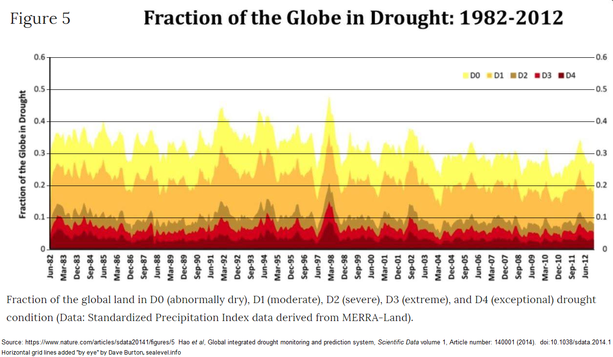
https://www.nature.com/articles/sdata20141
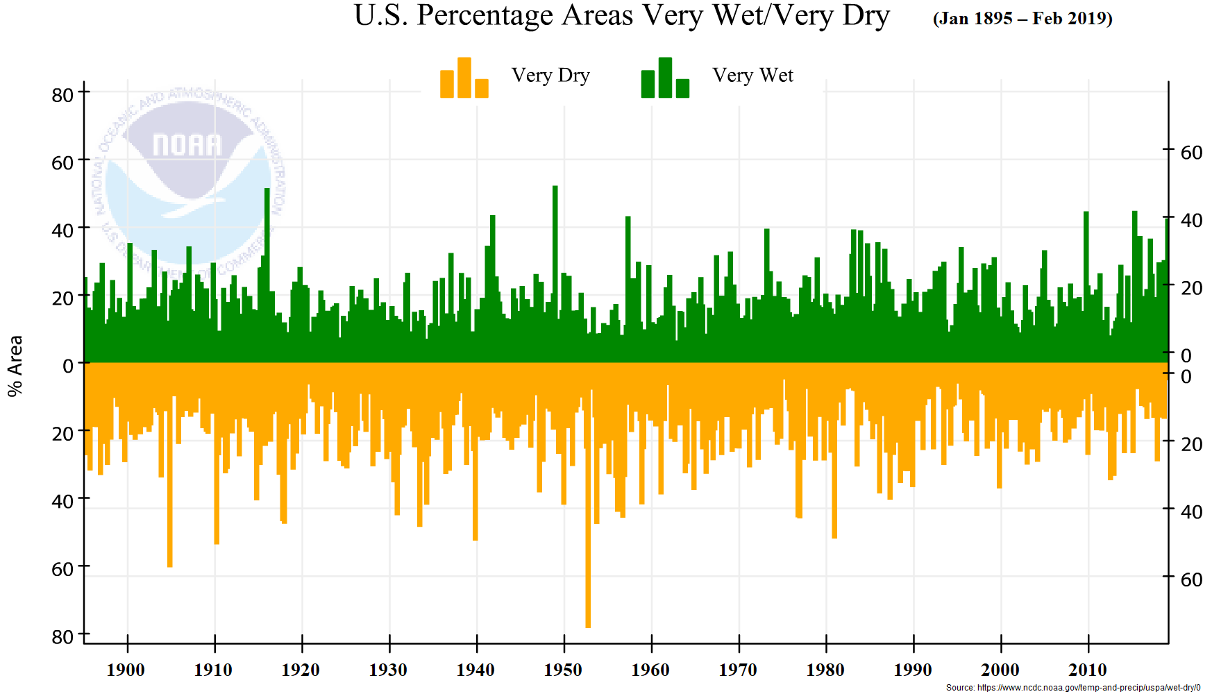
Here’s a NOAA chart:
https://www.ncdc.noaa.gov/temp-and-precip/uspa/wet-dry/0
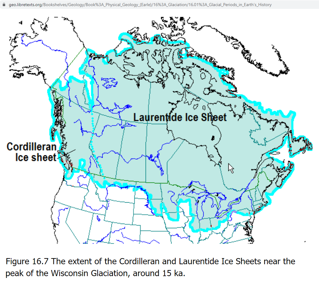
The only “climate change” which has contributed significantly to fire risk is the dawn of the Holocene interglacial. There were no wildfires in Wisconsin and Michigan when they were under a mile or more of ice:
Here’s a list of the deadliest wildfire disasters in U.S. history (through 2018):
1,200+ deaths, 1871 (Peshtigo Fire, Wisconsin)
453+ deaths, 1918 (Cloquet Fire, Minnesota)
418+ deaths, 1894 (Hinkley Fire, Minnesota)
282 deaths, 1882 (Thumb Fire, Michigan)
87 deaths, 1910 (Great Fire of 1910, Idaho and Montana)
84 deaths, 2018 (Camp Fire, Paradise, California)
65 deaths, 1902 (Yacolt Burn, Oregon and Washington)
29 deaths, 1933 (Griffith Park Fire, Los Angeles, California)
25 deaths, 1991 (Tunnel Fire, Oakland Hills, California)
22 deaths, 2017 (Tubbs Fire, northern California)
19 deaths, 2013 (Yarnell Fire, Arizona)
16 deaths, 1947 (The Great Fires of 1947, Maine)
15 deaths, 2003 (Cedar Fire, San Diego County, California)
15 deaths, 1953 (Rattlesnake Fire, California)
15 deaths, 1937 (Blackwater Creek Fire, Wyoming)
14 deaths, 2017 (Gatlinburg, Tennessee)
13 deaths, 1994 (South Canyon Fire, Colorado)
Source:
https://www.mercurynews.com/2018/11/22/5714558/
Do you see it? The four worst fires, and six of the seven worst fires, were all in northern states. If warmer temperatures really caused wildfires to be worse, then most of the worst fires should have been in southern states.
The reason that the most catastrophic fires were in the distant past is explained by changing technology. But that doesn’t change the fact that wildfires are not correlated with warm climate.
Not only is there no correlation between average temperature and wild fires, the temperature changes caused by mankind are minuscule compared to the natural differences in temperature between the American north and the American south. If someone thinks that temperature increases cause wildfires, then you should ask him why aren’t wildfires a bigger problem in the American south than in the north?
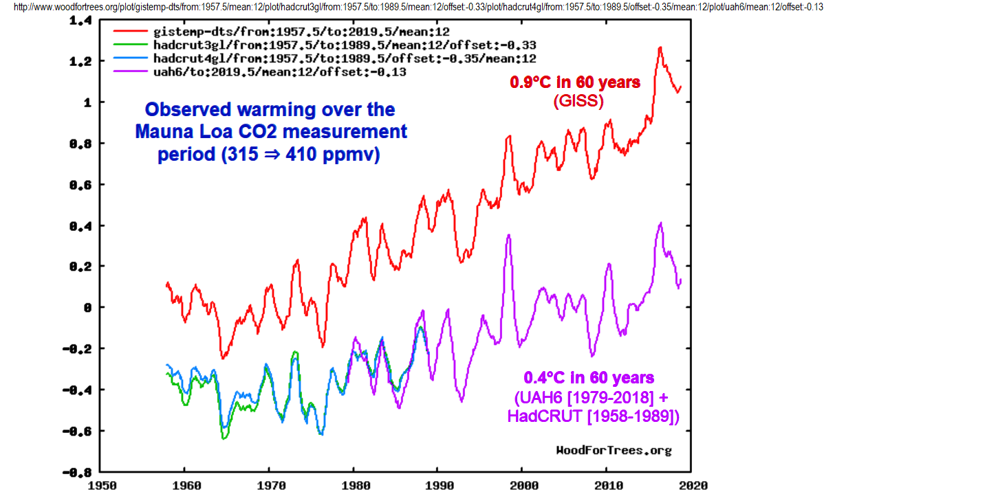
Depending on whose temperature index you use, we’ve seen an average of between 0.4 and 0.9 °C of warming since 1958 (when Mauna Loa CO2 measurements began). Here’s a graph, contrasting different temperature indexes:
That warming has shifted growing zones and “temperature isotherms” slightly toward the poles (northward, in the U.S.). So, the obvious question is, how far?
That’s easy to answer, by looking at an agricultural growing zone map. Here’s one, shared by permission from the Arbor Day Foundation:
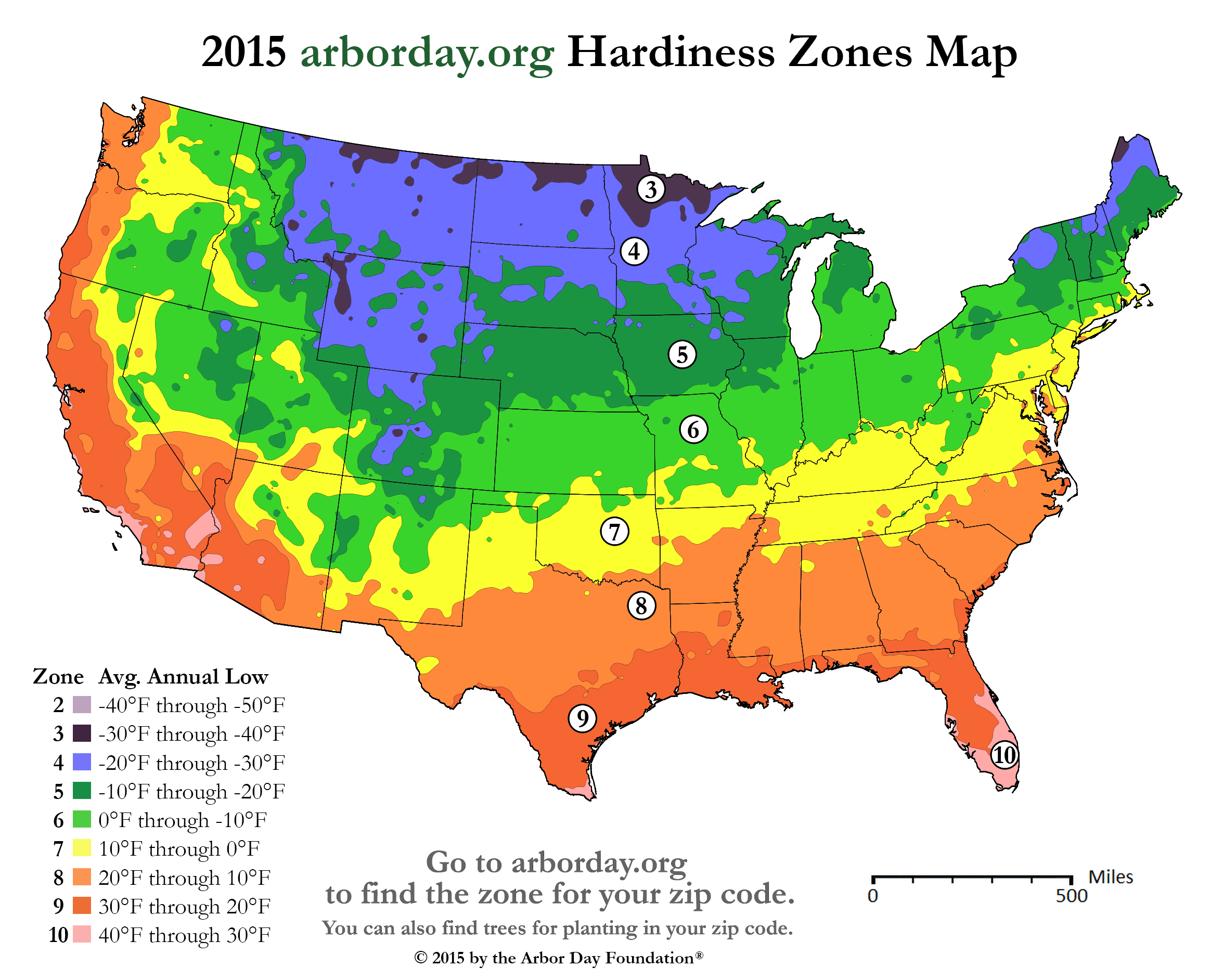
From eyeballing the map, you can see that 1°C (1.8°F) = about 50-70 miles latitude change.
Here’s James Hansen and his GISS colleagues reporting a similar figure:
That’s 100 to 150 km = 62 to 93 miles per 1°C. So, the 0.4 to 0.9 °C of warming which we’ve seen has caused, on average, a growing zone shift of only about 40 to 135 km (24 – 84 miles). Ho hum. 🥱
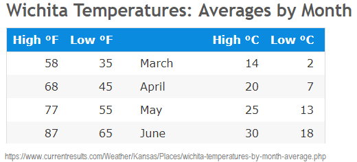
In most places that much warming can be compensated for by farmers, simply by adjusting planting dates. For example, in Kansas, 0.4 to 0.9 °C of warming can be compensated for by planting 2 to 6 days earlier in springtime:
The worst fire in US history was in chilly Wisconsin in October, 1871, when CO2 (estimated from ice cores) was only ≈288 ppmv. It is believed to have killed at least 1200 Americans. Here’s an article about it:
https://library.massasoit.edu/americanfires/peshtigo
Many of the people who lost their lives died of hypothermia, while trying to shelter from the fire in a frigid river.
Here’s another article about it:
https://www.weather.gov/grb/peshtigofire
That one fire consumed about 1.2 million acres. Here’s a map: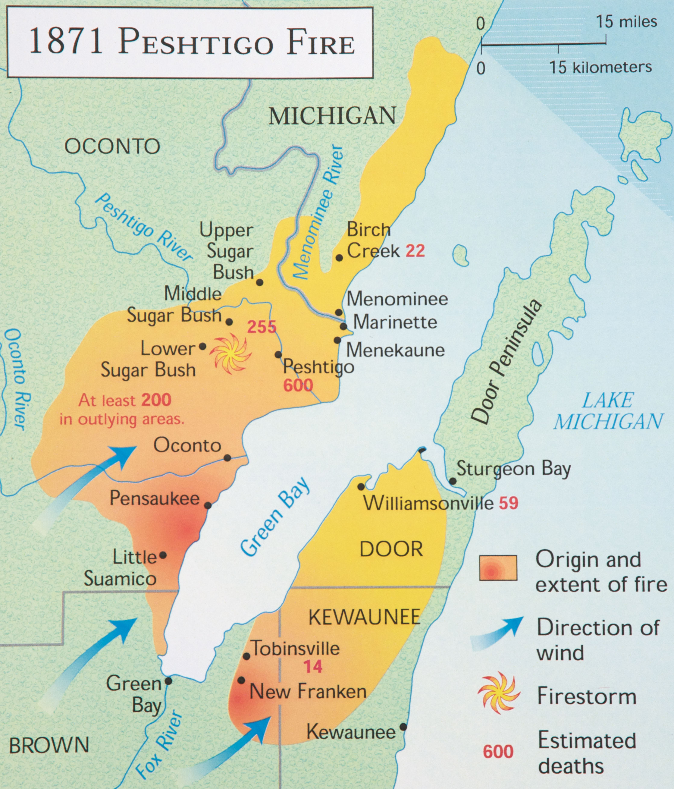
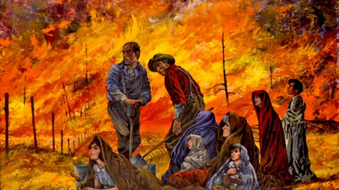
Here are some paintings, depicting the tragedy: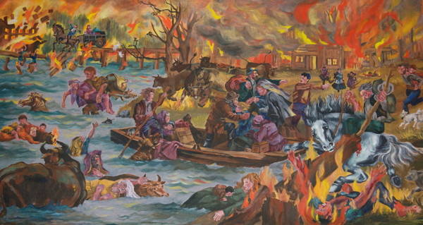
Or ask Google:
https://www.google.com/search?q=peshtigo+fire&tbm=isch
The main factor driving fire prevalence and severity is land management and forestry practices.
● If you let dead wood and forest litter accumulate, you’re asking for trouble.
● If you plant eucalyptus trees around houses, you’re asking for trouble.
● If you constrict exit routes in fire-prone areas, like Paradise California did, you’re asking for trouble.
● If you let trees fall on high tension lines, because you didn’t bother to maintain adequate cleared zones around the lines, you’re asking for trouble.
In the United States, nothing could be clearer than the fact that the U.S. federal government (like the Australian federal government) is absolutely terrible at land management. (State governments are often terrible at it, too, especially leftist state governments, like the Left Coast states, but not always.)
If there’s to be any hope for lands to be managed well, they need to be managed by people who have a personal interest in them. The land needs to be under local control, rather than the control of distant national governments. Here’s a very instructive lecture, by Montana State Senator Jennifer Fielder, who is also CEO of the American Lands Council, speaking at ICCC13:
Well said, written, illustrated!
42^42
The 1980 fire season in Southern California was particularly bad. I flew into Ontario (CA) Airport in June for a job interview, and the plane parked about 75 feet from the gate (this was pre-jetway Ontario). Though it was broad daylight, you couldn’t see the terminal from the plane, the smoke was that thick. I took the job in San Bernardino, and was there in November for the Panorama Fire. It was awe-inspiring; at night, it looked as if the entire San Bernardino mountain range was on fire. I was at no risk, but at least one person in my office lost her house, and other friends were evacuated. We didn’t have as bad a fire season until 2005, IIRC. Interestingly, 2005 was also the year when our swimming pool froze 5 out of 7 days in December, even though the air temperature didn’t drop below 38 F. But I digress…
Corollary hypothesis: eliminating wildfire data previous to 1983 (historically significant wildfire acreage burned) does support a false argument that climate change is responsible; but subsequent wildfire data also can conceal causation if #DEWs were used to to augment acreage burned in the years subsequent to 1983 to substantiate arguments for #Agenda21 and UN biodiversity pathways.
UN Biodiversity Pathways: simulated reserve and corridor system to protect biodiversity. Using #DEWs to clear the eminent domain conflicts, disrupt political demographics (Paradise elderly, Camp Fire), high speed rail corridor creation, and use zoning law to preserve future biodiversity targets.