It’s been an open secret, ever since Dr. Michael Mann used “Mike’s Nature Trick” to “hide the decline” by covering up some inconvenient tree ring data in the hockey stick climate graph, that climate alarmists will go to almost any length to only show the public the “crisis side” of climate data.
The National Interagency Fire Center (NIFC) has been the keeper of U.S. wildfire data for decades, tracking both the number of wildfires and acreage burned all the way back to 1926. However, after making that entire dataset public for decades, now, in a blatant act of cherry picking, NIFC “disappeared” a portion of it, and only show data from 1983. You can see it here.
Fortunately, the Internet never forgets, and the entire dataset is preserved on the Internet Wayback machine and other places, despite NIFC’s ham-handed attempt to disappear the data.
Why would they do this you ask? The answer is simple; data prior to 1983 shows that U.S. wildfires were far worse both in frequency and total acreage burned. By disappearing all data prior to 1983, which just happens to be the lowest point in the dataset, now all of the sudden we get a positive slope of worsening wildfire aligning with increased global temperature, which is perfect for claiming “climate change is making wildfire worse”. See figure 1 below for a before and after comparison of what the data looks like when you plot it.

Clearly, wildfires were far worse in the past, and clearly, now the data tells an entirely different story when showing only data post-1983. The new story told by the sanitized data is in alignment with the irrational screeching of climate alarmists that “wildfires are driven by climate change”.
This wholesale erasure of important public data stinks, but in today’s narrative control culture that wants to rid us of anything that might be inconvenient or doesn’t fit the “woke” narrative, it isn’t surprising.
Interestingly, the history on the Internet Wayback Machine shows how NIFC rationalized this erasure of important public data.
Back in June 2011 when this data was first presented by NIFC publicly, it was simply presented “as-is”. They say only this:
Figures prior to 1983 may be revised as NICC verifies historical data.
In 2018, they added a new caveat, saying this:
The National Interagency Coordination Center at NIFC compiles annual wildland fire statistics for federal and state agencies. This information is provided through Situation Reports, which have been in use for several decades. Prior to 1983, sources of these figures are not known, or cannot be confirmed, and were not derived from the current situation reporting process. As a result the figures prior to 1983 should not be compared to later data.
According to the Internet Wayback Machine, that caveat first appeared on the NIFC data page somewhere between January 14 and March 7 of 2018.
Curiously, that caveat appeared just a few weeks after I first drew wide attention to the issue in December 2017, with an article citing NIFC fire data titled Is climate change REALLY the culprit causing California’s wildfires?
It seems they received some blowback from the idea that their data, when plotted, clearly showed wildfires to be far worse in the past, completely blowing the global-warming-climate-change-wildfire connection out of the water.
Here is what NIFC says now:
Prior to 1983, the federal wildland fire agencies did not track official wildfire data using current reporting processes. As a result, there is no official data prior to 1983 posted on this site.
Not only is that a lie of omission, it is ridiculous. Their agenda seems very clear. When the data was first published, they only advised the public that some data prior to 1983 might be “…revised as NICC verifies historical data”.
There was no published concern that the data might be invalid, or that we shouldn’t use it. Besides, the data is very simple; a count of the number of fires and the number of acres burned. How hard is that to compile and verify as accurate?
What’s worse is that this data has been trusted for decades in almost every news story about any wildfire that ever occurred in the U.S. In virtually every news story about a wildfire, the number of acres burned it THE NUMBER the press uses in the story, without it, there is no scale of the severity of the fire. Similarly, for every story about “what a bad wildfire season we’ve had”, the press cites the number of fires as well as the acreage burned.
And now, after decades of that data being provided to the press and the public, and nearly a decade of NIFC making it publicly available on their website, they want us to believe that it is now unreliable data?
Seriously, just how hard is it to count the number of fires that have happened and the number of acres burned?
What NIFC is doing is essentially labeling every firefighter, every fire captain, every forester, and every smoke jumper who has fought wildfires for decades as being untrustworthy in their assessment and measurement of this critical, yet very simple fire data. I’ll take data from people on the fire scene over government bureaucratic doublespeak every day of the week and twice on Sundays.
This whole affair is outrageous. But what is even more outrageous is that NIFC isn’t at all transparent as to the reason for the change. They essentially say “The data prior to 1983 is no good, trust us”. There is no citation of a study, no methodology given, no rationale for the removal. That’s not science, that’s not statistics, that’s not even sensible, but that is what is happening.
Plotting the entire NIFC dataset (before it was partially disappeared) gives us some hints as to why this has been done, and how wildfire and weather patterns have been inextricably linked for decades. Note figure 2 below, combining the number of fires and number of acres burned. See the annotations that I have added.

Clearly, what NIFC has done by saying data prior to 1983 is “unreliable” and disappearing it is not just hiding important fire history, but cherry picking a data starting point that is the lowest in the entire record to ensure that an upwards trend exists from that point.
The definition of cherry picking is:
Cherry picking, suppressing evidence, or the fallacy of incomplete evidence is the act of pointing to individual cases or data that seem to confirm a particular position while ignoring a significant portion of related and similar cases or data that may contradict that position.
And by choosing the lowest point in the record for total fires, 1983, and making all data prior to that unavailable, NIFC ensures that any comparison between fires and climate change over the last 38 years always shows an upward trend and correlation with rising temperature.
It seems to me that NIFC very likely caved to pressure from climate activists to disappear this inconvenient data. By erasing the past data, NIFC has become untrustworthy. This erasure is not just unscientific, it’s dishonest and possibly fraudulent.
For posterity, the entire dataset from NIFC (including pre-1983) is available here in an Excel (.xlsx) file:
UPDATE: Here is an analysis paper from 2015 using the same data that is on the U.S. Forest Service website:
https://www.fs.fed.us/research/sustain/docs/national-reports/2003/data/documents/Indicator%2015/Indicator%2015.pdf
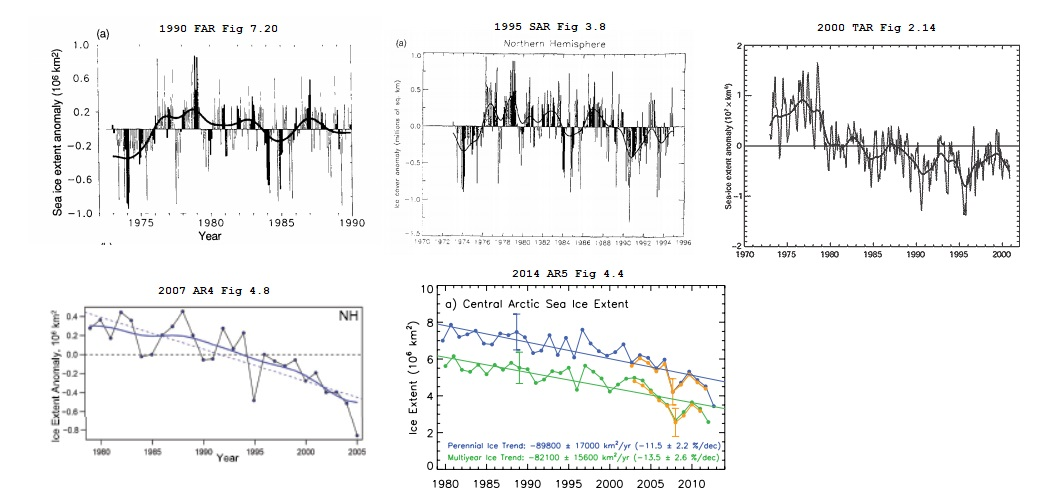
just like the Arctic Ice data before 1979.
before 1979.
GM, Thanks for the reminder, here’s the progression of that through all five IPCC reports
Read Orwell’s “1984” again. The Ministry of Truth “disappears” any inconvenient data.
In Orwell’s Animal Farm the pigs incrementally changed the seven commandments for animals until there was just one that said, “All animals are equal but same are more equal than others” Or something like that.
I’ve flown over the Arctic Ice at 40,000ft on three occasions going to Beijing from Toronto – past the east coast of Greenland over the Arctic Basin and across Siberia. I’m sure a lot of good info is available on ice from military and commercial flights and from shipping and exploration trips over a century, and of course the space programs since the 60s. But if course the climate wroughters dont want to know.
So there is no ice?
There are plenty of shady statistics the government produces and should be called out on, but I don’t believe this is one of them. The high number of fires in the 1st half of 1900’s is an artifact of bad government policy. When the US outlawed prescribed fires most landowners and local governments continued the practice in violation of Federal law. The feds counted these controlled burns as wildfires causing the massive spike fire numbers and acres burned. By 1930’s scientific publications were documenting the environmental damage being done by Federal policy. By 1940’s the feds had completely turned 180 degrees and began official prescribed burning again and these fires were no longer counted in official wildfire numbers.
Here is some more on history of fires and explains some of the policies that led to this statistical artifact. https://www.researchgate.net/publication/239590838_The_History_of_Fire_in_the_Southern_United_States
“The high number of fires in the 1st half of 1900’s is an artifact of bad government ”
As is the increase in the cherry picked portion of the graphic. Due to government policy limiting Forrest management and ecological logging. Also only a portion of the larger fires was due to controlled burns. The fires were often far larger. Suppression led to overgrowth, and overgrowth and government policy to worse fires lately.
I’m curious. How did sunsettommy edit Gerald Machnee’s comment?
sunsettommy is a moderator. It looks like he was just trying to help Gerald out.
(Yes I corrected his numbers for him, it was 1079, now 1979) SUNMOD
Oh, thanks.
You pretty much cannot find this chart
unless you know where it is, because this page:
https://www.fs.fed.us/research/sustain/criteria-indicators/indicators/indicator-316.php
where it used to be was scrubbed of content.
Last October, after listening to Governors Brown and Newsome declare “Climate Fires” were the new norm, I was able to download numbers from the NIFC and made these graphs. There was a disclaimer that said ” Prior to 1983, sources of these figures are not known, or cannot be confirmed, and were not derived from the current situation reporting process. As a result the figures prior to 1983 should not be compared to later data.” It is obvious that the method for counting the number of fires changed at that time. Counting fires can be tricky. thousands of fires can be started by a single lightning storm. Obviously, they can not all be counted let alone discovered.
Far easier to count fires now, and tropical depressions and storms as well.
Cherry picking par excellence
Rewriting history to support the narrative is what tyrants have been doing for millennia. Why should the current crop of communists currently in power be any different?
Disgusting! A harbinger of more radical actions to come by government that has lost its reason to be. Accepting reality is anathema today.. Cancel Culture is rife in science and culturally. Such a shame that we need to pass through such a phase.
Glad to see more detailed exposure to government climate data fraud, manipulation, and blatant hypocrisy (to name just a few). My short video catches Joe red-handed in this data fraud … https://newtube.app/user/RAOB/KX3Jgsm
You should put it up on You Tube as well. If You Tube deletes it, then that will become part of the preponderance evidence against the Climate Crusaders that will eventually (probably after I’m long dead) come out.
Steve. Thanks for your concern. I did post it there (link follows). As soon as YouTube realized I was trying to expose climate fraud, they started shadow-banning my YouTube site. Also, when ever I make a comment to someone else’s content, YouTube immediately erases my comments! Anyway — here’s the YouTube video link … https://www.youtube.com/watch?v=vRvnMmgJuIk&t
Well done. Thankyou
If you follow Tony Heller you know all this (and more).
Heller is finally beginning to gain traction on YouTube. It will be very difficult to rebury the lies and manipulation of the historical record he has exposed.
Tony Heller has been on top of the climate establishment’s data tampering for a long time. He also does a great job of searching historical periodicals and the literature for articles that both corroborate the untampered data and illustrate how the “climate science” zeitgeist has evolved over time.
For some reason, he doesn’t seem to get the wider coverage he is due. Maybe he’s too much of a lightning rod for some skeptics, but that seems contrary to recent articles here that skeptics need to take off the kid gloves and pick up their game.
“does a great job of searching historical periodicals and the literature “
a. Yes, very good at this.
b. Takes great photos.
c. Never sleeps.
d. Can get cranky.
e. I mostly avoid videos.
” I mostly avoid videos.” then you are an idiot.
I mostly avoid videos too. I’m literate, and much prefer reading.
I have to assume that you are illiterate to make such an accusation.
I can only watch videos with closed caption. No cc? It’s usually pointless to watch if it’s just someone talking.
And the videos with voice generated cc can be very difficult because I have the added fun of trying to figure out the mangled text of what was said, all the while the video keeps chugging along. Consequently, I don’t watch many videos.
Reading? I get instantaneous pause and rewind 😜
So… I’m an idiot?
The Ministry of Truth hates him — which means he’s over the target.
I understand that John. Me too. Yet his videos are quite shirt an well done.
“skeptics need to take off the kid gloves and pick up their game”
exactly! it’s the real battle to save our economy and freedom
This is for the skeptics … https://www.youtube.com/watch?v=Xcc5-ApXFm8
Tony Heller had long ago “gained traction” on Youtube, but has been repeatedly kicked off that Marxist propaganda train.
You can watch his stuff on Newtube now
https://newtube.app/TonyHeller
In six months he has nearly 15000 subscribers and nearly 2 million views.
for a long time, YouTube locked his subsriber count to 99,000- they finally let it rise and it’s now just over 100,000 but they’ve threatened to lock him out- I think his work complements this blog very well
Yes and if Tony had received a nickel for every ad hominem attack that he’s had to endure, then he would have quite a fortune.
He’s been a warrior for the climate truth fighting against lies such as shown above.
Tony is an awesome source of Truth! Mostly he shows the true records from the past, or shoves their own words and works back in their faces as proven wrong.
which of course is why they refuse to acknowledge his existence- to the alarmists- he is a “non person”- he should be invited on major talk shows- certainly at least on Fox
And here’s where you can find Tony Heller, for those who missed out on the years ago shadow-banning of Tony from WUWT (because Tony dared to call the climate fraudsters what they were); this is Tony’s version of the above article (published in March 2021):
https://realclimatescience.com/2021/03/biden-administration-erasing-more-climate-history/
Here’s the number of changes NASA’s GISTEMP has made to their Land Ocean Temperature Index (LOTI) since 2020
2020
Jan Feb Mar Apr May Jun Jul Aug Sep Oct Nov Dec
319 240 313 340 298 404 319 370 303 389 381 370
2021
Jan Feb Mar Apr May Jun Jul Aug Sep Oct Nov Dec
330 468 338
Over time those changes add up. Here’s what that looks like since 2010:
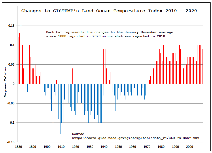
Here’s the link to the current data for GISTMP’s LOTI:
https://data.giss.nasa.gov/gistemp/tabledata_v4/GLB.Ts+dSST.txt
Update, GISTEMP’s LOTI is out for April (follow the link above) and 256 changes have been made to what it had been for the March 2021 LOTI
These changes go on month after month in a steady drone.
I was born in 1942 in Ohio. I can clearly remember at least two summers that you could smell the smoke and the evenings where red from horizon to horizon from the fires “out west.” Don’t remember the years they happened, but was well before the peak shown in the 70’s above as I was in the Navy in HI then. Have never seen skies as red as that since then,
When Yellowstone burned (1988???)- I could smell the smoke and see red skies here in MA
Dont forget, the spotted owl logging restrictions kicked in at about the same time, no more logging roads (firebreaks), no more forest planning and pruning…
and no more thousands of good logging and sawmill jobs- I believe it was later shown that the spotted owls don’t really depend on old growth forests- the same kind of crazies are now saying here in New England that we should stop all forestry so the forests will have only one function- to sequester carbon- the hell with future generations that might like to live in wood homes with wood furniture- let them eat cake and build cement homes
You might be lucky to eat cake
https://www.redpowermagazine.com/forums/topic/140371-seriously/
‘He who controls the past controls the future.’
Here it is, hidden in plain view.
The dirty tricks industrial complex never sleeps.
USG agencies lying about and removing historical data? I am shocked, SHOCKED I say!
UK’s Royal Society says that regionally there have been some increases but globally no trend. They also say that deaths due to wildfires continue to fall. They mention ‘urban wilding’ as a factor- the tendency for increasing populations and prosperity to spread out into forested suburbs and a lack of associated clearance. The tragedy of Paradise CA was started by an electrical distribution fault and exacerbated by lack of escape routes.
“The data prior to 1983 is no good, trust us”.
Nullius in verba! – motto of the Royal Society (take nobody’s word for it).
This sort of unscrupulous behaviour will be their undoing.
They might have got away with erasing pre-1950’s maybe, but the 1980’s? not a chance.
This fraud needs to be highlighted at any given opportunity around the subject of USA wildfires.
“This sort of unscrupulous behaviour will be their undoing.”
Let’s hope.
From here, the early part of the dataset is not showing the same thing as the more recent part. In particular, the early data seem to be showing area burned for both intentional burns and wildfires, while the later data are showing area burned for wildfires only.
That doesn’t seem to be the case. That’s just the bloggers interpretation. But following the link from the blogger he appears to be mistaken.
The graph is there in the link (figure 6 on page 35 of the PDF).:
https://www.fs.fed.us/research/sustain/docs/national-reports/2003/data/documents/Indicator%2015/Indicator%2015.pdf
Also I quote from just above the graph:
Which implies that the source the blogger mis-understands is quite willing to compare the two halves of the graph.
On the contrary, the blogger is exactly right. From the same paper, in reference to figure 6:
As I stated, the earlier data shows primarily intentional burns, while the latter half shows are burned by wildfires.
How many “wildfires” are incendiary fires ? Remember Australia….
I just looked up the definition of “Incendiary Fire” : A fire intentionally ignited under circumstances where the person knows the fire should not be ignited.
That us not the definition of a controlled burn. Most modern fires would also be classified as “incendiary fires” as they are started by people. So they are comparing the same thing in the older data as the newer data.
It would certainly include “illegal controlled burns,” and certainly means the older data includes more than simply wildfires.
Since the modern data also contains “illegal controlled burns”, why the desire to only toss the data that doesn’t support what you want to believe?
I think the modern data does not include these kinds of illegal controlled burns. During the 1930s, the US Forest Service had banned all forms of prescribed burning, and they considered any form of such to be an incendiary wildfire. As others in the thread have pointed out, most of the burn area reported in the old NIFC graph is from the Southern States, where woods burning was a cultural practice with a long history predating European settlement. Since the Forest Service began adapting prescribed burning in the mid 20-century, they would not have classified any prescribed burning of Southern forests as wildfires.
Again, the issue seems to be that the data from ~1930s is showing something entirely different than the data after.
Dude, the text explicitly says that “fire protection improved and eventually reduced destructive wildfires by more than 90 percent” and that’s what the graph shows. Apples to Apples,
The blogger either didn’t read his own source or lied to you.
Either way, be more sceptical.
Are you a pretzel?
If that was true, why not fix the older data, rather than just throw it all out.
The older data aren’t wrong, they’re just showing a different thing. Combining them with the more recent data and claiming that you’re showing historic trends in true wildfires is misleading.
Nice dodge.
I never said that the older data was wrong.
If they know that the older data contains data from controlled burns, then remove the controlled burns from the older data. That way you are now comparing like to like.
Now answer the question, why don’t they fix the data instead of just throwing it out?
I think we both know the answer to that question, and the answer is the fixed data doesn’t support the goals of the climate change warriors.
You’re making an assumption that there is actually a way to seperate out the historic controlled burn area from the total area burned, which is not necessarily true.
You “think you know” the answer not because of any documented evidence, but because you have a strongly held preconception. This is not a scientific mindset.
If they know which fires were arson, then they know how big those fires were. The data is there for those who want to go look for it.
Refusing to look because the results might not support what you want to believe isn’t very scientific.
So, you are saying the controlled burn area is a significant part of, say, 30,000,000 acres average through that time frame?
Do you want to subtract the arson caused fires from the recent acreage as well?
Mr. rise: Not misleading when presented in response to the alarmists meme that AGW is making wildfires worse. How hard is it to look at the numbers behind “primarily”? I recall reading of massive fires in WI, the midwest, and northwest in the crazy-weather ’30s, and it’s all there, why does he use the weasel word “primarily” when he could use math? Count me skeptical.
What we have here is data collected and charted by U.S. govt that sat quietly unnoticed. CliScis say AGW is increasing wildfires. The chart shows they lie, so Heller put it out there. The alarmists could have tried to go through old data to ferret out “intentional” acreage to dispute this, instead (great surprise) they throw out valid data to preserve their meme. Have you considered this- they DID ferret out that data and found it still put the lie to their catastrophe story? So it had to be pitched. It’s not misleading to lead folks away from false memes.
And there is still no hockey stick.
“Four legs good, two legs bad.”
New data good, old data bad.
The graph going back to 1926 is not the whole truth. The data for earlier years includes prescribed burns because of an anti-fire attitude that the US Forest Service had back then. http://ti.org/antiplanner/?p=15127
So the amount of acreage burned has something to do with what starts the fire? OK, then remove all arson and accidential fires from the current records too.
That’s 80% according to NIFC.
One problem with NIFC statistics is that the reporting Federal agencies (NFS, NPS, BLM, DOD, etc) and the states/territories do not report all fires in the same manner. Some states report County and Local (C&L) fires, like a vacant lot set on fire from fireworks, some do not. Easy to pad the numbers when the threshold for a wildland fire is .1 (one-tenth) acre. For example, in my home state of Washington, the National Park Service reported to NIFC four lightning caused fires in 2020. The four fires burned a total of .8 (eight-tenths) acre. NPS in New Mexico reported eight fires burning ten acres for the same category in 2020. But my favorite example is NPS in Utah; in 2020 three lightning fires burned zero acres.
https://www.predictiveservices.nifc.gov/intelligence/2020_statssumm/fires_acres20.pdf
Obviously the above examples are in high elevation, inaccessible terrain. Read any of Stephen J. Pyne’s recent books for a detailed look at how civilization encroaching relentlessly into fire adapted ecosystems, like much of the Western US, has caused huge, unintended consequences.
https://californiapolicycenter.org/environmentalists-destroyed-californias-forests/
“Up until the mid-1970s, we managed our national forests according to well-established and time-tested forest management practices. But 40 years ago, we replaced these sound management practices with what can only be described as a doctrine of benign neglect. Ponderous, Byzantine laws and regulations administered by a growing cadre of ideological zealots in our land management agencies promised to save the environment. The advocates of this doctrine have dominated our law, our policies, our courts and our federal agencies ever since.”
********
Article is dated September 2020, so 40 years before that would be around 1980. The forest fire data that the NIPC now shows starts going up in 1983.
Enough said.
and people now wonder why lumber prices keep going up
In Bradbury’s Fahrenheit 451 inconvenient books were burned by firemen. The present analogy is disappearing inconvenient data. Perhaps it is time to take a page from 451F, which had those keepers of the books, and everyone maintain a small depository of present data regarding, say, climate and weather, policing and crime, tax receipts and expenditures, health, demographics, agricultural production, and so on.
Whatever you are interested in.
Right out of Lenin’s playbook- lie cheat and steal whatever it takes to “win”.
Here is some more information on the subject.
https://realclimatescience.com/2021/03/hiding-the-decline-in-burn-acreage/
At some point, people will realize that Arrhenius, Ekholm and Callendar used the same unreliable data, equipment and measurement techniques in all their work because it could not possibly be reliable when they were alive.
That invalidates the entire premise of global warming, so remove it all from the libraries.
Remember this?
Scientists are frantically copying U.S. climate data, fearing it might vanish under Trump
https://www.washingtonpost.com/news/energy-environment/wp/2016/12/13/scientists-are-frantically-copying-u-s-climate-data-fearing-it-might-vanish-under-trump/
The key sentence “Investors offered to help fund efforts to copy and safeguard key climate data”….So really a plan for green-fleecing investors that sounds ‘truthy’ to Democrats.
Mr. jarves: Thanks for the memory, I do recall that news. I remember thinking that copying data would not make them frantic, point-n-clic. It was the groups deleting the list of fake-name email accounts that was frantic.