By Paul Dorian

NOAA’s CFS v2 computer forecast model is predicting relatively strong La Nina conditions by later this summer (August/September/October); SST anomalies plot courtesy NOAA
*La Nina may form in the equatorial Pacific Ocean later this year and, if so, it could have wide-ranging ramifications*
Overview
It appears somewhat likely that the current weak El Nino in the equatorial part of the central Pacific Ocean will transition into La Nina conditions later this summer. La Nina is a naturally occurring oceanic cycle that produces colder-than-normal sea surface temperatures (SSTs) in the tropical Pacific Ocean whereas El Nino is associated with warmer-than-normal water. If indeed La Nina forms later this year, it could have ramifications on the upcoming Atlantic Basin tropical season, prospects for drought in California, and potentially on global temperatures in the lower atmosphere.

The plot shows forecasts made by dynamical and statistical models for sea surface temperatures (SST) anomalies in the “Nino 3.4” region for nine overlapping 3-month periods. Note that the expected skills of the models, based on historical performance, are not equal to one another. The skills also generally decrease as the lead time increases. Thirdly, forecasts made at some times of the year generally have higher skill than forecasts made at other times of the year–namely, they are better when made between June and December than when they are made between February and May. Differences among the forecasts of the models reflect both differences in model design, and actual uncertainty in the forecast of the possible future SST scenario.
Computer model forecasts generally support the formation of La Nina
Several independently-made computer forecast models support the idea of a change in the central part of the tropical Pacific Ocean from the current weak El Nino to La Nina conditions by the summer of 2020. The plume of El Nino Southern Oscillation (ENSO) model forecasts from mid-February indicate a transition to La Nina conditions are likely to take hold by later this summer. Indeed, some models (e.g., NOAA’s CFS v2) are predicting a fairly strong La Nina by the end of the summer season with sea surface temperatures as much as 1.5°C below-normal in the “Nino 3.4” region (i.e., central tropical Pacific Ocean).

Warm (red) and cold (blue) periods based on a threshold of +/- 0.5°C for the Oceanic Niño Index (ONI) [3 month running mean of ERSST.v5 SST anomalies in the “Niño 3.4” region (50°N-50°S, 120°-170°W)], based on centered 30-year base periods updated every 5 years.
Possible impact on the 2020 Atlantic Basin tropical season
One of the surprising side benefits of an El Nino event in the tropical Pacific Ocean is that this type of sea surface temperature pattern (i.e., warmer-than-normal) tends to result in less tropical activity in the Atlantic Basin when compared to normal. This tendency for reduced tropical activity in the Atlantic Basin is a result of higher-than-normal vertical wind shear in the breeding grounds region of the Atlantic Ocean during El Nino events. Higher-than-normal vertical wind shear tends to inhibit the formation or intensification of tropical systems.
On the contrary, La Nina is often associated with a more active Atlantic Basin tropical season as overall vertical wind shear is usually on the low side in the breeding grounds region. The last time there was a relatively strong La Nina event during the tropical season in the Atlantic Basin was in the year 2010. This particular year saw La Nina-induced sea surface temperature anomalies as low as -1.7°C in the central part of the equatorial Pacific and there was anomalously low vertical wind shear in the tropical Atlantic. As it turned out, the 2010 Atlantic tropical season was the first in a group of three very active seasons. It is tied alongside 1887, 1995, 2011, and 2012 for the third-most active Atlantic tropical season on record, with 19 tropical storms, only behind the 1933 and the 2005 seasons.

University of Alabama-Huntsville (UAH) satellite-based temperature data of the global lower atmosphere from 1979 to the present. Several El Nino episodes in the past couple of decades were associated with spikes in global temperatures and La Nina usually resulted in a drop in temperatures. Data courtesy UAH, Dr. Roy Spencer
Potential impact on global temperatures
What goes on in the Pacific Ocean in terms of sea surface temperatures can indeed have an impact around the world with respect to global temperatures in the lower part of the atmosphere. If indeed a La Nina does form later this year in the tropical Pacific Ocean and it is relatively strong and long-lasting, it can result in a drop of global temperatures after it becomes well-established. In recent years, the number of El Nino episodes have surpassed the number of La Nina events and global temperatures have often reacted with noticeable spikes (see UAH data temperature plot). For example, the strong El Nino events that centered on the years of 1997/1998, 2009/2010 and 2015/2016 were associated with sharp upticks in lower atmosphere global temperatures. In times of La Nina such as during 2007/2008 and 2010/2011, there have been noticeable downturns in global temperatures of the lower atmosphere.

Drought conditions have worsened across California during the past few week; map courtesy NOAA
California drought
After a long period with severe drought conditions dominating the scene in California, the winter season of 2018-2019 brought significant rainfall to the state and incredible amounts of snow piled up in the Sierra Nevada Mountains. In fact, the drought was officially declared over by the time spring season began last year. In subsequent months, there have been spurts of dry weather across California, but drought conditions did not really become persistent until a few weeks ago. Contrary to the winter of 2018-2019, this winter season has been rather dry across California and the amount of snow that has fallen in the Sierra Mountain range of eastern California has been below-normal. This reduction of snowfall in the higher elevation locations could very well lead to some problems later this summer as a melting snow pack is an important contributor of water for the state.
In terms of what kind of an impact La Nina conditions in the tropical Pacific Ocean could have on California’s weather, the results are rather mixed. La Nina tends to create a looping jet stream centered around high pressure in the Pacific Ocean. If the high pressure system anchors around the international dateline, La Nina tends to bring wetter weather to North America. However, if it centers itself in the eastern Pacific Ocean, it tends to bring drier weather. Finally, if the high pressure system meanders around, the results are often periods of wet and dry weather.
Stay tuned…we’ll continue to monitor the prospects for La Nina as we close in on the tropical season in the Atlantic Basin and certainly nothing is set in stone when it comes to long-range model forecasting of sea surface temperatures.
Meteorologist Paul Dorian
Perspecta, Inc.
perspectaweather.com
Follow us on Facebook, Twitter, YouTube
Here’s Javier’s (empirical) prediction from a post he did at Curry last September:
(it’s the sun stupid)…
If El Niño and La Niña simply followed the peak and trough of the sunspot cycle, then this would be obvious and ENSO would be a regular 11 year oscillation. It’s not.
Where can you go to get up to date solar data – graphs of TSI and sunspot number? Javier, Leif Svalgaard and others are predicting a brisk recovery and strong cycle 25. Prof Zakarova and her solar model on the other hand predict a prolonged minimum and very weak cycle 25. Finding out who’s right must be quite soon. They can’t both be.
Figure 5. a) Average (black line) and standard deviation (grey area) solar activity in monthly smoothed sunspot number (left scale) for the solar cycles between 1950-2018 divided in 22 fractions of a solar cycle. b) Average (dark red and blue areas) and standard deviation (pink and light blue areas) ONI values (right scale) for the same periods. The plot has been divided in five phases (dashed vertical lines) labeled in roman numbers (see text).
(hatter, this is javier’s explanation of his graph)…
Due to oceanic thermal inertia it takes multiple solar cycles to swing between dominant El Niño and dominant La Niña phenomena.
(also)…
Figure 2. Top: Six-month smoothed monthly sunspot number from SILSO. Bottom: Oceanic El Niño Index from NOAA. Red and blue boxes mark the El Niño and La Niña periods in the repeating pattern. This figure was published in July 2018 in an article at WUWT. Since then the Niño prediction has been confirmed.
https://wattsupwiththat.com/2019/09/04/enso-predictions-based-on-solar-activity/
My take of 5years ago was that the volume of warm water in the equatorial Pacific was comparatively small and I couldn’t see how an extended El NINO could develop. It frittered away in ENSO neutral conditions from 2014 and I admit I was surprized we had such a high peak in November 2015. But it didn’t stay there long and dropped like a rock into La Nina territory where it oscillated between the Nino/Nina thresholds.
The confounding unusual slanting of cold waters from “Cold Blobs” in both the NH and SH Pacific temperate zones into the equatorial band caused breakdown of the usual ENSO E-W equatorial flows of warm and cold waters. The Western Pacific warm pool also got diluted. NOAA’s call for a modest El Nino in 2019_20, I argued was more likely to become an extended La Nina. The warm water had shot its bolt. The La Nina developing is likely to be strong becaus it will benefit from addition of continuing flow from th large cold blobs (I wish I knew how to copy the Pacific SST map)
NOAA’s Model map is too conventional. It won’t look like that. The large cold blobs above and below the equator aren’t goin to be replaced quickly by hot water as shown. They need a model that takes in what is different. There isn’t enough hot water. It seems that we have shifted paradigms in Enso. Indeed, assisted by the persistent Cold Blobs the La Nina condition will be stronger than usual and California may continue to get some rain because of the cold water off the coast that usually isnt there with La Nina. The smaller snowpack remains a problem, of course. It is going to be interesting to see how this affects Atlantic huricanes. The eastern Pacific will be too cool for much cyclonic action there.
Gary, re your: (I wish I knew how to copy the Pacific SST map) – This may help.
https://www.ospo.noaa.gov/Products/ocean/index.html
Click -> SST Anomaly Charts -> Pacific
Here are Pacific Ocean temperature contours since January 2019:
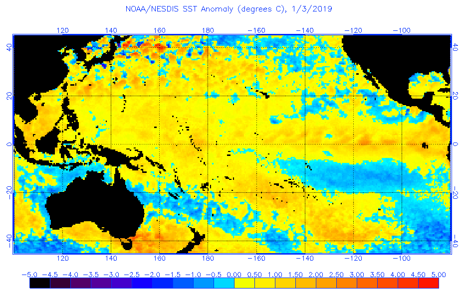
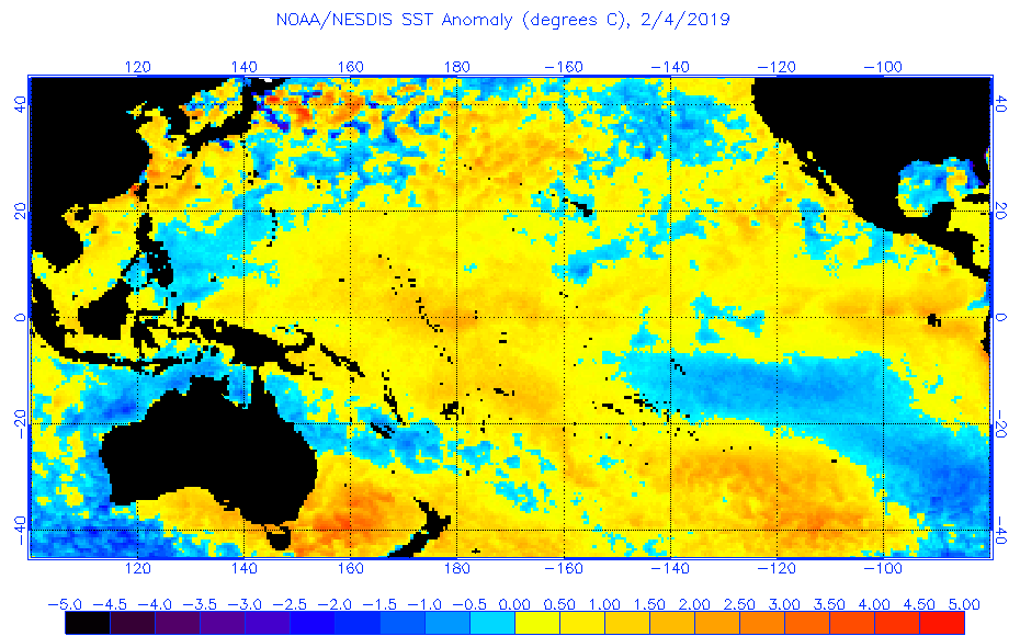
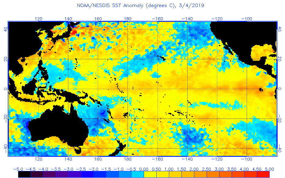
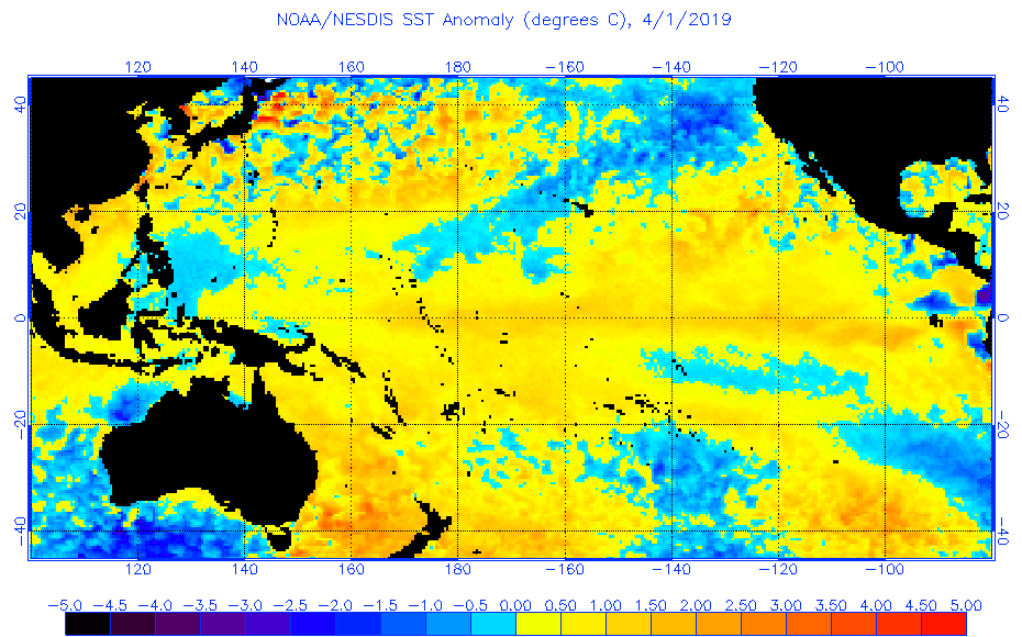
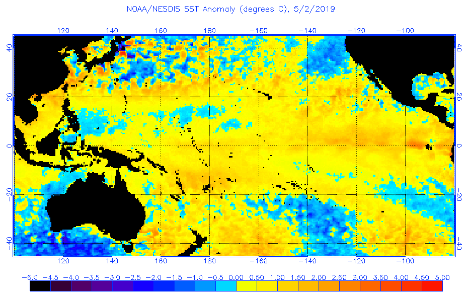
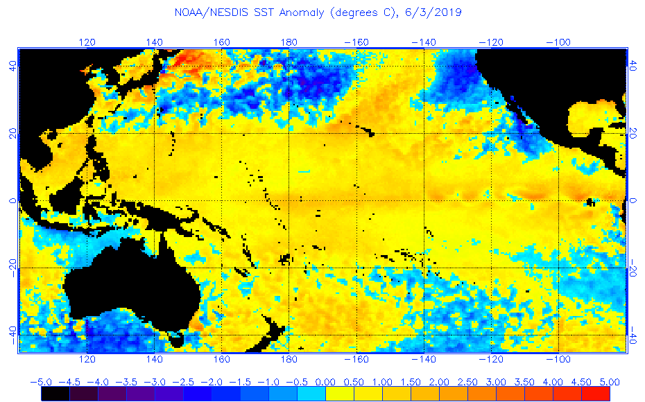
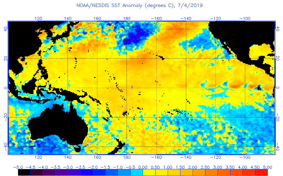
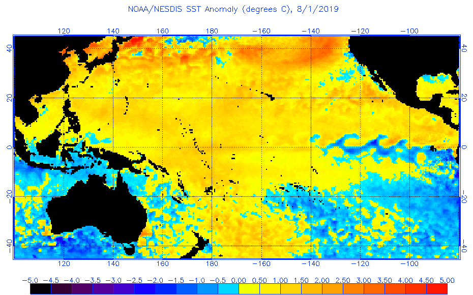
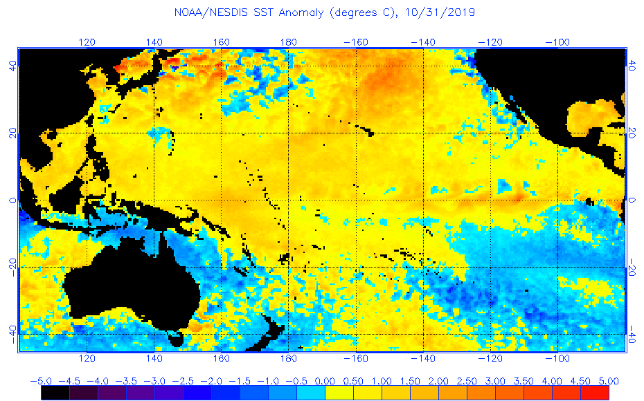
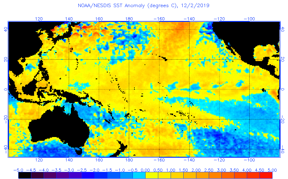
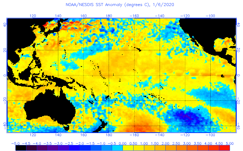
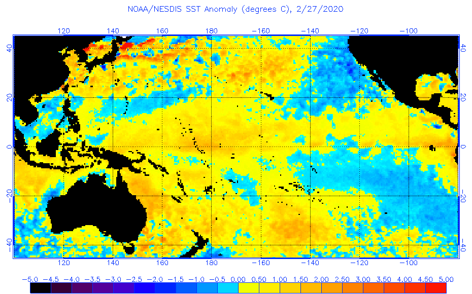
Just copy the above series into a draft email or similar and then click on each date to watch the progression.
It seesawed back and forth for a while but equatorial SST cooling seems to be the current trend. No guarantees – we’ll see.
One of the many unanswered or not even considered variations between the El Nino and La Nina years, is…
What percentage of the total volume of heat presented at sea surface is actually removed in the form of convection / water vapor. My estimation is that the most efficient years are La Nina, and that El Nino years the transportation system chokes causing ocean heat retention.
If this was not the case, the oceans in the lower / mid latitudes would be stripped of heat.
Food for thought.
With regards.
The magnetic activity of the Sun is now similar to 2009.

A cold northern front will now reach California.
http://tropic.ssec.wisc.edu/real-time/mtpw2/webAnims/tpw_nrl_colors/namer/mimictpw_namer_latest.gif
2020 could be an exceptional year : new solar cycle, new AMO cycle (starting with La Nina) , end of temperature peaks , same as 1876 and 1944 . Between these last 2 years we can count 6 solar cycles and 7 between 1944 and 2020 . I can also add that Jupiter and Saturn will be aligned later this year too .
I don’t think the events are just coincidence , natural cycles still dominate Earth climate despite anthropogenic warming which is not yet correctly measured ( 2-3 watts/m2 compared to 158 watts/m2 for all GHG )
Very good summary.
“2020 could be an exceptional year.” Agreed, especially since 2019 was a powerful lead-in.
2019 was the second lowest Daily Maximum in history, 63.31 Fahrenheit.
http://theearthintime.com/
This is the elephant in the living room. The cooling curve on the downslope.
Hubert
Excellent.
There should also be a lower ACE in East Pacific, stronger in Atlantic. Interested to see the Antarctic Blozone area, most importantly the annual accumulated area, which should be in the median range. To me maximum area is less important than annual accumulated area as an energy transport measure.
Regards
Re: imminent global cooling starting circa 2020, that is my Prediction 3 published in 2002.
I really want to be wrong about that one – I’m getting old and hate the cold. 🙁
https://wattsupwiththat.com/2020/02/28/la-nina-may-form-in-the-equatorial-pacific-ocean-later-this-year-and-if-so-it-could-have-wide-ranging-ramifications/#comment-2928572
[excerpts]
Planting has been one month late across the Great Plains of North America in both 2018 and 2019. There was a warm summer and fall in 2018 and the grain crop was good. In 2019 the ground was so wet that 40% of the huge US corn crop never got planted. Summer was cold and winter came early and there was a massive crop failure across the Great Plains. That does not sound much like warming to me.
THE REAL CLIMATE CRISIS IS NOT GLOBAL WARMING, IT IS COOLING, AND IT MAY HAVE ALREADY STARTED
By Allan M.R. MacRae and Joseph D’Aleo, October 27, 2019
https://wattsupwiththat.com/2019/10/27/the-real-climate-crisis-is-not-global-warming-it-is-cooling-and-it-may-have-already-started/
… ‘way back in 2002 I (we) predicted moderate global cooling to start by 2020-2030. Since 2013 or earlier, I’ve been predicting cooling to start closer to 2020, based on the end of very weak Solar Cycle 24. That is prediction 3.
My (our) two previous “outrageous-at-that-time” statements published in 2002 about global warming and green energy have already been proved correct.
1. “Climate science does not support the theory of catastrophic human-made global warming – the alleged warming crisis does not exist.”
2. “The ultimate agenda of pro-Kyoto advocates is to eliminate fossil fuels, but this would result in a catastrophic shortfall in global energy supply – the wasteful, inefficient energy solutions proposed by Kyoto advocates simply cannot replace fossil fuels.”
So if prediction 3 (moderate cooling starting ~ now) proves correct, the Swedes can pick up Al Gore’s Nobel Prize and deliver it to my place – just leave it in the blue dumpster next to the building. 🙂
It very likely this year’s La Niña will be a strong one since there hasn’t been one since 2010, and on average there is a strong La Niña every 8~10 years with few exceptions.
This strong La Niña will finally help offset the 2015~16 Super El Niño global warming spike, which was likely the strongest in 100 years.
It’s also highly likely the Pacific and Atlantic oceans will soon enter their respective 30-year cool cycles, which will cause a 30-year global cooling period, and finally drive a stake through the heart of the CAGW Hoax—the most expensive Leftist hoax in human history.
It’s also likely the coming Grand Solar Minimum event will add additional cooling to the PDO/AMO 30-year global cooling cycle.
We’ll see soon enough.
4-month sequence of vertical temperature anomaly sections at the equator, Pacific for February 2020
http://www.bom.gov.au/archive/oceanography/ocean_anals/IDYOC007/IDYOC007.202002.gif
All these pretty nice La Nina forecasts look in my humble opinion like snow forecasts for my Northern Germany corner.
On Wednesday, for the very first time in this (non)winter, we got… 4 mm (yes: four millimeters) of snow, which disappeared within a few hours.
For last night, a lot of snow was predicted, but… zero millimeter! Poor children around us…
This is not only the third (non)winter in sequence, with two amazingly warm summers in between.
This 2019/20 edition is, after 2006/07, also the second warmest winter for whole Germany since 1881.
Oh don’t think I would worry! I have experienced enough of these cold, snowy winters in 1956, 1963, 1978, 1986… I enjoy this wonderful warming.
But when I read all these comments predicting The Global Cooling Coming Soon, I get a big, big laugh, especially when comparing the winter temperatures for CONUS and Europe during the last ten years. Oho!
Best regards from a (much too) warm Germoney
J.-P. Dehottay
More rain and snow will come to Europe this spring.
Bindidon, CONUS temps are dropping, rapidly, to new lows. What data did you use to make your claim for warm CONUS?
windlord-sun
I replied hours ago, but can’t see the reply, sorry.
J.-P. D.
Ok. But do you agree temperature is dropping, and 2019 had the 2nd lowest TMAX in history?
windlord-sun
(1) – “But do you agree temperature is dropping…”
– Maybe if you mean TMAX.
– No if you mean TAVG, let alone TMIN.
TAVG temperatures for CONUS show a high trend since 2000, even higher since 2010. The trend is negative only since 2016.
(2) – “… and 2019 had the 2nd lowest TMAX in history?”
Maybe, I didn’t check that using GHCN daily which has many more stations than has USHCN. But the computer generating data is down, I can only post existing data.
Anyway, the goal of my somewhat lenghty comment was so show that imho TMAX is not the right corner to decide upon cooling or warming.
I saved it before posting; I’ll try again. Maybe it disappeared into some spam corner.
Happens often at Roy Spencer’s blog…
J.-P. D.
But the computer generating data is down…
And that folks pretty much sums up the sad state of what passes for climate “science” today.
windlord-sun
Second try, hopefully it works this time.
***
I know that CONUS is currently cooling, but it does not as you show.
The current situation since 2014 seems to be due to the increase of the polar vortex weakening.
Here is a graph I made some weeks ago, using GHCN daily:
https://drive.google.com/file/d/1RL6dA_EtMkZPcMHk-fIwdTgt33JKZPip/view
This is a completely different view, based on the winter months, measured by all available GHCN daily stations in those 12 northern CONUS states, for which I saw in generation stats the lowest absolute temperatures at single stations:
IA, ID, IL, MI, MN, MT, ND, OR, SD, WA, WI and WY.
But the truth IMHO isn’t to find there, let alone in a graph showing yearly averages of daily maxima.
Both approaches exaggerate single aspects up to a whole.
The difference between the monthly average of daily average temperatures, for e.g. CONUS and Europe (all EU states + Belarus + Ukraine + Russia till the Ural), reflects the situation in a less one-sided way:
1900-2019
https://drive.google.com/file/d/1OZXjeZ00Ew5_JDZWVA2NE2kIooprQBY5/view
1979-2019
https://drive.google.com/file/d/1Si1bNPeiJ_QGZ2Zr0fsurKeflCCQBht_/view
2010-2019
https://drive.google.com/file/d/13FJCPoqwqm9BXqNBDE5cOYayevbsgpEw/view
You see that CONUS
– shows much more stable over the long term than your graph suggests;
– does not show cooling for the last decade, but only since 2016;
– was in 2019 less dramatic than your graph suggests.
The linear estimates show this very well (in °C / decade)
1900-2019
CONUS: 0.03 ± 0.01
EU+RS: 0.19 ± 0.01
1979-2019
CONUS: 0.19 ± 0.03
EU+RS: 0.39 ± 0.03
2000-2019
CONUS: 0.19 ± 0.10
EU+RS: 0.29 ± 0.09
2010-2019
CONUS: 0.48 ± 0.35
EU+RS: 0.51 ± 0.24
Where does such a discrepancy come from? It comes IMHO from the fact that you think that warming and cooling depend on solar radiation only.
May I suggest that you create a graph similar to the one you have shown here, but based on daily minima, and showing it to us here again?
*
Last not least, I‘d like to remind us that CONUS accounts for no more than 6% of the Globe’s land masses.
Two years ago, Roy Spencer presented on his blog a chart made by John Christy, showing the number of daily maxima per station per year for CONUS, using USHCN data. „No significant warming“.
If you want, I can show you a very similar graph for CONUS, and a much less similar graph for the Globe – both based on GHCN daily data.
Rgds
J.-P. D. in Germany aka Germoney
windlord-sun
As you can see below, one of us must be wrong.
Here is a chart made out the yearly averages of CONUS’ TMAX, out of all available GHCN daily stations:
https://drive.google.com/file/d/1PhQQpErrQtYRvxUW6znkRXofizfFb8VR/view
to be compared with yours:
http://theearthintime.com/
The TMIN stuff came together with TMAX. Since the time series are somewhat distant, plotting them in absolute mode in one graph makes few sense, thus departures wrt the mean of 1981-2010 instead:
https://drive.google.com/file/d/16wjA5rw2QZLNcha_UgHpNTyFmEBlIRJO/view
Here the plots for stations and encompassing grid cells in each year:
https://drive.google.com/file/d/1YtnJL4DsbCEMnRcL5RZzcESp3ETmypwc/view
In the sum, from 1900 till 2019, 18059 stations contributed to the series, and were located within between ~ 160 and ~ 170 2.5 degree grid cells.
All data of course is subject to grid averaging, in order not to distort the series due to extreme differences in the station population across CONUS: while many corners have less than 20 stations per grid cell, others have over 300. 19 of the 20 topmost grid cells worldwide are in the US, 4800 stations together.
Rgds
J.-P. Dehottay
Thanks to the moderation for having fished this out of dark spam waters…
J.-P. Dehottay
windlord-sun
Last ‘contribution’ from my side, which you might appreciate much more:
https://drive.google.com/file/d/1lSCB4ScZ_MF_LPhXwTjb5o-iFA0-15SG/view
This is the same source as in the previous comment, but… processed without grid averaging.
Now you have it as you like it:
– 2019 is now 2nd lowest TMAX behind 1993;
– the Golden Thirties are atop!
1934 19.638
1953 19.538
1921 19.439
1954 19.434
1931 19.388
1939 19.370
1946 19.162
1933 19.070
1938 19.050
1956 19.037
Not one year after 1999 in the top 10! Ha!
I leave it up to you to decide what is right and what isn’t.
Sure you will now understand why so many people consider grid averaging as evil stuff, ‘plain wrong’ as Tamino would say.
Rgds
J.-P. Dehottay
I miss a comment here. On another thread, the moderator reports hundreds of posts stored in the spam directory. What a lot of work! Jesus.
I didn’t save the previous comment, so I add at least the link to the gridded TMAX plot:
https://drive.google.com/file/d/1PhQQpErrQtYRvxUW6znkRXofizfFb8VR/view
The comment above makes few sense otherwise.
J.-P. D.
For us Aussies it cant happen soon enough
last really good wet yrs were 15/16 17 wasnt too bad last 2 winter/spring seasons have been bad
the ENSO dropped a bit and within days we started to get the early cyclones forming off the east of Aus and others from west and nth as the IOD dropped away
bliss;-)
there wasnt enough soil moisture to make it worth touching the soil last yr even in spring, hope this yrs better
Curious as to how these weather effects with ENSO may be affected by 1) Solar cycle and 2) a positive or negative AMO?
Haiku tributes to the ENSO meter
my ENSO meter
currents on a stormy sea
setting my soul free
cute little children
¿¿El Niño o La Niña??
great gender reveal
oh ENSO meter
exalted ENSO meter
dashboard of weather
primitive tribesmen
gaze at the ENSO meter
dream of things to come
windlord-sun
“Bindidon, CONUS temps are dropping, rapidly, to new lows. What data did you use to make your claim for warm CONUS?”
*
Our different view does not depend on data, but on how we look at it.
I know that CONUS is currently cooling, but it does, from my point of view, not as you show.
The current situation since 2014 seems to be due to the increase of the polar vortex weakening.
Here is a graph I made some weeks ago, using GHCN daily:
https://drive.google.com/file/d/1RL6dA_EtMkZPcMHk-fIwdTgt33JKZPip/view
This is a completely different view, based on the winter months, measured by all available GHCN daily stations in those 12 northern CONUS states, for which I saw in generation stats the lowest absolute temperatures at single stations:
IA, ID, IL, MI, MN, MT, ND, OR, SD, WA, WI and WY.
But the truth IMHO isn’t to find there, let alone in a graph showing yearly averages of daily maxima.
Both approaches exaggerate single aspects up to a whole.
The difference between the monthly average of daily average temperatures, for e.g. CONUS and Europe (all EU states + Belarus + Ukraine + Russia till the Ural), reflects the situation in a less one-sided way:
1900-2019
https://drive.google.com/file/d/1OZXjeZ00Ew5_JDZWVA2NE2kIooprQBY5/view
1979-2019
https://drive.google.com/file/d/1Si1bNPeiJ_QGZ2Zr0fsurKeflCCQBht_/view
2010-2019
https://drive.google.com/file/d/13FJCPoqwqm9BXqNBDE5cOYayevbsgpEw/view
You see that CONUS
– shows much more stable over the long term than your graph suggests;
– does not show cooling for the last decade, but only since 2016;
– was in 2019 less dramatic than your graph suggests.
Here are the 12 monthly anomalies wrt the mean of 1981-2010 for 2019:
2019 1 0.11
2019 2 -0.72
2019 3 -1.03
2019 4 0.47
2019 5 -0.24
2019 6 0.10
2019 7 0.35
2019 8 0.54
2019 9 1.31
2019 10 -0.31
2019 11 -0.90
2019 12 1.64
And here are the 10 lowest monthly anomalies for 1900-2019:
1936 2 -4.49
1977 1 -4.04
1978 2 -3.97
1905 2 -3.95
1979 1 -3.87
1940 1 -3.66
1918 1 -3.37
1929 2 -3.31
1979 2 -3.28
1989 12 -3.27
(January 2019 appears at position 194 of 1440).
The linear estimates show this very well (in °C / decade)
1900-2019
CONUS: 0.03 ± 0.01
EU+RS: 0.19 ± 0.01
1979-2019
CONUS: 0.19 ± 0.03
EU+RS: 0.39 ± 0.03
2000-2019
CONUS: 0.19 ± 0.10
EU+RS: 0.29 ± 0.09
2010-2019
CONUS: 0.48 ± 0.35
EU+RS: 0.51 ± 0.24
{ I hope you don’t think all that is due to anomaly-based processing, that would be weird.
Absolute data show nearly the same trends, but the graphs look horrible due to the annual cycles. }
*
Where does such a discrepancy come from? It comes from the fact that you think that warming and cooling depend on solar radiation only.
May I suggest that you create a graph similar to the one you have shown here, but based on daily minima, and showing it to us here again?
*
Last not least, I‘d like to remind us that CONUS accounts for no more than 6% of the Globe’s land masses.
Two years ago, Roy Spencer presented on his blog a chart made by John Christy, showing the number of daily maxima per station per year for CONUS, using USHCN data.
Expected result: „No significant warming“.
If you want, I can show you a very similar graph based on GHCN daily data for CONUS, and a much less similar graph for the Globe.
*
Data source
ftp://ftp.ncdc.noaa.gov/pub/data/ghcn/daily/
(from 1979 in each year on average: about 7000 CONUS stations, and 2000 stations for EU+RS)
Rgds
J.-P. Dehottay
For the moderation
Please remove this comment: it is a duplicate of the one above :
https://wattsupwiththat.com/2020/02/28/la-nina-may-form-in-the-equatorial-pacific-ocean-later-this-year-and-if-so-it-could-have-wide-ranging-ramifications/#comment-2928813
Rgds
J.-P. D.
Hi J.-P.D.
Here is my graph of TMIN.
http://theearthintime.com/minn.jpg
The only differences I see between Min/Max: TMIN has shallower flow to its sine wave – the bumps extend somewhat longer. Additionally, it does appear that the recent TMIN is both higher than the earlier 1930s-1950s wave, and that it is only now beginning to follow the TMAX sine curve down. From one angle, you could even say it is nearly flat.
I don’t know if that is enough hay to feed even one horse. Why am I dubious? When MIN does not retreat as expected, slowing over 120 years, one must honor the doubt that urbanization teases. Yes, I know, this data is claimed to be adjusted by NOAA for heat islands and other siting issues, but still … did they get that right? To the tune of a few tenths of degrees F?
Not to mention these two twisters:
1) they stopped reporting the readings of over 400 stations, beginning in 1989;
2) the rate of redacted/missing readings (-9999) in the TMIN data increased since that time.
I welcome your response, if you so choose.
To take up ghcn at this time … I have to think about it. I downloaded the data a month ago. There are 50 million daily records for CONUS in it. Its not the size of that table, its the challenge of fussing with “why is ghcn-CONUS better or worse than ushcn” back and forth back and forth.
Adding …
“Where does such a discrepancy come from? It comes from the fact that you think that warming and cooling depend on solar radiation only.”
No. I’m only saying that the direct measurement of surface air temperature in the United States over the last 120 years shows no abnormal warming or cooling, per 50 million recordings of TMAX and TMIN.
I have made no claim on what temperature ‘depends on.” That is an entirely different discussion.
Adding …
“{ I hope you don’t think all that is due to anomaly-based processing, that would be weird.
Absolute data show nearly the same trends, but the graphs look horrible due to the annual cycles. }”
Anomaly-based processing 1) requires the challenger to demand the measurement data underlying them anyway, so what’s the point?; 2) are too easily used for inciting by emotion, “Oh, look, it’s going way up, the earth is burning up” when the actual constructed upswing is tiny.
As for “looking horrible, this is why I always supply a sine wave curve. It does not hide the granular data, yet it suggests evaluation of nature’s favorite motion: the gentle rocking of reality.
[I would add that if anomaly mapping is excused on the basis of ‘looking good,’ that does not speak well for its treachery possibilities.]
Thank you for responding.
Short answer: (I just returned to this thread after a trip)
1) I will respond about TMIN;
2) I challenge your assertion that simply examining TMAX is wrong. I will elaborate soon;
3) ushcn TMAX contains 50 million data points 1900-2019, adjusted for bias by NOAA. Would you give your reason for trusting CONUS ghcn over it?
4) the “US is a small sliver” argument has a struggle when confronted with this: “If a person claims abnormal global warming over the last x-years, how do they explain that 50 million data recordings in the USA missed it?
windlord-sun
(3.1) Didn’t you not understand that I am no US person, and therefore at least 95% of my data processing has to do with either the Globe or regions / countries outside the US? Why should I use this provincial HCN / CRN stuff? Nonsense for me.
(3.2) GHCN daily CONUS has about 20000 stations, on average with 71 years life time. About 500 million daily records, over 1 billion when averaging TMIN, TMAX and TAVG, I don’t count them in my stats. What for?
(4) Simple: because
– the US IS a small sliver;
– avoiding area weighting in the US creates a cooling bias, especially for TMIN. How could you see what is missing?
I posted a comment about that, based on John Christy’s daily maxima/station/year stat for CONUS, but it was not published.
(next comment)
“From one angle, you could even say it is nearly flat.”
Forget your misleading sine waves, and please
– communicate linear trend & 2 sigma CI;
– use for your graphs a linear estimate and
– a quadratic fit or a 10 year running mean instead.
Processing the raw USHCN data in GHCN daily gave this (1218 stations):
https://drive.google.com/file/d/1D7fzJgQoKwj8qgUKNPmLOG9fthfnYtDS/view
*
“Oh, look, it’s going way up, the earth is burning up”
Sorry, but to deny the usefulness of anomalies with such blah blah is too stupid for me.
Moreover, I try to imagine the poor Roy Spencer being obliged by people like you to publish his 4 atmospheric layers (LT, MT, TP and LS) in absolute form (LT at ~ -9 ° C, LS at ~ -60). Incredible.
How do you want to explain to people
– the amazing similarity between land surface and LT above land other than using anomalies in monthly plots (24 °C difference plus season zigzags otherwise)?
or
– the difference between LT and LS over the satellite era?
I don’t publish here links to explaining graphs, that goes to spam anyway.
You manifestly did not understand the point ‘removing the annual cycles’. That is not at all the same as yearly averaging.
3.1 evading: If I were to make the “provincial argument” as you just did, I would reject all the (relatively sparse) global direct measurement, and simply declare the US record to be the final, settled, proof that there is no warming – because I live in California. Instead, I am challenging with the obverse: If someone claims the globe is experiencing abnormal warming, why does it not show up in the US record? I keep posing that challenge to people and, like you, they deny it. (None of them went so far as to make a chauvinistic-natalist argument such as yours, however.)
3.2 I am busy parsing out interesting results from the full GHCN-CONUS dailies, and will post about them in the near future. So far, here’s what I’ve found: a) the GHCN subset of stations marked HCN do not produce the same results as found in USCHN. I’ll be digging to tease out why; and b) the organic sine-wave trend is even more pronounced in its “no abnormal warming” than in USCHN. I am also expanding my analysis to the wider set of stations.
4.0 You repeat the sliver argument, which is a fallacy. See 3.1 above; ALSO: NOAA has adjusted many of the recordings in both G/U for gridding. They have also redacted many readings. Yet still, even with three types of influencing the historical record, the resulting organic sine wave (repeating that phrase to annoy) shows no abnormal warming.
I cordially reject your order to abandon organic sine curve analysis in favor of flatline/anomaly. The curving line serves to project the mean, and in a clearer manner, and the plot of actual data is as honest and naked a reveal as could be desired.
I would not challenge Mr. Spencer or anyone else inspecting satellite data to show their data points. However, I do challenge them in the same way as above. If the conclusion of satellite measurements that construct surface temps differs from GHCN or USHCN (which show no abnormal warming), how do they explain that?
~ windlord-sun
Adding …
You posted a TMIN from GHCN-CONUS. Interesting. The plotting generally agrees with mine from USHCN. My USHCN TMIN is posted at my site now,
http://theearthintime.com
Notice how your rigid trend line points up, while your mean reflects the sine wave. A sine curve is much richer, more truthful of flow. The line conveys “straight up, no nuance.” Curve says “natural organic flow.” NOTE: I won’t do this, but I challenge you to plot the TMAX and apply a rigid line over 120 years. It will be flat. Temp has NOT been flat — it has been oscillating up and down, over/in more than one cycle. A linear trend line is misleading to the initial impression of the eye.
Meanwhile, here is my original TMAX from USHCN, but with the GHCN-CONUS-HCN plotted and superimposed:
http://theearthintime.com/gray.jpg
Quite congruent, except over the last 30 years, during which GHCN shows less of a rebound up. I have not performed a precise data analysis to tease out the difference. I don’t know why NOAA would not have absolutely identical data for both. USHCN contains 4.7 Million more recordings.
~ windlord-sun
windlord-sun
“Instead, I am challenging with the obverse: If someone claims the globe is experiencing abnormal warming, why does it not show up in the US record? I keep posing that challenge to people and, like you, they deny it.”
No. Not the others deny (me included): you deny the simple fact that averaging all stations together without area weighting is the major flaw in your approach.
This is no sound skepticism: this is simple obstinated will to keep right, against all your odds.
1. Wrong: TMIN without area weighting
https://drive.google.com/file/d/1D7fzJgQoKwj8qgUKNPmLOG9fthfnYtDS/view
2. Correct: TMIN with area weighting
https://drive.google.com/file/d/1qLDGUSheO75T4icaycIRqh50zLlsm7sF/view
The very best here is that the weighted aka gridded variant of the TMIN time series much better shows how, between 2000 and 2014, the minimum temperatures have decreased in CONUS.
And this cooling phase imho is correct.
3. Wrong: TMAX without area weighting
https://drive.google.com/file/d/1RWU3xkLHI50WkCrLonkLNFDlvPTn0ZBA/view
4. Correct: TMAX with area weighting
https://drive.google.com/file/d/1CANp9w6jzzcz5NNyl6HeQ9qoeXclExH4/view
The same remark holds as for TMIN.
Feel free to continue ignoring the trivial fact that without area weighting, regions hosting a greater number of measurement points will obviously dominate regions hosting only a few, thus producing two warming or cooling bias:
– in the mean absolute temperature;
– in the linear estimates.
I have no problem at all with that.
If I had any interest to do, I would add a method to my ware, allowing for the generation of all separate grid cells out of the gridded variants, and compare them until I find the cells responsible for the bias.
Re: imminent global cooling starting circa 2020, that is my Prediction 3 published in 2002.
I really want to be wrong about that one – I’m getting old and hate the cold. 🙁
https://wattsupwiththat.com/2020/02/28/la-nina-may-form-in-the-equatorial-pacific-ocean-later-this-year-and-if-so-it-could-have-wide-ranging-ramifications/#comment-2928572
[excerpts]
Planting has been one month late across the Great Plains of North America in both 2018 and 2019. There was a warm summer and fall in 2018 and the grain crop was good. In 2019 the ground was so wet that 40% of the huge US corn crop never got planted. Summer was cold and winter came early and there was a massive crop failure across the Great Plains. That does not sound much like warming to me.
THE REAL CLIMATE CRISIS IS NOT GLOBAL WARMING, IT IS COOLING, AND IT MAY HAVE ALREADY STARTED
By Allan M.R. MacRae and Joseph D’Aleo, October 27, 2019
https://wattsupwiththat.com/2019/10/27/the-real-climate-crisis-is-not-global-warming-it-is-cooling-and-it-may-have-already-started/
… ‘way back in 2002 I (we) predicted moderate global cooling to start by 2020-2030. Since 2013 or earlier, I’ve been predicting cooling to start closer to 2020, based on the end of very weak Solar Cycle 24. That is prediction 3.
My (our) two previous “outrageous-at-that-time” statements published in 2002 about global warming and green energy have already been proved correct.
1. “Climate science does not support the theory of catastrophic human-made global warming – the alleged warming crisis does not exist.”
2. “The ultimate agenda of pro-Kyoto advocates is to eliminate fossil fuels, but this would result in a catastrophic shortfall in global energy supply – the wasteful, inefficient energy solutions proposed by Kyoto advocates simply cannot replace fossil fuels.”
So if prediction 3 (moderate cooling starting ~ now) proves correct, the Swedes can pick up Al Gore’s Nobel Prize and deliver it to my place – just leave it in the blue dumpster next to the building. 🙂