Guest Post by Willis Eschenbach
Those who know me are aware that I’m a tropical boy, a hopeless addict of warm blue seas and coconut-laden islands with white sand beaches. Here’s where I used to live and work, Liapari Island in the Solomon Islands.

That is how I like my water to behave, soft, warm, and inviting. But when the ice jumps out of my tropical-type adult beverage and starts running around the countryside covering everything in white and floating in giant chunks all over the ocean, well, I call that “water behaving badly”.
And as you might imagine, other than brief visits I tend to avoid places where water behaves badly.
However, thinking about such icy climes when I’m someplace warm, that’s a more pleasant matter. So I got to considering ice, in particular, sea ice. And as is my wont, when I consider something I go get the longest dataset that I can find. In this case, that was the HadCRUT ice and sea surface temperature dataset. It claims to go back to 1870 … but that doesn’t mean that it’s good back to 1870. Figure 1 shows why.
(As an aside, Figure 1 also shows the importance of starting by running the old Mark I Eyeball over your data before subjecting it to any mathematical gymnastics … but I digress.)

Notice the very regular signal in the early days of both the northern and southern hemisphere data, and as a result in the global data. This is obviously just a perfectly regular repeating signal added to the later actual observations. We can get a better idea of when the real observations start (and stop) by removing the regular repeating seasonal signal from our dataset. Figure 2 below is the same as Figure 1, but with the regular repeating average seasonal variation removed.

The regular signal in the earlier parts of the record is an artifact. It is an interference pattern resulting from the removal of the seasonal signal. Only the latter part of the datasets contain valid observations.
In Figure 2 above we can see that Arctic measurements (northern hemisphere, blue above) are only good since about 1960. Note the odd lack of data (with missing data replaced by a regular signal) from about 1940 to 1952.
Antarctic ice area (southern hemisphere, red above) actual measurements are more recent. The Antarctic record is only good since 1973. As a result, we can only look at global data since 1973. However, that’s approaching a half-century, so it is still of interest. Here’s the global ice area since 1973, the period where we have actual observations. It’s worth noting that since 1979 we have full satellite observations of ice areas.

Now, I was surprised by Figure 3. Surprise is the very best part of science to me. I love the first sight of the graphics, turning what before was just a bunch of numbers into a record of the past.
There were a couple of surprises in Figure 3. First, from 1980 through 2004, a quarter-century during which there was general global warming, there was no trend at all in global ice area. None. Well, to be accurate, the trend 1980 through 2004 is -0.0000000000000001% per decade … and as you imagine, not statistically significant.
After 2005 the global ice area went down, but by 2010 it had recovered. From there to 2015, it was above average. And since 2015 global ice area has dropped precipitously but then recovered back to average. Finally, there is no statistically significant trend in the full 1973 – 2019 dataset.
So … lots of things of interest in Figure 3. However, I gotta say, I’m not seeing the evil hand of steadily increasing atmospheric CO2 in that record. Nor am I seeing any “anthropogenic fingerprint”. Perhaps most importantly, I am unable to detect any sign of any “climate emergency” in that record.
The final surprise was the recent several-year deep drop and then recovery of the ice area. I figured it must be from what alarmists have termed the “Arctic death spiral”, the widely trumpeted decrease in Arctic sea ice. So I added the separate Arctic and the Antarctic records to Figure 3 above. Figure 4 below shows those records.
Curiously, the amount of ice at the two poles is just about the same, at ~2% of the globe. But that makes it hard to compare the Arctic and Antarctic ice. So in Figure 4 below, I’ve offset the northern hemisphere (blue line) by 1% for clarity. You’ll need to add 1% to the northern hemisphere ice areas to get the actual values. Figure 4 shows the globe as well as the two halves of the planet separately. Note that in this graphic they are all to the same scale.

And for my final surprise, it turns out that the recent variations in global ice area are largely the result of variations in the Antarctic ice area, and not in the Arctic ice area that we spend so many electrons discussing …
So what I found out regarding the global ice areas was that I didn’t know all that much about global ice areas … and speaking of which, just what the heck did cause the drop and subsequent recovery in Antarctic sea ice area from 2015 to the present?
Here on the north coast of California, it’s the leading edge of autumn. We had our first rain this week, which left the forest full of the damp dark green smell of life, decay, and rebirth. And when I just looked outside, the rain had come again. What a joy it is to investigate the mysteries of this endless universe, even the vagaries of water behaving badly!
Best to everyone,
w.
@ur momisugly Willis
Nice post as usual.
I would like to call your attention to Figure 2, particularly the bottom data set, Northern Hemisphere.
What you said about this:
“The regular signal in the earlier parts of the record is an artifact. It is an interference pattern resulting from the removal of the seasonal signal.”
***** Stopped Me In My Tracks *****
Here is the story:
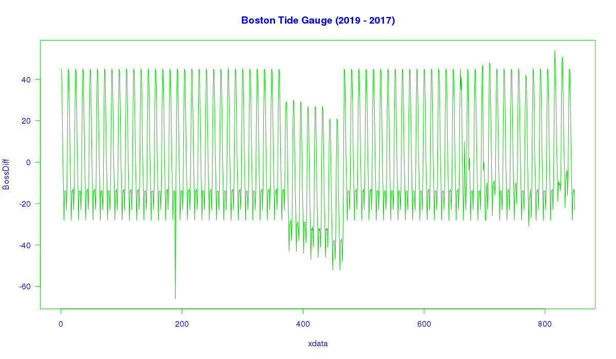
I like to keep as eye on the Boston Tide Gauge, just out of curiosity. I grabbed the data set back in 2017, and made some nice plots. Last summer, I thought it time to update my favorite plots, and so got the “Latest and Greatest”. After graphing, it was obvious the entire record had been altered. Of note is that the peak-to-peak level of the general data was increased dramatically, giving the appearance of a noisier data set. And this is clear through, from the start in 1921 to the present.
So I did what anybody would do. I graphed the difference. Simply, I subtracted the old(2017) from the new(2019) and got the difference.
The difference plot looks *exactly* like your Figure 2, bottom plot from start to ~1900.
Why should this be?
Why should an interference pattern suddenly appear, out of nowhere, in the Boston tide gauge data? And why should that pattern match a pattern you found in some old British Arctic sea ice data?
Here is the Difference Plot:
?????????
Comments??
Anybody with any ideas, feel free to jump in.
While I don’t understand what a “BossDiff” means in terms of “xdata”, the idea of changing the past goes back to Orwell’s “1984”. Yes, we are witnessing all kinds of bowdlerization of all kinds of data. Yesterday’s data is gone, trust me, today’s data is much better.
These “scientists” could not be moved to use any kind of a version control system – a system that allows you to retrieve data as it was yesterday, a day before, and so on. Very dangerous in a post-1984 world.
My apologies, I stare at my own plots long enough so I no longer see the obvious.
BossDiff = Boston Difference.
Y axis – Difference between 2017 data set and 2019 data set in millimeters. Total span from top to bottom in a typical annual pattern is 73 mm. The pattern is exactly 12 months long, repeating.
X axis – Data series in months, the data start is Jan. 1921
Here is a look at the first 5 years of numerical data, month by month, Jan. – Dec.
1921: 45 44 26 2 -11 -28 -14 -14 -14 -23 -11 25
1922: 45 44 26 2 -11 -28 -14 -14 -13 -23 -11 25
1923: 45 44 26 2 -11 -28 -14 -14 -14 -23 -11 25
1924: 45 44 26 2 -11 -28 -14 -14 -13 -23 -11 25
1925: 45 44 26 2 -11 -28 -14 -14 – 13 -23 -11 25
“These “scientists” could not be moved to use any kind of a version control system”
Indeed.
Back in the day, the data never changed. You would add to an ongoing data set, but you would never change existing data. In that world, a VCS made as much sense as a screen door on a submarine. I guess those days are long gone.
Willis, a request: Please put units on the vertical axes of the first 3 graphs, or in the accompanying title or text.
Done, in the captions. Thanks.
w.
Antarctica’s ocean dynamics led the planet out of the last deep glaciation:
http://home.sandiego.edu/~sgray/MARS350/deglaciation.pdf
https://agupubs.onlinelibrary.wiley.com/doi/pdf/10.1029/97GL02658
Antarctica’s ocean dynamics will likely lead us back into the next one.
Congratulations Mr. Eschenbach for pushing one of the simplest ways of constructing a misleading graph. Your choice of vertical axis units stinks.
…
https://en.wikipedia.org/wiki/Misleading_graph#Axis_changes
…
I suggest you build graphics using ACTUAL SEA ICE AREA instead of “% of global area. That way, the trend(s) in the data will be more obvious.
Michael Palmer September 30, 2019 at 2:25 pm
Michael, a graph of what you call ACTUAL SEA ICE AREA will be identical to the graph above, but with different units on the vertical axis.
The conversion from area to the percentage of global surface area is done by merely dividing by a constant. And as a result, there is nothing misleading about the presentation. Same graph, just different units.
Why did I do it? Because the underlying data is usually presented in units of millions of square kilometers … and people, myself included, have little intuitive understanding of what that equates to.
But saying that 4% of the globe is covered by sea ice, that conveys a true sense of scale.
Regards,
w.
You are correct, the two graphs would be identical, BUT the vertical axis would encompass a much wider range. Your graph has a compressed vertical axis which hides the trend.
See what an expanded y-axis does?
….
Secondly, using absolute values instead of anomalies hides the trend:
…
Your graphs are misleading, and you are using common techniques to do it.
So, what happens to the hockey stick when you plot to a vertical axis bottoming at last X years average minimum annual temp for the low end of the scale, and topping at last X years average maximum annual temp for the high end of the scale? ‘Bout as big as a pimple on skeeters’ tush, if I may say so.
Pot and Kettle come to mind…
Michael Palmer: “See what an expanded y-axis does?”
WR: Your graph is about sea ice extent, as Willis’ graph is about sea ice area. See comment https://wattsupwiththat.com/2019/09/30/water-behaving-badly/#comment-2810181
I like to use Texas-area as a unit T which is a little over 250, 000 square miles and a little under 700,000 square kilometers. Then I hum a song by Asleep at the Wheel.
Miles and Miles of Texas
Shout Wa Hey!
thanks for the memories
Michael writes
One might suggest that graphing temperature anomalies with a vertical axis in tenths of a degree is misleading in conversations of rapid warming, with extinctions inevitable and existential threat to all life on earth. Put the changes on a full Kelvin scale and see what people think. Add the perspective of daily and seasonal variation and the crowds of protesters will all go home.
Putting the changes on a full Kelvin scale is misleading in the same manner that Willis is doing.
Misleading in what way? If the goal is to show the effect of warming in the context of daily and seasonal variation then its the ONLY way.
After watching this time-lapse video representing 500 ma to present, I was taken by how rare and uncommon glaciers and polar ice caps really are on this planet. 50 years of data? Pffft…
https://youtu.be/UevnAq1MTVA
Willis
Clearly the ice trend in the arctic is going down. Not so in the SH.
How come?
The SH ice is a million miles from nowhere, the NH ice is within chimney belch of every source of soot and blacking and ice breaking you can think of… The SH is a n actual land mass with hills mountains and volcanoes with attached Ice the NH is floating ice alone constrained and compressed by the current flows between the fixed land masses. The two could not be less comparable…
https://www.sciencenewsforstudents.org/article/giant-volcanoes-lurk-beneath-antarctic-ice
“just what the heck did cause the drop and subsequent recovery in Antarctic sea ice area from 2015 to the present?”
As I indicated in a post above, undersea/ice volcanic activity.
Can anyone postulate on the effect so much changing ice distribution, hence weight, has on the Earth’s motion?
As it is spinning at approx 1,000Km/hr, I would expect the change of weight distribution from North to South as the seasons change to at least give us some ‘wobble’ due to precession effects. If so, how does this affect ocean circulations, ENSO’s, etc?
(Asked by an interested non-mathematician/scientist)
Yeah, I could, but don’t have time. Besides, XKCD has done a better job. The ice/water winter/summer effect is measurable, but it’s not the most important, at least over the long term.
Leap seconds are a great way to measure most of the effects, just not very good for the seasonal effect which is too small and cycles too quickly.
https://what-if.xkcd.com/26/
floating ice in liquid water make no significant difference. The displaced water from floating ice is the same mass as the floating ice in a given area. Only land ice make a mass distribution change effect.
“are largely the result of variations in the Antarctic ice area, and not in the Arctic ice area that we spend so many electrons discussing”
Where the electrons go is in discussing summer Arctic. The big difference in the hemispheres is that except for summer, the Arctic ice is largely land bounded, which reduces full-year changes. Antarctic is the opposite; unbounded in winter, but the edge comes closer to land in summer. But mainly much freer to move.
Willis, it seems perhaps you don’t respond too gar below root-level comments (forgive my file system orientation.) So reposting here:
Isn’t sea level rise (adjusted for landform subsidence) linearly coupled to global ice melt (sea and land)? And if sea level rise is very slow and steady (evident during human observation) doesn’t that indicate global ice melt (in aggregate) has been slow and steady as well? The wild swings and disparities between poles suggest that sea ice alone is a poor proxy for global temperature and resulting sea level. And smoothed sea level may be the only true proxy for global temperature.
brians356
“The wild swings and disparities between poles suggest that sea ice alone is a poor proxy for global temperature and resulting sea level.”
What is in your opinion the sense of comparing the poles?
The North pole is a piece of frozen ocean surrounded by Earth’s most land masses; the South pole is a piece of land surrounded by Earth’s most water surfaces.
Better proxies for global temperature would imho rather be the surface mass balances for Greenland’s and Antarctica’s ice sheets.
Replied to above …
w.
Willis
You might have obtained the same results by using a more direct info, namely the sum of sea ice extent and area (aka 100% pack ice) you can easily obtain from colorado.edu:
ftp://sidads.colorado.edu/DATASETS/NOAA/G02135/north/monthly/data/
ftp://sidads.colorado.edu/DATASETS/NOAA/G02135/south/monthly/data/
Here is an evaluation of their monthly data using a spreadsheet calc. (It takes some little time to collect the stuff out of the monthly files, and to sort it.)
1. Absolute data
https://drive.google.com/file/d/1vJCHySCeyaGwWrhx5kEztavRNV2Tm13v/view
2. Anomalies wrt mean of 1981-2010
https://drive.google.com/file/d/1uMFrTs2tAILeE4CVCNbU2-5Ad7OuM7Fi/view
The monthly plots are interesting: both Arctic and Antarctic experienced a rather big drop in their anomaly time series nearly at the same time (Oct vs. Dec 2016).
What isn’t quite apparent in your graph is that the Arctic extent+area drop (-4.4 Mkm² wrt mean) is even lower than that in the Antarctic (-3.5).
Strrange things happen!
Rgds
J.-P. D.
Calling Nick and Griff…calling Nick and Griff….?
https://sciblogs.co.nz/guestwork/2016/03/16/rise-and-fall-social-collapse-linked-to-sea-level-in-the-pacific/
http://theconversation.com/forgotten-citadels-fijis-ancient-hill-forts-and-what-we-can-learn-from-them-121103
Come out come out climate changers wherever you are and show us where this fits in your computer models.
It’s called paleoclimatology in case you’ve forgotten dudes. LOL
Very interesting as all Willis posts tend to be. My humble contribution to the intense interest in sea ice in the context of AGW is that the evidence does not support the assumed causation.
Pls see
https://tambonthongchai.com/2019/09/28/sea-ice-extent-area-1979-2018/
As suggested for example in alarmism such as this
https://youtu.be/1irhVwS60j4
Talk about behaving badly!
As a completely unqualified observation, that dramatic dip in the Antarctic data doesn’t look right. I would entertain strong doubts about that isn’t a glitch, without very good evidence that it was real.
Are we sure that there wasn’t a change in the methodology at that time.
It looks like a processing artefact, (In the supplied data and not by Willis!) as it is the largest dip – by far – in the entire record and it just happens to begin when it was at its greatest extent (2014) after growing for the previous 40 years.
I’m sure somebody will school me on this but I’m not likely to be convinced without a a very very good justification and physical explanation to account for – what is IMHO – is a very very odd looking graph! 😉
There actually was a big dip in the Antarctic data. But it isn’t unique, the NIMBUS data indicates a even greater abrupt dip in 1964-66:
https://earthdata.nasa.gov/new-data-from-old-satellites-a-nimbus-success-story
I know about Nimbus but you have linked to nothing that substances your claims.
Read the link:
“In fact, 1964 was the largest sea ice extent until 2014. Then in 1966 we saw the lowest ice extent that was ever seen. “
And then there’s the fact that Antarctic sea-ice area goes from huge to practically nothing in 6 months. So what does it matter all that much how it varies in that short a time-frame.
Oh yeah, it would mean Emperior penguins wouldn’t have to walk so far to get to their nesting sites.
Scott Bennett
When I read such comments, I’m always wondering that certain persons considering the graph below:
(1) https://drive.google.com/file/d/1uMFrTs2tAILeE4CVCNbU2-5Ad7OuM7Fi/view
so often feel the need to consider sea ice drops to be ‘odd looking’ or simply artefacts, while sea ice peaks are always ‘good’. The same holds of course for ‘odd’ sea level and temperature peaks vs. ‘good’ drops.
It is really amazing that the commenter didn’t bother about the Antarctic peaks in 2008 and 2014/15, but did very well look at the ‘odd’ drop in 2016!
Let us have a look at the year 2016, by using in a first step the absolute daily data for sea ice extent:
(2) https://drive.google.com/file/d/1KADx20o9trSqzbXevHvvZWleLLwieIQ9/view?usp=sharing
We see in blue the Arctic (with 2016 in dark, and with the mean of 1981-2010 in light), and similarly in red for the Antarctic.
Oh! Impossible! No odd drop in the Antarctic data! There is no more to observe than what looks like a small deviation from the mean, beginning in the September of the year.
But nobody looks at absolute data time series, especially when having to compare many of them. Anomalies wrt some mean are used instead:
(3) https://drive.google.com/file/d/1cGEBcRMkNr1Nk0Ee_aM8tCMV2DuHXqQl/view
And here we see that in December 2016, the daily anomalies for Antarctic’s sea ice extent reach a maximum.
I don’t have daily data for the area (aka pack ice) but though it had its maximum in November, the sum of extent and area, averaged over the whole December, gave a deficit of 3.5 Mkm² for the Antarctic, as can be seen in the graph (1) showing the monthly anomalies.
Yes, Scott Bennett: it was a ‘completely unqualified observation’ 🙂
Rgds
J.-P. D.
Bindidon
Hmmmmn.
In June 2014 (from the Cryosphere data set), the Antarctica sea ice anomaly exceeded 2.16 million sq kilometers. More “excess” sea ice around ANtarctica than the entire area of Greenland.
The NSIDC couldn’t have that of course, and so the Cryosphere sea ice lab was shutdown, and the Antarctic sea ice responsility was shited to the NSIDC, Boulder Colorado. The ANtarctic sea ice promptly shurunk from +2.1 Mkm2 to -1.5 Mkm2 in only a few months. ANd no one cared, no “icebergs the size of Greenland were lost” headlines and screaming press releases. But, regardless of the NSIDC best efforts, the sea ice around ANtractica continued to expand, just like it has for most of the years since 1992.
Well, today (Oct 2019) the Antarctic sea ice is back above its daily 1979-1990 average for 1 October, and they are still growing. And there is no “Antarctic sea ice expanded by 1/2 the area of Greenland in only 2 years” screaming headlines either.
Oh. By the way, the maximum Antarctic sea ice occurs in late September, a few weeks after the mid-Sept Arctic sea ice minimum. Difference is, the Antarctic sea ice at maximum is up past 58-60 degrees latitude in the high angle sunshine. The Arctic sea ice minimum is in the dark at 79-80 north latitude (edge of sea ice) and 82-83 (middle of the sea ice.) Over the course of the entire year, ANtarctic sea ice reflects some 1.7 times the differential solar energy that the Arctic sea ice does.
And, above all, remember: “The less Arctic sea ice from today’s extents, the greater the heat loss from the newly uncovered Arctic Ocean to the infinite black cold of deep space.”
RACookPE1978
“In June 2014 (from the Cryosphere data set), the Antarctica sea ice anomaly exceeded 2.16 million sq kilometers. More “excess” sea ice around ANtarctica than the entire area of Greenland.
The NSIDC couldn’t have that of course, and so the Cryosphere sea ice lab was shutdown, and the Antarctic sea ice responsility was shited to the NSIDC, Boulder Colorado. The ANtarctic sea ice promptly shurunk from +2.1 Mkm2 to -1.5 Mkm2 in only a few months.”
*
Well, Sir, without presenting valuable sources (data, original documents), what you write here has zero value.
Rgds
J.-P. D.
Willis
I got the impression that there was a monotonic downward trend in the Arctic ice area on your graph. So I took a screenshot of it, adjusted the 1% offset of the Arctic ice extent, and eyeballed a straight line through the squiggles. It shows Arctic ice area dropping from 2.24% of the globe to 1.89% between 1978 and 2019, a relative decrease of 16 percent (numbers are approximate).
The 13-month average of Arctic ice area on the NSIDC plot (which can be seen at the WUWT Sea Ice Page) drops from 12.2 million km² to 10.8 million km² over the same time interval, a relative decrease of 15 percent. They are both using the same satellite data sets, so this is not surprising.
It looks as though the Arctic Death Spiral is alive and well – it just doesn’t look that serious when you plot it with zero at the bottom of the Y-axis.
And of course the absence of satellite data pre-1979 means that you can write your own narrative about how this all fits into the long-term picture. There is, as other commenters have pointed out, a lot of anecdotal evidence that there was much less sea ice in the Arctic during the 1930s and 1940s, but it’s easy for alarmists to dismiss that stuff as unreliable. Or just ignore it. After all, the message is more important than the facts.
Willis, thank you once again.
One thing should be clear to everybody:
THERE ARE NO RELIABLE SEA-ICE DATA BEFORE THE SATELLITE ERA.
But there are satellite data long before 1979. The early IPCC reports included data back to 1973, and more recent reanalysis of NIMBUS imagery has extended the record back to 1964. The data are available, but have, remarkably, never been properly published, one wonders why?
https://earthdata.nasa.gov/new-data-from-old-satellites-a-nimbus-success-story
https://nsidc.org/data/nimbus/data-sets.html?_ga=2.155941758.471796119.1569921814-1616830077.1553511530
The coverage and data quality could be improved by using declassified CORONA imagery (which goes back to August 1960), particularly from the KH5 mapping camera missions, but apparently nobody is interested.
There is reasonably good data for the North Atlantic sector going far back, and for the Siberian coast (at least in summer) back to 1933, but Northern Canada is almost completely blank before the sixties.
“THERE ARE NO RELIABLE SEA-ICE DATA BEFORE THE SATELLITE ERA.”
Not to mention the whole continent of Oz only had a reasonable Stevenson Screen rollout by 1910 so they won’t accept the stinkers of the 1880s but still the climate changers live in the moment and we’re all doomed-
https://www.nma.gov.au/defining-moments/resources/federation-drought
Snake oil and catastrophism.
“there was no trend at all in global ice area. None. Well, to be accurate, the trend 1980 through 2004 is -0.0000000000000001% per decade … ”
This makes me think that there is very little change in ocean temperature. Any increase in Ocean temperature over 25 years should cause a statistically significant change in ice volume.
Years ago, when I was calibrating temperature elements at power plants to within 0.1 percent accuracy, we used insulated ice/water filled containers with a magnetic stirrer. We had procedures requiring that the quantity of ice was at least 30% of the container. We were comparing one “Laboratory” grade NTSB instrument for the reference with the instrument being calibrated. Occasionally, towards the end of the day you would see a change in the last digit of the reference instrument.
Interesting. How much of an effect does water purity/cleanliness have on freezing temperature? What effect at the end of the day caused the change? How many digits on the instrument? C or F?
The freezing point of water decreases 1.86ºC/mole of solute, if the water is in contact with air during the day you’d end up with about a millimole of dissolved gas so a change of about 0.001ºC
Definitely the polar see-saw effect. The increasing trend in the Antarctic since 1993 is directly following the weakening of the solar wind, and all that AMO and Arctic warming is an amplified negative feedback.
“Perhaps most importantly, am I unable to detect any sign of any “climate emergency” in that record.”
As written, the sentence is a question.
More seriously, that’s another fine article. Thanks, W.E.!
Thanks, James, fixed.
w.
As usual I am impressed by Willis’s data presentation. I hope he won’t feel offended that I have taken his analysis a step further.
I took account of both sea ice and snow cover. The basic data come from NSIDC and Rutgers University. It shows a slight downward trend from 1978 to present but equivalent to only 0.1% per year.
You can see my posting at:
https://climatescenarios.blogspot.com/2019/10/global-snow-and-ice-recent-post-called.html
Tony Heller has posted this video of September Arctic ice showing that in the last decade September as a whole has changed from a falling to a marginally rising trend of ice extent:
Oops – misread the graph. From the start to the end of September the trend specific to that date has changed from ice loss to ice gain.
As Javier once commented this (unsustainable) trend of forward movement of autumn may signify an impending climate transition of some kind.
Phil Salmon
That is simple cherry-picking.
Trends for absolute Arctic sea ice since 2007 (as chosen by Javier):
– September months: +0.2 Mkm² / decade
– March months: -1.2 Mkm² / decade.
When you look at ice on sea or on land, you look at both the highest and lowest levels.
The gain in March has a much lower trend than the loss in September.
Nothing dramatic, but it is as it is.
Willis
Thanks a posteriori for this guest post which motivated to do a similar job, through which I indirectly obtained a 1° land mask 🙂
I also wondered about the data before 1970.
*
What I don’t understand in your text is this:
“Finally, there is no statistically significant trend in the full 1973 – 2019 dataset.”
This can be correct only when you calculate the linear estimates on the basis of the absolute data time series. The HadISST Ice Globe trend then is
0.10 ± 0.09 Mkm² / decade
and that is indeed not very significant.
But it is due to the fact that absolute data often has higher deviations from the mean, which lead to a higher standard error. If you compute the linear estimate on the basis of anomalies e.g. wrt the mean of 1981-2010, you will obtain
0.11 ± 0.03 Mkm² / decade
due to the fact that you removed those seasonal dependencies Roy Spencer calls the ‘annual cycle’.
Rgds
J.-P. D.
Bindidon October 2, 2019 at 11:41 am
Bindidon, whether you use absolute data or you remove seasonal variations, the problem is autocorrelation. The Hurst Exponent is greater than 0.8. Once you correct for autocorrelation, the apparent statistical significance disappears.
See here for a larger discussion of these issues.
Regards,
w.
Willis
Thanks, sounds good.
Rgds,
J.-P.
It might be interesting to look at a comparison of (hopefully correct) anomaly-based plots, processed out of HadISST Ice and Colorado SIDADS data for the Arctic and Antarctic regions.
1. Arctic sea ice
https://drive.google.com/file/d/1CzTnNRcqHXaqOktfzf2T3ouKvXXoiYAz/view
2. Antarctic sea ice
https://drive.google.com/file/d/1CYTXB5m6zvyutdCH8SM0Ox_VoO2uhKyc/view
Hadley’s data looks smoother than the 100% satellite data, especially in the Arctic.