Guest Post by Willis Eschenbach
I’ve said before that I consider myself a climate heretic rather than a climate skeptic. A skeptic doubts parts of things. A heretic questions the basic assumptions underlying the whole field. My heresy is that I do not think that temperature is a linear function of greenhouse gas forcing. I think that the temperature is regulated by a variety of “emergent” phenomena. In my last post, Watts Available, I discussed my view of how thunderstorms act to cap the tropical Pacific temperature.
In addition to my underlying heresy, I consider the various climate phenomena in what some people think is a backwards or improper manner. I’m not so much interested in how these phenomena work. Instead, I’m much more interested in what they do when they do work. I was told that this is called a “functional” analysis of a situation, which makes sense—I’m looking to see what the function of a phenomenon is.
Doing a functional style of analysis leads me to notice things like how thunderstorms operate on the exact same principle as your household refrigerator. And it also leads to my heretical view of another emergent temperature regulatory phenomenon, what’s commonly called the “El Nino”.
Let’s take a leisurely perambulation through the work of the El Nino/La Nina interchange, and consider what are known as “emergent” phenomena.
Let me start by discussing emergence and the class of phenomena known as “emergent”. Here are the defining characteristics of emergent phenomena.
- Emergent phenomena appear, often very quickly, out of what might be termed a “featureless background”. For example, a day in the tropical oceans typically dawns clear. The clear air usually persists until late morning, when suddenly and without warning, out of the featureless blue sky background, puffy white cumulus clouds rapidly form and cover half the sky. These cumulus clouds are an emergent phenomenon.
- Generally, emergent phenomena are not what might be termed naively or obviously predictable before emergence. For example, suppose you’d lived your entire life in tropical clear blue morning skies without ever seeing or knowing anything about clouds. There’s no way you’d look up and say “Y’know what? I think a whole bunch of giant white bulbous masses could suddenly appear way up in the sky!”. People would call you crazy.
- Next, emergent phenomena are generally not permanent. For example, the tropical cumulus clouds above typically dissipate before dawn. Emergent phenomena usually have an emergence time, a lifespan, and a dissipation time.
- Emergent phenomena are often, but far from always, associated with a phase change. For example, the clouds mentioned above are associated with condensation, which is a phase change of water from a vapor in the air to tiny liquid droplets in the clouds.
- Emergent phenomena are often mobile and wander around the landscape. An excellent example of this kind of emergent phenomenon are the familiar “dust devils” that are frequently seen moving across dry hot landscapes.
- Emergent phenomena involve flow systems far from equilibrium.
- Emergent phenomena, as the name states, emerge spontaneously when the conditions are right.
- The conditions for that emergence are often threshold-based. Once the threshold is crossed, many individual examples of the phenomenon may appear quickly. This is true, for example, of the tropical cumulus clouds discussed above. Once the morning gets warm enough, and some local temperature threshold is passed, a skyful of cumulus clouds rapidly materializes out of nowhere.
- Emergent phenomena are generally not cyclical. They don’t repeat or move about in any predictable fashion. It’s why the predictions of the emergent phenomenon known as tropical cyclones have “cones” rather than a single line.
From the smallest to the largest, the emergent phenomena that I think work together to regulate the global temperature include:
• Dust devils
• Rayleigh-Benard circulation of both the atmosphere and the ocean
• Daily cumulus cloud fields
• Tropical (convective) thunderstorms
• Squall lines and other thunderstorm aggregations
• Tropical cyclones
• The El Nino/La Nina alteration, discussed in this post
• Ocean-wide circulation shifts such as the Pacific Decadal Oscillation (PDO), Atlantic Multidecal Oscillation (AMO) and the like.
All of these are thermoregulatory emergent phenomena. When the local temperature exceeds a certain level, they emerge and cool the surface down in a wide variety of ways.
With that discussion of emergent phenomena as prologue, let’s look at what’s happening in the Pacific. Here’s a movie of the month-by-month sea surface temperatures (SSTs). Take particular notice of the tongue of cooler water that extends out a variable distance offshore from South America along the Equator.

Figure 1. Month by month temperature variations, Reynolds Optimally Interpolated sea surface temperature dataset. The blue box shows the “NINO34” area, from 5°N to 5°S, and from 170°W to 120°W
So where in all of that endless motion is the El Nino and the La Nina? Here’s a drawing from NOAA showing the normal Pacific conditions.

Figure 2. ORIGINAL CAPTION The map (top surface) shows the Pacific Ocean from the Americas (brown area, right edge) to Australia (brown area, left edge) Graphic shows the sea surface temperature (colors from blue to red for cold to hot), the atmospheric circulation (black arrows), the ocean current (white arrows), and the “thermocline” (blue subsurface sheet). The thermocline is the bottom of the mixed layer—above the thermocline, the ocean is mixed on a regular basis, and below it there is little mixing. As a result, the water above the thermocline is warmer, often much warmer, than the water below the thermocline.
At times, however, the heat piles up in the eastern Pacific near the Americas. In this case both the atmospheric and oceanic circulation changes, as shown in Figure 3. The thermocline deepens, with warmer water near the coast of the Americas.

Figure 3. El Nino conditions. The surface near the Americas is warmer. The thermocline off the coast of the Americas is deeper.
Moving from theory to measurement, here is the sea surface temperature (Figure 4) as well as the sea surface temperature anomaly (seasonal variations removed, Figure 5) during an actual El Nino.

Figure 4. Actual sea surface temperature during the peak month (November) of the large El Nino of 1997-1998. Note the high temperature of the water in the blue rectangle that outlines the NINO34 area. Temperature in this area is diagnostic of the state of the El Nino/La Nina alteration.

Figure 5. Sea surface temperature anomaly (seasonal variations removed) during the peak month (November) of the large El Nino of 1997-1998. This show the large heat buildup along the equator in the eastern Pacific near the Americas.
After an El Nino condition peaks, a strong trade wind starts blowing towards Asia. This blows the warm surface water towards Asia, to the point where the thermocline comes all the way to the surface off the coast of the Americas. When the warm water hits the coast of Asia, it splits in two. One part goes towards the Arctic, and the other goes towards the Antarctic. Here’s the NOAA graphic showing La Nina conditions.

Figure 6. Schematic diagram of the La Nina Condition.
And as above, shown below is an actual La Nina condition. This is the La Nina peak of the same Nino/Nina cycle in Figure 5, which began 12 months earlier, in November 1997.

Figure 7. Reynolds Optimally Interpolated (OI) sea surface temperature for November 1998.
And here is the temperature anomaly at that time:

Figure 8. SST Anomaly (seasonal variations removed) during a peak La Nina condition.
Note in Figure 8 above how the trade winds have exposed the cooler subsurface waters all across the equatorial Pacific. They’ve been laid bare because the warm water has been pushed westwards. You can see above how when the warm water hits Asia/Australia, it is mostly split in two and moves towards the poles.
Now I started this by saying I do functional analysis. I don’t look at what causes the El Ninos or the La Ninas. I’m not trying to understand the processes. Instead, I look at what they do.
When I do that, I see that talking about the El Nino and the La Nina as separate phenomena is incorrect. They function together as the world’s largest pump. What they do is pump trillions of tonnes of warm equatorial Pacific water polewards. So much water is pumped that the elevation of the equatorial Pacific sea surface drops, and the effect is visible in local tide gauges.

Figure 9. The Nino/Nina differences as shown by the TAU/TRITON moored buoys along the Equator. You are looking westward, across the equator in the Pacific Ocean, from a vantage point somewhere in the Andes Mountains in South America. The colored surfaces show TAO/TRITON ocean temperatures. The top surface is the sea-surface, from 8°N to 8°S and from 137°E to 95°W. The shape of the sea surface is determined by TAO/TRITON Dynamic Height data. The wide vertical surface is at 8°S and extends to 500 meters depth. The narrower vertical surface is at 95°W. All of these data come from the TAO/TRITON Array of moored ocean buoys in the Equatorial Pacific.
So … what happens when warm ocean water gets transported towards the poles? More heat is lost to space. Figure 10 shows how much upwelling surface radiation makes it to space, by latitude.

Figure 10. Top Of Atmosphere (TOA) upwelling longwave radiation as a percentage of the upwelling surface radiation, by 1° latitude band. These are monthly averages over the entire period of record.
In Figure 10 above, the low spot at about 7°N or so is the location of the ITCZ, the intertropical convergence zone. When you start moving towards either pole, there’s an immediate and continuing increase in the percentage of the surface thermal radiation that escapes to space.
Now given the functional nature of my analysis, I make a different identification of “El Nino” and “La Nina” than the one normally given.
There are several indices used to evaluate the El Nino/La Nina conditions. An example of an index is that “El Nino conditions” are times when the sea surface temperature (SST) anomaly in the NINO34 Region (blue box) is more than a certain temperature (often around 1°C) warmer than normal. And “La Nina conditions” are when they are more than a degree cooler than normal in the NINO34 region. (There are other identifications, but they all identify Nino and Nina conditions separately, and they all establish a temperature threshold for Nino and Nina conditions. I do neither.)
I don’t look at them separately, or have any set temperatures. This is because I don’t see them as separate phenomena.
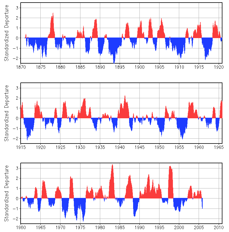
Unlike the standard definitions, I identify the Nino/Nina phenomenon as working together as a pump. In that pump the El Nino is the peak of the intake stroke, and the La Nina is the peak of the discharge stroke. We can see this activity in a graph of the temperature in the NINO34 region (blue rectangle shown in the graphs above).

Figure 11. Sea surface temperature in the NINO34 area. Blue sections show the times when the pumping action is occurring. Red dots show peak El Nino conditions, and blue dots show peak La Nina conditions. Dotted vertical white lines show November of each year.
I have highlighted in blue the times of the pumping action. What I first noticed about them is what the Peruvians noted about them. This is that they all start within a month or so of November, and thus are often strong near Christmas … hence the name “El Nino” for the boy-child.
I noticed another oddity. In all cases highlighted , the duration of the pumping action from the red dot at the top (peak “El Nino”) to the blue dot at the bottom (peak “La Nina”) is one year plus or minus a month or so. This allows us to distinguish the Nino/Nina pumping action from the normal temperature variations found anywhere in nature.
The regular ~ 12-month length of the discharge cycle also shows that the two (El Nino and La Nina) do not exist as independent entities. Instead, they are intimately tied in a single larger one-year-long phenomenon.
Now, recall that the question in functional analysis is, what does this single larger combined Nino/Nina phenomenon do?
I say that the El Nino/La Nina pump is an emergent phenomenon with a lifespan of 12 months. It emerges when enough heat is built up in the eastern equatorial Pacific Ocean. It cools the equatorial Pacific, and hence the entire planet, by
1) exporting the warm equatorial surface waters polewards where the heat is lost more quickly to space, and by
2) exposing the cooler subsurface ocean layer which cools the atmosphere.
So the function of the El Nino/La Nina alteration is to cool the earth by means of a periodic pumping cycle.
Like many other emergent climate phenomena, it is what I call “self-latching”. By this I mean that once the Nino/Nina pump starts, it creates conditions such that it strengthens itself, and thus tends to persist.
Here’s how that works. The strength of the trade winds in the equatorial Pacific is driven by the east-west temperature difference. Now, when the pumping action is underway, the east is getting cooler, and the warm water is piling up in the west. This increases the east-west temperature difference, which in turn increases the east–>west wind strength, which in turn increases the temperature difference, which …
This makes it self-latching, and this positive feedback is responsible for the long duration of the phenomenon once initiated. Once the Nino/Nina phenomenon begins, it generates its own wind. This allows it to continue to runs until the cold water is exposed all along the equator, as you can see in Figure 8 above.
Predictions and Conclusions
Now, any theory such as mine is only as good as its predictions. So how can I determine if the Nino/Nina is actually an emergent phenomena that cools the Pacific when excess heat builds up?
Well … we could start with the observation that the trigger for the pumping is the buildup of heat in the eastern Pacific. So the form of the phenomenon obviously is temperature-limiting (cooling) and thermal-threshold based (happens more when it’s warmer).
What I’d never figured out until this analysis was how to determine whether the Nino/Nina pumping phenomenon as a whole was more frequent or more powerful or both in warmer times than in cooler times. The problem is that we already know that it is triggered by excess heat … but does it increase when the excess heat increases? And how would you measure that increase?
What I realized is that if the pumping increases in warmer times, such as the current post-1981 Reynolds SST record of a gradual slight overall ocean surface warming, we should see differential heating trends in the Pacific.
And what the pattern of larger and smaller trends should look like is what it looks like after a complete pumping cycle—the areas on the way to the pole should show warmer trends, and the eastern Pacific should be cooler. If there is an increase in the number of Nino/Nina cycles, the transfer of energy will show up in the trend. The trend should be smaller in the area along the Equator where the pump exposes cooler water, and the trend should be larger where the pump moves the warm water, which is westwards and towards the poles.
Here’s how that played out at the end of the large 1997-1998 Nino/Nina cycle. I repeat Figure 8 from above to here for comparison.

This is Figure 8 from above.
And here are the sea surface trends during a 36-year period when, as the figure below shows, there’s been a slight SST warming (0.10°C per decade).

Figure 12. Decadal sea surface temperature trends.
My conclusion from the distinct similarity of those last two graphs is that the prediction from my theory is correct—the Nino/Nina pump is indeed a temperature-regulating emergent phenomenon, which opposes any increase in overall tropical Pacific temperature.
Here, the first rain came yesterday after a long dry “fiery but mostly peaceful” wildfire season here … the forest smells of growth, green life, and decay are particularly strong this evening, reminding me of the endless cycles of creation and destruction.
My best regards to everyone,
w.
Post Scriptum: When you comment please quote the exact words that you are discussing. This helps avoid the endless misconceptions that plague the internet. For more info regarding how you can show that I’m wrong, see my post Agreeing To Disagree.
Willis,
Another brilliant and thought provoking analysis.
Figure 1 is stunning to watch, particularly the land-locked Mediterranean and Black Seas showing how rapid the annual heating and cooling cycle must be.
Agree with Philip. Very interesting Willis. Great illustrations.
Request for Willis: it would be great to have the same figures (inclusive that fascinating figure 1) in the projection with a ‘Full Atlantic’ in the center. I am guessing that we can get a glimpse of the oceanic movements that cause the ‘warmer than normal’ North Atlantic subsurface inflows into the Arctic ocean: the inflows that cause Arctic ice melt and that are changing a lot of weather patterns over the North Atlantic and Arctic (and recently: over north east Asia).
My guess: given the warm patch in the North Atlantic during La Nina (figure 8) the warm water pulses into the Arctic could have been connected with strong La Nina’s. In that case the ‘Atlantification of the Arctic’ will now get another impulse and than it becomes more clear that we definitely entered ‘The Little Warm Age’.
Given the fact that weather (and so climate) becomes more unstable when the Earth’s oceans are cooling down (what already is happening during the last 6000 years) and variability enhances (Warm is stable – Cold is change *) the new ‘Little Warm Age’ would be a next step in the higher variability belonging to a possible slipping into the next glacial.
To compare: the relatively stable Holocene Climate Optimum followed the rapid rise after the Last Glacial Maximum. After a long period of gradual cooling we seem to have entered a new era with higher variability. Step one: Little Ice Age. Step two: Little Warm Age.
* https://wattsupwiththat.com/2017/08/01/warm-is-stable-cold-is-change/?t=1&cn=ZmxleGlibGVfcmVjcw%3D%3D&refsrc=email&iid=ca5651547f3243248a860b11d89d8a44&uid=434002280&nid=244%20281088008
Win
The weather and climate are never stable, what you state is a fallacy. It is always moving.
Given that the majority of the past 100,000 years has been considerably colder than present, something or someone is fiddling with the thermostat, or do we have multiple thermostats. If we go back 20,000 years into deepest glaciation, how relevant is the current theory.
With regards.
Martin Cropp: “something or someone is fiddling with the thermostat, or do we have multiple thermostats”
WR: The Earth is like a house with many rooms. You can close a curtain in one room and the Sun cannot come in (albedo change). In another room a door or window could be opened and warm air from different parts of the house is able to disappear into the open air. Many processes are happening in the same moment. Many thermostats are working at the same time: from the one that causes a dust devil to the one that causes the La Nina/El Nino system to perform.
The big natural power where Glacials are the result from is the change in insolation over latitudes (Milankovitch cycles). Instead of being absorbed at higher latitudes more Sun rays are received by tropical waters. While open tropical waters can’t exceed a yearly 30 degrees that extra heat is whether reflected by clouds or in second instance removed from the surface by the thunderstorm mechanism. So the extra energy that is received by the tropics never will make it to the higher latitudes: they cool, their oceans cool and the deep oceans cool. And colder deep ocean water is welling up into the tropical surfaces. Furthermore: less water vapor fills the air over the colder higher latitudes and surface energy can more easily escape into space. The Earth as a whole cools. Until more energy is received by the higher latitudes.
The big power ‘Insolation’ constantly changes over latitudes and is constantly changing temperatures everywhere, leading to a myriad of reactions we call ‘weather’. And the average of thirty years of weather is (by definition) called ‘climate’. Because big natural powers change constantly (insolation over latitudes) weather and climate have to change constantly. Weather adapts instantly on changing circumstances. By consequence Climate has never been stable. The idea that climate CAN be stable is the big fallacy.
I would gladly chip in towards Branson’s one wayfarer
Thanks, Willis, for a very informative and interesting article on an area little explained.
Sadly the NOAA pictures fig 2,3 and 6 are stupidly simplistic and inaccurate.
The thermocline shown seems to be supposed to represent some kind of typical equatorial section but is stretched in a uniform way from pole to pole. That is garbage. As we see from the DATA driven representation in fig 9 ( Triton ) it is not even constant across the tropics wrt latitude.
The supposed west to east convection shown in those pics is misleading. Convectional rise across the tropics causes air from higher latituded ( both N and S ) to move away from the equator at altitude and thus the return towards the equator near sea level. That is the famous Hadley circulation. It is then Coreolis forces which divert that movement towards the equator to the west in both hemispheres. This can clearly be seen on maps of wind direction.
The convection happens NS and SN, not WE as shown.
Does the person who drew these illogical misrepresentations no know how tropical circulation works, or have they simplified it to the point presenting disinformation in an attempt to explain it to a population for whom they have total contempt and for whom gross misrepresentation does not matter?
Figure 9 also shows how bands around +/- 10 deg latitude get warmer during La Nina, this will reduce convection and reduce the strength of easterly ( westward ) winds.
The 2D convections shown by NOAA pictures would be strongest during when E. Pacific is coolest and WPWP is hottest. This would reinforce the easterlies and there would never be a return flow of warm surface water.
Once the strong easterlies subside, warm water can flow back from the WPWP and an El Nino event begins.
It may not shock readers here that NOAA to not care about facts, logic and science, their main mission is elsewhere now.
“The supposed west to east convection shown in those pics is misleading”
Greg,
Great comment.
Slight niggle it’s SW and SE for the upper air return flow in the Hadley cells.
Thanks for your reply. I was breaking it down. It is the deviation caused by Coriolis forces which turns the basically NS/SN return flow in the SW,SE that you correctly state. Looking maps of wind direction you can see that curvature. If you draw a straight line to summise the “average” direction it will be as you state.
There is an increasing EW component to the wind velocity vector due to Coriolis.
Willis does not cover what breaks the “latch” effect he describes.
Looking at his fig 8 we can see the neg anomaly along the equator and the +ve anomaly in extra tropics ( esp. in SH ). This is what reduces Hadley circulation and reduces the Coriolis driven component of the easterly trade winds.
Greg,
I agree. We are looking for the latch on the floodgate.
Your diagram clearly shows that the flood is driven by the SET.
Have a look at the region of the North Pacific south of Guatemala. The cold patch there is clearly under the influence of the NET. Is this the trigger point? The question is – Why November?
The convective circulation West East is called the ‘Walker Circulation’
https://www.climate.gov/news-features/blogs/enso/walker-circulation-ensos-atmospheric-buddy
The Hadley cells are not consistent around the equator and there are other perturbing ’emergent’ phenomena and the Walker Cells are one of them. So the Hadley cell over a hot west Pacific is stronger than the Harley cell over the East Pacific – leading to a skew in the Hadley circulation which viewed as a slice West-East is the Walker Cell.
It is a complex 4 dimensional world.
“My heresy is that I do not think that temperature is a linear function of greenhouse gas forcing.”
The IPCC acknowledges that this is not the case and they defer to approximate linearity centered on the mean. Unfortunately, the assumption of approximate linearity around the mean infers strict linearity that they deny is being inferred because they want to call the average not accounted for by the incremental analysis the ‘power supply’ that that powers gain from massive positive feedback. Of course, the average power not accounted for by the incremental analysis is already accounted for by the average temperature that’s also not accounted for.
I’m not sure that even the IPCC think there’s much of a correlation between CO2 and temps, if they understand what they’re saying. In one of their ARs, they described the climate system as “coupled, non-linear and chaotic”. If they’re serious about these words, then I don’t know how they can make predictions at all.
The IPCC doesn’t even grasp the most basic consequences of COE. They define a sensitivity metric called ‘alpha’, expressed as W/m^2 per degree, and define wildly different ranges of values depending on the nature of the W/m^2. It seems to be news to them that 1 W is 1 Joule per second and that forcing from anything other than the Sun can only be legitimately quantified as being equivalent to some amount of actual (solar) forcing keeping the system (i.e. CO2 concentrations) constant. If there’s any uncertainty, it’s in the W/m^2 of equivalent forcing attributed to a change to the system and not in the effect that W/m^2 of equivalent forcing has on the temperature, which has one and only one value which can only be relative to solar forcing.
The measured surface emissions sensitivity is about 1.62 +/- 1% W/m^2 of surface emissions per W/m^2 of solar forcing which at an average temperature of 288K is about 0.3C per W/m^2 corresponding to an alpha of 3.3 +/- 1% W/m^2. The rest of the uncertainty added to ‘alpha’ and adjusting its mean to about 1.25 is all a consequence of re-centering around misapplied uncertainty arising from a failure to understand that a Joule is a Joule and each can perform only 1 Joule of work.
BTW, I pointed this out in my review of AR6 and it was summarily ignored.
“I was told that this is called a “functional” analysis of a situation” You never let me down Willis. Now I know why I’ve been looking at this world the way I do. Thank you & I’ll raise a pint to you.
Willis,
Please post the Latitude vs % Out data for the line shown in Figure 10.
Will do, Philip, running fast at the moment.
w.
Thanks.
OK, here you go. Comma separated, just copy and paste into a spreadsheet. Left column is latitude band, +N/-S. Second column is the percentage of upwelling surface radiation making it to space.
w.
+89.5, 78.1
+88.5, 78.4
+87.5, 78.0
+86.5, 77.9
+85.5, 77.8
+84.5, 77.7
+83.5, 77.6
+82.5, 77.0
+81.5, 76.5
+80.5, 76.7
+79.5, 76.6
+78.5, 76.2
+77.5, 75.5
+76.5, 74.7
+75.5, 74.4
+74.5, 73.9
+73.5, 73.6
+72.5, 73.4
+71.5, 73.1
+70.5, 72.8
+69.5, 72.6
+68.5, 72.6
+67.5, 72.5
+66.5, 72.1
+65.5, 71.5
+64.5, 71.0
+63.5, 70.2
+62.5, 69.6
+61.5, 68.9
+60.5, 68.1
+59.5, 67.1
+58.5, 66.5
+57.5, 66.3
+56.5, 66.2
+55.5, 66.0
+54.5, 65.7
+53.5, 65.5
+52.5, 65.4
+51.5, 65.2
+50.5, 65.0
+49.5, 64.8
+48.5, 64.5
+47.5, 64.1
+46.5, 63.8
+45.5, 63.3
+44.5, 62.9
+43.5, 62.5
+42.5, 62.2
+41.5, 61.9
+40.5, 61.4
+39.5, 61.0
+38.5, 61.0
+37.5, 60.9
+36.5, 61.0
+35.5, 61.2
+34.5, 61.1
+33.5, 61.1
+32.5, 61.0
+31.5, 61.0
+30.5, 61.0
+29.5, 60.9
+28.5, 60.8
+27.5, 60.7
+26.5, 60.4
+25.5, 60.4
+24.5, 60.4
+23.5, 60.3
+22.5, 60.1
+21.5, 59.8
+20.5, 59.5
+19.5, 59.3
+18.5, 58.9
+17.5, 58.5
+16.5, 58.0
+15.5, 57.5
+14.5, 56.9
+13.5, 56.3
+12.5, 55.5
+11.5, 54.7
+10.5, 53.9
+09.5, 53.1
+08.5, 52.5
+07.5, 52.1
+06.5, 51.9
+05.5, 52.0
+04.5, 52.4
+03.5, 52.9
+02.5, 53.6
+01.5, 54.3
+00.5, 54.9
-+00.5, 55.1
-+01.5, 55.2
-+02.5, 55.1
-+03.5, 55.3
-+04.5, 55.3
-+05.5, 55.5
-+06.5, 55.7
-+07.5, 56.0
-+08.5, 56.5
-+09.5, 57.0
-+10.5, 57.5
-+11.5, 58.0
-+12.5, 58.5
-+13.5, 59.0
-+14.5, 59.4
-+15.5, 59.8
-+16.5, 60.2
-+17.5, 60.5
-+18.5, 60.8
-+19.5, 61.0
-+20.5, 61.1
-+21.5, 61.2
-+22.5, 61.2
-+23.5, 61.2
-+24.5, 61.2
-+25.5, 61.1
-+26.5, 61.1
-+27.5, 61.0
-+28.5, 60.9
-+29.5, 60.8
-+30.5, 60.8
-+31.5, 60.7
-+32.5, 60.7
-+33.5, 60.6
-+34.5, 60.6
-+35.5, 60.5
-+36.5, 60.5
-+37.5, 60.4
-+38.5, 60.4
-+39.5, 60.4
-+40.5, 60.5
-+41.5, 60.7
-+42.5, 60.9
-+43.5, 61.1
-+44.5, 61.4
-+45.5, 61.6
-+46.5, 61.9
-+47.5, 62.0
-+48.5, 62.2
-+49.5, 62.4
-+50.5, 62.6
-+51.5, 62.7
-+52.5, 62.9
-+53.5, 62.9
-+54.5, 63.0
-+55.5, 63.0
-+56.5, 63.1
-+57.5, 63.3
-+58.5, 63.4
-+59.5, 63.7
-+60.5, 64.1
-+61.5, 64.4
-+62.5, 64.9
-+63.5, 65.6
-+64.5, 66.5
-+65.5, 67.5
-+66.5, 68.8
-+67.5, 70.8
-+68.5, 73.3
-+69.5, 75.7
-+70.5, 78.1
-+71.5, 79.6
-+72.5, 81.2
-+73.5, 83.5
-+74.5, 85.2
-+75.5, 86.7
-+76.5, 88.3
-+77.5, 90.0
-+78.5, 91.6
-+79.5, 92.3
-+80.5, 92.7
-+81.5, 92.5
-+82.5, 92.5
-+83.5, 92.4
-+84.5, 92.2
-+85.5, 92.6
-+86.5, 94.3
-+87.5, 96.2
-+88.5, 98.4
-+89.5, 98.8
Willis,
Got it.
Beautiful data.
Thanks
Willis, although the percentage increases towards the poles, the actual amount of heat being radiated must still be much less at the poles than at the equator. It would be interesting to see how much this is and how much it increases during a pump cycle to see if it can have any appreciable effect on global heat.
Is there a long enough period of cooling (e.g., 1945-75) with sufficient data to test your theory under different conditions?
Mmm … good question. There is a longer SST dataset, the HadSST dataset. However, our knowledge of the sea surface temperatures in the pre-satellite period is spotty both in time and space. That’s why I’ve used the Reynolds OI SST dataset, it starts in 1981.
It does make me think that I can look further to see shorter-term trends and how well they line up … so many drummers, so little time …
w.
This graphic suggests that the warmer last century lacked strong La Nina’s. Even when taking into account the pattern of general warming. El Nino’s dominated, especially since 1975.
Thanks, Wim. As I said above, the traditional way of looking at the El Nino/La Nina phenomenon is the way you are doing, considering them in isolation.
As I also said, me, I don’t look at it that way. I see the important question as being how much gets pumped, not whether the NINO34 area is somewhat warmer (traditional El Nino) or somewhat cooler (traditional La Nina). However, the pumping action requires a transition from Nino to Nina, they only work in pairs.
And the amount pumped isn’t dependent on whether there are more traditional Ninos or Ninas. The amount pumped is some unknown function of the ~ November to the following ~ November difference between the Nino and the Nina temperatures.
w.
Willis: “And the amount pumped isn’t dependent on whether there are more traditional Ninos or Ninas. ”
WR: We don’t differ in vision I think. But it still is interesting to look from the following view points:
1. Although I agree that the system is a unity that is constantly adapting to changing circumstances, I myself tend to mention La Nina first. Here the first visible step is made: warm water is blown to the Asian side where it cannot easily disappear
2. When ‘something’ (for example winds from the opposite direction) is preventing sufficient loss of the stored warm water to higher latitudes we can see this as ‘a frustration of the pole ward energy transport’. Finally a ‘correction’ has to be forced: the El Nino that again spreads the stored warm water layer over the oceans after weather patterns changed because of the horizontal extension of the warm piled up water.
Ocean currents change slowly, reacting slowly on changing weather systems. Because oceans react with delay the build-up of heat near Asia can continue years before the correction (El Nino) takes place. First weather patterns must change when transport to higher latitudes is insufficient.
I myself tend to mention La Nina first. Here the first visible step is made: warm water is blown to the Asian side where it cannot easily disappear
The warm water on the East Pacific side actually runs north on the Kuroshio current along Japan and North to the Arctic which is why that current trends warmer in La Nina years.
Heat pumps – very popular these days. You are very on-trend, Willis!
Being a heretic isn’t as dangerous as it once was. 🙂
Freeman Dyson described himself as a heretic. link
Willis has lots of heresy! Start with the title of this post; “Boy Child – Girl Child.”
They must certainly have a choice, and it is dangerous to determine which is which!
Is SARC necessary?
It’s not obvious to me what your conclusion is. I think most people already thought of Nino/Nina cycles as ocean releases and absorptions of heat, but in the long run the net effect on the global average surface temperature was near zero.. Since 1998, the net effect does not seem near zero, but that may be too short a period for analysis.
Seeing that you are calling yourself a climate heretic, it seems that I will have to call myself a climate lunatic — I like global warming, and want more of it. My plants like more CO2 in the air, and want more of it. The only bad news I recognize about global warming is the expense and actions taken to “fight” it. We’ve had intermittent warming since the late 1600s. Who was hurt? No one. I guess that’s too much good news for leftists to handle — they love to be miserable.
Well said Richard. Lukewarmers like Willis are not our friends. They can see CO2.
Cue The Twilight Zone music.
leitmotif, I’m many things, but a “lukewarmer” is not among them. Nor can I see CO2. It appears you’ve mixed me up with Greta, probably because we’re both so gosh-darn good looking.
w.
Willis “lukewarmer” Eschenbacher
Based on leftist logic (an oxymoron, if there ever was one), the fact that you DENY being a lukewarmer is proof that you ARE a lukewarmer.
I want the ocean to be less cold.
Our ocean is currently about 3.5 C
I think it would be better if our ocean was about 4 C.
It should take more than century for ocean to warm by about 1/2 a degree.
What happens if ocean warms to about 4 C?
The arctic ocean should frequently be ice free during the Summer.
And it’s possible that Sahara desert could start to green.
If ocean were to warm by 1 C, definitely have ice free arctic waters in Summer, and the Sahara desert will green.
Global climate {or global temperature} is all about the temperature of the ocean.
The joules of heat needed to heat the ocean by 1 C, is about same adding 1000 degrees to the atmosphere temperature.
And the only thing vaguely correct about climate science is:
“More than 90 percent of the warming that has happened on Earth over the past 50 years has occurred in the ocean.”
https://www.climate.gov/news-features/understanding-climate/climate-change-ocean-heat-content
And “more than 90 percent…” is probably more than 95%.
Our ocean was a bit colder during the Little Ice Age, and it’s been warming up for more than 100 years.
And our ocean was quite a bit, perhaps as much .5 C over 5000 years ago.
Or, wiki: “The Holocene Climate Optimum (HCO) was a warm period during roughly the interval 9,000 to 5,000 years BP, with a thermal maximum around 8000 years BP.”
was due to warmer ocean {about 4 C}.
And 5000 year trend has been cooling and possible we will not naturally return the warmer times of Holocene Climate Optimum. But it would be nice, if we did.
gbaikie
“I want the ocean to be less cold.”
–
Kenny Rogers time.
Willis,
Is it the North-East Trades (NET) or the South-East Trades (SET) that does the November triggering?
(Could be both of course). Looking at the animation in Figure 1 I recon that it is the NET that is the trigger and the reason is that in November the Andes are blocking the air flow from the Atlantic basin into the Pacific. So, when the winter Caribbean cools below 28C (does not happen every year) the NET strengthens across the Central American isthmus.
Philip, as I said, I’ve focused on what it does rather than exactly how it does it … so I fear I can’t answer your question. I do know that as with many emergent phenomena, it’s a bitch to predict …
w.
Philip: “Is it the North-East Trades (NET) or the South-East Trades (SET) that does the November triggering?”
WR: Looking to this map at this moment the South-East Trades are blowing the warm surface layer away:
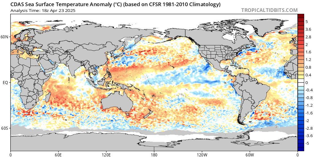
(from overview: https://www.tropicaltidbits.com/analysis/ocean/)
To add to my earlier comment: I don’t know about which winds were dominating earlier La Nina’s but this La Nina is a typical Southern Hemisphere one – so far. The last four decades nearly all ocean cooling seems to be concentrated on the SH: see figure 12, decadal SST.
One could also say: we miss a kind of La Nina effect on the NH. The Arctic has been warming, the pole to equator gradient diminished over the NH and the northern part of the Hadley cell functions weaker: NE trade winds slow down and less cooling of the NH oceans results.
Cold upwelling over the NH is not well visible at this moment of the year, but perhaps because of the NH autumn/winter season. Upwelling patterns are season influenced.
“the South-East Trades are blowing the warm surface layer away”
Thanks Wim.
Very useful image.
This is why i love this site.
I’ll drink to that! Pass the beer, not the kool aid!!
Thank you, Willis, for finally resolving that nagging disconnect regarding definitions that has escaped resolution for so long. I did not feel comfortable being described as a “skeptic” since I am a staunch BELIEVER in science. THEY are the skeptics, and since they think they own the GlowBULL Warming Orthodoxy, that makes US heretics….we are ALL Willis now.
Sir – Two questions:
1 “the Nino/Nina pump is indeed a temperature-regulating emergent phenomenon, which opposes any increase in overall tropical Pacific temperature”.
OK, I’ll buy that, but please – for a dumb old man – tell me; what are the implications of that for climate science? Are you implying that the more the environment heats up, the more effective will be the Nino/Nina mechanism at cooling it down again? Ie if this is a _real_ scientific theory (which it certainly appears to be) then there is the possibility for predictions and falsification. Is there any historical data you can use, and correlate with some of the measurement of “the hotness of the environment”? I imagine not, but if you or anyone can suggest any such link I would be intrigued.
2 “Ocean-wide circulation shifts such as the Pacific Decadal Oscillation (PDO), Atlantic Multidecal Oscillation (AMO) and the like” I’m not trying to be smart here, but is it possible to assess what impact (if any) these have on the Nino/Nina mechanism? If so, do you think it would have a large or small effect? Do you think there is any cause and effect relationship between PDO/AMO and Nino/Nina, or are they just separate phenomena?
Perhaps that is half a dozen questions, not two. Maths was never my strong point. Anyway, thank you for your analysis and for such a clear and thought-provoking paper.
OldCynic November 8, 2020 at 3:23 pm
OC, good questions. I came up with a theory a while ago, which was that a host of emergent phenomena actively regulate the earth’s temperature and keep it in a fairly narrow range. Since that time I’ve been amassing evidence to back it up, starting with my first post on the subject, entitled The Thermostat Hypothesis. It was followed by a paper in Energy & Environment here.
Since then I’ve collected and posted up a wide range of evidence to support the thermostat hypothesis. There’s an index to my work here, and the section about how emergent phenomena regulate the temperature is here.
You continue:
The relationship between the PDO and the Nino/Nina is interesting. The PDO has two states, a warm state and a cool state. These are not unlike the two extreme poles of El Nino and La Nina.
You can see the similarities, so obviously there is some relationship. The PDO seems like a really slow oscillation between the two El Nino states … go figure. The relationship between the two is not well understood.
That’s why I try to avoid maths in my explanations unless they’re necessary. And maths or not, you ask good questions.
w.
You’re way beyond heresy. This a great insight.
Willis, a compelling analysis!
In a sense, the solar ‘cycle’ runs on similar rails.
Thanks, Leif, always good to hear from you.
w.
Leif, I am curious how you would explain the temperature variations we observed in the Greenland ice core record during the Holocene. Solar? Internal variability of some type? Measurement error? It seems the data rules out variations in CO2 concentrations. Thanks
“My heresy is that I do not think that temperature is a linear function of greenhouse gas forcing.”
…
Most orthodox climate scientists agree with you on that point. They contend that both the ECS and TCS is dependent on a doubling of the concentration of CO2. That makes termperature a non-linear relationship to the concentration of C02. Forcing is measured in w/m2 not degrees. Do the math.
“Do the math”? Snide much? Here’s the math.
The formula involving the so-called “climate sensitivity” is
∆T = λ ∆F
where T is temperature, F is forcing, and lambda λ is the climate sensitivity. As you can see, this is a LINEAR relationship.
I discuss the derivation of this formula in my post “The Cold Equations” … wherein I invite you to do the math …
w.
w.
That formula is clearly an approximation and only valid for small values of Delta F. It is know that
a blackbody radiates as T^4 and so clearly the statement that “Delta T = lambda Delta F” is just a
Taylor series approximation to the correct equation.
I know that, Izaak, and your objection is well founded, but THAT’S THE FORMULA THEY USE.
w.
You see why Willis always requests quoting what it is you disagree with. Maybe he needs to add that you also need to read it.
None of your “emergent phenomena” adequately explain why in the past 100 years global temperatures have risen.
Be very happy with that warming.
The opposite would have been a disaster for humankind.
They haven’t only risen, have they? What about the period from the 1940s to 1970s?
And so remarkably little overall. How do you know that you are not just looking at the warming phase of a cycle? Like observing NH temperatures from March to August and concluding that temperatures are rising 6 degrees per month so that by January it will be 60C and everyone will be dead.
bethan456@gmail.com November 8, 2020, at 4:07 pm
Bethan, I got into this climate lark from a curious observation. As a result of my work with governed heat engines, I noted that compared with the governed systems I was familiar with, the global temperature actually varies little.
When analyzing the performance of a heat engine, you have to use temperatures in Kelvin. Nothing else works. And when you look at the temperature anomaly (temperature with seasonal variations removed) of the earth in Kelvin over the last century or so, you notice a funny thing:
The oddity is not that the temperature is rising. The oddity is that it varies so little. In the graphic above, the global average surface temperature is 287.0K ± 0.4% … less than half of a percent variation over a hundred and fifty years.
Now, remember that it’s not uncommon for temperature in a given location to vary by 60K in a short time, which is about 20%. So clearly the cause is not thermal inertia … and over 150 years any inertia would play out.
So the puzzle I was trying to solve was, why is the earth’s temperature so stable? I figured that this must be the sign of some kind of “governor”, like the cruise control in a car. Now that cruise control is sophisticated computer control, and if I’m going 50 mph keeps it within about ± 2 mph … which is ±4%, ten times sloppier than the control of the earth’s temperature (± 0.4%).
So you’re 100% right. My hypothesis doesn’t say why the temperatures have risen.
It does, however, explain why they’ve only risen by less than one percent …
Best regards,
w.
First, I enjoy your “heretical” posts and your curiosity Willis, always look forward to them.
I do take issue with that graph. There is a signicant pattern, but presenting the data like that just unnecessarily obscures it. A graph of the Earth’s mountain ranges would be similarly obscure with an inappropriate scale – say distance from the Earth’s centre – interesting, but not very informative. There has been a significant warming in recent decades and the oceanic warming trend especially looks unwavering. I don’t think that amount of energy injected into the surface layers can just be trivialised and expunged with a straight line.
I do have a question about dust-devils. I undertsand the mechanism your are pointing out but I’m surprised you include them in a list with other factors that look far more important. They don’t appear that powerful or to contribute much. What am I missing?
Thanks, Loydo. I had a very important point to make, which is that the variation in temperature is trivially small. To see that, you have to look at the earth as a giant heat engine that turns solar energy into physical work. And when you look at variations in a heat engine, or many other things to do with a heat engine, you need to use kelvin.
And when you do that, you’ll notice what I noticed, which is that the temperature only varied over the last 150 years by less than half of one percent. So I would submit that the “significant warming” you are on about isn’t “significant” in the slightest. Oh, it might be significant to humans … but I’m not trying to understand humans. I’m trying to understand the magnificent climate heat engine, and for that … sorry, not “significant”.
As to the dust-devils, I’ve never been able to find any good estimates of how much energy they move. Suggestions welcome. However, given that you can see them on any afternoon most anywhere the soil gets hot, I’d suggest that they have an effect out of proportion to their number.
In part, this is because like all of these emergent phenomena, they don’t cool random spots on the planet. Instead, they selectively cool only the warmest spots, and as a result, they’re able to move a lot of heat.
For more thoughts on these charming dust-devils, see my post entitled “The Details Are In The Devil“, where I discuss some of these issues at length.
Best regards,
w.
“As to the dust-devils, I’ve never been able to find any good estimates of how much energy they move. Suggestions welcome.”
I don’t know either. But two points.
1. Glider pilots use dust devils as markers for rising thermals they can use to gain altitude. One suspects that they might represent a fair amount of energy overall in order to lift several hundred kilograms of aircraft and pilot thousands of meters.
2. Many, many years ago I witnessed a curious phenomenon that I’ve never been able to explain. On a pleasant Winter day I was sitting on a mountain side in the Mojave desert splitting open shale looking for trilobite fossils. Although it was quite nice on the South slope of the mountain where I was, there was a wicked and rather chilly North wind — maybe 30 knots — blasting the other side of the ridge. It was raising dust clouds on the playas South and West of me and blowing the dust along in clouds somewhat like the duststorm in the movie The Mummy albeit not so big. Several times I saw one of these clouds slow down, mill about, and then go swirling off as a dust devil.
How is that possible? Beats me. But it does suggest to me that a dust devil might contain very roughly the energy of 10 or 20 seconds of a stiff wind over a front of a few tens of meters.
Nice article by the way. As always, the graphs are remarkably well done.
Don –> I think what you saw was a tornado. It sounds very much like a rolling wall cloud that spawns a tornado here in the midwest.
“What am I missing?”
Scale invariance.
Can you elaborate a little?
“Can you elaborate a little?”
No, do your own thinking.
The K chart (November 8 at 6:36pm comment) says “anomaly” in the title but appears to be an absolute temperature xhart.
Richard, it’s both. It is not the actual temperature data, because the seasonal variations have been removed. That makes it an anomaly, and I’ve aligned it with the overall average temperature.
w.
That process seems too complicated.
Wouldn’t an annual average for each year smooth away the seasonal trends?
Also, most data before 1920 are for the Northern Hemisphere, with lots of wild guesses for the Southern Hemisphere. I have a problem with anyone claiming to know the global average temperature before 1920 … and the data quality is still bad — non-global — until after World War II. Then the quality improves to mediocre, until 1979, when satellite data (not used in your chart) become available — the only near global data ever available, measured in a consistent environment, where the greenhouse effect actually occurs.
The temperature numbers prior to 1979 are not accurate enough for real science, nor can the margin of error be calculated, because the wild guess infilling, still in progress today, can never be verified. In addition, NOAA makes hundreds of “revisions” every month.
At least your chart does not grossly exaggerate tiny 0.1 degree C. temperature changes that no human would ever notice, unlike the usual “official” anomaly charts with a total range of of only 1 to 1.5 degrees C.
“It does, however, explain why they’ve only risen by less than one percent …”
Well it’s regarding the atmosphere. But what controls the average atmosphere is the heat of the ocean.
Heat of ocean controls how warm or cold the small region of near the poles.
Or polar amplification is considered large factor of “global warming or cooling”.
Or we in an Ice Age. We in Ice Age because we have a cold ocean.
An ocean with an average temperature of 10 C, is no where near an Ice Age.
But it’s not as though 10 C is particularly warm, but simply can’t be in Ice Age with such warm ocean and you are not going to have any polar sea ice [or ice shelves]. One would have enormous ocean thermal expansion.
But in our Ice Age which no one thinks we going to leave within tens of thousands of year, the ocean temperature stays within a temperature of 1 to 5 C,
and currently about 3.5 C. If ocean were to somehow warm to 5 C, that be a lot thermal expansion of ocean- about 1 meter- though the land would probably be wetter, and that would substract from such sea level rise.
More 90% of global warming is warming the ocean, or if focused on air, one looking less than 10% of global warming.
Just as an aside, the average global temperature can only do one of three things:
A) Rise.
B) Stay the same.
C) Fall.
Logic demands it.
Now Willis has correctly observed that, relative to local temperature variations, the average global temperature has consistently done B for a very long time.
But it isn’t perfectly constant (which would be an incredible observation). And for the last half century or so, or last half millennium, pick your timescale for the purpose you are making the analysis, it has done A – not C.
Well, that’s a 50-50 choice. Which isn’t that remarkable. In a chaotic system it is quite reasonable to say it is without any meaningful explanation.
Why do you think it is significant?
When the local temperature exceeds a certain level, they emerge and cool the surface down in a wide variety of ways.
Bingo! An analogy is an industrial furnace. The hotter the furnace is required to be, there will be more & more energy required to maintain the temperature because heat finds more and more ways to escape as temperature rises. What it amounts to is the furnace and the world can only get so hot.
I totally agree.
Ah, but warmists will take your analogy and say: “But adding CO2 is like adding insulation to your furnace and causes the furnace to get hotter for the same quantity of energy added.”
Of course adding an infinitesimal amount of insulation would lead to an infinitesimal increase in furnace temperature.
Same for CO2 and the Earth’s climate, or in warmist speak, average temperature anomaly.
And to an earlier comment from Loydo, why do “Climate Scientists” insist on NOT using the K scale. They always set the graphs at a scale that greatly increases the shock value of temperature increases that are less than the accuracy of their measurement devices.
Great paper again Willis worthy of a beer, will buy you one if allowed to ever travel again.
My point is that looking at Fig 11 and where we sit now we are just in November and entering what looks like and told so a La Nina. We are at a low temperature start point relatively are we not. What of our future if this were the case.
You have skirted the predictive portion of any discussion is there one?
The changes in global weather related to the Nino/Nina swings is a complicated question. For example, from memory there’s a positive correlation with North Atlantic temperatures. It affects tidal levels all across the tropical Pacific. But there’s a huge variation from place to place, with some seeing warming and others seeing cooling.
So whatever happens … always remember, I predicted it … just kidding. I discussed some of these effects in a post called “The Power Stroke“, q.v.
w.
REGARDING THE FULL-GULAG COVID-19 LOCKDOWN SCAM – IT’S THE BEGINNING OF THE GLOBAL DICTATORSHIP PLAN.
POSSIBLE LEAKED ROADMAP FOR THE NEXT PHASE OF THE AGENDA
https://www.youtube.com/watch?v=lKCTkLJbtT4&feature=youtu.be
20 minute video – Premiered Oct 20, 2020.
TO BE TRULY HUMAN IS TO BE TRULY FREE
https://www.youtube.com/watch?v=69-RncI_A3U
Last 2 minutes of the above video.
Here is my warning, published one year ago in Fall 2019, before the Canadian election.
THE LIBERALS’ COVERT GREEN PLAN FOR CANADA – POVERTY AND DICTATORSHIP
October 1, 2019 – My paper, edited with the Financial Post but not published in that paper.
https://wattsupwiththat.com/2019/10/01/the-liberals-covert-green-plan-for-canada-poverty-and-dictatorship/
THE RADICAL GREEN ROAD TO VENEZUELA – POVERTY, MISERY AND DICTATORSHIP
September 20, 2019 – My original paper – By Allan M.R. MacRae, B.A.Sc., M.Eng.,
https://wattsupwiththat.com/2019/09/20/the-radical-green-road-to-venezuela-poverty-misery-and-dictatorship/
Allan how is this relevant to Willis’ posting?
And if we’re weeks away from a panopticon dystopia, why are those videos still being allowed on YouTube?
Jeez, Allan, get a grip! This is likely an interesting set of links, but I have no interest in having them in the middle of a discussion of the Nino/Nina pump.
Regards,
w.
Very good article on Nino/Nina, thank you Willis. I’ve been watching the big La Nina develop for some months, and expect some very cold winter weather. I wonder if we’ll see a longer term shift in the PDO to cold mode and a stronger cooling trend for the next few years. That should pretty much end the global warming (CAGW) and green energy scams – for honest, rational observers.
What is happening in Canada is an indicator of where the Dems want to take the USA. Your election has been corrupted by huge voter fraud in key states, and that is just the beginning. It was obvious by early March that Covid-19 was a relatively mild flu, significantly dangerous only to the elderly and infirm. As you and I independently published on 21March2020, the full-Gulag lockdown for Covid-19 was not justified and we have now been proved correct. Both the CDC and the WHO have published recent data that greatly diminishes the danger of Covid-19, yet the lockdowns remain and even grow – and look more and more like deliberate scams.
I would ask that you read my links, I sent the video to the informant for my Sept-Oct2019 papers and he finds it credible and consistent with his mid-2019 information. Obviously, we would both prefer to be wrong about this situation and I would not publish if not concerned.
MackerelRae
Another wild comment on COVID.
Once again you act as if deaths of the elderly and infirm don’t matter.
Not that they are the only COVID deaths.
More important than deaths (perhaps 1 in 1,000 now) in my opinion, are those infected with COVID who suffer with flue symptoms, or serious flu symptoms (about 600 of 1,000).
The percentage COVID-infected patients who have serious symptoms, and need hospitalization, is far higher than a typical seasonal flu. The percentage of COVID hospital patients that need the ICU is also far higher than a typical seasonal flu,
You appear to dismiss all COVID suffering and hospitalizations as if they do not matter … unless there is a death.
You claim COVID is a mild flu, and that was obvious in “early March”
Both claims are still wrong.
Nothing was “obvious” about COVID in early March 2020.
And anyone who still claims COVID is a “mild flu” , after 244,000 Americans died, and deaths are still in progress, not to mention all the suffering by people who survived, is either heartless, or clueless. And that would be YOU.
Wrong RG. The true death count from Covid-19 in the USA was much less than 100,000, probably much less than 50,000 – the 244,000 number is false nonsense – it includes everyone who died while Covid-19 positive – including car crashes, heart attacks, cancers, etc. In Alberta and BC, 2-3 times as many people died from opioid OD’s as from Covid-19 – that does not include all the other deaths caused, not by Covid-19, but by the lockdown.
BTW RG, I am getting old and have great interest in the welfare of the elderly. I just do not ask that the young and the poor be destroyed – needlessly thrown under the bus – to protect me. The lockdown killed more than it saved, and many of those were young.
Told you so, ~8 months ago. I called it correctly on 21March2020* – NO LOCKDOWN! Covid-19 was a relatively mild flu except for the very elderly and infirm. Covid-19 is less dangerous to the general public than flu’s of recent decades that nobody remembers – the lockdown was a huge over-reaction, and probably a WHO scam.
Sweden correctly did not impose the full-Gulag lockdown and had low death rates and has now achieved herd immunity – forget a vaccine, all flu’s die because herd immunity is reached.
CENTERS FOR DISEASE CONTROL (CDC):
COMORBIDITIES PLAYED A HUGE ROLE IN DEATHS: OF THE ~200,000 AMERICAN DEATHS ATTRIBUTED TO COVID-19, ONLY ABOUT 6% WERE DUE SOLELY TO COVID-19.
https://youtu.be/7x-biB_JrcU
CDC Data: https://www.cdc.gov/nchs/nvss/vsrr/covid_weekly/index.htm
DID THE WHO JUST (ACCIDENTALLY) CONFIRM COVID IS NO MORE DANGEROUS THAN FLU?
https://www.zerohedge.com/medical/did-who-just-accidentally-confirm-covid-no-more-dangerous-flu?
by Tyler Durden
Thu, 10/08/2020
The World Health Organization (WHO) has finally confirmed what we (and many experts and studies) have been saying for months – the coronavirus is no more deadly or dangerous than seasonal flu.
My March calls:
21March2020 *Note: Willis independently made a similar call, also on 21March2020.
LET’S CONSIDER AN ALTERNATIVE APPROACH:
Isolate people over sixty-five and those with poor immune systems and return to business-as-usual for people under sixty-five.
This will allow “herd immunity” to develop much sooner and older people will thus be more protected AND THE ECONOMY WON’T CRASH.
22March2020
This full-lockdown scenario is especially hurting service sector businesses and their minimum-wage employees – young people are telling me they are “financially under the bus”. The young are being destroyed to protect us over-65’s. A far better solution is to get them back to work and let us oldies keep our distance, and get “herd immunity” established ASAP – in months not years. Then we will all be safe again.
RICHARD AND ALLEN, STOP WITH THE ETERNALLY CONDEMNED COVID!!! THIS IS NOT ABOUT COVID!!! TAKE YOUR DAMN VIRUS ELSEWHERE!!!
w.
This W.E. comment is evidence old man Eschenbacher is about to blow his top. Mr E., the comment storm trooper, and old geezer who chases children off his lawn, will soon be TYPING ALL CAPS DEMANDING THAT THE COMMENTS MUST NOT STRAY FROM THE SUBJECT OF HIS BELOVED ARTICLE. Just as sure as day turns into night. Mr. E. will lose his temper, and go berserk. I predict I will become a victim.
Basically is this suggesting that Niño/Niña might be a negative feedback mechanism on global temperature ?
That might be true but it is not a particularly effective one. The data Willis showed shows that
sea surface temperatures are rising by 0.1 degree per decade. Which if you think about the amount
of energy required to heat water is actually a very large increase in temperature.
Thanks, Izaak. Some back of the envelope calculations.
The ocean on average is absorbing some 533 W/m2 (CERES data) of energy. That’s 16.82 Gj/year per square metre.
Average ocean depth ≈ 3,600 m. Specific heat of seawater = 3.85 J/g. Run the numbers, if the ocean retained all the heat it is absorbing it would warm by 45°C per decade …
Yes, it does take a lot of energy to heat water, as you say … but on average each square metre of the ocean is absorbing 16,820,000,000 joules of energy per year, and that is a lot of energy.
w.
Willis,
Sunlight enters ocean water. Some places where the water is very clear one can look down many feet and see very well much of what is down there. That obviously means that some significant amount of the sunlight is reflected back out, thus not absorbed.
More often, over a great deal of the ocean, one can see very little from the surface. Perhaps this is because light is not reflected from below into the atmosphere, perhaps because surface reflections and distortions mask the image from below, perhaps because here is nothing near enough to the surface to reflect the light. Regardless of reason for visibility differences, do you mean the 533 W/m2 is the part of sunlight that is not reflected back into the atmosphere (as compared to the total amount of sunlight that enters)?
Andy, the 533 W/m2 is the amount of radiation (not just sunlight but including LW) that is actually absorbed by the ocean. More energy hits the surface, but as you point out some is reflected.
w.
Andy, the 533 W/m2 is the amount of radiation (not just sunlight but including LW) that is actually absorbed by the ocean. More energy hits the surface, but as you point out some is reflected.
At least in some places, some significant part of what enters beyond the surface is reflected. The fact that one can see the coral, fish, and such says that must be true. I guess that could be only where there is something within a certain small distance of the surface, say 100 to 200 feet but that complete absorption occurs in deeper water?
There doesn’t seem to be any controversy that IR only penetrates water about 10 microns, only about whether or not it can cause heating below that depth. Some claim IR on water only increases evaporation, removing the energy from the water, others believe the very thin absorbing layer must get mixed deep enough to be significant by wave action. If there are any verifications that heating of the bulk water occurs I haven’t run across them.
AndyHce November 9, 2020 at 1:20 pm
All of that reflected light, whether it’s reflected from the surface or the seafloor, is part of the reflected light that is measured to calculate the albedo.
There’s no “controversy” about whether LWR heats the bulk ocean except among certain fringe skeptical circles. As to verifications, see my post entitled “Radiating The Ocean“.
w.
Building up of heat itself of course is a negative feedback. If the Niña/Niño makes this feedback more efficient then that is very important towards predicting global temperatures over time.
LOL easy money La Nina coming
https://www.predictit.org/markets/detail/6234/Will-NASA-find-2020%E2%80%99s-global-average-temperature-highest-on-record
Not a bad paper, and thank you for your fine work….but here is what David Evans said about all that in 2008, its hardly a new idea and is exactly what I thought was going on. Here is DE’s excellent article.
https://sciencespeak.com/MissingSignature.pdf
Bemused, David’s paper is about the “hot spot” in the tropical troposphere that is shown in the climate models but not in radiosonde and other data. It’s an interesting issue, Christy and Spencer have also discussed it.
However, I’m totally unclear why you think this has anything to do with my post above.
w.
Hello Bemused
If you think that the article you linked to covers the same phenomena as Willis’ excellent post, you should really go back and read both of them again.
The best WUWT postings are from Willis. Always so disappointed when he gets to the weather report.
Thanks, Rich, appreciated.
w.
I have always considered the heating and boiling of water in the kettle a classic emergent phenomena. The water heats in a pretty linear function with the amount of energy being put into it. If you tracked the temperature rise from 20 deg to 98 deg C, you would see no real indication of what was about to happen at 100 degrees and the effective capping of the water temp (all at atmospheric pressure of course)