Guest Essay by Kip Hansen (with graphic data supplied by William Ward)
 One of the advantages of publishing essays here at WUWT is that one’s essays get read by an enormous number of people — many of them professionals in science and engineering.
In the comment section of my most recent essay concerning GAST (Global Average Surface Temperature) anomalies (and why it is a method for Climate Science to trick itself) — it was brought up [again] that what Climate Science uses for the Daily Average temperature from any weather station is not, as we would have thought, the average of the temperatures recorded for the day (all recorded temperatures added to one another divided by the number of measurements) but are, instead, the Daily Maximum Temperature (Tmax) plus the Daily Low Temperature (Tmin) added and divided by two. It can be written out as (Tmax + Tmin)/2.
Anyone versed in the various forms of averages will recognize the latter is actually the median of Tmax and Tmin — the midpoint between the two. This is obviously also equal to the mean of the two — but since we are only dealing with a Daily Max and Daily Min for a record in which there are, in modern times, many measurements in the daily set, when we align all the measurements by magnitude and find the midpoint between the largest and the smallest we are finding a median (we do this , however, by ignoring all the other measurements altogether, and find the median of a two number set consisting of only Tmax and Tmin. )
This certainly is no secret and is the result of the historical fact that temperature records in the somewhat distant past, before the advent of automated weather stations, were kept using Min-Max recording thermometers — something like this one:

Each day at an approximately set time, the meteorologist would go out to her Stevenson screen weather station, open it up, and look in at a thermometer similar to this. She would record the Minimum and Maximum temperatures shown by the markers, often she would also record the temperature at the time of observation, and then press the reset button (seen in the middle) which would return the Min/Max markers to the tops of the mercury columns on either side. The motion of the mercury columns over the next 24 hours would move the markers to their respective new Minimums and Maximums for that period.
With only these measurements recorded, the closest to a Daily Average temperature that could be computed was the median of the two. To be able to compare modern temperatures to past temperatures, it has been necessary to use the same method to compute Daily Averages today, even though we have recorded measurements from automated weather stations every six minutes.
Nick Stokes discussed (in this linked essay) the use and problems of Min-Max thermometers as it relates to the Time of Observation Adjustments. In that same essay, he writes
Every now and then a post like this appears, in which someone discovers that the measure of daily temperature commonly used (Tmax+Tmin)/2 is not exactly what you’d get from integrating the temperature over time. It’s not. But so what? They are both just measures, and you can estimate trends with them.
And Nick Stokes is absolutely correct — one can take any time series of anything, find all sorts of averages — means, medians, modes — and find their trends over different periods of time.
In this case, we have to ask the question: What Are They Really Counting? I find myself having to refer back to this essay over and over again when writing about modern science research which seems to have somehow lost an important thread of true science — that we must take extreme care with defining what we are researching — what measurements of what property of what physical thing will tell us what we want to know?
Stokes maintains that any data of measurements of any temperature averages are apparently just as good as any other — that the median of (Tmax+Tmin)/2 is just as useful to Climate Science as a true average of more frequent temperature measurements, such as today’s six-minute records. What he has missed is that if science is to be exact and correct, it must first define its goals and metrics — exactly and carefully.
So, we have raised at least three questions:
1. What are we trying to measure with temperature records? What do we hope the calculations of monthly and annual means and their trends, and the trends of their anomalies [anomalies here always refers to anomalies from some climatic mean], will tell us?
2. What does (Tmax+Tmin)/2 really measure? Is it quantitatively different from averaging all the six-minute (or hourly) temperatures for the day? Are the two qualitatively different?
3. Does the currently-in-use (Tmax+Tmin)/2 method fulfill the purposes of any of the answers to question #1?
I will take a turn at answering these question, and readers can suggest their answers in comments.
What are we trying to measure?
The answers to question #1 depends on who you are or what field of science you are practicing.
Meteorologists measure temperature because it is one of the key metrics of their field. Their job is to know past temperatures and use them to predict future temperatures on a short term basis — tomorrow’s Hi and Lo, weekend weather conditions and seasonal predictions useful for agriculture. Temperature predictions of extremes are an important part of their job — freezing on roadways and airport runways, frost and freeze warning to agriculture, high temperatures that can affect human health and a raft of other important meteorological forecasts.
Climatologists are concerned with long-term averages of ever changing weather conditions for regions, continents and the planet as a whole. Climatologists concern themselves with the long-range averages that allow them to divide various regions into the 21 Koppen Climate Classifications and watch for changes within those regions. The Wiki explains why this field of study is difficult:
“Climate research is made difficult by the large scale, long time periods, and complex processes which govern climate. Climate is governed by physical laws which can be expressed as differential equations. These equations are coupled and nonlinear, so that approximate solutions are obtained by using numerical methods to create global climate models. Climate is sometimes modeled as a stochastic [random] process but this is generally accepted as an approximation to processes that are otherwise too complicated to analyze.” [emphasis mine — kh]
The temperatures of the oceans and the various levels of the atmosphere, and the differences between regions and atmospheric levels, are, along with a long list of other factors, drivers of weather and the long-term differences in temperature are thus of interest to climatology. The momentary equilibrium state of the planet in regards to incoming and outgoing energy from the Sun is currently one of the focuses of climatology and temperatures are part of that study.
Anthropogenic Global Warming scientists (IPCC scientists) are concerned with proving that human emissions of CO2 are causing the Earth climate system to retain increasing amounts of incoming energy from the Sun and calculate global temperatures and their changes in support of that objective. Thus, AGW scientists focus on regional and global temperature trends and the trends of temperature anomalies and other climatic factors that might support their position.
What do we hope the calculations of monthly and annual means and their trends will tell us?
Meteorologists are interested in temperature changes for their predictions, and use “means” of past temperatures to set an expected range to know and predict when things are out of these normally expected ranges. Temperature differences between localities and regions drive weather which makes these records important for their craft. Multi-year comparisons help them to make useful predictions for agriculturalists.
Climatologists want to know how the longer-term picture is changing — Is this region generally warming up, cooling off, getting more or less rain? — all of these looked at in decadal or 30-year time periods. They need trends for this. [Note: not silly auto-generated ‘trend lines’ on graphs that depend on start-and-end points — they wish to discover real changes of conditions over time.]
AGW scientists need to be able to show that the Earth is getting warmer and use temperature trends — regional and global, absolute and anomalies — in the effort to prove the AGW hypothesis that the Earth climate system is retaining more energy from the Sun due to increasing CO2 in the atmosphere.
What does (Tmax+Tmin)/2 really measure?
(Tmax+Tmin)/2, meteorology’s daily Tavg, is the median of the Daily High (Tmax) and the Daily Low (Tmin) (please see the link if you are unsure why it is the median and not the mean). The monthly TAVG is in fact the median of the Monthly Mean of Daily Maxes and the Monthly Mean of the Daily Mins. The Monthly TAVG, which is the basic input value for all of the subsequent regional, statewide, national, continental, and global calculations of average temperature (2-meter air over land), is calculated by finding the median of the means of the Tmaxs and the Tmins for the month for the station, arrived at by adding all the daily Tmaxs for the month and finding their mean (arithmetical average) and adding all the Tmins for the month, and finding their mean, and then finding the median of those two values. (This is not by a definition that is easy to find — I had to go to original GHCN records and email NCEI Customer Support for clarification).
So now that we know what the number called monthly TAVG is made of, we can take a stab at what it is a measure of.
Is it a measure of the average of temperatures for the month? Clearly not. That would be calculated by adding up the Tavg for each day and dividing by the number of days in the month. Doing that might very well give us a number surprising close to the recorded monthly TAVG — unfortunately, we have already noted that the daily Tavgs are not the average temperatures for their days but at are the medians of the daily Tmaxs and Tmins.
The featured image of this essay illustrates the problem, here it is blown up:

This illustration is from an article defining Means and Medians, we see that if the purple traces were the temperature during a day, the median would be identical for wildly different temperature profiles, but the true average, the mean, would be very different. [Note: the right hand edge of the graph is cut off, but both traces end at the same point on the right — the equivalent of a Hi for the day.] If the profile is fairly close to a “normal distribution” the Median and the Mean are close together — if not, they are quite different.
Is it quantitatively different from averaging all the six-minute (or hourly) temperatures for the day? Are the two qualitatively different?
We need to return to the Daily Tavgs to find our answer. What changes Daily Tavg? Any change in either the daily Tmax or the Tmin. If we have a daily Tavg of 72, can we know the Tmax and Tmin? No, we cannot. The Tavg for the day tells us very little about the high temperature for the day or the low temperature for the day. Tavg does not tell us much about how temperatures evolved and changed during the day.
Tmax 73, Tmin 71 = Tavg 72
Tmax 93, Tmin 51 = Tavg 72
Tmax 103, Tmin 41= Tavg 72
The first day would be a mild day and a very warm night, the second a hot day and an average sort of night. The second could have been a cloudy warmish day, with one hour of bright direct sunshine raising the high to a momentary 93 or a bright clear day that warmed to 93 by 11 am and stayed above 90 until sunset with only a short period of 51 degree temps in the very early morning. Our third example, typical of the high desert in the American Southwest, a very hot day with a cold night. (I have personally experienced 90+ degree days and frost the following night.) (Tmax+Tmin)/2 tells us only the median between two extremes of temperature, each of which could have lasted for hours or merely for minutes.
Daily Tavg, the median of Tmax and Tmin, does not tell us about the “heat content” or the temperature profile of the day. If daily Tmaxs and Tmins and Tavgs don’t tell us the temperature profile and “heat content” of their days, then the Monthly TAVG has the same fault — being the median of the mean of Tmaxs and Tmins — cannot tell us either.
Maybe a graph will help illuminate this problem.

This graph show the difference between daily Tavg (by (Tmax+Tmin)/2 method) and the true mean of daily temperatures, Tmean. We see that there are days when the difference is three or more degrees with an eye-ball average of a degree or so, with rather a lot of days in the one to two degree range. We could punch out a similar graph for Monthly TAVG and real monthly means, either of the actual daily means or from averaging (finding the mean) of all temperature records for the month).
The currently-in-use Tavg and TAVG (daily and monthly) are not the same as actual means of the temperatures during the day or the month, they are both quantitatively different and qualitatively different — they tells us different things.
So, YES, the data are qualitatively different and quantitatively different.
Does the currently-in-use (Tmax+Tmin)/2 method fulfill the purposes of any of the answers to question #1?
Let’s check by field of study:
Meteorologists measure temperatures because it is one of the key metrics of their field. The weather guys were happy with temperatures measured to the nearest full degree. One degree one way or the other was not big deal (except at near freezing). Average weather can also withstand an uncertainty of a degree or two. So, my opinion would be that (Tmax+Tmin)/2 is adequate for the weatherman, it is fit for purpose in regards to the weather and weather prediction. For weather, the weatherperson knows the temperature will vary naturally by a degree or two across his area of concern, so a prediction of “with highs in the mid-70s” is as precise as he needs to be.
Climatologists are concerned with long-term ever changing weather conditions for regions, continents and the planet as a whole. Climatologists know that past weather metrics have been less-than-precise — they accept that (Tmax+Tmin)/2 is not a measure of the energy in the climate system but it gives them an idea of temperatures on a station, region, and continental basis, close enough to judge changing climates — one degree up or down in the average summer or the winter temperature for a region is probably not a climatically important change — it is just annual or multi-annual weather. For the most part, climatologists know that only very recent temperature records get anywhere near one or two degree precision. (See my essay about Alaska for why this matters).
Anthropogenic Global Warming scientists (IPCC scientists) are concerned with proving that human emissions of CO2 are causing the Earth climate system to retain increasing amounts of incoming energy from the Sun. Here is where the differences in quantitative values, and the qualitative differences, between (Tmax+Tmin)/2 and a true Daily/Montly mean temperature comes into play.
There are those who will (correctly) argue that temperature averages (certainly the metric called GAST) are not accurate indicators of energy retention in the climate system. But before we can approach that question, we have to have correct quantitative and qualitative measures of temperature reflecting changing heat energy at weather stations. (Tmax+Tmin)/2 does not tell us whether we have had a hot day and a cool night, or a cool day and a warmish night. Temperature is an intensive property (of air and water, in this case) and not properly subject to addition and subtraction and averaging in the normal sense — temperature of an air sample (such as in an Automatic Weather Station – ASOS) — is related to but not the same as the energy (E) in the air at that location and is related to but not the same as the energy in the local climate system. Using (Tmax+Tmin)/2 and TMAX and TMIN (monthly mean values) to arrive at monthly TAVG does not even accurately reflect what the temperatures were and therefore will not, and cannot, inform us properly (accurately and precisely) about the energy in the locally measured climate system and therefore when combined across regions and continents, cannot inform us properly (accurately and precisely) about the energy in regional, continental or the global climate system — not quantitatively in absolute terms and not in the form of changes, trends, or trends of anomalies.
AGW science is about energy retention in the climate system — and the currently used mathematical methods — all the way down to the daily average level — despite the fact that, for much of the climate historical record, they are all we have — are not fit for the purpose of determining changing energy retention by the climate system to any degree of quantitative or qualitative accuracy or precision.
Weathermen and women are probably well enough served by the flawed metric as being “close enough for weather prediction”. Hurricane prediction is probably happy with temperatures within a degree or two – as long as all are comparable.
Even climate scientists, those disinterested in the Climate Wars, are happy to settle for temperatures within a degree or so — as there are a large number of other factors, most which are more important than “average temperature”, that combine to make up the climate of any region. (see again the Koppen Climate Classifications).
Only AGW activists insist that the miniscule changes wrested from the long-term climate record of the wrong metrics are truly significant for the world climate.
Bottom Line:
The methods currently used to determine both Global Temperature and Global Temperature Anomalies rely on a metric, used for historical reasons, that is unfit in many ways for the purpose of determining with accuracy or precision whether or not the Earth climate system is warming due to additional energy from the Sun being retained in the Earth’s climate system and is unfit in many ways for the purpose of determining the size of any such change and, possibly, not even fit for determining the sign of that change. The current method does not properly measure a physical property that would allow that determination.
# # # # #
Author’s Comment Policy:
The basis of this essay is much simpler than it seems. The measurements used to form GAST(anomaly) and GAST(absolute) — specifically (Tmax+Tmin)/2, whether daily or monthly) are not fit for the purpose of determining those global metrics as they are presented to the world by AGW activist scientists. They are most often used to indicate that the climate system is retaining more energy and thus warming up….but the tiny changes seen in this unfit metric over climatically significant periods of time cannot tell us that, since they do not actually measure the average temperature, even as experienced at a single weather station. The additional uncertainty from this factor increases the overall uncertainty about GAST and its anomalies to the point that the uncertainty exceeds the entire increase since the mid-20th century. This uncertainty is not eliminated through repeated smoothing and averaging of either absolute values or their anomalies.
I urge readers to reject the ever-present assertion that “if we just keep averaging averages, sooner or later the variation — whether error, uncertainty, or even just plain bad data — becomes so small as not to matter anymore”. That way leads to scientific madness.
There would be different arguments if we actually had an accurate and precise average of temperatures from weather stations. Many would still not agree that the temperature record alone indicates a change in retention of solar energy in the climate system. Energy entering the system is not auto-magically turned into sensible heat in the air at 2-meters above the ground, or in the skin temperature of the oceans. Changes in sensible heat in the air measured at 2-meters and as ocean skin temperature do not necessarily equate to increase or decrease of retained energy in the Earth’s climate system.
There will be objections to the conclusions of this essay — but the facts are what they are. Some will interpret the facts differently, place different importance values on different facts and draw different conclusions. That’s science.
# # # # #
Mr MrZ: “As you can see (Tmax/Tmin)/2 is not very precise and the deviation is random. I am not sure it matters for trends over longer time periods but it does i, in my mind, disqualify adjustments like TOBS!”
I also have had a shot on that. Let see if comment frame likes images, if not link provided. Below the chart showing difference for Boulder (whole 2017) between integration of highly-sampled subhourly data set (temperature record every 5 min) and daily data set: (Tmax+Tmin)/2 provided for us by NOAA (subhourly and daily folders respectively – source). In this case error mean per year is 0.11 C.
Chart
Paramenter,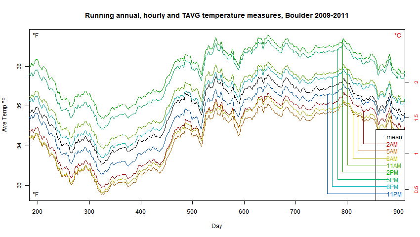 depicting offset by read-hour but none of his lines cross his black true average line. If find that strange. However Nick has corrected me on several occasions before.
Looks right. If you plot both you’ll see that their trends are almost paralell. So (Tmin+Tmax)/2 is good enough for an overall trend when we know the true Tmin and Tmax.
My main issue is how a relevant TOBS adjustment can be calculated when the diff is so random.
Nick had a graph above
There is another plot here which shows the differences of max/min from hourly mean. It expands the scale to make that clearer. The offsets are fairly steady.
There is another plot here which shows that all the different ways look the same on the scale of seasonal variation.
Sorry for my language ignorance here.
With running annual, do you mean a 365 day sliding average or 12 months. Shouldn’t this be done for individual months?
Yes, 365 days. It was 2009-11 so no leap years.
Thanks,
I am coding a zealous weather observer here… Let’s see
One more Q, sorry.
How did you treat a reading at 08:00 vs20:00?
Logically a 20:00 reading could represent current day in terms of what the thermometer actually measured while a 08:00 reading is mostly good for current day MIN but only yesterdays MAX.
Should I care or just strictly use Time of Observation as the date for a comparable graph to yours?
“How did you treat a reading at 08:00 vs20:00?”
I just took the previous 24 hrs of the time stated, as would be done in the old days. It actually doesn’t really matter for a running annual average whether you consider 08:00 Mon to belong to Sunday or Monday, since all you do is add the results. It makes a tiny difference as to whether the 3-year sequence should start at 08:00 Jan 1 or Jan 2.
Thanks again Nick,
Agree for the month average it has a minimal impact. It is essential for the TOBS offset though.
I made my virtual weather observer a bit thick. It reads the Min/Max and notes them with the same time of observation then resets. That method confirms the offset you had in your graph. (I also changed to hourly because Boulder lacks 5min for the 2009-2011 period)
But,
would the real weather observer read the Min/Max and put them on the same line/date or would he/she put Max on the line above. The latter would be a logical rule to have if you read at 08:00. Max is yesterdays high and Min is todays min. Silly if they did not understand that.
I am struggling to understand how any TOBS adjustment can be correct with so many sources of error even though I appreciate the statistical offset we calculate is pretty stable.
Matz
“Silly if they did not understand that.”
Observers have instructions and follow them, else there is no knowing what their records mean. They are asked to write down at an agreed time, what the thermometer says. others can argue about the day.
“TOBS adjustment can be correct with so many sources of error”
There are no new sources of error here. With high frequency data, you can exactly emulate the observing procedure, and so assess the effect of the change. The argument about what day is what doesn’t enter; a convention is known, and you just use it.
But a month average is just 31 max’s and 31 min’s (or whatever number). It doesn’t matter what order you do the adding and generate AVG, and it doesn’t matter how you decide to pair them in days, except for a possible disagreement about the first and last day. But within the system, that will have been agreed.
Hi again Nick,
After integrating Min/Max on month rather than day with reading hour gaps remaining I finally understand that a Min/Max thermometer actually miss events. (admittedly a little bit thick)
Here is the scenario for a 17:00 Max reading
Day 1 25.0 at 17:00 and 26.0 at 18:00 – we record 25.0 and reset
Day 2 18.0 at 17:00 and 17.0 at 18:00 – we record 26.0 from yesterday and reset
Day 3 26.0 at 17:00 and 25.0 at 18:00 – we record 26.0 and reset
Day 2s low reading is lost. With Max there will ONLY be lower temperature events missing and hence a warming bias is created.
At the same time non of the high readings are actually wrong. They just mask a lower reading by getting double counted.
In the TOBS record NOAA just cuts this bias off of every reading which rightfully can be interpreted as cooling the past. (Assuming difference past vs. now is estimated Min/Max by thermometer reading vs true Min/Max automated reading)
I think this s what many people, including me, miss and object to.
Matz,
“In the TOBS record NOAA just cuts this bias off of every reading which rightfully can be interpreted as cooling the past. “
Not exactly, although your summary is right. They don’t do anything unless a change in TOBS is recorded. Then they adjust for the change, changing the old to be in line with the current. However, as I understand, with MMTS they adopt a standard midnight to midnight period, so most stations will at some stage have been converted to that when MMTS came. In effect, that becomes the standard for the past.
As I read it several years ago, Hansen’s NASA-GISS UHI algorithm took the most recent NASA “lights” image of the entire US, calculated the Urban Heat Islands by the relative amount of lights (cities) and dark (country) pixels, then re-calculated and reported the earlier temperature data by region going back in time to fit the light and dark areas. Exactly opposite what is correct: REDUCE the current (artificially higher) temperatures by the UHI increases that is caused by local heating and local man-caused hot spots. As a result, each time a new NASA night-light data set was fabricated, a new regional temperature record for the US was fabricated as well.
However, the re-processed historical temperature records then get artificially reduced by invoking multiple reduction instances across many areas by assuming TOBS changes. But, instead of one change in one spot one time in one year (the single time when the time of recording the daily temperature changed, the TOBS effect for a region changes many readings and many months over many areas.
Thanks for your patience Nick.
What are debates for if we can’t admit when we learn something new? I did this time (again)
Good thing though is that hard learning sticks.
As those who read my work know, I’m a data guy. So I took a one-year series of ten-minute temperature data from my nearest station, Santa Rosa in California. The daily median averages 5.8 ± 2.8°C cooler than the daily mean. However, they move very closely in sync, and the uncertainty reduces with monthly means.
Offhand, I can’t think of any kind of analysis where one would be inherently better than the other.
Best to all,
w.
Willis,
So, are you now accepting that “median” is a good description of how the Tmax and Tmin are handled?
Variance and Standard Deviation are not defined for Median. Whereas, Mean is usable for the entire statistics tool box. It seems clear to me that a multi-sample mean is far superior to a 2-sample median for statistical analysis.
Willis ==> Averaging always reduces variance. Do you really mean that the (Tmax+Tmin)/2 median differs from the Daily Mean (of all ten minute records) by 5.8°C +/- 2.8°C?
So, a range in the difference from from 9.6 degrees C to 3 degrees?
It is quite surprising to me to see people writing the deviations from [maximum + minimum]/2 with the daily median estimated from the 10 minute interval data set very high in oC — in a day we get 24 x 6 = 144 observations. These points lie between maximum and minimum only. The 144 values follow sine curce as the sun moves east to west and west to east in 24 hours . — day refers to previous days maximum and current day minimum recorded at 0300 GMT observation. 10 minute data starts from previous day 0300 GMT upto current day 0300 GMT. These points lie on the Sine curve of 144 minutes. All the values lie between the maximum and minimum. Here the mean and median coincide very closely. If it is not, there must be something wrong with thermograph.
Dr. S. Jeevananda Reddy
This is interesting.
GMT confuses me though maybe you are in UK.
Do you mean that what is written in for example GHCN_Daily_AVG as February 14th actually represents:
(at locations 14th 03:00 to 15th 03:00 MIN + at locations 13th 03:00 to 14th 03:00 MAX) /2.
I do agree that method would pick the most accurate MIN/MAX readings but is it reflected in the NOAA files?
Dr;
I think if you select a few stations and do the analysis yourself, you will see that the profile is not a perfect sine wave.
Addendum to the Epilogue
I’d like to add some thoughts to Kip’s epilogue. Some people have thought that it was a little compulsive or pedantic to argue about whether the mid-point of the daily range of temperatures (Tmax – Tmin) should be implied to be a mean (as has been traditional) or called a median instead. It is, however, an important distinction because the parametric statistical descriptors of variance and standard deviation are not defined for a median. Therefore, tests of statistical significance cannot be used with medians. In the comments above, I demonstrated that while it is technically possible to calculate the standard deviation of just two points, there is poor agreement with the Empirical Rule, which uses the range (e.g. Tmax – Tmin) to estimate a standard deviation.
Our resident proselytes of orthodoxy have assured us, however, that everything is well and good. That is because those responsible for the temperature databases actually compute the monthly, mean highs and lows, and take the mid-point of those two means to define an ‘average’ monthly temperature. That is, they calculate the monthly median from the mean of the monthly high and low temperatures, and in so doing, reduce the variance of the data, which has implications for doing tests of statistical significance comparing months or years.
Most of the dire predictions for the future are based on assumed increases of frequency, duration, and intensity of Summer heat spells. Basing those predictions on the annual, arithmetic-mean of monthly medians is less than rigorous! We actually have good historical records of daily high temperatures. Those are what should be used to predict future stressful temperatures. I think that what NOAA, NASA, and HADCRUT should be presenting to the public are the annual mean high and low temperatures, as calculated from the raw, daily temperatures. Those are the only valid original temperatures that we have!
Kip and William Ward have made a case that the modern automated (ASOS) weather stations provide adequate information for calculating a true, high-resolution temperature frequency distribution, from which a valid arithmetic mean, and all the other statistical parameters, can be derived. Unfortunately, that level of accuracy, precision, and detail is probably not available from Third World Countries, or very sparsely populated regions. Thus, Roy Spencer’s observation that historical min-max observations is all that we have to work with may well still be true for global analysis. That is another reason for presenting the only real data that we have ― high and low temperatures ― instead of heavily processed means of medians of means. Then we might be justified in the kinds of temperature precision routinely claimed by NOAA and others.
Clyde ==> Thank you.
Hey William,
“I was perhaps too eager to continue to develop the points through this post.”
Good comments are always welcomed, one doesn’t exclude the other, what I meant was putting all your thoughts not only in comments but also into something more tangible. It will have wider impact.
“In summary, the key here is just how much error remains over longer periods of time.”
I’ve run 3 year comparison for Boulder (2015-2017). (Tmin+Tmax)/2 versus Tmean, both from subhourly dataset which was sampled every 5 min, over 300k records in total. Curve represents deviation of (Tmin+Tmax)/2 from ‘true’ mean calculated from highly-sampled data.
Graph
To me error looks persistent, averaging to 0.1 C what is consistent with what I had previously per one year also for Boulder. Because we’re operating on good quality data we can securely assume that we captured actual Tmin and Tmax. For historical records we don’t have such luxury and an error may be larger.
Hi Paramenter,
Nice work. I had not yet tried 3 year examples. I analyzed 1-year records for different stations and years and got a variety of results regarding error. Some errors as high as 0.6C over a year. I get different results for (Tmax+Tmin)/2 by using daily vs monthly results in the USCRN. Both provide a “Tmean” value for each entry. But we get an accumulation of averaging an average as the record gets longer. Some here have argued it is all about using the monthly numbers. What do you get if you compare the averaged 5-minute samples to the monthly (Tmax+Tmin)/2? What if you accumulate over 1yr, 2yr and 3yr. That might be interesting to see how it progresses. We probably don’t need graphs, just a small table with the numbers.
You hinted at something that needs to be magnified. The historical record does not have Tmax and Tmin obtained from the 5-min sampling of high quality instruments. Daily error magnitude is likely larger and sample jitter is likely higher. Maybe this too will reduce by averaging. The only way to know would be to measure with the historical methods/instruments at the same site as a USCRN site. This probably wont happen.
Hey William,
“Some here have argued it is all about using the monthly numbers. What do you get if you compare the averaged 5-minute samples to the monthly (Tmax+Tmin)/2? What if you accumulate over 1yr, 2yr and 3yr.”
Sure thing. However, I believe monthly averages are calculated not by using monthly (Tmax+Tmin)/2 but by averaging daily (Tmax+Tmin)/2 medians. According to NOAA specs:
F. Monthly maximum/minimum/average temperatures are the average of all available daily max/min/averages. To be considered valid, there must be fewer than 4 consecutive daily values missing, and no more than 5 total values missing.
Thus, we’re interested in comparing monthly averages build on daily medians/midpoints with averaged 5-minute samples by month. For Boulder I’ve extended dates from 3 to 6 years (2012-2017). Mean of the error drift from reference temperature is 0.15 C, slightly more than I had for 3 years. Distribution is not symmetrical with skewness 0.35.
If for monthly averages we actually use monthly (Tmax+Tmin)/2 and compare it with integrated 5-minute sampled signal that yields larger error: 0.9 C for 2012-2017, Boulder.
Paramenter, can you share those error calculations?
I don’t get how the mean of the error can drift larger over time. Probably my ignorance..
Paramenter,
Can you share your error calculations for my education?
Hey MrZ,
Nothing sophisticated here: first you integrate or do arithmetic mean over daily 5-min temperature record and compare it with daily (Tmax+Tmin)/2. That yields significant difference, sometimes up to 3-4 C per the same day. For comparison of monthly means the procedure is the same: monthly ‘true’ mean from 5-min temperature record vs monthly average based on daily (Tmax+Tmin)/2. That also yields some differences: averaging (Tmax+Tmin)/2 deviates from more accurate 5-min records. Over the time one may hope that those differences become evenly distributed and eventually cancel themselves out. But this distribution is not perfectly symmetrical and this error still persists even over few years. One may argue that if we take into account several stations and longer periods all those errors eventually disappear. But I can already see that this hope is in vain. More about it in few minutes.
IC
Then I am doing the same thing. I thought you calculated some “sampling error bars” (lack a better description in English). I also see the diff is skewed but I don’t see that the diff increase over time. Maybe I read you wrong.
I think you get a more dramatic result if you run the series month by month ie Jan 2012-2015 vs
jJul 2012-2015
That way amplitude effects should be clearer.
Hey Paramenter,
I knew NOAA USCRN published daily and monthly (Tmax+Tmin)/2. I assumed the monthly data was derived from the daily data. I wanted to see if “averaging of the average” would have an effect on the accumulated error as compared to the 5-minute sampled data over time. So I wanted to see 5-minute sampled vs. monthly stated mean over time.
In some places you mentioned medians, but I think you mean “means”, correct?
Where you specify “monthly” data, can you advise what you did specifically? Did you use the “monthly” file and 1) take the Tmax and Tmin add and divide by 2? If so did you round each value to 0.1C precision before doing further steps? Or did you 2) use the data provided in the column labeled “T_MONTHLY_MEAN”. It appears that the data provided in the column “T_MONTHLY_MEAN” is equal to my calculation of (Tmax+Tmin)/2 using the daily data and then rounding up or rounding down. NOTE: NOAA is not consistent in their round-up and round-down rules!!!! Ex: 5.65 becomes 5.6; 7.55 becomes 7.5; 14.55 becomes 14.6. Go figure!
My hope is that you used the provided “T_MONTHLY_MEAN” as I suspect this contains more error from averaging the average. (And rounding eccentricity).
Wow! 0.9C for the 6 years 2012 – 2017! Is this with “T_MONTHLY_MEAN”?
So not all error averages away!
NOTE: NOAA is not consistent in their round-up and round-down rules!!!! Ex: 5.65 becomes 5.6; 7.55 becomes 7.5; 14.55 becomes 14.6. Go figure!
They’re absolutely consistent, that’s the proper way to do it. The difficulty in rounding when the last digit is ‘5’, in order to avoid shifting the mean the proper approach is to round up half the time and down half the time. The way it is usually done is to have a rule such as ’round up if the last digit becomes even and down if it becomes odd’. The is what they have have done here (you could use the opposite rule, the main thing is to be consistent).
Phil,
I suspect that what is really happening is not the rounding method you describe, but something different. Your comment made me look closer and I suspect the following. If so it is a credit to NOAA and my comment is wrong.
The record shows Tmax, Tmin and Tmean, all rounded to 1 decimal place. So Tmax and Tmin are shown rounded. But when NOAA calculates (Tmax+Tmin)/2 to get T_Monthly_Mean, they use the non-rounded Tmax and Tmin, as they should.
We can’t see the unrounded max/min values, so averaging them is inaccurate. Ex: I calculate 5.65 but what is shown is 5.6. This is because the correct calculation using the unrounded numbers might be, for example 5.648, which rounds to 5.6. So it isn’t that some strange rounding scheme is used. It has to do with not working with intermediate rounded values. I was doing this and that was wrong.
Good catch! Thanks.
The correct way to round is:
Round down to x: x.0, x.1, x.2, x.3, x.4
Round up to x+1: x.5, x.6, x.7, x.8, x.9
In my experience, all of the following computer languages round this way: Fortran, C, C++. QuickBASIC, VisualBASIC, TurboPascal, Microsoft Excel.
Hey William,
My hope is that you used the provided “T_MONTHLY_MEAN” as I suspect this contains more error from averaging the average. (And rounding eccentricity).
I’ve run comparison for two sites: Boulder and Spokane. Looks like NOAA calculates monthly averages by averaging (arithmetic mean) daily (Tmin+Tmax)/2. Repeating the same procedure directly from subhourly records yield the same values for monthly averages with occasional exceptions due to rounding. I’ve compared monthly averages from NOAA monthly folder with values calculated by integration of subhourly records (5-min sampling) per each month.
Boulder data behaves reasonably well. I’ve run comparison for 12 years (2006-2017). Delta between monthly averages based on daily (Tmin+Tmax)/2 and integrated subhourly records oscillates around 0.1 C. I cannot see any cumulative tendency.
Spokane looks worse in this respect. I’ve run comparison for 10 years (2008-2017). Delta between monthly averages based on daily (Tmin+Tmax)/2 and integrated subhourly records oscillates around 0.34 C (error per some months exceeds 1 C). I cannot see any cumulative tendency yet there is clear positive skew: see the graph for Spokane.
Study I mentioned earlier confirms that the error varies between sites and is quite persistent across years.
Next steps? I would assume that would be a question: is this error associated with avergaing/sampling procedure used for calculating monthly means from daily (Tmin+Tmax)/2? And if so, what is a nature of this error? And what is a potential impact on interpretation of historical records?
Paramenter ==> In you Spokane graph, the skew is positive when which is subtracted from which?
Hi Paramenter,
I’m sorry for the slow reply. I have been distracted with other work. Thanks for the follow-up analysis and running the additional data.
In my limited analysis of the USCRN data, I too find that averages/means using the 5-minute sampled data tend to show a higher (warmer) value than the (Tmax+Tmin)/2. However, not always. Also when I plot the daily error over time (not cumulative error – just daily error), I see it is distributed both above and below zero, meaning some days the 5-minute mean shows a warmer value and some days it shows a cooler value. I don’t usually see perfect symmetry – the daily error over time usually seems to land more to the positive y-axis (meaning the 5-minute samples show warmer means).
Based upon what you presented in your last post, I have also tried something, but I didn’t run it out in time as long. A simple 10 day analysis seems to show what I have seen when I have run it longer – but I didn’t save that data. If I compare 5-minute sampled data and average this over 1, 2, 3… 10 days and compare this to the NOAA daily (Tmax+Tmin)/2 data that corresponds to an average over the corresponding 1, 2, 3… 10 day period, then it looks like this:
Whether we average over 1 day or 10 days or any number of days between, there is error and its value seems to continually vary. Since the daily error continues to vary, I don’t think it is expected that the value of accumulated error would settle out. It will keep varying. Can you check the data you have to see if you agree? For example if you compare a 1-year, 2-year, 3-year … 10-year average, are the values different? I think you have this data and that is why I ask. If you did not do the intermediate steps and have only done the longer 10-year average then what I’m asking will probably require too much work.
As for the reason, I’m pretty certain that the error we see is simply the difference between averaging a max and a min vs. finding the average from area under the curve. So, the more the daily signal deviates from a pure sinusoid, the greater the difference will be relative to the simple max/min average. This graph shows that for Spokane on 1/13/2018:
The 5-minute samples are easy to identify. The orange line shows the more accurate mean derived from the full 288 samples at 5-minute intervals. The grey and yellow lines show the Tmax and Tmin (selected as max and min from the 288 5-minute samples). The light blue line is the (Tmax+Tmin)/2 average.
If the daily signal were a pure sinusoid then the orange and light blue lines would be identical.
From sampling theory (Nyquist) we know those 2 (max/min) samples are aliased. There is obviously frequency content above the daily signal. Throwing away 286 of the 288 samples causes aliasing. The fact that the 2 kept samples are not strictly periodic means they are jittered (by definition), which adds additional error.
Hi Paramenter,
More: See graph below for how this looks over 10 days. Data used was 2008 Spokane from 1/13/2008 – 1/22/2008.
It should be easy to identify the daily temperature signal over 10 days using 288 samples/day. The orange line is the accurate average using all of the samples. The grey and yellow lines are the average Tmax and Tmin over the 10 day period. The light blue line is the average of the averaged Tmax and Tmin values.
The error between the orange and light blue lines will continue to vary at we go out in time and this is because the daily signal is always varying (no 2 days are every alike).
Ps – in the post above, the first graph shows 2008 Spokane from 1/13/2018 – 1/22/2018. It shows the cumulative error starting with one day and then looking at the cumulative over 2 days, then over 3 days, etc, up to 10 days.
I could only read so much of the mean/median discussion, so I don’t know if the following is useful, as I just skipped to the end.
My father, in his youth (literally – like many young men of the time, he modeled his age), went to work for the Hudson’s Bay Company as a fur trader, in NW Ontario and Northern Manitoba, in the days of dog sled, canoe and Morse code. One of the duties was daily recording of the weather, including temperature, of course, which he did as accurately as possible. As I’m sure all realize the winter temperatures were quite frigid, and as the thermometers only went to -40 degrees, anything colder was estimated. A technological limitation on accuracy to be aware of.
No One ==> I’m with you here — anything under -40 –“Too Cold”.
IMO, this blog thread reflects the known divice between the academic, ivory tower approach and the real world parctical approach shown by some engineers with their comments.
The academic approach recognises that errors occur, describes their properties in minute detail, but is seemingly reluctant to post any figures about accuracy.
The engineering approach might say that the observed errors are so large that they swamp the academics’ errors, rendering the, well, academic.
So, I went chasing figures again. In the referenced 2012 publication from Australia’s BOM, which expends serious $$$ on the topic we find in Table 9 – http://www.bom.gov.au/climate/change/acorn-sat/documents/ACORN-SAT_Observation_practices_WEB.pdf
Table 9
95% uncertainty estimate for laboratory temperature measurements.
1908–1973 Largely unknown but likely > 0.2 °C Ice point and reference in-glass thermometers
So, each Tmax and each Tmin has a +/- 0.2 deg C envelope and the sum of half of them has correspondingly more. And that envelope relates to the small portion of the error that can be measured under the best lab conditions. It cannot get better than that. As many have stated before me, the overall error of a unit operating at a field station is likely to exceed =/- 1 deg C, is almost certainly worse than +/- 0.5 deg C for 1 sigma.
While grateful for the detailed discussions on averages, jitter, distributions, etc., is it not really the case that at least this pre-1972 data are absolutely unfit for the purpose of contributing to a ‘global surface air temperature average’ or whatever similar term you choose to use?
Please invalidate this proposition. If you can. Geoff.
Goeff,
There is one thing though.
However large the error range is it does not increase along the timeline. Compare a dice, the more times you throw it the closer the average of your throws will be 21/6. (The outliers 1 and 6 has less and less impact)
What is beyond me is how we can correct past readings with statistical offsets to make them more accurate. Those corrections alone represents at least 30% of the trend. Then we have changing station coverage and massive station swaps 1950-1993, and so on…
I arrive at the same conclusion .
MrZ ==> Information Theory — you can not recover data never recorded. There is no time machine — any and every “reconstruction”, “reanalysis” or other attempt at creating past information not recorded in some way is at BEST a GUESS. (in extraordinary cases, it may rise to a, “educated guess”.)
Geoff ==> Thanks for the good reference link!
Kip: A week ago, I tried to explain why a constant systematic difference between two thermometers or temperature indices doesn’t necessarily interfere with an accurate measurement of warming. There same thing applies to your comments in this article:
You will get different average daily temperatures if you average continuous readings, or average readings taken every six minutes, or average readings take once an hour, or average the min and max readings recorded every morning (about 7:00) or average the min and max recorded every afternoon (5:00). If I remember correctly, monthly averages of min-max thermometers read in the morning and averaged for the day are about 0.2 degC lower than when in the afternoon. However, if you produce your data in a constant manner, the warming (change) reported by all methods can agree more closely than the absolute temperatures agree. It is not particularly important which method produces the “best” GMST for Sept 2018. To accurately measure change (warming), it is critical that one not change how measurements are made.
Unfortunately, NOAA wanted more accurate data on rainfall. When readings are made once a day, evaporation is less of a problem if the reading are made in the morning than in the afternoon. So, sometime in the 1980s (?), they told the volunteers who collect our data they would prefer readings in the morning. That produced an artificial cooling in the US of about 0.2 degC.
Frank ==> There is here a philosophical problem — a problem dealing with experimental design, if you will.
One station: What practical good is Daily Average Temperature? What does it tell us? Scientifically what does it tells us? What does a year’s worth of Daily Averages tell us? A century’s worth?
Two stations: What practical use is the average between the Daily Averages for LA and NY? A day’s worth? a year’s worth? a century’s worth?
Continue to add stations all you want.
Getting a “better” or “more accurate” or
“less wrong”average is not a worthy goal if the data itself, the metric, isn’t going to tell us something scientifically useful.
1sky1:
” CONTINUOUS-time determination of daily EXTREMA of the temperature signal has nothing in common with DISCRETE UNDERSAMPLING that leads to spectral aliasing and potential misestimation of the signal mean.”
Why not, if I may ask? My understanding is that all we have left is effectively a record of maximal and minimal amplitude. We don’t know when those points were reached throughout a day and we don’t know how many times – at least one. So from continuous temperature signal we are left with 2 known samples of extremes taken at unknown times.
Aliasing is entirely an artifact of discrete undersampling of a continuous-time signal using a sampling interval, delta t, that is overly sparse for the spectral bandwidth of the signal The sampling scheme is always periodic and fixed in DSP practice, i.e., there’s no shift in times at which the discrete samples are obtained.
By contrast, the times at which Tmax and Tmin occur vary widely from day to day–and are unknown in practice. Although one might be tempted to call the recorded extrema “samples” in some vague statistical sense, they are exact, exhaustive readings of daily wave-form extrema –unrelated to the PERIODIC discrete samples of the underlying signal. It’s the continuous signal, not the intraday discrete samples, that is used to establish the extrema. Consequently, there’s no mathematical possibility of any aliasing effects corrupting the determination of the daily mid-range value. Calling the latter the “daily mean” is highly misleading.
“Although one might be tempted to call the recorded extrema “samples” in some vague statistical sense, they are exact, exhaustive readings of daily wave-form extrema –unrelated to the PERIODIC discrete samples of the underlying signal.”
This author who published in the Scientific Reports (Nature group) couldn’t resist the temptation use word ‘sampling’ with respect to (Tmax+Tmin)/2:
Kaicun Wang (2014) ‘Sampling Biases in Datasets of Historical Mean Air Temperature over Land’, Scientific Reports, volume 4, Article number: 4637.
Temptation was also too strong for those venerable authors of this article published in the Climate Journal:
P. D. JONES, T. J. OSBORN, AND K. R. BRIFFA, (1997) ‘Estimating Sampling Errors in Large-Scale Temperature Averages’, Climate Journal, vol 10.
Consequently, there’s no mathematical possibility of any aliasing effects corrupting the determination of the daily mid-range value.
Again, those authors clearly speak about aliasing effects on sampled historical temperature records: “There is no guarantee that a simple arithmetic mean of a cluster of monthly data could cancel out the alias and provides a clean annual mean. From the variance of the 12 monthly series shown in Fig. 3(c), we can see that the aliasing effects are pretty serious for part of the data especially at the beginning of the dataset.
And:
“We have used the HHT filter on the extremely important long-term (1856-2004) global monthly surface temperature anomaly data to produce a clean annual dataset by removing alias errors associated with down sampling before computing the mean“.
REDUCTIONS OF NOISE AND UNCERTAINTY IN ANNUAL GLOBAL SURFACE TEMPERATURE ANOMALY DATA, (2009), Advances in Adaptive Data Analysis (link).
So I’m not entirely convinced that DSP terminology as sampling and aliasing is not applicable here.
Aside of that: going through those papers I’ve learnt that first what they do is ‘removing higher frequency noise’. ‘Higher frequency noise’ in this context is for example sampled every 5 min data from temperature series. Apparently this most accurate measurement introduces significant problems for large-scales ‘anomalies’.
All that your citations reveal is a generally widespread carelessness in the use of technical terminology and of averaging schemes by climate scientists. None of it contradicts the analytic validity of the very specific assertions I made here about aliasing and the intrinsic mathematical properties of daily mid-range values. Those values are not subject to aliasing; they are neither random nor periodic samples of the temperature signal; and they are certainly not valid, consistent estimators of the signal mean.
All that your citations reveal is a generally widespread carelessness in the use of technical terminology and of averaging schemes by climate scientists.
Actually, they reveal much more than just carelessness in the use of technical terminology. They also reveal use of sampling-oriented working methodology. Sampling, undersampling, aliasing, anti-aliasing filtering, spectrum analyses, frequency filtering – we’re well into the signal processing playground. True, you may say that they’re all wrong with respect to that. Possibly. But would be nice to see at least some sort of evidence to support that.
Meanwhile, more of carelessness terminology. Very solid, Nyquist based article from Judith Curry’ blog: Does the Aliasing Beast Feed the Uncertainty Monster? by Richard Saumarez.
One of my favorite bits by Dr Saumarez:
When confronted with aproblem there are two approaches:
1) I’ve got a lot of data, I’ve analysed with “R” packages and I don’t think there isn’t a problem.
2) You analyse the problem from fundamentals.
Aliasing is a non-linear transformation of a continuous signal into a sampled signal.
I have to say that many of you sound very confident that you have the answer without a rigorous analysis. I was brought up in a hard school of engineering mathematics, and I am not convinced that you have made a serious analysis of the problem
It seems that, instead of comprehending the analytic issues I raise here, you’re simply googling to find key words you consider “evidence” for your views.
In reality, if you read the cited papers carefully, you’ll find that Wang (2014) uses only periodically sampled DIGITAL temperature records to establish daily extrema and mid-range values. That is NOT what is used in meteorological practice. There’s simply no way that sampling has ANY relevance to the accurate determination of (Tmax+Tmin)/2 from CONTINUOUS temperature signals on a daily basis. Likewise, the “aliasing” that Jones et al. (1997) refer to is SPATIAL, not temporal. That is apparent from the very first sentence of their Abstract: “A method is developed for estimating the uncertainty (standard error) of observed regional, hemispheric, and global-mean surface temperature series due to incomplete spatial sampling. ”
I fear you’ve fallen prey to the red herrings of Wiki-expertise.
[Ended blockquote at first paragraph. .mod]
Hi Paramenter,
I have been away from the computer all day. I see you have made several very good posts today! I’m now trying to catch up and I will respond as soon as I can digest all of the good information. I’m starting with this one first because it is the easiest.
The peer reviewed paper discussing the sampling related error in the temperature record is very good!
I’m not sure why 1sky1 and Nick take the positions they do. They cannot refer to any academic text books on signal analysis that support their climate-science-exception to Nyquist. 1sky1 seems to be stating that since Tmax and Tmin are not strictly periodic then we can’t refer to them as samples. However, what they are, clearly, are samples with a lot of jitter.
https://en.wikipedia.org/wiki/Jitter
There is a specific section on “sampling jitter”. It is a well understood part of sampling theory. Jitter adds broadband and errant spectral components. The jitter from Tmax and Tmin are quite large relative to anything you would encounter in a modern integrated circuit ADC, but it is still jitter. The result is that if you pass the samples through a DAC (digital to analog converter) the resulting analog signal deviates from the analog signal that was sampled.
Here is another way to look at the situation. If you are interested to study a lower frequency portion of a signal you can do it in several ways (but not by cherry picking Tmax and Tmin). You can filter out the higher frequencies in the analog domain before sampling and then sample properly. Or you can sample the full bandwidth properly and then digitally filter out the undesired higher frequencies. Once you filter out the frequencies digitally, then you can reduce the sample rate. This process of “sample-rate-conversion” to a lower rate is known as “decimation”.
https://en.wikipedia.org/wiki/Decimation_(signal_processing)
The signal can be decimated down to 2 samples per day, albeit with a loss of information in the original signal – but without aliasing. Compared to using the full sampled dataset we get a different, less accurate mean. But these 2 properly decimated samples will yield a more accurate result than using Tmin and Tmax. There is just no reason to use Tmin and Tmax.
Selecting Tmin and Tmax violates every principle of signal analysis. Unfortunately, the full effect of the error can be partially masked by averaging, providing some with the motivation to keep justifying practices that are violations of mathematical laws.
Regarding the paper you found: The last few sentences of the abstract: “The noise in the climate dataset is thus reduced by one-third and the difference between the new and the commonly used, but unfiltered time series, ranges up to 0.1506◦C, with a standard deviation up to 0.01974◦C, and an overall mean difference of only 0.0001◦C. Considering that the total increase of the global mean temperature over the last 150 years to be only around 0.6◦C, we believe this difference of 0.1506◦C is significant.”
The authors agree that the Tmax+Tmin derived mean produces significant error relative to the ideal Nyquist sampled data. Their calculations show 25% of the increase in global mean temperature to be a result of sampling problems. (What would it be if we added in quantization error, reading error, UHI, thermal corruption, data infill, etc, etc.).
You said: “Aside of that: going through those papers I’ve learnt that first what they do is ‘removing higher frequency noise’. ‘Higher frequency noise’ in this context is for example sampled every 5 min data from temperature series. Apparently, this most accurate measurement introduces significant problems for large-scales ‘anomalies’.”
Specifically, the paper says: “It should be noted that, in down sampling of data, higher frequency noise should always be removed first. As the data could contain noise, uneven distribution temporally and spatially, and the data also suffer incomplete removal of annual cycle; therefore, each of down sampled series would suffer from aliasing effects.”
I mentioned this above when I discussed decimation and down-sampling. Any time you sample you must first filter out frequencies above your sample rate (follow the Nyquist Theorem) or the result is aliasing. The authors must not know about the Stokes-Sky Climate-Science Sampling Exception. (Humor intended).
” They cannot refer to any academic text books on signal analysis that support their climate-science-exception to Nyquist.”
Despite claims to the contrary, you still haven’t answered my basic question. To get a monthly average of temperature, what is the Nyquist requirement from sampling frequency? Actual numbers please, with the Nyquist reasoning to justify it.
Hi Nick,
Nick said: “Despite claims to the contrary, you still haven’t answered my basic question. To get a monthly average of temperature, what is the Nyquist requirement from sampling frequency? Actual numbers please, with the Nyquist reasoning to justify it.”
Nick, I can’t responsibly give you an exact number without doing the measurements. But why are you hanging your argument on this? A first year engineering student could arrive at the number with some basic equipment. I’m retired from the industry and don’t have access to the lab equipment. Do you contest that with a basic thermocouple front-end, instrumentation amplifier, spectrum analyzer and power supply that the maximum bandwidth could be determined? To be responsible, a standards body should define a standard thermal mass, response time, etc. The thermal mass will act as a filter and eliminate some frequencies. Lacking these standards and measurements, I refer to NOAA. NOAA uses 288 samples/day. This is (1) sample every 5 minutes –> one sample every 300 seconds –> 3.33mHz. This is the Nyquist frequency. The maximum bandwidth that can be sampled without aliasing is 1.67mHz. The instrumentation should have a built in electrical filter, with a break frequency and slope that eliminates frequencies above this. Aliasing would be eliminated. Then, with the properly sampled signal you can do DSP to focus on any frequency or band of frequencies you desire. For each month you just add the samples for that month and divide by the number of samples. You get an accurate average that is equivalent to the single value that will yield the same temperature-time product or area under the curve – the same (approximation) of thermal energy read at the instrument. You could also do a running 30-day filter – which might be more valuable than 1 value for each of the 12 months. But people who study climate can decide this. All possibilities are available. You can decimate if for some reason you want to constrain to lower frequencies and lower sample rate. You can use any algorithm that provides value to your analysis – and do so accurately – your results will be representative of the actual temperature signal.
I’m not sure what you mean by “… with the Nyquist reasoning to justify it.” Nyquist says sample at a frequency that is > or = twice the bandwidth. What I described above does this. Filtering the signal in the analog domain ensures compliance. Did you have something else in mind or did I answer your question(s)?
William,
The thing is, you have a basic part of the Nyquist logic missing, which is the frequency range you are trying to recover. When you digitise voice on a line, you might use the Nyquist frequency of 8 kHz calculated relative to the expected range of voice content. It isn’t calculated relative to whatever else might be on the line. It’s relative to what you want to recover. That is why you should be able to provide numbers. The target is there – monthly averaging. So what sampling frequency do you need in order to reconstruct that part of the signal?
Nick,
You said: “When you digitise voice on a line, you might use the Nyquist frequency of 8 kHz calculated relative to the expected range of voice content. It isn’t calculated relative to whatever else might be on the line. It’s relative to what you want to recover.”
Yes, I agree with you Nick – and in your example, you must filter above 4kHz ***BEFORE*** you sample. This is done in the real world circuits you mention. If you sample at 8kHz but do not filter above 4kHz then you alias. Your voice signal has error that is a function of the amount of energy aliased back into the spectrum of interest.
You said: That is why you should be able to provide numbers. The target is there – monthly averaging. So what sampling frequency do you need in order to reconstruct that part of the signal?
I answered that. The frequency range I’m trying to recover is 1.67mHz, as I stated.
Therefore the Nyquist rate is (at least) 2x that, which is 3.33mHz. The circuit must filter all content above 1.67mHz. Then you can extract the monthly average any way your heart desired.
If you just want data that changes at 1 cycle/mo and slower, then, in our electronic thermometer, you need to provide an electrical filter to remove faster frequencies than this. So, 1 cycle/mo –> 1 cycle/2,678,400 seconds (for 31 days) –> 3.73×10^-7 Hz. You would need to sample at twice this rate –> 7.47×10^-7 Hz (twice a month).
It is just so much easier and more accurate to properly sample faster and then do DSP to get what you want.
Now let’s look at the case of reading a mercury-in-glass thermometer – meaning a human putting eyeballs on it and getting a reading. This is sampling. When you sample, determines your rate and amount of sample jitter. How do you filter before reading a thermometer? You can’t. A MIG thermometer is fine for instantaneous measurements but not useful for long term trends unless you can read it often and according to a set schedule (288 readings/day).
MIG thermometers have more thermal mass than electronic thermometers and that mass acts as a flywheel – slows response to transients and spreads energy out. I’m not furthering that analysis but mentioning it for completeness.
Does this answer your questions?
William,
“The frequency range I’m trying to recover is 1.67mHz, as I stated.”
Well, maybe you are, but they aren’t. They are looking in the sub μHz range, as you later say.
” This is done in the real world circuits you mention.”
Well, not in the 8kHz days. You can’t get that fast a roll-off in one octave without distortion. So you have a choice of suppressing over 8kHz and losing lots of sub-4kHz, or tolerating some alias.
“It is just so much easier and more accurate to properly sample faster and then do DSP”
Yes, I agree with that. But that is just providing an effective low pass filter. It isn’t Nyquist.
Nick,
I keep answering your responses, not for you, but for anyone else who may be reading. I figured out a few messages ago that you are stubbornly committed to being wrong on this subject. I don’t want you to mislead other readers, so I keep coming back to dissipate the chaff you keep releasing on the subject.
With your example voice circuit, the 3dB bandwidth is 3,300Hz. You can roll-off the frequencies above that quite fine. Whether it’s a 1st, 2nd or 3rd order filter is beyond the scope of this discussion – as is the architecture of the filter. Filters introduce phase shift, but the filters selected are not audibly disruptive to hearing the voice in the call. The filters do not introduce audible distortion. Every engineer knows that in the real world, the conditions are always non-ideal – but the science is applied to get to a result that achieves the task. There might be some trivial frequency content above 4kHz, but the resulting aliasing is not audible. The design is made with Nyquist in mind – not by ignoring it.
Here is an example from an engineering text book confirming what I say:
https://books.google.com/books?id=zBTUiIrb2WIC&pg=PA440&lpg=PA440&dq=filter+design+for+3.3kHz+voice+channel&source=bl&ots=8cOWQkgzfd&sig=UvqVnsf2fTlEQnPKu4hbjVE0sRM&hl=en&sa=X&ved=2ahUKEwjFoMC8kvLdAhXJhOAKHR47B_wQ6AEwAnoECAgQAQ#v=onepage&q=filter%20design%20for%203.3kHz%20voice%20channel&f=false
Sampling temperature at the rate we discussed *does comply with Nyquist*. Nyquist requires a band-limited signal by definition, so a filter is required by definition! All of the text book references show the spectrum enclosed by a filter function! If you want to accurately get to the uHz frequencies, then you do so as I have described many times. You don’t get it by ignoring the requirements of the Nyquist theorem.
I have said all that needs to be said on this Nick.
Now let’s look at the case of reading a mercury-in-glass thermometer – meaning a human putting eyeballs on it and getting a reading. This is sampling. When you sample, determines your rate and amount of sample jitter. How do you filter before reading a thermometer? You can’t. A MIG thermometer is fine for instantaneous measurements but not useful for long term trends unless you can read it often and according to a set schedule (288 readings/day).
This is not what is done when using a MIG thermometer at a weather station, a Max-Min thermometer is used. The Max-Min thermometer continuously monitors the temperature and ‘saves’ the maximum and minimum temperatures reached. So when the thermometer is read it reports the two temperatures for the past 24 hrs.
MIG thermometers have more thermal mass than electronic thermometers and that mass acts as a flywheel – slows response to transients and spreads energy out. I’m not furthering that analysis but mentioning it for completeness.
My recollection is that a mercury in glass thermometer has a response time of about 20 secs.
Phil,
You said: “This is not what is done when using a MIG thermometer at a weather station, a Max-Min thermometer is used. The Max-Min thermometer continuously monitors the temperature and ‘saves’ the maximum and minimum temperatures reached. So, when the thermometer is read it reports the two temperatures for the past 24 hrs.”
I agree. I understand this, but there are only so many details that can be laid out at once without making posts difficult to follow.
The way a max/min thermometer works actually makes the situation much worse, because we don’t even have a clue where to place the samples in time. All of the analysis I have done in this discussion (along with Paramenter and others) has used the 5-minute samples and the Tmax and Tmin that have resulted from the samples. Basically, we look at the list of samples and find the high and low. We get a time stamp of when the Tmax and Tmin occur with this process. So, we can place the samples in time. The net effect is the same as sampling using a clock with a lot of jitter, if you throw away all of the samples by Tmax and Tmin. A good min/max thermometer (if calibrated) should provide the same Tmin and Tmax as the 5-minute sampling method, but without the time information. [Note: I’m ignoring instrument precision, reading error, thermal mass induced changes, etc.] So, it is equivalent to using the 5-minute samples and throwing away the time-stamps that associate with the samples.
To be clear, the “continuous monitoring” and “saving” action of the max/min thermometer doesn’t change any of the analysis. But I appreciate you clarifying the point relative to my description of how it is read.
With the max/min thermometers you get 2 numbers per day. You can do lots of math on the numbers, but the way to find out if that is correct is to compare it to a properly sampled system and look at the short and long term differences.
The “exception” is amply clear to any professional in signal analysis: daily Tmax and Tmin are extrema of a diurnal cycle plus random weather signal. They are NOT estimated from any series of discrete samples, but are determined exactly from the continuous record.
Shannon’s original paper on aliasing and band-limited interpolation of sampled signals makes the periodic requirement of discrete sampling amply clear. It is Ward who cannot refer to any academic text books on signal analysis that support his notion of extrema being mere “samples with a lot of jitter” and subject to aliasing.
1sky1,
You said, “They are NOT estimated from any series of discrete samples, but are determined exactly from the continuous record.”
Which is why Tmin and Tmax should be kept separate and analyzed as individual data sets. One might infer what is happening with the average based on the two time-series, but the level of accuracy and precision claimed currently is not warranted.
Clyde Spencer:
Separate analysis of the daily pair of temperature extrema is often made. But once those extrema are established exactly, the analysis of the range, Tmax – Tmin, and the mid-range value, (Tmax + Tmin)/2, follows as a physically meaningful algebraic result.
What I have tried to emphasize throughout this thread is the intrinsic mathematical difference between the mean of the latter measure and the arithmetic mean of signal ordinates, continuous or discretely sampled. While aliasing may be of concern in estimating the signal mean, the intrinsic discrepancy, which is due to wave-form asymmetry, does NOT disappear with increasingly frequent sampling. Attempts to explain that discrepancy in terms of sampling rates are patently blind.
All,
Looks like the ‘battle for averages’ had been already fought. I’ve just noticed that in 2012 on this very blog this article was published: Errors in Estimating Temperatures Using the Average of Tmax and Tmin—Analysis of the USCRN Temperature Stations by Mr Lance Wallace. Records from 142 stations meteo and several years, so quite large sample size. Still, the deviation of (Tmax+Tmin)/2 from actual daily mean taken from 5-min records persists. My favorites from this article:
The questions asked in the Introduction to this paper can now be answered, at least in a preliminary way.
“What is the magnitude of this error?” We see the range is from -0.66 C to +1.38 C, although the latter value appears to be unusual, with the second highest value only +0.88 C.
Delta T averaged over all daily measurements for each station ranged from -0.66 C (Lewistowne, MT) to +1.38 C (Fallbrook, CA, near San Diego). (Figure 1). A negative sign means the minmax approach underestimated the true mean. Just about as many stations overestimated (58) as underestimated (63) the true mean.
Magnitude of error
Thank you for finding a study of the actual data from actual sites.
Paramenter – great find! I’ll take time this weekend to read through it carefully.
Paramenter – great find! I’ll take time this weekend to read through it carefully.
Hey William, the pleasure is mine. May I suggest another obligatory weekend reading? Solid-rock article from Judith Curry blog: Does the Aliasing Beast Feed the Uncertainty Monster? That may substantially contribute to your own work, if you decide to proceed.
Hey Paramenter – that JC essay is awesome! I scanned it briefly but will take in all in as soon as I can fit it in. Her conclusion appears to align with what we have said and shown in the limited examinations we have done. She appears to provide some sophisticated analysis. The good news to me is that this *IS* a known issue by at least some in the field of climate studies. (As it should be!) The bad news (for climate alarmism) is that it just adds to the heaping mound of scientific and mathematically valid reasons to consider the temperature record a dumpster fire.
Perhaps there is no need for me to write anything further… why reinvent the wheel… just reference the good work of others as I take up arms against the manipulation of climate alarmism. I’ll think about it…
Paramenter, if you keep coming up with so many good articles so fast, you are going to get a reputation! Your ability to find this information is impressive. We all have Google … but you found them. Thank you!
Ps – JC was at Georgia Tech – a good engineering school. I’m sure she had a lot of support from the engineering faculty (if needed) for her analysis.
William and Paramenter,
I found the piece by Saumarez at Climate Etc to be interesting reading. What jumped out at me particularly was Figure 9 that showed spurious trends that reminded me of the ‘staircase’ appearance of most historical temperature records.
I noticed that our resident gadflies, Stokes and Mosher, commented on the article. They have seen the material before. (As has Kip) I might suggest that reading the comments might be enlightening. Should you still decide to write something yourself for WUWT, it might give you some additional talking points. Also, something that you might not be aware of is that David Evans (the husband of JoNova) is an expert (PhD) in Fourier and Hartley transforms. He is someone you might want to get to know and correspond with.
Hey Clyde,
Piece by Saumarez is definitely ‘to die for’. Indeed, figure 9 does show how poor sampling leads to ‘over-representation’ of lower frequencies that may become of trends in the actual trend-free signal. Interestingly, it shows ~40 year ‘warming’ what is pure artifact of very crude averaging of the original signal. As per me, ‘aliasing test’ also looks good, i.e. bad for temperature anomaly. Dr Saumarez says that access to daily temperatures would confirm or falsify his findings. I wonder if we can test it on the smaller scale, as we do have an access to decent quality records from last several years. Aliasing arising from averaging (per month) daily averages should be visible. If such phenomena is confirmed for historical records situation is even worse as we don’t know if those records actually captured daily Tmin/max. In many instances they only captured daily Tmin/max up to the point when an operator made a written record of the temperatures at the particular time of the day.
I reckon part of mainstream scientific community realizes that there is a potential problem here. Some are looking into things as particular weather patterns that inject significant deviations into higher-level averages. Dr Saumarez himself felt into this trap applying statistical techniques to data without taking into account underlying structure: what the data actually may represent in the first place.
And yes, few comments are both entertaining and enlightening. Sneer by dr Saumarez: “I’ve downloaded lots of data, I’ve processed it using R toolbox and all looks dandy” is truly a gem!
Also, something that you might not be aware of is that David Evans (the husband of JoNova) is an expert (PhD) in Fourier and Hartley transforms. He is someone you might want to get to know and correspond with.
I’m still encouraging William to have a go with that, even if that repeats some already known facts. Repeating good things under different forms is not bad at all and may still shed some light on different aspects of the issue. Even Judith Curry remarked that the problem with understanding of the fundamental nature of the temperature signal and consequences of that are ‘under appreciated’.
Well said.
Clyde – thanks for the tip about David Evans. Much appreciated.
My weekend chores slowed down my reading progress, but I’ll get through all of the good reading material soon. I’ll still think about putting together an essay – although I may take a breather to consider whether or not I can do something that adds value. I’ll be sure to read the comments you point out as well.
Perhaps there is no need for me to write anything further… why reinvent the wheel… just reference the good work of others as I take up arms against the manipulation of climate alarmism. I’ll think about it…
Hey William, I reckon there is nothing wrong with repeating good and interesting things. Each such effort may give slightly different perspective and context. Little by little does the trick.
Where you specify “monthly” data, can you advise what you did specifically?
Procedure was as follows:
1. Use subhourly 5-min records
2. Group by month
3. Integrate 5-min temperature records per month
4. Group by day
5. Per each day find Tmin and T max
6. Per each day calculate (Tmin+ T max)/2
7. Group by month
8. Average result of step 6 per each month
9. Compare results of 3 and 8 per each month
Or did you 2) use the data provided in the column labeled “T_MONTHLY_MEAN”.
No, I haven’t done any cross-check against monthly NOAA reports, so far I used only subhourly data. But will have a shot on that too.
Hey William, the article was published on JC blog however is actually authored by Dr Richard Saumarez. As he described his background:
“As Professor Curry asked me to give some biographical detail, I should explain that after medical school, I did a PhD in biomedical engineering, which before BME became an academic heavy industry, was in an electrical engineering department.
[…]
The use of engineering techniques in a clinical problem –sudden death – has taught me some of the pitfalls (by falling into them regularly) in interpreting data from one system in another and that carelessness in representing the basic physical nature of the system could lead to major conceptual problems. In physiology and medicine, the devil is the detail and a mathematical approach that fails to recognise these details may produce absurd results. Following the debate on climate feedback, I realised that there were similar problems: the physical concepts of climate and a formal approach to control and systems theory didn’t quite mesh.”
Hi Paramenter – Thanks for pointing that out. I was so excited by what I was seeing that I missed that important detail.
I found the quotes you give at this page on JC Blog:
https://judithcurry.com/2011/10/10/climate-control-theory-feedback-does-it-make-sense/
It seems that, instead of comprehending the analytic issues I raise here, you’re simply googling to find key words you consider “evidence” for your views.
With all necessary respect, so far there is not much to comprehend. Few assertions and interpretations. Obviously, always happy to change my mind.
In reality, if you read the cited papers carefully, you’ll find that Wang (2014) uses only periodically sampled DIGITAL temperature records to establish daily extrema and mid-range values.
Wang talks about sampling of Tmin and Tmax. And treats it as sampling and its consequences as biases.
That is NOT what is used in meteorological practice. There’s simply no way that sampling has ANY relevance to the accurate determination of (Tmax+Tmin)/2 from CONTINUOUS temperature signals on a daily basis.
I reckon no one claimed that. The question we started from is simply: can recording of daily Tmax and Tmin may be interpreted as sampling of the variable signal sensu Shannon? With all positive and negative consequences.
Likewise, the “aliasing” that Jones et al. (1997) refer to is SPATIAL, not temporal. That is apparent from the very first sentence of their Abstract: “A method is developed for estimating the uncertainty (standard error) of observed regional, hemispheric, and global-mean surface temperature series due to incomplete spatial sampling. ”
I’m happy to accept also spatial aliasing as well. And you helped yourself not mentioning third article where undersampling of historical temperature records is discussed explicitly with possible consequences as, yes, aliasing.
I fear you’ve fallen prey to the red herrings of Wiki-expertise.
That wasn’t constructive. Returning the favor: at least I put some effort into verification of my thinking. Looks like some guys here stared to believe in their own propaganda. Pretty bad state of mind.
In the spirit of understanding and mutual edification I suggest termination of our little talks. Question of how to interpret sampling of daily Tmin and Tmax must be answered by someone much more competent than me. And you.
Hi Paramenter,
I don’t plan to further communicate with 1sky1 on this subject because it gives him a platform to mis-lead readers. He thinks the position of calling-out climate science for violating the laws of signal processing is based upon “Googling” and “Wiki-expertise”.
I’m retired from the industry now, but data conversion and signal processing were at the core of my work over my career. I have been involved with over 1 billion deployed devices worth tens of billions of dollars. Complying with Nyquist has always cost money and limited what could be done at any given time. Said another way, if there was a way to skirt Nyquist, then designs would be a lot less costly and greater bandwidths could be handled relative to the limits of process technology at any given time in history. There are a lot of corporate CEOs, CFOs and CTOs that would demand Nyquist be ignored if possible, because the corporate bottom line could be enhanced. This has never happened for a reason: Nyquist is a law of physics.
One more interesting point: First there was analog signal processing (ASP). Digital signal processing (DSP) came along later. Analog processing is still used and is valid, but digital is just so convenient and cost effective. In the case of measuring temperature, with a thermistor and an instrumentation amplifier, the signal could be processed purely in the analog domain. The signal could be integrated using analog components – an analog integrator. This is equivalent to averaging the 5-minute samples in the digital domain. The output of the analog integrator could feed a chart recorder, giving us a running mean. The output of the analog integrator could be buffered and filtered, and if the filter is set up properly the output would be equivalent to the monthly or yearly average. In the analog domain the signal could be filtered first and then integrated, if you can justify discarding some of the frequency components. There is an equivalent operation in the digital domain. Every operation that can be done with DSP can also be done with ASP and vice versa. Processing in one domain yields the same results as the equivalent processing in the other domain. The importance of Nyquist is that if you follow it, then you can go back and forth between the domains without error. In neither domain can you pull the ridiculous stunt of grabbing 2 measurements unrelated to anything and start doing math on them. This is what Nick and 1sky1 are advocating, though they won’t admit it. Their “Daily EXTREMA” is more like “Daily EXCREMENT”. And they keep coming back like the creature in the B-horror movie that just won’t die.
Moderator:
It’s been half an hour since I submitted my final comment. What’s holding it up?
isky1 ==> Comments are not meant to be a chat session, although at times it may seem like it.
WUWT that automated rules that control much of the moderation. Inadvertent choice of language (sometimes perplexing, but noone’s fault), too many comments in too short a time, too many links, …it is a long list and amazing that it doesn’t interfere more often.
If your comment has been sent to human moderation, please realize that moderators are people too — they have to eat, use the bathroom, play with their kids and grandkids, they have wives that say “Would you get off that computer for a minute!”, and a lot of other considerations. All are volunteers and are seldom acknowledged for their efforts.
If you use the email notification feature, you’ll know when someone responds to your comments.
Instead of using up bandwidth to avoid it, you guys should try confronting the intrinsic analytic issue.
The functional meaning of the mathematical term “extrema” patently continues to be ignored, along with actual field measurement practice.
In fact, the daily extrema are not “grabbed” willy-nilly, but are determined rigorously by marking the pair of ordinates that satisfy the condition of being greater/less than (or equal to) all other ordinates in a daily stretch of CONTINUOUS signal. By definition, such readings cannot suffer from aliasing effects, because the signal has NOT been sampled at any periodic rate 1/(delta t). Thus there is no Nyquist frequency 1/(2delta t) to restrict the effective spectral baseband. Furthermore, the determination of extrema is direct, requiring no interpolation of bandlimited discrete data (see for example: https://www.dsprelated.com/freebooks/pasp/Theory_Ideal_Bandlimited_Interpolation.html) to locate them exactly.
While grouping the time series of daily extrema into months of unequal length is analogous to introducing “clock jitter” into the series of monthly averages, there’s no plausible jitter mechanism that would pick off the exact moments at which the daily extrema occur in the continuous signal.
Scientific understanding is never advanced by applying theoretical concepts that don’t correspond to palpable reality.
Paramenter, Clyde, Kip and All,
More very good information about contributions to measurement error – and variability of measurements. 2 very good videos (if you have the time to watch).
1) Air Temperature Measurement Sensors:
https://www.youtube.com/watch?v=LSQiA8dC9Lk
2) Solar Radiation Shields Overview:
Wiliam ==> Thank for the links.
You should keep a copy of
Automated Surface Observing System
(ASOS)
User’s Guide
https://www.weather.gov/media/asos/aum-toc.pdf
ready to hand on all this.
Hey Kip,
Thanks for the ASOS User’s Guide. Great info! I will read it and keep it for handy reference.
My understanding is that ASOS and USCRN are different. Can you confirm? With a quick search I found this:
https://journals.ametsoc.org/doi/full/10.1175/JTECH1752.1
Do you have a “survival guide” or quick summary of the different networks and how they are used currently? No worries if the answer is “no” – I’m just trying to improve my overall understanding of this subject.
There is a definite effort to improve the instrumentation, it seems. What is obvious and expected by engineers may not be as apparent to those who don’t deal with real world instrumentation on a daily basis. Measuring accurately is not easy! There are so many sources of variance and error in even the highest quality instruments: age drift, non-linearities, offsets, distributions, etc. Despite this effort, we still see the mistake of siting the instruments in places where the thermal mass is ever growing along with the man-made heat impulse pollution. Put it all together and there is no way, even with good instruments, to correctly quote records and trends of 0.1C.
William ==>You’re two best references at the ASOS guide and the document for GHCN monthly files. Your document comparing USCRN and ASOS may be out of date, as each may have been updated with slight modifications….GHCN has been.
The survival guide answer is that almost all global analyses are done from GHCN_Monthly records … so if you understandthe methods and data definitions in GHCN_Monthly, you are set at that level. GHCN raw data is not guaranteed to be raw data — originators may have adjusted prior to sending to GHCN.
USCRN has its own definitions and methods of calculation, but forwards to GHCN specific data for the GHCN_Monthly (specific to GHCN methodology).
ASOS is a terrific system, especially for weather — and if I had my druthers, and a jillion bucks, I’d finance them for all weather stations in the world, and we would begin to get mtre useful data.
Most global analysis is done starting with the GHCN Monthly data.
All,
Speak of the devil and he doth appear. Newest entry on this blog by Anthony Watts confirms that HadCRUT4 is plagued by errors. No, not even errors due to the nature of the sampling practices and temperature signal but with much more ‘ordinary’ ones.
Paramenter ==> In you Spokane graph, the skew is positive when which is subtracted from which?
Monthly NOAA average based on daily (Tmin+Tmax)/2 is subtracted from integrated temperature from subhourly records. Thus, for Spokane the difference is usually positive what means that monthly NOAA averages build on daily (Tmin+Tmax)/2 underestimate actual temperature, what happens regularly during summers: see the comparison here. From the first impression, that looks like ‘quantisation error’ where incorrect temperature values are assign to the same months.
For the original chart I’ve used absolute values so some values were flipped, here slightly more accurate diagram.
Paramenter ==> Well “underestimate actual temperature” — underestimate the average that one gets using more frequent thermometer readings. An interesting result.
Kip, for Darrington different picture: overestimation averaging 0.58 C for 10 years. Graph
Paramenter ==> It is as I suspected — the whole kit-n-kaboodle depends on the temperature profiles of the individual days — which in turn depend on the local Koppen climate-type, the seasons cycle, the local variation in cloud cover– basically the non-linear (chaotic) weather features.
The differences you are seeing tell us clearly that any of the various schemes of “daily average” temperature (and therefore, monthly annual averages) along will not inform us about the retention of solar energy in the climate system. These metrics may also not even inform us of very clearly about changes to the local climate picture even on a local station level.
To me, this is the real lesson to be learned.
Hi Kip,
I agree with everything you said in your assessment. In the last few hours I made 2 posts showing graphically what is happening with a daily and 10-day example. The use of daily and monthly averages leaves out a significant portion of the signal and therefore these averages are less accurate than their properly sampled counterparts.
Hi Paramenter – I second Kip’s comment: Nice work with what you provided!
Try looking at the speed of warming / cooling, especially minims.
in K/annum.
It is the derivative of the least square equation when doing linear regressions. You need to do 4 regressions to get at least 4 points to again plot the speed of warming against time.
Use equal number sample NH and SH balanced to zero latitude.
I used 54 stations, 27 for each HS,
Click on name, and scroll down to ‘investigations and results’ to try and understand what I did to get a surprising answer….it is already globally cooling.
Looking at the speed of warming/cooling eliminates all those errors you are talking about…..
sorry forgot to give the link
http://breadonthewater.co.za/2018/05/04/which-way-will-the-wind-be-blowing-genesis-41-vs-27/
Hi henryp,
I read the post on your blog. You have done some interesting work there. As it relates to the particular issue of the properly sampled mean differing from the (Tmax+Tmin)/2 mean, I can say this:
The “faster” the change in any signal the greater the spectral content of that signal. This is a basic concept of signal analysis (frequency and time domain analysis). However, if the signal is sampled properly then it is sampled at a rate that captures these “rapid” changes. If you sample properly you capture all of the information available in the signal.
By using Tmax and Tmin we get aliasing. And if a signal has more “rapid” transitions then it has more frequency content above the fundamental and the error between the 2 methods of generating the means will be greater. But I think it is correct to say that this is most important when the rapid transitions are faster than once per day. There is a seasonal component to the signal – this is sub-daily or slower than daily. Sub-daily signals will not cause the kind of problems we are seeing – even if their rate of change increases. These signals are captured by a 2 samples/day procedure, although the aperiodic nature of these 2 samples is problematic.
These metrics may also not even inform us of very clearly about changes to the local climate picture even on a local station level.
Yeah, trends may also differ. For Darrington, WA (11 years: 2007-2017) slope of the regression line (a least-squares) based on the monthly averages is 0.015. Slope for subhourly records is practically 0.
Paramenter ==> Forgot to say — Nice Work!
Kip, William, that was my pleasure. I reckon we may wish to understand better a nature of this deviation, why daily (Tmin_Tmax)/2 differ – often substantially – from subhourly averages. (Few days ago William offered explanation where decreasing sampling rate degrades accuracy of the daily mean.) And whether a particular temperature changes magnify the problem (biggest differences are usually associated with summer months). And last but definitely not the least whether a monthly averages based on daily (Tmin_Tmax)/2 alias and how we can know about that (that’s in the context of the incoming William work on that 😉
Paramenter, thanks for your continued encouragement about a future essay. I’m giving it some serious thought and I’m putting together an outline. If you are willing, I could bounce some material off of you along the way. I’m sure the results would be better with your input.
Hey William, I would love to have a look into that and help if I can. My email here so please ping me some material.
Hey William, sorry – I must have missed this one!
In my limited analysis of the USCRN data, I too find that averages/means using the 5-minute sampled data tend to show a higher (warmer) value than the (Tmax+Tmin)/2. However, not always.
Correct. For Spokane values of subhourly 5-min sampled data are bit higher indeed than (Tmin+Tmax)/2. That usually happens in the recurring pattern fashion over summer months – see the comparison chart. As you can see during warmer months NOAA montly average based on daily (Tmin+Tmax)/2 underestimate actual mean obtained from more accurate subhourly 5-min data. (Breaks in line indicate 2 months with missing records).
But for Darrington, WA opposite happens: (Tmin+Tmax)/2 overestimate actual temperatures by ~0.6 C. In the detailed study I mentioned earlier Lance Wallace analysed all available that time stations and found wide differences between regions.
Can you check the data you have to see if you agree? For example if you compare a 1-year, 2-year, 3-year … 10-year average, are the values different?
Sure, for few stations I’ve checked values tend to oscillate around constant error. For instance, for Darrington error oscillates between ~0.4 and ~0.6 C, depending on a month. Underneath of my comment there is data for Darrington, 11 years. Left column – date (month/year); right column error between subhourly mean calculated from 5-min data vs NOAA monthly averages based on daily (Tmin+Tmax)/2. You can copy that and paste as CSV file
As for the reason, I’m pretty certain that the error we see is simply the difference between averaging a max and a min vs. finding the average from area under the curve. So, the more the daily signal deviates from a pure sinusoid, the greater the difference will be relative to the simple max/min average. This graph shows that for Spokane on 1/13/2018:
Thanks for interesting graph. Yes, it has to be something to do with the shape of the temperature variation. Lance Wallace found the following dependency:
“Fundamentally, the difference between the minmax approach and the true mean is a function of diurnal variation—stations where the temperature spends more time closer to the minimum than the maximum will have their mean temperatures overestimated by the minmax [(Tmin+Tmax)/2] method, and vice versa.”
Darrington error:
———————-
Month_Year,Error (C)
01/2007,0.64
02/2007,0.36
03/2007,0.47
04/2007,0.43
05/2007,0.43
06/2007,0.56
07/2007,0.32
08/2007,0.55
09/2007,0.72
10/2007,0.58
11/2007,0.25
12/2007,0.1
01/2008,0.27
02/2008,0.71
03/2008,0.63
04/2008,0.9
05/2008,0.85
06/2008,0.43
07/2008,0.34
08/2008,0.93
09/2008,1.14
10/2008,0.55
11/2008,0.15
12/2008,0.09
01/2009,0.58
02/2009,0.83
03/2009,0.68
04/2009,0.8
05/2009,0.41
06/2009,0.42
07/2009,0.7
08/2009,0.73
09/2009,1.08
10/2009,0.26
11/2009,0.15
12/2009,0.48
01/2010,0.18
02/2010,0.56
03/2010,0.82
04/2010,0.78
05/2010,0.71
06/2010,0.64
07/2010,0.43
08/2010,0.94
09/2010,0.93
10/2010,0.63
11/2010,0.22
12/2010,0.08
01/2011,0.27
02/2011,0.38
03/2011,0.57
04/2011,0.52
05/2011,0.54
06/2011,0.48
07/2011,0.58
08/2011,0.77
09/2011,1
10/2011,0.43
11/2011,0.31
12/2011,0.33
01/2012,0.23
02/2012,0.63
03/2012,0.57
04/2012,1
05/2012,0.46
06/2012,0.49
07/2012,0.77
08/2012,0.87
09/2012,1.14
10/2012,0.56
11/2012,0.31
12/2012,0.19
01/2013,0.64
02/2013,0.43
03/2013,0.98
04/2013,0.64
05/2013,0.77
06/2013,0.6
07/2013,0.34
08/2013,0.91
09/2013,0.71
10/2013,0.99
11/2013,0.38
12/2013,0.08
01/2014,0.69
02/2014,0.32
03/2014,0.63
04/2014,0.96
05/2014,0.74
06/2014,0.36
07/2014,0.5
08/2014,0.78
09/2014,1.03
10/2014,0.36
11/2014,0.53
12/2014,-0.02
01/2015,0.54
02/2015,0.46
03/2015,0.69
04/2015,0.92
05/2015,0.74
06/2015,0.29
07/2015,0.44
08/2015,0.87
09/2015,1.09
10/2015,0.57
11/2015,0.63
12/2015,0.25
01/2016,0.23
02/2016,0.47
03/2016,0.88
04/2016,0.89
05/2016,0.59
06/2016,0.65
07/2016,0.52
08/2016,1.01
09/2016,0.91
10/2016,0.35
11/2016,0.13
12/2016,-0.01
01/2017,0.42
02/2017,0.7
03/2017,0.42
04/2017,0.88
05/2017,0.64
06/2017,0.42
07/2017,0.31
08/2017,0.56
09/2017,1.11
10/2017,0.63
11/2017,-0.05
12/2017,0.49
Paramenter
You’re still missing the point I made here. There isn’t just one (Tmax+Tmin)/2. It depends on the 24 hour period you choose. So there is no point in fussing about whether one is bigger than the other. The dependence of min/max on TOBS is well known, and is the basis for the TOBS adjustment when the time changes.
Hey Nick,
So there is no point in fussing about whether one is bigger than the other.
Good fussing isn’t bad, unless is done in bad will. Good fussing may lead to formulate important questions, get valid answers or highlight areas of concern.
There isn’t just one (Tmax+Tmin)/2. It depends on the 24 hour period you choose.
Surely it does. But here we’re talking about automated observations round the clock. My understanding is that (Tmax+Tmin)/2 is chosen based on local time per each station therefore comparison between subhourly and monthly data is feasible.