Dr Jennifer Marohasy writes by email:
There is evidence to suggest that the last 20 years of temperature readings taken by the Australian Bureau of Meteorology, from hundreds of automatic weather stations spread across Australia, may be invalid. Why? Because they have not been recorded consistent with calibration.

Somewhat desperate to prove me wrong, late yesterday the Bureau issued a ‘Fast Facts’ that really just confirms the institution has mucked-up. You can read my line-by-line response to this document here: http://jennifermarohasy.com/2017/09/bureau-management-rewrites-rules/
This comes just a few days after the Bureau issued a 77-page report attempting to explain why, despite MSI1 cards being installed into weather stations preventing them from recording cold temperatures, there is no problem.
Earlier this year, specifically on Wednesday 26 July, I was interviewed by Alan Jones on radio 2GB. He has one of the highest rating talkback radio programs in Australia. We discussed my concerns. And according to the new report, by coincidence, the very next day, some of these cards were removed…
You can read why my husband, John Abbot, thinks this 77-page report is “all about me” in an article published just yesterday at The Spectator: https://www.spectator.com.au/2017/09/not-really-fit-for-purpose-the-bureau-of-meteorology/
I’ve republished this, and much more at my blog.
ckb and Steve,
I agree that a procedure similar to what you suggest is MUCH preferable to reporting only the high, low, and last good reading in the 1-second reading matrix! It reduces the probability of impulse noise (incidentally, BoM notes that one of the weak points in the system is the connections where the resistance can be increased), and gives a better estimate of what is essentially a sample of temperatures, rather than using three of the 60 samples to represent the whole time-series.
” It reduces the probability of impulse noise”
In fact, they have a guard against that. By “good reading”, they mean one that differs by no more than 0.4C from its predecessor. The min/max are over “good” readings. But the main guard is the thermal inertia, as recommended by the WMO. There isn’t much point in hassling about how to characterise the minute scale data when the response time is of order 40-80 secs.
Incidentally, none of this is BoM’s design. It is hard-wired into the commercial MS11 card.
NS,
So, if the system has a high frequency hash with a peak-to-peak value of 0.6 deg C all temp’s get retained and one could see a range of +/- 0.3 deg C . The thermal inertia is irrelevant if the electronics are being impacted by external EM sources. Again, information is being lost when only 3 out of 60 readings are being reported. It may not be BoM’s design, but they bought the systems!
But Nick, the response time is not in the order of 40 to 80 seconds as you pointed out to me.
This means that each one second temperature value is not an instantaneous measurement of the air temperature but an average of the previous 40 to 80 seconds.
BOM average the data collected every second. This infers that the response time might be as low as 1 second, but it does not expressly say that, or say what the response time is. BOM are being unfortunately rather coy about the fine detail.
BOM then incorrectly conclude:
We record twice per second. Typical “noise” between readings is less than 1/1000th of a degree. To measure a 0.40C change the sensor would have been subjected to a several degree change over a few seconds. In a water-filled borehole we never see such rapid changes unless we pass by an open facture (with water entering or leaving the borehole). In the shop we see such changes, for example when the air conditioning comes on, or if the sunlight strikes the sensor directly. But such changes would be an indication that the sensor is not properly installed rather than sensor error. If you leave a probe in water you can actually see the water heating up due to the power supply of the probe (50 mW). For this reason, we log only in the downhole direction and then have to wait at least 24 hours for the hole to re-equilibrate. Thermistors have far more sensitivity than is required to measure earth temperature variation. But they are difficult to calibrate accurately.
If BoM assumes the accuracy of their measurement is +/-0.5 deg C absolute accuracy then they should be fine with these sensors. The circuitry for thermistors is very simple and the product is very stable requiring periodic recalibration on an annual basis. Even recalibration can be a problem because determining new coefficients for the thermistor can shift the “accuracy” of the thermistor up or down by 0.25 deg C. Imagine recalibrating the thermistor and it now reads 0.25 deg C warmer just because that is the limit of calibration. That is what they are up against.
From the Spectator article by Jennifer:
“Indeed, in the years preceding the flooding of Brisbane the Bureau’s own David Jones, Head of Climate Analysis, was often penning opinion pieces, including for the Sydney Morning Herald, that explained drought was the new norm for Australia. In an email, back in September 2007 he went as far as to say that: “CLIMATE CHANGE HERE IN AUSTRALIA IS NOW RUNNING SO RAMPANT THAT WE DON’T NEED METEOROLOGICAL DATA TO SEE IT.”
Dr Jones could be characterised as a ‘true believer’. He is now the Head of Climate Monitoring and Prediction at the Bureau. Perhaps not surprisingly the Bureau keeps telling us that next year will be hotter than the last and that this last winter was the warmest on record – never mind the record number of frosts being tallied up by farmers across the south east.”
Yep, is Dr. Jones of the BoM suggesting we don’t need temperature data anymore, “the science is settled” and “even the rain that falls will not fill up the dams” (last quote from Australia’s ex-Climate Commissioner, Tim Flannery).
Probably explains why the BoM climate prediction models for Australia are consistently wrong.
http://joannenova.com.au/2016/10/bom-september-failure-but-who-can-predict-the-climate-a-whole-month-ahead/
BTW, Australia’s permanent drought is looking grim. Current Dam levels of our capital cities today:
Sydney, 90%; Melbourne, 67%; Brisbane, 72%; Adelaide, 90% and Perth, 37%.
Sunny days ahead!
Oh, I forgot Canberra (wish it was permanent), where most of the loopey Greens live: 82%.
Can anyone point me to the data sheets for the temperature sensors and the design of the temperature measuring system?
These details do not appear to be in the BOM report.
From a quick search, that I did late last night, it appears that platinum resistance probes have a response time measured in seconds (1 to 3 seconds). Some manufacturers listed the thermal response time as less than 2 seconds.
If BOM are able to obtain 60 measurements per minute then that would suggest a response time in the region of 1 second.
“If BOM are able to obtain 60 measurements per minute then that would suggest a response time in the region of 1 second.”
That has nothing to do with the thermal response time. It just says how often you choose to apply a small voltage and measure the current. You can do that faster than the temperature is changing if you want.
Nick
Thanks. I am alive to that that point, and that is why I use the woolly expression suggests
If the thermal response was very very slow, there would be no need to take 1 second measurements.
It seems to me that BOM were alive to the thermal response issue, when they upgraded their system from LIG thermometers. It appears that BOM are very well aware that the platinum resistance probes have a very different response time to that of LIG thermometers.
We know that BOM are so aware, since they have included software to try and deal with this issue. The question becomes how to deal with that difference. And this is where BOM have erred.
BOM have introduced some averaging process. They collect data every second from equipment that has a response time in the region of 1 second, and then they average that data. BOM suggest that their averaging process
Nick, I am one of the people on this site, who always read and consider every comment you make. On every article, I specifically look out for your comments, and I very much welcome your contribution to this site. This site would be far poorer without your contributions.
Your comments are always well argued, but well arguing is sometimes a defensive ploy. Whatever side of the debate one is on, one should be able to be objective. I am not on any side as such, I am only after the truth, and that is why I am sceptical, and, of course, sceptical to both side’s position.
It seems to me that there are three issues involved:
First, one is the thermal response time of the equipment used. The BOM report is defective in that it does not address that issue head on. The BOM report should clearly state the thermal response time of the equipment that it uses.
Second, what potential impact does the difference in thermal response time between that of LIG thermometers and platinum resistance probes have. Again, that is not clearly dealt with.
Third, how should one properly deal with the problem created by a different thermal response time. In this regard, BOM state that they deal with it by creating an average of the previous 40 to 80 seconds of data that has been collected once a second. and then they assert that
On any basis, the official BOM report is defective. On the last assertion, BOM are plain wrong, and you know that as an extremely competent mathematician. You are probably one the most competent mathematicians who comment on this site, and you really ought to call out the BOM comment for what it is, ie., conceptually misconceived.
BOM are aware of a material issue, they have made some attempt to deal with it, but their methodology employed does not properly deal with the issue. The question then becomes, what mpact has the failure to properly deal with the difference in thermal response had on the resultant record, and what error bars should now be applied to the record?
The supplementary question is: is there a better way to deal with the thermal lag issue, or are we left to simply widening the error bounds to the record?
It is unlikely that the temperature response of the measurement system is that of the thermistor. For example, we epoxy a thermistor into (what is essentially) a hypodermic needle. This protects the thermistor but has the effect of increasing the time constant because you have to warm up the housing plus the thermistor, not just the thermistor itself. This leads to lower noise levels because the thermal volume being heated acts as a filter against temperature change over short time periods.
Steve
Here is a picture of what the probe looks like:
http://www.wika.us/upload/WIKA_Thumbnails/Product-Detail-Large/PIC_PR_TC40_3_de_de_48201.jpg.png
You are right that the response of an individual component when tested in laboratory conditions may be different to the response when it forms part of the system as a whole. The entire system might have a different response time, and the ascertaining/measurement of all of this ought to form part of the calibration process.
You are also right that the probe could be placed in something. What it is placed in could have a different thermal inertia response, to that of the bare equipment.
One way to mimic the timing of the thermal response of a LIG thermometer would be to place the platinum resistance probe in a casing which produced the same thermal response time as that of a LIG thermometer. A range of different materials could be tested in the lab, and then again tested in the enclosure alongside the LIG thermometer that the probe is replacing. All of this is part of the proper calibration process.
This is what I was getting at when I rhetorically asked is there a better way of dealing with the thermal response rather than using software coding? Why not take a materials
approach to this issue?
There is an official standard dealing with the testing of thermal response.
Just now looking at the BOM’s sydney area data. At Sydney airport the 1:00pm temperature was 26.7 and the high temp of 27.2 was also recorded at 1:00pm. This means that within a 60 second interval there was a variation of 0.5 degrees C, or greater.
“there was a variation of 0.5 degrees C”
It’s probably real. You’ll see that they have put in an extra value of 21.4 at 1.16pm. That is what they do when there is a sudden cool change. And it says the wind changed in that time from NW to SW. That is then a drop of 5.3C in 16 minutes, so a drop of 0.5 in a minute or so is not implausible.
Of course it’s real. The question is whether it would have been possible with a LiG, and in my experience it would be very unlikely.
The media in Australia are reporting record amounts of snow – the most for 17 years. Meanwhile, they assure us that we have just had the warmest winter evah!
“More spring snow on the way”
http://www.weatherzone.com.au/news/more-spring-snow-on-the-way/526849
“Victoria on track to break snow record in spring, while rain persists”
http://www.heraldsun.com.au/news/victoria/rain-wont-go-away-this-week-with-more-wintry-conditions-on-the-way/news-story/87299e5cf02ca41c3e88e83ce35c7a3e
“BOM: Australia’s hottest winter on record, maximum temperatures up nearly 2C on the long-term average”
http://www.abc.net.au/news/2017-09-01/australia-winter-2017-was-hot-dry-and-a-record/8862856
A severe case of cognitive dissonance IMHO
Alfred it’s hot snow and will melt in summer so it doesn’t count .
And it’s rotten snow.
That’s signs of climate change.
I thought Albany had the record for daytime high temp or did BOM make a mistake ?
If you read the BOM’s full report, daytime temps were above normal but nighttime temps were below normal. The ski fields are in the SE of the country where it was below average 24/7.
http://www.bom.gov.au/climate/current/season/aus/summary.shtml
I live within sight of Buffalo and Hotham and Bulla and it’s been the coldest winter we have had for ages .
Mostly our news reports on warmest winter eveahhh only and pretty much ignores the coldest bit .
In reality, it is quite obvious that there is all but no quality control by any of the world wide meteorological societies. The lack of proper quality control means that none of the data sets are fit for scientific purpose.
If there was quality control, the very starting point would be to undertake a very detailed on site audit of all the stations in its compass, dealing with individually station by station with its siting, siting changes, local environment changes, equipment used, equipment changes, calibration record, maintenance, its practices and procedures including record keeping, length and quality of record etc. etc.
It amazes me, in fact I find it dumb founding, that it would be left to citizen scientists (such as our host and followers who conducted the surface station audit) to carry out the most basic of all quality checks. This should have been done worldwide as the starting point, as soon as AGW took hold, and prior to the IPCC being set up, or at the very latest, it should have been the very first edict made by the IPCC and the results thoroughly reviewed and examined in AR2.
Science is a numbers game, and more so, in this particular field. Quality of data is paramount if it is to tell us anything of substance. We should have identified the cream, and disregarded the crud. We should have worked only with the cream, since one cannot make a silk purse out of a sow’s ear. We should obtain good quality RAW data that can be compared with earlier/historic RAW data without the need for any adjustment whatsoever. This would have required the keeping of, or the retrofitting of LIG thermometers in the most prime stations.
B€ST was a missed opportunity. It should have adopted a different paradigm to the assessment of temperature records, rather than adopting the homogenisation/adjustment approach adopted by the usual suspects. It should have carried out the above audit, selected say 100 to 200 of the best stations and retrofitted these with the same type of LIG thermometers as used by each of those stations, and then observed using the same practice and procedure that was historically used at that station in the 1930s/1940s. Modern collected RAW data could then be compared with each station’s own historic RAW data without the need for any adjustment whatsoever. One would not try and produce a global data set, merely a table showing how many stations showed say 0.2 degC cooling, 0.1 deg C cooling, no warming, +0.1 degC warming, +0.2 deg C warming etc since each station’s historic high of the 1930s/1940s.
AGW rests upon CO2 being a well mixed gas, such that one does not need thousands of stations to test the theory. One does not need global coverage to test the theory. 100 to 200 well sited prime stations would suffice to test the theory. An approach along the above lines would have given us a very good feeling as to whether there has been any significant warming since the historic highs of the 1930s/1940s and which covers the period when some 95% of all manmade emissions has taken place.
“B€ST was a missed opportunity. It should have adopted a different paradigm to the assessment of temperature records, rather than adopting the homogenisation/adjustment approach adopted by the usual suspects. It should have carried out the above audit, selected say 100 to 200 of the best stations and retrofitted these with the same type of LIG thermometers as used by each of those stations, and then observed using the same practice and procedure that was historically used at that station in the 1930s/1940s. Modern collected RAW data could then be compared with each station’s own historic RAW data without the need for any adjustment whatsoever. ”
1. You fail to understand what we set out to Disprove. Skeptics Argued that the existing adjustment proceedures were TAINTED and SUSPECT. So we devised a data driven approach. rather than appealing to human judgement about which stations need adjusting or human judgements about what is a “Best Station” we let an algorithm anneal the surface. The one human judgement? The “error of preditiction”
should be minimized.
2. The process actually allows us to identifiy the best stations in a mathematical way. Last I counted out of the 40K stations around 15K of them have no adjustments.
3. A record of the Best stations ( choose them any way you like ) yeilds the same answer as adjusted stations.
Thanks Steven
I think that you misunderstand the point that was being made.
Skeptics asserted that the thermometer record had become unreliable/tainted for a variety of reasons (eg., station moves, station drop outs, station siting, biasing away from high latitude to mid latitude, biasing away from rural to urban, biasing towards airport stations and where airports have greatly developed, equipment changes, and homogenisation/adjustments etc).
The only way to test whether the record has become tainted and unreliable is to carry out a field test. You can use a different algorithm to that adopted by HADCRU, or GISS, you may make different assumptions in the adjustment and homenisation of the data, and maybe that is or then again maybe it is not an improvement on what HADCRU and GISS do. But this in no way gets to the heart of the issue, namely is the record unreliable and tainted?
The only way to test the record is to get back to the data, and to conduct a field test and obtain like for like RAW data that requires no adjustment whatsoever.
Science is about experimentation and observation. The proposition is that due to a variety of reasons/issues the thermometer record has become tainted, so to test the proposition actual experimentation (retrofit best sited stations) and observation should be conducted (observe using the same practices as that used in the past on a by station basis).
As Lord Rutherford observed:
We can carry out an experiment, a field test along the lines that I suggest, that does not require any substantial use of statistics.
Mosher
How many stations does Best have in South America and in Africa with continued measurements from 1850 on? How many stations does Best have with continued measurements from 1750 on?
See http://berkeleyearth.org/summary-of-finding/
Clarification time.
This is a report issued by Australia’s BOM a few days ago –
http://www.bom.gov.au/inside/Review_of_Bureau_of_Meteorology_Automatic_Weather_Stations.pdf
It is the report at issue with Dr Marohasy.
Temperatures reported by Pt resistance thermometers show a lot of noise, often more in daylight hours than at night.
Here is a time series from an Australian site, BOM data –
http://www.geoffstuff.com/temperature noise thangool.jpg
In that report it is claimed that natural lethargy of the Screen and Pt thermometer reduces noise to levels comparable to LIG thermometers, but this graph shows that is not so.
The BOM claims that its procedures delete 1-second readings that are more than 0.4 deg C different to adjacent 1-second readings. This graph shows they do not.
The BOM made several explanations of why readings colder than about -10C were being clipped. Clipping is not part of WMO best practice.
Dr Marohasy used the word ‘calibration’ and claimed the BOM failed to implement it to WMO recommendations or suggestions. Calibration has several meanings in this context as readers have already noted. The important calibration is Pt resistance thermometry against LIG thermometry, to ensure that older records merge seamlessly with newer ones and do not induce an artificial warming or cooling. To my knowledge, there has been inadequate calibration of one against the other.
If there had been, there would not be graphs like I have shown above. There are many more graphs like that. For example, start here and read on –
https://kenskingdom.wordpress.com/2017/08/07/garbage-in-garbage-out/
Geoff
I find it hard to believe the variation in the graphs is “noise” from the Pt thermistor. It is likely variation due to installation (i.e. real changes). If you stretch a graph out to minutes rather than hours you can see the temperature variation naturally changing rather than simple sensor noise. If you want to blame BoM for something, blame them for over-sampling.
“If you want to blame BoM for something, blame them for over-sampling.”
And yes, everyone does want to blame BoM for something. But what is wrong with oversampling?
SfR,
Shorthand use of Pt thermometer noise. The noise is not there AFAIK, with LIG thermometry. Much of the day, the old Max/min thermometers recorded a single temperature, unmoving, until they were reset. The Pt resistance instrument has the noise shown, the LIG does not, so I called it “noise” from the Pt resistance thermometer. I do not know the origins of the noise. Still working on that. Geoff
Geoff,
“This graph shows they do not.”
I don’t think it shows what you claim. The purple annotation says that they are 1 second intervals. But the original black seems to make it clear that they were 1 minute intervals, and the graphs run for 1 hour and 14 hours.
“To my knowledge, there has been inadequate calibration of one against the other.”
You give no evidence. I don’t think it is true. But anyway, this isn’t calibrating an instrument for accuracy. It is testing for consistency. There is no reason to expect the LiG to be more accurate.
Nick,
My apologies, you are correct. The lower graph with the purple annotation is 1-minute sampling, not the 1-second that I annotated. Ken had no descriptive label on his axes and I jumped in unthinking.
However, it remains likely that much of my criticism (and that of Dr Marohasy and Ken Stewart) remains valid.
We are trying to ensure that the old data from LIG thermometers flows smoothly to the newer Pt resistance instruments, so that true trends over time can be revealed, without a jump when the later instruments started into the record. It is proving very hard to find data to eliminate the jump. It is rather easy to find indirect evidence of a jump, when it is noted that some of the time the old Max-min device showed a constant temperature, whereas the Pt devices show noise as depicted. The noise is like spikes on a more steady background. The fundamental question is, do you record a spike or a stead background? Past signal processing routines suggest spike removal in many cases.
Nick, do you have any ides of the cause of the noise that seems more intense in the daylight? I can’t find it in the literature I have read, which has some speculations, but no firm conclusions. If the cause becomes known, correction becomes more targeted.
You must agree that this noise/spike topic needs to be better understood. Geoff.
Geoff,
“You must agree that this noise/spike topic needs to be better understood.”
It’s always good to have better understanding. But at least with AWS we have the data. No-one knows about how LiG thermometers reached their max/min values. They may have been just as jumpy.
Also, they might not have been just as jumpy. It is academic for them because the reading resolution would have been too coarse to see. Have you ever watched a LIG thermometer under customary change and observed the absence of visible jumps? Geoff.
What you term “noise” is actually high-frequency temperature fluctuations due to turbulent mixing of wind-borne air masses. They show up not only in measurements made by thermistors but also, sometimes quite coherently, in hot-wire anemometer records. LIG thermometers have response time-constants very much greater and tend to smooth them out as would any exponential low-pass filter.
1sky1,
“in hot-wire anemometer records”
Yes. Those instruments are designed to pick up turbulent fluctuations. But BoM say that their instrument is designed to have a time constant comparable to LiG.
I guess when considering Australian temperature records, one should bear in mind the following: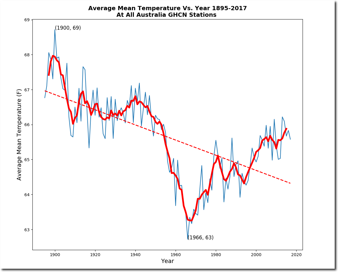
AND
No doubt someone will explain why the temperatures prior to about 1910 should be viewed with caution (even though it is clear that many stations were fitted with Stevenson type screens), and why BOM were right to start their reconstruction around 1910 which happened to be rather cold.
“No doubt someone will explain why the temperatures prior to about 1910 should be viewed with caution”
OK, I will, it took but a few seconds on Google.
http://www.bom.gov.au/climate/change/acorn-sat/#tabs=Early-data
“The national analysis begins in 1910
While some temperature records for a number of locations stretch back into the mid-nineteenth century, the Bureau’s national analysis begins in 1910.
There are two reasons why national analyses for temperature currently date back to 1910, which relate to the quality and availability of temperature data prior to this time.
Prior to 1910, there was no national network of temperature observations. Temperature records were being maintained around settlements, but there was very little data for Western Australia, Tasmania and much of central Australia. This makes it difficult to construct a national average temperature that is comparable with the more modern network.
The standardisation of instruments in many parts of the country did not occur until 1910, two years after the Bureau of Meteorology was formed. They were in place at most Queensland and South Australian sites by the mid-1890s, but in New South Wales and Victoria there were still many non-standard sites in place until 1906–08. While it is possible to retrospectively adjust temperature readings taken with non-standard instrumentation, this task is much harder when the network has very sparse coverage and descriptions of recording practices are patchy.
These elements create very large uncertainties when calculating national temperatures before 1910, and preclude the construction of nation-wide temperature (gridded over the Australian continent) on which the Bureau’s annual temperature series is based.”
Richard,
“one should bear in mind the following”
No one should not. It’s the usual Goddard-style nonsense of showing the year by year average of a constantly changing mix of stations (and without area weighting). All it is telling you is that 70 years ago the mix included more warm places.
There is a simple iron rule here – never average a bunch if different stations without first subtracting a mean of each, preferably over a fixed period.
Nick,
The parallel danger is that today the mix includes too many warm/cool days, whatever you wish for.
The present disposition of BOM stations for ACORN-SAT was chosen by methods unknown to the public. It is unbalanced when you look at a map. There is a weighting around the southern capitals, that seems to relate to availability of stations, when the criterion should be a distribution that covers station temperatures representatively. While the anomaly method might compensate for some imbalance, it is a dubious mathematical dodge that is no match for a proper ab initio station selection process. Why, for goodness sake belatedly add Rabbit Flat to the national record? I have little doubt that station selection has favoured a narrative of global warming. There seem to be no reports to contradict this. The uncertainty introduced by a small number of key stations in central Australia and the huge weighting they carry makes official error estimated look optimistic. These stations are not coped with adequately, as the frequent appearance of single station bullseyes on national contoured maps shows clearly. It is a simple matter that the early temperature data, say up to the satellite era, is blatantly unfit for purpose, when the purpose is to inform major political and economic decisions about global warming. Geoff.
Nick
As I mentioned to you, only a couple of days ago, as soon as you change the sample set, the time series becomes meaningless.
This is why no one knows whether the temperature today is any warmer than it was in 1940 or in 1880 etc.
If one wishes to know whether there may have been any warming since say 1880, one identifies the stations that reported data in 1880 and which stations have continuous records through to 2017. It maybe that in 1990 some 406 stations reported data, and of those 406 stations only 96 have a continuous record to date. So be it. One collects the data for the 96 extant stations and then a time series plot can be presented either of absolute temperatures, or if one prefers of anomalies from any constructed reference period
This type of data set informs something of significance because we have maintained at all times a like for like sample. We can say that as at the 96 stations there has been a change in temperature and how much that change is. one can then go on and start investigating why there has been a change in temperature (eg perhaps due to urbanisation/change in local environ land use, or equipment change etc), and whether changes have occurred at any specific time, and the rate of change etc, and whether there has been a change in the rate of change.
If one wants to know whether today is any warmer than say 1940, one conducts a similar exercise. One identifies the stations that were reporting in 1940 (say 6,000) and then identify which of these have a continuous record to date (say 1500). One then collects the data from the extant stations with continuous record (ie., the 1500) and then a time series presentation can be made. Such a plot will inform something of significance. It will enable us to see what changes have taken place in the area of the 1500 stations over the 77 year period.
The present presentation of the data tells us nothing because of the constantly changing of mix of stations. At all times throughout the entirety of the time series, you must have precisely the same sample set and no changes whatsoever to that sample set.
If I am tasked with considering whether the height of men has increased due to better diet over the past 70 years, I cannot go about that task by collecting details of the average height of Spanish men for the period 1951 to 1960, then collating the average height of Spanish and Portuguese men for the period 1961 to 1970, then collating the average height of Spanish, Portuguese, Italian and German men for the period 1971 to 1980, then collating the average height of Spanish, German and Dutch men for the period 1981 to 1990, then collating the average height of German, Dutch and Norwegian men for the period 1991 to 2000, then collating the average height of German, Dutch, Swedish and Norwegian men for the period 2000 to 2010, then collating the average height of German, Dutch, Swedish, Finnish and Norwegian men for the period 2010 to 2020. If I make a time series plot, I note that over time the average height of men has increased, but in practice all that I am showing is that Southern European men are shorter than Northern European men, and all I am showing is the resultant change of my sample set,
The above is an extreme example but in essence it demonstrates the problem with the present time series anomaly sets. the constantly changing sample set within the time series invalidates the series and means that the present presentation of the data is not informative of anything at all. We simply do not know whether it is or is not warmer today than it was in 1940 or 1880, nor if so, then by how much.
WHOOPS, typo:
Richard,
“as soon as you change the sample set, the time series becomes meaningless”
But you post it here and say we should bear it in mind?
In fact, “like for like” means from the same expected probability distribution. That is why you should always subtract the mean, since it is the main source of difference. There may still be a difference of variance, but that won’t bias the average, generally. The time series of anomalies is not meaningless.
Incidentally, I can’t reproduce that plot even using dumb Goddard methods. Just plain averaging of the varying set gives an increasing trend.
Nick
Thanks your further comment.
I take all these data sets with a pinch of salt. All the various data sets have significant issues such that they are not fit for scientific purpose. Probably the best of a bad bunch being Mauna Loa CO2. That said, whilst I accept that CO2 is a relatively well mixed gas at high altitudes, it is anything but well mixed at low altitude and that is why the IPCC rejected the Beck restatement of the historic chemical CO2 analysis data. Whether the variability of CO2 at low altitudes is significant to AGW, I have yet to see any study on that, so who knows.
What we do not need is area weighting or krigging or expected probability distribution or some fancy statistical manipulator. Like for like simply means the very same stations at all times. No more, no less. If there is an issue with station moves, the station should be chucked out since it is no longer the same station.
What we need is to accept is the limitation of our data. We could design a new network and obtain good quality data going forward in time, but if we wish to delve into the past then we are stuck with the historic station set up which is being used for a purpose for which it was never designed. We should not try and recreate a hemispherical data sets, or global data sets. I do not consider we should even endeavour to make a country wide data set, although perhaps the contiguous US may have sufficient sampling to allow a reasonable stab at that.
There is no need to make such data sets since AGW relies upon CO2 being a well mixed gas such that it should be possible to detect its impact with just 100 to 200 well sited stations. I recall many years ago that Steven Mosher was of the view that 50 stations would suffice. I do not strongly disagree with that assessment, but I would prefer to use more.
All we need do is to identify 200 good stations that have no siting issues whatsoever, and have good historic data with good known procedures and practices for data collection and record keeping and maintenance. Then we simply need to retrofit those stations with the same type of LIG thermometers used in the past (1930s/1940s) calibrated as they were (Fahrenheit or Centigrade as the case may be, and using the same historical methodology for calibration as used in the country in question), and then observe today using the same practice and procedure (eg., the same historic TOB) as used at each station. In that manner we obtain modern day RAW data that is directly comparable with historic RAW data with no adjusting.
We only have to go back to 1930/1940, since this is the period from which some 95% of all manmade CO2 emissions have been made. Obviously it would be interesting to look at earlier periods going back to circa 1860, but we do not need to do so in order to examine the AGW theory. If you want to go back earlier, maybe you will need 2 different LIG thermometers, and you may need to use 2 different observation periods. It is simply a question of examining the historic record.
Now obviously that approach is not perfect. A retrofit LIG thermometer will not be identical, but if the same manufacturing process is used and the same calibration techniques used, the error bounds will be small. We then simply say what has happened at each of the 200 locations. We do not seek to average them together or to form any spatial map, but we should note how many show 0.2 degC cooling, 0.1 degC cooling, no change, 0.1 degC warming, 0.2 deg C warming etc. Just simply tabulate the result without the use of any fancy statistics. This approach would tell us something of real substance.
Whereas presently we have no idea whether the temperatures today are warmer than they were in the 1930s/1940s or than they were in the 1880s. All we know is that there has been some movement since the LIA and that there is much yearly and multidecadal variation in temperatures.
Further to my above comment in which I suggest that we should accept the limitation of our data. Here is a good visual that shows the point.: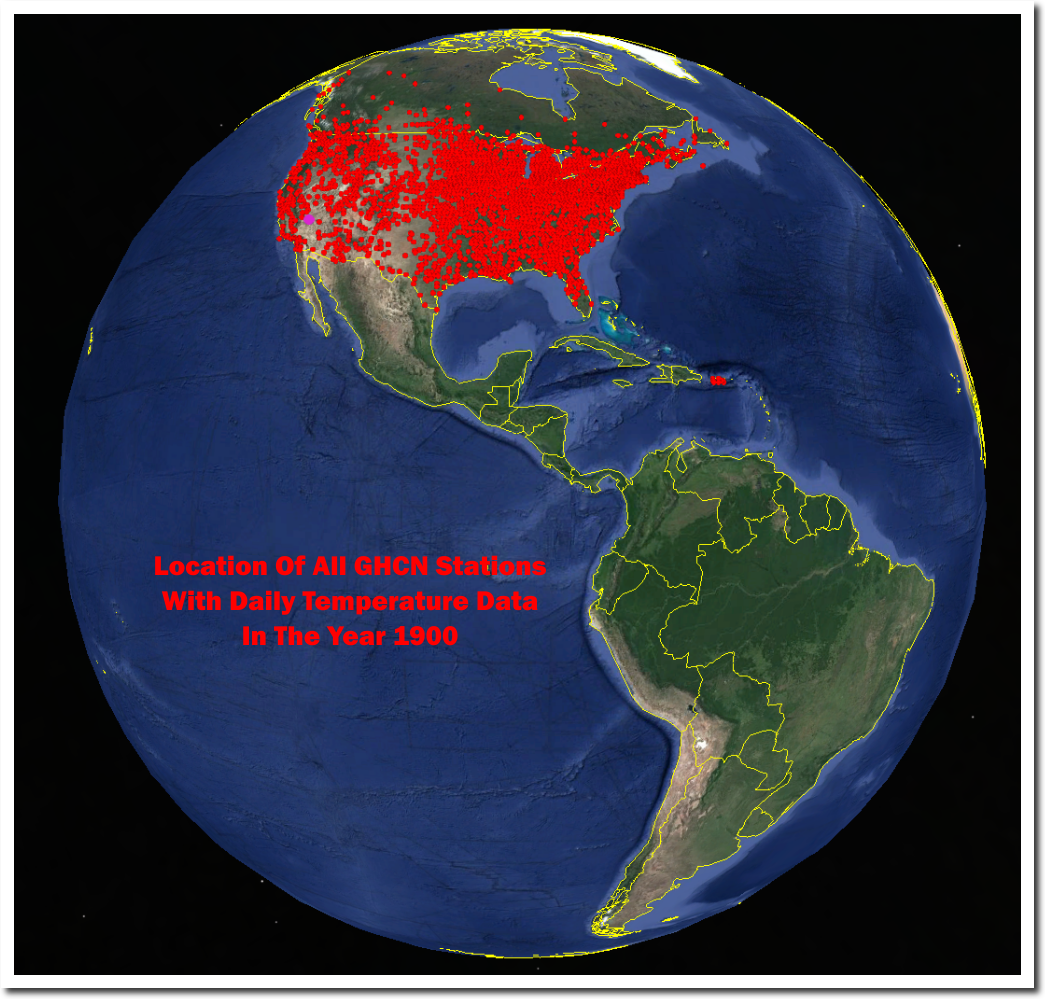
AND
The proposition is that CO2 is a well mixed gas and increasing levels of CO2 leads to warming.
The further proposition being that CO2 levels increased significantly only after 1940.
The point is that it is not necessary to make any global or hemisphere wide reconstruction. We can test the proposition(s) without such.
Since CO2 is well mixed, we only need a reasonable number of well sited stations. Since CO2 increased significantly only after 1940, we need only consider what the temperature was for the period say 1934 to 1944 as measured at the well sited stations, and then take measurement today of the current temperatures at those well sited stations, using the same type of equipment, practice and procedure as used in the period1934 to 1944.
There is no shortage of money going into climate science, and this observational test could quickly be carried out, and we would know the result within a few years. Materially, we can simply compare RAW data with RAW data with no need for any adjustments, and there is no need to employ the use of any fancy statistical model or technique.
As Lord Rutherford suggested: design an experiment that does not need statistics to explain the result.
For the sake of completion: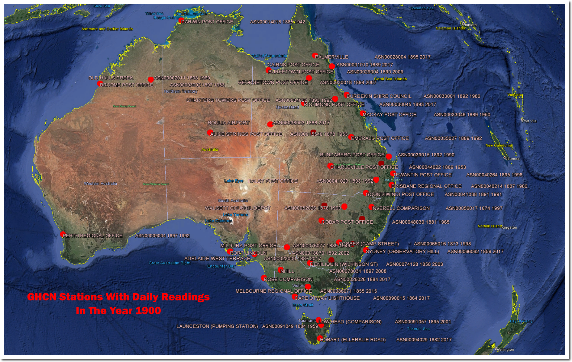
Australia has a bit of data, but it is generally on the East coast. There is no spatial coverage, unlike the image of the contiguous US above. Even with the US, it is only the Eastern half that is really well sampled.
If quality data does not exist, it simply does not exist, and I consider it unscientific to present data suggesting that we have insight into global temperatures on an historic basis.
Richard,

“we should accept the limitation of our data”
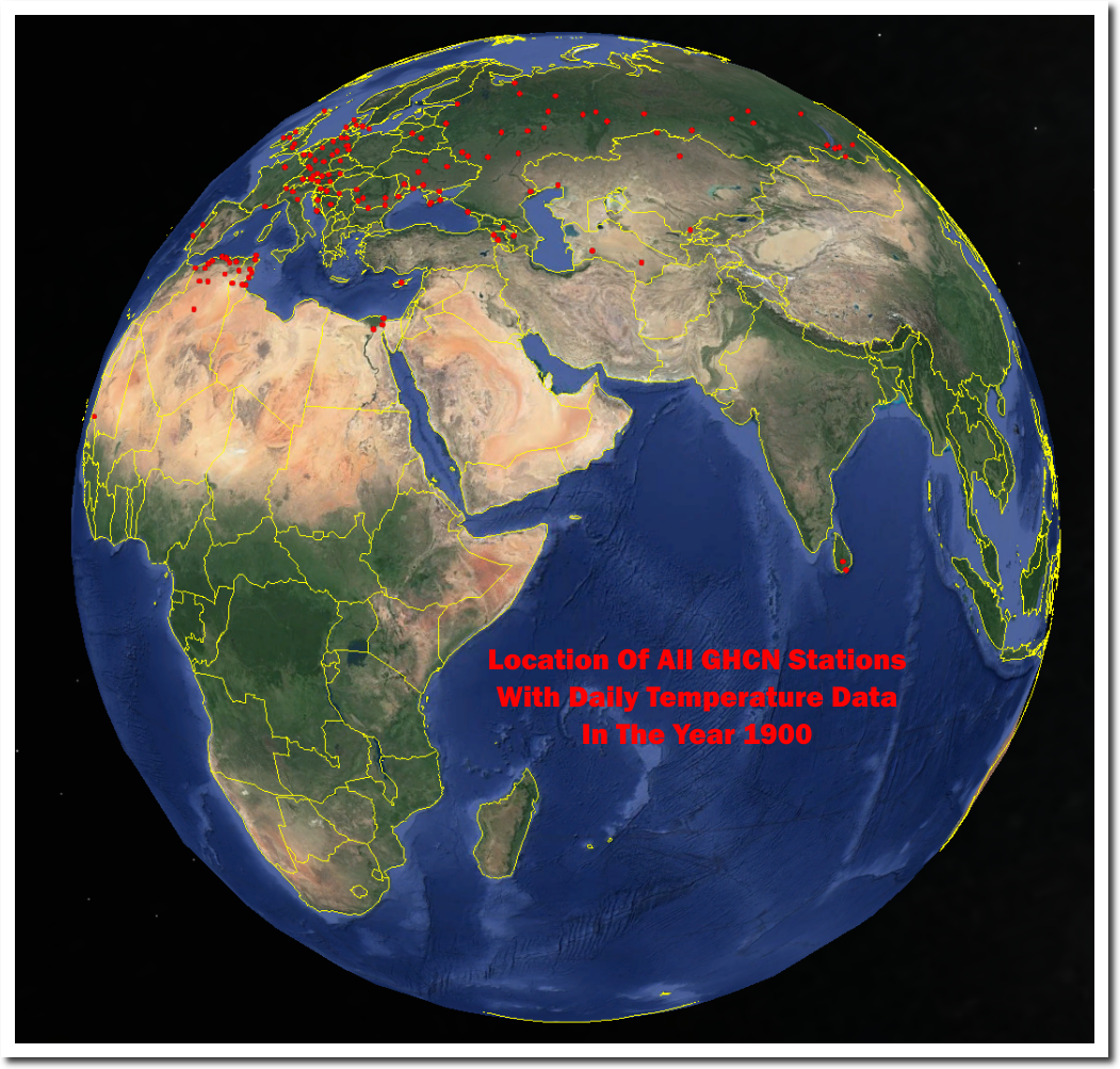
You have the limitation of getting your stuff from Steven Goddard. What you are showing are the stations with daily data in GHCN Daily. What is used for global indices are the stations for which we have monthly averages recorded, a different set. Here is a Google Maps page which lets you see which GHCN monthly stations were reporting at different times (and many other things). On that map you can click each station for details. Here is a shot of those whose reporting period included 1900 (there are 1733). It is very different from what you show:
Nick
Thanks your further comments. I appreciate the time spent getting back to me.
Probably most commentators on this site have a scientific background, and most of us are commenting on matters outside our direct expertise and where our knowledge may be limited. But then again, Feynman was insightful when he observed that: “Science is the belief in the ignorance of the experts” With expertise comes the risk of becoming blinkered, failing to see the wider picture and being unable to see the wood for the trees.
I have been on that website before which looks interesting, but I have never had success with it. Tonight, I sought to obtain a plot of the SH and waiting 40 mins but still no map loaded. But if you look at your screen shot, you will note that in the SH (this is just north of say Libreville in Gabon) there are relatively few stations.
I say that if you want to make any meaningful comparison, one must always compare like for like, and this is a point that you have side stepped. Returning to the thrust of the original article, I have suggested above that the platinum resistance probe should have been cased in material that had the same thermal response time as a LIG thermometer, and that ought to be part of the calibration of the equipment, and then field tests (in enclosure tests) should have been conducted (for a lengthy period) where the in enclosure LIG thermometer and the platinum resistance probe are monitored alongside each other. This is part of the end to end,/i> system calibration. It appears that this type of calibration was not done. I consider that to be a serious failing of BOM, but of course, they are not alone on that.
A German scientists Klaus Hager (Chair of Physical Geography and Quantitative Methods at the University of Augsburg) conducted a side by side comparison between a platinum resistance thermometer (PT 100) and the LIG thermometer and found that the platinum resistance thermometer read high by about 0.9 degC:
http://notrickszone.com/wp-content/uploads/2015/01/Hager_1.png
That is the sort of field test that BOM should have conducted at many different station sitings.
The response characteristics of thermometers is a huge and important issue. See for example the guidance given on page in the 1982 Manual for Observers: (https://archive.org/stream/instructionsforv00unitrich#page/18/mode/2up):
So this is a behavioral characteristic of a LIG thermometer, but how is this behavior replicated with the new replacement platinum resistance thermometer? This is a further issue over and above the thermal response issue.
The thermal response issue becomes more of an issue with poorly sited stations since the bias will tend exclusively, or very much towards warming. So if one has say a little swirling gust of wind bringing air from over a tarmac plot, or over a runway, or from a passing jet plane one will see a short lived warming spike. However a passing jet plane, or air over tarmac will never produce a cooling spike. The inherent bias is not equally distributed.
This type of bias causes real issues. Only a couple of years ago the UK Met office declared the highest ever UK temperature. It was at Heathrow and there was a short lived spike of about 0.9degC (if I recall correctly). Subsequent investigation established that a large jet plane was maneuvering in the vicinity at the time at question. Was this the reason, who knows, but it is probable that the old LIG thermometer would not have measured such a spike.
Then there is another issue and that is that the modern day enclosures are very different to the old Stevenson screens, the size and ventilation is very different, and these different enclosures create there own different thermal response.
We either have to accept that due to a variety of accumulated issues, our historic land based thermometer plots are accurate to around 2 to 3 degC, or should we wish to have a lower error bound, and hence to have something more informative, then we need to completely recompile the data and take a completely different approach to data acquisition and handling and reproduce, as best possible, like for like observation, including keeping at all times an identical sample set, using the same type of enclosure, painted with the same type of paint, using the same historic equipment and utilising the same historic practices and procedures etc..
Finally, I would point out that if our data sets were accurate to within a few tenths of a degree then we ought to know what Climate Sensitivity to CO2 is within a few tenths of a degree. The very fact that the IPCC sets out such a wide bound for Climate Sensitivity in itself shows that our data sets have error bounds in the region of 2 to 3 degC. It is the wide error bounds of a temperature data sets that results in us being unable to find the signal over and above the noise.
Richard,
“Tonight, I sought to obtain a plot of the SH and waiting 40 mins but still no map loaded.”
Sorry to hear that. I think it generally works with Chrome or Firefox, and most work with Safari. It needs Javascriot enabled. If it’s going to load, it shouldn’t take more than a minute or so, at most.
As a further check, here is the SW of WA in 1900. Your plot showed only one station. But there are 14:
You can verify with the NOAA station sheets. The three in the bottom SW corner are Cape Leeuwin, Katanning, and Albany. Each month marked with a colored dot.
On your notions about calibrations, remember that the objective of AWS is not to agree with LiG, but to get it right. If there is a disagreement with LiG, that is a matter for homogenisation, not the indefinite preservation of what may have been errors in LiG. Your Augsburg comparison simply shows a 0.9C discrepancy between two measurements. It doesn’t show which is right. It suggests one wasn’t calibrated properly.
“It appears that this type of calibration was not done. I consider that to be a serious failing of BOM, but of course, they are not alone on that.”
You’ve been pretty dogmatic about what BoM hasn’t done, but I don’t think you have made much effort to find out whether they have or not.
ps Richard,
There is a lot more detail here on BoM measurement procedures.
“Improper calibration would produce a consistent discrepancy”
On its own, yes. But it would account for the bias, which seems to be the author’s preoccupation. It’s unclear whether the variation would be different with two identical instruments similarly placed. No control seems to have been performed.
“I guess when considering Australian temperature records, one should bear in mind the following:”
Yes we should and here it is …..
Not the version you displayed and corrupted as Nick says.
http://www.bom.gov.au/climate/current/annual/aus/2013/20140103_Tmean_plot.png
BoM average anomalies suffer no less than Hadley CRU anomalies from shuffling stations in and out the set being averaged. The trick lies in the shuffle, just as with “mechanics” in Las Vegas. By insisting upon a FIXED set of stations throughout the entire time span and by avoiding UHI-corrupted urban stations, a set much more representative of the actual temperatures is obtained. Fortunately, Australia has a dozen or so small-town stations reasonably evenly scattered throughout its territory. Their average anomaly shows a great minimum in 1966 and a far gentler century-long trend than BoM’s graph above.
“Australia has a dozen or so small-town stations “
So which are they?
It’s at remote places such as Southern Cross, Marble Bar, Alice Springs, Cape Otway, etc. that one finds well-kept long records that manifest little UHI. It’s imperative, however, to use the data as originally recorded–not as spuriously adjusted decades later via ill-founded, blind comparisons with neighboring stations of much inferior reliability. Such ad hoc “homogenization” of indiscriminately located anomalies produces a trend 2 to 3 times higher! Along with attestations of consistent instrument response made by BoM, it’s various claims of “improved” reliability simply don’t withstand scrutiny.
BTW, my earlier reference to a “great minimum” should read 1976, in concordance with that observed globally, instead of 1966.
Just throw out Australian data and turn to the satellite record.
Obviously, the satellite data set has its own issues, but the most significant one is that it does not cover the 1930s/1940s.
The start date of 1979 is a sever restriction to its usefulness.
For those still following this thread, you might want to go over to JoNova’s website for a parallel discussion: http://joannenova.com.au/2017/09/australian-bureau-of-met-uses-1-second-noise-not-like-wmo-uk-and-us-standards/#more-54948
I still maintain that once science is used to justify a practical function, peer review should end and it should have to face a proper quality control department inspection with people paid just to knock holes in the work.
It is not just the Australian measurements that fails to maintain even remotely adequate standards the UK data would fail the tests used for even products sold for a Pound in a major UK chain. As if this was not bad enough they would fail in the rarely used category of do not consider this supplier again until they have first produced evidence of a considerable level of improvement.
i also have seen the results and some of the tests that prove that the Stevenson screen is not up to sub degree accuracy in differing air cleanliness conditions but we have no data at all on this aspect of the measurements. The assumption that pre industrial society had really clean air is readily provable to be fallacious.
The next round
“The Australian Bureau of Meteorology may not be meeting WMO, UK, US standards
Since the Australian BOM allows for one second “records”, it’s not clear it is even meeting guidelines recommended for amateurs.”
http://joannenova.com.au/2017/09/australian-bureau-of-met-uses-1-second-noise-not-like-wmo-uk-and-us-standards/
In these links you can find more detailed analysis.
https://kenskingdom.wordpress.com/2017/03/01/how-temperature-is-measured-in-australia-part-1/
https://kenskingdom.wordpress.com/2017/03/21/how-temperature-is-measured-in-australia-part-2/
As an engineer who designs measurement systems, can anyone point me to the data sheet for the sensor in the controversy? Its not just the sensor that is important but the amplifier circuit, the power supply, and the data capture system. All of these have to have their error budgets calculated. It would be good to understand the end to end system, if there is a design spec out there.
While you can get data sheets readily from reputable manufacturers (e.g., Belfort Instruments), experience indicates that their reliability is very mixed. That’s why responsible geophysical researchers insist on doing their own calibration tests before taking a sensor into the field. Furthermore, in the case of weather station equipment, it’s not the response of the sensor per se, but the effect of the enclosure that is most difficult to nail down. The white-wash or paint on wooden Stevenson screens deteriorates unevenly over time, as do the plastic thermistor enclosures of AWS. The error budget of the “end-to-end system” thus is by no means easy to understand, especially since test information from long-term deployments is often jealously guarded.
I’ve broken ranks with Marohasy. Although I’ve contributed on her blog and defended her in various forums in the past (including The Spectator and The (ridiculous) Conversation) some of what she now writes is extreme; smacks of unscientific vindictiveness and while I might watch from a distance, I’m no longer on her side. Although I once thought we were once (as they say) on the same page; there is simply no victory to be had in the approach she advocates.
Standing back with a cool head there are only a few key issues involved and most can be investigated objectively using Bureau data.
1. It was never envisaged that historic data would be used to benchmark climate trends. Consequently, the history and background of most historic datasets (earlier than 1960) is poorly known or not thoroughly researched.
No sites in Australia (from Darwin to Hobart; Norfolk Island to Sydney Observatory; Alice Springs to Port Hedland and Brome) have remained the same since their records commenced. (Of the hundreds of sites I’ve researched; only Tennant Creek seems to have remained in the same place; and even its data are affected by nearby changes.)
2. Changing from large (0.23 m^3) Stevenson screens in use since records commenced to small ones (0.06 m^3) at about the same time; and changing from eyeballed thermometers to electronic probes (and in many cases moving the screen somewhere else), also at about the same time caused a kink in Australia’s temperature record that had nothing to do with the climate.
3. No sites are homogeneous and it’s a fantasy that faulty data can be homogenised using other data that are faulty. Selection of comparator stations based on their correlation with the target ACORN-SAT site is ludicrous. Homogenisation is done everywhere using comparators having parallel faults. The whole process is a fallacy.
4. Unmanned sites beside dusty tracks or at airports and lighthouses where gear is not maintained, is guaranteed to be biased high. Only idiots use data they can’t verify and the climate-science world is overflowing with them.
I disagree with Marohasy; I doubt she understands climate data; how it is collected; why in its raw form it is no use for detecting trends and how hard it is to get data that reflects just the climate. I also disagree with the Bureau, which although abbreviated as BOM is code for climate politics.
Having taken turns with colleagues observing the weather for over a decade from 1971; set up weather stations at experimental sites; evaluated electronic probes with Stevenson screen data in collaboration with a manufacturer and analysed and used climate data for longer than I can remember; I can vouch that no Australian weather data are useful for measuring trends in the climate.
Also, even though their network is hopelessly compromised by site and instrument changes; and practices such as herbicide use; gravel mulching; cultivation; poor exposure; sensitive high-frequency probes operating in screens that are too small; and sites that are demonstrably poorly maintained; it is a fantasy that anyone can do it any better.
Cheers,
Dr. Bill Johnston
While I agree, in principle, with all your trenchant criticisms of BoM’s data products, the practical situation is not as dire as you paint it. What permits capable signal analysts to obtain quite useful time series of average anomalies is reliance upon the power of aggregate averaging of long, intact station records. The effects of most of the duly-noted vagaries of individual station records are greatly diminished thereby.
What is not diminished, of course, are systematic biases, such as due to UHI effects. But these localized effects can be distinguished from bona fide long-term regional climatic variations by their incoherence between stations. Similar to the means by which signal is distinguished from noise in target acquisition schemes, a rigorous vetting procedure for records is mandatory. Sadly, “climate science” is woefully unsophisticated in signal analysis and is obsessed with utilizing all available snippets of data indiscriminately. Proper analysis and screening procedures can demonstrably do much better than that.
Don’t get me wrong.
The Bureau’s data are and have always been useful for describing the weather; and for deriving site statistics; comparing Adelaide and Darwin or Sydney and Low Head or Townsville; which is a legitimate use; and for modelling such things as pasture growth and farming systems; which I’ve done. However changeable site control (or not even knowing what went on), makes them useless for benchmarking or analysing trends. (Data are inherently coarse/noisy and trends inseparable from serial site changes.)
Cheers,
Bill
I’m not referring to weather in my comments. My point is that there are rigorous means for identifying stations whose “changeable site control (or not even knowing what went on), makes them useless for benchmarking or analysing trends.” It’s wide-spread ignorance of those proven analytic methods (and the sheer convenience of passing off UHI as AGW) that inflates the trends of various published climate indices.
1sky1, I base my views on independent post hoc corroboration of data changes with site changes using aerial photographs; visits to museums and archives; local historic societies etc.There is lots of information available; having the time and energy to find it is the problem.
Changes occurred at many sites across Australia’s network that have been deliberately ignored by homogenisation; on the other hand, changes that had no impact on data are “adjusted”. The result is to engineer trends that don’t exist. Furthermore, faulty data embedding spurious trends are used to adjust other sites. I can give numerous examples but I’m just about to shut down and do something else.
The primary reference for homogenisation (Peterson et al Int. J. Climatol 1998: pp. 1491 to 1517), has 21 Authors and all groups who do it are represented. It is a consensus paper; what did any of those Authors actually contribute? There is hardly anyone outside the tent able to give critical review anyway. However, it is possible with careful patient research to now provide rebuttal; the challenge then is to get a rebuttal paper published. Which “expert” would do fair peer review for example? Why has the theory not been tested by the numerous professors and PhD students who use homogenised data without checking their veracity from the bottom-up?
It is almost too-big a boat to rock. Just imagine the consequence for CSIRO and the Bureau; “The Conversation” and everything (including electricity prices), when homogenisation comes apart at the seams.
Cheers,
Bill
“Just imagine the consequence for CSIRO and the Bureau; “The Conversation” and everything (including electricity prices), when homogenisation comes apart at the seams.”
CSIRO does nothing with surface temperature analysis. But the effect of homogenisation can be very simply tested by doing the same analysis on unhomogenised data, And it makes very little difference. Electricity prices wouldn’t change.
Bill:
The task of linking data changes to site changes is indeed arduous–and not entirely necessary if only relatively uncorrupted, long station records are being sought. My experience world-wide is that only a small percentage of available records pass stringent spectral tests for very significant coherence at the lowest frequencies. They are found primarily at small towns, reasonably abundant in the USA, Northern Europe, and Australia, but quite rare elsewhere.
What defenders of ill-conceived “homogenization” schemes fail to realize is the fact the rest are simply not fit for the purpose and should be totally excluded from climate-change analyses. (The notion that truly reliable ad hoc adjustments can be made to all records is patently foolish). Failing to do so, they cheerfully indulge in the casuistry of “testing” the effect of homogenization upon an egregiously corrupted, globally primarily urban, data base. Small wonder that their exercise in leads to the conclusion that “it makes very little difference.” By eschewing such circular reasoning, factor-of-2-or-more reductions in actual century-long linear trends (not highly variable trends per decade expressed per century, as Nick Stokes paints it) readily emerge in the estimates of continentally averaged yearly anomalies.
“factor-of-2-or-more reductions in actual century-long linear trends”
The graph I showed here is below. It shows, with adjusted (purple) and unadjusted (blue) global data, the trend you get for periods from the x-axis date to present. So it includes, on the left, century-long linear trends. The difference is less than 10%, not factor of 2. The breakdown by continent is done in detail here.
Because it is based upon indiscriminate use of data from all GHCN stations, instead of only properly vetted time-series, the above graph sheds no light upon the crucial issue at hand. Nick Stokes simply perpetuates the circular reasoning that mere numerical consistency of operations performed upon egregiously corrupted data tells us something meaningful about physical reality.
also snow is a 4 letter word in there weather warnings in our snowy region can you believe that