Guest Post by Willis Eschenbach
So I was wandering through the marvelous KNMI website, and I came across data for the Palmer Self-Correcting Drought Severity Index. This is an index that measures the drought conditions in some given area. The source website says:
The scPDSI (self-correcting Palmer Drought Severity Index) is a variant on the original PDSI of Palmer (1965), with the aim to make results from different climate regimes more comparable. As with the PDSI, the scPDSI is calculated from time series of precipitation and temperature, together with fixed parameters related to the soil/surface characteristics at each location.
Now, the KNMI site only offers linear trends of data. But if you look at the bottom of the KNMI page linked above, or other pages at that level of inquiry, you’ll find that there is an option to download the NetCDF version of the data. As in this case, this NetCDF data is often gridded.
And using that NetCDF gridded file lets me make a graphic showing the average scPDSI for the globe.

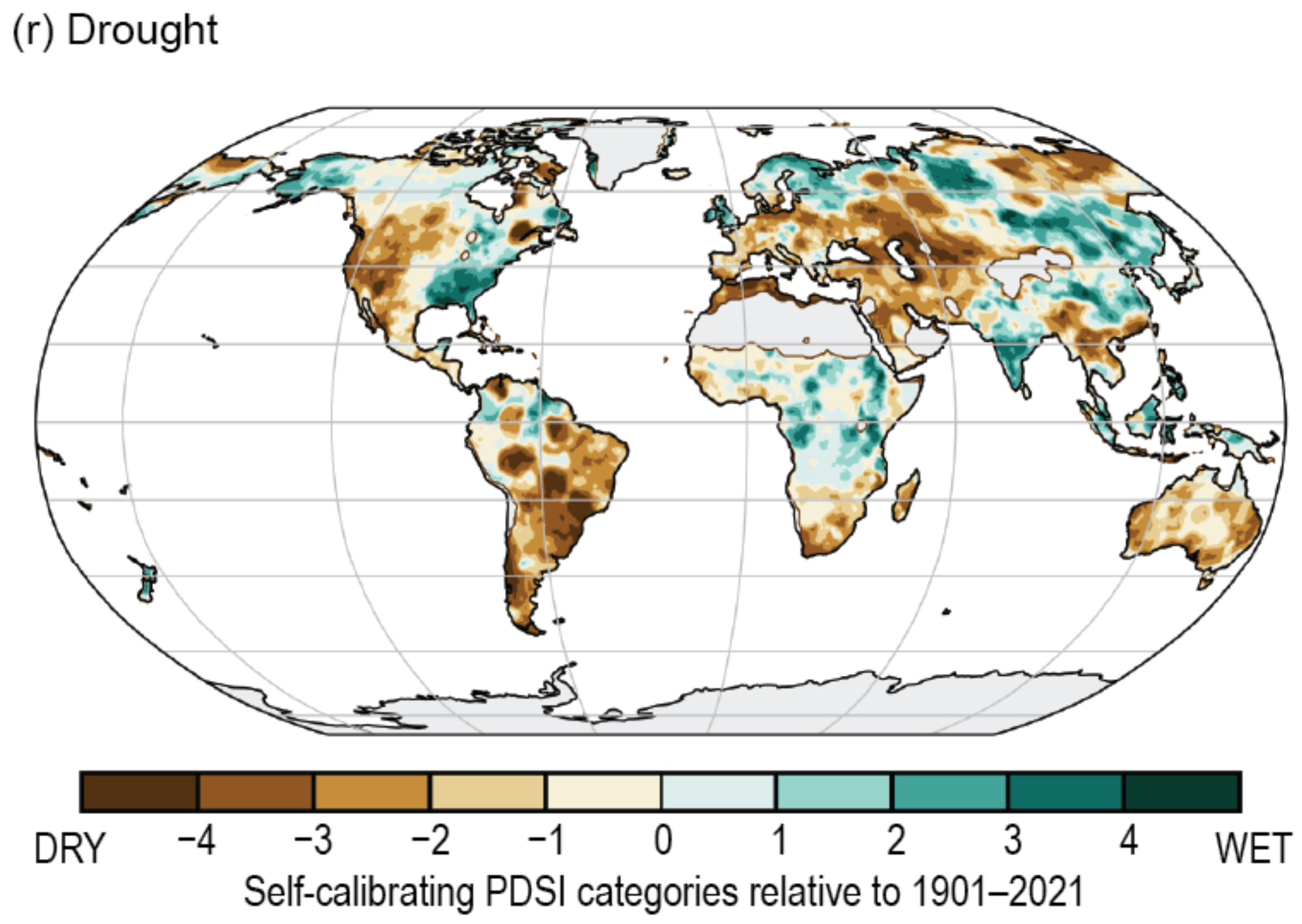
Figure 1. Yes, indeed, Australia is a dry country
Note that the long-term averages range from minus 2.5 (very dry) to 1.9 (pretty wet). Here, to the same scale, is the monthly global average scPDSI.

Figure 2. Monthly global average self-correcting Palmer Drought Severity Index (scPDSI).
No overall change in the scPDSI over the last 120 years—droughts are not becoming either more or less frequent or intense … go figure.
Having gotten that far, I thought I’d see what the IPCC Sixth Assessment Report (AR6) has to say about droughts. Here are couple of quotes:
It is an established fact that human-induced greenhouse gas emissions have led to an increased frequency and/or intensity of some weather and climate extremes since pre-industrial time, in particular for temperature extremes. Evidence of observed changes in extremes and their attribution to human influence (including greenhouse gas and aerosol emissions and landuse changes) has strengthened since AR5, in particular for extreme precipitation, droughts, tropical cyclones and compound extremes (including dry/hot events and fire weather).
SOURCE
My rule of thumb is that most of the time when the IPCC says something is an “established fact” … it isn’t. Here’s another of their claims:
In summary, there is high confidence that concurrent heatwaves and droughts have increased in frequency over the last century at the global scale due to human influence.
SOURCE
Both of those made me say “Hmmm”, so I thought I’d take a look to see what they are calling “heatwaves”, “droughts”, and “high confidence”. From the glossary of the Working Group where those quotes are found, we have:
Heatwave: A period of abnormally hot weather, often defined with reference to a relative temperature threshold, lasting from two days to months. Heatwaves and warm spells have various and, in some cases, overlapping definitions.
Drought: An exceptional period of water shortage for existing ecosystems and the human population (due to low rainfall, high temperature, and/or wind).
SOURCE
I suppose it might be possible for definitions of measurable phenomena to be more vague, but you’d have to work at it. How on earth can you have “high confidence” in claims involving totally undefined terms? And a two-day “heatwave”? Say what? That’s not a wave, that’s a tiny ripple.
Next, here’s how they assign “high confidence”. Not with mathematics or statistics, as you might imagine, but by squinting at it from across the room and making a value judgment based on “evidence” and “agreement”.

Figure 3. IPCC matrix for making value judgments regarding “confidence”.
So how can they have “high confidence” that ” concurrent heatwaves and droughts have increased in frequency” over the last century when they haven’t even bothered to establish clear, bright-line definitions for either heatwaves or droughts? This is fast approaching simply throwing darts at the above confidence matrix …
Having seen that the IPCC is merely issuing its usual meaningless pabulum, I continued my investigation of the scPDSI. I moved on to looking at the 120-year trends by geographical areas. Here’s that graph:

Figure 4. Century-long trends in the self-correcting Palmer Drought Severity Index.
Some points of note. First, there’s no overall trend. Next, almost nowhere has there been a change of more than ± 0.1 units per century. Next, the southwestern US has gotten wetter and the rest has gotten drier. And Australia, as usual … drier. But again, not much.
Seeing that graphic made me wonder about the oft-repeated claim that wet areas are getting wetter and dry areas are getting drier. For example, a study in Nature magazine says:
The “dry gets drier, wet gets wetter” (DGDWGW) paradigm is widely accepted in global moisture change.
To determine if this is true, we can use a scatterplot of the trend in scPDSI levels (Fig. 4) versus the average scPDSI levels. This gives us the following:

Figure 5. Scatterplot, trend vs average, self-correcting Palmer Drought Severity Index.
Interesting. Most of the world has an average scPDSI between -1 and +1 (bottom scale). There’s little trend in there. But in the dry areas, less than -1, the dryer it is, the wetter it’s getting. And the same is true above +1, the wetter it is, the dryer it’s getting.
Finally, I made a video of the annual changes in scPDSI around the globe. Here’s that graphic:

Figure 6. Video, changes in annual average scPDSI.
My conclusion from that? Ignore the hype about droughts. There’s almost always a hair-raising drought going on somewhere on this lovely planet.
In closing, to show there’s nothing new under the sun, here’s a long-term look at drought conditions in the American west …

Good thing that the now-ubiquitous Climate Snowflakes weren’t around during the 200-year drought, the folks back then would never have heard the end of their whining …
My very best to everyone,
w.
Heard It Before Note: When you comment please quote the exact words you’re discussing. It avoids endless problems and misunderstanding.
Editor’s note. For general reference on droughts and other topics, visit EveryThingClimate.com
https://www.sciencedirect.com/science/article/abs/pii/S0022169423003281
https://notrickszone.com/2023/06/19/new-study-21st-century-precipitation-trends-have-become-less-intense-globally/
https://joannenova.com.au/2023/07/models-wrong-again-looks-like-climate-change-is-making-rainfall-less-intense-globally/#more-92412
If true, means what?
Climate models appear to be similar to the output of an anti-aircraft, electro-mechanical predictor I used to maintain in the navy.
During the real-time processing of the ‘problem’ as to where to point the guns from inputs from a radar system, I was able to (and sometimes did) hold my thumb on the rotor of the output servos in order to dampen oscillations (jitter).
A thumb on the scales seems to be a required climate-model input
Floods – In summary there is low confidence in the human influence on the changes in high river flows on the global scale. Confidence is in general low in attributing changes in the probability or magnitude of flood events to human influence because of a limited number of studies and differences in the results of these studies, and large modelling uncertainties.
IPCC AR6 WG1 11.5.4
Droughts – There is medium confidence in the ability of ESMs to simulate trends and anomalies in precipitation deficits and AED, and also medium confidence in the ability of ESMs and hydrological models to simulate trends and anomalies in soil moisture and streamflow deficits, on global and regional scales
IPCC AR6 WG1 11.6.3.6
Willis:Eschenbach:
You have an uncanny ability to find flaws in the established understanding of the meaning of data.
To that end, I have had an article recently published titled “Definitive proof that CO2 does not cause global warming”
https://doi.org/10.30574/wjarr.2023.19.1.1329
It also explains why an El Nino is now forming.
If it can pass your critique, it must be correct, although I do expect that you will pass..
I tried, but the data source link ( https://Fluid.nccs.nasa.gov/weather ) is broken.
Also, here’s another one of my rules of thumb:
Any climate science article touting itself as “definitive proof” … isn’t.
Proof of any kind, particularly “definitive” (whatever that means) proof, is very, very, very scarce in climate science.
w.
Willis:
The data source link worked for me.
On the page that is brought up select “reanalysis” in the tool bar
Then scroll down to “Chem Maps”, and select from the list of options at left: Global, SO2 Column, click on the “date of Analysis” and select the date of interest from the pop up (anything back to 1980), and “activate” under the image. (Can take 15 seconds, or so)
Watching the SO2 aerosol pollution from the 1991 Pinatubo eruption (which lowered average global temps by ~0.5 deg. C) spread around the globe is very interesting
I chose the word “Definitive” in the sense that all aspects of our changing climate, both now and in the past, can be explained simply by differing amounts of SO2 aerosols in the atmosphere, which can be either natural, or man-made. There is zero evidence of any actual temperature changes due to CO2 or to solar effects. Just hypotheses.
This premise is testable, has been tested. and has been validated.
The link works for me.
So why do we keep hearing that the USA west is the driest in 1000 years?
What fake data leads to that alarmist trope?
I don’t know of any data that shows the western US to be the driest in 1000 years. It’s certainly not dry at the present time. California was inundated earlier this year and their drought situation is much improved, and the jet stream configuration is bringing rain into the central States and alleviating their drought condtions, too.
Climate Change Alarmists are real bad about making things up out of thin air. This claim of theirs sounds like one of those.
Do we know if there is a change to higher UV radiation over the last 100 years or so?
That could be the main cause for all the warming we have seen. More radiation reaching deeper in the ocean, warming the ocean surface and also more evaporation from soil and plants.
So nothing to do with CO2 so you can’t blame humans for it.
https://earth.nullschool.net/#current/wind/surface/level/overlay=uv_index/orthographic=37.79,17.52,380/loc=0.673,41.645
https://www.aemet.es/es/eltiempo/observacion/radiacion/ultravioleta?l=barcelona&f=anual
That’s one of a number of hypothesis.
The Science isn’t settled. 🙂
Robert C,
About 1988 I searched for records of global UV monitoring programs. I did this because Al Gore had claimed in his book “Earth in the Balance” that rabbits an salmon in Patagonia were going blind from increased UV. So someone had to be measuring incoming UV.
In those days, a search was much harder than now, so there is a chance that I missed some literature. But, at the time, I was unable to find ANY scientific, reported measurements of UV flux of any significance for baseline trends globally, or for use today in following past trends.
Naturally, I’d be pleased to read links that show me wrong. Geoff S
I went off to find about this ‘self calibrating drought index’
NB ‘index‘
Not ‘drought’ as in actual water deficit, ‘Index’ as in a calculation of water deficit and as such = something that includes myriad assumptions.
It stunk to high heaven in same way as Leaf Area Index tells us about Global Greening = a fabrication, created by computer, based on what it was told with myriad untold assumptions being made/assumed
So this Drought Index stinks
Oh oh oh you say, everybody **knows** what a drought is, everyone can picture drought and what it does.
Do they really,
just like they know what ‘climate’ is,how it’s different from weather,how trapped heat controls weather,how Temperature = Energy,how the atmosphere is transparent,how Oxygen/Nitrogen are not = GreenGasGases,how water is a GreenGasGas when in fact it’s just ordinary stuff that absorbs heathow The Emperor is so smartly attiredThey know only what they’re told to know and in this thing, they’re told relentless bullshit
I went to find out about this ‘self calibration’ and came away with the worst migraine I’ve had in a long time..
Never mind twitching its tail or wagging its trunk- Neumann’s Elephant could visit the Moon, travel through time, rewrite Shakespeare while enjoying the benefits of a dozen different varieties of sexuality while walking AND talking AND picking its nose/trunk.
On a tight rope.
There are soooooo many variables and assumptions it’s simply insane.
There is actually a variable assigned to ‘Climate’ in its calculation so what frigging use can it be for deciding if The Climate Has Changed – the calculation cancels it out
As exactly we see in Willis’ graphs
I visited the UEA website Willis linked to and they themselves have created a graphic, as far as I can see using identical data and same timespan as Willis used in his Figure 1 above.
Quote:”This is an index that measures the drought conditions in some given area. The source website says:
here it is as drawn/imagined by the ‘source website‘- Spot The Difference
(scroll halfway down or here….)
How to measure drought and how it’s changing:
Method: Simply visit your chosen place(s) and get as much barometric pressure data as you can for as far back as you can. All you need is an average but from closely(time) spaced measurements = at least 4 per day
Logic: Because water molecules have half the molecular mass/weight of the other atmospheric gases and because water evaporates All The Time (including from frozen ice)
Air containing water vapour will be much more bouyant than dry airvand tend to rise – lowering the barometric pressure
When there is a ‘a lot’ of water around (no drought) the air pressure will be on average lower than when the air is relentlessly dry (actual drought)
That’s all you need to track drought – has barometric pressure at ‘wherever’ you choose been falling or rising over your selected time period?
Isn’t that simply inconceivable in these modern times – actually using the presence/presence of water to measure drought?
presence/absence
Nice to see that Sahara is not dry ..
Was that Nature article submitted before or after the first draft, AKA the “subject to copy editing”, version, of the AR6 WG-I assessment report was published (August 2021) ?
In section 4.4.1.3, “Precipitation” (4.4 = “Near-term Global Climate Changes” …), on page 584 of the final version (May 2022), they first of all admit that
before citing a “peer reviewed scientific paper published in a serious journal” … Gulp ! … which reached the conclusion that
In section 4.5.1.4, “Precipitation” (4.5 = “Mid- to Long-term Global Climate Change” …), on page 601, the IPCC indicates it is aware that the situation is more nuanced than blindly repeating the old “dry gets drier, wet gets wetter” incantation, as the Nature article authors apparently did :
Always glad to see you weighing in, Mark. You always bring valuable information to the table.
Thanks for the compliment, but as a fallible human being I aim for “often” rather than “always”.
“Nullius in verba”, take nobody’s word for it … AKA “Trust, but verify” …
In my mind I tend less toward “bringing information” than asking questions along the lines of “Where the [ bleep ] did that come from ?!?”, combined with a “dog with a bone” mindset until I get detailed answers that actually (occasionally) resolve my state of confusion (as Willis can attest, see how patient he was in this multi-day exchange under his last WUWT article …).
The results of past enquiries over the decades, however, have given me a relatively large set of “information” and quotes to draw on at short notice.
Being Aussie, I have often wondered why Australia is a dry continent/island, as you note, Willis. My current best explanation is because it lacks much mountain range, highest peak being only 7,2000 ft high or 2,220 metres. Moisture laden winds from over oceans meet little uplift that leads to rain dumps. There are likely other reasons like those involving nucleation abundance.
In short, nothing emerges as likely to increase rain for centuries, so why bother losing sleep about it. But, given that on local scale, rainfall variation correlates with land temperature variation and can explain several tens of percent of temperature variance, we say that rain cools. Dr Bill Johnston reports on this with data on Bomwatch blog. So the question arises whether Australia, in parts or on whole, reports hotter temperatures than it should compared to other land areas of same latitude. I don’t have the computer or data base to look. But if there is an effect, what does this mean for calculating global temperatures and then attribution of changes to magical CO2?
(Sorry I have not adapted to “The science is settled” or the recent WEF “We own the science.”). Geoff S
This paper by Conor Murphy, Robert Wilby et al mentions some of the droughts in the UK since the mid 17thC.
‘The forgotten drought of 1765-1768 in the British and Irish Isles’
Major droughts : 1798-1808, 1854-1860, 1887-1888, 1890-1909, 1921-1922, 1933-1934, 1959, 1976, 1990-1992, 1995-1997.
Dry seasons or years : 1740-1744,1780-1781, 1785-1786, 1788-1789.
Shorter droughts: 1705, 1736, 1756, 1788.
https://rmets.onlinelibrary.wiley.com/doi/10.1002/joc.6251
Seems drought is quite common.
Normal annual variation of rainfall is quite high everywhere. Vegetation that adapts to local rainfall can become lush over a few years, which is going to make the inevitable low rainfall year seem to be a devastating drought to us occasional observers.
and then we’ll have bushfires.
Here’s your Drier Drought.
This is from one of my Wunderground stations = the one at Derby (as close to the geographic centre of England as you could wish for) and one of the longest temp records I can find.
I do know it has been running for nearly 20 years but Wunderground now seem to ‘crop’ the data at about 11 or 12 years old..
The ‘temp’ is the average of the average for each of the 7 days of that week – as calculated by Wunderground
Wunderground only give a Daily max and Daily min for barometric pressure, so the weekly value here is the average of those 14 values
To get the data to fit on the graph and ‘scale things’, the value you see for ‘pressure’ is that average value minus 1,000
wots rekkon…………is temperature related to barometric pressure which is in turm related to water content of the landscape
i.e. A dry landscape will warm faster than a wet one, will have less evaporative cooling. less heat storage capacity and will be subject to more frequent ‘high pressure ridges’
It’s because dry hot air is denser than warm wet air.
Crazy innit – you thought ‘Hot air rises’
In my reply-to-self below is the temperature data for that weather station but going back to 2003
The temp data for Derby since 2003 – a running trailing average of the monthly figures as presented/published by Wunderground
There’s your Climate Change = Aridification
Its always a pleasure to read your articles – as much a part of your observation of the world as your theorising! In the UK where we are not subjected to extremes of climate very much, i would have to say that not much has changed in my 66 years of existence. The weather gets hot, the weather gets cold, or wet or dry…….But the same plants grow, if anything a little more vigorously, the same animals frequent the countryside and the same birds visit my garden in pretty much the same quantities. Bees still visit all my flowers and vegetables and fertilise them, slugs and snails still eat things before I can get to them. The fish still shoal, there are calm days at sea and stormy days and the tide seems to go out just as far as it ever did when I was a kid.
So what then is this move towards catastrophe, I cant see it and I certainly dont think my children or their children are threatened by it either. The worst drought in living memory was in 1976 here – coming on for 50 years ago – since then we have had dry spells and hot spells but nothing of particular significance. If the planet was getting hot and dry wouldnt we have seen a worse spell of drought than 1976 by now……..maybe this year but theres no sign of it yet!!
Half a glass of water.
They want to claim it used to be full but it evaporated.
Hello Willis, thanks for this work. One question : shouldn’t the signs in figure 4 caption be reverted ? For example you say US southwest is getting wetter, as it seems to be getting drier on the figure. There’s something I don’t get.
Also, I can’t find your account on twitter anymore (apologies if you already answered about this). Did you get suspended ?
Figure 2 begins in a cold AMO phase and ends in a warm AMO phase.
The last graph seems to show that drought in the American west was correlated with higher temperatures (either globally or in the north Atlantic and northwestern Europe). The two megadroughts bracket the Medieval Optimum, when Eric the Red sold farmland in Greenland. The long wet period of approximately 1500 – 1850 corresponds to the Little Ice Age. But something different has been going on since 1900.