Guest Post by Willis Eschenbach
For a while now, I’ve been using a curious kind of scatterplot. Here’s an example. It shows the relationship between the surface temperature and the effects of clouds on surface radiation. Clouds can either warm or cool the surface, depending on location, time, and type. The phenomenon is called the “Cloud Radiative Effect” (CRE).
The amount of radiative cloud warming or cooling (the CRE) is measured in watts per square meter (W/m2). Positive means clouds warming the surface, and negative means clouds cooling the surface. Globally as an area-weighted average, clouds radiatively cool the surface by about – 21 W/m2.

Figure 1. Scatterplot, surface temperature (horizontal “x” axis) versus net surface cloud radiative effect (vertical “y” axis). Gives new meaning to the word “nonlinear”.
What are we looking at here? Well, each blue dot in Figure 1 represents a 1° latitude by 1° longitude gridcell somewhere on the earth’s surface. Each dot is placed horizontally with respect to its 21-year average temperature and vertically by its 21-year cloud radiative effect. The yellow/black line is a LOWESS smooth that shows the overall trend of the data.
And of particular interest, the slope of the yellow/black line shows how much the cloud radiative effect changes per 1°C change in temperature.
We can see from Figure 1 that clouds generally warm the coldest areas of the planet. Gridcells in the ~ 10% of the planet where the average annual temperature is below -5°C are warmed by clouds.
In warmer areas, on the other hand, clouds cool the surface. And when the temperature gets above about 25-26°C, cloud cooling increases strongly with increasing temperature. In those areas, for each additional degree of temperature, cloud cooling increases by up to -15 W/m2. This is because of the rapid increase above 26°C in the number, size, and strength of thermally driven thunderstorms in the warm wet tropics.
Here’s a video showing how the thunderstorms follow the warm water throughout the year.

Figure 2. Thunderstorm intensity is shown by colors (cloud top altitude is a measure of thunderstorm strength). Gray contour lines show temperatures of 27, 28, and 29°C.
From this, we can see that thunderstorms emerge preferentially over the hot spots, and they effectively put a cap on how far the temperature can rise in those areas. This is the reason that only 1% of the earth’s surface area, and virtually none of the open ocean, has an annual average temperature over 30°C.
With that as a prologue, since few people in climate use a gridcell-based scatterplot, let me discuss this kind of scatterplot. It has a very valuable property.
The value is that the method is looking at longer-term averages. In Figure 1, for example, these are the average temperatures that each of the gridcells has settled to after millennia. As a result, the gridcell-by-gridcell temperatures include all the possible various feedbacks and the majority of the slow responses to changing conditions.
And this allows us to answer questions like “what will be the response of the clouds if the temperatures warm slowly”? Alarmists would have you believe that the warming will be increased by the feedback of the clouds.
But Figure 1 tells a much more complex and nuanced story. The slope of the yellow/black line shows the change in CRE in response to a 1° change in temperature. If it slopes down to the right, it shows that the magnitude of the cloud-caused cooling is increasing with increasing temperature—the CRE is getting more negative, and clouds are doing more cooling..
There are only two places where the clouds act to increase an underlying warming. These are the areas in Figure 1 where the yellow/black line slopes upwards to the right. They are the 3% of the surface colder than -20°C, and the ~30% of the earth between 15°C and 25°C. These total about a third of the planet.
Gridcells at all other temperatures will have increasing cloud cooling as they warm, particularly the third of the globe that averages above 25°C.
Conclusion? Only a third of the globe has a warming cloud feedback and it is not that strong. Two-thirds of the globe has cooling cloud feedback, and in addition, the cooling feedback is far stronger than the warming feedback.
Thus, we can say that on average the cloud feedback is negative, not positive. An area-weighted average of the above data shows that globally, cloud cooling averages -3.2 W/m2 of cooling for each one degree C of warming. (In reality, the overall cloud response will be smaller than that, because the warmest areas of the earth where the cloud feedback is greatest are generally not going to warm much.)
Now, I’ve stated above that this method gives us the long-term answer after almost all of the various feedbacks, slow warmings, and adjustments have occurred. I’ve stated that this is not the short-term response of the clouds to surface temperature. It’s the long-term, basically steady-state response.
As a result, it can actually answer the question about the long-term response of clouds to 1°C of warming. And it can answer the question in detail, showing how cloud feedback varies from the poles to the tropics.
The only argument that I can see against this is that some slow thermal adjustment from the most recent warming hasn’t arrived yet. Possible, but here’s why that will likely make little difference—a rising tide generally lifts all boats.
In other words, if we have several nearby gridcells and one gets a slow residual thermal adjustment from recent warming, in all likelihood the other nearby cells will get a similar slow residual thermal adjustment as well.
And this will leave the slope of interest, the slope of the yellow line in Figure 1, pretty much unchanged.
Or at least, that’s what my logic said. However, I’ve always preferred data to logic. After some thought, I realized I could test this by taking shorter averages of the CERES data instead of the full 21-year average. I used 5-year averages of the same CERES data. For comparison, I’ve plotted them to the same scale as in Figure 1.

Figure 3. LOWESS smooths of the scatterplots of four selected subsets of the CERES data. Underlying scatterplot data not shown.
As you can see, the LOWESS smooth trend lines of all four gridcell scatterplots are so close that they cover each other up. This definitely shows that a gridcell scatterplot is indeed showing the long-term, all-inclusive relationship between the two variables of interest. It’s barely affected at all by the changes in CRE and temperature between the 5-year periods.
I’ll leave this here, and I will return to what I’ve learned from other gridcell scatterplots in the next post.
My very best to all,
w.
PLEASE: When you comment, quote the exact words you are responding to. I can defend my own words. I can’t defend your rephrasing of my words. Thanks.
Hi Willis, one more point to respond to.
I had failed to track that your Greenhouse Multiplier was defined as (in my notation) SLR/Sn where SLR is surface longwave emissions Sn is net absorbed sunlight.
I’ve been using 𝛽 = OLR/SLR as my metric (where OLR is outgoing LW radiation), and i had mistakenly thought your metric was 1/𝛽.
So, it’s interesting to see your post A More Accurate Multiplier. In that post, you adjust for advection. Though I’m not 100% certain how you did that adjustment, the ways that I would think to do that would lead to you basing your multiplier on an “input” that is numerically equal (or close to equal) to OLR. So, it appears that you rediscovered the metric I’ve been using (or the inverse of that metric).
For climate engineering this means one would need cloud engineering across the whole globe. Green alarmists are living in cloud cuckoo land.
Is this article saying the following?
There is global warming
The warmer troposphere holds more water vapor
More water vapor in the troposphere leads to more clouds
More clouds block some incoming solar energy
As a result, changes in clouds should limit the water vapor positive feedback effect of a warming troposphere
This would be a logical explanation for why there were limits to global warming trends in the past 4.5 billion years — clouds saved us from runaway global warming from a water vapor positive feedback.
Over a decade ago that was my theory for why our planet never had runaway global warming, even when CO2 levels in the troposphere were up to 10x higher than today.
The reason we don’t have runaway warming on earth is because 1) we have oceans and 2) the planck response is larger than total feedbacks, by a factor of about 1.5x or so.
The reason we don’t have runaway global warming is because the Greenhouse Effect is bollocks dreamt up by climate change alarmists and lukewarmists.
That’s not a rational response. Do you have anything reasonable to contribute? The Planck response is about 3.2 W/m^2/C. Total feedbacks are about 2.1 W/m^2/C, give or take. Whatever the precise value, it’s smaller than the Planck response, so temperatures stabilize.
While your description of the Greenhouse Effect is somewhat true, I don’t think it was “dreamt up” so much as a misunderstanding of the energy flow in the atmosphere and radiation models. It all looks rational from a static viewpoint.
In reality, once saturation of surface radiation frequencies occur, then there’s no more energy to warm the planet. The claim that additional CO2 reduces IR flow to space is based on seeing increases in downwelling IR from the models. However, this is only part of the process.
When you increase CO2 you must also increase upwelling IR. And, the increase must be higher than the increase in downwelling IR due to the changing density of the atmosphere as up go up. Fortunately, this cooling effect is balanced by slightly enhanced absorption due to pressure broadening,
The net of this is the temperature is almost completely independent of CO2 concentration.
The warm temperatures so evident over the region encompassing Indonesia, Philippines and Papua New Guinea is the antipode to the Chicxulub impact event.The primary heat source is geothermal.
Willis,
Using your Figure 1 I did a quick plot of % cumulative surface vs temperature. It is a bit crude because the bin size is 10C but it certainly does suggest there is no need for complex climate models to determine temperature.
I also did a PDF.
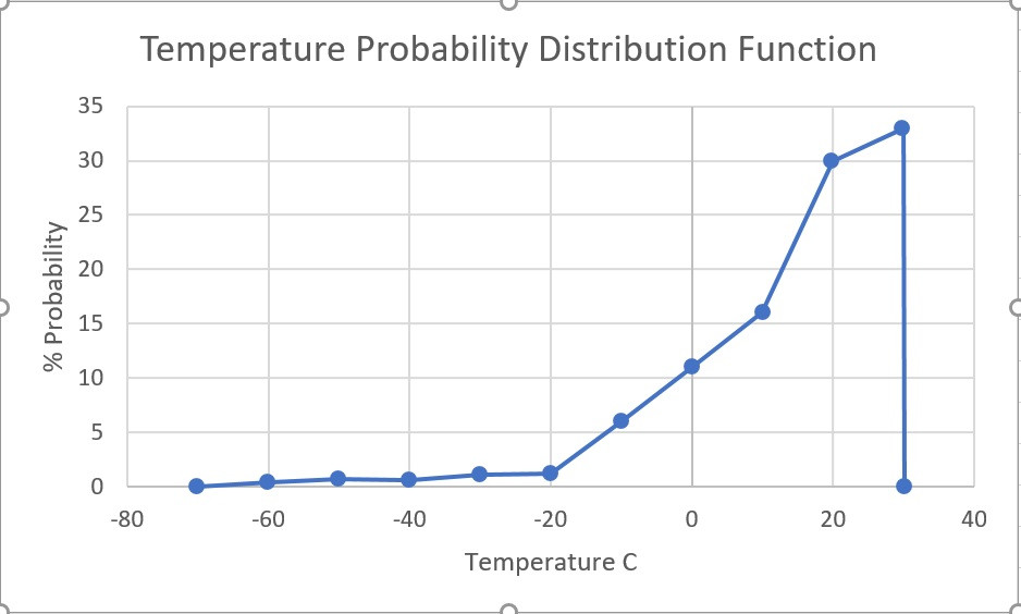
https://freeimage.host/i/Zt4exs
Willis,
I would like to repeat my two graphs with higher resolution if the raw data for your fig 1 is available. By year if possible to capture trending.
The PDF especially because it is so skewed. Assumption of a normal distribution may have skewed results.
PM email if convenient
Thanks, Ferd
Added a trendline to your data. Almost perfect fit with poly order 4. While this might simply be S-B, would expect to see cos(lat) solar.
Willis,
The most obvious response to me is that you did not calculate or estimate ANY feedback in any meaningful sense of the word. A feedback by definition is how much a warming signal is amplified or dampened by some feature of the climate system – in this case, clouds. So if GMST increases by 1 C, then a positive feedback of 0.2 W/m^2/C would amplify that signal by 0.2 W/m^2.
What it looks like you did is plot CRE with temperatures inferred from the CRE – a simple S-B calculation – to plot 21 year averages of CRE with inferred temperatures. It shows how CRE changes with temperature inferred from CRE regardless of the GMST anomaly. It does NOT calculate to what extent a global warming signal is dampened or amplified by clouds. At the very least, for that you’d need two curves at two different GMST anomalies to see how the curve CHANGES with increasing GMST. You didn’t do that. More interesting would be two plots, one of 1980-2000 and one of 2001-2021 and then compare the two.
In an actual estimate of the cloud feedback published in a scientific journal, this is what you you get. “We are able to constrain global cloud feedback to 0.43 ± 0.35 W⋅m−2⋅K−1 (90% confidence), implying a robustly amplifying effect of clouds on global warming and only a 0.5% chance of ECS below 2 K.” https://www.pnas.org/doi/full/10.1073/pnas.2026290118
Scott J Simmons October 15, 2022 1:25 pm
That is exactly what I did. I showed that as temperatures increase by 1°C, over part of the temperature range clouds have positive feedback (warming) and over the rest of the range they have negative feedback. I also gave the global area-averaged value of that feedback.
I did nothing of the sort. I did NOT infer temperatures from CRE, nor do I think that’s even possible.
Instead, I calculated the temperatures from the upwelling surface longwave. However, the graph does not change in any meaningful amount if I use the Berkeley Earth temperatures instead.
Clearly, you didn’t understand what I did. Which is not a problem … until you try to lecture me based on your misunderstandings.
Finally, you say:
Yes, I know that. It’s a central tenet of their alarmism, because without that, their house of cards collapses. AS I SAID IN THE HEAD POST:
You’re free to take that on faith. After all, they “use data of 52 GCMs from the Coupled Model Intercomparison Project phases 5 and 6 [CMIP5/6]” and who can possibly argue with 52 climate models that don’t even agree with each other?
I trust my analysis of the actual observations over any number of climate models, but hey, that’s just me …
That’s not what you did. You did NOT calculate how the curve you plotted would be altered by a 1 C change in GMST. You plotted how CRE changes with 1 C changes in inferred local temperatures. That’s not a feedback calculation. A feedback is in units of W/m^2/C, where C is a change in equilibrium GMST.
You could have used Berkeley Earth, but instead you used the S-B equation. But again, the X axis is still local temperature, NOT a change in GMST, so it’s not an argument against how the cloud feedback amplifies warming from a change in GMST.
You didn’t supply any shred of evidence that there’s a collapsed house of cards. You plotted a graph of CRE with inferred local temperatures. You did NOT show how that graph would be altered by a change in GMST, which is what you’d need to do show that a cloud feedback is negative.
But your analysis simply was not an analysis of any cloud feedback. It was a simple plot of temperature from the S-B equation with CRE. It was not an estimate of a W/m^2 change per 1 C increase in equilibrium GMST.
From the paper “Here, we develop a statistical learning analysis to calculate an observational constraint on global cloud feedback that significantly improves on previous estimates and does not require high-resolution simulations or observations.”
In this case, laughably, they use no science whatsoever. Past performance is no predictor of future performance. And yet this is what they claim constrains the result.
“ Clouds can either warm or cool the surface.” It takes 540 calories to change one gram of water at any temperature to one gram of water vapour at the same temperature, (latent heat.) As moist air rises it cools and the relative humidity increases. At the cloud condensation level, the vapour in the cloud condenses to liquid water, releasing 540 calories per gram. All this heat raises the temperature at the cloud condensation level. The rate of heat transfer from a warmer body to a colder body is proportional to the temperature difference between them.The Earth cools more slowly under cloud than under a clear sky. Cooling more slowly is not the same as warming up. To warm the surface, the cloud would have to be warmer than the surface. This would violate the principle of conservation of energy.
That’s not how conservation of energy works. If you put on a jacket, its temperature is less than 98.6 F, and yet it keeps you warm. It slows down the rate at which IR light escapes your body. In climate system, the GHE can keep the surface warmer than its effective temperature without violating conservation of energy.
I think this is a big deal.
<I> Well, each blue dot in Figure 1 represents a 1° latitude by 1° longitude gridcell somewhere on the earth’s surface. </I>
Doesn’t a “gridcell” represent more square miles near the equator than near the poles? And, so, when you say, <i> Two-thirds of the globe has cooling cloud feedback, </I> I wonder if that’s 2/3rd of the grid cells or 2/3rds of the area.
a 1° latitude by 1° longitude grid cell is 60 nautical miles on the north-south axis. the east-west dimensions are cos(latitude) x 60 nautical miles. this gives a reasonable approximation of what is otherwise a complicated subject.
pouncer, you’re correct about the differing size of the gridcells. I take that specifically into account via area-averaging.
And when I speak of “two-thirds of the globe”, that always means actual area, NOT 2/3 of the gridcells.
w.
Willis writes “In warmer areas, on the other hand, clouds cool the surface. And when the temperature gets above about 25-26°C, cloud cooling increases strongly with increasing temperature. In those areas, for each additional degree of temperature, cloud cooling increases by up to -15 W/m2. This is because of the rapid increase above 26°C in the number, size, and strength of thermally driven thunderstorms in the warm wet tropics.”
Also I think its worth noting you’re effectively hiding the incline by ignoring those few, presumably land based areas that show an average surface temperature above about 35C. The graph, if it was plotted, looks to reverse and go suddenly back to about/above 0 W/ms2 CRE. This appears to be around 15% of the earth’s surface too so not at all trivial.
Better to be thorough than evasive.
Tim, I am not hiding one damn thing, nor am I “evasive”. Those are scummy, scurrilous personal attacks that unfortunately you seem to specialize in. I invite you to gently place them a goodly distance up the far end of your alimentary canal.
You will be thoroughly ignored by me until such time as you can ask a scientific question without including any more of your false vile invective.
I am an honest man. It seems you are unfamiliar with the breed. I don’t hide things. I don’t evade questions. I tell the truth as clearly and transparently as I can, and I work to answer all cogent interesting questions.
But I’m not here to be your damn whipping boy, in that regard you are more than welcome to osculate my fundamental orifice.
w.
Instead of being overly sensitive you might have explained why your first graph doesn’t go all the way to the right and cover the last 15ish% of the planet.
But your response says it all really.
Tim, without a scrap of evidence you claimed I was hiding facts and evading issues. I’m an honest man, and I won’t stand for some charming anonymous internet humanoid like you making false accusations about me. I tell the truth as best I know it, and I admit my mistakes when I make them.
And now you have the insufferable arrogance to claim I’m the bad guy for objecting to your nasty behavior?
Really? You insult me without either reason or evidence, and I’m wrong for pointing out that you’re acting like an ℁soyl?
Like I said, if you want to discuss the science I’m your man. Stick to the science, leave the insults out, we can make it work.
But I won’t be your whipping boy in the process. Maybe that works on your friends. It doesn’t work on me. Keep a civil tongue in your head, and we can talk science.
In hopes of better days,
w.
Willis writes “without a scrap of evidence you claimed I was hiding facts and evading issues.”
Without a scrap of evidence? You didn’t plot the graph for what appears to be about 15% of the planet. Its right there in plain sight.
Twice now you’ve had the chance to explain why but instead have gone off at me because I’ve called you out for failing to plot all the data.
Tim, I don’t generally explain things to people who start out by insulting me.
However, I’ll make an exception. You said:
Yes, there are gridcells with 21-year average temperatures above 35°C.
They make up 0.009% of the earth’s surface.
0.009% …
NINE THOUSANDTHS OF ONE STINKIN’ PERCENT, and you’re making slimy false allegations about me because my graph didn’t include that meaninglessly small part of the planet?
Piss off, and don’t come back until you can keep a decent tongue in your mouth.
w.
Three things
The plot finishes half way through the 33% section of the earth so you need a better graph if that represents 0.009% of the earth.
Like it or not, you hid that data in your graph which should have shown it even though it would have visually weakened your argument on thunderstorms.
I’m the one who should be offended, not you. You’re a nasty piece of work at times.
Willis writes “Yes, there are gridcells with 21-year average temperatures above 35°C.
They make up 0.009% of the earth’s surface.
0.009% …
NINE THOUSANDTHS OF ONE STINKIN’ PERCENT, and you’re making slimy false allegations about me because my graph didn’t include that meaninglessly small part of the planet?”
Actually the graph stops at 30C, not 35C so its a LOT more data that’s been hidden. Tell me, why are you claiming you only missed the data above 35C?
Ah, my bad. The amount above 30°C is 1.0%.
w.
Okay…so…Water Vapor is the strongest greenhouse gas (as has been exclaimed here and as has been widely known since—-you know—-atmospheric physics) AND it regulates temperature almost immediately…..
As opposed to the depths of the oceans eating the CO2 induced warming!
Okay….okay….so how can they regulate water vapor and make money from that boogeyman?!
My basic observation is there are two kinds of clouds. Clouds over land, and clouds over sea. Perhaps more likely, clouds transported over dry land, and clouds evaporated from the local sea.
My growing up in low humidity Northern California, and my time in low humidity interior Alaska my observation is that terrestrial clouds over a low humidity land provide insulation between terra and sky. At night, this means terrestrial clouds act as a blanket to hold the heat over the land, keeping the land from radiating that heat to the clear cold night sky. In the day, terrestrial clouds over dry land shield the land from warming, thus keeping the land cool.
Dear Willis,
Very interesting and thought-provoking. Excellent article.
One question: you mention that these data come from grid cells of 1 degree latitude by 1 degree longitude. One degree of latitude is always the same; 60 nautical miles. However, 1 degree of longitude varies, from 60 nautical miles at the equator declining steadily with latitude until, at the north and south poles, 1 degree of longitude approaches zero.
So, do the grid cells have constant area? Or do they decrease with increasing latitude?
Best Regards,
Dale McIntyre
Thanks, Dale. The gridcells are indeed different in area, so it’s necessary to area-weight all averages.
Best regards,
w.
Hi Willis. After offering a few comments on older posts, I’m ready to address the current one. As is often the case, I find your CRE scatterplot analysis admirable, intriguing―and flawed.
I believe that your core premise relies on invalid logic, and that your empirical test offered no clear evidence to validate that premise.
In what follows, I’ll offer specific explanations of both these assertions.
This is the premise I’m referring to:
I’d like to explain:
1) A gridcell-by-gridcell analysis does not include all the possible feedbacks because every gridcell functions in a particular global context; it there is truly global warming, then that will put gridcells into a context that none of them has ever experienced before. That’s a general statement, but I can spell out exactly what I mean. I’ll risk being verbose so that you can follow my logic without the with a reduced chance of it not making sense:
Thus, another gridcell with the target temperature we’re moving towards will NOT in general have been operating in equivalent conditions. So, it’s NOT logical valid to assume it can provide a valid prediction.
Your procedure seems based on the premise that atmospheric behavior depends only on absolute temperature. But, that’s not true. Thermodynamic behavior of the atmosphere also depends on relative temperatures, not just absolute temperatures. After a global temperature change, there will be brand new combinations of relative and absolute temperatures. And that invalidates the logic of your process.
2) Regarding your empirical test… I’m glad you thought to try to do a test, but at the level of what you’ve shown us (up close the data might reveal more) the test is NOT sensitive enough to assess the validity of your hypothesis.
In short, simply eyeballing the curves and saying they look “really close” is highly misleading and proves almost nothing regarding your argument. Without careful examination for differences as small as even 0.1℃ of shift to the right, and better yet, a test of statistical significance, I think you’re fooling yourself if you think your well-intentioned test has thusfar validated your hypothesis.
If you do investigate whether or not you can rule out key parts of the curve having shifted, I’d be very interested to learn what you discover.
It’s been fun to think about this.
Thanks for your consideration, and for your ongoing investigations.
Thanks, Bob. You say the analysis method is flawed because it’s not taking into account a host of things other than available solar power that affect the temperature.
But in fact, I’ve included every one of those other things. For example, selecting for where the temperature is 20°-21°C, we get a range of gridcells from around the planet, hundreds of them. The only thing they have in common is the temperature. They have different clouds and seasons and all that stuff.
And despite that, they don’t appear randomly at any value. Instead, there’s a complex but very clear relationship between temperature and CRE shown in Figure 1—a pattern that includes all known variations of the other variables affecting the CRE.
Regarding your second question, you point out that it might shift to the right or left by 0.4°C. I agree, but it’s what I call a “difference that makes little difference”.
Remember, I’m looking at the whole world. What’s of interest to me is the overall shape, the weighted average, and the way it drops almost straight down at the highest temperatures. Your shifts don’t affect those questions.
w.
True. But, unfortunately, those are the wrong questions to validate your hypothesis.
To the contrary. Your intuition might tell you tiny shifts like that aren’t important. But math says that such a shift would entirely destroy the validity of your thesis.
Suppose that for a segment of your LOWESS smooth curve, it’s well fitted (in some units) by:
CRE = +2⋅(T – 10)
You have a grid cell at T=11℃ in 2003. It’s CRE value is in the center of the distribution, so CRE = + 2⋅(11 – 10) = +2.
By 2018, the temperature of that grid cell has risen by 0.4℃ to T=11.4℃
You predict CRE will change by ΔCRE = 2⋅(0.4) = 0.8
BUT, an undiscernable shift of 0.5℃ happened between your first curve and your 4th.
So, NOW, the new curve for CRE is
CRE = -2⋅(T – 10.5)
For our gridcell with a new temperature of T=11.4, that means
CRE = -2⋅(11.4 – 10.5) = 1.8
That means ΔCRE = 1.8 – 2 = -0.2.
Your method predicted ΔCRE = 0.8 but actually ΔCRE = -0.2.
That tiny, undiscernable shift has the power to make your predictions entirely wrong!!
* * *
With respect, I think you are engaging in what I call “sloppy verbal reasoning.” In my experience, that’s a practice that can justify just about any conclusion a person sets out to obtain. What it’s not good at is identifying reality.
I don’t trust my own sloppy verbal reasoning or anyone else’s, because it’s so extremely likely to be wrong. Part of the problem is that such verbal reasoning is typically full of ambiguous vague concepts, unexamined implicit assumptions, and unjustified logical leaps. When I was younger I did a lot of mathematical proofs, and I learned how tiny a logic error it takes to make one’s conclusions worthless.
So, when I want to check some logic that matters, I try to get precise about meanings, and if at all possible put what I can of it into some mathematical form, to see what that reveals.
* * *
You say that for those gridcells, “The only thing they have in common is the temperature.” I guarantee you that’s not true, though it might seem that way superficially.
The statistician in me is screaming at how obviously and wildly erroneous that logic is.
Let me offer both a concrete argument and an abstract argument. The abstract one might be harder to “get”, but to me it’s compelling.
* * *
A] Here’s a concrete argument. NONE of those gridcells have, in the last few centuries, experienced an atmosphere with a CO2 concentration 2X higher.
That increased CO2 concentration is NOT simply equivalent to increasing sunlight. CO2 introduces a dynamic where every time the lapse rate changes, that changes the efficiency of emissions from the surface reaching space. That’s NOT something that happens when sunlight increases.
None of your data for gridcell behavior in recent decades includes gridcells which have experienced a lapse-rate vs. heat transfer dynamic that strong!
* * *
B] Here’s an argument that may seem abstract, but which I’m deadly serous about:
The problem is, all those gridcells are drawn from the same probability distribution for properties. If something like radiative forcing changes the probability distribution, then all bets are off. Your prior information is potentially worthless.
When you change the probability distribution, then that “complex but very clear relationship between temperature and CRE” WILL shift. That is almost a certainty, for the vast majority of possibly changes in probability distributions.
The trend you’re seeing isn’t just about the grid cells you’re looking at but the probability distribution they are drawn from.
As someone who messes around with probability and statistics from time to time, it’s as clear as the nose on my face that it’s astronomically unlikely that your hypothesis could turn out to be true.
You’s acting as if all probability distributions were the same, just because it seems like the grid cells you look at from the current distribution subjectively seem to cover “the full range of possibilities.” That can’t possibly be true. Different probability distributions lead to different outcomes, and I can’t imagine an argument that would convincingly justify an assertion that the probability distribution won’t change.
As an example, maybe that “very clear relationship” you discovered for some segment has the form: CRE = 5 + 0.01⋅T ±2.
But, unbeknownst to you, that’s because the 5 in that formula is is really 0.1⋅X where X was a variable that used to have an average of 50 and a range of ±20.
Now, after radiative forcing, X averages 80±20. So now,
CRE = 8 + 0.01⋅T ±2.
Suddenly, everything you thought you know about CRE and T is wrong.