John Entwistle
A few months back one of the commenters on this WUWT article: https://wattsupwiththat.com/2021/07/12/the-truth-about-heat-waves/ posted a comment to the effect that the number of heatwaves is increasing, and cited this article on the EPA website: https://www.epa.gov/climate-indicators/climate-change-indicators-heat-waves . Embedded in the EPA article is this diagram:

I was disappointed that the article doesn’t provide data, methodologies, or calculations. It also used some terms such as “the local threshold” and “heat wave season” without defining them. I was prompted by this comment to channel my inner Willis to see if I could replicate this chart.
What is a heat wave?
I started with the definition of a heat wave. I found several delightfully ambiguous definitions on the internet. From Mirriam Webster we have: “a period of unusually hot weather”; Wikipedia defines it as: “A heat wave is a prolonged period of unusually hot weather.”; while from NOAA there is: “A heat wave is simply a period of unusually hot weather that typically lasts two or more days. The temperatures have to be outside the historical averages for a given area.” These definitions leave a lot of room for interpretation. Who gets to decide what is unusual? Historical averages over what period of time? Average over the whole period or a moving average? What is the local threshold and who determines its value? How far outside the historical averages?
Getting Some Data
I began my search for data by looking for some actual temperature records from my area. I wanted daily observed data, not monthly summaries or grid estimates. I live in central New Jersey, just outside of New York, and I was surprised to find that, despite the fact that there have been private colleges / universities and military bases from all branches within a stone’s throw of my house since the revolution, no local institution has recorded, or at least published, a historical daily temperature record. The best that Climate Data Online (https://www.ncdc.noaa.gove/cdo-web/ could offer was three discontinuous data sets from different locations, the oldest starting… in 1960! On WUWT it’s often been stated that “climate is 30 years.” If I was to look for heat waves from the ‘60s that meant that I needed to find data from at least 1930 in order to look for heat waves in the 60s.
I poked around the internet and found some sources that had daily temperature observations in New York starting in the late 1800s:
High Plains Regional Climate Center: High Plains Regional Climate Center – CLIMOD (unl.edu) at the University of Nebraska Lincoln. This site has a good data set for New York’s Central Park.
Cornell University: weather.nysaes.cals.cornell.edu/history/ has records taken at their experimental farm outside of Geneva, NY.
I used Python scripts to scrape or parse these data sets into CSV files. There was some missing data, particularly in the early years, so discarded the records from before 1900. The Cornell site seems to have stopped posting half way through 2020, so I dropped the last six months of that data set to align with the end of 2019. There were still a few holes, so I filled in the gaps by calculating the average of the ten days before each gap and plugged the hole with that average.
| Data Set | Date Range | Number of rows | Missing Highs | Missing Highs % | Missing Lows | Missing Lows % |
| New York Central Park | 1900 through 2020 | 44195 | 6 | 0 | 7 | 0 |
| Cornell | 1900 through 1999 | 43892 | 110 | .25% | 134 | .31% |
Back to the question of “usual temperature”. How do we determine the usual temperature for any given day of the year? It bothers me that we always think about usual / normal / average temperatures in terms of calendar months. A calendar month is a convenient fiction invented, in the case of our calendar, by the Romans. Months have little or nothing to do with actual climate related phenomena.
Rather than using an average of the days of a month, or the n days prior to a day, I thought it might make more sense to look at the temperatures for each individual day and location across the ~120 periods of each data set. This approach gives us a mean temperature for each day of the year that we can then use as the basis for our “two plus days above usual” evaluation. Using Python, Pandas, and Matplotlib I was able to quickly generate a data series for each day of the year over the ~120 years of each temperature record, calculate the mean, standard deviation, and a least squares trend line for each day, and plot these to see how the temperature has changed year over year for that day.
120 Years of Daily Temperatures
Every year citizens all across the US get together on the fourth of July, US Independence Day, to eat hot dogs, drink beer, and complain about how hot it is. A plot of the temperature on US Independence Day in Central Park from 1900 to 2020 looks like this:

The mean in this graph is the mean high temperature value for this day of the year, in this case day 185.
Cornell University has an experimental farm not too far from Geneva, NY, about midway between Rochester and Syracuse. They’ve been collecting temperature data since 1891, though they stopped updating their web site mid-way through 2020. If we look at July 4 in Geneva from 1900 through 2019 we get a slightly different picture than the one in Central Park:

It is interesting to note that the minimum temperatures in both locations have increased over the last 120 years.
I thought it might be fun to have a look at similar daily plots for some days that might actually be climate related – the solstices and equinoxes. Here is Central Park again:

The same four solstice / equinox days look like this in Geneva, NY:

Heat Waves
To find the heat waves we need to find two or more consecutive days above normal. I decided to use one standard deviation above the mean temperature for that day of the year as “normal” for that day. I will do this for the entire year, not an arbitrary “heat wave season”. After all, if it is really warm in the middle of winter, isn’t that a heat wave?
To start, I identified every day above this threshold value. Here is the count of these ‘hot days’ per year in Central Park:

The plot of hot days for Geneva, NY looks like this:

From here it’s a simple matter to count the number of consecutive hot days to find the heat waves:


Now let’s look at intensity and duration. I’ll choose intensity to mean the average temperature of all heat waves that year.


These are interesting pictures. Does it mean that heatwaves are getting cooler, or that the percentage of heat waves in the cooler months has increased in the latter half of the data period?
Finally, we can plot the average length of the heat waves each year over the same period:


Summarizing by Decade – The EPA Chart
Averaging the above heat wave numbers for each decade from 1900 – 2019 gives us charts similar to those provided by the EPA:


Interestingly, the number of heatwaves per decade in both Central Park and upstate New York in the period 1960 – 2019 show an increase in the number of heat waves each decade, similar to the EPA graph, though it looks like they used a higher threshold because the number of heatwaves they cite is much lower. The period from 1960 to 2020 doesn’t appear to tell the whole story, though, as we can see that there was a warmer period in both data sets in the 30s and 40s. The intensity and duration charts that I’ve produced are quite different from EPA’s in each location.
One Chart to Rule them All
The EPA only had one set of charts representing an unspecified region, I suppose the whole Earth? I have two sets of charts, one for the city and one for upstate. Combining the two by averaging the decadal values for each location gives these plots:


I’m not sure what these combined charts tell us. Averaging the counts of the heatwaves across the two locations does seem to mask the steady rise in the number of heatwaves in Central Park. The intensity and duration charts that we produced here bear no resemblance to those produced by the EPA. It would be nice to know what data they used to produce their charts.
What is clear is that a distance of approximately 300 miles and an altitude difference of 780 feet has produced very different temperature data in these two locations. The heatwave charts seem to show that even thirty years is not long enough to understand the climate in either location. It would be great to have another hundred years of data to see if that seemingly cyclical pattern in the number of heatwaves is real.
All data and calculations can be found here: https://github.com/jentwistle3/Heatwave_public
If readers want to get a stress headache, have a read of recent literature on marine heat waves. Unfettered alarmism seems to dominate cold, hard scientific assessment. Again. Geoff S
” I was prompted by this comment to channel my inner Willis to see if I could replicate this chart.”
Add a little back radiation here, a bit of back radiation there, maybe ramp up the ECS. Remember, it is imperative you don’t supply any evidence for any assertions you might make or else you will have the lukewarmists banging on your front door.
That should channel your inner Willis, John.
Don’t forget to delete my comment, though. That would not be inner Willis if you didn’t.
Typical Leitmotif. Full of personal attacks, plus lies that I don’t supply evidence, and without a single relevant scientific comment on the subject at hand.
And of course, the big lie, that I’ve deleted his comments. Despite being sorely tempted to place his trash in the appropriate receptacle, I can’t recall ever doing that.
Leitmotif, you are a lying sack of bovine-processed hay.
w.
Willis,
That’s an insult to sacks of bovine-processed hay!
At least THEY can be utilized for important things like methane digesters or compost piles!
Abolition Man is a Willis Groupie.
You obviously like junk science too.
“ Full of personal attacks, plus lies that I don’t supply evidence”
Erm… Well you don’t. You just utter BS about back radiation causing surface warming. You don’t even refer to any experimental evidence where this surface warming is measured.
You are also a serial liar, Willis. You have deleted many of my comments over the last year and those of rick will, eben and I also believe Zig Zag Wanderer. If you don’t believe me go back and check your blogs in the last 12 months.
If anyone is a lying sack of sh*t it’s you Willis.
Btw, I have background of STEM subjects to degree level. What is your background? Oh, wait a minute … psychology. Yes, that’s it. Not really a science, is it?
You need to be careful when using local observations to explain heatwave properties. For example, UHI effects and marine cooling in coastal towns.
For many cities, especially coastal ones, the heatwaves, however defined, originate away from the city. Example, Melbourne Australia gets many of its worst heat waves blown in from central Australia, more than 1,000 miles away. It is the weather and climate of central Australia, combined with wind strength and direction, that governs most heatwave properties in coastal cities to the S-E.
Probably the same with Florida. Does it get heat waves when central US is cool? Geoff S
Very well done analysis. The Urban Heat Island for New York has been commented on several time. I recently updated my Urban Heat Island web site with several more Land Surface Temperature maps, using Analysis Ready Data from the USGS Earth Explorer web site. Some of you might find the maps of interest.
http://www.urbanhi.net/uhi-cities/new-york.html
The problem with the whole “global warming” thing is that more than 200% of the data is fabricated either through manipulation of actual readings into homogeny or through fraudulent inputs to force table A to perform like expected table B. This means the margin of error on the output is up around 4000% Yes, that’s a four digit number indicating 40x as much error as the original individual data inputs.
This clearly indicates that most climatologists shouldn’t even be allowed to operate single-ply toilet paper.
John, that’s a nice piece of work. Many thanks. As mentioned, it would be great if you could extend it to as many other sites as possible.
When I looked at the four EPA graphs, two things were obvious – and they do not cast the EPA in a good light.
First, the graphs start in the 1960’s, although of course there is good data going back to at least the 1900’s. It’s obvious why they did this: the warm 1930’s is just too inconvenient, so they had to go. Sadly this fraudulent practice is common. Shortly after Biden became presiden, the US wildfire agency deleted all the wildfire data before 1980. Of course, the deleted data shows that US wildfires were far worse during the 1930’s and that today’s wildfires are fairly average.
Second, the graphs show no sign of the cooling in the 1970’s – another example of hiding inconvenient data. In contrast, your graphs clearly show a cool 1970’s. During those years many climate scientists were telling us we were doomed by global cooling. How quickly can climate science bandwagons change!
Still, we shouldn’t be surprised by this scientific malfeasance. In many areas, including climate and air particles, the EPA “science” is hopelessly corrupt.
Chris
Hi Chris
I am in the process of collecting data from other sites and will follow up with another post when I have the chance. Many of these older data sets have large gaps that I am loath to fill in so it takes a lot of surfing to find decent ones. Then too there is the problem that many are urban or airport, which may bias the results. That darned day job keeps intruding as well.
Regarding the claim that the EPA article “doesn’t provide data, methodologies, or calculations”: I saw these in the EPA article:
“For consistency across the country, Figures 1 and 2 define a heat wave as a period of two or more consecutive days when the daily minimum apparent temperature (the actual temperature adjusted for humidity) in a particular city exceeds the 85th percentile of historical July and August temperatures (1981–2010) for that city.”
Figure 2 has maps showing where these major cities are, and they can be identified.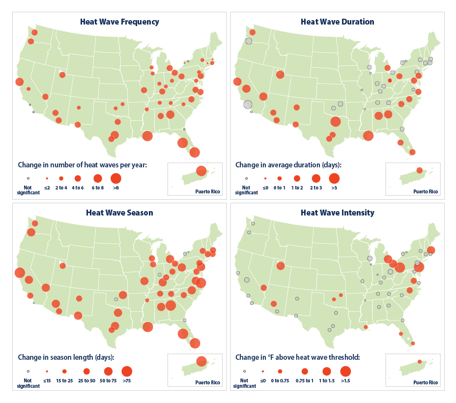
More methodology statements are in the article farther down.
I don’t see lack of stating methodology, etc. being the problem. I see the stated methodology, apparently chosen to maximize indication of increase of heatwaves, being the problem.
“I’m not sure what these combined charts tell us”
They tell us no more or no less than all the other charts used to demonstrate aspects of global climate change. They do seem to be honest representations of data available but as such only become confusing visuals.
Graphics are too often accepted as a true representation of reality which makes them effective for purposeful misdirection. To be believable they must use unassailable data. If such (observational or experimental) data exists (which I doubt) it can only pertain to the past. The chart may tell you what was, but that may have no relationship at all to what is or what may be.
Thanks for making an already confusing topic even more confusing. I am probably not helping.
She certainly can can-can.