By P Gosselin on 30. October 2021
Satellite data raise doubts about man-made climate change

Climate models do not represent reality. They sre running too hot.
Climate modeling has been awarded the Nobel Prize. But two German researchers prove that observations are more important than calculations in climate research.
By Alex Reichmuth (Switzerland)
(Translated, edited by P. Gosselin)
There was great satisfaction among protagonists of man-made climate change when the Nobel Prize Committee awarded at least half of this year’s Nobel Prize in Physics to American Syukuro Manabe and German Klaus Hasselmann. The two researchers are pioneers of what is known as climate modeling – that is, the attempt to trace and predict climatic developments with the help of mathematical models.
The prize recognizes “that our knowledge of the climate rests on a solid foundation, based on rigorous analysis of observations,” praised Thors Hans Hansson of the Nobel Committee as he announced the winners. Of “balm for the beleaguered souls of climate researchers,” wrote the “Tages-Anzeiger.” It will now be “even more difficult to ignore and discredit climate research.” Climate models were based on “solid physics,” it said.
Climate models have failed
With so much applause, it was lost how big the scientific problems are that go hand in hand with climate modeling. This was evident again just recently with the models called CMIP6, which form the basis of the new Intergovernmental Panel on Climate Change report issued in early August. The CMIP6 models are not able to correctly reproduce the real temperature development of the past decades and simulate a warming that is much stronger than the real data show. Thus, there can be no confidence in these models to correctly predict future warming. The Intergovernmental Panel on Climate Change has nevertheless relied on them.
Nobel laureate Klaus Hasselmann
Critics of climate modeling include, in particular, Steven Koonin, a highly accomplished American physicist and climate scientist who once served U.S. President Barack Obama and recently published a “climate skeptic” book. He notes that climate models have failed time and again because they fail to prove human influence on global warming. Discrepancies among individual climate models showed “that the science is far from settled”.
.

Almost all models are running too warm. Nobody knows why. Image: Legate’s presentation Heartland 14th Climate Conference Las Vegas 15 October 2021
Data from NASA’s Ceres project used
In general, real-world data repeatedly calls into question the results of climate models and thus the tone-setting climate science. This is also the case with a study by German researchers Fritz Vahrenholt and Hans-Rolf Dübal, which has just been published in the peer-reviewed scientific journal Atmosphere.
Vahrenholt and Dübal are originally chemists, but have worked extensively on climate science in recent decades. The study is based on data from NASA’s Clouds and the Earth’s Radiant Energy System (Ceres). Ceres has been using satellites to record the radiation that reaches, and is emitted by, the Earth since 1998. The project’s goals include a better understanding of the role of clouds and the Earth’s radiation balance with respect to global warming.
Cloud cover has decreased by two percent
And it is precisely these data from Ceres that throw a wrench into the thesis of man-made climate change. Vahrenholt and Dübal conclude that it is not man-made enhancement of the greenhouse effect that is the main cause of warming over the past 20 years, but a two percent decrease in cloud cover during that period. According to Vahrenholt and Dübal, the weaker cloud cover has resulted in more shortwave radiation from the sun reaching Earth. This increase in solar radiation has been a major driver of global warming.
NASA researchers led by Norman Loeb, as well as Finnish researcher Antero Ollila, have each pointed out in a study that shortwave solar radiation increased from 2005 to 2019 due to a decrease in low clouds. Dübal and Vahrenholt have now studied radiation fluxes for the entire period from 2001 to 2020 – both near the ground and at an altitude of 20 kilometers – and related them to changes in cloud cover.
Greenhouse effect had only a small impact
In fact, the satellite data from Ceres show that the shortwave radiation emitted into space by the clouds has decreased by about two percent in both the northern hemisphere (NH) and the southern hemisphere (SH). With solar radiation remaining nearly constant, this means that more shortwave radiation has reached the Earth’s surface and contributed to warming. At the same time, the fraction of longwave radiation that is reflected back to Earth from the atmosphere has only warmed the planet to a lesser extent. This radiation back to the earth is the greenhouse effect, which has been intensified by the emission of climate gases. According to Fritz Vahrenholt and Hans-Rolf Dübal, this enhanced greenhouse effect has even been largely compensated by the aforementioned decrease in cloud cover: The decrease in clouds has resulted in more longwave radiation reaching space from the earth.
IPCC relies on model calculations instead of real data
The study results of the two German researchers contradict the claims of the Intergovernmental Panel on Climate Change (IPCC), according to which the observed warming occurred solely because the proportion of long-wave radiation reflected back to Earth from the atmosphere increased (due to the stronger greenhouse effect). The IPCC attributes 100 percent of the warming to this enhanced greenhouse effect – but justifies it with model calculations rather than real data.
“The warming of the last 20 years has been caused more by changes in clouds than by the classical greenhouse effect,” say study authors Fritz Vahrenholt and Hans-Rolf Dübal
In their study, Vahrenholt and Dübal also looked into the background of the observed stronger heat absorption by the Earth. The corresponding explanations can quickly exceed the understanding of laymen: Based on observations of the so-called enthalpy of the climate system and oceanic heat uptake, it was shown that there have been two warming periods on Earth since 1850, each lasting 20 to 30 years. A third warming period began in 1990 and continues to this day.
The onset of each of these three warming episodes was accompanied by changes in the Atlantic Multidecadal Oscillation, a natural periodic ocean current in the Atlantic that significantly determines the climate…
End of the warming period could mean end of global warming
The third warming period coincides with the observed decrease in cloud cover. Whether this warming period, like its two predecessors, will end soon must be clarified by measurement data in the coming years. If the warming period ends soon, global warming should decrease and the announced “climate catastrophe” will largely fail to materialize.
To date, it is unclear what is causing the observed cloud thinning. According to the study authors, changes in ocean currents are cited in the literature as possible causes Study authors are cited in the literature as possible causes, but also a decrease in aerosols in the air and warming due to more CO₂ in the atmosphere. However, Vahrenholt and Dübal emphasize: “The warming of the last 20 years was caused more by changes in clouds than by the classical greenhouse effect.”
The Intergovernmental Panel on Climate Change is thus challenged to review its findings.
Hat-tip: EIKE
I wonder if the 40 failing models will be openly discussed at COP26?
It is a travesty that this climate modeling work is so highly regarded by some as to be awarded a Nobel Prize, when it can be clearly shown that the results do not concur with observed data. It surely casts doubt in the mind of any knowledgeable observer as to the lack of value of ALL Nobel awards!
No, that took Obama, with a Nobel Peace Prize, before he bombed and droned all and sundry.
What I found particularly egregious was that Obama was awarded the Nobel PP before he did anything! It was a financial gift not for an accomplishment, but probably because his skin was the politically correct color. There is a name for that that starts with an “R.”
Regretful? /s
If you are referring to the NPP committee, I doubt it. They have no shame!
More like ridiculous. NPP has always been a lefty moral approbation prize. It looks like the “real” Nobels are now being polluted with politics. Another institution bites the dust.
What worries me about Legate’s presentation is that the climate model data clearly has not been properly zeroed.
How many of those various model runs start at or below zero. Clearly the bulk start positive. Eyeballing looks like a postive bias of about 0.3F . Not a lot but why does he need to cheat the graph. This is exactly the kind of reprehensive crap we’d expect from Gavin Schmitt.
Clearly models are running too hot. Why diminish the argument by tricking the data presentation?
What are the half dozen runs which veer off hot? Are they all runs of the same model or from the same modelling group? Are they unrealistic RPC8.6 ?
Why are these models not eliminated from MIPS? If they remove the obvious failures maybe we’d get to narrow the ludicrously wide range of estimated warming.
Ask, rather, what is different about the best model? It used to be a Russian model called INM4 IIRC,. It had a CO2 sensitivity half that usually assumed.
JF
I downloaded the INMCM4 model here and compared it with the BEST dataset here from 1979/01 to 2021/08. The RMSE was 0.16 C as compared to the 0.10 C for the CMIP5 mean for 13 month centered averages. In addition the warming trend was +0.10 C/decade as compared to the +0.23 C/decade for the CMIP5 mean and the +0.19 C/decade for BEST. In other words, the Russian INMCM4 model is less skillful than the CMIP5 mean and no where close to the best model in the CMIP5 suite. In fact, it is among the worst.
Averaging the outputs of these models is absurd.
If, as you say, the INMCM4 model has 1/2 the warming o the CMIP5 mean, that must mean it is actually the best predictor of the lot. It’s only a little higher than the actual temperature.
No it’s not. It’s among the worst. And it’s actually lower than actual temperature.
Remember that we are told that averaging a bunch of runs from faulty climate models somehow removes any biases and results in The One Single Truth.
Re “How many of those various model runs start at or below zero.”
The average is zero so presumably prior to 1980 (ie not shown) the models were colder than average
Rakish?
Ridiculous?
wRONG!
Reprehensible.
JF
Obama won the Nobel Prize because he was not George W. Bush.
The Nobel Prize is purely driven by left-wing politics.
What does Arafat and Mother Theresa have in common? The Nobel Peace prize!
“What
doesdo Arafat and Mother Theresa have in common?”Fixed. 🙂
They are both six feet under and not spending the prize money.
What does Arafat and Mother Theresa have in common?
They both killed large numbers of people: Arafat with guns, Mother Theresa by denying poor people birth control.
Manabe’s work was ground breaking work in radiative heat transfer between atmospheric layers, and quite good scientific analysis. The GCM models of today have dozens, even hundreds, of parameters that can be adjusted and basically attempt to solve the Navier-Stokes fluid flow equations, and those can be adjusted to give you any answer you want, which is actually very un-Manabe-like.
The IPCC trick is that global warming is defined as surface warming, making the satellite readings irrelevant. The highly adjusted surface statistics show a lot more warming, so the models look much better. Ask Google for the definition of “global warming”.
The Nobel Peace Prize lost ALL credibility a LONG, LONG time ago! Now, it’s nothing more than a sad and NOT funny joke!
Exactly ! If Obama received one then Trump should have received 10 of them for what he achieved in the Middle east and with North Korea .
That’s 40 model RUNS. Many are the same model with different RPCs or randomised starting conditions. Though sadly Legate’s graph give NO indication what these runs are.
Also the vertical axis is labelled “air temperature” when clearly it is some kind of “anomaly”. Sloppy science.
The presentation is more designed to make a point than to be objectively informative. Disappointing.
Just remember that Legate didn’t create that graph. I’m not certain of its origins, but it’s been going around for many years.
Some of the models are not too bad. Russian and Chinese are reasonably close to observed warming.
Problem is they don’t forecast hellfire…….
The temperature graph appears to be comparing modelled surface projections against lower troposphere observations. It uses only UAH satellite data for the observations, which is in disagreement not only with the surface data but also with the other main satellite data producer, RSS.
The model projections used by the IPCC to inform policy makers are based on surface temperatures. Surface observations are currently well within the model range.
So why do the satellite and surface observations differ?
This is his point. They don’t differ.
So why do UAH and RSS differ?
A good question at last. Scientists suspect methodological problems with UAH since RSS can be matched with the various other datasets.
The weather balloon data matches the UAH data.
The weather balloon data does *not* match NOAA and NASA’s bastardized surface charts.
What does that tell you? The weather balloon data is wrong?
RATPAC is +0.21 C/decade. RSS is +0.21 C/decade. UAH is +0.14 C/decade.
Why do UAH and RSS differ?
Because RSS has been poluted with model “data” to match the heavily modified temperature data target. Basically, it was too embarrassing because RSS made it obvious how heavily the surface record had been corrupted. UAH refused to conduct scientific fraud, which is why it’s different.
And where do weather balloon measurements fit in here? I know they follow the satellite measurements, but which ones?
UAH satellite data and Weather Balloon data correlate at 97 percent.
That means that all the bastardized NOAA and NASA computer-generated charts do *not* match the Weather Balloon data.
RSS is/was trying to bring their readings more into line with the surface bastardized data.
Even so, UAH and RSS are not that far apart. There’s just so much you can do to bastardize the satellite records, and RSS is at that point now.
UAH and RSS differ by 0.07 C/decade. As a point of comparison UAH and RSS themselves differ from a 7 dataset composite at 0.05 C/decade and 0.02 C/decade respectively. In other words, UAH and RSS are further apart than each is to the composite.
Which is only meaningful if you assume the composite actually reflects reality.
Fudsdad
” So why do the satellite and surface observations differ? ”
The question itself isn’t correct, because only the observations of UAH6.0 LT (lower troposphere) differ from those performed at the surface.
Other satellite data sets (for example: RSS4.0, NOAA STAR) do not.
Even the previous revision of UAH (5.6) didn’t so much as does currently UAH6.0.
But anyway: why should observations in the lower troposphere (at an average altitude of about 4 km, with an average temperature around -9 °C) show the same at those made at the surface, with an average temperature around 15 °C?
because your greenhouse theory is that the surface is being heated from above?
billtoo
Huh? What’s that for a nonsensical reply? Where did I mention that stuff??
I did no more than a polite reply to Fudsdad, but you come around with redundant hand waving.
*
And no: the surface is NOT being heated from above.
H2O, CO2 and a few other guys (CH4, N2O, CFC etc) simply absorb IR energy emitted by the surface, and reemit that IR in all directions – i.e. not only to space.
The result is that the planet does not get rid as good of that energy as if these gases were absent: the IR interaction with the other atmospheric gases (N2, O2, Ar) is, with 10^-6 resp 10^-4, negligible.
and what happens when a CO2 molecule absorbs IR?
It immediately reemits it, just like a H2O molecule does.
But…
Bindidon, if you go through the calcs, most of them vibrate a bit more, then bump into a neighboring N2 or O2 molecule to get rid of the extra energy….
I don’t believe is simply re-emits every bit of energy it absorbs. Some raises the temperature of the molecule which is then able to kinetically pass it on to non IR absorbing (diatomic) molecules, thus raising the temperature of the atmosphere.
The total heat content of the atmosphere is small potatoes compared to where the real heat is , in the oceans , 800 times more actually and infra red only penetrates ocean surface water by 1mm .
You are of course right, I forgot that. No idea though how high this contribution to the Brownian movement actually is.
No, you didn’t mention it, but then you didn’t need to – it’s a fundamental part of the agw/greenhouse earth theory that the IPCC is using as justification for the models, the international campaign and the entire global divestment from fossil fuels. If you disavow the fundamental theory behind it, you must scrap absolutely everything the IPCC has done and said, starting again completely from scratch.
Again: I solely wanted to formulate an answer to Fudsdad.
Unlike you, I have no political agenda in mind.
It’s not a political stance, it’s a fundamental underpinning of the entire agw/ greenhouse theory. Without it, there is no ‘climate science’ – to say it’s a political stance is to say that the entirety of ‘climate science’ is political and not scientific. I fail to see why you are objecting – you do believe in climate science, don’t you?
Why are people like you always writing ‘believe’ ?
I believe in nothing.
There are parts of climate science you would never be able even to contradict 0.001 % of.
But… YOU believe they are wrong: for political reasons.
Well you’re right in part, there’s a lot of ‘climate science’ that no-one is ever allowed to contradict, on pain of excommunication.
However, I was discussing it from a purely scientific point of view – climate science is so inextricably linked to the agw/greenhouse theory that if you falsify one of the key fundamental points of the theory, you falsify everything. And since one of the key fundamental points of the theory is that the atmosphere warms the surface; well you work it out, it isn’t difficult.
I read everywhere about what you seem not to accept:
” The greenhouse effect is a natural process that warms the Earth’s surface. When the Sun’s energy reaches the Earth’s atmosphere, some of it is reflected back to space and some is absorbed and re-radiated by greenhouse gases. … The absorbed energy warms the atmosphere and the surface of the Earth. ”
What is your problem with that?
Do you refute that if there were no H2O nor CO2 molecules inj the atmosphere, the Earth would be a lot cooler?
Do you refute that if the atmosphere cooled down (due to e.g. a Milankovitch cycle) such that all H2O would precipitate, the Earth would be a (smaller) lot cooler as well?
I can’t imagine anybody refuting such evidence today.
The problem is for us to determine how much the lower stratosphere is able to accumulate CO2 without this gas behaving there exactly as H2O at the surface.
Bindidon – I accept what you are saying, I understand the mechanism as you have briefly described it, but that is still not the point. The underlying theory that the IPCC based everything on differs from what you have described. You are not arguing the science from the IPCC’s point of view, but from a modified theory that came into popular acceptance after the IPCC started it’s global campaign. The IPCC has never altered it’s scientific rationale behind the campaign to compensate for different scientific views. The theory behind the IPCC still has the atmosphere warming the surface and if that is changed then everything the IPCC has said or done up to that point must also have to be changed.
Using the greenhouse theory which requires the Earth to retain heat re-radiated by CO2 in the atmosphere, why didn’t the earth turn into a molten ball from retained heat millions of years ago?
“The greenhouse effect is a natural process that warms the Earth’s surface. “
Define warms! Does it increase maximum temps? Does it increase minimum temps. Does it do both? What are the impacts of increasing maximum temps? What are the impacts of rising minimum temps? What are the impacts of both increasing?
As Freeman Dyson pointed out long ago, you must analyze the climate on a holistic basis, not just on some “average” temperature whose makeup is unknown.
“some is absorbed and re-radiated by greenhouse gases. … The absorbed energy warms the atmosphere and the surface of the Earth. ””
How does re-radiated longwave radiation warm the earth? What on the surface of the earth absorbs that radiation? Since the re-radiated IR was originally radiated away by the earth, thus cooling it, how does it re-warm the earth? Why doesn’t the earth just re-radiate it back toward the atmosphere resulting in a damped sine wave of heat going back and forth till it all fades away into space? Does the earth hang on to the heat the atmosphere re-radiates back? How does it do that? And if it does then why didn’t the Earth turn into a molten ball millions of years ago from retained heat?
“Do you refute that if there were no H2O nor CO2 molecules inj the atmosphere, the Earth would be a lot cooler?”
Would it? How hot is the surface of Mercury? Does Mercury have an H2O or CO2 atmosphere?
“The problem is for us to determine how much the lower stratosphere is able to accumulate CO2 without this gas behaving there exactly as H2O at the surface.”
Given that the atmosphere is almost saturated with CO2 (in terms of absorption bands), and the real temperature regulator is cloud formation (on hot days, more clouds form and prevent extra sunlight from reaching the Earth’s surface), extra CO2 can therefore have no impact on the surface temperature.
“There are parts of climate science you would never be able even to contradict 0.001 % of.”
Name 4.
Pure projection. As your comments here prove.
Because satellites take a consistent measurement which is only 2-3 miles above where we live on the surface, and measure the ENTIRE globe in a consistent manner, whether over land or sea or remote wilderness where there are no surface observations. Unlike the surface “temperature”, which is an amalgam of averages and guesses and methods for land vs water, then different algorithms for remote areas without data, gaps in data, urban data, gridding, masking, splicing, homogenizing, at every turn is a chance for error, and it shows.
I’ll take the representative temperature 2-3 miles above, a consistent measurement around the world, as being at least as accurate a measure of temperature trends as the surface data calculations. Even more so for the guesstimated surface temperature 3,000 miles away where nobody lives, there are no weather stations, and the data is largely “infilled”, conveniently in those remote locations where most of the “global warming” is occurring.
BobM
What does your reply have to do with Fudstad’s question
So why do the satellite and surface observations differ?
and with my reply to it
But anyway: why should observations in the lower troposphere (at an average altitude of about 4 km, with an average temperature around -9 °C) show the same at those made at the surface, with an average temperature around 15 °C?
Nothing.
As opposed to mine, your reply is partial: while I didn’t choose any of the two being better, you do, and thus argue as if I had formulated a preference.
As opposed to you, I see advantages and drawbacks in both surface and satellite readings; you see only advantages in the latter, and drawbacks in the former ones.
RSS4.0 LT shows, for 1979-now, 50 % more trend than UA6.0 LT, and that nearly only because the respective teams consider different NOAA satellites being an inaccurate source!
Did you ever compare UAH6.0 LT with NOAA STAR MT?
They show nearly identical. But UAH6.0 MT does not look at all like the NOAA MT product.
Do these two little hints not speak to you?
You should try to find out how UAH manages to get rid of surface contamination of their data…
You rant against the processing of raw surface temperature data, but have very probably no idea about what is made out of raw satellite data, because nearly nobody ‘speaks’ here about it.
Did you ever generate data out of the GHCN V3 stations, in order to see how the difference between rural and urban data might look like?
https://drive.google.com/file/d/1Ya7uzs8SmIwN_Z_u7udshZoIXaKs7qiX/view
Do you know that without infilling, all ’empty’ cells in your grid get the same temperature as the entire grid?
Finally, I await a valuable source for your strange allegation about
“ … conveniently in those remote locations where most of the “global warming” is occurring. “
“RSS4.0 LT shows, for 1979-now, 50 % more trend than UA6.0 LT, and that nearly only because the respective teams consider different NOAA satellites being an inaccurate source!”
According to Roy Spencer, who handles the UAH satellite, the problem with the other methods of measuring the temperatures is they all, including the RSS data, use a satellite that Roy thinks is putting out bogus, too-warm data.
Roy quit using this faulty satellite in his database and that’s the reason for UAH showing cooler temperatures than all the rest, because all the rest continued to use the faulty data from this particular satellite.
You seem, like so many, to be quite partial: in your mind, Roy Spencer’s opinion is de facto colrrect, and worth more than that of all who contradict him, and that is not only Carl Mears.
If your funding depended on ever increasing temperatures, would you discard data that was too warm? What you are basically saying is that the other satellites are incorrect and only the “warm” one is correct. If you are going by numbers to determine what is right, wouldn’t the “cold” one be the ones that are incorrect?
Roy’s data agrees almost perfectly with SST data. That alone demonstrates Roy’s approach is correct. You practice the typical alarmist denial of basic science.
Doesn’t that demonstrate that UAH’s approach may be incorrect? Afterall UAH also says that land has warmed 50% more than oceans which means that it shouldn’t agree with SST data almost perfectly.
Richard M
” Roy’s data agrees almost perfectly with SST data. ”
Aha. Suddenly, Hadley data, up to now discredited ad nauseam, is good enough to conversely make UAH’s approach correct.
What you compare, however, is UAH6.0 LT Globe with SST’s data.
Shouldn’t you first present a comparison of HadSST4/5 with UAH6.0 LT Globe ocean? { No: not HadSST3! It’s deprecated since a long while. }
That would be a bit more honest, wouldn’t it?
*
” You practice the typical alarmist denial of basic science. ”
Duh. I could send you the gift back by naming you a Coolista denying the same, but in complementary form.
I won’t.
None of the graphs shown are depicting actual temperatures. They are displaying so-called ‘anomalies.’
Do you really think that you need to teach me about such a trivial thing, Mr Spencer?
https://drive.google.com/file/d/1QzCHgraMC2KgEwW_w4hsk2jGOsU6aJ3L/view
Apparently he does need to teach you.
How do you suppose *any* satellite measures temperature? Do they have a thermometer hanging from a long string? If they don’t then what is the ramifications of the measurements they do make?
What is the actual uncertainty of the projections created by the models? Do you have even a clue? Does the TheFinalNail or nyolci?
And don’t give me the canard that the Standard Error of the Mean is the uncertainty of the population. Supposedly the models are based on the use of the entire population of temperature measurements thus the SEM is useless. The mean of a population is the mean of the population. Whether it is of absolute values or anomalies. And that mean of the population doesn’t describe the uncertainty associated with the mean as propagated from its constituent components.
The best, Mr Gorman, would be that you finally stop boring me with your irrelevant remarks.
Nothing of what you write is unknown to me; but you permanently urge in showing off with egocentric stuff having NOTHING to do with what I’m talking about.
Please stop.
So just what is a ‘bindi’?
“Bindi is a prickly, painful, annoying lawn weed that can inhabit all grass types…”
https://www.myhometurf.com.au
(note the .au – Australia.)
binned
Binned is rapidly defaulting to slurs, insults, innuendos and false claims.
Typical.
These are published along with the model results and these are not measurement uncertainties. They do a good number of runs and the resulting run results are subjected to statistical analyses. The runs differ ‘cos the researchers alter slightly the various input parameters (parameters not calculated by the models) like starting state and external stuff like CO2 emissions, volcanism etc. Please read at least bit about this. At last. It’s very strange that you “skeptics” don’t seem to know bl00dy no-no nothing about climate modelling considering the fact that you casually condemn it every time as a matter of routine.
Tim, would you mind sending me an email at “clyde_h_spencer at hotmail dot com”?
Clyde was probably trying to teach all the readers who are not aware of this, I would imagine.
Thank you for the generous interpretation of my intentions. However, what motivated me was several comments that left me with the impression that they did not understand that the graphs were for ‘anomalies,’ and not actual temperatures. Bindidon’s remark made it seem more probable that he didn’t understand.
Averaged anomalies that fail to address error propagation caused by incomplete inaccurate models. Inconvenient model runs are likely ignored.
Perhaps I should have read what you said more closely:
What the threads were discussing was the comparison of observed temperatures and model predictions. I thought that you were arguing that elevation alone would explain differences, and I was pointing out that one would not expect elevation differences to be significant in the ‘anomaly’ plots.
Did I misinterpret your intentions?
Clyde Spencer
Thanks for the convenient reply.
” I thought that you were arguing that elevation alone would explain differences… ”
No I didn’t. No one who has processed absolute data into anomalies for several stations would argue that way, simply because anomalies are computed as departures from the mean of a common period, but which is computed station by station.
So it doesn’t wonder that two nearby stations – one at 150 m altitude, one at 1,500 – can have very different absolute behavior, but show highly similar anomaly time series.
*
But that is valid not only wrt altitude. Look at the anomaly-based comparison I made some years ago, between the ‘bad’ GHCN daily station ‘Anchorage Airport’ and the ‘pristine’ USCRN station AK_Kenai_29_ENE, located 50 km away in the middle of nowhere:
https://drive.google.com/file/d/1OhCuDiAFUT80Ws4S8XopciaWQTp4rorn/view
*
So no: you didn’t misinterpret my intentions. Maybe you rather underestimate the fact that the altitude of stations and the similarity of their anomalies has few to do with the average altitude of satellite readings made by various satellites between say 2 and 10 km: there you have weather patterns (e.g. huge advection streams moving polewards from the Tropics), differing completely from what happens at the surfaces.
The best way to show the difference between the surface and the LT would be to present a graph with two often highly differing plots: one for a single station located in a given 2.5 degree grid cell, and one for the UAH data of the same grid cell. But I (luckily) have no access to my desktop during holidays.
Why the area weighted averaging of the anomalies of thousands of GHCN stations lastly keeps so similar to UAH LT over land is something you can only see when averaging both sources to a sufficient extent.
If satellite agreed with surface, I would be very surprised. They’re measuring different things.
Of course, there is no global temperature, so no one knows what we’re really measuring.
I am curious… Is not the reason that the temperature models matching so well that they have revised multiple times in the last 20 years the ‘calculations’ to figure out the surface temperature ( please note that it has ONLY ever gotten warmer )…
In other words – are not the temperature records seemingly suspect? This does not mean there is not warming, but rather the surface temperature warming seems to fit models better because it has been modeled as well.
Now this does NOT mean that CO2 does not cause a small amount of warming, but I think you would agree that if it was ONLY CO2 that was of concern then it would NOT be a concern.
The only way to have large amounts of warming is via feedback mechanisms in the positive direction.
Now it is slightly suspect to the point of the feedback mechanisms POSSIBLY ( not according to the IPCC of course but rather a great number of increasing peer reviewed papers ) been much smaller, neutral, or potentially even negative.
The heart of the issue is that he ‘science’ of Climate Change has been lost in the advocacy of Climate Agenda’s. If the science was more pure, and devoid of money and politics, it would be much more trustworthy.
The UAH satellite measures the temperatures from the surface.
The Weather Balloons meaures the temperatures from the surface.
The UAH satellite data and the Weather Balloon data correlate at 97 percent “from the surface to the high upper reaches of the atmosphere.
You can claim UAH doesn’t measure from the surface but that’s not what the UAH website says. So go argue with them, please.
Tom Abbott
” The UAH satellite measures the temperatures from the surface. ”
This is absolutely wrong. Please show your source.
The contrary is the case: Roy Spencer has explained many times that using O2 emissions at 60 GHz from near the surface leads to bias, especially above the oceans.
And to compensate for unavoidable contamination of the LT by the surface, UAH uses an ad hoc formula mixing MT and even LS parts into the LT. Look at Spencer’s description.
AIRS is a satellite-born system performing surface data evaluation (IR-based).
*
” The UAH satellite data and the Weather Balloon data correlate at 97 percent “from the surface to the high upper reaches of the atmosphere. ”
Wrong agaoin, Mr Abbott.
What correlates at 97 % with UAH data is not the Weather Balloon data, but the 85 RATPAC radiosondes: a minuscule part of the IGRA set (over 1,500 units).
RATPAC data is highly homogenized, as a result of the use of homogenization techniques (RAOBCORE, RICH) developed over a decade ago by L. Haimberger at Vienna University, and based on… UAH data.
No wonder it fits so well to UAH:
https://drive.google.com/file/d/1a3p4ifwPEXJ8ZetEVZz64E10VrHjtE6p/view
Maybe this ‘speaks’ to you as well?
https://drive.google.com/file/d/1xRdSt7tx5f1iK8EAAaARP6Gk2_kx4H1J/view
I made these comparisons years ago, as I was interested in evaluating radiosonde data; but including the recent years won’t change anything here.
TA said: “The UAH satellite measures the temperatures from the surface.”
UAH definitely is not measuring the surface temperature. Their LT product is a calculation derived from MT, TP, and LS.
LT = 1.538*MT – 0.548*TP + 0.010*LS
This gives LT a trend of +0.135 C/decade.
But if we change the calculation to:
LT = 1.578*MT – 0.548*TP – 0.030*LS
That gives LT a trend of +0.150 C/decade.
TA said: “The UAH satellite data and the Weather Balloon data correlate at 97 percent “from the surface to the high upper reaches of the atmosphere.”
It is interesting to note that RATPAC has a warming trend of +0.210 C/decade from 850-500 mb while UAH has a trend of +0.135 C/decade and RSS has a trend of +0.214 C/decade. At least in terms of the warming trend UAH does not match very well with the RATPAC balloon data but RSS does.
They differ because the surface computer-generated “observations” are bastardized to fit the alarmist Human-caused Climate Change meme, and the UAH satellite data is not bastadized.
The UAH satellite data and the weather balloon data correlate with each other 97 percent, measured from the surface to high in the atmosphere.
The weather balloon data does *not* correlate with the bastardized surface “data”.
That ought to tell you all you need to know about which temperature data to believe in.
Any real, successful “climate science” wouldn’t have a model range.
To float a business on a stock exchange, the prospectus has to present 3 levels of anticipated profits for future years – high, medium, low expectations – in order to be allowed to take $$$ investments from the public.
Note that – just 3 models of outcomes satisfy the financial regulators.
How come the IPCC has to use 114 models, and still their projections would not satisfy a financial regulator?
Low quality standards?
NO quality standards?
And yet, with every stock exchange crash, financial regulators all claim that “we never saw it coming”.
So much for anyone claiming that they can tell the future.
The range of the models hasn’t changed over the past 30 years. The range of their projections is just as wide today as ever. They aren’t converging at all. If they were truly modeling realistic physics then you would expect *some* convergence at the very least. That’s because they are so heavily weighted toward using tuneable parameters rather then real physics. That’s also why their projections turn into nothing more than y = mx + b linear equations. The models all wind up with different values for m – mostly based on their tuned parameters.
To be truly useful, any range would be small — a fraction of the nominal values.
Surface temperatures are ADJUSTED to be “well within the model range”.
Big cities, and their Obama/Biden-world-mix of denizens, are responsible for most of global warming, due their HUGE “micro climates”, such as from Portland, Maine to well south of Washington DC, and from north of SF to south of San Diego.
Nature has been totally destroyed in those urban SPRAWLS
All the newfangled RE systems should be located in the big urban SPRAWLS, i.e., “Electricity generation close to the user”.
What is not to love?
With no fossils, we will all be wearing jute-based clothing, and leather hand-sewn moccasins.
Here is my latest example of prepping for the “End of our World”, as we will fondly remember it.
EXCERPT from:
WIND AND SOLAR TO PROVIDE 30 PERCENT OF FUTURE NEW ENGLAND ELECTRICITY CONSUMPTION
https://www.windtaskforce.org/profiles/blogs/wind-and-solar-provide-50-percent-of-future-new-england
Energy systems analysts of Denmark, Ireland, Germany, the UK, the Netherlands, etc., have known for decades, that if you have a significant percentage of (wind + solar) on your grid, you better have available:
– An adequate capacity, MW, of other power plants to counteract any variations of (wind + solar), 24/7/365, year after year.
– High-capacity connections to nearby grids
– An adequate capacity of energy storage, such as:
1) Pumped hydro storage
2) Hydro plants with reservoir storage
3) Grid-scale battery systems
RE folks often advocate:
1) Electricity must be 100% renewable by 2050
2) Getting rid of the remaining nuclear plants as soon as their licenses expire, or sooner
3) Getting rid of natural gas, coal, oil, propane to reduce CO2 to fight climate change
4) Adding biomass power plants (burning trees), because the combustion CO2 of biomass is “renewable”.
World Fossil Fuels Supply is 84 Percent of World Primary Energy
Primary energy is used for all purposes by users, such as power plants, industrial/commercial entities, processing plants, farming, buildings, transport, etc., to produce goods and services, including for electricity.
The percentage of fossil fuels of primary energy has remained about the same for several decades, even though wind and solar percentages have increased.
In 2020, the percentages of the primary energy mix were:
Coal, 27%; Natural Gas, 24%; Oil, 33%, a total of 84%, plus Nuclear, 4%; Hydro, 6%; Renewables, 5%, after more than 20 years of subsidies.
Some of the primary energy, about 10%, is used for exploration, extraction, processing and transport of primary energy to users. That 10% is often called “upstream energy”.
For example, to produce ethanol from corn requires a very significant quantity of primary energy to produce a gallon of ethanol for blending with gasoline; the combustion CO2 of ethanol is not counted, as is the CO2 of burning biomass, because they are “renewable”, per international agreement.
https://www.forbes.com/sites/rrapier/2020/06/20/bp-review-new-highs-in-global-energy-consumption-and-carbon-emissions-in-2019/?sh=4714e7f066a1
The JoeBama ruling elite doesn’t want to SEE, or HEAR, the results of their policies; designed to enrich their wealthy cronies! Even the obsequiously servile class, bred and indoctrinated just to shuck and tote for them, are shielded from their follies!
Only the rebellious and heretical, feral humans are forced to live around these monoliths to their pride!
That’s why all the new God of Wind idols are being placed far offshore; you don’t expect Hussein Obama or Bill Gates to look at them through their pricey coastal mansion windows, do you?
In one sentence you complain that surface temperatures are adjusted and in the next you set out some of the reasons why they need to be in order to provide useful information. UHI is adjusted for; why shouldn’t time of observation bias, etc be accounted for?
I may not have made myself clear enough
Large, urban-sprawl-city complexes, and their Obama/Biden-world-mix of denizens, are responsible for most of global warming, due their HUGE, pollution-induced, “micro climates”, such as from Portland, Maine to well south of Washington DC, and from north of San Francisco to south of San Diego.
Those complexes have many surface temperature sensing stations
Surface temperatures, which read higher and higher values, due to changing/increasing urban development, are OBJECTIVELY ADJUSTED BY BIASED “97% OF CLIMATE SCIENTISTS” to be “well within the model range” of about 70 computer-generated graphs.
“97% of Climate Scientists” invent all sorts of reasons for why OBJECTIVE satellite data are invalid and should be ignored.
But the various computer graphs should not be ignored, because THEY are based on decades of established orthodoxy regarding climate change.
Nature has been totally destroyed in those urban SPRAWLS
All the newfangled RE systems should be located in the big urban SPRAWLS, i.e., “Electricity generation close to the user”.
What is not to love?
That and a very heavy dependence on temperatures from large areas with minimal observation history and extremely sparse sensors.
Allowing malicious climate alarmists to swage in temperatures from up to 1200 kilometers away.
Just as they do when infilling and “adjusting” inconvenient observations.
ToeFungalNail,
The question is why temperatures CONTINUE to be adjusted for anything except UHI. After about 1980, measurement stations have been computerized and there is no such thing as a time of day bias. Stations have been moved, closed (my town’s station was closed and the data now comes from a station 20 miles away in a warmer climate much less affected by the marine environment). These changes should average out. Because of the UHI effect, far more recent measurements should have been adjusted downward rather than upward but that’s not what’s happening. All old measurements have ALREADY been adjusted so there’s no need to adjust them any more yet more “adjustments” are still happening. With very few exceptions, the past has been adjusted downward and more recent adjustments have been upward – not likely to be random, unbiased adjustments. Yet none of this bothers you and you continue to push your outdated and unreasonable explanations. Why?
Any adjustments to recent land surface data I’ve seen have been very slight and make no appreciable difference to trends. As is commonly pointed out here, using the ‘raw’ GHCN station data results in a similar trend to the adjusted data. If they are making adjustments to recent land surface temperatures simply to increase the recent warming trend they’re not doing a very good job of it.
If that were true, then the USCRN network would be in good agreement with the larger network of US stations. Fortunately, we have some studies which show that this is not the case. The USCRN shows less warming than the larger network covering the same area. Therefore, siting and adjustments are significant and clearly not done correctly for the larger network.
It is in good agreement with USHCN-adj indicating that the Menne 2009 PHA is working reasonably well.. Actually if anything USCRN has a slightly higher warming trend indicating USHCN-adj still has a bit of a low bias. Hausfather 2016.
Loren Wilson
” Fortunately, we have some studies which show that this is not the case. The USCRN shows less warming than the larger network covering the same area. ”
Aha.
I would enjoy you posting links to these studies.
Recently, I downloaded the entire USCRN hourly data set, in order to see whether there are perceptible differences between three averaging modi out of the same hourly data:
It appears to me there was not such a difference as usually claimed:
And now, look at the difference between
Some comment?
If you took *all* the data from *all* USCRN stations what allowances did you make for the multi-modal distribution that would have resulted?
If you used UAH then what allowances did you make for the time-of-observation differences for different locations having different pass-over times of the satellite?
UAH is purely a metric. It is *not* a temperature measurement per se since it doesn’t monitor all locations 24/7/365 but only collects samples at widely varying times.
How does UAH collect hourly anomalies when it doesn’t monitor everywhere on an hourly basis?
Exactly what do you think you are comparing here?
Bindidon, your results are consistent with ERA which provides 1 hour grids using 12 minute timestep processing. The warming trend from 1979/01 to 2021/08 is +0.190 C/decade and is nearly spot on with the (Tmax+Tmin)/2 methodology utilized by GISTEMP, BEST, and HadCRUT which show +0.188 C/decade, +0.193 C/decade, and +0.191 C/decade respectively. Like you said, it just doesn’t matter.
What is missing from this analysis that is very important is what is changing, Tmax or Tmin. In other words, are high temperatures increasing or are low temperatures increasing? Are both?
An average or mean inherently implies that there are half below and half above. Where are these places located. Desperately needed for correct mitigation.
I’ll repeat again. You have computed a mean of a distribution. What is the variance and standard deviation of that distribution? This is needed for mitigation. In a normal distribution 68% of the increased and decreased temperatures would be within one standard deviation and the further from the mean, the less of an increase would be seen.
Nope, ToeFungalNail, not even close.
Here’s a recent analysis of the differences between the raw and corrected data for the USHCN network, the highest quality surface stations in the US.
https://iowaclimate.org/2020/11/03/recent-ushcn-final-v-raw-temperature-differences/
Note that the “adjustments” are continuing even after the need for such corrections are CLEARLY not because of Time of Day effects. Again, note that one expects that the corrections would all but disappear after the temperature stations became computerized..
Normally if data are found to be biased, they are changed once and then left alone. Continuing adjustments are only needed if the previous adjustments were made in error. Nowhere have I ever seen an admission that past adjustments were done incorrectly.
Technically, if a measurement is found to be bad, it is discarded. The only other option is to remeasure if the scientist has kept records of the subjects AND HAS ACCESS TO THE TEST SUBJECTS. This just won’t work for temperatures since they are gone into the past, and access is not available. Consequently, they should be discarded if found to be in error.
The science behind what is being done is allowing fabrication of new data. One can argue that it is only corrections, but it is still fabrication. Does anyone think “adjusting” data would be allowed to show a discovery of the Higgs Boson? How about adjusting data about the speed of light? Would adjusting data be allowed to “prove” a new speed?
The only reason for adjusting most data is to preserve “long” records in order to reduce the effects on trends when including a number of short trends. Records should be terminated if they are found in error and new ones started. The data analysts will just need to deal with effects.
Spoken like a true scientist/engineer, Jim Gorman.
Wrong, along with the rest of your rant. Adjustments are made when a bias is discovered not because an error in a previous adjustment.
How do you identify a bias that is hidden inside an uncertainty interval?
They identify bias in the measurement method. Like engine intake has a bias of x deg C (rough example). And then it is justified to adjust those measurements that were done with this particular method.
How do they identify a bias in the measurement method? How do they quantify it once it is identified? Is the bias the same for *all* measurement stations? Do all engine intakes have exactly the same bias?
Circular logic. If an adjustment is made due to a bias, then how does one find another bias to make a second correction? The only answer is that the first correction was wrong. What you will end up doing is having constant corrections with no other reason than incorrect prior adjustments.
How about actually trying to get some information instead of bullshiting? We know that certain instruments had a bias of x. Later we discover that certain measurement stations induce some kind of bias (like the instrument was on the roof etc.). Etc etc. You can see, we are talking about very small corrections and a never ending process. And again, the unadjusted data has almost the same behaviour than the adjusted.
Consider a blood glucose meter that you’ve checked against a control solution several times and confirmed a +20 mg/dL bias. According to the contrarians commenters on here you should not adjust the readings in any way and only use the raw data for drawing conclusions and making decisions. Some contrarians even think you’d be committing fraud by making the offsetting adjustment. And some, albeit a minority, even think you’d be committing a crime if you did so. That, of course, seems absurd to you and I, but that’s the mindset of the contrarians and the more you try to explain the absurdity the more they dig in their heels.
No even close.
What we are saying is that after discovering that the meter had an accuracy problem, you would go back and correct all previous measurements that device had made to subtract 20 mg/dL !
That is fabricating data.
If proper procedures were followed, the device would be calibrated each time it is used. Your oversight shows you have never worked in a certified lab. If you found an error outside of the machines stated accuracy limits, you should mark it out of service and have it repaired. More importantly, you would not have prepared faulty data in the past so nothing would need correcting.
We have been over this. The “bias” you are alleging can have multiple reasons for occurring. Part of the problem sceptics have is that the “biases” are always to the high side so that adjustments are made downward. If “biases” have an ongoing appearance, then they are actually errors and would be considered systematic. What this shows is that older thermometers always read high so need adjusting down. How do you know that the newer thermometers are not reading low so they need adjusting? By just looking at averages, you have no way to know.
What would cause a sudden appearance of a “bias”? I believe it was Hubbard that said station records would need to be examined to determine errors. In other words, what happened? Things like new roads/buildings, replaced thermometer, new procedures, reparied enclosure. growing trees/ shrubs providing shade or perhaps removed, etc. Can you tell if a Tmax thermometer was reading high, or if the Tmin was reading high either of which could require downward adjustments. Without this evidence you have no basis in fact to know what adjustments should be made.
You are basically accusing the NWS employees of not following procedures outlined in their documents or those of the WMO. Do you have any evidence supporting this? If you don’t, then you have little evidence as to what cause a change may be from and any data you change is done based on supposition only. That is why certified labs are so careful, they CAN BE accused of crimes if they ignore proper procedures and “create” data based on something other than proveable facts, i.e., supposition. Engineers are held to the same requirements when dealing with the safety and proper operation of products. Should climate science be held to the same requirements? Are you willing to certify in a court today that your projection for 10 years is accurate to 0.03 percent and is also based on fact? Architects, engineers, and lab technicians do that everyday!
“Consider a blood glucose meter”
You seem to know just about as much concerning measuring blood glucose as you do about uncertainty. You can measure all the standards you want – it won’t eliminate uncertainty in the actual measurement. There are too many variables, e.g. blood pooling in the extremities (i.e. fingers), variations in the testing strips, drifting of the instrument itself, age of the test solution, etc.
No one, not my endocrinologist, not my family doctor, not my kidney doctor, not my weight loss nurse practitioner, none of my surgeons, etc. recommend adjusting my blood sugar readings for day-to-day measurements.
You are only defrauding yourself if you try to make adjustments in the face of reading uncertainties.
What you do is establish a fasting baseline and then track whether you are going up or down from there. Most meters will give a good relative measurement to let you know if you have spiked up or down.
Then every 90 days you get an A1C blood test in a lab to see how you have done over time.
I tell you, every time you post you really cause me to wonder just how much time and experience you actually have in the real world. Pete forbid you should *ever* design or build anything that would carry risk for others.
“We know that certain instruments had a bias of x.”
How do we know this? And how do we know what “x” is?
“Later we discover that certain measurement stations induce some kind of bias (like the instrument was on the roof etc.).”
And how is this any different than being located over fescue grass instead of Bermuda grass? And, again, how do you know what the actual bias is?
Both of these require that you know what the true value is at any point in time and that you can use it to isolate “bias”. Please teach us how *you* know the true value of every measurement from all stations!
Small corrections are still corrections. And they contaminate the actual real data. Any scientists making such corrections will document such for every correction make. They will list the original data with the correction along side of it.
I want to know how you have determined what corrections to apply to the measurement station at Forbes AFB over the past 60 years. Please tell us.
Has anyone really checked to see if a station was “mounted on a roof” and for how long? Most changes I’ve seen affect the entire past of a station. No short times back to the last calibration only, just modify all the data back to the beginning of the station records.
When these biases are “found” are procedures in place to see if thermometers or physical locations were changed. If so, the old record should be started and a new one started rather than simply adjusting old data based on a supposition.
“Note that the “adjustments” are continuing even after the need for such corrections are CLEARLY not because of Time of Day effects.”
A very pertinent point.
Faux claims.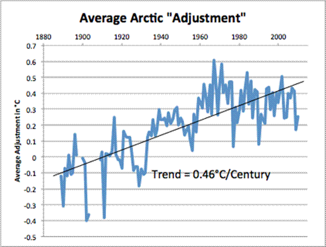
Everywhere NOAA/MetO/BOM stick their magic adjustment wands, they cool the past and warm the present.
I cannot comment on the top graph since I don’t know much about. But the bottom graph comes from Kiryre and the NTZ website.
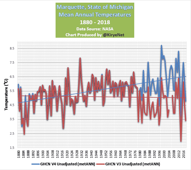
Marquette has an interesting history. It looks like there was 1 station from 1880-1961 and then 2 stations from 1961 to present. There was a fork that occurred when one of the stations moved 12 km to the west. At the same time the other station moved from a rooftop to the ground. There was an overlap period where the original site actually had two stations from 1961-1979. It looks like v3 may have formed a composite from 1979-2019 from the two distinct stations and omitted the 1961-1979 overlap period from the new station to keep the original station record unbroken. v4 split the records out into two stations; one for the city station that spans 1880-present and another for the airport station that spans 1961-present. Notice the divergence in the Kyrie graph above that begins in 1979. So to review. The blue line is a single station from 1880-1979, but a composite of two stations from 1979-2019 one of which is now 13 km away. The red line is a single station in which the recording instrument moved from the rooftop to the ground in 1979. This explains the divergence between the blue and red lines from 1979-present. 1979 had multiple large change points. Marquette is a good example of why adjustments are necessary.
“With very few exceptions, the past has been adjusted downward and more recent adjustments have been upward”
The myth that never dies.

Three bastardized charts are not proof of anything.
It’s proof that in regard to the global mean temperature the past has not been adjusted downward. It has actually been adjusted upward.
Which he revels in posting again and again and again.
I included a reference to the adjustments to the USHCN network, the US best network,bdwgx. Guess you didn’t look at it.
Here’s a complete comparison, Adjusted Berkeley Earth, Adjusted GISS, Adjusted NOAA, and Adjusted CRUTEM4 minus the RAW GHCN data. All four indices compared with the same set of RAW data. That makes it impossible to hide the actual adjustments. Note that a positive difference indicates a positive “adjustment”. The adjustments continued to the date of the analysis, 2013.
That’s only the land temperature timeseries. I posted a graph of the global temperature timeseries.
You dumb bunny, there are no stationary temperature stations on the oceans. No such thing as a gold standard network. The ocean data comes from floating buoys which move constantly, are not equally distributed, and tend to congregate in gyres and lulls. Ocean data comes from interpolation and extrapolation. It’s ALL “adjusted”, there’s no such thing as raw ocean data that represents a fixed location.
The point is how many past station records have been changed multiple times? If more than once, then something is fishy!
Even worse is if averages are changed without even bothering to change daily Tmax and Tmin station records. If only averages are changed you CAN’T call them corrections. The changes are out and out fabrications.
Not changing individual station readings means you have NO EVIDENCE as to where and when calibrations have failed. Changes are simply being done to meet an external need. That is simply not ethical for scientific investigations.
Multiple changes to individual readings is even worse. That you have no basis or substantiation for why changes are made.
There is only one reason for correcting averages, to create LONG records. You need to tell everyone why corrections are JUSTIFIED solely for this purpose.
Lookee there!
Bad bdgwx shows a chart where the 1930s mysteriously lose their hottest temperatures on record status!
Also the base period is suddenly 1951-1980, an anomalous cool period.
Making that a totally false chart.
And that’s with the 1930’s adjusted upward. Even with the upward adjustment the global mean temperature is significantly lower than today.
The base period does not matter. The shape of the graph and ranking of years is exactly the same whether 1911-1941, 1951-1980, or 1991-2020, or some other base period is chosen.
That chart is real. I think the confusion arises because contrarian bloggers only present the adjustments for the land portion of the temperature which does result in a lower adjusted value relative to the unadjusted values in the past especially in the United States where station moves, instrument changes, and time-of-observation changes caused a particularly acute low high bias for past data relative to recent data. The land and US only account for 21% and 2% of the globe respectively so it is imperative to consider the other 79% and 98% respectively before drawing conclusions.
Again, as Hubbard has pointed out, adjustments can’t be made on an ad hoc basis for entire groupings of station measurements. They must be done on a station-by-station basis. You have no evidence for making wholesale changes. Quayle tried and Hubbard showed why it doesn’t work.
Adjustments are nothing more than *creating* data. It’s unethical and unscientific. The proper methods are to either design the measurement protocols to measure the right things or to adjust your conclusions appropriately.
As Hubbard stated in his 2006 paper on instrument changes in the HCN:
“It is clear that future attempts to remove bias should tackle this adjustment station by station”.
Trying to adjust temps on an ad hoc basis using a local, regiional, or global basis is just not acceptable.
UHI adjustments are many times done without regard to local environmental factors such as changing ground cover (i.e. seasons), changing wind conditions, and clouds among many others. Coming up with a single “adjustment factor” is just plain wrong.
“Adjustments are nothing more than *creating* data. It’s unethical and unscientific.”
That’s exactly right. But that is what is happening with the official global temperature records. Unethical and Unscientific.
David Legates and Pierre Gosselin don’t seem have a problem with adjustments.
And that is your explanation? Why don’t you address the issues directly? If you are capable of discussing scientific research you should have some justifications in mind!
So what? Are they supposed to be some kind of paragons of ethical behaviour? Upon what evidence are we supposed to use to believe this?
Hubbard, 2006:
Legates adn Gosselin are wrong if they don’t have a problem with not going station-by-station with adjustments. And even on a station-by-station basis it is necessary to apply the adjustments with a time weighting since measurement devices can have increasing uncertainty over time due to things like drift and environment changes.
UHI is not adjusted to correct UHI bias, it adjusted to inflate temperatures.
Original observations should never be tampered with! “time of observation bias, etc.” are not ‘corrected’, they are bastardization of the data.
The problem of course is the fact that such warming isn’t going to be catastrophic whether the model matches the real world or not.
The warming will stop once the funding stops.
The plot looks to me as if both model data and UAH satellite data pertain to the “lower troposphere”. Look at the temperature scale on the y-axis, the temperatures are far too low to be surface temperatures.
This does beg the question though, why pick on this, rather than surface temperature? It can only be that the models fail at this altitude, whilst not being so bad at surface temperatures. The Heartland Institute does not want us to know the models are performing quite well with surface temperatures ?
They are low because they are so-called ‘anomalies’ and not actual temperatures.
I guess that would explain it, but the axis is labelled “Air Temperature degrees F” (BTW science uses C or K; it doesn’t give a good impression using F.)
Anyhow it is not clear to the layman exactly what we are looking at, which is poor.
the models don’t even show any unccertainty bars associated with the data. It is quite likely that the uncertainty interval swamps any anomaly values. I.e. you have no idea what the actual trend line even is.
Yes, the graphs leave something to be desired with respect to labeling. Which is why I felt I should comment on it.
You’re missing the point – the entire IPCC campaign, everything it’s done in the name of ‘climate science’ is predicated on the fundamental principles of the agw warming/greenhouse theory which states that the greenhouse warming increases in the atmosphere and then warms the surface. If the atmosphere is cooler than the surface, then the fundamental theory underpinning everything is wrong and the entirety of the ‘climate science’ is also wrong. You cannot have the climate science without the underlying theory and if the theory is falsified, everything else is as well.
I don’t think that necessarily follows. If the atmosphere is warmer than it was, the surface will also warm up from what it was. The atmosphere does not necessarily need to be warmer than the surface for this to happen.
True, but not the point. Everything has been based on that theory being correct. Everything. The theory states that the atmosphere warms the surface, NOT the other way round – that would be a completely different theory entirely. If you discredit the underlying theory that the entire IPCC, model series and global campaign is based on then you are left with nothing and must start again with a new theory, observations, models etc.
The IPCC has built the entire body of work on the theory being correct and the science being settled – without that specific theory, everything must be called into question and the science is wrong, not just far from being settled, but completely and utterly wrong. Do you not understand just how fundamental to the ‘climate science’ that theory is?
CliSciFi predicts tropospheric hot spots as a fundamental consequence of GHE. Detailed observations reveal that no hot spots exist. Yet the UN IPCC CMIP6 models churn out even more atmospheric heating. This will not end well for science.
“CliSciFi predicts tropospheric hot spots as a fundamental consequence of GHE. Detailed observations reveal that no hot spots exist.”
How does alarmist climate science continue on when the hotspot does not exist?
If the hotspot doesn’t exist, then that tells us that those speculating about CO2 warming the atmosphere don’t really know what they are talking about.
Their theory has proven wrong. Back to the drawing board.
Clouds seem to be the thing we should be focusing on. Not CO2.
Without disagreement I would add that the fundamental edifice of global warming alarmism is the LIE that somehow a warmer world would be bad. Warmer Is Better. Advocating totalitarian erasure of human rights, economic collapse, servitude, and mass deprivation because of a conjectured BENEFICIAL increase in warmth is more than stupid; it is evil times a billion.
The protagonists of alarmism who claim to be “non-political” and “scientific” are profoundly disingenuous.
Mike – no disagreement here. We are discussing the alarmism arising from the global warming industry who’s shaky foundation is the agw/greenhouse theory. Actually it’s still a hypothesis, it never got as far as theory stage. But yeah, part and parcel of the same big lie.
I don’t think it does. Everything is based on the surface being heated by short wave radiation. The heat comes from the surface and it warms the atmosphere. But much of it (in the windows where there is no or little absorption by GHGs) passes through into space. The atmosphere does not need to be warmer than the surface, just to provide a little more resistance to heat passing through it.
You are talking about something else entirely. I was discussing the agw/greenhouse theory that underpins the entire IPCC climate change campaign and reports. Apples and Oranges I’m afraid. Whilst what you say may be more consistent with reality, that has got nothing whatsoever to do with the agw/greenhouse theory and the whole of ‘climate science’ – crazy, but true I’m afraid.
No, the surface, i.e., the earth and oceans that absorb short wave electromagnetic radiation from the sun WILL NOT reach a higher temperature than what that radiation causes. In a simple explanation think of the atmosphere as red fiberglass insulation around your house. It has a certain heat conductivity that controls how fast heat moves through it. In other words, there is a gradient. If the conductance is low enough, it will heat to the wall’s temperature at the boundary and begin a gradient fall to the outside temperature. If the insulation reaches the inside wall’s temperature at the boundary, it will have achieved thermal equilibrium and the temperature will go no higher.
Now what will happen is that the heat source, the original wall, will lose heat slower, but it will still lose heat. The insulation can never reach a higher temperature than the wall so it can never “heat” the wall in a backwards fashion, only slow the loss from the wall.
The so-called back radiation can do two things, 1) reduce the heat conductivity of the insulation, i.e. the atmosphere, and 2) increase the heat of the insulation, i.e. the atmosphere.
Fundamentally, CO2 can only change the rate of the gradient by making it slower, but it can’t make it negative.
I really don’t understand it like that. The atmosphere (your “insulation”) is transparent to short wave radiation. It is not heated by it. I think you have a fundamental misunderstanding.
The short-wave radiation is the furnace in your house. It is the furnace that determines the temperature of the walls and, therefore, the temperature of the house-side of the insulation. The gradient begins at the wall and ends at the boundary with the outside environment, i.e. space.
The insulation is not a heat source and cannot add heat to the house itself. It can only slow down the heat loss to the outside environment.
At night, when the furnace is off, the house loses heat through the insulation. This is a time-varying function. The final temperature at the house wall is a dependent on that time-varying function. If the heat loss decreases (add insulation) the nighttime temp of the wall will go up. But that temp doesn’t drive the wall temp after the furnace comes on. The daytime temp of the wall is driven by the furnace, it isn’t dependent on the starting temp but solely on the heat dump into the house from the furnace. Anything that affects that amount of heat (e.g. clouds) will lower the daytime temp since there is nothing else that can *add* heat into the house.
I’m pretty sure Jim will offer the same observations when he replies.
I agree with you up to a point. And that point is, for a given heat input from your furnace, the temperature in the room is warmer with more insulation. So with this analogy, you have proven I am right.
Let’s say the furnace is on during the daytime and off at night. Added insulation will prevent heat escaping as quickly from the room at night. Therefore your 24-hour average room temperature is higher with the insulation than without it.
It follows from that, the heat gradient through the wall must then be steeper, because the interior temperature is higher than the exterior temperature (bear in mind we are adding insulation without increasing the thickness of the wall).
“And that point is, for a given heat input from your furnace, the temperature in the room is warmer with more insulation.”
No, the temperature in the room is determined solely by the heat input from the furnace. The insulation only determines the rate of decrease in that temperature over time. The slower the decrease the less the furnace has to run to maintain that room temperature. But the insulation simply cannot add any heat into the room, only the furnace can do that.
“Therefore your 24-hour average room temperature is higher with the insulation than without it.”
YES! But consider the result in detail! What it means is that nighttime temperatures go up, not maximum temperatures during the day!
Yet the CAGW advocates keep on saying the Earth is going to turn into a cinder from higher maximum temps. Thus causing lower crop harvests, flooding coastal cities, mass extinctions of species like polar bears, walrus, coral, etc.
“It follows from that, the heat gradient through the wall must then be steeper, because the interior temperature is higher than the exterior temperature (bear in mind we are adding insulation without increasing the thickness of the wall).”
The insulation factor of the insulation and the width of the path through the insulation is what matters. The temperature gradient will be highest when the maximum temperature is reached during the day.
The gradient through a homogenous material is typically linear and is directly dependent on the temperature difference between boundaries and inversely dependent on the distance between the boundaries.
q is heat loss, = insulation factor, A is the area normal perpendicular to the flow,
q = [Ak_m(t_2 – t_1)]/ [ dL]
dL]
TG said: “No, the temperature in the room is determined solely by the heat input from the furnace.”
That’s not what the 1LOT says. The 1LOT says ΔE = Ein – Eout. And then using the specific capacity formula we know ΔT = ΔE/mc = (Ein – Eout)/mc. Clearly ΔT is determined by both heat input and heat output. Increasing insulation will decrease Eout meaning ΔT will be positive and T will increase.
“ Clearly ΔT is determined by both heat input and heat output.”
The atmosphere provides NO HEAT INPUT. The atmosphere is not on fire and is not generating heat from chemical processes.
ΔT is how much temperature drops at night from heat transfer to the outside. During the day the furnace replaces any heat loss so T_inside is determined by the heat from the furnace only. I.e. T_inside ≈ furnace.
Specific heat only applies here between the heat source (the furnace) and the inside of the house.
It’s pretty obvious from other threads that you aren’t a trained engineer. Stop trying to pretend you are. As I’ve said before, stop trying to teach grandpa how to suck eggs.
(See attached jpg)
Are you challenging the 1LOT?
The 1LOT doesn’t have anything to do with this.
The first law:
ΔU = Q + W where Q is the net heat transfer into the system and W is the net work done on the system.
In our case W = 0 so we have ΔU = Q = Q_in – Q_out
ΔU and Q are time functions. They can be evaluated at any point in time which is what I showed in my analysis.
The temperature inside the house is determined by the net heat input from the furnace. At any point in time we let that heat amount added by the furnance equal q .
The temperature of the outside, at any point, in time is therefore the exact equation I posted.
Again, the heat loss doesn’t determine the inside temperature, only the furnace heat input does that. If the heat loss is great the input from the furnace may need to be great as well. So What?
You haven’t studied thermodynamics have you? Here is a good explanation of your mistake.
First Law of Thermodynamics – Equations, Limitations, Examples (byjus.com)
You might want to explore state variables and how to put together a gradient.
Are you challenging the fact that all other things remaining the same reducing Eout for a system will result in an increase of T of the system as well?
“For instance, the first law fails to explain why heat flows from hot end to cold end when a metallic rod is heated at one end and not on the other and vice-versa.”
DId you not read this? Did you not understand it? The first law is a generalized condition. It does not allow one to calculate the actual flow of heat in the real world!
JG said: “DId you not read this?”
Yes. I read it. And I ignored it because it has nothing to do with the statement and my response to TG said: “No, the temperature in the room is determined solely by the heat input from the furnace.”
JG said: “It does not allow one to calculate the actual flow of heat in the real world!
Yes it does. ΔU = Q – W. If you know ΔU and W then you can calculate the flow of heat Q in/out of the system.
Again, Eout *cannot* raise the temp of the house! The insulation has no heat generation internally.
The temperature of the house is determined solely by the heat input from the furnace.
Likewise, CO2 gets heat from the sun and from the earth. It re-radiates some of that heat back to the earth but the earth immediately re-radiates it back toward the sky. CO2 will intercept some of the earth’s re-radiated heat and send it back, where the earth will send it back again. Bounce, Bounce, Bounce, …… Each bounce will be smaller and smaller. A damped wave. Eventually reaching zero.
CO2 cannot generate heat on its own. Period. Exclamation point.
Now, this damped wave *is* a time function. So if it hasn’t reached zero when the furnace (sun) turns back on the starting temp may be higher than if there was no insulation but that would only affect the temp at sunrise, not during the day. In other words the world can’t be turning into a cinder because CO2 doesn’t determine Tmax, only the sun can do that as a heat generator.
Bingo!!!!
Define the system. That is always the first step.
You *really* aren’t an engineer.
Reducing Eout will *NOT* increase the temperature of the system. The temperature of the system is determined by the heat transfer into the system by the furnace. Remove the furnace, e.g. at night, and Eout WILL STILL OCCUR. If k_m is larger or smaller it may reduce the time interval needed for a specific heat loss but that heat loss *will still occur*. Eout can’t raise the temperature of the house.
If you will look at the formula I provided you k_m is a linear factor. It determines the slope of the energy loss. It is like the “m” value in y = mx + b. All you are whining about is that the value “m” might be different for different materials.
Eout cannot add energy into the system. *THAT* would be a violation of the laws of thermodynamics.
TG said: “Reducing Eout will *NOT* increase the temperature of the system. “
Yes it does. Do the math.
ΔT = (Ein – Eout)/(mc)
Here’s an example where there is 1 kg of water.
Let Ein = 4000 j and Eout = 4000 j from time T1 to T2. And let m = 1 kg and c = 4000 j/kg.K
ΔT = (4000 j – 4000 j) / (1 kg * 4000 j/kg.K) = 0 K.
Now from time T2 to T3 reduce Eout to 2000 j.
ΔT = (4000 j – 2000 j) / (1 kg * 4000 j/kg.K) = +0.5 K.
Notice that ΔEout = -2000 j resulted in ΔT = +0.5 K.
Reducing Eout will absolutely increase the temperature of the system. The 1LOT says so.
TG said: “Eout cannot add energy into the system.”
I never said it did. What I do say is that when Ein > Eout energy accumulates in the system. That’s the 1LOT. And because no material has an infinite specific heat capacity that necessarily means ΔT > 0.
It’s worth repeating. For a system with Ein > 0 increasing the effectiveness of the thermal barrier will reduce Eout and cause T to increase even when Ein remains unchanged.
“TG said: “Reducing Eout will *NOT* increase the temperature of the system. “
Yes it does. Do the math.
ΔT = (Ein – Eout)/(mc)”
You don’t even know how to interpret what you are showing. You are a mathematician not a physical scientist. What does a positive Ein – Eout tell you?
Does it tell you that Eout can get bigger than Ein?
Does Ein increase as Eout increases?
So what happens? Delta T decreases until it reaches zero.
What does that mean?
Does this equation tell you what happens to T1?
What happens to T2?
Did you fail to believe what this says?
“For instance, the first law fails to explain why heat flows from hot end to cold end when a metallic rod is heated at one end and not on the other and vice-versa. The first law only quantifies the energy transfer that takes place during this process. It is the second law of thermodynamics which provides the criterion for the feasibility of the various processes. “
“First Law of Thermodynamics – Equations, Limitations, Examples (byjus.com)”
Notice the phrase, “The first law only quantifies the energy transfer …”.
What does this mean to you?
IF Ein is a constant, how does T1 ever increase?
By the way I’m still waiting for you to tell everyone what the variance and standard deviation is for the Global Average Mean distribution?
JG said: “Does it tell you that Eout can get bigger than Ein?”
Yes. Eout can be bigger than Ein. Nothing in this equation or the 1LOT disallows that.
JG said: “Does Ein increase as Eout increases?”
That depends on the specifics of the system. For the system we’ve been discussing Ein can only increase up to the capacity rating of the furnace. If that furnace is already operating at full capacity someone can open a door or window thus increasing Eout and yet Ein won’t increase. The temperature in the home will decrease in that scenario.
JG said: “So what happens? Delta T decreases until it reaches zero.”
Assuming ΔE is positive then ΔT will be positive. As T increases the gradient between the inside and outside will increase which will cause Eout to increase. Both ΔE and ΔT will decline toward zero as a new balance and steady-state is achieved at a higher T.
JG said: “What does that mean?”
It means that adding/removing insulation cannot increase/decrease T infinitely. The reason is because while that act perturbs the energy balance initially the change in T itself will try to pull the system back into balance due to the feedback on Eout. We need to employ heat transfer equations to model that.
JG said: “Does this equation tell you what happens to T1? What happens to T2?”
I’m not sure I’m understanding the question. Nothing “happens” to a temperature. Things “happen” to systems and temperature is one property that can provide information about what “happened”.
ΔT = T2 – T1 = (Ein – Eout)/(mc)
T1 = T2 – (Ein – Eout)/(mc)
T2 = (Ein – Eout)/(mc) + T1
(T2 – T1) * (mc) = Ein – Eout = ΔE
If you know T1 or T2 then you can calculate T2 or T1 respectively. If you know T1 and T2 then you can calculate ΔE. Is that what you were asking?
JG said: “Did you fail to believe what this says?”
I understand both the 1LOT and 2LOT if that is what you are asking.
JG said: “What does this mean to you?”
The 1LOT says that the energy of a system changes given the amount of energy entering, amount of energy leaving, amount of work done by, and amount of work done to the system in an additive way. It is also a statement of the law of conservation of energy.
The 2LOT says that heat moves from warm to cool or more generically that entropy increases when the system is isolated or evolving by its own means.
JG said: “IF Ein is a constant, how does T1 ever increase?”
You should be able to answer this yourself by looking at the equation.
ΔT = T2 – T1 = (Ein – Eout)/(mc)
If Ein, mass (m) and specific heat capacity (c) are all constant then the only way T can increase is if Eout decreases such that Eout < Ein.
JG said: “By the way I’m still waiting for you to tell everyone what the variance and standard deviation is for the Global Average Mean distribution?”
Do you think that will help Richard S Courtney define “rubbish” and “erroneous”? Besides I already did this for UAH in another blog post so if RSC thinks he needs that to provide definitions then I’ll direct him to that post or better yet explain to how he can download the UAH grids and compute these statistics himself. For now it does not appear that he wants to provide definitions or to have his hypothesis tested. Who are we to force him to do so?
bdgwx,
You are clearly attempting to mislead onlookers when you write,
“Do you think that will help Richard S Courtney define “rubbish” and “erroneous”?”
I defined them years ago.
You would know I had if you had read the link I have twice provided for the edification of trolls in this thread. To save you needing to find it, I again post it here and point out that its Appendix B spells out all you could possibly want to know in terms even somebody as obtuse as you cannot fail to understand.
https://publications.parliament.uk/pa/cm200910/cmselect/cmsctech/387b/387we02.htm
But, of course, it may be beyond you because there are none so dense as those who don’t want to know.
Richard
Forgive me, but I’m not seeing it. Where in appendix B do you provide the objective criteria for determining whether a global circulation model is “rubbish” or “erroneous”?
bddwx,
Aha! Now I I understand your problem: You can’t read!
My words you are disputing were NOT about “whether a global circulation model (GCM) is “rubbish” or “erroneous” “. They were about the mean global temperature (MGT) data the GCMs purport to be emulating.
They were this post which I wrote to the other troll
“kzb,
I do not know what – if anything – “the Heartland Institute does not want us to know”, but I do know the surface temperature data sets are rubbish.
For a full explanation of what I know about the surface temperature sets then please see my submission to the Parliamentary Inquiry (i.e. whitewash) of ‘climategate’ especially its Appendix B which Parliament has entered in the Hansard record so you can read it here
https://publications.parliament.uk/pa/cm200910/cmselect/cmsctech/387b/387we02.htm
If that is too much to read then you can see at a glance the affect of unjustified changes to the data with a glance at this link
http://jonova.s3.amazonaws.com/graphs/giss/hansen-giss-1940-1980.gif ”
And Appendix B at the item in Hansard says; e.g.
“There are significant variations between the results of MGT calculated by the different teams that compile them. The teams each provide 95% confidence limits for their results. However, the results of the teams differ by more than double those limits in several years, and the data sets provided by the teams have different trends. Since all three data sets are compiled from the same available source data (ie the measurements mostly made at weather stations using thermometers), and purport to be the same metric (ie MGT anomaly), this is surprising. Clearly, the methods of compilation of MGT time series can generate spurious trends (where “spurious” means different from reality), and such spurious trends must exist in all but at most one of the data sets.”
It is clear and accurate to say data sets are erroneous rubbish when they provide spurious trends and statistically different indications for purportedly the same data.
Please return to elementary school, learn how to read, and after that return to discuss my words. It is not possible to rationally discuss the words I have written with somebody who cannot read.
Richard
PS Team Troll is doing badly in this thread and I advise you to both slink away.
RCS said: “The climate models are rubbish. Their hindcasting is erroneous”
That is what I was responding to.
But if you also think mean global temperatures are rubbish and erroneous then how do you know climate models are rubbish and erroneous? And what criteria do use to declare climate models rubbish and erroneous anyway?
bdgwx,
Oh! So you have forgotten the first rule of holes!
The kindest interpretation is that you are again demonstrating you can’t read.
Having explained to the other troll that the MGT values are wrong, I replied to his/her/their attempt to switch matters to the GCMs, and you have distorted by omission my reply.
My reply actually said,
“The climate models are rubbish. Their hindcasting is erroneous and, importantly, none of the present climate models has existed for 25, 50 or 100 years so they have no demonstrated forecasting skill. In other words, the climate models make predictions with the same known accuracy, precision and reliability as the casting of chicken bones to foretell the future.”
Clearly, “Their hindcasting is erroneous” when they are parametrised (i.e. tuned) to match erroneous past global temperature data.
And their forecasting having the same known accuracy, precision and reliability as the casting of chicken bones does mean they are rubbish.
Obviously, that reply was self-explanatory so I assumed it was my original point which you were too thick to understand and not – as you now say – that you were deliberately misrepresenting something else that I wrote.
I repeat, Team Troll is getting a pasting in this thread so both of you would do well to slink away.
Richard
So a model is “erroneous” if it is parameterized or tuned?
bdgwx,
You are being (deliberately ?) silly.
I did NOT say, suggest or imply that “a model is “erroneous” if it is parameterized or tuned”.
Having shown the past global temperature data are erroneous,
I said of the GCMs,
“Clearly, “Their hindcasting is erroneous” when they are parametrised (i.e. tuned) to match erroneous past global temperature data.”
At first, your stupidity was amusing, but it has gone on for too long. I have stopped laughing and I am getting annoyed.
Go forth and multiply.
Richard
Fair enough. I thought since parameterized and tuned were specifically called out that it could be an essential element of your criteria. That’s what I asked. Anyway, what if it is shown to match past global temperature data that is not erroneous?
I will say yes, because they do not faithfully reproduce hindcasting let alone the future. Erroneous in what way? The very fact that they must be tuned and parameterized means there is not sufficient data nor relationships to adequately supply initial conditions. Even worse individual models use different tuning and parameters. For a model to ever have the right initial conditions and calculate a correct answer would be akin to a group of monkeys typing the Iliad by chance. Consequently, yes they are erroneous and not trustworthy. Would you fly in a Boeing aircraft designed by engineers who tuned their model to give the output they wanted and concocted what they thought the parameters ought to be? I sure wouldn’t!
They are both rubbish. Averages hide much unless you know what the distribution is that spawned it. 0/100 average to 50, so does 49/51. I keep saying that the Global Average Temperature has no meaning unless you can quote the variance, skewness, and kurtosis of the distribution.
You are the one promoting GAT as a good metric (it is not a measurement). You should also be able to then tell everyone what the statistical parameters are for the average you are quoting.
What are they?
I asked this of you on another post and this isn’t about any specific database per se. It is about Global Average Temperature (GAT). You keep referring to the GAT as growing tremendously. As a mathematician you should know that it is improper to quote a mean without also stating the associated statistical parameters.
I’ll ask again, what is the variance and standard deviation of the GAT that you quote? If you have done the calculations then you should have them at your finger tips. If not what source are you using and what do they quote for those figures.
The time is fast approaching where regions are going to start requesting this so they can develop targeted mitigation plans. You should be prepared to answer those questions.
“Yes. Eout can be bigger than Ein. Nothing in this equation or the 1LOT disallows that.”
The DEFINITIONS disallow this. Eout being larger than Ein means that sooner or later you could reach a temperature lower than absolute 0!
“If you know T1 or T2 then you can calculate T2 or T1 respectively.”
How do you know T1 or T2? Can you measure the energy is a mass directly?
TG said: “The DEFINITIONS disallow this.”
Nope. The 1LOT does not say ΔE >= 0. In fact, the 2LOT says ΔE < 0 for the warm body in a 2 body isolated system where body A is warm and body B is cool.
TG said: “Eout being larger than Ein means that sooner or later you could reach a temperature lower than absolute 0!”
Nobody is saying Eout > Ein or Ein > Eout can persist indefinitely. In fact, I talk about this above. When the T of a system changes Eout changes as well. This change in T pulls the system back into energy balance.
TG said: “How do you know T1 or T2?”
It could be measured.
TG said: “Can you measure the energy is a mass directly?”
Probably. But that’s not necessary.
I didn’t say that! Read closer. I said Eout can’t be greater than Ein! If it could be greater then E could be less than absolute zero!
Really? You never made this distinction. In a system how does Eout get greater than Ein? What if Ein = 0? Does Eout go to zero as well? When does it do so?
Does your thermostat measure the outside air? Mine doesn’t.
You are calculating the CHANGE in temperature, not the temperature itself.
Are you dense? The earth’s surface, land and oceans are heated by short wave radiation. That is your house. The atmosphere acts as an insulator, just like that red fiberglass in your walls.
People would love it if that red fiberglass could actually heat your house to a warmer temperature than your furnace. However, that is a pipe dream.
The red fiberglass merely reduces the cooling gradient from your walls but cooling fo the walls still occurs. The red fiberglass warms as heat is absorbed by it but it can never raise the temperature of the wall beyond what your furnace does.. The earth operates the same. The atmosphere operates the same way.
See my reply above to Tim Gorman (are you related?)
The wall interior surface will be warmer with insulation than without it. Insulation does increase the interior wall temperature above what it would have been without insulation.
For a certain heat input, the average room temp will be warmer with insulation than without. Surely this is just obvious.
First, we are talking radiation not conduction/convection.
Second, the sun warms the surface of the earth via radiation to a given temp. Since the sun is the source, nothing, not even CO2, can warm it to a higher temp than the sun.
Third, you are missing the concept of time in your description. Gradients are based on time.
As to being warmer with insulation that without, you must also couple that with time. In essence, it will not be warmer, it will have just cooled less in any given time period. That is an important distinction. When you say warmer it implies CO2 will warm the surface, it will not. At best, it can only slow the heat loss over time.
The earth cools through radiation. It radiates based upon its temperature and nothing else. It may also absorb heat reflected back toward it but even if the radiation being reflected is 100% it will never warm past what the sun raises it temperature to.
The only way climate scientists will ever solve what is going on is to incorporate time into their derivations. The use of averages such as GAT can not explain the complex interactions surrounding the earth. Trends are worthless unless they are time based and made stationary. Remember what George Carlin said, “Think of how stupid the average person is, and realize half of them are stupider than that.” The same applies to GAT. Tell us where the warmer half is and where the cooler half is!
When did you last see a time based equation describing the radiation absorbed and radiated by the earth?
Nope. All the insulation does is decrease loss of heat to the outside. It can’t raise the temp inside the house. If it could then why do people even need furnaces. Just create insulation that could warm the inside of the house!
The only heat source is the furnace. It is the heat transfer from the furnace to the house that raises the temperature in the house and how much heat the furnace transfers determines the temperature inside the house.
What if there were *no* insulation? What if the insulation is a perfect conductor? What if the insulation is a perfect insulator?
What do you mean “certain heat input”? Does your furnace only run for a certain period of time and then shut off? Or does it keep running till the temperature on the thermostat is reached?
The room won’t *lose* heat as fast with insulation as without it. But it will still lose heat. And that means that the minute you stop heat input sufficient to make up the heat loss, the temperature of the room will go down. Again, the insulation is not on fire, it can’t provide any heat input. It is a passive actor. It doesn’t make the room “warmer” as in heat input. It only slows the heat loss. The temperature *will* go down.
The Earth is exactly the same. When the sun goes down the earth cools. The atmosphere may reflect some of that heat back slowing the heat loss from the earth but it can never push the earth back up the heat gradient. As as soon as the re-radiated heat is absorbed by the earth the earth will re-radiate it back to the atmosphere (and more of it will be lost to space). And around and around we go.
If the earth “retained” that reflected heat it would have become a molten ball millions of years ago. But there are also other processes that mitigate this. E.g. more evaporation from warmer water meaning more clouds and more cooling. And that is just a beginning. Lapse rate applies as well as other effects.
TM said: All the insulation does is decrease loss of heat to the outside. It can’t raise the temp inside the house.
It definitely can. You can test this out for yourself by removing insulating elements from own home (open windows/doors), turning your furnace on max (to prevent cycling), and allowing the temperature of your home to come into a steady-state. Now place those insulating elements back into service (close windows/doors). The temperature inside your home will increase until a new steady state is achieved.
TM said: If it could then why do people even need furnaces.
The best way to explain this is with the 1LOT which says ΔE = Ein – Eout. If Ein = 0 then ΔE <= 0. In other words a system cannot accumulate energy and warm unless there is an input of energy into the system. That in no way precludes the system from accumulating energy and warming under the scenario where Ein > 0, ΔEin = 0, and ΔEout > 0 leading to ΔE > 0.
You have no idea of what you are talking about. You mention nothing about radiation. You mention nothing about gradients. Energy tells you nothing about temperatures and net heat flow.
Insulation can not heat. I repeat, insulation can not heat. It can only slow cooling. If you had studied thermodynamics and learned about entropy you would understand. Do you understand what themal equilibrium means?
JG said: “You mention nothing about radiation.”
I didn’t mention radiation because that’s not the primary mechanism by which most residential furnaces heat homes. It also doesn’t matter whether the Ein is from radiation, convection, or conduction anyway. As long as Ein > 0 (regardless of what form it is in) then ΔEout < 0 will necessarily cause ΔE > 0 and ΔT > 0.
JG said: “You mention nothing about gradients.”
That’s because it is irrelevant in debunking the claim that adding insulation cannot cause ΔT > 0 inside a home.
JG said: “Energy tells you nothing about temperatures and net heat flow.”
Yes it does. ΔE = mcΔT where ΔE is the change in energy, ΔT is the change in temperature, m is the mass, and c is the specific heat capacity. And from the 1LOT we know that ΔE = Ein – Eout we can relate temperature to energy/heat inflow and outflow.
JG said: “Do you understand what themal equilibrium means?”
Yes.
“As long as Ein > 0 (regardless of what form it is in) then ΔEout < 0 will necessarily cause ΔE > 0 and ΔT > 0.”
Really? A negative number for ΔEout can cause ΔE to be positive?
ΔE = Ein + Eout. How does a negative Eout turn into a positive?
TG said: “Really? A negative number for ΔEout can cause ΔE to be positive?”
Yes. ΔE = Ein – Eout. When Eout < Ein then ΔE is positive. If Eout has decreased (ΔEout < 0) then that is certainly possible.
TG said: “ΔE = Ein + Eout. How does a negative Eout turn into a positive?”
First…I never said Eout turns negative. I said when ΔEout turns negative. Note that ΔEout < 0 is not a statement that Eout < 0.
Second…I never used the equation ΔE = Ein + Eout. What I used was ΔE = Ein – Eout. Pay close attention to the operation. I used subtraction.
New energy being added from outside the system. LIghting a match to the methane in the sky, that or reversing entropy somehow! LOL
“It definitely can. You can test this out for yourself by removing insulating elements from own home (open windows/doors), turning your furnace on max (to prevent cycling), and allowing the temperature of your home to come into a steady-state.”
You are kidding, right? Your insulation can generate heat?
Wow, Just WOW!
The heat comes from the furnace. Period. Exclamation point. Any increase in temperature is from heat input from the furnace, not from the insulation.
The first law says ΔU = Q + W
Q is the net energy input. It can’t get more simple than that.
Q = Ein + Eout
Ein can only come from the furnance. Eout can not be greater than 0, it is *always* negative in our system. Therefore Q will always be negative if Ein is 0. If Q is negative then ΔU is negative as well. A negative Eout simply can’t increase ΔU, it can only decrease it.
Even this is a simplification. Q, Ein, and Eout are time functions. With no Ein, T1 – T2 will drive toward 0, i.e. T1 = T2. (inside temp vs outside temp). Since q is dependent on (T1 – T2) q at any point will be a decreasing function of time. As heat loss continues heat loss will get less.
We are ignoring time in this simplification. In addition we are ignoring radiation and only considering conduction.
No matter how much you want to believe that insulation is a heat generator and can raise the temperature of a system it just isn’t true.
TG said: “You are kidding, right? Your insulation can generate heat?”
I’m dead serious. And I never said insulation generates heat. What I said is that adding insulation and reducing Eout can result in ΔT > 0. I’m saying this as a direct challenge to your statement “No, the temperature in the room is determined solely by the heat input from the furnace.” If you don’t believe the 1LOT then at least do the experiment and prove this out for yourself.
Here is an even easier experiment for you to do. Turn on your oven on high and open the door. Allow the interior to reach steady-state such that T stabilizes. Now add insulation to the oven (close the door). Ein says the same while Eout decreases. T will increase until a new steady-state is achieved and Eout matches Ein once again.
TG said: “Ein can only come from the furnance.”
Agreed. I never said otherwise.
TG said: “Eout can not be greater than 0,”
That’s not even remotely true. Eout is always greater than 0 especially in your home where heat exits the system by all 3 mechanisms radiation, conduction, and convection though windows, doors, walls, cracks, etc. There is no home in existence where Eout will ever be 0. That is true for pretty any system since isolation is effectively impossible in the real world.
The whole point of adding insulation to your home is to reduce Eout which means that to maintain the same temperature you can also reduce Ein by the same amount thus saving on fuel expenses for the furnace.
TG said: “No matter how much you want to believe that insulation is a heat generator”
I never said that. I never thought that. And I don’t want other people to think that either. Again, what I said is that insulation reduces Eout which means ΔE > 0 and ΔT > 0 until a new steady-state is achieved with a higher T inline with expectations from the 1LOT.
I’m sorry but you can’t see the wood for the trees. No-one is saying the insulation generates heat energy. What we are saying is it keeps it in the room.
If we compare an aluminium wall with a fibre board wall of equal thickness, for a certain heat impulse into the room, the room with the fibre board walls will be warmer both during the heat impulse and in the cool down period. The temperature gradient across the fibre board will be steeper also.
If we have a constant and equal heat input into the rooms, the room with fibreboard walls will maintain a higher temperature. The temperature will rise to a higher equilibrium and then level off. Surely this is all just common sense.
You can’t even begin to come up with the correct analogy for the earth and sun. It was probably a mistake to use a house as a model. When dealing with radiation there are different things at work.
1) The sun heats the earth surface. The radiation absorbed determines the amount that can be radiated.
2) Since the earth’s surface is an absorber it is also an emitter. So it immediately begins to cool as it radiates.
4) The atmosphere is an insulator and so slows the gradient of heat loss to space by re-radiating some of the lost energy back to earth.
5) But the earth’s surface continues to radiate at its equilibrium temperature as determined by the sun. The amount radiated by the atmosphere can not drive the temperature higher, it can only slow the cooling.
6) This is a time function with several components and averages over a flat earth just won’t do unless every part is in static equilibrium at a brief moment in time.
Insulation does *not* keep heat in the room, not unless is is a perfect insulating material. Such doesn’t exist.
Different kinds of insulation have a different heat transfer factor but heat transfer will *never* be zero. It will always be something.
Heat is not energy, it is energy transferred across a system boundary.
Insulation simply cannot increase temperature. It can only slow loss. Sooner or later the room will reach equilibrium with the outside. Then there will be no more heat transfer. The equilibrium temperature cannot be determined from the heat transfer. Temperature is dependent on E, not on ΔE.
kzb,
I do not know what – if anything – “the Heartland Institute does not want us to know”, but I do know the surface temperature data sets are rubbish.
For a full explanation of what I know about the surface temperature sets then please see my submission to the Parliamentary Inquiry (i.e. whitewash) of ‘climategate’ especially its Appendix B which Parliament has entered in the Hansard record so you can read it here
https://publications.parliament.uk/pa/cm200910/cmselect/cmsctech/387b/387we02.htm
If that is too much to read then you can see at a glance the affect of unjustified changes to the data with a glance at this link
http://jonova.s3.amazonaws.com/graphs/giss/hansen-giss-1940-1980.gif
Richard
My problem with the plot under discussion is that it seems a deliberate exercise to mislead the public. Why else would you compare two different datasets in this way? The Heartlands Institute does not want the public to know the models are (more or less) correct, so it gives out misinformation which takes expertise to realise is bogus. Even after the discussions on here, I don’t know for sure what I am seeing on that plot. There obviously a lot of contributors in the same position going by the comments.
You know, the first thing an Alarmist would say about your links is what is on your Desmog page. I don’t agree with this mindset myself, but that is where we are. Apparently it is not clear if you have a science degree or not, you’ve never had anything published in a peer-reviewed climate science journal and you work for the coal industry.
The Climategate business, as I recall, was a storm in a teacup. There were some unfortunate emails but nothing of that material was actually used in a published article or official report. It was completely inconsequential. There was no fraud, just some doodles in the margins.
kzb,
Any credibility your comments on the graph may have had is destroyed by your self-proclaimed admission that your “problem” with that graph is that you lack an ability to understand it.
The climate models are rubbish. Their hindcasting is erroneous and, importantly, none of the present climate models has existed for 25, 50 or 100 years so they have no demonstrated forecasting skill. In other words, the climate models make predictions with the same known accuracy, precision and reliability as the casting of chicken bones to foretell the future.
None of the emails from me that were leaked as part of ‘Cimategate’ had any “doodles in the margins”. My submission to the Parliamentary Inquiry was my explanation of my words in one of the leaked emails that was from me. Simply, the “Climategate Business” was a monumental scandal and the fraudsters got away with.
Please read what I wrote for you and the link I provided to Hansard. I would have been prosecuted for Perjury Of Parliament if anything I wrote in that link were untrue
And you need to have your head examined if you use the Desmog blog as a source of information: it is a collection of smears innuendoes and lies (indeed, each your statements and suggestions about me is a falsehood). But of course nobody knows your head or heads because you post your nonsense anonymously; e.g. does kzb stand for Katy, Zebedi and Bernie?
Richard
RCS said: “The climate models are rubbish. Their hindcasting is erroneous”
Would mind objectively defining “rubbish” and “erroneous” in terms of the threshold of the root mean square error on monthly global mean temperature anomalies? I’d like to test your hypothesis and see if climate models fit the definitions of “rubbish” and “erroneous”.
Why don’t you define the Root Sum Square uncertainty of measurements propagated through the averaging process!
While you are at it, tell us what the variance and standard deviation is for the GAT. If you have a mean, then you surely have those statistical parameters available also.
And lastly, tell us if the GAT is derived from samples or are the temperature data to be considered a population.
I dare you to demonstrate how an RMSE calculation can be performed without a true value.
I’m still waiting on those statistical parameters associated with a mean calculation. How about it? What is the Standard Deviation and Variance of the GAT? What is the RSS value of the uncertainty propagated from individual measurements through to the final mean value?
The reason I am being so critical on this forum is because you lot need to up your game. What is the good of me showing that plot to the believers when it can be so easily shot down in flames. The fact that we don’t know precisely what it is showing would be enough to do that in itself. I don’t know why it shows something different to the other plot that has been posted on here, which shows good agreement. Now you think I am thick, but let me tell you I am streets ahead of most of the public on this.
kzb,
You ask,
“ What is the good of me showing that plot to the believers when it can be so easily shot down in flames.”
But it cannot be “shot down in flames”.
Indeed, you have failed to show any fault in it, and when that was pointed out you resorted to factually untrue personal abuse in attempt to change the subject.
And after that from behind a coward’s screen of anonymity you have had the gall to claim the “game” should be raised by me and others!
You are a troll but you are not a very successful troll.
Richard
It has been shot down in flames by other posters showing plots where the agreement is rather good. You might not think so, but that is how it appears to people such as me.
My response is modelled on the response I get when I show people plots such as that. He’s not a climate scientist and he is a lobbyist for the coal industry. It’s not me saying this and neither is it abusive. I don’t know if it is correct or not, but you’ve not gone out your way to explain. I’m just telling you what it says.
kzb,
Your lies ARE “abusive” and your claim that you are spreading the lies of others does not alter that.
I am willing to agree I am the Devil Incarnate if you want me to do that, but who I am and what I am does not affect the graph from HI in any way.
I remind that my very first post above said to you,
“kzb,
I do not know what – if anything – “the Heartland Institute does not want us to know”, but I do know the surface temperature data sets are rubbish.
For a full explanation of what I know about the surface temperature sets then please see my submission to the Parliamentary Inquiry (i.e. whitewash) of ‘climategate’ especially its Appendix B which Parliament has entered in the Hansard record so you can read it here
https://publications.parliament.uk/pa/cm200910/cmselect/cmsctech/387b/387we02.htm
If that is too much to read then you can see at a glance the affect of unjustified changes to the data with a glance at this link
http://jonova.s3.amazonaws.com/graphs/giss/hansen-giss-1940-1980.gif ”
Your behaviour is lowering the standard of troll posting on this blog. So, I suggest that you stop spreading abusive lies like confetti and you crawl back under your bridge until you can discuss the facts and analysis I have provided for you.
Richard
The climate models are useless. First off, the project an “average anomaly”.
If I told you the average global anomaly was going to be +2C by 2030 could you tell me if that average anomaly is going up because maximum temps are going up or if it is because minimum temps are going up?
If you can’t tell me that then what use are the models? I really don’t know if I need to invest in sunscreen or to invest in corn futures (higher minimums mean higher harvests – just like the past 20 years).
Do you know what degree-days are? Growing-days? Look them up for various locations, especially in the US where enough data is available to calculate them properly. Is the climate getting better in Des Moines, IA or is it getting worse?
The basic point is that they are measuring different things. There should be no expectation that anomalies or trends should match between the two. Surface temps are designed to basically measure close to the boundary between the surface of the earth and the beginning of the atmosphere, e.g. ~6 feet off the ground. Satellites measure something entirely different and trying to argue that one is correct and the other one is not is a fool’s errand.
I’m not saying one is correct and the other wrong. I am asking why they are comparing two plots, which in your own words, we don’t expect to match. The fact they don’t match is held up as the denouement of climate models. If they are not expected to match in the first place then that denouement must be a damp squid.
Squib not squid, can’t you even get that right?
It’s a bit of painful humour. I always say squid to get attention.
What happens to the temperature of the inside walls of your house when you raise the thermostat threshold? Does their temperature go up? As the temperature of the inside walls goes up does the insulation touching the inside wall also see an increase in temperature? Would you then expect the temperature of the insulation to be some function of the temperature of the inside walls?
While the temperatures may not track exactly they should be at least proportional, e.g. Δatmos ≈ Δinsulation, (one is approximately the same as the other)
But since these are both time-dependent functions, they may never track exactly or even match, there will always be a time differential. Their plots on a graph should, however, at least appear similar. They don’t.
Even G. Schmidt, director of NASA GISS seems to disagree with you on that one:
“Many of the world’s leading models are now projecting warming rates that most scientists, including the modelmakers themselves, believe are implausibly fast”
That means a lot coming from him, as he heavily pushed climate models all his career, I wonder if he mans up and takes a personal consequence of being so wrong for more than 20 years.
The overconfident and false statements of climate modelers cost everybody Trillions of dollars (yeah with a capital t!) already, the public should be rightfully be enraged by being lied to by those “scientists”!
Those are not Dr Schmidt’s words. But these are…
“How then should we talk about these models? In my opinion, describing the properties of the multi-model mean or generalizing about the models as a whole is not sensible. Claims such as those made recently that the CMIP6 ensemble ‘runs hot’ are very easily misconstrued to imply that all CMIP6 models have too high ECS values (or indeed all models in general), when really it is only a subset.”
https://www.realclimate.org/index.php/archives/2021/08/notallmodels/
“only a subset” meaning ALL but a couple of Russian models?
And note that right before the text you quote, Schmidt says this: “However, they are only plotting the 5-95% envelope and at least one of the high ECS models (NCAR CESM2) used the historical trends as a tuning target. Despite that, it’s clear that the model spread is excessive in the post 1990 period. Were the raw CMIP6 data to be extended into the future – particularly for the higher emissions scenarios, the differences would be even starker. Thus for temperature projections, the IPCC authors (sensibly) effectively screen the models for coherence with observed temperatures (following Tokarska et al. (2020) and downweight models with ECS values outside the assessed range”
So, the models that run the hottest are downweighted. That means the average performance of the models is even worse than what is shown in the graph.
No.
You misspelt “Yes”
BTW, the fact that there are different “products” (as they call it) for the global temperature only adds to the uncertainty.
It reduces knowledge about the system, but does not disprove the fact that there are huge discrepancies between the models and one global temperature product, it just indicatess an additional problem to work on.
More importantly, the graph is showing temperature ‘anomalies,’ not actual temperatures. Because the ‘anomalies’ are showing relative change in temperature over time, one would expect the slopes of the modeled and observed lines to be the same, even if there is a temperature offset due to using a different baseline to calculate the residuals commonly called ‘anomalies.’ That is to say, the modeled temperature ‘anomalies’ are increasing at a faster rate than the actual temperature ‘anomalies.’ The rate of warming is all about the slopes of the lines!
The ‘warming’ is what the modelers want it to be.
Easy to do, with so many assumed input values and weightings.
Maybe if you start out with the extraordinarily cold 1985 and end with el nino 2020, you might manage to squeeze it in. I mean even if you look at the UAH record above, 1985 was about -0.3F and 2020 at 1.3F. So it would be +1.6F within 35 years, or 0.25°C per decade.
The problem is, temperature trends are not based on cherry picked entry and exit points. Rather the UAH record shows a trend of 0.14°C per decade (actually 0.136 to be more precise). And this is less warming than even low estimates within the model range. On other words, your chart is a fraud.
However, the problem is way more profound, as the basic assumptions of climate models are totally wrong. They all ignore two pivotal factors, which are surface emissivity and overlaps with clouds. Actually they even deny intra-GHG overlaps. That is WH2021 and earlier, which at least consider the CO2/vapor overlap, which instantly drops 2xCO2 forcing from 3.7 to 3W/m2.
Doing the proper thing, going all the way, 2xCO2 forcing is only 2W/m2, radiative vapor feedback only 0.5W/m2, and over all ECS well below 0.5K!!!
“The model projections used by the IPCC to inform policy makers are based on surface temperatures.”
No they aren’t, at least not closely – at best they are a loose interpretation based on a cherry-picked average designed specifically to make the model outputs look reasonable.
The IPCC needs to go back to first principles, take on all of the studies that they’ve ignored to date and do a more accurate job. Either that or admit that their work is pure alarmism and nothing to do with actual temperatures, just lousy models and speculation. They MUST be held accountable.
Hey there, Final Nail. Your chart uses “historical data” up to 2006 and CMIP5
predictionsprojections. Why don’t you use more current data and CMIP6predictionsprojections? Eh?Could it be that they tell a different story?
I’ve been looking for an answer that no one yet can answer sufficiently. So maybe final nail can. What is responsible for early 20th century warming that nearly matched late twentieth century warming? (Don’t post links to that hack Tamino)
I don’t know. I’m not saying what’s causing the recent observed warming either; just pointing out that it’s happening.
Global Warming due to greenhouse gases. The actual question should be “what is responsible for the mid 20th century cooling”, and the answer is aerosol pollution mainly due to sulfur from fossils. In other words, the aerosol induced cooling had masked the GHG induced warming for a while until the clean air acts got rid of them.
Wildass theory. First fossil fuels cooled the planet, then they warmed it, due to some government Acts? Not counting Red China, of course? Do you have a model? Some data in support? Tea leaves?
Please excuse me, but what’s bad about warming, anyway? How is a warmer world something to be feared? Why should all governments, or any for that matter, institute repressive strangulation of economies to allegedly “prevent” beneficial warming?
The answers to these questions are not beside the point or outside the realm of “science”; they are key.
Reading comprehension. Please work on it. They warmed the planet first. The explosion of fossils’ use after the mid 20th century resulted in extensive SO2 pollution, temporarily blocking the warming effect.
Critical thinking skills. Please find some. Your “theory” lacks evidence and does not account for myriad other possible factors. It’s just garbage heaved against the wall hoping something will stick.
Meanwhile you ignore and skate past the KEY questions. I’m paying $5 a gal for gas. Do you have any idea what the repercussions of that are? Do you care? Or are you jumping for joy that the economy is faltering?
You’re not “saving” the planet. You’re causing untold hardship, deprivation, and suffering for no reason except misanthropic cruelty. Have you no shame or remorse?
Not mine. This is the current scientific understanding of this. Which is a pretty strong thing, you can’t just dismiss it out of hand.
Hey, this is a fallacy, right? It must have a nice name, ask Rory or the Gormans. ‘Cos the topic of the debate is whether climate science is right or wrong, right? Not the (conteo caricature of) leftish thinking about society. Actually, your argument is especially silly if you think I’m a real “believer”. I don’t know what you think, and the above is a good illustration for the incoherence of your thinking anyway, but if I fear the effects of warming (to, among others, economy) that means I’m not jumping for joy, quite to the contrary. What I say is that (if science is right, and science is very good in being right) AGW will have extremely shitty effects of the economy and, more generally, to the conditions we live in.
By the way, economy is faltering because capitalism is faltering, and it’s faltering purely for internal reasons, not because of some imaginary leftish conspiracy. You can blame this, blame that, but eventually you run out of things to blame.
Even after being told over and over and over and over and over and over and over and over again, you STILL don’t get it!
It’s not an issue of right and wrong, it’s an issue of not being able to tell because none of the uncertainty is ever propagated correctly. All the so-called climate scientists know is Standard Error of the Mean as “uncertainty” – when it isn’t uncertainty at all! The SEM assumes there is a “true value” around which sample means will congregate. This requires a random population where the data values are predictive of an expected value, i.e. a true value.
Temperature data from multiple, independent stations is *NOT* predictive of anything. There is no expected value around which the data clusters. There may be a true mean for such a data set but there is no TRUE VALUE. Therefore the data cannot predict anything. The data is truly independent in all ways possible.
In such a combination of data it is imperative that the uncertainty of the components be propagated onto the calculated mean. But the climate scientists simply won’t do this. They instead assume all temperature measurements are 100% accurate and all they have to worry about is the SEM calculated from multiple samples. In this way they think they can cancel out all the uncertainty and come up with a perfect global average temperature. They can’t even understand the fact that when you combine independent, random variables the variance of the result is the sum of the variances of the component random variables. The larger the variance grows the less certain the mean is regardless of how many samples you take in order to reach a more precise calculation.
What are the shitty effects? Greening of the earth? Record food harvests for 20 years? Fewer hurricanes and tornadoes? Polar bear populations growing? Less desertification? Longer growing seasons?
Every shitty effect predicted by the climate scientists has been proven wrong. So exactly what has the “science” gotten right?
Most of the shitty effects we see today are political policies gone awry – runaway inflation, runaway energy costs, crappy food distribution. runaway crime, etc.
Words straight out of the Watermelon playbook.
A year ago we were energy independent and even exporting energy. No longer. We are BEGGING Saudi shieks to pump more oil. Why is that?
If CO2-induced warming can be overcome by aerosols, it must be feeble.
Brain tumor can be overcome by beheading, too. Please don’t be silly, the clean air acts were a reaction of an extremely serious problem, furthermore, even without them warming started to overtake the blocking effect, so it wasn’t “feeble”.
Bloody silly answer. It would be more like saying a brain tumour can be overcome by a common cold. The clean air acts were a reaction to a serious problem – but only in small localised regions. If you feel that by cleaning up the air in North Europe as well as the East and West coasts of America suddenly the entire world is affected then I can only assume you have a weird sort of atlas. If what you say is true then we should have entered a period of severe cooling from the 90’s until now as China’s dirty air caused aerosols to spread across the entire globe. China today invalidates your theory of mid C20th cooling.
The entire world was affected.
Gee, it’s very hard to debate you for the wrong reason. Why do I have to remind you to the “clean air acts”? The bulk of the aerosol problem was caused by sulfur pollution. Nowadays sulfur is removed from fossils. This is true worldwide.
There’s no evidence that human-derived CO2 or aerosols are causing the atmosphere to warm or cool.
A huge volcanic eruption *can* cause the atmosphere to cool for a short time, but human-derived aerosols are not in the same league as a volcanic eruption.
Human-caused Global Cooling has been pushed since the 1970’s, but there has *never* been any evidence put forward to support this claim. Just saying it is so, doesn’t make it so.
Then go back further, how about the Little Ice Age? How about interglacial and glacial periods? The climate is oscillatory, albeit with varying periods. Yet CO2 doesn’t seem to be the driver you think it is.
This is just an assertion of yours until you prove it. You know, a proof as it is required in science. FYI scientists have already proven you wrong.
If you are so blind as to dismiss the oscillatory changes in climate, then you are simply regurgitating the dogma of non-science.
Your argument of claiming Authority fails because you cite no authority. Please cite an authority that proves climate doesn’t oscillate between Ice Ages and Warm Periods. Or between Ice Ages and Interglacials. I won’t hold my breath.
I don’t dismiss it. Science has showed there’s no (intrinsic, internal) oscillatory mechanism you purport. This is that simple. It’s like flogiston. Now we know it was not flogiston. There’s no flogiston. It’s that simple. The oscillations are not because of an internal mechanism. By the way, for that you need energy reservoirs that fill up and go empty with an apparent multidecadal period. No one has managed to identify anything like that. This is a very strong (but not the only) argument against your oscillatory mania.
What do you think AMO stands for? Do you deny it exists? Can you point to some cite where it has been proven to not exist?
Holy cow! Does the sun come up and go down. That is oscillatory. Does the sun drive climate? How about sunspots? You can’t have an oscillatory driver without have oscillations induced into the system.
I am still waiting!
Michael Mann, see his latest paper. https://michaelmann.net/content/rise-and-fall-atlantic-multidecadal-oscillation This is about (the nonexistence of) AMO. AMO apparently is just an epiphenomenon. But this is just one example. The whole body of climate reconstructions and attributions are about this. No oscillatory phenomenon, no energy storage elements that work periodically.
Now try citing some papers in favor of AMO. Can you find some? One paper does not make a truth. But, I digress. Here I found one for you.
On the existence of a potential multidecadal AMOC-AMO-NAO feedback loop in MIROCOn the existence of a potential multidecadal AMOC-AMO-NAO feedback loop in MIROC – NASA/ADS (harvard.edu)
AMO was always suspect. Mann is an extremely good expert in this field (he was the one who actually coined the term “AMO”). Go read the linked article, it’s interesting. And the paper itself is interesting.
“A Disgrace to the Profession”
I rarely comment on this site. But when I see an overt falsehood then it’s time. The climate definitely oscillates naturally – if you don’t think it does then may I suggest you read one of the several excellent books on Ice Ages by authors such as James Croll, John & Katherine Imbrie or John & Mary Gribbin (there are many more).
Those books are not written by “skeptics” or “deniers” so you won’t have to worry about that.
BTW – what exactly is/was the plan for when the Earth goes into another glacial period that will cover much of the Northern hemisphere? (I am aware of some of the studies done that have suggested that Man/Womankind may have delayed this for thousands of years… Let’s hope they’re correct). Cheers.
Sorry, but in science this is just an assertion of yours that you have to prove. I help you, scientists have demonstrated that it’s not true, sparing you a lot of work.
I guess the fact that there have been multiple ice ages and inte-glacial periods is meaningless to you? You don’t believe in the sunspot cycle?
EXACTLY what scientists have proved that the global climate is not cyclical? BE SPECIFIC. Provide cites.
You sound very much like a climate denier.
??? I wasn’t speaking about these, and if you misunderstand everything in every possible way, you are doomed in a serious debate.
Back to ice ages etc. What you mentioned are external factors. Ice ages are commonly attributed to the Milankovic-cycles. Sun spots are external too. Modern climate science has accounted for all these factors, and the rest matches extremely well the calculated effects of CO2. There’s no magical external factor here, and there’s no magical internal oscillation (AMO is supposed to be an internal phenomenon).
In other words continual oscillation between glacial and inter-glacial periods is not an oscillation.
Thanks for playing but you didn’t win anything.
A fallacy on your part. It’s an Appeal to Authority with no authority even given. You just can’t help making unproven assertions can you?
I’m glad that you aren’t dogmatic. Otherwise I’d feel compelled to ask you what brought us out of the Little Ice Age and why it stopped having an effect after the start of the Industrial Revolution.
I kindly refer to you to the people who know this, scientists.
As always from nyolci, no evidence, merely an appeal to authority.
Is that why the earth emerged from the Little Ice Age or is it what caused it?
This reminds me of the Spanish Inquisition! Not only were the suspects universally proven guilty, but their wealth and possessions were confiscated by the inquisitors for their own personal gain!
At least the climate activists posing as scientists are not torturing humans; only the data! But they definitely earn their salaries based on the kind and quality of the torture they apply!
While no one expects the Spanish Inquisition, we should expect carpetbaggers to turn up at CoP gabfests.
Actually the Spanish Inquisition used to give their victims 30 days notice to prepare their case. So they were expected – 30 days in advance!
RSS used to track with UAH until a year or so age when they went through a massive “adjustment” making them track with the highly adjusted GISS surface stats. All bogus except UAH.
All the temperature databases were using a satellite whose data Roy Spencer (UAH) said was running hot, and was inaccurate. Roy stopped using this particular satellite’s data, but all the other databases continued to use this “bad” data. That’s why the UAH satellite data reads a little bit cooler than the others.
Do you have a chart comparing the various surface temperature datasets and the two satellite temperature datasets? You should post that.
You might be interested in my post further down.
UAH was in general agreement with RSS until RSS was “adjusted”, UAH is also in general agreement with radiosonde data.
To imply that RSS data is valid because it agrees with the highly corrupted land surface data (poorly maintained station, poor station siting, creeping urbanisation not to me tion multiple adjustments) is beyond parody.
The fact that it is measuring a different quantity, yet agrees with a surface temperature measured with thermometers makes me doubt both of them. Just too much of a coincidence.
UAH is adjusted as well. The RATPAC trend is +0.21 C/decade. The UAH trend is +0.14 C/decade. The RSS trend is +0.21 C/decade.
UAH eliminated a satellite data set that was thought to be giving readings that were too warm.
UAH stopped using this particular satellite data. The other temperature databases continued to use this satellite, so that’s why they run hotter than UAH.
Wrong. The UAH satellite data agrees almost perfectly with SST data. SST data is essentially identical to the surface of the oceans. This covers over 70% of the planet. The land data is useless, non-scientific data.
https://woodfortrees.org/plot/uah6/from:1979/to/plot/uah6/from:1979/to/trend/plot/hadsst3gl/from:1979/to/offset:-0.35/plot/hadsst3gl/from:1979/to/offset:-0.35/trend
Why do you avoid the best data we have?
“The model projections used by the IPCC…” are “tuned” to match the heavily modified temperature “data” to create a warming trend where none exists in the original data.
The BBC and Guardian coverage at the moment is little short of hysterical. COP26 will dominate the BBC news for the next ten days with endless broadcasts live from the conference. Endless clips of extreme weather with doom laden reporting. Interviews with people from hot countries explaining how terrible hot weather is and how its already destroying their habitats.
Meanwhile the UK policy madness continues. There are reports that the civil service has cold feet about the move to hydrogen, however. Hydrogen appears to have been quietly dropped from Boris Johnson’s presentation, though other Cabinet members are still talking about it.
It is obviously quite mad to propose, at the same time, the elimination of natural gas for household heating by replacing it with hydrogen AND ALSO to propose eliminating natural gas for household heating by installing heat pumps at the rate of 600,000 a year.
If you really do convert everyone to heat pumps and electriciry there’s going to be no demand for any sort of gas, whether natural or hydrogen, blue or green. So the total replacement of all appliances and of the gas transmission network, which are required for hydrogen, is not going to happen, if the heat pump revolution occurs then everyone is going to cancel their gas connexion.
Maybe they will find a way to burn the hydrogen to generate the electricity for the heat pumps? After they have found a way to source it!
Johnson was speaking the other day and claiming there would be no more fossil fuel generated electricity by 2035. The role of wind in the grid is supposed to be huge. Paul Homewood has explained in specifics what should be pretty obvious in principle, that this is just not possible.
If we had huge amounts of free storage, such as a vast high mountain lake about the size of Wales, and enough wind turbines, maybe it would be theoretically possible. Though servicing all of them would be an interesting challenge – tens of thousands of the things, offshore, in one of the stormier seas of the planet, and many of them in close proximity to the busiest shipping lanes on the planet.
But there is no storage of the scale required, no plans for it, not even any idea how to produce it were there to be plans. There is not enough battery production in the world to do it, and turning the Welsh or Cumbrian mountains into one vast pumped storage reservoir is going to provoke a storm of outrage. If it could even be afforded, which must also be very doubtful – it would be one of the largest civil engineering projects in human history, the sheer tonnage of earth and rock to be moved is mind boggling.
Thank goodness this is only going to be ten days worth. But the worry is that Boris will come back invigorated and demand that people actually start implementing this insanity. And that is where we get ready for the consequences of this completely unthought out project.
You could do it in an orderly fashion. Implement a huge insulation program, move people into dense city housing, construct bike and walkways everywhere, oblige industry and business and retail to locate close to residential areas…
It could be done, it would be taking the country back to the way life was lived in about 1900. But this is not what they are planning to do. They are taking some elements of what would be required and proposing to implement them piecemeal and fit them into a social environment which has grown up around completely different energy and transportation policies.
It is going to end in tears. And most of them will be shed by the old and the poor, as energy prices soar, transport becomes unaffordable, and their homes freeze in the winter.
An alternative future is that after COP Boris or at least the rest of the party will have to confront the electoral reality of retaining his new supporters in the north as they become aware of the staggering cost of his energy transition plans. How come they have been so quiet up to date, isn’t anyone telling them what is coming?
Same story in the US, Biden will have to confront the consequences of sacrificing energy independence and all the other imposts on the energy industry. If the winter is as severe as many expect, the human cost will be truly alarming.
Both Boris and Joe saw the run up to COP like the final sprint in a race, everything was focussed on the finishing line and nothing else mattered. Boris may be too bombastic to be deflated by a failure at COP but hubris is dangerous, as we know from the classics. As Stevenr Koonin reminded us in his new Prager presentation.
One can always hope that one consequence will be the delivery to number 10 of two new single beds! Time for Carrie to leave!
COP26 has dominated the BBC news for the last ten days. I switch it off very rapidly because I cannot stand the incessant lies from the BBC.
Try watching GB News – a couple of the presenters had a refreshingly critical view of the copfest. Neil Oliver was one of them – I actually enjoyed his take on it.
maybe hope on the horizon- https://notrickszone.com/2021/10/29/reemergence-of-energy-sanity-europe-now-considers-nuclear-natural-gas-as-sustainable/
You say: “There are reports that the civil service has cold feet about the move to hydrogen, however. …
It is obviously quite mad to propose, at the same time, the elimination of natural gas for household heating by replacing it with hydrogen AND ALSO to propose eliminating natural gas for household heating by installing heat pumps at the rate of 600,000 a year.
…. So the total replacement of all appliances and of the gas transmission network, which are required for hydrogen, is not going to happen,…
Maybe they will find a way to burn the hydrogen to generate the electricity for the heat pumps? After they have found a way to source it!”
The irony is that in the UK we used to use Hydrogen for cooking, and in earlier days for lighting. Just before leaving school, we were taken over the Croydon Commercial Gas and
Coke Co’s gas works (built 1867). Here coal was heated to red hot, and steam passed over it. The red hot coal reduced the water vapour, giving the reaction C + H20 = CO + H2. This had the effect of cooling the coal, so the stream of steam was alternated with a controlled amount of air, with the reaction 2C + O2 = 2CO. The resulting mixture was effectively a good source of energy, being CO and H2 in suitable proportions. This was stored in large “Gasholders” commonly knows as “gasometers” – all cricket fans knew of the “Gasometer End” at the Oval when Test matches were played.
When “North Sea Gas” was discovered, it could be piped and sold cheaper than the hydrogen/carbon monoxide mixture, and all gas cooking and heating appliances in the UK had to be converted to suit the methane. Now it is rumoured that there is a proposal to ‘gasify’ coal. Back to the early 1900s or late 1800s!
it will be interesting to experience the first 3 hr+ multi jam on a motorway in winter. Thousands of cars wanting their heaters on. Imagine as their batteries run down. How do you re-charge on a motorway blocked by cars.
How long do the batteries last with lights, heater, and windscreen wipers on a wet cold day in normal driving.
Don’t forget that you can’t charge the batteries when the temperature is below 0C.
Re heat pumps here is a quote from
https://hydrogen-central.com/hydrogen-heat-homes-uk-wired/
“I would argue that they (heat pumps) are completely unsuitable for about 50% of UK buildings”
Richard Sansom, Institute of Energy and Technology’s Energy Policy Panel
That’s generous, given the UK weather I’d have put the figure higher than that. I’m thinking that, if it has to happen, it might be cheaper to run the central heating from an immersion heater than install a heat pump and immersion heater combination (this is after seeing an article where the installed heat pump HAD to have an immersion heater working with it to achieve the desired temperature).
My understanding is you have to have a heat pump that can heat the water to at least 60C and preferably 65C to combat legionnaires disease. If your heat pump cannot reach this temperature then yes you will also need an immersion heater.
On top of this the heat pump may only be really efficient up to 55C so you also need to increase the size of your radiators (or install under floor heating) and to minimise heat loss greatly improve the insulation of your house.
It’s all expensive stuff!
“The IPCC is thus challenged to review its findings.”
Don’t hold your breath.
Interesting presentation, as usual. There is a striking fact evident from the satellite temperatures and other data, they start in mid-to-late 1970’s. The global cooling was pronounced in early-to-mid 1970’s, to even include warnings about decline into an Ice Age. The whole “post-Industrialization” climate change theme is following recovery from the “Little Ice Age”, starting early-to-mid 1800’s, again throwing questions into what is normal and what is Anthropogenic.
The IPCC CMIP models have been running hot to observations, at a statistically significant level, for over 30 years. If they weren’t government programs, they would be in the dumpster and forgotten by now.
Andy, the climate models use adjusted temp data for the calibration period. The adjustments are highly correlated with changes in CO2 concentration. This is why they are running off the rails. The models should really use the satellite data. Once the AMO negative phase kicks in its over for the fraud.
What’s the evidence for that please? Observations are well within the CMIP5 model range. As long as that remains the case the models are skillful.
one criticism from the top of my head would be that these ranges are not very impressive. The min max as well as the CIs cover such a big range that the models are set up so that they can’t fail. I could draw a random range on a piece of paper and probably correctly predict the temp in 20-30 years without millions of tax payer money. Also, the likely range for annual means is hovering just below 0(!) and (well) below 1 for the next 10 years. That is not a very alarming warming trend.
Then you have to wonder how so many people here say that they have failed already.
This article is about CMIP-6, not CMIP-5. Even so, it appears to me that Andy’s statement is essentially correct with the exception of the 2016 El Nino event. Which raises the interesting observation that the CMIP models don’t appear to handle an important forcing of surface temps well.
The CMIP6 models can hardly be expected to predict the timing of ENSOs. The point is that the CMIP5 models have been running forecast projections starting 2006. Current observations are right in the middle of the range of projections. That may just be luck, or it may be skill; but what it certainly isn’t is failure.
Sorry as Mckitrick and Christy have shown most fail at a statistically significant level and all run warm to observations. See attached.
Your statement is foolish. ENSO related changes do occur regularly. It is called an oscillation for a reason! Whether the models can predict to the day or not is an excuse. They should be able to show relatively predictable periods even if the are off by years. Since this isn’t shown at all, the models obviously have no programming that emulates an ENSO (or AMO either) effect at all.
If the models don’t take ENSO into consideration, then the models are wrong. They are a conglomeration of fudge factors that give the desired result.
If something that is known from observation to be a major influence on weather and climate isn’t being predicted, then it is shear luck if the models are right. There is no greater sin in science than to be right for the wrong reason!
Clyde Spencer
” This article is about CMIP-6, not CMIP-5. ”
Yeah, but…
http://wattsupwiththat.com/2021/10/31/swiss-analysis-climate-models-running-too-warm-falsely-calibratedipcc-needs-to-review-its-findings/#comment-3377786
I have lists of record highs and lows for my little spot on the globe.
There were no changes between the 2002 list and the 2007 list.
But for the April 2012 list about 10% of the highs and lows were changed. Not new records set but the values for the daily records changed. (i.e. The 2002 record high for January 6th was 65* F set in 1946. The 2012 list has record high for the same day, still set in 1946, as 61* F. 2002 for May 16 set in 1900 was 96. 2012 for May 16 still set in 1900 was 91, etc.)
But I’m sure such things only happened to the records for my little spot on the globe.
McKitrick, R., & Christy, J. (2018, July 6). A Test of the Tropical 200- to 300-hPa Warming Rate in Climate Models, Earth and Space Science. Earth and Space Science, 5(9), 529-536. Retrieved from https://agupubs.onlinelibrary.wiley.com/doi/full/10.1029/2018EA000401
Here you go. All 102 models warm faster than observations, and most fail at a statistically significant level.
They can’t show actual temperatures for the UN IPCC CliSciFi models; they differ in global averages by 3 C. They are only modeling modelers’ masturbatory fantasies.
Where are you seeing a difference of 3C?
The average global temperatures depicted by the various models vary up to 3 C. They are not modeling the same things nor the same physics. Didn’t you read Gavin Schmidt’s apologia on the subject?
Are you talking about the forecasts through 2100 for a specific RCP?
You seem to be unaware that the baseline climates modeled by the various CliSciFi modeling groups vary in average global temperature by about 3 C. It has nothing to do with RCPs nor forecasting; it is different groups modeling virtual Earths in entirely different ways. For example, one group can have an average global temperature of 12 C, while another has the average of 15 C.
The use of anomalies hides the fact that the UN IPCC CliSciFi models are divorced from reality; they produce what was programmed into them, reflecting the biases of their creators. It is so bad in the field that the modeled Earths don’t have to have any anchoring in real Earth metrics.
Being able to hindcast with high accuracy is a necessary condition to accept any kind of prediction as possibly being correct. However, it isn’t sufficient to guarantee that the predictions are correct.
Can you provide evidence?
I mean hand-waving always works for the vast majority of denizens – but some require evidence.
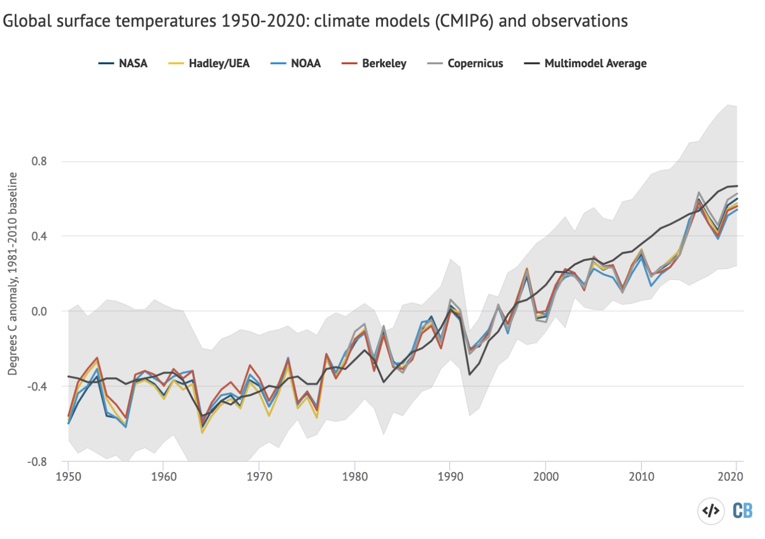
This FI ….
Bogus
Typical Banton plot, sans any provenance.
McKitrick and Christy, see citation above. Here is the best figure, the CMIP6 models are worse than the CMIP5.
You do realize that what you are showing looks very much like part of a sine wave, right? You’re going to be surprised if in the next decade or so that temps fall back down. 50 years worth of data in the history of the earth’s climate is nothing more than a twitch.
No they don’t seem to like to consider that. Even though EVERYTHING points to it being part of a wave. The only thing they have to hang their hat on is a dubious correlation between temps and co2 over a very short period of time. And it is VERY dubious indeed. The whole co2 ”theory” has been dead for some time now. Some people have just not noticed yet.
….Banton waves his magic graph and now observations run hotter than models, easy peasy, lemon squeezy.
Six bogus, bastardized instrument-era Hockey Stick charts are not evidence of anything.
There is a small volcano erupting in the Atlantic island of La Palma that is doing its best to inject dust and gas into the atmosphere just in time for the approaching northern hemisphere winter.
Worst volcano noise ever, before the biggest earthquake (5.1) hits La Palma hours later. 29.10
Due to the eruption on La Palma the UK has committed to Net Zero earlier than planned…..
Here is the new delta :
https://www.youtube.com/watch?v=rh7FmWLUIH8&t=177s
One of Gaia’s children badly needs a nappy-change!
Isn’t that just another convenient excuse for a lack of warming?
“Climate Models Running Too Warm”
This has been well known for quite some time. For example in 2017:
“Climate computer model projections of future man-made warming due to human emissions of carbon dioxide are running too hot, says a fascinating new study in Nature Geoscience. “
iowaclimate . org /
This latest “Climate models do not represent reality. They are running too hot.” study just isn’t going to make any difference.
We know that faith in egregiously inaccurate models trumps observation – every time. See Glasgow today and for the next fortnight…. It’s going to take something pretty spectacular to shake that faith.
I noticed yesterday that Christopher Scotese’s graphs showing temperature, CO2 and water levels through geological history has been completely disappeared from the web. Fortunately I happen to have a copy of it. What is interesting about that is the link to the site with those graphs gets redirected to some weird Vietnamese site with a This page could not be translated message.
Science is a mere fig leaf and nothing more. No amount of studies showing what we’ve known to be the case for years is going to change anything.
You surely mean “Climate Science – aka “The Science”. Real science is based on observations and data, plus good sound reasoning to reach conclusions which are falsifiable. Climate Science is based on computer models which use assumptions about the relations between the variables, and assumptions about the parameters where there is no data to plug in. It is supposed to be unreliable, that is why it is used by the alarmists.
No I clearly said ‘science’
No definite article, and no subdivision
….
“We know that faith in egregiously inaccurate models trumps observation ”
Models aren’t needed.
Arrhenius got it about right at the first attempt (1896) ….
https://www.rsc.org/images/Arrhenius1896_tcm18-173546.pdf
https://history.aip.org/climate/co2.htm#S1
“In 1896 Arrhenius completed a laborious numerical computation which suggested that cutting the amount of CO2 in the atmosphere by half could lower the temperature in Europe some 4-5°C ”
An no one has proved him wrong since.
Nor is hand-waving and selective graph worship going to on here (beyond the converted).
” … egregiously inaccurate models trumps observation”
Another myth – they don’t ….
They’re doing OK (yes a subset are to warm in CMIP6, as acknowledged by researchers) – here is a graph that isn’t deceptive (apples v apples and all data is available with conf. limits – which is not the case with the heroic graph posted in the OP)….

“I noticed yesterday that Christopher Scotese’s graphs showing temperature, CO2 and water levels through geological history has been completely disappeared from the web.”
Now that’s strange … as I found them straight away.
Not least because he has his own website …..
http://www.scotese.com/climate.htm
Ah, another one of the “treasured” graphs of climate science “sceptics”.
Along with the Alley graph “doctored” by Easterbrook of the Greenland GRISP bore-hole.
And the Lamb (sketch) of the MWP, that has been subsequently “erased”…. because we now have global data that shows it was not contiguous around the Earth.
BTW: Here is a more up-to-date graph than Scotese’s ….

Anthony Banton, that is an invalid test of the models since they are tuned to surface temperatures. McKitrick and Christy’s test is better, since they chose the tropical hot spot, which the models are not tuned to, but where they universally overstate the warming in tropical middle troposphere. Unless GHG’s are not included in the model, then they do better.
Andy:
“Anthony Banton, that is an invalid test of the models since they are tuned to surface temperatures”.
That’s the whole point, the surface is where we live – you know sea level!
Where weather events take place!
“McKitrick and Christy’s test is better, since they chose the tropical hot spot, which the models are not tuned to”.
OK, show me the paper where I can find all the data used to compile the “graph” and the model programme as well.
(with conf. limits of course).
Show me the peer-reviews analysing it critically (and not fawning over it as in this Blog).
Which UAH scanning band is depicted?
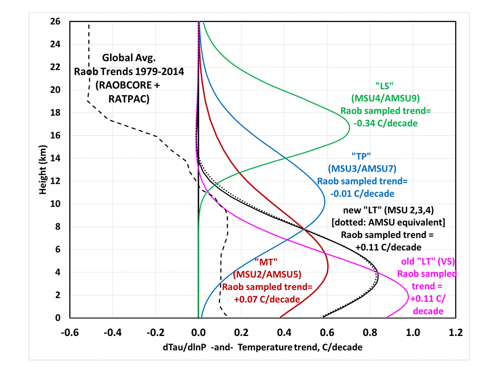
MT
LT
TP
LS
The THS lies between 500 and 150 mb with a centre at 300-250mb, or around 30-35,000ft (10-11km)
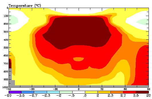
So the data plotted has to be TTP to be close to being valid
Is it?
The OP graph is plotted (y-axis) against deg F in the range -0.9 to 3.6F.
The 300-250mb band (THS range) has a temp of -30 to -40C (-22 to -40F) !
So the temps plotted correspond to ~ 400mb (24,000 ft or around 7km) … which matches none of the bands as a level of maximum radiance.
So none of it (the plotted UAH data) makes sense.
WITHOUT THE DATA
Do you have the answers?
Does anyone?
So that it can be properly peer reviewed and not just accepted as fact because it gives the required answer.
Anthony Banton:
Here you go. The graph on the left is from AR6, the graph on the right is from AR5. Notice that the models do not overlap the observations (re-analysis and weather balloons) at all from 300 to 100 mbar in AR6. In AR5, the observations fall below both the All Forcings and the GHG Forcing bands. These are the red shaded and green shaded areas. The blue shaded Natural Forcings only area is too narrow, actually it should extend all the way to the red. No satellite data is shown.
“No satellite data is shown.”
Then you have not answered any of my questions.
From the IPCC AR5 report that the right-hand graph came from …..
”Utilizing a subset of CMIP5 models with single forcing experiments extending until 2010, Lott et al. (2013) detect influences of both human induced GHG increase and other anthropogenic forcings (e.g., ozone and aerosols) in the spatio-temporal changes in tropospheric temperatures from 1961 to 2010 estimated from radiosonde observations. Figure 10.8 illustrates that a subsample of CMIP5 models (see Supplementary Material for model selection) forced with both anthropogenic and natural climate drivers (red profiles) exhibit trends that are consistent with radiosonde records in the troposphere up to about 300 hPa, albeit with a tendency for this subset of models to warm more than the observations. This finding is seen in near-globally averaged data (where there is sufficient observational coverage to make a mean- ingful comparison: 60°S to 60°N) (right panel), as well as in latitudinal bands of the SH extratropics (Figure 10.8, first panel), tropics (Figure 10.8, second panel) and the NH extratropics (Figure 10.8, third panel). Figure 10.8 also illustrates that it is very unlikely that natural forc- ings alone could have caused the observed warming of tropospheric temperatures (blue profiles). The ensembles with both anthropogenic and natural forcings (red) and with GHG forcings only (green) are not clearly separated. This could be due to cancellation of the effects of increases in reflecting aerosols, which cool the troposphere, and absorbing aerosol (Penner et al., 2007) and tropospheric ozone, which both warm the troposphere. Above 300 hPa the three radiosonde data sets exhibit a larger spread as a result of larger uncertainties in the observational record (Thorne et al., 2011; Section 2.4.4). In this region of the upper troposphere simulated CMIP5 temperature trends tend to be more positive than observed trends (Figure 10.8). Further, an assessment of causes of observed trends in the upper troposphere is less confident than an assessment of overall atmospheric temperature changes because of observational uncertainties and potential remaining systematic biases in observational data sets in this region(Thorne et al., 2011; Haimberger et al., 2012). An analysis of contributions of natural and anthropogenic forcings to more recent trends from 1979 to 2010 (Supplementary Material, Figure S.A.1) is less robust because of increased uncertainty in observed trends (consistent with Seidel et al. (2012)) as well as decreased capability to separate between individual forcings ensembles.”
Notice I highlighted 1961-2010.
I did this because that period encompasses many developments in radiosonde technology ( and also is 10 years behind current).
https://www.nap.edu/read/9755/chapter/12#52
“Instrument Changes: There have been many and widespread changes of radiosonde sensors during the history of the global radiosonde network. These changes often brought useful improvements in precision and accuracy, essential for weather analysis and forecasting, but they also prejudiced the homogeneity of the records from the perspective of climate change analysis (Gaffen, 1994). For example, efforts to update the sonde’s temperature-sensing technology and efforts to mitigate the effects of solar radiation on the sondes have, in some cases, introduced time varying biases. Parker and Cox (1995) documented an increased dominance of radiosondes made by the Vaisala company in recent years. Since their paper was published, many North American stations have also switched to Vaisala instruments, although stations in Russia, China, and Japan continue to use national instrumentation. Within each class of radiosondes (such as Vaisala), there have also been progressive developments (e.g., the Vaisala RS11 through RS90 series), which have introduced heterogeneity. Another problem is that the documentation of instrument types and the timing of instrument changes is not always complete or accurate (Gaffen, 1993).”
In short, radiosonde also do not have the resolution (as do satellite sensors … my ORIGINAL point) and homogeneity to properly assess the vertical profile of the atmosphere to a degree that the science requires.
Now, I do suspect you would be wary of surface temperature data in such circumstances ….. if it indicated a temp trend you did not like at least.
Typical alarmist. The data are wrong and my model is correct.
Sorry my man, if the model doesn’t match observations, it’s wrong. You realize you are saying that the radiosonde data, which is the same as the independent satellite data, is wrong and your models are correct, right? Use your eyes.
More like use rational thinking since the Radio AND Satellite DATA shows the contrived models are wrong.
During the last Ice Age the ice sheets were “not contiguous around the Earth.” Are you therefore saying that the Ice Age should be “erased”?
Did you give up spamming your “insolation” plot, Banton?
Where are the error bars/bands?
this was written in 1907 – same old, same old
“Is Our Climate Changing?
(By R. De Courcy Ward, assistant professor of Climatology at Harvard University.)
Belief in a change in the climate of one’s place of residence, within a few genera-
tions, and even within the memory of living men, is widespread. Whenever a sea-
son attracts attention because of weather conditions which seem to be in any way unusual, this belief is strengthened. For example, the mild and open winter which has been noted over considerable sections of the United States during 1905-6 has served to establish still more firmly the opinion that our winters are milder, and that we have much less snow than we did
some years ago.
People in the north-eastern sections of the country, in particular, are saying that something has happened to the winter; that when they were children there was al- ways deep snow at Christmas and sleighing lasted for weeks; that the mild days and warm rains of the present winter are unheard of: that the Gulf Stream must have shifted its course: and that the cli-
mate has certainly changed. The men and women who voice these opinions are often intelligent, observing members of the com-munity, and their words carry weight. In
view of the general interest in the question, “Is our climate changing?” it is
worth while to ask ourselves what the facts in the case realty are.
In the first place, it is clear that no definite answer can be given on the basis of
tradition, or of general impression, or even of the memory of the “oldest inhabitant.”
Human memories are unreliable things, and there are many reasons for their be-
ing particularly untrustworthy in matters of this kind, as we shell see. The only
definite answer of any real value must be based on what the instrumental records of
temperature and of rain and snowfall show. Accurate instruments, set out under proper conditions and carefully observ- ed do not lie, do not forget, are not prejudiced.
RECORDS SHOW NO CHANGE.
Now, when such instrumental records are carefully examined, from the time at which
they first began to be kept, which in a few cases goes back about 150 years, there is found no evidence of any progressive change in temperature or in the amount of rain and snow. Apparent indications of a permanent increase or decrease in one or the other have in every case been fairly easy to explain as being due to the method of hanging out the thermometer or of setting up the rain-gauge. Little care was formerly taken with the location of the
meteorological instruments. The building of a fence or a wall near the thermometer, or the growing of a tree over a rain-gauge has been enough in numerous cases to ac- count for any observed change in the mean temperature or rainfall.
Progressive changes of climate during the last century and a half are therefore not proved, even by the evidence of direct meteorological observations, and certainly not by general impressions, nor by the memory of the “oldest inhabitant.” Even when the most accurate instrumental re- cords are available care must be taken to interpret them correctly. Thus, if a rain- fall or snowfall record of several years at some station shows an apparent increase in the amount of precipitation, it does not follow that this means a permanent progressive change in climate, which is to continue indefinitely. It may of course simply mean that there have been a few years of somewhat more rainfall or snow- fall, and that a period of somewhat less rain or snow is to follow.
For the United States Schott, some 30 years ago, made a careful study of all the older records of temperature and of rain- fall (including snow) from Maine to California, and found nothing which could lead to the view of a progressive change in any one direction. There was, however, evi- dence of slight variations of temperature, occurring with the same characteristics and with considerable uniformity over large areas. These variations showed the characteristics of irregular waves, representing slightly warmer and slightly cooler
periods; but during these fluctuations the temperature differed by only a degree or two on one side or the other of the average temperature. Obviously these fluctuations are too slight to be of any general or practical interest, and in any case they do not give any evidence of a continuous change toward a warmer or toward a cooler climate. Schott found that these
waves of higher and lower temperature fol- lowed one another at intervals of about 22 years on the Atlantic coast. In the interior States the intervals between the the higher and lower temperatures are shorter, being about seven years. MAN CAN’T ALTER THE WEATHER.
The idea that the agency of man in cut- ting down forests and in cultivating new soil has resulted in a change in the cli- mate of the United States finds no sup- port in the recorded instrumental data. Further, the records of the closing of rivers, such as the Hudson, to navigation during the last hundred years or so show
that, the dates nowadays average no later than formerly.
If a list was carefully compiled of heavy snow-storms, of droughts, of floods, of severe cold, of mild winters, of heavy rains, and of other similar meteorological phenomena for one of the older sections of the country, beginning with the date of the first white settlements and extending down to the present day, we should doubtless have the following situation: If the list was divided into two parts, each di- vision containing an equal number of years, it would be found, speaking in general terms, that for every mild winter in the first division there would be a mild winter in the second; for every long-continued drought in the first group of years
there would be a long-continued drought in the second; for every “old-fashioned” win-
ter in the first series there would be an “old-fashioned” winter in the second. And
so on through the list. In other words, weather phenomena and climate do not seem to have changed from the time of the landing of the earliest Pilgrims on the in- hospitable shores of New England down to the hour when the last Italian or Jewish immigrant landed at New York from the steerage of an Atlantic liner.
MEMORIES NOT TRUSTWORTHY.
The question naturally suggests itself, Why is the popular belief in a change in our climate so wide-spread and so firmly fixed in the minds of our people when instrumental records all go to show that this popular belief is erroneous? It is not altogether easy to answer this question
satisfactorily; but several possible explanations of the attitude of the public may be given. The trouble arises chiefly from the fact that we place absolute trust in our memories and attempt to judge such subtle things as climatic changes on the basis of these memories, which are at best short, defective, and in the highest degree untrustworthy. If we trust our memories we are likely to remember a few seasons which for one reason or another made a
special impression on us, and we thus enormously exaggerate some special event. In addition to the popular impression that climate is changing, an impression which has now been seen to be without support in the results of instrumental re- cords, a good deal of other evidence has been adduced at one time or another which has been believed to prove climatic change. Yet most of the facts thus brought forward may easily be explained without the need of calling upon changes of climate.
For example it has been asserted that because grapes or corn or olives or other fruit and cereals are now no longer grown in parts of Europe where their cultivation was once an important occupation, therefore we must conclude that the climate has changed from a favorable to an unfavorable one. Such a conclusion is by no means inevitable; for it can easily be shown that the changes in the districts of cultivation of various crops often result
from the fact that the grapes or the corn or the olives are in time found to be more
profitably grown or more easily prepared for market in another locality. The climate of the districts first used has not changed.
In France Angot has made a careful compilation of the dates of the vintage from the 14th century down to the present time, and finds no support for the view so commonly held there that the climate has changed for the worse. The dates of the vintage do, however, indicate
some oscillation of the climatic elements. In the period 1775-1875 the average date of the grape harvest at Aubonne was about 10 days earlier than during the preceding century, but three days later than during the second century preceding. At the present time the average date of the grape harvest at Aubonne is exactly the same as at the close of the 16th century.
Wheat was formerly more generally cultivated farther north in the British Isles
than it is at present, because it paid. La- ter, after a readjustment ot the taxes on breadstuffs, it was no longer so profitable to grow cereals in that region, and the area thus cultivated diminished. Changes in the facility or in the cost of importation of certain articles of food from a distance are speedily followed by changes in the districts over which these same crops are grown. Again, it has been urged that there is a progressive decrease of rainfall in Greece, Syria, Northern Africa, and other parts of the Old World which were formerly more prosperous than now, or where the conditions of occupation or of population have changed within histo- ric times. From this point of view some writers have predicted an inevitable pro- gressive decay in the civilisation and in the prosperity of the inhabitants of these regions.
But there is another side to the story. Has there been a progressive desiccation, or have the inhabitants less capacity, less energy, less ability, than formerly ? Is the change from a once cultivated area to a barren expanse the result of decreasing rainfall or of the emigration of the for- mer inhabitants to other lands? The difference between a country formerly well
irrigated and fertile, and a present-day sandy, inhospitable waste may be the re- sult of a former compulsion of the people, by a strong governing power, to till the soil and to irrigate, while now, without that compulsion, no attempt is made to keep up the work. The incapacity of the present inhabitants is often responsible for effects which have been interpreted as be-
ing due to climatic change. It has been clearly shown that where irrigation is resorted to in many parts of the districts about the Mediterranean which are reported to be drying up, there the former fruit- fulness returns. In most cases the reports of increasing dryness in that region really concern only the decrease in the water supply from rivers and from springs,
and it is well-known that a change in the cultivation of the soil or in the extent of
the forests may bring about marked changes in the flow of rivers or springs, with-
out any essential change in the actual amount of rainfall. Partsch has disproved the supposition that there was formerly a more abundant rainfall in Northern Africa by showing that the ancient settlements on the interior lakes clearly indicate that these lakes formerly contain no more water than they do at present.The Tunisien Schott-el-Dierid contained
just as little water in the days of the Roman Empire as it does to-day.It appears, therefore, that the fact ofpermanent progressive changing in climate during historical times has not been prov-ed. The answer to the question, “Is our climate changing?” is a negative one.
On the other hand, it is clearly established that there are slight fluctuations or oscillations of climate, there being periods of slightly higher temperature and less rainfall or snowfall and then periods of slightly lower temperature, and more rain
or snow. The whole amount of these variations is, however, small indeed. Professor Bruckner of Berne has made a careful investigation of the whole subject of
these periodic climatic changes, and finds evidence of a 35-year periodicity in temperature and rainfall.
Bruckner began with the long-period oscillations of the level of the Caspian Sea. He then investigated the level of the rivers flowing into the Caspian, and then the dates of the opening and closing of the rivers of the Russian Empire, and finally extended his study pretty much over the world. A supplementary study of the new- er rainfall observations for Russia and the
United States, an well as for certain sta- tions in Central Europe and Eastern Siberia, has given Bruckner satisfactory confirmation of his earlier conclusions, in the fact that he finds a decrease of the rainfall over these districts as a whole, beginning about the middle of the decade 1880-90.
It must, however, be remembered that these are periodic oscillations of a slight amount. They are not progressive changes of climate permanently in one direction. The pendulum swings as far to the right as to the left. Its total swing involves a change in the average of only a
couple of degrees in the mean temperature,
and of only a small percentage in the annual rainfall.”
That is because the very basis for the climate models, – that CO2 drives temperatures, is pure fantasy.
When looking at pictures like
the first thing I miss all the time is the information: with which RPC level were the models run?
It should be evident to all of us that if you use the worst case – RPC 8.5 – you evidently will show only ‘hot models’.
This is all settled science 😉
I agree. Any chart should provide the basis for creating it.
I found Legates talk on YouTube, and the chart is based on SSP2-4.5.
Thanks.
I LOVE this systematic downvoting, appearing even if I only write ‘Thanks’.
How stoopid is one allowed to be on Earth?
I have seen such charts made by people who generated them themselves using the KNMI explorer’s model corner and compared the stuff with HadCRUT.
The charts looked quite a bit different… but I can’t recall where they were posted 🙁
There was one leaked in the last IPCC report that disappeared in the later published report.
The results of unrealistic RCPs only show up later in the 21st Century. It doesn’t matter the RCP in the near term.
WRONG.
It is evident that you NEVER extracted any CMIP data out of KNMI’s data base.
Then he is doing the right thing. It’s all garbage.
‘Falsely calibrated’. Correct! It was done deliberately.
For the disaster merchants on this blog. Simple rules for living with mother Earth.
If you live on a volcano, don’t be surprised by lava in the living.
If you live on a floodplain, don’t be surprised by furniture floating away.
If you live in the path of violent storms, don’t be surprised by a roof ripped off.
Nobody, least of all you, can stop it. You only can prepare for it.
Very nice article pointing out to an important observation, let´s hope that mainstream media eventually picks up on that! That should be good headlines and stories to run for weeks.. “man made climate change unproven..”
>>> The CMIP6 models … there can be no confidence in these models to correctly
>>> predict future warming…”
Well, just one correction here:
CMIP6 models are the best they have and vastly superior to CMIP5 and any previous model generation!
It is not “these models” that should not inspire confidence but all models!
There is the argument that models from the 1970ties predicted the human contribution to global warming. Those models used a flat earth and of course did not struggle with the cloud effect as the CMIP6 model, they simply did not have it.
They have as much science based predictive power as me scribbling pencil lines on paper: flat, raising and falling maybewith a few bumps in 20years ignoring all real life parameters.
In amongst all the COP26 modelling rubbish the Sunday Times has an article on Covid 19 modelling in the UK or should I say panic modelling.
Why does no one in the media put 2 and 2 together and ask why if modelling of covid 19 is so bad why is climate modelling driving to cliff edge rush to Net Zero by the same Government.
Where is the physical experiment which shows two bodies in space, both with atmospheres, which shows that the body with more trace amounts of carbon dioxide than the other becomes warmer at its surface when exposed to exactly the same amounts of solar radiation? Is there one? At school and beyond we always did the practical experiment to prove the theory and were told it was essential to do this.
“Is there one?”
No, there is not. Not in this solar system, anyway.
So… after a few trillion dollars are thrown down a rat hole, all we’ll get for it is a “Never mind”?!?
I doubt if we’ll even get that much – they’ll fight for every inch of the territory they’ve won. They will not give up easily.
Why listen to the IPCC, They are obviously biased by their goal of promoting man made climate change.
In the Church of Warming, Climate climate models are the equivalent of the Oracle of Delphi in other religions.
Just mentally “move” those model curves down until they are centered on the “observations”….If they recalibrated their models based on the observations….the results would no longer be alarming…
So recent warming is apparently caused by a reduction in cloud cover.
So far so good. But it begs the question – what caused the reduction in cloud cover? No one appears to have proposed a hypothesis that explains it.
Natural science advances by making observations of phenomena, then generating hypotheses to explain the observations.
If the “reduced cloud cover” phenomenon ever gets aired among the warmist community, I can confidently predict that it will be announced that human CO2 emissions have caused clouds to disappear – Oh the horror! Not only will we be drowned by rising sea levels, burned in continental-scale conflagrations, starved by failing harvests and eaten by left-handed sharks, but we will get terminal sun-tans as well! The end is nigh – and getting even nigher!
“…what caused the reduction in cloud cover?…” just a thought…maybe reduced industrial and forest fire particulate and arid area dust in the air, along with reduced SO2 emissions from industry ?
CO2 is supposed to increase cloud cover, according to the alarmists. CO2 is supposed to jump-start increased water vapor (clouds), which is supposed to be the real threat from Human-caused Global Warming because the increased clouds supposedly add to the CO2 greenhouse effect.
But here we have CO2 concentrations rising in the atmosphere yet there are two percent less clouds in the atmosphere than in the recent past. It doesn’t appear that CO2 is causing extra clouds to be generated. No hotspot in the troposphere.
This CO2 theory is falling flat on its face.
Thank you for translating and editing the paper. I find it to be very intriguing and your work is appreciated.
I note the following duplicated text near the end of your post: “Study authors are cited in the literature as possible causes”. There is also a small typo near the beginning: They sre running too hot.
In looking at the chart I see projections ranging from ~1 degree to ~3.6 degrees, a mere four years in the future.
Shouldn’t they settle their own science before telling the rest of us it’s settled?
They can’t even consent to their own consensus.
The exact source of the chart is unclear. Who made it?
Whatever the models can or can’t predict: the effects of GHG’s were modelled by Happer & Wijngarten (as well as by Fleming). The modelled spectra are compared to actual satellite measurements for several regions of varying latitude. The modelled and calculated spectra correspond perfectly with another. This means that their physical model is most probably correct in accordance with the scientific method. It also predicts a minimal effect if the CO2 concentration would double to 800 ppm. This also is in agreement with past geological periods where the CO2 concentrations were much higher than today with similar temperatures compared to today and the “recent” roman and medieval warm periods. Even if humans were responsible for the increases in CO2, there will be practically no temperature increase which will come from it. Besides that, increasing CO2 is a good thing, leading to a greener and minimally warmer planet and record agricultural outputs for the benefit of mankind.
Defund the IPCC and possibly even the UN with it (the WHO isn’t worth a hoot either).
It would also make sense to invest all this money in only a few “best” models to improve them, improvement meaning better correlation with observed data and not with political agendas. Having a hundred erroneous models doesn’t lead to any improvements whatsoever, even if they agreed with one another which they don’t.