Guest Post by Willis Eschenbach
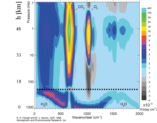
In considering how the energy flows around the planet, I got to thinking about the amount of solar energy that is absorbed rather than transmitted by the atmosphere and the clouds. As with many other such questions, I turned to the wonderful CERES satellite data. Figure 1 shows what CERES has to say about the average amount of solar energy absorbed by the atmosphere.

Figure 1. Total amount of solar energy absorbed by the atmosphere on average on a 1° latitude x 1° longitude basis. CERES Data, Mar 2000 – Feb 2017.
As you can see, just under eighty watts per square metre of incoming solar energy doesn’t make it to the ground. Instead, it is absorbed in the atmosphere. This is a bit more than a fifth (22%) of incoming solar energy. It is also about the same amount of sunlight that is reflected by the clouds.
And Figure 2 below shows the same data, but this time showing the absorption as a percentage of incoming solar energy. Obviously, where there is more solar energy, more energy will be absorbed in the atmosphere. Showing the atmospheric absorption as a percentage of incoming solar energy removes that bias.

Figure 2. Total amount of solar energy absorbed by the atmosphere, as a percentage of incoming solar energy, on average on a 1° latitude x 1° longitude basis. CERES Data, Mar 2000 – Feb 2017.
As I’ve mentioned before, I love the surprises that come from turning a huge mass of numbers into a picture. Here is what is the surprise of the 64,800 individual 1°x1° gridcell calculations was for me. See the red areas? Those are the areas where the largest percentage of incoming solar energy is being absorbed.
Now, the absorption of solar energy in the atmosphere is due to “aerosols”. In the most general sense, this is a term for a variety of chemicals and elements which are held aloft in the atmosphere. Aerosols include things like sulfur dioxide from volcanic eruptions, salt crystals and molecules from sea spray, a variety of bacteria, and black carbon and hydrocarbons from fossil fuels and forest fires. A number of aerosols are human-generated. I’d kind of expected to see increased absorption near cities and industrialized areas of the northern hemisphere.
But none of that was the case. The surprise to me was, it looks like the red areas are from plant-generated aerosols. The Amazon rainforest, the tropical forest areas of Africa and Asia, the forested tropical islands of Indonesia and Papua New Guinea, those were the main sources of aerosols.
And on the other hand, there is little vegetation in the arid areas of northern Mexico, the Sahara and Atacama deserts, Southern Australia, and southern Africa; or in the mountainous areas of the Rockies, the Andes and Himalayas; or in the polar areas of Greenland and Antarctica. These areas in greens and blues have clearer air, with less solar energy absorbed in the atmosphere.
Huh. Plant-based aerosols are the major player in terms of solar absorption. Go figure That would certainly not have been my first guess.
And this brings up another of those curious evolutions over time. Warmer surface temperatures generally mean more plants. More plants mean more plant aerosols. More plant aerosols mean more atmospheric absorption of incoming solar. More atmospheric absorption of solar means less solar energy making it to the ground. And finally … less solar energy hitting the ground means cooler surface temperatures.
And vice-versa, of course.
So the plants are affecting the amount of sunlight making it to the ground, with more sunlight making it through the atmosphere when and where plants are scarce and less sunlight making it through the atmosphere when and where plants are abundant …
Who knew? Likely somebody, but certainly not me …
Next, here’s the evolution over time of the amount of solar energy absorbed by the atmosphere:

Figure 3. Change over time of the absorption of solar energy by the atmosphere. Top panel is the raw data. Middle panel shows the repeating monthly changes. Bottom panel shows the residual signal after the seasonal component is removed. CERES Data.
There is a very slight drop over time in the absorption (a tenth of a watt per decade) which is not statistically significant (p-value 0.08). Overall, the data is surprisingly stable.
I also note that the El Nino/La Nina pump is clearly visible in the 2015-16 data. I showed in a paper called The La Nina Pump that there is an oddity about the La Nina pumping action. The La Nina pumping action is wind-driven, and it moves huge amounts of warm water first westward across the Pacific and from there towards the poles. The oddity is that it begins in November, lasts one year, and ends in the following November.
This same change is visible in the bottom panel above. In November 2015, the atmospheric absorption of solar energy peaked and began to drop. This drop ended in November of 2016, in parallel with the La Nina pumping action of that Nino/Nina episode.
Overall? I’d say what stands out is the stability, plus or minus half of a watt over the period.
w.
Willis,
You may be pleased to know that James Lovelock, the Gaia author has similar thoughts to yours about the involvement of aerosols in climate. Here he is in The Guardian on 29 March,2010:
“The great science centres around the world are more than well aware how weak their science is.If you talk to them privately they’re scared stiff of the fact that they don’t really know what the clouds and the aerosols are doing. We haven’t got the physics worked out yet.”
Good luck in your pursuit of the aerosols issue.
Solar absorption by aerosols is a second order effect relative to the solar energy absorbed by the liquid and solid water in clouds. Owing to the short period of the water cycle, averages over time periods of about a month or more are sufficient to consider the energy absorbed by the water in clouds a proxy for energy absorbed by water in the oceans, none the less, what we see in the plots and what’s called absorption by the atmosphere is where the clouds are most dense over the integration period of the data, which in this case is about 17 years.
co2isnotevil
I’m sorry, but that is not true at all. The graphics above do NOT show the same pattern as maps of cloud cover. For example, note in Figure 2 how absorption over the ocean is very even almost everywhere … and this is absolutely NOT true about clouds over the ocean.
Best regards,
w.
Willis,
I think it just happens that the two are coincident. For example, desert areas have few clouds have little vegetation while rain forests have lots of vegetation and lots of clouds. I also see higher absorption along the inter-tropical convergence zone, which is also known to have a relatively higher proportion of clouds.
If instead of plotting atmospheric absorption, you were to plot the average fraction of the surface covered by clouds averaged over the same 17 year interval and scale to the same colors, you would get pretty much the same result. You wouldn’t even need to go 17 years and the average across just a single year will be close.
The evenness as seen in the plots is a consequence of the long term averages that make up the data in the plot.
Consider it this way. The average fraction of the planet covered by clouds is about 66%. These clouds on average reflect about 42% of the solar energy, absorbing about 60% of the non reflected solar input allowing the remaining 40% to arrive at the surface. Note that 66% cloud coverage includes a significant fraction of partly cloudy skies.
If we take 66%. multiply by the 58% not reflected times the 60% absorbed, the result is, .66 * .58 * .60 = .229, which is approximately the same as the 0.224 claimed as the fraction of incident solar energy absorbed by the atmosphere (which means absorbed by the water in clouds).
co2isnotevil said:
Well, probably not. Here’s the cloud percentage. It’s quite different from absorption percentage. Note that e.g. the clouds are very prevalent over the Southern Ocean, but there is no excess solar absorption there. There are a number of other differences.
Far from being coincident, the correlation of cloud area percentage and solar absorption percentage is only 0.14.
Best regards,
w.
In order to do an apples to apples comparison, the cloud fraction needs to be weighted by solar insolation. For example, 80% cloud coverage at the equator will absorb far more solar energy than 100% at the poles.
I see more correlation than you do. The red along the inter-tropical convergence zone, Africa and SE Asia are the same in both. The deserts of the SW US, Australia and N Africa are also evident in both plots.
The sharp drop in clouds between the ocean and Antarctica seems suspicious to me. I know that from older sources of satellite data without near IR sensors, they have a hard time distinguishing between surface ice and clouds, especially sea ice and at night and polar nights can be quite long.
Try comparing it to the latest CO2 data from the OCO2 Satellite shown here
http://www.climatecentral.org/news/nasa-satellite-most-detailed-view-co2-18459
Or
https://www.livescience.com/49196-nasa-satellite-oco2-carbon-maps.html
So it looks like CO2 cools the surface.
I recall seeing a paper maybe 5 -6 years ago about CO2 measurements of CO2 over the Amazon area and the Atlantic ocean near Equator using an instrumented aeroplane of the type used for survilence. I recall that the authors were surprised that the CO2 levels were higher in tropical areas (no burning of forest at the time) than over populated Europe or measurements on the observatory on the volcano mountain in Hawaii.
By the way Australian Eucalyptus trees give off hydrocarbons which make them appear blue (as in Blue Mountains) this may appear to satellites as low absorption of sunlight. In fact the leaves of these threes tend to change colour after rain being more green and even with red on new growth.
Willis, I think co2isnotevil has a point. Cloud particles reflect/scatter visible light, but they absorb infrared (about half the total power of the incoming solar spectrum). I don’t think that’s in question. Plus, plant aerosols contribute to cloud particle nucleation. I think both of you have valid points — it isn’t a black/white question.
Not sure that is true. The pictures above show the effects of mountains ranges for example – which are not know to be particularly uncloudy. The Himalayas stand out clearly, as do the Rockies.
High mountains would have much less atmospheric mass above htem and so probably significantly fewer aerosols to absorb radiation
Excellent discussion, and I enjoyed the thread.
If it’s not merely the clouds, then it must be something else contributing. What is different about that atmosphere than other areas? What aerosols are plants contributing? Maybe O2?
Are the atmospheric gas concentrations different in these regions?
Could it be that this analysis is attributing conversion of solar energy to chemical energy (i.e. photosynthesis) to absorption by plant aerosols? Photosynthetic efficiency is maybe 1 or 2 percent, and the red areas on the map line up pretty well with the green belts of the planet.
Aerosol buildup from nucleation was reported by CERN CLOUD as measured when it actually was (wrongly) modeled. Svensmark definitely points to aerosol chemisty and CLOUD did say not enough was known. Svensmark has done actual aerosol expeiments.
Good thing you do this for fun Willis. No mention of CO2 and a matter-of-fact dialog in the essay will get you no money on the grant circuit. Interesting observations. Thanks for sharing.
“Overall? I’d say what stands out is the stability, plus or minus half of a watt over the period.”
Therefore, during that period, the the increase in CO2 not changes in solar absorption by the atmosphere is the reason for global warming.
(thought I would finish the thought)
ReallySkeptical, “during that period” the CERES data says there was no statistically significant trend in surface temperature. So I’m not sure what you are trying to explain.
w.
Willis, the usual definition of aerosols includes water droplets, does CERES distinguish between such water aerosols and the rest? Thanks.
Aerosols are NOT water vapour
What’s up Allen? Water vapour is a GHG. Water droplets are aerosols. Both absorb radiation, and droplets also refract it. I am not sure if droplets reflect much. Someone here probably knows. Water droplets are ‘black’ to IR.
The closest thing to water vapor mentioned in this Aerosol wiki article is fog. This leaves open the question of whether solar absorption is predominately by aerosols or by water vapor (clouds), if water vapor and clouds aren’t technically considered part of aerosols.
When I think of aerosols, it’s usually stratospheric, volcanic. How can near surface aerosol solar absorption be distinguished from stratospheric aerosol solar absorption in Willis’ analysis?
Look again. The picture on the article is labeled “Mist and clouds are aerosols”.
Who said that they were?
????
ReallyS
Are you not getting Willis’ point? Absorption is about constant during the seventeen years. So is the temperature. The CO2 level is increasing rapidly. It has no effect on either, obviously. If it has an effect, it is not detectable.
Yeah, the none detectable co2 RGE strikes again,……
The None detectable RGE and its back of a postage stamp phizzik’s.
None detectable for 160 yrs,… the best ”hide & seeker” in post normal ”science”.
No trend in temperature all the while CO2 went up suggests a lack of CO2 sensitivity. “The pause”.
EdB, replying to Willis Eschenbach.
Rather, if there were no CO2 influence on Global Average Temperature, the “pause, plus today’s longer hiatus” would merely be another natural decline between 1998/2000-2005 short cycle peak, followed by a small but steady 30-year decline.
Just like the decline that we found between 1945 and 1975.
In previous short cycles, the declines were more obvious as overall global average temperatures rose from the 1650 low spot in the midst of the LIA. Now, with CO2 adding a very amount of temperature increase each year, these declines got flattened, and the rises on subsequent half-cycle GAT increases slight greater than otherwise expected with no CO2 influence.
Willis,
Do you have a convenient link to the CERES surface temperature data available? I can’t find it on their site. You say there is “… no statistically significant trend…” in the CERES surface data; but is there a ‘best estimate’ warming trend and if so how close is this to statistical significance please?
I ask because all the other surface data sets (GISS, HadCRUT4, NOAA, BEST) show statistically significant global warming between Jan 2000 and Feb 2017. See: http://www.ysbl.york.ac.uk/~cowtan/applets/trend/trend.html
Of the TLT satellite sets, both UAH and RSS show ‘best estimate’ warming between those dates, with RSS very close to statistical significance (0.188 ±0.195 °C/decade (2σ)); though of course these are not surface data sets. Thanks.
“Plant-based aerosols are the major player in terms of solar absorption. Go figure That would certainly not have been my first guess.”
My first guess would be photosynthesis.
If you say that the amount of sunlight absorbed by photosynthesis is insignificant, then I would say, to the extent that your opinion is true, that it is the current level of photosynthesis that is the problem.
“More plants mean more plant aerosols”
NASA says a 5% increase in clouds would cancel out all of global warming…
If aerosols make clouds….and plants make aerosols….and the planet is greening
…someone needs to crunch the numbers
But isn’t overall humidity/water vapor going down?
The plant aerosols are water vapor? If so, since plants use less water with higher CO2 levels, thus a negative feedback to counter the extra plant growth.
Water vapor is a colorless odorless gas. Water vapor is not an aerosol.
“…a 5% increase in clouds would cancel out all of global warming”
So would a 10% drop in the number of termites.
The overall humidity. Can be represented by the ‘optical thickness’. Of. The atmosphere. Which is what we are really talking about. The optical thickness has been utterly constant for as long as NASA has been making measurements. That is why Miskolczi talks about it.
http://www.drroyspencer.com/2010/08/comments-on-miskolczi%e2%80%99s-2010-controversial-greenhouse-theory/
Crispin in Waterloo saidith, to wit:
Well now, I would think that iffen “overall humidity” can be represented by ‘optical thickness’, then is it not logical to assume that if the humidity concentration changes, ……. then the ‘optical thickness’ should also change?
Anyway, lets “talk” humidity, ….. to wit:
Quoted commentary by Willis Eschenbach, to wit:
I did a “quick” check on those same red areas (Figure 2) and discovered that all of them are denoted as being “tropical” or “sub-tropical” ….. and which were also subject to extremely high ……. Monthly-Yearly Average humidity measurements (quantities).
Is the above stated just a coincidence, ……. or does (especially high concentrations of) atmospheric H2O vapor (humidity) absorb/reflect any parts or portions of the incoming solar irradiance?
Iffen, …. the Amazon rainforest and the tropical forest areas of central Africa show (Figure 2) “westward” floating, per se, contrails, ….. consisting of “plant-generated aerosols”, ……. then why doesn’t the similar areas of Indonesia, India, Papua New Guinea and western China also show similar “contrails” of said aerosols?
Sam sez:
then why doesn’t the similar areas of Indonesia, India, Papua New Guinea and western China also show similar “contrails” of said aerosols?
Good question.
What would be the result of the back radiation of the green light by plant leaves? In a tropical forest not a lot of solar radiation reaches the ground.
“Now, the absorption of solar energy in the atmosphere is due to “aerosols”. In the most general sense, this is a term for a variety of chemicals and elements which are held aloft in the atmosphere.”
Nonsense, it is mostly due to the near infrared absorption bands in water vapour. And is that 22% figure actually the sum of the absorption and the Rayleigh scattering?
Willis’s globe diagram figure 2 would suggest you are wrong. Did you read his article?
Would you suggest that I repeatedly read it until I believe the nonsense?
So sayith did: Ulric Lyons
Ulric, I’m inclined to agree with you.
This is what I just “posted” up above, to wit:
Annual rainfall:
http://www.weather-climate.org.uk/images/09j.jpg
Ulric L, a quick comparison of “maximum solar irradiance absorption areas” as defined on Figure 2 …. doesn’t appear to me to be a good correlation with the “max rain totals” as denoted on your cited map.
It looks reasonable between the Horse Latitudes.
“Overall? I’d say what stands out is the stability, plus or minus half of a watt over the period.”
That’s pause for thought. (pun)
A few random observations of a beautiful and informative map (especially Fig. 2); thanks, w., for a true fusion of art and data.
1. The plateaus and altiplanos of Tibet, Greenland, Antarctica, Colorado, SudAfrika, and the Andes run from 12 to 18 percent, averaging 15 percent, or about 2/3 of the global average. At a typical height of 700 mb, they’re above a third of the atmosphere, so the atmospheric absorption is somewhat proportional to the column depth of air above the terrain.
2. The big red areas over the Amazon, Congo, and Indonesia mark out regions of lots of convective rainfall, which means lots of upward motion in the atmosphere. Those three locations mark the strongest pumping of the Haley circulation. Same for the nearby ocean areas, where the ITCZ shows up as a thinner red line (also lots of upward motion). That suggests to me that low level aerosols – plant stuff over land, salt spray over the ocean, and water vapor – is lifted into a vertically deep layer that can do plenty of absorption. There’s also lots of clouds – I don’t know how CERES factors that into absorption/reflection numbers.
3. Likewise, around the Tropics of C and C, the dashed lines, over the oceans the absorption is less, since there’s subsidence that keeps the aerosols close to the surface.
4. India and China sure have a lot of absorption, especially for their respective latitudes. Compare China with the eastern US, places with similar climates and rainfall. China has much more absorption. I wonder why.
5. Canada, Siberia, and the southern Ocean are amazingly uniform at the global average. Go figure.
RE: China. That I found curious also. Given their industrialization and related pollution that might account for the aerosols? Any satellite datasets that show lower atmospheric ozone?
China has a massive black market problem with aerosols. It’s easily detectible and the authorities there started a crackdown in 2017 and ramped up again this year. The scale is massive and it’s mainly organized crime rings. Just do a search on “china black market cfc” and I am sure you will get enough background on the problem.
India & China high Aerosols emissions.
A great deal of it is from burning biomass badly. Black carbon from bad combustion has an enormous light absorbing power, over 600 times that of CO2. There is a great deal of lousy combustion going on throughout the large forests. Slash and burn. Agriculture is called that for a reason.
As per above much of China’s is not from that it’s real CFC mainly CFC-11 as a black market product.
” I’d kind of expected to see increased absorption near cities and industrialized areas of the northern hemisphere.
But none of that was the case. ”
Err, check out india and China.
Yes check them out.
http://www.weather-climate.org.uk/images/09j.jpg
Also low altitude aerosols can increase surface temperatures. Like summer time city smog, and forest fires, e.g. Moscow summer 2010.
Richard Keen,
I agree that Willis is to be congratulated for the quality of his analysis and for providing us with Figure 2 in particular. I had similar thoughts to you that the detailed features of atmospheric absorption seen on the continents in Fig. 2 relate in part to altitude, but clearly this is not the case everywhere.
Starting with the oceans:-
1. The Southern Ocean between the Tropic of Capricorn and the Antarctic Circle is typically coloured from light orange towards yellow (21%), whereas the Northern Pacific and Atlantic Oceans between the tropic of Cancer and the Arctic Circle are typically coloured deeper orange (24%), a significant difference between the two hemispheres.
2. In the Atlantic and Pacific Oceans the ITCZ is biased into the Northern hemisphere, this bias is not seen in the Indian Ocean, a difference caused by the effect of the Indian Ocean monsoon which pulls the locus of maximum atmospheric absorption to the north, onshore into India.
3. In Indonesia the locus of maximum atmospheric absorption is back at the equator, but now located over the land masses.
Looking at the effect of continental surface altitude:-
1. The two major polar icecaps of Greenland and Antarctica both have low atmospheric absorption but notice that East Antarctica, which dominates with the lowest global values, also has much lower values than either West Antarctica or Greenland.
2. In North America the part of the western Cordillera region centred on the desert state of Arizona and extending south into Mexico forms a region of low atmospheric absorption.
3. In North Africa; The Atlas Mountains of Morocco, the Hoggar Mountains of Algeria, the Tibesti Mountains of Chad, the Aïr Mountains of Niger (faintly) and the Ethiopian Highlands can all be identified as regions of lower atmospheric absorption against the higher background values of the Saharan region.
4. To the east in Asia; The Hijaz & Asir Mountains of western Saudi Arabia, the Zagros Mountains of Iran and the Hind Kush mountains of Afghanistan are all clearly identified.
5. Finally north of the Himalaya is the Tibetan Plateau that has the lowest northern hemisphere values; this region is separated from the Mongolian Plateau to the north by the higher atmospheric absorption region of the Xinjiang trough and the Gobi Desert.
Looking at the effect of continental surface altitude in the Southern Hemisphere the identifiable areas of low atmospheric absorption are not so clearly related to elevation:-
1. In South America the Atacama Desert of Chile and the Patagonian region of Argentina both occur in areas of low atmospheric absorption on different sides of the Andes Mountains.
2. In Southern Africa the Cape Province area of the Great Karoo, inland of the Great Escarpment, is clearly identified.
3. Western Australia forms an identifiable area that includes, in the east, the Great Victoria Desert.
The map that Willis has created for us is a chart of the atmosphere. It clearly combines both latitude features of global circulation, such as the ITCZ and the Asian monsoon, with elements that relate to zones of high elevation and therefore lower humidity.
We can observe these effects of lower humidity related to elevation both in the Horse Latitudes under the descending limbs of the Hadley Cells (e.g. the Saharan massifs) and also in both Polar Regions where high elevation ice caps are located under the descending influence of the planetary Polar Vortices.
On the poleward margin of each hemisphere’s Hadley Cell we can identify areas of Mediterranean climate, particularly in the southern hemisphere continents, but also in California and Morocco.
The effects of mountain induced rain shadow can also be identified, both in the Andes (Patagonia) and also with the Himalayas (Tibet).
Willis: I congratulate you on producing an analysis of satellite data that can clearly be used as a basis for the remote sensing classification of the world’s climatic zones.
“And finally … less solar energy hitting the ground means cooler surface temperatures.” … not really!
Only 2.5% of sun light make it to the surface of Venus, and temperatures there are not that low, if you will. It really should not matter where solar radiation is being absorbed, whether high up in the atmosphere, or below the water line (which is true for most solar radiation on Earth). The important question is rather where LWIR is getting emitted.
Even more important however are clouds, and it seems funny how no one seems to understand.
“This is a bit more than a fifth (22%) of incoming solar energy. It is also about the same amount of sunlight that is reflected by the clouds.”
Right, clouds contribute the most part of Earths albedo. Assuming a 22% of 342W/m2 that would be 75W/m2 cloud albedo effect. This figure is much higher than what the IPCC likes to claim, like 44-50W/m2.
Now clouds not just interfere with solar radiation, but also with terrestial LWIR. If clouds retain less LWIR than they reflect solar radiation, they will have a cooling effect obviously, and that exactly what is the IPCC states. The cloud “GHE” would amount to roughly 25-30W/m2, far less than the 75W/m2 named above.
Weather data however tell a very different story. In real life average temperatures are always higher with clouds present, rather than with clear skies. And that is specifically true for low clouds in the tropics. Accordingly clouds will contribute >75W/m2 to the natural GHE.
“the higher atmospheric absorption region of the Xinjiang trough ”
The Takla Makan desert (=”Xinjiang trough”) is an extremely dusty area, possibly the largest dust source of the Northern Hemisphere due to an abundant supply of fine materials from the surrounding mountains, extreme aridity and strong winds.
“The Takla Makan desert”
Thanks tty. It is not easy to find the accurate correct names for geographic features on Google Maps. The Taklamakan Desert is definitely missing.
“Weather data however tell a very different story. In real life average temperatures are always higher with clouds present, rather than with clear skies. And that is specifically true for low clouds in the tropics. ”
I have a hard time believing this. Perhaps at high latitudes where the warmth is imported from elsewhere.
https://de.scribd.com/document/370673949/The-Net-Effect-of-Clouds-on-the-Radiation-Balance-of-Earth-3
So why is Venus hot? Because it has an extremely high atmospheric pressure.
https://wattsupwiththat.com/2010/05/06/hyperventilating-on-venus/
No, that is NOT the reason. One would only put it that way, if physics were too complicated for a low IQ brain.
What matters is where emissions go into space, or rather where they go unhindered into space. This defines the thermodynamic surface. On Venus this surface is very much defined by a very thick cloud layer. On top of this cloud layer Venus has just the temperature a perfect black body should have at that specific distance from the sun (~328K).
Temperatures below that thermodymaic surface will then be largely determined by the adiabatic lapse rate. And yes, that is where the strong atmosphere and the high pressure on the firm surface come into play.
However it is pivotal to understand, that if the clouds were removed, temperatures would fall off sharply on Venus, without a change in atmospheric pressure.
All I know is that … ‘my people’ … come from the GREEN zone. And when we travel into the RED zones … my skin “absorbs” a LOT of solar energy. My demotoligist recommends an Urban sombrero for me. Nope. He says a ballcap is no good … gotta be a sombrero, amigo.
“Warmer surface temperatures generally mean more plants. More plants mean more plant aerosols. More plant aerosols mean more atmospheric absorption of incoming solar. More atmospheric absorption of solar means less solar energy making it to the ground. And finally … less solar energy hitting the ground means cooler surface temperatures.”
This sounds like more plants equal cooler temperatures. If more CO2 in the atmosphere leads to a greening of the planet does it follow that increased CO2 cools the planet?
Given the global greening which is occurring it seems really surprising that plant aerosols are dropping slightly. What are your thoughts Willis?
Don’t believe him. It’s water vapour.
There was a recent WUWT story on clouds. That caused me to wonder how it is that Venus is so darn hot on the surface when it is shrouded in clouds.
The following is pure conjecture.
Clouds absorb as much energy as they transmit and reflect depending on the latitude, about a third for each effect.
Absorbing energy will cause clouds to heat up. That will suppress convection. General atmospheric heating higher in the atmosphere will also suppress convection. Plus, clouds and atmosphere radiate toward the planet’s surface.
It seems reasonable that, even if clouds and the atmosphere absorb energy which then doesn’t make it to the surface, the net result is that the surface becomes warmer for two reasons:
1 – The surface will cool less because convection will be somewhat suppressed.
2 – The surface will be somewhat warmed because of long wave infrared radiated downward by clouds and atmosphere.
The surface temperature of Venus is just about all due to two factors: density and composition. With a density of ~90 times Earth sea-level, and a composition of 95% carbon dioxide, it is the rare infrared photon that escapes. (Note that earlier Mariner and Venera flyby missions did indicate high temperatures from the IR emittance, but the actual surface temperature was not pinned down until the Venera 7 soft landing.) Convection is indeed suppressed, but not to an extreme extent. However, the upwelling from the surface does not reach into the upper troposphere like it does here, as the Venus troposphere is about three times as deep as ours. The composition also prevents the immense release of energy at the top of a convection column, carbon dioxide does not change phase at that altitude (even if it did, the energy released is quite a bit less than when water condenses).
At altitude, temperature is still heavily influenced by composition. Where the pressure is close to Earth sea-level, the temperature is still a bit higher than a straight calculation based on the higher solar flux would seem to indicate. The difference is almost entirely due to a high concentration of aerosols at that level; the 50 kilometer level (where the pressure is ~ 1 bar) is right smack in the middle of the cloud deck. These aren’t our clouds, either. Venus only has ~ 20ppm of water in its atmosphere; these clouds are mostly composed of sulfur dioxide and sulfuric acid.
That’s probably more due to the clouds and other atmospheric gases than due to CO2 which absorbs only in a few narrow bands.
I suspect it is few compared to the bombardment it gets sitting that close to the sun.
CO2 having little effect other than “not condensing” like water does in the upper atmosphere. It just sits there as a hot gas.
I used to think that, too (that CO2 absorbs only in a few narrow bands). But given the much, much higher CO2 concentration compared to the 0.04% here on the Earth, and given the higher (approx. 90 times) overall pressure, the absorption bands are smeared sideways, so that the Venusian atmosphere is approximated as layers of black bodies which absorb and emit over almost all infrared (IR) frequencies. Molecular bands are composed of individual lines which are broadened by both the Doppler effect (higher temperatures mean higher molecular velocities) and by pressure broadening (when molecules are close to colliding, the energy levels are no longer the crisp, clearly defined ones of isolated individual molecules in empty space). And at higher temperatures, the wings of the molecular bands broaden, as the fraction of molecules in higher initial energy states E increases exponentially as the Boltzmann factor exp(-E/kT) where k is the Boltzmann constant.
Here on the Earth, the extra absorption on doubling CO2 occurs not because the number of ground state (vibrational quantum number v=0) molecules increase (their lines are mostly saturated, and you can’t increase absorption much if it is already 99%), but because it nearly doubles the v=1 first excited state molecules which constitute only about 3% of all molecules, so their lines are not saturated, especially in the wings. You can see this in the MODTRAN computer-generated spectrum available at https://en.wikipedia.org/wiki/Radiative_forcing . Doubling CO2 from 300 to 600 ppmv increases the area of the absorption ditch by only about 9%; this is the area between the green and blue curves, and corresponds mostly to absorption at 618 and 721 cm^-1 for the band origins, rather than 667 cm^-1 . For the energy level diagram of CO2, see the third diagram in the section “Spectral transitions” at http://www.barrettbellamyclimate.com where you can see the energy level transitions from the bond-bending first excited state which is 667.4 cm^-1 above the ground vibrational state.
Although the IPCC and the climate change hysterics have given computer models of the Earth’s temperature a bad name, the computer models for molecular absorption spectra are quite good, and it would be wrong and foolish to reject all models (the Ideal Gas Equation, PV=nRT, is a very good model, even though it does not predict the liquid state at low temperatures or the relative incompressibility of gases at pressures higher than 1000 atmospheres). Perhaps one of the best experts on molecular spectroscopy is Princeton’s William Happer, whose Wikipedia entry acknowledges his invention of sodium guide stars which have revolutionized the value of large, ground-based telescopes but nevertheless pans his views on climate change because he is a skeptic going against the 97% consensus; see https://en.wikipdia.org/wiki/William_Happer .
Oops, the link for William Happer should have read https://en.wikipedia.org/wiki/William_Happer .
I should also have noted that because both CO2 and H2O bands are not as smeared across in the Earth’s atmosphere, there are “windows” of relative transparency at certain IR frequencies. This is not the case for Venus, which is also covered by clouds of liquid sulfuric acid which also make the atmosphere approximated by black body layers which absorb and re-emit at all IR frequencies.
It should also be noted that the homonuclear diatomic molecules N2 and O2 that make up 99% of our dry air do not possess permanent electric dipole moments, so they cannot and do not absorb or emit any significant IR radiation. So the climate change literature is wrong when it shows a very large amount of energy “emitted by the atmosphere” (e.g. in the Trenberth energy budget diagram). The total area under the MODTRAN modelled spectrum equals that of a 255 K Planck black body because we have equated the two areas and used the Stefan-Boltzmann law backwards to calculate that 255 K! The agreement between the two curves (actual spectrum closely modelled by MODTRAN – see the Fig. at http://climateaudit.org/?p=2572 which shows an actual satellite spectrum taken over Guam, and the 255 K Planck black body) is lousy at all but two frequencies where the curves cross.
The calculation by Sir John Houghton of final escape of IR photons at 5 km altitude in the climateaudit link is all wrong, since it assumes that the Earth’s troposphere is closely modelled by Planck black body layers at all IR frequencies.
“So the climate change literature is wrong when it shows a very large amount of energy “emitted by the atmosphere” (e.g. in the Trenberth energy budget diagram).”
Not at all. If you look at the spectrum taken above Guam you will notice that except for “the atmospheric window” where the radiation temperature is c. 300 K (=the sea surface temperature) the radiation temperatures varis from c. 215 to 280 K. This is because the radiation in these bands originate at various heights in the atmosphere where the temperature is lower.
You note the importance of the absorption in the 667.4 cm^-1 wavelength and in the Wikipedia links it shows the Plank curves at 20Km, which is above the tropopause (this being about 14km, but of course the height varies across the globe).
Materially, it appears that none of the photons at this wavelength make their way down to the surface to be absorbed by the surface thereby warming the surface.
See the following plot dealing with radiative transfer by height of the atmosphere. The dotted line at 14 Km denotes the tropopause.
One can see how CO2 in the 667.4 cm^-1 wavelength is really important above the tropopause from about 20 Km to over 60 Km. However, it is extremely material that no photons of these wavelengths are being back radiated to the surface.
Note the gap between about 15 Km right down to the surface (0 Km) where there is no radiative transfers in the 667.4 cm^-1 wavelength band.
Below the tropopause water vapour plays a role (one can see water vapour radiation touching the surface in narrow wavelengths), although the main energy transfers are conduction, convection, thermals, and evapo-transportation. It is only above the tropopause that CO2 plays a material role in transferring/carrying energy, which it does up to TOA where it is radiated away into the great void of space.
From this plot it does not appear that CO2 plays any significant role in warming the surface.
There are lots of other GHG:s in the Venus atmosphere. For example CO, SO2, HCl and H2O (20 ppm of 65 atmospheres is a significant amount). Plus probably a lot of others we don’t even know about, such as various sulfur compounds and carbonyls.
Also at such pressures even the 3,5 % nitrogen is a significant GHG due to collision-induced absorption.
Convection explicitly requires bulk transport of mass upward under buoyancy as an energy transport mechanism. For Venus, this would imply different fluids in a gaseous atmosphere. No large scale evidence of that on Venus. Radiative transfer is the mechanism of LW energy transport on Venus.
(the lava lamp works because the wax and oil remain separated and have differing heat capacities. Similar with Jupiter and Saturn with ammonia and methane.)
CO2 has a very strong absorption band centered at 4.2 microns. The high pressure broadening of Venus expands the absorption “wings” a bit to absorb 4.1 to 4.4 microns.
Wein’s Displacement Law says:
T = b/lambda(max) = 2.8977729(17)×10^−3 m⋅K / 4.1×10^-6 m = 673.9 K
707 K = 433.6 deg C = 812 deg F.
Very close to Venus observed surface temp.
Coincidence?
Has a night-time Venus surface temperature ever been measured?
Willis, what about China and India? Looks like a different story there, no?
Different aerosol, same effect?
So you are saying that increased plant growth because of co2 will lead to a negative effect on the increased temperature caused by co2. What a wonderful world we live in!
Self regulating… in cycles.
Its an equilibrium system – change one variable, equilibrium moves to offset imposed change
Remote sensing of atmospheric aerosols is quite difficult to interpret because water is included in the aerosols and the higher the relative humidity, the higher the water content of the aerosols. Thus aerosols in air masses with higher relative humidity take on more mass from condensed water and when the relative humidity is very high you get cloud/fog droplets/ice crystals that are dominated by water.
My experience in reviewing lots of speciated particulate matter less than 2.5 microns in size measurements from monitoring sites in Texas is that most of the dry mass (35% relative humidity) on average is dominated by smoke, dust, and sulfates (derived from sulfur dioxide gas), with only a small portion including other organic carbon (including bacteria, viruses, mold spores, and tiny broken bits of animal and plant matter), salt, and odd chemicals. The dust tends to be mostly from blowing dust which can be transported for thousands of miles from large dust storms and is dominated by silicon, aluminum, iron, and sometimes a little calcium. On rare occasions dust can include volcanic ash. All of this particle mass when suspended in the atmosphere will absorb some of the sunlight and I’m guessing it will absorb more sunlight when there is added water mass associated with higher relative humidities.
NASA has monthly average maps of aerosol optical depth here and the high AOD areas are dominated by wind blown dust, smoke from forest fires and agricultural burning, as well as large amounts of human generated smoke in India and China:
https://www.earthobservatory.nasa.gov/global-maps/MODAL2_M_AER_OD
Unfortunately in a quick search I didn’t find any global AOD maps averaged over many years, although I have seen them in the past.
NASA also has additional global maps here:
https://www.earthobservatory.nasa.gov/global-maps
“Unfortunately in a quick search I didn’t find any global AOD maps averaged over many years”
Here, 2000-2010:
The big sources are the Sahel zone in Africa, Rub-al-Khali and Takla-Makan (but not Gobi!) deserts, the densely inhabited parts of India and China (including the Szechuan basin). These are all obvious.
I am more mystified by the concentrations in Gulf of Guinea coast-Congo Basin, SE Amazonia and Indonesia. Widespread forest burning?
Thanks tty, that looks similar to what I remember seeing. The high AOD in the Gulf of Guinea coast-Congo Basin area is probably from agricultural burning and related forest fires as is the case with the weaker signatures in northwestern Brazil, southeast Asia, and Indonesia.
The Sahel is the playground for dry but dusty Harmattan winds. The chronically overcast Gulf of Guinea littoral is also densely populated by wood-burning peoples. Natural fires are very rare in tropical forests and there’s no one source for all natural aerosols. Very different species seem to produce similarly great optical depths.
Bryan
Thanks for posting. Your comments as an experienced professional data analyst are much appreciated.
Here are some more of my thoughts about Figure 2.
A number of contributors to this thread have addressed the question – Is this cumulative plot a measure of aerosols (solid particulates), condensed water droplets (clouds), humidity (molecular water in its vapour i.e. gaseous phase) or a combination of all of these atmospheric components?
I have always been interested in the process by which this planet can be cooled by thermal radiation passing from a solid ground surface directly through the semi-transparent window of the gaseous atmosphere and out into space and how this radiative cooling mechanism varies by both altitude and by latitude. The plot Willis presents in Figure 2 allows for an assessment to be made of these areas.
The geological evidence of progressive planetary cooling over the course of the last 23 million years, since the start of the Miocene, is well documented. The global climatic change associated with the development of the high elevation surface of the Antarctic continental icecap and also the formation in the northern hemisphere of the high plateau of Tibet, are both regions that permit direct thermal radiation to space through a thin (low surface pressure) and dry (low humidity) atmosphere.
Starting with East Antarctica; the coldest, driest and highest average elevation continental land mass on Earth, this is the region with the globally lowest Atmospheric Absorption values of 12%. The icecap is located under the descending dry air of the polar vortex; it has the thinnest overlying atmosphere with the greatest transparency that permits the most efficient direct cooling of the ground to space.
West Antarctica and Greenland are also continental icecaps but with a lower atmospheric absorption of 18%. One possible explanation for this difference is that both of these icecaps experience marine influenced air masses and therefore have a higher snowfall accumulation than the dry ice desert of East Antarctica. But is it vapour humidity or solid aerosols that are being measured In Figure 2? Well we know that it snows a lot in Greenland, so we must now add ice crystals to our list of solid aerosols being detected and displayed.
Next consider the Atacama Desert of Chile. The Atacama is the driest desert on Earth; it receives less measured precipitation than the ice desert of East Antarctica. The extreme dryness of the Atacama, located in the orographic induced rain shadow of the Andes, is further enhanced by the forced descent of the upper air at the poleward limit of the southern hemisphere Hadley Cell. The Atacama Desert therefore provides a convincing example of the importance of forced air descent in controlling the mid latitude locations of low atmospheric absorption. These are places, not associated with the polar vortex, that also permit the direct thermal emission from ground to space and are a critical thermoregulatory feature of our fast rotating planet. On Earth they form low latitude regions of enhanced radiative cooling that are not present and can never have formed on slowly rotating Venus, where the Hadley Cell instead extends unbroken from the equator to the Venusian poles.
The Great Karoo of Cape Province in South Africa is “partly defined by its topography, geology and climate, and above all, its low rainfall, arid air, cloudless skies, and extremes of heat and cold.” The presence of this region of low atmospheric absorption on Figure 2 suggests that it is the low humidity of this area that is being detected rather than the low occurrence of aerosols.
So what about the Saharan and Arabian Deserts? Both of these deserts are located under the influence of the descending limb of the northern hemisphere Hadley Cell and have generally high values of atmospheric absorption (24 to 27%) particularly in regions of low topographic elevation, for example the Chad Basin and the Rub’ al Khali (the Empty Quarter).
So is this aerosol dust or perhaps high humidity? The Aerosol Optical Depth chart posted by tty shows dust in the Sahel and also the Empty Quarter, but what causes the dust to fly?
During the course of my geoscience training I was fortunate to be involved as a student in a hydrological analysis of Sebkha Kelbia in central Tunisia. I well remember standing on a flat roof in Sousse one evening in March watching a major thunderstorm track east from the mountain peaks around Jebel ech Chambi. As the storm passed over the plain of Kairouan the lightning bolts from the convective cells burst down from the cloud base following the descending virga, the falling plumes of precipitation that evaporate before the water reaches the ground. As the falling rain evaporated in the hot low level air, the lightning bolts failed to strike the ground, instead they were forced to follow a curved U shaped track and re-enter the convective cloud layer above.
This remains a vivid memory of the dramatic effect of high level humidity producing convective storms overlying low level dry desert air. In the Sahel, where convective summer storms associated with the northward track of the West African monsoon form aloft and also produce virga, here the descending air from these storms continues down below the zone of evaporation, and on reaching the ground, creates a surface dust storm or haboob. No moisture aloft means no convection and therefore no precipitation induced downdrafts, without which there would be no dust storms. Therefore we have in Figure 2 a commingling of these two possibilities, both upper atmospheric moisture and surface dust into a single measurement.
So why do I consider mid latitude regions of high elevation and low atmospheric absorption, such as the Tibetan Plateau to be so important? The planetary cooling Earth has experienced during the last tens of millions of years leading up to the current series of ice ages shows us that our planet is vulnerable to the risk of cold death and not heat death. The idea that the Earth could ever become like Venus is simply not geologically possible. This is because it is the speed of planetary rotation that determines the latitude reach and locus of the poleward limit for the Hadley Cell. This mid latitude limit on a fast rotating planet means that appropriately located areas of high elevation can provide additional high atmospheric transparency “leak points” for venting heat from the solid ground directly into space.
Slow rotating Venus, unlike Earth only has the two polar vortices that can ever have permitted direct planetary surface radiation to space. This is the reason why Venus experienced a “run-away greenhouse effect” and also the reason why the fast rotating Earth did not and still cannot. The fast rotation of the Earth ensures that, unlike Venus, the Hadley Cell is forced to descend in mid latitudes. This process of forced descent to the surface of upper atmospheric air creates a second zone where direct surface to space radiative cooling can occur on the Earth in addition to the two polar vortices. This rotationally induced pattern of atmospheric circulation permits the possibility that, throughout geologic time, tectonically created high elevation regions, such as the Tibetan plateau, can act as additional heat ventilation leak points that work in addition to the polar vortices and will enhance planetary surface to space radiation induced cooling.
As an additional safety net planet Earth has an abundant supply of low pH buffered surface water (aka the salt water oceans). These oceans permit the geochemical mechanism that removes from the atmosphere the volcanically emitted gases CO2 & SO2 and through a process of lithic sequestration places them in the ground, thereby forming a safe repository of solid limestone and gypsum mineral rocks.
Minor correction
low pH; Of course that’s basic alkaline seawater (with a below neutral 7.0 value of pOH 5.9) 😉My two cents.
In November the Earth is speeding up in its orbit around the sun as it approaches perihelion. Currently perihelion occurs January 2. The moon though also is a player with its own tidal and orbital effects. This 3 body system appears unpredictable, like ENSO. But La Nina coming in on or about November is predictable as the orbital-spin momentum transfer induces the atmospheric (Southern Oscillation) pressure change to speed up the Trade Winds.
Because the moon’s effects cannot be ignored in this effect, this is a much more complicated (chaotic) problem than Mars and predicting when Mars Global Dust Storms will occur due to its minor eccentricity orbit around the sun.
“This 3 body system appears unpredictable”
..
There will be a solar eclipse visible in most of Europe on Jan 26, 2028
If ENSO cycles occurred with eclipse-like timing, the problemof ENSO timing would have been solved long ago. Simply determining Lunar and solar eclipses were figured out centuries ago.
Solving the gravity/tidal interactions in conjunction with orbital eccentricity to understand ENSO Southern Oscillation pressure changes in its pseudo-periodicity is an NP hard problem.
James Shirley at NASA/JPL has likely cracked the code on orbit-spin momentum transfers for Mars that predict when the thin atmosphere on Mars undergoes a pressure pattern shift to excite a global dust storm, as has just occurred.
Earth is much more complex (an NP hard problem) due to the liquid ocean currents shifting mass and the moon pulling back on Earth (tidal forces). These team up to make ENSO timings appear chaotic within a range of years, but that the onsets when they occur are generally predictable. As Willis notes the La Nina onset is almost always in November.
Which is when the Earth is speeding up as it approaches perihelion.
Thank you joelobryan, the three bodied (earth, moon & sun) system is NOT unpredictable. Nice to see someone who is able to admit they were wrong.
You made an extension to something out of the context of the topic. You put words in my mouth I did not utter. I did not talk of the relatively simple problem of predicting lunar or Earth occultations of the sun. The fault is yours.
No Joel, the orbits of the Earth, Moon, Sun is a three body problem. You said, ““This 3 body system appears unpredictable.” I showed you a prediction for 10 years from now. Not only the date and year, but if you want, I can get you the start and end time for any geographical location that will have the shadow of the moon cross it.
Joel was not referring to the actual orbits. He was referring to the wobbles of the planets, changes to the axial tilt, and changes in the precession. All of those can effect the climate. Everybody knew that except you David Dirkse . Please be more circumspect before you attack someone who knows more than you do.
Those “wobbles” are also predictable to a very high degree of accuracy. Ever heard of Milankovich?
And please note astronomer point their telescopes based on the assumption that they know exactly in which direction an object will be at a given time, and exactly how that direction will change. And they manage to get sharp images.
DD,
Joel is a scientist. You don’t even play one on a blog.
Joel is also a great American who has served his country in uniform.
Please state what are your qualifications for commenting here. Were your comments to stand on their own, there would be no need to ask.
But, sadly, they don’t. Hence. inquiring minds want to know. What do you know?
Joel, might I suggest that a careful analysis of the ENSO timings ARE the solution to the NP hard problem, or 3 body problem you mention? The problem isnt “hard” for the system to solve!
“My two cents. … This 3 body system appears unpredictable.” One cent at most. Astronomy is a science, climastrology is not.
Do [a] aerosols or [b] water vapor absorb light in the highest proportion?
Figure 5 shown below from ‘The La Nina Pump’ has the same indices – but without the solar part I had put forth several times in the comment sections in a graphic of mine, months before that article, in a different format:
Willis has confused the effect for the cause by showing the ocean response to the real cause, the sun, and re-framing/re-naming it as the cause, the ‘La Nina Pump’, while ignoring the variable sun’s driving role.
Every ENSO indice in his plot was also in my graphic, where I cross-correlated them all individually with solar cycle TSI over four cycles. The equatorial ocean clearly responds to solar cycle energy in a repeatable pattern, as seen in the data since 1979:
The La Nina pump is a misnomer of sorts, as it’s really riding solar cycle TSI, making the sun the real pump.
Sir, you can recommend people read the standard meteorology & oceeonography text books on the subject matter, before coming up with some new inventions!!!
Dr. S. Jeevananda Reddy
Who is the person you are referring to about coming up with new inventions?
The la nina pump nomenclature is Willis’ invention. Did you criticize his new invention?
Or are you criticizing me because you don’t like, or understand, or approve of how I’ve advanced understanding by including the real driver, solar activity, because I show ENSOs are more than just water sloshing around, like the standard text books say? Is that it?
Willis,
You said, “A number of aerosols are human-generated. I’d kind of expected to see increased absorption near cities and industrialized areas of the northern hemisphere.”
It looks to me like your expected effect is present in SE China.
When I was trying to get an equation to estimate total (global) solar radiation for the northeast Brazil, I found overestimates along the north coast — sea spray affect of Albedo. Sea spray acts as condensation nuclei.
Dr. S. Jeevananda Reddy
Perhaps the aerosol pollution around modern cities isn’t enough to make an effect at this scale. Whereas China and India are more of the dirty vehicle type pollution (though I wouldn’t think Northern China would be so red).
I do see a red spot centred over Belgium and Germany. There’s a gentle slide of gradient over Russia from 21% to 24% too.
There are a lot of interesting features within figure2.
Willis asks:
Who knew? Likely somebody, but certainly not me …
Well the answer would appear to be Climate Scientists. After all they are the ones who put the satellite up in the first place. And the have been including the spatial patterns of aerosol distributions in global climate models since at least 2002. Have a look at “Predicting global aerosol size distributions in general circulation models” (https://doi.org/10.1029/2001JD001010 ) for more information. In addition the source code with the aerosol distribution can be found online as well for the GISS model.
Can anyone explain what ‘plant aerosols’ consist of and how they are produced?
It seems there is a controversy of whether plants are a net sink or net emitter of aerosols.
It also seems there is a controversy of whether plants in the future will be a net sink (as they are now) or a net emitter of carbon dioxide. My guess is that they will remain a net sink of CO2.
Now back to the aerosols.
Susan you will have to read the following URL. It is a complicated subject that the climate computer models will never get right. You think clouds are strange. Wait till you read up on plant aerosols.
http://aerosol.chem.uci.edu/publications/Irvine/2017_Holopainen_TPS_SOM_in_ecosystems.pdf
Thank you. A bit over my head, but I get the gist.
Okay Willis you started it . Now you will have to help finish this. It seems we need a life cycle diagram of aerosols now. They seem to be even more important than CO2. The climate scientists cant even agree on the % of human caused versus natural. I have seen a range of 25% to 51% for the anthropogenic emissions of aerosols.
On another note. Take Nasa or Trenberth’s earth energy budget but forget about the figures for DWIR and the preposterous earth figure of emitting more than 100% of original solar. An equilbrium diagram can be drawn up without those 2 figures. I have worked backwards(from the hydrological numbers) on the evaporation figure of 86.4W/m^2 and verfied that it is indeed in the ballpark. The other 2 figures that we can be confident of reality ,is the initial solar of 340.3 and your figure 77.1 from Ceres on absorption of the solar by the atmosphere which is bang on the amount shown by NASA in their diagram. The other figure that CERES has meaured is outgoing LWIR. However for compete equilibrium it would have to be 240.4. However NASA gives 239.9 which means there is a 0.5 W imbalance shortfall which NASA is implying causes global warming. Do the CERES data support NASA’s deficit or is there an actual equlibrium?
The last question is ? Are there any other figures in the energy budget diagram that are solidly based in real measurements or are the rest just estimates?
Alan,
Again read the literature. Analysing the energy imbalance at the top of the atmosphere is hard due to issues with calibration of the satellite’s sensors. However it would appear from
https://journals.ametsoc.org/doi/10.1175/JCLI-D-13-00294.1
that the CERES data shows a consistent energy imbalance of about 0.9 W/m^2 since the start of the century. The data itself can be found at
https://ceres.larc.nasa.gov/products.php?product=EBAF-TOA
All of which provides direct evidence that the earth is warming.
The links you gave are general links to a website . Absolutely no details of what you are referring to. I am not doubting what you are saying, but I don’t have the time to research the website to confirm what you are saying. I would find it more useful if you did a cut and paste and posted that. Not trying to be rude but those websites are huge and navigating through them can be awkward.
Alex,
Look at Fig. 9 in the paper that the first URL links to. It shows the energy imbalance at the top of the atmosphere as measured by the CERES satellites since 2002. The raw data itself can be downloaded from the 2nd website.
The first link just takes me to the home page. Direct linking to the paper on google takes me to the same home page. Maybe you subscribe to ametsoc and can link directly to the paper. I don’t pay for information and prefer to get my knowledge for free.
Percy
Accepting your other point, “warming” goes too far. If the energy is being converted to biomass, it is not warming, it is storing energy.
Crispin, excellent point. I’m always amazed how linear the thinking is on the warming. “Enthalpy”and thermodynamic “Work” seem never to get a mention nor the “Great Greening^тм”, which has definitely scared the Team into silence (or idiotic “explanations” of how bad it is) with an 18% increase in “leaf cover” and fattening of existing tree/shrub stock over the past 35yrs.
Note, not only has the greening sequestered ~100Gt of carbon (a back of envelope calc I’ve presented a few times in comments a WUWT), but the greening is exponential and is an endothermic reaction.
I’ve never seen error bars for the ‘measurements’. Draw your own conclusion.
Alex,
the conclusion I would draw would be that you aren’t looking. Again the raw data and the error analysis is available on the web at
https://ceres.larc.nasa.gov/science_information.php?page=EBAFbalance
It is also discussed in various papers if you read them.
The comment was meant for Alan. Thanks for the next link. I stand corrected. Ceres does mention errors. The possible errors are much larger than the alleged imbalance.
I will 1st quote the last paragraph of the paper by Trenberth that you site .
“Yet, closure of the observed energy budget over the past 5 years remains largely elusive for interannual variations (Trenberth 2009; Trenberth and Fasullo 2010). While some of the previously missing energy is accounted for, substantial discrepancies between OHC and CERES at interannual time scales persist and are especially prominent during 2008/09. Thus, state-of-the-art observations and basic analysis are unable to completely account for recent energy variability at interannual time scales, since they provide either an incoherent narrative or imply error bars too large to make the products useful. Both TOA radiation and OHC datasets need to be improved further. A vital need exists for OHC datasets of at least seasonal resolution, with care taken to reduce spurious noise, if real variations in nature are to be adequately understood.”
Also I will quote from a study 1 year earlier that says
“Fluxes leaving Earth at the
TOA are also well documented, although inherently less accurate
with an uncertainty of ±4 Wm –2 on the net TOA ux that mostly
stems from calibration errors on measurements of the outgoing
uxes12,15. is uncertainty is almost an order of magnitude larger
than the imbalance of 0.58 ±0.4Wm–2 inferred from OHC infor-
mation1 ”
https://www.researchgate.net/publication/260208782_An_update_on_Earth%27s_energy_balance_in_light_of_the_latest_global_observations
(PDF) An update on Earth’s energy balance in light of the latest global observations.
So no one knows whether the earth is in balance or not. The best anybody can do is to look at the raw CERES data. Even though the raw data has a large error factor , we can say that it shows no decrease in outgoing TOA IR over the satellite time period, as Willis has pointed out in separate articles on WUWT.
Thanks
“So no one knows whether the earth is in balance or not.”
Yes we do (know it’s out of balance) …


“It is shown that an ocean reanalysis with multivariate dynamical data assimilation features much better agreement with TOA radiation, and 44% of the vertically integrated short-term OHC trend for 2005–14 of 0.8 ± 0.2 W m−2 (globally) occurs below 700-m depth. Largest warming occurs from 20° to 50°S, especially over the southern oceans, and near 40°N in all ocean analyses. Earth’s energy imbalance (EEI) is estimated to be 0.9 ± 0.3 W m−2 for 2005–14.”
https://journals.ametsoc.org/doi/full/10.1175/JCLI-D-16-0339.1
And:
“According to the most up-to-date estimates, the top 10 warmest years of the ocean (indicated by OHC change at upper 2000m) are all in the most recent decade after 2006, with 2015-2016 the warmest period among the past 77 years. The heat storage in the ocean amounts to an increase of 30.4×10²² Joules (J) since 1960, equal to a heating rate of 0.33 Watts per square meter (W m-2) averaged over the entire Earth’s surface— and 0.61 W m-2 after 1992. For comparison, the increase in ocean heat content observed since 1992 in the upper 2000 meters is about 2000 times the total net generation of electricity by U.S. utility companies in 2015.
https://phys.org/news/2017-09-ocean-temperature-vital-revealing-earth.html
[Another duplicate. .mod]
“(PDF) An update on Earth’s energy balance in light of the latest global observations.”
Except that is not “in the light of the latest global observations”
“So no one knows whether the earth is in balance or not.”
Yes we do (know it’s out of balance) …
“It is shown that an ocean reanalysis with multivariate dynamical data assimilation features much better agreement with TOA radiation, and 44% of the vertically integrated short-term OHC trend for 2005–14 of 0.8 ± 0.2 W m−2 (globally) occurs below 700-m depth. Largest warming occurs from 20° to 50°S, especially over the southern oceans, and near 40°N in all ocean analyses. Earth’s energy imbalance (EEI) is estimated to be 0.9 ± 0.3 W m−2 for 2005–14.”
https://journals.ametsoc.org/doi/full/10.1175/JCLI-D-16-0339.1
And:
“According to the most up-to-date estimates, the top 10 warmest years of the ocean (indicated by OHC change at upper 2000m) are all in the most recent decade after 2006, with 2015-2016 the warmest period among the past 77 years. The heat storage in the ocean amounts to an increase of 30.4×10²² Joules (J) since 1960, equal to a heating rate of 0.33 Watts per square meter (W m-2) averaged over the entire Earth’s surface— and 0.61 W m-2 after 1992. For comparison, the increase in ocean heat content observed since 1992 in the upper 2000 meters is about 2000 times the total net generation of electricity by U.S. utility companies in 2015.
https://phys.org/news/2017-09-ocean-temperature-vital-revealing-earth.html
“(PDF) An update on Earth’s energy balance in light of the latest global observations.”
Except that is not “in the light of the latest global observations”


https://journals.ametsoc.org/doi/full/10.1175/JCLI-D-16-0339.
https://phys.org/news/2017-09-ocean-temperature-vital-revealing-earth.html
[Another duplicate. .mod]
According to Lord Monckton, the net anthropogenic forcing as of 2018 (according to the IPCC) = 2.85 W/m^2 (includes 2/3 of negative aerosol forcing added back in). Because this supposed excess of heat each year isnt really increasing the air temperatures very much, all the alarmist climate scientists are saying that the heat is going to the oceans and eventually will come back to bite us. Trenberth ‘s famous “missing heat comment comes to mind”. I wanted to check the amount of actual heat flux that the alarmists scientists say is actually hiding in the oceans all this time. The time scale will be 1955 to 1998 because that is when the period of data that was analyzed ; ended for the important study done in 2004 and published in 2005.
https://www.scribd.com/document/24701910/Ocean-Warming
with Levitus et al on Warming of the World’s Ocean 1955-2003. That study was the 1st one to actually numerate the total amount of extra forced heat flux that the atmosphere dissipated(because of global warming) to either the oceans, melting of continental glaciers, heat permanently absorbed by the troposphere, Antarctic melting, melting of mountain glaciers, melting of northern hemisphere sea ice, and melting of Arctic sea ice.
They give a figure detailing each of the above categories. The total of all categories is 17.3 x10^22 joules. By far the most important one
is the ocean absorbed heat. The authors state that it is 83.8% of the total or 14.5 X 10^22 joules for the Zero to 3000 metre depth. We will call this the OHC%. Ocean heat content % This amount came from the studies of ocean plankton!!!!!! used as a proxy for ocean temperatures. This data is apparently stored in the WORLD OCEAN DATABASE (Conkright et al 2002). In the study they state that the period of 1957 -1990 is used as a reference period for their estimates. They have had to use estmates of the linear trend for 6 ocean areas covering the globe, presumably because even though their plancton datbases contain over 2 million data points, even that is not enough to cover all 6 parts of the oceans. of course they combine that with the old bucket and expendable bath thermograph measurements. These days all the researchers use the Argo buoy float data and the plancton based database seems to have been forgotten. It may be because of the following. I am not familiar with using plancton as a proxy for seawater temperatures as an after the fact historical measurement. However the following study says some very important things on the matter.
https://www.st.nmfs.noaa.gov/spo/FishBull/70-4/eppley.pdf
“Temperature does not seem to be very important in the production of phytoplankton in the sea.”
Nevertheless the author presses on to find a maximum temperature that sets an upper limit on plancton growth rates. In the study the limit on temperature seems close to 40C. It is not saying that the temperature of the water cannot exceed 40C; only that the plancton growth curve levels off after that. Using this kind of proxy to estimate sea temperatures is fraught with huge error bars, but the important point is that the supposed total of 17.3 x10^22 joules that was the result of 50 years of imaginary forcing has not gone away. Present day climate scientists are still using the OHC% figures today and the media are going along with this of course. However it is curious that over the years, the OHC% figure has crept up from 83.8% to 93% . However since the invention of the Argo float buoy data, no one talks about plancton heat studies anymore. My contention is that I will prove that the accumulated heat that was found from these studies was bogus anyway. The result will be that even though the alarmists will argue that that heat will eventually cause CAGW, they have no credible source for the amount of heat that was hidden away and they are increasingly desperate ( because of the ARGO float buoy data) to show that any modern day heat is being hidden away in the deep oceans.
The 1st study mentioned above was where the breadcrumbs ended up in my search for the now often quoted “93% OHC% of the heat radiative imbalance in the atmosphere ends up in the ocean”. This is important for the following reason. When the UHA satellite temperature data set finally nails down that there is no atmospheric warming or very little, the alarmists will fall back on their 2nd line of defense “The oceans are warming because of CO2 back radiation and we will all die from this heat when it gets released to the atmosphere from its very long cycle of deep ocean currents and heat capacity”.
So a study that can prove that the oceans are warming is important. Unfortunately for the alarmists, the ARGO ocean buoys are increasingly showing that the amount of heat increase in the oceans is so minimal as to be laughable with estimates of 400- 600 years for a 1C rise. The buoys came into existence after the top study was finished. However the 80% figure has persisted and even increased in time and every study on ocean temperatures now always quote the OHC% figure. Even though the ARGO buoys are hard to argue against for the alarmists, the oceans are so vast and deep; that they will say that the heat is hiding in the deep ocean and will some day come back to haunt us. Most ARGO floats are good for depths down to 2000 metres but the newer ones are now measuring down to 4000 metres. Every time the data comes back that there is no increase in heat for certain depths, the alarmists say that the heat has sunk even further down. That is why we skeptics will never be able to prove that the oceans are not hiding the heat because it is a perfect deep umeasurable sink for their heat global warming meme. The big problem for the alarmists is that it conflicts with the “Climate Change has already happened meme and is causing all our extreme weather events.” However my purpose here; is to show that mostly based on the top study above, the alarmists position of total heat flux hiding in the deep ocean doesn’t add up. As usual with one lie built on top of a 1000 lies, the whole meme breaks down when you really look at the data. We skeptics have 2 things on our side 1) the truth 2) there is no central body of alarmist central office coordinating all the lies so that they can fit together as 1 credible thesis of global warming. Michael Mann tries to do this but even he cant keep up with 1000’s of researchers and 100’s of organizations that every once in a while let the truth slip out or else present stats to counter the global warming groupthink.
So Let us start from the beginning of my quest for the origin of the “80-93% of missing heat is in the oceans” figure and follow the breadcrumbs back to the top study. My quest began with a June 2017 released study by the Chinese Academy of Sciences called “Distinct global warming rates tied to multiple ocean surface temperature changes”. This was dealt with in a WUWT article on June 13, 2017. The bogus main graph of that study combines the plancton data mentioned above with computer generated data for the latest years along with Hadcrut4 data. This is the study that Anthony Banton is now referring to. The authors of that Chinese study DID NOT USE ARGO FLOAT DATA by itself. Instead they used the MET office Hadcrut 4 dataset which combines HADSST3 DATA(ARGO FLOAT DATA) WITH CRUTEM4 DATA. The CRUTEM4 data is land based data. This is preposterous. Since there are almost 4000 ARGO buoys floating in all the world’s oceans , why would you combine that data with land data to give you sea temperature data? One single reason.THE ARGO FLOAT BUOY DATA DO NOT SHOW THAT THE OCEANS ARE WARMING. The latest ARGO float data have shown that the oceans are warming in some places and cooling in others with the net result that
“After an upward bump in April 2017 due to the Tropics and NH, the May SSTs show the average declining slightly. Note the Tropics recorded a rise, but not enough to offset declines in both hemispheres and globally. SH is now two months into a cooling phase. The present readings compare closely with April 2015, but currently with no indication of an El Nino event any time soon.”
https://rclutz.wordpress.com/2017/06/13/ocean-cooling-resumes/
The alarmists don’t like to mention the ARGO float data (Scripps dataset) because it contradicts their message. The Chinese study used computer simulations and land surface temperatures to analyze ocean temperatures????????????????????????????
I then switched my attention to a 2016 NCAR study by Trenberth himself and referred to by Anthony Banton as proof of ocean warming. In that study Trenberth attempts to show ocean heat content as increasing. However Trenberth uses 8 different datasets to try to prove this including reanalysis data simulated by models!!!!!!!!!!. The really important data are the data from the ARGO floats (Scripps dataset) which Trenberth tries to dismiss with comments like. ” Von Schuckmann et al. (2014) show how the omission of the Indonesian region in Argo analyses can miss as much as a 20% increase in global sea level. but the Argo analyses contain a lot of noise, thought to originate mainly from mesoscale eddies and details of the thermocline and its changes over time.”
What this has to do with ocean heat content is your guess. It is interesting that in Table 1 he gives the trends for the 8 different data sets except that the trend for the CERES data is missing. All in all even in the conclusions he says
“For this period, the energy imbalance is estimated to be 0.9 ± 0.3 W m−2. This includes small contributions from the non-ocean climate system components [0.04 W m−2 for 2004–08 by Trenberth (2009), 0.07 W m−2 in the 2000s increasing from about 0.03 W m−2 in the 1990s by Hansen et al. (2011), and 0.03 W m−2 from 1993 to 2008 by Church et al. (2011)] and from the deep ocean [0.07 W m−2 (Purkey and Johnson 2010)] (although ORAP5 included a 0.015 W m−2 contribution from below 2000 m). The global OHC component 0–2000 m is assessed to be 0.8 ± 0.2 W m−2. ”
So from the 8 data sets, 0.1 W /m^2 per year increase in ocean heat content is not something to worry about. Even more important is that the ARGO data set which shows the lowest overall warming over the 9 year period of 0.45W/m^2 +/- 0.1W/m^2 is dismissed because it contains a lot of noise. (See above). Don’t forget that this rate of increase of W/m^2 forcing is equivalent to 0.03C/ decade. So a 1C increase will take 333 years. And that is only the top 2000 metres. The oceans can absorb much more heat in lower depths which can reach 6 miles in some places.
I then switched my attention to a 2016 NASA study that came out titled “Warming of the global Ocean : Spatial Structure and Water Mass trends”. I will dismiss that study by simply quoting from the study “To support the results from the observational datasets we analyze the Simple Ocean Data Assimilation reanalysis ……..SODA fills in the missing data by optimizing the model physics and forcing….”
Then I switched to a 2015 study by Roemmich that is titled “Unabated planetary warming and its ocean structure since 2006”. While the 2015 study is paywalled, reporters did mention a 93% OHC%. In the study the authors mention “Global mean SST has increased by about 0.1 [degrees Celsius per] decade since 1951 but has no significant trend for the period 1998-2013.” It is interesting to quote Trenberth on commenting on the 2015 study ” It is disappointing that they do not use our stuff (based on ocean reanalysis with a comprehensive model that inputs everything from SST, sea level, XBTs and Argo plus surface fluxes and winds) ” ……”It is a nice paper but sad that oceanographers are slow to utilize all of the available information to produce better estimates. They seem to take pride in… “exclusive use of Argo” data with no use of anything else, including sea level.”
So Trenberth believes that models will give a better estimate of sea water temperature than actual observations. Such is the sad state of climate alarmism today.
WUWT covered this topic in 2016 in an article criticizing another study called “15 years of ocean observations with the global Argo array”. In that 2016 study Riser claimed the 90% OHC% figure. I should also mention NASA’s contribution to this topic.
I ntracked down the report where the 93% OHC%(mentioned above) was used.
https://www.carbonbrief.org/beneath-the-waves-how-the-deep-oceans-have-continued-to-warm-over-the-past-decade
In the media article above; where Trenberth was quoted, it mentions his study in 2013. “Distinctive climate signals in reanalysis of global ocean heat content” Because of Trenberth’s penchant for using models I didnt bother reading much of his study. However he left an important breadcrumb. “Over the past 50 years, the oceans have absorbed about 90% of the total heat added to the climate system(Bindoff et al 2007).”
In Bindoff’s lead author contribution to the IPCC Assessment papers of 2007, Bindoff does not mention the OHC% content, but the other IPCC report by Lead authors Monika Rhein and Stephen Rintoul do. They say 93% again. and they left 3 more breadcrumbs 1) by Domingues 2008(for studies from 0 to 700 metres, 2) Levitus 2012 for depths from 700-2000 metres and 3) Purkey and Johnson 2010 for 2000 metres to the bottom.
Dominigues gives a total heat flux of 16+ or – 3 x 10^22 joules from 1961 to 2003 which is in the same ballpark of the 2004 Levitus study referenced in my 1st paragraph. But that figure only inculdes the top 700 metres.
Levitus 2012 was dealt with by Willis Eschenbach in a devastating critique on WUWT.
The Purkey and Johnson study left me another breadcrumb by saying ” Over the past few decades, roughly 80% of the energy resulting from this imbalance has gone into heating the oceans (Levitus et al. 2005)”
So now we have worked our way back to the study that I referenced in the 1st paragraph. The Levitus study was actually finished in 2004 but not published till January 2005.
So let us do the numbers . As you will recall in the 3rd paragraph above , the total heat content was 17.3 x10^22 joules. This a time period from 1955 to 1998. The total solar insolation assuming nearly constant of 340W/m^2 all during that time would be 2.35 x 10^26 joules based on a total earth surface of 5.1 x 10^14 m^2. This is 1358.38 times the amount of heat that got trapped ( according to the alarmists). or 3% per year. which works out to 10W/m^2 per year. Compare that to what Lord Monckton says is the present day alarmist figure of 2.85W/m^2 that is getting trapped , you can see that there is a big discrepancy. Since the total heat trapped figure was basically taken from plancton studies which are now all but forgotten because of their inaccuracies and modern day Argo buoys, it is no wonder that the alarmists do not tell you exactly how much heat is down in the Mariana trench (11000 metres deep) and elsewhere in the deep ocean hiding away. It is because they have no credible source for the amount.
As a skeptic, I dispute their present day figure of earth energy imbalance of 2.85 W/m^2 especially since the CERES data give an imbalance of 0.58 W/m^2 with an uncertainty of the total outgoing TOA of + or – 4W/m^2. I would like somebody to prove the earth energy balance equation with the parts that have had exact measurements and the parts that are only estimates. NASA figures give 5 or 6 W/m^2 which are pure fantasy based on their diagram. I accept the solar input figure of 340 W/m^2 and the atmosphere absorption of 77.1 W/m^2 and the evapotranspiration figure of 86.4 W/m^2. The outgoing figure of 240 W/m^2 is in the ballpark but impossible to say if it is balanced or not with the solar input. All other figures are only estimates or are bogus. Any thoughts?
I meant to say NASA gives 0.5 to 0.6 W/m^2 in the 4th to last sentence.
All measurements have an uncertainty. That is a fact of life. It is unusual to show them in Cli Sci. It is not an ‘error bar, it is showing the uncertainty about the measurement. That’s all.
Sorry, I just used the wrong way to phrase what I meant. But you got what I meant.
Take Nasa or Trenberth’s earth energy budget… and
So no one knows whether the earth is in balance or not.
Alan, Trenberth & co have created real problems with their false view of reality.
What is really ‘in balance’ when every temperature series is always either rising or falling? and for how long can any temporary balance really be maintained?
Reality is sunlight is converted to heat at depth in the ocean, varying year-round with 1au TSI and with the solar cycle, ocean heat which then warms the air.
The post question of ‘what is absorbing the sun?’ is best answered with the ocean.
UAH global LT correlates with global SST at 97%, and with the tropics at 87%, meaning the air is mostly absorbing outgoing heat from the ocean, as well as absorbing incoming sunlight, and heat from land.
The absorbed solar energy, the ocean heat, is always rising and escaping into the air, and if there isn’t enough incoming TSI/insolation energy over time, the equatorial ocean heat content depletes, causing OHC and SST to quickly fall. In 2014/15 I found HadSST3 warms and cools decadally at a certain level of incoming 1au TSI, 1361.25 W/m^2 SORCE TSI. The effect was demonstrated at the top of solar cycle 24 by equatorial ocean heat content, sea surface temperature data, and TSI:
A true energy budget should be solar cycle based, over time, not static. Net solar cycle ocean warming is based on cumulative solar cycle energy, TSI. Cycle TSI has a repeating pattern on equatorial ocean heat content that affects all the other ocean indices, shown below in cross correlations over four solar cycles:
Warmists believe the earth was in radiative balance from 1850-1930, when the sun’s energy was declining. They blame CO2 thereafter for warming instead of rising solar activity. The red line at 94 sunspot number is equivalent to 1au SORCE TSI of 1361.25W/m^2:
On ‘balance’:
OHC/SST = savings
TSI = earnings
OLR = spending
Savings fall after low earnings and high spending, but if earnings are higher under lower or same spending, savings balance increases. Do the higher savings mean it’s ‘out of balance’?
Since the climate business operates on an ~11-year solar earnings curve, where is the balance point of incoming solar? 1361.25W/m^2 SORCE TSI.
Another fascinating article, keep up the goid work Willis.
This time an excellent graph by Willis! Gratulations…. The bottom graph of figure 3, the composite is the most important. It shows that the incoming solar radiation increased from year 2000 (in fact, since 1980, but this part is missing)…. increasing to a radiation absorption (received) peak in 2004. Very good. From 2004 peak on, the incoming radiation stays as plateau, slightly inclined downwards, this 0.5 W/m2 less absorption, because simply less Sun energy was
incoming…. We may (the 62 year cycle) calculate the continuation of this downward trend, by 2030 another 0.5 W/m2 will have dropped off, making it a 0.75 W/m2 drop by about 2040…..
This is exactly described in paper PART 8, Climate Pattern Recognition, see:
http://www.knowledgeminer.eu/climate-papers.html …where you find more background
on this development from 1600 AD to 2050 AD, here excellently demonstrated by Willis.
The first 2 graphs of the figure 3 are also important: They show the varying incoming
insolation, absorbed by the air, depending on the distance Sun to Earth (more absorption –
the Sun is closer, less absorption the Sun in further away). There will be the “wise guys”, pointing to the TSI which does not vary in this absorption rythm… This is logical, because the TSI is a calculated value (never measured) for a theoretical FIXED distance of 150 mio km between Sun-Earth in space….but the Earth does not stay fixed, but the Earth meets this distance only during two days each year, one day in autumn, one day in spring, as the two first graphs show for 365 minus 2 days each year (of course, a little change in TSI-solar activity 2000 to 2017 might show in absorption, if large enough in number, but I bet this change is to minuscule to show…Willis could join the TSI and the bottom graph of figure 3 to see whether some correlation results or not, I doubt any visible correlation. JS
J.Seifert
From yours and Lemke’s (2018) paper:
“Present temperatures, since 2004 AD, as the 62-year cycle peak, will continue as plateau, which should even decline by 0.1-0.2°C until the plateau end in 2046 AD.”
________________________
As of July 2018 all the global surface temperature data sets show statistically significant global warming from Jan 2004, while both the main satellite TLT data sets show ‘best estimate’ warming, with RSS closing in on 2σ significance. See: http://www.ysbl.york.ac.uk/~cowtan/applets/trend/trend.html
That could hardly be described as a “continuing plateau”, could it? When would you expect a temperature downturn sufficient to suggest that a plateau or cooling will manifest itself post 2004?
….. DW Rice,
it is a nuisance to deal with people who do not read papers but only pick
one little piece out of summaries….
Please read the paper: It is all explained within the paper that temps have not dropped due to fiddling with measurement stations (Anthony wrote a large paper how warmistas have bent the temps upward by “airporterization”, stations placed next to the asphalt runway etc.) The UHI (urban heat island) effect is next, and also
satellite measurements are continually revised upward by lowering measurements of previous decades…..An extensive study on the same subject with detailed
photos of measurement locations in Japan is just a few weeks old (either on WUWT or on No- tricks Zone) ….. and reading just the name of “Cowtan” is sufficient not to open this link, because it guarantees pure trash…JS
J.Seifert
If we can’t trust any of the global temperature data sets, whether surface or satellite, then how on earth do we ‘know’ whether it’s been warming, cooling or ‘plateauing’ since 2004? How can you confidently say it’s been ‘plateauing’ when you don’t yourself trust any of the temperature data sources? According to your own statements you have no way of knowing whether it’s been plateauing or not.
In your paper you forecast future global temperature changes (cooling) to a tenth of a degree accuracy, yet here you are, claiming that no one can trust any of the global temperature data providers! If that’s the case, then how on earth would it ever be possible to confirm your own forecasts? Sorry to be a nuisance.
…. it is all explained in the paper, all CALCULATED with empirical data over 10,000 years in succession. It starts with paper PART 1 beginning 8,500 BC…. do reading first before asking, this is how you educate yourself.
In the paper, not to mention your other ‘forecasts’ following on from the links it contains, you use HadCRUT4 a lot. Now here you are telling us not to trust hadCRUT4.
You’re making predictions about things you say can never be measured accurately. What’s the point in that?
@DW Rice
have you at least looked in your own backyard to see if it is really warming or that it started cooling, like I did?
http://breadonthewater.co.za/2018/05/04/which-way-will-the-wind-be-blowing-genesis-41-vs-27/
“There areas in greens & blues have clearer air”
= better quality breathing air ??
= less polluted air ??
= easier to see through ??
= desirable air ??
= less oxygen to breathe ??
= more oxygen to breathe ??
= why do we need trees ??
If we are utilizing solar energy – does it matter is 1/5th is lost in the atmosphere ??
Isn’t there so much that we could never use it all ??
Q: Once Upon A Time was planet Earth smaller – as small as the existing continents – then water came about & like a dry sponge absorbing water the planet expanded & would this be from the core out ??
Seeing as how planet Earth has been lush & fertile for billions of years plus – it stands to reason that mankind has been around for billions of years also – only that we eradicated ourselves – & oops … here we go again ??
Interesting article.
All will be revealed in the next exciting episode of ‘The mind of R Davis’.