I invite readers to list all the things wrong with this bit of agitprop by Ed Hawkins (a lead author in AR6; perhaps this foreshadows the tone of the report). It’s going viral on the Left.
“Warming stripes” at Climate Lab Book.
‘A new set of climate visualisations, communicating the long term rise in temperatures for particular locations as a changing set of colours from blue to red. Each stripe represents the temperature of a single year, ordered from the earliest available data to now.”
Here shows graphics for Central England, continental US, Toronto, and (below) “Annual global temperatures from 1850-2017. The colour scale represents the change in global temperatures covering 1.35°C.”

His Tweet: https://twitter.com/ed_hawkins/status/999242147135188993
The inevitable fawning articles in the media: “This Has Got to Be One of The Most Beautiful And Powerful Climate Change Visuals We’ve Ever Seen” at Science Alert — “We are headed into the red.” The author is listed (with unintentional irony) at “Staff – Science as Fact.”
h/t to Larry Kummer
It looks too much like the tail painting of Air France, the formerly well regarded French plane company.
http://flightlineaviationmedia.com/wp-content/uploads/2011/10/5830.jpg
Like
Last time Hawkins did the spiral, so I responded with the sinkhole – our descent into the next ice age.
Context is everything
https://wattsupwiththat.com/2016/08/04/the-sinkhole-our-descent-into-the-next-ice-age/
I still think it looks like Saturn’s rings turned into CAGWer comic art.
” …. the change in global temperatures covering 1.35°C.”
This is incorrect in at least one sense: what are supposedly being
depicted are in fact global “MEAN temperatures”, which are quite
different beasts from “‘temperatures”. For example, assuming no
‘spikes’, if Day 1 Celsius range is 10-20, and Day 2 range is 12-19,
then Day 1 has the higher maximum temperature, and Day 2 the
higher mean temperature (with 14-18 even more so).
I recommend all regular WUWT fans post on the link http://www.climate-lab-book.ac.uk/2018/warming-stripes their thoughts as above.
I just posted mine, but it’s “Waiting for moderation”.
I doubt it will ever been seen again.
Laura Ashley
Alarmists must do something to entertain themselves and reinforce the message after two years and 3 months of temperature anomaly dropping fast, and after a cold and long winter in many places of the Northern Hemisphere. If things don’t change, we will go through the Pause average level in just a year. If that happens there will be a lot of explaining to do, so they are closing ranks in preparation.
That they so much celebrate such a silly, unoriginal, clearly manipulative display actually talks of desperation.
Add brown for the adjusted temperatures.
“What’s wrong with this picture?”

From Hawkins’ blog post…
HadCRUT4, no scale:
http://www.climate-lab-book.ac.uk/files/2018/05/globalcore-600×338.png
HadCRUT4, to scale:
Thanks for that context. So I guess life on Earth still has a chance.
😳
David, that’s a devastating graphic for dismissing the agw proposition.
Can I use it when & where I need to slam-dunk a warmist with rationality?
“Warmist with rationality?…
“Devastatiing” only to the reputation of whoever fabricated it. Deliberately deceptive. Ironic given the apparent criticism in the headline. Only the terminally blinkered could fail to see as far worse since the graphic in the story is at least based on data not an intentional lie.
Zazove, I can’t tell if it really is HadCRUT4 or a free hand red line but that is the point, its too small.
Except that is the difference between an Arctic covered with several metres of solid ice and blue water. Meh.
No, Zazove. The predictions of ice-free Arctic did happen.
DM, nuff said. Superb visual takedown of the new visual.
An excellent example of the relatively new discipline called Neuromarketing. It basically states that most “buying decisions” or persuasion are p done st the subconscious or subliminal level. Color is huge in Neuromarketing, and that is what they are doing. They are so concerned about the psychological effects of their messaging, but it is completely transparent. Has anyone ever considered the ethical dimensions of influencing the public about scientific data using psychological and brainwashing techniques? Even the marketers are not so disingenuous.
Looks like the bar code for pantyhose!
I need some labels on the damn thing. Otherwise, it’s just a gradient without meaning. I don’t really know what I’m supposed to be looking at. It’s just a left-to-right gradient from blue to red, taking advantage of the Western progression from left to right as our means of delineating information in a line, and taking advantage of our tendency to view blue as cool and red as hot, therefore ONLY giving a visual impression of moving from cold to hot.
It’s just a visualization of the lie, and so, in this respect, it is a great visualization … of a lie.
I would suggest that the truth would look something more along THESE lines:
Here time moves in a circle indefinitely tracing through hot and cool periods over and over again.
RADIAL projection here replaces the lie-version’s linear progression.
It needs work, but you get the idea, hopefully.
Linear thinking in a cyclical world.
Remember this one from Clive Best in response to one of Ed Hawkins’ earlier scare-graphics:
http://clivebest.com/blog/wp-content/uploads/2016/05/Square-3.gif
Click on the above graphic for animation.
I think this is a very clear, very accurate representation of the data which enables the underlying facts to be grasped readily in a helpful manner. This is the very model of honest scientific communication. If only more climate data was presented so well.
/Sarc
This is the worst form of political pap, it was designed to get an emotional response not a contemplative one requiring thought. It depicts tiny changes in temperature anomalies, ones that are far far less than the typical daily variations as dramatic swings in color. It was intended to deceive, if they were honest the color variations would have been slight shade changes of the same color (all shades of blue, or red it doesn’t matter).
It is useful to read an article from The American Statistician in 1984: How to Display Data Badly The author discusses various “rules” which when followed are pretty much guaranteed to produce ridiculous results. In particular:
This “graph” lacks any context of time as well as relationship of the colors to the magnitude of the temperatures. They might consider heeding the final rule as well:
No indication of where adjustments were in operation, no error bars, what colour would a 10 deg C rise be (probably short wave)?
With error bars…
Brilliant.
For starters, the red line is supposed to be at centre ice. Sheesh.
The entire range of color represents 1.35 deg C increase? Seems like their color transitioning is over dramatized.Give me a break!! Guess the liberals figured presenting the data in this visual format would catch more attention since of their readers could not grasp it any other way.
Compared to what they’re attempting to model –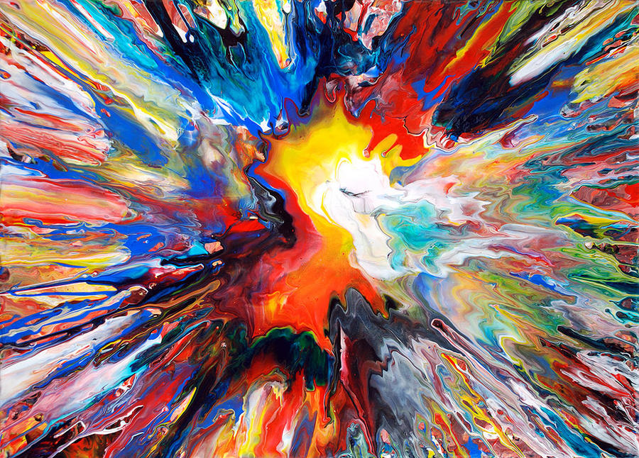
Okay, that’s NOT Jackson Pollock. So whose is it?
Mark Chadwick
I could do that with their so-called climate model. Think it would hurt their Feewings?
Or
by yours truly
Nome too shabby at all, RKernodle. It took me a while to “get” that abstraction is merely exploring color and space, but I finally got it when I saw Alan Bates taking on Paul Jenkins’ abstract methods in An Unmarried Woman. I tend to lean toward expressionism and classic realism, but that’s just me.
Sara, yes,
… color, space, forms, relationships, order in chaos, spontaneous elegance, but (for me) NEVER about expressing anything more, .. like emotions or subconscious symbols, meanings, or other baggage of human perception.
The expression in “abstract expressionism” is the response of human senses to these qualities, NOT what the mind makes of them.
Back to climate stuff now. (^_^) … or lack thereof, which is a form of what I would call “asstrack expressionism”.
The latest projections assuming funding scenarios continue unabated.
https://goo.gl/images/FMLzJV
sorry
What’s wrong with it?
Reminds me stage curtains.
It needs a caption.
https://youtu.be/ubIpoPjBUds
Or maybe just, “Brought to you the Great and Powerful Wizards of COz!”
“The arresting image”?
ar·rest·ing
əˈrestiNG/Submit
adjective
1.
striking; eye-catching.
“at 6 feet 6 inches he was an arresting figure”
synonyms: striking, eye-catching, impactful, conspicuous, engaging, engrossing, fascinating, impressive, imposing, spectacular, dramatic, breathtaking, dazzling, stunning, awe-inspiring; More
Hey staff,
Justy shut up.
If this was a charades crayon coloring clue for the phrase ‘Climate Change’, would anyone ‘get it’?
Crayon coloring Climate Change charades….. clueless.
I like this quote from Science Alert.
“The arresting image removes all the scientific accessories, leaving only a color scale to represent an overall change of 1.35 degrees Celsius.”
What would a curtain look like for any 24 hr period for any place on Earth?
PS Just what are “scientific accessories”? Data? The scientific method?
Is actual and honest “science” just an accessory to the CAGW hypothesis?
Ornaments, baubles, a kaftan with culturally appropriated prints worn by a frightbat? Who knows.
The colors don’t make much sense. According to Wien’s displacement law, the temperature difference between blackbodies with emissions peaking in the middle of the blue band and those with emissions peaking in the middle of the red band is about 1500 °C, and blue is the hotter of the two.
I think the color for the 1860s should be blood-red (for obvious reasons, if you’re an American), or perhaps blue and grey. The recent color should be green.
http://sealevel.info/greening_earth_spatial_patterns_Myneni.html
http://sealevel.info/greening_earth_spatial_patterns_Myneni.png
https://mobile.twitter.com/ncdave4life/status/1000497346965319680
https://twitter.com/ncdave4life/status/1000497346965319680
Seems to depict today’s temperatures quite well, so far…