Last week, Larry Kummer posted a very thoughtful article here on WUWT:
A climate science milestone: a successful 10-year forecast!
At first glance, this did look like “a successful 10-year forecast:

The observations track closer to the model ensemble mean (P50) than most other models and the 2016 El Niño spikes at least a little bit above P50. Noticing that this was CMIP3 model, Larry and others asked if CMIP5 (the current Climate Model Intercomparison Project) yielded the same results, to which Dr. Schmidt replied:
CMIP5 version is similar (especially after estimate of effect of misspecified forcings). pic.twitter.com/Q0uXGV4gHZ
— Gavin Schmidt (@ClimateOfGavin) September 20, 2017

The CMIP5 model looks a lot like the CMIP3 model… But the observations bounce between the bottom of the 95% band (P97.5) and just below P50… Then spike to P50 during the 2016 El Niño. When asked about the “estimate of effect of misspecified forcings, Dr. Schmidt replied:
As discussed here: https://t.co/0d0mcgPq0G
(Mostly misspecification of post-2000 solar and volcanoes)
— Gavin Schmidt (@ClimateOfGavin) September 21, 2017
Basically, the model would look better if it was adjusted to match what actually happened.
The only major difference between the CMIP3 and CMIP5 model outputs was the lower boundary of the 95% band (P97.5), which lowered the mean (P50).
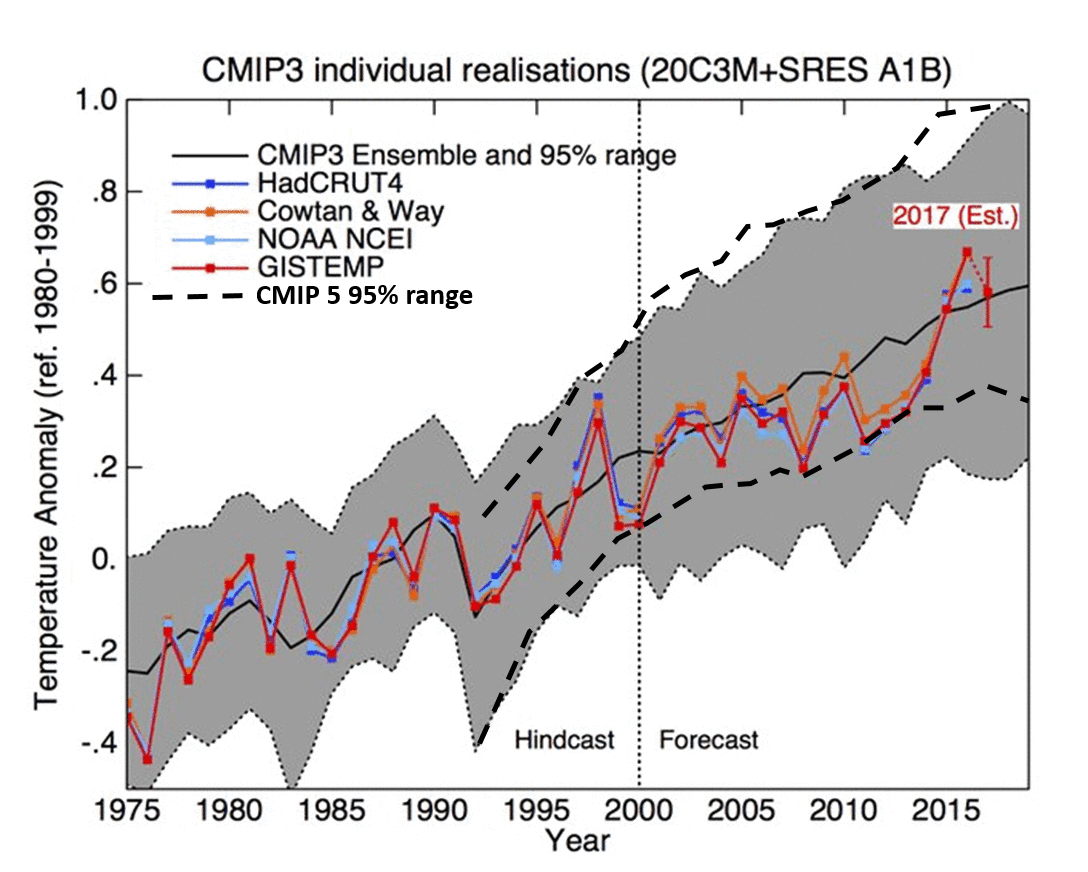
CMIP-5 yielded a range of 0.4° to 1.0° C in 2016, with a P50 of about 0.7° C. CMIP-3 yielded a range of 0.2° to 1.0° C in 2016, with a P50 of about 0.6° C.
They essentially went from 0.7 +/-0.3 to 0.6 +/-04.
Progress shouldn’t consist of expanding the uncertainty… unless they are admitting that the uncertainty of the models has increased.
Larry then asked Dr. Schmidt about this:
Small question: why are the 95% uncertainty ranges smaller for CMIP5 than CMIP3, by about .1 degreeC?
— Fabius Maximus (Ed.) (@FabiusMaximus01) September 22, 2017
Dr. Schmidt’s answer:
Not sure. Candidates would be: more coherent forcing across the ensemble, more realistic ENSO variability, greater # of simulations
— Gavin Schmidt (@ClimateOfGavin) September 22, 2017
“Not sure”? That instills confidence. He seems to be saying that the CMIP5 model (the one that failed worse than CMIP3) may have had “more coherent forcing across the ensemble, more realistic ENSO variability, greater # of simulations.”
I’m not a Twitterer, but I do have a rarely used Twitter account and I just couldn’t resist joining in on the conversation. Within the thread, there was a discussion of Hansen et al., 1988. And Dr. Schmidt seemed to be defending that model as being successful because the 2016 El Niño spiked the observations to “business-as-usual.”
well, you could use a little less deletion of more relevant experiments and insertion of uncertainties. https://t.co/nbAQhtjznrpic.twitter.com/gb29tm6rup
— Gavin Schmidt (@ClimateOfGavin) September 5, 2017

I asked the following question:
So… the monster El Niño of 2016, spiked from ‘CO2 stopped rising in 2000’ to “business as usual”?
— David Middleton (@dhm1353) September 25, 2017
No answer. Dr. Schmidt is a very busy person and probably doesn’t have much time for Twitter and blogging. So, I don’t really expect an answer.
In his post, Larry Kummer also mentioned a model by Zeke Hausfather posted on Carbon Brief…

El Niño events like 1998 and 2016 are not high probability events. On the HadCRUT4 plot below, I have labeled several probability bands:
| Standard Deviation | Probability Band | % Samples w/ Higher Values |
| +2σ | P02.5 | 2.5% |
| +1σ | P32 | 32.0% |
| Mean | P50 | 50.0% |
| -1σ | P68 | 68.0% |
| -2σ | P97.5 | 97.5% |
Yes… I am assuming that HadCRTU4 is reasonably accurate and not totally a product of the Adjustocene.
I removed the linear trend, calculated a mean (P50) and two standard deviations (1σ & 2σ). Then I added the linear trend back in to get the following:

The 1998 El Niño spiked to P02.5. The 2016 El Niño spiked pretty close to P0.01. A strong El Niño should spike from P50 toward P02.5.
All of the models fail in this regard. Even the Mears-ized RSS satellite data exhibit the same relationship to the CMIP5 models as the surface data do.
–

The RSS comparison was initialized to 1979-1984. The 1998 El Niño spiked above P02.5. The 2016 El Niño only spiked to just above P50… Just like the Schmidt and Hausfather models. The Schmidt model was initialized in 2000.
This flurry of claims that the models don’t “run hot” because the 2016 El Niño pushed the observations toward P50 is being driven by an inconvenient paper that was recently published in Nature Geoscience (discussed here, here and here).
Claim of a substantial gap between model projections for global temperature & observations is not true (updated with 2017 estimate): pic.twitter.com/YHzzXtbhs9
— Gavin Schmidt (@ClimateOfGavin) September 20, 2017
21 September 2017 0:27
Factcheck: Climate models have not ‘exaggerated’ global warming
ZEKE HAUSFATHER
A new study published in the Nature Geosciences journal this week by largely UK-based climate scientists has led to claims in the media that climate models are “wrong” and have significantly overestimated the observed warming of the planet.
Here Carbon Brief shows why such claims are a misrepresentation of the paper’s main results.
[…]
All (95%) of the models run hot, including “Gavin’s Twitter Trick”. From Hansen et al., 1988 to CMIP5 in 2017, the 2016 El Niño spikes toward the model ensemble mean (P50)… Despite the fact that it was an extremely low probability weather event (<2.5%). This happens irrespective of then the models are initialized. Whether the models were initialized in 1979 or 2000, the observed temperatures all bounce from the bottom of the 95% band (P97.5) toward the ensemble mean (P50) from about 2000-2014 and then spike to P50 or slightly above during the 2016 El Niño.
Amid the battle of the Graphs, if you want to know what the weather is, stick your head out of the window. If you want to know what it will be tomorrow, consult the ants.
Mods
I have tried a couple of times to post a response to NS at September 26, 2017 at 3:53 pm
it has simply disappeared. Please look out for it, and please post the 2nd versions since I corrected a small formatting issue.
Many thanks
(It has been found and approved) MOD
No, it is not reasonable accurate just a less awful dataset / making it up as they go along. Last time it was reasonable accurate were pre-1990’s around the beginning of the global warming scare.
Adding over 400 stations just in the NH and comparing with previous years without them, is not data comparison. This on it’s own changes about 6% of the data every time from when it was introduced. It is worse than this because it was added to try and show more warming in the Arctic so it effects larger areas in grids.
One example of grid data for December 2010 covering the UK. It was the coldest December in the UK since records began and the 2nd coldest in the CET since the 17th century (only by 0.1c). There was sea ice forming around the island with harbours having fairly thick ice forming. SST’s cooled a lot around the UK since mid-November until end of December.
The grid for December 2010 shown in 2011, showed the UK warmer than average. What chance does a month have getting below average, when the coldest doesn’t even reach the average? After complaining and showing the grids were worthless as any don’t generally reflect regional temperatures they later changed. This time they showed up to around up to 0.7c cooler than average. Land temperatures over the UK were widely below average by 4c for the month with some areas even colder.
Was “WomannBearPig” really fighting with Gavin on Twitter? That’s hilarious all by itself.
Model verifications are best done with straight numbers, not deceptive graphs. The arithmetic is not hard.
I’ll use HadCrut for verification. Alarmists want GISS and skeptics want UAH so this makes neither happy.
Linear fit was used to determine trends.
1988-2017
HadCrut +0.50
Hansen +0.96
Bias 1.92 to one
CMIP5 2005-2017
HadCrut +0.20
CMIP5 +0.31
Bias 1.55 to one
Disclaimer… There were no corrections done for “misspecification” of post-2000 volcanoes, wildebeasts, ManBearPigs, or carbon offsets.
Thank you Bill. Regarding your graphic please consider that the HadCrut 4 surface observations, per IPCC GHG physics, should be adjusted down 20 percent below UHA lower troposphere levels to show the portion of surface warming that can be attributed to GHGs, according to the IPCC.
It was suggested once before here that the best way to analyse the the worth of the models was to look at 10 year trends of individual runs. You have a grey area of spaghetti but do any show a 15 year trend between El Nino events that is a tenth of the 3°C/century warming or less?
http://www.woodfortrees.org/graph/uah6/from:1988/to:1998/mean:12/plot/uah6/from:1999/to:2014/mean:12/plot/uah6/from:1999/to:2014/trend
HadCrut4 is not so damning but also far from what you would call scientific data.
http://www.woodfortrees.org/graph/hadcrut4gl/from:1988/to:1998/mean:12/plot/hadcrut4gl/from:1999/to:2014/mean:12/plot/hadcrut4gl/from:2001/to:2014/trend
The reason for running ensembles of multiple models is to produce a probability distribution. Due to the stochastic nature of weather and climate variabilities, individual model runs are about as useful as mammary glands on a bull.
They might be but so is the comparison with a starting point in the spaghetti and a finishing point.
What’s the probability of this variation neutralising the CO2 warming effect for 10/15 years?
Our forecast modelling group discovered a long time ago that ensembles don’t actually give you a probability distribution. It looks and feels like a probability distribution but it’s not.
To get an actual probability distribution, we do statistics on the historical ensemble results.
If 20 ensembles are run and two of them bring snow, the actual probability may be quite a bit higher or lower than 10%. Many weather forecasters and climate modelers erroneously assume 10%
In climate, there aren’t enough Case studies to statistically improve the ensemble results
Yes David. Yet only a disingenuous piece of something would take the mean of some 70 models that all consistently run warm,
and then fund 100s of disaster studies based on that way above observations mean.
Have emissions really been in line with Hansen’s 1998 Scenario B?
I’ve been under the impression that emissions from China meant globally we were exceeding even Scenario A.
“Scenario B” is one of the great deceptions of the Hansen apologists. Make no mistake… scenario A is what happened. Actually Scenario A+ since emissions have been far greater than imagined
This “Scenario B” nonsense comes
from the fact that there is far less CO2 in the atmosphere now than Hansen thought given the emissions. The atmosphere is far better at mitigating the gas and returning it to earth than earlier assumed. This is another source of modelling error which doesnt happen on backfit data.
So they fudge on what the forecast was and change the obs and put results on a deceptive graph and… SHAZAAM… the forecast is only half terrible instead of totally terrible
Mary Brown September 27, 2017 at 5:50 am
“Scenario B” is one of the great deceptions of the Hansen apologists. Make no mistake… scenario A is what happened. Actually Scenario A+ since emissions have been far greater than imagined
This “Scenario B” nonsense comes
from the fact that there is far less CO2 in the atmosphere now than Hansen thought given the emissions. The atmosphere is far better at mitigating the gas and returning it to earth than earlier assumed.
Sorry Mary but you’re completely wrong.
Hansen’s projections for CO2 were as follows for 2016:
Scenario A: 405.5
Scenario B: 400.5
Scenario C: 367.8
Actual global annual average: 402.8
So the CO2 projection fell between A and B.
Phil. — wrong, Hansen’s testimony is very clear, he was making a prediction based on emissions, not concentrations. The fact he got the relationship between emission and concentrations completely wrong doesn’t make his model more accurate..
http://classicalvalues.com/2014/12/getting-skeptical-about-the-claims-made-by-skepticalscience-about-skeptics/
Phill, you completely missed my point.
You don’t get to change the forecast scenario based on the CO2 verification. That’s part of the forecast.
Business as usual means business as usual… which is what happened…and then some. If you gave Hansen the exact future emissions, he would have assumed CO2 much higher than 405 and forecast even hotter. But the atmospheric CO2 has been much less than anticipated given the emissions. That is good news for climate change.
And how on earth does 5ppm make such a huge difference in temp fcst from A to B? By 2019, the difference is ~0.5*K
Imagine if the same emissions 1988-2017 only produced CO2 of 367ppm today due to totally unexpected reasons. Would we then say that Scenario C verified? That’s your argument.
If that happened, we would say that record emissions occurred but the atmospheric CO2 verified at dramatically reduced emission levels.
Hansen got lucky… the atmosphere shed much more CO2 than he assumed.
You can argue this stuff forever but the bottom line is that a 3rd grade kid with a ruler in 1988 could draw a trend line on the temp data and do as well as the climate models. There are not enough forecast cases to determine any skill level in the models. The 3rd grader’s trend line would have been more accurate but that doesn’t mean he had any skill either. Skill must be proven which requires many cases.
yet the temperature doesn’t reflect what hansen proposed for that level of co2 in the atmosphere phil. go figure.
talldave2 September 27, 2017 at 7:17 am
Phil. — wrong, Hansen’s testimony is very clear, he was making a prediction based on emissions, not concentrations. The fact he got the relationship between emission and concentrations completely wrong doesn’t make his model more accurate.
This was what I was replying to:
This “Scenario B” nonsense comes from the fact that there is far less CO2 in the atmosphere now than Hansen thought given the emissions.
As I showed there is not “far less CO2 in the atmosphere”, it in fact lies between A and B. Hansen projects concentrations based on the observed history and calculates temperature based on the concentrations.
Phil said…
“As I showed there is not “far less CO2 in the atmosphere”, it in fact lies between A and B. Hansen projects concentrations based on the observed history and calculates temperature based on the concentrations.”
Valid points… but I said “far less CO2 in the atmosphere GIVEN the emissions”.
Emissions 1988-2017 were MUCH higher than anyone anticipated. Hansen got the CO2 levels roughly correct by being wrong on emissions (higher) and wrong on atmospheric CO2 mitigation (less CO2 remains).
Two wrongs sometimes make a right. Two Wrights sometimes make an airplane.
So, in this case, two wrongs almost made his CO2 assumptions right. But those are serious forecast errors, the kind that will rear their ugly head and ruin future forecasts.
Back to my earlier point… forecasts can be right or wrong for a lot of reasons. In weather forecasting, we know almost exactly what the skill and errors bars are because we have millions of cases. In climate forecasting, we have very few cases and no clue what the skill level or errors bars will be. Betting our future on such unproven techniques is very poor policy.
Phil — yes, Mary’s claim would be slightly more accurate if she said “there is far less GHG in the atmosphere than predicted” or “there is somewhat less CO2 than predicted” (CO2 emissions exceeded A but concentrations are lower than predicted) because the main source of error was methane.
But either way, Hansen’s independent variable is clearly emissions — concentrations are a function of emssions (not just “based on the observed history”), and temperatures a function of concentrations, so emissions -> concentrations -> temps.
Mary Brown September 27, 2017 at 7:26 am
Phill, you completely missed my point.
You don’t get to change the forecast scenario based on the CO2 verification. That’s part of the forecast.
I suggest you actually read the paper, because it’s clear that you don’t understand what was done!
“We define three trace gas scenarios to provide an indication of how the predicted climate trend depends upon trace gas growth rates. Scenario A assumes that growth rates of trace gas emissions typical of the 1970s and 1980s will continue indefinitely; the assumed annual growth averages about 1.5% of current emissions, so the net greenhouse forcing increases exponentially. Scenario B has decreasing trace gas growth rates, such that the annual increase of the greenhouse forcing remains approximately constant at the present level. Scenario C drastically reduces trace gas growth between 1990 and 2000 such that the greenhouse climate forcing ceases to increase after 2000. The range of climate forcings covered by the three scenarios is further increased by the fact that scenario A includes the effect of several hypothetical or crudely estimated trace gas trends (ozone, stratospheric water vapor, and minor chlorine and fluorine compounds) which are not included in scenarios B and C.
These scenarios are designed to yield sensitivity experiments for a broad range of future greenhouse forcings. Scenario A, since it is exponential, must eventually be on the high side of reality in view of finite resource constraints and environmental concerns, even though the growth of emissions in scenario A (~1.5% yr-1) is less than the rate typical of the past century. Scenario C is a more drastic curtailment of emissions than has generally been imagined;it represents elimination of chlorofluorocarbon (CFC) emissions by 2000 and reduction of CO2 and other trace gas emissions to a level such that the annual growth rates are zero (i.e., the sources just balance the sinks) by the year 2000. Scenario B is perhaps the most plausible of the three cases.”
Business as usual means business as usual… which is what happened…and then some. If you gave Hansen the exact future emissions, he would have assumed CO2 much higher than 405 and forecast even hotter. But the atmospheric CO2 has been much less than anticipated given the emissions. That is good news for climate change.
‘Business as usual’ meant carrying on emitting as before, in fact as anticipated by Hansen this did not occur.
And how on earth does 5ppm make such a huge difference in temp fcst from A to B? By 2019, the difference is ~0.5*K
No it isn’t, look at fig 2, the difference between A and B due to CO2 is about 0.05ºC by 2020.
The total difference between A and B is due to the reduced growth of ‘all the trace gases’ and the presence in A of ‘ozone, stratospheric water vapor, and minor chlorine and fluorine compounds’. The effect on A over and above CO2 alone, of these gases is about 0.6ºC by 2020 (Fig 2). In fact the trace gases other than CO2 followed scenario C most closely (2016 values):
CH4: 2.8A, 1.9C, ~1.8(2016)
N2O: 0.34A, 0.31C, ~0.33(2016)
CFC12: 1.44A, 0.50C, ~0.5(2016)
Hansen got lucky… the atmosphere shed much more CO2 than he assumed.
No CO2 did about what he expected, the other trace gases exceeded his expectations for reduction, and the ‘several hypothetical’ gases didn’t materialize (as he expected).
Well said Phil with good information. I will consider.
The difference from A to B is fairly close in 2017 but looks to be about 0.4 to 0.5deg in 2019 or 2020. I am just eyeballing off graphs… but A really spikes
But no matter how you slice it, the bias is upwards of 1.8 to one and this is just one case study. I am a long way from trusting GCMs to plan humanity’s future.
“Phil:
I suggest you actually read the paper, because it’s clear that you don’t understand what was done! . .. . CO2 did about what he expected, the other trace gases exceeded his expectations for reduction, and the ‘several hypothetical’ gases didn’t materialize (as he expected).”
I think you may be the one not reading Hansen’s original paper carefully enough. His approach was to simplistically equate emissions scenario growth with forcing growth via the equations set forth in appendix B to that paper. Trying to draw a distinction between Hansen’s emission scenarios and some mythical “forcing” scenario doesn’t get you anywhere.There is no practical distinction between predicted emissions and predicted forcing in that paper, because Hansen assumed that every particle of GHG emitted by mankind would cause a 1-1 increase in GHG concentrations in the atmosphere. We know this because his paper said that “the net greenhouse forcing [delta T0] for these [emissions] scenarios is illustrated in FIG. 2. [Delta T0] is the computed temperature change at equilibrium for the given change in trace gas abundances.”
Hansen obviously got the relationship between CO2 emissions and CO2 concentrations wrong because we wound up with CO2 concentrations associated with significant cuts in emissions, which did not occur. It wasn’t until his “oops” moment a decade later that he learned that not everything emitted stayed in the air and started applying a 0.6 multiplier.
Mary was absolutely right. Had Hansen known that emissions would not have dropped to 1.5% or lower growth like he assumed for all three scenarios, he would have used his equations to get more forcing, and a higher transient temperature response, thereby exacerbating the discrepancies between his prediction and the reality that ensued.
Hansen also got the relationship between forcing and temperature wrong. Actual forcing (not just emissions) followed scenario A set forth in FIG. 2, or even higher, but temperatures followed the track between the predictions for scenarios B and C.
In short, Hansen got nothing right.
Mary Brown September 27, 2017 at 12:21 pm
Well said Phil with good information. I will consider.
The difference from A to B is fairly close in 2017 but looks to be about 0.4 to 0.5deg in 2019 or 2020. I am just eyeballing off graphs… but A really spikes
Are you looking at Fig 2? That shows scenario A at just over 1.0ºC and Scenario B at ~0.7C in 2020, only slightly less in 2017. Most of that difference is due to the ‘other trace gases’ not CO2, asI pointed out the difference due to CO2 is more like 0.05ºC.
Kurt,
“There is no practical distinction between predicted emissions and predicted forcing in that paper, because Hansen assumed that every particle of GHG emitted by mankind would cause a 1-1 increase in GHG concentrations in the atmosphere”
No, that’s not true. He didn’t assume that. And even if he had, it would have been of no use, because he had no measure of “every particle of GHG emitted by mankind”.
For the most part, we still don’t. No-one measures the amount of CH4 or N2O emitted. We can’t. The emission is inferred from the concentration increase. Hanson’s language re CO2 and CH4 is identical, and confuses us today. The reason is that for about 25 years, we’ve been talking about CO2 emissions as calculated by governments measuring FF miniing and comsumption. But not for 30 years. The reason we can do that is that because governments through the UNFCCC assembled that information. Hansen didn’t have it. So to him, emissions of CO2 meant just the same as for CH4 – an observed concentration increase.
“We know this because his paper said that “the net greenhouse forcing [delta T0] for these [emissions] scenarios is illustrated in FIG. 2. [Delta T0] is the computed temperature change at equilibrium for the given change in trace gas abundances.””
That’s your proof of the supposed assumption. But read it carefully, especially the last sentence. It says the opposite. It relates ΔT0 and abundances.
“Hansen obviously got the relationship between CO2 emissions and CO2 concentrations wrong because we wound up with CO2 concentrations associated with significant cuts in emissions, which did not occur.”
No. Hansen only dealt with CO2 concentrations, and got them right. Again, he had no other quantification of emissions. He set it out in detail in Appendix B:
Note that the 1.5% he referred to earlier as increase of emissions, is an increase in concentrations. Scens B and C are described in the same way.
talldave2 September 27, 2017 at 8:23 am
Phil — yes, Mary’s claim would be slightly more accurate if she said “there is far less GHG in the atmosphere than predicted” or “there is somewhat less CO2 than predicted” (CO2 emissions exceeded A but concentrations are lower than predicted) because the main source of error was methane.
But either way, Hansen’s independent variable is clearly emissions — concentrations are a function of emssions (not just “based on the observed history”), and temperatures a function of concentrations, so emissions -> concentrations -> temps.
No, Hansen based his projection on the observations of CO2 concentration from 1958-81 by Keeling, not on emission measurements.
Keeling et al. ‘Carbon Dioxide Review: 1982’, ed. W C Clark, pp.377-385, Oxford University Press, NY, 1982.
Nick – In one respect I think we agree on a fact, but just interpret it in completely different ways. Hansen in 1988 certainly equated emissions with annual increments in GHG concentrations – they were treated as interchangeable, both ways. When he had industrial data on CFC emissions he used those directly to construct his “emission” scenarios. When he didn’t have the industrial data, he constructed his “emission” scenarios based on past, measured differences in trace gas concentrations. And he took his emission scenarios, plainly stated as the conditions for his projections, and used them as direct increments to GHG concentrations, and had his model calculate the delta T based on those concentrations predicted from the emission scenarios. So as I said, there is no practical distinction between emissions into the air, and forcing – one determined the other. But based upon what he said in that paper, and his contemporaneous statements about his scenarios, the public prediction he made tied temperature increases to various emission scenarios.
And incidentally, the data on CO2 emissions was available from at least 1958 onward, Hansen just didn’t look for it until 1998 when his prediction went wrong. Then he went out and got it because he needed it to explain why temperatures weren’t rising as fast has he led the world to believe they would.
If I have a prediction that says: If 1 then 2, if 3 then 4, if 5 then 6 – and reality shows the result of 1 and 6, I can’t save my prediction by arguing that my analysis assumed that 5 would lead to A and A would lead to 6, and that reality showed not just 1 and 6, but 1, A, and 6. And as long as the same system controls the relationship between all these variables, I can’t even use the post-hoc correlation between A and 6 as evidence of my understanding of the system. That’s cherry picking.
You, and Phil, and many others are too willing to let Hansen off the hook for not understanding the climate system well enough to nail the relationship between emissions and changes in GHG concentrations. For all Hansen knows, there is a huge natural control mechanism that regulates the CO2 and methane in the air as a function of temperature, and it’s temperature driving these atmospheric changes, not vice versa. If Hansen whiffed on the relationship between emissions and changes in GHG concentrations, it’s certainly plausible that he whiffed on the amount of water vapor feedback via temperature throwing the correlation between forcing and temperature off.
I’ve got a long reply to Phil above, which I won’t repeat here, but suffice it to say that there is no question at all that Hansen’s 1998 paper intended to show the predicted consequences of three hypothesized policy choices, not three hypothesized future atmospheric trace gas compositions.
“No, Hansen based his projection on the observations of CO2 concentration from 1958-81 by Keeling, not on emission measurements.
Keeling et al. ‘Carbon Dioxide Review: 1982’, ed. W C Clark, pp.377-385, Oxford University Press, NY, 1982.”
Again, the methodology of his prediction is irrelevant. Hansen was advising Congress on emissions policy. It doesn’t matter if Hansen bases the predictions on astrological signs, Congress can still pass laws to affect human emissions, but can no more command concentrations than King Canute could order the tides around.
So to him, emissions of CO2 meant just the same as for CH4 – an observed concentration increase.
With one really, really important difference — Congressional policy and legislation can target actual GHG emissions in sundry ways, which was the point of his testimony, but can no more directly affect GHG concentrations than the force of gravity or the Planck constant. Remember, his scenarios are labelled as emissions policy scenarios — “business as usual” vs draconian cuts.
The inability for proponents and skeptics to look at a simple prediction like Hansen 1988 and agree on what it meant is a common issue in pseudoscience. With no firm predictions, there can be no falsification.
“With no firm predictions, there can be no falsification.”
Well said. Drives me crazy. I have worked in quantitative forecasting for a long time. I hate fuzzy forecasts and fuzzy verification. We score everything ruthlessly and carefully. That is the only way to be sure it works.
I stand behind my assertion that Hansen got the CO2 forecast correct by making two big mistakes. He extrapolated the trend. The reality is that emissions dramatically increased but much of it did not stay in the atmosphere.
Kind of like hitting a 7 iron when you should have hit a wedge. Then you hit it really fat and it went on the green. Doesn’t mean it was a good shot.
I will update your saying…
“With no firm predictions, there can be no verification.”
Climate science has produced one 30 year forecast that didn’t do very well and can’t be accurately assessed.
So, the proven statistical significance of forecast skill remains very very close zero. Unfortunately, I don’t see how that can change in the next few decades.
See how Nick fogs up the discussion with misleading concerns?
“Nick Stokes
September 26, 2017 at 10:02 pm Edit
Richard,
Yes, clearly there was a circulating newspaper story at the time with near identical text and graphs claiming to be global temperature, some of which attribute the writing to John Hamer and the artwork to one Terry Morse. What we don’t have is an NCAR source document saying what kind of measure it is – land only, land/ocean? How much data was available? How about some scepticism?”
It is 1974,Nick! There was NO Ocean temperature data to speak of in those days. Stop with your misleading questions baloney! You KNOW this,so why all the crap about whether it was land only or land/ocean?
In those days it was NORTHERN Hemisphere only,because at that time that was all they had much to work with. The Southern Hemisphere was scanty data wise. DR. Jones himself admitted this back in 1989.
I read that article back in 1975,seeing how it was matching up with others charts of the day,the few that were published in the public arena,were mostly from NCAR and NAS,little else since NASA didn’t get into the picture until 1981. How scientists of the day were echoing the concerns of sharp temperature decline, you seem to gloss over.
Richard Verney,showed that Hansen in 1981,the IPCC,NAS and other sources basically agree with that 1974 NCAR chart, So what is your problem?
You need to stop with the misleading comments as if it is all a mystery,when the only mystery is you being the way you are here. NCAR, probably no longer has the data for the chart,which is not being posted as they don’t have it on their website.,after all it was 43 years ago!
“It is 1974,Nick! There was NO Ocean temperature data to speak of in those days. Stop with your misleading questions baloney!”
Indeed so. How does it help to say that we’re comparing modern GISS land/ocean to 1974 land only, and that somehow proves the data has been tortured (original claim) or GISS has fudged it or whatever? They are just different things. And it’s no use saying that they are using Land only because they couldn’t get marine data. This sort of fudging is just not honest.
But you could take that 1974 apect further. There was very little usable land data either. People forget two big issues – digitization and line speeds. Most data was on paper. If you wanted to do a study, you had to type it yourself (or get data entry staff). And if there was anything digitised, there were no systematic WAN’s, and what they had would hacve been at 300 baud. So it isn’t a wonder if 1974 analysis deviates from modern. It’s just a miracle they got as close as they did (if you find something genuinely comparable).
As for what Richard Verney has shown, again not a single one matches. There was no IPCC in 1981. NAS was NH data. Hansen’s is even more restricted – just NH extra-tropical. They do look somewhat similar, and that is because NH extratropical was pretty much all they had. That still doesn’t make it comparable to GISS land/ocean.
Nick
The fundamental issue in Climate Science is that the data is not fit for purpose. The reason why we cannot measure Climate Sensitivity, ie., the warming signal to CO2 (if any at all), is either because the signal is very small, or that the accumulated error bandwidth of our data sets (and the way it is presented) is so wide that the signal cannot be seen above the noise of natural variability. This is a data issue, and we need high quality data, and we need this to be presented in an unbiased way, if we are to answer what if any impact has CO2 had on this planer’s temperature.
It is very difficult to know where one should start with all of this, since <b.it is obviously correct that as far as possible one should always make a like for like comparison if one wishes to draw meaningful conclusions.
But this point is equally applicable to all of the time series thermometer reconstructions (whether they be GISS. or Hadcrut etc). On the basis of your reasoning, you should throw out all the time series thermometer data sets since they never over time make a like for like comparison since the sample set (and its composition) is continually varying over time (and this is before the continuing historic adjustments/reanalysis that is a continuing on going process with the past being constantly altered/rewritten)
Given the comings and goings of stations and station drop outs, the change in distribution from high latitude to mid latitude, the change in distribution from rural to urban, the change in distribution towards airport stations, the changes in airports themselves over time (many airports in the 1930s/1940s had just a grass runway, and all but no passenger and cargo terminals, and certainly no jet planes with high velocity hot exhaust gas etc), the change in instrumentation with its different sensitivity and thermal lag, the change in the size, volume and nature of equipment enclosures which in itself impacts upon thermal lag, etc. etc, the sample set that is involved in these time series reconstructions is a constantly moving feast, and there is never a like with like comparison being made over time.
These time series thermometer data sets are not fit for scientific purpose, and it is impossible from these to say whether the globe (or some part thereof) is any warmer than it was from the highs of the late 1930s/early 1940s, or for that matter around 1880.
I consider that due to their composition and the way they purport to present data, they are not quantitative, but maybe they are qualitative in the sense that they can say it was probably warming during this period, but the amount and rate thereof cannot be concluded, or it is probable that it was cooling during this period but the amount and rate thereof cannot be concluded, or that during this period it is probable that there does not appear to be much happening.
But they should really be given a very wide berth. The claim that the error bound is in the region of 0.1 degC is farcical, Realistically it is closer to 1 degC than 0.1 degC.
You maybe correct that in the mid 1970s, or early 1980s, or the end of the 1980s (the date of the IPCC First Assessment Report) that there was limited data, but the important point is that this data (limited as it was) was showing the same trend. Whatever it consisted of, it was showing that the NH (or some significant part thereof) was warmer in 1940 than it was in the early 1970s, or in 1980. The IPCC First Assessment Report shows the globe to be slightly cooler in1989 than it was in 1940.
There is a consistent trend here, and for quantitative purposes one can get an impression of what was going on.
You will know that Hansen, at various dates in his career, has made various assessments of US temperatures. Now this data set is far more certain, and yet, over time, there are very significant changes in his temperature reconstructions.
The upshot of all of this is that one cannot have reasonable confidence in the various temperature data sets (and I consider that the satellite data set also to have issues). They are not fit for the scientific inquiry and scrutiny that we are trying to use them for. I consider that an objective and reasonable scientist would hold that view. This is why I have so often suggested that we require an entirely different approach to the assessment of temperature, the collection, handling and presentation of data. It is why BEST was a missed opportunity, especially since BEST was well aware of poor station siting issue, and the potential issues arising therefrom.
If we are genuinely concerned about CO2 emissions, we only need to look at the period around 1934 to 1944 and to see whether there has been any change in temperature since the highs of the 1930s/1940. Some 95% of all manmade CO2 emissions has occurred subsequent to that period. Since CO2 is a well mixed gas, the warming signal (if any at all) can be found without the need to sample the globe. We only need a reasonable number of pinpoint assessments to see what if any temperature change has occurred at each of the pinpoint locations. We only need a reasonable number of exact (or as nearly exact as possible) like for like comparisons to tell us all we need to know.
I consider that we should ditch the thermometer temperature reconstructions, and start from scratch, by assessing say the best 200 sited stations across the Northern Hemisphere, which are definitely free of all manmade change , and then retrofit these stations with the same type of LIG thermometers as were used in the 1930s/1940s calibrated in the same way as used at each station (on a station by station basis), put in the same type of Stevenson screen painted with the same type of paint as used in the 1930s/1940s, and then observe using the same observational practices and procedures as used in the 1930s/1940s at the station in question. We could then obtain modern day RAW data that can be compared directly with historic RAW data (for the period say 1933 to 1945) with no need for any adjustment whatsoever.
There would be no sophisticated statistical play, no attempt to make a hemisphere wide set, no area weighting, no kriging etc. Simply compare each station with itself, and then simply list how many station show say 0.3 deg C cooling, 0.2 deg V cooling, 0.1 deg C cooling, zero change, 0.1 deg C warming, 0.2 deg C warming, 0.3 deg C warming etc.
This type of like for like comparison would very quickly tell us whether there has been any significant warming, and if so its probable extent.
This will not tell us definitively the cause of any change (correlation does not mean causation), but it will tell us definitively whether there has been any change during the period when man has emitted some 95% of his CO2 emissions. To that extent, the approach that I propose would be very useful.
Whoops. Should have read:
Nick, this is my complaint about you, is that you try to make it appear that I argue that the 1974 data is comparable to modern data. That it is superior or complete. You basically talk too much about stuff I didn’t bring up. You must be hungry for fish,since YOU posted a number of Red Herrings against me.
Here is my FIRST comment about the chart,
“Nick, the 1974 NCAR line is real,as it was in an old Newsweek magazine back in 1974:”
(Posted the chart)
You later say,
“Indeed so. How does it help to say that we’re comparing modern GISS land/ocean to 1974 land only, and that somehow proves the data has been tortured (original claim) or GISS has fudged it or whatever?”
My position all along has been that the 1974 chart is real and data for it is real,which YOU have never disproved once with evidence. You talked all around it a lot,but no evidence provided that it isn’t real. I NEVER said they were comparable to modern data at all,you try to put words into my mouth…., again! STOP IT!
Here I give you evidence that it was Murray Mitchell who provided the data for that chart,that you whine so much about.
Then Nick writes,
“But the second shows what is claimed to be a NCAR plot, or at least based on NCAR data. That plot isn’t from any NCAR publication, and the data is not available anywhere. Instead it is from the famous Newsweek 1975 article on “global cooling”.
It has been answered at Tony’s site that you avoid commenting in.
Douglas Hoyt,at Tony’s blog writes, https://realclimatescience.com/2017/09/nick-stokes-busted/#comment-66381
“The NCAR plot is based largely on the work of J. Murray Mitchell, which was confirmed by Vinnikov and by Spirina. Spirina’s 5 year running mean looks a lot like the NCAR plot.
See Spirina, L. P. 1971. Meteorol. Gidrol. Vol. 10, pp. 38-45. His work was reproduced by Budyko in his book Climatic Changes on page 73, published in 1977”
Richard Verney, showed the NAS chart,showing a striking similarity with NCAR chart, https://wattsupwiththat.com/2017/09/26/gavins-twitter-trick/#comment-2621480
Gee, it might be based on the same 1974 Northern Hemisphere data………..
Nick goes on with his manufactured whining,
“They are just different things. And it’s no use saying that they are using Land only because they couldn’t get marine data. This sort of fudging is just not honest.”
NEVER said they were the same thing,why do you try so hard to make a Red Herring on this? Besides that it was over the first chart (NOT NCAR) when you whined about Land only or land/ocean database babble.
You write,
“The first GISS plot is not the usual land/ocean data; it’s a little used Met Stations only, essentially an update of a 1987 paper. I don’t know if it’s right.”
==============================
You go on with this,I NEVER argued for:
“But you could take that 1974 apect further. There was very little usable land data either. People forget two big issues – digitization and line speeds. Most data was on paper. If you wanted to do a study, you had to type it yourself (or get data entry staff). And if there was anything digitised, there were no systematic WAN’s, and what they had would hacve been at 300 baud.”
Here you are showing your tendency to OVER ANALYZE the issue,since I NEVER argued that the 1974 chart was robust. All I kept trying to point out to you that the chart is real and was based on real data. That was all I was doing,but YOU keep dragging in a lot of other stuff that I never talked about.
Last but least,since you try hard to put words into my mouth.
Nick writes,
“As for what Richard Verney has shown, again not a single one matches. There was no IPCC in 1981. NAS was NH data. Hansen’s is even more restricted – just NH extra-tropical. They do look somewhat similar, and that is because NH extratropical was pretty much all they had. That still doesn’t make it comparable to GISS land/ocean.”
Sigh,neither did Richard or me said the IPCC existed in 1981, here is what Richard stated about the IPCC,
“Unfortunately, I am unable to cut and copy Figure 7.11 form Observed Climate Variation and Change on page 214. But I can confirm that this plot (endorsed by the IPCC) shows that the NH temperatures as at 1989, was cooler than the temperature at 1940, and the temperature as at 1920. Not much cooler but a little cooler.
This is the IPCC Chapter 7
Lead Authors: C.K. FOLLAND, T.R. KARL, K.YA. VINNIKOV
Contributors: J.K. Angell; P. Arkin; R.G. Barry; R. Bradley; D.L. Cadet; M. Chelliah; M. Coughlan; B. Dahlstrom; H.F. Diaz; H Flohn; C. Fu; P. Groisman; A. Gruber; S. Hastenrath; A. Henderson-Sellers; K. Higuchi; P.D. Jones; J. Knox; G. Kukla; S. Levitus; X. Lin; N. Nicholls; B.S. Nyenzi; J.S. Oguntoyinbo; G.B. Pant; D.E. Parker; B. Pittock; R. Reynolds; C.F. Ropelewski; CD. Schonwiese; B. Sevruk; A. Solow; K.E. Trenberth; P. Wadhams; W.C Wang; S. Woodruff; T. Yasunari; Z. Zeng; andX. Zhou
Figure 7.11: Differences between land air and sea surface temperature anomalies, relative to 1951 80, for the Northern Hemisphere 1861 -1989 Land air temperatures from P D Jones Sea surface temperatures are averages of UK Meteorological Office and Farmer et al (1989) values.”
It was one of two times he brought up the IPCC on the thread,both times it was about chapter 7. Again you fog it up with crap,you do this a lot.
Never disputed that NCAR and NAS were based on Northern Hemisphere data. Never said they were comparable with GISS land/ocean.
Stop with the Red Herrings!
========================
Nick you are obviously a smart man,but you have a bad habit with Red Herrings and over analyze the topic,in your replies to me.
Sunsettommy
I agree with your analysis.
I referred to the IPCC FAR because:
(i) their data plot generally corroborated the NCAR, and NAS plots, which in any event were corroborated by Jones and Widgley (1980 paper) and by Hansen (1981 paper). Jones and Hansen extended the NH plot out to 1980 and confirmed that as at 1980 the NH was still cooler than 1940.
(ii) the IPCC plot extends the position out to 1989, and confirmed that as at 1989, the NH was still cooler than 1940.
(iii) I set out details of the Authors to the IPCC paper who endorsed the plot because these were major Team players, eg., Karl, Vinnikov, Bradley, Jones, Trenbeth, Wadhams etc. All these guys were quite satisfied that the data suggested that as at 1989 the NH was cooler than it was in 1940. The recovery of the substantial post 1940 cooling was still not complete.
Note the importance of the recovery from the 1940 -early 1970s cooling, still not being complete by 1989. This was of course why M@nn in MBH98 had to perform his nature trick. The tree ring data was going through to 1995 (it might have been 1996) and it too showed that as at 1995 (or 1996) the NH was still no warmer than it was in 1940!!!
But it was in the late 1980s/early 1990s that the data sets underwent their revisionary rewriting which meant that the adjusted thermometer record now showed warming where previously there had not been a complete recovery to 1940s levels. This was the real reason for the cut and slice. M@nn had identified that the tree rings no longer tracked the adjusted thermometer record. The tree rings did track the unadjusted historic record at least in qualitative terms, ie., they showed no net warming between 1940 and mid 1990s which would have been the position had the late 1980s onwards adjustments not been made to the thermometer data sets!!
This is how it all ties together. The nature trick is only required because of the revisionary adjustments made to thermometer time series set.
Whilst the below plot (prepared by Tony Heller, not checked) is just the US, one should bear in mind that the US makes up a large percentage of the GISS temperature set.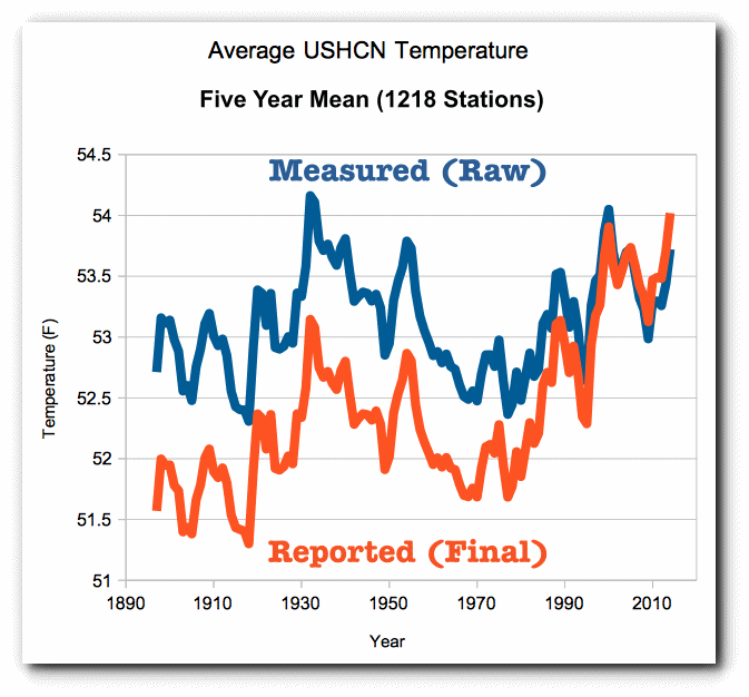
There are adjustments being made in the region of up to around 1 degF, and it is clear how the 1930s and earlier data has been cooled. Unadjusted, the 1930s are the warmest period, whereas in the adjusted plot, by 1990 temperatures had fully recovered and post then the temperatures are reported warmer than 1930.
i am not saying that the adjustments are wrong (they could be valid), but that type of adjustment should set off alarm bells, and is a genuine reason to be extremely skeptical as to the legitimacy and scientific value of the thermometer time series reconstruction.
RV, the adjustments are being made in a non-blind process, and there is a long history of bias creeping into results in those circumstances. Medical research, especially with drugs, routinely uses a “double blind” procedure because of that effect.
Notably, I am not alleging conscious deception, but it still works out to the same result.
richard verney September 27, 2017 at 6:30 pm
Agree, and there’s another, bigger problem with the adjustments as well — even if we concede, ad argumentum, that the adjustments are accurate, the claimed error bar for the temps (.1 according to Gavin) is much smaller than the adjustments to past data since, say, the year 2000. So the claimed error bar was wrong. And there will probably be more changes which will also exceed the claimed error bar, so it’s very likely wrong now too. Maybe it’s gotten better, but how could anyone know that?
The upshot of this is that no one really knows what the temperatures were in the pre-satellite era to within a degree at 95% confidence and it’s not even all that clear how well we know the satellite-era temps. Combine that error bar with the error bars on model predictions and you quickly realize the overlap is so large few models can even be falsified — even if we could agree to stop using baseline anomalies and predict real temps.
Seems to me that the majority of the land in S. Hemisphere still has pretty scanty coverage of surface stations that report regularly. Massive areas are filled in by interpolation every year. As are huge areas of Asia in the N. Hemisphere. So why should anyone trust the claims of a global temperature average based on surface station data?
“So why should anyone trust the claims of a global temperature average based on surface station data?”
Simple.. THEY SHOULDN’T
“Trust” is the wrong word. The myriad adjustments are problematic… but all of the temperature records more or less depict the same thing since 1979.
http://www.woodfortrees.org/graph/gistemp/from:1979/offset:-0.43/mean:12/plot/hadcrut4gl/from:1979/offset:-0.26/mean:12/plot/rss/mean:12/offset:-0.10/plot/uah/mean:12
Personally, I think the early 20th century warming has been suppressed by the adjustments… But I can’t prove this.
As it pertains to validation of the models, we really only need the pist-1979 data.
David Middleton September 27, 2017 at 1:35 am
““Trust” is the wrong word”
———————————————————
Trust is the right world for the layman IMO. Which is what I am with no credentials nor formal education in science or statistics above the level of sophomore in college. The difference is I’m interested so read and watch videos, about this stuff and frequent several climate blogs. But the average layman doesn’t do that and relies only on their faith in the institutions which authoritatively publish their reports which are then reported with little detail, nor questioning of content or context in the general press as scientific fact.
As for the “early 20th century” record. I presume your referring to the massive heat waves of the 1930s?
Yep. In a detrended temperature series, the 1930’s should be as “hot” as today, or even hotter. They aren’t… which makes me think that the adjustments are suppressing the 1930’s.
That said, the temperature stations do have to be adjusted for factors like time of observation.
There can be no doubt they were much hotter in 1934-36 in the US than any period since.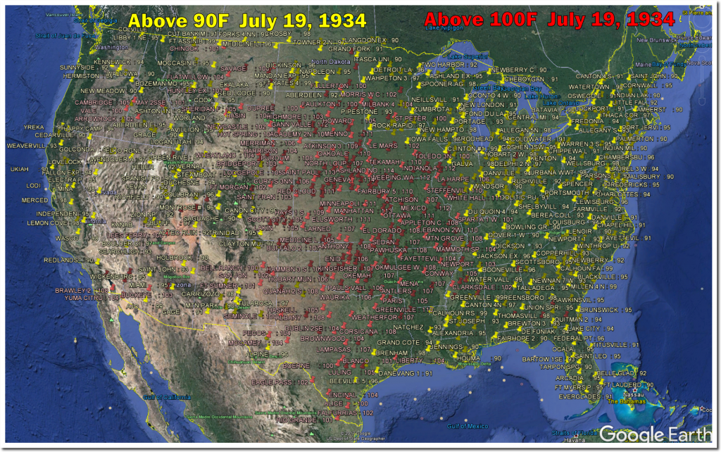
In the US 1934 -36 the spring and summer highs were just outlandish. Incomprehensible to most Americans today for the areas they lived in. Tony Heller has done a great job of showing this.
Here is just one of the many day by day examples he has posted from that period: https://realclimatescience.com/2017/07/july-19-1934-every-state-over-90-degrees/
The maps he uses really get the point across:
People argue that this just covers the US. But the fact is that nowhere else has as pristine or comprehensive record over such a broad area as the US does for this period.
Considering the more human aspect of that period one has to remember that even the White House didn’t get AC until 1933 and then just in the living quarters. Central air for the whole area of living working quarters was not installed until the Truman era.
So the only place the average city dweller had to go to beat the heat was the local theater. Most of them had AC installed in the late 20s or early 30s because it made a huge difference in their bottom lines.
And don’t forget it is not simply areas being infilled where there are no stations, it appears that even where there are stations some 40 to 60% are not reporting data (or consistently reporting data) so that these stations also get infilled.
It is a complete mess. Of course, we should not be trying to deal with thousands of stations, which inevitable causes problems. We should just be dealing with the cream, say the 200 very best sited, managed, maintained and run stations and then retrofit those with as nearly as possible identical equipment as used in the 1930s/1940s and then observe using the same procedure and practices as used in the 1930s/1940s. We could the just compare observational RAW data obtained today, with the observationally obtained RAW data of the 1930s/1940s without the need to make any adjustment whatsoever to the data. This would be far more informative
richard verney says:
“……..It is a complete mess. Of course, we should not be trying to deal with thousands of stations, which inevitable causes problems. We should just be dealing with the cream, say the 200 very best sited, managed, maintained and run stations and then retrofit those with as nearly as possible identical equipment as used in the 1930s/1940s and then observe using the same procedure and practices as used in the 1930s/1940s. We could the just compare observational RAW data obtained today, with the observationally obtained RAW data of the 1930s/1940s without the need to make any adjustment whatsoever to the data. This would be far more informative”
Then people would actually have to go to the stations and read the mercury thermometer and faithfully record and report the data as they did back then.
Rah,
Glad you brought this up,showing that in year 2017, land only data is still has a lot of holes in it. I am sure Nick Stokes, will come along and pontificate on this awesome reality!
No wonder he avoids Land only in modern GISStemp data! He knows it isn’t that much better than the old 1974 level of NH data coverage.
He constantly says something like this,
“That still doesn’t make it comparable to GISS land/ocean.”
Snicker………
The late 1990’s was a period of little volcanic activity, but the 2000’s saw a serious of moderate volcanos. About the same time, we developed the ability to detect stratospheric volcanic aerosols with much greater sensitivity and detect changes in aerosols that were in the noise before 2000s. That allowed many people to claim that the Pause was partly due to the continuous presence of slightly higher than normal aerosols for more than a decade. In reality, we didn’t really know how much higher than normal those aerosols were, because we couldn’t accurately measure “normal” before about 2000. So they wanted to correct the CMIP5 projections because volcanic cooling was stronger than anticipated. Also, N2O didn’t increase as fast as projected. Whether these were valid excuses isn’t clear.
IMO, we should be focused on the longest possible sensible period to compare observations to projections: Observation 1977-present: +0.17 K/decade. Projection trends provided above by Bill Illis: FAR and Hansen about 0.3 K/decade. AR3, AR4, AR5 about 0.2+ K/decade. Mann 0.37 K/decade. (Consider only trends, not y-intercept and trend. Estimating y-intercepts adds greater uncertainty.
During the 2000’s the SAOT showed no trend, so the volcanoes had no influence on the stratosphere. Higher sulphate aerosols in the lower atmosphere make no difference to global temperatures and even China still warmed as usual with them.
Matt G: Some scientists claim that there was an increase in volcanic aerosols in the 2000’s vs the late 1990s and that this made an important difference.
http://onlinelibrary.wiley.com/doi/10.1002/2014GL061541/full
Abstract: Understanding the cooling effect of recent volcanoes is of particular interest in the context of the post-2000 slowing of the rate of global warming. Satellite observations of aerosol optical depth above 15 km have demonstrated that small-magnitude volcanic eruptions substantially perturb incoming solar radiation. Here we use lidar, Aerosol Robotic Network, and balloon-borne observations to provide evidence that currently available satellite databases neglect substantial amounts of volcanic aerosol between the tropopause and 15 km at middle to high latitudes and therefore underestimate total radiative forcing resulting from the recent eruptions. Incorporating these estimates into a simple climate model, we determine the global volcanic aerosol forcing since 2000 to be −0.19 ± 0.09 Wm−2. This translates into an estimated global cooling of 0.05 to 0.12°C. We conclude that recent volcanic events are responsible for more post-2000 cooling than is implied by satellite databases that neglect volcanic aerosol effects below 15 km.
I’ll try to paste the key Figure below, otherwise see Figure 1 in the paper. I personally believe that the evidence for a change in stratospheric aerosols is marginal and is highly uncertain quantitatively.
http://onlinelibrary.wiley.com/store/10.1002/2014GL061541/asset/image_n/grl52300-fig-0001.png?v=1&s=a8c4d782c05732014ee3d7389b813d82cf9caaaa
The Vernier reference below shows some of the same information in different ways, but doesn’t quantify it as a forcing.
http://onlinelibrary.wiley.com/doi/10.1029/2011GL047563/full
The trend below show little difference in background noise. The linked papers show very little difference between late 1990’s and 2000’s. The value SAOD or SAOT around 0.01 is a tiny amount and 17 times smaller than Pinatubo 1991. The difference between late 1990’s and early to mid 2000’s is less than SAOD of 0.001. This value represents 170 times smaller than Pinatubo that had an estimated cooling of 0.35 c.
The estimated global cooling of 0.05 to 0.12°C is unrealistic and totally far fetched, that would lead to Pinatubo 1991 having an estimated cooling of 0.85 to 2.04 c.
The SAOT of 0.01 is 17 times smaller and represents global cooling of about 0.02 c that is far less then just above. The difference between late 1990’s and early to mid 2000’s represents about cooling of 0.002 c. This just confirms that the trend show little difference from background noise and the signal being far too small, won’t be observed in global temperatures.
“Valid excuses”
???
Once the forecast is made, there is no excuse. You can’t go back and change the forecast just because things happened that you didn’t know anticipate or understand
Climate Forecast apologists want to change the forecast because volcanoes turned out different or CO2 was mitigated by the atmosphere more rapidly than anticipated. Then they try to use GISS to verify because that’s the data they were able to manipulate the most
Fudge A little here, fudge a little there, fudge fudge everywhere
Mary wrote: “Once the forecast is made, there is no excuse.”
Technically-speaking, the IPCC makes “projections”, not “forecasts”. They “project” what will happen IF the forcing from aerosols and rising GHGs changes in a particular way. If the observed change in forcing is inconsistent with the forcing changes used in a projection, then that projection has a legitimate excuse for being wrong*. Ideally, one would go back and re-run the same climate model using the observed change in forcing agents and see what the model predicts, but modelers don’t invest their resources re-running obsolete models that are decades old. Instead they estimate how much the projection would have changed.
This process is scientifically reasonable. The fudging comes in when several marginally significant perturbations from expected forcing are added together to explain a failed projection.
The most important use of projections is to show policymakers how much cooler it will be if they restrict CO2 emissions.
* Suppose an economist made a projection for economic growth over the next two years based on the expectation that Congress would pass Trump’s tax cut and infrastructure spending plans. Would you say the economist’s projection was wrong if Congress failed to pass either program? What if the economist had warned that his projection would not be valid if this legislation did not pass?
If the models were grounded in reality, they could show policymakers how much cooler it will be if they if they just left us the Hell alone.
Almost every catastrophic prediction is based on climate models using the RCP 8.5 scenario (RCP = relative concentration pathway) and a far-too high climate sensitivity. RCP 8.5 is not even suitable for bad science fiction. Actual emissions are tracking closer to RCP 6.0. When a realistic transient climate response is applied to RCP 6.0 emissions, the warming tracks RCP 4.5… A scenario which stays below the “2° C limit,” possibly even below 1.5° C.
https://www.carbonbrief.org/factcheck-climate-models-have-not-exaggerated-global-warming
Note that the 2σ (95%) range in 2100 is 2° C (± 1° C)… And the model is running a little hot relative to the observations. The 2016 El Niño should spike toward the top of the 2σ range, not toward the model mean.
Frank…
Your points about “projections” are valid in a scientific sense of discovery and understanding
But when you are demanding massive changes to society based on the models, then you are making a forecast.
If i make a bet on a stock based on Congress passing a law, I don’t get my money back if the law doesn’t pass.
Real world forecasting is full of booby traps. I’ve done it for a long time on many issues. When you are wrong, you cant go back and change the forecast. You can go back and re-develop your models and issue a new forecast from that point going forward
Yep. Using the models as heuristic tools is fine for science projects. Using them as weapons in the mother-of-all armed robberies is a whole different story.
Frank, I think your economic analogy is incomplete. Climate and economic models include multiple steps and (net) positive feedbacks. Climate models say that increased emissions => increased concentrations => higher temps => even higher emissions (CO2, water vapor, methane) => even higher concentrations, etc (repeat with diminishing returns).
The Bush tax cut would be a better analogy because the proponents said that cutting taxes at the high end => more money to the wealthy => more investment => more jobs => more spendig => even more jobs, (repeat), ultimately leading to an increase in tax revenue.
In both cases, the initial flows, increased emissions and more cash to the wealthy (or less taken from them), were as large as promised, but the models drastically over-predicted the positive feedbacks, and, therefore, the end result.
Mary,
“But when you are demanding massive changes to society based on the models, then you are making a forecast.”
This is really silly stuff. Scientists don’t forecast future GHG levels, exactly because they depend on policy decisions. They say – if you do this, then this will happen. That’s all they can say. You’re saying – well if you can’t tell us what we’ll decide, then why should we listen to you before deciding?
Nick Stokes:
Is that really you, or did a watermelon spring up under your bed?
As you’ve so forcefully demonstrated above, this party line of yours only lasts until the thing that was supposed to happen (Scenario A temperatures), doesn’t, even when the associated policy decision the scientists warned against (business as usual) continues, in which case the party line literally does switch to “our model was a forecast of different future GHG levels.”
Frank:
“Technically-speaking, the IPCC makes “projections”, not “forecasts”. . . The most important use of projections is to show policymakers how much cooler it will be if they restrict CO2 emissions.”
That should have read “the most important abuse of projections . . .”
Until the scientists have the courage to commit to definitive forecasts, and accept the verification and/or failure of those forecasts, they haven’t demonstrated that they know what they are talking about, and asking anyone to rely on their opinions is arrogant. But they want it both ways. They want society to have blind faith in these mere “projections” without having to put first their credibility on the line.
Kurt,
“only lasts until the thing that was supposed to happen (Scenario A temperatures)”
No-one said Scenario A is supposed to happen. I’m sure lots of people hope it doesn’t.
Most scientific prediction is based on scenarios. It doesn’t make absolute predictions. If you drop a ball from the Empire State building, science predicts how long it will take to reach the ground. It doesn’t say that you will drop that ball, or that you should. That’s policy. Given a scenario, there is stuff you can predict. Without it, science can’t.
I don’t understand this bit: “They essentially went from 0.7 +/-0.3 [CMIP5] to 0.6 +/-04 [CMIP3]. Progress shouldn’t consist of expanding the uncertainty… unless they are admitting that the uncertainty of the models has increased.” Assuming your estimates are correct, you have the direction of progress backwards. CMIP5 is more recent than CMIP3. What they’ve done is they have gone from a less precise model but more accurate model to a more precise but less accurate model. That is semiprogress.
The CMIP3 model run was characterized as a successful 10-yr forecast… Hence progress over the unsuccessful CMIP5 forecast.
I fully realize that the actual model progression is from CMIP3 to CMIP5.
I often trade clarity for sarcasm.
https://tse2.mm.bing.net/th?id=OIP.DtoEmLWDPY-oGJfXP5rhTAEsEs&pid=15.1&P=0&w=300&h=300
Uncertainty has increased in the models because for a start, they don’t know what caused the pause. Cherry picking ideas what may have occurred to model data in individual short periods, using hind casts against already known observed temperatures doesn’t actually improve forecasts. Only where it would improve forecasts is if it fit the entire timeline, but they mainly adjust short periods individually because they don’t know. Every time the models are adjusted it needs decades later with zero changes to confirm if they were any good.
It’s silly to claim successful forecast when the forecast range is from 0.2 to 1.0 C, a spread of 0.8 C in a single year. That’s almost the actual temperature change since 1850, a period of 166 years. Even dart-throwing monkeys can hit that gigantic bull’s-eye. Anybody with a bit common sense will just say the range is huge because we can’t forecast temperatures.
For the millionth time, stop using anomalies in temperature forecasts! Forecast a real number (or range) so everyone can agree whether you got it right.
That Hansen 1988 graph is a perfect example of why this matters — remember Ira’s graph? Where Now compare to Gavin’s above — where you set that baseline matters, in Ira’s graph there’s no way that El Nino spike pushes GISTEMP up to Scenario B. But it shouldn’t matter — we’re talking about real physical phenomena, which has real physical values.
http://wattsupwiththat.files.wordpress.com/2013/03/hansen88.jpg
Forecasters should issue a new forecast every year. Very specific forecasts…what they are forecasting and how it will be verified.
Then we can evaluate easily and have a new sample every year.
Without that, it’s just dart throwing monkeys.
I often think climate science would be a great field for a young person to get into if it weren’t already so politicized. So much to learn. Of course that means there are prominent people who haven’t learned as much as they think they have, or pretend they have.
part of the trouble with the science is young people coming through the establishments that provide them with the knowledge to enter the field have their minds corrupted to the point there is no notion that the currently accepted climate science warming line might be wrong. to progress a field requires inquisitive open minds .
The surface increasingly non-data sets should be scrapped as an observation tool for global warming and validity of climate models.
Why?
The huge problems with them are obvious, but the main point being the theory involves warming the atmosphere not the surface. The models are trying to resolve how much the atmosphere will warm not at the surface. This con trick is happening now comparing models with surface data.
Naturally short wave radiation (SWR) warms the surface because it goes through the atmosphere like a vacuum and is absorbed by the ground and oceans. Warming at the surface more than the atmosphere only indicates the source of warming is from the ground and ocean, warming the air above it. That is not evidence of a greenhouse effect from increasing CO2 and why no detection out of noise is verified. This points to SWR being the reason for increased warming with the AMO / ENSO and with declining global cloud levels, decreasing RH levels and stations recoding increased sunshine hours this becomes obvious.
Altering data and infilling causing more warming at the surface than there actually was, is actually further falsifying the theory when there should be more warming in the atmosphere.
This was suppose to be a general post, not a reply to one.
“,,,,,,stations recording increased sunshine hours…”
Richard Verney, you might find this interesting:
Data Tampering At USHCN/GISS
“The measured USHCN daily temperature data shows a decline in US temperatures since the 1930s. But before they release it to the public, they put it thorough a series of adjustments which change it from a cooling trend to a warming trend.”
https://stevengoddard.wordpress.com/data-tampering-at-ushcngiss/
Here he has a, GHCN Software, you can download to better use the NOAA temperature data:
“I have released a new version of my GHCN software. It is much faster at obtaining NOAA data and should work on Mac, Linux or Cygwin on Windows. Download the software here.”
https://realclimatescience.com/ghcn-software/
An old comment that may apply.
https://wattsupwiththat.com/2017/01/26/warmest-ten-years-on-record-now-includes-all-december-data/#comment-2410018
PS I made another comment upthread yesterday (I think on this post) that may also apply as to a possible method. (A layman’s input.)
I think it went into the auto-bit-bin. My fault. I used the “D” word. I’m not asking the ModSquad to retrieve it since it was so far upthread.
Regarding my missing comment, here’s the gist from a previous thread.
https://wattsupwiththat.com/2017/09/22/a-climate-science-milestone-a-successful-10-year-forecast/#comment-2618517
David I’ve brought this criticism up many times before and never seen an answer; why is it the climate science community accepts the idea of an average (P50 I think you call it) behavior of these models? It’s a very basic mistake to average two or more distinctly different things, and these models are different.
If you had hundreds of runs using the same model, taking the average might have some real meaning, but these are different models. Why does the climate science community continue to tolerate this practice?
It’s how probability distributions are run. Before we drill wells we build a probability distribution by inputting the minimum and maximum cases for a variety or reservoir parameters (porosity, permeability, area, thickness, drive mechanism, etc.). The computer then runs a couple of thousand Monte Carlo simulations and we get a probability distribution from P90 (minimum) to P50 (mean, or most likely) to P10 (maximum) of the resource potential (bbl oil, mcf gas).
With the climate models, sometimes the run an ensemble of the same RCP scenario and sometimes they run multiple RCP scenarios, like this:
While there isn’t a lot of divergence of the RCP’s yet, the temperature observations are clearly tracking closer to RCP 2.6 than RCP 8.5.
Emissions tracking RCP 8.5 scenario pathway, whereas temperatures are tracking RCP 2.6 scenario pathway.
If that simple fact does not tell you everything you need to know about whether the models are running hot, nothing will convince you.
The emissions are actually closer to RCP 6.0.


The graph on the left uses a constant ratio of oil, gas and coal. The graph on the right displaces oil with gas.
If TCR is substantially less than 1.5, temperatures might track as low as RCP 2.6… Certainly no worse than RCP 4.5.
No wonder there, when the adjustments track CO2 ppm…
https://realclimatescience.com/2017/09/nick-stokes-busted-part-2/
Mr. Layman here.
(For this comment maybe I should have put that in all caps?)
All those different models, whatever the method used, are trying to model the same thing. Reality. Future “reality” at that.
Comparing real observations of present reality with what models said observations should be speaks to the validity of the models.
If a model got it wrong, learn and adjust the model. Don’t adjust the data to cover your behindcast. 😎
Nothing like a spot on Texas Sharpshooter.
Now Nick is wading into lies,since it was HIM who whines about the Land/Ocean argument,that no one said or disputed.with. He does it to deflect from his false claims about NCAR chart which was based on J.Murray Hamilton work. He did it to deflect from the animated GISS charts Lars posted.
The NCAR chart exist, it was labeled as being from NCAR,you were repeatedly shown them and that NAS chart is very similar to it. You have yet to prove otherwise.
Nick writes,
“I said that there was no NCAR source, so we can’t work out just what is being plotted. I said that it came from a Newsweek story. Heller says that he got it instead from another old newspaper. So? Still no NCAR source.”
Funny that many newspapers,posted that chart a lot in 1974,long before Newweek posted it,that it came from NCAR right at the bottom of the chart,but the person who made that data for it was given to you,which you COMPLETELY ignored,since that destroyed you entire babble about the NCAR based chart existence.
You drone on with more misleading stuff,
“And he says indignantly, well of course it’s land only, it’s all they had. What a defence! He wasn’t telling you that on his graph. He’s claiming that the difference between a 1974 plot of land only (probably NH, despite the newspaper heading) and 2017 land/ocean is due to GISS fiddling. Never tells you that they are just quite different things being plotted.”
You originally stated differently,
“Steven Goddard produces these plots, and they seem to circulate endlessly, with no attempt at fact-checking, or even sourcing. I try, but it’s wearing. The first GISS plot is not the usual land/ocean data; it’s a little used Met Stations only.”
Tony upon reading your dishonest red herring replied,
“The amount of misinformation in that claim is breathtaking. Nobody attempted to do land/ocean plots in 1974, because they weren’t willing to make up fake temperature data like modern climate fraudsters.”
It was YOU who created something that didn’t exist in 1974,that no one HERE besides you said anything about land/ocean data. Tony,NEVER said they were land/ocean data for 1974,1981 or 2001.
The 2001 chart Tony posted shows only land data on it.
Here is the animated chart you originally responded to,
BOTH charts for the years 2001 and 2015 are straight off the GISS website,Tony simply created the animation to show the obvious changes. They are LAND DATA ONLY FOR THOSE TWO YEARS. It is ALL GISS.
NOTHING about land/ocean on those two charts Lars P. posted on
September 26, 2017 at 12:43 pm.
When are you going to stop LYING?
Then Nick tries to lie about what I said,since I NEVER once claimed they were land/ocean based charts for NCAR,NAS or any pre 2001 chart in this thread.
Nick writes,
“And sunsettommy still doesn’t even try to figure out what the GISS plots are. The GISS we have been following and discussing for years is GISS Land/Ocean.”
Lars P posted the animation chart that you replied to with this part about land/ocean drivel that only YOU brought up over the chart Lars posted,
Nick first comment about Tony’s charts (Which really came from GISS),
“The first GISS plot is not the usual land/ocean data; it’s a little used Met Stations only, essentially an update of a 1987 paper.”
The GISS charts NEVER says it was land/ocean at all, just Meteorological stations,it says so right on the FREAKING charts!
“Those GISS plots marked Met Stations are something different – he still seems to have no idea what. They are a continuation of the Met Stations index of the paper Hansen and Lebedeff, 1987”.
No the two charts came from the GISS webpages as shown to you by Lars P. I posted the 2001 chart that is from GISS themselves which is identical to what Tony used for the animation.
You brought up the Hansen 1987 paper as if you have something relevant say,which no one cares about it,since it was IRRELEVANT,since Tony got the charts from the GISS website.
“They used Met stations data to extrapolate over the whole globe. It’s isn’t land/ocean, and it isn’t land only. And most people think it is no longer a good idea, and no-one else does it. It is rarely referenced. Again, Heller isn’t going to tell you any of this.”
Tony used the GISS data based charts,which you NEVER refuted a single time! The ones Tony used were always LAND only.
Again I quote Tony,
“This was the GISS web page in 2005. Top plot was “Global Temperature (meteorological stations.) No ocean temperatures. The 2001 GISS web page had the same thing.”
You need to stop Lying!