From the Fabius Maximus Blog. Reposted here.
By Larry Kummer. From the Fabius Maximus website, 21 Sept 2017.
Summary: The gridlock might be breaking in the public policy response to climate change. Let’s hope so, for the gridlock has left us unprepared for even the inevitable repeat of past extreme weather — let alone what new challenges the future will hold for us.

The below graph was tweeted yesterday by Gavin Schmidt, Director of NASA’s Goddard Institute of Space Sciences (click to enlarge). (Yesterday Zeke Hausfather at Carbon Brief posted a similar graph.) It shows another step forward in the public policy debate about climate change, in two ways.
(1) This graph shows a climate model’s demonstration of predictive skill over a short time horizon of roughly ten years. CMIP3 was prepared in 2006-7 for the IPCC’s AR4 report. That’s progress, a milestone — a successful decade-long forecast!
(2) The graph uses basic statistics, something too rarely seen today in meteorology and climate science. For example, the descriptions of Hurricanes Harvey and Irma were very 19th C, as if modern statistics had not been invented. Compare Schmidt’s graph with Climate Lab Book’s updated version of the signature “spaghetti” graph — Figure 11.25a — from the IPCC’s AR5 Working Group I report (click to enlarge). Edward Tufte (The Visual Display of Quantitative Information) weeps in Heaven every time someone posts a spaghetti graph.
 Note how the graphs differ in the display of the difference between observations and CMIP3 model output during 2005-2010. Schmidt’s graph shows that observations are near the ensemble mean. The updated Figure 11.25a shows observations near the bottom of the range of CMIP5 model outputs (Schmidt also provides his graph using CMIP5 model outputs).
Clearing away the underbrush so we can see the big issues.
This is one in a series of recent incremental steps forward in the climate change policy debate. Here are two more examples of clearing away relatively minor issues. Even baby steps add up.
(1) Ocean heat content (OHC) as the best metric of warming.
This was controversial when Roger Pielke Sr. first said it in 2003 (despite his eminent record, Skeptical Science called him a “climate misinformer” – for bogus reasons). Now many climate scientists consider OHC to be the best measure of global warming. Some point to changes in the ocean’s heat content as an explanation for the pause.
Graphs of OHC should convert any remaining deniers of global warming (there are some out there). This shows the increasing OHC of the top 700 meters of the oceans, from NOAA’s OHC page. See here for more information about the increase in OHC.
(2) The end of the “pause” or “hiatus”.
Global atmospheric temperatures paused during period roughly between the 1998 and 2016 El Ninos, especially according to the contemporaneous records (later adjustments slightly changed the picture). Activists said that the pause was an invention of deniers. To do so they had to conceal the scores of peer-reviewed papers identifying the pause, exploring its causes (there is still no consensus on this), and forecasting when it would end. They were quite successful at this, with the help of their journalist-accomplices.
Now that is behind us. As the below graph shows, atmospheric temperatures appear to have resumed their increase, or taken a new stair step up — as described in “Reconciling the signal and noise of atmospheric warming on decadal timescales“, Roger N. Jones and James H. Ricketts, Earth System Dynamics, 8 (1), 2017. Click to enlarge the graph.
What next in the public policy debate about climate change?
Perhaps now we can focus on the important issues. Here are my nominees for the two most important open issues.
(1) Validating climate models as providers of skillful long-term projections.
The key question has always been about future climate change. How will different aspects of weather change, at what rate? Climate models provide these answers. But acceptable standards of accuracy and reliability differ for scientists’ research and policy decisions that affect billions of people and the course of the global economy. We have limited resources; the list of threats is long (e.g., the oceans are dying). We need hard answers.
There has been astonishingly little work addressing this vital question. See major scientists discussing the need to do so. We have the tools to do so. A multidisciplinary team of experts (e.g., software engineers, statisticians, chemists), adequately funded, could do so in a year. Here is one way to do so: Climate scientists can restart the climate policy debate & win: test the models! That post also lists (with links) the major papers in the absurdly small literature — and laughably inadequate — about validation of climate models.
There is a strong literature to draw on about how to test theories. Let’s use it.
- Thomas Kuhn tells us what we need to know about climate science.
- Daniel Davies’ insights about predictions can unlock the climate change debate.
- Karl Popper explains how to open the deadlocked climate policy debate.
- Milton Friedman’s advice about restarting the climate policy debate.
- Paul Krugman talks about economics. Climate scientists can learn from his insights.
- We must rely on forecasts by computer models. Are they reliable? (Many citations.)
- Paul Krugman explains how to break the climate policy deadlock.

(2) Modeling forcers of climate change (greenhouse gases, land use).
Climate models forecast climate based on the input of scenarios describing the world. This includes factors such as amounts of the major greenhouse gases there are in the atmosphere. These scenarios have improved in detail and sophistication in each IPCC report, but they remain an inadequate basis for making public policy.
The obvious missing element is a “business as usual” or baseline scenario. AR5 used four scenarios — Representative Concentration Pathways (RCPs). The worst was RCP8.5 — an ugly scenario of technological stagnation and rapid population growth, in which coal becomes the dominant fuel of the late 21st century (as it was in the late 19th C). Unfortunately, “despite not being explicitly designed as business as usual or mitigation scenarios” RCP8.5 has often been misrepresented as the “business as usual” scenario — becoming the basis for hundreds of predictions about our certain doom from climate change. Only recently have scientists began shifting their attention to more realistic scenarios.
A basecase scenario would provide a useful basis for public policy. Also useful would be a scenario with likely continued progress in energy technology and continued declines in world fertility (e.g., we will get a contraceptive pill for men, eventually). That would show policy-makers and the public the possible rewards for policies that encourage these trends.
 Conclusions
Science and public policy both usually advance by baby steps, incremental changes that can accomplish great things over time. But we can do better. Since 2009 my recommendations have been the same about our public policy response to climate change.
- Boost funding for climate sciences. Many key aspects (e.g., global temperature data collection and analysis) are grossly underfunded.
- Run government-funded climate research with tighter standards (e.g., posting of data and methods, review by unaffiliated experts), as we do for biomedical research.
- Do a review of the climate forecasting models by a multidisciplinary team of relevant experts who have not been central players in this debate. Include a broader pool than those who have dominated the field, such as geologists, chemists, statisticians and software engineers.
- We should begin a well-funded conversion to non-carbon-based energy sources, for completion by the second half of the 21st century — justified by both environmental and economic reasons (see these posts for details).
- Begin more aggressive efforts to prepare for extreme climate. We’re not prepared for repeat of past extreme weather (e.g., a real hurricane hitting NYC), let alone predictable climate change (e.g., sea levels climbing, as they have for thousands of years).
- The most important one: break the gridlocked public policy by running a fair test of the climate models.
For More Information
For more about the close agreement of short-term climate model temperature forecasts with observations, see “Factcheck: Climate models have not ‘exaggerated’ global warming” by Zeke Hausfather at Carbon Brief. To learn more about the state of climate change see The Rightful Place of Science: Disasters and Climate Change by Roger Pielke Jr. (Prof of Environmental Studies at U of CO-Boulder).
For more information see all posts about the IPCC, see the keys to understanding climate change and these posts about the politics of climate change…
- Why the campaign to warn people about climate change fail: incompetence.
- Ignoring science to convince the public that we’re doomed by climate change.
- Look at the trends in extreme weather & see the state of the world.
- Focusing on worst case climate futures doesn’t work. It shouldn’t work.
- Paul Krugman shows why the climate campaign failed.
- Manichean paranoia has poisoned the climate debate.
- What you need to know & are not told about hurricanes — About Harvey and Irma.
This seems like a very rational and objective article to me on AGW. Let’s see more of these on WUWT.
Looks like propaganda to me.
Not at all. It is very pragmatic but I am assuming not ‘sceptical” enough for you.
Increasing funding for climate science is pragmatic? What planet do you live on? Pragmatism would be hardening the infrastructure and civilization against what nature can throw at us. Excessive funding of climate science IS the problem. What purpose does it serve?
Ditto.
ICISIL., you are exactly correct!
In this article there are a few “reasonable” proposals; however, IMO, such are overwhelmed by a cry for more funding and support for more “centralized command and control” BIG GOVT brainwashing, that is, for support for many of the same gang of duplicitous quasi-scientists who got us here in the first place.
“…. not ‘sceptical” enough for you”
Me neither.
The first unlabelled figure shows CMIPS from 2007, fine. But the problem is that the DATA has since been “corrected ” to fit the models. This is not “validation” of a model prediction.
The unlabelled second figure shows “pentadal average” which is notably different from the 3mo and yearly plots. It seriously undercounts until 1970, fails to capture the early 80s drop and goes entirely in the wrong directions during the post Pinatubo period of the early 90s. Is this really supposed to be the same data?
Also this pentadal average clearly is NOT a five yearly average of anything it is a running mean. The author clearly does not even know what an average is.
Furthermore, seriously presenting OHC data going back to 1960 is either blatant misrepresentation or ignorance. There simply was not reliable OHC data that far back.
It may be a rather tamer form of propagandistic position but it is still AGW propaganda.
Re-allocate climate spending would have been a better term. I agree they don’t need more money, they just need to quit funding 30+ models that are nowhere near reality and focus on those 5 or so that are. Competition!
There’s nothing “pragmatic” about a scam….. There hasn’t been any science in so called Climate Science. It’s been an exercise in political activism and a scam right from day one….. When Hanson admitted that he turned the air conditioners off at the conference and was proud about that theatrical prop…. The science of climate change died that very day.
It is very pragmatic …..since when is some WAG that only works short term…the basis for anything pragmatic
…extend that little line out far enough that it matters…and it’s the same crap they’ve been spitting out since day one
i’m not buying any pitch of any prophet or acolyte or minion
and i’m also getting real sick of constant exhortation and importuning.
kummer- mitts off my stuff or pull back a stump.
don’t even look at my wallet.
don’t even talk about my wallet.
I am having difficulty with the increasing OHC measured in 10^22 joules. Joules per what? Is this a large amount? Is this another attempt to make a tiny temperature increase (with large error bars) seem like a massive change. In other words is this a continuation of the hyperbole aka propaganda?
Malcolm, think temperature changes in the 1/100 degree range, immeasurable even now with ARGO.
Measurements of ocean temperature before 2003 are basically non-existent for most of the ocean.
Its a load of ASSumption driven modelling FARCE.
Even if ARGO could measure with that accuracy, there aren’t enough probes to justify maintaining that kind of “accuracy” when extended to all the oceans.
ivan K:
1. Yes, it is “rational.” The author’s half-truths and lies support his goal: promote AGW.
2. “Objective” — not. It is an attempt to persuade you to agree with the author.
3. What this article is
(given, as Greg and NUMEROUS others have nicely explained, such assertions as this:
{WRONG: it only shows the code writers’ ability to make their computer simulation mimic KNOWN data.}
is: a piece of JUNK.
And this author, L. K. of the FM piece of junk blog is a KNOWN AGW schlepper around here.
Not really. Even “skeptics” like Doc Spencer point to a limited warming in the measured data of about 1.4 C per century. The actual data seems to appear stepped rather than a trend and could reflect solar influences working in combination with oceanic thermal mass. If the major solar minimum comes about as frequently predicted, then a good test will be to see if the “trend” steps backward over the next few decades.
The problem really isn’t about the science per se, but rather the struggle, which approaches the ugliest 19th century misunderstandings of Darwinian selection, for access to limited resources (money, facilities, computing capacity). This leads to competive “packs” of scientists battling it out for access to all the necessities of science: money, a new microscope or computer, publication space, etc. That is what produces the debacle we call “climate science.” If you toss in the growing success of “high-functioning sociopaths” in our current civilization, the out come is predictable. A means of forcing better science would be to pit teams of HFS’s against each other with equal, limited access to funding and facilities and publication in journals with open peer review, preferably refereed by reviewers from a different discipline. Attendance at conferences, which really is helpful if you actually practice a science, should be self-funded. The IRS allows professional expenses to be claimed, so make them take that route rather than funding travel to exotic locations through public taxes.
I was completing this when the cat [really, no joke] stepped on the enter-key a moment before I completed typing my handle:
Not really. Even “skeptics” like Doc Spencer point to a limited warming in the measured data of about 1.4 C per century. The actual data seems to appear stepped rather than a trend and could reflect solar influences working in combination with oceanic thermal mass. If the major solar minimum comes about as frequently predicted, then a good test will be to see if the “trend” steps backward over the next few decades.
The problem really isn’t about the science per se, but rather the struggle, which approaches the ugliest 19th century misunderstandings of Darwinian selection, for access to limited resources (money, facilities, computing capacity). This leads to competive “packs” of scientists battling it out for access to all the necessities of science: money, a new microscope or computer, publication space, etc. That is what produces the debacle we call “climate science.” If you toss in the growing success of “high-functioning sociopaths” in our current civilization, the out come is predictable. A means of forcing better science would be to pit teams of HFS’s against each other with equal, limited access to funding and facilities and publication in journals with open peer review, preferably refereed by reviewers from a different discipline. Attendance at conferences, which really is helpful if you actually practice a science, should be self-funded. The IRS allows professional expenses to be claimed, so make them take that route rather than funding travel to exotic locations through public taxes.
Duster,
Satellite trend in “warming” is meaningless, since it can only measure since 1979, which was the start of a natural warming cycle. The alleged 1.3 degrees C per century rate is based upon a cycle coming off a strong cooling cycle from the 1940s. Thus the actual centennial scale warming is much lower.
But even if it were that high, that’s a good thing, not a bad thing.
ICISIL many replies to this entry, all other approaches of deceiving the masses have failed for soothsaying is not science. This is a very clever attempt as a prelude to tell us the oceans will boil by the year xxxx just another bit of fortune telling.
These soothsayers are rapidly running out of time as old Sol would appear to be entering one of his moods that causes a tad of serious cooling.
Yeah, the objective is, “Give us more money.” While cherry-picking those data which may match empirical measurements.
The call for validation is a nice change, I will give him that.
Validation would be absolutely necessary as there is a high probability that out of ~50 climate models, one or two of them would get close to reality just by chance. The high variability in the projections suggests a weak methodology and high probability that chance takes the credit rather than the skill of the modellers.
Ivankinsman, look at what they constructed. First they adjusted temperature data to eliminate any “pause” or “hiatus” and to fit model projections, then they show increased sea temperatures and say it explains the “pause” or “hiatus”, that is the missing heat went into the oceans. They are trapped by their own data manipulation, looks like to me.
Everyone should compare HausDaddy’s Blended Model 1970-2020 Fairy Tale to this, from the Grooveyard of Forgotten Hits – 2009 Style.
http://rankexploits.com/musings/wp-content/plugins/BanNasties/imageDiversion.php?uri=/musings/wp-content/uploads/2009/04/20yeartrends.jpg
Note only the 1997 peak touches the ‘Model Runs’ wereas this chart is well over the lines.
They are reporting how well their New Revised Models compare to the New Revised Temperatures.
And if they have this ‘Climate Modeling’ down to perfection, why do we still need 47 of them?
LOVE it! lolol (and your excellent expose of the bogus “projection,” too)
Hausdaddy is good, but Grooveyard is better. Gotta love those Golden Oldies!
Larry spouts the CACA party line, imagining that satellite data have been more adjusted than the pack of “surface” lies. However, in reality, satellite observations were adjusted in the past to improve them, fixing problems. By contrast, “surface” lies are constantly “adjusted” in order to bring them in line with the failed CACA hypothesis, not to make them closer to reality.
Past satellite adjustments were warranted. HaddDRU, NOAA and NASA’s antiscientific, mendacious, made-up “surface” sets, not so much. As in, not at all.
The climate model predictions only match the temperature record because the temperature record was warmed to match the models. This is indeed propaganda. Berkely Earth pretended to be skeptical and honest and then went and warmed the data as the other AGW “scientists” do.
Either that or temperatures really are rising, as every group that looked into it has reported.
Rising overall, DWR54; but not at the rate predicted by the models!
I love it when trolls try to move the goal posts.
Nobody has claimed that the earth hasn’t warmed.
It’s the degree of warming that has been cooked.
“as every group that looked into it has reported.”
roflmao.. all linked to the same manically adjusted data.
reported… as part of the overall scam.
AndyG55
It’s noticeable that temperature data sets only become part of the ‘scam’ once they show trends some folks here don’t like the look of. The UAH lower troposphere satellite temperature data set shows an almost identical warming trend to HadCRUT4 since 1996. So if it’s a ‘scam’, then I guess you believe Roy Spencer and John Christy are in on it too?
Sorry, that should be from 2006 (not 1996). That’s the period covered by the CMIP3 models. The trend in HadCRUT4 since 2006 is 0.274 deg. C per decade; in UAH TLT the trend since 2006 is 0.272 deg. C per decade. If we accept that the UAH satellite trend since 2006 is accurate (RSS disagrees and is higher), then the HadCRUT4 ‘scam’ has amounted to an increased warming trend of 2 one-thousandths of a degree C per decade since 2006. Well within the range of error in both sets.
They show the increase in heat content of the ocean. The heat capacity of the ocean is at least two orders of magnitude greater than the atmosphere. Thus, it will take more than 100 times as long to heat the ocean 2 degrees as it does to heat the atmosphere.
They modified the data, so it is no longer data, it is Guesstimation.
Plus one magnitude, 1000 times.
The amount of heat energy in the oceans is not two but three orders of magnitude greater than the atmosphere. Furthermore it is six orders of magnitude greater than the amount of energy that can be attributed to CO2
Out of more than 50 models they found only 3 that could fit up til now??
Spray and Pray?
How many models actually fit year for year? I guess it has been going down each year. In 20 year none of them no longer fit?
This is the the significant recommendation: “The most important one: break the gridlocked public policy by running a fair test of the climate models.”
Select what appear to be the best models (by throwing out all of the extreme outliers) and require the selected models to make a 10 year forecast. At the same time, validate the historic data by having a rigorous and critical look at all of the adjustments and the history of the method and location and technology of all of the data recording stations (starting with the surface stations findings.
A previous suggestion is to take the prefered models and start them from 1850, inputting all of the available data and run them forward, to see what they produce compared to the actual progression of the world’s climate. If 1850 is too far back to go, select a date in the 20th century when rigorous weather data was being collected…1940 for instance. If the models fail to actually model what happened, then recognize they are not fit for purpose.
Its a very odd way of doing science. Make 100 or so models, then choose the few that match massively up-adjusted temperatures, even if those models are based on far less aCO2 that there actually is.
High FARCE, …. not science.
Not only that, but given the fact that climate is a non-linear, chaotic phenomenon- as per several series of articles here at WUWT – is coincidental matching between a model and a given set of data necessarily an indication of actual correctness? How do we tell the difference between a correct model that happens to have one or two parameters slightly off and an incorrect one?
I’m looking at the anomalies chart And trying to figure it out. The “anomaly” for what appears to be the 1998 el nino is significantly lower than the anomaly for the 2015 el nino. Since an anomaly, I thought, was the change from some baseline average, and the actual difference between the stated temperatures for the two el ninos are only slightly different, doesn’t that far greater anomaly for the 2015 el nino “suggest” that the “baseline average” has gone down in order for it to be that much greater?
Now if that is the case, how can you call this rational and objective since it obviously is pretending that oranges and pineapples are the same? I am probably misinterpreting something here, but I am not sure what.
It is called “adjusting history” to make the data better.
I call it cheating and fraud.
As I have pointed out numerous times they have cooled the 1997/98 average by 2.39 degrees C.
Tom O: The baseline from which the anomalies are calculated is the same for all the years. El Ninos cause temporary increases in surface temperatures at the expense of deeper ocean temperatures. El Ninos and La Ninas cancel out each other in the long run, and they merely are variability within the Earth’s energy system. Meanwhile, additional energy accumulates pretty steadily, causing the rise over the long run. The wiggles in surface temperature caused by El Ninos and La Ninas are merely weather noise on top of the long term temperature increase that is climate. The 2015 El Nino was an increase on top of a starting temperature that was much higher than the 1998’s starting temperature.
Ivankinsman,
Thank you for the feedback. Note the comment replies. The usual, showing how the climate policy debate has become dysfucntional.
“I Came” thinks that any views that disagree with his (hers?) are “propaganda”. Johnny seems to have not read the first `1500 words of the essay, and delusionally imagined what the last section says.
So it goes.
I agree. Difficult to bridge the big yawning gap that principally seems to exist in the US. Found this a very interesting profile of a typical climate sceptic:
https://www.theguardian.com/environment/2017/sep/22/climate-deniers-protect-status-quo-that-made-them-rich?CMP=share_btn_fb
“…climate policy debate has become dysfunctional”
The Democrats embraced an extremist, radical leftist agenda, then accused the Republicans of being far right and creating a poisoned political climate by not compromising when the right started to undo some of the left’s excesses.
Climate science is dysfunctional, not the debate. Wouldn’t you agree?
Interesting … a suck up comment without content is thanked for being “feedback”. Climate policy should be about science, not just liking those who call you “rational and objective”. When Climate science becomes google/facebook/twitter then it is dysfunctional.
Ivankinsman,
Wow. Thanks for the link to that entertaining Guardian “article”: “Climate deniers want to protect the status quo that made them rich.” Even for The Guardian, that’s quite nuts.
No wonder they’re losing money so briskly (£45 million last year, down by a third from the previous year!). It’s the ultimate trust fund baby of news media, without which it probably would quickly go to its deserved reward of bankruptcy.
https://www.theguardian.com/media/2017/jul/25/guardian-media-group-cuts-losses-by-more-than-a-third-to-45m
The gap doesn’t make the debate dysfunctional. It is the use of logical fallacies, Ad Hominem attacks, and suspicious data manipulations that make it dysfunctional. I have seen a great deal of it from both sides, but the skeptical argument doesn’t depend on such things.
Why don’t you show the satellite and balloon data ?
After all, the earliest ‘litmus test’ prediction of the AGW hypothesis is to do with the Lower Tropical Troposphere warming faster than the surface. So you need to demonstrate this. This is the specific discriminator between the IPCC AGW Hypothesis and other causes, such as a continuation of the natural global warming which is mostly likely caused by Solar magnetic variability (eg. the Svensmark – Shaviv hypothesis).
This is the second time I’ve seen your posts calling for being ‘reasonable’ while they omit essential facts and the *specific prediction of the AGW hypothesis*. For me, that’s two strikes against your credibility.
My question is whether you are just consistently mistaken in your approach (incompetent) or deliberately deceptive (unethical) ?
In science there is no ‘reasonableness’, there is only falsified and not-yet-falsified. The satellite and balloon datasets currently falsify the most-probable AGW model at the 3-sigma level. You need to address that to have any credibility. If you consistently don’t then you look really, really shady.
Thanks to Anthony Watts to allowing AGW-proponents such as yourself to post here, so we can have a robust debate – and we get to point out the holes in your presentation/reasoning. As Mark Steyn says, “Diversity of Opinion is the only ‘diversity’ that actually matters”. Good on you for batting up to present your beliefs to a tough crowd.
Moa, PhD (Physics).
Moa,
“Why don’t you show the satellite and balloon data ?”
(1) Because at 1600 words this is already far longer and more complex than most people are willing to read. As seen in the comments here. I prefer to focus, rather than try to provide a too-long essay few will read.
(2) Because the balloon data is sparse and the lower troposphere data is less accurate than the surface data (e.g., as seen by its far larger adjustments over time).
(3) Because models’ forecasts are less accurate for the lower troposphere than for the surface. Ditto for their forecasts of ocean heat content and (when downscaled) regional forecasts. This is a milestone, with lots more work needed. In the real work most progress is incremental. Even baby steps add up.
Here is a graph of model forecasts vs. observations using sat data:
http://www.remss.com/research/climate
Aw, fer christsakes! Mears’ apologia cannot muddy the waters enough to hide the fact that 15+ years of hard data trend beclowns IPCC model tripe.
The satellite data have the same relationship to CMIP-5 as the surface data do…
http://images.remss.com/figures/climate/RSS_Model_TS_compare_globev4.png
The observations track the bottom of the 95% distribution band, only spiking to P50 during the monster El Nino of 2016.
Editor of the Fabius Maximus website September 22, 2017 at 11:50 am
The so-called “surface data” can’t possibly be “accurate”, because it is made up. The record isn’t data, ie actual observations, but man-made artifacts.
It is at best not fit for the purpose of public policy programs, and at worst, worse than worthless GIGO lies.
Tell you guys what, since you appear to agree that at least three models “have it right”, then obviously the modelers have correctly deciphered what is going on in the earth’s atmosphere and obviously have developed all the equations necessary to describe the overall atmospheric operation. When do you expect them to put the mathematical underpinnings of their models into a textbook so that us commoners can become properly educated as to what is really going on in earth’s atmosphere?
Or did they just happen to hit upon some statistical manipulations that appear to give accurate results? That is, dumb luck in making a curve fitting prognostication.
The divergence in this century is obvious. Thus, the models can’t forecast to save their lives.
In response to David’s graph.
The one Zeke H. posted the other day (on Twitter I think) said it was RCP4.5 in size 3 font at the bottom. Seems a bit disingenuous to not clearly point out that the great fit (over a fairly short span of time) is to a scenario that will lead to less than 2 C warming by 2100. And to not call out those predicting doom from RCP8.5 studies (Schmidt and Zeke and other climate scientists not calling out others). Also, if one looks at the 1998 El nino and how a year or so later it was back at baseline, the great fit is to the top of the El nino peak. It may not look as good in a year or so if there is a La nina or it comes back to the baseline as in ’98’.
These graphs don’t say what RCP they are. Not sure with the CMIP3 if the letters in parentheses are just the GCM used or if those refer to something similar to RCPs. Do you know?
Google is my friend. The SRES A1B seems to also be a middle of the road emissions scenario.
Editor, all surface records are, in my view, fubar. However both UHA and the weather balloon data sets are most cogent to CAGW. PER IPCC CAGW doctrine, the tropospheric warming must exceed the surface warming by about 20 percent. ( More in the MIA tropical hotspot reason)
However they are in fact warming at a considerably slower rate. The model mean is warming at 2.5 times the observed warming. This is a major fail. This means that the bucket adjusted ocean warming, 50 percent made up homogenized land warming does not make a rats ass difference to GHG warming. Whatever the cause of MOST of the surface warming, CO2 cannot, per the IPCC physics, be the cause.
When is WUWT going to do a post on this model fail?
( UHA. University of Huntsville Alabama. If it is UAH, my dyslexic apology. I hear 10 out of 4 suffer with this.)
“climate-deniers-protect-status-quo-that-made-them-rich”
I wish.
Malcolm,
“I am having difficulty with the increasing OHC measured in 10^22 joules.”
Me, too. So I wrote this as an intro to the subject of ocean heat measurements. It has some link you might find useful.
https://fabiusmaximus.com/2016/01/15/measuring-error-in-ocean-warming-93036/
Larry Kummer(article) “(1) Validating climate models as providers of skillful long-term projections.
The key question has always been about future climate change. How will different aspects of weather change, at what rate? Climate models provide these answers. But acceptable standards of accuracy and reliability differ for scientists’ research and policy decisions that affect billions of people and the course of the global economy. We have limited resources; the list of threats is long (e.g., the oceans are dying). We need hard answers.”
Larry- one run of a climate model produces one temperature series that may predict one possible future of the climate state. How do we select which climate model/run is the correct one?
“(1) This graph shows a climate model’s demonstration of predictive skill over a short time horizon of roughly ten years. CMIP3 was prepared in 2006-7 for the IPCC’s AR4 report. That’s progress, a milestone — a successful decade-long forecast!”
You’ve misread your own graph. The the supposed “prediction” is the CIMP-3 model mean, not the output of one run of one climate model(which would be useless, since the climate is, to one degree or another, chaotic and never repeats the exact same pattern).
Averaging multiple runs from multiple models is an exercise in futility. The numbers being used don’t contain any meaningful information to be averaged. Numerous skilled statisticians have called out this error.
To quote one: “the variance and mean of the “ensemble” of models is completely meaningless, statistically because the inputs do not possess the most basic properties required for a meaningful interpretation. They are not independent, their differences are not based on a random distribution of errors, and there is no reason whatsoever to believe that the errors or differences are unbiased.”
Furthermore, implying a trend to the sort of air temperature data that has been accumulated is another major mistake. Despite many climatologists drawing straight lines through temperature data, the raw temperature data is not suited to straight line regression. The ARIMA statistical tests were invented to handle autoregressive data trends. Most of the data is a daily high, a daily low, and the arithmetic average. A useful indicator for a good meteorologist, but not for statistical analysis. Not to mention that all organizations that collect the data even adhere to the basic WMO standards. The Australian MO has been caught lately using a 1 sec interval for high, low and average with electronic instruments and truncating highs and lows at various stations. The WMO recommends 10 minutes of averaging, which is better but ignores the fact that an “average” of temperatures is not really a measurement. A more useful term would be the predominant or most common temperature in a period, or using a standardized block of aluminum to damp the second by second variations.
philohippous: Regarding individual model runs, see my comment at https://wattsupwiththat.com/2017/09/22/a-climate-science-milestone-a-successful-10-year-forecast/comment-page-1/#comment-2617732 and the one following that.
The central estimate for current total feedback from clouds is 0.6 W/m².
(ref.: AR5; WGI; Figure 7.10 | Cloud feedback parameters; Page 588)
The central estimate for global accumulation of energy is also 0.6 W/m²:
«considering a global heat storage of 0.6 W/m²»
(ref.: AR5; WGI; 2.3.1 Global Mean Radiation Budget; Page 181)
0.6 W/m² – 0.6 W/m² = must be zero
Current warming must be equal to the cloud feed-back effect alone then?
By the theory propounded by IPCC the current warming is equal to the cloud feed-back effect alone!
By the theory propounded by IPCC, the sum of all other effects must be zero then?
Wait a minute, something’s wrong here
The key won’t unlock this door
Wait a minute, something’s wrong, lord, have mercy
This key won’t unlock this door,
Something’s goin’ on here
I have a bad bad feeling
He is an island of sanity
Perhaps you are suffering from the Stockholm syndrome?
No you will note that the editor gives positive and rational steps for moving forward and improving the situation.
part of that is down to his skepticism.
yes, he is skeptical of all the skeptics who are so certain that the science must be wrong.
Im not a scientist but Im certain this stuff is all political!
For me its pretty clear. the best science ( stuf we knew in 1896) suggests we cannot spew c02 with impunity.
That devish stuff can both help plants grow and warm the planet.. lets call it a green house gas.
How much warmer? hard to say, but the best science suggests 1.5C to 4.5C for doubling from 280 to 560ppm
What can we do?
That’s also tough.
A) America can do what it does best, Innovate , think X prizes not subsidies
1) energy effieciency innovation
2. new power sources (not FF, or reduced emmissions)
B) Adapt: we dont prepare for the weather of the past. change that stupid approach to planning.
C) Mitigate: we are decarbonizing,
1. Accelerate Nuclear Power Plant building.
2. Experiment with a small revenue neutral carbon tax
3. Work on the black carbon problem
There is a chance this won’t be enough.
In short there is plenty of uncertainty in the science to have rational debate about key elements.
Thats a debate without insisting that skeptics are paid by big oil and debate that doesnt insist
that the science we’ve known since 1896 is a fraud or that we are all part of some socialist plot.
You can for example believe the GMST record is reliable and STILL have doubts about the
future warming we will see.
And there is plenty of uncertainty in the policy. you can accept all the science and all the models and still
have a rational debate about the policy.
The Editor actually takes time to read and consider and have fresh thoughts about how to move forward.
I suspect like me he is sick and tired of seeing his political team make unforced errors in this debate by making stupid hoax claims and stupid conspiracy claims, and basically avoiding the STRONGEST skeptical arguments in favor of the easiest arguments to make..
Mr. Mosher, your “… the future warming we will see.” is ridiculous on its face. Go back to Wandering in your Weed Patch.
Your statement reflects on one of the many problems I see with CAGW-mongers: Religious-like certainty about the unknowable future; 1.5 to 4.5 degrees C is the IPCC’s huge range of uncertainty, no matter the lipstick Gavin Schmidt puts on that pig.
When IPCC and U.S. government reports sound like science instead of poorly written sales jobs I would be happy to change my opinion.
Mosh,
There is no actual science behind the ECS range of 1.5 to 4.5 degrees C per doubling of CO2. That range was derived from two GCMs in the 1970s and never improved. Manabe’s model found 2.0 degrees C and Hansen’s 4.0, which is clearly unphysical, ie imaginary. Charney added an arbitrary error range of 0.5 degrees high and low from those two WAGs.
In the lab, the effect is 1.2 degrees C, but the atmosphere is much more complicated than a controlled experiment. IPCC assumes without evidence that net feedback effects are positive. There is no valid reason to think so, on a water planet clearly homeostatic.
Ner feedbacks are probably negative, so 0.0 to 1.1 degrees C is a more likely range, although an upper error margin to 1.5 or even 2.0 degrees is possible, given our enormous ignorance about the climate system. The science is profoundly unsettled.
Also, since you’re not a scientist, why does the BEST site state that you are one?
Praising a new climate hype marketing tool as a way to win an argument reminds me of the “hickey stick”. Hiding the multi-ensemble failed models behind crazy wide error bars and then claim this shows a successful 10 year forecast makes no sense, if one is seeking an open and rational discussion.
Rewarding the most pernicious social mania, who’s true believers are on record calling for the end of civil society and the impoverishment and reduction of humanity seems a bit unjust.
Ignoring the litany of failed predictions and doctored data that Schmidt’s side of the issue have utilized to focus on his new graph is just wrong.
Hunter, your “Hiding the multi-ensemble failed models behind crazy wide error bars …” is slightly off; there are no “error bars.” Essentially, the IPCC takes the hottest models and compares them to the cool, hacked Russian model. No statistics there at all.
OHC calculated post Karl et al??????????
As long as past surface temperature observations are being adjusted to fit current hindcast models, and current surface temperature observations are the result of faulty instrumentation and poor placement of temperature stations, I think we should stick to satellite observations. And that is a different kettle of fish.
Indeed. And “debate” has no place in proper scientific method (including debate regarding public policy that rests on science).
Exactly. There’s too much skin in the climate game to trust anyone really.
Surface temperatures are not adjusted to the past model performance.
The models
1. Are more varied than and of the surface products.
2. There are key areas the models can never get right
3. The average of all models removes natural variation which the surface datasets have
Yes they are Steve. Your claiming otherwise is disproved and anniying.
“Edward Tufte (The Visual Display of Quantitative Information) weeps in Heaven every time someone posts a spaghetti graph.”
I’m not sure about the Heaven part, references?
According to https://www.edwardtufte.com/tufte/ people can still sign up for his course. Fees include all his books, I went several years ago.
Darrel Huff Book “How To Lie With Statistics”
Great books, Great course.
Ric,
You are right, of course. But it makes the point in a powerful fashion. And it will become true eventually (he’s 75).
Yes, but it’s pretty bad form declaring people dead when they are still alive. Shows the author’s degree of fact checking.
Greg,
This shows your lack of a sense of humor. It’s also odd how you ignore the extensive details in a 1600 word article to focus on a 12 word joke.
Whoever is careless with the truth in small matters cannot be trusted with important matters.
– Albert Einstein
Editor of the Fabius Maximus website September 22, 2017 at 11:04 am
Your 1600 word article is a joke. A very bad joke.
You’re lucky that the gracious host of this successful blog lets you peddle your pathetic wares here.
(You need to back off on the emotion here) MOD
So rather than correct your error and apologise you prefer to double down on the insult by pretending it was an intentional joke. That makes it worse not better !
Larry, I did not ignore 1600 word article, my first comment was a scathing criticism of the supposedly scientific content of the post like the “pentadal mean” which is quite clearly a different dataset, not as labelled and the stupid reliance on bogus OHC graphs going back to 1960 to make you case.
Of course, you chose to totally avoid addressing any of that in favour of doubling your insult and to focus on a 12 word joke.
You should have simply apologized and moved on.
Your unwillingness to do so is prideful and distracts from your reputation.
And frankly your bad joke is only part of what under reasonable review is a really bad essay.
Can someone please explain what is so bad about a spaghetti graph?
Throw enough spaghetti at the wall and see what sticks. Point to it and say how right you were.
That’s not science.
The spaghetti graph obscures rather than reveals, hinders rather than helps. The classic graph as shown in the post looks like a hundred joke cans of snakes were opened up at once and photographed via time lapse. More constructive might be a one-by-one comparison of each RCP with the historic data, including error bars. Then you could get a sense of which assumptions are too wide of the mark, given historical CO2 emissions. That might be useful.
The spaghetti graph is useful in that it shows how divergent the climate models are. But which model is “right”? You don’t improve on knowledge by averaging peoples guesses. So the spaghetti graph is a travesty of science.
Robert Austin: None of the individual model runs has the shape of the multi-model (“model ensemble”) mean line. That’s not a failure, because we expect the global temperature to *not* follow that multi-model mean line. That’s a stronger statement than “we don’t expect the global temperature to exactly follow the multi-model mean line.” It would be disappointing if any of the individual model runs followed that mean line, because it is quite clear that the global temperature varies a lot more than that. That’s because the global temperature in the short term is weather by definition, and only in the long term is climate. So what we expect is for global temperature to vary a lot day to day, month to month, year to year, and even decade to decade, in response to variations in internal variations such as ENSO; and to variations in forcings such as volcanoes, insolation, greenhouse gas emissions and absorptions, and reflective aerosol emissions.
We do expect that the resulting wavy actual global temperature line will follow the *general*pattern* of all those model runs. That includes expecting the observed temperature line to usually stay within the range of all those model runs (the bounds of the ensemble). We expect it will not hug the ensemble mean; we expect it will swing up and down across that mean line, sometimes all the way to the edge of the range (not just to the edge of 95% of the range).
The CMIP5 project had multiple models, most produced by different teams. Each model was run at least once, but some were run multiple times with different parameter values or structural differences. The set of all model *runs* is a “convenience sample” of the population of all possible model runs. Indeed, it is only a “convenience” sample of all possible *models*. “Convenience” sampling in science does not have the “casual” or “lazy” implication that the word “convenience” does in lay language. It means that the sample is not a random selection from the population, and not even a stratified random sample. In this case, it is impossible to randomly sample from those populations of all possible model runs and all possible models. Therefore the usual “confidence limits” related concepts of inferential statistics do not apply.
What does this distribution of model runs represent? It is multiple researchers’ attempts to create models and model parameterizations that span the ranges of those researchers’ best estimates of a whole bunch of things. So it does represent “confidence” and “uncertainty,” but in more of a subjective judgement way than the usual “statistical confidence interval” that most people have experience with.
The climate model runs’ lines’ shapes do a good job of reproducing the sizes and durations of those large swings above and below the model ensemble mean. What the models do poorly is project the timings of those short term changes–for example, internal variability’s oscillations due to ENSO. The sizes and durations of temperature oscillations due to ENSO are projected well, but the phase alignments of those oscillations with the calendar are poorly projected.
That’s due to the inherent difficulty of modeling those things, but also to the difference between climate models and weather models. Those two types of models essentially are identical, except that weather models are initialised with current conditions in attempts to project those very details of timings that climate models project poorly. Weather models do well up through at least 5 days into the future, but after about 10 days get really poor. Climate models, in contrast, are not initialized with current conditions. They are initialized with conditions far in the past, the Sun is turned on, and they are run until they stabilize. It turns out that it doesn’t matter much what the initialization condition details are, because fundamental physics of energy balance (“boundary conditions”) constrain the weather within boundaries that are “climate.” It’s useful to think of it as the mathematical (not the normal English!) concept of “chaos,” with weather being the poorly predictable variations around stable “attractors.”
Evidence that the models well-project durations and sizes of temperature swings can be seen if you pick out from those model run spaghetti lines, the runs whose timings/phasings of some major internal variability in ocean activity just happen to match (by sheer accident) the actual calendar timings of those. Risbey et al. did that, as described well by Stephen Lewandowski along with his descriptions of several other approaches demonstrating the skill of the models: http://shapingtomorrowsworld.org/lewandowskyCMIP5.html
A spaghetti graph tells you almost nothing, but that makes it well suited to showing model ensembles which contain almost no real information. The only real information is visible in the fact that even “adjusted” temperature data runs below the model averages. Apparently, all (or nearly all) the models contain one or more systematic errors that bias the results. The simplest conclusion is that the models all contain a CO2 factor that assumes an influence of CO2 on atmospheric warming that is stronger than it should be.
Mann’s “Nature trick” was to hide the decline behind a mass of spaghetti, so that the downturn in temperature, as so ridiculously based upon tree rings, wouldn’t be noticeable in one data series.
Treemometers aren’t thermometers in any case. The rings respond to water, not T.
I should say, and less to growing season, related to average T during which.
Tom,
Sorry, but your reply is complete BS. Multi-model averaging is bad science.
Sir,
You wrongly and rashly impugn all BS, sir! Bull sh!t has many uses, while what Tom posts is pure, unadulterated, worse than worthless drivel and poppycock.
Spaghetti graphs are bad because it shows that “climate science” is just trying to scare and not inform.
They cannot defend their failed predictions and so hide them behind huge error bars.
They rewrite the rules of confidence levels, lowering the required levels of precision so that unjustified confidence can be claimed.
Using the spaghetti graph approach reminds people that errors are not cancelled out but increased by using many inaccurate tools.
Schmidt is hoping to join Mann in fabricating a compelling visual to inspire the climate faithful in a sciencey looking way.
Wonderful, another highly detailed and very precise chart showing changes to a metric which has never been accurately measured and for which the methods, locations, times, and numbers of measurements have undergone almost constant change. How useful.
Amen
This is just another of those pathetic attempts to justify more taxpayer monies for a crooked industry. Time to shut it down for ever.
Krugman? Surely you mean strong in the sense of stench. Why do your writings not inspire me?
screwed up blockquote. First paragraphed should be quoted.
I Came I Saw I Left September 22, 2017 at 5:33 am
Fixed.
w.
You are so kind. t/u
I Came,
You should read before making your knee-jerk criticism. Citing Krugman in support of skeptical positions is a powerful argument — something like “admission against interest” in the courtroom.
https://www.nolo.com/dictionary/admission-against-interest-term.html
With the exception that Paul Krugman has a track record of contradicting himself as the political needs of the moment shift (as well as making stats up).
At the moment he wrote those things, he felt those ideas would advance the fortunes of the Democratic Party. It is highly unlikely he gave any consideration as to long term effects of his suggestion or had any interest in reducing partisan fighting while making it. It is far more likely that it was the product of the same thinking that generated his infamous call for the Fed, Banks and GSE’s in the mortgage industry to all work together to inflate a housing bubble to increase aggregate demand.
Given the Orwellian memory holing the people who see him as an authority have to be engaging in a daily manner to see him as a wise oracle, the fact that Krugman once recommended something is highly unlikely to sway them when it is trotted out by wreckers and class enemies.
That’s not to say that what he wrote is automatically stupid. It’s just that nothing he writes is ever treated as an admission by his fans when it takes him (or them) to places they don’t want to go.
As soon as Krugman got two recommendations in a list of seven, I became — more suspicious than before.
Ellen,
Read, then comment. This will work much better for you.
There’s a HTML link problem at the top, on the second link to the Fabius maximus site:
<p><a href=”https://fabiusmaximus.com/2017/09/21/a-small-step-for-climate-science-at-last-a-step-for-humanity/”>From the Fabius Maximus Blog. Reposted here.</a></p>
<p>By Larry Kummer. From <a title=””FM”” href=”https://fabiusmaximus.com/2017/09/21/a-small-step-for-climate-science-at-last-a-step-for-humanity/” target=” rel=”noopener”>the Fabius Maximus website</a>, 21 Sept 2017.</p>
The “target” keyword only has one quote. The “title” keyword doesn’t need four.
Oh yes! finally the catastrophical antropogenic climate change warming propaganda machine has success in adapting the past data to the reality of todays model forecast results! What a triumph! 🙂
Anybody can make a forecast and then make the data fit it, as has been done here.
And the pause has not gone away, only the data adjusted lower to make it look as if it has.
I cannot make up my mind whether or not Larry Kummer is just naive and believes what is written or is just an out and out warmist helping to spread their mis-information.
Having survived another British summer, all I can say looking back over the last 60 years is how today’s summers remind me of the 1950s summers, and apart from the lower incidence of smog and pollution, so do the winters.
I dunno where all the global warming is, but it ain’t hereabouts.
Yes they fit the data to the theory, that’s groundbreaking!
Saved by an El Nino—that’s only valid for global warming believers, of course. Start in 1998 and you’re an excoriated skeptic out to ruin climate science. End in 2016 and you’re a hero to climate science and Al Gore. Insanity runs rampant.
seems a line drawn between 1998 and 2016 roughly parallels the overall data.
Yes. After its adjustment, that is. Sorry, no compelling evidence other than confirmation bias. No evidence on cagw at all.
Hugs, as shown by Bob Tisdale, El Ninos’ impacts on the world, including average global temperatures, vary greatly. I believe the 2014, 2015 and 2016 El Nino had a greater impact on temperatures than the 1998 version; a straight line drawn between their peaks does not tell us anything about the underlying climatology. Nothing fundamental about the climate has changed between their peaks. Additionally, I argue the climate has not changed in 100+ years.
The CMIP 5 project ran from 2010 to 2014. Comparing “predictions” from models run in 2010 to 2014 with data from before 2010 is little more than silly exercise in confirmation bias. Any model, no matter how eggregiously wrong, can be ‘tuned’ to data you already have. Predictions only count when you don’t already have the results in hand. I think it better to see how the model projections do between 2014 and 2024 before declaring that they make accurate predictions. It would also help if the past projections were based a more realistic forcing profile (RPC 6) rather than a lowball forcing profile (4.5). Do that and the models look somewhat less…. ahem…. accurate.
.
Larry Kummer would do well to keep his eye on the pea, not on the slight of hand.
Steve,
“The CMIP 5 project ran from 2010 to 2014. ”
Read more carefully. The graph is CMIP3, prepared in 2006-07 for AR4. That’s clearly explained in the text in bullet point (1). How could you have missed this?
Which RCP does that represent, and do the actual global CO2 emissions match that pathway?
Larry,
You are right about the CMIP 3 versus CMIP 5. But the A1B scenario from AR4 is way wrong. A1B called for US$75 trillion in world gross product in 2020, and according to the world bank, it was already US$75 trillion in 2016. Global emissions have been well over the A1B scenario, but temperatures are still on the low side of the projections. Take into consideration the warming influence of the recent El Nino, and the temperature trend remains below the CMIP 3 projections.
The most credible estimates of sensitivity to forcing are empirical… they are reasonably consistent with each other (unlike the models, which disagree wildly with each other!) and they say the sensitivity is about 60% of the average of the models (or a bit less).
The good news (so to speak) is that there will be no reduction in CO2 emissions in the foreseeable future (oh, say, for 25 years), so there will be plenty of time for the true sensitivity to forcing to become more clear. I do hope you will come back in 3 or 4 years when the temperature trend has again dropped below the model mean and explain why that happened… but don’t worry, there will be a hoard of modelers providing excuses for the continuing divergence (just as they are today). You can rely on those excuses being available. Will there be warming over the next couple of decades? Sure. Will it be huge and catastrophic? Heck no… more like 0.2 to 0.3C. Will economically sensible public policies ever actually be considered by the global warming concerned? I doubt it… it’s going to be solar, wind, and diminished global wealth or nothing, no matter how nutty those policies are, because the priorities of the global warming concerned are the priorities of Paul Ehrlich and the Club of Rome… always wrong headed but 100% convinced they are right.
The graphs showing the performance of the climate models are very misleading. First, there are the hindcasts, that make up more than half of the record. The cooling in 1992 is due to the eruption of Mt. Pinatubo. Of course, that will show up in the observed record, but why does it show up in the hindcasts of climate models? The only way that happens is that the models are forced to the observations, meaning they aren’t hindcasts of the models at all. The hindcasts are a deception of model accuracy.
Secondly, the last 10 years have been 8 years of flat, with an El Nino at the end. That is not a signal of man-made climate change. That is a signal of a steady climate with an El Nino at the end. I remember when the pause reached 10 years and skeptics were sighting it as a falsification of the models. This was seen as completely outrageous, because 10 years was simply not long enough to make any conclusions. Now after 10 years of flat and 2 years of El Nino, they are curve fitting it to the model forecast, and proclaiming it is proof that the models have skill. It would be funny if it wasn’t so sad and deceptive.
Thirdly, temperatures are still cooling from the El Nino. They may cool down to pause levels or even below. Proclaiming that the El Nino is evidence of resumed warming or a step-up in global temperatures is completely illegitimate at this time. We will need another year or two at least before any claims can be made either way.
Fourthly, Can someone explain how exciting additional carbon dioxide molecules in the atmosphere warms the top 700 meters of the oceans instantaneously, often without even warming the atmosphere? When we look at OHC and compare it to atmospheric temperatures, there is a much better argument for natural changes in the OHC to be driving atmospheric temperatures than for increasing atmospheric CO2 to be driving ocean temperatures. Unless they can show the magical science that takes heat instantly from an atmospheric molecule at elevation instantly into the top 700 meters of the ocean, the OHC correlation contradicts the AGW theory.
I believe that the F. M. website means well, and appears to be arguing for a reconciliation of the two sides of the climate debate, but science is not an average of two opposing interpretations of the observations. Overall, I find this article to be disingenuous and deceptive.
I agree. There is an element of “Texas Marksman” in the surface temperature purported “records”. This site has gone into the level of infill used by HADCRU recently, and that collection of supposed surface temperatures is typical of the evidence used to support the narrative.
The test should be to use UAH, which has both a different means of measurement and a management that is not committed to supporting the consensus.
Just more manipulative artifice to keep their modelling chums in highly paid grant funded employment, just more parameterisation or tweaking a few numbers as Joanna Haigh called it. If the emission of 100,000 billion tons of Co2 between 2000 and 2010 didn’t freak out the atmosphere then its very hard to visualise exactly how much Co2 we need to emit to cause a rapid an immediate linear response from temperature. It was absolutely likely that the modelling profession would try to find some way of persuading people to jump back on board but it still doesn’t go anywhere near to resolve the basic issue of climate angst about Co2. If Co2 is the primary cause of climate change then why did the planet warm at the same rate between 1910 and 1940 as it did between 1970 and 2000? Maybe old hat but still central to the debate. To me this is just one more egregious attempt to make plausible the implausible that Co2 forces catastrophic climate change without causing catastrophic global warming first. We still don’t know how sensitive atmosphere is to Co2 if 100,000 billion tons did not shake things up then more seemingly coherent modelling is hardly likely to make a difference is it. Unless of course modelling is now so embedded in our psychology that we after 40 years of bludgeoning are believing their is some reality in their somewhere which I dispute. The models are predicated upon inexact science and grossly inadequate data so that means the result is always a product of the individual(s) who tweak it until it says what they want us to believe is true.
jclarke341: The Pinatubo eruption’s cooling temperature forcing from reflective aerosols was used in the models’ hindcasts. Hindcasts use actual forcings as inputs to the models. (Forecasts must use estimates of future forcings.) The models’ accurate reflection of the cooling effect of Pinatubo’s eruption is evidence of the models’ skill in calculating forcings’ effects on temperature.
a model can never have predefined future OR past unexpected forcings … its not a model then … the eruption was an unexpected forcing … period … if its in the model then the model has a parameter like “in 1992 assume an eruption” i.e. not a model at all …
Kaiser Derden: GCMs are not models of forcings. They are models of the Earth’s systems in response to forcings. For example, there do exist completely other types of models that are used to attempt to predict or project the Sun’s output, the amount of CO2 humans will inject into the atmosphere, and so on. But those are not GCMs. GCMs take forcings as inputs. Different forcings are input as different “scenarios” to project how the climate will respond to each of those scenarios.
Uh, Tom, you may have caught your foreskin in the assertion “The models’ accurate reflection of the cooling effect of Pinatubo’s eruption is evidence of the models’ skill …” Please note that models “over-drove” global temperatures downward. Such unrealistic cooling (reflecting modelers’ misapprehension of forcing effects) would necessarily effect future modeling of global temperatures. Additionally, using 2014, 2015 and 2016 Super El Nino temperatures as end-of-trend data points is disingenuous, to put it mildly.
“The models’ accurate reflection of the cooling effect of Pinatubo’s eruption is evidence of the models’ skill in calculating forcings’ effects on temperature.”
Is this calculated from first principles, or more from our experience with volcanoes and atmospheric temperatures. We have many examples of those. We know from experience and observation what volcanoes do. We can use that experience along with first principles, to calculate a reasonable response to a given volcano eruption.
Unfortunately, that knowledge only lends to our skill in predicting the volcanic impact on climate. It in no way verifies the models skill in predicting the impact of human emissions, which are, by far, the driving factor in the current climate models. Our knowledge of volcanoes is not evidence that models have skill in predicting the effect of human CO2 emissions.
My point is that the article is about the models showing skill at forecasting, and then most of the graphic is a hindcast that is force fit to the observations. This gives the impression that the models, from the beginning, had significant skill, which is not true. They have always run hot, except for a few El Nino years, which they are still doing. Roy Spencer’s graphic of model/actual temperatures is still a much better representation of the actual ‘skill’ of the models.
http://www.drroyspencer.com/wp-content/uploads/CMIP5-73-models-vs-obs-20N-20S-MT-5-yr-means1.png
JC, please compare the models’ response to Pinatubo to actuals. The models “overdrove” global temperature reductions significantly.
Tom Dayton, the hindcasts use ESTIMATED forcings as inputs to the model in many cases, both in terms of W/m^2 and atmospheric concentration. Pinatubo was a large event and the focus on intense modeling for several years at NOAA and elsewhere. The models’ so-called “accurate reflection of the cooling effect of Pinatubo’s eruption” is better described as the models’ being forced to match Pinatubo as the calibration event of all volcanic eruption events.
Futhermore… https://www.geosci-model-dev.net/9/2701/2016/gmd-9-2701-2016.pdf
“…the fifth phase of the Coupled Model Intercomparison Project (CMIP5) has demonstrated that climate models’ capability to accurately and robustly simulate observed and reconstructed volcanically forced climate behavior remains poor…”
You say “accurate reflection,” 2016 publication says “poor.”
(I realize this article is about CMIP3 not CMIP5…however, the CMIP5 models are supposed to be an improvement, of course!)
jclarke,
“First, there are the hindcasts, that make up more than half of the record.”
The graph shows the multi-decade trend as necessary context. Just showing the ten year forecast period would be nuts. The essay is clearly about the forecast period.
“That is not a signal of man-made climate change.”
The atmosphere temperature record since ~1950 looks like stairs, not a straight line. Rise, pause, rise. For an explanation read “Reconciling the signal and noise of atmospheric warming on decadal timescales“, Roger N. Jones and James H. Ricketts, Earth System Dynamics, 8 (1), 2017.
The paper that you quote shows that the current data has been adjusted to get closer to the CO2 trend, because it is no longer a stair step.
But the original raw data is.
You just shot yourself in the foot.
A C Osborn,
“because it is no longer a stair step.”
See the NOAA graph. It clearly shows three “stair steps”. Only time will tell if the next few years form another “step” (plateau).
It is not “necessary context” if it is not the same thing before and after the vertical line, and it is not. To the right, we have a forecast. To the left we have a computer model output forced to mimic what has been observed. That is not a hindcast, and it is disingenuous.
Only a warmist could refer to natural cycles as ‘noise’. It’s not noise…it’s the Earth’s natural climate. Just because we don’t understand the cycles, is hardly reason to try and dismiss them as noise.
That is nothing like a stair step that is a saw tooth on a trend and looks nothing like the original data.
You do know what stairs look like I assume?
Step up, horizontal for a period, step up, horizontal etc
Aahh forget it, you have your mind made up and believe their adjusted data.
Most meterologists find that the air temperature over the oceans is highly correlated with the ocean surface temperature, and presumably controlled by it.
Touting a ten year prediction as proof of anything is absurd. And the prediction was not particularly good one at that and is getting worse as the planet cools after the last El Nino. I am convinced that most of those who are arguing about the climate future are doing so because their income depends upon convincing folks that something needs to be done. ALL of the future of CO2 emissions is about future energy technologies and that requires energy experts, not climate experts, who generally make pretty stupid assumptions , “business as usual” being the dumbest of them all. Anyone who has missed the recent massive changes in automotive technology, in which electric cars have become economically competitive in the mid range market, motivating major automakers to vastly expand their plans for near-term and long term electrification of their vehicles,must have been living on Mars. The second man-made emitter of CO2 is the power generation sector,and here again, the future (and a near one at that) is clearly molten salt nuclear power, which can be sited anywhere, including within cities, with no need for cooling water, fueled either by Thorium or uranium. There is no need to subsidize this technology ala wind and solar, and this technology guarantees the cheapest power possible and the safest as well and with no need for
the massive overcapacity required by unreliable wind and solar, which, contrary to the beliefs of their enthusiasts, are NOT transformed into reliable energy sources simply by installing storage facilities. In fact, wind and solar require fossil fuel backup, whereas molten salt reactors can load follow, thereby requiring very little (probably none) peak demand backup by fossil fueled generators. It is as clear as the nose on your face that economics alone will drastically reduce man-made CO2 (and other) emissions – there is, in fact, no need whatsoever to convince anyone about any (in actuality, impossible) future climate changes brought on by excessive atmospheric CO2.
Now THAT is the real “business as usual” scenario – business always responds to economics, and economics is what is motivating the eelctrification of cars and the power generation provided by molten salt nuclear tehnology. As per usual, Paul Krugman, the corrupt NY Times lapdog who they trot out whenever they need to promote their opinion by putting it into the mouth of an “independent expert”, has totally misunderstood the issue at hand, which proves no obstacle to his offering up his solution of the non-existent problem. Krugman is living, breathing proof that a Nobel Prize means nothing – just take a gander at who these things have been awarded to : Al Gore, perhaps the dumbest cluck who ever claimed to know anything about anything, or Jimmy Carter, the peanut grower and worst President since Abe Lincoln.
The same error made by Malthus, Club of Rome, etc.: Nothing changes in the future; people in the future will not have better technology.
Again comparing cold times to warm ones.
Warming so measured means very little.
Wonderful. The IPCC produces a graph showing the observations lying right at the bottom of the model runs. Then Gavin miraculously comes up with a graph showing the observations right in the middle of the model runs, over the same period of time. What a genius that man is. Give him a Nobel prize.
When does he retire?
The problem is, they don’t measure heat content, they measure temperature and then convert that into heat content.
The fact is, as big as those numbers look when presented in joules, they only work out to a warming of a few hundredths of a degree, and the notion that we can measure the temperature of the entire oceans, surface to depth, to a few hundredths of a degree is ludicrous.
The projection is only “accurate” because of the 2015/2016 El Nino. As the world continues to cool down from that event, the accuracy will continue to disappear.
It’s not global warming/climate change it is El Nino warming/El Nino change.
Why does GISS show about 0.2c warmer for the recent strong El Nino compared with HADCRUT?
http://www.woodfortrees.org/plot/gistemp/from:1997/offset:-0.1/plot/hadcrut4gl/from:1997
Why does RSS show about 0.2c warmer then UAH for the recent strong El Niño?
http://www.woodfortrees.org/plot/rss/from:1997/plot/uah6/from:1997
It was well known that satellite data showed warming and cooling with ENSO stronger than the surface data, so what has changed?
The strong El Nino in 1997/98 was very similar to 2015/2016, so why has the GISS warmed 0.6c compared to 0.4c last time? They is a deliberate artificial add-on temperature of 0.2c, that confirms with HACRUT because it is 0.2c cooler.
There is no reason why the behaviour with ENSO between satellite and surface would change with just one strong El Nino. Satellite has always showed more warming with El Niño’s than surface data, but this time GISS has matched them. HADCRUT is also closing in on satellite data too regarding warming with El Niño’s.
This has not been applied with the 1997/98 El Nino, which would had made it 0.2c warmer and no global records would have been broken until the El Niño 2016/17. Instead the strong 1997/98 El Nino has been cooled with their continuous adjustments. There are serious dubious tricks going on here and they should be ashamed of their dishonesty.
Gavin Schmidt has excelled once more and even exceeded himself. The use of CMIP-3 at outset shows contempt for CMIP-5 progress which is understood. The data points are interesting in that only those that are consistent within the detail are shown while the majority, which do not agree as well or often at all, are omitted. The degree of fit of data points shown is statistically impossibly good or else confirms once again selectivity. The lack of HadCRUT recently released data in the final ten years is recognised as that shows no warming being in total conflict with what is shown. (Confirm the almost total lack of HadCRUT (light blue) data points (only 2) shown since 2007 in that period.) I am unsure as to why C & W data are shown but recognise why the totally divergent International data from UAH and RSS are not shown. Could the level of attempted dis- and misinformation be growing even now as reality dawns on all but the committed alarmists (those who are scientists) of yesteryear?
CMIP3 is useful to show, because it has a longer forecast, because it was run years before CMIP5.
Tom, CMIP5 was supposed to correct the deficiencies in CMIP3, especially in Polar ice. The fact that climate apologists were forced to fall back on CMIP3 is an indication that climate “science” is not progressing as the alarmists had hoped.
Could someone please pinpoint where to find that graph in AR4? (Of course, without “measured” “anomaly” after 2006). There is a similar graph FAQ8.1 Fig.1, but it does not show any dip around 2000. Maybe at the time of AR4 data was not adjusted enough.
Don,
“The use of CMIP-3 at outset shows contempt for CMIP-5 progress which is understood.”
That’s very wrong, for two reasons.
First, the only way to show success in multi-decade forecasts is to match forecast vs. observations of past models. Hindcasts of current models are weak evidence due to the possible influence of tuning to match past observations.
Second, as the text says — Schmidt also provided the same graph using CMIP5.
CMIP5 looked worse. I left a post with a question or two above.
Based on performance so far the cAGW conjecture has about 0.0002% probability to be correct once in 500,00 years. Let’s hope my ancestors won’t freeze to death at childbirth first.
Good news! Your ancestors did not freeze to death!
Not sure about your decedents yet.
They keep rewriting history…
Not sure about your decedents yet.
Descendants?
10% didn’t survive the year without summer at the 19th century and no one seems to know how cold it will eventually be.
Schmidt’s CMIP-5 output is not similar to the CMIP-3 output. It exhibits the same thing as Ed Hawkins’ version. The observations only approach P50 (model mean) during the recent strong El Nino.
Boost funding for climate sciences. Many key aspects (e.g., global temperature data collection and analysis) are grossly underfunded. If $40 billion wasn’t enough then how much is enough? Seems like every university on the planet is living on the back of angst about “an extreme climate” and if the only supposed means of moderation is to abate Co2 then its a lost cause to begin with. So they have fiddled with the models to imply a greater degree of accuracy the same reality applies, suspend democracy and cut Co2 and when the planet continues to warm what exactly do we do then?
Then we don’t have any money left to adapt to warming! (and nothing to eat, because of low CO2)
All he did was to expand the lower uncertainty range.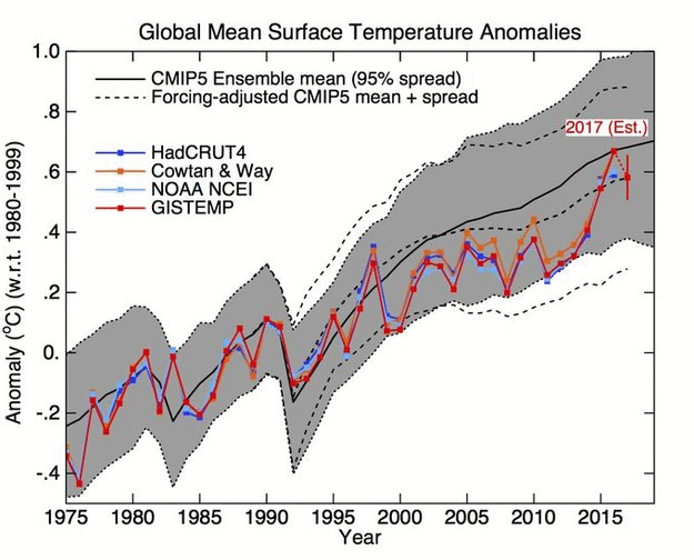
Widening the error range isn’t “progess.”
No, David Middleton. CMIP3 and CMIP5 were projects using different models. The gray shaded region in the graph spans 95% of those models’ runs.
You are correct. It is a probability distribution, not an error range.
I should have said, all he did was to lower the bottom of the 95% probability band.
CMIP-3 simply lowers the bottom of the 95% probability band relative to CMIP-5. The tops of the bands are essentially the same.
Does that really matter? Anxiety over different model runs just distracts from the real issue, does Co2 cause CAGW. You could run these models a million times and it would make no difference whatsoever because at the basic level a computer can never provide the resolution need to cope with the complexity of our climate hence parameterisation. Grid size of 400 km needs to reduce to 1mm or less to capture thunderstorms lightning and aerosols so bellyaching about modelling is just one more pointless distraction minutiae. As the IPCC said we have a coupled non linear chaotic climate and therefore predictions of future climate states are not possible. Are we able to influence a climate that can create monster hurricanes that emit the energy equivalent of 1 million Hiroshima nuclear bombs every single day of their existence no chance. Is there anyone on the planet able to identify how much Co2 we need to mitigate to exert influence over another Hurricane Irma? Not a chance. What we should do is sack every modeller on the planet and spend the money on securing infrastructure to cope with whatever we believe might be thrown at us because else wasting energy on whether one model or the other is more honest than they other is idiotic. Humanity influencing climate is moonshine we might as well advocate rain dancing.
No, David Middleton, it is not a probability distribution. It is merely the range of 95% of the model runs. Those model runs are a convenience sample of all possible model runs, and the model runs are from a convenience sample of all possible models. Convenience sampling rather than systematic (e.g., random) sampling means the samples cannot be relied on to be representative of the populations, sufficiently to formally infer probabilities in the ways you are accustomed to seeing. (By the way, climatologists are very well aware of that, and usually they carefully label their graphs accurately as Gavin has done. But rarely do they discuss it with the public because it is a difficult topic to understand without a background in statistics.)
David Middleton: You must be tired from that Gish Galloping. You made a claim that was incorrect. I provided a correction. You changed the topic.
Thank you David Wells September 22, 2017 at 6:59 am. My thoughts exactly.
David Middleton, I apologize. A different David Gish Galloped.
It is a probability distribution. 95% of the model runs fell within the gray band. The model mean (P50) is the middle of the gray band.
I was incorrect when I descibed it as an error range.
The only reason that the CMIP-3 P50 tracks the observations is because the bottom of the 95% band was expanded downward relative to CMIP-5.
This is an example of improving accuracy by reducing precision.
Agree. I don’t see anything related to standard errors, it’s simply the mean +/- 95% of the total range of model output. A question – Does variation in the input that feeds each model run cause most of variation around the mean, or is more of the variation around the mean driven by variation in the sensitivity of the models to a given set of inputs?
Tom in Indy: The CMIP projects’ model runs are supposed to use the same forcings as inputs. That is, all the CMIP3 runs use the same forcings as each other, all the CMIP5 runs use the same forcings as each other,… The CMIP site has all those forcings listed for each of the CMIP projects. For example, for CMIP6 see the section “CMIP6 Forcing Datasets” here: https://www.wcrp-climate.org/wgcm-cmip/wgcm-cmip6. But I imagine that there might be miscellaneous minor forcings that are specified differently in different models and different runs of a given model.
David Middleton: If instead or in addition you were referring to the dashed lines in the CMIP5 graph, those are the result of estimating the effects on the model runs if the forcings used by the models better matched the actual forcings. The forcing estimates used in the CMIP5 model runs were significantly less accurate than were known a few years later, so Schmidt, Shindell, and Tsigaridis in 2014 used the newer, more accurate estimates: https://t.co/0d0mcgPq0G
Which produced a broader 95% probability band.
How does a more “accurate” estimation of forcing yield a wider distribution of model ourputs?
Watch the birdie? Review the following and then maybe you guys can communicate on a more realistic level:
https://wattsupwiththat.com/2017/01/02/john-christy-climate-video/
https://wattsupwiththat.com/2015/02/20/believing-in-six-impossible-things-before-breakfast-and-climate-models/
https://wattsupwiththat.com/2016/12/29/scott-adams-dilbert-author-the-climate-science-challenge/
https://wattsupwiththat.com/2017/01/10/the-william-happer-interview/
http://www.thebestschools.org/special/karoly-happer-dialogue-global-warming/william-happer-interview/
As said but obviously with no impact whatsoever what exactly is the point of dancing on a pin head? Models are the product of belief using inadequate data and computers incapable of resolving the issue because of their inherent lack of resolution. If you run the same model on a different computer you will get a different result. If the grid size is reduced to 1mm on current technology one computer run would take 4.5 billion years.
Gavin Schmidt is behaving like the Royal Society he believes his purpose in life is to maintain the status quo and if that is not possible then at least find some way of manipulating reality to keep himself and his chums in well paid employment. Models are irrelevant. As said if the atmosphere is not sensitive to 100,000 billion tons of Co2 then what it is sensitive to?
If Co2 is not the cause of climate change then something else is and if that is the case humanity has no chance of either moderating its effects or manipulating the outcomes. Co2 is only popular as an entity because believing it is the arbiter of our climate future gives the misleading indication that we can exercise control over the climate which is what rain dancing is all about.
Set aside Co2 and what you are left with is reality which to superstitious humanity is a huge challenge.
David Middleton: Look only at the CMIP5 graph. The gray band outlined with dotted lines is the model runs range with less accurate forcings used as model inputs. The dashed lines are the estimates of the upper and lower bounds of the range (i.e., dashed lines replace the original dotted lines), and the mean line (the middle dashed line replaces the solid mean line). Both upper and lower bounds, and the mean, are shifted down. You are factually incorrect in your claim that the better forcing estimates result in a wider range.
Can you please provide justification of why an ‘ensemble mean’ has any value whatsoever?
it’s a prime example of reification IMHO.
JonA, a short explanation of the value of ensemble model means is in AR5, Chaper 9 Evaluation of Climate Models, section 9.2.2, page 754. https://www.ipcc.ch/report/ar5/wg1/. More details can be found, for example, in an entire special issue of Philosophical Transactions of the Royal Society A, 2007: http://rsta.royalsocietypublishing.org/content/365/1857
David Wells September 22, 2017 at 7:43 am
Glad to see someone else making the argument that believing CO2 changes climate, and believing humans seriously affect CO2 levels allows people to believe climate can be controlled. No body seems to really want to accept the Second Law.
I am with you, Mr. Wells. The warmists have put forth these things called ‘climate models’ and we have taken the bait. I significant percentage of the population thinks the models have skill. Skeptics don’t believe the models have skill, but argue as if they could have skill if they were done better. But neither viewpoint is correct. It isn’t even possible for the models to have skill at predicting future climate.
But they do still serve an important purpose, akin to the fire and smoke of the Wizard of Oz. They distract us from the men (and women) behind the curtain.
David,
“All he did was to expand the lower uncertainty range.”
(1) They are different models. Of course they have different uncertainty ranges. I’ll ask why they differ so much.
(2) Statistical uncertainty ranges are facts, not opinions. To say that he changed the mean is an accusation of malfeasance. What are you saying?
I am saying that the older CMIP-3 model yielded a much broader probability distribution of model outputs than the newer CMIP-5 model. And all of the broadening was on the low side. This is what moved the model mean toward the observations. I don’t know if this is due just to different forcing assumptions or a different ensemble of RCP scenarios.
CMIP-5 yielded a range of 0.4 to 1.0 C in 2016, with a P50 of about 0.7 C. CMIP-3 yielded a range of 0.2 to 1.0 C in 2016, with a P50 of about 0.6 C.
They essentially went from 0.7 +/-0.3 to 0.6 +/-04.
Progress shouldn’t consist of expanding the uncertainty… unless they are admitting that the uncertainty of the models has increased.
I have no idea about their motives… just a negative preconception regarding anything done by GISS.
Is CMIP-3 now the standard? Will it replace CMIP-5?
Editor of FMW, I will assert that statistical uncertainty can only apply to actual data. Since climate model output is not data, their “statistical uncertainty” is an imaginary construct of modelturbation.
David Middleton: You wrote that CMIP5 produced a narrower range than CMIP3. CMIP5 was produced after CMIP3. So you had it all backwards when you wrote “Progress shouldn’t consist of expanding the uncertainty… unless they are admitting that the uncertainty of the models has increased.”
David,
It is an interesting question. I don’t get the same numbers. But trying to pull numbers with such accuracy from a graph is imo a waste of time. I suggest you ask Schmidt or perhaps someone at Carbon Brief or elsewhere for the actual numbers.
David,
I asked Schmidt why the uncertainty range is smaller for CMIP5 than CMIP3. His answer –
He doesn’t know? Didn’t he run the models?
Larry,
I asked Dr. Schmidt if his models were ensembles of different RCP scenarios, or just RCP 4.5. We’ll see if I get an answer.
The model in Zeke’s article is just RCP 4.5, a strong mitigation scenario. Actual emissions most closely match RCP 6. Ed Hawkins models use a range of RCP’s in the ensemble.
If they are using a lower RCP than reality, they haven’t fixed the problem with the models running hot. They are just hiding the problem… largely because the recent Nature paper is embarrassing them.
The #1 conclusion is boost funding. That alone makes me skeptical of the entire piece.
Actually, all 6 conclusions require more government funding. Make Climate propaganda bigger and bigger. Add more and more layers of organization and over-site. Try harder and harder to solve a non-existent problem and predicate an unpredictable system.
Show me YOUR money!
That’s what’s known as a tell.