Guest essay by Monckton of Brenchley
The IPCC published its First Assessment Report a quarter of a century ago, in 1990. The Second Assessment Report came out 20 years ago, the Third 15 years ago. Even 15 years is enough to test whether the models’ predictions have proven prophetic. In 2008, NOAA’s report on the State of the Global Climate, published as a supplement to the Bulletin of the American Meteorological Society, said: “The simulations rule out (at the 95% level) zero trends for intervals of 15 yr or more, suggesting that an observed absence of warming of this duration is needed to create a discrepancy with the expected present-day warming rate.”
To the continuing embarrassment of the profiteers of doom, the least-squares linear-regression trends on Dr Roy Spencer’s UAH satellite dataset shows no global warming at all for 18 years 6 months, despite a continuing (and gently accelerating) increase in atmospheric CO2 concentration, shown on the graph as a gray trace:

Dr Carl Mears’ RSS dataset shows no global warming for 18 years 8 months:

By contrast, the mean of the three much-altered terrestrial tamperature datasets since May 1997 shows a warming equivalent to a not very exciting 1.1 C°/century:

It is now time to display the graph that will bring the global warming scare to an end (or, at least, in a rational scientific debate it would raise serious questions):

The zones colored orange and red, bounded by the two red needles, are, respectively, the low-end and high-end medium-term predictions made by the IPCC in 1990 that global temperature would rise by 1.0 [0.7, 1.5] Cº in the 36 years to 2025, equivalent to 2.78 [1.94, 4.17] Cº/century (page xxiv). The boundary between the two zones is the IPCC’s then best prediction: warming equivalent to about 2.8 C°/century by now.
The green region shows the range of measured global temperatures over the quarter-century since 1990. GISS, as usual following the alterations that were made to all three terrestrial datasets in the two years preceding the Paris climate conference, gives the highest value, at 1.71 C°/century equivalent. The UAH and RSS datasets are at the lower bound of observation, at 1.00 and 1.11 C°/century respectively.
Two remarkable facts stand out. First, the entire interval of observational measurements is below the IPCC’s least estimate in 1990, individual measurements falling between one-half and one-third of the IPCC’s then central estimate.
Secondly, the interval between the UAH and GISS measurements is very large – 0.71 C°/century equivalent. The GISS warming rate is higher by 71% than the UAH warming rate – and these are measured rates. But the central IPCC predicted rate is not far short of thrice the UAH measured rate, and the highest predicted rate is more than four times the UAH measured rate.
The absolute minimum uncertainty in the observational global-temperature measurements is thus 0.71 C°/century, the difference between the UAH and GISS measured warming rates. Strictly speaking, therefore, it is not possible to be sure that any global warming has occurred unless the warming rate is at least 0.71 C° century. On the mean of the RSS and UAH datasets, the farthest one can go back in the data and yet obtain a rate less than 0.71 C° is August 1993.

In short, the Pause may in reality be as long as 22 years 5 months – and the more the unduly politicized keepers of the terrestrial records tamper with them with the effect of boosting the rate of warming above the true rate the more they widen the observational uncertainty and hence increase the possible length of the Pause.
In 1995 the IPCC offered a prediction of the warming rates to be expected in response to various rates of increase in CO2 concentration:


The actual increase in CO2 concentration in the two decades since 1995 has been 0.5% per year. So there should have been 0.36 C° global warming since then, equivalent to 1.8o C°/century, as shown by the single red needle above.
Once again the graph comparing observation with prediction displays some remarkable features. First, the IPCC’s 1995 prediction of the warming rate to the present on the basis of what has turned out to be the actual change in CO2 concentration over the period since 1995 was below the entire interval of predictions of the warming rate in its 1990 report.
Secondly, all five of the principal global-temperature datasets show warming rates below even the IPCC’s new and very much lower predicted warming rate.
Thirdly, the spread of temperature measurements is wide: 0.38 C°/century equivalent for UAH, up to 1.51 C°/century equivalent for GISS, a staggeringly wide interval of 1.17 C°/century. The GISS warming rate over the past two decades is four times the UAH warming rate.
Fourthly, the measured warming rate has declined compared with that measured since 1990, even though CO2 concentration has continued to increase.

So to the 2001 Third Assessment Report. Here, the IPCC, at page 8 of the Summary for Policymakers, says: “For the periods 1990-2025 and 1990to 2050, the projected increses are 0.4-1.1 C° and 0.8-2.6 C° respectively.” The centennial-equivalent upper and lower bounds are shown by the two red needles in the graph above.
Once again, there are some remarkable revelations in this graph.
First, both the upper and lower bounds of the interval of predicted medium-term warming, here indicated by the two red needles, have been greatly reduced compared with their values in 1990. The upper bound is now down from 4.17 to just 3.06 C°/century equivalent.
Secondly, the spread between the least and greatest measured warming rates remains wide: from –0.11 C°/century equivalent on the RSS dataset to +1.4 C°/century equivalent on the NCEI dataset, an interval of 1.51 C°/century equivalent. Here, as with the 1990 and 1995 graphs, the two satellite datasets are at the lower bound and the terrestrial datasets at or close to the upper bound.
Which datasets are more likely to be correct, the terrestrial or the satellite datasets?
The answer, based on the first-class research conducted by Anthony Watts and his colleagues in a poster presentation for the Fall 2015 meeting of the American Geophysical Union, is that the satellite datasets are closer to the truth than the terrestrial datasets, though even the satellite datasets may be suffering from urban heat-island contamination to some degree, so that even they may be overstating the true rate of global warming. The following graph shows the position:

NOAA’s much-altered dataset (J. Karl, prop., say no more) appears to have overstated the true warming rate by some 60%. Watts et al. determined the true warming rate over the continental United States by a sensible and straightforward method: they adopted as normative a standard for the ideal siting and maintenance of temperature monitoring stations that had been independently drawn up and peer reviewed, and then they applied that standard to all the stations in the contiguous United States, excluding all stations that did not comply with the standard. The result, in blue, is that from 1979-2008 the true rate of warming over the continental U.S. was not the 3.2 C°/century equivalent found by NOAA, nor even the 2.3 C°/century equivalent found by UAH, which keeps a separate record for the 48 states of the contiguous U.S., but just 2.0 C°/century equivalent.
On this evidence, the satellites are far closer to the mark than the terrestrial datasets.
Thirdly, the measured rate of warming has again fallen, directly in opposition to the continuing (and gently accelerating) increase in atmospheric CO2 concentration and in anthropogenic forcings generally.
This inexorably widening divergence between prediction and reality is a real and unexplained challenge to the modelers and their over-excited, over-egged predictions. The warming rate should be increasing in response not only to past forcings but also to the growth in current anthropogenic forcings. Yet it has been declining since the mid-1980s, as the following interesting graph shows:

At no point has the rate of global warming reached the lower bound of the interval of global warming rates predicted by the IPCC in 1990:

Displaying the three prediction-vs.-reality graphs side by side shows just how badly off beam have been the official predictions on the basis of which governments continue to squander trillions.


The graphs show between them a failure of prediction that is nothing less than abject. The discrepancies between prediction and observation are far too great, and far too persistent, and far too contrary to the official notion of high climate sensitivity, to be explained away.
The West is purposelessly destroying its industries, its workers’ jobs, its prosperity, its countryside, and above all its scientific credibility, by continuing to allow an unholy mesalliance of politicians, profiteers, academics, environmental extremists, journalists and hard-left activists to proclaim, in defiance of the data now plainly shown for all to see for the first time, that the real rate of global warming is “worse than we thought”. It isn’t.
Great post,
May I suggest an addition to your time clocks. A green shaded area that shows rates of warming prior to the great scare commencing which would then show natural variability and that the current warming is no different to the past.
You really didn’t notice, that there is an information in the article that IPCC was predicting how fast it will warm after 1990, and there is no comparisson of that prediction with periods 1990-2015? Many other periods are presetet, but not 1990-2015 – the one it shout be shown in the first place? Guess why!
Sorry, my mistake. There is comparison of period 1990-2015.
Te fraud is somethine else here. Here are 1990 IPPC predictons:
http://www.skepticalscience.com/pics/FAR_projections.png
1.94-4.17 °C warming was predicted to occur within 1990-2090 period.
Warming predicted within 1990-2015 period was similar to that, what actually hapenned in that period.
As always, awesome job Viscount Monckton of Brenchley !!
Chritopher Monckton, you may he underestimating the errors!
I understand that CAGW theory predicts that the tropical troposphere will rise 30 percent faster then the surface, and the overall trophsphere will rise wp percent faster.
Yet it appears your UAH and RSS charts compare troposphere T to predicted surface warming, not the greater warming predicted for the troposphere. Corrections welcome, and great post!
Ah!!! fat fingers, small phone, old eyes and nasty autocorrect!
…and the overall trophsphere will rise 20 percent faster.
It seems to me that the (increasing) CO2 in the atmosphere ought to increase the LWIR radiation absorption (in the 15 micron band) “instantaneously”, within attoseconds of a new CO2 molecule taking up residence (for the next 200 years), it should already be catching LWIR photons, and within nanoseconds it should be imparting that energy to the atmospheric N2, O2, Ar molecules of the air and warming them.
So I have a hard time contemplating any time offset, between CO2 increases, and atmospheric Temperature increases.
And it seems to me that what Dr. Roy and Prof Christy are measuring is in fact the Temperature of that atmosphere (yes via a well established proxy thermometric means).
So I am dumbfounded by the complete lack of any apparent connection in MofB’s first two graphs, or the RSS and UAH data linear trend (of zero) to the clearly obvious continual annual growth of that atmospheric CO2, whatever its source is.
We can talk about water amplifications of CO2 initiated warmings till the cows come home.
But then there isn’t any CO2 warmings to be waking up the H2O at some later, yet to be determined time for them to do their amplification thing.
And since we now know, that much of the actual surface station supposed measured data is actually somebody’s wild a**** guess of what such data should be, and wasn’t measured by anybody, and a lot of it is false data from phony ocean water temperature exercises; is it any wonder, that we aren’t impressed with their protestations of emergency international calamity interdiction requirements and the money to go with it.
g
George E. Smith has the matter in a nutshell. The initial warming effect of CO2 should indeed be instantaneous, but it is not occurring. It is possible that natural factors may be overwhelming the warming signal from CO2, but even if that is the case the warming from CO2 must be very small.
The truth is LWIR in the 15 micron band is absorbed to extinction after a short traverse through the atmosphere, so any additional CO2 has no effect. That is why there has been no global warming over the last 18 to 19yrs even though the CO2 conc has been steadily increasing.
Currently in schools, children are being taught that there is no such thing as failure.
Grades used to be A = average, B= bad, C= catastrophic.
(BTW – AGW has redefined catastrophic to mean microscopic)
Now Grade A = attended (or just enrolled).
So the term “abject failure” today would probably be treated as a grammatical mistake by most teachers.
This is exactly how it was when i taught class at Miami University a couple years ago. In fact, the Department head pressed me to bump people’s grades up just the slightest bit because people complained they had a B or a B-, in the Lab classes i taught. It’s not like it was a hard lab. Only 1 person they didn’t press me on and that was because they didn’t show up to 10 (out of 16) lab sessions (1 of them being the final). Achievement has been replaced by entitlement.
Walt, serious question: Are you being somewhat sarcastic, or is this literally true regarding how school children are being taught?
I know that in games and sports, they have done away with winners and losers, but is it a fact that the grading system of evaluating each students progress and achievement level has been abandoned?
Just curious…little surprises me these days regarding our educational system.
(Or maybe I am surprised, but have come to accept being surprised as the norm.)
The Swiss canton Berne wanted to abolish grading some years ago, at the behest of the teachers. Guess who put an end to this nonsense: the pupils, who didn’t stop to nag and complain until the teachers gave up.
Object there Walt ! An abject is a speech impediment !
When I went to school, C was a passing grade, demonstrating all of the required standard knowledge of the subject. Class averages in any subject always fell right around 50% for the whole class.
But then they asked real questions, and they didn’t give you the answers to select from.
I still have ALL of my high school report cards, with actual exam marks on them. I believe I even have one in which my exam score was more than double what the average for the whole class was. I think it was 98 / 48.
Not bringing up my luck, just that 48% for the class average was not considered a problem. And we were the top class out of three classes taking the same subject material.
A 15 foot jump to clear a 16 foot chasm, is not generally regarded as a win.
g
@george e., 10:56 am, plus many, The downfall of education systems started 30-40 years ago. As parents we were heavily involved until unions decided that parent involved in their kids education was “detrimental” to our kids. We continued their education at home ( on top of the forced school system), they are fine as 35-40 year olds now thank god and can think on their own feet. It is truly a crime what the school systems in western countries has done to our children and it is no surprise that Asian kids are so far ahead of us.
But try to fight them. We had to leave one district after ( even physical against my wife!) confrontations but the crap just followed us until we just started the “home schooling “.
Lord Monkton. I took the liberty of making a small addition to your excellent piece.
Thank you for your tenacity and scientific prowess.
The Western world EU, USA, now Canada etc.. with their ubber Liberal socialist Government’s are purposelessly (Classic Obamanomics) destroying their industries, its workers’ jobs, its prosperity, its countryside, and above all its scientific credibility, by continuing to allow an unholy mesalliance of politicians, profiteers, academics, environmental extremists, journalists and hard-left activists to proclaim, in defiance of the data now plainly shown for all to see for the first time, that the real rate of global warming is “worse than we thought”. It isn’t.
.
‘report on the State of the Global Climate, published as a supplement to the Bulletin of the American Meteorological Society, said: “The simulations rule out (at the 95% level) zero trends for intervals of 15 yr or more, suggesting that an observed absence of warming of this duration is needed to create a discrepancy with the expected present-day warming rate.”
To the continuing embarrassment of the profiteers of doom, the least-squares linear-regression trends on Dr Roy Spencer’s UAH satellite dataset shows no global warming at all for 18 years 6 months, …’
The usual pea-moving. NOAA writes about trends in surface temperature, and in fact about ENSO-adjusted global mean temperature^*. So Lord M immediately reaches for his favorite satellite measures of the troposphere. Now it may be that I similar statement could be made about the troposphere (after ENSO adjustment). Or it may not. NOAA didn’t make it.
But the key thing (apart from ENSO) there is the 95% level. That says that if you look at just one instance from the population, and find it out of range, that is something that would happen only one time in 20, so you can say that it is likely something unusual is going on. But if you look here and there, hither and yon, then of course you will find occurrences. One in twenty events do happen. And if you extend your range to different regions, they will be found even more often.
* NOAA said “the simulations rule out…” What simulations (my bold)?
“The 10 model simulations (a total of 700 years of simulation) possess 17 nonoverlapping decades with trends in ENSO-adjusted global mean temperature within the uncertainty range of the observed 1999–2008 trend (−0.05° to 0.05°C decade–1). “
I am having difficulty discerning your point, Mr. Stokes.
I think Mr Stokes should be more worried about his own body temp ( and his BP) every time he sees one of Moncton of Brenchley’s posts.
I think Mr nick should be worried more about his own body temp ( and his BP) it seems to go to dangerous high levels every time Moncton posts.
Mr Stokes digs himself further into the mire every time he comments here. The official theory is that global warming, particularly when caused by wicked, naughty fossil fuels, should cause more warming in the troposphere than at the surface (see Santer, 2003, cited by IPCC, 2007). So, if the lower troposphere shows no warming for more than 15 years, a discrepancy has arisen: for the implication, confirmed by Anthony Watts’ excellent research, is that the surface-temperature datasets ought to be showing a lot less warming over recent decades than they do.
Mr Stokes’ second point is as half-baked and ill-thought-through as the first. He makes much of model simulations that “possess 17 non-overlapping decades with trends in ENSO-adjusted global mean temeprature” that show a zero or near-zero trend. Well, of course they do, for very nearly all of the 17 decades precede any anthropogenic influence. What is remarkable about the present stasis (RSS, UAH) or near-stasis (the rest) in global temperatures is that it is occurring notwithstanding rising anthropogenic forcings, including CO2 concentrations.
Mr Stokes should stop wasting his time contriving ever more elaborate attempts to explain away what is made manifest in the graphs in the head posting: the IPCC’s models have consistently and considerably exaggerated their predictions of warming rates, and the trends in observed temperature are very substantially below what was predicted i n each of the first three Assessment Reports. Best to admit that fact than to produce tortuous, ill-considered attempts at diverting attention away from it.
“models have consistently and considerably exaggerated their predictions of warming rates”
====
That’s because the models have been fed temperature records that have consistently and considerably exaggerated the rate of warming….by cooling the past…and warming the future
….the models are only doing what they have been told
I would like to see model runs on raw unadjusted un-algorithumed unfaked original temperature records…
..I would be willing to bet the models are not doing such a bad job
But we will never know….and the models will never be right
[Comment deleted. “Jankowski” has been stolen by the identity thief pest. All Jankowski comments saved and deleted from public view. You wasted your time, sockpuppet. -mod]
I find myself wondering yet again if Nick Stokes is any relation to Sir George Gabriel Stokes?
Seems like and apples-oranges issue here. You compare measured (and adjusted) surface temperature trends obtained from surface thermometers with surface temperature trends as predicted by models and lower troposphere trends as measured by satellites. You note that climate models predict greater temperature increases in the lower troposphere than at the surface. So a better comparison would seem to be between the modeled troposphere and the satellite (and balloon) measured troposphere. From my meager understanding of these matters, it seems that such a comparison might show an even greater discrepancy.
But if you look here and there, hither and yon, then of course you will find occurrences. One in twenty events do happen.
====================
You fail to account for the fact that no one had to looked hither and yon. The Pause happened on the very first occurrence. No sooner was the paint dry on the climate models than they started to diverge from reality and run hot.
What are the odds that 100 climate models will ALL run hot simply by chance? The same odds that if you toss a coin 100 times it will land heads every time. The odds are 1/2 to the power of 100. As close to zero as you can get.
“The Pause happened on the very first occurrence.”
Not of the dataset that they were talking about. Another had to be searched for. And then there is a whole range of years that can be scrutinised.
But the omission of mention of the ENSO adjustment that really does it. It’s well known that every couple of decades a big ENSO comes along and makes a huge spike in the temperature, especially in the troposphere. And for many years later, if you take a trend from that date, you’ll get a negative trend. Thgis arithmetic consequence is not what they are interested in. So they specifically removed the ENSO effect, to see if a truly significant effcet might be found in the remainder. That is where their 15 year figure comes from.
At the present time, your own figures show the following:
So RSS shows no statistically significant warming for 22 years and 8 months.
So UAH6.0beta4 shows no statistically significant warming for 22 years and 11 months.
So if I understand things correctly, the real question seems to be whether or not these times will go under 15 years in 8 months from now. Is that correct? (The reason I say 8 months is that by August 2016, this present super El Nino will presumably be back to normal so the 1998 and 2016 El Ninos will cancel out.)
“So RSS shows no statistically significant warming for 22 years and 8 months.”
Yes. But the trend actually observed was 0.772°C/Century. Lower than expected, but not zero. Saying that it isn’t statistically different from zero is just saying that in a whole lot of other Earths, with the same climatic conditions, 2.5% could have trend less than 0 (and 2.5% would have trend >1.574). That isn’t saying much.
So no, the 15 yrs and 22+ yr figures are quite different. When NOAA says that 15 year runs happened only 5% of the time, they are referring to actual occurrences (in their model).
An El Nino rise to balance 1998 would probably bring the trend to something more than 0.772, and that probably would be significantly different from zero. That shows a weakness in the calc of stat sig here. It would say that there was less than 2.5% chance of the trend since 1997 being negative, and yet a few months ago it was negative. What caused the change was ENSO, and there is likely better than a 2.5% chance of the El Nino happening. The random model on which the stat sig is based just doesn’t include that.
That is why the NOAA quote that this post leads with was based on trends with the ENSO effects removed. With ENSO, pauses are common, for reasons that don’t have much to do with the climate issues they are interested in. So they remove them. Then, and only then, it is true that there is less than a 5% chance of observing a 15 yr pause (in surface temp).
” It’s well known that every couple of decades a big ENSO comes along and makes a huge spike in the temperature, especially in the troposphere. And for many years later, if you take a trend from that date, you’ll get a negative trend.”
I would council patience, Nick.
It appears they are doing their darnedest to airbrush these dips out of the surface records.
Hard to claim “warmest year ever” year after year if some big fat el nino way back in 1998 keeps standing head and shoulders above the crowd.
But give them time, they’ll work it out.
Thank you! Do you have a program that removes ENSO effects, or is such a program even possible to create?
Mr Stokes again makes several bad points. He insists that NOAA’s removal of ENSO effects is important, but does not appear to understand that ENSO is a synoptic phenomenon – a cycle – and that its duration is typically only 3-4 years. Over 15 years it is broadly self-canceling. The El Niño spike of 1998, for instance, is near-perfectly offset by the spike of 2010. Remove both and the trend is near identical to what it was before the removal.
He then fails to grasp that the minimum observational uncertainty in a record covered by several datasets is the difference between the least and greatest trends over the period of interest. Mr Brozek had pointed out, correctly, that the usual computational significance tests broadly concur with the observational uncertainty demonstrated in the head posting.
Next, Mr Stokes demonstrates a poor understanding of what observational uncertainty is. He says that the RSS warming over 22 years is about 0.8 K/century equivalent. Noting in passing that that is not exactly a life-threatening warming rate, one should appreciate that the observational uncertainty derived from the difference between the RSS and GISS warming rates means that the True warming rate may be as far below the RSS rate as the GISS rate is above it.
Nex, he complains that UAH made corrections to its dataset. So it did -but it did so for genuine reasons well explained. Contrast this with the recent tampering so with the sea-surface temperature dataset on which the terrestrial datasets crucially depend. The indefensible decision was taken to adjust the ARGO bathythermograph temperatures massively upward to bring these inconvenient data into line with the earlier and far less reliable ship-bucket data.
As the head posting shows, on all datasets the observed warming rate is well below IPCC’s 1990 and 1995 predictions, and the 2001 least prediction only narrowly manages to overlap with some of the much-exaggerated terrestrial datasets, and only then because the I tire prediction interval has been so drastically reduced compared with the extremist IPCC predictions of 1990 that got the climate scam going,
Werner,
These are GCM results, so they have considerable ability to remove ENSO effects based on the mechanics.
But Foster and Rahmstorf (2011) did remove ENSO (and volcano and solar) effects from both surface and satellite indices. They used regression against MEI. The results is here. No pause to be seen:
http://www.moyhu.org.s3.amazonaws.com/2016/1/F%26R.png
Mr. Stokes, do you agree with this statement or not?
“The simulations rule out (at the 95% level) zero trends for intervals of 15 yr or more, suggesting that an observed absence of warming of this duration is needed to create a discrepancy with the expected present-day warming rate.”
Because it sounds like they are saying 15 years indicates a discrepancy. You seem content to do a bunch of hand waving, But even if you’re right and there is not, in the end, a discrepancy, the fact remains that the benchmark for investigating the validity of the models has been met.
The use of one data set versus another isn’t moving the pea. Rather, it’s a look at untortured data vs. tortured data. Everyone will use the data set which enforces the point they want to make.
“Rather, it’s a look at untortured data vs. tortured data. E”
Here is Roy Spencer’s account of the changes made in going to V6. Examples:
“That is no longer possible, and an explicit correction for diurnal drift is now necessary. The correction for diurnal drift is difficult to do well, and we have been committed to it being empirically–based, partly to provide an alternative to the RSS satellite dataset which uses a climate model for the diurnal drift adjustment.”
“The LT retrieval must be done in a harmonious way with the diurnal drift adjustment, necessitating a new way of sampling and averaging the satellite data. To meet that need, we have developed a new method for computing monthly gridpoint averages from the satellite data which involves computing averages of all view angles separately as a pre-processing step. Then, quadratic functions are statistically fit to these averages as a function of Earth-incidence angle, and all further processing is based upon the functional fits rather than the raw angle-dependent averages.”
Only raw data there.
Michael Jankowski,
All excellent points. It takes an ulterior motive to use Phil Jones’ Hadcru, or any ground-only stations.
To say nothing of adjusting state of the art ARGO buoy data to match wooden buckets and ship intake systems.
Hello Nick, thank you for your copy and paste of DrSpencer’s methodology. What is that, the bazzillionth time now?
Do, be a dove, please show us all of the changes, times and dates of and the actual adjustments to, the land based temp set….
…and Nick, please tell us which independent accurate and precise instrument data set the land based thermometers data are verified with?
(Nick knows the satellites are checked with the most accurate instuments we have on weather ballons)
Nick…..two last requests from the above comment…..One, the rational for each of the changes to the land based temp set. And two, what changes have not been made to the land based temp record that “should” be made…..ie-urban heat island.
Ohhhhhhh ooooooppppppsssssss……my request is “overly broad” and it would require too many hours of your time?!?……as well as tooooooooooo much space for a simple copy and paste….WOW
[Comment deleted. “Jankowski” has been stolen by the identity thief pest. All Jankowski comments saved and deleted from public view. You wasted your time, sockpuppet. -mod]
Phil Jones, July 5, 2005:
“The scientific community would come down on me in no uncertain terms if I said the world had cooled from 1998. Okay it has but it is only seven years of data and it isn’t statistically significant.”
I tried to prove his statement true with Hadcrut3 from 1998 to July 2005, but the slope was positive! Was Hadcrut3 adjusted since his statement was made? See:
http://www.woodfortrees.org/plot/hadcrut3gl/from:1998/to:2005.6/plot/hadcrut3gl/from:1998/to:2005.6/trend
Nick,
As far as I’m concerned, all this talk about model output is just wasted time. As you are a proponent of leaving the climate science to the experts, I’m sure you would agree that writing software should be left to the software engineer (just as building bridges should be left to the equivalent experts). However the models (and much of the temperature record keeping/averaging) are just large pieces of software. Software which was written by people, which though they may be experts in their fields, have little or no training in software engineering. As a professional software engineer I can assure you that writing such complicated software without following industry design and testing standards will result in unreliable code which is riddled with bugs. Nobody should trust the output of any software that has not been verified and validated. None of the models, to my knowledge, have been through that process. Using such software (unvalidated and unverified) is like using uncalibrated instruments in an experiment: worthless.
” I’m sure you would agree that writing software should be left to the software engineer”
No, I don’t. You might as well say that writing blog comments should be left to English majors. I was writing programs before the term SE was invented. They worked then and they work now.
I wrote a program for producing a monthly global average surface temperature. The code is set out and described in a series terminating here. It was not written “following industry design and testing standards”, and I’m sure you could find much to criticise. But it works. Every month on about the eighth, I post the results. I have done that for about four years. The latest for December (and 2015) is here. About a week later, when the GISS results come out, I post a comparison. They are very close – a recent review is here. I think that indicates that both my program and GISS/NOAA are doing something right.
But you can possibly do better. I’m all ears.
Nick says:
I think that indicates that both my program and GISS/NOAA are doing something right.
Yes, I agree. I also agree that the pre-Copernicus scientists of their day were doing something right, when they created programs to predict the retrograde movement of planets with epicycles. They were quite accurate.
Then Kepler came along and blew that nonsense out of the water.
You’re doing something similar. You are taking natural events and assigning an anthropogenic cause. But you still can’t answer a few critical observations:
There is nothing happening that exceeds past temperature parameters, from when there were no industrial CO2 emissions. What is observed now is not unusual, or unprecedented. It has happened repeatedly, and to a much greater degree in the past.
And you always avoid Occam’s Razor, which says that the simplest explanation is most likely the correct one: we are observing natural variability in global temperatures, because CO2 at current levels just does not have the effect you claim. In fact, the rise in CO2 has been a net benefit.
You would see that if the scales ever fell from your eyes. You’re desperately searching for solid evidence that there is something happening that can only be explained by human emissions. But you can’t find anything, so you argue around it, trying to build a circumstantial case. That’s for the courtroom, Nick, not for scientists. In science, skepticism is essential. But you’re no skeptic.
You’re a smart guy, Nick, so you must be aware of these things. So somehow you’re getting compensated, either with money, or with pats on the head from people you want to impress, for promoting their alarmist views. You have no skepticism of the ‘dangerous AGW’ conjecture. Without skepticism, you’re just studying epicycles.
[Comment deleted. Identity thief post. ~mod.]
Hi Michael Palmer,
If you have the patience, I’ll answer your question as a skeptic of the “dangerous AGW” (DAGW) conjecture sees it.
First, WUWT isn’t a peer reviewed publication. It’s a site where all different views are expressed. In fact, it’s been the Internet’s “Best Science” site for the past three years. If you conflate this site with peer reviewed papers, I suggest you read Montford’s The Hockey Stick Illusion, and some of the Climategate email sites. You will see that they are not credible because climate peer review, and the associated journal system has been thoroughly corrupted. There isn’t any doubt about that.
On this site you will find plenty of comments that argue for the DAGW conjecture. Some folks, like Brandon Gates, Nick Stokes, and Joel Shore try make rational arguments, which are all based on their belief that “dangerous” AGW is happening, or that it will happen if CO2 keeps rising. But they’re wasting a lot of time arguing over a very minuscule effect that is too small to even measure. I have yet to see any of those folks arguing that AGW is too small to worry about. Therefore, their arguments conclude that there is something to worry about. Thus: “dangerous”.
Others, however, make no bones about their belief that human CO2 emissions are causing dangerous global warming. They are convinced that a climate catastrophe is occurring, or that it soon will. I won’t name any more names because others seem wacky. But the ones above are people I respect, because even though they’ve been completely wrong so far about DAGW, they try to make a good case. I make the counter-case: show us any global damage, or harm, caused by human CO2 emissions.
So even though DAGW is clearly a conjecture (and AGW isn’t far behind), those writing the papers for journals are being as careful as Nick, Joel, and Brandon. They’re too smart to say what they really believe (except maybe Gates). But all their arguments go in the direction of DAGW, and they never admit that AGW is something we very likely don’t have to worry about. (If new evidence appears that shows a cause for concern, I’ll accept it. It’s the knowledge that matters most to skeptics, not the bragging rights.)
The literature is no different from the three folks I mentioned here. Most of the scientists who pass the journal gate-keepers are in it for various reasons, money and status not being the least of them. They’ve staked out their position, and they won’t back down. They’re certainly not the skeptics that Profs. Feynman, Langmuir, and Popper wrote about. They have an agenda, and it’s not to gain more knowledge or to accept the current un-scary observations.
On the other hand, skeptics really have no position other than: “Show us! Post convincing evidence that the rise in CO2 is something we should worry about. Convince us that our national priorities need to be re-ordered because of the ‘carbon’ scare.”
But so far, I haven’t seen any convincing evidence. If they can’t quantify the fraction of AGW out of global warming from all sources like the natural recovery from the LIA, and from volcanic eruptions, el Ninos, and other causes, then AGW remains an unproven conjecture. They are asserting that AGW is a problem. But their evidence is lacking.
Data, Michael. That’s what is missing. Measurements are data — but there are no measurements quantifying AGW. That means AGW must be too small to measure. If they can measure subatomic forces to twelve decimal places, why can’t they measure the fraction of global warming being caused by human CO2 emissions? (I’ve repeatedly explained exactly why not, but they never respond with a good answer.)
They also post links of “adjusted” data (which isn’t really data at all unless every step of the process, from the raw data through all adjustments is thoroughly documented). It’s interesting that the final product shown to the public almost always shows more scary warming; almost never cooling. The warming is always ascribed to human emissions. And of course, the maps are colored in scary reds. That isn’t an accident. Red implies danger.
But CO2 has risen from only about 3 parts in 10,000, to 4 parts in 10,000 over the past century. That’s just one part in 10,000. And it’s been up to almost 20X higher in the past without causing a climate catastrophe. But they never use the ‘parts per ten thousand’ metric. Its always something like, “CO2 has gone up by X %!!” Can you see the agenda?
So when you try to frame the debate in terms limited to what’s in the climate peer reviewed literature, what you’re leaving out is the fact that climate alarmism is based on DAGW, not on AGW. I’m sure you’ve seen the graphs of the number of papers containing scare words like ‘man-made global warming’. Now that number is accelerating. Can’t you see the grant trolling? Without something to scare the public, the money spigot will be turned way down. So just because they don’t overstep and write “dangerous” AGW, certainly anyone who follows the debate knows that’s exactly what they’re peddling.
Now let me turn the argument around, and ask you: how many papers conclude that AGW is a non-problem? You say you’ve read much of the literature. Give me a reasonable ratio of the number of papers that you think conclude that AGW is something to worry about, versus the number that says it isn’t.
Better yet, get the three folks I mentioned above to state unequivocally that based on all available evidence, there is no global harm or damage being caused by the rise in CO2, and there is plenty of evidence showing its benefits; what people worried about has turned out to be a false alarm, and unless something changes those facts we should not spend any more public money to fix what has turned out to be a non-problem. Other areas of science are being starved of funding that has gone instead into ‘studying climate change’. Let’s get our priorities back to normal.
Good luck. If you can do that, maybe we can tackle the corrupted climate journal/peer review system, which is still being controlled by the same self-serving charlatans.
[Comment deleted. Identity thief post. ~mod.]
…in effect the word “dangerous” is not part of the science.
Neither is the climate peer review/journal system. It’s self-serving propaganda, and just because a clique has gotten together and put their ‘Appeal to Authority’ stamp on it, that doesn’t mean it’s science. Montford shows that in spades.
You’re not replying to the many points I made. Since ‘silence is concurrence’, we can drop the discussion now.
[Comment deleted. Identity thief post. ~mod.]
Michael Palmer,

I spent some time patiently explaining for you exactly where the “dangerous” narrative comes from, and who promotes it, and why it’s false. You’re right, you don’t have to respond. But I think the reason is because you cannot refute my explanation. If I’m wrong, explain where I’m wrong.
Next, ‘skepticgonewild’ says:
The NOAA fully expected the warming to resume in the next few years since the time interval would then exceed 15 years.
That’s the same error that Dr. Phil Jones made. Jones stated that 15 years would be needed to statistically confirm that global warming has stopped. Count the years:
http://realclimatescience.com/wp-content/uploads/2015/06/ScreenHunter_9549-Jun.-17-21.12.gif
Here are fivew WoodForTrees databases showing the same thing. Global warming stopped a lot longer than 15 years ago.
Since global temperatures refuse to do what the alarmist crowd predicted, the UN/IPCC doubles down every time, while raising their ‘confidence’ levels:
http://www.energyadvocate.com/gc1.jpg
Even B.E.S.T. admits that global warming has stopped.
And the left-leaning Washington Post agrees:
The only response the climate alarmist clique has is to repeat their narrative, that we are facing “dangerous man-made global warming”. They completely disregard the facts, and hope the public listens to their alarmism, rather than independently verifying it.
NOAA is part of that deception:
They would not have to fake the temperature record if there was actually dangerous warming occurring. Since there isn’t, they fabricate it.
Never listen to just their words. Always watch their actions.
[Comment deleted. Identity thief post. ~mod.]
[Comment deleted. Identity thief post. ~mod.]
Michael Palmer,
Your arguments are becoming increasinly lame and nasty, telling me I know nothing about science.
Well, I know more than you do, because I know the difference between a hypothesis and a conjecture. And I know when someone tucks tail and skedadles, rather than answering questions or replying to points I’ve made.
You jumped into this and asked me a question. Fair enough; I took some time to politely answer you. But you didn’t like what I wrote. I’ve pointed out that you are unable to refute it. Your response:
I don’t have to refute anything you’ve said.
My reply: That’s just a smoke screen. You are simply incapable of refuting my points. If you could have, you would have. Instead, you lower yourself to schoolyard taunts:
You flunk science 101. …you have shown that you don’t have any conception of what “science” is.
Ah, but I do. That has you flustered. So you try to wing it:
Science does not concern itself with the values of a given phenomena.
Wrong-o, pal. Science is absolutely concerned with that. It’s called “data”, and it comes from measurements — which you lack.
More tap-dancing:
Science does not and cannot say if AGW is “beneficial,” nor can it say if AGW is “dangerous.” Unfortunately, when you say “dangerous” AGW, you have left the study of science.
Wrong again. First off, you don’t read very well. I wrote to you that ‘the rise in CO2’ has been a net benefit. And your whole thought process is out to lunch: science constantly assigns values to outcomes. That is exactly what scientists do all the time: Are antibiotics good? Is syphilis bad? And so on. Since you mentioned it, I think AGW has also been a net benefit. Where’s the downside? Show us any global harm, or damage caused by AGW. Or by CO2. Be specific.
While you’re at it, have you read all of the climate peer reviewed literature? You seem to think so, because you stated that “dangerous” does not appear anywhere. You wrote that “none of your points address where the “dangerous” comes from.” But I spent some time explaining in detail to you exactly where that narrative comes from, and why. Like I said, you just don’t like the answers, but you’re incapable of refuting them. You don’t come across as being able to make a coherent argument, Michael. For your sake, I hope you’ve got tenure. From your responses it’s clear that you wouldn’t rise very far in the private sector.
See, you’re confused about everything. I have you so spun up now that you’re posting multiple consecutive comments. I always like that, it shows you’ve got nothin’, so you continue to post random new thoughts as they occur. That amuses me. But I’d prefer that you reply to my specific points. I hate to see a guy floundering around like that (and yes, I know it’s ‘foundering’. Both apply).
When you make the statement “science constantly assigns values to outcomes.” you are playing with words. Science does not assign “good” nor “bad” to outcomes. Science is value neutral. Good and bad belong to the study of ethics, a branch of philosophy. So when you label AGW “dangerous” you have left the study of science. Is CO2 beneficial? That depends on the meaning of “beneficial” which of course, science cannot answer.
Mr Palmer, assessing if a phenomenon is dangerous or not DO belongs to science. Many science paper explicitly do that. With or without using the word “dangerous” itself.
So, if indeed no scientific paper says that climate change is “dangerous”, well, let’s don’t make fuss nor spend money nor write no rules about it. We already have so many dangerous things to cope with.
Correctomundo, paqyfelyc. Palmer is clueless.
Once in a while we run into someone who paints himself into a corner with illogical nonsense, like Palmer is doing here. The .edu factories collect numbskulls who couldn’t make it in the real world.
So he’s a good example.
Science is used to solve problems. Problems are subdivided into good and bad outcomes. As it turns out, AGW and CO2 are good, confounding the worrywarts. Some of them pointlessly nitpick, instead of manning up and admitting they called it wrong.
Human nature is amusing when you understand it.
[Comment deleted. Identity thief post. ~mod.]
OK this has deteriorated into a childish food fight, ALL OF YOU – STOP.
Otherwise I’m closing the thread.
“ Near-zero and even negative trends are common for intervals of a decade or less in the simulations, due to the model’s internal climate variability. The simulations rule out (at the 95% level) zero trends for intervals of 15 yr or more, suggesting that an observed absence of warming of this duration is needed to create a discrepancy with the expected present-day warming rate.”
What Nick fails to realize is the context of the above quote. The title of the section where the above quote appears:
“Do global temperature trends over the last decade falsify climate predictions?”
The NOAA answered their question. No. Global temperature trends over the last decade do not falsify climate predictions. Why? Because near-zero and even negative trends are common for intervals of a decade or less in the simulations, due to the model’s internal climate variability.
What time interval would then create a discrepancy? Answer: 15 years or more, “The simulations rule out (at the 95% level) zero trends for intervals of 15 yr or more, suggesting that an observed absence of warming of this duration is needed to create a discrepancy with the expected present-day warming rate.”
The NOAA concluded by stating:
“Given the likelihood that internal variability contributed to the slowing of global temperature rise in the last decade, we expect that warming will resume in the next few years, consistent with predictions from near-term climate forecasts.”
The NOAA fully expected the warming to resume in the next few years since the time interval would then exceed 15 years.
Good post. It would be great if Nick would respond.
“It would be great if Nick would respond.”
I’ll try. But it’s difficult now. For the last year, all my comments have gone through moderation. But now they seem to be going to the spam bin (the last four). Maybe they will be fished out.
“The NOAA fully expected the warming to resume in the next few years since the time interval would then exceed 15 years.”
Again, the NOAA was explicitly writing about ENSO-adjusted trends, of surface temperature. The box begins:
“Observations indicate that global temperature rise has slowed in the last decade (Fig. 2.8a). The least squares trend for January 1999 to December 2008 calculated from the HadCRUT3 dataset (Brohan et al. 2006) is +0.07±0.07°C decade —much less than the 0.18°C decade recorded between 1979 and 2005 and the 0.2°C decade expected in the next decade (IPCC; Solomon et al. 2007).”
They then say
“The trend after removing ENSO (the “ENSO-adjusted” trend) is 0.00°±0.05°C decade, implying much greater disagreement with anticipated global temperature rise. “
That’s the context. It was actually the ENSO-adjusted zero (surface) trend that was bothering them. The ordinary trend was positive. That’s why it is so improper to ignore that caveat. It’s essential to their argument.
Nick St0kes:
You say
NO!
Every climate model runs hot and every climate model always has run hot.
This is not news: I first published on it in peer reviewed literature in 1999.
None of the models – not one of them – could match the change in mean global temperature over the past century if it did not utilise a unique value of assumed cooling from aerosols. So, inputting actual values of the cooling effect (such as the determination by Penner et al.
http://www.pnas.org/content/early/2011/07/25/1018526108.full.pdf?with-ds=yes )
would make every climate model provide a mismatch of the global warming it hindcasts and the observed global warming for the twentieth century.
This mismatch would occur because all the global climate models and energy balance models are known to provide indications which are based on
1.
the assumed degree of forcings resulting from human activity that produce warming
and
2.
the assumed degree of anthropogenic aerosol cooling input to each model as a ‘fiddle factor’ to obtain agreement between past average global temperature and the model’s indications of average global temperature.
Nearly two decades ago I published a peer-reviewed paper that showed the UK’s Hadley Centre general circulation model (GCM) could not model climate and only obtained agreement between past average global temperature and the model’s indications of average global temperature by forcing the agreement with an input of assumed anthropogenic aerosol cooling.
The input of assumed anthropogenic aerosol cooling is needed because the model ‘ran hot’; i.e. it showed an amount and a rate of global warming which were greater than observed over the twentieth century. This failure of the model was compensated by the input of assumed anthropogenic aerosol cooling.
And my paper demonstrated that the assumption of aerosol effects being responsible for the model’s failure was incorrect.
(ref. Courtney RS An assessment of validation experiments conducted on computer models of global climate using the general circulation model of the UK’s Hadley Centre Energy & Environment, Volume 10, Number 5, pp. 491-502, September 1999).
More recently, in 2007, Kiehle published a paper that assessed 9 GCMs and two energy balance models.
(ref. Kiehl JT,Twentieth century climate model response and climate sensitivity. GRL vol.. 34, L22710, doi:10.1029/2007GL031383, 2007).
Kiehl found the same as my paper except that each model he assessed used a different aerosol ‘fix’ from every other model. This is because they all ‘run hot’ but they each ‘run hot’ to a different degree.
He says in his paper:
And, importantly, Kiehl’s paper says:
And the “magnitude of applied anthropogenic total forcing” is fixed in each model by the input value of aerosol forcing.
Kiehl’s Figure 2 can be seen here.
Please note that the Figure is for 9 GCMs and 2 energy balance models, and its title is:
It shows that
(a) each model uses a different value for “Total anthropogenic forcing” that is in the range 0.80 W/m^2 to 2.02 W/m^2
but
(b) each model is forced to agree with the rate of past warming by using a different value for “Aerosol forcing” that is in the range -1.42 W/m^2 to -0.60 W/m^2.
In other words the models use values of “Total anthropogenic forcing” that differ by a factor of more than 2.5 and they are ‘adjusted’ by using values of assumed “Aerosol forcing” that differ by a factor of 2.4.
So, each climate model emulates a different climate system. Hence, at most only one of them emulates the climate system of the real Earth because there is only one Earth. And the fact that they each ‘run hot’ unless fiddled by use of a completely arbitrary ‘aerosol cooling’ strongly suggests that none of them emulates the climate system of the real Earth.
Richard
“NO!
Every climate model runs hot and every climate model always has run hot.”
That makes no sense as a rebuttal here. Lord M has invoked a statement from NOAA about a fifteen year pause to say that there is something wrong with AGW, which he says now lies outside 95% limits. That 15-year pause statistic was calculated using models (with ENSO correction). It is Lord M who is invoking model results, not I. I am just pointing out that the NOAA calc, right or wrong, was not calculated for the circumstances to which he wishes to apply it.
Nick Stokes:
You provide a plain daft excuse for my having shown you to be plain wrong.
You wrote
That was a clear assertion that the ‘pause’ was a statistical “one time in 20” probability so no big deal. It may have been your misinterpretation of what NOAA wrote in 2008, but so what?
I replied that your assertion was plain wrong when I wrote with explanation
“Every” is very different from “one time in 20”.
But you have replied
Twaddle!
At very best, your response is sophistry. You said the ‘pause’ was a “one time in 20” probability according to model performance.
You were wrong about model performance and I explained that you were wrong.
“Every” is very different from “one time in 20”.
Richard
“That was a clear assertion that the ‘pause’ was a statistical “one time in 20” probability so no big deal.”
It’s not my assertion. Lord M says, quoting NOAA, that a 15 year pause would rule out a zero trend at the 95% confidence level (not mentioning their proviso of ENSO removal). I’m just explaining what that means – a 5% chance that it could happen in any one observation, and more if you look in repeated places. That is just standard statistical test stuff, and has nothing to do with whether models run hot or cold.
NS:
Have it your way.
You now claim to be making a purely semantic argument about the specific words Monckton of Brenchley quoted.
Monckton of Brenchley was addressing the fact that model predictions are for warming that are too high (i.e. the models ‘run hot’): he cited the 2008 NOAA statement as example that the models say pauses like the present one are improbable because the models ‘run hot’.
You arm waved about “improbable” not being “impossible”. That was puerile.
I pointed out that your arm-waving is not relevant because as I explained
But if you want to think you have ‘won’ your argument then do because your semantic point does not alter the fact that Monckton of Brenchley was addressing the reality of model predictions being for warming that are too high (i.e. the models ‘run hot’).
Richard
Nick, just wondering in which branch of science people stick to a model+ theory having a 1 out of 20 success record…
“listen, it’s true that our theory predict that rats would survive the experiment, and that 19 out of 20 died. But statistically this can happen, you know, so let’s keep our theory for now”
O_o
Post-modern science, I guess.
Maybe I am getting old…
richardscourtney January 14, 2016 at 2:02 am
As always, another exquisitely lucid and salient contribution.
Thank you for taking the time, Sir.
Mods:
I posted a response to the above post but it has vanished. Please see if it is in the ‘bin’ and recover it or if it is not there then let me know so I can resubmit it. Thanking you in anticipation
Richard
Until yesterday, mentioning my name would put your comment into moderation. Now it seems to send it to the spam bin. That’s where my comments have been going.
[Reply: it’s the same folder. Your comments are always approved. Lots of comments are delayed for one reason or another, some by Anthony and some by WordPress. Moderators don’t have that editing authority. ~mod.]
Nick:
So you think you know how to identify a trend in a time series?
Want to make a quick $100,000?
Doug Keenan has generated 1000 global-temperature type time series. Some were generated using a trend; some were not.
He has already published an encrypted file of how the series were generated, so he has no way to change things after the fact.. If you can get 900 out of a 1000 right you will win the $100,000 prize.
GISTEMP’s confidence intervals are worthless, except to show us that their alterations to the thermometer-based temperature record are unjustified.
“GISTEMP’s Overconfidence Intervals”
http://bit.ly/1RnNu9X
http://bit.ly/1JMCUa7
great graphics
Very nice comparison, thank you very much.
Your statement ‘In short, the Pause may in reality be as long as 22 years 5 months’ led me to this thought:
Around another 22 years before, in the seventies, was the ‘Cooling Hype’.
Cooling, I fear much more than warming, but more and more I think that hypes I fear most.
Regards, Lorenz
Great presentation! Shameful that the MSM simply ignores information like this.
Another excellent contribution. Thanks for posting.
Also, just found this. It was inevitable:
http://newsdaily.com/2016/01/global-warming-could-stave-off-next-ice-age-for-100000-years/
I had hoped I was the only one who had come across that brilliant essay spin (called a ‘study’) including his eminence, Hans Joachim Schellnhuber, the original 2 degree dart thrower, but alas you are perhaps more of a news junkie than I am. How to spin warming good into bad and now we have ‘natural’ carbon dioxide plus, by inference, ‘unnatural’ man-produced carbon dioxide? Clearly humanity is a virus that only an elite few should survive. Where can one buy some pompous to become one of the guys (survivors)? No thanks.
” Clearly humanity is a virus that only an elite few should survive. “….Bubba, that is EXACTLY what the liberal elite believe !!
marcus,
From the wiki~
“Liberalism is a political philosophy or worldview founded on ideas of liberty and equality.[1] The former principle is stressed in classical liberalism while the latter is more evident in social liberalism.[2] Liberals espouse a wide array of views depending on their understanding of these principles, but generally they support ideas and programs such as freedom of speech, freedom of the press, freedom of religion, free markets, civil rights, democratic societies, secular governments, and international cooperation.[3][4][5][6][7][8][9]
Liberalism first became a distinct political movement during the Age of Enlightenment, when it became popular among philosophers and economists in the Western world. Liberalism rejected the notions, common at the time, of hereditary privilege, state religion, absolute monarchy, and the Divine Right of Kings. The 17th-century philosopher John Locke is often credited with founding liberalism as a distinct philosophical tradition. Locke argued that each man has a natural right to life, liberty and property,[10] while adding that governments must not violate these rights based on the social contract. Liberals opposed traditional conservatism and sought to replace absolutism in government with representative democracy and the rule of law.”
That corresponds pretty well with what I’ve learned . . and I’m wondering why you keep using the term liberal in such an inverted way . . Is it just ’cause the TV talking heads do?
JohnKnight…..you mean to tell us that liberals in the USA want liberty and equality?!?
Have you been awake and coherent for any of the past decades?
By the by, “liberalism” does not equal “a liberal”. Much in the same sense that “Communism” (please do show us the wiki link that extolls the beauty and wonderment of a true Communist society where everyone gets the same of everything….koooooommmmbayahhhhhhhhhh!!!!!) does not equal “a Comminist”. You see, in Communist USSR, there were wait lines for toilet paper for the masses but what of the Politbureau???
Trot out your fancies, they dont meet reality.
The meaning of ‘liberal’ has indeed been inverted from the original definition.
Authoritarians have hijacked it.
Given that western democracies are the best embodiment so far of workable non-authoritarian societies then ‘liberating’ peoples from such a system is simply a return to more authoritarianism which is what modern ‘liberals’ are all about.
The same goes for the term ‘progressive’ which has been perverted in an identical manner.
George Orwell accurately described the process in his novel ‘1984’ and termed it ‘Newspeak’.
It is all around us and if left unchecked will eventually destroy the western democracies.
gaelansclark,
“JohnKnight…..you mean to tell us that liberals in the USA want liberty and equality?!?”
Yes, but many calling themselves liberals are not really liberal . .
If the same people took up calling themselves Saints, . would you grasp why I might question your calling them Saints?
Soooo …. they are saying that (A)GW is bad because it is delaying an ice age Catastrophe!
I would love to see a soup-to-nuts essay on the subject of warmer vs. colder.
Left out of many excellent discussions is the very pertinent question of just why warming is a thing to be feared, rather than welcomed.
Our planet contains vast areas that are perpetually frozen wastelands, cold enough to kill an unprotected person in minutes, and even larger areas that are seasonally so.
Contrast that with the fact that the hottest places on the Earth are survivable for indefinitely long with a pair of sandals and an adequate water supply.
With the possible exception of an encroaching sea, I have never seen any convincing argument demonstrating that a hotter world is a less hospitable place for life…human or otherwise.
This point should not be ceded any more than any of the other misinformation being promulgated by the warmista fearmongers.
spectacular graphics – particularly like the inkblot, etch-a-sketch of ‘predicted warming’
Great post but ultimately a waste of time because it’s preaching to the converted and won’t convince any warmists.
https://tamino.wordpress.com/2016/01/13/hottest-year-on-record/
Just because the horses aint drinkin’ is no reason to not lead them to the water.
Menicholas is right: the truth prevails more quickly if people take the trouble to tell it.
Says I, “You can lead a horse to water, but you can’t make it think.”
“the truth prevails more quickly if people take the trouble to tell it.”
Indeed.
And, in any case, it is my belief that there is a large ocean of humanity sitting between the scientific realists and skeptics on one side, and the CAGW alarmists on the other side, who are struggling to decide what to make of the whole thing.
Many have strong doubts about CAGW and alarmism in general, and this group seems to be growing in size and conviction.
But many others are in the sway and thrall if the warmista alarmists, and it is the constant barrage of misinformation and appeals to emotion that bring many to the beliefs they have.
So, IMO, it is vitally important to keep on keeping on, and to never let the fear mongers be the only voice heard.
And for your efforts in that regard, Viscount Monckton, I thank you.
Sincerely.
The horses have been led to the water countless times. The problem is, the wrong end of the horse is presented to the trough.
I received this from someone who studied politics at university
It was with a picture of a cat in a lab so I replied “and dogs can’t?”
I get the feeling that Tamino is either dishonest or is like an arts graduate and doesn’t appreciate the pitfalls of extrapolating data.
[Comment deleted. “Jankowski” has been stolen by the identity thief pest. All Jankowski comments saved and deleted from public view. You wasted your time, sockpuppet. -mod]
IIRC, a few years back someone posted a screencap of what tamino did to his (skeptical) comment – all the vowels had been removed.
Robert B:
I thought those “who studied politics at university” believe there are only THREE types of people in the world; i.e. those who can count and those who can’t.
Richard
Lol, all climate scientists are dyslexic. They adjust warming factors down (UHI) and cooling factors up. ( the ice age scare)
Well, not all climate scientist are dyslexic, but 10 out of 4 are!
There are 10 types of people in the world.
Those who understand binary, and those who don’t.
Great post!
Those are some really clear and striking graphics in this posting, Viscount Monckton of Brenchley. They are ideal for emailing to waverers in the debate.
Viscount Monckton, you NAILED IT!!
The abject failure is in not owning up to the prediction error. That is fundamental. In a similar vein, a dictator does not own up to shortcomings, an infallible church leader only admits shortcomings of a predecessor with a few century lag, and deadender advocacy groups assault those who even point out the suggestion of a discrepancy.
Nice summary. One suggestion: it would be instructive when you cite the predictions from the first three Assessment Reports to include the “certainty” value given. As I recall they started out around 90% and have become more certain with each report, even as your graphs show the mismatch between observation and projection has increased.
As Inigo Montoya once said about “inconcievable”, we can note of the IPCC and “certainty”:
Robert McCloskey Quotable Quote
“I know that you believe you understand what you think I said, but I’m not sure you realize that what you heard is not what I meant.”
Alan Watt,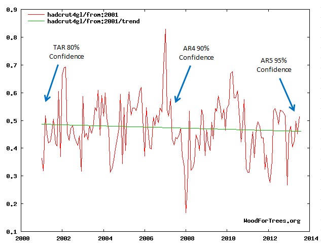
Did you mean this chart?:
Every graph in this post shows about .4deg C warming from 2012 to the present. How is the name of little green apples is that no warming for the past 18 plus years. It has obviously been warming for the past 4 years.
And if you’re going to go with the two point ( start/stop ) trend line BS don’t bother. That is a lie, and not remotely a trend. Heck if you want to do it with 2 points, go back to the Holocene Warming and you have not had any warming for 8 thousand years.
I am not a scientist, or even good at math. I also really hate what the alarmists are doing to science. But please, lets at least be honest: If there has been .4C warming in the past four years, surely one cannot say there has been not been any for18 plus years.
You really should spend some time learning before you continue to embarrass yourself.
Lord Monckton did not use a two point trend line.
Oh dear, perhaps you should have kept quiet
Mr Denier-o makes an ass of himself again, even though it has already been well explained to him that a least-squares trend is determined on the basis of every monthly data point in the interval, not merely the starting and ending points.
A rather high standard of scientific and mathematical knowledge is expected of commenters here. Try reading any elementary textbook of statistics to see how a least-squares trend is actually determined. Your suggestion that it is determined only from the start-point and endpoint is nonsense.
Also, read the head posting itself rather carefully. One needs at least 15 years of temperature data before one can start drawing tentative conclusions about trends, as NOAA’s State of the Climate report for 2008, cited in the head posting, made clear.
It should be blindingly obvious merely from looking at the temperature graphs in the head posting that there are various ups and downs in temperature during the periods shown. However, the trend line indicating which way temperatures have really moved over the entire selected period is obtained by straightforward calculation. I say there has been no global warming on the RSS dataset for 18 years 8 months because the trend over the past 18 years 8 months, as calculated from the data, is zero.
Thank you for the explanation. I have found a couple of links to learn more about least squares trends. My apologies for my lack, which has caused embarrassment.
Roy Danio said:
Thank you for the explanation. I have found a couple of links to learn more about least squares trends. My apologies for my lack, which has caused embarrassment.
I gotta say, that was pretty classy. Plenty of folks would have either disappeared, or called names.
Well said denio Stick around and learn with us.
Lord Monckton,
Maybe people do make asses of themselves but as a Catholic can I remind you of something that the Catechism of the Catholic Church states;
2478 To avoid rash judgment, everyone should be careful to interpret insofar as possible his neighbour’s thoughts, words, and deeds in a favourable way:
‘Every good Christian ought to be more ready to give a favourable interpretation to another’s statement than to condemn it. But if he cannot do so, let him ask how the other understands it. And if the latter understands it badly, let the former correct him with love. If that does not suffice, let the Christian try all suitable ways to bring the other to a correct interpretation so that he may be saved.’ (St Ignatius of Loyola, Spiritual Exercises.)
Thanks, Alba. The world has been putting that sentiment in my face for days.
I need the reminder.
Ps Good Job, R.D.
Roy …..negative 4 added to four equals…ZERO !!! You have to add together ALL the ups and downs..
I am not a scientist, or even good at math.
===============
a self evident truth
If there has been .4C warming in the past four years, surely one cannot say there has been not been any for 18 plus years.
====================
there is quite a large change in the average temperature of the earth every 6 months as we move closer and farther away from the sun because the orbit is not circular.
so, by your reasoning, you cannot say there is any warming of cooling longer than 6 months. How can there be even 1 year of warming, when after 6 months of warming the earth always starts to cool?
Thank you all for the answers, and I do understand fairly well now. However I think the argumentum ad hominem was a bit over the top. And if it makes you feel better to make me out to be stupid, I am glad I could help.
Hello Roy, a joke, if you will.
Super ego and ego walk into a bar, the barman says “i’d like to see some ID”
Cheers.
Mr Denio is in no position to complain about ad-hominem remarks. His original posting included the following sentence: “And if you’re going to go with the two point ( start/stop ) trend line BS don’t bother. That is a lie, and not remotely a trend.”
Accuse your opponents of lying when you do not know what you are talking about and you can expect them not to be too gentle with you in response. Better manners than yours are expected here.
True C.M., yet his honest, humble and exceedingly rare response at 6:09 deserves recognition.
Roy, I suggest an apology to Mr. Monckton is in order . .
[Comment deleted. “Jankowski” has been stolen by the identity thief pest. All Jankowski comments saved and deleted from public view. You wasted your time, sockpuppet. -mod]
I agree: Roy Denio displays a sincere desire to understand – a trait shared by real skeptical folks, layman and scientists.
Agreeing with
dbstealey @ur momisugly January 13, 2016 at 7:13 pm
JohnWho,
Maybe yes, maybe no. Roy came on a bit strong at the outset and got a slap or two.
The mea culpa is good but the nom de guerre is suspect.
Though it is not the whole world, the USCRN (US climate reference network) another un-adjusted dataset shows NO warming for 10 years, the entire run of the data set.
Search WUWT for USCRN to see some nice graphs of the USA data.
Pristine rural sites, great sensors, NO adjustments allowed.
And, like the satellites—NO warming is observed.
Yes and it would be more accurate if his Lordship would say instead of “measured warming rates” – “reported warming rates”.
See, there measured (Raw) is not there reported (final).
DD More makes a fair point.
As always, an excellent and clear article from his Lordship.
Funny that the Noble Lord Monckton undermines the validity of terrestrial temperature measurements on the basis of their having been corrected when the UAH version 6 that he cites as evidence of lack of warming is the result of a very large correction of the previous UAH version. The UAH series has been the subject of repeated corrections over the last 25 years, so why Lord MOnckton trusts it I can’t imagine
Funny that you don’t understand the nature of the corrections made to the satellite records.
If you don’t trust advancements in temperature measuring technology, I suggest you ask every doctor you visit to use the time tested method when taking your temperature.
http://realclimatescience.com/2016/01/satellites-versus-surface-temperatures/
I’ll stick with the satellite approach.
repeated corrections
============
Anthony’s study of category 1-2 stations shows that UAH’s results do a much better job of capturing the true surface temperature than does GISS.
The problem for GISS is land use. The bulk of their US sampling is from areas that have been contaminated by land use changes. UAH also has land use changes, but a smaller percentage as compared to GISS. The problem is in trying to adjust out the effects of land use changes. Every adjustment adds uncertainty.
The category 1-2 station have almost no land use changes, and thus require no adjustments.
It may (or may not, as you choose) be worthwhile to make the distinction that UAH “corrects” the way measurements are made while NOAA “corrects” the measurements after they are made.
Roy,
If that was all the data we had i.e. 18 yrs worth, then it would show a zero slope line trend at MoB has stated. It is not a 2 point line. Surely you don’t think temps have to remain flat all the time to say there is no warming or cooling. You are right – temps have increased in the past 4 years. And if you said temps have risen since 1910 you would be right. There is no correct starting point for picking trends and you are right – go back a long time and temps may appear to have remained flat. But 18 years, and counting, is significant because the IPCC was very certain that by now temps would have risen.
This changes nothing because the climate scam isn’t scientific – it’s politics. Always has been. Hence the strength of presentations like this matter little, as they – alarmists, aren’t interested, aren’t listening and aren’t accepting of contrary scientific evidence that could compromise their political motives. Nice work as ever though, Lord M.
Cheshirered is wrong. It is always valuable to tell the truth to shorten the period when it is unheard.
For the illumination of Cheshirered and in support of the noble Lord; politics is most certainly influenced by strong, repetitive argument – as science should not. It may be, as you postulate, that “alarmists aren’t interested”; but alarmists don’t make policy, politicians do – like it or not.
Politicians pay attention – believe it or not – and are well aware of and interested in the work of Lord Monckton, Mr Watts et al. Do they “matter little”. I should say not. They matter a great deal.
Declaration of Interest.
I am a politician and (democratically elected) serving member of the ruling party of Great Britain.
I am delighted to say that the “political environment” (lovely couplet that one) has almost reached the point that questioning CAGW is no longer a statement of resignation from office. Almost. Keep it coming.
Of course Lord M you’re absolutely right there. Maintaining exposure of blatantly exaggerated projections IS essential, even if those currently in positions of influence or benefitting from the scam refuse to listen. It may take time but eventually the truth will out. Great job as ever.
Phil’s dad, Reminds of the saying “Telling the truth is an act of rebellion” hope the time comes soon when truth is the norm.
And some politicians are paying attention!
I thought Senator Cruz was very well informed on climate issues. I recently found out why. Here:
http://judithcurry.com/2015/12/10/reactions-on-the-senate-hearing/
Judith Curry says this:
“Senator Cruz seems very much into the Data, and generally knowledgable about the scientific process. One of his staffers is an avid reader of CE, WUWT and apparently Steve Goddard’s blog.“
Excellent post !
The writer’s prior post of 4th. December 2015 (“The robust Pause resists a robust el Niño Still no global warming at all for 18 years 9 months”) contains fifteen (15) bullet-point type, EXCELLENT, short paragraphs which I attach here.
May I say; there are none (to my knowledge) capable of writing or speaking with such clarity, fairness and such dignity.
START PASTE
The RSS satellite dataset shows no global warming at all for 225 months from March 1997 to November 2015 – more than half the 443-month RSS record.
.
There has been no warming even though one-third of all anthropogenic forcings since 1750 have occurred since the Pause began in March 1997.
The entire UAH dataset for the 444 months December 1978 to November 2015 shows global warming at an unalarming rate equivalent to just 1.14 Cº per century.
Since 1950, when a human influence on global temperature first became theoretically possible, the global warming trend has been equivalent to below 1.2 Cº per century.
The global warming trend since 1900 is equivalent to 0.75 Cº per century. This is well within natural variability and may not have much to do with us.
The fastest warming rate lasting 15 years or more since 1950 occurred over the 33 years from 1974 to 2006. It was equivalent to 2.0 Cº per century.
Compare the warming on the Central England temperature dataset in the 40 years 1694-1733, well before the Industrial Revolution, equivalent to
4.33 C°/century.
In 1990, the IPCC’s mid-range prediction of near-term warming was equivalent to 2.8 Cº per century, higher by two-thirds than its current prediction of
1.7 Cº/century.
The warming trend since 1990, when the IPCC wrote its first report, is equivalent to 1 Cº per century. The IPCC had predicted close to thrice as much.
To meet the IPCC’s central prediction of 1 C° warming from 1990-2025, in the next decade a warming of 0.75 C°, equivalent to 7.5 C°/century, would have to occur.
Though the IPCC has cut its near-term warming prediction, it has not cut its high-end business as usual centennial warming prediction of 4.8 Cº warming to 2100.
The IPCC’s predicted 4.8 Cº warming by 2100 is well over twice the greatest rate of warming lasting more than 15 years that has been measured since 1950.
The IPCC’s 4.8 Cº-by-2100 prediction is four times the observed real-world warming trend since we might in theory have begun influencing it in 1950.
The oceans, according to the 3600+ ARGO buoys, are warming at a rate of just 0.02 Cº per decade, equivalent to 0.23 Cº per century, or 1 C° in 430 years.
Recent extreme-weather events cannot be blamed on global warming, because there has not been any global warming to speak of. It is as simple as that.
END PASTE
PS: I do so agree that 1952 was a very good year.
Regards,
WL
Warren, you should check out all of his videos..Very informative and sometimes even funny !! IMHO
Thank you Marcus. I am aware of same and I agree !
Regards,
WL
From a blog post of mine 13 December 2015
A climate treaty based on a failed model, a victory for the political class
Scientific theories stand or fall based on the accuracy of their predictions. Exactly 100 years ago Einstein’s theory of gravity was welcomed because it corrected an inacurate prediction of Newton’s theory.
It’s worth staying the course to follow what I’m about to describe. The orbits of all our planets are nearly circular — but not exactly so. A circle has a single center; an ellipse has two ‘centers’ (focal points). Planetary orbits have the sun at one focal point of the ellipse (this was known even before Newton). This means that every orbit has a point at which the planet is farthest from the sun (called the aphelion) and a point at which it is closest (the perihelion).
The perihelion doesn’t stay in the same place with each succesive orbit. Rather it moves — this is called the precession of the perihelion. Newton’s formulation of gravity predicted a certain rate at which the perihelion of the planet Mercury moved between sucessive planetary orbits — which was not corroborated by actual measurement.
Physicists a century ago were seriously exercised by this inaccuracy. So how large was it? Quite small. Recall that a circle contains 360 degrees. A degree is far too large for astronomical work. So each degree contains 60 minutes and each minute contains 60 seconds. So a second is 1/3600 of a degree. The discrepancy was a mere 43 seconds per CENTURY.
Contrast this with the inaccuracy of the models of global warming, NONE of which predicted the current stability of global atmospheric temperature as measured by satellite for the past 18+ years. It’s not that CO2 isn’t a greenhouse gas the accumulation of which (other things being equal) should reflect radiation back to earth and warm the planet. No one disputes that. It is the magnitude of the CO2 effect and the importance of other factors determining global temperature which is crucial. Clearly global temperature should have continued to rise in the past 19 years as CO2 rose. This is what the models on which the Paris agreement is predicated predicted But there has been no rise.
It’s also fairly sleazy that all the ‘adjustments’ being made to temperatures as measured on the surface of the earth mostly adjust past temperatures downward to preserve the rise. Note that satellite temperatures are the most accurate we have and there is no way to adjust them. Unfortunately they just don’t go back that far.
It is far more accurate to say that global warming has stopped for the past 18+ years. Saying that it has paused implies that it will continue. Some 50 post-hoc explanations of ‘the pause’ have been published.
Bottom line: the concern over global warming is based on models which have failed in their predictions of the present. There is little reason to regard them as more accurate for their predictions of the future.
” It’s not that CO2 isn’t a greenhouse gas the accumulation of which (other things being equal) should reflect radiation back to earth and warm the planet. No one disputes that.”
Not to get into an old argument , but I think you will find plenty of people disputing that over at Principia Scientific !
Oooops . I probably should not have brought up that on Lord Monktons’ post , akin to farting in Church.
Sceptical is as sceptical does is my point .
Nick would also agree here since the lower Cl is negative. Here are the relevant numbers from his algorithm:
http://moyhu.blogspot.com.au/p/temperature-trend-viewer.html
For RSS:
Temperature Anomaly trend
May 1993 to Dec 2015
Rate: 0.772°C/Century;
CI from -0.030 to 1.574;
t-statistic 1.886;
Temp range 0.125°C to 0.299°C
So RSS shows no statistically significant warming for 22 years and 8 months.
For UAH6.0beta4:
Temperature Anomaly trend
Feb 1993 to Dec 2015
Rate: 0.822°C/Century;
CI from -0.014 to 1.658;
t-statistic 1.928;
Temp range 0.009°C to 0.196°C
So UAH6.0beta4 shows no statistically significant warming for 22 years and 11 months.
Well done, Werner.
Thank you!