This simple visual analogy that Ron House has designed can help readers not familiar with a contentious atmospheric modeling issue get a primer on the it. While not a perfect analogy (and by definition analogies often aren’t) it does help convey an important point: the predicted red spot has not appeared. For the more technically inclined, or for those wanting more, Steve McIntyre posted an interesting discussion at Climate Audit. – Anthony
Guest Post by Ron House July 29, 2009
Let’s say it’s a cold night and Fred climbs into bed:
 (A) Fred in bed.
Will Fred use a blanket to keep warm? If so, the air will heat up close to Fred because his body warms the air and the blanket prevents it from moving away. On the other hand, as the night progresses, the air beyond the blanket will cool:
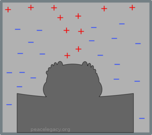
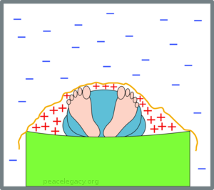 (B) With a blanket, the warm air collecting around Fred warms him up.
In the picture, the “+” signs show air that becomes warmer, and the “-” signs air that becomes cooler.
Now what if Fred (forgetful Fred) didn’t use a blanket? The warm air escapes and tends to rise (warm air being less dense than cold air):
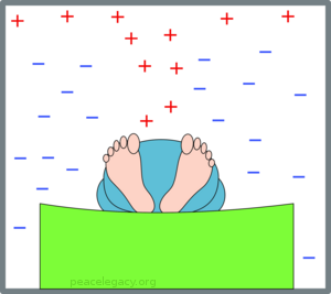 (C) With no blanket, warm air escapes and Fred shivers.
Poor Fred gets colder as the night wears on. But now we come to the point of the exercise: How do we know whether Fred used, or did not use, a blanket?
“Easy,” you say: “Take a look!” But let’s suppose that Fred is a very light sleeper, we dare not put on the light, so there’s no way we can see if there’s a blanket. But—surprise!—we just happen to have an infra-red scanner that can tell us the temperature of the air at various spots throughout the room. Depending on whether Fred uses a blanket, the temperature change in the room follows one of the two characteristic patterns we saw above; so if we check where the air gets colder and where it gets warmer as the night wears on, we know, for a fact, whether or not Fred used a blanket, even without being able to see it. If Fred did use a blanket, our scanner should show results like this (note how we can’t see the blanket, but we can be sure that it is there):
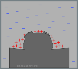 (D) Warm air collects in a contained region, so there must be a blanket.
On the other hand, if he does not use a blanket, we will see the temperature change in a pattern something like this:
 (E) Warm air escapes upwards, so we are sure there is no blanket.
Once again, there is no doubt at all what is going on. In science, nothing is absolutely certain, but depending on which temperature pattern develops, we can be very, very sure indeed of the answer to the question: Did Fred use a blanket?
Now we can turn to the global warming question, whether the Earth is surrounded by a ‘blanket’ of anthropogenic (human-generated) greenhouse gas stoking up the temperature of the planet. The physics of a real blanket (as with Fred in the fable above) and a gaseous ‘blanket’ around the Earth differ, but just the same, different heat dissipation (or retention) processes will result in different characteristic patterns of temperature change. Just as Fred will be surrounded by something roughly resembling one of two quite different patterns of air temperatures, so likewise will temperature changes around the Earth have a quite definite pattern, depending on which climate theory is right. Scientists whose paycheck does not depend on agreeing with global warming alarmism will all agree with this simple statement. It’s part of the basic skill of having a ‘nose’ for physics.
What, then, are our main competing climate theories? The IPCC’s reports are based on results from a collection of climate computer models; they have nothing else. These are simply computer programs that, in essence, contain a computerised version of the assumptions and beliefs of the climate modeller as to how the climate of the planet works. Whether these assumptions are well-founded is another question, but the key point is that whatever these assumptions may be, when the climate model is run, it generates its ‘predictions’ by calculation of hypothetical futures for the behaviour of the atmosphere. These ‘futures’ contain, as an essential element, predictions of the changes of atmospheric temperatures at various heights above the planet and the various latitudes all the way from south pole to north pole.
The indisputable fact about these atmospheric temperature predictions is that if the pattern doesn’t happen, the model is wrong. Just as Fred won’t warm up if he isn’t surrounded by warm air, likewise the effects on the Earth of global warming cannot happen if the cause of the warming —the warm air—isn’t there.
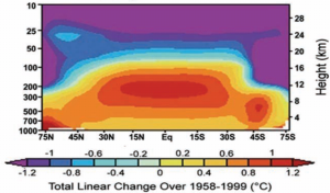
So now we come to the graphs that clinch the matter. All global warming models predict some sort of developing ‘hotspot’ in the atmosphere above the tropics. Here is the graph for one of the models, but they all look roughly similar:
(F) Model predicts air above the tropics heats up. from the NIPCC Report p. 107
This picture shows the air from 75 degrees north to 75 degrees south (the equator in the middle) and up to 30 km above the Earth. We can think of this air pattern as corresponding to the pattern in Fred’s bedroom when Fred used a blanket: although the actual mechanism is different, something is ‘keeping the heat in’, so to speak. Just as we did with Fred in bed, we can compare reality with this picture. Is the heat in the real atmosphere doing what the model predicts? Here is the temperature trend in the real world:
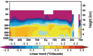 (G) Real world trend develops no hotspot. from the NIPCC Report p. 106
What have we actually proved here? Well, proved, without possibility of error, nothing, of course: no question at all about the real world ever has a complete perfect proof as an answer, so don’t be misled if someone says the world still might be heating due to CO2 despite the absence of the warm spot that is supposed to do the warming. Of course anything might be happening; but how likely is it? Well how likely is it that Fred has a blanket, but the air around him is getting colder just as if he had no blanket, and yet Fred is warming up despite that? The two questions have the same answer: not very.
Yet surprisingly, some proponents of global warming alarmism actually resort to this very strategy. “True,” they say, “the hot spot isn’t developing. But that is because the heat is being stored up elsewhere—it’s “in the pipeline”—and one day it will burst forth with even greater severity and vengeance.”
What can we make of that claim? Well, thinking back to Fred again, it amounts to this: We use our temperature probe in Fred’s darkened bedroom and we see a pattern like that in (E) above, corresponding to no blanket: Fred should be freezing! But actually, the heat has all gone into Fred’s body, despite the complete absence of the hot air which is the mechanism for making it do so. In other words, Fred got warmer by disobeying the second law of thermodynamics—in other words, by magic. Likewise, if someone says heat is being secretly stored somewhere by global warming, despite the absence of the very mechanism that does the warming, they are saying global warming is happening by magic. That is the harsh truth of the matter.
One thing I have learned whilst studying the global warming question is that, like many other physical systems, the climate is constrained by limits that can be understood by any intelligent person willing to learn some simple physics. The ‘hotspot’ is one of them. Anyone talking down to you and telling you you have to take the word of some mythical ‘consensus’ of ‘experts’ is trying to hoodwink you.
Let’s say it’s a cold night and Fred climbs into bed:
 (A) Fred in bed.
Will Fred use a blanket to keep warm? If so, the air will heat up close to Fred because his body warms the air and the blanket prevents it from moving away. On the other hand, as the night progresses, the air beyond the blanket will cool:
 (B) With a blanket, the warm air collecting around Fred warms him up.
In the picture, the “+” signs show air that becomes warmer, and the “-” signs air that becomes cooler.
Now what if Fred (forgetful Fred) didn’t use a blanket? The warm air escapes and tends to rise (warm air being less dense than cold air):
 (C) With no blanket, warm air escapes and Fred shivers.
Poor Fred gets colder as the night wears on. But now we come to the point of the exercise: How do we know whether Fred used, or did not use, a blanket?
“Easy,” you say: “Take a look!” But let’s suppose that Fred is a very light sleeper, we dare not put on the light, so there’s no way we can see if there’s a blanket. But—surprise!—we just happen to have an infra-red scanner that can tell us the temperature of the air at various spots throughout the room. Depending on whether Fred uses a blanket, the temperature change in the room follows one of the two characteristic patterns we saw above; so if we check where the air gets colder and where it gets warmer as the night wears on, we know, for a fact, whether or not Fred used a blanket, even without being able to see it. If Fred did use a blanket, our scanner should show results like this (note how we can’t see the blanket, but we can be sure that it is there):
 (D) Warm air collects in a contained region, so there must be a blanket.
On the other hand, if he does not use a blanket, we will see the temperature change in a pattern something like this:
 (E) Warm air escapes upwards, so we are sure there is no blanket.
Once again, there is no doubt at all what is going on. In science, nothing is absolutely certain, but depending on which temperature pattern develops, we can be very, very sure indeed of the answer to the question: Did Fred use a blanket?
Now we can turn to the global warming question, whether the Earth is surrounded by a ‘blanket’ of anthropogenic (human-generated) greenhouse gas stoking up the temperature of the planet. The physics of a real blanket (as with Fred in the fable above) and a gaseous ‘blanket’ around the Earth differ, but just the same, different heat dissipation (or retention) processes will result in different characteristic patterns of temperature change. Just as Fred will be surrounded by something roughly resembling one of two quite different patterns of air temperatures, so likewise will temperature changes around the Earth have a quite definite pattern, depending on which climate theory is right. Scientists whose paycheck does not depend on agreeing with global warming alarmism will all agree with this simple statement. It’s part of the basic skill of having a ‘nose’ for physics.
What, then, are our main competing climate theories? The IPCC’s reports are based on results from a collection of climate computer models; they have nothing else. These are simply computer programs that, in essence, contain a computerised version of the assumptions and beliefs of the climate modeller as to how the climate of the planet works. Whether these assumptions are well-founded is another question, but the key point is that whatever these assumptions may be, when the climate model is run, it generates its ‘predictions’ by calculation of hypothetical futures for the behaviour of the atmosphere. These ‘futures’ contain, as an essential element, predictions of the changes of atmospheric temperatures at various heights above the planet and the various latitudes all the way from south pole to north pole.
The indisputable fact about these atmospheric temperature predictions is that if the pattern doesn’t happen, the model is wrong. Just as Fred won’t warm up if he isn’t surrounded by warm air, likewise the effects on the Earth of global warming cannot happen if the cause of the warming —the warm air—isn’t there.
So now we come to the graphs that clinch the matter. All global warming models predict some sort of developing ‘hotspot’ in the atmosphere above the tropics. Here is the graph for one of the models, but they all look roughly similar:
 (F) Model predicts air above the tropics heats up. from the NIPCC Report p. 107
This picture shows the air from 75 degrees north to 75 degrees south (the equator in the middle) and up to 30 km above the Earth. We can think of this air pattern as corresponding to the pattern in Fred’s bedroom when Fred used a blanket: although the actual mechanism is different, something is ‘keeping the heat in’, so to speak. Just as we did with Fred in bed, we can compare reality with this picture. Is the heat in the real atmosphere doing what the model predicts? Here is the temperature trend in the real world:
 (G) Real world trend develops no hotspot. from the NIPCC Report p. 106
What have we actually proved here? Well, proved, without possibility of error, nothing, of course: no question at all about the real world ever has a complete perfect proof as an answer, so don’t be misled if someone says the world still might be heating due to CO2 despite the absence of the warm spot that is supposed to do the warming. Of course anything might be happening; but how likely is it? Well how likely is it that Fred has a blanket, but the air around him is getting colder just as if he had no blanket, and yet Fred is warming up despite that? The two questions have the same answer: not very.
Yet surprisingly, some proponents of global warming alarmism actually resort to this very strategy. “True,” they say, “the hot spot isn’t developing. But that is because the heat is being stored up elsewhere—it’s “in the pipeline”—and one day it will burst forth with even greater severity and vengeance.”
What can we make of that claim? Well, thinking back to Fred again, it amounts to this: We use our temperature probe in Fred’s darkened bedroom and we see a pattern like that in (E) above, corresponding to no blanket: Fred should be freezing! But actually, the heat has all gone into Fred’s body, despite the complete absence of the hot air which is the mechanism for making it do so. In other words, Fred got warmer by disobeying the second law of thermodynamics—in other words, by magic. Likewise, if someone says heat is being secretly stored somewhere by global warming, despite the absence of the very mechanism that does the warming, they are saying global warming is happening by magic. That is the harsh truth of the matter.
One thing I have learned whilst studying the global warming question is that, like many other physical systems, the climate is constrained by limits that can be understood by any intelligent person willing to learn some simple physics. The ‘hotspot’ is one of them. Anyone talking down to you and telling you you have to take the word of some mythical ‘consensus’ of ‘experts’ is trying to hoodwink you.
I guess an issue with refuting the hot spot by analogy is that, in dissipative and conservative systems the variables of gravitational acceleration, the specific heat at constant pressure of dry air, the gas constant for dry air, the mixing ratio of water vapor, the latent heat of vaporization, the ratio of certain gas constants, temperature and spontaneous and unpredictable aspects such as the irreversible moist-adiabatic process can combine. Yes?
However, to be fair, this is not evidence that the feedback argument is false, since the warming people keep saying we haven’t reached the tipping point yet.
I’ll bet the waitresses hate that.
Since this is our first instance of global warming where computer models and modern knowledge of thermodynaics is widely available, isn’t the hot spot essentially an untested hypothesis?
So we shouldn’t read too much in to the lack of a hot spot, the theory is still uncharted territory.
Vincent,
“model vs radio sonde discrepancies have largely been resolved”
I qualified that statement for a reason. Some discrepancies remain. The updates mentioned in Lanzante’s work go beyond the sonde analyses quoted in the NIPCC report i.e. HAD AT2. The NIPCC is quoting out-of-date material, IMO. The discrepancy is largest in the NIPCC report due to their data selection choices. The discrepancy is somewhat resolved in Lanzante’s work though by no means completely. The other studies seem to resolve this issue further.
“McIntyre is writting a paper to discuss these issues.”
McIntyre is submitting a comment on this paper highlighting that the inclusion of more years of data breaks one of the hypothesis tests with respect to UAH data. This is a useful contribution and not entirely unexpected given that RSS and UAH are somwhat divergent. Did his analysis go beyond this? Perhaps you can correct me if I’m understating his result. According to Santer et al., UAH and some of the older sonde products seem to be showing the greatest remaining discrepancies. NIPCC use the oldest, coolest trending and most widely acknowledged to be the most error prone record in their analysis. Hence my criticism that this analysis is too narrow. Santer certainly got one thing right: he didn’t shy away from comparing models to all of the available obs data (as far as I can see).
Ron, there is a deep, fundamental problem with your analogy. Your analogy and the graphic measure entirely different things. This mixup is likely in part due to the nickname of the red spot in the graphic, which is misleadingly called the “tropical hot spot”. It is not a hot spot at all.
Your analogy measures the temperatures above the man in the bed.
The graphic, on the other hand, does not show the temperatures. It shows the temperature trends, which is a very, very different thing.
I hate to say this, because your analogy is very tempting. But because they measure totally different things, your analogy falls apart completely. There actually is a so-called tropical “hot spot” in the real atmosphere … but it’s not a hot spot. It is a part of the atmosphere which both warms and cools more than the surface when the surface warms or cools. This is not a “hot spot”, and it has absolutely nothing to do with your analogy.
Please see my WUWT post on the subject.
All the best,
w.
The IPCC assumes that the ratio isn’t 1:1 even but entirely downwards, which is the first fundamental mistake.
Actually to a first approximation it is not bad.
Do a paper experiment. You have two mirrors back to back. Each reflects 50% of the incident light. The rest passes through the mirror. On the first pass through the system the first mirror reflects 50% of the light. The second mirror reflects 25% of the total light back to the first which passes 12.5% back to the origin.
So two 50% reflecting 50% transparent mirrors in series without going through all the backing and forthing (which will increase the reflection) reflects 62.5% of the incident light. You pile more mirrors in series and it gets better.
If you work it all out two 50% mirrors in series will reflect 75% of the incident light. Add more mirrors and it gets better and better.
Mirrors in some lasers work that way. So it may take 10 or 100 reflections for a photon to escape. If you assume the reflecting surface is at 50 Km and it takes 100 reflections. About 1/30th of a second. On average. Which gives you a ball park. Not counting any delays of reradiation by the absorber.
Hey Stevo:
Here is a temperature profile of the atmosphere.
http://apollo.lsc.vsc.edu/classes/met130/notes/chapter1/vert_temp_all.html
Convection produced clouds only go to the top of the troposphere. The temperature decreases steadily from the ground up to the tropopause. The temperature increases above that, but there is not much if any convection there that I can see any cause for at least.
So, wattsupwiththat? You hypothesis does not make sense.
Stephen Wilde (16:12:11) : Your: highly relevant article — Dated: July 16, 2008
I know you have been reading and thinking seriously about these issues for the past year. I wonder how you might reword parts of your article if you were writing it from scratch today, especially parts 5 and 6 (first 3 paragraphs)?
Well, let’s give Stevo some credit here. Frankly, it’s the first time I’ve seen an AGW argument with a plausible mechanism and some data to support it. If we check Roy Spencer’s UAH site, for example, the data do indeed show warming at lower altitudes and cooling at higher ones in a more or less secular trend for the last ten years. At 1 km, the temp anomaly is a solid 2 deg F compared to the 20 year average (interestingly, 8 of the last 12 years were around record highs). By 4.4 km, the anomaly is close to neutral, and it’s negative higher up.
So we have a hypothesis that we can test.
For example, if the temp anomaly then increases the closer to the surface, should the surface temp anomaly not be around 3 deg F?
The comment was:
—————-
M. Simon (04:21:27) :
There are two possibilities for where the “missing heat” is being stored. In the land or in the ocean. The oceans are not heating. In fact they may be cooling.
That leaves the land. Is there any evidence of the land heating?
BTW the hot spot is necessary for radiation balance. The earth heats in conformance to the second law from a hot body – the Sun – to a cool body – the Earth.
—————-
Dear Simon,
.
YOU are DREADFULLY incorrect in your presumption/assumption/assertion.
.
Energy cannot be =stored= in the same form in which it was received.
.
Since heat energy must change form to be stored then it NO LONGER has AFFECT as a source of ‘heat.’
.
Plants store energy by CONVERTING it to another form.
.
You talk about ‘missing heat.’ There is ‘no such thing.’
.
If solar energy is not absorbed and thence re-released upon absorption, then it is converted to something else and is NO LONGER a source of heat energy.
.
Finally, your last remark above is so laughable as to not deserve a reply. But I’ll provide you with one.
.
IF the Earth were to the be receiver of the Sun’s energy such as to absorb 100% of the impinging energy, then upon nightfall, the Earth would become a freezing ice box.
.
Honestly, where do you get such ideas?
There will never be a hot spot for the simple reason that we have such a thing as wind.
The atmosphere is essentially transparent.
Most of the heat is transferred from the earth to the atmosphere via conduction and convection. All materials radiate at all times proportionally to T**4. In the dense lower atmosphere convection and conduction dwarf radiation heat transfer. As the pressure gets lower and lower radiation assumes a larger role and the other modes diminish significantly.
I don’t know about your temperature profile. It looks pretty but of the high performance aircraft I have been in at 40 to 50 k ft, it is damn cold.
Highlander,
Evidently you are not familiar with textural conventions “missing heat” means supposed missing heat.
And who said anything about the same form?
And you know I was under the impression that you warm something up and it radiates heat in conformance with its temperature (T^4) and albedo. At least that was one of the (minor) factors in the design of low temp (below 100 C) coolers for semiconductors. But perhaps I got it wrong.
Heat is really devilish stuff and hard to think about. Convection, conduction, and radiation all come into play to varying degrees. And partial differentials. Lots of partial differentials.
In any case I was hoping to avoid a dissertation and get an answer to my question. Guess not.
true believer (16:46:22) : But….all things combined mean: Air no heat saving (Big chief says).
I’m still waiting for you guys to bring some light into the question of whether or not any GHG AGW is strictly additive to natural heating or if it is buried in natural heating. If you take a 30 dB sound and add another 30 dB sound to it, whether it is the same source or a different sound, same frequency or different frequency, you don’t get 60 dB.
It this the case for warming? If you have 2 degrees of natural warming, and then add .5 degrees of anthropogenic CO2 to that warming, do you get 2.5 degrees of warming? My hunch is this is not additive. Comments?
This site has quite a good explanation of what Stevo is saying:
Greenhouse effect
Stefan (09:02:35) :
The presence of CO2 is a signature of greed. That’s the signature greenies are really thinking about. If we can tackle that mistaken perception, then we can all go home.
I don’t know of any immediate cure for envy. A deadly sin – according to some.
“”” Phil M (04:27:58) :
Let me take a simpler stab at an explanation…
Consider the imapct of CO2 alone. The earth absorbs energy from the Sun mostly in the visible part of the spectrum. Call this amount G. Earth’s temperature increases as a result. Anything with a temperature above 0 K emits power proportional to its absolute temperature to the fourth power. A steady earth “mean” temperature obtains when the emitted power (in the IR bands) equals the absorbed power from the Sun. In other words G is absorbed and G is radiated away. At present this “mean” temperature is about 288K or so.
Add CO2 or some other gas that absorbs heat radiation but is transparent to visible. Suppose the amount of heat radiation the CO2 absorbs is X. This absorption warms the gas until it also emits X, and the gas now reaches a steady temperature. The gas emits one-half of this X toward space and one-half toward earth. We can now look at the situation from two perspectives, either of which describes why the Earth becomes warmer.
1) The amount of downward power reaching the earth is now G+one-half X, which is larger than without CO2, so the earth must warm to emit the increased power and reach a new, slightly higher steady temperature.
2) With CO2 in place the absorbed solar power is still G, but the outgoing thermal power above the CO2 layer is G minus one-half of X. So there is an imbalance and the earth must increase its temperature to emit a little bit more power and achieve a balance again.
What Mr. House says here, in effect, is that all sorts of other processes go on beneath and within the CO2 “blanket” but the distribution of resulting temperature might provide a reasonable “fingerprint” of CO2 as a cause, yet no one can really be pinned down to say that “such and such” is a “fingerprint” of AGW and that it would provide a definitive test of the hypothesis.
Pamela Gray (19:25:47) :
I’m still waiting for you guys to bring some light into the question of whether or not any GHG AGW is strictly additive to natural heating or if it is buried in natural heating.
One of the reasons of using watts/m**2 is so that one is talking about heat inputted and outputted, and heat (energy) is additive. So if one uses this ( for me) bizarre energy system ( bizarre because the problem is three dimensional) the CO2 contribution will be additive to the natural contributions (including H2O).
Bob D (19:32:52) good explanation of GHGs
Bob, Thanks for this link.
You’re welcome, here’s another along the same lines, and dealing with the hotspot in particular:
What Greenhouse warming?
Ed Long (13:27:46) : “I am a skeptic of AGW and do have a large problem with the IPCC’s work. So what I say here refers to the misuse of the two figures. I have seen these two figures so compared before. But, I am afraid the user overlooks the respective scales and thus makes too much regarding the differences. The modeled data is for a period of 41 years; the scale is C/41 years. The HadAT2 data is for C/decade, or C/10 years. Taking this into account then the hot spot in the modeled data reduces to a range of values from 0.25 C/10 years to 0.3 C/10 years. The HADAT2 data places the values from 0 C/10 years to .1 C/10 years. The ratio of these is ‘3′ for the upper end. So, even though there is a difference between modeled and observation we should be cautious in making too much out of this.”
It is indeed unfortunate that these diagrams are plotted to different scales, and that is well worth pointing out. However, if you look carefully at them, it is arguable that on the same scale, the difference would be even greater. There is a height about 4km above the equator that is actually cooling (blue) where the model wants a hotspot. And at all latitudes the actual data from about 15 km upwards is either cooling very much faster than the model, or cooling where the model is warming. The two are irreconcilable no matter the scale because they have fundamentally different shapes. Therefore we can make as much out of it as it warrants – it disproves the model.
You are right, decibels don’t add because it is a logarithmic scale. Doubling adds about 3 decibels. See http://www.phys.unsw.edu.au/jw/dB.html .
I think your question about warming is not well enough defined for a simple answer. Power radiated from a body is proportional to T to the 4th, so more power will radiate than the sum of the powers radiated by either process individually. You would have to have specific processes in mind to answer the question, I suspect.
In my opinion, the question is not “Is there an Anthropogenic or for that matter a Physiogenic (Natural) Greenhouse Effect?” Instead it is “Is the industrial age Anthropogenic Atmosphere Change appreciably modifying our global climate?”
The most telling argument as to why this may not be the case is that there may be a law of diminishing effect for increasing concentrations of greenhouse gasses. This is much like the transparency reduction observed with increasing coats of black paint on a window. The first coat does most of the work.
David Archibald has presented a chart that suggests our current carbon dioxide concentration may be equivalent to a second or third coat of paint.
With the sun now going through a record period of minimum activity, we should soon have evidence proving that we do or do not have a serious Anthropogenic Climate Change problem.
Nice article, Mr House. It is a clear enough analogy, despite the attempts of some people to confuse your methodological criticism of AGW theory (different types of atmospheric phenomena produce different signatures in the atmosphere, which is how you detect the difference between them) with a mechanical one (Fred’s blanket behaves like CO2 in the atmosphere). After all, analogies are there to highlight the point you are trying to make, not to reproduce the phenomenon you are studying; they are retorical tools, not scientific ones.
Ooops!
retorical > rhetorical
Speed and spelling do not mix; sorry.