In comments on WUWT, people often think freely and throw out all sorts of ideas. Like in any collection of people, some are bad, some are average, a few are good, and even fewer are noteworthy. However, one that was noteworthy recently was from a WUWT regular known as “hotrod” in the “NASA Deep Solar Minimum” thread.
The thing that has been nagging at me is, that the trace of a rogue wave in this link, looks a lot like the 1998 temperature spike. On thinking about it, if a [rogue] wave is possible in the ocean, is it not conceivable that the same sort of behavior could exist in an average temperature plot for a body like the earth, as it oscillates around an average temperature? This like the PDO and AMO are just different types of periodic motion.
He was referring to what has now become known as the Draupner Wave, named for the oil platform that recorded it on January 1st, 1995.
In the case of the Draupner Wave, it has an amplitude about 3x that of the average background wave amplitude. It was created when the amplitudes of some waves of dissimilar amplitude and period combined in sync to form a new wave peak for an instant. That instant passed and the sea went back to normal background amplitude.
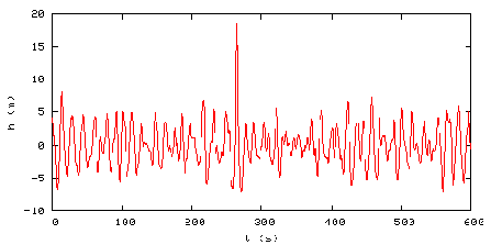
In the case of the 1998 Super El Niño, there is a similar sort of event where the temperature peak is about 3x that of the background peaks. This plot of the RSS Global Temperature Anomaly below (done by Barry Wise) shows the 1998 super event in red:

Barry writes:
The 1997/98 El Niño temperature spike seems to have had a long lasting effect that is dissipating. This graph shows what the trend was before the event and how the trend was affected by it. The dashed red line is the trend with all of the data and the purple is the trend based on the data before the area highlighted in red. Notice that there appears to be a decaying oscillation. If correct we’re in the third peak which is less than the previous two, and is much closer to the purple trend line.
[Note: I should point out that Barry’s method creates a different result than if the 97/98 El Nino data is removed, and before and after trend lines are plotted (h/t to Tom P) the resultant effect of the 1998 Super El Niño is less apparent. See comments for more discussion.]
Certainly there appears some similarity between the Draupner Wave and the 1998 Super El Niño worldwide temperature spike. And certainly we have a number of periodic systems and forcings going on here on Earth that are sinusoidal by their nature. They span short (high frequency) and long (low frequency) periods. Here are a few that I’ve thought of, short and long, but by no means is it a complete list.
Diurnal solar insolation and temperature variation, daily and monthly lunar tide cycles, seasonal variation of solar insolation by hemisphere, seasonal variation of temperatures by hemisphere, seasonal biomass variations, seasonal sea ice variations, seasonal albedo variations, 11 and 22 year solar cycles, Earth’s length of day variations, El Nino Southern Oscillation, North Atlantic Oscillation, Pacific Decadal Oscillation, Atlantic Multidecadal Oscillation, and at very long periods, Milankovitch cycles.
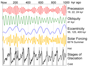
There are many many cycles on earth that are known, some yet to be discovered. Almost all of them have a root cause in periodic circular motions such as planetary rotation and orbital motion in our solar system and the variances of orbital eccentricity, obliquity, and precession. For example, the graph below shows how these different waves eventually synchronize to cause cycles of ice ages on earth.
To illustrate how sinusoidal cycles can conspire to produce peaks and valleys in amplitude, this interactive Java sinusoidal generator allows you to combine three different waves of varying phase, amplitude, and wavelength and see the resultant wave that forms from them:

During my limited experimentation above I couldn’t get the generator to produce a Draupner type wave, but as you can see in the screencap above, I was able to illustrate how a new peak can be generated (in blue) that is larger than any of the source wave peaks.
Here is an example of how “wave focusing” can occur to produce a Draupner type peak:

Lest you think this essay is about childs play with sinusoids, I’ll point out that there have been some serious works done on the mathematics behind the creation of “rogue waves”. For example there’s this brief discussion from the link commenter “hotrod” originally provided:
BBC Two, on November 14, 2002, aired a program on this phenomenon and its recent mathematical analysis. Freak waves, also “rogue waves,” “monster waves,” are extraordinarily tall and steep waves that appear sporadically and wreck havoc with shipping. One is suspected to have washed away the German cargo München which went down with all hands in the midst of a routine voyage in 1978. More recently, the cruise ship Caledonian Star was struck by a 30m wave on March 2, 2001. The standard analysis of ocean waves predicts a Gaussian-like distribution of heights; extreme heights, although possible, should be very rare – a 30m wave is expected once in ten thousand years, according to the BBC. But these waves occur much more frequently than predicted. The program focused on new methods of analysis, and on the work of the mathematician A. R. Osborne (Fisica Generale, Torino). Osborne has applied the inverse scattering transform, which he describes as “nonlinear Fourier analysis,” to the time series analysis of wave data. He conducted simulations using the nonlinear Schrödinger equation and found near agreement with the standard analysis, except that “every once in a while a large rogue wave rises up out of the random background noise.” His paper, available online, gives an example of such a simulation:

From CIM Bulletin #14 at http://at.yorku.ca/i/a/a/h/51.htm
Here’s a paper (PDF) on the Draupner wave titled: THE SHAPE OF THE DRAUPNER WAVE OF 1STJANUARY 1995 from Paul Taylor, Department of Engineering Science, University of Oxford. Taylor did a mathematiucal analysis of the Draupner wave, created a model to approximate the formation of it, and concluded that: “The New Year wave is ~ 1 in 2×10^5 waves” which when you think about it, makes it fairly common especially when you view it in context to images like the one below:

So it seems that such amplified rogue waves are fairly common in the nature of our oceans. That’s quite a journey from them one time being considered “mystical” by science.
Another scientific paper (PDF) of interest is: Physical Mechanisms of the Rogue Wave Phenomenon by Christian Kharif and Efim Pelinovsky of IRPHE in France and the Institute of Applied Physics in Russia, respectively. They conclude (emphasis mine):
All the physical scenarios of possible extreme wave generation (focusing, wave-current interaction, modulational instability), in fact, were known but only now (during the last 5 years) they are “dressed” by mathematical models of various levels (linear, weakly nonlinear, fully nonlinear models). Results of numerical simulations show the behaviour of each mechanism taking into account the random character of the wind waves in the ocean. Computations provide also the probability of rogue wave occurrence for simplified conditions. The many results are very sensitive to the model parameters (shape of wave spectrum, various corrections of the weakly nonlinear evolution models, accuracy of numerical schemes for long49 time computations).
Given that rogue waves were once thought to be the fantasy of imaginative sailors and fishermen, and given that science has now only addressed the problem once one was measured in 1995, it illustrates how something once thought to be impossible is now possible once it is measured, better understood, and studies published about it.
By the same logic, things like the Pacific Decadal Oscillation weren’t discovered until fairly recently. The PDO was named by Steven R. Hare, of the University of Washington, who noticed it while studying salmon production patterns (See BAMS article, PDF). Almost simultaneously the PDO climate pattern was also found by Yuan Zhang. This happened in 1997. It is one more natural cycle added to the many that were already known such as the El Niño-Southern Oscillation (ENSO) and the North Atlantic Oscillation (NAO)
Perhaps it is not an unreasonable to consider that on occasion, some of these cycles conspire to produce extreme ocean events like the 1998 Super El Niño.

And, given the difficulty in predicting exactly when natural cycles might coincide to produce such an event, perhaps this is why they are so hard to predict. For example, there was Dr. James Hansen’s 2006 prediction about a “super El Niño” that would rival the 1983 and 1997-1998 El Niño events.
In March 2006, Hansen wrote a paper claiming the following:
We suggest that an El Niño is likely to originate in 2006 and that there is a good chance it will be a “super El Niño”, rivaling the 1983 and 1997-1998 El Niños, which were successively labeled the “El Niño of the century” as they were of unprecedented strength in the previous 100 years.
We all know now that prediction was a bust. While there was in fact a 2006-2007 El Niño event. In the words of climatologist Mike McPhadden the event:
“started late, ended early and was below average strength”
Hansen’s prediction of a “super” event “rivaling the 1983 and 1997-1998 El Niños” never came true. Undeterred, Hansen is still predicting the onset of an El Niño event that will drive global temperatures to a new record high in 2009 or 2010. (h/t to Roger Pielke Jr on Prometheus)
Perhaps the applications of the studies of rogue ocean waves might be useful in figuring out if the 1998 event was in fact a synchronicity of natural cycles, linear, non-linear, and chaotic for a brief time, and if so, applied towards forecasting future super El Niño and La Niña events. I think it is worth considering. – Anthony
In all things there is a law of cycles.– Publius Cornelius Tacitus (55-117) Roman historian.
Anyone trying to make sense of the relationships between length of day (LOD), atmospheric angular momentum (AAM), & El Nino/La Nina/Southern Oscillation (ENSO) might want to take a look at the insightful wavelet plots in the following article:
http://www.uni-stuttgart.de/gi/research/schriftenreihe/quo_vadis/pdf/schmitzhuebsch.pdf
The plots appear under the references. Figure 1 (a,b,&c) shines some light on LOD/AAM/ENSO.
[Note: This is the stuff Sidorenkov & Sonechkin are writing about. Remember, Sidorenkov has a patent on a weather-forecasting method based on this stuff.]
Anthony,
Rather than clarification, if Barry Wise’ comment “(t)he dashed purple portion is an extrapolation of what the temps would look like without the super El Niño effects” is a justification for excluding all the temperature data since 1997, I’m afraid it raises far more questions than it answers.
REPLY: I understand where you are coming from, but the idea is to illustrate what the trend “might” have looked like without the 97/98 event. In this case Barry used a simple persistence forecasted trend line. As I’ve learned many times on WUWT, no trend line fitted to any type of data presented here would ever be satisfactory to 100% of the readers, someone will always find fault with some aspect of it. So, I’m not too worried that you have issues, it is expected. The point to take away is simply this: had the 97/98 El Nino not occurred, the slope for this dataset would be lower. A variety of different data selection and curve fitting techniques could be applied, each yielding different results. It can be argued ad inifinitum which method and result is best. – Anthony
“DJ (13:06:22)
“BTW there is something wrong with your trendline as almost all recent values sit well above the line. It looks like an extrapolation to me???”
See the caption under the graph, which includes:
“[…] This graph shows what the trend was before the event and how the trend was affected by it.”
It goes on to elaborate:
“The dashed red line is the trend with all of the data and the purple is the trend based on the data before the area highlighted in red.”
…So you are right – it is an extrapolation — and a good example of how extrapolation can fail (as Anthony has astutely observed).
btw: thanks for the great wave link Anthony:
http://www.eserc.stonybrook.edu/ProjectJava/WaveInteractionApplet/
I saw hotrod’s post about the rogue wave idea and was immediately dismissive, but then I recalled those annoying La Ninas just before and after it. That’s a characteristic of things like tsunamis, pulses run through low-pass fitlers, etc. So I elevated it to “interesting thought”.
The same thing shows up on both the Draupner Wave plot at the top of the post and in the simulated rogue wave later on.
I might try my hand with that sinusoidal testbed. A Fourier transform of an isolated impulse is all frequencies at equal amplitude and in phase. More approachable is the Fourier transform of a pulse train, which is all harmonics at equal amplitude and in phase. If anyone beats me to it, all I could say is thank you!
Time to make dinner….
I don’t know what happened, It’s like I missed half the post the first time I read it.
Blame the computer.
Fun post that makes a lot of sense.
Tom P (14:14:39) :
Tom, if you reread my original comment the point I was trying to make was that the data after the El Niño is related to it and is a continuation of that spike. With a temperature spike that large that’s a lot of heat that has to go somewhere. Some gets radiated into space but some returns to the system. My conjecture is that the system is acting as a decaying oscillator with the hump above the purple line the second peak after the 97/98 peak. Where the data crosses the purple dashed line (about 2008) I believe is the start of the next positive part of the cycle. As I said, this is conjecture, but if the data continues at about this level for a period of time (which could be a couple of years) and then recrosses the purple trend line I think that supports my belief.
Anthony,
You wrote:
“The point to take away is simply this: had the 97/98 El Nino not occurred, the slope for this dataset would be lower.”
I’m afraid you can’t claim that, unless you really want to insist that all the data from 1997 is so dominated by the 1997/8 El Niño event as to be discarded from any long term trend analysis. If you want to do that, you also remove any basis for claiming a more recent cooling trend as well.
Indeed, the whole point of the thread is consider that this El Niño was a rogue event, with a relatively short duration easily discernible above the background, just as the Draupner wave in the first plot you show. The effect of a rogue wave therefore has a defined end point, not a long-term persistence – the sea returns to an eery calm.
If the 1997/8 El Niño can be modelled as a rogue wave, its overall effects on the long-term temperature trend should be very slight, which is consistent with the satellite data.
REPLY: Well then, may I suggest that you make your own graph. Remove/replace/ignore/smooth/flatten the 97/98 event using any method of your choice, plot the trend, enjoy. Personally I think you are reading way too much into the graph,…but as I pointed out, it is what people tend to do with trendlines here followed by: Yes it is! No it isn’t! ad infinitum. You are welcome to plot your own interpretation, and post a link to it in some hosting service like imageshack. – Anthony
OT and rhetorical but I’ll chance it- Is it just me or are we beginning to experience overtures of hatchet-burying between once-implacable opponents!
Recently, I’ve visited realclimate.com as a sceptic and come away an optimist!
Change is afoot, I think, and we all must weigh up where we go from here!
The last few years of climate-discussion have, sadly, been witness to claim and counter-claim, attack-parry and riposte between, for the most part, highly intelligent individuals whom, while sharing the same level of passion, differ in conclusions!
Time for a truce, I think. Time to consider that our similarities are far more in synch than our differences of opinion superficially may suggest.
Excepting the extremist outliers, our shared belief is identical – we care for this planet. Yes, we differ in the detail-the symptons and the diagnosis – but we do agree!
IMHO- Chris at RealClimate is holding out an olive-branch that signals a simple message- Forget the past- let’s sort out the future!
Thank’s Chris
“use a FFT (14:07:11)”
…and then study half-planes for all possible window-widths to avoid being fooled by scale-dependent measures?
There is a reason why wavelet methods are shaking old habits – and of course they have their own suite of limitations.
It is easy to find examples where base-periods don’t even show up in spectra – & these are not just clever “trickster” examples.
Perhaps a carpenter needs a variety of tools….
I think what is being discussed here is a soliton – a constant speed wave or wave packet that remains highly non-dispersive in its energy content for varying intervals in the real world. In various forms (solutions to several types of differential equations some of which describe real phenomena) these have been known and mathematically described for almost two hundred years but received their name only recently. On the world’s oceans there are at any time of the order of ten active solitons that may endure from twenty to two hundred miles before they finally disperse. They are also used as pulse shapes in modern minimally dispersive fibre optic cables. The toroidal vortex of a common smoke ring is a kind of soliton. Lots of information is available on them by just googling soliton. Here’s a good starting point http://kasmana.people.cofc.edu/SOLITONPICS/
Rogue waves or holes in the sea …
did expirience one, 1979, between Spitzbergen and East-Greenland. Was not that
extreme as they could become. But nevertheless, about 18 to 19 meters (59 to 62 ft).
We lost the port crane and had an about 80 sqarefeet hole in the boats deck, about 17 meters above sea level. Wasn’t that fun. And it was so much cold there. Air temp about – 27°C, with the storm – measured peak was 132 knots, then the anemometer was cut off and vanished in night and sea. The felt temperature was about -55°C
To the Catlins: You felt nothing really, yet, when we’re talking about real cold temperatures. Better get out your ass and everything else bevore it’s getting really
cold over there…
Even in the rather flat part of the North Sea (German Bight), rogue waves are not uncommon. The sea rescue vessel “Adolph Bermpohl” lost Feb. 1967 the whole crew and the four dutch fishermen – saved some hours ago – due to a freak wave.
(Due to the echolot printing -saved, when the vessel was found a few days later- , they expirienced a sudden hole in the sea where the depth did go from 19 meters to nil.)
1995 another freak wave did kill two of the crew of the “Alfried Krupp”, when they were on the way back home, and the vessel did turn upside down.
Personally, I’ve seen when a ship fell sidewards into a hole in the sea, it was not the smallest one, length 144 meters, 6900 tons deadweight, nevertheless it did look
like somebody does fell sidewards from it’s stool.
Klausb
Barry,
Firstly, if you wish to model the El Niño event as a decaying oscillator, this is not consistent with what would be expected from a rogue wave.
Secondly, a decaying oscillator has an associated fixed period – the zero crossings of your purple line are far from evenly spaced indicating at the very least the behaviour is much more complicated than a simple damped oscillator response.
Anthony,
“Personally I think you are reading waaaaaayy to much into the graph…”
Really? All I did was look at the data precisely in terms of the El Niño being a rogue event, remove the associated data and see the trend for the UAH data reduce from 0.0106 to 0.0100 degC/year. I think this is the simplest possible analysis, unless you can suggest an alternative.
What you and Barry have presented relies on a much more complicated analysis based on the persistency of the response of a damped oscillator, an analysis which is neither consistent with the rogue wave model or indeed the data itself.
REPLY: Like I said, you are welcome to plot it and post it. BTW this is RSS data presented in the graph, not UAH. – Anthony
To clear up this matter about the red & purple lines:
[Re: Tom P (15:44:17)]
The key word in the caption under the graph is “before”. (Note that Barry used it twice.)
The purple line does not just chop off the El Nino event – it also chops off everything after it – (note where it switches from solid to dashed).
So: The dashed segment of the purple line can be considered an extrapolation into the future (based on the past – i.e. on the solid purple segment) that was made just-before the El Nino event (…so this really was a worthwhile example to consider).
I was interested in the post about angular momentum. It may be completely inconsequential, but aren’t all the windfarms being built/postulated a source of resistance? My electonics is long ago for me, but isn’t this implied when dropping power across soemthing like this? Maybe not so minimal on a local basis?
chip (16:51:55)
“[…] angular momentum […] aren’t all the windfarms being built/postulated a source of resistance? […]”
Why stop at windfarms? …dams, wells, tall buildings, tidal power, gulf-stream-turbines, airplanes, shipping of materials, etc. – all a ‘huge drag’ on Earth? ….and so the list of perceived “anthropogenic climate change” factors grows …& grows – despite back-of-the-envelope calculations meant to quell imagined amplitudes with reason.
There seems to be a bit of synchronocity here as others have also picked up hotrod’s vibes. See: http://www.twincities.com/opinion/ci_12057815
===================
Patrick McIlheran: Climate science, unsettled
By Patrick McIlheran
Posted: 04/03/2009
Anastasios Tsonis is not a lunatic, and no serious person says he is.
He is a scientist, a mathematician at the University of Wisconsin-Milwaukee whose specialty is climate. He and a colleague say they’ve figured out why the Earth is cooling.
It has been cooling, since about 2001, and Tsonis and a colleague say temperatures may go on cooling for 10 or 20 more years. Climate, Tsonis said, is heavily affected by a few well-known oscillating systems — El Nino, in the Pacific, is one — and from time to time, four big oscillations synchronize.
When they do, he says, they become coupled, as if synchronized swimmers tried holding hands, and this messes up the dance. There is, then, a sudden shift in trends. If it had been getting hotter, it gets cooler, and vice versa. This happened in 1943, in the 1970s, in 2001, and it will happen again, he says…
============
But the 1997-98 El Nino and the temperatures which resulted ARE an outlier.
It has certainly affected the trendline (any simple linear regression trendline is going to respond to a huge outlier spike which is towards the end of the timeline – it is just math).
The only time period in the record which comes close is the 1877-78 El Nino where temps spiked a little higher even.
In fact, it is very interesting (actually more than a little interesting) how similar these two time periods are: being exactly 120 years apart. If it wasn’t for Krakatoa getting in the way, they would probably have exactly the same slope as well.
Here are the same 30 year time periods for the 4 biggest Super El Ninos in the record.
http://img12.imageshack.us/img12/9844/superelninos.png
The 1982/3 el nino does show very clearly in lod but 1998 does not.
Processed for time localisation, not amplitude
http://www.gpsl.net/climate/data/earth-lod-el-nino.png
The 1998 event seems very strange. Something I have not followed up was noticing it appears in the topex/jason sea level data _before_ the amsu data. I don’t understand that, sea level before temperature? (or I am wrong, quite possible finger trouble)
http://www.gpsl.net/climate/data/jason-2009-04-06a.png
Some have mentioned a decaying oscillation from the 1998 event, I disagree.
The heat pulse seems to arrive in the tropics and travel toward the poles over time. This is the tropics ocean amsu data where both 1983 and 1998 can be seen
http://www.gpsl.net/climate/data/MCU_tls_tropics_ocean_2009-02-15a.png
Data is also given for a vertical slice from tropics to north, the USA48 data. This suggests the 1998 event can be seen time spreading as it travels north.
http://www.gpsl.net/climate/data/MCU_tls_usa48_2009-02-15a.png
Later here too, north pole ocean but that is the end of it
http://www.gpsl.net/climate/data/MCU_tls_north_pole_ocean_2009-02-15a.png
Anthony,
The RSS data, complete and without the El Niño event is here:
http://img9.imageshack.us/img9/32/rssdata.png
The RSS trend shows a similar small reduction as the UAH data, from 0.0155 to 0.0146 degC/year by excluding the event from the time series.
Unless you can both reject the rogue wave hypothesis for the cause of the 97/8 El Niño and explain why its effect should be the dominant driver for global temperatures more than a decade later, it’s not possible to say we see much of an influence from this event on the long-term temperature trends.
REPLY: Thanks for putting that up, I appreciate it. I should point that you mentioned this earlier:
I wrote: “The point to take away is simply this: had the 97/98 El Nino not occurred, the slope for this dataset would be lower.”
You wrote: “I’m afraid you can’t claim that…”
As I said, it would be lower, and your graph trend lines show exactly that. Lower, not as much as in Barry’s example, but lower nonetheless than if 97/98 data had remained.
Yes we can see from your method the trend would be different than what Barry plotted, no surprises there, but we can still speculate and investigate all we wish on the “rogue wave” theory, it is not negated by your graph. Just out of curiosity, how did you deal with the 97/98 data? Flatten, deleted, spliced? And what trend method did you use? It looks like a polynomial curve fit? This is where the ad infinitum part starts. 😉 – Anthony
Tim Channon (17:50:51)
“The 1982/3 el nino does show very clearly in lod but 1998 does not.”
You are wrong here Tim (your latter point) – see the rate of change:
http://ivs.nict.go.jp/mirror/publications/ar2003/acoso/img1.gif
It is also evident in the multi-decadal plots that include seasonal detail, but you really do have to look a lot more carefully (zoomed in) to see it.
Anthony,
There’s nothing in the data or my simple analysis that negates the rogue wave theory per se. It’s Barry’s analysis and derived trend that is inconsistent with it.
I just excluded the data during the event from the time series. It makes no discernible difference to the results if you replace it with a linear or any other reasonable interpolation so I really don’t think there is much room for dispute here.
There is of course a good mathematical reason why this event has a minimal effect on the long-term trends – it is in the middle third of the time series and so has little “leverage” on the slope. When the 97/8 El Niño first appeared in the time series, its initial effect was to greatly exaggerate the warming trend. In six years’ time its effect will be neutral, and beyond that it will contribute negatively, but with decreasing weighting, to the trend.
REPLY: Yes, I agree, start and end points have greater weighting, which is why in Barry’s method, his trend up to 97/98 is lower. – Anthony
Regarding Tom P (17:50:58)
http://img9.imageshack.us/img9/32/rssdata.png
Note for the non-statistically-oriented in the audience:
Tom P’s Example:
Cut out the El Nino event.
Barry’s Example:
Cut out the El Nino event and everything after.
The Upshot:
Considering different examples yields different insights.
The power of the rogue wave analogy is that it is accessible to a wide audience.
As economist Edward R. Dewey (1970) suggested:
“The study of cycles reveals to us our ignorance, and is therefore very disturbing to people whose ideas are crystallized.”
About Dewey and Economic Crashes:
“Dewey first became interested in cycles while Chief Economic Analyst of the Department of Commerce in 1930 or 1931 because President Hoover wanted to know the cause of the Great Depression. […] Dewey reports that economists gave him no consistent answers on the cause of the depression and he lost faith in economic methods. He received and took advice to study how business behaviour occurred rather than why.”
Source:
http://en.wikipedia.org/wiki/Edward_R._Dewey
It didn’t show when I processed the daily data, guessing because 1998 has a different kind of signature. I don’t want to mislead anyone so I can only apologise.
And now for an entirely different interpretation:
Solar warming – Solar cooling
How the change in ultraviolet radiation and the solar wind changes the parameters of the climate system and the character of the Southern Oscillation. Covers the reasons for the current cooling pattern. Suggests that there is more cooling to come.
Find it at http://climatechange1.wordpress.com/2009/04/05/solar-warming-solar-cooling/