
Lower UK wind speeds and less powerful storms have always been a bit of a disappointment to activists whipping up a climate crisis frenzy to back the Net Zero fantasy. Going back over 50 years, the data is clear on a declining trend. Of course, despite its lamentable inability to step up to the Net Zero plate, wind is one of the UK’s “essential climate variables”, to quote the Met Office’s own words. Since it first started publishing its annual state of the UK climate report, the climatic performance of wind and storms have had their own dedicated chapter. Alas, no more. The 2025 report, published last month, has abolished the chapter – wind it seems is now little more than a footnote. Should do better, some might comment.
However hard one tries to regard the Met Office as a sound independent science body, its obvious Net Zero promotion constantly gets in the way. “Embarrassingly duped by activists” was Matt Ridley’s recent verdict and it is difficult to disagree. How it can justify abolishing wind is almost beyond comprehension. It doesn’t take a particularly cynical nature to suggest the ever-expanding chapter on temperatures is unlikely to disappear in future editions.
The Met Office has had trouble with wind and storms in the past. In January 2024, a spokesperson told a BBC radio programme that UK storms were “more intense” due to the effects of climate change. Paul Homewood asked for an explanation via a Freedom of Information (FOI) request, but was told no answer could be provided due to the fact that the information “is not held”.
It often seems that the Met Office does not hold a great deal of information when FOI requests are made. It has been asked many times to supply the names of ‘well-correlated and neighbouring’ stations that are apparently used to estimate temperatures at non-existent weather sites, but the answers always come back none.
You do not have to be particularly conspiratorial or uncharitably minded to find difficulty in understanding why the Met Office has got the hump about the heavenly breezes. As with temperatures, rainfall and sunshine hours, all given a large chapter every year, wind speeds and frequency are measured across a UK-wide network of dedicated weather stations. In its 2024 report, the Met Office described all these observations as “ground truth”, adding that its UK climate monitoring capability would not be possible without them. “When considering the variability in the UK’s climate, it is perhaps helpful to consider the observational series presented in this report as one realisation of an ensemble of possible outcomes which, taken together, represent the UK’s climate overall”, it notes.
Update to the latest report: “… represents the UK’s windless climate overall”.
The big take-out from recent Met Office reports is the graph below showing maximum wind gust speeds back to the 1970s. Noted the Met Office last year, this is a “useful measure” of storminess.

The graph plots the number of days each year on which at least 20 stations recorded gusts exceeding 40/50/60 Kt (46/58/69 mph). This useful storm measure shows an obvious decline over around 50 years in almost all the gust speeds tracked. Perhaps unsurprisingly, the Met Office has a habit of expressing caution about these inconvenient figures, suggesting data “limitations” might be due to changes in instrument types, the station network size and individual site exposure. Would that such doubts were raised by the State meteorologist about its temperature measuring operation with its 100 non-existent stations, ‘records’ declared from obvious heat spikes picked up by new improved measuring devices, and a hopelessly compromised, unnatural heat-ravaged UK-wide 380-site network.
Lower wind speeds, particularly if they are part of a long-term trend, are not exactly helpful to the current fanatical Net Zero UK Government that is keen to throw billions of pounds of subsidies at promoting renewable energy. No doubt energy ministers will welcome a little reticence on such matters from other government departments.
Of course, the Met Office has not completely given up on the value of windstorm scares to push the Net Zero political project. In its separately published guidance notes on wind, it states: “In future, most climate projections indicate that winter windstorms will increase slightly in number and intensity over the UK i.e., more winter storms, including disproportionately more severe storms, are projected to cross the UK. However, this has medium confidence because a few climate models indicate differently.”
How the Met Office arrives at this conclusion is unclear, although like most Net Zero activists it is keen on the ‘evidence’ produced by selected computer models measuring an unmeasurable atmosphere. It is certainly not backed up by decades of past observations, now conveniently ditched in its recent cherry-pick of essential climate variables. Instead, the report notes individual wind gust extremes and covers major storms in detail, but fails to update vital wind data to provide the trends of most interest to scientists. Needless to say, the Met Office owes the paying public an explanation for its extraordinary behaviour in failing to update such important climate data.
Chris Morrison is the Daily Sceptic’s Environment Editor. Follow him on X.
“You do not have to be particularly conspiratorial or uncharitably minded to find difficulty in understanding why the Met Office has got the hump about the heavenly breezes.”
Yes, you do, as this article abundantly exhibits. In the introduction, it explains:
“To prevent the report becoming excessively long, several sections have been temporarily dropped this year, where the only addition from the 2024 report is an extra data point for the year 2025. For these, readers may refer back to State of the UK Climate in 2024″
In government bureaucratic speak “temporarily” means permanently, we just aren’t saying so now, and in a couple of years time people like you will have completely forgotten we ever did something different.
“We are temporarily increasing the price of a full tank at the pump to cope with the temporary difficulties caused by the vagaries of international politics.”
LOL
The wind speeds, on land and offshore, have been decreasing in New England for the past 5 years
Even though more windmill MW capacity has been installed, at great cost, the production, MWh, did not increase!!
EUROPE AIMS TO WEAKEN THE US WITH EXPENSIVE OFFSHORE WINDMILLS THAT PRODUCE EXPENSIVE, LOW-QUALITY ELECTRICITY
https://www.windtaskforce.org/profiles/blogs/europe-attempts-to-entangle-us-with-expensive-offshore-windmills
.
Net zero by 2050 Euro elites tried to weaken the US, with help of the unpatriotic, leftist Biden clique, into going down the black hole of 30,000 MW by 2030 of expensive, highly subsidized, weather-dependent, grid-disturbing offshore windmill systems, which would need expensive, highly subsidized, short-lived, battery systems for grid support.
.
If little wind and solar, aka DUNKELFLAUTE, there is near-zero output of wind and solar, and a large fleet of OTHER plants, must provide the missing electricity up to demand, 24/7/365.
If the OTHER plants are insufficient, electricity needs to be imported at highwholesale prices
If too much wind and solar, much of the electricity needs to be exported at low wholesale prices
These OTHER plants must be fueled, staffed, kept in good working order to instantly provide what is missing.
The more wind and solar tied to the expanded/reinforced/more complex grid, the more OTHER plants.
THAT TWO-SYSTEM COMPLEXITY DOES NOT COME FOR FREE.
Hidden Costs: These are the A-to-Z costs (windmill to land fill) almost all folks are kept ignorant about.
At a future 25-30% W/S annual penetration on the grid, based on UK and German experience:
– Onshore grid expansion/reinforcement to connect far-flung W/S systems, about 2 c/kWh
– A fleet of traditional power plants to quickly counteract W/S variable output, on a less than minute-by-minute basis, 24/7/365, which means more Btu/kWh, more CO2/kWh, more cost of about 2 c/kWh
– A fleet of traditional power plants to provide electricity during 1) low-wind periods, 2) high-wind periods, when rotors are locked in place, and 3) low solar periods during mornings, evenings, at night, snow/ice on panels, which means more Btu/kWh, more CO2/kWh, more cost of about 2 c/kWh
– Pay W/S system Owners for electricity they could have produced, if no curtailment, about 1 c/kWh
– Importing electricity at high prices, when W/S output is low, 1 c/kWh
– Exporting electricity at low prices, when W/S output is high, 1 c/kWh
– Disassembly on land and at sea, reprocessing and storing at hazardous waste sites, about 2 c/kWh
Total: 2 + 2 + 2 + 1 + 1 + 1 + 2 = 11 c/kWh
.
Offshore wind full cost of electricity FCOE = 30 c/kWh + 11 c/kWh = 41 c/kWh, no subsidies
Offshore wind full cost of electricity FCOE = 15 c/kWh + 11 c/kWh = 26 c/kWh, with equivalent of 50% subsidies
This compares with 7 c/kWh + 3 c/kWh = 10 c/kWh from existing gas, coal, nuclear, large reservoir hydro plants.
Some values increase due to inflation and as more W/S systems are added to the grid.
.
Such expensive W/S electricity would have made the US even less competitive in world markets.
Any US tariffs on the European/Chinese supply of W/S systems would greatly increase their turnkey capital costs/MW and their electricity costs/ kWh.
.
Almost the entire supply of the wind projects would be:
1) designed and made in Europe,
2) then transported across the Atlantic Ocean by European specialized ships,
3) then unloaded at new, taxpayer-financed, $500-million storage/pre-assembly/staging/barge-loading areas,
4) then barged to European specialized erection ships for erection of the windmill systems.
5) The financing would be mostly by European pension funds, that pay benefits to European retirees.
.
Hundreds of people in each seashore state would have jobs during the erection phase
The other erection jobs would be by specialized European people, mostly on cranes and ships
Hundreds of people in each seashore state would have long-term O&M jobs, using mostly European spare parts, during the 20-y electricity production phase.
.
Conglomerates owned by Euro elites would finance, build, erect, own and operate almost all of the 30,000 MW of offshore windmills, providing work for many thousands of European workers for decades, and multi-$billion profits each year.
.
That Euro offshore wind ruse did not work out, because Trump was elected.
Trump-hating, Euro elites are furious. Projects are being cancelled. The European windmill industry is in shambles, with multi-$billion annual losses, lay-offs and tens of $billions of stranded costs.
.
Trump spared the US from the W/S evils inflicted by the leftist, woke Democrat cabal, that used an autopen for Biden signatures, and bypassed on-the-beach/in-the-basement Biden, an increasingly dysfunctional Marionette.
All information is interesting, as long as it relates to the subject matter covered by the report in which it appears. Knowing that there is an upward trend in a given phenomenon is interesting. Knowing that there is a downward trend or stagnation in another phenomenon is equally interesting. “Nothing to report” is just as relevant a conclusion as any other.
As for the “excessive length” that these reports are supposedly meant to be protected against, unless one takes into account the cost of paper and binding, I have a hard time seeing the relevance of such an intention. This very much looks to me like a report intended for specialists (which does not prevent the layperson from delving into it if they find it of interest), so I tend to doubt that astronomical print runs are envisaged.
The value of a report lies in its comprehensiveness. Otherwise, it is a summary, an overview, a “digest”—necessarily partial and very likely biased.
My main point is that they did explain perfectly well why they omitted, which the article does not mention. What UKMO say is that there is really no new information that changes anything, so we’re not setting it all out again. See the 2024 report.
They dropped parts of an annual report and published words that we are invited to take as the reason.
If one believes the words the reasoning is silly. And if one doesn’t, the silliness reveals the purported explanation for a deception—large or small I don’t know, but it’s certainly not respectable.
Leaving information somewhere else, to be chased down, is unhelpful. The Met Office should deliver everything it knows on a plate. That is part of being a useful public service.
Like a graph and a short explanatory paragraph would be the the only things making the met office claptrap unreadable.
Yes, Nick, you are absolutely right: they did give an explanation. Just like the boy who explains why he has not handed his homework in on time blames the dog. He also gives an explanation. Does the teacher believe his “explanation”?
This WUWT post ends
“Needless to say, the Met Office owes the paying public an explanation for its extraordinary behaviour in failing to update such important climate data.”
But they did give an explanation, as I quoted, which Morrison ignores. They basically say that the chapter is the same every year, and they are under space pressure, so look at last year’s report. You and others may scoff at this, but without looking at the merits of the case. Is it really the same every year? Seems so to me. Is it really difficult to look up 2024? No!
I didn’t read the report but it seems to me that any public report should present updated/current information. However, your last comment is dismissive at best and disingenuous. It may not be difficult for you to look up but many people may not make the effort, so your comment is just personal opinion.
Also, why even publish an updated report if they are going to leave out information. Why not just save time and money and just say, not much has changed, go look at last year’s report.
Imagine:
“Main conclusions of AR6 ==> See AR1.”
But this kind of approach isn’t particularly effective at reviving fear of an Apocalypse that has remained just as invisible after three decades.
Or ginning up money for their next holiday extravaganza in some exotic locale.
How is it that the chapter is “the same every year” when actual data presented in the WUWT paper shows that wind energy over the nation is slowly decreasing since abut 1990, certainly a very important bit of data in a country devoted to all-wind/solar electricity. Is it continuing to decline? Bad news. Is it leveling off? Good news. Agan, bizarre.
Yeah! Maybe the wind decreased some more during 2025. But we don’t know because the MET advises us to see the 2024 report.
Space pressure? Are the reports hand written or typed on paper and the file cabinets are full? If it is exactly the same as last year, simply use a copy machine (or cut and paste) with changed dates on the pages.
I suspect it’s more like we need an explanation and we don’t have one. Maybe this year’s data will rebound.
That is not an explanation. It is an excuse.
Does the 2024 report include the 2025 wind data?
If the data is updated annually, then it is not the same every year.
Try to think critically.
How do 2024 wind speeds tell you anything about 2025 wind speeds?
“Is it really the same every year? Seems so to me.”
Do you really believe the weather is static with no changes year to year?
Data is king, not words
They didn’t explain perfectly well as you say, but they did include some words which you call an explaination. Not reporting on the status of wind in a country devoted to powering itself with nothing but wind and a bit of solar is bizarrely incompetent.
No. MET did not explain “perfectly well” why they omitted a significant section.
They made excuses.
So, to prevent excessively long, one now has to have both reports? That seems excessive.
One has to wonder what roadblocks or cost obstacles will be imposed on obtaining the 2024 report. At a minimum, time spent by the requesters and time is money, plus paper shipping costs or computer memory usage will all be more excessive than had the section been left in and updated.
In addition, the 2024 report does not include the 2025 data updates for that section.
“one now has to have both reports? “
Despite all the confected rage here, no-one has actually read the wind chapter of the UKMO climate report. Any report.
Including you.
Yes, including me.
Nice sophistry. You cannot answer the points raised so you divert to a different theme.
Hi Nick,
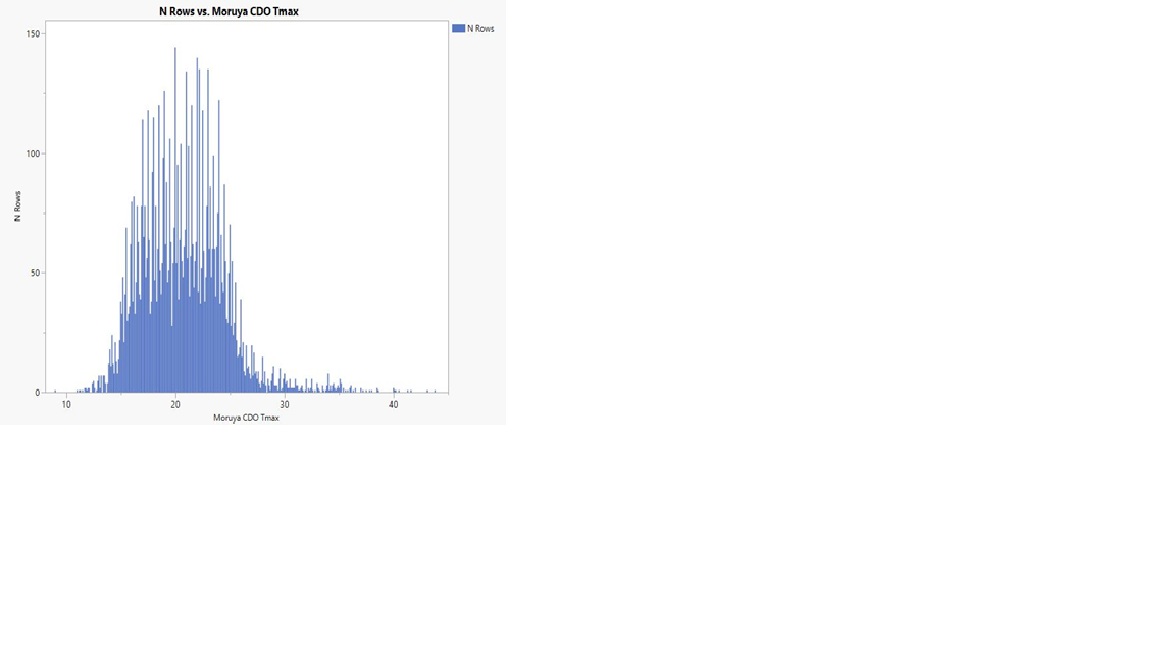
So a government body tasked to be the official national source of data about weather and climate can choose to delete reporting of a relevant topic? It does not matter that a reason to delete was provided – a similar argument exists for many factors because climate is typically described over 30 years, so movement over 1 year is likely to be a small part of the picture. Your mathematics speciality might cause you to agree.
BTW, talking math, here is a typical distribution graph of daily Tmax at Moruya Heads, Australia, with customary layout of temperatures from lowest to highest on the X axis in bins of 0.1 deg C increment and the number of days reporting that temperature as Y axis. Time period is 21 years from 1 Jan 2005 to 31 Dec 2025.
A naive expectation is that the frequency of days at one temperature like 20 deg C would be close to neighbours 19.9 and 20.1 deg C. A common normal distribution might even be approached, with a smooth variation to the curve through the top.
Instead, we have a pattern of comparatively high counts for about 80 of the 250 or so bins. Many of these spikes are twice the height of neighbours.
They form a pattern resembling the Fahrenheit to Celsius math conversion error, plus one or more other effects. AI describes this as ‘Fahrenheit comb effect’
Now, these are the ‘raw, unadjusted’ Climate Data Online downloaded temperatures. They start well after BOM decimal conversion date in 1972. They are from an AWS automatic weather station, free from observers writing down Celsius temperatures each day and maybe favouring some temperatures over others. This spike pattern at Moruya Heads is seen at a majority of the dozens of other weather stations so far studied to seek this type of noise.
Nick, what do you suggest as the cause of this rather prominent mathematical departure from expectation?
All the best. Geoff S
p.s. Can Readers from other countries do similar distributions and report?
Geoff,
This is a bit off topic. But I think the answer is in the notion that it is raw data. Strictly, it isn’t. A max is a calculated value. The algorithm might be as simple as looking through to find the largest number, but some here object to that as being too sensitive to random fluctuations. There is merit in that, and I think they do something to establish some kind of statistical significance. That involves smoothing. I can’t see why that would lead to what seems to be some degree of decimal rounding, but it might.
Thank you, Nick.
Our BOM has a few web sites that quote the CDO temperature data as ‘raw, unadjusted.’ It is the main climate factor available to imagine our past and future climate and to make highly expensive political policy.
The 3 links that I gave here can be summarised to show that it is rare to find any Australian weather station that is NOT adjusted in this CD0 temperature set.
It gets worse, because BOM further adjust this foundational CDO set to produce a subjective ACORN-SAT data set that embeds a general warming that is not measured, but guessed. BOM send this double-dipped ACORN-SAT to international bodies compiling global temperature guesses.
There comes a point where temperatures are so far adjusted from those originally observed that they are NOT fit for purpose.
Geoff S
It is silly to call this adjusted. There is no native Tmax measurement. It has to be calculated. There is no underlying measure to adjust.
“”There is no native Tmax measurement. It has to be calculated.””
Please explain how Tmax is “calculated” at a station rather being measured.
OK, how do you measure it with a AWS?
I may be late to the party and lower down the scientific food chain than you and Jim, but to be “calculated” it has to be calculated from something (some might call it an underlying measure). What raw data is it calculated from?
You mentioned one way. “The algorithm might be as simple as looking through to find the largest number, but some here object to that as being too sensitive to random fluctuations.”
The objection arises from taking one or two six second readings and using them as Tmax. That ignores the time constant of prior LIG and min/max thermometers. Comparing the two different types is akin to the concern you and others have about time-of-day errors. The result is an automatic bias to higher temperatures.
In the U.S., those readings are averaged into a 5-minute period in order to more closely match with older technology. In fact, most of my work has been with 5-minute data from USCRN stations. No one would complain if that was done universally. Which points out a problem with using 5-minute readings along with six second readings to obtain a single average.
Interesting, maybe, Charles, but not important unless you’ve bet the farm on wind-generation for your power supplies.
As we know, betting the farm is exactly what the UK is doing.
Losing the farm now.
That’s what happens when ignorant voters elect ignorant politicians.
And to believe that one must also believe that:
Especially to windmills.
Um, a government report prevented from becoming excessively long?
Not in this reality.
You have lost your ability to think critically. Sad.
Hard to lose something that one never possessed.
About 10 years or so (the exact year escapes my memory) Nick was often praised for his critical thinking. He discovered a major flaw in an article and was roundly praised. He prepared and published an article on WUWT that was astute, concise, well written, and technically spot on.
So, perhaps he once had that ability, but he seems to have archived it.
In my perception of reality anyway.
Even a broken watch is right twice a day. Maybe he got lucky.
Ok, that was gratuitous. Nick is obviously very smart and provides some insightful comments, but usually about math because Nick is a mathematician. I think the problem is he nitpicks the minutiae trying to make an obscure or irrelevant point while all of the common sense stuff just seems to pass on by.
Chuckle. The Nickfish swallowed that line! I hope he doesn’t expect the rest of us to be so absurd.
Mr. Stokes: Hard to believe a fellow with your skills wasting time pot-shotting at articles here. Can’t you work on demonstrating how CO2 is causing slower wind? Then they could get back to reporting on climate-catastrophic wind slowing.
Nick, if you think the Met Office’s excuse for hiding important information is acceptable then I don’t think we live on the same planet. The MO claims to be a scientific organisation. So why does the latest report not include data on a dramatic climatic change that has huge consequences for the government’s energy policies? Claiming it’s okay because earlier reports did include the data is a joke. Everyone will naturally download the latest version which excludes this inconvenient truth. That includes politicians who need to know that the output of wind farms is falling because the unicorn farts that they need is also falling.
To be honest, I simply can’t understand why you continue to insist on defending the indefensible.
Wind speeds are slowing over UK because of friction caused by all those damn turbines, anyway that’s my theory.
😏
Well, there can’t be zero effect if all that power is being extracted from the wind.
There is an effect. Turbines in the turbulent wake of other turbines produce less electricity. Aircraft designs with pusher propellers turning in the aircraft’s own wake suffer the same problem, producing less thrust.
Which is not to give credence to the idea that wind turbines are noticeably slowing the world’s wind! That is just laugh-out-loud funny.
I wondered why pusher-props never really caught on.
As for slowing the wind, it’s clearly happening at a local level as cited in your post. What the other local effects might be, who knows?
It’s a tradeoff. Pushers can be better faired into the wing and reduce wind resistance overall, but they are less efficient. Weight distribution is also different and may be an advantage. I expect for some designs pushers work while not for most.
Key words, “noticeably” and “world’s wind.”
But 0.0001 C is significant.
I see nothing in the post about world wind. So you are applying sophistry to divert from the actual content of the post.
The point is not a global effect, it is an phenomenon affecting the local array of WTGs.
Temperature dropped 30 F during a thunderstorm 2 days ago. Did that local phenomenon register on the Global Average Surface Temperature or any other statistic used? Storm lasted about 4 hours.
Funny, the ratio of storm time to the time in one year correlates to the 450 ppm concentration of CO2. Therefore CO2 must have caused the storm’s timing.
History tells us, the most effective way of dealing with unhelpful facts is to simply not report them.
The narrative of climate alarm has pushed the purveyors into a corner of their own making. They have been banging the drum of climate crisis, using every small weather anomaly as evidence of impending climate disaster. The oft mentioned tipping points and projections of doom with markers widely published such as ice free Artic summers, loss of islands to rising seas, or even walruses falling of the cliffs all used to convey our fate. The graphic images and frightening language is even coordinated. Organisations like the Guardian being tasked to ensure the most dramatic words are used by all publications, that is their role in this as stated by themselves..
None of the hype is real. None of it is ever realised because it is nonsense.
Fear mongering peddled to advance the international obligations of Net Zero, is a project entered into by ignorant politicians or maybe vested interests. How is Al gore’s bank account doing these days?
The Met Office is at best engaged in being economic with the truth. Perhaps that is driven by the need for ongoing funding which only comes from progressing the political narrative, who knows?
Indeed.
Two days ago, NOAA reported that July 2026 had the warmest average temperature for any month on record in the contiguous USA.
So far, WUWT simply has not reported it.
I am sure once the data has been looked at and confirmed it will be reported in the usual way these things are covered in WUWT.
The great good fortune we have is the willingness of the site to cover all subjects relevant aspects to debate and not just the items favoured by the alarmist community.
The science is not settled. The nature of weather patterns is chaotic and clearly cyclical.
On a personal note. I have experienced living in a cold world lacking comfort or modern aids that enable comfortable enjoyable warm living conditions. I do not wish to return to the former.
As I say, confirmation of the temperature record was reported in a press release on Monday and the finalised figures were also published on that day. These are not provisional figures.
Well I know we live in a fast moving world these days but one day after details are announced and still no coverage by WUWT might be just a bit unreasonable……
Six days now, Rod.
Nothing yet from WUWT.
And that press release would be wrong based on NOAA’s actual temperature data report as noted above.
You were looking at the ‘monthly comparison’ data (comparing ClimDiv and USCRN). That hasn’t been updated yet (Aug 12, 15:00 GMT+1) but the monthly data are here and have been published since Mon, Aug 10th.
Yeah, but NOAA bases their claims on a bogus, bastardized global temperature record that doesn’t exist in reality.
My local meteorologists informed us yesterday that Oklahoma had 65 days over 100F in 1936, and 59 days over 100F (in some cases WAY over 100F) in 1934.
We aren’t even close to those records this summer. This summer we have had about 20 days over 100F. It was 100F yesterday. Expected to be 102F today and that high or higher for the next ten days.
Which is perfectly normal for this area at this time of year (the hottest few weeks of our summer).
Here in a few weeks the temperatures will start to drop, just like they do every year. Nothing to see here.
Not even close to a high temperature record in Oklahoma, and that goes for the continental USA and Canada, too.
Now tell me about that European “heatwave”, and how bad it is.
This is the CONUS record, Tom, not global.
Also, the USCRN network, which WUWT describes as “State-of-the-art” is in good agreement with the ClimDiv data, which include adjustments.
(In fact, USCRN has been warming at a slightly faster rate than ClimDiv since 2005, but let’s not quibble about details.)
“This is the CONUS record, Tom, not global.”
I would contend that the CONUS record represents the global record as all unmodified regional temperature records from around the world have basically the same temperature profile as the U.S. regional chart, which show it was just as warm in the Early Twentieth Century as it is today.
None of the temperature profiles of the regional records look anything like the “hotter and hotter and hotter” temperature profile of the bogus Hockey Stick chart.
One has to wonder where the creators of the Hockey Stick global chart got their information. It certainly wasn’t from the regional data which shows a completely different picture.
The only conclusion is the Hockey Stick chart creators made it all up to make it appear that temperatures correlated with CO2 amounts. They created almost a perfect match. And have fooled millions of people in the process. Which was their aim.
The Hockey Stick chart is not backed by any legitimate data.
What I wonder about is how smart people can be fooled so easily when the evidence against accepting the Hockey Stick chart as legitimate is so readily available in the form of the written, historic regional temperature records. It’s right there in front of your eyes, yet it is rejected.
People believe what they want to believe whether it is true or not. That is the case with all climate alarmists. They believe in something that doesn’t exist in reality. They could not believe in CO2 climate change if they had no Hockey Stick chart to look at because it is the Only “evidence” they have of a correlation between CO2 and global temperatures. And it was all made up in a climate alarmist’s computer.
Believe what you want. It doesn’t make it true.
CONUS is less than 1.6% of global surface area.
Maybe this is why you keep thinking the 1930s was warm all over the world when it wasn’t?
“….the U.S. regional chart, which show it was just as warm in the Early Twentieth Century as it is today.”
Why do you keep saying that?
No it doesn’t!
“Believe what you want. It doesn’t make it true.”
Indeed – Let’s turn this back…
“I would contend that the CONUS record represents the global record as all unmodified regional temperature records from around the world have basically the same temperature profile as the U.S. regional chart, which show it was just as warm in the Early Twentieth Century as it is today.’”
On the basis of the above how “would you contend” exactly?
Without resorting to conspiracy.
There are levels of belief that confound common-sense – this of yours is one of them.
TFN’s got everyone off on a meaningless distraction and has derailed the conversation again.
I was actually addressing a point made by another poster regarding ignoring facts inconvenient to one’s interests. This seemed relevant.
If and when (and we’re over three days since the announcement) WUWT finally addresses the fact that the US just had its warmest month on record, we can switch the conversation to that thread.
You seem to be operating under the delusion that just because you have an irrational fear of a little warming that everyone else has a moral and ethical obligation to share the same concern, and on demand. HINT: The reason it’s been ignored by others is no one cares about a meaningless number. But it is meant to frighten people and it’s obviously working on you. If you’re so concerned about it, start your own thread.
No, I love all this! I just can’t understand why a site based in the US that claims to be dedicated to “global warming” ignores an warming important landmark like the warmest month ever recorded in their own country.
If it had been the coldest month on record, or even the coldest July, do you think WUWT wouldn’t be shouting it from the rooftops?
Talk about beating a dead horse. They would be “shouting it from the rooftops” in well-deserved mockery, which you wouldn’t understand.
Mr. Nail: Ahhh, there’s your error! This site is not “dedicated to global warming”, where is that claim made at this site?
I learned long ago to ignore the ravings of alarmist propaganda, which you can’t understand because you turned off your bs meter when you joined the cause. Please keep posting here, you’re what we call a reverse barometer.
The subtitle of this website is, “The world’s most viewed site on global warming“.
Those words appear every time you type ‘WUWT’ into a search engine. Surprised you’ve never noticed!
Your preoccupation with records betrays your self-assigned duty of being a troll!
Record values in the written records are bound to occur with warming from the Little Ice Age. Otherwise, we would still be at the temperatures during that time.
A single month is weather, not climate. Trying to imply a single current month is indicative of future change is what trolls do. What are you going to say when the next month is lower? Are going to claim that would mean a cooling climate is going to occur in the immediate future? Are you going to blame WUWT for not jumping on a cooler month within days?
That doesn’t follow, because as has been pointed out many times, there is zero warming trend in any of the global temperature records between 1850 and the 1930s. Did “warming from the Little Ice Age” take an 80-year hiatus?
Here is a chart from Wikipedia, which is far from a skeptical site.
https://en.wikipedia.org/wiki/File:2000+_year_global_temperature_including_Late_Antique_Little_Ice_Age,_Medieval_Warm_Period_and_Little_Ice_Age_-_Ed_Hawkins.svg
Notice when the warming from the Little Ice Age starts in this chart.
Where is the warming between 1850 and the 1930s?
Notice the dip in the averaged data (red line) from the 1870s to the early 1920s.
Isolate that, then add your averaged data and you will get a zero trend.
Note also the massive increase since the 1930s and especially since the 1970s.
There is no equivalent anywhere in the previous record. So it is nonsense to say that the current observed warming is a continuation of warming from the 1850s.
“Two days ago, NOAA reported that July 2026 had the warmest average temperature for any month on record in the contiguous USA.”
Yes.
According to NOAA, July 2026’s daytime TMAX ranked as the 6th warmest on record, while overnight TMIN ranked as the warmest. TAVG (the average of TMAX and TMIN) was also the warmest on record.
This is an important detail.
My prediction for WUWT is that it will publish an article highlighting the 6th-warmest TMAX ranking and use it to claim that July wasn’t the warmest month on record—all while conveniently omitting that they’re cherry-picking a different metric.
And warmer nights during the growing season is a problem why?
That’s the question they can never answer.
You can look at the actual data at https://www.ncei.noaa.gov/access/crn/visualizations.html and decide for yourself.
We have noted your prediction.
When/if it proves a false prognostication, will you admit you were wrong?
So what….. nothing to do with anything humans have done.
UAH shows the anomaly was nowhere near the maximum monthly anomaly.
No one has claimed that July 2026 was “the maximum monthly anomaly”, including NOAA. They said that at was the warmest average month in the c.US record and they are not referring to temperature anomalies, but to the actual temperature (76.9F).
And as a matter of fact, UAH does show that July 2026 was the warmest July on record in US48 (contiguous USA, +1.14C), although that record begins in 1979.
USA was much warmer in the 1930s, and 40s.
No one is falling for this garbage anymore, nicey. Have you noticed that?
Yet you want everyone to take your garbage seriously.
What I said was a simple fact that no one, so far, has been able to dispute. The response above, for example, shows only stations designated “OAS” (Ocean Air Sheltered) and it stops 16 years ago!
On Monday Aug 10, NOAA said that July 2026 was the warmest month of any month on record for the c. USA and released their monthly stats. (BEST will concur shortly, according to Zeke Hausfather.)
Meanwhile, WUWT, ‘the world’s most viewed site on global warming’, has so far failed to so much as mention it.
Multiple sources show 1930s,40s warmer.
Not only in the USA, but all over the Northern Hemisphere. !
Amazing how well the graph above matches Karl’s 1988 data through the 1930s and 40s.
Yes, that chart shows the basic temperature profile of the Earth.
It shows that increasing CO2 amounts do not result in any new net warming, because it was just as warm in the recent past as it is today despite the increase in CO2.
The creators of the bogus Hockey Stick chart turned the benign temperature profile of the chart above into a temperature profile that has gotten hotter and hotter and hotter since the end of the Little Ice Age and today is the hottest time in human history.
Now how do you get from one profile to the other? I don’t think you can without manipulating the data.
Only in your mind’s eye, Tom.
Nothing like a chart showing annual temperature that stops 40 years ago to refute a claim about a monthly temperature that was recorded last month.
Didn’t see that one coming.
1979? Wow, that’s a massive data set.
Doesn’t even look at the 1900s and 1930s numbers.
Yawn. Next.
You haven’t followed the above threads, have you, Mike?
Probably too tired; hence the yawning.
The problem with this alleged NOAA “report” is that the actual CONUS temperature data that NOAA publishes does not show July 2026 as the warmest ever. Many years prior were warmer. See https://www.ncei.noaa.gov/access/crn/visualizations.html
Perhaps the alleged report concerned a single measurement at a single location which was warmer than ever before and that “report” was distorted by the press? That is a highly probable explanation.
It’s not an “alleged” report, my friend. It’s NOAA’s official monthly assessment report.
The updated monthly NOAA data are available here. They show that July 2026 had an average temperature of 76.89°F, ranking it the warmest month in their 1579-long monthly record, which starts Jan 1895.
The data you linked to are the ‘Monthly Comparison’ data, which compare ClimeDiv to USCRN. These always take a day or two longer for NOAA to produce and, at time of writing (Aug 12, 14:45 GMT+1), July 2026 has not yet been updated at that site.
Did you not choke when reporting an “average temperature” down to the last one hundredth of a degree F? I certainly got a chuckle reading it!
I probably would have found it funny, had I thought it was a value gleaned from a single thermometer reading rather than the arthritic average of thousands of different temperature readings.
Do you know anyone daft enough to think that, hiskorr?
It ignores scientific notation.
Erm, how? (I know I’ll regret asking this.)
In scientific notation the result of a calculation cannot be stated with more precision (aka decimal places) than the least precise value in the calculation.
1 x 2.1 = 2
1.0 x 2.1 = 2.1
There are those of the CO2 persuasion who think significant digit rules are arbitrary, capricious, and out-dated.
Right, and 76.89 follows that rule, because there will be many, many many more decimal places after the 9 in the actual averaged data, considering that there are thousands of individual values.
You appear to be confusing scientific notation with decimal places.
Groan. The two are not unrelated, sigh.
‘Groans’ and ‘sighs’ but no refutation.
All fur and no knickers.
You appear to be a complete idi… or, innumerate. Decimal places (and the proper use of significant figures) are no where more important than in scientific notation.
Funny how USCRN has such a difference.

As compared to NOAA’s climate-at-a-glance.
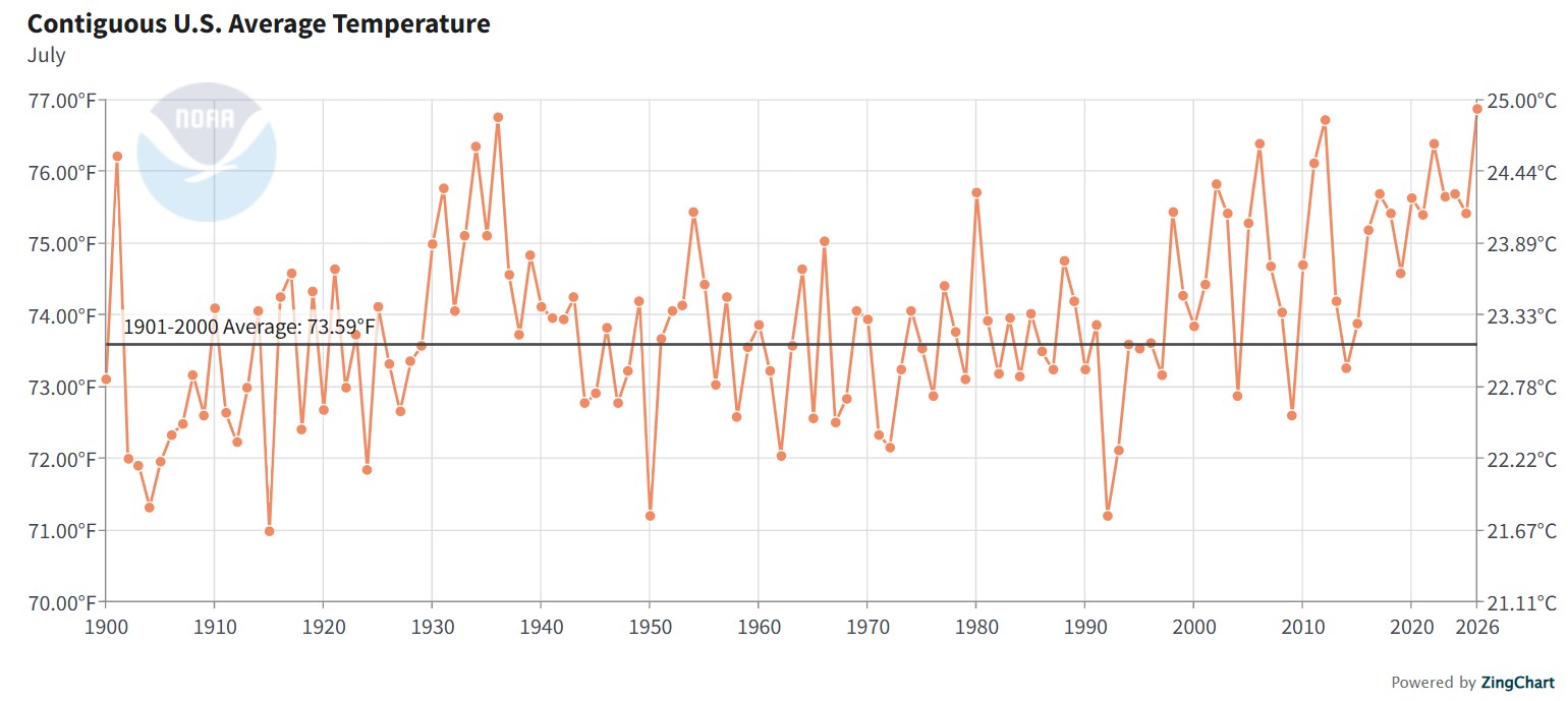
Look a bit closer at your chart, Jim.
USCRN hasn’t been updated to July 2026 yet. Your chart ends last July, though I see you’ve clipped it in such a way that this isn’t clear to the reader (accidentally, no doubt).
When USCRN is updated be sure to get back to us with new chart!
Tow whole days and that “proves” WUWT denies data.
Let’s just say they’re quicker to publish some stories than others.
Mr. Nail: Maybe you should just say it right the first time, you wouldn’t need to crawfish like that.
You need to get over your narcissistic superiority complex. Just because something rocks your reality doesn’t mean anyone else needs to care about it.
Publish your own effin’ story if you have a problem with it.
Into day 6 now, still no mention.
Don’t need to, dumb@ss, you won’t let it go.
By the way, diverting attention from the article is sophistry.
Whether or not WUWT reports the NOAA data has absolutely NET ZERO with what is happening at the UK MET.
Your “what aboutism” is that since WUWT has not commented on a 2 day old report, what MET did is totally justified, which it definitely is not.
My response was to Rod Evens’ observation that ignoring awkward news is a tried and tested way of dealing with it. I agree.
My response was to your several posts starting with thee first that brought NOAA and WUWT to the front. You know, the one responding to Rod Evans way up there.
Indeed.
Two days ago, NOAA reported that July 2026 had the warmest average temperature for any month on record in the contiguous USA.
So far, WUWT simply has not reported it.
Rod Evans was talking about MET.
That you do not grok it is no surprise.
No, he was talking about ignoring news items that don’t fit with your agenda.
Quite fitting, therefore.
He was talking about it in the stated context of MET deleting a primary section.
Not getting around to republishing someone else’s report is not even close to the same thing. And insinuating the WUWT did so deliberately is below even you.
You are clueless to what it takes to research and analyze a publication.
You are clueless to what the scheduling of articles prioritizes.
You are attributing something based on your opinion as nefarious, when it likely is totally unrelated to your opinion of WUWT.
You just took a cheap shot. That is nefarious.
So do you think WUWT should cover this news or not?
Is WUWT a science-based website or an advocacy site, in your opinion?
If you think it is worthwhile to mention, write up an essay and submit it for publication. This is a user based blog for all. You can write a story as well as anyone. I suggest you get busy.
Here is a graph of July CONUS Tavg. Makes you wonder what happened to CO2 starting in about 2000 to make temps take off. Data manipulation is a likely candidate.

Well, we won’t have long to wait for the monthly ClimDiv vrs USCRN update.
As you know, USCRN was set up in 2005 and is considered by WUWT to be the “state-of-the-art” US climate data network, compared to ClimDiv, which uses adjustments.
At present, USCRN is warming at a faster rate than ClimDiv over the same period. Who knows whether that will continue with the July 2026 update?
Odd that you didn’t notice the ClimDiv data hadn’t been updated either, before you deselected it.
“Makes you wonder what happened to CO2 starting in about 2000 to make temps take off. Data manipulation is a likely candidate.”
one set of temperatures is real …others are “real feel ” ?
😉
The ‘pristine’ USCRN stations are warming faster than the ClimDiv data.
Not something you will read about here.
Go figure.
Ah, another conspiratorial post from the Daily Skeptic.
Contrary to his inference that a reduction in winds and the MetO’s lack of reporting of it this year being some sort of dodge from it not fitting modelled effects of CC …. it in fact does:
And so it was an “own goal” by them not to have emphasised it, rather than omitting it.
https://www.nature.com/articles/s41612-024-00880-2
”Western Europe experienced an unprecedentedly hot July in 2022, which significantly impacted ecosystems and society. Our observational and numerical modeling study reveals that this event was influenced by anomalous North Atlantic and Eurasian jet streams. The northeastward shift of the North Atlantic jet stream, driven by sea surface temperature gradients, and the curving of the Eurasian jet stream, affected by rainfall anomalies in Pakistan, enhanced atmospheric subsidence over western Europe. This research highlights the crucial role of the synergistic behavior of the North Atlantic and Eurasian jet streams in driving extreme heat over Western Europe. Furthermore, CMIP6 climate model projections suggest that under the SSP585 scenario, similar jet stream configurations could lead to even more intense extreme temperatures (~7.02 ± 0.61 °C) compared to the current climatological mean.”
“In January 2024, a spokesperson told a BBC radio programme that UK storms were “more intense” due to the effects of climate change.”
That is correct – in winter – but not in summer.
The reason lies in Arctic Amplification …..
In short, as the climate warms both the NH and SH PJS’s move poleward as each Hadley cell expands. (NB: of course this is on average as there is much variation and also more waviness involved).
As Storms are spawned and driven by these jets, then less and weaker storms/depressions will occur when the Jets move poleward.
BTW: The SH jet has the intransigent cold of the Antarctic to push against however and the movement is slow but results in a stronger overall PJS.
The process is driven by the deltaT gradient from mid Lats to pole.
https://www.nature.com/articles/s41467-018-05256-8
“Schematic figure illustrating the main seasonal differences in upper tropospheric circulation between winter (January) and summer (July). Panels a and bshow 250-hPa wind speed (green-to-blue shading) illustrating the jet streams with black arrow lines that follow the zone of maximum wind speed. The wintertime stratospheric polar vortex is outlined with the thick green line following the 30-hPa maximum wind speed. Panels c and d show the 250 hPa meridional wind speed (dark gray-to-dark red shading) depicting the stationary wave features associated with the jet streams. White arrows are added to illustrate wind direction. Basic differences in the summer circulation features, as compared to winter, include shorter stationary waves, more northerly subtropical jet, absence of stratospheric polar vortex and an Arctic front jet forming double jets.”
“Arctic Amplification “
Arctic was far warmer for most of the last 10,000 years..
Was also just as warm in the 1930s, 40s.
Also.. CO2 causes cooling in the Arctic
New Research Finds Increasing CO2 Induces Cooling In The Lower Atmosphere Over The Arctic
“Arctic was far warmer for most of the last 10,000 years..”
Heck – you don’t say!
“Also.. CO2 causes cooling in the Arctic”
Err, no – That’ll be the Antarctic – which we know about: it’s called the -ve greenhouse effect …..
The first paper that talked of this seems to be this (from 2015) ….
https://agupubs.onlinelibrary.wiley.com/doi/full/10.1002/2017GL076668
“That’s funny” From the paper you link and misquote …..
“When increasing both, CO2 and CH4 from pre-industrial values to
current concentrations, and averaged over the whole troposphere, we find a warming of 0.42 K for the Arctic
and a slight cooling of 0.01 K for Antarctica. Our results contribute to the understanding of the lack of warmingseen in Antarctica throughout the last decades.”
You might like to inform Mr Richards of his “to funny” error.
FYI: A negative greenhouse effect is where greenhouse gases cause a net cooling effect by enhancing energy loss to space rather than trapping heat due to warmer air overlying a marked surface inversion – this is the case case over the Antarctic plateaux in winter.
Translation: CO2 does whatever we need it to do.
“Translation: CO2 does whatever we need it to do.”
Translation:
Again – Get in a sarcy comment in leiu of anything constructive.
You didn’t look at the second paper did you. !
Yes, it’s called the negative greenhouse effect and only occurs on the Antarctic plateaux …. As I said.
“CMIP6 climate model projections suggest that under the SSP585 scenario”
That’s funny ! 🙂 Still the totally fake and discredited scenarios, used in fantasy la-la-land models.
“That’s funny ! Still the totally fake and discredited scenarios, used in fantasy la-la-land models.”
Try some comprehension…
It says:
“Furthermore, CMIP6 climate model projections suggest that under the SSP585 scenario, similar jet stream configurations could lead to even more intense extreme temperatures (~7.02 ± 0.61 °C) compared to the current climatological mean.”
IOW: Models show the process and the (extreme) warming scenario shows extreme warming.
Well wuddn’t u know it?
Only a brain-numbed AGW zealot gives a single bit of worth to the CHIMP model projections and their anti-science scenarios.
They both are totally non-scientific and totally bogus.
Only a brain dead denier of AGW would want climate scientists to use a slide rule or an abacus to work out such a complicated layer-resolved physical process as is the GHE.
Not in short supply around here, Anthony.
Yep, climate scientists are a step ahead of Newton, Einstein, Heaviside, Planck, NASA (see the movie Hidden Figures), Maxwell, and dozens of other scientists. Do you think German scientists who built the V1 and V2 rockets had computers and calculators? How about the folks who built the first atomic bombs?
Your ego is on display and is not a good look.
Has anyone told these folks, that this has been deprecated and is no longer plausible?
So the stratosphere and jet streams somehow reduce surface wind speeds to a large extent?
Did you read this before posting?
“Has anyone told these folks, that this has been deprecated and is no longer plausible?”
See above.
“Did you read this before posting?”
Yes.
Did you.?
If you did then you failed to grok that it was simply saying that the effect was present in all scenarios and that the extreme scenario gave extreme temps.
“So the Stratosphere and jet streams somehow reduce surface wind speeds to a large extent?”
In winter jets are strong due to the deltaT between the mid-lats and the pole being at a max and the Stratospheric jet forms because the pole is in shadow, which adds impetus to the trop PJS below, as it flows similarly west to east (this occasionally reverses if a SSW occurs and that then markedly slows the PJS)
In summer there is a much reduced DeltaT and the PJS is free to move further northwards (on ave), hence the reduction in winds from depressions affecting the UK, espeically England.
Thanks.
I was also struct by envisioning windmills so tall that their blades would be spinning in the jet stream.
The demonstrated absurdity of climate alarmism grows daily.
Nature. ’nuff said.
No independent verification.
Omitting a key data set in a climate report invalidates the whole report unless it is renamed and removes the Climate title.
Yes, of course it does, even though it’s just one year at the end of 55 years and the updated graph is just a click away prominently displayed in said report.
No hockey stick today? What gives?
Certainy not your usual snarky comment in lieu of anything pertinent to say.
I would have expected more high gusts as more stations moved to sonic anemometers over previous mechanical cup or rotor systems with greater mechanical inertia.
Even within mechanical sensors, you would expect marginal improvements in bearing technology and QC over the decades to reduce the degredation in sensors between maintenance visits.
One would have to assume that someone was attentive and funding available to accomplish those simple tasks you noted.
One would also expect the misnamed Climate Stations to have regular maintenance and calibration performed.
An interesting difference between rotor and sonic anemometers is the elimination of the dead band where the mechanical instruments can’t respond to slight winds, about 5 mph IIRC.
I wish people would stop calling those responsible for ukmo and it’s blatant theme of using only weather stations that run hot under certain atmospheric conditions ‘activists’ ukmo is art of civil defence and it’s guidance comes down from on high in the deep state and the deep state are almost openly controlled by the globallist new world order mindset. The call the shots and the carefully selected activist staff run around like zombies chanting net zero . I think this is far, far deeper and manipulated than trusting people realized. The very warm western european summer has been used as a springboard to re launch and justify Net zero. A few heat records here and some fires there are all designed primarily to fast pace the UK to energy and food poverty. I have no doubt many of the recent dramatic wild fires, like Libya’s Derna dams late 2023 were conscious planned psychologically sabotage. Call me nuts I don’t care .
It’s worth remembering that much of the UK has had an average Summer; only certain areas have broken records.
Really?
One would never know it based on the reporting.
I guess reporting on an average summer doesn’t sound like a crisis to the alarmist press.
England and Wales had the most of the heat/sun but both NI and Scotland reached their heat thresholds at least once.
So I’d say that is most of the UK – certainly by far the biggest population.
This June up to 15th July….
A small pocket of pleasant warmth over the UK and western Europe.
So what !!
And remember, Met-office measurements are a total joke anyway.
What is it , some 70%+ or more class 4 and 5 stations ??
Oops, I made a mistake.. the percentage of Class 4,5 sites in the UK is nearer 80%.
.. and climbing as they add more of them. 😉
And the warmest July on record for the US, according to both UAH and NOAA, let’s not forget.
UAH only goes back to 1979.
So it’s not a record?
Need you be reminded that warming is “meant ” to be global, and USA is what, 2% of the globe.
Australia, of similar size, had a negative anomaly, making it the 27th warmest July.
You are yet again mixing up WEATHER with climate.
USA was MUCH warmer in the 1930s, 40s
Globally, around 1979, when UAH started, was basically the COLDEST period since 1900 in most raw surface data.
”Globally, around 1979, when UAH started, was basically the COLDEST period since 1900 in most raw surface data.”
And in 1900 the atmospheric concentration of CO2 wasn’t even 300ppm – now it’s 429 (July 2026).
40% higher.
Just a coincidence of course (sarc).
“A small pocket of pleasant warmth over the UK and western Europe.
So what !!”
You seem to have misunderstood what I was responding to bnice.
The extent of the hot summer over the UK.
Has it not dawned on you that planetary weather has variation.
Ah the convenient “with on bound he was free” comment.
If it makes you think you have a win, be my guest.
And as ray sanders points out that they were very questionable if not damn lies
It is not a conspriracy theory if it is true.
When one takes the wider view of humanities current insanities, very distinct patterns emerge and those patterns align well with the hypothesis of a drive to create the One World Order.
There is not a big invisible foot trying to stomp on you, Sparta. You only think there is.
The temperatures you are feeling and the wildfires, etc, that you are reading about are real and are certainly going to get worse.
The only conspiracy you should worry about is the one that is spending a fortune to convince you otherwise.
Swing and a miss.
Your disparaging comments are noted as is your sophistry.
They weren’t intended as “disparaging” comments, Sparta; they were just observations. No offence meant.
I would always encourage genuine scepticism; but that is not what we get here on WUWT.
What we get here, remorselessly, is advocacy for a vested interest. In this case, fossil fuels, especially coal.
You’re nuts.
***Story Tip***
UK Energy supplier Octopus Energy asks it’s customers to not use major household appliances during the solar eclipse
https://www.rt.com/news/644111-uk-energy-solar-eclipse/
And right after the eclipse comes nighttime. What then?
how many of the weather stations reporting wind data are normally downwind of a wind farm?
That is an astute question.
Well done, mate.
Declining wind speed is not just a UK phenomenon, it has been reported globally, last I knew, and most dramatically in the long term record at the Blue Hill Weather Observatory, south of Boston Massachusetts.
They seem to have completely messed up access to some data (membership issues, access agreement, I’ll snarl at them and remind them of my donation history and the account that may be extremely stale), but here’s a wind speed graph for 1885-2023. The last I saw, no one has a credible explanation for what’s going on. The next AMO flip will be interesting, but there’s so sign of it in this plot.
Any calculations available for WTG effects, as well as land use changes to install SV and WTG farms?
Any possible relationship to earth’s axial precession?
Certainly solar and orbital affects play a part, but that is non-deterministic as the sun is not a constant energy source.
Does cloud coverage present as a cause or an effect of these changes?
I am sure there are several other parameters that could be included. Humidity?
Cheers.
Between today’s lame eclipse and me going to a Mt Washington weather seminar this evening, I don’t have time today to dig into recent stuff.
Land use has been suggested as a big possibility, but Blue Hill has trees, had trees, will have trees. It overlooks a lot development, e.g. I-95 and that commercial corridor, but I don’t see how that could lead to something this dramatic.
Earth’s precession is too slow to be behind this, though the date of our perihelion has changed measurably over my lifetime. (I’m a geezer, it interesting to note things like this.)
Cloud coverage could well be tied to this, but we just don’t have good data. Blue Hill does have some really neat cloud cover data, but it’s burned on paper strips by an antique glass sphere – my favorite artifact there that’s still in use! And we don’t have decent global data except from the satellite era, and I’m sure it needs attention.
My sister is involved in editing an annual “State of Mass Bay” report, they’ve noticed a change in wind direction that I passed on to the Blue Hill folks. It’s not at all clear if that’s a useful data point or if it’s merely related to the AMO.
From my https://wermenh.com/wind/ :
2009’s Why is the Wind Speed Decreasing? describes a couple possible reasons why wind speed has decreased at Massachusett’s Blue Hill Weather Observatory since 1980. Their suggestion of vegetation growth is not convincing to me. In their State of the Climate at Blue Hill Observatory:1885-2022 they drop that and expand on changes in wind patterns:
While that 15.0 mph to 12.1 mph decline in velocity is remarkable, wind energy varies with the cube of the velocity, and that is an astounding 48% decrease. I don’t know if wind project developers are aware of this, I have seen reports that wind projects have not produced as much power as expected.
—-
Basically, as I noted: “no one has a credible explanation for what’s going on.”
They will be hosting a weather conference in October, I’ll likely get back up to speed on this and look for people to pester. 🙂
Thank you.
I hope you noted that my questions present a partial analysis of alternative explanations and by no means was intended as negative criticsm.
That’s an interesting chart.
The wind has fallen off a cliff!
I think there is a perfectly credible explanation for reductions in wind speeds. As the climate gets warmer, the tropics vs. high latitudes AND the day vs. night temperature differentials are shrinking.
Which should logically reduce wind speeds AND violent weather.
Oh and you can throw in some reduction from “wind farms” extracting energy from the wind.
Yeah, I forgot to mention the warming arctic as a potential reason. I’m less fond of the wind turbine idea, New England doesn’t have many, and the decline started before most wind sites were developed.
A climate report that omits wind data does injustice covering climate. Next will be rainfall and then cloud cover until it all comes down to temperature, thus closing the loop on the initial bogus claim of a “runaway greenhouse effect.”
This is all backed by the change early on to determining the effect on temperature of rising CO2 concentrations in the climate models back then.
After all, CO2 can be quantified and taxed per a UN official in the mid-70s.
“Look! Acceleration!”
“Rapidly increasing”
You can tell it’s not an independent outfit because all these guys still have their jobs. Clearly government has corrupted the Met.
Losing some fine detail in rainfall data in Oz-
The Australians keeping a century of rainfall records as stations disappear