Guest essay by Larry Hamlin
NOAA has updated its U.S. Contiguous USCRN Average Temperature Anomaly Data through July 2023 as shown below.

The measured data shows no supporting upward trends regarding U.S. 2023 average summer temperature anomalies to date. This reality flies in the face of the out-of-control media climate alarmist incompetent and idiotically hyped “tipping point” climate change temperature propaganda this summer as illustrated by these prior WUWT articles exposing this purely bogus garbage.


What a bunch of alarmist politically contrived gibberish.
For more on heat waves and temperature check out EveythingClimate.com
July 2006 was hotter. No talk of climate emergency back then I don’t think.
The extreme left were just warming up to it
The temperature record shows there is no recent overall warming in the US.
Objectively a fact.
And yet we are assailed on a regular basis with a blizzard of stories and papers regarding things that are blamed on “climate change”.
We have people, including so-called scientists, as well as political leaders, weeping and moaning about how we are all roasting and are doomed.
The ocean is rising, the glaciers are melting, the crops are failing, our cities are becoming unlivable, we will soon be extinct…
And yet, where is the warming that is ostensibly causing it all?
It cannot be pointed to. It is all anecdotal, or refers to adjusted numbers, or cherry-picked intervals carefully selected.
If we could put a piece of paper into the hands of and in front of the faces of every person in the country, would the scales suddenly fall from their eyes?
How will people react if they can be shown conclusively that all of the alarmism is based on a mishmash of outright lies and fabrications, spiced up with a mélange of unevidenced naked assertions?
Do people even know the true nature of CO2 and it’s essential role in the biosphere, or it’s actual paltry amount in the air?
Are people aware we are living on a planet in an ice age, and deadly cold and long Winters are not the normal state of the Earth?
Is their going to be a reckoning, a day when the lies become obvious to the masses?
Will we ever find out how much better off we could all be if we return to a state of affairs characterized by a devotion to using the scientific method as an objective tool for inquiry?
How much damage is being done by an academic and scientific world devoted to perpetuation of a blizzard of lies?
“How much damage is being done by an academic and scientific world devoted to perpetuation of a blizzard of lies?”
They are doing a lot of damage to the younger people, who don’t know any better.
Older folks, who have a long history of weather, know there is nothing unusual going on with the weather, but the younger ones are having mental problems and some are saying they don’t want to have children in the world they are told will exist.
It’s Child Abuse.
Are you serious? They’ve been bleating about this since 1988.
Can someone explain what the effect of carbon monoxide is with respect to GHG? I read a few articles but got lost in the terminology. They said it is not a direct but indirect GHG, interacting with OH? Couldn’t find PPM levels for either.
Thanks in advance.
I was watching this video on WSF converting to hybrid electric ferries.
The direct GHG effect of CO is negligible to nonexistent, but it does affect CH4 and O3 levels locally.
https://acp.copernicus.org/articles/13/5381/2013/acp-13-5381-2013.html
CO2 is miniscule too.
An electric ferry with a cargo load of electric vehicles and an electric fire would be a wonder to behold. would hope the passengers have their life jackets handy.
Do you suppose they would issue asbestos suits as safety equipment as well? I don’t think one could get a life jacket on and get off the boat fast enough.
There is not much of it, and it does not stick around long.
It is very reactive, being incompletely oxidized carbon.
Despite it being produced in numerous biological processes and by every combustion process, it exists in the atmosphere at a concentration of less than 1 part per million.
The idea that it gobbles up hydroxyl and thus prevents elimination of methane seems absurd given how few molecules of both of these species are present.
Unless you are in an enclosed space with an inefficient combustion occurring, it is nothing to be concerned about.
It is like worrying about eating apples because they have some methanol in them, or bananas because they are radioactive.
What is important to know is, warmistas are not engaged in objective scientific inquiry, but focused and irrational alarmism.
I thought that the problem with apples was cyanide in the seeds.
Holy crap!
I am DONE with eating apple cores.
Promise.
I can’t believe you never knew that.
Thanks for your explanation!
Climate screamers scream because they can’t debate.
It’s being venerated daily in The Guardian, NYT, CNN, WAPO, MNSCB, ABC, BBC, CBC, NPS, and innumerable other “desperado news” outlets.
The US had a heat wave in the SW, while the northern prairies were cool. You can see that in this global map
But the rest of the world was mostly warm, so that July was 0.225°C warmer than the next warmer July (2019). The mean temperature to date has already passed the hot years of 2016 and 2020, and those years peaked in Feb-Mar.
No mention of July 1936. Or of July 5977BC for that matter.
Globally, July 1936 was not hot at all.
NH was hot in the mid 1930s. Africa was hot in the 1930s/40s
Several records for Australia were from the mid 1930s before they were adjusted.
IPCC shows 1940s warmest in NH before the AGW scam adjustments started.
“IPCC shows 1940s”
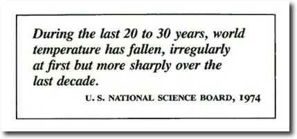
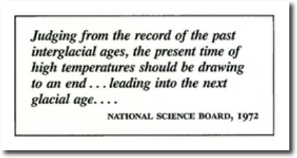
There was no IPCC in 1975
Poor Nick,,. This is what they knew…
… before all the data tampering ..
You know.. to get rid of the 1940s blip !
What, really?
No!
Here’s another from the same period.
Temperature of goodness knows what, from goodness knows who.
ROFMLAO..
That last graph is from James (Homer) Hansen.
Your dementia is taking a firm hold, isn’t it NIck !!
And what is it of?
Dearie me..
Now you don’t even trust Homer Hansen.
Your masters will have something to say about that !
You should ask that of yourself! Very little actual measurement in the SH till later in the 20th century. Yet you speak of “Globally, July 1936 was not hot at all.”
How do *you* know how hot the SH was in 1936?
“How do *you* know how hot the SH was in 1936?”
That would be my question, too. Going by the written temperature data, the time period around 1936 was one of the warmest periods in Australia’s history, equal to the warming we have today. Nick needs to get his head out of those bogus Hockey Stick charts.
Well, we can take comfort in knowing that when a warmista posts a graph or chart, goodness had nothing to do with it.
https://youtu.be/u7ekAQ_Plxk?t=39
Everybody alive at that time. Everybody:
There was no alarmist cult in 1975 either.
But there was a National Geographic Society, and they were still at that time an organization devoted to factual knowledge of the Earth.
And people like Tom Karl were still actual scientists, and NOAA was still an organization that published unbiased information:
“Analysis of warming since 1881 shows most of the increase in global temperature happened before 1919 — before the more re-cent sharp rise in the amount of carbon dioxide in the atmosphere. said Thomas Karl, of the National Oceanic and Atmospheric Administration’s National Climatic Data Center in Asheville, N.C. While global climate warmed overall since 1881, it actually cooled from 1921 to 1979, Karl said”
But then the liars came:
Great comment!
“Why the blip” indeed.
The next question is why did they feel a need to remove the blip?
We know why: So they could create a fake temperature profile (instrument-era Hockey Stick) that would allow them to claim temperatures and CO2 levels are correlated.
If the “blip” remains, then there’s no correlation.
This “remove the blip” fraud is part of the beginning of the biggest science fraud in human history: the notion that human-derived CO2 can cause the Earth’s climate to change. There has never been any evidence supporting this claim.
None of this BS would be possible if we were all still looking at honest information.
And they all know it damn well.
Not a word of it even passes the laugh test in light of what everyone knew to be the case as of 45 years ago, and even less time than that in many cases.
The blip has nothing whatsoever to do with maintaining a 20th century warming trend. The blip referred to an artifact in the ocean surface temperature data around the mid-20th century resulting from changes in the way ocean temperature measurements were made, as discussed in Thompson, et al. 2008. We can see exactly the impact that removing the blip had on surface temperature trends:
Tom Wigley was aware at the time that the artifact had been identified and was going to be corrected for, but he did not know exactly what effect the correction was going to have because the updated datasets weren’t yet available, so he offered some speculation.
I’ll eagerly await your assessment of where the fraud is here.
If it “makes no difference”, why bother to apply the fraudulent “adjustment”?
You should read the Climategate emails. They referenced both a sea-based “blip” and a land-based “blip”.
So they had records showing that both the sea and the land had temperature upswings that they called “blips”.
And they wanted to change those records to look like something else. Thus, “what about the blip” was what they were discussing. Or, in other words, they were discussing how to get rid of the warming that ruined their claims about CO2 and temperatures being correlated.
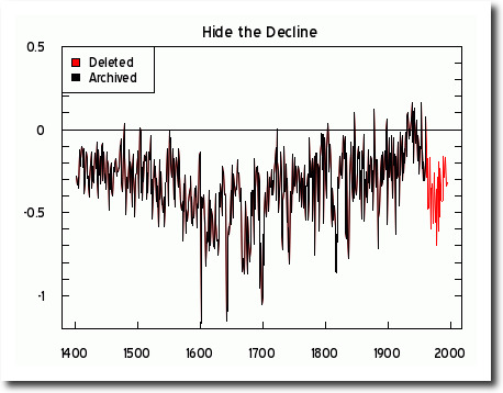
The decline shown in red is probably from manmade changes other than on global temperature. It disagrees with the instrumental record including sea surface temperature, and it disagrees with the JRA-55 reanalysis dataset that even Steve Milloy of junkscience has cited favorably. For that matter, this graph disagrees with the Hockey Stick graph, even in the handle part. The handle of the Hockey Stick appears manipulated to be more straight than is expected from looking at this graph. (The blade is a version of HadCRUT older than HadCRUT3 probably HadCRUT2, which shows less warming than HadCRUT3 which shows less warming than HadCRUT4 which has been shown to not overreport warming by the JRA-55, ERA -Interim and ERA5 reanalysis datasets.) Then again, temperature interpretation of tree rings is like polygraph test results all too often are – the results are what the persons doing the interpreting want the results to be.
“The blade is a version of HadCRUT older than HadCRUT3 probably HadCRUT2, which shows less warming than HadCRUT3 which shows less warming than HadCRUT4”
It’s funny (strange) how every time they revise the version, the temperature goes up. All done in a computer, not in the real world. All done to fool the public into a panic over CO2.
Love those charts! They tell the *real* story of the Earth’s climate.
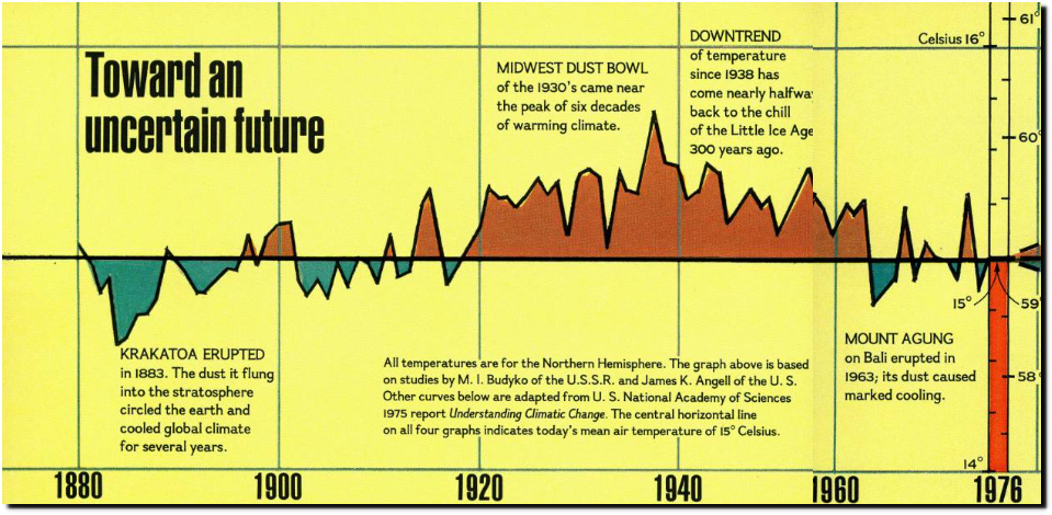
That graph has nothing to do with the IPCC. It’s from a report by the NAS from a report produced in the mid 70’s. 15 years before the IPCC’s first report.
The graph itself is stitched together from two separate graphs. One IIRC was from a soviet study if solar activity.
Why would you assume they could get better estimates for global temperatures in the 70’s than today?
Funny that it matches all the NH real data, hey bellboy !
“they could get better estimates for global temperatures in the 70’s than today”
Nowhere near as much urban warming in the 1970s, jet engines and airport sites not as prevalent, either…
… so the end result was bound to be more representative of real temperatures than the current pre-warmed surface garbage..
There was also no climate scam agenda manipulating data for religious reasons.
“stitched together from two separate graphs”
Coming from an AGW shill… that is hilarious ! 🙂
And not motivation to corrupt the data.
A lot of downtown official weather stations were replaced by airport ones by the late 1970s, including as early as in the 1940s. This caused a decrease of measured daily average temperatures (mostly from decrease daily low temperatures) that got adjusted for mostly after sometime in the late 1980s.
As for jet engines: Why is it that WUWT article posters blamed these for temperature exceeding the previous nationwide (in UK) alltime record high temperature, that was previously set at the same busy airport when jet airliners were already common? While similarly high temperatures got measured elsewhere in the UK?
Data fraud, pure and simple.
Because they were not in the habit of busily altering data collected over many decades, and throwing away any info that was not in accordance with predeclared conclusions.
Just for starters.
Why would you assume people who alter data know what the temp was at some long-ago time in some faraway place better than the persons who were right there with scientific apparatus to measure the temperature of the air?
Bellman is a big advocate of fraudulent data “adjustments”.
Graphs back then focused on the northern hemisphere because they knew there was no high-quality data over a long period of time from the southern hemisphere, and it had not occurred to anyone yet to just make it up.
Unadjusted data from cities all over the world show a nearly identical long term patten of rising and falling temps.
IOW, there is no objective evidence that a large part of the planet can have one trend while the entire planet is having a different trend.
The exact opposite is the case.
There can be excursions in small areas over limited intervals of time, but the motion of water, and air, the jet streams, the movement of air masses, evens out temps over the entire surface and long intervals.
As all untampered data has always shown.
Even data from South America shows a very warm period around 1940.
Just about any unmodified chart you look at from around the world has the same benign temperature profile where it was just as warm in the Early Twentieth Century as it is today.
I haven’t provided this link in a while. Here are about 300 charts that don’t look anything like a bogus Hockey Stick chart.
http://notrickszone.com/2017/06/16/almost-300-graphs-undermine-claims-of-unprecedented-global-scale-modern-warmth/#sthash.neDvp33z.hWRS8nJ5.dpbs
And of course the Arctic region
Don’t forget South Africa
Do you really think that’s realistic. Temperatures just plumet by over 2°C in a couple of years, before continuing to rise from the low point. Or is it just possible that something happened to the station?
A similar pattern occurred in widespread locations in a similar amount at a similar time.
Didn’t you hear of the global cooling scare about that time ?
If it went up 2C you would blame it on CO2 ! 😉
Now,, any evidence or just baseless conjecture?
“Now,, any evidence or just baseless conjecture?”
OK, let’s look at some more South African stations. In all these graphs I’m showing annual average temperatures from the unadjusted GHCN monthly data, and I’ve drawn a red line at 1960.
In fact I’ll start with the one mentioned above. I think the discontinuity is obvious – but the claim is therer is nothing wrong with the data and 1960 cooling is seen in other stations.
Sorry, here’s the graph.
Only a few km away:
No sign of any 2°C drop in 1960.
On the other side of the country in Durban we have a big drop, but in 1940, with a similar rise in 1980.
And in Gqeberha it’s a slighlty different story again, with some movement and missing data after 1940, but temperatures warming after 1960.
Then inland at Kimberly
One final one for now.
In case you are wondering how I selected these locations, it was going down all the South African stations in order of the number of complete years.
Not all of the warming from the lowpoint of the mid 1970s is from increase of manmade greenshouse gases; but a majority of it is. Some of it is from reversal upswing of multidecadal oscillations that were downswinging from the early 1940s to the mid 1970s.
And you know this, how exactly?
Mount Agung on Bali erupted in that interval, marked global cooling resulted.
Who knows what else occurred?
La nina?
Luckily it warmed back up pretty quick.
Is that a mistake too?
This single station record contains a rather obvious and large discontinuity around 1960. If you address this station move I do not think you will like what it shows.
What you are doing is plain cherry picking, but you aren’t even good at it.
What you are doing is making plaintive whimpering noises.
A good season for cherries. Do you really believe there was no peak in the 30’s/40s followed but a fall to 1980 in global temps?
Show me your cherries? Let’s see how good you are?
I do believe there was a “peak” in the 1940s followed by cooling until the 1970s, that is what all global temperature indexes show. None of them show the 1940s as being warmer than the present day. You’ve once again cherry picked a selection of individual station records to try and make your point – cherry picking is a fallacy.
What the hell are you babbling about? I responded to Nicks quote……..
1936 was not warm at all relative to modern temperatures. There was a peak in temperatures at that time, but the peak was nowhere close to the present day. What you are doing is simply cherry-picking individual station records that show what you want to see while ignoring any records that contradict it, and you are completely ignoring the forest for the trees by looking at individual station records instead of a global index.
“None of them show the 1940s as being warmer than the present day.”
Yes, that’s what all the instrument-era Hockey Stick charts say.
But it’s not true. The actual temperature data from around the world shows it was just as warm in the Early Twentieth Century as it is today.
The Hockey Stick charts are bastardizations of the real temperature profile of the planet.
The regional U.S. chart shows this plainly. It shows a peak in the 1930’s, and then a 2.0C cooling phase from the 1940’s to the 1970’s.
Unmodified, regional, written temperature data from around the world show the same benign temperature profile as the U.S. chart.
None of the unmodified, regional charts show a Hockey Stick “hotter and hotter and hotter” temperature profile.
If you look at a chart and the 1940’s look to be cooler than today, then you are looking at a bogus, bastardized instrument-era Hockey Stick chart.
Don’t be fooled!
The raw, unmodified data show exactly the same thing as the “modified” data:
The mid-20th century was simply not as warm as the present day.
Your graph of US temperatures ends in the year 2000 – 23 yers ago. Try bringing it up current to the present day:
Wow, you confess to committing data fraud.
That nasa graph is pure manufactured fantasy.
2000 was NOT 0.6 degrees warmer than 1960.
If we had satellite data going back to ’58 it would look like this…
No.
Yes, the temperature profile of that chart looks just like the temperature profile of the U.S. regional chart (just above), which shows it was just as warm in the Early Twentieth Century as it is today.
Which means there is no unprecedented warming today, as the climate alarmists claim.
Which means CO2 amounts in the atmosphere do not correlate with temperatures.
The early 1960s plummet in the red graph does not resemble what happened with global temperature anomaly according to any of the datasets thereof, including the JRA-55 reanalysis that goes through that far back and that even Steve Milloy of junkscience cited favorably.
Finland, Sodankylä. Annual and seasonal climates (1908-1937)-(1993-2022), (30-year periods). Anomalies (°C), base period 1925-1954, warmest 30-year period early 20th century.
Here on google.maps:
https://goo.gl/maps/NTr2R1BMmAfGNHEf9
And India
Flooding the zone with nonsense!
“with nonsense”
No, I’ll leave that up to you, Nick
It is the only thing you are good at.
Using nonsense never-was-data, like that from GHNC.
He is literally full of shit, and more than his large intestine.
Yes, you sure are! Thanks for admitting it, Nitpick Nick!
Are you a true believer or just a useful idiot?
Your lack of counterpoints to the growing list of evidence placed in front of you that various regions of the world outside of America also had unusual hot 1930’s temperature information.
Your posts have declined in credibility over time…..
It’s cherrypicking. How do we know? Because the global average did not show anything like a maximum. That means that for every site you pick with a 30’s maximum (and there are about 20000 to choose from in GHCN) there must be many more with a dip there to end up level.
Show an unmodified regional chart with a dip in the 1930’s.
Flooding the zone with real data.
You realise that graph only goes up to the 1990’s and shows temperatures then we’re warmer than in the 30s?
Have a look at Bangalore urbanization.
Pay attention dim-wit.
The argument is that temperatures around the 1930s/40s were “not hot at all”.
Patently, they were. !
No. The claim was that July 1936 was not particularly hot globally. None of the graphs out side the US are showing 1936 let alone July 1936 as being particularly hot, let alone hotter than current temperatures.
It would be truer to say it was hotter in the early 40s than 1936, but that wasn’t true in the US.
You are blinded by your own idiotology, bellboy.
All of the graphs show the 1930s/40s period considerably warmer than. All have the same pattern as the USA.
All gone now, due to manic fraudulent adjustments.
So if the heat doesn’t occur exactly in the year 1936, it doesn’t count? What if the heat occurred just before or just after 1936, the way the real world works?
Think “Early Twentieth Century” rather than 1936.
Btw, Hansen says or said, that 1934 was the warmest year in the United States, not 1936, and Hansen also said 1934 was 0.5C warmer than 1998, which would make it warmer than any temperature since 1934.
Here’s Hansen’s chart (Hansen 1999) for your edification:
“So if the heat doesn’t occur exactly in the year 1936, it doesn’t count? ”
Not if you are talking about the average temperature in 1936, it doesn’t.
I can just imagin what you would say if someone says that 2022 was the warmest on record, but in order to calculate that had used data from 2021 or 2023 where it was warmer than 2022.
Historical warming and cooling denier.
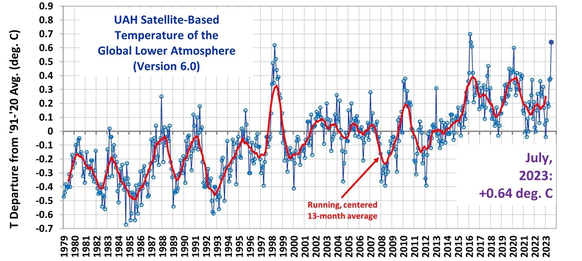
Well, if you go by the UAH chart, and I do, then you will see that the 1990’s was just as warm as any temperature in the 21st century.
UAH does not remotely show the 1990s as being as warm as the 21st century.
What it shows is one year in the 1990s as being very warm in co trast to the rest of the 90s. More recently we have seen two years that have been more or less equal to 1998, and virtually every recent year has been well above all the other years in the 90s.
I’ll check the details when I can, but I think this is obviously the case just looking at the moving average on the graph.
“UAH does not remotely show the 1990s as being as warm as the 21st century.”
UAH shows that 1998 and 2016, the warmest year in the 21st century, are statistically tied for the warmest temperature in the satellite era.
Hansen says 1934 was 0.5C warmer than 1998, so that would make 1934 warmer than 2016, too.
Which is not the same as saying the 1990s were just as warm as any temperature in the 21st century. 1998 is not the same as the 1990, and basing a claim that there has been no warming on just one very unusual year is just cherry picking.
Wondering if you wouldn’t mind adding the last 22 years of data to that graph.
No one knows what the global temperature was in July 1936.
Global Historical Climatology Network Database.
Note the temperature network 1921 – 1950.
That is the daily database as it stood in 2012. They only started compiling it in 2011. All indices are based on the much more comprehensive monthly network, where work began about 1990.
Regardless the Global Historical Climatology Network stations in 1930’s were hardly ‘global’.
Regardless of the fact that for a very long period of time, the US was the only large contiguous area with good records and good coverage over a long and continuous period of time, it is indisputable that all unaltered historical records and information assembled into a coherent and consistent picture of conditions and events.
Widely reported observations in print media, including news accounts and textbooks, but hardly limited to those, were entirely consistent with observed surface data of meteorological conditions. As were records of sea level, alpine and polar ice, and all manner of related phenomena.
All of that changed in the era of global warming alarmism, when records were altered, history erased, factual information denied and lied about, etc.
There is smoking gun evidence of why it was done and who did it and when, from sources as disparate as the climate gate emails, news sources, archives of data prior to those same data sets being massively and repeatedly changed, congressional whistleblower testimony, etc.
The existence of a doomsday cult whose adherents refuse to acknowledge any of this does not change the facts.
The ability of human beings to make stuff up does not make those inventions the truth, no matter how many people say something and how many times they say it.
“They only started compiling it in 2011″
While in the full swing of the AGW scam.
So funny !
Now where are those sites where temperatures were measured in the 1950s and now in the big red crayon patches?
Your childish efforts at distraction to avoid producing them, are noted…… by everybody.
Kindly explain how it is possible for a large area such as the US to have a temperature pattern that is not only decoupled from, but at large variance with, the rest of the planet, while at the same time individual locations all over the Earth and in both hemispheres, have long term records that closely match the pattern seen in the US and with the northern hemisphere as a whole?
And since the US pattern is not all that different from the satellite data in the period covered by the satellite data, how the US suddenly became coupled to the rest of the Earth?
Another excellent comment!
You’re on a roll, Nicholas!
Although coverage of the temperatures is spotty in many places, all the raw data that is available from all around the world shows they correlate with the U.S. regional chart profile, where it was just as warm in the Early Twentieth Century as it is today. Throwing cold water on the idea that CO2 is the temperature control knob.
If it was just as warm in the recent past, with lower CO2 levels, as it is today, with higher CO2 levels, then that means that CO2 is a minor player in the Earth’s temperature regulation. There appears to be no correlation between temperature and CO2 when using an honest temperature chart profile.
Here’s an honest temperature profile. The U.S. regional chart (Hansen 1999). This temperature profile is the global temperature profile, imo. You find it everywhere in the unmodified (unbastardized) temperature data.
It was just as warm in the recent past in the U.S. as it is today. And that applies to the whole world.
For those of you wondering why Tom’s graph finishes in 2000…. here is the updated version. You will notice it has warmed in the US significantly since.

And Simon puts forward a chart AFTER the manic adjustments of the climate cabal as some sort of evidence….
Hilariously stupid. !
Yes, that’s why I use Hansen 1999. It was created before most of the modifications were made.
In this case, because of the modifications to the temperature record by the temperature data mannipulators, the real temperature profile of the Earth should be the combination of the Hansen 1999 chart with the UAH satellite chart.
The Hansen 1999 chart shows 1934 as being 0.5C warmer than 1998, which means 1934 was about 0.4C warmer than 2016, the warmest year in the 21st century.
Which means that, at least in the United States, we have been in a temperature downtrend since 1934.
While at the same time CO2 amounts have been constantly increasing in the atmosphere. It doesn’t appear that CO2 is having any effect on the U.S. temperatures as they are cooling, not warming at the present time.
Note that in the earlier graph the late 30s was much warmer than the late 80s. In the later graph the late 30s are much cooler than the late 80s.
And there is no discussion of the ongoing impacts of increasing UHI over time. The current graphs are not made to inform but as propaganda to sell a narrative.
“And there is no discussion of the ongoing impacts of increasing UHI over time.”
This has been covered so many times it is beyond a joke you say there is no discussion.
AHHHHHHHHHHH A HOCKEY STICK!
. . . nor do they know it today with an accuracy of better than about ± 0.5 C.
C’mon, we’re talking about the average of a dynamic, interacting system with continuously varying mass and phase changes of water content (heat capacity) and continuously varying solar energy input (mainly via shifting albedo via variable cloud coverage) that has a mass of 3.9e15 kg and thickness of about 11 km (troposphere portion only) and that has its “average temperature” taken by multiple instruments that don’t directly measure temperature and which almost certainly cannot have individual end-to-end determination of the temperature of any relatively tiny volume segment of Earth’s troposphere to an accuracy of better than ± 0.25 C at any instant in time.
Yeah, that’s a run-on sentence, but well deserved IMHO.
Nick claims ± 0.0005° C
Of course he would.
Sure we do!
Just turn on the little blue light in the corner, put your fingers on the planchette and let it move you around the Yamal 06’s tree ring!
It erased lots of warm periods in the ancient past. The 30’s should be a breeze! 😎
Now wait just one moment . . . did you ask ChatGPT the question?
I’m sure you’ll get an answer (even a hallucinated one), but you’d be correct in pointing out that ChatGPT does not fall in the category of “anyone” . . . yet!
No one knows what it is now, because such a thing is completely meaningless.
Who experiences ‘global’ temperature?
We live in an ice age, do we not? As such, all warming is a temporary blessing.
More CO2 means more life, more abundance.
Justify your perverse faith that warming is harmful, Nick.
Haha!
You so funny!
The mid 1930’s and until early 1940’s were and they were warmer than the strong El Nino 1998 in many regions in the Northern Hemisphere.
Arctic
Europe
The summers were warm too although not always at the same time of the US.
Source: Indices for daily temperature and precipitation extremes in Europe analyzed for the period 1901–2000

Now, there’s some data! That’s what we like to see!
Climate Change Alarmists don’t have any data, they have guesses, and speculations, and assumptions and unsubstantiated assertions.
But the real data, like that above, puts the lie to their claims of unprecendented warming today. There is no unprecedented warming today from any cause. That’s what the unmodified charts say.
Finland, Sodankylä. Annual and seasonal climates (30-year periods) (1908-1937)-(1993-2022). Anomalies (°C), base period 1925-1954, warmest 30-year period early 20th century.
Sodankylä on google.maps
https://goo.gl/maps/NTr2R1BMmAfGNHEf9
Weather station on google.maps
https://goo.gl/maps/Wxq54qcD4Ku3TU8g7
Finland, Sodankylä. Summers (JJA), 1908 – (2023-08-07). Daily TAVG (°C). Warmest summer so far is summer of 1937, average temperature 15.5°C.
Finland, Sodankylä. Summers (JJA), 1908 – (2023-08-07). Daily TAVG (°C).
Warmest summer so far is summer of 1937, with an average temperature of 15.5 °C.
Coldest summer so far is summer of 1962, with an average temperature of 10.0 °C.
Current summer, 2023, so far with an average temperature of 14.5 °C.
Finland, Sodankylä. Autumns (SON), 1908–2022. Daily TAVG (°C). Warmest autumn so far is autumn of 1938, average temperature 3.5°C.
Finland, Sodankylä. Autumns (SON), 1908–2022. Daily TAVG (°C).
Warmest autumn so far is autumn of 1938, with an average temperature of 3.5 °C.
Coldest autumn so far is autumn of 1927, with an average temperature of -4.4 °C.
Last autumn, 2022, with an average temperature of 1.1 °C.
Finland, Sodankylä. Winters (DJF), (1908-1909) – (2022-2023). Daily TAVG (°C). Warmest winter so far is winter of (2007-2008), average temperature -7.4°C.
Finland, Sodankylä. Winters (DJF), (1908-1909) – (2022-2023). Daily TAVG (°C).
Warmest winter so far is winter of (2007-2008), with an average temperature of -7.4 °C.
Coldest winter so far is winter of (1965-1966), with an average temperature of -20.0 °C.
Last winter, 2022-2023, with an average temperature of -8.9 °C.
Finland, Sodankylä. Springs (MAM), 1908–2023. Daily TAVG (°C). Warmest spring so far is spring of 1920, average temperature 2.3°C.
Finland, Sodankylä. Springs (MAM), 1908–2023. Daily TAVG (°C).
Warmest spring so far is spring of 1920, with an average temperature of 2.3 °C.
Coldest spring so far is spring of 1917, with an average temperature of -6.4 °C.
Last spring, 2023, with an average temperature of -0.8 °C.
I’m surprised that Nitpick Nick hasn’t raised this point yet. There was no July in 5977BC. Julius Caesar wasn’t born yet!
So, there! Your point, presumably about the “alleged” Holocene Climate Optimum 8000 years ago, is totally debunked.
Nevertheless, there was a thirty day interval that began around the time of the Aphelion of the Earth, even though the cyclic changes in orbital parameters have shifted that exact event over the course of 8000 years.
Although it may be that 8000 years ago, orbital precession caused
Perihelion to be closer to the time of the northern Hemisphere was pointing directly at the Sun, which would have made July even hotter, unless they called it January, then it would have been colder, being that Earth was farther from the Sun right when the northern Hemisphere was having Winter.
Except in the Southern Hemisphere, when all that would have been reversed.
And hyeah, I know you was just funnin’ us some.
That’s much better. So complicated that probably even you got lost partway through your dissertation! My congratulations—World class Climastrology!
Now just hold on, I say hold on a cotton pickin’ minute, son! What did you just say? Hotter without CO2? That dawg don’t hunt.
So many climates all around the world hey Nick?
All doing their own things, in their own times and their own cycles.
How many different climates do you reckon there are around the world?
GHCN.. ROFLMAO.
Nearly all urban, airport and “adjustments”.
Basically no data at all over the southern oceans before 2004.. all “made-up” according to Phil Jones of CRU
It is meaningless garbage.
Totally unfit for comparison of temperatures over time.
Hence the propagandist’s tool !
Come on Nick, you are the believer in this crap data.
See those bright red areas… let’s choose two
The one in South America seems to be the Bolivia area.
The one at the top of Africa would include Algeria.
Now produce pictures of three sites in each where the temperatures were measured at in the 1950s and again now.
That is a picture of temperatures in July 2023.
Really Nick, you aren’t even aware of the base period being used.
That really is dumb of you., isn’t it !!
I’ll explain it to you Nick, since your mind seems to be addled and not even cognisant of what you are posting.
It is a made-up colouring-in chart comparing current temperature with the period from 1951-1980.
I’m asking you to show where the data came from in the 1950s, particularly in areas that are crayoned in bright red.
Do… you… under… stand… now?
Let’s also look at the red blob off the Labrador coast.
Cooling from 1940-1985, then warming.
Where do the numbers for the south Indian Ocean come from?
Note—no response from Stokes.
I had a couple of thoughts here, to me based on the visual in the story it doesn’t like any particular trend long term, it does seem like those few extreme points are possibly skewing the total decadal change? Is anything done with “outlier” data when studying climate, I only took a few statistics classes quite a long time ago but if I remember correctly the outlier data was often dropped, in this case it would sort of be like “is an el nino year truly representative of the longer term climate trend based on human GHG emissions” if not is it valuable to trend? Not actually making a judgement on this one way or the other just some things I was considering when looking at the data. I was also curious if the fact that warming is happening at different rates around the globe if this is really “captured” by the models, and if no how is that accounted for.
“Is anything done with “outlier” data when studying climate”
“Outlier” data can be your most important. In my biz, the “outlier” wells might be the new drills funding your development campaigns. In climate, the “outliers” are what cause heat related deaths, drought, floods, fungilence, pestilence, etc.
But outliers are not indicative of “Global AVERAGE temperature”. In your example, do you use outliers to predict the average yield potential of everywhere in the entire area? Outliers may predict the potential in a small area, but not the entire area being drilled.
Besides you are comparing apples and oranges. Temperature is caused by the introduction of energy. It is basically an effect caused by something else. In your field do you search for what caused the object you are searching for, or do you search for structures that contain the what you are looking for. To be an appropriate analogy, one should look for areas that have the temperature you are searching for.
Meant to respond to “Jonny”.
You have landed on a point many of the posters here deal with. If the issue is to show that CO2 is warming the earth, then trends should only use temperatures that are controllable by CO2.
Using temperatures (both cold and warm) that are affected by El Nino and La Nina ocean currents skews the data with information that CO2 doesn’t affect whatsoever.
Non-repeatable weather influenced temperatures are not caused by CO2, yet they are included in the calculation of the global temperatures.
One of the fundamental metrology tenants is that to obtain a true value of an object, in this case global temperature, the same thing must be measured multiple times using the same device under similar conditions, i.e., repeatable conditions. That allows one to generate a Gaussian or normal distribution surrounding the true value. Repeatable conditions require one hold factors that can affect the measurand to the same values.
Measuring a global temperature and claiming that it is warming due to CO2 concentration increases requires one to hold all other factors to the same value over the period of measurement in order to obtain data that confirms the affect of CO2. This will probably require some sophisticated AI that can remove data that has been affected by non-repeatable weather and cyclical phenomena.
What is the problem with current trending of measured Tmax and Tmin? Systematic uncertainty because of non-repeatable conditions surrounding the true value of temperature change due to CO2. This systematic uncertainty can only be estimated as a Type B uncertainty. What is the value that should shown due to this? I would postulate a ±1.0° C uncertainty interval. I have searched for papers with CO2 attribution to temperature change as much as I can, but have found none.
CAGW is based on the concentration of CO2 increasing temperature, yet there is no real evidence that this is true because there is no adequate measurement of CO2 true affect on temperature over time.
Exactly.
The current metrics used for climate “science” are not fit for purpose.
And yet, Joe Biden never makes a speech about the global average surface temperature measurement crisis.
Just saw his interview yesterday where he promised to stop, stop entirely drilling for oil and gas.
People need to be told how that is going to ultimately affect them. Synthetic fibers for clothes, fertilizer, gasoline, diesel, all gone.
Brandon made it through an interview without drooling or inappropriate groping?
I’m shocked.
Oh, Joe drooled a little bit, and he brushed an insect off the shoulder of the female interviewer. Joe is a touchy-feely kind of guy.
In measuring conditions on the earth, it is not possible to measure the same thing with the same device over and over again.
Every measurement made with a given thermometer is of a different time period, hence, not the same thing.
Repeating measurements to reduce measurement uncertainty is meaningless in the context of measuring a parameter which is in constant flux.
Warmista claim the Earth is getting ever hotter and hotter, and have graphs they have invented that show it.
But there are zero locations that show anything like that.
The point is that warmista’s follow Joe Biden and others that CO2 is the enemy of climate via warming. If a temperature goes up, only CO2 could have caused the rise.
Yet they have no data showing CO2 is the cause rather than some weather conditions or other phenomena. My point is that temperature alone can not be apportioned properly to the multiple conditions that cause temperature.
Only if there are repeated conditions surrounding a temperature, can a single cause be isolated and shown to be the cause of a change. You are correct in saying that will never occur.
Climate science should be developing experiments that provide attribution to different elements from insolation, clouds, humidity, wind, etc. The almost tunnel vision applied to temperature only will be the downfall of climate science.
No “almost” about it, averaging air temperature is the only wrench in their toolbox.
You get one chance to measure an air temperature then it is gone forever.
Stokes claims that subtracting a baseline removes “error”.
No, I don’t. It increases homogeneity.
Do warm years or cold years, “skew” the long term trend or the averages?
I do not know what you mean by skew.
Do you mean the alter the trend from what it would be if you took out all of the warm years or all of the cold years?
How is it an average if you first take away all the number that you do not like the look of?
That is called fraud in most circumstances.
We could take all the dry years out of the climate records from California, and hey it is not a desert anymore.
Or take out all the wet years if we are looking for evidence of droughts getting worse, because those wet years are not helping us prove it is getting drier.
Climate is the 30 year average of weather conditions for a specific location.
How is it an average if you pick and choose some years for deletion first?
In some places, there may be few periods that are average, with most of them being above or below average, and maybe by a lot.
Wet years, dry years, hot years, cold years.
It tells you nothing about the averages if you are not actually, you know, averaging.
Fair enough I see your point as it is actually a record and shouldn’t be considered erroneous data. I guess my point was taking an average of temperature which is hotter due to things non-CO2 related i.e. el nino without that context behind the overall warming trend seems a bit dubious and doesn’t really inform as to what is really happening. My thinking was along the lines of say you have a big dinner party with a bunch of well to do folks. This is catered by a large group of hospitality workers. If you averaged all of the salaries and applied it across the group you would say “wow look hospitality workers get paid pretty well” when that in fact is not true (sorry for the weird analogy but as a former chef I experienced this quite a bit! ). In this instance the average isn’t really a useful metric. As I’ve seen here repeatedly mentioned many seem to consider a global average temperature to be a useless metric for a significant number of reasons. The more I’ve looked into this the more I agree, climate science needs to do better and could if they lost their dogma/groupthink. As well if you were open about analyzing the data I’m not sure why someone couldn’t go “Here is the overall trend, if you remove xyz for these reasons here is the trend which is different.” As long as you are upfront about the data what has been done and why I don’t see the harm, the conclusions made from this can then be debated as to the validity. This was something often drilled into me in school: “Data is fragmented pieces of symbols and characters strung together, information is refined data whereas knowledge is useful information” Of course one can easily come to a wrong conclusion which is why the “settled” bit is so concerning. The narrative has been chosen and many refuse to deviate.
I’ve been in Europe for the past couple of weeks, starting in the UK, then Netherlands, France, Germany, Switzerland and now Germany again.
I had packed a couple pair of shorts instead of pants thinking, it being summer, I could save some space in my luggage. I wore one pair of shorts one day in the UK, but it’s been too cold otherwise. I didn’t pack enough long sleeve shirts either.
My personal experience tells me when others are full of shit.
Our good fortune of living in a mild, gradually warming, improving climate can’t continue forever I’m afraid, Nick. Eventually all this good news will end and the Holocene’s long-term cooling trend will reassert itself until the catastrophe of global cooling is upon us.
Be like the UN IPCC and root for a return to the Little Ice Age.
So the 1930s Dust Bowl was a figment of JD Salinger’s imagination? Jeez, who knew? He really did well faking all those contemporary newspaper accounts and photographs, then.
Did Salinger write about the Dust Bowl as well? I thought that was Steinbeck’s forte.
It was reported breathlessly that there were heatwaves going on all around the northern hemisphere this year, but we are supposed to believe that an intense heatwave in the 1930’s, in the central U.S., that lasted the better part of a decade was an outlier, and the rest of the globe was much cooler during that time?
That’s what the Climate Change Alarmists want us to believe. They make the same argument about the Roman Warm Period and other warm periods in the past, calling them regional.
Who are you going to believe, the climate change alarmists, or your own logic? (rhetorical question)
Bullshit.
Here near Paris in France, july was cold during 3 weeks, with a lot of rain.
I wore a pull-over.
First week of july was warm with a max at 32°C on 2 days.
No dog-days.
Surely you aren’t suggesting that the MSM and its apologists are cherry picking?
Let’s have it a bit more realistic with it being not smoothed over 1200km and as the comparision with 1951-80 is garbage with a lot of Southern Hemisphere missing for the earlier period.
There are only 7000 stations in the world with enough data from which to get a baseline, and 71% of them are in the US, Australia, Russia, and China. Producing a number like “0.225C warmer” is pure fraud. Sure, your calculator gives the numbers, but temperature data measured in tenths of a degree can not provide an anomaly to the thousandth.
Averaging all those stations together, even “anomalies” (which are still temperatures), is bad science. Intensive properties should not be averaged.
Anomalies are not measured temperatures. Anomalies are the difference between two values of a temperature, ∆T. This is not a temperature that indicates the energy contained by a substance.
∆T doesn’t define heat at a point of the atmosphere.
If I tell you ∆v1 = 5 mph and ∆v2 = 5 mph, what are v1 and v2?
Example ∆T = 1° for both T1 and T2.
Can T1 = 80° and T2 = 10°?
0.225000°C? OMG, where’s my asbestos fire fighting suit?
I wonder if the mainstream media will start naming the “heat waves”? I think a good name for this heat wave would be “summer”.
Lefty sad sacks prefer comparisons with the winter of their discontent-
Sonnet 18: Shall I compare thee to a summer’s… | Poetry Foundation
That would be appropriate Ron.
Given that the UHI is the cause of the “heat”.
There’s even a song already –
“Hot town summer in the city
Back o’ my neck feelin’ dirty and gritty
. . .”
“The measured data shows no supporting upward trends regarding U.S. 2023 average summer temperature anomalies to date.”
The overall trend in USCRN anomalies is 0.29°C / decade.
Trend for July anomalies is 0.30°C / decade.
This compares with UAH global anomalies over the same period of 0.20 °C / decade for all months, and 0.25°C / decade for the month of July.
Of course the UAH data is statistically significant, whereas the USCRN isn’t due to the much larger variability.
Trend in USCRN only exists because of the bulge from the 2015/16 El Nino.
UAH only shows warming at El Nino events.
There is absolutely no sign of any human forced warming in either of them.
Then that should be explained. The problem is all we ever see here are people claiming there is no trend in the 18 years of CRN data, and that it somehow proves there is no global warming
You can honestly say that there is a trend but so far not enough evidence to confirm this is anything other than the effects of looking at highly variable data over a short period, but you can’t honestly claim that this disproves the global rise on temperatures.
It proves that when you measure temperature properly, to get rid of urban warming and fake adjustments….
…. there is very little warming.
UAH there is absolutely no evidence of any warming by human causation either.
It is only seen in the faked, mal-adjusted urban-affected garbage put out by the climate cabal.
“there is very little warming.”
You have 18 years of data. The best estimate is there has been warming at the rate of 0.29°C / decade. You can say that there is not enough evidence to say that this is anything other than chance, but by the same token you cannot claim this shows there has been little or no warming.
No, again you are having to use the El Ninos. It is all you have.
There is basically no warming in UAH data apart from those 2 major El Ninos. And nothing in USCRN apart from the 2015/16 El Nino bulge.
El Ninos are what the whole AGW religion is based on.
They pretend that CO2 causes the warming that comes from El Ninos.
There is no human causation… period.
How am I using the El Niños? I’ve shown that ignoring 2016 and 2017, the two warmer years around that time, still leaves you with a substantial rate of warming. Note that 2017 wasn’t an El Niño, and there have been multiple La Niña years since then. Should I also ignore 2012, the warmest year in the CRN, despite being a La Niña year?
“There is basically no warming in UAH data apart from those 2 major El Ninos.”
How on earth do you think 1998 causes a warming trend? Note which half of the data set it is now on.
“There is no human causation… period.”
Yet you think I’m the religious one here.
What do you think is causing El Niño to get warmer and warmer over time?
El Nino’s are solar energy that buildup in the Tropics and are released in bursts. The more SW radiation that reaches the ocean surface causes El Nino to get warmer over time.
/deleted/
That is a wildly incorrect description of El Niño. Do you have citations for any of this?
That is essentially what happens and not a direct description of El Nino, but a main part of the mechanism.
Solar radiation has a huge influence on ocean and land temperature. When solar energy increases in the surface, land temperatures/SST’s rise and El Nino’s rise in temperature with it. This is partly down to the change in cloud albedo that deterimines how strong one can be with the trade winds persisting ultimately. A significant positive correlation has been found between SSN and ENSO.
A description of ENSO itself is as follows.
The walker circuation speeds up or slows down resulting in change to the trade winds. This results in high air pressure in the western Pacific and low air pressure in the eastern Pacific (El Nino). If the trade winds slow down enough for at least 3 months than an El Nino forms. If the trade winds speed up for at least 3 months than La Nina forms.
During the trade winds slowing down, warm water and atmospheric convection move eastwards. The Tropics in this region cloud over a lot more. During the trade winds speeding up, warm water moves west with atmospheric convection causing more upwelling of the ocean that in turn cools SST’s. This leads to much clearer skies over this part of the Tropics so strong sunshine warms them.
The solar buildup occurs during La Nina, pushed westwards and released during El Nino, when the warm water comes back eastwards again.
“In this study, a significant positive correlation has been found between SSN and EMI with a time lag of 2 years. A quasi-11-year period can be detected in the El Niño Modoki index (EMI), similar to the typical period of the solar cycle.”
https://www.sciencedirect.com/science/article/abs/pii/S1364682617303024
So Alan doesn’t think tropical solar radiation warms the tropical oceans.
What sort of fantasy world is this joker/fool living on !!
An assumption without the facts in evidence?
It isn’t CO2 for sure. CO2 IR only penetrates μm.
IR from a heat lamp only penetrates food to less than a μm yet it keeps the food warm. Would love to hear how you think that works.
You have made a poor experimental design.
Microwave ovens are designed to bounce the EM in all directions so that all points of material placed in them receive those EM waves.
You would need to have a microwave generator that directs energy to one area of the material via a very directional waveguide. The frequency used would need to be the primary emmision frequency of CO2.
One design might have the subject suspended in a large bowl of water and insure that only the surface of the water is irradiated.
Remember the goal here is to prevent heating of the water from the sides or bottom by the IR. CO2 can only access the surface of water.
I’m not talking about a microwave oven, I’m talking about a heat lamp, placed above trays of food to keep them warm.
Different wavelengths of light—a heat lamp is an incandescent source that emits lots of short-wavelength infrared, less than 2um. The principle CO2 wavelength band is centered at 15um, much longer than a heat lamp.
The point is quite the same – the light is penetrating not very far into the solid matter, yet is keeping it warm.
Then I can’t help you.
Your help isn’t needed. Increasing IR flux into the ocean (or decreasing IR flux out of the ocean) will warm the ocean no matter how deeply the IR is penetrating.
YOU asked about a “heat lamp” experiment, and I tried to inform you the wavelengths are totally different and therefore totally inappropriate.
That you can’t understand is not my problem.
Different process. You’ve never studied thermodynamics, right? You would know that conduction is a form of diffusion and that heat migrates through a solid.
LOL, Seems that Alan boils his water by breathing CO2 on it.
Hilarious. !
Not unlike a thermos bottle that reflects heat back to the source. If the skin temperature on the chicken is as high as the internal temperature, any heat lost at the surface by radiation is replenished by the heat lamps. Conduction from the interior is suppressed by keeping the surface hot.
“What do you think is causing El Niño to get warmer and warmer over time?”
That seems to be the flaw in bnice2000’s “I’ve got it all sorted” theory. I’ll look forward to seeing if he answers it ?(without any personal abuse).
Easy answer! Less cloudiness.
Also continued high solar input.
Ocean cycles.
Solar warmed tropical water gets circulated around the globe.
There are plenty of causes that don’t need the fantasy of linking it to a tiny amount of extra plant growth gas and using that fantasy link to destroy western society.
You really need to stop following the fantasies and lies of the anti-CO2AGW scam, and start looking at what is real.
I doubt you are capable of that, though.
Fair enough. Got any links to your clever theories or are they just “your” clever theories?
Your simple lack of any knowledge or rational theories is a highlight of your posts.
Or are you going to PRETEND that CO2 somehow warms the oceans and causes El NInos. ?
That would be very funny ! 😉
If you still haven’t figured out that the planet is warmed by the SUN.. no-one can help your other fantasies and delusions.
less cloud.. plenty of links..
Were you ignorant of that fact, as you are of everything else?
Haha you are such a funny guy. Your cornflakes packet graph says nothing about what you claim… Try again. Go on you can do it…. Find me some evidence that El Nino is the cause of the current warming (last 100 years)…..
Where is the evidence that the magic molecule causes el ninos?
I have no idea why you are asking me that. Despite what bnice2000 says I have never claimed nor do I believe that.
What is causing the less cloudiness?
https://wattsupwiththat.com/2023/04/13/more-on-cloud-reduction-co2-is-innocent-but-clouds-are-guilty/
“””””CO2 is innocent but Clouds are guilty.”””””
Poor Alan, struggling desperately to keep up to reality. !
And do you have any links for your “reality” re El Nino being the cause of the warming (without resorting to personal abuse)?
The SUN is the cause of the warming! CO2 is not. El Nino is not. The SUN!
Hmmm the sun you say. Got any references for that? I only ask because my understanding is the sun is not throwing out more energy at the moment, so it’s been ruled out as the source of the warming. Be great if it was that simple though.
Imagine that. All that discussion and pondering and it was just the big ole sun after all?
Oh No… so little Simon is off on his little “CO2 causes El Ninos” fantasy trip again
Hilarious.
No accounting for its ignorance of solar input.
Current solar cycle is similar to the last one.
Maybe a 30 year (climate period) trailing average of TSI might wake the simpleton up to reality ? Or not. !
Gotta get past its science fantasies first.
“Current solar cycle is similar to the last one.”
Are you trying to make my point? Gee thanks.
IIRC, the UN IPCC says CO2 does not impact ENSO phenomena.
And seeing the planet is warmed by the Sun via the tropical oceans…
… it should be obvious to even the most ardent AGW cultist that CO2 is NOT causing the planet to warm.
I suspect they do actually realise this, but are trying desperately to keep their religion alive via fantasies.
If I ever get this much spare time on my hands, just shoot me.
Oh sorry, that was my new add-on – “Thought to Text” kicking in.
Trendology nonsense.
“Trendology nonsense.”
ie… monkey with a ruler. !
Pretty much sums it up, pun intended.
All three of them showed up to downvote me. They don’t like me very much.
They are well aware of what they are ! 😉
Whine some more. I down voted you for once, just because your entire comment was your usual pathetic insult. If being down voted is such a problem for you try being constructive.
Meanwhile I’ll be off to frame all my downvotes – as they suggest I must be doing something right.
This is your basic run-of-the-mill trendology word salad.
What bit didn’t you understand?
“What a bunch of alarmist politically contrived gibberish.”
No the downvotes are a Pavlovian response to you. No offence.
“as they suggest I must be doing something right.”
No , they suggest that you are a mindless AGW shill caught out in a series of stupid comments.
That could, of course, be your intent.
Over what time interval? I don’t see it when looking at the graph. The right-side (2023) of the USCRN should be at least 0.5°C higher than the left-side (2005). Eyeballing, they appear about the same.
The period where the website shows anomaly data for CRN, that is from 2005 to present.
The trend were calculated using the standard OLS equations – the same Monckton uses all the time.
The trend is not based on just looking at the start and end point, it takes into account all the data.
For July the average for 2023 was 0.69°C compared with 0.47°C in 2005, so a rise of 0.22°C. but you can easily cherry pick different start and end dates to get different results. Between 2009 and 2022 there was a rise of 2.34°C, between 2006 and 2023 a drop of 0.36°C.
You have to look at all data to get a hint of what is happening on average. At present this is influenced by a few cold summers in the earlier part and relatively warmer summers in recent years. This could very likely change one way or another, hence the uncertainty in the current short term trend.
Yes, when you look at the USCRN data you can see there has been essentially ZERO warming apart from the El Nino bulge.
Removing 2016 data reduces the trend from 0.29 to 0.26°C / decade. Removing 2017 as well drops it to 0.23°C / decade.
But you are missing a trick here. You could use the El Niño bulge to pull a Monckton and say the trend has been sharply down since just be fore the bulge. Since 2015 the trend is -0.64 °C / decade. If that continues we will be in a new ice age by the end of the century,.
“ pull a Monckton”
LOL…
.. showing that you are ignorant on how his calculations are done.
So Funny… that you would choose to keep displaying ignorance
Bellman, honest disclosure would require you post the current UAH6 43+ year temperature trend of 0.14℃/decade (rounded from 0.135; last month it was 0.13, rounded from 0.134). The 0.20℃/decade is a short period ending-on-a-Super El Niño and a one-month temperature excursion.
Oh, and the short-period UAH6 trend is no more statistically significant than the USCRN data over the same short period. The fact that the full 43-year UAH6 trend is statistically significant does not translate to significance for the short UAH6 period.
“honest disclosure would require you post the current UAH6 43+ year temperature trend of 0.14℃/decade”
I was comparing the same time period as the CRN data used in this article. That’s why I said “This compares with UAH global anomalies over the same period”.
The point was to compare the claim of no visible warming in the US against the amount of warming globally. Using the period from 1979 just makes the US warming seem even faster.
“The 0.20℃/decade is a short period ending-on-a-Super El Niño and a one-month temperature excursion.”
Yes, it’s a short period, though ironic that it’s twice as long as the current “pause”. and similar in length to the previous Great Pause.
I’m not sure what you mean about ending on a super El Niño. That was 7 years ago.
Incidentally the overall warming rate for the USA48 are in UAH is 0.24°C / decade since 2005, and since 1978 it’s 0.17°C / decade.
“Oh, and the short-period UAH6 trend is no more statistically significant than the USCRN data over the same short period.”
I beg to differ. I get a p-value < 2.2e-16 for UAH data. For CRN it’s 0.035. Neither of these are accounting for auto-correlation, which is why I assume CRN is not statistically significant.
He, he. The global land trend is reported by the UAH6 keepers to be 0.18℃/decade while for CONUS its a cool 0.17℃/decade. I’m just showing how the UAH6 folks round down their numbers; not trying to justify anything.
Dick around with numbers all you want, I’m just pointing out that UAH6 and USCRN show no alarming warming trend. Compare those minor warming trends to the unbelievable UN IPCC CliSciFi climate model trends.
Are we giving up on significant digits completely, and accepting that you can make anomalies to the hundredths or thousandths place from data that only has tenths? We can’t even agree on what the average of monthly temperatures over a year is.
Here’s 12 monthly TMAX records for a station:
12.5
10.1
22.0
23.5
28.8
34.4
35.9
34.3
29.3
21.3
18.9
10.5
What’s the average of those? 23.45833? 23.5? 23.5+/-0.17?
If we can’t agree on basic math, we may as well give up.
Using NIST TN 1900, I get 23.5 ± 5.9. I should point out that this uncertainty is based on the variability of the data. This does not include uncertainty of random effects or systematic effects. This as stated in TN 1900.
Could you explain that? The standard deviation of the values is 8.89. I looked at the TN 1900 at NIST, but couldn’t find a section to which you might have been referring. I’d really like to know how you got that value.
Sorry, I should have said Example 2 for finding a monthly Tmax mean and an expanded experimental uncertainty interval.
Here are my calcs.
total — 281.5
mean — 23.5
stddev — 9.3
sd / √12 — 2.68
t factor @ur momisugly DOF 11 — 2.20099
expanded experimental uncertainty —
5.9
I gave up long ago on arguing about things I can’t change. Radiosondes, satellites and ARGO are the only things I think even come close to be reliable temperature estimates. Lack of data, measurement methods, siting issues and UHI corrupt everything else.
I agree, mostly. There are long term surface stations that seem ok but they hard to find.
Climate change is causing despair among many people….and maybe even criminal activity and lies in high places…..yeah that’s it….blame the criminality on hot weather….they didn’t do it….the heat did it.
The climate change AGENDA is leading to criminal activity, fraud, etc etc in many areas.
Solindra got 500 million from taxpayers to “save the planet” and delivered nothing. And they weren’t the only ones.
The plot of U.S. Contiguous USCRN Average temperature anomaly since Jan 2005 sure appears to be a random walk about the 0.00 deg-C average.
However, left unsaid is whether or not the USCRN data has be “adjusted” to offset the known urban heat island (UHI) effect that has gradually and increasingly polluted ground temperature monitoring station data over that interval.
If UHI pollution of USCRN data has not been properly “zeroed out”, then there would actually be an overall negative slope in the above article’s temperature anomaly plots.
USCRN site are pretty well placed to avoid any UHI effect over the time they have been there. Maybe eventually that may have to be considered.
There is slight bulge around the 2015/16 El Nino which is used by AGWers to get a positive trend, but the last 3 year average is less than the first 3 years.
It is obvious that ClimDiv is being juggled to match USCRN, so the whole “adjustment” farce of US temperature before 2005 has been brought to a halt… and temperatures have levelled off
One needs to be careful to distinguish (a) temperature monitoring errors (bias) introduced simply by incorrectly siting the station relative to the environment within, say, 50 m of the station from (b) those errors introduced by a relatively large scale UHI effect, which I understand can extend outward by more than 2 km downwind of a large metropolitan area.
I don’t believe all USCRN monitoring stations are located more than 2 km away from urban areas of, say, greater than 10,000 population, but please correct me if I am wrong on this.
As followup to my own post, I just located a paper that discusses in detail UHI effects that extend outward from urban areas:
Urbanization Effects on Estimates of Global Trends in Mean and Extreme Air Temperature, Panfeng Zhang, et.al., 1 March 2021
(free download of pdf copy available at
https://www.researchgate.net/figure/The-percentage-of-urban-areas-around-the-a-USCRN-stations-and-b-all-global-land_fig1_347816481 )
Within is this statement:
“The outliers indicate that the USCRN stations may be contaminated to some extent (i.e., a few USCRN stations had been actually affected by urbanization).”
The paper examine UHI effects as a function of “buffer radii” ranging from 1 km to 12 km from urban areas.
FWIW, the paper does show that the USCRN is relatively MUCH better than other ground-based temperature monitoring networks in minimizing UHI-induced errors.
But at least the US has made a good effort to start measuring temperatures properly and consistently, fairly evenly spaced, and avoiding as much urban heat problems as they can.
Nowhere else seems to be bothered !
But GHCN uses and abuses all that highly dubious data anyway.
And the rest of the world has fewer rural sites as a percentage compared to the numbers in CONUS. The rest of the world’s data sets are much more corrupted by UHI than is the U.S. already-UHI corrupted sites. And that doesn’t even consider all of the horribly sited and maintained sites worldwide.
“I don’t believe all USCRN monitoring stations are located more than 2 km away from urban areas of,”
It’s the change in the urban area that is important.
The sites were specifically chosen to avoid that sort of issue as much as possible.
Here is a list, should you want to try and find any of them.
Station List: Integrated Station Information System (noaa.gov)
Some of those links don’t work. This is the link I use:
https://www.ncei.noaa.gov/pub/data/uscrn/products/
It isn’t just the radial distance from urban heat centers, but one has to consider prevailing winds, which are typically westerly winds in the US.
Did I not state: “. . . those errors introduced by a relatively large scale UHI effect, which I understand can extend outward by more than 2 km downwind of a large metropolitan area.” in my post upthread dated August 8, 2023 11:48 pm?
I could swear that I did.
My apologies. I missed the “downwind.”
The last 3 years mostly coincides with a triple dip La Nina. Positive trend that survived this is for real. Also, USCRN can deviate from global temperature datasets that include the other 98.4% of the world.
Why should it, if it’s a global effect?
Also, the contiguous US is 6.7% of the land area of the world. That is a significant amount.
The USCRN stations were eased in over time. Looking at the monthly data set, at the end of 2005 there were 71 stations scattered about. 2006 added another 6 and in 2007 another 21 came on line. As the years passed, stations came on line and others were closed. Right now there are 170 stations on line, but not all of them have data back to 2005.
So tell me, how did NOAA get that graph from that data?
The constant talk of the hottest July ever, will no doubt become accepted truth after a couple of more years telling the tale.
Here in UK, this hottest July was probably the coldest and wettest I have ever experienced. The heating system in my house agreed. It tried to fire up on a number of occasions until I calmed its urge to heat, by turning the thermostat down a couple of degrees and put on a fleece to combat the record heat in July.
Today August 9th we have got a sunny day, finally, high temp of 23deg. C and I am off to plank up some oak trunks. I have been waiting for the weather to change for weeks.
World averages, are all very well, but it is local weather conditions that matter, that is what people experience.
Our European cousins have been plagued this year by fire starters in the Greek and Mediterranean islands in general. Those arsonists are heroes apparently, judging by the media reaction. The media report climate crisis proven, just look at the Med. It is burning up!
If the weather holds up, I might even take some honey off the bees. Fingers crossed..
It doesn’t include the 1930s, so it doesn’t count 😜
I like the flood of stories about Antarctica melting away in the winter. Just two years ago the stories were about the coldest 6 months on record. Now, in the winter, when the S. Pole is still in a very dark eternal twilight and the temps are still well below freezing, we’re told the place is melting away! Glaciers will be slipping into the sea due to lack of sea ice and catastrophic sea level rise just around the corner.
Every single day my MSN “news” feed has several such stories and other stories of impending disaster.
I haven’t seen any claims that Antarctica is “melting away”, but sea ice extent there is at a record low for the time of year, as it has been for months.
So, what caused this SUDDEN event, little child?
Not CO2.. please explain how 😉
We can’t wait for your hilarious non-attempts at answers.
The Antarctic sea ice data only goes back to 1978.
Proxy studies have shown it to have been a lot lower in the past.
Stability of the Antarctic Ice Sheet during the pre-industrial Holocene | Nature Reviews Earth & Environment
Holocene melting of the West Antarctic Ice Sheet driven by tropical Pacific warming | Nature Communications
Oh , and who is affected by this chicken-little catastrophe ?
Seems like the Ship of Fools should take another expedition 😉
That’ll be it….
No counter.
No explanation for the sudden change.
Proven wrong yet again.
Pathetic !!
The appropriate counter would probably get me banned, and you’re not worth it. Great comedy here. Including you, clown.
So, as I said , absolutely no counter.
Zero content.. Zero science. That is your meme.
Maybe learning a bit about something, anything, might help you.
Instead of your abject and continual displays of rank ignorance.
Lots of words, though.
The US is a small fraction of the world and US temperature has deviated from world temperature before, for example US having a temperature peak from the Dust Bowl heatwaves in the mid 1930s that did not get exceeded when global temperature had a peak in the early 1940s. Meanwhile, even the most rightwing-favored one of the major global temperature datasets (UAH v6 TLT which is by rightwingers) says the world is warming.
“even the most rightwing-favored one”
Cite? And where is the hockey stick? I don’t see it.
The hockey stick describes the shape of the global temperature evolution of the past two millennia, the UAH series begins in 1979 and so contains only a sliver of the “blade.”
Oh, OK.
Still no cite though.
UAH contains NOTHING of the “blade” because the blade is a fantasy…
… dreamed up using decidedly un-mathematical processes.
What utter nonsense. It describes no such thing.
The Hockey Stick only describes Mickey Mann’s maleficent and mathematical ineptitude.
It bears zero resemblance to anything real.
But look at this graph from UAH. We are in a period where temperatures are rising above the baseline, but are still returning to the baseline. There is not enough data to indicate one way or the other if temperatures will remain above the baseline or fall below it.
One needs to make a value judgement that is not based on anomalies. Rather, one should base the decision on what is an appropriate absolute temperature. If one says the absolute temperatures below the baseline are the best temperatures for all of the earth, then you should expound on why. If you think the temperatures above the baseline are better for the earth, then one should expound on why that is.
Ultimately, the baseline temperature should be what you think is the best temperature for the world! Want to tell us what absolute temperature you think is best? Maybe what range?
The spikes of 1998 and 2016 are due to the two greatest El Ninos since the one of 1877-1878. Please notice that around these two spikes, there is a noticeable warming trend.
Caused by what, exactly?
What do you think the baseline is? You’ve made that claim before, that somehow temperatures will keep returning to the baseline, whilst ignoring the fact that the base line changed a few years ago. How do temperatures know which baseline they are supposed to return to?
And if the base line increases every 10 years, returning to the most recent baseline just means they keep warming.
Why does this matter to you? Do you not understand about time series that revert to the mean? Why do you think a warmer baseline will prevent a return to an anomaly mean?
You appear to have the same misconception as many that anomalies are a measured temperature. THEY ARE NOT TEMPERATURE. Anomalies are more akin to the slope of a line. They are ΔT, not an absolute temperature. The fact that anomalies revert to the mean does not mean that the absolute temps they are based on are cooler or warmer or that they revert to a mean.
“Why does this matter to you?”
Because I can;t figure out what you are trying to say, and I’d like to get tot the bottom of it.
“Why do you think a warmer baseline will prevent a return to an anomaly mean?”
You seem to think that UAH will return to some mean, presumably because you refuse to believe there could be an actual warming trend, but you won’t say what that mean is.
I don;t think a warmer base line will change anything. I’m just saying that if you claim the baseline to be the mean that it will return to, you have to say why you think that will be the case even after the baseline has been changed.
I’ve no idea if that is what you believe becasue you refuse to say what you think the mean is, but as you keep getting exited by every month that is just below the current baseline, I’m guessing that is what you think the mean is.
“You appear to have the same misconception as many that anomalies are a measured temperature.”
Anomalies are the difference in temperature between what is measured and t=what it was on average during the base period. I’m not sure why you think that’s a hard concept.
“THEY ARE NOT TEMPERATURE.”
No need to shout. They are a temperature difference. No different in concept than saying degrees Celsius is the difference between the measured temperature and zero degrees.
“Anomalies are more akin to the slope of a line.”
You were implying that when you thought their units were °C / Month. It makes no sense. You could say that an anomaly represents a change in temperature and if you new the length of time that change over which that change had happened you could describe it as a slope. But there is no need to do that when we are using all the anomalies to work out a rate of change using linear regression.
“The fact that anomalies revert to the mean does not mean that the absolute temps they are based on are cooler or warmer or that they revert to a mean.”
No, I’ve still no idea what point you are trying to make. If you know an anomaly and the absolute temperature of the base temperature, you know the absolute temperature – but you don’t need to know the absolute base temperature if all you want to know is how much temperatures have changed. A change in the anomaly will be the same as the change in the absolute temperature.
It is a darn good thing it began to warm after the disastrous 3 decades of warming that preceded the satellite data time period.
So, it has warmed up how much since the coldest years in the past 100?
AMO closely matches the UAH data in the interval the UAH data covers.
Why should we believe that if we had satellite data for the 100 years, it would not look like this?
If we are experiencing a 75+/- year climate cycle the next few years should be illuminating.
AMO along with multidecadal oscillations in general affecting global temperature show up well in JRA-55 (which starts with 1958) and HadCRUT4 (which goes back to 1850). JRA-55, which even Steve Milloy of junkscience cited favorably, indicates HadCRUT4 does not overstate warming and agrees impressively well with HadCRUT4 during the time covered by both of these.
Quantify “agrees impressively well”, I dare you.
And the AMO profile matches the U.S. temperature profile (Hansens 1999) with the highpoint in the 1930’s and a lowpoint in the 1970’s.
And notice the 1880’s show a similar highpoint to the 1930’s.
Hansen 1999:
Your mistake is assuming that conservatives are big fat lying liars like all you communists know that you all are.
The left always assumes everyone is as corrupt as they are.
Like when white lefttards try to tell us all that all white people are racists at birth, and nothing they do can change that.
I believe that you all believe it, since you are all obvious racists.
When you tell us all who you are, we should believe you.
The USCRN data shown in the top chart is not ‘summer’ data, but all months from Jan 2005 to July 2023. There is no trendline on the chart. When you add a trendline you see it shows +0.52F per decade warming.
When you filter out the summer months to test the exact claim in the article, you discover that the warming rate in the summer months (Jun-Jul-Aug) is actually faster than for all months (+0.58F per decade, only Jun & Jul available for 2023).
Occasionally it pays to check things for yourself, especially when you’re a ‘skeptic’.
What is the statistical significance of the trend line.?
Did you know the average for the last 3 years on a year-to-date basis, is LOWER than the average of the first 3 years.
Did you know that on a year-to-date basis 2023 is the 8th COLDEST out of 19 years.
Did you know that on a year-to-date basis 2012 was the hottest, and 2019 was the coldest.
Just pointing out that the claim in the article that:
“The measured data shows no supporting upward trends regarding U.S. 2023 average summer temperature anomalies to date”
Is completely false. They show a clear upward (warming) trend.
I asked if it was a statistically significant trend.
Stop blethering and answer the question.
The claim doesn’t mention “statistical significance” so that would be irrelevant to the fact that it is false.
ROFLMAO..
For there to be a meaningful trend, it needs to be statistically different from zero.
Hint, you poor mathematical illiterate twit……. It isn’t.
His statement is totally correct.
“The measured data shows no supporting upward trends regarding U.S. 2023 average summer temperature anomalies to date”
The word “statistical” is not present in the false claim. “No supporting upward trends” when there’s a+0.58F per decade warming trend? Pull the other one!
To be “supporting” it not only has to have a positive trend, it has to be statistically significant. Nice try, but not cigar.
A reference for this? Christmas crackers don’t count.
The Merry Monck has been reporting a so-called ‘zero-trend’ in UAH every month for the past while (though not this month; better to avoid all mention of UAH at the moment, I suspect).
None of you, none of you, have ever asked him what the error margins are in that trend. By the way, the are enormous.
(Bellman and others have tried, but none of you so-called ‘skeptics’ has ever so much as raised the subject with him. Yet here we are with a clear ‘best estimate’ warming trend and suddenly statistical significance is of great importance. You want to think around that.)
My recollection is that some of the first exchanges I had with you and Bellman was on the issue of statistical significance. However, it isn’t worth my time to go back and resurrect them to prove a point.
I generally look at the slope and variance, as incorporated into the r^2 value, to get a rough idea as to whether the trend is significant or not. Nearly flat trends may go either way, but also may be just on the edge of the arbitrary 5% cutoff, and may change with new data. The point being, just because something meets the formal, defined criteria of being statistically significant doesn’t mean that the trend is really useful long-term.
I think the point is with respect to Monckton’s calculations is that there is not any strong, irrefutable trend over the last 8+ years, and it changes every month. If there were a consistent, significant upward trend, that would justify the concern. However, a negligible, varying trend calls into question the validity of the thesis of ‘the main control knob.’
So hilarious to see FN yet again displaying its totally ignorant of basic statistics.
Larry is aware, and his statement is totally correct. !
It is just that FN is too mathematically illiterate to understand that fact. !
That’ll be it
Scientifically there can be no trend if there is no statistically significant trend.
WUWT is a scientific site. Why don’t you stay on the sites were the loudest shouters win by wearing everybody out or where the Leftist moderators censor comments they don’t like.
I look forward to you telling Monckton this, the next time he posts his statistically insignificant UAH ‘pause’ trend here, on this ‘scientific’ site – if he ever does again.
There is such a thing as a best estimate trend, though. And to ignore that, even when it is very clear in this case, is at best highly misleading.
Best estimates are done by mathematicians! Physical scientists and engineers are trained not to make estimates of measurements. The uncertainty in doing so is infinite.
“Physical scientists and engineers are trained not to make estimates of measurements.”
Here’s what the GUM says:
Do you see that estimate quoted anywhere here as y ± U?
Don’t quote things that show you don’t know what is being discussed. The ESTIMATE being discussed does not utilize the measurement uncertainty interval to show what the real value may be. The estimate under discussion is nothing more than a wild ass guess.
There go those goalposts again. You said engineers do not make estimates of measurements. In practice all measurements are estimates and the quoted figure is the best estimate.
I often give uncertainty ranges for trends. I’m usually shot down either in the grounds you think they are too small or that there is no uncertainty in a trend.
The fact that there’s a large uncertainty interval on the USCRN trend is implicit when I say the trend is not significant.
But whatever the uncertainty it is still the case that the best estimate is the stated trend, subject to a few assumptions. If you remember the last time you brought this up for CRN, complaining about the normal distribution assumption, I tried a different method that doesn’t make such an assumption, and the trend was slightly bigger.
No goalpost change. Trends that use averages for values also have uncertainty introduced due to the uncertainty of the average value. This measurement uncertainty is not accounted for in traditional trend error analysis. R² and standard error of the regression do not evaluate uncertainty in the data used to create the regression trend.
Wrong. As has been explained to you countless times before. Uncertainty of the trend depends on the variance of the residuals which in tern depends to some extent on the measurement uncertainties.
The only reason you seem to think this isn’t the case is because you believe the data has enormous uncertainties that for some reason don’t appear as variations in the actual data. In that case you could plug your imagined uncertainties into the formula, but it still won’t be as big as you assume.
As always though you will ignore this whenever the trend is something you like. How big do you think the uncertainties are In the pause, giving the claim of ±1.4°C in any month? It would mean an uncertainty several times larger than the one I give, yet that won’t stop you trying to draw all sorts of exact conclusions from it.
And you are still deflecting from your original claim. You said engineers and scientists would not use the term “best estimate”. Do you at least accept you were wrong on that point?
No, I am not wrong and I am not deflecting. Engineers and physical scientists do not use “best estimates” of a measurement. These fields of endeavor do not estimate measurement values. There are carefully produced measurement protocols and and uncertainty determinations as defined in the GUM that you quoted.
Look at the statement I was referring to.
“””””There is such a thing as a best estimate trend”””””
A ” best estimate trend” is a guess. It doesn’t utilize measurements of the variables in the individual components nor their uncertainty to develop likely trends and their sensitivities.
If you define “best estimate trend” as something different, then it is up to you to show that definition. Remember, the discussion is about trends and not measurements as in your GUM reference.
“Engineers and physical scientists do not use “best estimates” of a measurement.”
The GUM says they should. It uses the term dozens of times.
E.g.
“A ” best estimate trend” is a guess.”
It’s a mathematical equation that gives the best fit for the data, using a desired metric (say least square). If the errors are normally distributed the best fit using the least squares fit can also be shown to be the best estimate,.
“If you define “best estimate trend” as something different, then it is up to you to show that definition”
The best estimate of a trend is defined the same way as for any other statistical value, by maximum likelihood. The OLS fit is the best estimate assuming the various assumptions such as normality of the error distribution. But you can also use it for other distributions and assumptions. But in most cases the OLS is good enough and simple. That’s presumably why Monckton uses it.
See Taylor page 182 if you won’t believe me.
Do you think R² or SE of the trend include uncertainties in the data points?
Your argument is more with the value of the uncertainties in the data points than uncertainty in the trend. Tough.
I have started using NIST TN 1900 as part of combined expanded experimental uncertainty. You are more than welcome to show errors in my calculations. If you have problems with NIST methods, I suggest you argue with them.
“Do you think R² or SE of the trend include uncertainties in the data points?”
Yes, as long as you mean error, or variation in the measurements caused by uncertainty.
“Your argument is more with the value of the uncertainties in the data points than uncertainty in the trend.”
No. I’m arguing about the uncertainty in the trend. The uncertainties in the measurements are generally of little concern as the variation in the data should be much bigger than the measurement uncertainties. But you can, as Bigoilbob explained some time ago, substitute your assumed uncertainties into the equation if you want.
“I have started using NIST TN 1900 as part of combined expanded experimental uncertainty. You are more than welcome to show errors in my calculations.”
What calculations? Any particular example dealing with linear regression?
“””Do you think R² or SE of the trend include uncertainties in the data points?””””
Be a gem and tell everyone how measurement uncertainty is entered into the calculation you are using for R² or SE of the trend calculations.
Excel certainly has no variable for uncertainty of a trend.
Take a look at this from Microsoft about inaccuracy in trends in Excel.
https://learn.microsoft.com/en-us/office/troubleshoot/excel/inaccurate-chart-trendline-formula
“Take a look at this from Microsoft about inaccuracy in trends in Excel.”
Gosh. A bug in Excel plotting. And this is a problem for me, how?
“Be a gem and tell everyone how measurement uncertainty is entered into the calculation you are using for R² or SE of the trend calculations.”
Why, so you can throw it back in my face again? You insult me on a daily basis, fail to answer any of my questions and then expect me to explain the mathematical underpinning of statistics, like I’m some sort of an expert.
But let me try (and bare in mind, I’m no expert so don’t blame me if I’m completely misunderstanding this.). Look at Taylor equations for the uncertainty of a linear regression. (8.16). See that σ_y symbol in the equation – that’s defined in (8.15). That’s just the standard deviation of the residuals of your data. And in the examples Taylor is using this for, these residuals are just the individual measurement errors, so the their standard deviation is the estimated measurement uncertainty.
Now say you already new what this uncertainty was (Type B uncertainty as the jargon has it.). Rather than using the errors you could ignore (8.15) and just plug the measurement uncertainty in place of σ_y into (8.16).
Now, in the real world, the data is more stochastic. The variation in the data isn’t for the most part caused by measurement errors, but mostly becasue of the natural variability in the data. But you still use the same equation, which still depends on the standard deviation of the residuals – and that standard deviation includes the natural variability and any measurement errors. But if for some reason you thought there was some uncertainty in the measurements that wasn’t appearing in the actual data, you could do what I suggested above and add this (in quadrature) to the uncertainty based on the standard deviation.
Normally there is little point in doing this because the measurement uncertainty should be small compared to the natural variation, and will effectively disappear when added in quadrature. But also because the data already contains measurement errors, so you are double counting it in your uncertainty calculation.
Quit cherry picking things you have spent no time learning about.
Look at the first sentence in 8.1.
“””””One of the most common and interesting types of experiments involves the measurement of several values of TWO DIFFERENT PHYSICAL VARIABLES to investigate the mathematical relationship between the two variables.””””” (all caps by me)
This whole chapter is based the “xᵢ, yᵢ” measurements having a functional relationship. Sorry to tell you, but what you are dealing with has no functional relationship. IOW, time (xᵢ) is not a variable that determines temperature!
This chapter in Dr. Taylor’s book is not applicable to what you are attempting to use it for.
What you are dealing with is a TIME SERIES. It requires different methodologies to trend. This is a common fault in climate science and why so many statistical misconceptions exist.
Don’t misunderstand, you can certainly do a least square regression on a time series, however, the regression is not appropriate to use in predictions, either forward or backward. Why? Because next year has no relationship to the value of temperature. Trying to predict a temperature from a simple linear regression of a time series is not even a best estimate, it is a pure guess.
That is why multivariate models were started. In order to predict one must have a complicated “equation” that has a functional relationship to temperature.
“Quit cherry picking things you have spent no time learning about.”
Truly pathetic, even by your standards. You wanted me to explain how uncertainties worked in a linear regression, I take the time to explain it to you, and not only do you throw it back in my face, and fail to engage at all with the uncertainties, but just insult me. If you don’t agree with what I said, you need to explain how you would propagate the uncertainties in the regression. You need to show where the equations, not just from Taylor but every other text book on statistics is wrong and does not apply to a time series.
“Sorry to tell you, but what you are dealing with has no functional relationship.”
You still don’t understand what a functional relationship is, or that it has nothing to do with the difference between what Taylor is describing in that chapter, and how linear regression is used outside the laboratory.
“It requires different methodologies to trend.”
Yet, you have no objection when Monckton uses the same methodology in his realityometer or pause trends.
If you want to use different methodologies then use them – there are loads to choose from, but state which one you want, rather than leave us guessing. In the meantime don’t just claim there anything wrong with using OLS regression in a simple time series. There is just no difference between using time as an independent variable, than any other quantity. It just means you can interpret the trend as a rate of change over time.
“however, the regression is not appropriate to use in predictions”
And yet more goal post moving. Nobody has said anything about using the regression for prediction. We were talking about it as the best estimate and what the uncertainty is.
“That is why multivariate models were started.”
It’s not. But I guess you don’t remember all the times I showed you multivariate models, which of course you just blew away. I’ll attach a graph to refresh your memory.
“In order to predict one must have a complicated “equation” that has a functional relationship to temperature.”
Which is why actual projections (not predictions) are based on complicated models – which you of course then deny, because they are still just models.
Here’s the latest output from my 3 variable multiple linear regression, trained up to the start of the pause. Clearly didn’t do very well this month, which shows how unusual it was.
Show us exactly how a “calendar year” is in a functional relationship with temperature.
Do you really not understand what this statement means?
“””””One of the most common and interesting types of experiments involves the measurement of several values of TWO DIFFERENT PHYSICAL VARIABLES to investigate the MATHEMATICAL RELATIONSHIP between the two variables.””””” (all caps by me)
You say:
“””””You still don’t understand what a functional relationship is, or that it has nothing to do with the difference between what Taylor is describing in that chapter, and how linear regression is used outside the laboratory.”””””
If time (independent variable) versus temperature (dependent variable) has a functional relationship (or mathematical relationship) tell us what it is. You can save trillions of dollars in modeling for the world by showing a mathematical relationship. This whole blog will no longer need to discuss ocean cycles, clouds, radiation, etc. You will have settled all questions about temperature.
Then tell us what the temperature in the year 1 would be. A true relationship would will give you a valid answer.
Lastly, substitute a sequence of numbers 1, 2, …, N for the years, I bet you get the same line thru the temperatures. That should tell you that the linear regression does not show a relationship between x and y.
There is a reason Dr. Taylor uses the mathematical notation of (xᵢ, yᵢ) in his text. It means that a value of xᵢ determines a unique yᵢ.
“Show us exactly how a “calendar year” is in a functional relationship with temperature.”
Look at the average anomaly for each calendar year, do you see any year that has two different anomalies – if not you have a functional relationship.
But it’s still irrelevant, you do not need a functional relationship to use linear regression.
“Do you really not understand what this statement means?”
No mention of functional relationship there. But as always you have a warped logic. You think if someone says it’s useful to use linear regression when you expect to have an exact relationship between two variables, that means you can only use it where an exact relationship exists. This is just not true. You should know this. You were the one going on about regression to the mean a few days ago – where do you think the term linear regression was first used? It was by Galton looking at the relationship between the heights of children and parents. Not an exact relationship.
“If time (independent variable) versus temperature (dependent variable) has a functional relationship (or mathematical relationship) tell us what it is.”
Here it is for UAH and the last ten years.
Again though – none of this is remotely relevant. The purpose of a linear regression in a time series is not to tell you the exact value for any one year or month, you already know that, it’s to tell you if there exists a change over time in the average value.
“Then tell us what the temperature in the year 1 would be.”
The you would be completely misusing the regression. It’s virtually the first thing you should learn about regressions, it’s dangerous to extend them outside the data range.
“Lastly, substitute a sequence of numbers 1, 2, …, N for the years, I bet you get the same line thru the temperatures. That should tell you that the linear regression does not show a relationship between x and y.”
What nonsense. The year is just a label. It doesn’t matter what where you start counting.
“There is a reason Dr. Taylor uses the mathematical notation of (xᵢ, yᵢ) in his text. It means that a value of xᵢ determines a unique yᵢ”
No it doesn’t. In the examples in Taylor each yᵢ is a measurement with an error. Measure again for the same value of xᵢ, and you could get a different yᵢ.
The assumption is there is some true value of y for each xᵢ given by the linear equation A + Bxᵢ. But your best estimate of this depends on the non-true yᵢ measurements – hence the uncertainty in the trend.
But as you continue to demonstrate you ignorance of, all the equations of linear regression work just as well when applied to data that does not have an exact relationship between two variables, but an assumed linear relationship that accounts for some of variability in y. And when you apply this to a relationship between time and a value, you get an indication of whether the variable is (on average) changing over time, and if so how quickly.
And if you don’t think you can use linear regression to determine the rate of change in a variable global temperature, why on earth do you keep accepting it when Monckton does it? As so often it seems you will accept anything that confirms your belief, but disagree with the same thing when it challenges them.
You don’t even understand the basics of the subject, especially that uncertainty is not error, so what you would give is quite irrelevant.
And yet you defend fraudulent “adjustments” to historical data.
“UAH ‘pause’ trend here,”
roflmao..
Yet again proving you are clueless about what a statistical significance test calculates.
You need to unlearn all the junk you think you know…
… and start again.
FN lets me answer the easy ones. In units of degC/year, here are the chances of the trend being less than:
0.029 50%
0.028 47%
0.027 44%
0.026 41%
0.025 38%
0.024 36%
0.023 33%
0.022 30%
0.021 28%
0.020 26%
0.019 23%
0.018 21%
0.017 19%
0.016 17%
0.015 15%
0.014 14%
0.013 12%
0.012 11%
0.011 9%
0.010 8%
0.009 7%
0.008 6%
0.007 5%
0.006 5%
0.005 4%
0.004 3%
0.003 3%
0.002 2%
0.001 2%
0.000 2%
The student t value of 1.97 is just below the value of the trend/it’s standard error of 2.12, so, at the 0.05 level, it is (just) statistically significant. Which won’t make a whit of difference to you….
Hello Bob.
It’s simpler than that. The USCRN data for average summer temperatures has a clear ‘best estimate’ warming trend. You can see it right there in the chart, with or without a trendline. Linear regression estimates it to be +0.58F per decade since 2005.
The author of the above post says that there is no upward trend in summer average temperature in the US, when there clearly is, whether or not it’s statistically significant (I still haven’t had time to check).
I make the point above and I make it again here: when Lord Monckton issues his monthly (though not this month!) updates on the ~8-year old UAH ‘pause’, it comes without any reference to the significance of the trend, which would absolutely drown out the estimate; far, far higher than the significance in the USCRN data.
No one on the ‘skeptic’ side of the debate here, to my knowledge, has ever once questioned him on the significance of his ‘pause’ trend. But here, it’s become vitally important all of a sudden. Why do you think that is?
Again, FN using tools he obviously has basically zero understanding of.
Then using its total lack of understanding to back up its ignorance.
Would be hilarious if it weren’t so sad.
I did not se the data selection you referenced, upstream. I was looking at ALL months. That being said, my trend using the exact data you do reference results in a trend of 0.34 degC/decade, with a standard error of 0.13 degC/decade. Please check your work, as will I. As for it’s statistical significance, it’s better than that for all of the data. Here is the comparable table of the chances that the annual trend is less than the left side value.
0.034 50%
0.033 47%
0.032 44%
0.031 41%
0.030 39%
0.029 36%
0.028 33%
0.027 31%
0.026 28%
0.025 26%
0.024 23%
0.023 21%
0.022 19%
0.021 17%
0.020 16%
0.019 14%
0.018 12%
0.017 11%
0.016 10%
0.015 8%
0.014 7%
0.013 6%
0.012 6%
0.011 5%
0.010 4%
0.009 4%
0.008 3%
0.007 3%
0.006 2%
0.005 2%
0.004 2%
0.003 1%
0.002 1%
0.001 1%
0.000 1%
The diff between our trends is not qualitatively different. It channels Chong trying to figure out his drug profits on one of the fist hand held calculators, from his ice cream truck. After awhile, he threw it out, and proclaimed “**** it man, we’re rich”
Oilyblob also doesn’t understand statistical significance tests.
Especially on a time series.
Yes, it’s a fraction shy of statistical significance. The point is, it’s a clear ‘best estimate’ warming trend. To suggest, as the author of this post does, that average summer temperatures in USCRN show no warming trend is nonsense.
Fraction ‘off’… sorry.
A fraction shy….. BS
It misses by a proverbial mile.
To suggest that there is any significant trend is absolute ignorance and BS.
The author’s comment was totally correct.
It is your ignorance and lack of understanding of statistics which is the issue here.
And your refusal to even bother to learn.
“A fraction shy….. BS
It misses by a proverbial mile.”
Nope. TFN nailed it.
Interesting that you make claims of statistical insignificance without doing an evaluation yourself. Even with TFN spoon feeding you the data. Could it be that you can’t?
“Yes, it’s a fraction shy of statistical significance.”
In fact, your evaluation is statistically significant. Student’s t 2 tailed, 2.00, and the trend/standard error, 2.49. As lolg as the second is greater than the first, at he 5% significance level, it’s a useful trend.
What do you get, bnice (sarc^42)?
That is an interesting claim because the basic hypothesis for AGW, driven by radiative forcing, predicts that most of the warming should be occurring at night and in the Winter! You are presenting evidence that suggests that something other than CO2 is causing global warming.
No, I was just pointing out that the author of this post is making a false claim. I’m not saying he’s doing it wilfully; just that he’s wrong.
It’s easy to check this stuff. Seems to me that only Bellman and me have actually done that, so far. And you call yourselves ‘skeptics’. Well, here’s some news, skeptics check stuff. That’s what it means to be ‘skeptical.
“I was just pointing out that the author of this post is making a false claim.”
Except the author is absolutely correct.
It is YOU that is totally ignorant of statistics and statistical significance.
I should add bigoilbob has also done it and come up with more or less the same result we did.
Proving as he did so, that he is also a statistical inept wannabe.
Sooooo glad you’re not on my side.
You are failing totally on your own.
A matter basic ignorance of anything to do with statistics.
Maybe you should call your truant Swedish high-school dropout girlfriend, for help with statistics. Even she would probably know more than you seem to.
Your habit of deflecting from you non backed up claims persists.
You are right, we should check everything. And the verdict on your graph is…Fake Graphs R US Blue Light Special.
No warming trend in the US, 2023 vying for the least hot year on record:
Only that’s not a chart of the data the author of the post is referring to.
I think that depends on what you are looking for, if I wanted to see if temperature is increasing in the summer I can use the same tool above for just July, and plot max temperature and I get a very different picture than averaging high and low and mixing spring, summer, fall and winter.
But the claim specifies “average summer temperature anomalies”, so it’s still false.
I see, trying to find a needle in a needle stack.
Not false, these are averages of the highs from many stations, so by your nitpicking standards, you stand corrected.
It is not a matter if we are wrong, it is a matter of how wrong we are, on pretty much any topic you would like to bring up.
I’m talking about the claim made by the author of this article, which refers specifically to “average summer temperature anomalies”. His choice of data, not mine. So if we’re going to test the accuracy of his claim, why would we select a data set that he isn’t specifically referring to?
If we are going to test the accuracy of his claim, we need to use proper statistical methods.
The fact that FN is totally ignorant of statistical significance is the real thing that is “wrong” here.
Does your mother know you’re on the computer?
Oh dear, stop compounding your ignorance, little child.
Perhaps go back and try to learn what statistical significance measures.
Maybe then you won’t continue to make such a goose of yourself.
And further more, the graph presented in this article is not summer temperatures, it is all months.
I already made that point. Why do you think he showed a chart of all months while making a claim about “summer temperature anomalies”?
I would guess that it’s because, even without adding a trendline, there is an obvious warming trend in the summer data which rather contradicts the claim he is trying to make.
Aggh, I see your earlier post, And I thought I got up early. Sorry for the confusion. I thought you were saying that my data was false, now I realize that you had already debunked this narrative.
Autumn and Fall do not seem to exhibit a trend, so when you include them in the average the summer trend, the meaningful trend is attenuated. I do not understand why so many people scour average temperatures looking for an effect.
You would think all of these armchair scientists would ask the question, what is the data I am looking at and what can be expected from it.
All averages hide information. If one wants to know something real, you must look into the data making up the average. In this case, what does the graph of Tmax , using individual months, show. Then, what does Tmin, using individual months show.
You can’t just ASSUME rising temps of either or both from an average of an average. The first average is daily to monthly and the second average is monthly to 3 months.
Finally, there is no way to determine the combined variance of these distributions. Variances DO add when combining distributions although some here believe the variances reduce.
Yes, there is much work to be done to find the truth. Was it cloudy on this day, what was the barometric pressure, what time of the day was it: etc. People just throw everything into a bin and make declarations about their pretty pictures about what they see or do not see.
OK, but the author of the post didn’t refer specifically to autumn/fall trends or data. He referred specifically to ‘summer average trends’, and he got it completely backwards.
Post the graph using individual months. Averaging into one “season” hides information. Then do Tmax separate from Tmin.
Explain that to the person who wrote the post!
How many times do I have to explain that I am using the exact data he is referring to?
I asked you to do it. Don’t whine. Either do it or don’t do it. If you don’t, then you really don’t care about what is hidden do you?
Anything else you want me to do while I’m here?
Look it up for yourself! That’s what I did.
You’re about as skeptical as a kid in a candy store.
“Anything else you want me to do while I’m here?”
Stop carrying on like an ignorant little perennially truant school-child.
“Explain that to the person who wrote the post!”
That person is well aware that there is no statistical warming.
It is you that is very, very confused because of your lack of education in statistics.
And he was correct from a statistical point of fact.
Sorry you are totally incapable of getting to a level of competence that allows you understand that fact.
Suddenly you’re interested in statistical significance. I look forward to your response to Monckton’s next statistically insignificant UAH ‘pause’ update.
I suspect there won’t be one for a while though, given the likely impending direction of temperatures in that data set.
Again, FN has nothing to back up anything it says.
Probably doesn’t comprehend that the number of data points has a large effect on the significance of the result.
Why make your lack of statistical comprehension the only point in all your posts?
That’ll be it
Oh dear.. FN has adopted the dead parrot defence.!
All he has.
The fact that you ask for a significance test on the pause, shows you have zero understanding of what a significance test measures anyway.
That is always the way it is with you.
As nitpicky as Nick. Just because the basic premise of the author is wrong is no reason not to hold forth on other opinions. You don’t seem to understand that every thread here is effectively, open.
Yes sir, I was replying to Mr. Gorman, this is off topic. Is that allowed?
Yes, so what. Why are you bothered by such things?
Warmer at night is not hotter though, is it?
And anomalies are not temperatures, are they?
The thing about alarmists is, they pick and choose what is important depending on which data manipulation they can dig up that shows a trend upwards.
For years, we have been assured hotter means more fires, and it is getting hotter.
But hey, this year has the least fire burn acreage on record!
And the least number of hot days in record.
Where exactly shall we look for the crisis?
At a one day reading of a swamp near a nuclear plant?
Who said it was? Why do people keep trying to change the subject (like I don’t know why).
The author of this post was not referring to ‘burn area’ or ‘maximum temps’ or ‘hottest days’.
He was specifically and explicitly referring to USCRN average summer temperature anomalies.
These have risen, according to the best estimate trend in that data set, over its time of record.
The author of this article made the false claim that they had not.
That’s it.
Typical mathematician. No interest in the why, just calculate a number and defend how you calculated it.
You need to read up-thread. It’s explained in painful detail.
“It’s explained in painful detail”
Watching you try to explain… was laughable for us.
We could all see your pain at your own ignorance….. and yes, it is laughable
“made the false claim that they had not.”
Except his claim was absolutely correct..
It is just that you are too inept to understand that fact.
You keep doubling down on the fact of your own ignorance..
It’s bizarre… but totally expected.
Not even if you close one eye and squint with the other, is it correct.
It’s utter nonsense. Gaslighting.
Only here, on WUWT and the like, do we have people who applaud ludicrous claims about short-term pauses in global temperature data sets such as UAH, that show best estimate zero trends over short periods. Statistical significance tests are not required when no warming is detected, apparently.
The very same people then demand statistical significance tests from data sets that, over much longer periods, show long term best estimate warming.
Where would you get it? Comedy central. Honestly.
Again.. FN’s absolute lack of comprehension of basic statistics shines through.
Doesn’t even know how to check for statistical significance, or what it even means.
Sorry little child, but the author DOES know.
You, on the other hand, obviously don’t understand, not even remotely.
Deliberately doubling down on your own ignorance,..
… just makes you look more and more ignorant.
You should look in the mirror see those dull empty eyes looking back at you.
“Comedy central. “
Only when you are here.
It is like watching a village idiot perform to its utmost idiocy.
The continued display of abject ignorance of basic significance tests.
It really is just pitiful and sad.
Thats my point, averages are not a good metric to find the truth. I can assure you on the Gulf Coast during summer it is only going to get down to around 85F on most soggy nights regardless of if it was 105 or 98 for the high. Extremes have a reason associated with a forcing; averages are just an agglomeration of all the reasons, as I am sure you know.
Apart from the dip in 2009.
Basically NOTHING happening. !
But how hot is it?
How about if we count how many stations reach 95 degrees in each year?
Well, this is the least hot year ever!
Much less hot that when CO2 was 280 PPM.
And that is what we really want to know if we are warmistas, is it not?
Oh, wait, only if the answer looks scary.
Oops.
Those are not the data the author was referencing.
Empty mindless comment from FN. yet again!
Its’s almost as though it KNOWS it is wrong and is trying in vain to cover up its ignorance.
That’ll be it
Yep.. very introspective of you.
Maybe you are Finally Nailing down your own ignorance. !
WRONG, the statement was totally correct.
It was made by someone that understands statistics.
Not by a mathematically inept clown with basically zero understanding..
That’ll be it
Most certainly FN has shown his statistical ineptitude and lack of comprehension.
As he has in basically every other field of knowledge.
lol. that’ll be it
So funny… FN, the mindless parrot, squawks again.
Proven ineptitude in basically everything.
Yep, That’s FN.
And spammer.
“The data don’t show anything concerning at all, and if they do, the data are fake and can’t be believed.”
Tale as old as time.
Where is the crisis? EVERYWHERE. You just read wrong newspapers.
A comparison with the NOAA US average temperature anomaly graph above and the graph from Our World in Data below shows that the former actually discredits the latter. There is no way the world average has been steadily climbing over 40 years for the whole world but not for the USA.
It is why you never see a variance quoted for the information that makes up anomalies. Remember anomalies are calculated by subtracting two random variables. That means the anomalies should carry the variance of monthly averages plus the variance in the baseline temps.
Simply finding the standard deviation of the very small valued anomalies and then dividing that small value by √n to get an SEM that is ridicously small is an invalid statistical procedure.
There is a way that can happen.
Urban warming, aircraft jet engines, air-conditioners affecting most sites
Sloppy unfit for purpose temperature sites
This hodge-podge is then adjusted and fabricated together with a very specific agenda in mind.
The world surface data is made up nonsense, with the Northern Hemisphere (NH) being warmer in the 1930’s and 1940’s than up to the 2000’s using actual station data in different regions.
The reason why it isn’t for surface global temperatures is because the Southern Hemisphere (SH) is treated as it cooled/didn’t warm unlike the NH, so when divided by two the warming is reduced by half as much in the 1930’s and 1940’s. This is the opposite to the hide the decline and instead we have hide the increase. The station data was virtually non-existant around this time with the SH, so it was made up.
Over years the cooling between the 1940’s and 1970’s was increasingly removed, meaning when it actually did warm during the 1980’s. It went above earlier peaks because it already started at a higher level than what it should had been.
So why is the NH and SH warming similar during the period when the SH had little station coverage?
https://www.woodfortrees.org/graph/hadcrut4nh/to:1980/mean:12/plot/hadcrut4sh/to:1980/mean:12/plot/hadcrut4nh/from:1980/mean:12/plot/hadcrut4sh/from:1980/mean:12
Maybe it was because the oceans didn’t warm as much during this same period?
https://www.woodfortrees.org/graph/hadsst3nh/to:1980/mean:12/plot/hadsst3sh/to:1980/mean:12/plot/hadsst3nh/from:1980/mean:12/plot/hadsst3sh/from:1980/mean:12
No, not true either as it also warms similar to the surface temperatures. The conclusion being the surface data doesn’t represent what happened in the SH with either the SST’s or the station temperatures before the coverage of SH improved significantly.
Finally, why has the temperature started to diverge between the NH and SH since the 2000’s significantly? (even the ocean for very recent years)
I have seen further revisions of data sets with increased warming in the latter period. Therefore, one of the explanations is further tampering to try and get that extra warming in the NH. This contributes to the big difference between the NH and SH that we are now seeing in the surface data.
Why is not being said about the NOAA data…?the first graphic seems pretty interesting to my eye.
so it is hotter in some places but colder in others – can’t wait till we see the stories about the below average temperatures in certain regions