Reposted from NOT A LOT OF PEOPLE KNOW THAT
AUGUST 7, 2021
By Paul Homewood
Once every five years, the IPCC publishes its latest Assessment Report into the state of the climate. And every five years, governments get together to write their own scary version:

UN researchers are set to publish their strongest statement yet on the science of climate change.
The report will likely detail significant changes to the world’s oceans, ice caps and land in the coming decades.
Due out on Monday, the report has been compiled by the Intergovernmental Panel on Climate Change (IPCC).
It will be their first global assessment on the science of global heating since 2013.
It is expected the forthcoming Summary for Policymakers will be a key document for global leaders when they meet in November.
After two weeks of virtual negotiations between scientists and representatives of 195 governments, the IPCC will launch the first part of a three-pronged assessment of the causes, impacts and solutions to climate change.
It is the presence of these government officials that makes the IPCC different from other science bodies. After the report has been approved in agreement with governments, they effectively take ownership of it.
On Monday, a short, 40-page Summary for Policymakers will be released dealing with the physical science.
It may be brief, but the new report is expected to pack a punch.
“We’ve seen over a couple of months, and years actually, how climate change is unfolding; it’s really staring us in the face,” said Dr Heleen de Coninck, from Eindhoven University of Technology in the Netherlands, who is a coordinating lead author for the IPCC Working Group III.
“It’s really showing what the impacts will be, and this is just the start. So I think what this report will add is a big update of the state of the science, what temperature increase are we looking at – and what are the physical impacts of that?”
One key question in the new summary will be about the 1.5C temperature target. The climate summit held in the French capital, Paris, in 2015, committed nations to try to limit the rise in global temperature from pre-industrial times to no more than 1.5 degrees.
The fact that governments “negotiate” tells us every thing we need to know. Their Summary for Policymakers will not be an objective, independent scientific report, it will be a political statement.
This will be the sixth report, and every previous one has used progressively more scary language, in order to ramp up the propaganda. The gullible western media naturally laps it all up, despite the fact that none of their apocalyptic warnings have come true. Meanwhile, the rest of the world merely pays lip service to it, demands ever more blood money and carries on as normal.
McGrath, not for the first time, shows how poorly he understands the Paris Agreement, misleading readers by saying “The climate summit held in the French capital, Paris, in 2015, committed nations to try to limit the rise in global temperature from pre-industrial times to no more than 1.5 degrees.”
It did no such thing. While it aimed to keep temperature rise below 2C, and pursue efforts to limit it to 1.5C, the national pledges actually made in Paris meant that emissions would remorselessly increase, as of course they have done. The Agreement committed nobody to limit the rise.
We must wait for the report, but I have little doubt it will contain the usual threats about melting ice caps, sea levels, storms, floods, hurricanes, droughts, famines and wildfires. All of these will get much worse in years to come, it will say, despite the fact that there is no actual evidence to support this. When the full scientific report is eventually published, this will all be apparent.
Meanwhile global temperatures, following on from the record El Nino in 2015/16, are no higher now than they were two decades ago. Isn’t it strange that things like Germany’s floods this year have been based on global warming, when there has not been any for twenty years!

https://www.nsstc.uah.edu/climate/
It seems the purveyors of (global cooling…no, no, global warming…rats!) climate change have the same strategy as any other professional scammer: Never give up the con.
I notice that wildfire is now a favorite poster child of the alarmists. If they were honestly into stark reality, they would realize that wildfire is in fact a natural process that in many respects is necessary for healthy forests to exist.
I’ll note that yesterday and today in my part of Colorado, the smoke has been not only visible but its odor is noticeable and the particulates are irritating. In everything there is good and bad. The smoke suppressed the normal August high temperatures and produced beautiful sunsets. Plants actually thrive in the diffuse light and probably the extra food.
The cool temps allowed me to make multiple bike rides without exhausting heat even mid-day. I just returned from a morning ride and I can feel some lung irritation but otherwise it was a great ride.
The UK i newspaper 6th August carried a report on the ‘wild fires’ in Italy, quoting Italy’s ecological transition minister Roberto Cingolani.
“With several arrests made across Italy in recent days, Cingolani said 57% of the fires were malicious and 13.7% were due to negligence.”
“More than 70% of the fires in Italy are our responsibility” he added “Less than 2% are caused naturally, for example by a lightning strike, for 4.4% the cause is undetermined and 22% are unclassifiable situations in which it is difficult to know what triggered the fire”
He didn’t mention climate change and no, i have no idea what an ‘ecological transition minister’ is.
It’s the path from economy to illogical
A lot of it seems to be coming from Montana/Idaho:
https://inciweb.nwcg.gov/
First the Central European drought lowered the river levels until they uncovered the :”Hunger Stones” (https://en.wikipedia.org/wiki/Hunger_stone ) carved over the last 8 centuries with dates marking very low water levels, obviously due to man induced climate change over the last 150 years, Now three years later the floods are obviously from the same cause. Hope they don’t look for the high water mark on the 500 year old buildings, marking past floods.
Not too hungry to carve messages in stone to no one in particular for no discernable purpose.
Truly hungry people got better things to do.
I was digitizing some old film and slides of my family and I came across a set of slides my parents bought in Yellowstone park. These were slides bought in one of the stores inside Yellowstone national park. Two slides were of the major wildfire that occurred there in the early 1990’s. It is almost like they were just as proud of the fire as they were of the buffalo and all the geysers. I don’t remember which year the fire was. But I do remember quite well the park rangers speaking about the wildfire and how good it was for the environment.
I was last in Yellowstone in 1995. In under 20 years, wildfire has gone from a good thing to an evil product of capitalism and liberty.
It’s now “global heating” at the BBC. What next, “global roasting”?
The Guardian started this stupid term about 2y ago. They thought global warming was not scary enough. Apparently the British Bullshitting Corporation has now adopted it.
The Guardian’s resident scientist (Monbiot) is a zoologist and doesn’t know the difference between warming and heating.
It was actually dreamed up by Richard Betts of the Met Office and of course the Guardian was delighted to use it in the article:
https://www.theguardian.com/environment/2018/dec/13/global-heating-more-accurate-to-describe-risks-to-planet-says-key-scientist
Repeat the lie often enough and people will believe it .
As both the 2 degrees and the 1.5 degrees were pulled out of the bureaucrat’s nether regions, neither has any real significance.
We are, after all, coming out of the LIA, which was hardly a climatic optimum.
Tom Halla August 8, 2021 6:06 am
We are, after all, coming out of the LIA, which was hardly a climatic optimum.
—————————-
You have proof of this? how about sharing?
Can you predict how high this natural change will take the temperature? – it shows little sign of reaching a maximum.
Not only are we still coming out of the LIA — humans believed they stopped the LIA from getting worse … https://www.youtube.com/watch?v=lyXAPG4Xh5M
Climate cycles over millennia, and you are panicking because a trend has lasted a few decades. Sheesh, grow up and gain some perspective.
The upward trend stopped in 1997. The latest Super El Nino has the warmunists salivating. The trend of UHA6, however, is 0.14 C/decade from 1997 ending on said Super El Nino. Since that covers a late 20th Century period of cyclical increase in a mildly increasing secular trend from the Little Ice Age, fearmongers fear UAH.
Pretty much all historic climate estimates not produced by Mann or his trained seals, ah funded coauthors, show the LIA ending about 1850 and starting about 1320. It is not a real dispute, which is why Mann was so blatant in pushing his “hockey stick” claim.
Recommended reading:
more recommended reading, and a link to Dr. Baliunas talking about extreme weather in central Europe in the 1500s
thanks, interesting talk.
Great video.
In the 1500’s the authorities and “experts” knew that extreme weather was caused by witches and sorcerers “cooking” the weather working with the devil. The cure was to execute witches and sorcerers.
What wasn’t said explicitly, but clearly implied, is that we still have extreme weather (always have and always will), but now the authorities and “experts” know that it’s caused by CO2 with the support of skeptics (climate rationalists) working with evil fossil fuel corporations. The cure is to shut down the fossil fuel industry but, like executing witches, that will also kill many innocent people – including the poor in underdeveloped countries.
Poor people in underdeveloped counties already have options. It’s those of us in rich counties who are dependent on the electrical grid that very often don’t have options when the grid fails. The powers that be are shoving too many random energy sources on the grid and gradually destabilise it. Random energy has a tendency to fail under both benign (fog and no wind) and extreme conditions (ice & snow).
Once the fossil fuel option is removed in rich countries, people in poor countries can use the material, it’s the people in the rich countries who are out of options since there is no options left when the electrical grid fails. What happened to the electrical grid in South Africa is instructive, they failed to plan for growth and invest in the plants. On a large scale what happens when the existing fossil fuel plants are run down with no new investment? Those plants very often take 10 years from concept, design and construction, so one day our current infrastructure is run down, we have added demands on the electrical grid and random energy sources fail.
Finally a meaningful two letter acronym – RE.
Random Energy!
Black Marxists took over in South Africa and are taking over the West.
Thanks
Recommended reading:
I’ll second that. Sometimes grim, but written before the climate liars and climate crackpots became collective doomsters and phony-doomsters.
You think the LIA was an optimum?
Why would that be? Is it the disease, the hunger?
The deaths. Ghalfrunt hates life.
Exactly! I wish the climate emergency was true – the Earth really needs an extra 2-5 degrees over the next century. There won’t be any silly B-movie doomsday tripping points of course, but the biosphere would expand and flourish.
You prove the point with your comment. The climate science community cannot do this, which establishes that the null hypothesis cannot be discounted. This could be all part of a natural cycle, and we have seen plenty before. The data show several warm periods since we came out of the last glacial period, and sea levels well above the current values. CO2 did not appear to cause these warm periods. We cannot prove that this time is different. Better to not bankrupt humanity and leave many in energy and economic poverty. If you are really concerned, support nuclear power, which is both reliable and emits no CO2. If you think that intermittent energy sources will support modern society and help others to achieve the benefits of our modern world, you are ignoring the data.
Did you really type that?
The Little Ice Age is common knowledge and his statement is basic logic, like saying we’re inbetween ice ages, it’s only a matter of when the sharp drops in temperature return. If you really have no clue about the issue look up Little Ice Age, Medieval Warm Period, Roman Warm Period and Minoan Warm Period. There was another warm period 8,000 years ago when the Sahara was savannah and forest, but I forgot what the scientists called it.
Considering that before the LIA, Vikings were farming barley in Iceland and Germans could cultivate grapes at higher elevations than now, and that the Chinese were farming further north than they can today with modern methods, one would have to conclude that modern temperatures still have a ways to go before matching the Medieval peak. Unfortunately there is a distinct downward trend in the Warm Period peaks – 8000 years was warmer than about 2000 years ago, which was warmer than the Medieval peak, which is still warmer than the modern era.
The current cycle of glaciation commenced in 1585; the last time perihelion occurred before the austral summer solstice.
The glaciers have not yet got the memo but as the precession cycles moves on, the tropical North Atlantic will be warm for longer from August to October and the boreal winter will be cooler. These are the preconditions for glaciation – lots of snowfall during the rapid cooling. It will be rapid over the first 12,000 years, a pause and then continue on.
Humans can probably intervene by seeding glaciers with particulates to accelerate melting in June and July each year. The process should be obvious before the end of this millennium.
Check this out ghalfrunt:
http://www.co2science.org/education/reports/prudentpath/figures/Figure6ao.gif
Where do you think we’re headed?
Pity CO2 is too useless to avert what will be a real climate crisis.
What, exactly, would be a ‘sign of reaching a maximum?’
Since it is natural, who cares how high it goes? Why don’t you tell us how high it will go with increasing CO2 emissions from China, India, Africa & etc.? Anything other than “f**k if I know” is unacceptable.
Coming out of every glacial period the warming rises really fast (qeologically speaking)….but it always stops rising and it stops (by all evidence) about 2 degrees above the current level. The “Holocene Opitimum” was one such peak.
Emergent phenomena like Thunderstorms… Hurricanes… ocean circulation changes (dozens more) that cool the earth are triggered at a temperature threshold (not a CO2 threshold) setting a peak temperature…about 2 degrees above where we are now.
Civilizations (dependent on agriculture) all flourished when that extra 2 degrees occurred…and faltered or even fell when colder climes returned.
2 degrees came from economist William Nordhaus in 1975: CAN WE CONTROL CARBON DIOXIDE? William D. Nordhaus June 1975 http://pure.iiasa.ac.at/365/1/WP-75-063.pdf
“If there were global temperatures more than 2 or 3°C. above the current average temperature, this would take the climate outside of the range of observations which have been made over the last several hundred thousand years.”
Before IPCC:
“World Climate Programme – International Conference on the Assessment of the Role of Carbon Dioxide and of Other Greenhouse Gases in Climate Variations and Associated Impacts, VILLACH, AUSTRIA, 9-15 OCTOBER 1985”
https://library.wmo.int/index.php?lvl=notice_display&id=6321#.W8HF1vZRfs0
UEA’s Phil Jones and Tom Wigley were both participants.
“If present trends continue, the combined concentrations of atmospheric CO2 and other greenhouse gases would be radiatively equivalent to a doubling of CO2 from pre-industrial levels possibly as early as the 2030’s. The most advanced experiments with general circulation models of the climatic system show increases of the global mean equilibrium surface temperature for a doubling of the atmospheric CO2 concentration, or equivalent, of between 1.5 and 4.5°C.”
In 1990, the IPCC had happened and was to produce issue that year. Prior to that there was a report from the Stockholm Environment Institute which built on the Villach and Bellagio WMO conferences:
“Targets and Indicators of Climatic Change” edited by F.R. Rijsberman and R.J. Swart
The Stockholm Environment Institute 1990
The executive summary for their WG2 was written by a couple of familiar IPCC names, Per Vellinga and a certain Peter Gleick, of Heartland documents fame.
“Two absolute temperature targets for committed warming were identified. These limits entail different levels of risk:
(i) A maximum temperature increase of 1.0 °C above pre-industrial global mean temperature.
(ii) A maximum temperature increase of 2.0 °C above pre-industrial global mean temperature.
Temperature increases beyond 1.0 °C may elicit rapid, unpredictable, and non-linear responses that could lead to extensive ecosystem damage.
An absolute temperature limit of 2.0 °C can be viewed as an upper limit beyond which the risks of grave damage to ecosystems, and of non-linear responses, are expected to increase rapidly.”
They have clearly not changed the tune since then.
Meanwhile global temperatures, following on from the record El Nino in 2015/16, are no higher now than they were two decades ago.
What on Earth is he talking about?
I don’t see the problem – the graph you post shows the average temp anomaly now to be no greater than it was twenty years ago, which is what the man said, no?
He didn’t say anything about trends, of course.
Average over how many months?
Average temperature for the first 7 months of 2021 is +0.08°C, average for first 7 2001 was -0.04°C. Average over last 12 months is +0.18°C, average over 12 months to July 2021 was -0.09°C.
Even using the nonsense of individual months, July 2021 was +0.2, July 2001 was -0.05. Even the warmest month in 2001 was colder than this last month.
I was just eyeballing the last point on the graph, which I assumed to be the most recent calculation of the average global anomaly, ie the average of all the data points available in the network used by UAH to calculate that one single data point.
Given natural variability I don’t suppose it means very much, but I couldn’t see what was so puzzling about making the claim.
UAH is a proxy for CO2 in the atmosphere with some indirect influence from the surface temperature. It is not measuring anything near the surface. The actual radiation data implies a measured temperature around 273K. You will never see the actual temperature because it would result in difficult questions.
It is like the scary stiff about oceans warming up. The average temperature is around 4C. The measured warming of the upper 2000m from 1955 to present is 0.06C. Scary stuff indeed.
In fact, the fact that oceans are retaining more heat is the result of reduced evaporation. They are in fact not cooling as fast as they were for a long time now. Sunlight over the Southern Hemisphere peaked in 1585. The energy into the ocean surface has declined since causing a reduction in evaporation. However the Northern Hemisphere is warming and evaporation from norther oceans has been increasing.
So, an increase of about 0.1 C over two decades. And that’s what you fear? LOL.
I actually think that’s about right. The oceans have continued to warm slightly. Of course, the oceans have been warming for the last 400 years which probably puts us near the top of the millennial cycle.
With the PDO and AMO potentially moving into predominately cool phases over the next 5 years we are even more likely to see climate stasis or cooling in the future. The current pause is likely to extend longer. Going to be harder to sell your warming claims.
The only real question is whether humans have been enhancing the natural ocean warming with 50 years of nonstop plastic pollution.
“So, an increase of about 0.1 C over two decades. And that’s what you fear? LOL.”
And that 0.1C is within the measurement error of the satellites. So we can’t really say with certainty that 2016 is warmer than 1998.
And why should he? Pick your period, pick your “trend.” The “trend” doesn’t mean a damn thing.
Oh I don’t know. I suspect there was a cooling trend going in to the LIA, and if so I wouldn’t be entirely certain it was meaningless.
Considering that geologic time frames are the only useful basis; the trend for the Holocene has been steady cooling for over 8 millennia. The lesson here is therefore … enjoy the current warming while we can, cause it ain’t gonna last.
Assuming the scale on the left is degrees C, the graph show an increase of around 0.3 C over the last 20 years. How do you get something different from it?
He’s talking about observed surface data — https://www.youtube.com/watch?v=Pvuhxv1Ywd4
Look at the 2001 vs 2021 numbers both in McGrath’s bar chart and your graph here, rather than the longer term ‘fit’ on your graph from a very low starting value.
The chart (of the lower troposphere btw) was posted by Paul Homewood, of NALOPKT. Here in England, the Central England Temperature (CET) anomaly was 1.4C in March this year. It was 1.4C again in June. Applying Homewood’s technique I now declare English summers have ceased happening. LOL.
The English have no clue what summer is really like. They all melt when the the temperature hits 27C (80F). And of course there isn’t a glass of really cold beer in the whole blessed kingdom.
The classic joke about the British summer was that it consisted of a sequence of three fine days and a thunderstorm.
Why do you think so many Brits like to fly off to the Med for their holidays in the hope of some fine weather?
When allowed to, of course.
Exactly! Anyone offered free tickets and accommodation would gladly accept the global warming ‘catastrophe’ of the sands, surf and palm trees of Bali, rather than the IPCC climate paradise of Scotland. (My apologies to Scots for dragging their beautiful country into this discussion, but you have to admit it would be nicer if it was warmer).
We don’t “melt” at all.
It is a relative thing.
And of course we do not have AC in our houses – being made of brick they absorb the days solar heat and like storage radiators keep our houses hot when we want to sleep.
I visited London in the summer of 1976. It got mild enough to warp the train tracks, disrupting train schedules. Notice I said mild, not hot; 80-some degrees F is not hot.
We have beer, but not the weak chemical piss that Americans get wasted on!
Ah you haven’t drank much beer in the states recently, there has been an amazing change for the better over the last 20 years. Like most things eventually we surpass the brits.
Not sure about that, you still can’t spell flavour or colour, and still think petrol is gas 😉
The idea that petrol is gas has always amazed me.
When they pump it don’t they notice? Petrol is a liquid.
While American beer may as well be a gas as it’s not worth drinking.
It’s supposedly named after John Cassell.
“Gas” is shorthand for gasoline.
You’re going to wear out the letter ‘u.’
I see you haven’t had the joy of trying the really wonderful craft brews put out by small artisan breweries in the US lately.
I recommend you don’t, as once you do, going back to the lackluster Ales that the typical pub pours will just make you sad. 🙂
And don’t even get me started on Stella Artois, the number one selling beer in the EU. Ironically owned by Anheuser-Busch, the US brewer of Budweiser. (And no, I don’t mean the original Budweiser from the Czech Republic).
That was even true … at one time.
27C!
We’re in shorts, t-shirts, and flipflops when the temperature reaches 10C
In Scotland, it’s + anything for the flipflops to be dusted off
I can believe you because we were in Edinburgh one summer and the temp reached 15 c The Scots were stripping off to sunbake saying its a great day for the beach
In Melbourne Australia 15c is our average winter daily maximum temp with Melbourne being considered rather cool by most other Australian cities such as Sydney (say 18-20c) or Brisbane say 22-25c in winter!
The English appear to be a nation of frightened sheep at present. That is possibly due to a progressive tendency towards the Left. For some reason they’re intent on destroying a once great country. They’ve collectively lost touch with reality.
Trend since 2001 is 0.149°C / decade, slightly faster than the trend since 1979.
Well below the the decades old IPCC per decade prediction….. er projection of a minimum .20C/decade warming trend.
And well above the zero warming Paul Homewood was claiming.
Er no. You’ve been reading too much Monckton. The first IPCC report, 1990, had four scenarios labelled A-D. Scenario A has the approx 0.3C/ decade warming, the others were cooler.
“under the other IPCC emission scenarios which assume progressively increasing levels of controls rates of increase in global mean temperature of about 0 2°C per decade (Scenario B), just above 0 1°C per decade (Scenario C) and about 0 1 °C per decade (Scenario D) ”
https://www.ipcc.ch/site/assets/uploads/2018/03/ipcc_far_wg_I_full_report.pdf
If only you understood half as much as Monckton, you’d know twice what you believe you do.
But CliSciFi practitioners used the high scenario to frighten the gullible.
The trend is meaningless unless you understand the drivers. Too much noise in the data.
Come back next year and, if La Nina predictions hold, you will probably see your trend cut in half. So, what did it ever mean?
Pointing out the trend is in response to the author of this piece claiming that temperatures were no different to 20 years ago. I don’t need to show what caused the warming to point out that there has been warming.
“Pointing out the trend is in response to the author of this piece claiming that temperatures were no different to 20 years ago.”
I think the author was referring to the year 1998, when he said it wasn’t any warmer today than two decades ago. He should have said “in the last 22 years” or, “since 1998”, rather than two decades ago. He gave the nitpickers something to pick.
So, if the author is including the year 1998, in this “two decades”, then he is correct, it was not any warmer in 2016 than it was in 1998, and it is certainly not warmer today, since today is about 0.4C cooler than either 1998 or 2016.
I’m betting the author was referring to 1998. It’s the only thing that makes sense.
Wow, to 3 decimals, makes it seem more ‘sciency’ that way!
Call it 0.15° / decade if you prefer, it still doesn’t make it zero.
Error! 0.15 deg C over a decade is whithin error margins
It doesn’t make it 2 or 3 C/decade, either. CliSciFi fails again.
Those of you who truly believe the world CAN work together
(hilarious, but ok),
who ALSO believe that the abstraction called “temperature of the planet” is a metric within humanity’s grasp
(even more hilarious),
who ALSO believe that hundredths of a degree are a MEANINGFUL metric
(Dudes. Seriously.),
who ALSO believe that the entire world economy can shift toward unreliable green energy away from from reliable energy created by bountiful coal, oil, gas and nuclear
(Ok, now y’all are just babbling nonsense),
who ALSO believe the IPCC creates useful rational summations of the current highly contentious and wildly overheated and fragmented science of Climatology…?
(I’m rolling on the ground, laughing uncontrollably).
YOU guys and gals will never understand that your gullibility is the real problem…
“Those of you who truly believe the world CAN work together”
I think it’s highly unlikely the world can work together. It’s hard enough getting a single country to work together.
“who ALSO believe that the abstraction called “temperature of the planet” is a metric within humanity’s grasp”
Maybe you should tell Dr Roy Spencer he’s wasting his time.
Dr. Roy Spencer uses satellites to get a rough understanding of the metric called “temperature of the planet,” yes, but I doubt he’s in agreement that humans can meaningfully decrease future temps or future droughts, floods or storms regardless of how much or how little of the heat comes from mankind’s emissions… Now I see I was too vague – I should have said “humanity’s ability to control…”
Beginning on a significant La Nina and ending on a Super El Nino.
Your graph is not “climate”.
Global warming = El Nino.
See below.
Then what does La Nina = ?
The current anomaly is the same as the late 80’s, so you’re right, he should have said temps have been basically level for over 30 years not twenty.
Don’t see why anyone would care about tenths of a degree over decades of time and compared to the roughly 15°C baseline, and especially compared to the -25° to +35 degree range we manage to survive here in Southern Ontario.
Furthermore, ridiculous precision claims of 100ths of a degree for temperature measurements supposedly representing 100s or 1000s of square kilometers and free of urban contamination show the climate science has gone insane.
You can find any trend you like if you just consider two data points out of the hundreds available. For example the UAH anomaly in February 2020 was over 0.6C warmer than the Feb 2000 number, for example, an increase over twice the trend in the full data. Anyone using this to claim ongoing warming of greater than 3C / century would have been ridiculed for statistical illiteracy, as Homewood should be now.
Looking at rather more data the most recent 60 month average was 0.24C, 20 years ago it was -0.04C, thirty years ago -0.18.
No warming? BS.
If we set the data points between now and the height of the MWP, you get a negative trend for the last 1000 years.
If you set the data points between now and the end of the Holocene Optimum, you would get a negative trend of somewhere around 1C per millennium.
That would imply the Holocene Optimum was globally about 8°C warmer than current temperatures. Do you have any evidence for that?
“ Do you have any evidence for that?” No he wont. Mark makes stuff up. MarkW is the man who said todays temperatures are cooler than the average of the last 10,000 years.
Really? Kaufman et al found peak Holocene warmth approaching but less than modern temperatures. PAGES 2K found ‘There were no globally synchronous multi-decadal warm or cold intervals that define a worldwide Medieval Warm Period or Little Ice Age‘.
Weasel words “globally synchronous multi-decadal” – there are PLENTY of other descriptions that DO show a worldwide Medieval Warm Period AND Little Ice Age – adding those meaningless metrics that we vaguely possess for modern temps that we TRULY LACK in any meaningful detail is like comparing the grades for a class we took with a class we NEVER TOOK….
“Globally Synchronous” – a metric that is especially damning with the included “multi-decadal” measurement, as IF proxy temperature data had such precision on a worldwide scale… Sheesh. Yet so many gullible folks swallow such obviously misleading statements as gospel, that is true…
Treelines confirm the warmth of the Holocene:
https://wattsupwiththat.com/2018/05/31/inconvenient-new-treeline-paper-suggest-temperatures-were-warmer-9000-years-ago/
The baseline is closer to 287K. That puts a delta of 0.01K in perspective.
A relatively short trend ending on a Super El Nino. Propaganda.
just wait…the Sun has not been producing much UV radiation for a long time…but that’s about to change…the Sun is entering an active phase which will heat the upper atmosphere of Earth and then you will see global warming increasing. The damn “Global Dimming” project will exacerbate the problem.
Yes!
What you hypothesise, and also its opposite, both can happen!… And, of course, a lot (and I mean, a LOT) other developments can happen! Who knows? Do you? Are you sure that what you say WILL happen?
This is a report of a paper that states the mesosphere is cooling and contracting. Does this report or the paper make sense?
https://www.nasa.gov/feature/goddard/2021/nasa-satellites-see-upper-atmosphere-cooling-contracting-climate-change
It does make sense. More CO2 will radiate more energy out of the upper atmosphere. In fact, that is the only place CO2 operates as this data shows.
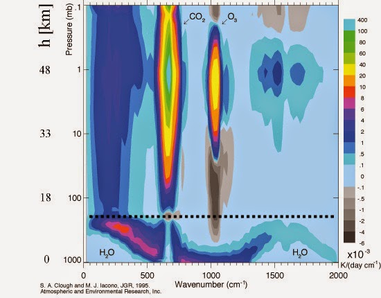
As we can see there is almost no heat trapping occurring in the Troposphere. More CO2 will not warm the Troposphere but it will cool the Stratosphere and Mesosphere.
Science and government has NEVER been a good mix. It has always led to absolute corruption.
President Eisenhower warned about this after his first-hand experience of “empowered” scientists with their own agendas.
I agree.
BUT:
And you really have to watch out for “experts”, i.e. anyone with an opinion who is capable of stringing two sentences together
“Science and government has NEVER been a good mix. It has always led to absolute corruption.”
Exactly what I was thinking when I read the segment below…..
“It is the presence of these government officials that makes the IPCC different from other science bodies. After the report has been approved in agreement with governments, they effectively take ownership of it.”
***********
That is, for all practical purposes, an admission that the IPCC and their “climate science” is being corrupted by the governments of the world. When science is working the way it should, it does not need govt officials from around the world telling scientists what or what not to do. Govt officials are there to ensure that the report serves their purposes (i.e., money).
The climate scare narrative has little or nothing to do with the Earth’s climate.
It is also astonishing that in the final editing of IPCC reports, the government bureaucrat delegates can require the scientific findings to be changed in order to ensure “consistency” between what the IPCC wants to say, versus what the scientists said about any particular aspect.
The tail definitely wags the dog in this circus.
“… that makes the IPCC different from other science bodies”
The IPCC is not a “science body”!
New report will highlight ‘stark reality’ of warming
Here’s the real true stark reality of warming. It is entirely made up.
In the UK this has been a cold dismal summer with a three to four day heatwave that got up to 29C It’s been wet, wet, wet and averaging 20C at best. So imagine my surprise when I learn that…
“But the weather forecasters insist that this summer has been more temperate than usual, apart from in the south east of the country.
Met Office meteorologists said that because long periods of heat have been interspersed with high levels of rain and flooding in some cases has been so severe that people forget the good weather.
Becky Mitchell, a Met Office meteorologist, said this summer has been ‘warmer and drier than average’. She told the Telegraph: ‘It’s not been wetter on average but we’ve seen a lot of reports on the news about the flooding. That’s why it may feel like a bad summer, with not much warmth or sunshine.’ “
https://www.dailymail.co.uk/news/article-9872957/Its-not-Britain-hit-downpours-today.html
20C at best is nowhere near warmer than average. As for the precipitation, drier? Not a chance. The grass is lush and verdant, not brown as you would expect in a ‘hotter drier’ summer.
I just can’t believe how they can lie so easily about what is bleedin’ obvious to anyone with eyes. And get away with it.
Ha ha, yes, I, too, saw this and could hardly believe what I was reading. I don’t know a single person from anywhere in the UK — and I talk to a lot of people in different places — who believe this has been anything other than a normal British summer. In other words it’s been pretty cold and wet, with a few scorching days.
The Met Office has lost sense of reality and clearly believes people are stupid. It will, however, backfire on them because Joe Public reads this stuff and just laughs at it. Far from ‘educating’ people it just makes them believe even less in what the ‘experts’ come out with.
There’s a running joke in the UK about “Barbecue Summers” because the weather forecasting is so poor. To be fair to the Met Office predicting weather in the UK is tough, but they don’t help themselves by making absurd comments like this. Most people just don’t take them seriously.
Don’t worry here too the US has surpassed the brits, our weather people can’t get 2 days right in a row, we have the worst weather people in the world, though must of them are pretty fair to look at.
Who are you going to believe, the Met and the IPCC, or your lying eyes?
I think you’re making the MO’s point. You perceive the summer as being below average based on your personal experience and expectation of what a British summer should be. This is often at odds with the overall value.
Compared with the 1991-2020 period, June was pretty average but July was over 2°C above average. For the UK as a whole rainfall was only 40% of average in June and 75% in July, but in the Southeast of England June was 66% and July 114% above average.
Observation is what I base things on.
Perception = feelings = nonsense, as you well know.
So which observations are you using?
So which time frame are you using for comparison? The totality of the available reliable record, or some chosen 30 year period.
Make a comparison of the TOTALITY of the record, then get back to us.
You warmists want the 30 year magic number for comparison, and a 30 year recode that is set in decades according to the calendar year, not from the beginning of the record to the present.
And the record in England goes back to WHEN? 200 years ago?? And you are using 1991 to 2020??
What a clown!
As I said I’m comparing to the 1991-2020 period. This seems to be the preferred period here as it can lead people to think there’s been less warming.
If you prefer, to use the total period, June was 1.4°C above average, July 2.0°C.
Rainfall: June 62%, July 87%
That’s using MO data going back to 1884 for temperature and 1862 for rainfall. Hope that helps.
So above you mention June 40%, July 75%, big difference from the much higher 62% (over 50% higher than 40%) and 87% (15% higher than 75%), no?
So why not always use the LONGEST record?
Not only your doing, the other climatistas do the same.
Now go back 3,000 years and see how the current compares to the average.
Then go back 5,000 years.
The whole premise that “it is hotter then evah!” is ridiculous.
The whole, “temperatures are rising faster than evah!” is ridiculous.
The hokie stick elimination of the MWP and LIA is ridiculous.
Only a true believer of the high priest of Mann and his god gas could continue to post the nitpicky crap you post.
See my comment below where I say those figures were a mistake. Unfortunately I cannot edit my mistakes and the threading on this site means my correction doesn’t appear directly below the mistake. (The figures in the above post are compared with just 2020)
The corrected figures compared with 1991-2020 are:
June: +0.87°C
July: +1.31°C
UK rainfall:
June: 56%
July: 88%
UK sunshine
June: 106%
July: 111%
It shouldn’t be too much of a surprise that the anomalies for temperature based on recent years are smaller than those based on the full record as it was mostly colder before 1991. The reason I don;t use the entire record set as a base is
a) it means having different figures every year – Dr Spencer’s change from 1981:2010 to 1991:2020 already causes enough confusion.
b) People would accuse me of a bias in comparing current temperatures with those from the little ice age.
The reason I don;t use the average over 3-5 thousand years is the Met Office don’t have detailed thermometer readings over that period.
“The whole premise that “it is hotter then evah!” is ridiculous.”
The inability to spell “ever” is ridiculous, as is any claim that it is hotter than “ever”.
“Only a true believer of the high priest of Mann and his god gas could continue to post the nitpicky crap you post.”
Whatevah!
Argh! ignore all those values, a made a typo when calculating the base values. Corrected value to come.
Compared with 1991 – 2020:
UK mean temperatures:
June: +0.87°C
July: +1.31°C
UK rainfall:
June: 56%
July: 88%
UK sunshine
June: 106%
July: 111%
Bellman
No worries no one expects you to be right about anything anyway.
It’s like the old joke
Boy comes home from school with his second failing grade in math. He says to his dad “I just can’t seem to get anything right”
The dad says “don’t fret son you’ll get better and if you don’t you can always be weatherman”.
No, you’re completely missing the point. I’m a great believer in data and the Met Office data might be correct — in fact I’m sure it is. The point I’m making is that the data does NOT prove in any shape, size or form that what we’re experiencing is anything other than natural variation. It certainly does NOT mean that what’s happening is down to man-made emissions.
For instance, we’ve been told that spring now arrives earlier and earlier because of climate change. Well, it doesn’t — we’re at least two to three weeks behind where we were last year. I actually have data to prove this.
The plain truth is that Mother Nature’s doing what she’s always done and always will do. There is nothing in the Met Office data to suggest otherwise and Joe Public knows it even if the Met Office believes otherwise.
“It certainly does NOT mean that what’s happening is down to man-made emissions.”
Nobody mentioned man-made emissions. The comment I was replying to said the MO was wrong to claim UK temperatures were above average and rainfall below average this summer.
The problem is that “above” and “below the average” are meaningless concepts unless the variation is included as well.
For example, It could well be 10% drier than the average. But if the precipitation varies by 30% year on year anyway then there has been no real change.
The original commenter made the very pertinent observation that the grass is green. The land is verdant. And we all know that, when it has been dry, the grass is yellow.
As no-one is quoting any figures for variance the debate about averages is nonsensical. But the observation that the grass hasn’t noticed anything untoward is meaningful.
The grass samples a wide area. And it’s OK.
“The land is verdant. And we all know that, when it has been dry, the grass is yellow.”
Nobodies said we are in a drought, just that the total rainfall across the UK was below average. Below average isn’t unusual, it should happen half the time. My point is simple you cannot say the MO is lying simply based on your own observation of the state of the grass. I can only speak for the grass in the south of the country, and that’s had above average rainfall, including some serious flooding.
“As no-one is quoting any figures for variance the debate about averages is nonsensical.”
I was debating with someone saying the MO was lying in claiming summer had been above average temperatures, and below average rainfall. I was not claiming it had been unusually hot or dry, and suggesting otherwise is a strawman argument.
But, out of interest, looking at MO data for the whole of the UK:
June 2021
Mean temperatures where equal 12th warmest, out of 138 years.
Rainfall was the 29th lowest out of 160 years.
July 2021
Mean temperatures where equal 5th warmest.
Rainfall was 60th driest.
For variance it will depend on what period you use as a base – having been told off for using the 1991-2020 period as a base I’ll start by looking across the entire time series, from 1884 for temperatures, and 1862 for rainfall
June:
Mean temperature was 14.2°C, compared with a mean and SD of 12.8±0.9°C
Rainfall was 43.2mm, compared with mean and SD of 69.9±26.4mm
July
Mean temperature was 16.6°C, compared with a mean and SD of 14.6±1.1°C
Rainfall was 72.5mm, compared with mean and SD of 83.1±28.4mm
I’m not sure how useful the rain variance is as I expect it will be far from a normal distribution.
At last, some meaningful figures. I agree that there will be a skew towards high rainfall on the distribution as there can be storms but the rainfall is never negative. But we are not on the edge so I think we can use the figures,
So we now see that temperature and rainfall are well within 2 standard deviations. With over 100 years of Met Office data we have enough evidence to conclude that there is nothing of note going on.
And now we come to the political, rather than the scientific, question.
Should the Met Office make statement that is technically correct but implies the misleading inference that something is strange?
In my opinion they should not. If they wish to say that something is happening they should also clarify that this is not significant. Otherwise it looks like they are rattling the tin, unjustifiably.
I am assuming you took the temperature SD as an anomaly and not SD of the number relative to zero, right?
Haven’t checked because I assume you aren’t a muppet but thought I ought to clarify in case muppets are reading this.
If you don’t like my rushed calculations you could always do the work yourself.
I’m not sure what you mean by “take the SD as an anomaly”. By definition the SD is a deviation from the mean.
“With over 100 years of Met Office data we have enough evidence to conclude that there is nothing of note going on.”
If you need something to be above two sd to be of note, then you are not going to notice very much.
“Should the Met Office make statement that is technically correct but implies the misleading inference that something is strange?“
The MO haven’t done anything of the sort. Look at the article this is referring to – all they say is that summer so far has been warmer and drier than average. I’ve no idea what you think they are implying by saying that the month has been drier than average. Are they implying the opposite if they say it was wetter than average? Should they just stop reporting any weather details until they are in the top 2% of extreams?
I think some people here are so paranoid about global warming that they worry that any above average month could be evidence, and so have to stamp on it before anyone has any doubts. In reality there will always be warm and cold months in the UK and elsewhere and you cannot deduce what’s happening globally by looking at just one month in the UK.
For more context here’s the graph for June and July TMEAN values:
And for rainfall
“20C at best is nowhere near warmer than average. As for the precipitation, drier? Not a chance. The grass is lush and verdant, not brown as you would expect in a ‘hotter drier’ summer.”
The UKMO is talking of average mean temps:
In June the Ave Mean Temp was 14.2C (+1.2C) and Ave UK rainfall was 59% of usual.
In July the Ave temp was 16.6C (+1.5C) and Ave UK rainfall was 93%
https://blog.metoffice.gov.uk/2021/07/01/warm-june-heralds-start-of-summer-despite-recent-unsettled-weather/
https://blog.metoffice.gov.uk/2021/08/02/heatwave-helps-mark-fifth-warmest-july-on-record/
The “lush grass” comes from a wet may which saturated the ground for rapid grass growth come June when temps rose considerably
 /metofficegovuk%3Axsmall
I live in the SE and this has been the wettest summer I can remember and I’m 48. All the bridleways and footpaths are as muddy as they are in winter it’s that bad.
It’s been cold too.
A few years ago we a nice hot summer and the tracks were bone dry for most of the year. Climate change seems to be able to produce both extremes and everything else inbetween.
The BBC says:
The report will likely detail significant changes to the world’s oceans, ice caps and land in the coming decades.
We perhaps need a theological discussion of what the BBC means by ‘likely’; this may help us with understanding their understanding of the IPCC report likely, maybe perhaps could be I’ll bet
you don’t need to discuss it.
That crap came from McGrath who doesn’t even have a science qualification.
In fact if one day M M spat out something which actually was even vaguely close to understanding a scientific concept it more “likely” we would get heart attacks from the shock.
The BBC likes to employ people who spout garbage because it gives credibility to their claim of being impartial.
Ie. their own (circular) reasoning,- you can’t have bias in garbage, because garbage doesn’t have bias.
And a theological discussion of “significant”….
“… in the coming decades.” CliSciFi believes it can predict the future weather. Even Gavin Schmidt admits the GCMs run hot. But the MSM will push the hype.
“Meanwhile global temperatures, following on from the record El Nino in 2015/16, are no higher now than they were two decades ago.”
Followed by a graph showing 20 years ago most months were negative, whereas now they are mostly positive.
And warmer than the 20s 😉
Bellman posted:
You appear to have completed missed, more likely failed to comprehend, the data provided in the first graph of the following WUWT article: https://wattsupwiththat.com/2021/08/02/the-new-pause-lengthens-again/
If you care to look at the graph you’ll find quite a few “negative” short-term trends as well a many negative anomalies (from the overall trend) over the the last seven (7) years.
Facts matter.
I was responding to the graph used in this post, not to “pause” graph, which I am well aware of. Of course there are negative trends over any period, there are also great positive trends, none of this has anything to do with the temperature today not being the same as it was 20 years ago.
Maybe if you back over Monckton’s posts you’ll see that even he admits that global temperatures have warmed over the last 20 or so years. Look at the second graph, and his odd trend lines. That shows temperatures 20 years ago at 0°C, and now at over 0.2°C.
Bellman posted:
I previously mentioned about failing to comprehend . . . it bears repeating.
There is NO graph in the Lord Monckton WUWT article that I linked in my previous post (above) that shows GLAT 20 years ago was at 0°C and now is over 0.2°C.
First, you should know that the second graph you refer to, and “his odd trend lines”, are clearly identified by Monckton with this statement in the paragraph introducing that graphic: “In last month’s column, I showed Chris Schoeneveld’s graph of the succession of Pauses which, taken together, drove the global warming of the past century or so . . . The y axis was incorrectly represented (which was my fault). Here is the corrected version.” The graph and its data come from Schoeneveld, not Monckton!
Second, if you know anything at all about Earth’s climate, it is clear the y-axis of that graph does not give absolute temperature, but rather the temperature anomaly about the 0°C reference established by the clearly-marked 18.4 year interval from ~1997 thru 2015.
Any statement that global average lower atmospheric temperatures were 0°C 20 years ago, or are 0.2°C today, is outright laughable.
Of course Moncktons’s first graph does not show anomalies going back 20 years, because he’s only showing the last 6 and half years, becasue he wants to make a silly point about a pause. I specifically said I was referring to graph used in this posting, the one showing the whole range of UAH data, which claimed temperatures where currently no warmer than 20 years ago. (And in case you misunderstood, by this posting I mean the one we at the top of this page, the one written by Paul Homewood.)
The second graph, mashing up two separate data sets, with no indication of how they were joined, is being used by Monckton to show that if you use enough imagination and as little statistical analysis as possible, you can pretend the earth is warming in a series of spontaneous jumps. I don’t care who concocted it.
Finally, you are technically correct. I should have referred to it as anomalies and not temperatures. Mea Culpa. I pointed out the distinction in the past when it matters.
“Any statement that global average lower atmospheric temperatures were 0°C 20 years ago, or are 0.2°C today, is outright laughable.”
It’s Monckton who is making that claim in insisting in drawing pause trends. If you think the trend lines are a true reflection of general temperatures, you have to believe that for 18 years temperatures were roughly equal to the base period average, and then 6 and half years ago jumped by over 0.2°C, and we are still at that temperature.
If you assume the trend has been roughly linear, with a trend of 0.135°C / decade, then over the last 20 years temperatures would have warmed (on average), by 0.27°C.
Or you could use averages as I do above.
In any case, there has been no evidence presented that temperatures today are are the same as 20 years ago, which doesn’t involve making selective use of monthly anomalies, or claiming that by 20 years he actually means 23 years, and is comparing temperatures to day, during a La Niña with temperatures during the strongest El Niño spike in the UAH record.
The graph clearly shows that there was a step up and then a plateau for a couple of decades.
It is a matter of opinion that the next step (when it happens – which it will as climate is never stable) will also be up.
It is a matter for science that we do not know that. Because we do not know what triggered the step up or what stopped it continuing up.
This is the reason for our disagreement. Fundamentally you believe without evidence that the step up was caused by AGW. And therefore the next step will also be up.
But that is a religious conviction, not an empirical observation. You could not predict when that step up would happen. You could not predict when it would stop and plateau.
And you cannot predict when the next step up will be. Because you have no understanding of the mechanism. If you did you could tell us when the plateau will end.
QED You cannot know that the next step will be up or down.
“This is the reason for our disagreement. Fundamentally you believe without evidence that the step up was caused by AGW. And therefore the next step will also be up.”
No. Our fundamental disagreement is that I don’t think the world does warm up in steps. There is nothing in the graph to suggest that the warming is not continuous, the steps in the graph are clearly just artifacts of starting each step change just before a large spike. No statistical evidence has been presented that this is more plausible than a smooth warming trend, linear of otherwise.
There are fundamental reasons why I think the escalator model is impossible. It goes against physics – a planet cannot spontaneously warm up in an instance and then stay at that new temperature for years. The world, or any body, should be always trying to move to an equilibrium temperature. You might quickly warm a part of the world, but it can only be temporary unless the equilibrium changes, and it makes no sense to suppose that a big El Niño spike like 1998 could cause a permanent change in the earth’s equilibrium which will last for almost El Niño.
Moreover, even if this was physically plausible, it would create an unstable planet with temperatures being a random walk. This is inherently unstable. If a few random El Niños can cause this much warming in 50 years, how much could temperatures change over thousands or millions of years? If this was how global temperatures work, the world would now in all probability be either to hot or cold for life to exist by now.
To me, the statistics simple show a continuous warming trend, linear or otherwise. I make no assertion about what caused the warming, although I do think increasing CO2 is probably the best candidate at the moment. It doesn’t matter to me what caused it, I just want a realistic treatment of the data, rather than the fantasy step changes.
“And you cannot predict when the next step up will be.”
Assuming the world is warming in a near linear fashion I would expect the next “step up” using Monckton’s method to be a year or so before the next large El Niño.
Strictly speaking at present it’s not possible for his method to show a step down – even if temperatures where to plummet for the next decade or so, all that would happen is the current pause will get longer and possible eat up previous pauses. But I’m sure if that happens Monckton will come up with a new method by then.
Twenty years ago we were in a significant La Nina. Go back to 1997 or 2004 and end on 2014 to get a somewhat representative trend of the early 21st Century.
Uhhh . . . going back to 1997 would be using data outside of the 21st century.
Moreover, why should I stop trending for the 21st century at year 2014 (your recommendation) when the current year is 2021?
And, please quantitatively define “somewhat representative” trending.
The reality is in fact staring us in the face. It is written in all the climate trends that show no clear direction other than a slight and pleasant warming. It is written in the continual betterment of human and environmental wellbeing that comes with energy consumption, development, wealth and gradual urbanization which reduces the human footprint on nature. It is written in the continual failure of CAGW advocates to come to the table for scientific debate about their favoured beliefs. It is written in the huge conscription of human wealth that is now siphoned off by the liars and cheats who use CAGW religion to line their pockets while degrading the lives of those who pay. My guess is that these truths will not find any space in the upcoming report which is to be written by the very same scoundrels who sustain this scam.
Well said, Andy. Myself, I think the CAGW scam has now reached such outrageous proportions that it won’t be able to survive much longer. Then, there will be a reckoning.
Fodder for more Amazon ads of self preening climate narrative using children. “Do something” the kids say. I say, order direct and skip Amazon’s electronic mall.
Fixed that for them.
Translation: The report will hype more speculative bullshit about the unknown future and attribute everything supposedly “bad” about it to the imaginary “crisis” of supposedly, but not actually, human-induced “climate change.”
Translation: It will be the first steaming pile of hype and bullshit the IPCC has excreted since 2013. The word “science” will again be misused to represent naked speculation that continues to diverge from reality.
Translation: The usual politicized nonsense which bears little connection to the already cherry-picked scientific reports “accepted” by the IPCC, which was formed for the express purpose of blaming changes to the climate on humanity as a guise for creating an excuse for globalized socialism under the control of unelected bureaucrats like those in the UN (who of course expects to impose itself in the middle of all the wealth transfer schemes supposedly “needed” to “save us” from the imaginary “crisis”) will be what they bleat endlessly about in an attempt to browbeat western nations into “emission” reduction and payola schemes that wouldn’t fix the “climate” if the “crisis” was real.
It will be the first steaming pile of hype and bullshit the IPCC has excreted since 2013. The word “science” will again be misused to represent naked speculation that continues to diverge from reality.
Correct!
Excerpt from my paper
CLIMATE CHANGE, COVID-19, AND THE GREAT RESET Update 1d
“Rode and Fischbeck, professor of Social & Decision Sciences and Engineering & Public Policy, collected 79 predictions of climate-caused apocalypse going back to the first Earth Day in 1970. With the passage of time, many of these forecasts have since expired; the dates have come and gone uneventfully. In fact, 48 (61%) of the predictions have already expired as of the end of 2020.”
Climate doomsters have a perfect NEGATIVE predictive track record – every very-scary climate prediction, of the ~80 they have made since 1970, has FAILED TO HAPPEN.
Fully 48 of these predictions expired at the end of 2020. Never happened! Never will!
What are the odds at 50:50 per prediction?
3.6*10^-15 = 0.0000000000000036
That is one in 281 Trillion!
There is a powerful logic that says no rational person or group could be this wrong, this utterly obtuse, for this long; they followed a corrupt agenda, and they lied again and again.
The ability to predict is the best objective means of assessing scientific competence, and the global warming alarmists have NO predictive track record – they have been 100% wrong about everything and nobody should believe these fraudsters – about anything!
Ouch … that’s gotta hurt the true believers, but clearly it doesn’t if the examples on this thread are anything to go by. Oddly many of them appear to be from Britain … the land of “feelings” based science, the new paradigm.
Bah humbug!
It’s all in the El Nino, as Ron Clutz shows.
https://rclutz.com/2021/05/08/adios-global-warming/
Also Bob Tisdale.
https://wattsupwiththat.com/2019/01/20/does-the-climate-science-industry-purposely-ignore-a-simple-aspect-of-strong-el-nino-events-that-causes-long-term-global-warming/
Interesting that McGrath’s BBC presentation seems to show “Actual” temperatures (per Met Office) through 2024!
https://www.woodfortrees.org/graph/uah6/from:1979/to:2021.58/plot/uah6/from:1979/to:2021.58/trend/plot/uah6/from:2015/to:2021.58/trend/plot/uah6/from:2001.58/to:2021.58/trend
“Meanwhile global temperatures, following on from the record El Nino in 2015/16, are no higher now than they were two decades ago. ”
From the above graph:
No:
It shows the LMS trend for July 2001 to July 2021 is actually a little steeper than the long-term-trend for the whole UAH TLT V6 trend period.
And incidentally Monckton’s “PAUSE” is still at a higher temp than is the LT trend at this juncture.
No, he was talking about the temperature not the trend.
Let me guess we are all doomed unless we send more money to climate scientists and redistribute wealth to the 3rd world and it’s more urgent than ever.
The IPCC approach ist the following. IPCC lets to write the recommendations (summary) by the governments for themselves. After that the governments hand over the recommendations to IPCC. In the next step IPCC will officially hand over the recommendation (elaborated by the governments) to the governments accompanyig by loud media tam-tam publicly as the “latest very scientific recommendations from IPCC”. In the final step IPCC will cash the budget for the next period from the governments. This approach is the so called “progressive and creative science” (similar to creative accounting).
In breaking news I’ve found the perfect mentor for Greta’s mum-
Teen loses two million followers after mum deletes her TikTok and Instagram accounts (msn.com)
Really? you look at this summer’s N hemisphere events and you conclude this is not worse than 10 years or even 5 years ago? Really?
Hey, Numbnutz, REALLY!
Worse? How?
You could argue it was better, you would probably need to define a metric you are talking about … oh but wait it’s Griff who is always short on any sort of detail.
.
World is still here and ticking along just fine.
Again
Your argument does not constitute a rebuttal. There are “events” in the northern hemisphere every summer. These events are not even all that special.
Again, your argument is a fallacy; argument from incredulity – (“Look at all these events! Something must be happening!”). In reality, these events are not that incredible, and when compared to what has happened in the past, entirely expected.
Griff doesn’t believe that past events (empirical evidence) has any bearing on the feelings based “science” of today.
griff
What with all the death, destruction, and mayhem that we are presently experiencing, in which time period would you prefer to live your life?
[__] Benign low CO2 1675-1750
[__] “Dangerous” CO2 1950-2025
Define “worse”, if you can. Relative to what?
“Really? you look at this summer’s N hemisphere events and you conclude this is not worse than 10 years or even 5 years ago?”
Yes, I conclude it is no worse than any season I’ve spent on this Earth. And the statistics back up that position. The statistics say we are having much more benign weather than in the recent past.
Griff, you can’t see past your climate change bias. You want to believe CO2 is making the weather worse, and so that’s what you see. It’s not true. The facts dispute your claim.
Let the kabuki dance begin. All the MSM on Monday will be filled with this scary nonsense derived from the SPM.
The Summary for Policy Makers (SPM) is drafted by the politicians in the IPCC and is often at odds with the main body of the work done by scientists and technicians. However, it is published first and the actual report is released later and in pieces. The IPCC know that everyone will read and concentrate on the SPM, and pay no attention to the later report. So no one will notice or report on any discrepancies.
Make no mistake, this is deliberate. They took the old adage about a lie making it halfway around the world before the truth can get its boots on and made it their communications strategy.
I expect the news tomorrow to be filled with doom and gloom from the SPM and the later publishing of the main report to make mary a ripple.
And almost no one will actually read the SPM either. Most will read the Guardian’s summary of the SPM (with traditionally unguarded, highly amplified scare-mongering)
“The Summary for Policy Makers (SPM) is drafted by the politicians in the IPCC and is often at odds with the main body of the work done by scientists and technicians.”
One of those summaries came out claiming humans were causing the Earth climate to change, when the actual science in the IPCC report said there was still not enough evidence to link humans to changes in the climate. So the summary lied to the world and misrepresented what the actual IPCC findings were.
Of course, all of us are looking out for these kinds of alarmist tricks now. We have gained experience dealing with Charlatans. What new lie will they spring on us this time?
Here is a point to make that the data has been changed for years to support the lies of the IPCC propaganda for the last 32 yrs.https://electroverse.net/u-s-has-been-cooling-since-the-1930s/ As virtually all the hottest years have been recorded in the 30’s. As for wildfires the trend is downward if you take care to reduce the amount of brush, dead trees and brush that can burn. Blame the Greenies for stopping that common sense management (California / Australia). As for the California dry season why drain the dams in 2 years from record full levels? Then complain for low water restrictions emergency measures panic. Since we have been cooling for the last 5 years. The only real heat events have been extreme EL NINO events since the 90’s
As virtually all the hottest years have been recorded in the 30’s”
They were indeed (in the US) … caused by a combination of a prolonged warm pacific and also a warm AMO phase … and a feed-back from agricultural practices.
AKA the “Dust Bowl”…..
https://www.pnas.org/content/106/13/4997
The following figure compares the PDO+AMO with the US average annual temperatures. D’Aleo calculated an r-squared of 0.85 between the two – an extremely good correlation.
http://appinsys.com/globalwarming/PDO_AMO_files/image008.gif
http://appinsys.com/globalwarming/PDO_AMO_files/image005.jpg
However the 30’s also had an equal number of US cold record temps.
NOT so now>>>>
NB: the graph shows the RATIO of warm vs cold records.
A stable climate would be indicated by a ratio near 1:1.
A warming one by a high ratio (red)
Of course the warming is irrelevant-it would be the alleged effects of the warming that would matter. And that would be after proving that the causation of the effects were from the warming, and that the warming was man-made. You guys still have a long road ahead of you…
“However the 30’s also had an equal number of US cold record temps.”
Nothing unusual about cold weather in the 1930’s during wintertime.
You say there are an equal number of cold records during that time? I had not heard that. I know there were cold records set during that time, but not that there were a record number of them. Do you have a link?
There is no such thing as a stable climate
”A stable climate would be indicated by a ratio near 1:1.”
Stable. Ha ha ha. Good one!
Absolute made-up B.S. to influence the public (government propaganda). The ratio shows the alarming red spikes because winter nighttime temperature lows are going up in the higher latitudes while maximum temperatures are flat. Showing each trend separately would contradict the CliSciFi memes.
Policy based evidence manufacturing falls apart so quickly.
This “New Report” same as all the old reports will say whatever the policy dictates.
For “The Cause”.
A massive cull is needed.
When we have bureau upon bureau of useless functionaries,naturally this kind of corruption will expand.
Now one aspect of the Cult of Calamitous Climate,being a creation of our bureaus,is committee speak.
“Never ask a question you do not know the answer of”.
Naturally with evidence manufactured to suit the policy,you will avoid any such surprises.
Evidence based policy making is hard.
You have to gather real world data.
You have to guess if there is any meaning to that data.
Then you need to consider if “policy” can make a lick of beneficial difference.
You have so many unknowns and unknowable situations/scenarios.
Thus reverting to the preferred position of any self respecting minion and sychophant,kissing the bosses butt,is so much safer and certain.
After these last 16 months,we have now learned “Evidence” is not the only thing our government manufactures.
Collective wilful self-delusion.
From the above article:
“It’s really showing what the impacts will be, and this is just the start. So I think what this report will add is a big update of the state of the science, what temperature increase are we looking at – and what are the physical impacts of that?” — Dr Heleen de Coninck, from Eindhoven University of Technology in the Netherlands
“. . . this is just the start.” ROTFLMAO! Then what has the IPCC been doing since it was formed by the United Nations in 1988, some 33 years ago?
And, as noted by Paul Homewood in his article above, the IPCC’s “big update” better present a pretty good reason that GLAT has been essentially constant over the last 20 years, despite Mauna Loa observatory measurement of de-seasonalized atmospheric CO2 increasing by more than 12% over this time interval, from 371.1 ppm to 416.6 ppm
(ref: https://gml.noaa.gov/webdata/ccgg/trends/co2/co2_mm_mlo.txt )
IMHO, the “big update of the state of the science” from the IPCC regarding global warming will be actually to show how dismal it has become overall.
The democracies if the developed countries proved with COVID they were all incompetent. All they had to do was isolate the elder care facilities and assist other at risk individuals with self isolation. Instead, they often infected the elder, and simultaneously shut down their economies and shoveled monopoly money out of helicopters.
Why would anyone expect these incompetents, combined with criminal dictatorships and totalitarian states, to solve “climate change”, even if it was real.
The only real solution to anything now is the dramatic reduction in the size, scope, and power of government everywhere. Shut down the UN, shutdown all the international agencies, and demand the elimination of programs, agencies, and entire departments, of all government, everywhere.
“Meanwhile global temperatures, following on from the record El Nino in 2015/16, are no higher now than they were two decades ago.”
Shuckmann et al. 2020
Berkeley Earth 2020
https://realclimatescience.com/2017/09/the-global-temperature-record-is-a-complete-fake/
Compare this chart to the bogus Hockey Stick chart above, from 1979 to the present. They look quite different, don’t they.
They look different because the bogus Hockey Stick chart was created to sell the “hotter and hotter” climate change crisis and distorts the temperature profile of the Earth.
The UAH satellite data correlates with the Weather Balloon data, which means the bogus Hockey Stick chart is wrong from 1979 to the present.
The bogus Hockey Stick chart is also wrong about the Early Twentieth Century warming. Regional surface temperature charts show it was just as warm last century as it is today. The bogus Hockey Stick chart artificially cooled the 1930’s into insignificance to make it appear that the temperatures were getting hotter and hotter for decade after decade and it is now the hottest time in human history. That’s what you would think if you looked at the bogus Hockey Stick chart, and that’s what the Data Manipulators want you to think, but it’s all a Big Lie created to sell a Human-caused Climate Change narrative.
The way to recognize a bogus, bastardized, instrument-era Hockey Stick chart is to look at the 1930’s on the chart. If the 1930’s show to be cooler than the present day, then you are looking at a bogus, bastardized Hockey Stick chart.
How can anyone put any faith in the bogus Hockey Stick when its temperature profile is so different from the satellite profile? One or the other is wrong, and the Weather Balloon data says it is the bogus Hockey Stick chart that is wrong.
The Data Manipulators are manipulating the data for political/personal gain. The Science is not in them. Here’s the evidence right before your eyes.
“The bogus Hockey Stick chart is also wrong about the Early Twentieth Century warming. Regional surface temperature charts show it was just as warm last century as it is today.”
You made exactly the same claim a few days ago in the UAH posting. You posted a load of graphs to prove your point. I pointed out the problem with those graphs and posted graphs for some of the same regions, using the same data, all of which clearly show it is warmer now than it was last century. Did you see my comments?
Here for example is the graph for the USA
The Berkeley graph is a nonsense as evidenced by this compedium of countless radiosonde data showing 1958 was exactly the same AGT as it was in 2000/2002, not the 0.2C or more higher as shown in the Berkeley graph. UHE in action. If it’s wrong in one place it’s wrong in every place.
Fact is it has not warmed that much if at all when compared to the 30s.
Recently my late father told me….”it’s changing, for instance, it was much hotter in the 50’s that today”.
It was even warmer in Italy – for example – during WW1
Or do you have a chart which refutes that?
https://www.nytimes.com/2021/05/08/world/europe/italy-glacier-wwi-artifacts.html
Not sure where you got that graph from, but here’s the graph I produced from HadAT2 for the 850hPa level. This goes up to 2012.
https://www.metoffice.gov.uk/hadobs/hadat/hadat2.html
And here’s the RATPAC-A version up to 2021
“I pointed out the problem with those graphs and posted graphs for some of the same regions, using the same data, all of which clearly show it is warmer now than it was last century. Did you see my comments?”
No, I did not. That thread was getting very old.
I would guess that the graphs you posted were modified temperature graphs, like the one you just posted above, and not the “raw” data, which is what I was showing. The raw data is the only legitimate data. Manipulating the raw data is what got us into this climate change mess. You could repost some here, if you want.
Notice the problem with the bogus Hockey Stick chart above.
The bogus Hockey Stick is showing 1998 to be 0.3C cooler than the UAH satellite chart shows.
The UAH satellite chart shows 1998 and 2016 (the hottest year evah!) to be statistically tied for the warmest temperature since 1998. The bogus Hockey Stick chart shows 1998, as being 0.3C cooler.
This was done so that NASA Climate and NOAA could proclaim year after year in the 21st century as being the “hottest year evah!”, culminating in 2016, thus fooling peope into thinking it was getting hotter every year.
But if you go by the UAH satellite chart, NASA Climate and NOAA would not be able to call any year between 1998 and 2015 as the “hottest year evah!”. And that’s why they don’t trumpet the UAH satellite record, and why they have bastardized and artificially cooled the year 1998 in the Hockey Stick “record”. It enabled their lies about the climate.
Also notice, that on the Hockey Stick chart, they show the 1880’s to be just as warm as the 1930’s. And this is correct, the 1880’s were a point in time where the temperatures were equal to the 1930’s. The only problem with the Hockey Stick chart is the Data Manipulators cooled both the 1930’s and the 1880’s so they look much cooler than today.
But the unmodified regional surface temperature charts show the true temperature profile and show that the 1880’s and the 1930’s and the present day were all equally warm. All three eras should fall on the same horizontal line on a chart.
So, if the Weather Balloon data corresponds with the satellite data, then that makes the bogus Hockey Stick chart unrepresentative of reality. We see the political reasons for why the bogus Hockey Stick chart looks the way it does. It’s Crisis Climate Change Propaganda dressed up as Science.
“I would guess that the graphs you posted were modified temperature graphs, like the one you just posted above, and not the “raw” data, which is what I was showing.”
You were showing exactly the same data sets as I used. The only difference was that your graphs only go up to 2012, only show maximum temperatures for a single month each year, and don’t include any smoothing making it difficult to estimate what periods are warmer.
“The bogus Hockey Stick is showing 1998 to be 0.3C cooler than the UAH satellite chart shows.”
The chart I showed was for USA. Why do you think it should show the same pattern as global satellite data?
Here’s the UAH data for the contiguous USA, using the same scheme, 12 month and 10 year averages.
“You were showing exactly the same data sets as I used. The only difference was that your graphs only go up to 2012,”
Bob Tisdale needs to update his charts. 🙂
So you don’t like the Tmax charts? They have to be “smoothed”?
Me, I just go by the actual temperature readings. I think those who wrote down the temperatures in the past were fully capable of doing their job well and as accurately as anyone who reads a thermometer today. Plus, they didn’t have a bias, pro or con, about CO2.
I don’t think their temperatue readings need any adjustments, and they certainly don’t need any adjustments that completely change the temperature profile into a scary CO2 scenario. The arrogance of the Data Manipulators! But it’s not really arrogance, its actually greed that drives these people.
The actual temperature readings, minus manipulation, tell the real story of the Earth’s climate and that story is not a scary CO2 nightmare, rather, it says CO2 is not something we need to worry about. Yet, here we are, getting ready to waste $Trillions of dollars trying to reign in CO2 production. All based on falsified, manipulated temperature records.
So arguing the nuances of the Hockey Stick charts are irrelevant to me, other than to debunk them as being unrepresentative of reality. They are politics dressed up as science, as far as I’m concerned.
And I have evidence to back me up: The written, unmodified, regional surface temperature charts, and the obvious data manipulations NASA/NOAA have done since 1998, which demonstrates they are artificially manipulating the data.
We have evidence of this post-1998 data manipulation by NASA and NOAA. And as far as I’m concerned, we have evidence of them bastardizing the entire instrument era record, because the regional surface temperature charts show a completely different temperature profile than the computer-generated Hockey Stick charts.
It’s bastardization of the temperature record all the way down. Not fit for purpose.
To be fair to Bob Tisdale, I think when he made those charts the BEST regional data only went up to 2012.
“So you don’t like the Tmax charts? They have to be “smoothed”?”
I’ve nothing against the charts, they’re just not showing the same thing as the global average charts. This is a problem if you are using them to any difference shows fraud.
It isn’t just that they are showing max, rather than mean temperatures. It’s that they are only showing one month of each year, the hottest in absolute terms. This will usually be July, but might occasionally be June or August. In so doing they miss more than 90% of the data for each year. You might regard this as a better way to measure regional warming or not, but it isn’t comparable to the regional and global charts that are showing temperature over the entire year.
As to smoothing, I just want to see some indication above the noise that it was warmer in the 30s or whenever than it is today. It’s difficult to compare different periods when all you have is noisy monthly data. How do you define warmer? Do you mean one individual year, or do you mean in general? Say over a 10 or 5 year period.
“Me, I just go by the actual temperature readings.”
Which actual temperature readings. You said it was true for all regions, but looking at individual temperature regions, even in the US, I can find some that are clearly cooler throughout the 20th century.
“I think those who wrote down the temperatures in the past were fully capable of doing their job well and as accurately as anyone who reads a thermometer today.”
But did they take into account stations moving, or the local environment changing.
“The actual temperature readings, minus manipulation, tell the real story of the Earth’s climate…”
Then produce it. It’s the biggest problem I have with all these conspiracy theories about data manipulation or whatever. The data’s available, anyone who disagrees with any of the temperature data sets could easily do there own research, come up with a data set they think represents the true changes in global temperature. Then we could argue about the choices that made in interpreting the data. But I’ve never seen anyone do this.