Reposted from Dr. Roy Spencer’s Blog
August 2nd, 2021 by Roy W. Spencer, Ph. D.

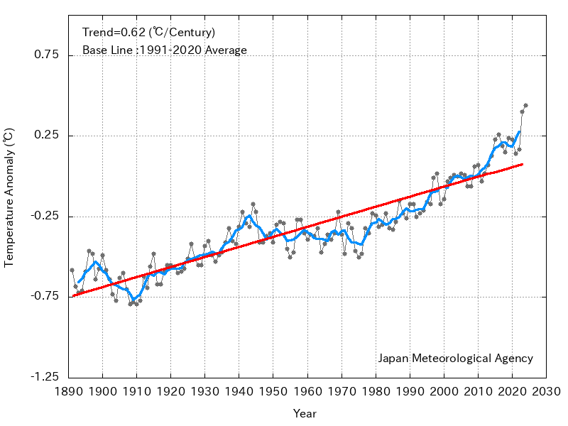
The Version 6.0 global average lower tropospheric temperature (LT) anomaly for July, 2021 was +0.20 deg. C, up from the June, 2021 value of -0.01 deg. C.
REMINDER: We have changed the 30-year averaging period from which we compute anomalies to 1991-2020, from the old period 1981-2010. This change does not affect the temperature trends.
The linear warming trend since January, 1979 remains at +0.14 C/decade (+0.12 C/decade over the global-averaged oceans, and +0.18 C/decade over global-averaged land).
Various regional LT departures from the 30-year (1991-2020) average for the last 19 months are:
YEAR MO GLOBE NHEM. SHEM. TROPIC USA48 ARCTIC AUST
2020 01  0.42  0.44  0.40  0.52  0.57 -0.22  0.41
2020 02  0.59  0.74  0.45  0.63  0.17 -0.27  0.20
2020 03  0.35  0.42  0.27  0.53  0.81 -0.95 -0.04
2020 04  0.26  0.26  0.25  0.35 -0.70  0.63  0.78
2020 05  0.42  0.43  0.41  0.53  0.07  0.84 -0.20
2020 06  0.30  0.29  0.30  0.31  0.26  0.54  0.97
2020 07  0.31  0.31  0.31  0.28  0.44  0.27  0.26
2020 08  0.30  0.34  0.26  0.45  0.35  0.30  0.24
2020 09  0.40  0.42  0.39  0.29  0.69  0.24  0.64
2020 10  0.38  0.53  0.22  0.24  0.86  0.95 -0.01
2020 11  0.40  0.52  0.27  0.17  1.45  1.09  1.28
2020 12  0.15  0.08  0.21 -0.07  0.29  0.44  0.13
2021 01  0.12  0.34 -0.09 -0.08  0.36  0.50 -0.52
2021 02  0.20  0.32  0.08 -0.14 -0.65  0.07 -0.27
2021 03 -0.01  0.13 -0.14 -0.29  0.59 -0.78 -0.79
2021 04 -0.05  0.05 -0.15 -0.28 -0.02  0.02  0.29
2021 05  0.08  0.14  0.03  0.06 -0.41 -0.04  0.02
2021 06 -0.01  0.31 -0.32 -0.14  1.44  0.63 -0.76
2021 07  0.20  0.33  0.07  0.13  0.58  0.43  0.80
The full UAH Global Temperature Report, along with the LT global gridpoint anomaly image for July, 2021 should be available within the next few days here.
The global and regional monthly anomalies for the various atmospheric layers we monitor should be available in the next few days at the following locations:
Lower Troposphere: http://vortex.nsstc.uah.edu/data/msu/v6.0/tlt/uahncdc_lt_6.0.txt
Mid-Troposphere: http://vortex.nsstc.uah.edu/data/msu/v6.0/tmt/uahncdc_mt_6.0.txt
Tropopause: http://vortex.nsstc.uah.edu/data/msu/v6.0/ttp/uahncdc_tp_6.0.txt
Lower Stratosphere: http://vortex.nsstc.uah.edu/data/msu/v6.0/tls/uahncdc_ls_6.0.txt
Right on top of CDAC on our site which was .34C but based on normals ending 2010. Even tweeted .2c as the estimated. UAH is the gold standard, but weatherbell.com site can give you a hint as to where it might go. We are going to get the averages changed. Dr Roy RULES
Equal 5th warmest July in UAH data set, 0.18°C below the all time record July set in 1998.
Start of Monckton style pause moves from March 2015 to February 2015, making the pause 6 years and 6 months old, [sarc] 4 months shorter than last month [\sarc].
Top 10 warmest July Anomalies in UAH:
What if I love CO2?
I love it too – the gas of life.
Love the stuff in my beer, sparkling wine, etc, they wouldn’t be the same without it!!! 😉
It really is sad how the trolls actually believe they have made some kind of killer point.
Considering UAH started in a colder period, what’s the problem?
It doesn’t matter when it started. The anomaly reference period is the previous full 30 years, 1991-2020. That’s hardly a ‘colder period’.
Who picked 30 years? Like that really means something in geological time frames, which are climate time frames.
I declare that all anomalies of global average temperature shall be to the mean of the FULL RECORD of whatever is being measured by whatever consistent means.
So for UAH, that would be from 1979 to the present. Over 40 years.
ACGW lunatics picked 30 years. They seem to like the years to go by calendar decades, all of which is entirely arbitrary. Ridiculous!
That is a reasonable choice of baseline. Just understand it doesn’t change the shape of the graph or the warming trend so in the end it won’t a make difference either way.
It doesn’t matter what period you use as a baseline, the trend will be the same, as will the relative ranking of specific months. The only thing using a different baseline does is to change the specific vales, discrepancies between different calendar months, and the relative position of different systems with different trends.
Here’s what the year so far would look like using the 1979 – 2020 base line:
30 year normal periods were the tradition before AGW was a thing.
This would be after 1998 was bastardized and cooled by the Data Manipulators.
Are you claiming UAH has been bastardized?
No, I’m claiming the Hockey Stick charts y’all are talking about have been bastardized.
UAH is the only chart you can count on.
I’ll be back in a little while to show you what I mean.
We’re talking about UAH here.
And how do you know that UAH is the only chart you can count on?
NASA Climate and NOAA turning 1998 into an insignficant year tells me that they can’t be counted on to tell the truth.
https://en.wikipedia.org/wiki/Instrumental_temperature_record
Warmest years
“In January 2017, several scientific agencies around the world, including NASA and the NOAA in the United States[10][11] and the Met Office in the United Kingdom, named 2016 the warmest year recorded.[12][13] This marked the third consecutive year reaching a new record temperature, the first time since the current warming trend began in the 1970s that three years in a row were record highs.[11] 2016’s record meant that 16 of the 17 warmest years have occurred since 2000,[11] 2017 being the third-hottest year on record meant that 17 of the last 18 warmest years have occurred since 2000.”
end excerpt
Now look at the UAH satellite record, and see if any year between 1998 and 2016 can be called the “hottest year evah”. Can you find 16 years between 1998 and 2016 that are warmer than 1998? No, you cannot. None of them are warmer.
NASA Climate and NOAA continued to bastardized the surface temperature record since 1998, so they could claim that each year after that was hotter than the last and hotter than anything in human history.
NASA Climate and NOAA could not make those claims if they went by the UAH satellite chart.
They manipulated the surface temperature record to sell the Human-caused Climate Change scam but the UAH satellite chart shows they were just spreading lies and fearmongering.
So your argument is that UAH can be counted on because…
— You feel NASA and NOAA cannot be counted on.
and
— There are no years between 1998 and 2016 warmer than 1998
Do I have you argument correct?
Yes, that, and the fact that the satellite data correlates with the Weather Balloon data. So the satellite data has support of a second set of measuring instruments, unlike the NASA Climate/NOAA global surface data.
I defy you to stand on a street and notice when the temp changes by 0.38 degrees.
Get a grip on yourself.
Here’s the graph of UAH July Anomalies:
Looks to be about 1C per century.
Trend for July is 1.26°C / century, a little slower than the overall warming rate.
According to the CET (UK Met Office) records average July temperatures for England have gone from ~15.8°C in 1772 to ~16.4°C in 2020 which is roughly 0.03°C per decade.
France’s coldest July was in 1980 with an average temperature of 17.71°C.
How is the climate catastrophe narrative justifiable for the UK?
That’s not how you determine a trend! July 2021 was 17.7°C. By your logic that means the trend is now more than twice what you claimed.
As it happens, the actual trend since 1772 is 0.026°C / decade, but why would you start in 1772? Start in 1972 and the trend is 0.187°C / decade. June over the same period is warming at 0.266°C / decade.
CET is not the Globe, it isn’t even England, and the UK is not typical of global concerns about warming.
1722 was the year the CET moved outdoors, having previously been constructed from readings taken in unheated rooms – not always actually in England. However it moved to a single station in London, which is stretching ‘Central England’ a little, and then hopped around between different single sites in the capital until 1855 when it moved to Oxford, before finally moving to three sites broadly comparable with the modern series in 1878. This is one reason the uncertainty in the 1722 value is greater than 1C.
I haven’t done a trend calculation, you just need a functoning eyeball to see the warming in CET.
https://www.metoffice.gov.uk/hadobs/hadcet/Parker_etalIJOC1992_dailyCET.pdf
I;m not sure where you are getting your data from, but it’s completely wrong. CET for July 1772 was 16.9°C, in 2020 it was 15.7°C.
Maybe I’m just misunderstand what records you are referring to. Given the start date of 1772 I’m guessing you’re using daily data, but I still can’t figure out how you get the approximate values you quoted. If I misunderstood your point I apologize.
See, this is how debate on a civilised level should be conducted. Accept that you might be wrong and be open to correction, even if you think you are right. Don’t flip the subject or misdirect if you think you have been exposed as being wrong. That’s childish, and most certainly not ‘skepticism’. The sermon endeth.
Not exactly earth shattering.
That makes sense considering that the land air temperatures are increasing mostly in Winter, and the NH has more land area than the SH.
And since at least 3/4ths of that is natural, it still doesn’t amount to anything.
So it’s less warm now than 23 years ago? Is that your point, Bellman?
Not my point. I’m not sure if there was any point, just a fun fact. I don;t think you can deduce much from looking at individual monthly values. You could probably draw conclusions from the fact that most of the warmer happened in the 21st century, but if you just want to see if global warming is being observed you are better of just looking at the overall trend.
So, errr…, it’s worse than we thought? 🙂
It was also the 3rd warmest 1pm on July 5th on record.
I think you qualify for a job at NASA Climate/NOAA, Mark.
Equal 5th warmest July in UAH data set,
Not very warm though. Do you think it will go up or down from here?
I try not to make predictions, but my guess would be down in the short term up in the long term.
Given that the UK Met Office have forecast an August heatwave, my money’s on a cooler than average August. Chances are it won’t then pick up before next year.
It’s been cooling off and on for the last 7000 years.
Why are you so terrified that the earth may gain a small amount of that back?
Who says I’m terrified. Someone else claimed I’d be ecstatic if temperatures warmed. In these comment I try not to speculate on what will happen in the future or how I’d feel about it, but maybe I’d love to get back to the climate of 7000 years ago, when civilization was benefiting from all that warmth.
Thanks for admitting July 1998 was hotter.
So it’s been warmer in the past. At least you admit it.
What on earth do you think the point of my post was? It’s just a list of the warmest UAH months of July. Why do you think I would pretend 1998 doesn’t exist?
Calm down dear!
You’ll be back no doubt next month and adjust Moncktons pause whatever the temp shift direction? In the name of fairness. Its good to see you qualified Moncktons pause.
I hope to keep doing this as long as I can. It’s fun.
Still can’t get terribly excited by a 1.1°C rise in global average temperatures over 150 years!!! That’s a terrifying 7 thousanth of a degree per year, not a thermometer on Earth can measure to that degree (excuse the pun) of accuracy!!!
Lots of people seem to have been triggered by the claim that this was the 5th warmest July in 40 years, yet nobody has objected to Joe Bastardi saying in his data set it was the 2nd warmest July in 40 years.
I’ve got absolutely no problem with it being a warm July – it’s the height of the NH summer and it’s supposed to be warm. It’s how these temperatures develop over the longer time frame that I’m interested in. Now for the nitty-gritty – the anomaly you quoted is a mathematical average, right? What’s the statistal probability error range for that, and what’s the actual error range, please?
You need to address your questions to Dr Roy Spencer and Joe Bastardi. I’m just quoting their figures.
Personally I don’t give too much credit to UAH data, it being based on uncertain satellite data and something of an outlier compared to other data sets. But it is the only one accepted here, and everyone has become very obsessed about reading the entrails of every monthly report. So I just play along with it, and give my own perspective.
So you’re just repeating something you read somewhere with no understanding of what it is that you’re actually posting? That’s completely irresponsible and rather stupid, don’t you think?
Try reading his posts here, and on current threads (Monckton’s pause, that is actually warmer than the long-term trend is FI).
He has provided his own analysis and posted data/graphs from it.
If by that you mean I’m using the data from various data sets, including UAH, and treating them as valid despite my misgivings so I can debate with people here, then yes I’m taking the word of Dr Roy Spencer and others on trust.
Does that mean I actually believe the data without question? No. However, my main concern here is not the accuracy of the satellite data, but the uses and abuses of the statistics perpetuated here.
The July 2021 value is relative to the July 1991-2020 average. The fact that it is the NH summer and is supposed to be hot is statement of absolute temperature only. The UAH figure is the deviation from the baseline specifically for the month of July so it already takes into account that it is “supposed to be warm” this time of year.
I’m not sure I’ve seen a focused quantification of the uncertainty for the monthly anomalies for UAH. Christy does have several publications in which uncertainty is discussed, but I don’t think I’ve seen anything specific to the monthly anomalies themselves. I’ll double check that. I will say that Mears 2011 does specifically address uncertainty for the monthly anomalies for satellite derived time series. The uncertainty can be as high as +/- 0.2C (2σ). For point of comparison the conventional surface datasets have an uncertainty on the order of +/- 0.05C for the monthly anomalies. I will say that Christy 2000 (and there was another that I’ve lost track of) that claims the UAH trend uncertainty is on the order of +/- 0.05 C/decade. Note that this is the trend uncertainty in units of C/decade; not the uncertainty on the monthly anomalies in units of C.
Thanks for the gentle reminder that there are actual statistical laws governing this.
“Lots of people seem to have been triggered by the claim that this was the 5th warmest July in 40 years, yet nobody has objected to Joe Bastardi saying in his data set it was the 2nd warmest July in 40 years.”
I personally don’t object to either because I think a 40-year period is irrelevant. And I know it was just as warm as today in the last century, so all these claims of unprecendented temperatures today is just so much climate alarmist propaganda.
Can you provide a reference to a dataset showing that the global mean temperature in the last century was just as warm as it is today?
Is that a trick question? You don’t know the history of the recording of the temperatures?
Yes, I know what you are getting at. You want to dismiss the regional charts as not representing the global temperature profile.
I say the regional temperature profiles are the only fact-based element in this Human-caused Climate Change scam. If they all say the same thing, and they do, then their temperture profile is the temperature profile of the Earth.
All the regional charts from all around the world show it was just as warm in their regions in the Early Twentieth Century as it is today. Is it a coincidence they all have the same temperature profile?
The only temperature profile that differs is the bogus, bastardized, instrument-era Hockey Stick charts which were created in a computer to sell the Human-caused Climate Change hoax.
You are free to argue how many Angels can dance on a Hockey Stick as much as you want. I say it is irrelevant to the actual situation here on Earth.
It is not a trick question. Which dataset are you referring to when you say “And I know it was just as warm as today in the last century”? How do you know?
What do you want me to do, show you all the regional surface temperature charts I have?
Here’s one, the U.S. surface temperature chart:
It shows the substantial cooling from 1940 to 1980, and the warming from 1980 to 1998, and shows that 1998 was cooler than 1934, and since 1998 is equivalent to 2016 in the satellite charts, that makes 1934 warmer than 2016, too. So we are in a temperature downtrend since the 1930’s, at least in North America.
And of course, I have other charts from different parts of the world that show the very same temperature profile.
You want to see them all? You haven’t been paying attention as I posted them during all this time? You’re new here?
And then we have the bogus, bastardized, instrument-era Hockey Stick charts that show a completely different temperature profile. Notice how the 1930’s have been cooled into insignificance in order to make it appear that current temperatures are warmer than anything in human history. And it’s all a Big Lie, created in a computer out of nothing factual.
Bogus, Bastardized Hockey Stick Chart:
All the unmodified regional surface temperature charts resemble the temperature profile of the U.S. chart, where it was just as warm in the Early Twentieth Century as it is today.
None of the regional surface temperature charts resemble the bogus Hockey Stick chart profile. It’s an OutLiar.
The upper graph you posted has two problems. First, it is not the global mean temperature. Second, it is contaminated by non-climatic factors like station moves, time-of-observation changes, instrument changes, etc. Address these issues and resubmit for review.
BTW…This is now at least the 3rd time I’ve notified you of these issues. If you continue to pass off that top graph as if it were the global mean temperature and as if had no biases then I’m going to forced to include that are you intentionally trying to misleading the WUWT audience.
Conclude whatever you want. One of your heroes, James Hansen created that chart. Are you saying he can’t read a thermometer?
You want to dismiss the regional charts because they blow up the Human-caused Climate Change narrative.
Here’s some examples for your edification. Notice how all of them show being just as warm in the Early Twentieth Century as it is today:
US chart:
China chart:
India chart:
If I put more than three charts in a comment, it goes to moderation, so I give the moderators a break by doing it this way.
Norway chart:
Australia chart:
Here’s Tokyo 1936 to present
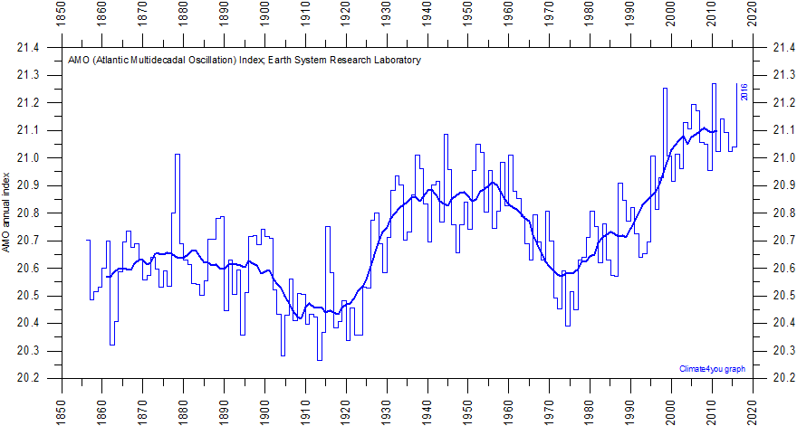
The AMO has the same profile:
Another item with the same profile:
Pakistan:
Bangladesh
https://realclimatescience.com/2019/03/nasa-tampering-with-reykjavik-raw-temperature-data/#comments
Greenland has the same profile as the U.S. from the Early Twentieth Century to today”
Finland:
Arctic temperatures:
Nigeria:
Argentina:
South Africa:
Do you see a temperature pattern with all these charts?
I do. I see it was just as warm in the recent past as it is today, all over the world. CO2 does not seem to be a factor in the temperature record, going by the regional temperature charts, since it is no warmer today with lots of CO2 in the air, than it was in the Early Twentieth Century with less CO2 in the air. More CO2 in the air does not equate with a warmer climate.
AMO is a detrended measure. If current AMO values are the same today as they were 60 years ago, it’s because temperatures are warmer.
All those graphs stop 10 years ago, and only show single months, the warmest max temperature for each year. And they all show different profiles – warm periods at different points of the 20th century.
In any event it’s difficult to test how warm it was if all you show is very variable year to year values. What does a 5 or 10 year average show?
Also, all these charts are from BEST, one of those fraudulent manipulated data sets you don’t accept. Why do you think their regional data would be better than their global data?
Here’s the Contiguous US from the same source, showing 12 month and 10 year mean temperatures.
Source: http://berkeleyearth.lbl.gov/regions/contiguous-united-states#
And for China
And India
“It shows the substantial cooling from 1940 to 1980, and the warming from 1980 to 1998, and shows that 1998 was cooler than 1934, and since 1998 is equivalent to 2016 in the satellite charts, that makes 1934 warmer than 2016, too. So we are in a temperature downtrend since the 1930’s, at least in North America.”
Satellite data does not show current average temperatures in the USA being the same as in 1998. Using the same 5 year average as your old graph shows USA warming by about 0.75°C from the early 80s, about 0.5°C from the 1990 peak, and about 0.25°C from the 2000 peak. Any mash up would suggest that USA is currently a little warmer, over a 5 year average, then the 1930s peak.
What is the temperature reading for 1998 in the satellite record, compared to the NASA Climate/NOAA reading?
“All the regional charts from all around the world show it was just as warm in their regions in the Early Twentieth Century as it is today. ”
Not true. CET doesn’t show it being warmer in the early 20th century as warm as it is today.
It’s my understanding that CET did not have much coverage (one or two measuring stations) for many decades.
And wasn’t CET embroiled in a little data manipulation themselves? If it doesn’t show the same warming that all other regional charts show, then it has to be suspect, in my book.
So I don’t put any faith in CET.
CET has always only been represented by a few places, given the intention to make it a long running record. Whether anyone thinks this is a good or bad thing seems to depend on whether they think it makes their point or not.
But if you prefer, here’s the Met Office’s UK data, which also shows temperatures are warmer today than in the early 20th century. (Red line is 10 year moving average).
Of course, I’m guessing you will say you don’t trust this data either, which is the problem. You can always dismiss any data not confirming your claim, and then say you were right, all regions and data you haven’t rejected shows temperatures warmer than today.
What you mistake as triggering is actually amusement, at the way you are so convinced that this little datum is actually meaningful, much less important.
I’m not sure what meaning you think there is in a single month being equal 5th warmest. I think it’s interesting context, but not very meaningful. You certainly can’t conclude that temperatures are not cooling, or that they have been cooling since 1998. But again, if you think I shouldn’t have mentioned the ranking, do you also object to Joe Bastardi pointing out it was the 2nd warmest July?
I assume you would be ecstatic if it was the warmest July rather than only the 5th.
Why. I’m not someone who claims hot is always better than cold. July this year was plenty hot for me (in England), and I’m rather glad it’s now cooled down a bit.
Like what stock market analysts call a *dead cat bounce*.
The magnitude of these fluctuations always surprises me. That’s a very spiky graph.
Hmm, I never understood why this value can bounce to rapidly.
What is the uncertainty of this number?
Does this really mean that the global LT Temerature is 0.21°C higer than last month? That sounds unbelievable..
It doesn’t really mean anything. It’s another bogus average.
It jumps up and down with cloud cover over large patches of the ocean as weather fronts move across. Then Continental temps lag SST by a couple of weeks, and there is a long term trend as sea surface temperature varies over multi decadal cycles. It can’t warm up much more than 3 C before the Stefan-Boltzmann T^4 relation sends the heat to outer space faster than ocean can accumulate it.
I believe it’s seasonally adjusted, or it would be more bouncy.
Or it’s comparing July and a year with that July and a year.
Or there is 30 year average, and adjusted seasonally it’s .21 C above that 30 year average
temperature.
Or you should not look at 1 month to get global average temperature, but if you did
global temperature has increased by .21 C in 30 years.
But actually way to look at it is the trend which is .14 C per decade, so this one month of July 2021, is below the .14 C per decade trend.
Or it’s below the average warming trend of 30 years
How long, not including today have you been in climate hobby
“What is the uncertainty of this number?”
The measurement error is about 0.1C.
And the error bars are what we should always bear in mind. When the alarmists are getting all het up about an anomaly of 0.2 degrees and the error is half that, we need to get some sort of rational perspective.
“The measurement error is about 0.1C” – highly unlikely, the measurement error will be around +/- 0.5C for a single datum point. For a combined figure like this, with datum points from hot areas and cold areas, the actual error range is going to be around +/- 30C or more. The statistical probability error range (the area that the averaged temperature is PROBABLY within) will be around +/- 3.0 C.
It really is high time that Willis or someone either resurrects an old post on error ranges or does a new one to highlight issues like this.
Where are getting these figures?
The error range of +/- 0.5C is roughly correct for reading/instrument error – there isn’t a thermometer in the world that has an error range as low as +/- 0.1C (accurate but not precise). The error range for the total temperature record is calculated as being the highest recorded datum point + error, to the lowest recorded datum point – error. There’s no way around that figure, I’m afraid – that’s why most scientists use mathematically derived probabilities instead of actual error ranges. As to the figure of +/-3.0 C that’s a conservative estimate of the probability that the mathematical average of thousands of datum points from all over the world, ranging from the coldest part of Antarctica to the hottest part of the equator along with their individual error ranges, will be found within that area. Using averages like this is rather like shooting a fly with a shotgun – one pellet MIGHT hit, but you’re also going to hit a lot of empty air all around it.
We’re not talking about the uncertainty for a single measurement from a single thermometer here. We’re talking about the uncertainty of the monthly global mean temperature anomaly as measured by UAH which doesn’t even use individual thermometers.
“We’re talking about the uncertainty of the monthly global mean temperature anomaly as measured by UAH which doesn’t even use individual thermometers.” Re-read what I wrote, not what you think I wrote. The UAH figures are derived from a time series of individual thermometers; the fact that this is a mathematically derived average of thousands of these measurements doesn’t alter the laws of physics and the way those individual temperatures are measured in the first place. Once you start adding these temperatures together, you have to start adding the error ranges together – you can derive any number of statistical probabilities that you care to after this, but the fact is that the actual error range will be huge. The fact that some comments have raised a statistical probability range of +/- 0.1C is laughable – that is purely the answer of a statistician giving a range for the accuracy of his figures (not the precision of the measurements) and has no connection with reality whatsoever. It’s easy to forget, when you’re compiling all of these figures, what it is that they actually are – they are an average of individual temperature readings from all over the world. Given that, the statistical probability that the average temperature of the earth will be within +/- 3C is extremely conservative.
“Once you start adding these temperatures together, you have to start adding the error ranges together”
I guess this means we have to rehash root sum of squares and standard error of the mean rules here. No worries. RSS is used when you sum measurements together and want to know the uncertainty of the combined result. SEM is used when you average measurements want to know the uncertainty of the mean.
A monthly global mean temperature requires averaging many different measurements over both spatial and temporal domains to produce a mean value. The keyword here is mean. The uncertainty of that value is given by the SEM which states σ^ = σ/sqrt(N). In other words the uncertainty of the mean is always less the uncertainty of the individual measurements within the sample. Note, however, that this does not include an accuracy bias.
For a rigorous analysis of the uncertainty of the monthly global mean temperature products derived from satellite data see Mears et al. 2010. The authors demonstrate that the uncertainty is generally less than +/- 0.20C (2σ). Compare this to the uncertainty of the traditional surface datasets which are generally less than +/- 0.06C (2σ) over the same period of record.
This is the root problem. The denial of over 200 years worth of advancement in statistical evaluation. They just don’t seem to get their head around measurement/evaluation processes.
“As to the figure of +/-3.0 C that’s a conservative estimate of the probability that the mathematical average of thousands of datum points from all over the world, ranging from the coldest part of Antarctica to the hottest part of the equator along with their individual error ranges, will be found within that area.”
Here we go again.
1st you are averaging anomalies not absolute temperatures. Absolute temperatures might vary by tens of degrees of degrees across the globe, but anomalies vary much less.
2nd, (and I can already sense the usual suspects queuing up to tell me I’m wrong) the error of an average decreases with the square root of the sample size. Taking thousands of datum points across the world, averaging them across 30 days for a monthly average, means that the standard error is going to be a lot less than your 3°C.
Of course this only means the result is precise. It says nothing about it’s trueness, and as I may have mentioned above it’s uite possible that at least one of these data sets has a systemic error, or there wouldn’t be such a discrepancy between different sets.
On the other hand, the fact that monthly averages using completely different methods still tend to agree within a few tenths of a degree illustrate why your ±3°C of the standard error is unlikely to be correct. For that matter, even just looking at a single data set, I’ve never seen one month be 3°C different from the previous month. All 500 or so monthly values in UAH are well within ±1°C of the average, so it’s very difficult to see how your conservative estimate can be correct.
Oh dear God – practically everything you wrote is wrong.
1st – you cannot (responsibly) create an anomaly out of thin air; they are derived from temperature measurements with all of the inherent flaws of same. The fact that you are treating them as statistical numbers in absentia of any other factors does not alter the fact that these are temperature measurements at the basic level.
2nd – a statistical probability may well do exactly as you describe but an error range most certainly does not – the more results you add to a product, the more the error range multiplies. Taking thousands of readings over 30 days all over the world means that the actual error range is going to be huge. As I pointed out, as clearly as I could, that +/- 3C is a statistical probability range, not an error range. Please do not confuse the statistical probability range with an actual error range.
“Of course this only means the result is precise…” Argh, no it doesn’t – it means it is accurate; it’s got no precision whatsoever – which is what this whole discussion was all about. Your statistical anomalies use numbers which have an accuracy of +/- 0.1 but the precision of the numbers has a huge error bar attached to it – so much so that they are useless as a guide to what temperatures are doing but will no doubt give you great enjoyment in keeping score.
“you cannot (responsibly) create an anomaly out of thin air; they are derived from temperature measurements with all of the inherent flaws of same.”
Not all “the same flaws”. To calculate the anomaly at a specific place and time, you take a 30 year average of that place and time of year as a base. This won’t be influenced by the large seasonal and spatial differences you were claiming would create a large error range in the global average.
Of course an anomaly is based on “temperature measurements at the basic level”, but the point I was making is the range of anomaly values taken around the world is much less than the range of temperatures around the world, and hence less likely that different samplings will cause big errors.
“a statistical probability may well do exactly as you describe but an error range most certainly does not – the more results you add to a product, the more the error range multiplies.”
And you make exactly the same mistake I hear time after time. We are not talking about a sum of values, we are talking about the mean of values. The mean is derived by taking a sum and dividing by the sample size. When you divide by the sample size you reduce the error size.
I’ve been arguing this simple fact with numerous people over the last few months. I’m quite prepared to be persuaded that they are all correct and I’m wrong, but so far I haven’t heard a single argument that explains why they think that the error of the mean should increase with sample size. I’ve been over it numerous times, they point me to authorities that explicitly contradict what them, I’ve run simulations that demonstrate how uncertainty decreases with sample size, and I’ve read and reread sources that all agree with me. But maybe this time, you can be the one to give me a convincing explanation.
“Argh, no it doesn’t – it means it is accurate; it’s got no precision whatsoever – which is what this whole discussion was all about.”
Something cannot be accurate and have no precision whatsoever. By precise I mean the likelihood of repeated measurements being similar. In this case the precision is referring to the variation in the mean, i.e. the standard error. If the standard error is small, taking different averages using different samples should still give me a similar value. This is distinct to the bias (or trueness) where the results might be precise, but wrong because of a systematic error in the measurements. If I take a thousand measurements and each is out by ±1, the expectation is that most of the plus and minuses will cancel out and the average will be out by a lot less than 1. If on the other hand all the measurements are out by +1 the average will also be out by +1. This will be precise but it wont be true.
Ok. We are discussing Apple’s and oranges here. There is a difference between an error range and a statistical probability range – when you average a set of figures to get the mean then the probability of the correct mean being within a small amount of the actual mean lessens and the accuracy will go up to around +/- 0.01. This, however, has got nothing to do with the error range which is a product of reading/instrument error and multiplying those errors together to create your data set. Accuracy and Precision have exact definitions and should not be confused – I understand if statisticians use the two to mean the same thing but they really are not. Consider this example – I have an electronic thermometer that has an accuracy of +/- 0.01C and an instrument precision of +/- 0.5C (not too uncommon for most thermometers). If the outside temperature is 12.5C then the thermometer will read somewhere between 12C and 13C +/- 0.01C. This is why most automatic temperature stations (except for Australia’s BOM) take 3 readings over 5 or 10 minutes and use an average – it doesn’t make it any more precise but it helps with the accuracy. As I have said – you are still using the term precise when actually you mean accurate.
Sorry if I was a little pedantic about the precision accuracy distinction. It’s just last time on here I was being criticized for using the terms too casually. Some are very instants that you have to use the correct metrological definitions. Which isn’t helped by the fact that the definitions have changed.
The terms used in the International Vocabulary of Metrology, are “measurement precision” which I take to mean how closely the same measurements agree with each other. “measurement trueness” how close the average of an infinite number of the same measurement would be to the true measurement, and “measurement accuracy” how close a measured value is to the true value. Under these definitions I take accuracy to be a combination of precision and trueness.
More generally I see precision as an indication of random errors and trueness an indication of systemic errors.
I do think these definitions can be confusing when compared with less formal uses of the words. If think that’s the main problem when you talk about the accuracy of a thermometer being ±0.01°C, with a precision of ±0.5°C. TO most people a thermometer that only reads to the nearest degree is not very precise, but to the metrologists here it is very precise if it always gives you the same reading rounded to the nearest degree. What it isn’t is very true or accurate as if say the true temperature was 10.7°C it would always read 11°C which is out by 0.3°C.
Yes – exactly, we do agree on this more or less. This is a big problem that I have with these figures; they are accurate and consistent and that’s fine in themselves but because of the underlying precision problems of the instruments and methodology you can’t really use them for anything – even broad trends may just be an artefact of the precision problems. That’s just something we’ll likely not agree on.
Strictly speaking, that is only true for stationary (constant) data where the distribution of the measurements is normal.
When you are sampling non-stationary data, such as temperature, the data for a full year is skewed with a long cold tail. Also, over several years with a positive trend, the mean and SD increases. You aren’t justified in dividing by the sqr rt of n because the temperature data don’t meet the requirements. You can’t logically claim that the mean is known to greater precision when it is constantly changing. You are saying that the position of a ‘moving target’ can be known with more accuracy and precision than a fixed target. Not in the world I live in.
I wasn’t talking about a time series, just the monthly value so stationarity is not an issue. And the CLT does not depend on the distribution being normal.
“You can’t logically claim that the mean is known to greater precision when it is constantly changing.”
The mean isn’t changing. When I take a mean over any period of time, the mean I’m talking about is that mean. If I take a daily mean, the temperature might change throughout the day, but the mean doesn’t because it is the mean for that day. If I take a months worth of daily means to get a monthly mean, the daily means change, but the monthly mean doesn’t. Etc.
“You are saying that the position of a ‘moving target’ can be known with more accuracy and precision than a fixed target.”
No. I’m saying the mean of a moving target can be known more precisely using a multitude of measurements, than just using one measurement.
Accurately, Bellman, NOT precisely. Precision is the one thing you won’t get with a statistically averaged mean.
It applies to both as long as both are randomly distributed. They don’t even have to be normally distributed. It just has to be random. By nature precision error is random. Accuracy error often isn’t especially when you use the same instrument repeatedly since it’s out-of-calibration bias is also repeated. But, if you use different instruments the out-of-calibration bias does tend to randomly distribute around a true value.
Don’t take Bellman’s and my word for it. Do a monte carlo simulation and prove this out for yourself.
“You are saying that the position of a ‘moving target’ can be known with more accuracy and precision than a fixed target. Not in the world I live in.”
No. That is not what is being said. What is being said (by extension anyway) is that the uncertainty of the mean position of a moving target is lower than the uncertainty on a single measurement of the position of a fixed or moving target. The keyword here is mean. This cannot be emphasized enough.
Don’t take Bellman’s and my word for it. Do a monte carlo simulation and prove this out for yourself.
UAH TLT is literally measuring thin air at around 273K. It takes no energy to shift the temperature. It bears little relationship with surface temperature which has tight thermostatic constraints on SST – 271K under ice and 303K in the tropics.
UAH TLT is best used as an analogue for CO2 concentration.
The long term trends in solar input at the top of atmosphere is warming in the Northern Hemisphere and cooling in the Southern Hemisphere. That has been the case since 1585 when perihelion last occurred before the austral summer solstice.
Northern Hemisphere is getting wetter and wider extremes with atmospheric water peaking in late August ahead of colder winters – read more snowfall and the re-start of glaciation this millennium. Southern Hemisphere will experience both milder summers and milder winters but reducing precipitation resulting in higher land temperature in Australia and longer droughts.
The Nino34 along the equatorial Pacific region shows no temperature trend; in contrast to inept climate models that always get warmer.
“UAH TLT is literally measuring thin air at around 273K. It takes no energy to shift the temperature.”
Yeah, SST is a much safer bet with its thermal capacity and far less noisy as you’d expect. The area of 30C water temp must be increasing for the average to rise.
From https://www.data.jma.go.jp/gmd/kaiyou/english/long_term_sst_global/glb_warm_e.html
Are you seriously suggesting that someone on Earth knows what SST was in 1900 to within half a degree C? Maybe God in Heaven knows, but not a climate speculator in Japan.
He’s been told to believe it, and as a good troll, he believes it.
Large month-to-month variations in tropospheric temperature can be traced to small variations in convective heat transport from the surface. Convective heating and radiative cooling are large on a daily basis, and a small imbalance between them can cause such mont-to-month variations.
Why are we so concerned about all these tiny little ups and downs?
because the long term average is 0.14 degrees per decade. If that continues everyone should be concerned.
Lol and yet the seas just rise with no acceleration.
Err, this is a quadratic fit …
and although tiny, an acceleration has a nasty habit of increasing rate of change.
Lol…slow and steady indeed
If dealing with a parabola, the greatest rate of change is near the minimum. The limbs of a parabola tend to approach a straight line at large values of x.
So you have a problem with interglacial periods?
That’s an ill posed argument. The increasing rate of change is directly related to the radiative imbalance at the top of the atmosphere. If the rate of change doubles, so must the imbalance at the TOA.
And that’s just not an obvious result from a gradual linearish increase in emissions even if you believe all the warming is due to the CO2.
Concerned about what? You do know that projecting a “long term average” of weather has no real meaning, don’t you? Everything could have changed 5 times between now and then.
“IF” frogs had wings they wouldn’t bump their ass so much.
” If that continues everyone should be concerned.”
What are you going to do about it?
MAYBE in a few hundred years
Why should everyone be concerned?
0.14 degs per decade (not even per year) is miniscule.
Get some sort of perspective and stop wetting your pants.
And you assume there are no cycles in temperature so it will rise at that rate forever? A little CO2 has completely taken over control of the Earth’s temperature?
Isaak, like so many climate enthusiasts, seems only able to think in straight lines. Hence the cooling scare of the 70’s and the current warming scare. If they were able to put those 2 events together in their heads, they might come up with a much more realistic model. Sadly, however, each straight-line projection in their heads supersedes the last completely, as if they are unable to mentally reconcile 2 different pieces of information at the same time.
Excellent comment, Richard.
“And you assume there are no cycles in temperature so it will rise at that rate forever?”
Yes, that is what alarmists assume. Wrongly.
It seems to me that the warming so far has been beneficial. Food production has increased. Global vegetation in general has increased. Rain over Australia (that I’m familiar with) has increased. These are all good things.
On the negative side, sea level increases continue as it has for hundreds of years but the increase is so slow that it has no practical impact because natural human movements and depreciation is much, much faster.
At what point do beneficial outcomes cause concern?
Since there is no evidence that any of this warming has been caused by CO2, what’s the problem?
The current rate of warming is no different than the rate of warming prior to the big increase in CO2.
There have been other, much bigger periods of warming and none of them were caused by CO2;.
It’s a mystery.
Other than there are denizens who think that whenever it dips – it heralds a long-term cooling.
When one glance at Dr Roy’s graph and the ENSO state tells us it’s just a temporary natural variation around a long-term warming trend (currently running at around 0.14C/Dec – on the coldest GMST series of the lot).
As the person who jumped off the Empire state building said at the half-way point; “so far, so good!” At the moment you’ve got a slight dip, which might be nothing more than that, or it might be the beginning of a downturn. The ENSO state tells us that we’re returning to a repeat series of La Nina’s (looks like we’ll get a second this year or early next) which, given that the entirety of your ‘long-term warming trend’ was in lockstep with a series of El Nino’s, may mean a reversal – a long-term cooling trend. Frankly I hope we don’t see that but time will tell.
“Other than there are denizens who think that whenever it dips – it heralds a long-term cooling.”
Dips in temperature have happened in the recent past. Why shouldn’t people think a dip in temperature might herald a change in the temperature trend? Because of CO2?
CO2 didn’t stop the decline in temperatures that took place from 1940 to 1980. Around 1975, prominent publications were declaring that the Earth might be entering another Ice Age. The Human-caused Global Cooling crowd thought that cooling trend would continue forever, too. But they were wrong, weren’t they.
The planetary energy imbalance is setting at almost +0.9 W/m2 right now. Any dips we see in the atmospheric temperature are going to be transient until that imbalance gets worked off.
From WWII to about 1980 aerosol forcing rapidly increased outpacing GHG forcing. This is a significant contributing factor in the cooling over this period.
“Why shouldn’t people think a dip in temperature might herald a change in the temperature trend?”
A dip in temperature might herald a change in temperature, just as a big rise might herald an acceleration in the rate of warming. But unless you wait to see clear signs of a significant drop in temperature you should remain skeptical, especially when there’s an obvious explanation for the dip, such as La Niña conditions.
The current warming trend is merely a continuation of the trend that started back around 1850.
There have been 4 previous warm blips since the current cooling trend started about 7000 years ago. The current warm blip is lower and shorter then the previous 4 blips were.
Yea, and some can’t even look past the satellite period….
Why not use 1981 – 2020 for the graph instead of the shorter 30-year averaging period of 1991-2020? There is nothing magic about 30 years. The longer the period the better.
The IPCC folks invented the new standard for determining “climate” as 30 years (likely to reflect their then current cherry pick). It’s all petty meaningless and serves only in a political sense … not a scientific sense. It’s all for show … billions of $s thrown away for a political shell game.
No, they didn’t. That choice goes back to the beginning of the last century.
Not according to my geology text and instructor in the early ’60s. You’re right that the ‘first ‘conventions‘ were developed in the mid-1930s, when most countries had collected only about 30 years of climate data: 1901-1930″. However, my geology text explained that climate normals can vary from several months to millions of years, but for general reference, no less than 66 years should be used for most climates. I guess the IPCC felt convention suited their purpose more.
Why not use 1931 – 2021?
Oh wait . . .
C’mon man…the 30s were cold 😉
It doesn’t matter much. The graph will look the same except the temperature anomalies will be shifted up by an average of 0.0636 if using the 1981-2020 baseline. The warming trend will be the same +0.14 C/decade either way.
The most recent uptick was anticipated by the SST that precedes the GAT by a few months, UAH in almost perfect sync.
The warming is quite steady.
Would it be a stock, the chart issues a strong “buy” signal
Sometimes stock movement will fool you. It could fall farther after the buy signal, rather than continuing to climb. You should establish a point where the stock automatically sells after it falls so far. Just in case.
I see, you have an experience!
Yes, I have had some experiences. Some not so good. I now keep the sell stop in my head instead of entering it into the brokerage software.
I once put a sell stop on a stock and was absolutely certain it wouldn’t be hit, and it got hit anyway, and then as soon as it got hit, the price rebounded. I learned a very good lesson from that.
I’m also leary of the way high-speed computer trading has influenced the way the market moves. Imo, it ought to be banned.
And the requirement that Daytraders maintain a $25,000 account ought to be banned, too. All this does is hurt the little guy who might have the ability to trade successully, but doesn’t have a large enough bank account. I have never seen an adquate explanation for this rule.
I used to Daytrade, but I don’t trust the high-speed computer trading. It distorts the stock movements, which would affect Daytraders. But, then again, one of the reasons you Daytrade is because you get in and out quick enough that you don’t get stuck with a big loss.
Daytrading is exciting, if you have the money. You learn from your mistakes quickly, or you don’t last long. And you will make mistakes. A lot of them.
Plus you’d need willingness from the market to buy that stock – I’d not be interested in a short-term minimal gain with the likelihood of longer-term losses if you got the timing even a tiny bit wrong.
Cycles apparently fool the majority these days with agenda science and agenda news.
A little OT, but not too much:
Hey Simon, you are the victim of Leftwing Media disinformation.
Remember how the Leftwing Media claimed Trump told DOJ lawyers to declare the election invalid, and that he, Trump, would take it from there? The implication was that Trump wanted the DOJ to declare the entire 2020 presidential election as invalid and then Trump “would take it from there”, further implying that Trump was going to overthrow the election.
Well, it turns out that the election Trump was complaining about was *one* particular election that took place in Pennsylvania, not the entire 2020 presidential election.
Simon, *never* believe anything the Leftwing Media says about Trump at first glance. You always have to wait a few days to get the real story, and the real story is never the way the Leftwing Media portrays it, especially when it is about Trump.
To get the truth, you have to assume the Leftwing Media is lying to you, until proven otherwise. If you don’t, then you will be led astray, as you were here.
I read something like this about how to read Pravda back in the CCCP days. It wasn’t so much what they said as what they didn’t say!
To make sense of the world, you must assume, until proven otherwise, that the Leftwing Media is distorting the facts when it comes to the political oppostion and especially Trump.
They throw out a distortion that travels around the world, and nobody hears about the correction. It’s insidious.
Led astray by Dr Spencer?
As in May and late June the Niño region 3.4 was a bit warmer than before, the UAH temperature increased some tenth of degrees.
But that should change next month
Oh hell. It’s the beginning of August, a warm NH month – just how low is it going to go?
The trend on that graph moved warmer when this last active region in the south came into sight back on the 1st of August.
Considering that humans emerged from Antarctica millennia ago, this warming trend is very disturbing! Wait… what’s that? Africa? Not Antarctica? Oh, okay… Never mind!
Ladies and Gentlemen,
Please, may I ask a silly question: Why would be so important this UAH Global Temperature Measurement?
Many THX for the answer (I am simply a beginner, so, please, don´t interpret my question as a provocation).
The satellites give us the best look at conditions on our planet.
Yes, a lot of different parameters will be observed by satellites. However, it seems for me, that UAH plays a key role within the observed set of parameters. Why?
Now claiming the warmest July ever! NOT.. Since NASA changed the numbers downward for 2016. More MSM fraud alarmism. At least 3 articles about thee record heat.