As we all know. It’s just weather ~cr
France declares ‘calamité agricole’ after record cold: What is it?
The emergency support comes after freezing weather caused significant damage to crops
9 April 2021
The government has acknowledged the damage that many farmers had suffered to their crops as a result of the freezing weather.
By Hannah Thompson
Farmers across France will receive government support after the agriculture minister acknowledged the damage the cold had wreaked on crops; with the cold snap set to continue across the country.
Minister of Agriculture Julien Denormandie confirmed a state of “calamité agricole” – or farming disaster – yesterday (April 8), to acknowledge the damage that many farmers had suffered to their crops as a result of the freezing weather.
He told FranceInfo: “[We confirm] the implementation of what we call the calamité agricole scheme
What does that mean?
Normally, a calamité agricole is uninsurable.
But the government recognition and official definition of the situation means that it has committed to providing financial aid as compensation to the farmers and producers affected, as well as ensuring that insurers and banks will also cooperate.
Those affected will now also have access to compensation from the national agriculture risk fund, le Fonds national de gestion des risques en agriculture (FNGRA).
An official calamité agricole must be recognised by authorities before funds from insurers and other sources can be released.
In France, the situation is most often declared due to drought, but this time it has been confirmed due to unseasonably cold temperatures, especially at night.
Mr Denormandie also said that the government had called on insurance companies to confirm their cooperation and support, as well as bankers and lenders.
He said: “We are organising a total emergency response so that support measures can be put in place as quickly as possible to ensure that no one is left behind.”
The article discusses the procedures and accounting of government aid to agriculture and includes this stark warning.
Mr Denormandie also said: “Unfortunately, we are expecting new freezes in the next few days to which we will be paying great attention, so the bill could rise. The situation is already very difficult.”
What temperatures are we talking about?
From Monday April 5, temperatures in some areas of France dropped suddenly to around 7C below the usual average.
Wednesday April 7 was one of the coldest April days since 1930.
Read the full article is here.
Yesterday in Wales it was snowing a little bit unusual for April but what was unusual the snow was falling in a coastal area , today the snow has moved into the cambrians ,the last 3 mornings we have had a frost,,and predicted to last the week.the coastal area yesterday was + 2.5c which is unusual.
Stratosphere is coldest ever for this time of the year
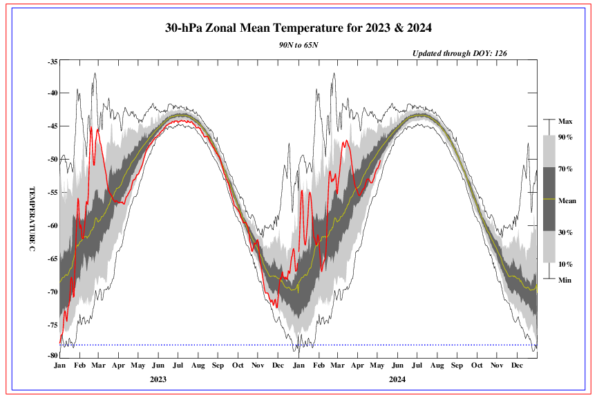
The polar vortex, after a resurgence in late February, is still active.
During the winter-spring period, the stratosphere and troposphere at latitudes 50-80 N, intermingle.
A very simple question. Can they eat or drink money if no food is produced?
If bread is over, it’s cake time
To paraphrase Marie Antoinette – let then bite Bitcoin.
While the production from vineyards is likely to be down, it is often the case that small harvests produce good quality wine.
The much bigger problem is that global agricultural production has already been forecast to be impacted by the lockdowns and travel restrictions imposed during the Wuhan coronavirus pandemic. Widespread weather impacts on agriculture in both Europe and North America could add further stress on maintaining the plentiful supply of cheap food we have become used to.
The impact in the western world is likely to be on prices where there are already inflationary pressures from the money supply situation – with governments printing money to pay for their spending on the pandemic. Poorer nations are the ones more likely to suffer if there is widespread disruption to food production. Remember what happened in Ireland when potato blight devastated just the potato crop throughout Europe for just a few years.
We should be ready to push for the re-purposing of lands diverted to growing crops for bio-fuel production back to growing food crops to feed the starving (or at least crops to feed the food).
The winter wheat crop here in Kansas is doing great! Just the right temps and plenty of ground moisture. If nothing else happens it will be a bumper crop. The Kansas farmer will, once again, help feed the world.
The more labour-intensive crops such as fruit and vegetables which often rely on migrant workers for harvesting are the ones apparently suffering most from COVID restrictions. They also tend to be the most vulnerable to cold (bad) weather events. The crops which rely on fossil fuel powered machinery for planting and harvesting may be more stable. However, in areas such as the UK with a relatively short growing season, a delay in spring can feed through to a delayed harvest in wet autumnal weather. Just be aware that in a relatively free market, price volatility can be an early indicator of impending shortage. I think we are currently ok, but becoming more vulnerable to any other major events impacting food supply.
Veggies like potato, cauliflower, broccoli, and lettuce are amazingly cold tolerant. I give you my garden as an example. Planted in mid-March and still going strong after even 29F temps on two separate nights, one of which we had light snow (less than 1/4″). My mulberry trees are still doing fine as well. My tomato plants got burned off and I had to replant them. But I expected that, they are *not* cold tolerant.
Yes, harvesting many veggies today is labor intensive. But there are several automated harvesters being developed for both cauliflower and broccoli. The shortage of migrant workers has provided a significant boost to these efforts. In addition, several seed companies are already developing plants more suited to automated harvesting. That’s already been done for broccoli and cauliflower. Bulk lettuce (e.g. for use in prepackaged lettuce) is already using automated harvesting.
It’s all part and parcel of farmers providing more food every year in the face of continued forecasts of doom by the CAGW crowd.
A brass monkey refused to comment, he simply lacked the balls to say anything….
It’s getting cold out there.
Meanwhile here in New Hampshire, Spring weather has arrived about 2 weeks earlier than usual. Ice-out on the big lake was declared a week ago (April 5) , while the average date is somewhere around April 23. The Spring Peepers, a clear sign of Spring peeped for the first time a couple evenings ago, which is fairly early for them. But of course, we have had early Springs – even earlier than this one, before. Are Springs earlier now than say 100 years ago? Probably by about 2 weeks I would guess. Is that a “climate disaster”? No. Is man to “blame”? No.
There will be may more cold events like this coming, including brutally cold winters like we had this year.
The Atlantic, Pacific, Southern Ocean and Indian Ocean are all cooling:
https://www.ospo.noaa.gov/Products/ocean/sst/anomaly/
CAGW skeptics have been warning for decades that 30+ years of global cooling were coming when the AMO and PDO approach, then reenter their respective 30-year ocean cool cycles.
Most of the beneficial global warming we’ve enjoyed since 1980 has been from the PDO and AMO ocean warm cycles, while rising CO2 levels have had very little to do with it.
Cooling global temperatures and growing Arctic Sea Ice Extents during the 1945~1978 PDO cool cycle led many “scientists” to pronounce we were heading into a New Ice Age caused by, you guessed it, burning fossil fuels— it’s always man’s fault.
Leftists are so hilarious….
Good comments Sam.
Some of the recent cooling events have already been attributed by the usual (warmist) suspects as “cooling caused by global warming”.
The whole purpose of the term “Climate Change” is to create a “Non-falsifiable Hypothesis”, which Karl Popper defined as “unscientific”, aka utter nonsense. Warmer, colder, wetter, drier, windier, calmer, it’s all Climate Change according to the warmist fraudsters, and it’s all caused by fossil fuels – all warmist lies, a deliberate, decades-old scam.
In fact, as you point out, the obvious driver is the oceanic cycles, particularly the PDO, and specifically the NIno34 area SST is a good short-term predictor of global temperatures four months into the future, also impacted by major (century-scale VEI5+) volcanoes.
The Nino34 Sea surface temperatures seem to be strongly influenced by the end of Solar Cycles, particularly weak ones like SC24 – we also saw some significant cooling for a few years at the end of SC23 – that observation allowed me in 2013 to re-calibrate my 2002 prediction of measurable global cooling to start circa 2020, which is now looking pretty good.
Lest anyone thinks this is a good thing, think again. Humanity suffers during cold periods.
Besides, I’m getting old and hate the cold.
Are there any doubts that this European-wide cold spell was caused by global warming?
Any doubts at all?
Me?
I doubt it
I’ll put myself up as a denier target for the scientologists.
Would it be too much to hope that it snows in Cornwall in June for the G7 conference – that would be much harder to explain away. However as a Brit with the French seemingly hating us over Brexit and Macron spitting feathers at us – I cant say I feel much sympathy
If Europeans are so into the global warming narrative, maybe they should have followed the U.S. example and reduced their carbon emissions instead of all that virtue signaling and finger pointing.
I just didn’t realize that global warming was so serious!!!
Waiting for the after the fact prediction that cold is also climate change.
As usual, many commenters here just need a hint on a corner getting somewhat colder somewhere on Earth, and soon do they start claiming we enter some Grrreat Coooling.
Let us take one of the examples cited in the article Charles Rotter refers to, namely Gourdon:
https://tinyurl.com/4bmm7u3f
It has a GHCN daily weather station, with id ‘FRM00007535’. There are no adjustments in this data set, the data for US stations is even rawer there than in the raw USHCN data.
You can download station data form the NOAA server, e.g. using
ftp ftp://ftp.ncdc.noaa.gov/pub/data/ghcn/daily/all/FRM00007535.dly
and process it.
And indeed, the lowest temperature ever recorded by FRM00007535 for April days is on top of the list for the month:
FRM00007535 2021 4 7 -4.8
FRM00007535 1996 4 4 -4.5
FRM00007535 1970 4 3 -4.3
FRM00007535 1984 4 3 -4.1
FRM00007535 1968 4 9 -4.0
But… if this was a hint on cooling, why then are there no hints to 2021, 2020, 2019, 2018 etc in the months before April? Here are the top 5 for these months in Gourdon’s station data:
FRM00007535 1971 3 7 -12.8
FRM00007535 2005 3 1 -11.7
FRM00007535 1971 3 6 -11.5
FRM00007535 1971 3 5 -8.8
FRM00007535 1971 3 8 -8.8
FRM00007535 2012 2 9 -14.2
FRM00007535 2012 2 6 -14.1
FRM00007535 1963 2 4 -13.9
FRM00007535 1963 2 5 -13.5
FRM00007535 1963 2 3 -13.4
FRM00007535 1985 1 16 -19.0
FRM00007535 1985 1 9 -17.8
FRM00007535 1987 1 17 -17.8
FRM00007535 1987 1 18 -17.0
FRM00007535 1967 1 10 -14.4
Last not least: here are the ten lowest departures from the monthly means of the period 1981-2010:
2012 2 -6.80
1985 1 -5.62
1974 10 -5.22
1987 1 -5.19
1971 3 -4.56
1963 2 -4.49
1985 11 -4.47
1963 1 -4.22
1972 6 -4.02
2001 12 -3.98
I can only tell you that we are here way, way away from any cooling in Gourdon:
The trend for the station data there since 1961 is 0.34 ± 0.04 °C / decade; and that for the years since 2010 I prefer not to publish.
I think I would come to similar results when looking at the data of the other places mentioned by the French News and Views website.
J.-P. D.
Planting was one month late due to cold and wet in 2018 and 2019 across the Great Plains of North America. In 2018 the summer/fall was warm and the crops recovered. In summer 2019 there was a huge crop failure across the Great Plains, extending from the Great Lakes to the Rocky Mountains and as far South as the Texas north border.
The polar vortex goes where it goes – it can only be predicted days/weeks in advance.
We published a paper about the 2019 cold event:
THE REAL CLIMATE CRISIS IS NOT GLOBAL WARMING, IT IS COOLING, AND IT MAY HAVE ALREADY STARTED October 27, 2019
https://wattsupwiththat.com/2019/10/27/the-real-climate-crisis-is-not-global-warming-it-is-cooling-and-it-may-have-already-started/
In 2002 we published that cooling would start circa 2020 – that was one year before Theodor Landscheidt‘s famous 2003 global cooling paper. You better hope we’re both wrong.
Mr MacRae
1) You are always telling us how the Globe is in front of a major Cooling, but… many of your examples in fact are restricted to the Canadian Prairies and their continuation into CONUS.
Moreover, you seemed to have restricted your Prairie analysis to growth periods. A temperature chart for 1900-2021, based on the data of over 400 GHCN daily stations (a restricted set excluding as many UHI-suspected sites as possible) looks like this:
We will see how much cooling appears during the next years.
What remains however is that while CONUS’ statistics for the number of daily maxima per station per year looks decreases over the years since decades, as as been shown by John Christy, the contrary happens worldwide, as I have shown in a comment below your guest post dated October 27, 2019.
2) In this 2019 guest post, you furthermore insisted on the fact that the incoming solar cycle SC 25 would be very low compared with its predecessors; though there was newer material clearly contradicting you, you nonetheless posted – from both NASA and Leif Svalgaard – information already outdated in 2019.
Here is his somewhat more recent opinion about SC 25:
https://arxiv.org/pdf/2010.02370
And when I look at a comparison of the first years of SC 24 vs. SC 25:
I prefer to say: Wait and see.
J.-P. D.
There is a strong decrease in UV radiation due to the lack of active sunspots.
ren
You have shown that stuff elsewhere already, and I repeat here: what you show in one little face of the whole.
J.-P. D.
“What remains however is that while CONUS’ statistics for the number of daily maxima per station per year looks decreases over the years since decades, as as been shown by John Christy, the contrary happens worldwide, as I have shown in a comment below your guest post dated October 27, 2019.”
It can’t be GLOBAL WARMING if the entire globe is not warming. It just becomes regional warming.
” It can’t be GLOBAL WARMING if the entire globe is not warming. It just becomes regional warming. ”
Typical stuff written by a person who probably never processed any temperature data worldwide, but perfectly knows everything better about it than those who did such work.
It seems to me that, like many Pseudoskeptics, you deny the accuracy of averaging processes used everywhere in the industry by engineers.
a) CONUS: regional lack of warming
b) Globe: sum of regional warming
Any ten year old child understands that the trend visible on the graph would be flat if the increase of daily maxima per station per year was restricted to a few regions.
I this discussion was worth the extra two hours needed to produce a global graphical grid trend map corresponding to the data out of which the daily maxima chart was constructed, I would do it.
But I had to learn that persons like you, Mr Gorman, are always right.
J.-P. D.
“Typical stuff written by a person who probably never processed any temperature data worldwide, but perfectly knows everything better about it than those who did such work.”
Pure malarky. You avoided answering the question!! Why is that? You don’t *have* an answer?
“t seems to me that, like many Pseudoskeptics, you deny the accuracy of averaging processes used everywhere in the industry by engineers.”
What accuracy? You mean the *assumption* that uncertainty *decreases* when you average? That it cancels when you combine averages?
Engineers don’t combine individual, uncorrelated, measurements of different things into an average and assume that the uncertainty doesn’t grow!
Your graph is a perfect example. No uncertainty analysis associated with it at all. When you average 100 stations measuring different things at different times the uncertainty grows by a factor of TEN! That’s +/- 5C for a typical station or an interval of 10C. Your second graph goes from about eight to 23. If you have averaged 1000 stations the uncertainty becomes +/- 30C or an interval of 60C!
In other words depending on how many stations you have averaged you can’t tell *what* the actual trend is. It could be ANYTHING! The uncertainty overwhelms what you are trying to discrn.
Now, prove John Taylor and Phillip Bevington wrong in how they teach to analyze uncertainty!
Gorman
I’m probably losing valuable time here, but leaving such a condescending, almost arrogant-looking reply without answering again: that was never a good idea. I hope the comments on this thread won’t be closed before I finish answering.
*
You did not understand anything of what I made, and hence wrote a completely redundant answer to my comment.
*
The origin of the two graphs I presented above is this one:
which was made by UAH’s Prof. John Christy out of USHCN station data, and published on Dr. Spencer’s blog some years ago.
His intention was, as is clearly visible, to show that for CONUS, the repartition of the number of daily maxima between 1895 and now, reported by over 1,000 stations, should be a hint on ‘no warming’, as the years with the highest number of daily maxima per station were in the 1930’s, and decreased since then.
As somebody asked on the blog for a worldwide extension, I first made a graph very similar to Prof. Christy’s, this time out of a considerably higher number of CONUS stations (over 18,000) present within the GHCN daily station set.
*
It is evident to me that a person with the experience of Prof. Christy would have been wondering a bit about a global extension of graph (1), should it look like this graph (3):
because of a lack of correlation between global temperatures and these global maxima per year.
How can a graph (3) look so fundamentally different from graph (2), though both were based on exactly the same set of worldwide stations?
*
A simple confirmation that something goes wrong here is to extract all CONUS stations out of the global set, and to generate the corresponding maxima, as is visible in this graph (4):
Anybody having some experience in the time series processing of station data now understands the need to perform, as I did, area weighting in order to avoid a bias due to the overhead of CONUS stations within the worldwide set: about 50 % of the set are located within CONUS, though its surface barely exceeds 6 % of the global land surface.
By distributing station data over a grid of reasonable size (I chose UAHs 2.5 degrees), this extreme imbalance is eliminated: Instead of the previous competition between 18,000 CONUS stations and 18,000 outside of it, 2,000 grid cells outside of CONUS are now competing with 200 cells inside from CONUS.
Now, a sound correlation between land surfaces and station weights exists.
And this – nothing else – explains why graph (2) is as it is. The difference between graph (2) and graph (4) in turn is explained by the fact that there are, outside of CONUS, still many corners whose station overhead distorts the reality.
*
I wouldn’t wonder if you would have had, silently, 100 % opined to graph (3), as it would have confirmed the (wrong) assumption that the Globe looks much like CONUS. It doesn’t, at all.
Near the end, you wrote:
” In other words depending on how many stations you have averaged you can’t tell *what* the actual trend is. It could be ANYTHING! The uncertainty overwhelms what you are trying to disc[e]rn. ”
I am 100% sure that, if John Christy in person had presented the two graphs of my preceding comment, you, Mr Gorman, wouldn’t even have dared to comment his job in the same way as you did concerning mine.
*
I conclude. You wrote:
” Now, prove John Taylor and Phillip Bevington wrong in how they teach to analyze uncertainty! ”
That is the typical behavior of those I like to name the Pseudoskeptics, i.e. the people always saying: “I think you are wrong. Prove me wrong!” instead of proving me wrong.
No, Mr Gorman. That’s not the right way.
The right way is
– to design, implement, validate and verify a software processing daily temperature data, taking uncertainty into consideration – in a professional, acknowledged manner;
– to download some data (e.g. GHCN daily, now 40,000 stations measuring temperature);
– to generate the time series as I did;
– to compare the results.
Feel free to knock at my door when you completed the job!
cu
J.-P. D.
You simply aren’t listening. I’m not surprised.
“I am 100% sure that, if John Christy in person had presented the two graphs of my preceding comment, you, Mr Gorman, wouldn’t even have dared to comment his job in the same way as you did concerning mine.”
Of course I would say exactly the same thing. It doesn’t matter who jams so many independent measurements of different things together the uncertainty remains and I will tell *anyone* that!
Let me repeat: “ In other words depending on how many stations you have averaged you can’t tell *what* the actual trend is. It could be ANYTHING! The uncertainty overwhelms what you are trying to disc[e]rn. ”
You apparently don’t even know who Richard Taylor and Phillip Bevington are. They have nothing to do with climate or being climate deniers. They are professors (Taylor is a physicist) who have written treatises on how to analyze uncertainty.
You can’t write software that can overcome the uncertainty associated with jamming data from independent stations measuring different things into an analysis.
The more independent stations with measurements of different thing that you jam into the data set the larger the uncertainty becomes.
In general, if you have a series of independent measurements, designated by “n”, with a common uncertainty interval then the total uncertainty of the sum of the “n” data points will be
[latex] \delta q = \sqrt (n * \delta ^2) = \delta * \sqrt(n)[/latex]
You can argue with this all you want – you still won’t be able to refute the math.
Gorman (suite & fin)
I forgot a last detail in the previous comment: a graph showing the temporal average of the GHCN daily station distribution over a 2.5 degree grid:
No explanation needed, I guess 🙂
J.-P. D.
VERY obvious that the slight warming happened around the 1998 El Nino and at the 2015 El Nino
Thanks for verifying that there is ZERO HUMAN CAUSATION in the slight NATURAL warming in this location.
fred250
Maybe one day you ankle biter begin to understand that not everybody writing here is interested in putting human causation in front of everything, let alone the ‘slight natural’ causes.
You are so terribly boring.
J.-P. D.
A further check of French station data (a bit over 70 of them) confirmed my opinion: this April 2021 stuff is a nice storytelling, but it has much more to do with perfect vineyard lobbyism than with any imminent cooling.
Simply because such April cooling occurred many times before. The only two exceptions with April 2021 we find near the top of the list came from stations located at altitudes of 1500 resp. 800 m.
10% of the top 10,000 records are from years belonging to the last decade.
Cooling? What cooling?
Coolistas should keep focusing on the places promising them more success than France, e.g. … CONUS 🙂
J.-P. D.
Sorry Bindi, but your arguments make no sense to me.
Oh Noes!
That you did not need to write, Sir.
J.-P. D.