Guest Post by Willis Eschenbach
I read a new study that claims that El Ninos are triggered by a “transition” in the sun. Sunspots have a cycle of about 11 years. The paper says that the transitions from one sunspot cycle to the next trigger El Nino events.
The study, entitled “Termination of Solar Cycles and Correlated Tropospheric Variability”, Leamon et al., hereinafter L2021, is available here. So are they right?
Well … turns out I couldn’t tell. The first problem I ran into was that they end up with highly improbable dates for their transitions.
They locate the transition using something they call a “band-o-gram”, which they define as:
We introduced the concept of the data‐driven SOHO/SDO band‐o‐gram in our 2014 paper (McIntosh et al., 2014, hereafter M2014), specifically Section 3 and Figure 8 of that paper. There are only three parameters that define each cycle: the time of max of the preceding cycle, that is, the time at which new‐cycle flux appears at 55° in each hemisphere; and the termination point. … M2014 deduced that the temporal overlap and interaction between the oppositely polarized bands of the band‐o‐gram inside a hemisphere, and across the equator, was the critical factor in moderating sunspot production and establishes the butterfly diagram as a byproduct. The terminator is given as the time that the oppositely polarized equatorial bands cancel or annihilate and establish growth on the remaining midlatitude bands. This gross modification of the Sun’s global magnetic field has an impulsive growth on radiative proxies and a corresponding, inverse, relationship on the CRF as shown in Figure 1.
Here’s the first problem. These are the dates that they get for the transitions.

Figure 1. Observed terminator dates from L2021.
The problem?. From this it appears that the dates are assigned to either the start or the middle of the month … why? They’re using satellite data, their “band-o-gram” is supposedly very accurate … why the half-month rounding?
Second problem. It appears that the “band-o-gram” sometimes doesn’t work, so they apply “temporal shifts” to the dates … such “ad-hoc” procedures always make me nervous.

Figure 2. Observed terminator dates and “temporal shifts” from L2021.
Third problem. Two of the “temporal shifts” are exactly 100 days, and all three of them are even multiples of ten … odds on that?
So that makes our “temporally shifted terminator dates” as follows:
- TERMINATOR DATES
- June 1, 1966
- January 1, 1978
- February 22, 1988
- August 31, 1997
- March 25, 2010
This leads to the fourth problem. They refer in their note above to “See Figures 4 and 5”. Here’s their Figure 4.

Figure 3. This is the L2021 Figure 4. Original Caption: “Comparing more than five decades of solar evolution and activity proxies. From top to bottom: (a) the total (black) and hemispheric sunspot numbers (north—red, and blue—south); (b) the latitude‐time variation of sunspot locations; (c) the Oulu cosmic‐ray flux; (d) the Penticton F10.7 cm radio flux; (e) a data‐motivated schematic depiction of the Sun’s 22 years magnetic activity cycle; and (f) the variability of the Oceanic Niño Index (ONI) over the same epoch. The black dashed lines mark the cycle terminators.”
The fifth problem is that in their Table 1A above, the fourth termination is August 1, 1997, and plus the 30-day temporal shift it’s August 31, 1997. But if you look at the vertical dashed lines marking the terminators in Figure 3 just above, it’s not in August of 1997. It’s in the early part of 1998. And the one that’s supposed to be on March 25, 2010 is actually on January 1, 2010.
The sixth problem is visible in the second panel from the bottom. The first four transitions are at the termination of each cycle, where the faint dotted lines cross … but the fifth one is not. And the sixth transition, listed in their Table above, isn’t shown at all.
The seventh problem? It has to do with how they’ve defined an El Nino/La Nina event. The paper says:
First, we observe from Figure 4 that there are 13 major El Niño to La Niña transitions (defined as a change of the NOAA ONI index of −1 in less than 12 months) over the duration of the data set; the mean gap between them is 57.4 ± 25.5 months.
It’s not entirely clear what this means. Do they take every 11-month period (including overlaps) in the record and see if there was a 1-index-unit drop at any point in that 11 months? Because if you do that, you find that of the 844 11-month periods (including overlaps) in the record, there are no less than 246 of them with a 1-unit drop.
And what if the one-unit drop is from high up in the red (warmer) part of the graph to a point that is lower but still in the red part of the graph? Count it or not?
And if you’re not using overlapping 11-month periods, where do the non-overlapping periods start in each year?
But that’s just the technical difficulties with their definition
The first real problem with their definition is that it totally ignores the actual nature of the Nino/Nina transitions. It is called the “El Nino” for a reason—because it happens around Christmas. It starts in November ± two months. And the second problem is, the Nino/Nina transition ends with a “La Nina” approximately one year later, once again around Christmas, once again in November ±2 months.
Here is the Oceanic Nino Index, their chosen Nino Index, with those ~ Christmas peaks and troughs identified.

Figure 4. Oceanic Nino Index (ONI) along with the peaks and valley that occur in November ± two months (circles)
Given that pattern, how should we define a Nino-Nina transition? Let me suggest that a Nino/Nina transition starts at one of the circles in the red (warmer) area, ends a year later at the succeeding circle in the blue (cooler) area, and drops more than a certain amount.
What should the “certain amount” be? Well, here’s what it looks like if we set the threshold at a minimum drop of 3 index units. The “El Nino Events” are shown by the ~ one-year-wide red vertical areas with dotted edges.

Figure 5. Oceanic Nino Index (ONI) along with the peaks and valley that occur in November ± two months (circles). Vertical red sections with dotted edges show the six largest El Nino/La Nina transitions, those with a drop of at least 3 Index Units.
This shows the six largest El Nino events since 1950.
And finally, here are the locations of their “solar transitions”.
Figure 5. Oceanic Nino Index (ONI) along with the peaks and valley that occur in November ± two months (circles). Vertical red sections with dotted edges show the six largest El Nino/La Nina transitions, those with a drop of at least 3 Index Units. The vertical yellow/black lines show the L2021 solar transitions.
To summarize:
• Figures 4 and 5 show the six largest Nino/Nina events. Three of them have no association with the L2021 solar transitions.
• They’ve shown six solar transitions. One of these occurs at the start of a large Nino/Nina event. Two of them occur in the middle of a large Nino/Nina event. Three of them are not associated with a large Nino/Nina event.
From this, we can see that solar transitions occur without associated large Nino/Nina events, and large Nino/Nina events occur without associated solar transitions. Hmmm …
In closing, I can’t really say if their results are significant or not, because of the seven problems I listed above. They may be, but the story is far from complete. I can’t reproduce their results, the sample size is very small (six solar transitions), their dates don’t match their graphs, and there is no clear (or agreed upon) definition of what makes an El Nino event, so I can’t conclude much of anything.
For one of my next investigations, I’ll see what I find when I extend their results further back in time. The Oceanic Nino Index is virtually identical to the NINO34 index, which goes much further back, all the way to 1870. We also have sunspot data going back that far. I’ll report back on that question whenever I get around to it.
Let me say in closing that I have a very different understanding of the El Nino/La Nina event. It functions as a huge Pacific-wide pump, moving an untold amount of warm water poleward where its heat more easily radiates to space. It also exposes a large area of cooler sub-surface Pacific water to the atmosphere. In both cases, it cools the surface. I’ve discussed this in a post called The La Nina Pump, and there are other posts of mine on the subject here.
In my understanding, the La Nina pump is an emergent phenomenon that is more common in warming times. I’ll investigate this as well.
And on our lovely coastal hillside, I’ve gotten about an acre of our sloping yard mowed, and I’ve gotten the new gatepost concreted in and the gate re-hung. However, I fear I’ve been thrown into Facebook jail again, for seven days this time … I’ve listed my sins of commission on my website here.
Best of the world to all,
w.
Confirmed temperature anomalies for 07.04.2020 in Europe.
Sorry. 07.04.2021.
Looks like a great time for Europeans to take a vacation to southern Spain, unless they’re into skiing.
It needs to stay like that for a long time to knock some sense in the place.
Maybe the EU can come up with a tariff on imported cold temps.
In my understanding, the La Nina pump is an emergent phenomenon that is more common in warming times.
I believe you are right, however you will catch a lot of flak from the solar brigade for suggesting that the climate possesses active internal dynamics.
For the solar brigade, the climate needs to be entirely passive, with every change, oscillation and pattern forced externally from solar and astrophysical phenomena.
In the same way the CO2 brigade make exactly the same mistake in assuming that the climate is entirely passive, with every change, oscillation and pattern forced externally by CO2 and occasionally by a volcano or two.
Both are wrong. Climate has a powerful internal dynamic with emergent pattern over many time and spatial scales.
As Galileo would have put it: “Eppur si muove”. “Still – it does move!” By itself.
The Humboldt Current is a surface current and originates in the ice of the South Pacific. It is therefore dependent on the amount of solar energy in the south and the strength of the wind.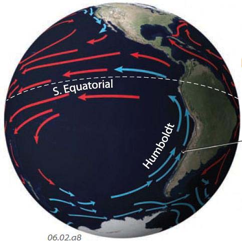
“The cold waters of a current (the West Wind Drift) flowing east from Australia turn north along the west coast of South America. During this long track across the southern Pacific, the waters turn cold and form a very pronounced cold current, called the Humboldt Current (also locally known as the Peru or Chile Current). As the Humboldt Current approaches the equator, it turns back to the west, toward Australia, to complete the circuit of this huge gyre. The west-flowing segment is the South Equatorial Current.”
https://geography.name/what-is-the-global-pattern-of-surface-currents/
ren
The Humboldt current’s importance is under-appreciated. It is the ultimate source of the Peruvian upwelling linked to ENSO. I suspect that variability in the Humboldt current is a factor in ENSO variability.
And BTW the Humboldt current is the coldest now that it has been over the whole Holocene:
https://agupubs.onlinelibrary.wiley.com/doi/full/10.1029/2018GL080634
Good explanation.
Thanks, Willis, was hoping you’d do some basic anaylses on this (I think you already did it earlier).
Willis: Although unrelated to Nino/Nina, the solar cycle is clearly aligned with climatic regime shifts and these line up with the vertical dotted lines in your Figure 3 above (Figure 4 from L2021). In 2009 Basil Copeland and Anthony Watts did an analysis involving a Hodrick-Prescott filter on the monthly HadCRUT anomaly data. Their data showed temperature regime shifts whenever the filtered data exceeded +/- 0.0025 and these shifts always lined up with the onset of the new solar cycle (the vertical dotted lines). I used the NOAA regime shift algorithm developed by Sergei Rodionov to identify the climate temperature shifts. They line up well with solar phenomena as documented here: http://appinsys.com/globalwarming/ClimateRegimeShift.htm
Sorry, but I couldn’t make the Excel VBA code work in Excel. Not sure why.
I did take a look at the break detection algorithm that I use (r package “strucchange”) and the HadCRUT 4 global data. What I found is that it’s sensitive to the minimum length of the allowable breaks. If that is at or just below the 11-year sunspot cycle, the breaks tend to line up with troughs in sunspot data. However, if the minimum is shorter than that or longer than that, the breaks are more randomly distributed WRT the sunspots.
I also note that in the algorithm you use, the minimum length is ten years … so I suspect you’re looking at an artifact based on the method.
w.
Perhaps it is an artifact of the regime analysis, but it is curious how it aligns with the Copeland/Watts analysis, as well as the Kp geomagnetic storms. http://appinsys.com/globalwarming/ClimateRegimeShift_files/image013.jpg
Willis,
I was curious if you found any positive observations or learnings from the study.
You say “For one of my next investigations, I’ll see what I find when I extend their results further back in time. … Oceanic Nino Index is virtually identical to the NINO34 index, which goes much further back, all the way to 1870.”
Don’t bother. Data coverage of the NINO34 index region was pretty low until at least 1950. I can’t recall which end is particularly low on data but I *think* it’s the western end, and that means inevitable uncertainty about what the average would be across the entire region.
Maybe, just maybe, the Troup SOI would be more accurate, although in Tahiti from about 1915 to 1935 the air pressure was recorded at a hospital rather than by official weather office instruments.