Guest Post by Willis Eschenbach
(Note: In 2025 I revisited this issue in a post here. Same conclusion.
mung
/mənj/ [pronounced “munge”]
verb
INFORMAL•COMPUTING
gerund or present participle: munging
to manipulate (data)
EXAMPLE: “you could do what anti-spammers have done for years and mung the URLs”
For more than a decade now, I’ve been wondering about a couple of questions.
First, why does the satellite-based sea-level data show that the sea level is rising so much faster than the rise measured at tidal stations on the coastlines around the world? Records from tidal stations show a rise on the order of a couple of mm per year, a rate which is little changed over the century or so for which we have adequate records. But the satellite record (Figure 1) shows a rise of 3.3 mm/year. Why the large difference?
Second, why does the satellite-based sea-level show such significant acceleration? As mentioned above, the sea-level records from tidal stations, which are much longer, show little or no acceleration. But the satellite record claims that the rate of sea-level rise is increasing by about a tenth of a millimeter per year. That amount of acceleration would double the rate of sea-level rise in about thirty years. Again, why the large difference?
To start with, here’s what the satellite data says, according to the University of Colorado Sea Level Research Group.

Figure 1. University of Colorado sea level data, showing the trend and acceleration. Note that the graph shows no overlap between the individual satellite records. SOURCE: UCSLR Group
I got to thinking about these questions again this week, so I went to NOAA and got their Excel spreadsheet showing the full dataset for each of the four satellites.
I plotted up the NOAA data. But unlike the Colorado data above, I included the full overlap between the individual satellites. I then looked at the rate of sea-level rise shown by each of the four satellites separately. Figure 2 shows that result.

Figure 2. NOAA sea level data, showing the trend of each of the full individual satellite records and the overall trend. SOURCE: NOAA Excel Spreadsheet
Well, go figure … seems like after all these many years of wondering, I finally have an answer to my two questions. The trend is so large and the acceleration is so great for a simple reason. The two most recent satellites show trends that are significantly larger than the earlier two satellites. The first two satellites agree quite well, but they both show a much smaller trend than the latter two satellites. And neither half of the satellite record shows any acceleration.
Now I freely admit, I’m just a guy with no scientific training at all. I took Physics 101, Chemistry 101, and one year of Calculus in college, and that’s it. But the beauty of science is that it’s all about the facts and the evidence, and not about the qualifications of the person presenting the facts. What you see above are the facts as given by NOAA, and I’ve linked to the source of those facts above. And it seems to me that those facts are more than sufficient to entirely discredit the satellite sea-level record.
So if you have an explanation for those facts, fine. But don’t bother busting me because you think I’m not qualified to present and discuss the facts. “The Captain”, my great-grandfather who was a Mississippi riverboat captain, used to say “If you have to hang your diploma on your living room wall, there was something wrong with your education”.
And to return to the issues at hand, why does the NOAA data show an overall trend which is 0.3 mm per year smaller than the Colorado data? It’s because the Colorado data contains what is called the “GIA”, and the NOAA data doesn’t.
“GIA” stands for the “glacial isostatic adjustment”. There’s a description of it on the Colorado site here. It relates to the changes in the earth’s overall shape due to the melting of the huge and immensely heavy ice sheets from the last glaciation.
According to that page, the GIA is “independently estimated from models at -0.3 mm/yr (Peltier, 2001, 2002, 2009; Peltier & Luthcke, 2009)”.
Now, I’ve been programming computers since 1963, coming up on 60 years now. As a result, I’m very aware that a computer model is nothing more than a physical realization of the beliefs, understandings, and in particular the misunderstandings of the person programming the computer. Since Mr. Peltier has been intimately involved in programming all four of the model realizations listed on the Colorado site, their claim that the four models are “independent” is laughable. What we have is one man’s claim that he can calculate the GIA.
What effect does the GIA have? The Colorado site says (emphasis mine):
Prior to release 2011_rel1, we did not account for GIA in estimates of the global mean sea level rate, but this correction is now scientifically well-understood and is applied to GMSL estimates by nearly all research groups around the world. Including the GIA correction has the effect of increasing previous estimates of the global mean sea level rate by 0.3 mm/yr.
So there’s the missing 0.3 mm/year, applied by “nearly all research groups” … I guess NOAA didn’t get the memo.
For me, the claim that a computer model can calculate the changing of the total volumes of all of the world’s various ocean basins to the nearest 0.3 mm per year of sea level … well, let me just say that it strains credulity far beyond the breaking point and leave it at that. Here’s why.
For the land portion of the calculation, these “independent” computer models must be using GPS altitudes. By using split-phase GPS and repeated measurements, these can be as accurate as ± 10 mm or better, an amazing scientific feat … but that’s a far cry from a tenth of a millimetre, and that’s just on land. Not only that, but we don’t have GPS measurements all over the land. They’re concentrated in the US and Europe, with only spotty coverage elsewhere.
At sea, the “independent” models must be using satellite measurements, so we get into the question of the accuracy and precision of the satellite sea level measurements themselves. These measurements are done by bouncing radar waves off of the ocean surface and measuring how long it takes them to return to the satellite. Here, repeated measurements are not possible because the sea level at any point changes constantly, and the satellite is rarely in the same position twice. A recent NASA press release describing the Sentinel-6 satellite, the successor to the Jason-3 satellite, quotes the oceanographer Josh Willis:
Sentinel-6 will orbit about 800 miles up and use radar to measure the surface of the ocean. An instrument on the satellite sends a radar wave down to Earth. The radar bounces off the surface of the ocean and returns to the satellite. By measuring how long it took for the radar to go down and back — and accounting for moisture in the atmosphere which slows the radar down — scientists can measure how far away the surface of the ocean is from the satellite.
In other words, the satellite can tell scientists on Earth how high the oceans are, and how that height is changing over time.
“It’s really kind of an incredible feat of technology,” [Josh] Willis says. “We can accurately measure the water level with an accuracy of 1 inch from 800 miles up.”
An accuracy of 1 inch, that’s 25.4 mm … and they’re claiming they know the annual change in the volume of the oceans from the GIA to the nearest tenth of an mm of sea level height? I know that accuracy is different from precision, and that measurement of changes in length over time (precision) can be an order of magnitude better than the measurements of the length itself (accuracy), but still … sorry, but I’m not buying the GIA claim.
Let me see if I can give you a sense of the difficulty of the satellite measurements of sea level. The satellites orbit at an altitude of about 830 miles, which is about 1.34 billion millimetres. So to measure the change in sea level to the nearest tenth of an mm, we’d need to be able to measure the distance from the satellite to the sea surface to a precision greater than one part in thirteen billion … and that is a hard challenge even in a controlled laboratory setting.
Here are some of the difficulties in that measurement. First is the measurement of the altitude of the satellite itself. Unless we know that to the nearest mm or so for every second of every day, we’re going to get inaccurate answers. Next is the varying composition, temperature, cloudiness, and humidity of the atmosphere. All of these change the time it takes the radar signal to return to the satellite. Then there are the ocean waves, which obviously change the height of the ocean by thousands of mm. Finally, there is “instrument drift”, the inevitable changes that occur to electronic measuring instruments over time.
Net result? Well, the net result can be seen in Figure 2 above, where according to the University of Colorado one satellite says the sea level is rising at 2.5 mm/year, and a mere 8 days after the end of that satellite’s data (the interval between one satellite and the next in the Colorado sea-level record) the successor satellite says it is rising at 4.1 mm/year … no bueno. They’re claiming that in 8 days, the rate of rise jumped by 1.6 mm per year. Note also that there is absolutely no acceleration in either half of the satellite record, just a step-change between satellites. Clearly, they’re not able to measure annual sea-level changes to the nearest millimetre, much less to the nearest tenth of a millimetre.
However, the people working on the project are all true believers. In the same article, Josh Willis is quoted as saying “We know that the oceans are rising because of human-caused interference with the climate.”
Dang humans, always interfering with the climate … for example, our new “Climate Czar”, John Kerry, has 5 houses, a number of cars, a yacht, and a private jet, and he tells us to take the bus to avoid the dreaded “human-caused interference with the climate” … but I digress.
The problem is that starting out with a fixed “scientific” belief like that leads to the people working on the satellite sea-level datasets splicing together what are obviously incompatible satellite results, spreading peanut butter over the cracks so they can’t be seen, and announcing to the world that the satellites show a dangerous acceleration in sea-level rise, so we should all be very worried …
Me, I’ve said for some time that we shouldn’t put any weight on the satellite results. However, I have based this solely on the very large differences in both trend and acceleration between the satellite and the tidal station records, and the known difficulties in satellite measurements discussed above. I investigated this question in several posts, including “Inside The Acceleration Factory” and “Accelerating The Acceleration“
But now, at long last, I have the facts to back up my claim. There’s no evidence of any acceleration in the rate of sea-level rise in either the tide gauge or the shabbily-spliced satellite records. It’s been going up at on the order of eight inches (200 mm) per century for quite some time, and there’s no sign of any change in that rate of rise.
So you’re free to do what Obama and Bill Gates have done—buy seaside property. They proclaim loudly that the sea level is rising dangerously, but like the majority of climate alarmists, their actions belie their words.
My very best wishes to everyone in these most strange of times,
w.
PS—My usual request. To avoid misunderstandings, please quote the exact words you are discussing. I can defend my words, but I cannot defend your understanding of my words.
PPS—My post linked to above, “Accelerating The Acceleration“, earned me a laughable “fact-check” on Facebook by some well-meaning folks who were apparently short on cranial horsepower … now that Facebook has announced it’s taking over as the global arbiter of scientific truth, we’ll see what happens to this post.
‘We'(the left) listen to the ‘Scientist(our Scientist). You pay these useful idiots to give you what you want, they make a mockery of real science. Just like Tycho Brahe trying to keep peace in the church over Earth centric universe. Make up your own facts(Climate Gate) for the desired outcome to satisfy and keep your income!
For years it was too much of a coincidence for me to believe that the start of acceleration of SLR miraculously happened exactly when the shift to satellite happened. You have given a great insight into why.
This is one of the best posts I’ve read over the last 10 years. It was a wonderful aha moment.
Thanks
A large part of this thread has been a defense of the fallacy that averaging measurements can’t improve the precision. That a thousand measurements can only have the precision of one of them – or the least precise of them. This is horribly wrong. Where to start? GPS measurements for instance increase accuracy by using multiple measurements from several satellites to interpolate a more accurate position.
Arguing against this is like arguing for a flat earth. And don’t go diving into distracting detail about distribution models and statistical arcana. Even with non normal or skewed distributions, a mean of measurements is going to improve on the precision of a single measurement. The exception proves the rule. The presence of error doesn’t mean that the universe doesn’t exist. That’s the smoke-screen argument tactic used by warmists to hide the big holes in their case, no need for us to copy that.
The fraction of girls or boys in a population is about 0.5.
For this to be true, it must be the case that all babies born are 50% boy and 50% girl.
We couldn’t have the precision of the average being different from the precision of any single case, could we now?
So now we’re on board with the LGBQ-trans lobby – how nice!
Maybe one of the “W” s of WUWT should change to “woke”?
Woke up with that? 🙂
Hatter Eggburn February 22, 2021 9:41 am
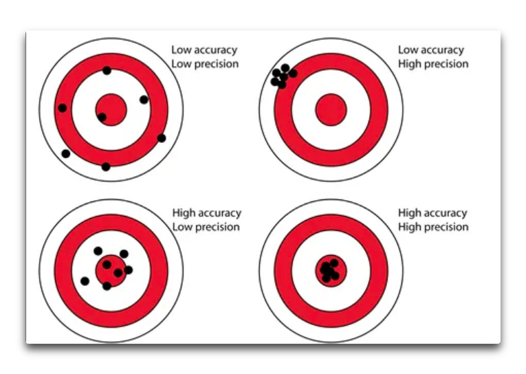
First, precision is the spread of the individual actual measurements. This can’t be changed by averaging, because it relates to the spread of the measurements themselves. You mean that averaging measurements can improve the accuracy, which is how close we’re getting to the actual value.
You continue:
Not true, even given that you’re wrong about “precision”, you mean “accuracy”. (A single measurement has no “precision” because precision is the spread of repeated measurements).
For example, suppose we have a measuring device that always measures 2 units too small. If we average a hundred such measurements, the result will be 2 units too small … averaging absolutely will NOT improve on a single measurement. And this is not some “distracting detail”, it is a real, valid, and important issue that has to be considered for any measuring device.
These questions about distribution models and the like are not “statistical arcana” as you falsely assert. For example, if the distribution of what you are measuring is NOT symmetrical, averaging will not give you a valid answer.
For example, I showed elsewhere in this thread that human height is not symmetrically distributed.
Brian Jackson claimed:
Here’s the actual distribution of human heights, with an average height of about 5’9″.

So I generated 50,000 random numbers with that actual distribution and a mean of 69″. That has a standard error of the mean of 0.02″, because there are so many random numbers.
But using Brian’s method of rounding to the nearest 12″, it gives us a mean of 69.4″ ± 0.02″, which is an error of almost half an inch. And increasing the number of measurements does NOT bring that answer any closer to the true value.
Heck, Brian’s method doesn’t even give us the right answer even if the distribution is symmetrical. The problem is that the average height is 6.75 feet. As a result, many more of the heights will get rounded up to 6 feet than get rounded down to 5 feet. This means that the average using his method will be taller than the true average. I just tested it with 50,000 random numbers simulating the height distribution (mean = 69″, standard deviation = 2.93″). His method gives an average height of 70.2 ± 0.02 inches … a full inch out from the correct answer. Brian’s method is out by an inch even using his assumption of a normal distribution.
Not only that, but suppose we round the heights to the nearest two feet … that gives us an average height of 71.4 ± 0.02″, even worse. And again, using more measurements doesn’t bring us one iota closer to the true value.
So I’m sorry, but these questions are NOT “statistical arcana”. They are crucial questions that have to be asked before we start averaging data and proclaiming an answer.
Best regards,
w.
If Brian’s nearest foot-only estimate is out by only half or one inch, how does that not just prove Brian’s point?
Anyway this is already beyond my statistical pay grade.
Hatter, Brian’s claim was:
Unfortunately, his answer was wrong. All he did was prove his misunderstanding of statistics.
w.
“This is horribly wrong. Where to start? GPS measurements for instance increase accuracy by using multiple measurements from several satellites to interpolate a more accurate position.”
And precisely how many satellites at any one time are focussed on the particular point of the wave to triangulate and check the vertical distance being measured? Oh that’s right they can’t do that simultaneously and if you stuck 2 vertical tape measures a metre apart on the same satellite would they ever agree?
You could try it yourself with 2 lasers on a sturdy frame a metre apart out off the beach next time you’re down there and see if you can get the measurements to agree anytime they’re both triggered together. How far above the sea level are the lasers fixed? Can you tell us to the accuracy of the lasers?
That average annual SLR at Port Arthur tide gauge is 0.85mm/yr but you reckon you could detect that in any year or 2 or 3? What hubris some folks have and they reckon they’re gunna change the climate to what they know it’s supposed to be to boot. We had special places for people like that but now they walk among us and congregate in universities with compooters.
If the proportion of boy babies to girl babies were 50/50, we’d have a large imbalance in favor of girls. Please keep your examples in the realm of factual.
Standard error is standard deviation divided by the square root of number of measurements.
So precision is increased (standard error decreased) by more measurements.
OK assuming this and assuming that and taking away the number you first thought of…
Willis, connect the dots. The Hockeystick shows a dog-leg at 1902. If temperature rapidly reversed in 1902, sea levels should have been falling up to 1902, and then rapidly start rising post-1902. There is no dog-leg in sea levels, so either the Hickey Stick or the Sea Level data is wrong and is non-confirming. How can temperatures rapidly increase and sea levels not?
There actually is a dog-leg in sea-level data around 1850. Before that sea-levels had been falling, after that they started rising.
At a remarkably steady rate.
Ironically, the Sea Levels look to have a reverse dog-leg starting just about 1902.
https://www.climate.gov/news-features/understanding-climate/climate-change-global-sea-level
GIA calculations are extremely uncertain. They are probably reasonably correct for Northern Eurolpe where there is a large body of measurements of relative sea-level going far back (>250 years), a dense network of GPS stations and where the glacial history is well known.
Data are much more uncertain in every way in North America and Greenland, and very sparse in the most important area, i e Antarctica. The glacial history there is very uncertain, GPS station are few and far between, and there are of course no GPS stations at all in areas covered by ice (they must be on bedrock). And what is worse <i>none</i> of the GIA models come even close to matching the limited actual data there is. For an example look at figures 9 and 10 in this paper:
https://www.semanticscholar.org/paper/A-new-glacial-isostatic-adjustment-model-for-and-of-Whitehouse-Bentley/b8b0c52546304964f79406ff9a49b0d8bc43e9a3
The correlation chart between predicted and actual values looks like it had been done with a shotgun at long range.
And of course we have no data att all for ocean areas, which are the important ones for sea-level adjustments. There are no underwater GPS station, only extrapolations of already shaky land data. ”It´s models all the way down”
The sea level is widely imputed to be a serious threat. The danger is depicted on the cover of the National Geographic shown above, with the Statue of Liberty half under water. Almost invisible and just above the water level, is the legend :”NO ICE”, implying that is the level when ALL ICE on the Earth has melted. Since melting all ice in Antarctica and Greenland (mountain glaciers are negligible) raises the sea level by over 80 meters, and thermal expansion would add another 5 meters, at least, so the artist’s impression is grossly inaccurate.
ONLY half of the torch would be above water! Moving along…
Whether the sea level may be rising or not is NOT the important question.
The important question is whether land is being submerged BY the sea? The answer is well known. NATURE CLIMATE CHANGE , pg 810-813, VOL 6 | SEPTEMBER 2016,www.nature.com/natureclimatechange. The COASTAL land area has increased by 13,000 km2 in the past 30 years.
OK, you say, but what about all those Pacific islands being inundated? The National Geographic article: https://www.nationalgeographic.com/news/2015/02/150213-tuvalu-sopoaga-kench-kiribati-maldives-cyclone-marshall-islands/- addresses the issue.
It turns out that 80% of the coral islands in the Pacific and Indian Oceans are stable or gaining area, while 20% are losing area. The 20% losing area are overpopulated, with groins – sea walls- i.e. islands where natural nourishment is inhibited by HUMAN STRUCTURES. One Congressman famously asserted that islands were being tipped over by human structures.
That effect is NOT known.
It is often asserted that coastal cities are threatened by rising seas. In reality, it is sinking cities near coastal areas; due to withdrawal of ground water faster than it is replenished.
Jakarta is a prime example.
Measuring the eustatic sea level is insecure since the signal is buried among: diurnal and semi-diurnal astronomical tides, long period tides, Chandler Wobble effects, Lunar node tides, changes of atmospheric pressure (e.g. polar front pressure centers, hurricanes, winds causing storm surges, persistent winds, evaporation and precipitation, changes in ocean surface topography, the El Nino Southern Oscillation, Kelvin-Rossby waves, seasonal water balances among ocean basins, seasonal variations in water slope, river runoff/floods, seasonal water density changes due to temperature and salinity, seiches, tsunamis, thrust earthquakes altering the ocean floor, thermal expansion-contraction, glacial melt or growth, terrestrial water storage, sediment deposition, and more. ALL these effects are larger; most are MUCH larger than the measured sea level anomaly. Possibly, a sea level anomaly of 2-3 mm/year IS measured and interpreted accurately, but it is equally possible that confirmation bias is clouding the reality.
Although relative sea level measurements exist before 1750, those prior to ~1880 are routinely ignored. The earlier DECREASE in sea level is not consonant with the current narrative.
According to Gavin Schmidt, the current administration’s science advisor, https://www.studlife.com/news/2017/09/21/wash-u-hosts-climate-change-panel-continues-push-toward-increased-sustainability-on-campus/, since 1980, climate change and associated anomalies are 100% due to humanity. That raises the fascinating question of both the origin and sudden cessation of all prior anomalies in the climate system of which sea level is one aspect that is used to frighten people needlessly.
A related issue arises in OHC data from ARGO where a 0.02 degree temperature change is presented in units of 1022 joules over depths of 700 m or 2000 m. This unit obscures the tiny temperature changes putatively being measured. The ARGO I and II measurements may represent a sensor calibration error issue more than a temperature change.
Willis, isn’t the GIA adjustment mixing volumetric measure (ocean basin volume) with linear measure? I think ‘sealevel’ will wind up somewhere up above the real ocean this way. This is not how the system works.
If the ocean basin was a rigid box and you threw a rock into it, yeah the water level would go up. However the physical material giving emergence of the rising land is material being drawn from beneath adjacent seafloor which sinks. The principal of isostasy would suggest there is no change in ocean basin volume.
Now, vis à vis dropping a rock in the box, global rivers deliver a steady stream of sediment, many volcanoes send lava into the sea, desert dust, meteorites and dust add a liitle bit. Even this load is compensated for by some lowering of the seafloor.
The biggest effect is from sediment loading, but the sediment is preponderantlty lighter sialic (continental crustal material) and therefore introduces a volumetric addition.
It shows that astronomers, mathematicians and physicists should cultivate a geological friend to temper their hubris.
There is another possible reason why the satellite data disagree with tide gauges. Should I believe (I don’t) in the accuracy of satellite measurements, satellites measure whole oceans. Most of the area is far from shores. So satellites tell us that water is slowly and inexorably rising in the middle of oceans. In each ocean it creates a huge bulge. When these bulges burst, we will get a tsunami of biblical proportions. Only the New York City is getting prepared for the catastrophic sea level rise.
/sarc
Tangier Island shorelines superimposed from 1850. Not what the major news will report on, and this image is getting harder to all the time. Last year it was handy.
tangier island shoreline surveys 1850 1905 – Bing images
WoW, I’m surprised at sea level goin down off trend apx 10 mm in 2016 then up off trend in 2016. Were these tied to significant event and/or corroborated with tide gauge data?
A shame that Willis Eschenbach did not include a copy of the most up to date version of global tidal gauge measurements for comparison. Otherwise fantastic article – as usual. Thanks for the enlightenment.
John, thanks for the kind words. The problem is that these days the tidal records all have the satellite records spliced onto the end of the tide gauge records. You can read my analysis of this issue in the post “Inside The Acceleration Factory“.
w.
I’m going to take this opportunity to go off-piste for a moment to say that I’ve been put in Facebook Jail for three days for linking to an article in Newsweek Magazine … middle of the road Newsweek! Madness.
Just wanted to get the word out so folks who are my Facebook friends don’t wonder where I’ve disappeared to.
I wrote up the issues on my blog, you can read about this latest madness in my post called “Totalitarian Censorship“.
We now return you to your regularly scheduled programming …
w.
It is a nature of police states that they “round up usual suspects” when they need to show that they work hard and faithfully.
Watch the movie Casablanca again.
Although satellite sea level measurements are fun for academics to study, tidal gauges are far more important if one is worried about coastal flooding. Tidal gauges measure the relative sea level changes to dry land elevations which are affected by plate tectonics, isostatic rebound, and subsidence. Some land areas are subsiding, e.g. Louisiana, and some are rising like Alaska. Averaging the worlds tidal gauges should be a pretty good estimate of actual sea level. I am always a little skeptical when “modeled adjustments” are added to data. Those adjustments make it too easy for non-scientific biases to affect the results.
Deleted comment and reposted.
Willis – I have a question related to your post on “Bright Green Impossibilities”. Comments there are closed so could not ask there now. My apologies for being off topic here. So, my question – can wind and solar generate sufficient energy on their own without using fossil fuels to reproduce themselves including powering all the mining machinery, transport, manufacturing, land clearing, on-site assembly, and ultimate decommissioning? To me, it seems obvious they can’t meaning that they are reliant on fossil fuels from cradle to grave, but I lack the technical knowledge to back up my assertion. Have you done or considered (or do you even have any interest) in doing a post on how much energy is required to produce a solar panel or wind turbine including the energy required to mine, transport, etc.? To me, it is blindingly obvious, but apparently not so obvious to the activists supporting this nonsense.
Thanks.
Thanks, Barnes. I ran the numbers on wind turbines a while back. At that time the energy payback time was on the order of four years. However, it’s not an easy calculation, and I didn’t include maintenance or decommissioning.
I don’t think that the answer is “blindingly obvious”. I suspect the true numbers are on the order of 8 years or so, but it’s highly dependent on just where the panels or turbines are located.
I suspect that if you did a thorough google search that you’d find some better data than mine. Me, I have other things on my plate, but I encourage you to do the research.
w.
Thanks Willis. I will keep digging. I am not sure if I made myself clear. I am not looking for payback time, but trying to ascertain if wind turbines and solar panels could generate sufficient energy to drive the entire process for their creation, deployment, maintenance and ultimate decommissioning without any support from fossil fuels or nuclear. I think the intermittency issue alone would make the manufacturing process difficult if not impossible, but that is opinion alone. That being said, I am sure you have plenty of other things to work on besides chasing this down. Thanks for your posts – they are always highly informative.