Guest Post by Willis Eschenbach
I see that the merchants of hype are at it again. The scary headline says “Report: Sea-level rise ‘accelerating’ along U.S. coasts, including in the Bay Area“. And in the text, it says “The Bay Area was home to two of those stations: one in Alameda and one in San Francisco, which both recorded a year-over-year rise.” Of course, they blamed the usual suspect, global warming.
I see that and I say … whaaa? I live an hour and a half north of San Franciso, and I’ve been following sea levels around here for a while. I knew nothing of any sea-level acceleration.
The media article references something called the “US Sea Level Report Card“, which indeed lists San Francisco and Alameda. So I went to the NOAA Tides and Currents site to get the data. Let me start with the shorter of the two datasets, Alameda. It’s an island, albeit just barely, in San Francisco Bay near Oakland. It’s lovely, I lived there on the waterfront for a bit just after I got married.

Originally it was part of the Oakland mainland, but in the 1890s the canal at the lower right was cut through. This allowed flowing water to prevent the ongoing problem with siltation in that estuary. As a consequence, the land across from the island became the main location for the Port of Oakland. The channel between Alameda and the mainland is a gorgeous part of the world. Here’s a photo I took the last time I sailed those waters, showing the giant land horses of the Port.

So what is the story of the Alameda sea levels? Here you go:

Figure 1. Sea level in Alameda, California. The red line is an 8-year centered Gaussian average, the blue line is the linear trend
Hmm … not seeing a whole lot of acceleration in that record. It might show as acceleration, however, because it both starts and ends at a high point.
The oddity of this sea-level record is that it’s not far from San Francisco, but the sea level rise is less than half that of SF … say what? Must be some vertical movement of the land itself, go figure. It can’t be an actual real difference in sea level, otherwise compared to 1939, after 80 years the sea level in Alameda would permanently be some four inches (100 mm) lower than the level ten miles (16 km) across the bay. Not possible.
Based on that impossiblity, I’d advise not putting any weight on the Alameda record … but I digress.
How about San Francisco? It has a much longer record, so any acceleration should be more visible. Here’s that graph:

Figure 2. Sea level in San Francisco, California. The red line is an 8-year centered Gaussian average, the blue line is the linear trend
Man, that is about as straight a line as anyone could want.
Mystified by the claims of acceleration, I went to see how the “Sea Level Report Card” study accelerated the acceleration. Turns out the answer is simple.
1) Throw away all of the data before 1969.
2) Calculate a quadratic (accelerating) fit to the data.
3) Subject it to bootstrap and Monte Carlo tests to see if it’s significant.
4) Extend the quadratic fit out to the year 2050
5) Declare success.
Seriously, that’s what they’ve done. Here’s their “Sea Level Report Card” for Alameda, starting in 1969:

Figure 3. Alameda graph from the study. Projection of unverified acceleration out to 2050.
And here is the same thing for San Francisco:

Figure 4. San Francisco graph from the study. Projection of unverified acceleration out to 2050.
As you can see from the graphs, in both cases the quadratic (accelerating) trend is only trivially different in the period covered by the actual data. The two lines overlap almost entirely during that period. Occams Razor says don’t unnecessarily multiply causes. And by that maxim, a straight line is the better choice. But Occam has been wrong more than once …
So to avoid getting a bad shave from Occam, I ran my usual analysis on both datasets. Using the full-length datasets in both cases, I started by looking at the Hurst Exponent of the datasets. The Hurst Exponent varies from 0 to 1, with random datasets measuring 0.5. It measures how “autocorrelated” the data is, meaning how much this month is like last month, this year is like last year, this decade is like last decade.
And the problem is that when the Hurst Exponent is high, it means the data is naturally trendy, so that large swings up and down are not uncommon. See here for a discussion of the issues.
In both cases, the Hurst Exponent is high — 0.77 for Alameda and 0.73 for SFO. This is plenty large enough to invalidate normal statistical tests.
And speaking of tests, the normal statistical test (ANOVA) shows that for San Francisco, the accelerating “Quadratic Trend” seen in Figure 1 is not statistically better than just a straight line.
However, the situation is different for Alameda. The ANOVA test shows that the Quadratic Trend does a significantly better job than a straight line in explaining the data.
Ah, but the Hurst Exponent … let me take a small digression.
The number of months or other data points in a dataset is usually represented by “N”. For San Francisco, there are 1,896 months of data, so N = 1,896. That’s lots of data points, which is good. It makes any conclusions that we draw more solid. It reduces the uncertainty in trends and the like. The more data points we have, the better.
The normal way to deal with a high Hurst Exponent dataset is to calculate an “effective N” which reflects the number of normal random data points that the dataset will act like. I use the method of Koutsoyiannis to calculate effective N, as I described in the link above. And I discussed the question of sea levels and effective N here.
For the San Francisco data, instead of the N of 1,896 months of data (data points), the effective N turns out to be only 57 data points.
And since we couldn’t say that the Quadratic Trend is a better fit with 1,896 data points … there is no chance of it being statistically significant with only 57.
Regarding Alameda, it has an N of 969 months. But when we calculate the effective N, it’s only 24. And while (unlike San Francisco) the ANOVA test showed the Alameda accelerating Quadratic Trend was significantly better without adjusting for autocorrelation, once we take the Hurst Exponent into account, the acceleration is no longer significant.
Of course, when they chop off the early part of both records before 1969, it just gets worse. Both datasets now have only 612 data points … and the effective N is only 12 for Alameda and 14 for San Francisco. And with that small an N, all bets are off—it’s far, far too little data to come to any conclusions of any kind about small levels of acceleration.
Now me, in addition to looking at the statistical calculations, I use another method. Recently I realized that we can employ an unusual application of Complete Ensemble Empirical Mode Decomposition analysis, also known as “CEEMD”, to the sea level question. CEEMD breaks down (“decomposes”) any signal into its component cycles by frequency bands. It removes these bands of cycles (known as “empirical modes”), one at a time, from the signal. At the end of the process, what’s left behind is the part without cycles, called the “residual”. My insight was that we can look at that residual to understand the most basic swings in the tidal dataset after all the natural tidal cycles are removed.
The CEEMD method is classed as a “noise-assisted” method of data analysis, which seems like a contradiction in terms. For those unfamiliar with the method, I wrote about it here.
So let’s see how the CEEMD works out in practice. Here is the Complete Ensemble Empirical Mode Decomposition (CEEMD) of the San Francisco dataset.

Figure 3. CEEMD decomposition of the San Francisco tide levels. The top panel shows the raw annual sea level data. Empirical Modes C1 to C5 show the component cycles starting with the highest frequency (shortest period) cycles and working down to the lowest frequency (longest period). The bottom panel shows the residual that’s left once C1 through C5 are subtracted from the raw data. The individual Empirical Modes actually have different amplitudes, but I’ve set them all to the same size for easy comparison. Units are Standard Deviations.
We can take another look at this same decomposition in a “periodogram” that shows the lengths and strengths of the cycles.

Figure 4. This shows the periods of the various Empirical Modes C1 through C5. As you can see, there are strong cycles at about 13 years (Mode C4), and 27 and 36 years, with smaller cycles centered at 50 and 80 years (Mode C5).
As I said, the relevant graph for our purposes is the “Residual” shown as the bottom panel in Figure 3. This is what’s left after all tidal cycles are removed. As we’ve seen, there are significant cycles in the San Francisco data out to around fifty years and more. This generally agrees with Mitchell’s conclusion in “Sea Level Rise in Australia and the Pacific” who noted (see p. 15) that even after 50 years, sea-level rise accuracy is still only ± a couple of mm. This is because the tides have long, slow oscillations, and if we use shorter data, we may just be looking at a tidal cycle rather than a true sea-level change.
So here’s how I plot up the CEEMD residual. I overlay it on the linear trend of the residual so I can see just how the residual changes over time. Here’s that graph.

Figure 5. The “residual” of the CEEMD analysis of the San Francisco sea level data, what remains after all cycles have been removed from the data.
As you can see, once we remove the tidal cycles from the data there is no acceleration. However, I suspect that the authors of the study have mistaken the slight increase in trend from the relatively level period 1975-2000 for acceleration. Go figure.
How about Alameda? Here’s the CEEMD data:

Figure 6. As in Figure 4, for the Alameda data.
And here are the periodograms of the Alameda Empirical Modes:

Figure 7. This shows the periods of the various Empirical Modes C1 through C5. As you can see, there are strong cycles in the range from 10 to 15 years, and around 30 years.
Here we can see the problem with even a 60-year dataset. There’s still energy in cycle lengths all the way out to 60 years, so we’re unable to truly disentangle the trend from the cycles. However, given that, here’s the residual.

Figure 8. CEEMD residual, as in Figure 5, but for Alameda Island
YIKES! You can see what I meant about problems with the Alameda data. I suspect it has to do with the groundwater levels. I find the following:
From the 1850’s, Alameda Island had been known for its abundant, pure water supply. Early wells varied in depth from a few feet to hundreds of feet deep. Even in the early days, it was common knowledge that artesian waters would be found along the southwestern side of the island at a depth of 100 feet or so. The water would rise in the bore holes to about high tide level. SOURCE
So obviously, there is trapped water a hundred feet under the island exerting significant upward pressure. Since then, these wells have been pumped, and then shut down, and new wells drilled, and pumped, and then shut down. In addition, the island was a Naval Air Base during the war, and the population and the water use varied greatly before and after. My guess is that what we are seeing in the Alameda sea-level record are changes in land level resulting from changes in groundwater pressure.
Intrigued, I thought I’d look further. Here’s the sea-level record for San Diego, California.

Figure 9. Title says it all. SOURCE
To my surprise, a standard analysis shows a very slight acceleration over the period. The rate of sea-level rise is increasing by a hundredth of a millimetre (0.01 mm) per year … be still, my beating heart. Almost too small to measure.
And in fact, we can kinda see this very small acceleration in the CEEMD analysis.

Figure 10. CEEMD residual, as in Figure 5, but for San Diego
This shows why I like my CEEMD method of looking at sea levels. The residual, showing the underlying changes in the rate of sea-level rise, starts out above the trend line. For forty years, from 1920 to 1960, it is a straight line exactly on the trend. It then decreases slightly and slowly for about 20 years, when it starts to increase, once again slightly and slowly. And at the end of the period, it appears to be slowing down again.
Is this a true acceleration of the rate of sea-level rise in San Diego? Well … I’d say no. I’d say that we are seeing very slight increases and decreases in the rate, but that they are not statistically significant. And the analysis using the Hurst Exponent to calculate “effective N” says the same thing—with an effective N of only 19, there is no statistically significant acceleration in the San Diego sea-level record.
CONCLUSIONS:
• There is no significant acceleration of any kind in the San Francisco tide level data.
• Due to changes in ground level, the Alameda tide station is completely unsuited for any kind of comparison to other sites or for projections into the future. However, I can understand why the authors of the “Sea Level Report Card” study might mistakenly think that it is accelerating …
• The San Diego record shows a very slight acceleration, but it is not significant when corrected for autocorrelation. It also appears not to be a true acceleration, but instead a slight “porpoising” above and below the trend line.
• Whatever method the authors are using to determine if there is significant acceleration seems to be giving false positives.
• Despite being warned about upcoming dangerous sea-level acceleration by societies of very learned folks and by climate alarmists since the 1980s, and despite claims that major cities would be underwater by 2020 or 2050, there is still no sign of such threatening sea-level rise. In particular, the ocean around San Francisco has been rising both slowly and steadily with very little variation for over 160 years.
And here in our house up atop the first major ridge in from the coast, on this lovely sunny spring day I gaze out upon a small bit of the distant ocean visible between the hills, whose level keeps rising at its historical pace of about eight inches per century.
My very best wishes to you all,
w.
PS – Just for humor’s sake, here’s their “Sea Level Report Card” from Crescent City, at the northernmost end of the California Coast.

According to their report card, the rate of rise is accelerating … in the wrong direction. Looks like no drowned cities up there …
PPS: As is my wont, I politely request that when you comment, you quote the exact words you are discussing so we can all be clear on your subject.
FURTHER READING:
Reduce your CO2 footprint by recycling past errors! 2011-06-23
Anthony has pointed out the further inanities of that well-known vanity press, the Proceedings of the National Academy of Sciences. This time it is Michael Mann (of Hockeystick fame) and company claiming an increase in the rate of sea level rise (complete paper here, by Kemp et al., hereinafter Kemp…
Further Problems with Kemp and Mann 2011-06-26
In my previous post I discussed some of the issues with the paper “Climate related sea-level variations over the past two millennia” by Kemp et al. including Michael Mann (Kemp 2011). However, some commenters rightly said that I was not specific enough about what Kemp et al. have done wrong,…
The Ups and Downs of Sea Level 2011-07-03
Much has been made in AGW circles of the sea level forecast of Vermeer and Rahmstorf, in “Global sea level linked to global temperature” (V&R2009). Their estimate of forecast sea level rise was much larger than that of the IPCC Fourth Assessment Report (FAR). Their results have been hyped at…
So Many People … So Little Rain 2012-03-10
Well, I started a post on Kiribati, but when it was half written I found Andi Cockroft had beaten me to it with his post. His analysis was fine, but I had a different take on the events. President Tong of Kiribati says the good folk of the atolls are…
The Most Important Sea Level Graph 2013-08-02
In a post here on WUWT, Nils-Axel Morner has discussed the sea level in Kwajalein, an atoll in the Marshall Islands. Sea levels in Kwajalein have been rising at an increased rate over the last 20 years. Nils-Axel pointed to a nearby Majuro tidal record extending to 2010, noting that…
Sea Water Level, Fresh Water Tilted 2014-03-28
Among the recent efforts to explain away the effects of the ongoing “pause” in temperature rise, there’s an interesting paper by Dr. Anny Cazenave et al entitled “The Rate of Sea Level Rise”, hereinafter Cazenave14. Unfortunately it is paywalled, but the Supplementary Information is quite complete and is available here.…
Virginia Sea Level 2014-09-13
Science Magazine is published by the American Association for the Advancement of Science. I’m reading my AAAS Newsletter, and I find the following blurb (emphasis mine): Virginia Panel Releases Coastal Flooding Report. A subpanel of the Secure Commonwealth Panel of Virginia released a report containing several recommendations for dealing with risks…
The Ninth First Climate Refugees 2016-11-30
[see update] Well, the claims of the ‘first climate refugees’ are coming up again. I think we’re up to the ninth first climate refugees, it’s hard to keep track. In any case, I came across this: International leaders gathering in Paris to address global warming face increasing pressure to tackle …
Sea Level Rise Accelerating? Not. 2017-07-20
(NOTE UPDATE AT END) There’s a recent and good post here at WUWT by Larry Kummer about sea level rise. However, I disagree with a couple of his comments, viz: (b) There are some tentative signs that the rate of increase is already accelerating, rather than just fluctuating. But the …
Wandering Thru The Tides 2017-12-30
I got to thinking about the records of the sea level height taken at tidal stations all over the planet. The main problem with these tide stations is that they measure the height of the sea surface versus the height of some object attached to the land … but the …
Inside The Acceleration Factory 2017-12-30
Nerem and Fasullo have a new paper called OBSERVATIONS OF THE RATE AND ACCELERATION OF GLOBAL MEAN SEA LEVEL CHANGE, available here. In it, we find the following statement: …
Nick would have been proud of that effort in abuse of statistics 101, everything is defining the justification.
Thanks Willis for a wonderfully explained course on statistical trends. I’ve often wondered if the wakes of the huge container ships in a confined area such as the San Francisco Bay has any effect on the tide gauge readings?
You can get quite a bit of water pushed up into an area if traffic is heavy.
Seems doubtful. The Bay is a big place, lots of water. Tide gauges have “stilling wells” that are connected to the ocean by only a small opening. This prevents waves from affecting the reading. But mostly I’d say too much water in the Bay to be affected.
w.
Best ribs in the Bay Area: Great American BBQ in Alameda on High Street just west of the bridge. Always long-haul aircrews from nearby OAK loading up on takeout – a good indicator.
Bummer. “Permanently closed”. 🙁
I watched a video of the 56 floor porsche design building in Miami, its absolutely incredible, you can drive in to your apartment, the penthouse is 32 million dollars, it as has 11 car parking spaces, 10,000 sqft of outside space just for the penthouse, lifts Everywhere, Oh and it includes a pool for each apartment.
And yes, its right on the beach front, and the other million building around that area, seems nobody is bothered about the meters upon meters of supposed sea rise 😐
Sunny, I have been staying at the same beach for a very long time now on the gulf side. The beach has been expanding not contracting and the water level is the same as it has been for fifty years. I am always amazed at how many people cannot see that which is right in front of them. It also bothers me that many people actually think that what is happening has never happened before, that their life span is all there ever was or is.
Just out of curiosity – and pardon if you’ve talked about this before – where did you gain your breadth of statistical exposure?
I read everything you post at WuWT and enjoy continually learning about the ways to deploy statistical methods and practices to deconstruct bad “science-y” reports.
c1ue, as with everything to do with science, I’m totally self-taught. I took Physics 101, Chemistry 101, and one year of Calculus. That’s it. Everything else I’ve learned by studying on my own.
There are pluses and minuses to this. The minus, of course, is having to teach myself everything.
It also leaves me with what I call “leopard knowledge”, where I know things in spots where I’ve had to learn them for a particular inquiry into how the world works … but not in other spots.
The plus is that I end up with what Zen Buddhists call “Beginners Mind”. My mind is not fixed or set by having been told what the official version of the facts is like. So I can approach problems with a blank slate, untouched by the “consensus” of what the answer shoudl be.
This leaves me in a position to look at something like the CEEMD and go “Wait a minute, I could use that for sea level analysis”.
Anyhow, that’s the answer. Self-taught and still learning.
w.
Willis, you’re a legend and an inspiration for inquiring minds of all ages.
Not your chosen field I know, but what I’d like to read is a study of why some people have absolutely no inclination for skepticism on any topic, just accept everything they’re told or taught, whereas other people go – “hang on a minute, I want to convince myself about this”?
See, that’s “diversity” right there!
Thanks-impressed of Your eager to show the lack of acceleration. Acceleration is the most wanted sign of climate change
There is a graph useful and available fore the acceleration.
The change in change using 50 years average:
San Francisco
https://tidesandcurrents.noaa.gov/sltrends/sltrends_station.shtml?id=9414290
Cresent City
https://tidesandcurrents.noaa.gov/sltrends/sltrends_station.shtml?plot=50yr&id=9419750
I use them often so if they are wrong or misleading let me know!
That’s the data that I just analyzed, Lasse.
w.
The title: Accelerating the Acceleration
That means jerk.
.Thank you Willis
Your review here is a perfect example of why skepticism is always warranted with any new alarmist claims. Easily debunked with a bit of math and science, not to mention common sense.
The study authors clearly tortured the data until it cried “uncle” and said what the authors wanted it to say.
That notion of tortured data brings to mind, with all due apology to musician John Prine, the climate alarmists’ new verse to his paean to”Paradise” should be:
Then the climate alarmists came with the world’s largest model
And they tortured the data and stripped all the science
Well, they ran their fake models till man’s end was a given
Then they wrote it all down as the progress of science.
Kinda drowned, sunken in memories.
https://www.google.com/search?client=ms-android-huawei&sxsrf=ALeKk00aSbX9pnBpKEq8CQhyzK5hGJikZQ%3A1582343698128&ei=EqZQXtm2B4eimwXzwpMY&q=paradise+john+prine+lyrics&oq=John+Prine&gs_l=mobile-gws-wiz-serp.
Should the first two graphs be meters?
Yes, either correct the units or the scale.
Grrr … I’ll fix it. Thanks.
w.
My first guess as to what’s happening at Crescent City would be stress building up from the Cascadia fault zone.
Indeed. California is filled with faults, so you cannot trust the land level to stay still any more than the sea level. A certain amount of urban land is landfill, but government geologists probably wouldn’t put their reference point there; pity people have built buildings there. Landfill slumps.
At San Diego sea-levels are are very strongly influenced by ENSO. During El Nino, the easterly equatorial trade winds diminish, and the Pacific ocean sloshes to the east, raising sea-levels at San Diego, and lowering sea-levels in the western Pacific. During La Nina, the opposite happens. Here’s graph showing the ENSO correlation:
Even so, the sea-level trend at San Diego is not significantly different from linear:
Interactive: https://sealevel.info/MSL_graph.php?id=san+diego
Linear trend = 2.176 ±0.184 mm/yr (9 inches / century)
Acceleration = 0.00879 ±0.01259 mm/yr² (positive, but statistically insignificant)
To see precise values, hover your mouse cursor over the graph traces (or touch the graph on a touch-screen).
AMO also influences sea-levels in some places, though generally not as much as ENSO. The AMO period is about 60-65 yrs. Using a sea-level measurement record significantly shorter than that is a good way to create the illusion of an acceleration or deceleration in sea-level trend.
“It is well established that sea level trends obtained from tide gauge records shorter than about 50-60 years are corrupted by interdecadal sea level variation…”
Douglas B 1997. Global Sea Rise: a Redetermination, Surveys in Geophysics, Vol. 18, No. 2-3, 279-292.
San Francisco is less influenced by ENSO than is San Diego, but San Francisco is also less tectonically stable. If you start your trend analysis after the 1906 earthquake, you get:
https://sealevel.info/MSL_graph.php?id=san+francisco&c_date=1906/6-2019/12
Linear trend = 2.006 ±0.200 mm/yr (8 inches per century)
Acceleration = -0.00292 ±0.01390 mm/yr² (negative, but statistically insignificant)
Notes: https://sealevel.info/san_francisco_no_acceleration_since_the_earthquake.html
Honolulu is near the mid point longitude of the ENSO “teeter-totter,” so it is little affected by ENSO slosh. It also has the advantage of being on a tectonically stable “old” island, with little or no vertical land motion (though the whole chain of islands is moving to the NW at a rate of a few inches per year).
Honolulu has an extremely high-quality measurement record, extending back 115 years, without a single month missing. It has seen no acceleration in the rate of sea-level rise:
Interactive: https://sealevel.info/MSL_graph.php?id=honolulu
Linear trend = 1.485 ±0.208 mm/yr (six inches per century)
Acceleration = -0.00479 ±0.01403 mm/yr² (negative, but statistically insignificant)
Very, very few locations with long, high-quality sea-level measurement records have seen a significant acceleration or deceleration in the sea-level trend within the last ninety years.
As a former trial lawyer looking for simple ways to make a point, and to impeach an expert witness report, I wonder why your PS at the end showing the graph of sea level falling at a nearby city like Crescent City doesn’t effectively put in question itself their entire report of acceleration of acceleration of sea level rise. What would be their comeback to that?
Bruce, all tidal readings are affected by vertical ground movement. In Scandinavia, many of the sea levels are falling as a result of “post-glacial rebound”. After the last glacial period, the melting of trillions of tons of ice have left the land slowly rising.
And along the East Coast of the US sea levels are rising fast because in lots of places the land is slowly sinking.
Go figure …
w.
“Geological changes along the East Coast are causing land to sink along the seaboard.
New research using GPS and prehistoric data has shown that nearly the entire coast is affected, from Massachusetts to Florida and parts of Maine.
The study, published this month in Geophysical Research Letters, outlines a hot spot from Delaware and Maryland into northern North Carolina where the effects of groundwater pumping are compounding the sinking effects of natural processes.”
—John Upton, “Sinking Atlantic Coastline Meets Rapidly Rising Seas”, Scientific American, 14 April 2016
Things are not always as they seem to be on the surface (pardon the pun). Land subsidence has NOT YET been asserted to be an effect of climate change.
The Hayward Fault just to the east of Alameda is well known to slowly creep.
https://seismo.berkeley.edu/hayward/hayward_tours.html
Magisterial demolition of the sea level rise acceleration myth, thanks Willis!
When land level change is in the mix, interpretation of SLR must be very cautious, and extrapolation completely impossible. This malpractice must be exposed – and has been here.
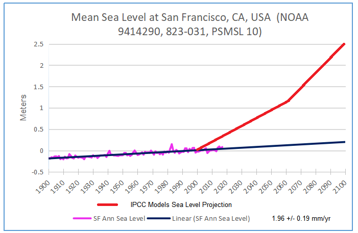
Methinks the effort is under way to make sea levels to match climate models projections, such as those used by Union of Concerned Scientists to scare coastal dwellers and land owners. For example, here are their projections compared to a continued trend from the SF tidal guage. As the chart shows, reality is already diverging from imaginary sea levels since 2000.
Synopsis of their methodology is here: https://rclutz.wordpress.com/2018/06/21/uscs-warnings-of-coastal-floodings/
This travesty was put together by VIMS, Virginia Institute of Marine Sciences. I am almost sure that it is taxpayer’s money at work. Who else would pay these geniuses?
Thank you, Willis, for another excellent analysis of of paper which used a flawed method for their projection. Once again, you have proven Mark Twain to have been correct.
In figures 5 and 8 what are the units for the y-axes, the empirical mode index?
Asking because I couldn’t follow what that is.
Thanks in advance.
Standard deviations.
w.
Thanks again. That makes sense.
I was thinking wrong when I was looking for units. The SD are in the same units by definition and the scale is relevant for the same reason.
Also, I now can see that the residuals are not big compared to the variations that the real world experiences. (e.g. the non-tidal effects aren’t – practically – big).
Thanks, Willis, for the fun AND educational post.
Regards,
Bob
A few more centuries before traffic on the Golden Gate is threatened…
You are not doing it correctly, instead take the last five years of figure 1, for example, and draw a straight line. Ergo acceleration for the acceleration.
Very interesting rebuttal of the claimed acceleration, Willis.
One thing that struck me was the 21.5y peak in figs 4 & 7. Also a 10.5 in strongly in fig 7 and much less strong but still present in fig 4. ( Alameda )
Fig4 also has a strong circa 13y peak , something which is found in many SST records but I have no idea what the cause of that is.
Greg, 13 years peak:
https://www.google.com/search?client=ms-android-huawei&sxsrf=ALeKk00WlyyZOyB6FsoyM9rjgDOVQiCcKQ%3A1582345348763&ei=hKxQXsKOLomMlwShkq-wDQ&q=4+x+%28+2+x+11.3%29+%2F+7+%3D&oq=4+x+%28+2+x+11.3%29+%2F+7+%3D&gs_l=mobile-gws-wiz-serp.
= 4 times ( sun spots cycle ) / ( El Niño + La Niña )
Greg and Johann, I did a very extensive analysis looking for sunspot-related cycles in the tides.
The first thing you have to remember is that, as old Joe Fourier showed, EVERY signal can be decomposed into sin/cosine waves. And those waves will have some period. This means that there is NO a priori reason to assume that simply because a signal has a component with a period of X it has to mean something.
In any case, the results of my analysis are in a post called “The Missing 11-Year Signal“.
My best to both of you,
w.
One problem is that Fourier analysis works very well for detecting weak signals with unvarying periods, but poorly for detecting signals with varying periods. The “11 year” sunspot cycle is not really eleven years, it’s anywhere from 9-13 years.
What’s more, there’s a noticeable positive correlation between the length of one sunspot cycle and the length of the next. In other words, the rate of oscillation sometimes slows down or speeds up for an extended period of time. That behavior prevents Fourier decomposition from working well to detect a weak signal.
Dave, I’m sorry, but that’s not true. My periodograms of the sunspot cycle show it very clearly, including the variations.
And although there is some autocorrelation in the lengths of the sunspot cycles, again, it doesn’t prevent the periodogram from highlighting it.
Here’s a couple of examples, examining the first and second halves of the daily sunspot data. Note how they each pick up the particular range of cycles in their part of the data.
w.
quasi biennial oscillation:
https://wattsupwiththat.wordpress.com/2016/09/02/a-strange-thing-happened-in-the-stratosphere-a-reversal/
As usual, no one puts error estimates on their data. I think it’s safe to say that 0.01 mm is well within the measurement error of the data.
Oh what delicious incompetence by the goons who put that pile of scientific crap together! Fitting a quadratic with so little curvature that its almost linear but allows you to project ‘acceleration’ out in future fary land.
As it happens I used to use quadratic curves in my professional work as a naval architect to generate sheer lines for boat designs and also deck camber chapes. When working in a particular shipyard it was practice to use the arc of a circle for camber curve templates that could be used with greater flexibility and in many locations, not just the deck geometry, since you did not have to line up the centre mark. This was possible because for say a 150 mm in 5000 camber, a quadratic is within a mm or so of an arct with say 50000 radius (if I remember the numbers correctly – it was decades ago).
Taking that as a cue, these guys could have done a curve fit using a circle and guess what? The ‘acceleration would have disappear up it own ass eventually! I doubt if the goons in question would have twigged nor their review ‘pals’ and still published anyway. Oh well, one lives in hope they will find their true career end point eventually. Honestly, if you made this sort of folly up about someone they would have you cold for defamation.
Indeed. This paper is another demonstration of the fallacy that peer review provides some assurance of quality.
https://tidesandcurrents.noaa.gov/sltrends/sltrends.html
Amazing. So they openly admit they crop the data to get more “acceleration” . The more linear part of the data don’t count because they would give less acceleration… which they know is there “given” the fact they cropped the data to create it.
Seems like Occam must be using those new politically correct Gillette safety razors nowadays. You know, the ones free of “toxic masculinity”.
The hurst trick again.
Oh, please, stop with the crappy drive-by posting. What do you mean by that?
The tragedy of your posting style is that I know for a fact that you are a really smart guy, but your posting style makes you look like a petulant 12-year-old.
What are you trying to say? That we shouldn’t adjust our statistical tests for autocorrelation? That the Hurst Exponent is not a good way to estimate effective N? That nature is not naturally trendy? What?
w.
Willis
Unlike you, Mosher either doesn’t realize, or at least doesn’t acknowledge, what you call “leopard knowledge.” Thus, while being bright, he doesn’t appreciate his limitations and behaves as though he thinks he has no peers here. As Dirty Harry was wont to say, “A man has to know his limitations.”
Willis
Consider this a vote of confidence from someone who spent most of a 40 year career looking at noisy highly autocorrelated process data. You are doing exactly what you need to do to make sense out of this.
Thanks for the kind words, amigo. Generally I’ll take the word of an engineer over that of a climate scientist any day. An engineer has to live with and sometimes pay for his mistakes, and they can cost lives.
A climate scientist just writes another paper, and says “Oh, that old paper, we’ve moved way past that now!”
Having your own okole on the line tends to sharpen a man’s focus remarkably …
w.
the strongest autocorrelation is probably AR1, remove that by differentiation and see what’s left.
Greg, I’m generally reluctant to do that. The first difference of a high Hurst Exponent often has a Hurst Exponent well below 0.5. For the SF Sea level data, the Hurst Exponent is 0.72. But the HE for the first difference of SF data, the Hurst Exponent is 0.14 … no bueno.
So you don’t end up with random normal data, you end up with anti-autocorrelated data.
The same thing is visible using an ARIMA analysis. “sfots” is the San Francisco sea level data.
> arima(sfots,order = c(1,0,1))

Call:
arima(x = sfots, order = c(1, 0, 1))

Coefficients:
         ar1      ma1  intercept
      0.9683  -0.3946    -0.1187
s.e.  0.0063   0.0273     0.0190

sigma^2 estimated as 0.002029:  log likelihood = 3334.17,  aic = -6660.34

===============================

> arima(diff(sfots),order = c(1,0,1))

Call:
arima(x = diff(sfots), order = c(1, 0, 1))

Coefficients:
         ar1      ma1  intercept
      0.6128  -0.9715      1e-04
s.e.  0.0487   0.0303      1e-04

sigma^2 estimated as 0.00194:  log likelihood = 3375.14,  aic = -6742.29
The AR1 coefficient is down, but the MA1 coefficient is almost minus 1, huge negative autocorrelation … I don’t see how that’s an advantage. You’ve just traded one non-normal dataset for another.
w.
Willis , do the tide cycles have any correlation to solar cycles ?
My old eyes see a 11 to 12ish year cycle in some ?
Can’t see an obvious reason for that .
Sweet Old Bob February 9, 2020 at 9:54 am
Nope. I’ve looked at lots of them. No solar cycle. Hang on, let me find the analysis … OK, it’s here.
Regards,
w.
Maybe it would be more pertinent to look at the data you used here which seems to show strong 10.5y and 21.5y peaks. The seems to be what he was referring to .
a quick spectral analysis of d/dt(MSL) at S.F. site (1898 on) shows a clear peak at 10.8y and 13.2y
longer periods are severely attentuated by diffing.
Huh? The San Francisco data has a peak at 13 and 28 years.
The Alameda data has a broad area of energy from about 10-18 years. And as you point out, it has a peak at 11.5 years.
However, the solar data for that time has a peak at 10.5 years.
And this is a fine example of why I use CEEMD. Here’s the comparison of the decadal-length cycles:
As you can see, the similarity is much more apparent than real …
w.
Sorry, I was misreading the log scale after 20, very careless. 28 indeed. That explains my not seeing in my spectrum using the derivative to remove AC.
In that spectrum the circa 11y peak is the same height as the 13y.
One problem with your CEEMD is that it applies band pass filters to separate C3,C4 etc. In this case 10-11y get attenuated in both those bands. I don’t know whether you can alter where the bands are centred but it may be worth experimenting.
I’m seeing poor resolution of those peaks. That is probably due the Kaiser-Besel windowing function, it is quite a heavy smoother. I’ll look into this some more.
CEEMD separates the data into bands based on the data itself. That’s what the “Empirical” in the name means. So no, you can’t mess with the bands.
As to whether the “10-11y get attenuated in both those bands”, I don’t think so. The sunspot data has periods ranging from around 9 to 14 years … but it doesn’t get attenuated.
w.
I have not looked into the mechanics of how CEEMD splits the bands but to look at your fig 4 it sure looks like different bandpass filters. It may be a different technique which is doing something similar. Clearly is separating, ie filtering, the variability in some way.
Compare the circa 10.5 and 11.5 peaks in C3 and C4 , they are both present in each at about the same place but magnitudes are reversed.
Here is a (very) rough graph of the spectrum I get from a linear detrended SF sea level. The circa 11 and 13y peaks are comparable. I get similar results from using the first difference to remove AC.
It may be worth exploring how that CEEMD tool behaves with a known input. It will not remove an 11y cycle but it may be reducing it to a level which leads you to regard it as not significant.
Anyway, thanks for an interesting discussion. It’s always good to compare the output of different techniques.
Greg, one difference may be that the CEEMD splits data into components which can be added together to recreate the original signal. I don’t think yours can.
w.
I think you’ve put your finger on it. So the amplitude of the 10-11y year range is being split between C3 and C4 in some way. It’s similar but not the same as the filtering I thought was happening. (There’s no guarantee with bandpass filters that it all adds up. )
So you need to bear in mind that what looks rather small in both C3 and C4 needs to be added together mentally. Neither the C3 nor C4 amplitudes give an accurate comparison to the ( respectively ) lower and higher adjacent frequencies in their band.
If the height of the twin 10,11y peaks in C3 is added to their height in C4 ( to represent its contribution to the whole ) they would be less than but similar to the height of the 13y peak. That is consistent with my spectral analysis, which is reassuring from both ends.