Reposted by permission from Medium.com
Dispelling the fallacies of a solar company owner
Mar 6 ·

Gregory Wrightstone — March 6, 2020
Author of Inconvenient Facts — The science that Al Gore doesn’t want you to know
An article highly critical of my book Inconvenient Facts, a bestseller, has received wide distribution. It’s Easy to be Tricked by a Climate Denier purports to be a factual take-down of the book and, by extension, of me. However, it is really just one more example of how proponents of catastrophic man-made warming need to resort to lies and distortion in order to advance their agenda.
The author, Willard MacDonald, is not a scientist but the Vice President of Vivint Solar, a solar panel manufacturer and installer. No conflict of interest there! He does have degrees in computer science and electrical engineering, documenting an education appropriate to his line of work but not applicable whatsoever to discerning the complexities of climate or the long-term records of temperature and carbon dioxide.
In reference to my book’s 60 inconvenient facts, MacDonald states right up front that “most of them are true” and that they are also non-controversial statements. However, he disputes the conclusions drawn from them. He asserts that “every page of [the] book includes incorrect or misleading interpretations of data or science.”
What MacDonald objects to is not so much incorrect data or charts, but how the book tends to view the data by placing them in the long-term geologic perspective without resorting to alarmist interpretations. That is the crux of the entire hit piece — not that the book provides incorrect science, just that it doesn’t “toe the company line” and advance the so-called “consensus” opinion of catastrophic man-made warming.
MacDonald admits that “Wrightstone does include ‘some’ peer-reviewed references.” If “some” means 17 pages of sources and more than 130 separate peer-reviewed references, then I suppose he would be correct.
A recurring theme is that Inconvenient Facts “cherry-picks” data in order to support assertions that are in opposition to man-made catastrophic warming. Yet, no documented examples of so-called “cherry picking” are provided.
From the article:
“Wrightstone presents a number of true facts to build credibility and trust on a topic, and then from those true facts deduces an incorrect conclusion. The casual reader can easily overlook the misdirection. Climate science is complicated, and most readers are not equipped with the background or the time to investigate claims that, when written with authority, sound truthful.”
In essence, MacDonald is telling you that you are too stupid and unqualified to make a judgment on your own. Please ignore the well-credentialed and degreed scientist (Wrightstone) with his highly qualified sources, and rely on me (MacDonald), a self-described “solar entrepreneur,” to provide the truth about this complicated subject.
In his purported exposé of the supposed fallacies within Inconvenient Facts, MacDonald lists seven basic high-level “myths.” Here, we will examine each of these so-called myths related to Catastrophic Anthropogenic Global Warming (CAGW) and find out that the facts are not quite as our solar entrepreneur asserts.
Myth 1 — Since the history of the earth includes periods of significantly higher CO2 and temperature, we shouldn’t worry.
As a geologist, one of my main goals within Inconvenient Facts was to place our current climate conditions into the long-term geologic perspective, rather than comparing it to short-term trends dating back hundreds or even thousands of years, as is common. This longer viewpoint was a central over-arching theme and was my stated goal in creating Inconvenient Facts:
“As a geoscientist who has dealt with various aspects of the Earth’s processes for more than 35 years, I know that the brief hundred or so years of recorded temperatures — and the even shorter time frame since the first satellite was launched — is just a blink of a geologic eye. It is too brief a period to evaluate the data adequately. Much of climate science deals with the few decades of recorded data available and does not attempt to place this data in the longer geologic perspective needed to analyze it adequately.”
Here, we will review how temperature and carbon dioxide are analyzed within Inconvenient Facts and why Mr. MacDonald’s distaste for the big picture is just not correct.
Carbon Dioxide
According to MacDonald, carbon dioxide (CO2) and temperature data on a geologic scale are not relevant to any discussion concerning our changing climate. Only data since man appeared on Earth should be included and pertinent.
First, we will look at carbon dioxide changes through geologic history. Then we will review his objections to long-term temperature. He states:
“the fact that CO2 levels were higher millions of years ago is irrelevant to whether people living today will be negatively impacted by recent high levels.”
Let us first dispel any notion that projected higher levels of CO2 will have a direct deleterious impact on humans. As of early 2020, atmospheric CO2 concentration was about 415 parts-per-million (ppm). According to the National Oceanographic and Atmospheric Administration (NOAA), CO2 levels may reach 900 ppm by 2100, which is well below the minimum threshold for negative impact to humans. The United States Department of Agriculture has set a maximum exposure limit for workers at 5,000 ppm and states that even at levels of 10,000 ppm there are typically no ill effects.
Proponents of man-made catastrophic warming claim that the increase in carbon dioxide concentration from 280 parts per million (ppm) during the early stages of the Industrial Revolution in the mid-1700s to more than 400 ppm today is an alarming increase. According to this viewpoint, this ~130-ppm increase will surely lead to the many disasters foretold by the IPCC and other groups promoting the “consensus” on the catastrophic consequences of our changing climate.
The recent rise in CO2 does appear to be a remarkable increase when viewed in the context of our current Pleistocene epoch dating back to the beginning of our current spate of glacial advances and retreats. The illustration below (Figure 1) shows levels going back 400,000 years along with what appears to be a remarkable increase in the last century.
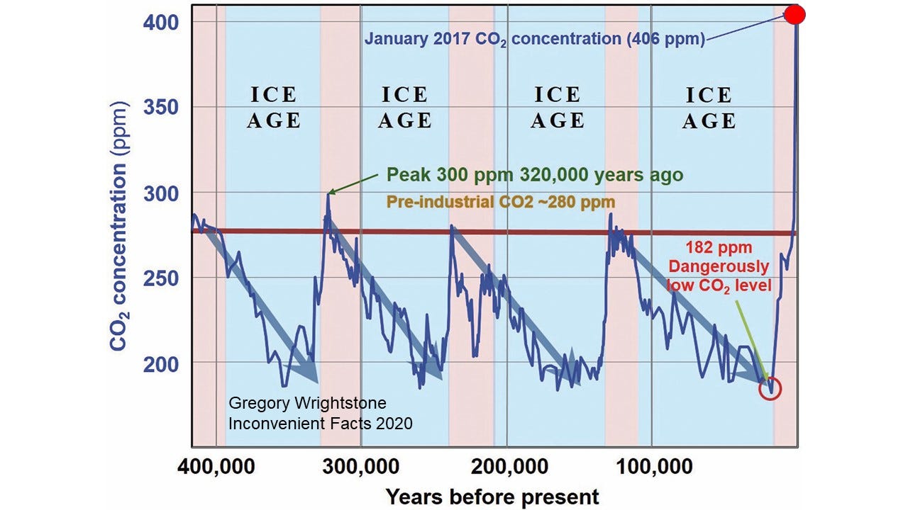
Figure 1–400,000 years of CO2 history — Barnola 2003
A closer look at the data (Figure 2) and comparing it to temperature shows that the variations in CO2 levels were temperature driven. In other words, the temperature changed first and then CO2 followed it. The warming of the interglacial periods such as the one we are in right now caused CO2 atmospheric levels to increase because warm oceans expel the gas. The cold of the glacial advances caused the seas to absorb the life-giving molecule and lessen the concentration in the atmosphere.
For more than 800,000 years, temperature has driven CO2 levels, but Mr. MacDonald would have us believe that all changed sometime in the mid-20th century. This is a primary reason that he and his fellow alarmists don’t want the longer-term geologic record revealed.
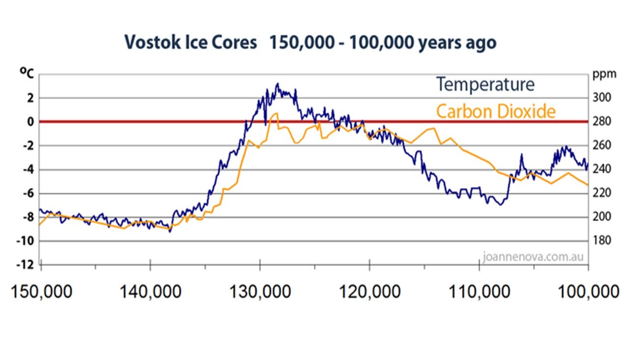
Figure 2 — Temperature vs. carbon dioxide from Antarctica — Data source: Barnola et al (2003) credit Jo Nova for graphics
Placing this data into an even longer geologic picture (Figure 3) provides an eye-opening perspective to the modern 130-ppm increase. It reveals that the Earth has been in a 140 million-year dangerous decline in carbon dioxide. The decrease from 2,500 ppm to the dangerously low level of less than 180 ppm at the end of the last ice age put the Earth perilously close to a true climate apocalypse. Why would such a low level be dangerous? It is because it came terrifyingly close to the minimum threshold for most plant life to exist at about 150 ppm. Had that line-of-death been crossed, it would have resulted in a true climate apocalypse.
Viewed in this perspective, it becomes obvious that our recent increase of 130 ppm is exceedingly small and barely registers as a blip on the chart of Earth’s CO2 history.
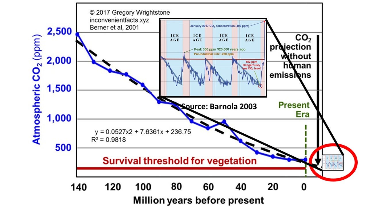
Figure 3–140 million years of a dangerous decline in CO2 — Berner 2001, Barnola 2003
Temperature
When viewing temperature, nearly all proponents of CAGW look at only the most recent several decades of data to “confirm” their notion of a CO2-driven dangerous warming. According to MacDonald:
“the fact that it was significantly warmer before mammals existed on earth is irrelevant to whether global warming is or is not detrimental for our modern civilization.”
It is certainly “convenient” to only view the most recent several decades of temperature data, the reason being that during the last 150 or so years both CO2 concentration and temperature have increased. And so, the alarmists say there is clearly a correlation between rising CO2 and rising temperature. Not so fast. Correlation is NOT causation.
No, Mr. MacDonald, it is not only appropriate to look at the recent data in the longer perspective, it is vital and necessary. We will look at three temperature charts in order to confirm the value of a long-term geologic perspective. The first (Figure 4) is a chart often used by proponents of man-made warming to support their contention of a link between the rise of CO2 and increasing recent temperature. It charts the recent temperature and CO2 data going back to the year 1850 with an apparent correlation between the two.
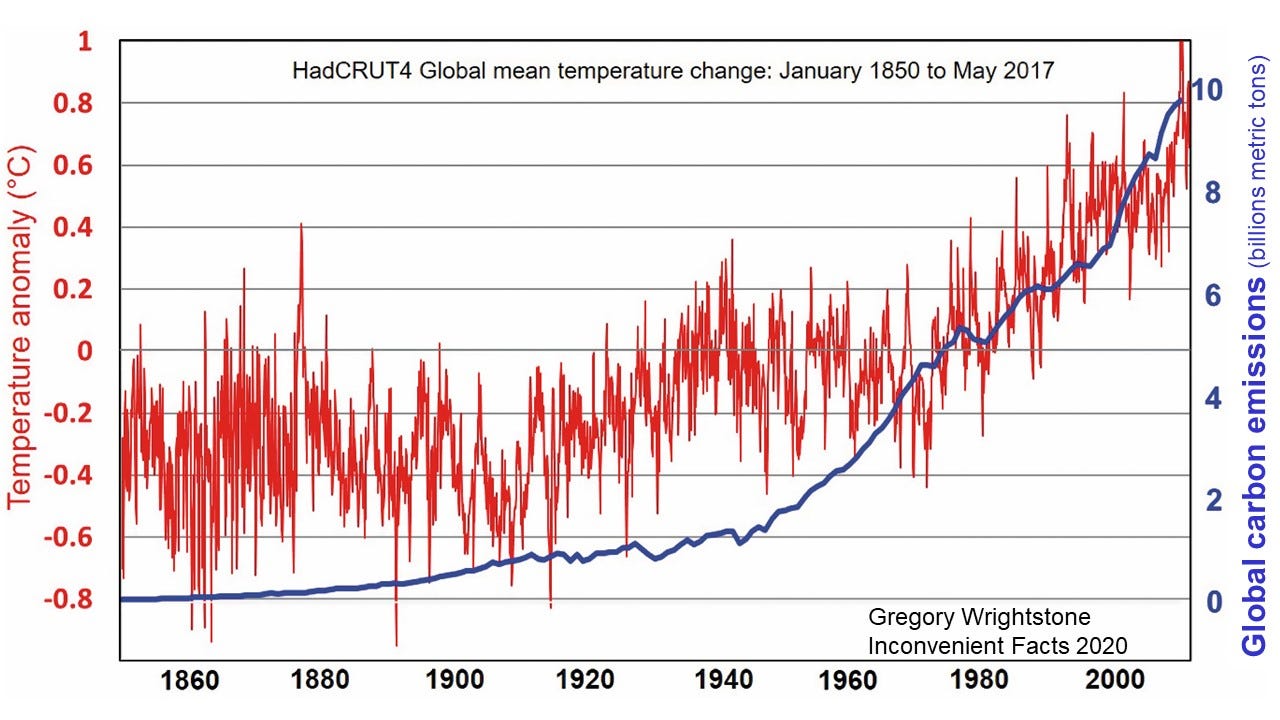
Figure 4 — Temperature vs. Carbon emissions 1850–2017 — Source data: Temperature: HadCRUT4, CO2: Boden 2016
A bit longer perspective (Figure 5) shows the longest available thermometer record dating to 1659 that reveals that our current warming trend began more than 300 years ago, and the supposed correlation disappears. Importantly, it shows that the Current Warming Period began long before any significant increase in human emissions could have caused any warming.
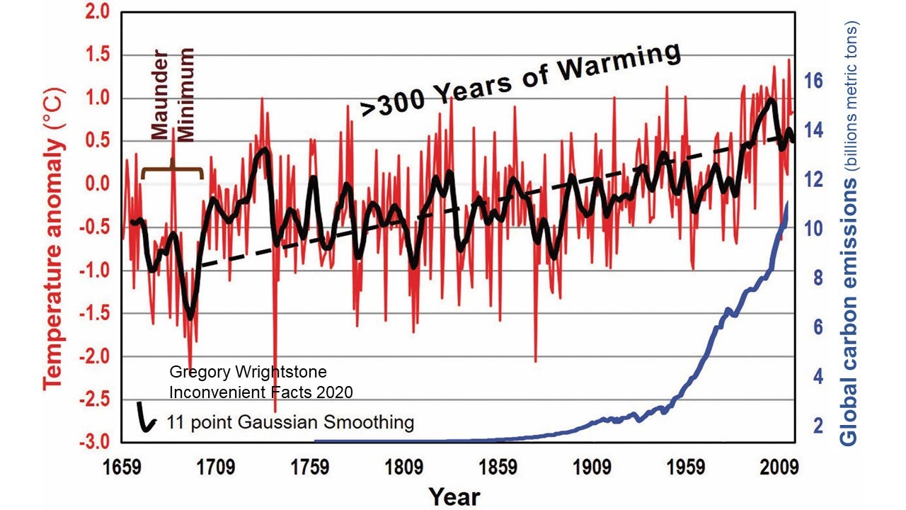
Figure 5 — Temperature vs. Carbon emissions since 1659 — Source data: Temperature: Parker 1992, CO2: Boden 2016
Our last chart on temperature (Figure 6) shows 10,000 years of temperature fluctuations with a gradual decrease in temperature over the last 6,000 years and that the Current Warm Period is likely nothing more than another cycle of warming very similar to the nine previous cycles that were all 100% naturally driven. Another common talking point is that the rate of warming is also unprecedented, yet five of the nine other warming trends had higher rates of warming.
Human carbon dioxide (CO2) emissions began ramping up in earnest in the post-World War II era of the mid-twentieth century. If the temperature increases over the last 70 or so years were historically unusual and unprecedented over the scale of thousands and millions of years, then that would be strong evidence that man’s increase in CO2 is the primary driver of that temperature change. On the other hand, if scientific and historical records confirm that our recent temperature changes are very similar to those of previous periods, it would be supportive of those who say that our modern changes are nothing more than a continuation of natural cycles of warm and cold are probably correct. This last chart on temperature (Figure 6) does just that.
Unprecedented? Unusual? No and no.
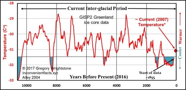
Figure 6–10,000 years of temperature — Alley 2004
Myth 2 — Global warming is not due to CO2 or Humans
Mr. MacDonald’s primary objection in this regard is the fact that Inconvenient Facts used “cherry-picked” data to support an allegation of a “pause” in global warming in the decade-plus record in the years immediately following 1998. The chart in question can be found on page 31 in the book (Figure 7, below) and shows that global surface temperatures ceased increasing for 14 years even though carbon dioxide concentrations continued increasing.
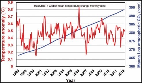
Figure 7 — “Inconvenient Pause” while CO2 increased — HadCRUT4 (2017)
This chart used a truncated portion of a global temperature history of surface and ocean gauges known as the HadCRUT4 data set. (HadCRUT stands for Hadley Climate Research Unit at the University of East Anglia). The time frame selected was to show a fourteen-year-plus period in recent data that revealed that, although CO2 continued increasing, temperature did not.
According to MacDonald the data was “cherry picked” and omitted the years in 2015 and 2016 when there was an uptick in temperature:
“the logical explanation for why he omitted it appears to be because the data clearly returns to an upward warming trend just like the 20 years before 1998, and this didn’t support his facts.”
No attempt was made to “hide” the 2015/2016 data or the increase in temperature in those years as claimed, as the full data set available at the time of publication is presented on three other illustrations within the covers of Inconvenient Facts, including one on the facing page (page 30). I also referred to that very same rise in 2015–16 that MacDonald says that I ignored by stating, “Based on the most recent data and confirmed by examination of satellite data, the Inconvenient Pause may have ended in 2015.”
Further support of the “pause” after 1998 comes from the U.S. Climate Reference Network (USCRN), which was created in 2005 as a network of 114 land-based temperature measuring stations across the United States. This network was created in order to have a pristine data set that was free from any biases including the urban heat island effect and has had no “adjustment” of the data, as have most of the other data sets. The USCRN data (Figure 8) show that there has been no significant warming for nineteen fifteen years across the United States, dating to inception of data gathering.
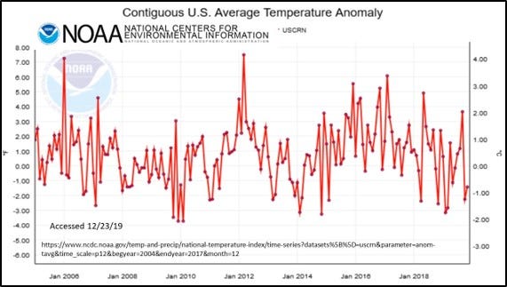
Figure 8 — Land-based surface temperature for United States — US Climate Reference Network — Source: NOAA National Centers for Environmental Information
The second problem identified under this “myth” is the use of the Central England Temperature Record (see Figure 5, above). MacDonald does not approve of displaying this because it is not global, and it begins during a cold period.
“this data is not for the world, the northern hemisphere, or even Europe — just for local England…”
“Second, the data set happens to start with a period known as the “Maunder Minimum,” around 1700, a very cold period coinciding with what’s known as the “Little Ice Age.” The Little Ice Age was caused by volcanoes triggering a feedback loop in sea ice plus natural lows in solar radiation.”
The data set was used because it is the longest record of instrument data available (1659) and predates the HadCRUT4 data (figure 5) above by nearly 200 years. The Central England Temperature record is from a geographically small area but uses three sets of records bounded more or less by London, Bristol and Lancashire. While geographically small it has been said to be representative of a much larger area, and according to Dr. Mike Hulme “it is well correlated with land temperatures over the entire Northern Hemisphere (Hulme 1997).”
By pointing out that the data begins in the middle of the cold period known as the Little Ice Age and admitting that the warming began 300+ years ago due to natural forces, MacDonald unknowingly supports one of the biggest themes that runs throughout the book. The recurring thesis within Inconvenient Facts is one of cyclic natural forces forcing large temperature swings through time. These naturally driven cycles of warm and cold reinforce the notion that our current warming trend is simply a continuation of those cycles. Those natural drivers did not end in the middle of the 20th century.
Myth 3 — Rising sea levels are not due to CO2 or humans
The majority of the critique by MacDonald was well-constructed and written (incorrect and misleading, but well-constructed). This particular section was a confused mishmash which unintentionally validated my position on sea level rise. He agreed that natural forces are likely the primary control of current sea level rise and that it is not accelerating at alarming rates. As if to underscore this, he writes:
“As global temperatures naturally recovered from the Little Ice Age, the glaciers naturally receded.”
He also has a particular issue with the sea level graph used within Inconvenient Facts (Figure 9 below) from Jevrejeva (2008).
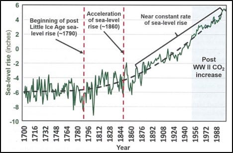
Figure 9 — More than 200 years of sea-level rise — Jevrejeva 2008
One claim is that I “cherry-picked” data and that the chart above only showed data to 2000, when additional data was available through 2010. The dates at the bottom are only labeled every 16 years for chart clarity. The actual data used for Figure 7 extend through 2002, which is the most recent data reviewed by the researcher for this paper.
The author returns again and again to his claim that there was natural warming before the 20th century, but that has all changed in the not-too-distant past:
“… sea level rise in the 1800s was due to the same warming trend following the Little Ice Age … In this case, there was natural warming before the 1900’s, and then human CO2 emission causing warming in the 1900’s and beyond …”
So, according to our solar entrepreneur, natural warming has been driving sea level rise and fall since the dawn of time, but all that remarkably changed with the advent of the Model T. He does accurately quote Dr. Jevrejeva in saying, “…sea level acceleration up to the present has been about 0.01 mm/yr and appears to have started at the end of the 18th century.”
In hindsight, a better and more recent study by the same author (Jevrejeva 2014 — Figure 10) used more data points (1,277 records) for a clearer look at sea level since 1807. This reveals that MacDonald’s breathless reporting of a possible dangerous rise in sea level of 340 mm by the year 2100 may not be quite so catastrophic. When compared to my trusty Estwing rock hammer, that rise doesn’t appear quite so dangerous and likely easily mitigated by forward-thinking nations and communities.
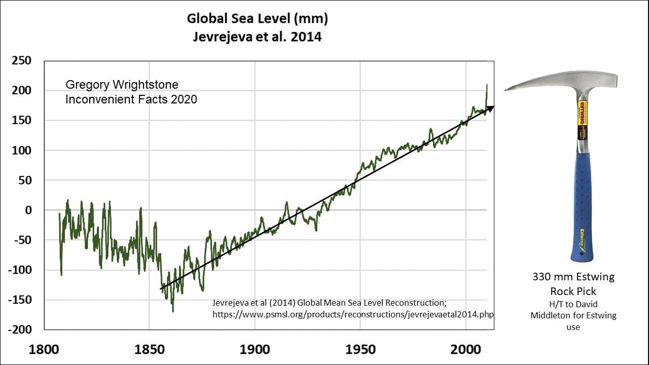
Figure 10 — Sea level change since 1807 — Jevrejeva 2014 — Hat tip to fellow geologist David Middleton for the idea of using the Estwing for scale
One final response to unfounded sea level claims made by our friend in his critique of Inconvenient Facts. MacDonald stated:
“It is estimated that population displacement due to climate change will be 200 million to 1 billion people by 2050.”
With no reference or source to this claim provided, we could review what the United Nations has had to say in the past on similar claims. A report for the United Nations’ Environment Program in 2005 asserted that there would be 50 million climate refugees by 2010, many of them driven out of their coastal homes by sea-level rise.
The UN even provided a handy identifier map which included the areas of highest risk: low-lying islands of the Pacific and Caribbean and commented that “some will disappear completely.” Review of the most recent census of these islands shows that the populations have blossomed, so, rather than fleeing these islands, people are flocking to them as the tropical paradises they are.
One of those “at risk” island nations is the Maldives, where three new resort hotels are being constructed along with a new airport. This new Maldives construction has been completely financed and insured by companies that avoid risk like the plague. These companies have assessed the risk and are betting against the UN with hundreds of millions of dollars of their own capital.
Undeterred by facts or common sense, the UN predicted in 2015 the same 50 million climate refugees by the updated timeline of 2020. Please be patient, the UN’s updated climate refugee deadline will be released soon and I am sure that they will get it correct this time.
Myth 4 — Global warming is not a problem, in fact it is good
In this section our solar panel installer presents multiple factually incorrect statements concerning what is represented in the book and about the many benefits of modest warming and increasing CO2. Here we will present his statement and then the facts.
“The author poses an interesting idea: the next ice age is coming, so we should allow the earth to warm in order to counteract it. It is true that there is a next ice age coming, and so this is an intriguing idea…until you learn that the next ice age is, at the soonest, 2000 years away!”
Yes, indeed another ice age is coming. I never presented the idea that we should allow the Earth to warm in order to prevent it. However, I DO quote a statement that can be found on the United States Geologic Survey’s own website concerning the next ice age that stated “It is somewhat ironic that our contribution of greenhouse gases to the atmosphere may actually be helping to delay the next ice age from starting!”
My Inconvenient Fact #15 stated “Interglacials usually last 10,000–15,000 years. Ours is 11,000 years old.” As to when the next ice age will descend upon us, the fact of the matter is that no one really knows. It may be the 2,000 years referenced, it may be in 200 years and it may have already begun, and we just don’t know it yet. Whenever it does begin, one thing is certain, it will be horrific.
Another fact-free statement from MacDonald:
“…global warming is going to hurt food production, not help it, due to worsening droughts and increased temperature.”
“The impacts of increased global warming are widely understood among the scientific community to include: more extreme weather events, increased coastal flooding, reduced access to clean water, reduced crop yields, increased fires, more disease, resource wars, and more.”
The amount of misinformation in these two sentences is quite extraordinary. The supposed catastrophic consequence of the presumed man-made warming listed are simply unfounded speculation on what may or may not occur 50 or 80 years into the future based on failed climate models.
I live in the real world and draw on what is happening today and the recent past in order to project what we may see in the future. What we find is the following:
· Food production is increasing and breaking records year-after-year.
· Droughts are in long-term decline.
· Extreme weather deaths are in significant long-term decline.
· Our water and air are cleaner today than in 100 years and continue to improve.
· Fires are decreasing globally.
The debunking of the increasing number and severity of severe weather events will be dealt with in a later section on that subject.
Since Easy to be Tricked admits that our rising CO2 concentration is increasing plant and crop growth today, I won’t bore you with the voluminous studies related to the matter. I do strongly recommend the CO2 Science Plant Growth Database that is managed by Dr. Craig Idso and his team of scientists to learn more about how increases of this miracle molecule benefit plant growth.
One line of thinking used often by alarmists such as Mr. MacDonald is that, while crops will increase yields and growth (it is hard to dispute this fact), the nutritional value will be decreased. According to one of the most widely quoted studies (Beach 2019), wheat, rice, maize, barley, potatoes, soybeans, and vegetables are all projected to suffer nutrient losses of about 3% on average by 2050 due to elevated CO2 concentration. This is due to projected losses in protein, iron, and zinc.
According to Craig Idso (2013), the relatively tiny amounts of speculated nutrient reductions are overwhelmed by an average increase of 46% of crop biomass owing to increased CO2 fertilization effect. Please note that protein losses are most likely due to lower levels of nitrogen available and that all of these alleged reductions can be easily resolved by continuing or increasing the practice of that radical new agricultural technology: fertilization.
On top of CO2 turbo-charged plant growth, crops are benefiting from the warming by an extended growing season (Figure 11). Killing frosts end earlier in the spring and begin later in the autumn, leading to additional plantings and reduced crop loss.
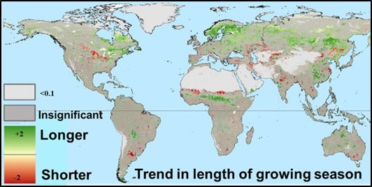
Figure 11 — Trend in length of growing season (1981–2006) — Modified from de Jong 2011
An important but overlooked factor concerning the fires and droughts is the increasing soil moisture that alleviates both of these. A warming ocean leads to increased evaporation and, hence, to increases in precipitation. That, combined with lessened water needs by plants owing to enhanced CO2 fertilization, is leading to a worldwide increase in soil moisture, and that is a good thing for ecosystems and humanity.
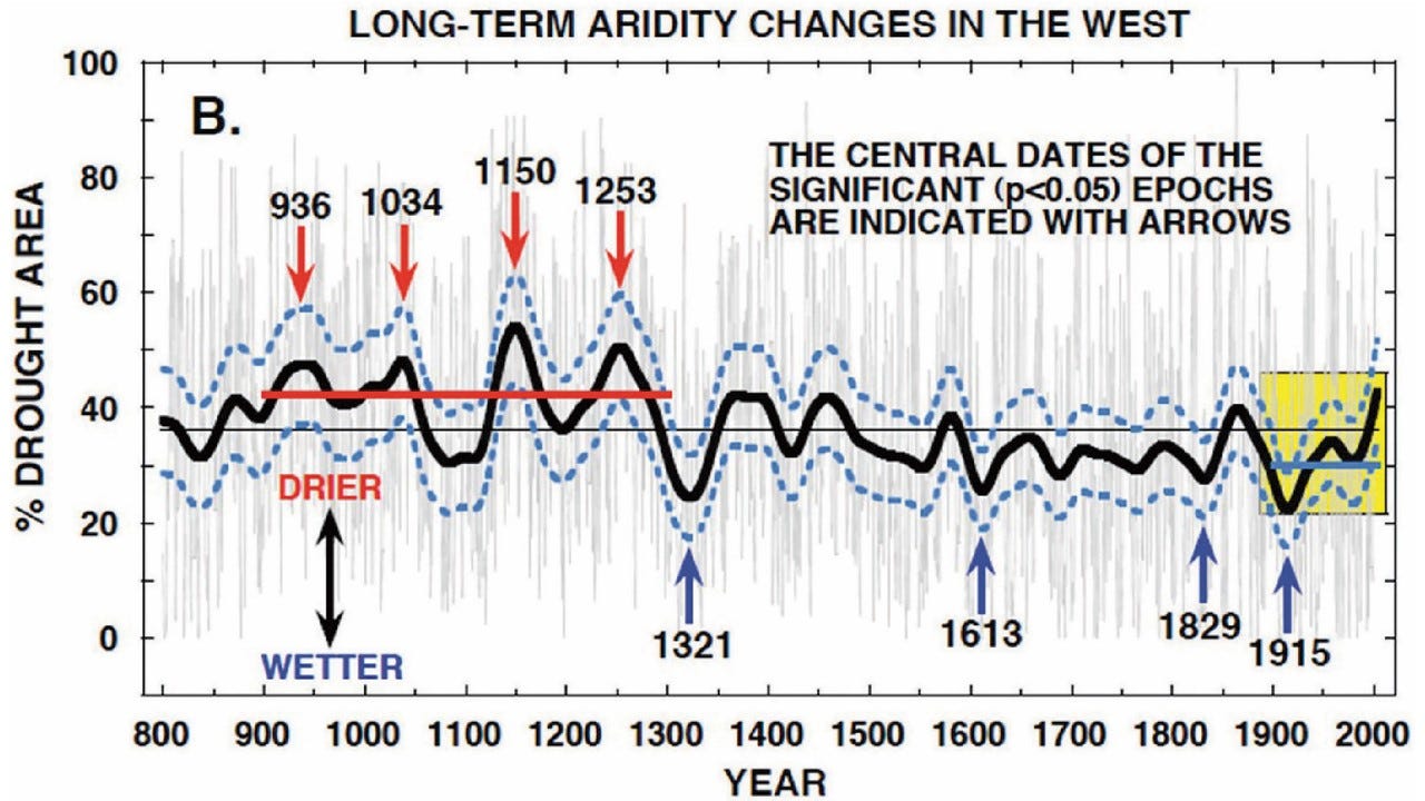
Figure 12 — Downtrend in drought for 30 years — Modified from Hao 2014
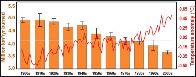
Figure 13 — Significant global decline in wildfire — Burned area: Yang 2014; temperature: HadCRUT 2017
Myth 5 — Scientists don’t agree that global warming is man-made
The Easy to be Tricked critique falls back on the tired 97% “consensus” opinion for Myth #5. That alleged “consensus opinion” is that the 0.8 degree C warming measured over the last 120 years is caused by human emissions of greenhouse gases (mostly CO2).
I agree that there is likely a near 100% agreement on the following:
· Carbon dioxide concentration has been increasing in recent years.
· Temperatures have been generally increasing in fits and starts
We saw in previous sections that the Current Warming Period began more than 300 years ago. Even Mr. MacDonald agrees that the first 200 or so years of that modern warming were driven entirely by natural forces. The fact of the matter is that those forces did not stop functioning in 1950 and are actively affecting temperatures today just as they have since the dawn of time.
I don’t dispute that increasing CO2 has a warming effect on the atmosphere since it is a greenhouse gas. What is impossible to quantify is the actual percentage of warming that is attributable to increased anthropogenic (human-caused) CO2. There is no scientific evidence or method that can determine how much of the warming we’ve had since 1900 was directly caused by us and how much can be assigned to the continuing natural drivers of climate.
The long and hard road to scientific truth cannot be followed by the trivial expedient of a mere headcount among those who make their livings from government funding. Therefore, the mere fact that climate activists find themselves so often appealing to “consensus” is a red flag. They are far less sure of the supposed scientific truths to which they cling than they would like us to believe. “Consensus,” here, is a crutch for lame science.
The primary paper that is often trotted out in support of the notion of “97% consensus” was written by John Cook. Published in 2013, it is the most widely referenced work on the subject of climate consensus and has been downloaded more than 600,000 times. Of note, the project was self-described as “a ‘citizen science’ project by volunteers contributing to the website.” The team consisted of two dozen climate activists who did not leave their climate prejudices at home. Nor were they in any way qualified to be part of this type of what claimed to be a peer-reviewed paper.
Cook and his team of 24 volunteers who were recruited from his website reviewed abstracts from 11,944 peer-reviewed papers related to climate change or global warming, published over the 21 years 1991–2011. Their stated goal was to assess the extent to which the papers supported the “consensus view” on climate change. They concluded that “97.1% endorsed the scientific consensus on AGW.”
One gargantuan error in the Cook paper (Cook 2013) was the categories used to determine if an author agreed with the consensus. Only the first category amounted to an explicit statement that humans are the primary cause of recent warming. The second and third categories would include most skeptics of catastrophic anthropogenic warming, including me, who accept that increasing CO2 is probably causing some, probably small, amount of warming; an amount that is likely rendered insignificant by natural causes of warmer weather.
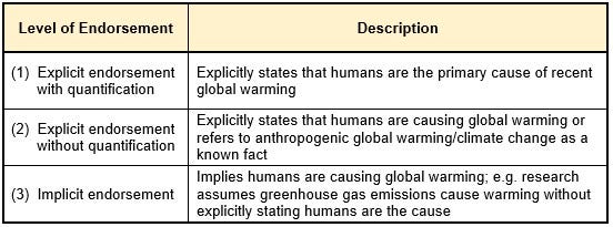
Cook 2013
In rebutting this paper, I cited another peer-reviewed paper whose primary author was noted climatologist Dr. David Legates (Legates 2013). Dr. Legates reviewed those same 11,944 papers and found that 7,930 of the papers took no position at all on the subject and were arbitrarily excluded from the count on this ground. If we simply add back all of the papers reviewed, the 97% claimed by Cook and his co-authors falls to 32.6%.
Quoting from Inconvenient Facts concerning the Legates study:
“They reviewed the actual papers used by Cook and found that only 0.3% of the 11,944 abstracts and 1.6% of the smaller sample that excluded those papers expressing no opinion endorsed man-made global warming as they defined it. Remarkably, they found that Cook and his assistants had themselves marked only 64 papers — or 0.5% of the 11,944 they said they had reviewed — as explicitly stating that recent warming was mostly man-made. Yet they stated, both in the paper itself and subsequently, that they had found a “97% consensus” explicitly stating that recent warming was mostly man-made.”
MacDonald had a big problem with using the entire nearly 12,000 papers rather than the 4,014 papers that explicitly stated one way or the other that climate change was primarily caused by human CO2 emissions:
“This is not a valid way to tally opinions. If you are trying to report the number of people who have opinion A vs opinion B, you take the total number who have opinion A and divide it by the total number that stated either opinion A or B. If there was no opinion stated, then it is not part of the statistic.”
I will cede this argument to the non-scientist MacDonald as having a valid point. If we ONLY look at the smaller number of papers that either agree or disagree with the consensus, then the number agreeing with the consensus is still very tiny at 1.6%, which is nowhere near the 97% claimed.
A second detailed review of Cook’s methodologies was completed in 2014 by Dr. Richard Tol, professor at the University of Sussex. Dr. Tol agrees that the overwhelming majority of literature on the subject agrees with the consensus but argues that Cook’s methodologies were flawed.
This is how Dr. Tol described the deficiencies in Cook 2013:
“Reported results are inconsistent and biased. The sample is not representative and contains many irrelevant papers. Overall, data quality is low. Cook’s validation test shows that the data are invalid. Data disclosure is incomplete so that key results cannot be reproduced or tested.”
And:
“…they gave further cause to those who believe that climate researchers are secretive (as data were held back) and incompetent (as the analysis is flawed).”
Science does not advance through consensus, and the claim of consensus has no place in any rational scientific debate. We ask: What does the data tell us? What does it mean? Can we reproduce the results? If climate alarmists need to resort to an obviously flawed consensus opinion, rather than argue the merits of the science, haven’t they already conceded that their argument cannot be won through open debate?
Perhaps the best statement on the subject was made by the late, great author Michael Crichton (not merely an author of fiction but also a Harvard-educated medical doctor whose scientific and technological achievements were widely recognized):
“Let’s be clear: the work of science has nothing whatever to do with consensus. Consensus is the business of politics. Science, on the contrary, requires only one investigator who happens to be right, which means that he or she has results that are verifiable by reference to the real world. In science consensus is irrelevant. What is relevant is reproducible results. The greatest scientists in history are great precisely because they broke with the consensus.
There is no such thing as consensus science. If it’s consensus, it isn’t science. If it’s science, it isn’t consensus. Period.”
Remember, you can’t spell consensus without “con.”
Myth 6 — Global Warming is not Creating More Extreme Weather Events
Panel installer MacDonald doesn’t like what Inconvenient Facts has to say about extreme weather:
“Not everything in Wrightstone’s book is wrong or misleading. He is correct that many people incorrectly tie too many extreme weather events directly to climate change. Scientists have not been able to create a clear case for connections between global warming and the frequency of hurricanes and tornadoes. There is, however, scientific evidence that the intensity of hurricanes is increasing due to increasing ocean temperatures caused by global warming.”
He pretty much gets this much correct. In my book I quote NOAA’s foremost hurricane expert Christopher Landsea, a meteorologist for the National Hurricane Center, who has quantified what an increase in the intensity of major hurricanes, driven by global warming, may mean (Landsea 2011). His work indicates that the warming over the last several decades translates into an increase in intensity of about 1%. For a Category 5 hurricane like Katrina, the wind speed would increase by 1 to 2 mph. He wrote: “The 1–2 mph change currently in the peak winds of strong hurricanes due to manmade global warming is so tiny that it is not measurable by our aircraft and satellite technologies available today, which are only accurate to about 10 mph (~15 kph) for major hurricanes.”
In other words, the estimated increase in hurricane strength is too small to be significant.
On the matter of heat waves, Mr. MacDonald has this to say:
“There is also a connection between global warming and increased heat waves and to some degree regional drought, both of which Wrightstone denies. For example, his “Inconvenient Fact 40” states “EPA: Heat waves are not becoming more frequent” (see: Wrightstone, 2017). However, the EPA (Environmental Protection Agency) study he refers to in his book is for the Southeastern United States, not the world.”
MacDonald here is blatantly misrepresenting material within Inconvenient Facts. I presented three illustrations related to heat waves and excessively high temperature and only one was regional in reach. That one local chart showed peak daily temperatures for the southeastern U.S. state of Alabama, was clearly labeled as such, and was used as an example of how local temperatures vary from strident media reporting. The two charts below, including the one from the EPA, address heat waves across the lower 48 states of the United States.
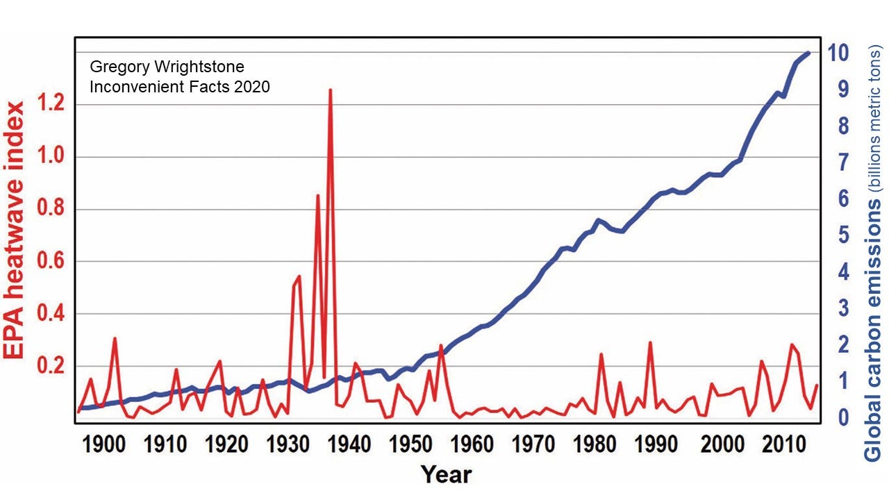
Figure 14 — Nature, not CO2 emissions, drives heat waves — Heatwave: EPA 2016b, Carbon: Boden 2016
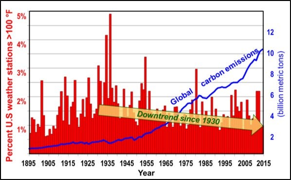
Figure 15 — Up goes CO2 concentration, down go heat waves — Heat: Modified from Christy 2015, Source Carbon: Boden 2016
An interesting additional chart that was not included in my book is this gem derived from fellow geologist Bob Tisdale’s wonderful repository of charts gleaned from NOAA. In Extremes and Averages in Contiguous U.S. Climate: Graphs of 100 Years of NOAA Contiguous U.S. Climate Data, Tisdale presented a chart showing that the highest monthly temperature of the United States had slightly declined in the period 1919 to 2018.
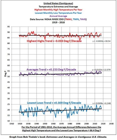
Figure 16 — Slight decrease in maximum temperatures for nearly 100 years — Tisdale R (2018) after NOAA
As for the claim that droughts were increasing and linked to climate change, no evidence was presented to contradict the six charts I provided documenting either no increase in drought (2) or a long-term decline (4). One of the most impactful of my charts was of the most severe and persistent droughts of the twentieth century (Figure 17) that documents a 60-year decrease in these devastating dry periods. Another was a much longer-term look at drought over 1,200 years in North America that reveals that the worst events occurred during the period 936 to 1253 AD (Figure 18).
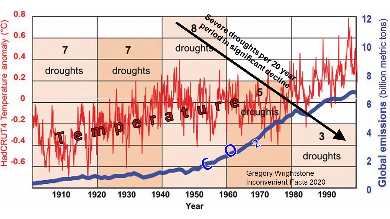
Figure 17 — Most severe and persistent droughts of the twentieth century in decline — Modified from Hao 2014
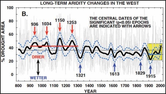
Figure 18 — Long-term changes in aridity in western North America — Modified from Cook 2007
MacDonald reserves most of his firepower in this section for his attack on my contention (backed up by science) of a global decline in the number of wildfires rather than the media-driven narrative of a planet beset by ever-increasing flame.
He presents my chart of the number of fires in the United States (Figure 20) that shows a nearly 80% decline in fires and then proceeds to do what he heavily criticized Inconvenient Facts of doing (falsely it turns out): cherry picking data to fit a narrative. He states:
“the last 30 years starts just after the dramatic cliff in his chart in 1986. If you plot just the 30 years from 1986 to 2016, the data looks like the chart below (Figure 19). When you fit a straight line to this data that starts in 1986 it does show a very slight decline, but it’s almost imperceptible to the average person looking at the data who would tend to say it looks more or less flat — certainly nothing like the visual impact when you compare it to the data prior to 1986.”
So, our friend’s solution to charts that don’t fit his narrative of “More CO2 = More Fires” is to delete the data that don’t conform and then graph the data that do.
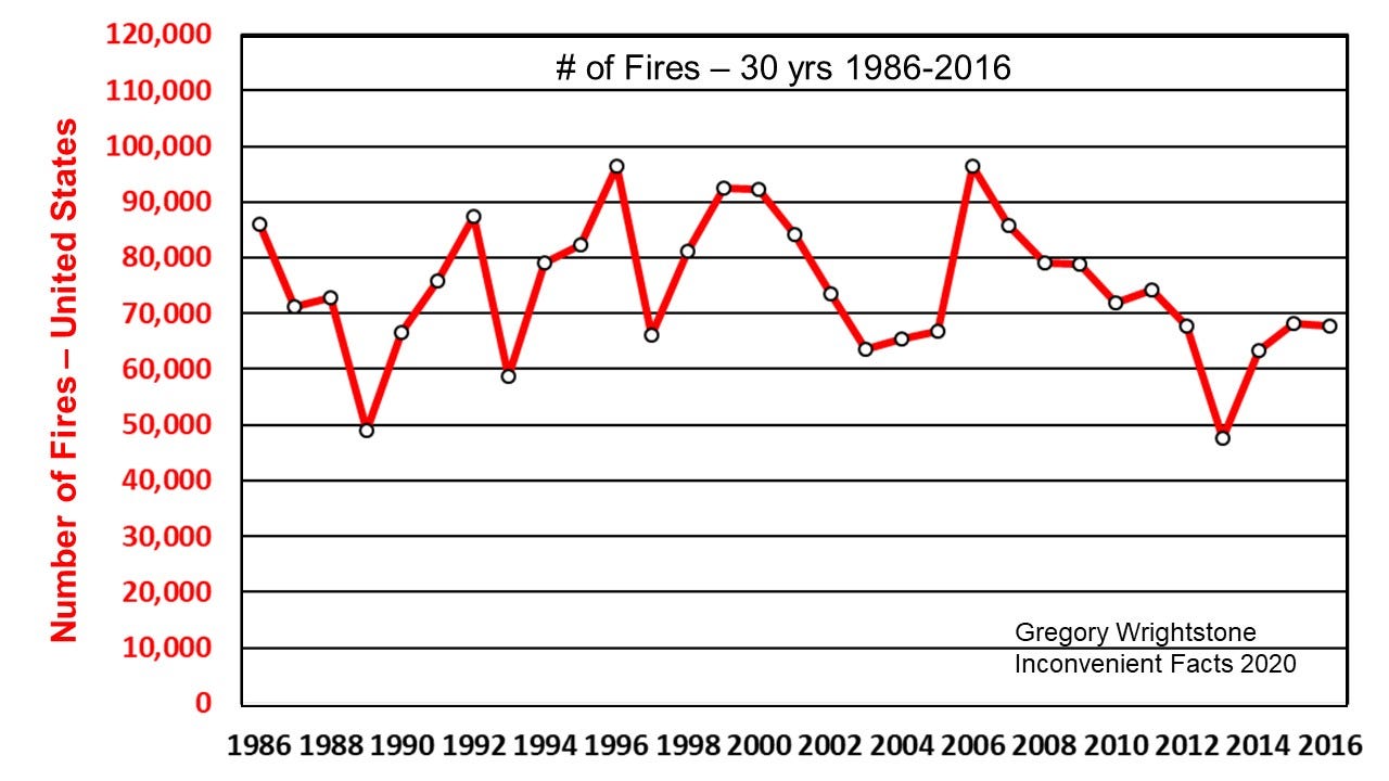
Figure 19 — Cherry picked data by MacDonald used to reduce decline in the number of fires — NIFC 2017
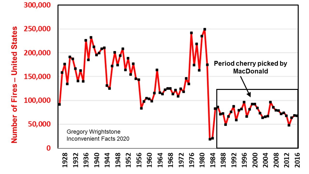
Figure 20 — Full chart to 1928 — NIFC 2017 & US Census Bureau
The charts shown above were derived from data accessed from the archives of the National Interagency Fire Center (NIFC). The NIFC states that data they present before 1983 is suspect. This is in much the same manner that NOAA warns against using late 19th and early 20th century numbers of tornadoes and hurricanes because they believe that these numbers were under-reported compared to today. It is likely that, before our modern reporting system, many fires went unreported, leading to an undercount in early years.
Subsequent to the publication of Inconvenient Facts, I discovered that the U.S. Census Bureau was responsible for cataloguing the number of fires and area burned during the period of 1928 to 1970. Inclusion of this earlier data allows us to chart data for an additional 40 or so years and confirms much higher fire numbers in the early 20th century and is presented below (Figure 21). Bear in mind that it is certainly likely that the chart under-reports this early data.
Confirmation of the validity of using both sources was made by noting the exact duplication between the Census data and the NIFC data during the period 1960 to 1970 as shown below:
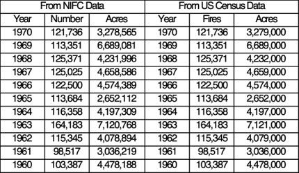
Figure 21 — Comparison of NIFC fire data to US Census Bureau data
MacDonald then digs an even deeper hole for himself by utilizing an even more egregious abuse of the “cherry picking” process by looking at only the most recent 32-year period for area burned in the United States, when nearly 90 years of data were available. By only reviewing the latest 30 years of data and then graphing it with a greatly expanded y-axis he charted what appears to be a large and alarming increase in the acres burned within the United States. According to him:
“It appears that while the number of fires has not increased recently, the size of the fires has increased dramatically. We really care about acres burned, not numbers, of fires.”
“In the chart of NIFC data above we see burned acres increased from around 2 million acres in 1984 to 7.5 million in 2016. This is a 275% increase.”
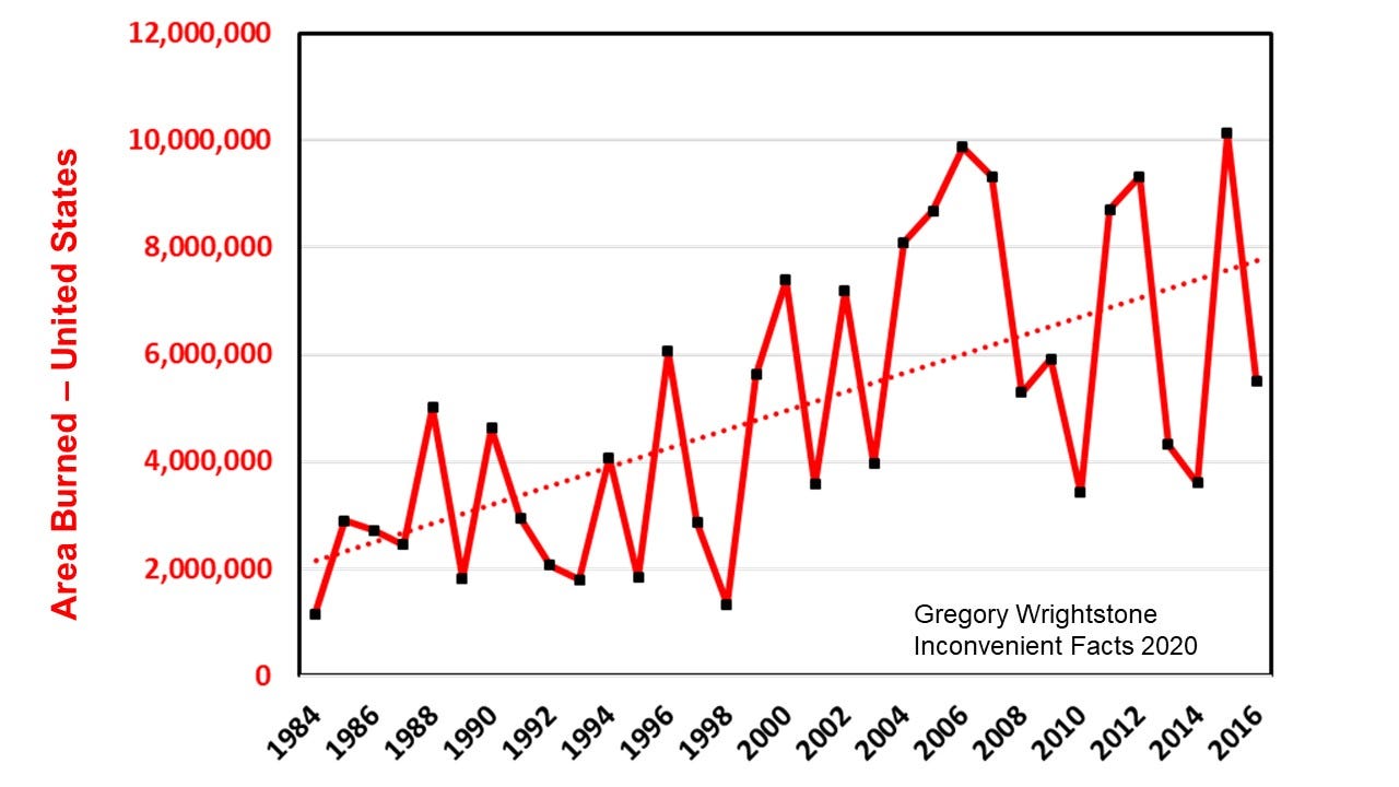
Figure 22 — Exaggerated chart of acres burned in the United States used by MacDonald — NIFC 2017
Placing the above chart into the full history of the data available (Figure 23) reveals quite a different story. The true and inconvenient revelation is that the area burned has also dramatically declined from more than 50 million acres to the current 6 to 10 million acres per year.
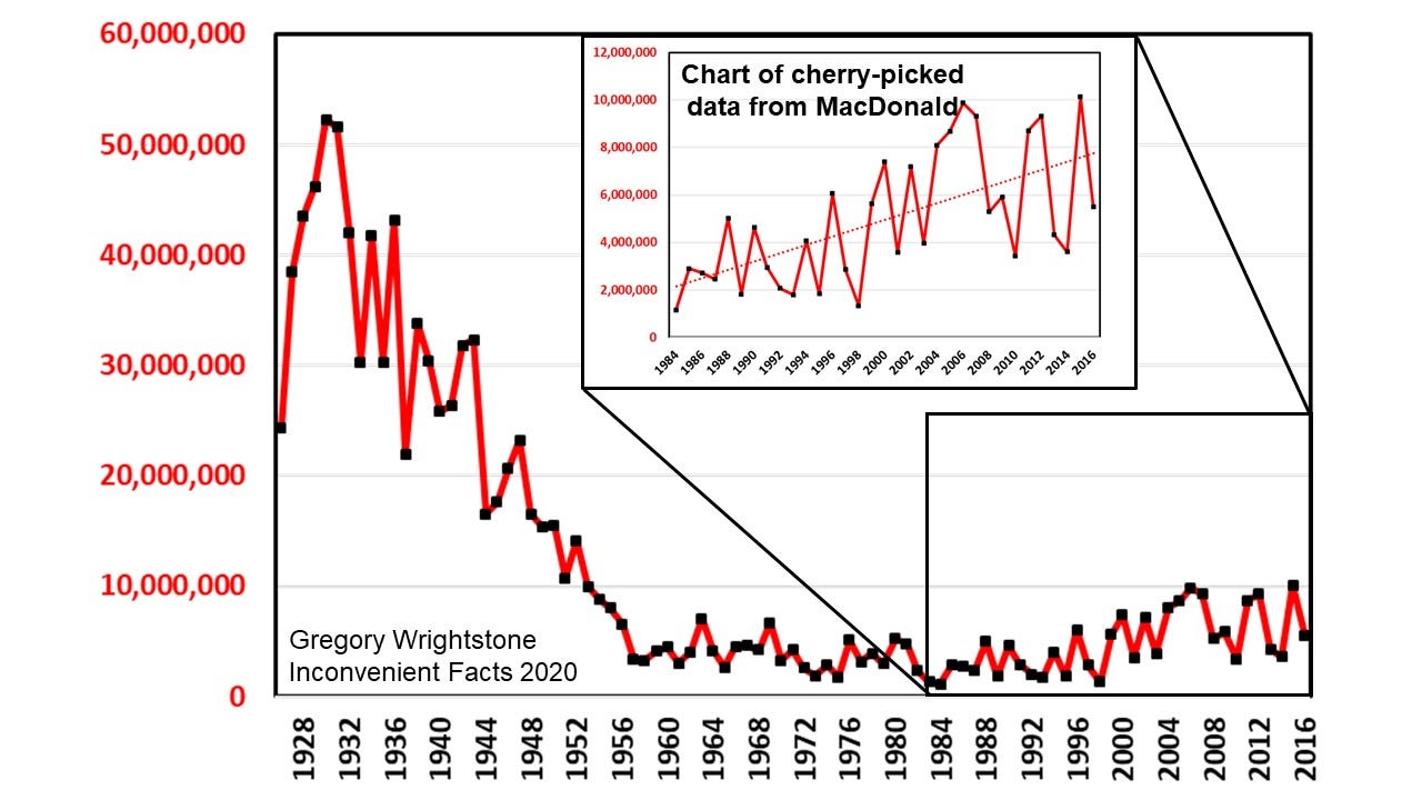
Figure 23 — Area burned NIFC + US Census Bureau data (inset from MacDonald 2019)
It is thought by experts in the field that the moderate increase over the last 30 years is a result of change in our forest management, rather than a result of our changing climate. According to the Sierra Nevada Conservancy (2017) “Overgrown, unhealthy forests are the underlying problem. Restoring our forested watersheds to a more resilient state offers the best protection for the future.” From their most recent publication:
· Today many Sierra forests host 300 or 400 trees per acre where there used to be 50 to 80.
· Overgrown and unhealthy forests provide optimum conditions for the spread of bark beetles.
· Fires that once revitalized forests are instead destroying them, resulting in massive amounts of dead trees.
Myth 7 — Ocean acidification is not a problem.
Once again, in attempting to refute the science within the pages of Inconvenient Facts, the author of Easy to be Tricked actually makes the case in support of its primary argument on so-called “ocean acidification.” The truth of the matter is that the oceans are NOT becoming acidic and WON’T become acidic except for a few isolated locations. According to MacDonald:
“Scientists are not concerned that the oceans will become acidic, becoming acidic means, by definition, a pH level below 7.0. Currently, the ocean has a pH level of around 8.1. “Becoming more acidic” just mean (sic) that it will drop, perhaps to 7.8. It is highly unlikely to drop below 7.0 any time soon.”
Thank you, Mr. MacDonald for stating what should be obvious: The ocean is firmly, consistently and historically alkaline (basic). Anything less than 7.0 on the pH scale is acidic and above that is alkaline. According to NOAA, the pH of the ocean’s surface waters has dropped from 8.21 to 8.10 since the start of the Industrial Revolution (NOAA 2020), hardly a dangerous decline and well within the natural variations that have been documented over several centuries of data.
The ocean’s pH varies depending on depth and geographic position and is generally slightly above 8.0 and is predicted by the IPCC’s own models to get all the way down to 7.92 pH by 2100, still quite alkaline and nowhere near acidic.
Any good climate change alarmist article on “ocean acidification” would not be complete without fact-free claims of pending oceanic disaster and MacDonald does not disappoint:
“Ocean acidification is happening, and it’s a serious threat to the coral, shellfish, and pteropods at the base of the oceans’ food chains and could lead to a collapse of the ocean ecosystem with serious consequences for humans that rely on food from the oceans.”
Or not. An example of the unfounded alarm described above was the recent reporting that rising acidity posed impending danger to Dungeness crabs. According to the Guardian, the “Pacific Ocean is becoming so acidic it is starting to dissolve the shells of a key species of crab.” A little research showed just how utterly false claims such as this are. According to the Food and Agriculture Organization of the UN, Dungeness crab must not have gotten the message about their imminent demise because their numbers are thriving and getting better (Figure 24). The most recent reporting year was the 7th highest since 1950.
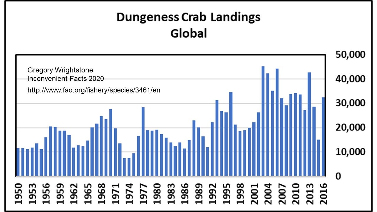
Figure 24 — Global Dungeness crab landings — UN FAO 2020
The primary assertion in Inconvenient Facts on the matter was a strong criticism of the term “ocean acidification” to describe this slight lowering of the oceans’ alkalinity. A more accurate description would be that our seas were becoming slightly less caustic, but that doesn’t gin up the public fear that is needed to impose economically crippling plans like the Green New Deal or the Paris Climate Accords.
Who is Gregory Wrightstone and why did he write this book?
It is in this final portion of Easy to be Tricked that Mr. MacDonald finally reveals his hatred for anyone who dares to provide science and data that contradict the idea of man-made catastrophic warming. If you are a scientist who disputes the “consensus opinion,” then you must be derided with distasteful names, like “denier,” which tries to link skeptical scientists to deniers of the Holocaust. Your credentials must be discredited, and attempts made to link you with fossil fuel-linked funding sources.
According to MacDonald, he describes me thus:
“Actually, he is not a scientist. He doesn’t have a PhD. And I was not able to find any peer-reviewed articles about climate change that he has authored. He has a master’s degree in Geology from the 110th ranked Geology program in the US based on the 2018 US News and World Report. Inconvenient Facts is self-published, and it is Wrightstone’s only book.”
“Gregory Wrightstone is not a scientist with authority, but he is impersonating one.”
“Wrightstone’s errors in interpreting the real science are so blatant when you scratch the surface that it’s clear he is being willfully deceptive and either hoping to make money or generate notoriety from a sensationalist book that skillfully mis-leads non-scientists, or he is being paid to produce this mis-information by a special interest. I have a hard time accepting that he actually believes what he has written.”
As to why I wrote the book: I did not set out to write a bestselling book about climate change. I set out to seek the truth about the subject and was shocked to learn that much of what we are being told by the mainstream media and government sources was just incorrect. The science and facts just did not support the notion of catastrophic man-made warming, and I set out to arm my readers with the inconvenient facts that I discovered.
It is true that the bulk of my early career was spent in exploration and development of oil and gas resources. It was a truly fascinating experience that allowed me to travel the world (and I was pretty good at it). I walked away from that exciting and productive career in 2016 in order to devote myself full-time to disseminating the inconvenient facts about climate change. At that time, my wife went back into the workforce for the first time in more than 20 years in order to help support us while I researched and wrote the book.
I take zero funding from any outside sources, either direct or indirect, despite what Mr. MacDonald falsely alleges.
My mission is to educate and inform those persons that are truly interested in learning the facts about our ever-changing planet. The Earth and humanity are thriving and prospering owing to our modest warming and increasing carbon dioxide, and that is a very good thing.
Sleep well. Earth and humanity are doing just fine, thank you.
Make sure to download the Inconvenient Facts smartphone app that provides many of the charts shown here and much more. For Iphone and Android.
Wrightstone: Qualifications, memberships and awards
Expert Reviewer Intergovernmental Panel on Climate Change — (AR6)
Bachelor of Science, Geology — Waynesburg University 1977
Master of Science, Geology — West Virginia University 1985
Cornwall Alliance for the Stewardship of Creation- Senior Fellow & Contributing Writer
Heartland Institute — Advisory Board member
AAPG (American Association of Petroleum Geologists) Division of Environmental Geosciences
AAPG Eastern Section — President 2010–11
2012 Distinguished Service Award honoree
2014 Presidential Award — Section’s highest honor
Pittsburgh Assoc. of Petroleum Geologists — President 1990–91, 1999–2001, 2007–2008
Geophysical Society of Pittsburgh
Geological Society of America
Appalachian Geologic Society — Vice President 1986
Pittsburgh Geologic Society
Houston Geologic Society
Ohio Geologic Society
LMKR Geographix Eastern “Champion” 2016–2020
Sources/References
Alley RB (2004) GISP2 Ice Core Temperature and Accumulation Data. IGBP PAGES/World Data Center for Paleoclimatology Data Contribution Series #2004–013. NOAA/NGDC Paleoclimatology Program, Boulder CO, USA. ftp://ftp.ncdc.noaa.gov/pub/data/paleo/icecore/greenland/summit/gisp2/isotopes/gisp2_temp_accum_alley2000.txt
Barnola JM, Raynaud D, Lorius C et al (2003) Historical CO2 record from the Vostok ice core. In Trends: A Compendium of Data on Global Change. CDIAC, Oak Ridge National Laboratory, U.S. Dept of Energy, Oak Ridge, TN, USA, http://cdiac.ornl.gov/ftp/trends/co2/vostok.icecore.co2
Beach R, Sulser T, Crimmins A, Cenacch Ni, Cole J, Fukagawa N, Mason-D’Croz D, Myers S, Sarofim M, Smith M, Ziska L. (2019) Combining the effects of increased atmospheric carbon dioxide on protein, iron, and zinc availability and projected climate change on global diets: a modelling study. The Lancet Planetary Health, 2019; 3 (7): e307 DOI: 10.1016/S2542–5196(19)30094–4
Berner RA, Kothavala Z (2001) GEOCARB III: A revised model of atmospheric CO2 over Phanerozoic time, IGBP PAGES and World Data Center for Paleoclimatology, Data Contribution Series # 2002–051. NOAA/NGDC Paleoclimatology Program, Boulder CO, USA.
Boden TA, Marland G, Andres RJ (2016) Global CO2 emissions from Fossil-Fuel Burning Cement Manufacture and Gas Flaring 1751–2013. CDIAC, Oak Ridge National Laboratory, U.S. Dept of Energy, Oak Ridge, TN, USA, DOI 10.3334/CDIAC/00001_V2010
Bojanowski A (2011) Der Spiegel. Retrieved 13 March 2019. UN Embarrassed by Forecast on Climate Refugees
Cook J, Nuccitelli D, Green SA et al (2013) Quantifying the consensus on anthropogenic global warming in the scientific literature. Environ Res Lett 8(2):024024
EPA (2016a) Palmer United States drought-severity index data. https://www.epa.gov/climate-indicators/climate-change-indicators-drought, accessed 2017 May 2
EPA (2016b) U.S. Annual Heat Wave Index 1895–2015, https://www.epa.gov/climate-indicators/climate-change-indicators-high-and-low-temperatures
Hao Z, AghaKouchak A, Nakhjiri N et al (2014) Global integrated drought monitoring and prediction system. Sci Data 1, doi:10.1038/sdata.2014.1
HadCRUT4 (2017) The Hadley Climate Research Unit (HadCRUT4) annual global mean surface temperature dataset, http://www.metoffice.gov.uk/hadobs/hadcrut4/data/current/download.html
Hulme M, Barrow E (1997) Climates of the British Isles: Present, Past and Future, Routledge Abingdon, Oxon,
Idso S (2020) CO2 Science Plant Growth Database http://www.co2science.org/data/plant_growth/plantgrowth.php
Jevrejeva S, Moore JC, Grinsted A, Woodworth PL (2008) Recent global sea level acceleration started over 200 years ago? Geophys. Res. Lett., 35, L08715, doi:10.1029/2008GL033611
Jevrejeva, S, JC Moore, Grinsted A, Matthews AP, Spada G (2014) Trends and acceleration in global and regional sea levels since 1807, Global and Planetary Change, vol 113, 10.1016/j.gloplacha.2013.12.004
Landsea C (2011) Hurricanes and Global Warming. Opinion piece on NOAA website: http://www.aoml.noaa.gov/hrd/Landsea/gw_hurricanes/
Legates DR, Soon W, Briggs WM et al (2015) Climate consensus and ‘misinformation’: a rejoinder to ‘Agnotology, scientific consensus, and the teaching and learning of climate change. Sci Edu 24:299–318, doi: 10.1007/s11191–013–9647–9
MacDonald W (2019) It’s Easy to be Tricked by a Climate Denier, Medium, https://medium.com/@willardm22/its-easy-to-be-tricked-by-a-climate-denier-a87ba4b4a087
National Oceanic and Atmospheric Administration NOAA National Centers for Environmental Information — United States Climate Reference Network USCRN (2020) https://www.ncdc.noaa.gov/temp-and-precip/national-temperature-index/time-series?datasets%5B%5D=uscrn¶meter=anom-tavg&time_scale=p12&begyear=2004&endyear=2019&month=12
NIFC (2017) National Interagency Fire Center — Total Wildland Fires and Acres (1960–2015), https://www.nifc.gov/fireInfo/fireInfo_stats_totalFires.html, accessed 04/2017
NOAA (2020) Understanding climate — climate change atmospheric carbon dioxide; https://www.climate.gov/news-features/understanding climate/climate-change-atmospheric-carbon-dioxide
Parker DE, Legg TP, Folland CK (1992) A new daily Central England Temperature Series, 1772–1991. Int. J. Clim., Vol 12, pp 317–342, www.metoffice.gov.uk/hadobs.
Pelejero C, Calvo E, McCulloch MT, Marshall JF, Gagan MK, Lough JM, Opdyke BN (2005), Preindustrial to Modern Interdecadal Variability in Coral Reef pH, Science 309, 2204, 2005
Sierra Nevada Conservancy (2017) THE STATE OF THESIERRA NEVADA’S FORESTS; https://acconsensus.org/wp-content/uploads/2017/03/State-of-SN-Forests-2017.pdf
Tans P, Keeling R, (2017) Trends in Atmospheric Carbon Dioxide. Earth System Research Laboratory (ESRL), Global Monitoring Division, NOAA https://www.esrl.noaa.gov/gmd/ccgg/trends/data.html
Tisdale R (2018) Extremes and Averages in Contiguous U.S. Climate: Graphs of 100 Years of NOAA Contiguous U.S. Climate Data (2018 Edition) — A Book That NOAA Should Have Published, independently published
United States Department of Agriculture 2020 — Carbon Dioxide Health Hazard Information Sheet; https://www.fsis.usda.gov/wps/wcm/connect/bf97edac-77be-4442-aea4-9d2615f376e0/Carbon-Dioxide.pdf?MOD=AJPERES
UN FAO (2018) Species Fact Sheet Dungeness Crab — United Nations Food and Agriculture Organization, Fisheries and Aquaculture Department http://www.fao.org/fishery/species/3461/en
Yang, J, Tian H, Tao B, Ren W, Kush J, Liu Y, and Wang Y (2014) Spatial and temporal patterns of global burned area in response to anthropogenic and environmental factors: Reconstructing global fire history for the 20th and early 21st centuries, J Geophys Res Biogeosci, 119, 249 263, doi:10.1002/2013JG002532.
Bravo, a good, and long read, which I’ll go back over more than a few times.
As for the “unbiased” guy who tried to smear you: just typical of Big Green.
Big Green has to divisions: the Dreamers and the Schemers.
The Dreamers are low information people with no math skills.
The Schemers are the ones taking the money from the Dreamers.
Nice. What the climatistas don’t recognize is that, with Coronavirus collapsing economies, governments are going to spend the next few years trying to repair the damage. There will no time for destructive climate schemes.
I just thought of a song: Green Scheme Believers.
Sung to the tune of ‘The Monkeys’.
You mean the one that goes:
“Cheer up sleepy Joe,
Oh, where can we go,
with your green scheme believers,
and a know-nothing schmo”
or something like that..
+42
Right-hand, made me laugh. The Monkeys had some good songs.
They were actually called “The Monkees.” Just FYI.
Love it. Now lets work on the corus with the “Minnisotans for global warming” bunch.
Erm.. that is the chorus. What we need is some verses..
Joel S,
I just wrote the lyrics (or, at least, my version). Now somebody needs to produce it:
Green Scheme Believer
Oh, I could lie and convene
All the lawyers on left wing
The doomsday clock alarm would always ring
And it rings and I rise
Wipe reality aside
My narrative is sharp and it stings
Fear up, whine and scream
Oh, what lies I stream
As a green scheme believer
And a home-wrecking queen
You should think of me
As a dark knight on his steed
I am so unhappy, you can see
Oh, and our bad times never end
Without dollar one to spend
But how much, baby, do we really need
Fear up, whine and scream
Oh, what lies I stream
As a green scheme believer
And a home-wrecking queen
Fear up, whine and scream
Oh, what lies I stream
As a green scheme believer
And a home-wrecking queen
+1 googol.
+ 1 MILLION
“Figure 1–400,000 years of CO2 history — Barnola 2003”
This graph is not even science. It merges ice core data with current Mauna Loa data, which is just wrong. It is based on the unfounded assumption that ice core data are absolute CO2 measurements of ancient atmosphere.
Jaworowski, a world expert on ice cores, has indicated that the trauma and microfracturing of ice cores being extracted from the high pressure of great ice depth can lead to CO2 losses of 30–50%. If you back calculate an average 40% loss into the ice core data, you end up with values the same or higher than now.
This graph should never be used except as an example of very bad, flawed science and the misleading conclusions that can be drawn.
How does this flawed science and the misleading conclusions differ from the Hockey Stick Graph?
Agreed. Ice core data may illustrate the timing of rises and falls of CO2, but not the absolute amounts. Comparing them directly to Mauna Loa is like comparing apples to spiders.
I also seem to recall they arbitrarily “moved” the period of time the ice cores were supposed to represent, because if they didn’t it showed a rise in CO2 that pre-dated Mauna Loa, and would have required a (post industrial) decrease in order to hit the Mauna Loa “start” point.
I concur! Well done, and thank you, Greg.
rip
>>> He does have degrees in computer science and electrical engineering, documenting an education appropriate to his line of work but not applicable whatsoever to discerning the complexities of climate or the long-term records of temperature and carbon dioxide.
Argumentum ad verecundium, a fallacy of logic meaning an appeal to authority.
Simply because this gentleman does not possess the degrees you believe are requisite, does not preclude him from arguing logically on this matter. (Irrespective of his misapplication of logic.)
This is the very thing that the alarmists do to dismiss valid arguments from skeptics and has no place here.
That aside, I had a bad experience with Vivint Solar and would give less credence on that basis.
I think Greg noted that because this was one of MacDonald’s arguments…
“Actually, he is not a scientist. He doesn’t have a PhD. And I was not able to find any peer-reviewed articles about climate change that he has authored. He has a master’s degree in Geology from the 110th ranked Geology program in the US based on the 2018 US News and World Report. Inconvenient Facts is self-published, and it is Wrightstone’s only book.”
“Gregory Wrightstone is not a scientist with authority, but he is impersonating one.”
Unless MacDonald’s only knowledge of geology comes from The Big Bang Theory TV show, he is utterly clueless about geology. It is a science and it is one of, if not the most, relevant subject regarding the context of climate change.
Doubling down on the fallacy doesn’t make it a good argument.
Showing that the original author is a flaming hypocrite is always a good argument.
It wasn’t an argument.
Wrightstone was certainly using it as one.
“When you have a case, pound the law. When you don’t have a case, pound the table”.
Climate alarmists are smear artists first and foremost, almost every one of them.
When they can’t deny the numbers, they try to deny the qualifications of those who are pointing out the numbers.
When they can’t deny the expertise of those people, they smear with ranking universities.
Then again, when one of your lead goons is a cartoonist, you don’t have much of a moral ground on which to stand.
Sounds similar to the childish retort “I know you are, but what am I?”
I wasn’t saying that McDonald didn’t double down on stupid with the argument, but replying with the same fallacy does not bring credulity to the subject.
If you wrestle with a pig you both get muddy, and the pig likes it.
It’s never a good idea to point out that the author is a hypocrite who is disqualified by his own arguments?
If the ‘Vivint Solar’ article writer, Willard MacDonald, is engaging in credentialism but is, in fact, the person in the discussion who is relatively *low* on credentials, that is at least worth pointing out.
It is *not* an ad hominem argument to point out that the verbal aggressor in this case, this ‘MacDonald’, has scotched his own credibility! You can call it a ‘pissin’ match’ if you want, but it is still relevant to note where the ‘and hominem’ implication came from in the first place!
The thing to note here is that I myself no reason to pick on anyone here in particular (i.e., in this particular argument/discussion of the significance of long term earth temperature trends). This is just one more example of green alarmist hypocrisy, that’s all.
The other issue, even before we get to the temperature part, is the assumed human cause of observed changes in atmospheric composition.
https://tambonthongchai.com/2019/11/16/agw-issues/
chaamjamal
You have once again made the most important point in this whole confusing controversy. None of the alarmist arguments are of concern if your statistical analyses are valid as they support the contentions of Selby, Harde, and Berry. Mr.Wrightstone has produced here a valid disputation of the criticisms aimed at his book and the facts and sources he gives us are enough to refute the hypothesis of CAGW but he has not addressed this most basic part of the hypothesis: that humans are causing the increased CO2 that is hypothesized as the cause of the warming. He is not alone in his implicit acceptance of that assumption. If the alarmists will not address this the skeptics should stress it at every discussion instead of ignoring or even accepting it outright.
I DO believe that the increase in CO2 is primarily from us and from burning fossil fuels. I embrace it and welcome it and you should as well.
Mr. Wrightstone
Why should I accept that if the evidence does not support it. If you do, please show us why. That demonstration needs to clearly refute Salby, Harde, and Berry. We are about to get another test as global emissions are going to drop due to Corona and I expect to see no evidence of that drop in the Mona Loa data.
4 links and my comment is in moderation. Mods, is there some sort of rule of thumb (👍) for avoiding this?
(would’ve given ferdinand engelbeen fits back in the day)…
It’s Mauna Loa (& mona lisa… 😉)
Mr. Gregory, first off happy feast day (gregory the great in the tridentine rite). Secondly, i’m just getting over the flu (maybe the wu flu?!) so i’m not at my level best. But, here goes anyhow:
i hope you’re aquainted with the derivative plot. (if not, too bad, just not enough gas in my tank right now to explain… 👎) Atmospheric carbon dioxide growth correlates with the SSTs of the southern ocean going back to 1958:
http://www.woodfortrees.org/graph/plot/esrl-co2/from:1958/mean:12/derivative/plot/hadsst3sh/from:1958/scale:0.253/offset:0.099/plot/esrl-co2/from:1958/mean:12/derivative/trend/plot/hadsst3sh/from:1958/scale:0.253/offset:0.099/trend
And here are the integrals of both:
http://www.woodfortrees.org/graph/plot/esrl-co2/from:1958/mean:12/derivative/integral/plot/hadsst3sh/from:1958/scale:0.253/offset:0.099/integral/plot/esrl-co2/from:1958/mean:12/derivative/trend/plot/hadsst3sh/from:1958/scale:0.253/offset:0.099/trend
Here we go back to the derivative plot, except this time we’ll extend the temperature data back to 1850:
http://www.woodfortrees.org/graph/plot/esrl-co2/from:1958/mean:12/derivative/plot/hadsst3sh/from:1850/scale:0.253/offset:0.099/plot/esrl-co2/from:1958/mean:12/derivative/trend/plot/hadsst3sh/from:1958/scale:0.253/offset:0.099/trend
And here we take the integral of the temperature back to 1850:
http://www.woodfortrees.org/graph/plot/hadsst3sh/from:1850/scale:0.253/offset:0.099/integral
At this point i’m going to stop as too many links will hang my comment up in moderation (if it won’t happen already). i’ll get back with the close of my whole comment when the above shows up…
Terrific(!) The thamn ding shows up 16 hours later (somebody buy this hoodlum a drink)…
(or how ’bout one of dem hard lemonades dat all y’all mods got in da fridge?)
Here’s part two to my comment that i broke in two (in the hope of avoiding moderation… 😖) Part one will hopefully show up later.
Here we have the actual data (mlo+law dome):
https://www.sealevel.info/co2.html
Ice cores tell us that CO2 stood at 287ppm back in 1850. Add to that the 125ppm that you see in my wood for trees graph (in the part of my comment that’s stuck in moderation) and we get 412ppm. The same as the above graph — all by a simple calculation from temperature.
Lastly, we have this graph a la middleton (don’t you jus’ luv dat guy?):
If you look closely, you can see that the temperature relationship holds going back 500 years where at that point it abruptly stops. With exactitude, higher temps correlate with accelerated carbon dioxide growth, low temps with slow growth (even going negative at times). The fact that the relationship ends abruptly half a millennium ago may indicate that there is more to deforestation than meets the eye…
Gregory – thank you for your contributions.
I am science trained (Nat Sci at Cambridge) although my working life has been in electronic engineering. This means I get both measurement techniques and 1/e time constants. I just read the Edwin Berry’s 2019 paper from start to finish with its beautiful fit of the decay of excess C14 from bomb tests and I found it shocking. Why? Because it demolishes the IPCC assumptions on where human CO2 goes or doesn’t go (including the ludicrous fraction that is supposed to stay in the atmosphere forever). So instead of assuming all of the extra CO2 from the past 150 years is anthropogenic in origin it instead concludes only about 1/6 of of this is from humans.
The corollary is that 5/6 of the extra CO2 is natural in origin – perhaps from a slightly warmer oceans? – I have no real idea. In any case the whole IPCC argument breaks down if this is true.
Can any of you experienced commentators throw more light on this? What do our alarmist friends have to say?
John, since watts’ comment page isn’t a quarter of what it used to be (and part one of my comment above your is still missing), i’ll break my part one in two as well. Just for you…
Here is the so called derivative plot. Atmospheric carbon dioxide growth rate correlates with the SSTs of the southern ocean going back to the inception of the MLO data set:
http://www.woodfortrees.org/graph/plot/esrl-co2/from:1958/mean:12/derivative/plot/hadsst3sh/from:1958/scale:0.253/offset:0.099/plot/esrl-co2/from:1958/mean:12/derivative/trend/plot/hadsst3sh/from:1958/scale:0.253/offset:0.099/trend
And here are the integrals of both (they form a nice match):
http://www.woodfortrees.org/graph/plot/esrl-co2/from:1958/mean:12/derivative/integral/plot/hadsst3sh/from:1958/scale:0.253/offset:0.099/integral/plot/esrl-co2/from:1958/mean:12/derivative/trend/plot/hadsst3sh/from:1958/scale:0.253/offset:0.099/trend
Part two (or should i say 1.2 or maybe 1.5?*) is on the way…
*ripshin, yer gonna drive the fonz to drinkin’ here
Here’s part two of part one. (oh, good grief):
Let’s return to the derivative plot (in my part one of part one… 😖), but this time we’ll extend the temperature data all the way back to 1850:
http://www.woodfortrees.org/graph/plot/esrl-co2/from:1958/mean:12/derivative/plot/hadsst3sh/from:1850/scale:0.253/offset:0.099/plot/esrl-co2/from:1958/mean:12/derivative/trend/plot/hadsst3sh/from:1958/scale:0.253/offset:0.099/trend
And then we’ll take the integral of that temperature data:
http://www.woodfortrees.org/graph/plot/hadsst3sh/from:1850/scale:0.253/offset:0.099/integral
Part two of my (original) argument is where we pick up from here. John, that is right above your comment. i’ll link it, but in yet another comment, so as to avoid moderation once again…
https://wattsupwiththat.com/2020/03/11/its-easy-to-be-fooled-by-a-climate-alarmist/#comment-2936175
So we’ve got this temperature relationship that goes on for 500 years. So, what might be going on here? Assuming that ice cores give us a good snap shot of co2 levels, what could be causing this relationship but only for the last 500 years? The relationship of temperature to CO2 in deep ice cores shows that a rise in temps of 1°C gives us just a 16 ppm increase in atmospheric concentrations. But, this is predicated on the growth of sequestering trees. A glacial has very few trees, an interglacial has many. Without trees we get an entirely different relationship of CO2 to that of temperature. And over the course of the last half millennium, we have cut down a lot of trees. Trees no longer properly perform their sequestrating function. Thus we get anomalously high levels of co2 and that, then, causes warming of the sea surface. Which, in turn, causes anomalous outgassing of the oceans, further warming & further outgassing (etc., a positive feedback loop). Once this feedback loop gets established, the compromised biosphere can no longer keep up and gets left behind in the carbon cycle dust. So, in essence, the oceans are freely emptying their co2 into the atmosphere, unimpeded now by the formerly sequestering (but, now decoupled) biosphere. When all is said and done, we can expect carbon dioxide levels to be in the thousand of parts per million. Unless, of course, we plant trees. Lots and lots (and lots) of trees…
John Dawson===>In any case the whole IPCC argument breaks down if this is true
the fonz===>Exactamundo! (whoa… 👍)
Here’s another graph a la middleton (gawd, i luv dat guy) of ice cores verses cumulative emissions:
According to ice cores, from 1750 to 1900 atmospheric concentrations rose 20ppm while emissions were just 5ppm. Over the last 120 years, given population growth, we could at least double, triple or even quadruple that number. Say, land usage or natural sources could easily account for half of the observed rise. More if there happens to be a temperature component (there is). This is one paradigm that could unravel the agw ball of yarn and i intend to unravel it…
@chaamjamal and DMA
BINGO! Again and again, there is the “assumption” of this “fact not in evidence.”
They infer it from the hydrocarbon… carbon composition of human production. Apparently, it’s the only plausible explanation for climate… weather cooling… warming… change in their models.
n.n
I’m not quite sure where you were going with this but if you intended to cite the “proof “that is often cited of the changing balance of carbon isotopes 12 and 13 being consistent with the increase being from anthropogenic sources you should check the Salby videos and Berry 2019 for the logic
and quantification analysis that refutes that argument.
DMA, simply put, a naturally warming world produces a lower C13 ratio on its own. Add to that deforestation and the simple fact that we are burning fossil fuels (w/o necessarily adding to the rise) and we get what we got. Lower C13 ratios…
“Assuming that ice cores give us a good snap shot of co2 levels”
Accepting that would be pretty gullible.
https://youtu.be/b1cGqL9y548?t=26m45s
See also time 1:12:15.
Anyone who start off talking about “myths” or “debunking” has an agenda. I don’t bother going any further.
Myths are a real thing and debunking myths is helpful and appreciated by people who are interested in reality, science and truth.
Skeptical thinking is a good thing.
Debunking is here the main issue
Worth a look.
Nasty piece of work, these electrical engineers. His attitude is that if you don’t have a PhD, aren’t working as an academic concentrating wealth generated by others in your own jeans, but working in industry generating the wealth that gives those who criticize us their lifestyle–never mind all the facts and credentials, you’re not a scientist??
Frankly, if people don’t see through MacDonald’s conflict of interest right at the start, they are fools. A real Foxy Loxy this solar industry entrepreneur, talking through the fence at fowls. I do wish more of you could see that cartoon; talk about life today imitating the art generated as a parody of life in the past. The barnyard has not advanced much; there have been a lot of minutes since 1943 for suckers to be born in.
Seem, he isn’t the brightest candle on the pie 😀
Len – I am not sure what to do. Should I pretend that I don’t have a PhD or pretend that I do? When setting myself up as an expert it seems both paths are open. Amateur commentators with no relevant experience or professional qualifications on relevant subjects frequently write extensively. From what I see and read, there is no qualification that places one person above another when it comes to setting forth clearly and carefully an opinion with supporting evidence.
If everyone can be an expert, then self-elevation or backbiting calumny has no truth-supporting weight. The arguments should stand on their own. The most irritating fool is a clever fool who is right all the time.
This story above is amazing – for the effort misspent trying undermine the progress made in public understanding of what is wrong with the climate alarm madness. As usual, the tools are misrepresentation, ad hominem, false comparisons and above all (as I read it) a pre-disposition to support a preferred conclusion.
‘One of those “at risk” island nations is the Maldives, where three new resort hotels are being constructed along with a new airport. This new Maldives construction has been completely financed and insured by companies that avoid risk like the plague. These companies have assessed the risk and are betting against the UN with hundreds of millions of dollars of their own capital.’
Not to mention people everywhere in the island continent of Australia continue to pay the highest prices for land and homes on the seafront despite some minute areas facing the inevitable storm damage and erosion due to localised vulnerability. Insurers have no trouble insuring them unless they back on to Eucalypt forest now and their owners show no sign whatsoever of panic selling and heading for higher ground. In fact quite the opposite with homes and land changing hands in a normal fashion for ever higher prices beyond the dreams and wherewithal of most.
Are all these high income high net wealth people all barking mad CAGW deniers because that’s what the climate changers are virtually saying with every tiresome epithet they can muster. Just have the guts to tell it to their faces and continually harangue them to see sense armed with all your voluminous doomsday tipping points and outpourings. After all these are your very movers and shakers to lead the poor ignorant deplorable masses out of the darkness and into the light so get cracking with them.
And it’s a disgrace that Australian Geographic reprinted this article (from The Conversation) by ancient mammal expert/climate activist, Tim Flannery on how he feels he is failing to convey to the public the extent of the “emergency”. Here is a scientist who’s area of expertise is utterly irrelevant to “climate science” yet is lauded as a visionary by the MSM.
https://www.australiangeographic.com.au/topics/science-environment/2019/09/why-tim-flannery-looks-back-on-his-20-years-of-climate-activism-as-a-colossal-failure/
Tim Flannery should view his weather/climate forecasting as a failure.
https://www.heraldsun.com.au/blogs/andrew-bolt/flannery-denies-what-he-actually-said/news-story/8f9ac2ed71c5b01470299510ce0de7f2
There’s no denying that there was a bit of a dry patch in eastern Australia recently but things seem to have shifted back to what is considered “normal” …if there is such a thing as normal Australian weather, accepting that it’s generally cooler than some places and quite a lot warmer than others.
https://www.seqwater.com.au/dam-levels
Rest easy people as I sit in my fireproof house at an altitude of 350m in the Kinglake Ranges – I am not troubled by sea level rise or the increased incidence of droughts and bushfires being driven by Global Warming (well thats what they mean when they say Climate Change). As a geoscientist I have long ‘denied’ the impact of ‘carbon’ on global temperatures or extreme weather – because the physics is wrong. It bothers me when politicians wish to blame our recent (not out of the ordinary) bushfires on ‘climate change’ when the theory of global warming is based on increased water vapour in the atmosphere leading to greater rain and soil moisture – not dryness or droughts. Our recent drought and fires owe more to the changes in the Indian Ocean dipole than to climate – although I note that even there some are making attempts to blame that on Climate even when we dont know what causes the IOD changes or El Nino etc. I accept that the bushfires were bad – but they happened in the same areas in 2003 and were predicted back in August last year due to the build up in fuel loads caused by insufficient prescribed burns. Politicians and retired Fire Chiefs would be keen to blame climate change before admitting that their own work was deficient.
Figure 4 — Temperature vs. Carbon emissions 1850–2017 — Source data: Temperature: HadCRUT4, CO2: Boden 2016
It’s pretty easy to make any two rising functions look like there’s a relationship if the Right and Left “Y” axes are jiggered to make them fall on top one another. It’s right in there with the quote from John von Neumann:
“With four parameters you can fit an elephant to a curve; with five you can make him wiggle his trunk”.
Figure 23 — Area burned NIFC + US Census Bureau data (inset from MacDonald 2019)
Bingo! That cherry pick starting out at some time after 1960 ignoring the Forest service graph
Figure 16-1 is a regular ploy of the Climate Cult.
Speaking of graphs, USCRN data from NOAA is down today. Lets see if a redo of Fig. 8 looks the same when they come back on. Theoretically USCRN data is engraved in stone.
Made up quote:
“Yes, we found a nearly insignificant problem with the data. We are going to correct the problem with a small adjustment.”
“No, you may not see the actual algorithm we are using for this process.”
““Yes, we found a nearly insignificant problem with the data. We are going to correct the problem with a small adjustment.”
“No, you may not see the actual algorithm we are using for this process.””
Yes, we found a nearly insignificant 1 degree problem with the sailing directions for this 1,000 km trip. We are going to correct the problem with a small adjustment.”
“No, you may not see the actual map we are using for this trip.”
The two processes are “non stationary”- that means they’re sums of cumulative values. It’s ALWAYS a mistake to run a correlation on non stationary events. One is LIKELY to get wee “P” values”.
https://www.svds.com/avoiding-common-mistakes-with-time-series/
I picked up a “randomizer” program from William Briggs’ blog, ran a correlation between a cumulative sum of 100 random numbers and the series 1 to 100, in “R” and got a “P” value of 2 e -16
“HIGHLY” significant if I didn’t KNOW it was the cumulative sum of RANDOM numbers, and the REAL correlation should be zero, If i had matched delta random number with time, I WOULD have gotten an insignificant correlation,
“It’s Easy to be Fooled by a Climate Alarmist”
So so true! They flipped reality completely upside down:
http://phzoe.com/2020/02/13/measuring-geothermal-a-revolutionary-hypothesis/
A nice summary.
Well done! This credo deserves to be read by every youngster exposed to the CO2 scaremongering, and by every adult who has lived through even more of it:
‘My mission is to educate and inform those persons that are truly interested in learning the facts about our ever-changing planet. The Earth and humanity are thriving and prospering owing to our modest warming and increasing carbon dioxide, and that is a very good thing.’
This is in such conflict with what CO2 alarmers would have us believe, that it ought to launch countless individual investigations into claims of our being on the verge of catastrophe.
Let’s hope so. More power to your elbow , Gregory Wrightstone.
I recently had a conversation (or rather was being lectured to) with an “ecology biologist” (whatever that is!) who was going on and on about man destroying the planet. I discovered during this conversation that the person was an avid botanist. I asked them what sort of food they liked and discovered they were a “mostly vegetarian but not religious about it”. So I asked them about CO2 and plants and at what level plants stopped producing and he gave an answer of around 150ppm. I asked him if he had heard of Le Chatelier’s principle and he admitted he had. After some further discussion of the horribleness of man, I asked if he knew we were currently in an interglacial period of an ice-age. He admitted that we were. I asked if he knew that sometime in the next 5 to 10 thousand years we would plunge back into the glacial phase of the ice-age. He asked what that had to do with the conversation. I told him that during the last glaciation, we were within 10-15 ppm CO2 of extinction and he accused me of making it up. I showed him the ice-core data and he was shocked. I also showed him that until the industrial revolution, we were running significantly below the CO2 curve for the last glacial period and that very likely we were saving all terrestrial life on earth with our CO2 emissions by assuring plant life would not die off in the next glaciation. We parted, but he looked rather worried as he walked away. I hope I shook his faith, but even facts don’t usually get through to the convinced in the horribleness of man.
That is generally what happens when I discuss the topic with a True Believer where the discussion is a) started in good faith by both of us, and b) the person has the math.
In one case, a brilliant guy who was programming our health care model started to get that “…but…why aren’t the experts telling me this?”
First, despite our increasing emissions of CO2, the rate of atmospheric CO2 increase remains linear, which means that we are having no effect on CO2 and the oceans are in charge.
Second, It is wrong to used ice core data to indicate past CO2 as they are no absolute measurements of past atmosphere, due to losses during ice core extraction from high pressures deep in the ice.
Third, the question can be asked regarding why atmospheric CO2 has been on such a huge downward trend for about 550 million years, down from ~7000 to 280 ppm. The assumption that there is some kind of natural equilibrium regarding CO2 is clearly wrong. There are mineralizing processes (chemical reactions) at work that are constantly trying to remove CO2 from the oceans and thus the atmosphere as calcium carbonate, as evidenced by the huge limestone Cliffs of Dover and the coral reefs in the US Midwest, as in Coralville, Iowa. The oceans are indeed sources of CO2 in the short term, as in an Ice Age (and its glacial and interglacial periods) but the removal would be complete, and us extinct, if it was not probably for CO2 emissions from the world’s many volcanoes.
The estimate is that just a few days of a large volcanic eruption could easily wipe out all human emission reduction ever. Indeed, a huge eruption has been conjectured to be possibly equal to all human emissions in the Industrial Revolution to now.
Charles, the prolonged downward trend in CO2 you mention is very alarming to me. Ocean reefs are carbonate factories (Dr. Jon Thorsen) and they work hard at removing oceanic CO2 and fix it as aragonite, a primitive calcium carbonate. This indirectly leads to atmospheric removal of CO2 as more goes into solution in seawater. The last glacial cycle terminated at 180 ppm CO2, dangerously close to the 150 ppm CO2 plant health minimum. Us humans can do ourselves, and our plant friends, a favor and get atmospheric CO2 up to around 1,000 ppm. In fact, as soon as I post this I am going to jump into my SUV and drive around the neighborhood, honking my horn, and therein confirming several neighbors fears about me. Press On! Press on the gas pedal, that is.
Very good, Gregory. I for one am grateful you retired and are working to inform the public of the truth of these matters. We lost Bob Carter and others, but you are well filling his/their shoes. Thanks so very much.
Figure 3’s red oval and its contents should probably be somewhat to the left, so the year zero points would be aligned.
Excellent summation of the overall situation!!!
MacDonald, eh? I always understood Scots to be skeptical, this one seems to have missed that trait, and he’s trying to make up for it by projecting. He pans the author’s qualifications while ignoring that he himself is utterly unqualified to critique the author. IF AGW warriors were somehow rendered incapable of accusing us of what they are doing everyday, they would find life very empty indeed.
I am simple in the head, which means that I am attracted to simple arguments. I always suspect that complex arguments are intellectual prestidigitation. All I want is simple answers to my simple questions. I already know they’re simple, but their simplicity is not a disqualifier of them, surely.
I’ve lived in Alberta for sixty years and sure, the climate has gotten marginally warmer in that time. This has been a good thing. Why would I think that, all of a sudden, the climate would drastically and catastrophically change, causing misery and chaos, when it hasn’t so far? How many populous cities are there south of Edmonton in North America? Got to be a least three hundred. All of them have warmer climates than Edmonton, and nobody in them is currently agonizing over their ostensibly inhospitable climates. So why should I worry if it gets warmer in Edmonton? Why is this a dumbbell question?
If hot weather is so bad, the further south you went in North America, the more people would be harmed by climate. If you lived in Texas, that would be hell on Earth, according to that theory. Why then do 28.7 million people live in Texas? Why is this a dumbbell question?
Why would anyone buy an electric car when they cost forty percent more to buy new than a comparable ICE car, and don’t work as well? Why is this a dumbbell question?
I have dumbbell questions. Give me some dumbbell answers. Don’t just ignore the questions.
Actually on the topic of electric cars I purchased a Tesla Model S75D 3 years ago, in the UK. My rationale? Firstly it contributes far less to urban pollution than an ICE vehicle. Secondly I tend to keep my cars for 10 years or so and, in that time, I expect to save about 1/3 of the cost price in reduced fuel bills. Service bills are also pretty minimal and the car is really relaxing to drive. 3 years and 45,000 miles in I do not regret this purchase and would HATE to go back to an ICE car in future.
Almost all of that fuel savings come from the fact that you aren’t paying road taxes.
Once ICE vehicles reach a non-trivial fraction of cars on the road, you can guarantee that this subsidy will be gotten rid of.
My service bills are trivial as well.
I wasn’t actually including Vehicle Excise Duty (aka road tax) in my remarks above, just basing it on fuel cost and lack of needed routine maintenance. All I need to account for is tyre wear (I got 33K miles from the first set) and windscreen wipers and fluid. The brakes should last the life of the vehicle due to strong regenerative braking.
In the UK a bit more than half of the cost of petrol or diesel is fuel duty and VAT; the economy 7 electricity I use for about 90% of the Tesla’s consumption is of course only taxed at 5%. Nevertheless the electricity cost of 2.5p per mile in the Tesla is pretty good – no comparable ICE car gets anywhere near 5p per mile in fuel costs, especially in the urban cycle.
I do accept that one day my costs will have to go up but not I think in the growth phase while our government is promoting EVs.
Maintenance savings is a lot less than you are claiming. In my experience, total maintenance is less than $200/yr, and much of that is spent on things that you would find on a electric car as well.
If you are spending most of your time driving around town, then you aren’t going fast enough to get much use out of the regenerative brakes.
It has always fascinated me how self-righteous people can get when they spend other people’s money.
You have never driven a decent electric car have you?
The regenerative braking works at any speed down to zero – it’s called one pedal driving.
Not interested in spending any one else’s money btw – just pointing out that my experience of an electric car, purchased entirely with my own hard earned cash, has been extremely positive.
John D:
Here in Arizona, USA elctric vehicles don’t pay any road taxes and get to drive in the high-occupancy lane despite having a lone occupant. But after pricing a used Tesla3 vs a new Sonata Hybrid (I have a 2011 Sonata hybrid) I’ve decided it would take 10-12 years of driving the Tesla just to break even due to the higher purchase price & insurance [despite the lower fuel & maintenance costs]. This calcualation assumes I don’t have to replace the battery in years 11-12 (out of warranty). But I love the way the Teslas drive!
MIT did a Nov 2019 review of battery electric vs ICE vehicles — and comes to a similar conclusion: BEV are not yet cost effective compared to an ICE vehicle.
https://energy.mit.edu/insightsintofuturemobility
it contributes far less to urban pollution
Exactly, the pollution is shared/shifted to less visible environments. It is a niche solution for transportation that displaces a better use of low efficiency batteries.
Well yes and no….. 90% of the electricity used to power the car comes using overnight Economy 7 electricity (I charge from 1am onwards) when about 1/3 of the generation is nuclear and a variable but not inconsiderable percentage is wind. The rest will be gas or perhaps the dreaded Drax “biofuel” i.e. woodpellets, notionally green. In any case my drain generates very little pollution in terms of NOx, SO2 etc. compared with fossil fuels used in ICE vehicles, especially when the engines of the latter are not fully warmed up.
Interestingly as I write this at just before midnight 45% of UK power is coming from wind, 19% from gas, 24% from nuclear (including France), 3% from hydro and 3% from biomass. Total UK power demand is now 26.1GW at 107 grams of CO2 per kWh. I am quite impressed 🙂
Ecological pollution is not limited to gases, notably wind turbines, but other low-density environmental incursions, and batteries are an inefficient means for energy transport.
15,000 miles p/a, so you just use it to go to the shops, Asda/Tescos/Waitrose and back, barely run in!
Ian, so right. As you travel up from Calgary you can see just where the corn stops being a crop and canola takes over. A degree or two would enable Canada to supply so much more food for people around the world who need it. Plus, less days in the winter of -20 or lower.
To an alarmist, talking about data that contradicts their narrative is “cherry picking”.
As anyone paying attention can easily discern, they themselves are well past the point of mere cherry picking supportive data.
They have long since graduated into outright lies, fake graphs and charts, fraudulent manipulation of historical data sets, speculating wildly and then proceeding as if their own speculations are facts, and just plain making stuff up.
I’m continually amazed that any geologist on the planet actually believes in this CAGW nonsense when they must have learned the historical CO2-temperature relationship in university. I guess it shows how powerful confirmation bias and pressure to conform can be.
Excellent debunking of the Eco-Nazi pseudo debunking of your book.
I would say it’s amazing how Mr. MacDonald accuses YOU of “cherry picking” when that is precisely what HE is doing in his baseless “arguments,” but it’s really just Standard Operating Procedure for the Climate Fascists. Classic projection on their part, as usual.
This part bothers me: “He has a master’s degree in Geology from the 110th ranked Geology program in the US based on the 2018 US News and World Report.”
That smacks of elitism. It is akin to saying “You didn’t go to Harvard, therefore your viewpoint is worthless.” It is an ad hominen — attacking the author because he didn’t some “elite” college. I guess from Willard MacDonald, unless you go to a prestigious school, you can never produce something extraordinary.
That’s actually step 2 in “Smearing Skeptics 101”
1) you aren’t qualified
2) you are qualified, just not AS qualified as the experts
3) you ARE as qualified as the experts, you you don’t publish as much as they do
4) you DO publish as much as they do, but not in the right places
5) you do publish in the RIGHT places, but not as often as the experts
6) you do publish as OFTEN , but you gave a speech once to a business group that received a donation from an oil company, and this OBVIOUSLY wipes out your expertise
BTW, Steve McIntyre actually not only graduated with a double math degree from “Canada’s Harvard” (U of Toronto, just ask it), AND studied at Oxford, but is disqualified because he worked for the mining industry.
Its almost as if Big Green isn’t as interested in actual math…
Which University did Einstein attend?
Nice job.
“The USCRN data (Figure 8) show that there has been no warming for nineteen years across the United States, dating to inception of data gathering.”
How does it do that?
USCRN only shows 15 years, and it shows a warming rate of over 0.3°C / decade.
“The first (Figure 4) is a chart often used by proponents of man-made warming to support their contention of a link between the rise of CO2 and increasing recent temperature.”
They shouldn’t be making that comparison. The expected link is between atmospheric concentrations of CO2 and temperatures. This is why ECS is defined as a fixed increase per doubling of CO2.
“A bit longer perspective (Figure 5) shows the longest available thermometer record dating to 1659 that reveals that our current warming trend began more than 300 years ago, and the supposed correlation disappears.”
CET does not show any real warming trend starting 300 years ago. Up to 1900 the trend is only 0.12°C / century. Between 1700 and 1900 there’s no positive trend at all – a 200 year “pause”. By contrast “our current warming trend” since 1950 is 1.7°C / century.
I’m an expert on all things climatological because I have a degree in Railway Engineering, write steamy novels and like flying about to major cricket matches. To me the climate thingy is a religion.
When I adjust the stove T higher, I never think it’s the gases above my stove that make it hotter. Why are some people so silly?
http://phzoe.com/2020/03/11/40-years-of-climate-change/