By Christopher Monckton of Brenchley
In the increasingly vain hope of success in flogging the dead horse Global Warming, revisionists are increasingly trying to pretend that climatologists’ original predictions of doom were accurate.
Here, I shall take a further look at the single most important prediction of them all: IPCC’s prediction of medium-term warming from 1990-2025 in its First Assessment Report.
When I recently pointed out that a revisionist paper praising models’ original predictions in fact proved they greatly exaggerate, faithful adherents of the New Religion piled in to try to say the original predictions were correct after all.
Here, for instance, is one comment, in a manner all too typical of the New Faithful:
Lord Monkfish, earl of obfuscation, refuses to share the data he used and the code he used to generate his charts. Maybe he will share 1) the ACTUAL DATA used in making the charts; 2) the actual code used in making the charts. Pretty simple. He won’t.
In the posting, I had published several graphs, only three of which were my own compilation. Contrary to the false allegation that I had “refused to share the data … and code”, I can now publicly confirm that I had previously received no request from or on behalf of Mr Mosher, or of anyone else, for any data or code connected with my posting.
Since Mr Mosher knew perfectly well that he had made no such request, and had caused no such request to be made on his behalf, and has not been in touch with me since my posting appeared, we may legitimately infer that his allegation that I “refuse” to share my material was a deliberate falsehood.
Such dishonest conduct is, alas, all too characteristic of the Thermageddonites as they panic in response to mother nature’s refusal to respond in accordance with their absurd over-predictions, and their creed collapses in festering ruins around them.
The first of my three graphs showed the simple mean of three monthly global mean temperature anomaly datasets from 1990-2018. The chart is plainly labeled showing that the three datasets were HadCRUT4, NCEI and GISS. The data are shown as a spline-curve. The least-squares linear-regression trend on the data was also plotted, showing that the period observed warming trend was equivalent to 1.85 C°/century.
Contrast this with IPCC’s midrange prediction of medium-term warming equivalent to about 3 C°/century, which is nearly twice as much. Give that prediction a Fail.
The second chart showed the UAH monthly global lower-troposphere temperature anomalies and 1.3 C°/century equivalent least-squares linear-regression trend over the same period, again compared with IPCC’s “confident” but failed 3 C°/century-equivalent prediction from 1990. Not only did the heading on the graph state explicitly that the data were from UAH: the unique resource locator for the data was given, in full, on the graph itself. Had Mr Mosher wished to verify the data, he had merely to follow the published link.
What then, was my secret, esoteric, hidden, undivulged, concealed, buried source for the warming predicted by IPCC (1990)? Well, it was – wait for it – IPCC (1990):

The facsimile above is from page xxii. A more precise medium-term prediction than “about 0.3 C° per decade” is given on page xxiv:

Here Mr Mosher will need the assistance of his kindergarten mistress, for some elementary arithmetic is necessary. We begin with the assumption that temperature in 1850, when the HadCRUT4 record began, was about the same as it had been in the IPCC (1990) preindustrial reference year 1750, as the data from the only regional dataset available for that period (Central England) tend to confirm.
Warming from 1850-1990, according to HadCRUT4, the only global data going back that far, was 0.46 C°. Deduct this from the 1.8 C° prediction to leave 1.34 C° predicted to occur over four decades from 1991-2030. The mean predicted rate is thus 1.34 / 4, or 0.34 C°/decade.
This more precise IPCC prediction is almost double the terrestrially-observed warming since 1990, and well over two and a half times the UAH observed warming over the same period. IPCC’s more precise prediction, then, must be marked down as a Fail a fortiori.
In case Mr Mosher wonders whether emissions have indeed followed a business-as-usual pattern, or whether all the chanting and moaning of his fellow-Thermageddonites has Saved The Planet, the truth is that ever since 1990 CO2 emissions have comfortably exceeded IPCC (1990)’s predicted business-as-usual trajectory from then till now.
My third graph, reproduced below, was captioned as it is here.

Projected midrange Charney sensitivities (CMIP5 3.35 K, orange; CMIP6 4.05 K, red) are 2.5-3 times the 1.4 K (green) to be expected given 0.75 K observed global warming from 1850-2011 and 1.87 W m–2 realized anthropogenic forcing to 2011. The 2.5 W m–2 total anthropogenic forcing to 2011 is scaled to the 3.45 W m–2 estimated forcing in response to doubled CO2. Thus, the 4.05 K CMIP6 Charney sensitivity would imply almost 3 K warming from 1850-2011, thrice the 1 K to be expected and four times the 0.75 K observed warming.
The 3.35 K CMIP5 midrange Charney-sensitivity prediction is the mean of the midrange estimates in 15 models of the fifth generation of the Coupled Model Intercomparison Project, given in Andrews et al. (2012). The 4.05 K midrange CMIP6 prediction is the mean of 21 models of the CMIP sixth generation, dated September 2019. Each of these 21 models was listed by name and quantity in my posting.
The 0.75 K global warming from 1850-2011, the year to which IPCC updated all its forcing data in time for its 2013 Fifth and most recent Assessment Report, is of course taken from HadCRUT4, the only dataset that goes back that far.
Though it is not generally realized, it is possible to use observational data such as these to derive directly the holy grail of climate-sensitivity studies, Charney sensitivity, which is the warming in response to doubled CO2, after all short-acting feedbacks have operated and the climate has returned to equilibrium. We don’t really need the models any more, because we have enough data. The method is set out (though defectively proved) in Lewis & Curry 2015.
All one needs to know is the warming from 1850-2011 (0.75 C°), the total period forcing (2.49 W m–2: IPCC, 2013, fig. SPM.5) the period radiative imbalance or unrealized forcing (0.62 W m–2: Smith et al. 2015), and the forcing in response to doubled CO2 (3.45 W m–2: mean of 15 CMIP5 models: Andrews et al. 2012).
The realized forcing, the difference between the total and unrealized forcings, was about 1.87 W m–2. Since the official midrange realized forcing and resultant warming are known (subject to the usual uncertainties), the equilibrium-sensitivity parameter is instantly derivable: it is simply 0.75 / 1.87, or 0.4 C° W–1 m2. The product of this value and the 3.45 W m–2 CO2 forcing (the mean of 15 CMIP5 models’ midrange estimates: Andrews 2012) is 1.4 C°. There or thereby, and not the currently-predicted 4.1[3.0, 5.2] C°, is the true Charney sensitivity. And, since the midrange anthropogenic forcing predicted for the 21st century is about the same as the CO2 forcing, 1.4 C° and not 4.1 C° is the warming we can expect this century, and only that on the generous assumption that all warming since 1850 was anthropogenic. Not exactly a crisis.
The 3 C° midrange Charney sensitivity predicted in IPCC (1990) was thus double the 1.4 C° that real-world evidence since then shows it should be, and the CMIP6 models’ currently-predicted 4.1 K is thrice what it should be.
At this point Zeke Hausfather, a longtime champion of the Party Line on climate and lead author of the paper purporting to demonstrate that the models had not exaggerated, weighed in, saying that his paper was showing how good the simple energy-balance model was, and not how good the general-circulation models were. In effect, he is saying that the predictions I have cited above from IPCC (1990) were based only on a simple energy-balance model and not on the general-circulation models.
That energy-balance model (green), as Hausfather’s own supplementary material shows, predicted 0.26 C°/decade, not 0.34 C°/decade, in the medium term:

A question arises. If the energy-balance model (EBM: green in the above reproduction from Hausfather’s supplementary matter) on which IPCC (1990) based its headline predictions itself predicted only 0.26 C°/decade global warming over the decades from then until now, why on Earth did IPCC (1990: purple line, omitted from Hausfather’s original diagram), on the basis of the EBM, say that the warming from then until now would amount to 0.34 C°/decade, precisely in line with the general-circulation models (GCMs: red) that Hausfather says it did not use?
Now you will see why I have taken the trouble to produce facsimiles of what IPCC actually predicted in 1990. For Hausfather’s revealing supplementary material shows that in 1990 it was the general-circulation models, not the energy-balance model, that predicted the 0.34 C°/decade medium-term warming that IPCC chose as its midrange prediction.
Yet his comment in response to my refutation of his paper maintains that IPCC’s headline medium-term prediction, which, as I have shown, was 0.34 C°/decade, was based on the energy-balance model:
“The Summary for Policymakers of the IPCC First Assessment Report only featured the simple energy-balance model. … The main text of our paper focuses on the primary projection featured in each IPCC report, at least before the Fourth Assessment Report.”
In fact, however, IPCC’s 0.34 C°/decade headline prediction in 1990 was in line not with Hausfather’s report of the energy-balance model’s 0.26 C°/decade prediction but with Hausfather’s report of the 0.34 C°/decade predictions made by the general-circulation models then prevailing.
Even the energy-balance model exaggerates the rate of warming. However, public policy is based on the significantly higher predictions of the GCMs and of the IPCC. The large difference between IPCC’s original prediction and the true rate of observed global warming can be seen in the diagram: it is the difference between the purple and pale blue lines on the diagram.
This episode nicely illustrates the problem we are dealing with. It is very easy for the New Faithful to recite their key mantras in the most naïve terms, whereupon their echo-chamber in the Marxstream media dutifully and unquestioningly regurgitates whatever nonsense they preach.
Here, for instance, is an extract from a posting entitled Beaten Down By Science, Deniers Turning To Science Fiction To Scare Their Followers, published at a notorious Communist website:
“… a post by Christopher Monckton … takes a swipe at a paper in Geophysical Research Letters that shows … that climate models from before the year 2000 have done a fine job simulating actual temperatures.”
The models, whether EBM or GCM or CMIP or IPCC, haven’t done a fine job. They’ve grossly over-predicted, particularly if, as I do, you reckon that the UAH temperature record (pale blue in the diagram) is the only one that remains honest. Now you have the facts.
To refute nonsense such as that which has been exposed here takes time and effort, and it is just sufficiently complicated to bore most people rigid. Then the New Faithful come back with childish, drive-by comments such as that of Mr Mosher and of the Communist website. Refuting these, too, requires time and effort so that the objective truth is eventually re-established.
Much of what passes for “climate science” is just like what I have exposed here: disingenuous at best and downright dishonest at worst. If Mr Trump wins this year’s election, he will set up the red team/blue team enquiry, under a retired Federal Appeal Judge, of which the liars and fraudsters are so visibly terrified, and with which they have hitherto leaned very heavily upon him not to proceed.
Rules of evidence will be followed. Each side will be able to present its own case and cross-examine its opponents. A proper hearing of both sides using the courts’ formal rules of procedure is perhaps the only way to prevent the serial disingenuousness and dishonesty that I have highlighted here, and to fix in place the goalposts of objective truth.
The sooner the better. Australia has lost much of its flora and fauna because for decades environmental extremists had let out the water from the dams, prevented new dams from being built, and savagely punished – with fines up to AUS$400,000 a time – those who had cleared the scrub from their land precisely to prevent the bushfires that have now done such damage.
Meanwhile, one in six of the world’s population dies 15-20 years before his or her time because there is no electrical power, and because nearly all of the world’s intergovernmental, central and merchant banks, citing global warming as their pretext for inaction, refuse to lend for urgently-needed coal-fired power stations.
The Thermageddon cult is thus a cult of death. Thanks to the vicious policy of refusing to lend for coal-fired power where it is desperately, urgently needed, there are perhaps one or two Holocausts of the powerless every year. By now, all or nearly all of those premature deaths could have been prevented by the universal availability of affordable, continuous, reliable, easily-maintainable, base-load, coal-fired electricity.
Nothing so rapidly, so securely and so permanently lifts a suffering third-world population from poverty, disease and premature death as universal access to electrical power. This is the first generation in which the outright eradication of primary poverty has become possible. The chief obstacle to the realization of that noble ambition is not climate change. It is wicked policies ostensibly intended to prevent it, based on exaggeration piled upon equivocation.
Given the brutal consequences for life, health and well-being driven by this cruel, hate-filled cult’s dishonest promotion of the central falsehood that small warming will do large damage, the truth being that even large warming would do much good, perhaps it is time to begin considering whether every dishonesty and fraud calculated to increase public support for, or to profiteer from, climate extremism should be prosecuted as an indictable criminal offense akin to conspiracy to commit murder, or perhaps even genocide. Enough is enough.
It appears apologists for the global warming scam are now arguing that “they never said it would get that hot” but, if that is the case, then why are they arguing to overturn modern industrial society to prevent vengeance from the weather gods? Either they think warming is out of control, caused by human activity and dangerous, or they have nothing useful to say and should go back to their grants and tea kettles and stop bothering the sane.
Also, what ever happened to ‘The Pause’?
John, “The Pause” is ongoing when you account for non-climate factors. Roy Spencer just has a post where 40% of all the warming in the UAH data was due to when the two major volcanic eruptions occurred. You still need to account for ENSO, PDO and AMO also adding to the trend.
You’re wrong. He didn’t use UAH data, he used sea surface temperatures. He didn’t use the whole globe, just the part between – 60 and 60 degrees latitude. And he used model data, which would beg the question of whether the phenomena you mentioned were included at all.
The Keeling curve shows a steady rise in atmospheric co2 of about 2ppm pr. year.
I think even IPCC says only less than 5 pct. of this rise in due to emissions from
human activities. The rest is from natural sources.
Am I mistaken ?
You can read my report by clicking on my name.
Am I mistaken ?
It’s possible you don’t understand the annual carbon cycle. It’s true that CO2 from fossil fuel burning only represents about 4% of total atmospheric CO2 and that CO2 from fossil fuels only represents about 4% on annual emissions but that is exactly what we would expect.
Each year about 150 GtC is removed from the atmosphere and replaced by another 150 GtC (+ a bit). The accumulation of the’bits’ has resulted in an increase of atmospheric CO2 since 1850.
1.4C would more or less harmonize with Professor Lindzen’s Iris paper prediction of around 1.1C for a doubling of CO2. Personally I go on the assumption that this prediction is valid and consequently I am very relaxed about climate consequences of ‘as usual’ behaviour.
In a normal world, Dr. Lindzen would be feted as the greatest climate scientist of all time.
Yes, but:
1) math is hard
2) hype is easy, and getting easier with every dumbed-down generation who can’t think critically
3) media and political power is based on knowing 1) and 2)
4) he gave a presentation once to a group that got some of its funding from an oil organization
5) 4) means he’s cancelled
Why?
It’s likely that the earth has already warmed by about 1 degree C since ~1850 and yet the current forcing from CO2 is only at ~2 w/m2. We’ve some way to go until the CO2 levels are double 1850 levels. It’s also quite possible there is warming in the system which is yet to be realised.
Note the above forcing value of 2.49 w/m2 is (a) wrong and (b) includes forcing from other ghgs – not just CO2.
“John Finn January 17, 2020 at 1:59 pm
It’s likely that the earth has already warmed by about 1 degree C since ~1850…”
How many thermometers were there, globally, to measure temperature in 1850 without the need for massive grid smoothing?
Irrelevant. We have plenty of recent observational evidence. e.g.
UAH shows 0.52 degree warming since 1979
CO2 levels in 1979 were ~337 ppm – now ~410 ppm
Forcing = 5.35 x ln(410/337) = 1.05 w/m2
Sensitivity = 0.52/1.05 = 0.5 w/m2
Forcing for 2xCO2 = 3.7 w/m2
DeltaT for 2xCO2 = 3.7 x 0.5 = 1.85 deg C .
(Note : this assumes NO further warming from energy imbalance)
John Finn, over 40% of the UAH warming is due to when two major volcanoes erupted. When you ignore known facts it appears you are being intentionally dishonest.
Now add in the major ocean cycles and you are left without much warming. Probably well within the accuracy of our measurement system.
Monckton has this bit absolutely right:
“Nothing so rapidly, so securely and so permanently lifts a suffering third-world population from poverty, disease and premature death as universal access to electrical power. “
Dr. Spencer seems to feel that Lewis & Curry 2018 adequately addresses any failings of the previous paper. link
More importantly than the microscopic temperature changes, did the world end?
And how many doomsday deadlines have we missed now?
Far too many! It’s about time we tightened things up and got properly doomed on time.
Let me know when we’ve reached the tipping point of missed doomsday deadlines. Or have we passed it:)
The goal of United Nation’s Agendas 21 and 2030 is to reduce the world population to 500,000,000 people. The United Nation’s climate policies seem to be helping them achieve that goal.
“Given the brutal consequences for life, health and well-being driven by this cruel, hate-filled cult’s dishonest promotion of the central falsehood that small warming will do large damage, the truth being that even large warming would do much good, perhaps it is time to begin considering whether every dishonesty and fraud calculated to increase public support for, or to profiteer from, climate extremism should be prosecuted as an indictable criminal offense akin to conspiracy to commit murder, or perhaps even genocide. Enough is enough.”
This needs to be repeated again and again and again…….
What role has the U.N played and how can we go about prosecuting those within the U.N. who continue to promote the falsehood.
From the article: “And, since the midrange anthropogenic forcing predicted for the 21st century is about the same as the CO2 forcing, 1.4 C° and not 4.1 C° is the warming we can expect this century, and only that on the generous assumption that all warming since 1850 was anthropogenic.”
And does anyone with any sense think that all the warming the Earth has experienced since 1850 was caused by human beings and CO2?
CO2 may cause some warming, but it certainly doesn’t cause all warming, so that 1.4C is too high by an unknown factor, depending on the difference between natural and CO2 forcings.
The IPCC says the warming that took place from 1910 to 1940 was mostly natural and CO2 was a minor factor at that time. During the period from 1910 to 1940 the temperatures warmed at the same magnitude and up to the same temperature level as the temperature increase from 1980 to the present. There is no unprecedented warming today.
So why should we assume CO2 is a bigger influence on our temperatues today, when the temperatures were just as warm as today less than 100 years ago, and got that warm without any major help from CO2 (according to the IPCC)?
Should we assume CO2 is a bigger influence today because CO2 is more plentiful in the Earth’s atmsphere today? Not necessarily. CO2 levels increased steadily from 1940 to 1980, yet the temperatures dropped for all those decades to the point that some climate scientists were starting to fear the Earth was entering into another Ice Age. That’s 40 years of CO2 increases while the temperatures fell. CO2 is the control knob of the climate? I don’t think so.
We shouldn’t assume that CO2 is the major player in the Earth’s atmosphere. We should assume that today’s conditions are duplicating the conditions in the 1930’s and doing so for the same reasons, which doesn’t include CO2 as a major player. That’s what a good scientist would do, until it was proven otherwise.
Let me guess – You’re an American. Am I right?
The warm 1930s only applies to the USA. It wasn’t as warm in Europe or most other parts of the world.
“It wasn’t as warm in Europe or most other parts of the world.”
Really? The hottest temperature ever recorded in Adelaide, Australia was in the 30’s. I don’t have time to look up other regions. On what basis is your claim made?
A lot of people don’t realise Adelaide is at the southern tip of the Simpson desert and northerly winds blast through there all the time.
“The hottest temperature ever recorded in Adelaide, Australia was in the 30’s.”
Just not true. The highest temperature ever recorded in Adelaide was 46.6°C, on 24 Jan 2019.
Adjusted Nick?
No.
This temperature record was made using the new instantaneous measuring thermometer that does not conform to the world standard of averaging over a few minutes. Since these thermometers have been installed there has been a ‘magical’ increase in maximums. The measuring station has also been moved from Kent Town recently leading to a siting change. The difference in temperatures to the nearby airport are typically higher and this can be as much as 6 degrees based on http://www.bom.gov.au/sa/observations/adelaide.shtml. BOM also homogenizes their measurements using the mysterious ACORN 2 process that shows hotter maximums than the ACORN 1 did and of course huge differences from the original records. All the temperatures from the 30’s have been homogenized way down as has been reported on this site and others.
“hottest temperature” is weather. It could be caused by a combination of factors. I think a case could be made that the highest recorded UK temperature was in 1911.
The CO2 only attacked America 😉
“The warm 1930s only applies to the USA.”
Yes, I am a happy resident of the USA, and the warm 1930’s was a global event, at least to the extent that we have records. The records we have show the 1930’s were just as warm as today.
This means we are not experiencing unprecedented warmth today, the world has been here before, with no lasting dire effects, and no evidence that CO2 is having any measureable effect at all. In other words, CAGW (Catastrophic Anthropogenic Global Warming) is dead, if it was just as warm in the past as it is in the present, and it *was* just as warm in the recent past as it is in the present.
Here are a few examples for you:
Tmax charts
US chart:
China chart:
India chart:
Norway chart:
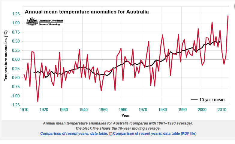
Australia chart:
These graphs show highest max temperatures – not MEAN or MEDIAN temperatures.
Also what is the source for these graphs. Bob Tisdale isn’t the original source.
“These graphs show highest max temperatures – not MEAN or MEDIAN temperatures.”
Well, if you want to know what the warmest temperatures are then you look at a Tmax chart.
Are you denying what the Tmax charts show: That the 1930’s or thereabouts show to be just as warm as today?
Do any of those Tmax charts look like a fraudulent Hockey Stick chart (see below)? How does one get a Hockey Stick chart temperature profile out of those Tmax charts? Answer: Fraudulent Manipulation of the Data.
Bogus, Bastardized Hockey Stick
Further to previous reply. Look at the 12 month & decadal TMAX moving averages., e.g. the US
http://berkeleyearth.lbl.gov/regions/united-states
Berkely Earth produces a bogus, bastardized, Hockey Stick chart. It represents a False Reality. I reject False Realities. They are not good for one’s mental health.
How can you tell if you are looking at a bogus, bastardized “Modern-Era” Hockey Stick global temperature chart?
The easiest way is to look at the 1930’s. If the 1930’s do not show to be as warm as today, then you are looking at a Big Lie.
You can also look for the cold 1970’s. If the chart does not show the 1970’s to be exceptionally cool, then you are looking at a Big Lie.
Here is the bogus, bastardized Hockey Stick chart:
And here is a U.S. surface temperature chart (Hansen 1999), in case you thought only Tmax charts show 1930’s warming::
Here’s where that Hansen 1999 chart originated: Note Hansen’s lame explanation for why the US surface temperature chart and the Hockey Stick look so different.
http://www.giss.nasa.gov/research/briefs/hansen_07/
And here’s the AMO chart. I threw this in because you claim the U.S. is different from the rest of the world, but as you can see, the AMO is a “mirror-image” to the U.S. surface temperatue chart profile, in that it shows the warm 1930’s and the cool 1970’s plainly.
AMO Chart:
See, the Climategate Charlatans, in order to change the profile of the temperature charts, in their efforts to make it appear that the Earth is experiencing unprecedented warmth caused by CO2, had to cool the 1930’s into insignificance, but in order to retain the magnitude of the hot and cold changes, when they lowered the 1930’s on the chart, they had to raise the 1970’s, so they in effect erased both the 1930’s warmth and the 1970’s cooling in order to create their bogus, bastardized, fraudulent Hockey Stick global temperature chart.
No other unmodified chart on Earth resembles the “hotter and hotter” profile of the Hockey Stick chart. All the unmodified charts show the warmth of the 1930’s and the cold of the 1970’s.
If you are looking at a Hockey Stick chart, you are looking at a Big Lie. If you are using a Hockey Stick chart for serious science, you are wasting your time because you are dealing in a false reality and your results won’t resemble reality any better than the Hockey Stick.
John,
Exactly what does the “mean of daily high temperature” actually tell you?
Is it actually telling you what Tmax is?
Remember, means and averages simply don’t tell you anything about what the extremes are. Averages and means represent a loss of data. Averages and means don’t tell you much abut what is happening at the edges which is where the actual impact of increasing or decreasing temperatures occurs. The daily mean maximum temperature can go up by having more warm days, not just more hot days. You just can’t tell what is actually happening.
Here is a somewhat wider look:
https://realclimatescience.com/2019/10/time-travelling-climate-scientists/
“The records we have show the 1930’s were just as warm as today.”
No they don’t:
I feel sure you and many on here will persist in thinking that a Blog dedicated to being anti-AGW, really has all the answers, and that the bizarre conspiracy theory of fraud and/or incompetence answers all questions.
But, actually, as common sense should tell if it were not for raging cognitive dissonance – temperatures now well exceed those of the 1930’s out side of the USA. And the USA is far from being a proxy for the globe.
China:
https://iopscience.iop.org/1748-9326/12/6/064005/downloadHRFigure/figure/erlaa68e8f7
https://iopscience.iop.org/article/10.1088/1748-9326/aa68e8
India:
https://archive.indiaspend.com/cover-story/mumbai-average-temperature-up-2-4-c-over-124-years-23335
Norway:
https://folk.uib.no/ngfhd/Climate/climate-tnor00.html
Australia:
All of these charts give MEAN temperatures, and some are anomalies and not even actual temperatures. An average or mean hides what actual temperature truly are. The mean can go up from having more warm days, not just from having higher maximum temperatures.
The data you have given tell us more about how long the growing season is but not whether the earth is actually getting hotter and hotter. Only a graph of the *actual* Tmax temperatures can tell you if it is getting hotter. And Tom Abbot’s graphs show that maximum temperatures are no higher than they have been in the recent past.
Also all of those charts are meaningless in the context of the current discussion.
For example, look at the ones from India: The first figure shows data from the four largest cities in India. Does anyone think that looking at temperature data from gigantic cities that are now industrialized concrete jungles with massively expanded populations are a good way to assess changes to the temperature of the entire surface of the Earth and of the atmosphere over time? Ever hear of UHI?
Other data in these links is similarly dubious…they are from the very organizations and data sets being refuted in this discussion.
On the subject of bizarre ideas and cognitive dissonance…you are the one dismissing the entire body of historical documentation in favor of the revisionism of people who are employed by what has become a massive and well funded industry, all centered around one basic idea.
The only thing unusual about the weather these days is the number of people who have made it their life’s work to try to scare people about it, and the number of people who believe something for which all of the evidence has been manufactured out of whole cloth.
Do you take advice about automobiles from the guy who makes his living selling them?
Tom Abbott,
The chart for India shows the warmest year was in the early 20s and the second coldest year was in the 30s.
The Norway chart shows 1941 as the warmest year, and the warmest 1930 temperature has been beaten twice this century.
The Australian chart only shows one really hot year in the 1930s and 5 years during the 30s where a lot colder than any year since 2001.
In any event these charts are not showing average temperatures, only max, and I assume only a single month for each year. Also they only go up to 2012, so I find it difficult to see how this establishes that the 1930s where globally warmer than current temperatures.
No nation’s temperature record looks exactly the same as another.
The most important thing they have in common is they all show it was just as warm in the recent past as it is today. CAGW is dead.
As you say, regional temperatures are all different, which is why you need some evidence to support your claim that the 30s where as warm as today across the globe.
If your only evidence is looking at single warmest months, then it’s inevitable that you will be able to find many countries that had a single warm month at some time in their past tayt is as warm or possibly warmer than current warmest months. It’s just variability, and tells us nothing about whether any decade was warmer than today.
Thanks for the data, Tom. I have saved these links.
“The warm 1930s only applies to the USA.”
You have go to be kidding.
One thing is for sure…in places where the population is far more gullible and credulous, and historical temperature data more sparse, it was far easier to adjust away past warmth and exaggerate recent warming.
Any discussion of historical temperature data which does not closely examine what was universally accepted as true prior to the advent of global warming alarmism, is simply not credible.
There are long lists of individual station data sets which look just like Reykjavik, and many of them which have been subjected to attempts at historical revisionism.
This is one example, there are many…including for the southern Hemisphere in such locations as South Africa.
By the late 1980s, no one was disputing that several decades of cooling had erased all of the early 20th century warmth…not just in the US, but globally as well.
https://realclimatescience.com/2019/03/nasa-tampering-with-reykjavik-raw-temperature-data/
Luanda and Capetown adjustments, and unadjusted time series data:
https://realclimatescience.com/2016/09/nasa-joins-in-the-noaa-african-fraud/
Historical records show that ice was melting and glaciers retreating rapidly all over the world, including in Europe and the Arctic, in the 1920s, 1930s, and 1940s.
By the late 1940s these trends were reversing…also all over the world.
The documentation is extensive.
The efforts to change the past are revealed.
And besides for documentation…there are plenty of us who REMEMBER very well what was written in the textbooks we studied back in the early 1980s and prior years.
Newspapers from all over the world describing current events over decades of time…year after year after year…those are unaltered records from the past by people with no agenda except to report the news.
Why should anyone accept for even one second revisions to history from people with an agenda and a failed hypothesis on the line?
https://realclimatescience.com/overwhelming-evidence-of-collusion/
From your link:
“International Team of Specialists Finds No End in Sight to 30‐Year Cooling Trend in Northern Hemisphere
New York Times, January 5, 1978
The report, prepared by German, Japanese and American specialists, appears in the Dec. 15 issue of Nature, the British journal. The findings indicate that from 1950 to 1975 the cooling, per decade, of most climate indexes in the Northern Hemisphere was from 0.1 to 0.2 degrees Celsius, roughly 0.2 to 0.4 degrees Fahrenheit.”
Thanks for all those links, Nicholas. I found the above excerpt particularly interesting. We have official records that show temperaures cooled for decades from the 1940’s to the late 1970’s, yet this cold time period doesn’t even register on the bogus, fraudulent Hockey Stick chart. If you were looking at a Hockey Stick chart the 1970’s looks like a warming period.
Yes, we have documented evidence of the cold decades from 1940 to 1980, yet the bogus Hockey Stick chart completely downplays this cold temperature extreme. The alarmist data manipulators erased it from the official record.
Imo, I believe that recent criticsm on this issue has caused Michael Mann to come out and try to fool people into believing there was no exceptionally cold period that ended in the late 1970’s. Mann has rewritten history in the past and he’s trying to do it again, but I don’t see how he is going to be successful considering all the evidence available to refute his contention.
But, the Leftwing Media is a powerful thing, so Mann wll get some traction no matter how blatant the lie is.
The bogus, bastardized Hockey Stick chart is below. It shows the Data Manipulators changed the significance of the 1930’s warmth, the 1970’s cold spell, and the warmth of 1998, all in an attempt to make it appear that temperatures have been climbing steadily for decade after decade and claiming all this is caused by human-derived CO2.
The alarmists would have a hard time explaining their CO2 theory if it was understood that CO2 amounts in the atmosphere had been climbing steadily from 1940 to 1980, yet the temperatures declined all during that time period, so erasing the cold of the 1970’s would serve the alarmists’ purposes. And they erased it.
The truth is the temperatures climb for a few decades and then they decline for a few decades and then they climb again, all within certain upper and lower bounds for the last few hundred years anyway, where we have fairly adeqate records. We should assume that is what the temperatures will do in the future (repeat past patterns) until demonstrated otherwise.
The Hockey Stick is a HUGE HOAX that has managed to fool too many people. One of these days it will all come out in the wash.
Gee, were predictions made with 1990s technology successful? No
The great thing about predictions is they are almost always wrong.