Guest Post By Javier
A no-assumptions look at the global warming evidence helps clarify the possibilities.
The planet’s surface has been warming since the depths of the Little Ice Age, and particularly since ~ 1850 AD. The surface temperature record, however incomplete or uncertain, reflects this warming. Hypotheses about why the warming is taking place can be grouped into three general categories:
- The energy input is increasing. This is the basis of the variable solar output hypothesis.
- The energy output is decreasing. This is the basis of the greenhouse gases hypothesis.
- The transfer of heat within the system is changing. This is the basis of some hypotheses for a reduced vertical exchange in the ocean, or for changes in the oceanic currents that redistribute the heat.
A combination of these categories cannot be ruled out.
Whatever causes the temperature change must necessarily affect its rate of change, the velocity at which temperature changes over time, measured in °C/decade. A velocity that varies continuously and can be positive (warming) or negative (cooling).
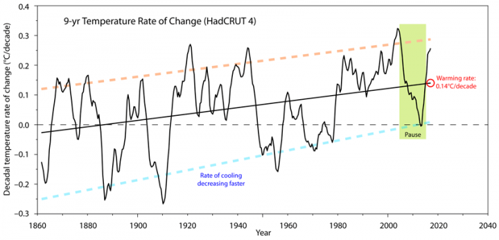
Figure 1. 9-year global surface temperature rate of change (4-year averaged) in
°C/decade. The Pause is indicated by the khaki box. Source: Met Office UK, HadCRUT 4.
There are two features in the evolution of the temperature rate of change since 1850 (figure 1).
- A long-term increasing trend, represented by the linear adjustment, that indicates the warming has been progressively accelerating. The current rate is 0.14°C/decade.
- A very variable rate that indicates that the surface of the planet does not warm continuously but through periods of warming interrupted by periods of cooling.
These two features have been described with the analogy of a man walking his dog. The man’s path being the long-term trend, and the dog’s path the variability around that trend. There is an apparent but irregular periodicity in the temperature rate of change, meaning that the dog does not move at random. Periods of warming and cooling are of roughly 30 years each, constituting the known 60-year oscillation.
Additionally, during each 30-year period there is a reversal in the direction of temperature change, that goes through a period of change in the rate opposite to the main oscillation. This behavior of the data can be graphically represented by a curve oscillating with these characteristics (Figure 2, thick grey curve).
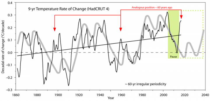
Figure 2. 9-year global surface temperature rate of change (black curve) and 60-year oscillation (grey curve). The analogous position to the present in previous oscillations is shown with red arrows.
What we call the “Pause” is just the latest change in the periodical behavior of the temperature rate of change. Something that should be expected simply as an extrapolation of past behavior. However, assumptions taken about the cause of global warming precluded most scientists from simply extrapolating past observations. Further extrapolation suggests the Pause is the beginning of a non-warming period that should be ~ 30 years long.
The examination of the evidence without assumptions leads to the following observations:
- The surface of the planet has been warming in a linearly accelerating way since 1850. The long-term rate of warming is currently 0.14°C/decade.
- Periods of higher rate of warming alternate with periods of lower or negative rate of warming in an irregular ~ 60-year oscillation.
- The rate of warming presents also a ~ 20-year oscillation, and usually inverts its direction of change after about a decade.
Now we can start testing possible causes. The leading candidate according to most climate scientists is the anthropogenic increase in GHGs. By comparing the temperature rate of change with the increase in the main GHG, CO2, we can see that this affirmation is not supported by the evidence (figure 3).
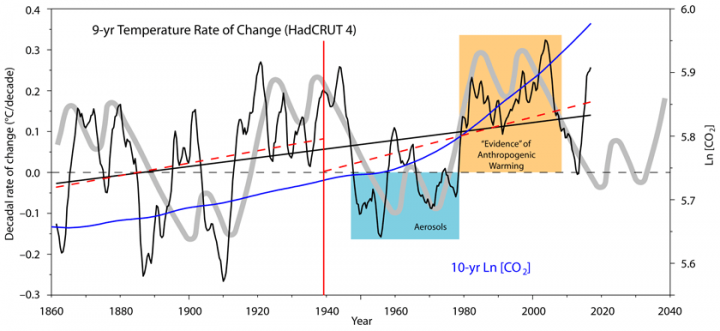
Figure 3. 9-year global surface temperature rate of change (black curve, LHS) and 10-year change in the natural logarithm of atmospheric CO2 concentration (blue curve, RHS). The logarithm better represents the changes in forcing by CO2. The red dashed lines are the linear adjustment to the black curve for each half of the data. Source: 1850-1958 Law Dome. 1959-2017 NOAA.
We can see why many scientists are mistaken about this issue. The increase in CO2 since the 1960s coincides with a period of increase in temperature rate of change (orange box in figure 3). They just needed to explain away the prior cooling (blue box in figure 3) which they did by using aerosols, a byproduct of the early global
industrialization. However, by looking at the long-term rate of change we can see that the increase in CO2 cannot explain the increase in warming from 1850-2018. Most of the CO2 increase has taken place in the second half of the period, while both halves of the temperature data are not significantly different and have a similar slope in their linear adjusted rate of change (dashed red lines, figure 3).
Obviously, the increase in CO2 cannot explain the 60-year oscillation either. This oscillation is also unlikely to have a solar origin, as there is no 60-year solar periodicity. It may have an oceanic origin, since it is present in some oceanic indices. Alternatively, it could be caused by an oceanic-atmospheric interaction.
Solar variability can be related to both the long-term increase and the periodical oscillation in the temperature rate of change (figure 4). It is at least plausible that it contributes to both.
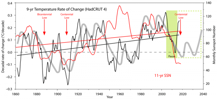
Figure 4. 9-year global surface temperature rate of change (black curve, LHS) and 11.1-year averaged monthly sunspot number (red curve, RHS). The position of the lows from two well known solar periodicities are indicated by red arrows. Source: Silso.
Measuring solar activity by its proxy, the 11-year averaged monthly sunspot number, we can see a long-term increase in solar activity since 1850, matching the increase in rate of warming. Additionally, the oscillations in solar activity are compatible with the oscillations in the temperature rate of change, particularly during the first 80 years of the record and the last 40. However, the 40 years in between are in clear disagreement.
Periods of very low solar activity in the 170-year record coincide with periods of low or negative temperature rate of change. It is possible that the 60-year oceanic oscillation is paced and reinforced by the periods of low solar activity and the oscillation then continues through the periods of higher solar activity.
The CO2-hypothesis is an atmospheric hypothesis of climate, where the atmosphere acts as the main controller of how much energy enters or leaves the system. Its main contender is the oceanic-solar hypothesis of climate, where the oceans control the surface temperature and do so by integrating the changes in solar output and deep ocean heat exchange. In this hypothesis the oceans are quite sensitive to small solar changes but also to other factors (clouds, wind, upwelling) that can determine a different response at times. The climate control by the oceans
could compensate, in great measure, for changes in atmospheric non-condensing greenhouse gases, like CO2. This would explain the thermal homeostasis of the planet during the Phanerozoic Eon, when great changes in solar output and GHGs took place.
In conclusion, a no-assumptions look at the evidence of warming shows that solar forcing has changed during the period 1850-2018 in a more consistent manner with the warming rate than CO2, and thus constitutes a better candidate for the main cause of the observed warming. There is insufficient evidence to evaluate other possibilities over the entire period.
In other words, we don’t know what causes climate change, and there is evidence directly contrary to any simple explanation.
No. That is not what I say, so it is not “in other words.”
We know every important factor that can affect climate change, so there is no factor x behind the observed warming. What we do not know is their relative contribution, but the evidence supports solar variability as an important factor and GHGs as a secondary factor at best. The evidence also supports that solar variability acts through the oceans, and not directly.
I did write “simple explanation”. A feedback with the oceans and solar variability governed by a presumable chaotic relationship does not fit my definition of “simple”.
Then you are in the wrong subject if you are looking for simple answers. Climate ain’t simple.
I was agreeing with you. The notion of “CO2 as a temperature knob” is the sort of simple explanations that are fairly well disproved.
Climate ain’t simple.Neither is data processing. Why don’t you start out by clearly stating what you are doing to the numbers ?
What is a “9y rate of temperature” ? Gobbledygook.
Why do you need a 4y average if you have already some kind of 9y filtering? Because you used a sloppy defective running mean ??
What is the thick grey line ? Some kind of 60y + 20y sinusoidal model ? why don’t you state the model and how you fit it ( and why ) ?
How do you fit the orange and blue lines in fig 1? No explanation it seems. Just eyeballing a few peak? Come on !
Even after the 9y and 4y processing you still have squggles down at annual or biannual resolution. That should tell you something about your processing.
As always you seem to attempting to put forward some alternative to AGW but you adopt all the processing errors of mainstream climatology.
BTW if you want a decadal filter, the Met office provide properly constructed 21 pt binomial filtered version of this time series. You could take the first difference on that series to get a properly filtered rate of change.
here is a quick look at the rate of change of the Met. Office’s 10y filtered data. No annual noise, notably different from the above.
BTW if you look at the ‘cycles’in the more reliable part of the data since WWII the 1946 trough to the 1999.7 trough, that is 6 cycles in 54 years that gives you 9 year periodicity.
That is a lunar period, NOT solar.
A different filtering doesn’t change the bottom line of the article. Temperature rate of change is a lot more similar to solar variability than CO2.
except when it’s not 1940-1970
Yes of course. The point is that it is a lot more similar than CO2, not that temperature change always follows solar variability. Temperature is multifactorial, so at times other factors are affecting it dominating the change. For example the 2015-16 El Niño was strong enough to show in the graph despite the smoothing. For the temperature rate of change to always follow solar variability it would have to suppress other factors.
Clearly in the 1940-1970 period the oceans said cooling despite the Sun being very active, and they dominated the response. It is known that the 1976 flip from cooling to warming was originated in the Pacific. Probably the increased solar forcing during the 1940-70 period made the warming afterwards more intense contributing to the CO2 hysteria.
So if the oceans are the reason for opposite direction of surface temps and solar then they must be the dominant cause of change.
You are just using post hoc exceptional logic to stay up the premise which you started out with.
It is not just 1940-1970, The similarity ends in 1920. dT/dt jumps up , plateaus then goes negative again. Meanwhile solar is on a steady rise. The end goes totally wrong too. Yet you manage to squint at the data ( instead of doing any stats at all ) and manage to convince yourself that most of the record is following solar ( except for when you play oceans as joker). It’s lamentable.
This is exactly what I criticised: you are guilty of exactly what climatologists do all the time you just chose a different a priori “cause”.
No. I have just given an opinion on why it shouldn’t be expected that temperature change always follows solar variability. The disagreement in the data is there and I don’t have an explanation for it. But the disagreement is not a show stopper. Solar variability is still the best no-assumptions explanation, as its long-term trend (the man) coincides better than CO2, and its shorter-term variability (the dog) also coincides better than CO2. If you have a better candidate show the data.
It is very clear that periods of low solar activity are periods of no warming. And this is observed also in the paleo record reinforcing the solar candidacy, but the article doesn’t go about that. In the late Holocene solar variability has been following a 1000-yr periodicity, and climate has also been following a 1000-yr periodicity.
And when we look at the last 170 years of data the agreement is also good. It is not perfect, but we shouldn’t expect it to be so as temperature is multifactorial.
It is the assumption that temperature changes have to follow solar variability for it to be a leading cause that is unwarranted. When no assumptions are taken, solar variability fits the bill for the cause of global warming better than anything else.
Javier:
“Solar variability fits the bill for the cause of global warming better than anything else”
Since it is impossible to measure solar variability from the surface of the Earth, due to variations in the amount of intervening volcanic SO2 aerosol emissions, you have NO evidence to support your claim.
(Satellite emissions above the atmosphere since the mid-1970’s have shown no significant changes in solar irradiance).
We use several proxies to measure solar variability, like sunspots or F10.7 cm solar radio flux.
And what is insignificant to you might not be so to the Earth’s climate.
Javier:
1. The largely sun-spot-free-Maunder minimum had no effect upon Little Ice Age temperatures.
According to Wikipedia and “Volcanoes of the World, Third edition”(2012)” during the 70 year period of the Maunder Minimum (1645-1715) there were three VEI6 eruptions (1650, 1650, 1660), seven VEI5 eruptions, and twelve VEI4 eruptions, whose SO2 emissions easily account for all of the cooling that occurred.
Thus, none of the cooling can be attributed to solar variability due to fewer sunspots.
2. Since the beginning of satellite measurements, solar irradiance levels have briefly varied between a maximum of 1.368 and a minimum of 1.365 watts per square meter. Are you suggesting that a difference of 003 watts/square meter is sufficient to cause a significant change in Earth’s temperatures?
it is impossible to measure solar variability from the surface of the Earth
Not true. DRAO F10.7cm solar microwave flux is measured in Canada, on the ground. From the History of the 10.7cm Solar Flux page,
The correlation of F10.7cm, sunspot number, and solar irradiance is the heart of my solar-ocean forecasting method.
coolclimateinfo:
As one of my references states, “As earth-based measurements of this quantity (solar irradiance) are of doubtful accuracy due to variations in the earth’s atmosphere, scientists have come to rely on satellites to make these measurements”.
Measurements from the ground simply cannot be trusted. As a case in point, your method wrongly identifies the source of the 2015-2016 El Nino as being due to increased solar irradiance, when in fact it was due to a massive 30 Megaton reduction in dimming anthropogenic SO2 aerosol emissions, which cleansed the air, allowing sunlight to strike the earth with greater intensity.
Measurements from the ground simply cannot be trusted.
F10.7cm measurements are universally used and trusted data.
Your explanation regarding aerosols is pure handwaving, including your comments about the LIA & maunder minimum cooling.
Aerosols had nothing to do with the sun’s TSI peaks warming the equatorial ocean that produced Kelvin waves, atmospheric rivers, and the NW Pacific warm pool during the last El Nino.
The cumulative power of solar cycle 24 TSI over the ocean:
I doubt you can show some aerosol data that makes your case.
coolclimateinfo:
“F10.7cm measurements are universally trusted and used data”.
This does not mean that they are actually correct. Do they precisely match satellite data?
“Your explanation about aerosols is pure hand waving, including your comments about the LIA and Maunder Minimum cooling”.
All modern VEI4 and higher eruptions have caused some cooling. Are you saying that the more extensive Maunder Minimum eruptions caused no cooling?
You show an increase from 1,360.50 watts/meter squared to 1,361.50 watts per meter squared in your graph. In other words, you are claiming that a .003 % increase in TSI was responsible for the strongest El Nino to date
Nonsense!
Especially in view of a massive 30 Megaton reduction in SO2 aerosol emissions between 2014 and 2016..
This does not mean that they are actually correct.
What info do you have that says F10.7cm is not correct other than an accusation?
I have provided plenty of data on this post to support my points. I’m still waiting for you to support your aerosol claims, especially the supposed 30 megaton reduction from 2014-2016. Citations, data, … anything?
coolclimateinfo:
I have not said that F10.7 cm is not correct. I merely stated that, to be completely correct, it should match satellite data, where available.
I have since taken a look at the satellite data, which shows that solar irradiance levels since the beginning of satellite measurements vary between 1.364 and 1.368 watts/square meter.
The F10.7cm data from your graph shows a range of 1360.5 to 1.361.50, which is lower than the satellite data. This would be due to intervening pollution in the atmosphere, and would lead to erroneous conclusions about changes in solar irradiance if atmospheric pollution levels should change (as they do).
Regarding the 30 Megaton reduction in SO2 levels: China adopted a goal of reducing pollutant emissions, which took effect in 2014. In 2014, their SO2 emissions totaled 37.5 Megatons, and in 2016, they were 8.4 Megatons, a drop of 29.1 Megatons. The EPA reported a drop of 2.5 Megatons in the US, and Europe had a similar amount. The 30 Megaton reduction is a reasonable estimate for the 2014-2016 period.
http://www.ecns.cn/2017/11-10/280408.shtml.
You’ve confused F10.7cm with TSI, the 1360.5-1361.5 range. Reminding you what you originally said:
Since it is impossible to measure solar variability from the surface of the Earth… you have NO evidence to support your claim.
F10.7cm is such a measure, invalidating your claim. There are many solar radio flux monitors at the ground level all over the world, of different wavelengths too.
NASA GISS model of stratospheric aerosol optical depth data invalidates your claims. Optical depth was minimal during the 1940-1970s cooling and maximal during the post 1976 warming:
Compare the Chinese claim of a 29.1 megaton reduction in two years to Mount Pinatubo, the last big SO2 aerosol spike, which was about 20 megatons. If China were putting up more aerosols over the years than Pinatubo did, the data would look a lot different. I doubt their claims.
The cooling associated with Mt Pinatubo is truly owed to the drop-off in TSI from 1991-1993, where PMOD TSI shows a similar level and trajectory then as since the 2015 SC24 TSI peak into 2017. History repeats with a large 2-year temperature drop now as then, for the same reason, the decline in solar cycle TSI.
Coolclimate info:
“Since it is impossible to measure solar variability from the surface of the earth….you have NO evidence to support your claim”
My evidence:
1. All El Ninos and La Ninas correlate with decreased or increased levels of Sulfur Dioxide aerosols in the atmosphere, primarily due to volcanic activity, but also of anthropogenic origin.
2. The NASA fact sheet on SO2 aerosols states: Stratospheric SO2 aerosols reflect sunlight, reducing the amount of energy reaching the lower atmosphere and the Earth’s surface, cooling them. Human-made sulfate aerosols “absorb no sunlight but they reflect it, thereby reducing the amount of sunlight reaching the Earth’s surface”.
3. Pinatubo injected about 20 Megatons of SO2 into the stratosphere, which quickly converted to SO2 aerosols, thus cooling the Earth.
4. I have a plot of Solar Irradiance for the years 1880-2012. With appropriate delays, essentially every increase or decrease in” Solar Irradiance” can be associated with either a volcanic eruption, or anthropogenic activity.
“The cooling associated with Mt Pinatubo is truly owed to the drop-off in TSI from 1991- 1995”
This comment proves my point. You are attributing changes in TSI to changes in the sun’s irradiance, when in fact they are the effect of volcanic-induced changes m atmospheric SO2 levels.
“If China were putting up more aerosols over the years than Pinatubo did, the data would look a lot different”
I am not sure what you mean, with respect to the data. However, Chinese SO2 aerosol emissions have exceeded Pinatubo’s emissions every year between 1994 and 2014.
Their claim of deep reductions between 2014 and 2016 was confirmed by monitoring instruments and a NASA satellite.
allowing sunlight to strike the earth with greater intensity
and nightly cooling grounds enhanced sending energy to outer space.
Javier:
The 1976 flip from cooling to warming was due to Clean Air act reductions in in global anthropogenic Sulfur Dioxide aerosol emissions.
quickly
That is the claim.
Now, from measured SO2/SO3 levels going down, from amounts of CO2 produced (worldwide vs US, Canada, Europe, Australia, Japan – the only regions actually reducing sulfate pollution), the amounts of sulfates removed (per year due to those regulations in those regions), and amounts of the difference in measured temperature changes WORLDWIDE, show that claim is true.
Javier:
You say “Climate ain’t simple”
Actually, climate is VERY simple.
The control knob for Earth’s climate is governed by the amount of Sulfur Dioxide aerosols in the atmosphere, of both volcanic and anthropogenic origin, plus natural recovery from the Little Ice Age cooling (about .05 deg. C/decade).
Consider a VEI4 or larger volcanic eruption: The dimming SO2 aerosols injected into the atmosphere initially cause cooling, but after a year or so, they settle out and temperatures recover to pre-eruption levels, or often, somewhat higher, because of the cleansed air.
Global anthropogenic SO2 aerosol emissions peaked around 1975 at 131 Megatons. Due to global Clean Air efforts, by 2014 they had fallen to 111 Megatons, and because of the cleansed atmosphere, temperatures rose , just as they do after a volcanic eruption, accounting for all of the warming that has occurred, with NO contribution from “greenhouse” gasses.
The very strong 1997-1998 and 2015-16 El Ninos were both caused by large drops in SO2 aerosol emissions, 7.7 and an estimated 30 Megatons, respectively.
SO2 aerosols are the factor “X” which you, and others, so steadfastly ignore.
Global anthropogenic SO2 aerosol emissions are tropospheric, not stratospheric, while some volcanic eruptions inject the SO2 directly into the stratosphere. The difference is huge because in the troposphere precipitation makes short work of the SO2, so you can’t compare the climatic effect of both.
anthropogenic SO2 aerosol emissions are tropospheric?
You need to consider where commercial airlines have been operating since the 1960s.
“troposphere precipitation makes short work of the SO2” How can it make “short work” when those emissions are going on 24.7 . Any pollution removed by rain has already been replaced.
Again this is cliamtologist’s selective logic. They naively latch on to on e aspect of melting sea ice ( albedo ) and then totally ignore any other effected like reduced insulation , increased evaporation and increased IR emissions from open water.
They have been wailing about “run away” melting and “death spirals” since 2007 , despite Arctic sea ice being much the same a decade later.
The half-life of SO2 molecules in the troposphere is much shorter. And their effect is associated to the aerosol effect that is being found to be smaller and smaller by researchers. Check Judith Curry’s last Week in Review-Science edition.
And I don’t see what that has to do with alarmists position on Arctic ice. Guilty by faulty association fallacy?
Javier
Please explain what the “correct” alarmist position is supposed to be “on Arctic sea ice”. I assume you mean the fear of an “arctic death spiral”, but that fear is not explained by the calculations showing that “Less arctic sea ice from today’s sea ice extents means more heat is lost from the newly-exposed arctic ocean than can be absorbed from the sun over a year’s length.”
“despite Arctic sea ice being much the same a decade later.”
Wrong. The Arctic is now a thin layer of first year slush and the sub-surface water is even warmer. The next 2012 style cyclone will obliterate it.
Javier:
The climatic effect of stratospheric and tropospheric SO2 aerosol emissions is IDENTICAL.
The bulk of anthropogenic SO2 emissions into the troposphere come from sources that are constantly being renewed (such as from a power plant), so that those that are washed out are immediately replaced, giving them an essentially infinite lifetime.
quickly,
So, what you are saying is that SO2 can’t accumulate and there is an upper bound on the amount that can be injected. That would imply that as a long-term ‘control knob,’ it isn’t going to be very effective. It is more likely to have short term impacts that are damped by a short half-life.
Clyde Spencer:
No, i am saying that SO2 can accumulate, and to the best of my knowledge, there is no upper bound to the amount of SO2 that can be injected.
Atmospheric SO2 is the control knob, since increasing emissions cause cooling, and decreasing emissions cause warming.
El Ninos correlate with decreased emissions, and La Ninas correlate with increased emissions, with most of them occurring due to volcanic activity.
quickly,
You said, “…The control knob for Earth’s climate is governed by the amount of Sulfur Dioxide aerosols in the atmosphere,…”
Other than the sun, I’d be very surprised if anyone could demonstrate that any one (1) control knob existed. Although, water vapor probably comes close. The point being that many things affect weather and climate, and most of them are interrelated in complex ways.
“Other than the sun, I’d be very surprised if anyone could demonstrate that any one (1) control knob existed. ”
The average temperature of the ocean is the control knob.
One could argue what changes the average temperature of the ocean, but it is important to realize that the ocean average temperature is the control knob.
We are in an icebox climate and icebox climate has cold oceans.
Over last million years the ocean has varied by 1 to 5 C.
And currently it’s is about 3.5 C.
And average ocean surface temperature is about 17 C- and that is determines the global average air surface temperature of about 15 C.
One could call the average ocean surface temperature a control knob, but the range temperature possible is restricted by the temperature of the entire ocean [3.5 C]. It’s fluctuation of ocean surface temperature which is what we are measuring in terms of global average temperature and these fluctuations are time periods of days to centuries, and ocean average is time in time periods centuries or longer- unless one could measure it in terms of 1/1000th of a degree, it at time scale of centuries or longer.
But we are measuring global air temperature at about 1/10th of degree
Ocean surface temperature varies quickly and regionally but this surface waters are limited/restricted by entire ocean’s average temperature.
No. Aerosols, unlike CO2, are short-lived in the atmosphere. This means they are “regionally specific”. Any climate effect from aerosols would be identified in regions close to the source of the aerosols (i.e. in the heavily industrialised regions). No such effect exists. Between 1940 and 1970 the arctic experienced a cooling rate 4 times greater than that of the NH mid-latitudes. Even if aerosols had reached the Arctic they would create a phenomenon known as “Arctic Haze” which causes WARMING not Cooling.
John Finn:
As I pointed out earlier, anthropogenic SO2 aerosols have essentially infinite lifetimes, since they are constantly being renewed
The climatic effect of SO2 aerosols IS primarily in the heavily industrialized regions (i.e. the Northern Hemisphere). Just look at a GISS map of anomalous global temperatures.
Javier writes:
“Yes of course. The point is that it is a lot more similar than CO2, not that temperature change always follows solar variability. Temperature is multifactorial, so at times other factors are affecting it dominating the change. For example the 2015-16 El Niño was strong enough to show in the graph despite the smoothing. For the temperature rate of change to always follow solar variability it would have to suppress other factors.”
Story telling. SST’s change inversely to solar variability, including ENSO.
Thank you Javier,
Quite independently, I share your opinion, as you summarized here:
“What we do not know is their relative contribution, but the evidence supports solar variability as an important factor and GHGs as a secondary factor at best. The evidence also supports that solar variability acts through the oceans, and not directly.”
Best, Allan
As an aside:
REGARDING THE ALLEGED GLOBAL COOLING BY INDUSTRIAL AEROSOLS FROM ~1940 TO ~1977
This aerosol explanation of the cooling from ~1940 to ~1977 is just more warmist nonsense – the cooling from ~1940 to ~1977 was caused by the PDO being in “Cold Mode”, which shifted to “Warm Mode” during the Great Pacific Climate Shift of 1977.
It should be noted that the aerosol “data” that was used to drive the modeled cooling period from ~1940 to ~1975 was fabricated “from thin air”. This is evidence of fraud by the warmist modelers, imo.
Here is some of the evidence, from conversations I had with Douglas Hoyt over the last decade:
https://wattsupwiththat.com/2015/12/20/study-from-marvel-and-schmidt-examination-of-earths-recent-history-key-to-predicting-global-temperatures/#comment-1674890
[excerpted – it’s a long post]
Re aerosols:
Fabricated aerosol data was used in the models cited by the IPCC to force-hindcast the natural global cooling from ~1940-1975). Here is the evidence…
Also, as has been hashed out many times before, the ’45 – ’80 ‘dip’ in
temperature allegedly was about the same in each hemisphere (HadCRUT4) whereas any aerosol pollution due to early industrial development would have been mostly confined to the NH (Coriolis effect) as well as being short-term and localised.
http://www.woodfortrees.org/plot/hadcrut4nh/from:1900/mean:12/offset:-0.1/plot/hadcrut4sh/from:1900/mean:12
Since CO2 is a well mixed gas in the atmosphere the relative hemisphere T trends after 2000 are a puzzle.
“Javier
We know every important factor that can affect climate change,…”
We do? I am not sure of that based on my own studies over the years.
If one were to look at sea surface temperatures compared to 10.7 cm flux, would that show a correlation? I’ve read that oceans warm when the 10.7 cm flux is more than 80, but do not warm (cool?) At less than 80. Is this correct?
“We know every important factor that can affect climate change”
Somehow, I doubt that. And certainly we don’t “know” them in the sense that they have been observed and measured over a sufficient period of time to determine their affects and their interactions with one another.
I’d generalize by saying that “climate science” is in its infancy. And with its “human induced catastrophe by greenhouse gas emissions” fixation, it is currently frozen at a level of sophistication not unlike the medical profession at about the time “blood letting” was said to have been a cure for a list of diseases as long as your arm.
A “simple explanation” here is that it’s idiotic to plot world temperature relationship over a 158 years in 1/10th degree C.
Furthermore, the Earth is 4.5 billion years old.
158 years of mostly incomplete, sparse, and inaccurate surface temperature, cannot provide us with any scientific insight to the Earth’s Climate. To suggest so, is simply absurd.
Are you a climate scientist Reg?
There are a lot of oscillations in climate. El Niño’s and La Niña’s, sunspots, AMO, PDO, QBO, SOI and on and on. Some no doubt cause or influence others and some are no doubt a result of others.
But nothing matters more than H2O in all its three states of matter. The oceans, cloud droplets, ice crystals high in the atmosphere and on the ground as snow and ice, water vapor in the atmosphere. That darn molecule is just plain magic in all it does.
Whenever someone says something like “constituting the known 60-year oscillation” I get nervous. And for good reason in this case. There is no “known 60 year oscillation”. The record is only a century and a half, far too short to nail down such a phenomenon. In addition, the broad long-period power in the HadCRUT4 data peaks at 70 years, not sixty … and if you were to re-do your figures with a seventy-year cycle, you’d see that it doesn’t work. It only works because you’ve tuned it to work.
Not that such cyclomania ever works. Joe Fourier showed that we can decompose ANY signal into component signals … so what? Seriously, until you can lay out a clear genesis for any such cycle, it’s just puerile curve fitting.
Now, I’ll admit that you are very good at curve fitting … but it is still meaningless.
w.
It is meaningless in yet a deeper sense than you probably intend — the data going into defining the meaninglessness is itself meaningless.
… not meaning to be insensitive to either author or commentator, but not saying this would make me worse than an insensitive ass — I’d be an accepting, nurturing liar.
Of course there is. Just not by you.
Plenty more where these came from.
50–70 year climatic oscillation and quasi-60 years’ oscillation are not inconsistent with Willis’ plot. There seem to be two point at the same level in the low resolution of his plot. One just over 60y and one just over 70y. In view of the length of the data, dismissing the existence of a circa 60y oscillation is really a case of which eye you chose to close first.
So he is probably over stating the case to say There is no “known 60 year oscillation”. He is right to say that that data set is far too short be certain of the presence of absence of any such periodicity.
You are all quasi-correct.
Just ask quasi-modo.
Indian Astrology presents a 60-year cycle. Chinese Astrology also presents the 60-year cycle with three years lag from Indian Astrology. Similar to Indian Astrology, all-India Southwest Monsoon Rainfall presents a 60-year cycle. IITM scientists brought out a booklet containing monthly, seasonal and annual rainfall data series for 32 met sub-divisions for 1871 to 1994. If we plot the 10-year averages without any statistical jugling presents a Sine curve pattern of 60-years. Two 60-year cycles have been comleted by 1986.
In the case of Durban in South Africa and Forthaleza in northern Brazil analysis of annual rainfall data series presented 66 and 52 years cycle. These are published in 80s [presented in my book of 1993]. I projected the pattern based on the cycle and sub-cycles amplitude and phase angles. The present drought condition followed that projection.
However, south Indian state of Andhra Pradesh presented a 132 year cycle. This part receives rainfall during the southwest monsoon season [June to September], post-monsoon, known as northwest monsoon, season [October to December — severe cyclones season] and Pre-monsoon thunderstorms season [April – May] cyclonic activity. Annual rainfall includes all these three seasons rainfall. The Krishna River annual water in this belt also follow the 132 year cycle. However, southwest monsoon rainfall presents a 56 year cycle and northeast monsoon rainfall also follow the 56-year cycle but in opposite direction to southwest monsoon. The frequency of occurrence of cyclonic storms in Bay of Bengal ollowed the northeast monsoon rainfall pattern.
South of Andhra, onset of monsoon over Kerala presents 52 year cycle similar to Fortaleza around the same latitude in the Southern Hemisphere.
It all presents hard work and understanding of local and regional circulation patterns with latitude and longitude. The cycle period goes from 22 to 66 years with increasing latitude but in areas that were confronted by differing general circulation presented different patterns. Indian orography [Western Ghats &V Himalayan Mountains] playing major role on rainfall patterns over different regions. Also, when cyclonic activity is concentrated over West Bengal, the rainfall will be weak in Hyderabad region, etc.
Dr. S. Jeevananda Reddy
While I don’t think the roughly 60-yr oscillation (quasi-periodic fluctuation) can be directly tied to solar cycles, it’s definitely present…
20-year average δ18O ratios…
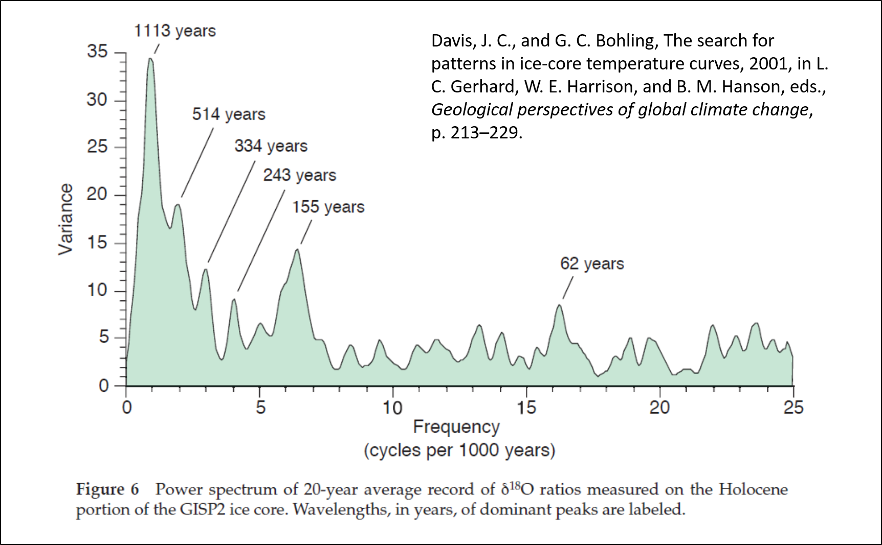
2-m average δ18O ratios…

Davis, J. C., and G. C. Bohling, The search for patterns in ice-core temperature curves, 2001, in L. C. Gerhard, W. E. Harrison, and B. M. Hanson, eds., Geological perspectives of global climate change, p. 213–229.
Sorry, but that all looks fairly random to me.
~21 and ~64 http://woodfortrees.org/plot/hadcrut4gl/mean:120/mean:120/derivative/mean:60/detrend:0.0012
120,120,60 , a crude triple running mean. Not bad. How try a more balanced r3m and it tidies up the squiggly noise a bit.
https://climategrog.wordpress.com/2014/07/13/989/
http://woodfortrees.org/plot/hadcrut4gl/mean:120/mean:104/mean:75/derivative/detrend:0.0012
The two up one down pattern is quite clear as far as the data goes.
If that pattern holds we should be seeing a clear drop in temps in the next 5y . That will need a lot of work on the global warming causes cooling theme.
http://woodfortrees.org/plot/hadcrut4gl/mean:120/mean:104/mean:75/derivative/detrend/plot/sidc-ssn/mean:120/mean:104/mean:75/offset:-80/scale:0.00004/from:1840
comparing to solar, some of the minor bumps match up. Big swings, not really.
Thanks!
http://virakkraft.com/Had4_21+63yrs.png
Forget solar, it must be the clouds.
How cute. Exactly what I showed except done by you and detrended.
I guess that should put all your criticisms to rest.
Good try. Just like you can sue anyone, you can criticize anyone, for any reason. I can’t complain, but sometimes I still do. And we need criticism to get its exercise. No rest for the wicked and all that.
No because you have not adressed ANY of my criticisms . We still don’t know what any of you squiggles are since you refuse to say how you processed the data.
At least using WTF.org means any analysis is automatically documented and reproducible.
If you find that “cute” maybe you should adopt it.
Odd that you use the filtered HadCRUT but leave off the solar which does not follow it at all well. That rebuts what you call “the bottom line of the article. ”
We still don’t know what your thick grey line ( now thin and blue ) actually is.
Not so cute.
Not true. I have said in the figure caption and in a comment.
You get a similar result with your figure, except with less noise.
My goal is for anybody to be able to reproduce it, so you get the data from the database linked in each figure caption.
–For temperature subtract from each month data the data 108 months before (9 years). Then divide by 9 to get the yearly rate and multiply by 10 to get the decadal rate. Then run a 4 year moving average to smooth the data.
–For CO2 calculate the Ln of the yearly concentration, then run a 10-year moving average. The smoothing is not really required as the data is not noisy, but I did it for consistency with the solar data.
–For solar SSN monthly data run a 133 month (11.1 year) moving average.
I know that is not the way you like it, but I don’t care. The figure above comparing my way to yours shows that as the information in the data is the same, the result is very similar.
In the case of the solar filter you use, part of the noise eliminated agrees quite well with the solar data, as my figure 4 shows. I prefer to use my 11.1 yr moving average solar monthly data for the same reason.
Despite your quibbling, what I show is correct, and the bottom line of the article is solid. Solar data looks a much better candidate than CO2 data.
Aren’t you plotting the mean of a mean?
Anto,
Plotting the mean of means is done all the time by climatologists. Although, it should be obvious that the practice reduces the apparent variance. What should be plotted is the daily diurnal temperatures. Once upon a time that was tedious. Today, with even 6-year olds having access to a computer, there is little excuse for not retaining the raw, unfiltered data.
Willis,
The ~60-year cycle is known from observations stretching much further back than AD 1850.
Hubert Lamb saw a 50 year cycle, but lost sight of it as we approached the depths of the LIA.
50 .. 60 ..70.. 80, that works for a couple of cycles then all those options are in conflict. They are contradictory not mutually supporting.
If the Right Honorable Lordly Bigwig says it’s 60 years, then many will refer to it as that, however long it really is. And who cares what Scaffetta reckons, he’s forcing it to specious planetary periods. Measuring though finds that it almost keeps step with seven solar cycles through the 20th century, which is obviously more than 60 years. With the coldest anomalies at 1904-1913 -1923, and 1974-1984-1993.
http://www.woodfortrees.org/graph/esrl-amo/from:1900/to:2000/mean:11/plot/sidc-ssn/from:1900/to:2000/normalise
Greg,
That would suggest to me that we are dealing with interference with the periodic signals combining being out of phase. That is to say, we may be looking at a pseudo-periodicity resulting from the phase differences of fundamental periodic signals. That isn’t to say that the constructive interference doesn’t create something that can weather or climate, just that focusing on the ephemeral pseudo-periods may distract analysts from the phase relationships of the fundamental periods.
Very amusing, I couldn’t have said it better myself.
In July last year I saw climate change in the southern hemisphere, when the subtropical ridge lost its intensity. I ran around the blogosphere waving my hands, but was ignored.
We are back in the 1950s and there is nothing we can do about it. Its a 60 year cycle and the earth is entering a cool phase lasting at least a couple of decades.
It’s the solar toroidal and poloidal fields going in and out of phase.
He also leaves outline a glaring possibility – given that the apparent warming is in the fractions of an average degree each year, it might well be nothing more than an artifact of poor quality measurement, calibration or data aggregation techniques.
Klyashtorin has done a lot of work on atmospheric ocean cycles using fish as proxies. You don’t need to decompose. There is plenty of “fish in the boat” evidence of quasi 60 year cycles.
“The planet’s surface has been warming since the depths of the Little Ice Age..”
________________
Sorry Javier, but that’s just not true. If you look at the HadCRUT4 record, which runs from 1850, then fully the first 80 years or so of that period shows no warming whatsoever; slight cooling, in fact.
How’s that for a “pause”?
Come on guys. Why recycle the same old stuff based on false premises? This makes us look very ‘un-sceptical’.
DW Rice, the depth of the Little Ice Age is about 1610 AD. The temperature anomaly then reach -0.85 degrees C, this compares to the modern era when it is around 0.4 degrees based on the same proxies. The anomalies are computed from the mean from 500 BP to 9000 BP. It’s not really valid to compare proxy data to instrument data, but either way, 1610 AD was much colder than anything in the past 150 years. See here for a discussion of the Little Ice Age: https://andymaypetrophysicist.com/climate-and-civilization-for-the-past-4000-years/
The period around 1610 AD might just have been the coldest period of the entire Holocene.
Perhaps so, but does that mean that it’s been warming since then? As pointed out above, the period 1850-1930 saw no global warming at all. I guess that was just a ‘pause’. If we can have an 80-year period of no warming against an overall warming background, then why was such a fuss made about the recent ~10-year ‘pause’?
Probably because of the alarmist claims that the warming was CO2 driven, and since CO2 continued to rise while the temperature supposedly “driven” by it did not.
The period between 1692 and 1699 regarding the CET data argues against this case because 3c colder than now for a spell of around 8 consecutive years was extraordinary.
Ah yes, the seven “Ill Years” in Scotland that killed 15% of the population. 36% of the population in Finland died after the failed crops of 1696 and 97. I don’t know about the temperatures, but the conditions for agriculture were awful in Northern Europe during the last decade of the 17th century.
That was when climate could take a good bite at the population of a country. Supposedly a low-CO2 paradise then. If only 1% of the population of a really small country was to die today from climate-related catastrophes we would enter into shock. The climate they envision was capable of taking a third of a country.
Javier,
Your quote in full was:
“The planet’s surface has been warming since the depths of the Little Ice Age, and particularly since ~ 1850 AD.”
_________________________________
The HadCrut 4 data charted above show that for the first 70 years following 1850 there was no trend of any description and certainly no warming trend. BEST also runs from 1850 – again, no discernible trend between 1850 and 1930.
Considered in total, it was a period of zero warming.
You are reaching the wrong conclusion. The uncertainty in the data prevents from reaching that conclusion, and proxy evidence contradicts it. Research the issue a little bit more.
Numerous papers refer to the 1690’s as the coldest decade in the last 1000 years. The main aim in life during that time was to try and survive through it. Temperatures in Northern Europe and especially western Iceland were well below even the anomaly of 3c for the CET. Western Iceland’s climate during that decade was referred to as extremely severe.
These estimates were based on old observations, proxies and how they fair in relationship to the CET. For example Europe can have a severe cold period, but Iceland, Scotland and England can easily miss out being on the western fringes. The continental climate is more severe over Northern Europe than North Western Europe for example.
Javier states above that there has been a warming trend, “particularly since ~1850”. That is not the case according to the HadCRUT4 and BEST global temperature data sets. The 80-year period from 1850 to 1930 had zero trend. No consecutive 30-year period in that time had a warming rate in excess of 0.09C/dec. By contrast, 30-year trends in HadCRUT4 have been above 0.15 C/dec for each overlapping 30-year period for the last 22 years.
Folks here were claiming until quite recently that global warming had stopped because of a (variously) 10-15 year slowdown in the *rate* of warming, yet they seem to see nothing wrong with describing an 80-year period with a slight cooling trend as the continuation of a warming period!
The data prior to about 1910 has huge error bars. It is very questionable to draw conclusions from it.
Proving points with trends is tricky as they are very dependent on start and end points. We have plenty of evidence for a warming surface since 1850.
Oerlemans 2005 glaciers

Ogilvie 1992 Nordic seas ice
http://s28.postimg.cc/h1ftjm4r1/temp.png
based on that proxy, the world was cooling from 1700 to 1820, equally refuting your “ever since”.
Yeah …. but as I hear it, glaciers are more sensitive to precipitation than temperature. Just sayin what I’ve been hearin.
This is interesting. It kind of makes sense considering that water stays frozen at sub-zero temps (temp around glaciers most of the time) and rain is above freezing so it’s going to take some ice with it.
Dr. Deanster,
Yes, glaciers make very poor proxies for temperature because they are complex dynamic systems where things like precipitation, cloudiness, windiness, and surface coatings can override ambient air temperatures, especially when the air temperatures never get above freezing.
Oerlemans did a temperature reconstruction using glaciers:
Javier,
This reconstruction leaves a lot unanswered. The behavior at the snout, where the temperatures are on average near freezing, may be quite different from the behavior in the Zone of Accumulation, which will probably be below freezing most if not all of the year. There are time delays between temperature changes which will vary with the thickness and length of the glaciers. Overall, I’m of the opinion that there is a relationship between global temperatures, but because of the confounding factors, the correlation is low. Even now, some glaciers are advancing while others are retreating.
Funny thing about Oerlemans… Almost 3/4 of the glacial retreat preceded the significant rise in atmospheric CO2.
” from 1850, then fully the first 80 years or so of that period shows no warming whatsoever;”
LIA ended in 1850 is total made up bullcrap…..to fit their agenda
The early 19th century was particularly cold. Clearly colder than the late 18th century.
The depths of the LIA in my book were during the Maunder Minimum. Based upon CET data, the low was around AD 1695.
There is no better data covering the LIA than the CET and it does indeed show the late 17th century being the depth of the cold. The CET shows the LIA ended by 1860 after that it was generally warmer most of the time.
http://mclean.ch/climate/Eng_Scot/Fig_01_CET_from_1650.gif
CET is essentially flat from 1730 to 1930.
True, but the very cold years (<8.0c) ended by then with one exception. I relate to the LIA with occasional very cold years and huge temperature ranges not necessarily a period of average warm/cold years. The CET shows during the LIA there was a huge range in yearly temperatures that suggested a dry and often continental type climate or a very wet cool/mild Atlantic based one. This has the hallmarks of the jet stream being more meridonal than zonal during low solar activity.
There are distinct cold periods in each solar minimum through CET, and they are constrained by solar cycles. The bulk of cold in Maunder is 1672 to 1705 for three solar cycles roughly maximum to maximum, and interrupted by the warm 1686 at a sunspot cycle maximum. In Dalton the years 1807-1817 are mostly colder, roughly between the maximums of cycles 5 and 6. And in Gleissberg 1885 to 1895, roughly between the peaks of cycles 12 and 13.
https://climexp.knmi.nl/data/tcet.dat
I don’t know if you looked at what I posted earlier but I took a few of the cycles and looked at them back in time.
Indeed, that is 1695 when it bottoms out. The 1000-year cycle will peak in 2135. The 209-year cycle peaked not long ago.
Thanks!
Charles May
Hmmn.
Check these sums, tell me why you believe 2135 will be a peak.
Assume a 60-70 year short cycle. Average 65 ?
I assume that when you say short cycle then the full cycle would be double that in years. BTW, I do show a 150 year cycle.
My identification of 2135 comes from this simple calculation.
Element Amplitude Frequency Period Phase
1 .30832 .00097558 1025 7.3297
Here are tge equations used.
y1=A*sin(2*pi()*F*x+Ph)
dydx1=deriv(“A*sin(2*pi()*F*x+Ph),x”,x)
Here is the output. I guessed 2100 as the value for x and it iterated to this. I set the value of dydx1 to 0.
Status Input Name Output Unit Comment
L .308323367 A
L .000975578 F
F x 2135.59418
y1 .308323367
L 7.32972342 Ph
0 dydx1
I may get back to you later I have an appoitment.
Charles May
No. The climate “short cycle” is a 60-70 year peak-to-peak near-constant – but NOT “perfect to 8 decimal places!” -temperature pattern of about 1/2 degree C.
I do not pretend to know why the short cycle occurs, nor is it “exactly” correspond to El Nino/La Nina changes, to the multi-year AMO, the multi-year PDO, nor to volcanoes or solar cycles. It may simply be the average length of the feedback cycle of several different phenomena – no single one of which is the “cause” of neither the start nor stop of the cycle, but are the results of the natural overcorrection of the various separate causes. Remember, there is NO “thermostat” regulating “climate”. Merely many different factors and events that combine to “ceate” average climate we experience.
If at any given time, two or more factors cause global average temperature to be “higher than normal”, those influences do NOT immediately get “turned off”, get turned down, or go away. Rather, they REMAIN IN PLACE as temperature continues to rise “above average”, but become slowly less effective. Another three, four, or five factors, previously too small (in combination or as single factors) to prevent the global average temperature from becoming too warm, become more influential as temperatures rise, but that “increase in cooling influence” does NOT suddenly “turn on” nor does it “suddenly stop” when temperatures become “too cool”.
Thus, global average temperatures cannot EVER stay at the steady “global average temperature” laboriously assumed by claculation to be “in thermal equilibrium” with radiation received from the sun. Yes, Global average temperature might pass through that value at times, but only as the earth warms (or cools) to another high or low point.
At which time, that “global average temperature” is (once again) “too warm” or “too cold”. It CANNOT ever “stabilize” to a single continuous temperature due to the inherent inertia of the thermal mass of the molecules involved, except in the physics papers that simply the thermodynamics to a single flat earth model.
The “long cycle” is a second, 900-1100 year cycle imposed on top of the 60-70 year short cycle. It too is characterized by a slowly changing cycle of about 1/2 to 3/4 degree C oscillation shown by the Egyptian Warming Period, the Minoan Warming Period, the Roman Optimum, the Medieval Warming Period, and now – today’s Modern Warming Period.
Not to horn in, but is there a disconnect going on here? CHARLES MAY wrote “The 1000-year cycle will peak in 2135.” meaning (to me) that he claims the 1000-year (reddish sine) cycle peaks in 2135. The chart agrees. It then appears to me that perhaps RACookPE1978 is thinking CHARLES was suggesting the overall temp (the sum of the sines) peaks in 2135?
Thanks DW, but just for this simple engineer, could you plot this on the scale of a thermometer that I could buy at my hardware store and hang by my back door?
No, No, No! Imprecisely measured, uncalibrated instruments scattered over a tiny part of the land and almost NONE of the oceans don’t stop them: they still insist they’ve got global “data” to the TENTH of a freakin degree!!!
DW Rice, the little ice age was (roughly) from 1550-1850. Your graph, lovely as it is, does not cover “the depths of the little ice age” so it does not disprove the statement “The planet’s surface has been warming since the depths of the Little Ice Age..”
You’ve been told this before, but temps are not linear (even in your graph you see they move up and down). It varies in the short term. The overall trend from “the depths of the little ice age” to the present is that of warming, Yes there are periods of brief cooling and even a pause here and there but the overall trend is warming. Why do you keep showing a cherry-picked brief snippet of that period and think that somehow debunks the overall trend? You lose all credibility when you do that.
DWR,
My take on the graph you provided is that the temperatures rose slightly from about 1858 to about 1882, then declined until about 1912, rose until about 1915, and then was close to flat until 1930.
Unless one defines a threshold for temperature changes and an interval over which to consider, any interpretation is possible. I’d suggest a moving average of 31 years and a threshold of 0.05 deg C.
DWRice:
Your plot is for the Southern Hemisphere, which is pretty quiet, while most of the climate activity is associated with the Northern Hemisphere.
Show us the same plot for the Northern Hemisphere, and see whether you can draw the same conclusion.
Perhaps I missed it but your three general categories do not mention clouds. Perhaps clouds are active in all three categories so maybe that just cancels them out.
Clouds are a consequence. Something has to cause the clouds to increase or decrease. They cannot be responsible for the warming without a prior cause.
Water vapour is the biggest greenhouse gas, by a huge margin, surely that counts for something.
Quiet sun and cosmic ray bombardment creates low cloud cover and a cooler climate.
Water vapor depends on temperature, so it cannot solve your problem of what caused the warming in the first place.
The relationship between cosmic rays and clouds is far from demonstrated. There is no shortage of condensation nuclei.
What if the extra heat is being generated by solar-modulated geomagnetic activity?
Why not? But where is the evidence? I’ve read a couple of papers about that and they were interesting, but they had zero impact because of lack of evidence.
Okay thanks, until further evidence comes to hand I’ll go with ‘the transfer of heat within the system is changing.’
Thanks for doing an analysis using integrals (rates of changes) rather than the simple measured values. As you say, this is required by the accumulation of energy being the driving factor. I credit Dan Pangburn for doing a clean climate estimation model following the same rules. However, as he noted, some factors such as SSTs are factored into the HADCRUT values, and the effect is not integrated. I did a synopsis of his climate analysis which combines solar and oceanic variables.
https://rclutz.wordpress.com/2016/06/22/quantifying-natural-climate-change/
Question from a layman… Is CO2 considered twice as “powerful” as a greenhouse gas when its concentration in the atmosphere is doubled? I think I have read that its radiative forcing ability (if that is the correct term) diminishes as its concentration increases. Is the science settled or in dispute about this one factor?
That diminishing effect is why Javier used the log function.
The log function in IR absorption by CO2 applies when CO2 concentration across an IR path length is sufficient to absorb much or most of the IR flux, as in the original Tyndall experiment.
But atmospheric CO2 concentration is sufficient that the IR path length at STP is measured in meters. So, many IR absorptions and emissions by CO2 occur before the IR escapes to space from the higher atmosphere. This is not the Tyndall experiment.
This process does not produce most of the greenhouse warming as CO2 increases. Rather elevation of the CO2-IR emission height into colder atmosphere, thus slowing the IR emission rate until the atmosphere & surface below warm, produces the greenhouse warming. This effect may not be strictly linear, but I doubt it is logarithmic.
You say correctly that the CO2 path length is meters. This is true for the fundamental bend and rotational sidekicks. But then you recite the old saw that increasing CO2 concentration raises the emission altitude. Increasing concentration shortens the path length to even fewer meters, and LOWERS the extinction altitude. The extinction altitude is where photons at surface temperature/energy are replaced by longer wavelength lower energy photons.
Is CO2 considered twice as “powerful” as a greenhouse gas when its concentration in the atmosphere is doubled?….
At the small levels we are working with right now…just about yes
Which means the temp increase we are measuring should not be a linear straight line…nor sea level rise
No Lat, you are wrong. CO2 is well out of the linear absorption regime , that is why log is used.
So it’s not “twice as powerful” for each doubling but increases by a fixed amount for each doubling.
Sadly Javier does not even get that right since log of ppm is not the accepted formula. The natural “equilibrium ‘ value is assumed to be a post industrial figure of about 280ppmv. The “forcing” is based on the log of the ratio to that value.
If you want to compare that to the surface record you need to integrate ( ie find the cumulative effect not thin instantaneous “forcing” ).
But , hey, that’s Javier. Don’t expect physically meaningful comparisons.
The logarithm is a good enough approximation. It is better than using CO2 levels as most people do, and simpler to understand for most people that using ln (C/C₀).
” It is better than using CO2 levels as most people do” I grant you that is too often seen. Presenting wrong science because it’s easier for the masses to understand is key trick of the whole CO2 scam.
I don’t know if you understand logarithms, but the logarithm of a quotient is equal to the difference of the logs of the numerator and denominator. As the denominator in this case is a constant (280), the effect is subtracting a constant from every data point, which leaves the exact same curve. As usual you quibble about things without a practical effect. Pretty infantile. The funny thing is that you believe that subtracting a constant from every data point actually makes it more “physically meaningful.” Try mathematics first.
The log effect of CO2 absorption occurs because over a distance, part of the original IR flux has been absorbed, and fewer additional absorptions are possible. This effect is not relevant to the actual atmospheric case.
Because the CO2 IR absorption bands are saturated at low altitude, some added absorption occurs on the “wings” of these bands (a type of pressure broadening). This gives a quasi-log effect. However, this extra absorption is small compared to absorption in the main bands of CO2. Further, any slow-down of IR escape to space through additional absorptions is small because of the extremely short times for absorption-emission. The major source of CO2 warming occurs, not from the extra amount of IR absorbed, but from an increase of the emission height into colder atmosphere. Whether that effect is linear depends on how the temperature changes with height (lapse rate), and thus may depend on where the emission height is located relative to the tropopause.
Funny the charts used doesn’t show the warming starting at the end of the coldest era of the past 10,000 years called the Little Ice Age: http://c3headlines.typepad.com/.a/6a010536b58035970c0120a75431d3970b-pi
Interpreted; from everything we know, we still don’t know enough to make a rational or logical reasoning of global warming and climate change. When we cannot connect all the pieces together to figure out fractions of a degree changes. Theory and hypotheses is still all we have, with all our scientific advances to observe whatever is going on.
How can we make political economic policies on things we know so little about? When that is exactly what politicians have been doing for decades. They have caused price distortions globally by their hatred of Capitalism that the Fossil Fuels Industries provides the greatest sources of energy, that have brought the world out of poverty and reduced mortality rates for every country that uses Fossil Fuels. None of the medical advances would have been done without the technology that their energy brought. Absolutely everything has advanced because of Fossil Fuels energy.
Willis was showing something around 70 years. 67 seems about right.
The actual number doesn’t matter much. There are at least 15 different indices showing this oscillation, according to Wyatt & Curry, 2014. Each one will give a slightly different periodicity. But it is generally known as the 60-year oscillation.
From length of day to Arctic sea-ice, sea level, AMO, PDO, NH temperature, the ~ 60-year oscillation is shifted, showing how it moves from one compartment to the next. And then it appears to be variable in time.
Javier:
There are no such thing as climatic oscillations. Everything is driven by the amount of SO2 aerosols in the atmosphere, PRIMARILY from random volcanic activity.
It is very easy to say something. Show the data.
Javier:
O.K. Google “Climate Change Deciphered”
Also, the preprint “Atmospheric SO2: Principal Control Knob Governing Earth’s Temperatures” at OSF.io/bycj4/
I don’t think so.
Oh gosh! It is unclear to me whether changes in temperature cause economic recessions or it is the other way around. Perhaps it is coincidental or you are just seeing things in the data that just aren’t there. Or if you are biased enough you will find minor temperature decreases close enough to anything, like Madonna’s album releases. Although on second thought she probably causes temperature increases.
Thanks for the entertainment value.
Javier:
Economic recessions reduce industrial activity, and as a result, fewer SO2 aerosols enter the atmosphere, causing warming.
However, a closer examination of the climate record using enlarged WoodforTrees.org plots shows that some of the El Ninos attributed to business recessions were actually due to a combination of Volcanic-induced warming, and recession induced warming (the warming actually began somewhat before the start of the recession).
This is shown in my “Atmospheric SO2: Principal Control Knob Governing Earth’s Temperatures ” post at Osf.io/bycj4/ .
Not sure whether you read it, you did not comment upon it.
You cannot understand these issues properly by looking just at the century of data.
There are two important papers that place this in the right perspective.
The first one by Qian Wei Hong and Lu Bo [1], two scientists from the School of Physics at Peking University, looks at time series of solar radiation and north Pacific sea surface temperature index to find multiple periodic oscillations, the present day warm period due to the superposition of four modes. The paper predicts pronounced cooling by 2030s and a new warming period in the 2060s. The famous “hiatus,” it appears, is not a hiatus at all. It is a global temperature maximum.
The second paper by Philip J. Lloyd of Cape Peninsula University of Technology in South Africa [2] looks at freely available temperature data for the past 8,000 years obtained from ice cores and finds the natural centennial global temperature variability to be 0.98+/-0.27 degree Celsius per century. This is actually more than the total global warming of 0.8 degree Celsius since 1880 claimed by NASA. The Earth climate over the past century has been more stable, not less, than over the past 8,000 years!
By looking deep into the past, not just at the last century, we can distinguish several natural climate oscillations which Nicola Scafetta of the University of Naples ties to the dynamics of the solar system [3]. This lets us assess how much of the current climate variability is entirely natural, and it turns out that almost all of it is.
How so? The answer to this comes from a very recently published Journal of Physics D paper by B. M. Smirnov of the Institute for High Temperatures in Moscow [4]. It turns out that calculations pertaining to the interaction between the atmospheric CO2 molecules and the outgoing thermal radiation were in error. When the error is corrected, it transpires that all human CO2 emissions have contributed only a puny 0.02 degree Celsius to the observed warming, and the so called “climate sensitivity to CO2 doubling” is only 0.4+/-0.1 degree Celsius, far lower than claimed by IPCC.
[1] https://doi.org/10.1007/s11434-010-4204-2
[2] https://doi.org/10.1260/0958-305X.26.3.417
[3] https://doi.org/10.1016/j.asr.2016.02.029
[4] https://doi.org/10.1088/1361-6463/aabac6
Longer perspectives adds essential context. The ice cores show conclusively that CO2 follows temperature at all time scales.
The Smirnov 2018 citation deserves special emphsis. Link shows more details.
http://notrickszone.com/2018/06/04/atomic-physicist-human-co2-emissions-have-an-equilibrium-climate-sensitivity-of-a-not-important-0-02-k/
There is no shortage of peer reviewed science showing that doubled CO2 increase has very small radiative effect.
http://notrickszone.com/50-papers-low-sensitivity/
“Because anthropogenic fluxes of carbon dioxide in the atmosphere resulted from combustion of fossil fuels is about 5% [Kaufman, 2007], ”
Junk citing more junk.
0,02 degrees! We are doomed! Doomed I tell you!
Increasing sunshine hours observed by many areas around the world and decreasing global cloud albedo have definitely contributed to warmer oceans by allowing more solar radiation reach them. The problem with aerosols during bad air pollution is that they are very localised and will have no affect over most of the planets surface with the ocean surface at 71% being the prime example. The oceans near surface temperature determines the global atmospheric temperature not relatively much smaller land mass.
The paused occurred because not only the AMO had peaked, but the solar activity had started declining earlier and had occurred at a time of the positive ENSO phase. The negative ENSO phase transfers energy into the ocean with the positive ENSO phase transferring energy from the ocean to the atmosphere. Global cloud albedo had also stopped declining and was in a slight recovery becoming stable with even a little rise. The AMO is the main ocean transfer of solar heated energy around the planet and on a scale significantly larger than ENSO. The warmer and cooler phases do have a large influence on global cloud and sea ice albedo. The Arctic is hugely affected by the AMO and AMOC and influences the trends in sea ice there.
In 1997/98 the strong El Niño lead to a strong La Nina and this caused a step up in global temperatures soon after. The recent strong El Niño in 2016 on par with 1997/98 has so far failed to deliver a strong La Nina and therefore has been no step up in global temperatures.
WHY?
…..because the negative ENSO phase transfers energy into the ocean so is retained like a central heating system so we get a step up.
The positive ENSO phase transferring energy from the ocean to the atmosphere without this phase loses energy eventually to space is lost. Causing a drop back down to normal temperatures, but with no step up after.
“Figure 3. 9-year global surface temperature rate of change (black curve, LHS) and 10-year change in the natural logarithm of atmospheric CO2 concentration (blue curve, RHS). The logarithm better represents the changes in forcing by CO2. The red dashed lines are the linear adjustment to the black curve for each half of the data. Source: 1850-1958 Law Dome. 1959-2017 NOAA.”
This is a good example of the dishonesty that’s occurred within climate science especially with surface data sets over the decades. The rate of warming was the same for both periods either side of the cooling one labelled aerosols, but no way was this warming around 3 times greater than the cooling. The cooling was as significant as the warming in especially the NH, so instead of recent temperatures being similar to the 1930’s and 1940’s like the Arctic data shows. Instead we have a difference on global temperatures caused by reducing the rate of cooling by around 3 times the difference.
Full agreement.
“In 1997/98 the strong El Niño lead to a strong La Nina and this caused a step up in global temperatures soon after. The recent strong El Niño in 2016 on par with 1997/98 has so far failed to deliver a strong La Nina and therefore has been no step up in global temperatures.
WHY?
…..because the negative ENSO phase transfers energy into the ocean so is retained like a central heating system so we get a step up.
The positive ENSO phase transferring energy from the ocean to the atmosphere without this phase loses energy eventually to space is lost. Causing a drop back down to normal temperatures, but with no step up after.”
It can be cold in Europe.
I agree with much of what you said except for the step up part. The step up into the 2000s was effected by the rise in SC23 TSI. Most of the top years in PMOD ver 1709 TSI were the years following the 97/98 ENSO (98 was #17):
2002 1361.6119
2000 1361.5917
2001 1361.5312
1980 1361.5147
1981 1361.5048
1989 1361.4849
1979 1361.4294
1990 1361.4294
1999 1361.3642
1991 1361.3542
The following graphic depicts TSI vs climate indice cross-correlations since 1979, SC21-24, where the solar cycle influence on ENSO activity stands right out:
The rise in TSI go hand in hand regarding the step up because the El Nino is solar energy based. With it being to warm a significant area of the Tropics this signal from increased TSI with ENSO therefore enhances the otherwise more difficult general background signal being seen.
When the next strong El Niño appears and fails to deliver a strong La Niña after (especially only just weak or ENSO neutral, could we actually see a step down in global temperatures to follow? This may still occur yet over the next few years, but may require more than this one pattern to occur one after the other for it to actually happen.
Why I think this could also happen extra to the original post is because the last two occasions there were a relative strong El Niño (for the time back then) during the late 1950’s and around 1966/67. The following La Niña was only weak at best for a very short time or mainly ENSO neutral. This led to a step down in global temperatures on both occasions when this pattern last occurred.
The strong ~1973 El Niño and strong ~1975 La Niña led to a step up in global temperatures.
The strong ~1987 El Niño and strong ~1989 La Niña led to a step up in global temperatures.
There seems to be a general pattern developing with ENSO and global temperatures since 1950 with the following steps.
1) Relatively strong El Nino followed by Strong La Niña = step up in global temperatures.
2) Relatively strong El Niño followed by barely weak La Niña or ENSO neutral = step down in global temperatures.
It will be very interesting to see what happens later because this has occurred on more than one occasion before, not just the Strong El Nino 1997/98 and strong La Niña ~2000 events.
What is warming the earth? The sun stupid…!
The “Pause” box doesn’t look khaki to me. Or even olive drab.
Hi Javier
You are getting better as time progresses. Looking at the change in C or K per annum or per decade is a good start/: it eliminates a lot of error.
Sadly though it is really not possible to compare data from 100 years ago with those from today.
You are comparing pears with apples.
From the 70’s we started with ‘re-calibrating’ thermometers every year [since we realised the errors] and we have different recording techniques, i.e, machine/computers and not people.
And if you look only 40 years back,
I find there has been no warming here, where I live…
so,
the global warming is not global? what does that mean to you?
Click on my name and ask me about my sampling procedure….
Before commenting on the past solar influence, now is a good time to see the sun’s influence in the short-term when both sunspot number is zero again and F10.7cm flux is low.
The sun’s earth-facing side right now is lacking bright areas, active areas, and has many deeper blue coronal areas, leading to low TSI for now. SORCE TSI a week ago was at 1360.6972 W/m^2, getting closer to the last solar minimum level. The bright active area on the farside won’t be visible for several days, so in the meantime we’ll enjoy a short-term solar cool-off.
Its been noticeably cooler this week in the US and elsewhere from this low TSI, esp in the mornings.
TSI will go up again when that farside active area rolls into earth-facing position with it’s higher flux, and we’ll get a warming surge from it.
This example was meant to show solar influences are layered and time dependent.
There is a short term affect especially with the jet stream over 2.5 years and the ENSO to less effect, but to see any more noticeable changes comparing different cycles. This minimum period needs to last longer than the normal 2.5 years.
If the minimum solar activity period of generally no sun spots lasted for 5 or even 10 years that would tell us a lot.
The last geomagnetic storm and the increase in the speed of the jet stream.

I agree. A Dalton minimum level of solar activity would do it, but since this cycle exceeded that level, and the next one should be comparable or larger, overall solar warming will continue after this minimum’s cooling effects.
The last solar minimum was quite extended, and TSI was still low after the SC24 onset El Nino in ’09/10. There are papers marking the effect of low TSI on the cold 2010 winter.
I highlighted the real-time and near-future solar observations and influences, the action, so people can orient themselves to it for their own observing experience. Understanding the present helps with the past.
Note that solar minima after even cycles are usually extended.

As long as the solar flux is sub 95 or so that equates to cooling. I expect the solar flux to stay sub 95 for quite some time.
“Its been noticeably cooler this week in the US and elsewhere from this low TSI, esp in the mornings.”
No. I get it that American can’t see anything beyond their own borders but this ridiculous.
“elsewhere” like Hawaii?
Well, it’s snowing across Canada and northern and western US states.
Actually Bob (Coolclimateinfo) is correct. This week is seeing a global surface temperature anomaly noticeably lower that is likely to reduce the monthly surface data when it comes out (maybe not UAH, as it is lower tropospheric). The GSAT hasn’t been this low since Nov. 2014. The cause is an unusually cold anomaly in Antarctica without compensation elsewhere, but the Northwestern part of the US and Canada is also colder than average.
RyanS,
The temperatures in Hawaii have been running below average for the last week:
https://www.accuweather.com/en/us/honolulu-hi/96817/august-weather/348211
You missed the irony tag.
If “Its been noticeably cooler this week… from this low TSI” surely that would mean everywhere.
The sun’s influence is seasonal. I meant in the northern hemisphere right now, where above 45 degrees north it’s cool:
I’m on the 45th, and it’s feeling like October.
Where my attention will be turned during the coming winter is on the SST of the ice free waters off the coast of NW Russia and the amount of cold Polar air that flows across them during the winter. Because last winter suggested there maybe a link between this and cooling in the northern Atlantic during the following summer.
It’s not that the consensus can’t see the logic of your position. It’s worse than that. They have been charged with and paid for determining that man has caused the warning. Even without all the stuff of Climategate, the revelation of UN/NGO real plan for global political control, etc., the effort that has gone into adjusting the temperature and other climate data is all the proof you need of consensus global warming. Even the data you use is greatly changed with time as the theory began to crumple.
Actually nearly all the warming over the past 150 years occurred by 1935-40 before CO2 could have been a factor. GISS was frustrated that 1998 was not a new high. They decided to get rid of the 30s-40 high. They shoved it down several tenths and got a two-for out of it. This also got rid of a 40 year DECLINE in temperatures after the high and gave it a modest rise to the late 70s. Not only that, the warming from 1880s wasnt changed by this (although since, they have been pushing early temps down too over the last decade)
When it was pointed out all the State temperature records and heatwaves were in the 1930s, the argument was that US is only 3% of the global area. But a little digging found the same pattern for Canada, Greenland, Europe, Siberia, South Africa, Paraguay, Ecuador and even Australia (although this country and NZ virtually destroyed their temperature record over the last couple of decades).
Here is a raw temperature record for Capetown S. Afr. that could be mistaken for the US temperature chart:
Anyway even the illustrations used in this and Kip Hansen’s posts have been greatly corrupted. This area is going to need massive rehab once this latest of the neomarxbrothers’ manifestations has been foiled.
An excellent and much-needed article.
Thanks again. Javier!
Arctic ice looks on course for a high-ish September minimum.
Recovery, anyone?
There could still be a storm to scatter and pile up the floes, but as of yesterday, it’s looking as if this year will beat not only the low years of 2007, 2012 and 2016 (when there were cyclones), but probably or possibly 2008, 2010, 2011, 2015 and 2017. The high years of 2009, 2013 and 2014, probably not.
Not recovery, its no more decline.
Sunset,
IMO it is recovery, unless a new, lower low occurs, which IMO is unlikely.
The trend since 2007 is flatish, but it’s up since 2012. The average for the five years 2013-17 is higher than for the previous five years, 2008-12. And that doesn’t include the second lowest year, 2007, so the six-year average, 2013-18 will be even higher than 2007-12.
I was made the no more decline statement from the year 2007 YOU chose, which you state is “flatish”.
You post several different year groups to make a case, which is several too many for me. Suggest that you stick with year 2007 bottom and drop those other misleading years.
Javier, in his comment below is using the 2007 start point because that is the LOW point in the first decade of the century to show there is no more decline, which is factually true.
Plainly no recovery or “no more decline” in maximum extent.
And AGW works greatest at night (land) and in winter.
So this is different from the “recovery” between 1990 and 2001?
Just natural variance after extreme melt in 2007 and 2012.
So now it is natural variance, but in 2012 there was no natural variance despite freak weather being responsible for the low value. The Arctic sea ice was going to melt away in just a few summers.
After a series of papers that came out in 2014, I noticed from the bibliography and data that the Arctic had changed regime around 2007, so the old trend was no longer valid.
I made a figure in 2015 that I have been updating every year since, and I wrote about it in an article at WUWT in Oct 2016.
At the time believers in AGW laughed at it saying it was statistically irrelevant. BFD. Things change and for many years the statistics has to wait before finally confirming it. Year after year my prediction that no significant September Arctic sea ice decrease in extent was going to take place for over two decades is being confirmed. The September Arctic sea ice hiatus is already 11 years long. You will just be the last one to accept it, clinging to a negative slope trend that does not represent what is going on in the Arctic.
” Year after year my prediction that no significant September Arctic sea ice decrease in extent was going to take place for over two decades is being confirmed”
I would say that was a good call, SST’s are cooling in numerous regions and at depth too. The AMO is expected to change to its negative phase by about 14/15 years time. Low solar activity looks like occurring over the next 2 cycles. The volume of Arctic ice has significantly recovered and 80N+ summers have had frequently below normal temperatures.
It is not the colder than normal winter temperatures that cause ice ages or glacier advancement, but the cooler summers than normal that do.
I am predicting global temperatures should start cooling over next several years beyond levels prior to the strong 2016 El Niño. The main reason being the ENSO unbalance recently changing to cooling mode.
Not only no significant September Arctic sea ice decrease in extent was going to take place for over two decades, but after several years from now they will be some recovery in Arctic sea ice towards previous levels.
“The September Arctic sea ice hiatus is already 11 years long. You will just be the last one to accept it, clinging to a negative slope trend that does not represent what is going on in the Arctic.”
Clinging to a poitive one?
Take a deeper look at the condition of the ice, the volume, how much multi-year ice remains and the temperature and salinity profile of the sub-surface. Clinging by its finger nails.
A hiatus is not a positive trend.
“a pause or break in continuity in a sequence or activity.”
I have looked at all that and more, but not surprisingly the data and graphs that were so abundant when the ice was melting became unavailable or changed format when it became clear that there was an Arctic sea-ice pause in the making.
So now we get all-year Arctic sea-ice which is still going down, and volume. Why volume? Because it is modeled, not measured, and surprise! surprise! the models include temperature data. So the warmest years on record show decreasing volume while extent is not decreasing. I call that the Arctic sea-ice pancake-to-crepe hypothesis. It is getting thinner but with the same extent. Yeah, right!
Arctic sea ice volume has been above the mean for the last few months.
http://ocean.dmi.dk/arctic/icethickness/images/FullSize_CICE_combine_thick_SM_EN_20180830.png
The trend will not go down for ever, it does during the positive AMO phase.
Arctic sea ice extent has been slowly recovering since 2012.
Arctic sea ice (today measurement, 30 Aug 2018) is now greater than 7 of the previous 11 years, going back to 2008. So I’d push that trend back to 2008.
The general Arctic maximum sea ice extents was 1981-1983, based on the 1978-2018 satellite measurements. You really need to compare each 5 year average from 1978-1979 with the other 5 year averages to see that cycle developing.
Claiming ANY linear trend is foolish, extrapolating that linear trend into the future is even worse. But, the climastrologists need a linear decreasing sea ice trend to support their future funding since their most-favored-CO2-warms-the-earth-and warms-the-pole-first theory REQUIRES a linear downward, catastrophic trend.
Further, since we have only now have true ice measurements for less than 2/3 of the assumed cycle period – much less three or four full periods! – assuming a cycle is useful, but “concluding” any cycle period or amplitude or long-term trend is, at best, premature.
Just to point out that the positive AMO phase is a temporary state, part of a longer term cycle and therefore non-linear. Therefore a decline and downward trend only occurs part of the longer term cycle while it is in this phase.
None of the alarmists had the slightest interest in anything but Sept min until it all went wrong. Then they skipped off the Antarctica for a few years, then came back with a new “canary in the coal mine” : February, since the last canary had not got any worse over the last then years.
Note the way it is necessary to fit a straight line to trick the eye into the impression that summer min is still consistent with rapid melting. Take off the line and you realise it’has not been going anywhere since 2007.
Note the scale on the Feb data 16 down to 14 in almost 40 years. Nowhere near as dramatic but if you plot on a scale with a zero you would lose all interest and OMG we must act now value.
And volume?
RyanS are you having serious ocular problems?
Your own chart shows the decline stopped after 2007, which is why many are saying there is currently NO MORE DECLINE going on!
Interesting that the mesosphere over the north pole is unusually wet for August
https://spaceweatherarchive.com/2018/08/15/a-mystery-in-the-mesosphere/
and noctilucent clouds are still numerous. What effect is that having on outgoing longwave radiation as the season changes? Do ice clouds also warm the poles?
What about the Milankovitch cycles? Is there any effect from our orbital process on this short a term?
No. You have to get to the millennial scale to see changes due to Milankovitch forcing. Essentially every millennium is colder than the previous. I don’t expect that to change.
True, as the peaks of warm periods are falling and the troughs generally dropping. The LIA was probably colder than the Dark Ages Cool Period.
Since the Holocene Climate Optimum ended c. 5 ka, the fifth millennium BC was cooler, the fourth millennium still cooler, the third millennium cooler yet, the second millennium even cooler and the first millennium the coolest. The first millennium AD was cooler, despite the Roman and Medieval WPs, while the second was downright cold, again in spite of the Medieval WP at its beginning and the Modern WP at its end.
Not a good trend. But then that’s why it’s called an interglacial.
It is amazing how people can buy into AGW.
If one looks at the historical climatic record even going back just 10,000 years, one would quickly see this period of time in the climate is in no way unique, not in the rate of warming, not in the degree of magnitude change in the warming, and not in the absolute global average temperature.
.
To make it worse this warming of the past 150 years followed the end of the Little Ice Age.
I would say from 1850- 2005 all natural factors were in a warming mode and AGW hi jacked them. Starting in late 2005 this started to change and I by the end of year 2017 was completed. In other words the natural factors effecting the climate now are in a cold mode. Let’s see how much AGW we get from this point in time(late 2017) moving forward. My answer is zero.
I have maintained for over a year now that year 2018 will be the transitional year to a cooler climate, and I expect a climatic shift to cooler similar to the climate shift of 1977 which was to warmer.
My two solar conditions are now meant which are 10+ years of sub solar activity in general (2005) followed by a period of time of very low average value solar parameters slightly greater then those associated with typical solar minimum periods of time.
All this moderated by the geo magnetic field which when in sync with solar(both weakening) will enhance one another.
I say low solar equates to lower overall sea surface temperatures and a slightly higher albedo.
I say AGW is over and done with and this started in late 2017.
I must say it is striking that each and every time the sun enters a prolonged solar minimum period of activity the global temperatures overall( not in a straight line or not without countertrends) always go down when all is said and done and every time the sun enters a very active phase the global temperatures always go up overall. Again not in a straight line or without some counter trends but overall.
I can find no exceptions.
Perhaps (and I believe) that some third factor influences both solar activity and ocean currents, simultaneously. Planetary / lunar alignments?
“This oscillation is also unlikely to have a solar origin, as there is no 60-year solar periodicity.”
It is not 60 years, it has been a mean 69 years. All the noise is solar driven. The three coldest AMO periods of the early to mid 1970’s, the mid 1980’s, and the early 1990’s, were all during the periods of the higher solar wind temperature/pressure. And they were all during the minimum region of the solar cycle, just like the cold AMO anomalies in the 1910’s and 1920’s. And the AMO is regularly in a warm phase during centennial solar minima. Until one can explain how the Sun drives the AMO, nothing truthful can be said about the long term temperature trend.
http://www.woodfortrees.org/graph/esrl-amo/from:1880/mean:13/plot/sidc-ssn/from:1880/normalise
Solar plasma, temperature, density, and pressure:

That is not happening now. I know you are going to say it’s noise but I disagree.
All cycles are meant to be broken and are if one looks closely.
What is not happening now? You’ll have to be more specific than ‘that’.
Ulric With all the evidence against global warming I don’t see how a person as intelligent as you can fall for this CAGW hoax?
Correct. I couldn’t fall for it. As I see that the AMO is a negative feedback to solar wind variability, and is not internal and unforced.