By Larry Kummer. From the Fabius Maximus website.
Summary: The world’s temperature is in the news again, showing that 2017 was another warm year. Now that it is in the record books, let’s look at the more important question — about future warming, if a new pause has begun — and what might be the political implications.
One of the most important datasets of our time.

Another warm year!
The world has been warming for two centuries, since the Little Ice Age ended. “It is extremely likely (95 – 100% certain) that human activities caused more than half of the observed increase in global mean surface temperature from 1951 to 2010” {from AR5, the IPCC’s Fifth Assessment Report). See the above graph. So we have had a lot of headlines like this: “For the globe, 2017 was the third warmest year on record and the warmest year without an El Niño present.”
Look at the numbers (from NOAA’s Climate at a Glance interactive graph).
- The total 18 year increase from the 1998 El Niño to the 2016 El Niño was 0.31°C (0.56°F).
- That is 0.18°C (0.32°F) per decade.
- That is faster than the warming of 0.11°C (0.20°F) per decade during 1950 – 1998.
- That is 4x faster than the warming of 0.04°C (0.07°F) per decade from 1880-1950.
We did not get these headlines during the “pause” (aka “hiatus”) from 1999 through 2014. The global surface temperature did not exceed the 1998 high (by more than the ~0.1°F margin of error) until the 2015-2016 El Niño. Scores of papers discussed the pause; scores explored its causes.
Climate activists responded by denying the science and concealing these papers from the public (examples here and here). For good reason. Frequent stories about warming are the core of their messaging. The long pause disrupted that program. They had to rely on scary but false predictions (more & bigger hurricanes after Katrina) and falsely blaming most extreme weather on global warming (e.g., 2017’s hurricanes).
What comes next?
“Mr. President, if that’s what you want there is only one way to get it. That is to …scare the hell out of the country.”
— Senator Arthur Vandenberg’s advice to Truman about starting the Cold War. Truman did so in his famous speech on 12 March 1947. From Put yourself in Marshall’s place
by James Warburg (he helped develop the US WWII propaganda programs).
Unfortunately, motivating America to action is more easily done using fear than reason. Fears ‘R us (it makes us easy to rule). So our news is presented as a series of hysteric fits. That is why we live in the crisis crisis. Hence the misuse of the worst-scenario in the IPCC’s AR5 (RCP8.5), ubiquitously described by activists as the “business as usual” scenario (which it is not; it is unlikely — and becoming more so).
That’s why the pause had such a large political effect, disproportionate to its significance to scientists — it interrupted the flow of scary stories about global temperature records.
What happens if we get another plateau, a step up only one or two tenths of a degree C (0.2 or 0.3°F) higher than the previous plateau? A pause perhaps lasting 10 or 15 years. Can the climate policy campaign continue without new record highs in temperature? A post by James Hanson et al. describes why this is “plausible, if not likely” — “Global Temperature in 2017.” Excerpt…
“The record 2016 temperature was abetted by the effects of both a strong El Niño and maximum warming from the solar irradiance cycle. …Therefore, because of the combination of the strong 2016 El Niño and the phase of the solar cycle, it is plausible, if not likely, that the next 10 years of global temperature change will leave an impression of a ‘global warming hiatus’. …Therefore, temperature change during even the next few years is of interest, to determine whether a significant excursion above the trend line is underway.”
A new pause might already have begun. To see tentative signs of a new plateau, watch the YoY seasonal temperature changes in temperature. Like the following graph showing the average temperature per year for October to December. The September – December and August – December graphs are similar, but weaker. The passage of time will tell the answer.

What do Activists have without new temperature records? Thirty years of blaming extreme cold and warm, drought and floods, on CO2 has accomplished little (details here). Activists’ favorite tactic of focusing on worst case climate futures doesn’t work. It shouldn’t work.
Activists could try science instead. Stop exaggerating the research, stick with reports from the IPCC and major climate agencies, and accurately describe the large uncertainty of climate forecasts. Of course, that is not as scary as their usual tactics.

Why the (possible) stair steps in warming? (updated)
Where did the heat come from in the massive warming during the 2014-2016 El Nino period? A new paper proposes an answer: “Big Jump of Record Warm Global Mean Surface Temperature in 2014-2016 Related to Unusually Large Oceanic Heat Releases” by Jianjun Yin et al. in Geophysical Research Letters (in press).
A recent paper give an explanation of this pattern: “Reconciling the signal and noise of atmospheric warming on decadal timescales“ by Roger N. Jones and James H. Ricketts in Earth System Dynamics, 8 (1), 2017 — Abstract…
“Interactions between externally forced and internally generated climate variations on decadal timescales is a major determinant of changing climate risk. Severe testing is applied to observed global and regional surface and satellite temperatures and modelled surface temperatures to determine whether these interactions are independent, as in the traditional signal-to-noise model, or whether they interact, resulting in step-like warming.
“This model indicates that in situ warming of the atmosphere does not occur; instead, a store-and-release mechanism from the ocean to the atmosphere is proposed. It is physically plausible and theoretically sound. The presence of step-like – rather than gradual – warming is important information for characterising and managing future climate risk.”
This paper points us to another perspective on climate change. Ocean heat content (OHC) is in many ways the best metric of warming. This was controversial when Roger Pielke Sr. first said it in 2003 (despite his eminent record, Skeptical Science called him a “climate misinformer” – for bogus reasons). Some scientists point to changes in the ocean’s heat content as an explanation for the pause.
Graphs of OHC should convert any remaining deniers of global warming (there are some out there). This shows the increasing temperature of the top 700 meters of the oceans, from NOAA’s OHC page. See here for more information about the increase in OHC. It is in a sense the clearest metric of global warming. Why do we not see this graph more often? Probably because it is not scary.

That’s all a sideshow. Here’s the center ring.
Information about past and present warming is important. But for making public policy decisions, we need to know about future warming. What are the odds of severe warming during the 21st century? There is no easy answer, and no consensus of climate scientists about it. So climate activists either ignore the research (e.g., the 4 scenarios described in AR5) or focus on the worst of these (the truly horrific RCP8.5) while ignoring its unlikely assumptions.
So far the weather has sided with the skeptics, with little of the extreme weather activists predicted. No surge of hurricanes after Katrina (despite the predictions). No sign of the methane monster. Northern hemisphere snow extent has risen since in both the Fall and the Winter. There is little evidence that we have passed one of the often declared “tipping points”.
The smart way to bet is on inaction, as both sides continue their food fight while climate scientists make incremental progress (insufficient to affect the public policy debate. America will not prepare for the repeat of past extreme weather, let alone what we can reasonably expect in the future.
There are ways to break this deadlock, but neither climate scientists nor the US government will push for them. So we hope for pleasant weather. Hope is not a plan.
For More Information
For more information see The keys to understanding climate change, and especially these …
- How we broke the climate change debates. Lessons learned for the future.
- My proposal: Climate scientists can restart the climate change debate – & win.
- Thomas Kuhn tells us what we need to know about climate science.
- Daniel Davies’ insights about predictions can unlock the climate change debate.
- Karl Popper explains how to open the deadlocked climate policy debate.
- Paul Krugman talks about economics. Climate scientists can learn from his insights.
- Milton Friedman’s advice about restarting the climate policy debate.
- We can end the climate policy wars: demand a test of the models.
While I know it has been discussed before on this site I really have an extremely hard time with “global mean surface temperatures” present or especially from the past. Comparing present mean surface temperatures with those say prior to World War II but especially before 1900 is just crazy, different instruments, different geographical coverage, etc. Even today for much of the earth’s surface there is NO surface temperature data, reliable or otherwise. 75% of the earth is covered by oceans yet there are a relatively tiny handful of fixed data collection sites. You might be able to say that eastern North America or Western Europe has had “x” change in average surface temperature but certainly not the entire planet. They are just making it up.
All of the warming since 1900 came from Hansen’s 2000 TOD adjustment that was pure bull! Without his fiction of cooling the 1930’s and warming the 1990’s, the AGW mantra would have failed miserably and died a well deserved death after Climategate! Earth did warmed slightly from 1900 to 1950. Cooled slightly from 1950 to 1976. Warmed slightly from 2 or 3 strong el Ninos, then had a 12 year pause from 1990 to 2016. All this warming took place while the Sun was in an extreme solar activity cycle (3 strong sunspot cycles back to back) from 1960 to 2000. Man hasn’t contributed more than 0.1 deg F, but that doesn’t fit the narrative or drive fear and contributions!
Kummer sez:
” Information about past
and present warming is important.
But for making public policy decisions,
we need to know about future warming.”
The above sentence is nonsense!.
The article title is nonsense.
The article is nonsense.
One of the worst so far this year.
The author should ask to have it deleted
and try again.
The author is capable of much better —
in fact every other article he’s had
at this website was better!
One year is no more important
than any other year
in the climate “business” !
And how can the next few years
be more important ???
We don’t know anything about them now,
and two years from now you could still
claim the next few years will be
more important.
Where does it end,
like a dog
chasing his tail?
We have no idea now whether the
next few years will be warmer
or cooler.
We’ve had a mild
and beneficial warming trend
since 1850, and suddenly
“The next few year
will be more important”
(than the past 167 years) ?
Public policy
should not be changed,
based on the climate,
because our current climate
is WONDERFUL, and has been
getting BETTER for at least 400 years,
since the Maunder Minimum
very cold period.
The planet is greening too.
That’s good news.
Higher northern latitudes
are getting warmer nights.
That’s good news.
Although warming
doesn’t seem to be happening
in the southern half
of the Southern Hemisphere —
— one of many reasons (evidence)
warming can not be blamed
on greenhouse gases with
95% certainty.
President:
Should we start a war with North Korea?
Cabinet:
Public policy must depend on
whether or not
there is future warming.
Mr. President.
And that must be based
on surface measurements,
where over half the “data”
are just wild guesses (infilling),
and not the more accurate
weather satellites
and weather balloons.
Climate blog that makes sense:
http://www.elOnionBloggle.Blogspot.com
Further reading of the essay raises the question of why the author chooses to use the bigot’s favorite word, “denier” and lower the tone of his essay and needlessly become inflammatory?
Also, it was the climate consensus leaders who rejected OHC, not skeptics.
Pielke was shredded by the consensus for pointing out that OHC is not at the level predicted by the alarmist consensus.
hunter,
(1) Words are not inherently good or bad (there are probably exceptions to this rule, as always). “Denier” is a useful word that has been (as so often the case these days) been misappropriated for propaganda use.
It is used in this post twice. First, to describe climate activists who “deny” scientists’ papers about the pause (too good an opportunity to miss, given activists long history of misusing “denier”). Second, about those few (but too many) who deny the massive evidence that the Earth is warming.
(2) “it was the climate consensus leaders who rejected OHC, not skeptics. Pielke was shredded by the consensus …”
This post says that, and links to evidence.
I do not deny climate change. I do not deny that there has been warming – from time to time, as well, in case it failed to register, cooling from time to time. I do not deny that it is probably so that for a while, at least, the warming and cooling will continue. I do deny that carbon dioxide is the control knob for global temperature, and that anyone that has looked at climate history can actually state that the Earth is warming in a manner that is going to be catastrophic in any way.
Thank you for making me one of your few but too many that deny the massive evidence that the Earth is warming in any form other than likely to accommodate all life forms on the planet to have a more pleasant climate to live in. They will adapt, as they have in the past, and as we should be doing now instead of tilting with windmills.
In 2016, I published “Denier Pride” and it can be Googled.
Liked the play on words, but I am a skeptic and critic of the theory that man-caused CO2 increases force global warming.
0.8 C since 1880, with a very dodgy temperature record before 1960, is just meaningless to the public. No one goes around saying, “Wow! It is so much hotter than it used to be!”
So, no one cares except “Climate Scientists” and alarmist journalists.
Why are there alarmist journalists? It sells papers, generates clicks. They went into journalism because they did not want to go into industry. Plus, it is another opportunity for virtue signaling, the Left’s favorite sport.
It seems to me that so much of this alarm publicity is caused by hatred of mining, which destroys natural habitat, at least until they reconstruct the natural habitat after they are through mining.
After another decade or two it will all go away, as everyone notices that nothing bad has actually happened…
Michael,
“Wow! It is so much hotter than it used to be!”
Missing the point. What matters is the trend, not the present level — and what it means for the future if it continues.
Larry, is that like the trend in the tide – its now 3 hours we’ve been watching the sea and the sea level has been rising almost consistently. In fact at the current trend by tomorrow it will be 40ft deep where we are now which has been dry land within living memory!! By the end of the century even the mountains will be inundated!! We are all going to drown!! That kind of trend?
“What matters is the trend, not the present level — and what it means for the future if it continues.”
Watch the pea under the thimble. Whoops! Where did it go?
This quote sounds a little speculative. Pick a trend, any trend! (Barks the carnival clown) What happens if it continues?
This is a joke. We need real science, not this Chicken Littleism.
Andrew
The “trend” is over an insignificant period of time. Certainly not long enough to be a climate trend. And most certainly not as long as the pause that the climate hype industry so steadfastly worked to ignore.
And ignoring the fact that temps, vs. anomalies, are not doing anything significant at all is not constructive.
We do not have “anomaly waves”. We have weather.
And the climate hype industry survives on claiming non-climate scale events are climate, while studiously ignoring the history of climate, showing we are not experiencing anything of particular note.
Bad Andrew,
“Pick a trend, any trend!”
This post shows the surface atmosphere trends over 4 periods from 1880 to 2017, plus the full ocean heat content dataset. They all show roughly the same picture.
As does the satellite data. See the Global Temperature Report for December 2017 from Christy and Spencer at UAH: “2017 was third warmest year in satellite record.” Roy Spencer shows more info about December and the longer record at his website.
Also see similar data bout 2017 by Remote Sensing Systems, and their analysis of the longer-term data.
That’s only true if the trend continues. Something you have assumed but not demonstrated.
Mark W,
“That’s only true if the trend continues. Something you have assumed but not demonstrated.”
See my reply to your almost identical earlier comment: https://wattsupwiththat.com/2018/01/25/2017-was-warm-the-next-few-years-will-be-more-important/comment-page-1/#comment-2726879
“This post shows the surface atmosphere trends over 4 periods from 1880 to 2017, plus the full ocean heat content dataset. They all show roughly the same picture.”
Larry Kummer,
I know you are a focused propagandist, but my point is that a person can pick ANY trend and extrapolate it into a concern.
I wish that people could stick to science, when they dare drape themselves in a lab coat, and not try to sell me the latest 97% of dentists study.
Andrew
Bad Andrew,
“I know you are a focused propagandist, but my point is that a person can pick ANY trend and extrapolate it into a concern.”
Instead of insults, why don’t you share with us your interpretation of the data. You appear to be calling any look at the data to be invalid “cherry picking.”
“why don’t you share with us your interpretation of the data”
I have been. For years. Here we go again:
The data is not adequate to draw conclusions from.
Andrew
“The data is not adequate to draw conclusions from.”
Certainly there is no sign of any CO2 influence in the satellite data
(plenty of sign of human “influence” in surface data though 😉 )
As I said before, you are assuming that the trend will continue, so you want government to do something about it.
The whole core of your argument is your assumption that what has been happening will continue to happen.
Without that assumption there is no crisis for the government to fix.
Mark,
“As I said before, you are assuming that the trend will continue, so you want government to do something about it.”
As I said to your other identical comment — Including the “trends continue” scenario when planning is basic risk management. Failure to do so is irresponsible. This is not “assuming” anything.
So the failure to plan for a Martian Invasion is irresponsible?
What you have done here though you probably won’t admit it, is invoke the Precautionary Principle.
Mark,
You are just trolling us. I’ve attempted to discuss this with you. Done.
“So the failure to plan for a Martian Invasion is irresponsible?”
That is not a rational response to saying we should plan for the “trends continue” scenario.
“What you have done here though you probably won’t admit it, is invoke the Precautionary Principle.”
As I said to your other identical comment — that is quite false. You’re just making stuff up.
https://wattsupwiththat.com/2018/01/25/2017-was-warm-the-next-few-years-will-be-more-important/#comment-2727395
You have proclaimed that if the trends continue, something bad might happen, and that is sufficient justification for doing something about it now.
That is the precautionary principle in a nutshell, no matter how much you want to deny it.
As to the Martian issue, you are the one who has proclaimed that it is the job of government to take actions to prevent possible harm in the future, no matter how unlikely the potential harm.
Larry, you made a very good point in the graph, that the so-called “mean” temperature has flatlined recently, or appears to have done so.
However, since this is in tenths of a degree Celsius or Fahrenheit – doesn’t matter – I have difficulty understanding why there is so much dissension in addition to all that howling on the CAGWer side of the fence, when this is not something that is detectable by any human. I understand that it is averaging, but in my view the averaging presents a false picture that the CAGWers can latch onto. Would it not be better to address the factors that are possibly causing the flatlining, e.g., increased volcanism?
Sara,
” since this is in tenths of a degree Celsius or Fahrenheit – doesn’t matter ”
The trend matters. Small changes equal big changes in many fields — climate, economics, demographics.
The rule in all of these is that reasonable action now have substantial effects only decades out.
Trends only matter if they continue.
Climate trends in the past haven’t continued, but you want us to pretend that the current trends will continue to the point where something bad happens.
Why should we make the same bad assumptions that you are making?
“However, since this is in tenths of a degree Celsius or Fahrenheit – doesn’t matter – I have difficulty understanding why there is so much dissension in addition to all that howling on the CAGWer side of the fence, when this is not something that is detectable by any human.
It most certainly does matter becaus the oceans have 1000x the heat capacity of the atmosphere and the graph should more properly be the one plotted in that metric (J 10^22) ……
In other words that “doesn’t matter” temp can heat the atmosphere as though the oceans were air at 100C (for water having warmed by 0.1C).
Toneb,
“the graph should more properly be the one plotted in that metric (J 10^22)”
I love people proclaiming as if they were the Pope of Science!
There is no one way,/b> to display data. Different perspectives each have their utility, which is why NOAA provide different perspectives at their page on ocean warming.
This post was for a general audience. Most don’t know what a joule is, and if they do they have little feel for what it means. More importantly, the atmosphere temperature data is in degrees – so I show the ocean data in the same way for easier comparison.
Larry:
Then you should explain that 0.1C of OHC is 1000x larger then, when comparing it to an atmospheric temp anomaly.
I’ve met this before on here.
Your “general audience” is rather deficient on understanding here and it just promulgates comments such as “However, since this is in tenths of a degree Celsius or Fahrenheit – doesn’t matter “.
As I said, it most definately does matter.
“Your “general audience” is rather deficient on understanding “
Yes, we had noted your lack of basic understanding of most things, especially actual science and physics..
Stick with it, tone, Its all you have.
“Yes, we had noted your lack of basic understanding of most things, especially actual science and physics..”
So, was I incorrect to say that ….
The Oceans contain 1000x more heat energy that does the atmosphere?
And that therefore a 0.1C rise in ocean temps (given that is throughout the oceans) is the equivalent of a 100C rise in the atmosphere?
Pray tell.
Oh, and do try to critique the science and not the poster – there is a name for that.
Mind, I do know from your history that you find it difficult.
Why is that?
Couldn’t be that the pot calls the kettle black could it? (rhetorical).
And really it is you who has a “lack of basic understanding of most things,especially actual science and physics”.
And, just put of curiousity you umderstand – to what do you attribute your “expertise” pray?
I’m sorry, but that can change quickly.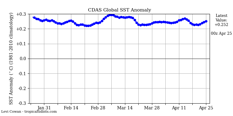
http://www.ospo.noaa.gov/data/sst/anomaly/2018/anomnight.1.22.2018.gif
ren,
Yes, weather changes quickly. What is your point?
The graphs show changes in ocean surface temperature and this is not a temporary “weather”.
Monthly Niño-3.4 index
2017 1 26.12 26.45 -0.33
2017 2 26.68 26.66 0.02
2017 3 27.33 27.21 0.12
2017 4 28.04 27.73 0.30
2017 5 28.30 27.85 0.45
2017 6 28.06 27.65 0.41
2017 7 27.54 27.26 0.28
2017 8 26.70 26.91 -0.21
2017 9 26.29 26.80 -0.51
2017 10 26.15 26.75 -0.60
2017 11 25.74 26.75 -1.01
2017 12 25.62 26.65 -1.03
Repeating Larry’s graph from above.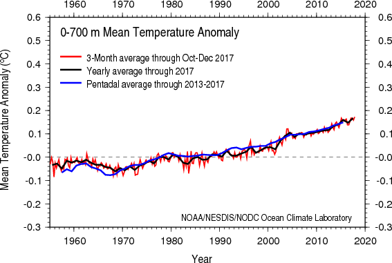
(0.2 deg C in 40 yrs)/(40yrs/century) = 0.5 deg C per century.
Half a degree per century!! Oh noes! We’re all going to die at that rate.
Joel,
(1) “Repeating Larry’s graph from above.”
It’s NOAA’s graph.
(2) “We’re all going to die at that rate.”
This is where showing the ocean heat content in joules (as Tony did above) is useful. Note the slope. As the papers in this post suggest, even a small release of that heat from the oceans can heat the atmosphere a lot.
Add the fact that ocean temp data before ARGO is nearly useless, not fit for use.
We only have reliable data from 2003.
To be clearer …
The capacity of air at 100C NOT actually at that temp.
The obsession with tenths of a degree imply that the oceans constitute a microclimate like the one in my yard that has a sharp line dividing melting snow in the sun and snow NOT melting in the shadow of the house next door.
That is not an appropriate viewpoint, especially since it also implies that ocean water is a static state when we all know that it is not.
modelled, assumption based nonsense. Insufficient data before 2003.
certainly nothing to show anything that isn’t totally natural
“This model indicates that in situ warming of the atmosphere does not occur; instead, a store-and-release mechanism from the ocean to the atmosphere is proposed. It is physically plausible and theoretically sound. The presence of step-like – rather than gradual – warming is important information for characterising and managing future climate risk.”
Yes, or the only cause of global warming is due to the ocean.
The average surface temperature of the Ocean is about 17 C. And average temperature of the Land is about 10 C.
A significant factor of why the average temperature of ocean is that the average temperature of tropical ocean is about 26 C and tropical ocean surface area is about 40% of entire ocean.
Or in class of 100, one has 40 students with high score and rest class are mostly flunking the class.
Our world is cold, other than in or near the tropics. Or we have been for millions millions of years
in an ice box climate- which is defined as cold oceans and having polar cap.
And a hothouse climate is warm ocean and no ice caps.
And as everyone knows the tropics warms the rest of the world. The tropical ocean warms the rest of the world- adds heat to the rest the world. And tropical zone makes the earth class have a passing grade of 15 C and having average temperature of 15 C is actually rare in terms of total surface area.
Now one could say tropical ocean surface temperatures controls global weather, but it’s the average volume temperature of entire ocean which controls global climate temperature.
Or it’s the difference between an ice box and hothouse climate. And this average volume temperature of our ocean is about 3.5 C.
What happens of earth’s average volume temperature was instead 5 C- mainly prevent colder nights and colder winters outside the tropics. Or doesn’t make hot days hotter. .
That is why La Niña is so important. The wind direction along the equator significantly lowers the temperature in medium latitudes.
The surface cannot warm without the additional “enhanced greenhouse effect”. Climate models assume water vapor is a strong positive feedback and that relative humidity is constant. On RPS’s now defunct weblog, he discussed this topic frequently.
Toneb, please explain how a .0001 Mole Fraction increase in atmospheric CO2 levels can warm the ocean depths. Is it a magic gas? Considering the vaunted “back radiation” we’ve heard about all these decades can only penetrate the top ~.030mm of water, surely you can provide an experimental source where tests have verified CO2 can warm the oceans more than short wave radiation over the past 30 years? I suspect even with make believe “wave action” overturning mixing of the “heated” top layer could not contribute a measurable temperature change by the most sensitive thermometer.
Climate models also assume cloud cover is controlled by CO2. Would you care to explain by what mechanism this is accomplished? It seems like it’s just more bumpkins pulling levers on GCM’s once the curtain is pulled away.
“Considering the vaunted “back radiation” we’ve heard about all these decades can only penetrate the top ~.030mm of water,”
and when evaporation occurs, it actually decreases the water temp in the first 1mm or so by 0.3ºC due to the extraction of latent heat.
So any “mixing” will actually cool the surface.
What is the evidence that whatever warming occurs will be harmful in the future?
So far it appears to be mostly beneficial. Since even most catastrophists admit the upward temperature trend will moderate, what evidence is there the beneficial trend will end before that moderation?
Brian,
There is a massive amount of studies showing ill effects from warming.
“what evidence is there the beneficial trend will end before that moderation?”
That’s why the IPCC uses scenarios, from best case to worst case. These provide a basis for making public policy. It is imo an inadequate basis, hence my proposals (links shown in this post).
“That’s why the IPCC uses scenarios”
Larry Kummer,
You may not realize this but appealing to the IPCC is not science.
Andrew
I’m aware of a massive amount of speculation, some of it in the form of studies. That speculation is considerably blunted in that there were massive studies and speculations that we would already be seeing considerable harm from rising temps. But, as you note, the effect so far has been mostly positive.
The history of these speculations and projections and scenarios have been almost always overstating the actual negative effects followed by a quiet reassessment that later also turns out to be overly pessimistic.
The “massive amount of studies” have so far inspired little to no confidence they are worthwhile.
The actual concrete evidence we have, the past and present observations, compared to previous studies and speculations seem to me to demonstrate we should place very little credence in the same people telling us this time they have it right for sure.
It is especially disappointing to observe the manner so many react to their failed speculations.
Moar cowbell! is not science.
Kummer, you’ve done it now
This quote below
certainly must be a typo,
or you are drunk:
.
.
“There is a massive amount of studies
showing ill effects from warming.”
.
.
What the h-e-l-l are you talking about?
Cold weather is much more dangerous
to humans than warm weather.
There are nonsense junk science “studies”.
And we don’t need no stinkin’ studies!
we had an alleged one degree C.
of warming since 1880 and our
planet has the most prosperous
and healthy people we’ve ever had.
The past 137 years was the best 137 years
for humans since there were humans
on our planet.
We had warming for at least 137 years
and now the climate is wonderful,
people are healthier
and more prosperous too.
The cold era in the last half of the
1600’s (Maunder Minimum)
got lots of complaints
in anecdotal evidence,
and there were some famines too.
Warming = good
Cooling = bad
There is no evidence
the reverse is true.
But there is no evidence
and no real science studies
showing that the roughly estimated
average temperature change
of +1 degree C.
(+/- 1 degree C., in my opinion)
since 1880,
has caused any ill effects,
or that a +1 degree C. increase
from doubling CO2
in the future would be harmful,
(I’m assuming the simple CO2 lab
experiments are correct)
+1 degree C.
in the next 133 years
(if CO2 is up 3 ppm per year)
+1 degree C.
in the next 200 years
(if CO2 is up 2 ppm per year)
You’re in a deepening hole,
Kummer, and still digging,
halfway to China by now,
in one day!
Sorry, no poem this time!
“The world has been warming for two centuries, since the Little Ice Age ended.” A very good thing. If it wasn’t it would still be just as cold or very likely getting colder. You would have to be very stupid to wish for that, unless you favor widespread famine and slowly encroaching glaciers.
The oceans have probably been warming for about 10 or 12 thousand years. Also, a good thing as it takes a long time to heat a pot of water if the heat source is on top. Even the coldest periods of the Holocene were probably warming the oceans.
According to IPCC the ocean has warmed about 0.1 degrees C in 50 years. That is very close to actually cooling. Perhaps we should begin to worry.
this story and thread are based on a precision of measurement that does NOT EXIST…..we CANT arrive at a single temperature for the entire earth with precision to the hundredths of a degree being claimed here.
Bill Taylor
Kummer is using tenths of a degree C.
I think tenths are meaningless,
but many disagree.
It is NOAA who are “quoted”
using hundredths of a degree C.
As in ‘2016 was a few hundredths of a degree C.
warmer than 2015 — everyone head for the hills!’
the economy of the US is being decarbonized; this would happen faster if nuclear power plants were not being shut down but the trend is still there
events in 2018 should make this trend more obvious e.g., the emergence of hybrid trucks, better energy storage devices, although there will be events that go the other way
the metrics on this take several years
The US economy is becoming more efficient. Something it’s been doing for hundreds of years.
That we use less energy in the process is a by product, not the intent.
One of things l will be watching closely in 2018 will be the NH spring snow cover extent.
Last winter there was above average snow depth over large parts of northern Russia which lasted into the spring. This help to cause a large rise in the 2017 spring snow cover extent. Well this winter the same thing has happened again with above average snow depth over central and NE Russia. So it will be interesting to see what happens to this years spring snow cover extent.
As a further note there is also above average snow cover around the Hudson bay. So any extended cold weather that lasts into the spring in these area’s. Will cause this years NH spring snow cover extent to shoot up.
Sorry above average snow depth around the Hudson bay area rather then snow cover.
Hundred$ of Billion$ of dollar$ $pent world wide on temperature wiggle watching, with chicken little hand wringing over ‘changes’ in hundredths of an ‘average’ degree…. What a profound waste of time, manpower, and money.
“But, but it’s the trend that matters! Oooh! It wiggled up last year.”
Excuse me. I have more important work beckoning. Time to clean the lint out of the dryer exhaust vent.
Well that’s fairly important:
“An estimated 2,900 clothes dryer fires in residential buildings are reported to U.S. fire departments each year and cause an estimated 5 deaths, 100 injuries, and $35 million in property loss.
Failure to clean (34 percent) was the leading factor contributing to the ignition of clothes dryer fires in residential buildings.”
Good point, Phil! Dryer lint is more hazardous that Global Warming, AGW, Climate Change, Climate Weirding, or whatever the climate chicken littles are calling it these days.
J Mac
“temperature wiggle watching,”
You climate change wisdom
is so great that it only takes
you three words to make a huge
point.
If the temperature of Earth can not be determined exactly in the past then we should not claim that we know the precise temperature of the past, all the adjustment of past global temperatures makes me lose confidence that you know what the global temperature was. The present global temperatures will soon become past global temperatures and will be adjusted again which gives me no confidence that you know what the present global temperature is , this method may be acceptable in social science but it is not acceptable in science. All the temperature adjustment and additions to the global temperature gleefully declared necessary before we can know what the true extent of global warming really is leaves the possibility open that the measurement of the last el nino temperature increase was wrong and not an indication of global warming. How do the oceans warm during a pause?
A criticism made at the link shown below is that the NOAA and NASA data on which the claim of record 2017 warmth is made is fake. Cold on their map is shown as warm. Areas for which they have no observations is shown as warmth, even record warmth.
https://realclimatescience.com/2018/01/new-video-2017-the-fakest-year-on-record-at-nasa-and-noaa/
At this link it is pointed out that in 2017 Greenland had the fifth largest gain in ice on record. Arctic ice has gained thick ice and ice volume over 1o years ago. As is pointed out “Global warming is caused by data tampering at government agencies.”
groweg,
“A criticism made at the link shown below is that the NOAA and NASA data on which the claim of record 2017 warmth is made is fake.”
Even if that is true (which I doubt), there are other systems giving confirming evidence.
The two sets of satellite data show a similar picture. See the Global Temperature Report for December 2017 from Christy and Spencer at UAH: “2017 was third warmest year in satellite record.” Roy Spencer shows more info about December and the longer record at his website.
Also see similar data bout 2017 by Remote Sensing Systems, and their analysis of the longer-term data.
Also, this post shows the ocean temperature data — which shows recent temperaturer is a record high (going back to about 1955).
Larry makes no refutation of the point made in the linked to article that very many of the “hot” areas in the NOAA/NASA data have no observations and use imputed (“made up”) temperatures. If this is true, his article collapses. All he can say is he has “doubt” that it is true. Is true or not that very many ‘hot” areas in the data set Larry cites actually have NO empirical observations? Apparently, Larry is saying he does not know. It is either true or not that many of the “hot” areas have no observed actual temperature readings, leaving room for “fake” hot temperature data to be filled in.
Larry, did you write an article claiming record warmth in 2017 when very many of the “hot” areas your conclusion is based upon have no actual temperature readings? Yes or no?
A simple look at the temperature graph Christy and Spencer develop makes it clear their upward trend looks nothing like the relentless upward march your graph shows. Since you bring it up, why is there this difference? The Christy and Spencer data set does not show a “similar picture.”
Kummer’s “analysis” is right out of a Wall St. stock broker’s office.
Semi-meaningful observations, stuck together with pretty charts, hand-waving, and an “if-this-trend-continues-you’ll-make-a-million-by-the-third-quarter” exhortation.
Still can’t figure out what he’s exhorting–but every stock broker’s pitching something.
Of course, he cannot be bothered with actual vetting of the “data” his “trend” is based on.
If he acknowledged the fraudulent data, then he’d have no basis to exhort action.
Meanwhile, back on Main St., the temperature record fraud is chronicled daily.
See Homewood’s analysis today: NOAA massively altered NY’s temperature record.
https://notalotofpeopleknowthat.wordpress.com/2018/01/25/new-yorks-temperature-record-massively-altered-by-noaa/
How’s that “trend”?
What’ll happen if we don’t act now?
What temperature will be in North America at the beginning of February 2018?
Kummer is not a good contributor for this site.
He embraces the fake NOAA/NASA temperature data.
Not sure what his motivations are, but whatever they are, it’s not good.
Not even sure what he’s trying to say in this posting. He throws around “denier” a bit. Seems to criticize alarmists.
Then he says that the important thing is “knowing the future temperature”? What?! The temperature record is totally corrupted. It is changed, adjusted, homogenized, cooled, warmed, and twisted into a tool for the alarmists to tout. Why think the future will be any different?
The real indicator of unfitness of this contributor, however, is his links at the bottom of his article. He links to his own site. It should only take one of those links to disqualify him as a source worth listening to. This one:
“Paul Krugman talks about economics. Climate scientists can learn from his insights.”
Yeah, that’s it. What’s missing from the climate debate is Paul Krugman’s insights!
Yeah! Krugman is a failure as an economist. Much like Al Gore, if Krugman predicts it, the opposite is likely to happen.
Nearly nothing Krugman predicts happens. He believes, like the AGW cultists, in a proven-wrong economic theory (Keynes), and despises normal-Americans. Reality never gets in Krugman’s way.
One example? The day Trump was elected, Krugman predicted the stock market would crash, continue crashing, and plunge the world into never-ending recession. The reality? The stock market has set nearly daily records in the year of Trump’s administration.
Krugman’s “markets will never recover” prediction:
“It really does now look like President Donald J. Trump, and markets are plunging. When might we expect them to recover?
Frankly, I find it hard to care much, even though this is my specialty. The disaster for America and the world has so many aspects that the economic ramifications are way down my list of things to fear.
Still, I guess people want an answer: If the question is when markets will recover, a first-pass answer is never.”
https://www.nytimes.com/interactive/projects/cp/opinion/election-night-2016/paul-krugman-the-economic-fallout
Yeah, just what we need–Krugman and Kummer as the prophets of a “climate solution.”
No, thanks. Please send Kummer packing off to the NY Times with Krugman.
Thanks.
Kent,
Wow! Not much worth responding to there, but I’ll look at a few points.
(1) “He throws around “denier” a bit.”
Words are not inherently good or bad (there are probably exceptions to this rule, as always). “Denier” is a useful word that has been (as so often the case these days) been misappropriated for propaganda use.
It is used in this post twice. First, to describe climate activists who “deny” scientists’ papers about the pause (too good an opportunity to miss, given activists long history of misusing “denier”). Second, about those few (but too many) who deny the massive evidence that the Earth is warming.
(2) “Seems to criticize alarmists.”
Yes. I do that a lot. What’s your point?
(3) “What’s missing from the climate debate is Paul Krugman’s insights!”
I’m amazed that I must explain this. Krugman is a big-time climate alarmist. When his own logic shows the fallacy of the alarmists’ case, it is news. This is similar to what attorney’s call an Admission Against Interest.
(4) “Nearly nothing Krugman predicts happens.”
That’s bizarrely false. He has become preeminent among economists in part because of his many accurate predictions. Such as during 1994-1998 about the East Asian economies. https://en.wikipedia.org/wiki/Paul_Krugman#East_Asian_growth
Also, his analysis during the 2007-08 crash and aftermath were quite accurate (esp since so many others’ were very wrong).
(5) “Krugman’s “markets will never recover” prediction” was an impulsive and emotional comment in reaction to disappointment after the election. Perhaps you are Mr. Perfect and never said something dumb like that, but most of the rest of us have.
“Kummer is not a good contributor for this site.
He embraces the fake NOAA/NASA temperature data.”
OK. Then I assume you prefer UAH.
If so, could you elaborate as to why?
Perhaps tell us why it’s many adjustments should not make it untrustworthy?
Fake even?
Such that, UAH (not forgetting the all important V6.0) is a cold outlier in the various tropospheric temerature series.
Is that scientific considering the standard practise of at least taking the mean of series as the most likely to have least error?
In short a conspiracy theory that belittles any rational site let alone a science based one.
“OK. Then I assume you prefer UAH.
If so, could you elaborate as to why?
Perhaps tell us why it’s many adjustments should not make it untrustworthy?
Fake even?”
Yes, I definitely prefer UAH. The radiosondes measurements agree with the UAH satellite measurements. Are the radiosondes fake?
http://www.cfact.org/2016/01/26/measuring-global-temperatures-satellites-or-thermometers/
“Yes, I definitely prefer UAH. The radiosondes measurements agree with the UAH satellite measurements. Are the radiosondes fake?”
Really??
You ought to look more closely…..
http://postmyimage.com/img2/792_UAHRatpacvalidation2.png
They most certainly do NOT agree.
UAH has been running cold against them since the move from NOAA 14 to 15 and the new AMSU in ’98.
RSS made a correction with their v4.0 to take partial account of it.
UAH have not.
http://www.remss.com/blog/RSS-TMT-updated/
But thanks for saying that radiosonde measurements are good.
Here is a comparison of the tropospheric trends…..
UAH is a distant cold outlier.
Kent Clizbe
Excellent comment.
Especially your next to last sentence:
“Yeah, just what we need–Krugman and Kummer
as the prophets of a “climate solution.” “
“Not sure what his motivations are, but whatever they are, it’s not good.
Not even sure what he’s trying to say in this posting. He throws around “denier” a bit. Seems to criticize alarmists. ”
How about Reasonable Man in the Middle game, ie, act like a peacemaker trying to bring both sides together as a way of eroding opposition to alarmists’ goals of government established policy?
ICISIL,
Yeah, that’s what I thought for a while. But it sure looks like he’s got some other angle.
He’s a career stockbroker. They always have an angle–always something they’re working on selling.
Glib babblers telling stories that sound plausible, even attractive.
The dead giveaways of “issues” are two:
1. He doesn’t care that the data his entire edifice is built on is fake. That is a Bernie Madoff-size indicator of fraud.
2. He touts the failed economist, Paul Krugman.
Either one of those indicators is a deal-breaker.
Together they send the Kummer ship to the bottom of the sea of credibility.
Beware.
I love his attitude that it is unreasonable to not assume that current trends will continue forever.
Funny, climate trends have never continued forever in the past.
Mark,
Have you ever heard such nonsense before? From whom?
If you’ve ever dealt with a stock broker, this is the EXACT exhortation you get.
“GLOBAL WIDGETS stock hit a 5 year high today. Look at the charts. See the trend? It’s going straight up. You HAVE to buy now!”
Their nonsense exhortations for us to put our money where their mouth is are total nonsense.
Kummer doesn’t know what the temperature will be in the future–regardless of his silly faith in NOAA and the IPCC.
Snake oil, at best. Fraud at worst.
Mark,
“I love his attitude that it is unreasonable to not assume that current trends will continue forever.”
Your comments are just reading FAILs. You make stuff up, respond to that, and declare victory. Not much point to responding to them.
That is also the most common tactic used by alarmists. Odd how the fringes in both sides resemble each other.
Pardon my laymen bluntness, but it looks to me like the trend on the last section of the graph was moving back down after a peak.
Joel,
Yes, declining from the peak. What comes next might have large political effect. This post speculates about what that might be, examining one scenario — another pause (implications of the cooling and warming scenarios are obvious).
Time will tell.
So, only the trends that you agree with should be considered as continuing forever.
Non-scientist here, so forgive my ignorance, but . . . what temperature data does the above graph use? Has it been manipulated/adjusted? If so, what would it look like if it used raw, unadjusted data?
“Non-scientist here, so forgive my ignorance, but . . . what temperature data does the above graph use? Has it been manipulated/adjusted?”
It uses NASA/NOAA data. Yes, it has been extensively manipulated to lower past temperatures, which makes later years look warmer (hotter and hotter).
These heavily manipulated surface temperature charts are called “Hockey Stick” charts. They are not to be believed. They are dishonest manipulations of the temperature record.
“If so, what would it look like if it used raw, unadjusted data?”
It would look something like this: The 1999 Hansen surface temperature chart and the UAH satellite chart (1979 to present). Notice on the Hansen chart that the 1930’s is 0.5C hotter than 1998, and then notice on the satellite chart that 2016 is 0.1C hotter than 1998, which makes the 1930’s 0.4C hotter than 2016, which NASA and NOAA claim was the hotter year ever.
Hansen 1999 chart (notice it looks nothing like a Hockey Stick chart):
UAH satellite chart:
http://www.drroyspencer.com/wp-content/uploads/UAH_LT_1979_thru_December_2017_v6.jpg
The way to recognize a Hockey Stick chart is to look at the 1930’s. If the chart shows the 1930’s as being cooler than 1998, then you are looking at a bogus, bastardized Hockey Stick chart. Most legitimate charts, from all over the world, show the 1930’s as being hotter than subsequent years and none of them look like Hockey Stick charts.
David,
Ignore all the wild claims about conspiracies. There are multiple databases, all of which show roughly similar patterns of warming.
The two sets of satellite data show a similar picture. See the Global Temperature Report for December 2017 by Christy and Spencer at UAH: “2017 was third warmest year in satellite record.” Roy Spencer shows more info about December and the longer record at his website.
Also see Lower Tropospheric Temperature for 2017 is the second warmest in recent history by Remote Sensing Systems, and their analysis of the longer-term data.
This post also shows NOAA’s ocean temperature data — which shows a roughly similar picture.
Larry, you keep referring to Christy and Spencer’s chart as supporting your chart. It contains less than 40 years of data. 2017 was an el Nino year and it was third of 38 years. So what? Fluctuations due to el Nino’s happen. The UAH chart looks nothing like the chart you extol with its relentless upward temperature progression.
The NOAA/NASA data set you use imputes record high temperatures to large sections of the globe where there are no recorded observations according to Steve Goddard. Have any answer to that criticism? If not, why waste our time here.
https://realclimatescience.com/2018/01/new-video-2017-the-fakest-year-on-record-at-nasa-and-noaa/
“Ignore all the wild claims about conspiracies. There are multiple databases, all of which show roughly similar patterns of warming.
The two sets of satellite data show a similar picture.”
Well, you should look at this post by Mr. Heller. He gives very good visuals of how the temperature records, including the satellites, have been changed over time.
The UAH satellite measurements are the least changed of all, and UAH agrees with the balloon measurements. So it looks to me like UAH is the most accurate one.
https://realclimatescience.com/2018/01/my-climate-forecast-from-three-years-ago/
Once again Larry, your sources are confused or wrong. ?w=720
Willis investigated the ocean heat content claim back when NOAA first introduced their chart disguise that placed temperatures into joules.
It makes a massive difference when 0.02°C change is suddenly displayed as a 0.2°C temperature change.
As, I remember, Willis checked the ocean temperatures for several portions of the world and discovered that the oceans are not uniformly warming.
As with so many other NOAA products, temperatures found in one isolated regions are smeared to represent temperatures in other oceanic regions.
Link? I went and found one. You find the rest.
ATheoK,,
“Link? I went and found one. You find the rest.”
I’ll stick with the NOAA data — which is broadly similar to that of the surface atmosphere and satellite data. You can explore the grey literature if you like.
Ocean temperatures are starting to drop. as you would expect from the sleepy sun and the dissolution of the El Nino transient. ?w=1000
Larry Kummer, “One of the most important datasets of our time.”
Its importance is strictly political.
Scientifically, neglected systematic measurement error makes the global air temperature record almost meaningless.
Pat,
“Its importance is strictly political.”
Yes, I agree.. That’s what I said in the opening and closing sections.