Global effects of El Niño event seem to have passed, and we’ve cooled to a value just before the event, according to data from the UK Hadley Climate Centre
Earlier we reported on ocean temperatures dropping, now we have confirmation that global air temperature is dropping as well. The latest data is in, and now according to HadCRUT data, we are back to the same level as before the 2014/2016 super El Niño event heated up the planet.
Clive Best writes:
The HadCRUT4.5 temperature anomaly for September calculated by spherical triangulation is 0.54C, a fall of 0.17C since August. Temperatures have seemingly returned to a long trend after the 2016 El Niño.

Clive Best uses a custom triangulation method to calculate the global temperature anomaly from the raw data, so I thought I’d verify this from the publicly available HadCrut data.
Source of global temperature anomaly data:
HadCRUT4 time series
These ‘best estimate’ series are computed as the medians of regional time series computed for each of the 100 ensemble member realisations. Time series are presented as temperature anomalies (deg C) relative to 1961-1990.
Quoted uncertainties are computed by integrating across the distribution described by the 100 ensemble members, together with additional measurement and sampling error and coverage uncertainty information.
The data files contain 12 columns:
- Column 1 is the date.
- Column 2 is the median of the 100 ensemble member time series.
- Columns 3 and 4 are the lower and upper bounds of the 95% confidence interval of bias uncertainty computed from the 100 member ensemble.
- Columns 5 and 6 are the lower and upper bounds of the 95% confidence interval of measurement and sampling uncertainties around the ensemble median. These are the combination of fully uncorrelated measurement and sampling uncertainties and partially correlated uncertainties described by the HadCRUT4 error covariance matrices.
- Columns 7 and 8 are the lower and upper bounds of the 95% confidence interval of coverage uncertainties around the ensemble median.
- Columns 9 and 10 are the lower and upper bounds of the 95% confidence interval of the combination of measurement and sampling and bias uncertainties.
- Columns 11 and 12 are the lower and upper bounds of the 95% confidence interval of the combined effects of all the uncertainties described in the HadCRUT4 error model (measurement and sampling, bias and coverage uncertainties).
More details are given in the paper introducing the dataset.
According to the Japanese Meteorological Agency, the 2014-2016 El Niño event formed in May 2014.
Plotting the HadCRUT4.5 data (column 2, mean anomaly) for that period yields this:

In May 2014, at the beginning of the ENSO event, Global Temperature Anomaly was 0.608, now in September 2017, it has cooled to 0.561. It appears all affects from that ENSO event are now removed from the global temperature record.
Looks like claims of the “hottest year ever” won’t be happening in 2017, and we may see a return of “the pause” soon.
The Dogs coat says the Sun is weak. Grow more fur it’s getting cold!
Fig 4 and the forecasts from my paper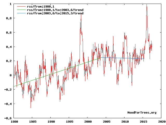
http://climatesense-norpag.blogspot.com/2017/02/the-coming-cooling-usefully-accurate_17.html
show where we are now.
Fig 4. RSS trends showing the millennial cycle temperature peak at about 2003 (14)
“Figure 4 illustrates the working hypothesis that for this RSS time series the peak of the Millennial cycle, a very important “golden spike”, can be designated at 2003.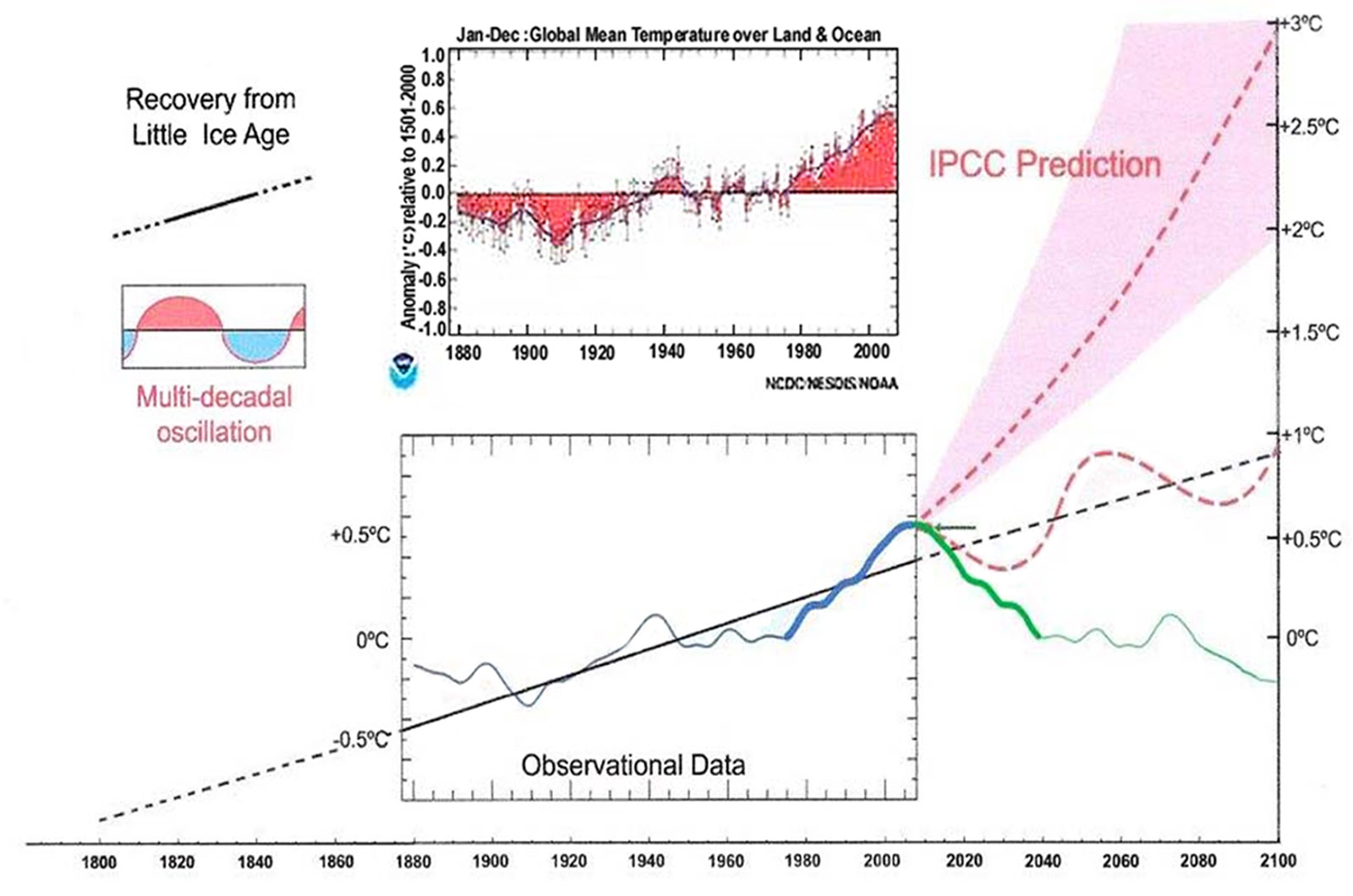
The RSS cooling trend in Fig. 4 and the Hadcrut4gl cooling in Fig. 5 were truncated at 2015.3 and 2014.2, respectively, because it makes no sense to start or end the analysis of a time series in the middle of major ENSO events which create ephemeral deviations from the longer term trends. By the end of August 2016, the strong El Nino temperature anomaly had declined rapidly. The cooling trend is likely to be fully restored by the end of 2019”
Fig 12 shows the forecast to 2100
Fig. 12. Comparative Temperature Forecasts to 2100.
“Fig. 12 compares the IPCC forecast with the Akasofu (31) forecast (red harmonic) and with the simple and most reasonable working hypothesis of this paper (green line) that the “Golden Spike” temperature peak at about 2003 is the most recent peak in the millennial cycle. Akasofu forecasts a further temperature increase to 2100 to be 0.5°C ± 0.2C, rather than 4.0 C +/- 2.0C predicted by the IPCC. but this interpretation ignores the Millennial inflexion point at 2004. Fig. 12 shows that the well documented 60-year temperature cycle coincidentally also peaks at about 2003.Looking at the shorter 60+/- year wavelength modulation of the millennial trend, the most straightforward hypothesis is that the cooling trends from 2003 forward will simply be a mirror image of the recent rising trends. This is illustrated by the green curve in Fig. 12, which shows cooling until 2038, slight warming to 2073 and then cooling to the end of the century, by which time almost all of the 20th century warming will have been reversed. Easterbrook 2015 (32) based his 2100 forecasts on the warming/cooling, mainly PDO, cycles of the last century. These are similar to Akasofu’s because Easterbrook’s Fig 5 also fails to recognize the 2004 Millennial peak and inversion. Scaffetta’s 2000-2100 projected warming forecast (18) ranged between 0.3 C and 1.6 C which is significantly lower than the IPCC GCM ensemble mean projected warming of 1.1C to 4.1 C. The difference between Scaffetta’s paper and the current paper is that his Fig.30 B also ignores the Millennial temperature trend inversion here picked at 2003 and he allows for the possibility of a more significant anthropogenic CO2 warming contribution.”
Fig 4 and the forecasts from my paper… show where we are now.

“Now”? The WFT trend line ends in early 2015, more than 2 and a half years ago.
Here’s where we are now.
http://www.woodfortrees.org/graph/rss/from:1980.1/plot/rss/from:1980.1/to:2003.6/trend/plot/rss/from:2003.6/trend?.png
https://www.google.com/search?q=geologic+temperature+record&oq=geologic+temperature&aqs=chrome.0.0j69i57j0l2.15888j0j7&sourceid=chrome-mobile&ie=UTF-8#imgrc=30GschKIZcoFcM:
Depends upon your time frame.
The last image might not embed. I’ll try this.
http://i1006.photobucket.com/albums/af185/barryschwarz/rss%20split%20trend_zpsrwctwaii.png
Barry as I said above “Akasofu forecasts a further temperature increase to 2100 to be 0.5°C ± 0.2C, rather than 4.0 C +/- 2.0C predicted by the IPCC. but this interpretation ignores the Millennial inflexion point at 2004. Fig. 12 shows that the well documented 60-year temperature cycle coincidentally also peaks at about 2003……. Easterbrook’s Fig 5 also fails to recognize the 2004 Millennial peak and inversion. Scaffetta’s 2000-2100 projected warming forecast (18) ranged between 0.3 C and 1.6 C which is significantly lower than the IPCC GCM ensemble mean projected warming of 1.1C to 4.1 C. The difference between Scaffetta’s paper and the current paper is that his Fig.30 B also ignores the Millennial temperature trend inversion here picked at 2003.”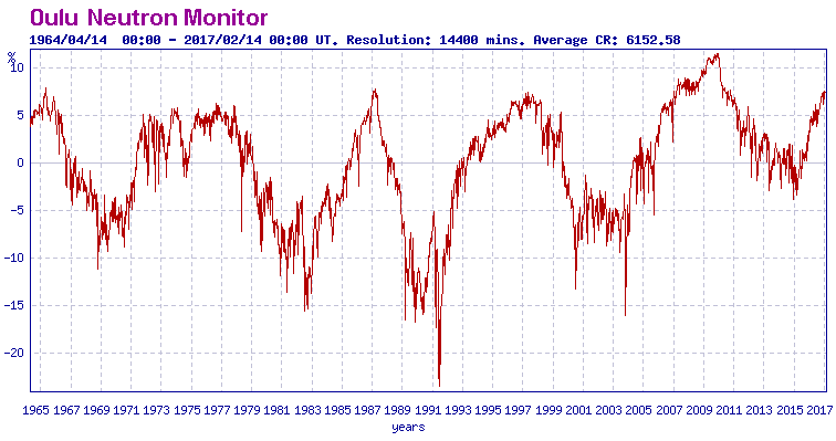
This failure to recognize the correlation between the millennial cycle temperature peak at about 2003/4 (The El Nino peak at 2016 is a temporary aberration) and the solar activity peak at 1991 is the root cause of the climate establishments scary dangerous global warming forecasts. See Fig 10 and the paper as a whole for a discussion of the delays between the solar driver and the temperature and other climate indicator peaks or troughs.
N page: a massive
cherry pick; not
science.
Great to see the courageous skepticism. We posted this update on http://www.PressCalifornia.com, a sort of Drudge for just California.
What’s utterly mad about all of this is that, while proof of detrimental warming caused by man-made CO2 has never risen to a degree of certainty that would be demanded in any other field of science, the proof of its beneficial effects in the ecosystem is incontrovertible – all over the world and especially in arid climates.
On November 8th, the anniversary of the last US election, misguided liberals and their loony goons are going to go outside and emit an enormous group scream – surely antithetical to their position regarding CO2 emissions? Well, no matter. On November 8, I’m going to plant corn and capture some of that gaseous goodness. .
And I’ll enjoy their scream.
You are so correct that they ignore the positives of warming. Do they not know that the hot ages were prosperous ages?
Nevertheless, even if they really believe they are correct, what gets me is how glibly they ignore all the fantastic technology God has allowed men to develop over the past 200 years: Automobiles, aircraft, space flight, computers, the internet, modern medicine, telecommunications, electric power & lighting, AIR CONDITIONING. heating, earth moving equipment, roads, skyscrapers, dams, water & sewage systems…the list goes on and on and on. Do they REALLY expect mankind to just sit on their hands and watch a global catastrophe unfold???? If the ancient Dutchmen could push the sea back using only the muscles of men and animals, and primitive wind power, what could we do given 50 years? And even IF we allowed the sea to reclaim land, how many roads and buildings do you know of that are even 50 years old, much less 100? Their wilful ignorance is legion…
My questions are: Does that big shinny thing in the sky have anything to do with the temperature on earth? If so, we should control it posthaste. Does this CO2 create warmth, or does CO2 follow warmth? Lastly, if the liberal leftists had their druthers, would they make the earth cooler or warmer…. for the good of mankind?
The sun does provide the earth with most of its energy. Solar activity varies about 0.2% which is not sufficient to make it a significant factor in climate change. Peer-reviewed studies confirm that.
A meta-analysis paper, put together by both solar and climate scientists, details these studies: Solar Influences on Climate. Their bottom line: though the Sun may play some small role, “it is nevertheless much smaller than the estimated radiative forcing due to anthropogenic changes.” That is, human activities are the primary factor in global climate change. http://solar-center.stanford.edu/sun-on-earth/2009RG000282.pdf
http://solar-center.stanford.edu/images/600px-Temp-sunspot-co2.svg-sm.jpg
1) TSI is only one of, and the weakest mechanism by which the sun influences the earth’s climate.
2) You are ignoring thermal lag.
If TSI is the weakest mechanism the sun has on earth’s climate what is stronger?
Milankovitch cycles were stronger and TSI.
Jack believes what he is told. If you want to know what somebody else thinks, ask Jack. Jack doesn’t want to get into all that “thinking stuff”.
Like what might have caused all the changes that the earth saw regularly and were greater than we see now, but before humans had any impact. Or like, after 60 years of this “catastrophe”, nothing much has even happened, and one decent cool spell like 1940-1970 would utterly wipe out ALL the warming we saw up to 2000.
Makes his head hurt!
John – you do not know jack.
Mark S Johnson November 2, 2017 at 12:32 pm
The highest-energy portion of solar irradiance, the UV. Also magnetic flux.
Also, TSI fluctuates not just on an ~11 year cycle, but over longer periods.
https://phys.org/news/2015-03-fluctuations-solar.html
And UV varies the most. Half or more of TSI flux comes from the much bigger changes in UV, which at its high end makes and breaks ozone and at its low end penetrates seawater the farthest.
Gabro, UV is part of TSI (hint: the “T” stands for TOTAL)
.
“Total solar irradiance (TSI), is a measure of the solar power over ALL wavelengths per unit area incident on the Earth’s upper atmosphere. ” https://en.wikipedia.org/wiki/Solar_irradiance (my emphasis added)
…
What is the w/m2 effect of the magnetic flux? Doesn’t seem to be much considring how cold it is in the Arctic and Antarctica.
Mark S Johnson November 2, 2017 at 2:08 pm
As already noted but apparently ignored by you, the UV portion of TSI varies enormously, while the other spectral bands fluctuate much less.
UV is qualitatively different from the rest of TSI because it makes and breaks ozone and penetrates seawater farther than visible and IR light.
But but global warming. And Al Gore needs more money.
All I get from this is that global temp trends mirror changes in ENSO. This is something we do know.
I just keep hoping for maybe thermo nuclear war, a super volcano, asteroid, or other phenomenon to cause an ice age and wipe out mankind. I may be dead, but at least I wouldn’t have to hear about mankind altering the climate. LOL false data being peddled by the government as usual, the same government that exploded nuclear weapons in our atmosphere then blamed the public for the use of aerosols and hairspray for holes in the Ozone, during the 80’s! 😉 If no ice age then hope for global warming. Plants don’t tend to grow well in permafrost!
So, sell Fairbanks properties or not?
But, but, but … I thought it was models all the way down, Robert!
Anthony:
Individual point or volume temperature sampling/measurements should probably be plotted as statistical deviations and distributions from the calibration curve for the instrument over that reading. Along with thermal and equipment noise, errors and and time based smears.
When taking averages of multiple sites or multiple readings on a site then the calibration curves converge but the sampling noise/error of the samples/measurement does not.
> Temperatures have seemingly returned to a long trend after the 2016 El Niño.
… a trend which just so happens to be what CO2 forcing alone would have predicted over the same interval, if not a wee tad higher.
https://twitter.com/brandonrgates/status/926144837027430400
Uh, Brandon, you are actually showing that temperatures have nothing to do with CO2 concentrations. Except for the ending Super El Nino, that has to do with massive increases in tropical water vapor.
You might consider shaving that pussy facial hair growth.
Hadcrud4 is nonsense, and you know that.
“How do you like my 1-mo baseline?”
Speaking of which; what is the point behind using monthly intervals to measure the validity or lack thereof of the temperature record of the earth? It seems to be used as more of a a talking point than anything else because every 30 days or so some news head will gravely intone that the world has seen its hottest month on record.. You don’t hear much about the colder months. What is so magic about a given month? It seems rather arbitrary and pointless.
Rick,
For purposes of diagnosing climate changes, long term trends are what count most. I used monthly data here for parity with Clive’s analysis, and a 1-month baseline to spare myself the effort of connecting March 1998 to October of 2017 with a horizontal line … again for parity with Clive.
Normally, I’d use annual data because monthly is overkill, and I’d usually dispense with changing the baseline because in y = mx + b when I care about m, choice of what to make b is somewhat arbitrary.
we are back to the same level as before the 2014/2016 super El Niño event heated up the planet.
If 1998-2003 are anything to go by, we need a while to be sure there has not been another step change or other kind of net increase.
Don’t expect to see this made public by the BBC. They “believe”
So the increasing Super El Ninos caused by natural variation and some bad luck. Also, need to explain away Oct data point if it is higher (just call it normal variation).