Today, there’s all sorts of caterwauling over the NYT headline by Justin Gillis that made it above the fold in all caps, no less: FOR THIRD YEAR, THE EARTH IN 2016 HIT RECORD HEAT.

I’m truly surprised they didn’t add an exclamation point too. (h/t to Ken Caldiera for the photo)
Much of that “record heat” is based on interpolation of data in the Arctic, such as BEST has done. For example:
A different view of the record #Arctic warmth in 2016, which contributes to the ongoing decline in #seaice. pic.twitter.com/m1vt4k1wNo
— Dr. Robert Rohde (@RARohde) January 18, 2017
Since 1970, #globalwarming has continued at a furious pace, and disproportionately impacted continents and the Arctic. pic.twitter.com/HOBAZuirJA
— Dr. Robert Rohde (@RARohde) January 18, 2017
But in reality, there’s just not much data at the poles, there is no permanent thermometers at the North pole, since sea ice drifts, is unstable, and melts in the summer as it has for millennia. Weather stations can’t be permanent in the Arctic ocean. So, the data is often interpolated from the nearest land-based thermometers.
To show this, look at how NASA GISS shows data with and without data interpolation to the North pole:
WITH 1200 kilometer interpolation:


WITHOUT 1200 kilometer interpolation:

Here is the polar view:
WITH 1200 kilometer interpolation:

WITHOUT 1200 kilometer interpolation:

Source: https://data.giss.nasa.gov/gistemp/maps/https://data.giss.nasa.gov/gistemp/maps/
Grey areas in the maps indicate missing data.
What a difference that interpolation makes.
So you can see that much of the claims of “global record heat” hinge on interpolating the Arctic temperature data where there is none. For example, look at this map of Global Historical Climatological Network (GHCN) coverage:

As for the Continental USA, which has fantastically dense thermometer coverage as seen above, we were not even close to a record year according to NOAA’s own data. Annotations mine on the NOAA generated image:

- NOAA National Centers for Environmental information, Climate at a Glance: U.S. Time Series, Average Temperature, published January 2017, retrieved on January 19, 2017 from http://www.ncdc.noaa.gov/cag/
That plot was done using NOAA’s own plotter, which you can replicate using the link above. Note that 2012 was warmer than 2016, when we had the last big El Niño. That’s using all of the thermometers in the USA that NOAA manages and utilizes, both good and bad.
What happens if we select the state-of-the-art pristine U.S. Climate Reference Network data?
Same answer – 2016 was not a record warm year in the USA, 2012 was:

Interestingly enough, if we plot the monthly USCRN data, we see that sharp cooling in the last datapoint which goes below the zero anomaly line:

Cool times ahead!
Added: In the USCRN annual (January to December) graph above, note that the last three years in the USA were not record high temperature years either.
Added2: AndyG55 adds this analysis and graph in comments
When we graph USCRN with RSS and UAH over the US, we see that USCRN responds slightly more to warming surges.
As it is, the trends for all are basically identical and basically ZERO. (USCRN trend was exactly parallel and with RSS and UAH (all zero trend) before the slight El Nino surge starting mid 2015 )

I keep hearing on the news that the last 3 years have each set a new record for “hottest year evah” but that just doesn’t make sense to me. We know that 2016 was warmer due to the el nino but it was only barely hotter than 1998 according to every article I have read so far. Looking at all the charts 2015 and 2014 don’t even seem to come close to setting records above 1998, even with all of the manipulations to cool the past. Am I missing something here?
Just like Mann made the medieval warm period disappear, now they have made the 1998 El Nino disappear.
“Am I missing something here?”
You won’t miss anything if you look at a proper chart like the UAH satellite chart which shows 2016 as barely hotter than 1998.
The surface temperature charts have been manipulated to remove 1998 as the hottest year, and to make it appear that it is getting hotter and hotter every year so NOAA/NASA can claim it is the “hottest year ever” each year, like they are again doing this year.
They are actually correct with regard to 2016, but incorrect with regard to any other year between 1998 and 2016. 2016 was one-tenth of a degree hotter than the hottest point in 1998, but 1998 still holds second place (actually a tie with 2016, if you want to get technical).
Anyway, your instincts are correct, 1998 is hotter than every subsequent year but 2016.
http://www.drroyspencer.com/wp-content/uploads/UAH_LT_1979_thru_December_2016_v6.jpg
As far as US temperatures, we got a double top from 2006 / 2012, then a declining trend until now. As mentioned the US station coverage is way better than most of the rest of the world, so probably the decline in US temperatures is also a decline that’s happening worldwide, notwithstanding the pure garbage on the Arctic.
Further, the idea the US data should take preeminence is even more true when you look at the 1930s when the rest of the world had *very* sparse station coverage.
In 1999, before radical data manipulations, NASA data made it clear that it was hotter in the USA in the 1930s:
So we proved that 2014 wasn’t the hottest year. And then, no, it wasn’t 2015, and now, no it wasn’t 2016. So what was the hottest year?
I guess I’ll be told 1934.
Forrest,
“What makes you think that a single manufactured figure can reasonably be representative of the entire earth’s surface?”
This is the third year that a record is announced, and suddenly all sorts of reasons why this year’s number can’t be believed. The reasons (like station gaps here) would apply any year, but suddenly become pressing when the temperature is up.
But yours is the most comprehensive – we shouldn’t talk about global temperature at all! Yes, that has been popular. There is no way of knowing whether the Earth is warming, so it isn’t a problem. But then, WUWT has for ten years been talking about global temperatures. Grumbling about untidy stations, showing solar effects, predicting cooling. What would WUWT have to talk about if there was no global temperature?
Nick-
“This is the third year that a record is announced, and suddenly all sorts of reasons why this year’s number can’t be believed. The reasons (like station gaps here) would apply any year, but suddenly become pressing when the temperature is up.”
We’ve pretty much talked about the “records” and all the reasons why the numbers can’t be believed for a very long time. (pppppsssttt…you know Anthony has spent many years studying the station gaps and siting issues) But then YOU contradict yourself beautifully in the next statement: “But then, WUWT has for ten years been talking about global temperatures. Grumbling about untidy stations, showing solar effects, predicting cooling.” (so see…..all sorts of things have been pressing here at WUWT)
“What would WUWT have to talk about if there was no global temperature?”
Maybe recipes, or politics, or what Nick Stokes is doing for a job these days, since there’s no global temperature and climate science is an exacting, professional field devoid of conflict and filled with logic and reason?
Well Nick, you’ve described the problem perfectly while we all laugh at you.
But we’re told (irrelevantly)
“2016 was not a record warm year in the USA, 2012 was:”
Why can the USA have a record year, but not the globe? Exceptionalism?
Oh yeah, there’s laughin’ goin’ on … more than you think.
Nick,
Hardly all of a sudden. Skeptics have said that the antiscience, antihuman works of fantasy by NOAA, GISS, HADCRU and BEST were packs of lies for decades.
Nick,
For the sake of argument, let’s assume that the global temperature anomaly as currently calculated is a valid, useful metric. Why should the average person really care what the hottest year was? What does that, by itself, tell us, other than satisfy idle curiosity? I’m serious. What is the justification about all the hand-wringing over record this and record that when talking about the natural world?
Paul,
Individual years don’t mean much. But our future is made up of yars. It’s a reminder of where we are going. 0.1C here, 0.1C there and soon enough you’re talking about real warmth.
Except there’s evidence showing co2 has little affect on minimum temp, so we’re experiencing almost all natural climate.
So, Nick, you discount measurement error and credit climate models that have no predictive value. Fake science, brought to you by the folks at climate alarm central.
Nick said:
“Paul,
Individual years don’t mean much. But our future is made up of yars. It’s a reminder of where we are going. 0.1C here, 0.1C there and soon enough you’re talking about real warmth.”
Our past is made up of “yars” too. 4.5 billion yars (according to scientists). And all of the empirical evidence screams that Earth’s repeated patterns of behavior have been…0.1C here, 0.1 C there, and soon enough, an ICE AGE ends (like the one we are currently still living in) and there is a nice, warm, thriving planet for everyone (well…except now days just for people who aren’t stupid enough to build on coastlines that have repeatedly been submerged by this planet). And then the cooling returns. Surely you aren’t an empirical evidence science denier…..???
But lets suppose that humanity CAN generate some “real warmth” with emissions from fossil fuels. That might come in handy if Earth decides it’s time to glaciate again, ya think?
“Individual years don’t mean much.”
On that much we can agree. I would go further, though, and say they don’t really mean anything. Which why all the focus and headlines about “record” heat is just pure PR nonsense.
“It’s a reminder of where we are going.”
No, individual years tell us nothing about where we are going, record or not. It is entirely possible to have a record cold year even during a warming trend, and vice versa.
“[+]0.1C here, [+]0.1C there and soon enough you’re talking about real warmth”
Only assuming that all the other non-record years are neutral or positive. But they aren’t. So even if three or four of the last 10 years were record highs, it still does not mean anything. The others could all offset them for a trend of zero.
So all this n of m years had record high temperatures is just sensationalist nonsense. And every scientist should denounce it as such. I can excuse the media, but not the climate science community that promotes this crap.
Nick,
Yes, 0.1C per decade here, 0.1C per decade there. If we follow the current trend we will experience some warmth, maybe 1-1.5C, in a hundred years. Oh my!
Of course, when the 95% confidence level is +/- 5C then it is just as likely we will experience cooling. My bet is the null hypothesis, more of the same cyclical natural variation.
Gloateus,
“were packs of lies for decades”
Actually, they haven’t. It’s become a lot more shrill recently. But what we never see is any attempt by sceptics to calculate an average themselves. Unadjusted data is readily available. It isn’t hard.
Actually, I shouldn’t say never. Back in 2010, Jeff Id and Romanm made a valiant effort. I’ve continued using some of their methods. And then, they just ended up getting the same results as everyone else.
And of course the recent sceptic scientific audit of the indices just disintegrated. Nothing to report.
Why don’t you satisfy me you’re capable of even solving for the temperature of air by telling me the name of the law of thermodynamics written for solving temperature of atmospheric air.
Face it: your gurus got caught processing fraud. Mann/Jones/Hansen with their ”it’s a whole new form of math” that turns out over and over to be utterly worthless spam designed to steal grant money.
Have you ever worked in gas chemistry in any way, at any time? I think everybody on this board knows the answer to that. You don’t have any school in atmospheric chemistry. You don’t have any school or work in atmospheric radiation or for that matter, radiation physics of any kind.
How do I know that? You continue to claim you think the basic science of AGW is real science.
If you think it’s real, then show us all here, – atmospheric science professionals and amateurs alike – that you’re atmospheric chemistry and radiation physics competent.
Tell us the name of the law of thermodynamics to solve the temperature of a volume of atmospheric air, gas, vapor, etc.
Tell us the equation and tell us what each factor means.
Till you can competently do that you’re another fake on the internet claiming to understand something there’s no way you can,
when you can’t even name the law of thermodynamics governing the field.
And oh yes govern it, it does. It’s what gives the world enforceable legal and scientific certification standards that make the entire modern internal combustion, refrigeration/furnace and many other fields even possible.
I’ll wait, you think up some lie.
“Why don’t you satisfy me you’re capable of even solving for the temperature of air by telling me the name of the law of thermodynamics written for solving temperature of atmospheric air. “
Because this marks you as a crank, and I’m not interested.
As per my post above, when the earths temperature has been rising more or less steadily for more than a hundred years, warmest years ever are pretty commonplace. Even multiple warmest years ever in a row are probably commonplace. I have taken to measuring the snow depth in my yard as the snow is falling. I get a new record every few seconds. Warmistas are always trying to re-frame the debate from whether or not there is a large human influence in the current warming to there is warming so it must be caused by humans. How many warmest years in a row happened in the 1930’s? Anybody know??
BCBill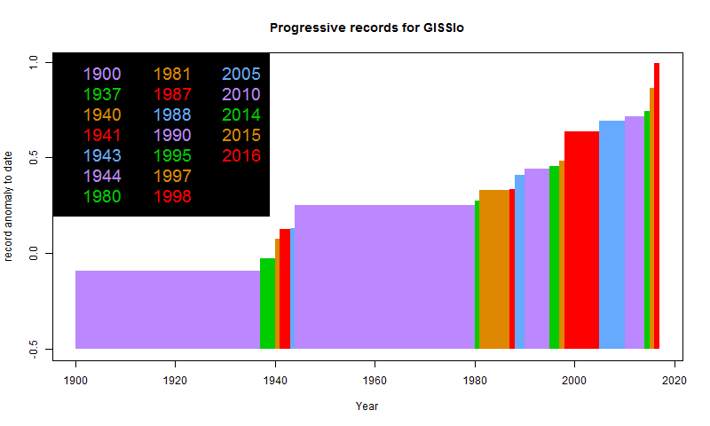
“warmest years ever are pretty commonplace.”
They are a lot more commonplace recently. Here is a plot of cumulative records of GISS since 1900. Every time a record is set, the plot changes color and rises to the new level. The current situation is not commonplace.
That’s a nice graph Nick and answers the question I have been asking, though I think that the late 19th/ early 20th century and from 1945 to 1976 were periods of slower warming/cooling. I understand they are somewhat atypical in terms of the climb out of the LIA . It would be nice to see a little further back. As many have pointed out, the thirties were a period of warming similar to the present though perhaps not as prolonged. Were there other periods similar to the present?
“I guess I’ll be told 1934”
That’s what Hansen said. He said the 1930’s was hotter than 1998, and his chart (see Eric’s chart above) shows the 1930’s as 0.5C hotter than 1998, which means the 1930’s was hotter than 2016, too. Which means 1934 was the “Hottest Year Evah!”.
And yes, the U.S. temperature chart represented by Eric’s chart is a good proxy for global temperatures (as good as we will ever have), imo, which is further strengthened by the Climategate dishonesty where the conspirators were concerned about the “GLOBAL” “40’s heat blip”, which they subsequently removed from the temperature records, to make it look like things are much hotter now than then. The Big Lie.
The principal actors in the CAGW false narrative said it was hotter in the 1930’s “GLOBALLY” than it is now. They then went about changing the temperature record to make it conform to the CAGW theory. There is no changing this fact. Alarmists can’t dismiss the 1940’s heat blip as being restricted to the USA.
“That’s what Hansen said.”
Yup. I predicted it.
“which they subsequently removed from the temperature records, to make it look like things are much hotter now than then. The Big Lie.
The principal actors in the CAGW false narrative said it was hotter in the 1930’s “GLOBALLY” than it is now. “
Absolute nonsense. Below is a GISS plot (history page) showing versions since 1987. 1987 was met stations only, the rest land/ocean. You can see that globally, the 1930’s have never been rated close to present values; in fact, the highest value 1944 is rated higher now than in any previous version. There is no sign that temps were bumped down by 0.15°C.
A couple of articles ago the graphs were from MET using the base line 1961-1990. The BEST graphs are using a base line of 1951-1980. The NOAA graphs don’t show the base line period. Why can’t you’all just use the same freakin’ base lines!
‘Hiroshima atomic bombs’
Fear-mongering 101.
From 600 Million Year Geologic Record I note 2 things
1. Even when CO2 levels reached 7000ppm this planet did not experience run-away global warming. In fact at no time did such an event ever happen. Even with CO2 levels at 2 times to nearly 10 times the current levels, ice-age glaciation was not prevented. Showing how merge is CO2 in climate terms.
2. Historically this planet is running very low on atmospheric CO2.
If it drops just a little to 200ppm plants will struggle to survive, endangering all animals. Worse if it falls below 180ppm, as then plant life and all animal life, including humans, stops.
So it may or may not be the ‘hottest year ever’ recently but historically it is nonsense.
If only the 1930s ‘Grapes of Wrath’ years were not excised from the record, the climate choir would have to sing a different song.
It may or may not be the ‘hottest year ever’ but CO2 levels are obviously not the climate driver.
It may or may not be the ‘hottest year ever’ but that relies on your personal beliefs in the probity or otherwise of those making the claim.
“If only the 1930s ‘Grapes of Wrath’ years were not excised from the record, the climate choir would have to sing a different song.”
That’s why it was excised. They didn’t want to sing that different song.
Interpolation across a pole… has to be on a Top Ten List for “Ways To Flunk a Numerical Methods” Sr. project. Sigh.
Just a simple pole? Easy.
Both GHCN version 4 and Berkeley Earth have pretty decent arctic coverage, especially in recent years. That said, there are still no stations directly in the arctic ocean, so some interpolation is needed. But we know from remote sensing products (AVHRR and MSU) that the arctic has been freakishly warm during the last three months, so its a pretty safe bet that interpolated products are more accurate than leaving that area out (which implicitly assigns it the global mean temperature in the resulting global temperature estimate).
Via Nick Stokes GHCNv4 station location plotter:
Via reanalysis (using satellite data):
Made up data is better than no data?
Is that really the story you want to go with?
Zeke,
Can you please quantify “freakishly warm” for us? And then please explain to us why three months of this “warmth” means anything in terms of climate?
It’s one thing to interpolate between two (or more) surrounding areas that are hotter and colder to estimate a local temperature. It’s another to extrapolate data and guess and the temperatures in the warmest areas.
The two most northerly stations are Eureka Canada (84N) and Svalbard (78N).
They both had very warm years about 6C above normal in 2016 (yes I checked). Probably a fluke more than anything else but they also have very variable year-by-year records, just like every station. +/- 6.0C is not that unusual for these two stations.
BUT, this does not mean the entire Arctic Ocean was 6C above normal in 2016. If that was the case, ALL of the sea ice would have melted out this summer. At best, the Arctic Ocean was 1.0C above normal, probably just 0.5C.
This extrapolation technique across the polar oceans is completely BS. That means GISS and Cowtan and Way and Zeke as well.
There are physical signs that have to be evident to show any ocean area being so far above normal.
THEREFORE, because what I just wrote is actually factually and physically true, we should throw out ALL of these extrapolations across the Arctic Ocean and force people like Zeke above to be honest.
This article reminds me of a Monty Python scene, crowd yells out “we are all individuals”, one person yells “I’m not”. Why do we have an article that makes a point of saying the USA temperatures are different to world temperatures, that could be done in any country, it does not mean anything when talking about average world temperatures.
Nick Stokes January 19, 2017 at 10:44 pm
Thank you. There are too many responses I could make, so I’ll try just one. If you include ‘extrapolation’ to mean projecting and comparing sea temperature and air temperature, then the sea profile is central to the argument. Ask yourself, ‘What is the proper part of the sea profile to sample for T to compare with the air?’. The surface microlayer is in contact. Should it be chosen? The top 500m can mix and contact, can it be the one? Can we simply use whatever slice the Argo float happened to be at? Not on your Nellie, because the within-sample profile variation can be large compared to the effect being sought. Papers that choose among marine data sets to adjust for T bias and be pausebusters are clearly wrong because of this lack of being able to define and measure which part of the natural sea T profile is to be used to compare with air T.
And both sea and air are in dynamic T states at any point on various time scales from minutes to days or more. My reading is incomplete, but my gut feel was that it is breaking new ground to try to use geostatistics or generally interpolation/extrapolation like this on dynamic sample data. It might be possible if we have detailed knowledge of the time dependency of the dynamics, but here at sea we clearly do not.
Geoff.
“What a difference that interpolation makes.
So you can see that much of the claims of “global record heat” hinge on interpolating the Arctic temperature data where there is none.”
Data is always being interpolated where there is none. It goes with any kind of continuum science. You can’t measure everywhere, you can only sample. Most people don’t have an AWS on the premises. But they still find weather reports useful. They interpolate from the Met network.
So what always counts is how far you can interpolate reliably. That is a quantitative matter, and scientists study it. Hansen many years ago established that 1200 km was reasonable. It’s no use just saying, look, there are grey spots on the map. If you don’t think interpolation is reasonable, you need to deal with his argument.
And there are checks. The Arctic has a network of drifting buoys, so it isn’t so unknown. Here is a map from a couple of years ago:
If I recall correctly, Cowtan and Way used the drifting buoy data as an out-of-sample evaluation of their interpolation, and found that it matched up pretty well.
And how do they turn completely different types of data, one with only a general vague location into data you can compare to a fraction of a degree?
I’m not sure what bothers me more, warmists thinking I should believe this, or me wondering if they really believe it.
“And how do they turn completely different types of data, one with only a general vague location”
Why do you say that? As the map indicates, they know where the buoys are, I would expect to the nearest few meters at any time. And they will be taking air temperature, probably 1.5 m above surface.
I was thinking they blended surface data with satellite data, but I was thinking they infilled the Arctic with satellite and as I was starting to type in realized that wasn’t correct, but likely the other way around.
Then the only other concern is how the in band data was processed onto the average mean field. But it’s likely just taking the average of the mean buoy air temp is not comparing like to like. With all the homogenizing and infilling and all.
Nick,
Please do not use bad science to impugn geostatistics.
Yes, extrapolation from one point to another and interpolation between points are common methods in geostatistics and other methods.
However, those sample points have conditions precedent before they can be used properly.
In work familiar to me, and now talking only geostatistics, one does not interpolate between different media, as from sea to air. Or ice to adjacent water. Boundaries matter.
Further, there has to be some knowledge of the properties assumed for or known about the points in a given medium. In rock work it is common to process different major rock types separately because they can have different fabrics with different alignments, leading to different ‘solids of search’ for later weighting and other complications.
Now taking a vertical sea profile containing a buoy, do we have the equivalent of different rock types through the profile? Yes we do, especially in fine detail. The very surface of still water has sub mm layers impacted by long wave IR, different to lower down, being evaporated, special effects on T. The top 500 mm or so of sunlit water is often at higher T, by a deg C or more, than lower down. Proceeding down, you can meet thermoclines and ipsoclines before 100m down, the depth used by some to express overall surface sea temperatures. Therefore, such SST are by definition an average for some sort of T whose variation in that profile is large compared with the effect often sought, namely the T difference between one profile site and another. Even day/ night sea cases are different.
It is mathematically wrong to use geostatistics when the within-sample static variation is much larger than between sample, let alone including dynamics on time scales of making a measurement. Yet, that is being done. Mixing by Nature can make results seem better, but they are not actually better unless the pre-mixing T distribution is known in detail so that the appropriate sub- sample can be compared site to site, apples to apples, later in the process. What part of a variable sea T profile should be compared to air T above? How do you know if you have captured it? Given the size of T variation down a profile, this is a fundamental impediment. Sure, you can grope around and get some general figures but these will not usually be good enough even for government work. It is stuff to kid yourself with.
A further problem happens when air T is compared with sea T. Their thermal inertias differ. Some heating or cooling effects work to different time patterns. You cannot interpolate between air and sea because of this, except with huge assumption errors.
For reasons like these, the Karl pause buster paper is invalid. The Cowtan & Way fiddles in the Arctic are wrong at Kindergarten level and should be retracted before doing more harm. Rohde from BEST might like to address some of these points to justify his recent revisionist work about the hottest evah. I had hoped he would have done better. Others like satellite T people should refrain from overextension of ideas linking air T to sea T. Again, it is invalid unless given a huge and correct error from non- physical assumptions.
Geoff
Geoff,
“Now taking a vertical sea profile containing a buoy, do we have the equivalent of different rock types through the profile?”
I’m not impugning geostats; it’s a fine subject. My late colleague Geoff Laslett also spent time at Fontainebleau and Grenoble. We worked together at Geomechanics. But your argument here is way off beam. Interpolation is not used here to look at microlayers in the sea. It is used in surface averaging. And there is not a lot of inhomogeneity across the surface. There is the land/sea interface, for which a land mask is usually used. And ice is a nuisance.
You have more complications in rock (not all of which you know in advance). But in the end it’s the same deal. You infer the properties of a continuum from samples, using geometry.
Karl’s paper has nothing to do with details of interpolation; it is just calibrating the instruments. Cowtan and Way is fine; it basically shows that rational interpolation is far better than just “leaving empty cells out”, which assigns the hemisphere average to them.
Hansen is a criminal and a fraud and the fact you even reference him as scientific proves the kind of degenerate you are.
“Hansen is a criminal and a fraud and the fact you even reference him as scientific proves the kind of degenerate you are.”
That’s a bit strong, isn’t it D. Turner? Criminal, degenerate, fraud?
Geez, get a hold on yourself.
It doesn’t look like interpolation on the color charts. If it is, it certainly isn’t linear. It certainly needs to be justified.
There’s nothing wrong with making an estimate where there are no measurements. But a record should be made of measurements and not estimates.
Estimates and interpolations and imputations should not be included as “data” in a data set at all. If a someone wants to use their own “estimates” to prepare a study then they should include the methods they used to obtain the estimates and the study should directly explain it uses the authors estimates, not measurements.
If someone wants to use a “government” data set that has adjusted data, they should have to include a disclaimer that some of the data is estimated and how.
Every time I see this I think of the old adage, “I’m here from the government and I’m here to help!”
“There is something fascinating about science. One gets such wholesale returns of conjecture out of such a trifling investment of fact.”
― Mark Twain, Life on the Mississippi
Nick said, “Hansen many years ago established that 1200 km was reasonable.”
That seems like an awfully large distance. I know anecdotes are not scientific evidence, but I live in what’s commonly referred to as the “Inland Valley” in southern California. My nearest beach (Newport/Costa Mesa) is about 60 km away. There are times when it is 90 F here and 75 F there (wait, I’m not done), and there are times when it is 90 F here and 88 F there; rarely is it true that Costa Mesa would be warmer than Pomona in the summer (though the reverse is mostly true in the winter, because Costa Mesa’s proximity to the ocean moderates the temperature there), but it seems highly unlikely to me that anomalies in Pomona would be representative of anomalies in Costa Mesa. Costa Mesa’s temperatures see a much lower variance that Pomona temperatures, and the direction of change may correlated or anti-correlated depending on (e.g., wind patterns or cloud cover).
I guess, now that I’m thinking about it, the 1200 km margin for interpolation is highly problematic if one is trying to interpolate inland from a coast (because of the moderating effect of large bodies of water on temperature changes, which ultimately also impacts the magnitude of the variance in temperature day-to-night, day-to-day, and even year-to-year), and that would be worse yet if one is interpolating inland from two coasts (or a surrounding coastal region into the interior of a large island, or polar region). I guess what I’m thinking is, looking at the coverage in Greenland (for example), it is not at all unreasonable that the coastal regions might slightly warm year-to-year for many years while the interior was doing something entirely different (in any given year) because of the much higher variability and higher magnitude of response to changes in other relevant variables.
So, all that said, I don’t see how periphery anomalies can be used to interpolate inward (and, into higher latitudes) to the North Pole in a reliable manner.
Barbara,
“I guess, now that I’m thinking about it, the 1200 km margin for interpolation is highly problematic”
A lot of people think that. But you really need to quantify it. Hansen did that in his early days, and it has survived pretty well. You need to quantify just how much spatial correlation there is, and then the cost of whatever shortfall in terms of the uncertainty of what you are calculating (eg global average).
I have a page here where you can see visualised anomalies for each month of land with GHCN V3 and ocean with ERSST4. This is the basic combination that GISS uses. The style of plot is that the color is exact for each measuring station, and linearly shaded within triangles connecting them. You can click to show the stations and mesh. I’ll show below a snapshot of Eurasia in Dec 2016. You can get the color scale from the page – it doesn’t matter here. left and right are basically the same scene, with right showing the mesh. The important thing is that the anomalies on the left are fairly smooth over long distances. Not perfectly, and the errors will contribute noise. But if you think of taking any one node value out and replacing it with an average of neighbors, the result wouldn’t be bad. Much better than replacing with global average.
You asked about the Arctic. I wouldn’t recommend my gadget there; it’s treatment of the sea/ice boundary is primitive. But interpolation is in principle no different, and they do have buoys to check with.
“Data is like a whore, it will do anything you want for money.” – anonymous
If you torture the data long enough, it will tell you anything you want to know – anonymous
lts rather interesting that after the “hottest year ever” that the current snow cover extent in the NH is running above average.
I just lurve the way they use orange – red – dry blood red in the ‘temperature’ colour scheme when they are talking about an ‘anomaly’ or a trend/decade value.. This is marketing 101 psychodramartisation of information. Its the visualisation of the word ‘DEADLY’ in its intent, to invoke fear and loathing. Its how the shamans have worked over the human mind for millenia.
This corrupt, melodramatic, propaganda schlok belongs down the toilet of marketing history with cigarette advertising and the like.
The Bureau of Meteorology and the TV networks use the same buulshit device on weather maps in Oz. 30˚C is pretty warm summer’s day down under but 40˚C is genuinely hot. Red and dry blood red kick in from 25 or 30˚C as iff thousands will collapse and die doing their Saturday shopping or while sitting in a cafe.
Since they are so fond of averaging all of Earth’s temperatures into a single number to scare us, I think they should average all of those colors across the globe into a single “average” color and paint the whole map with it and then tell us why that’s so bad.
Nick, I have no problems with Arctic warming. It likely has probably done that at every interstadial peak. And CO2 has peaked along with it. The current pattern has been repeated several times the past 800,000 years.
PG, essay Northwest Passage argues it does that with a sine wave of 65 years or so. Qualitative, but backed up by Akasofu and extensive Russian records, some now translated into English.
Not at 400ppm it hasn’t.
And it it were not for that we would likely still be cooling from the HCO.
Forrest Gardener nailed it.
global average temperature is about as useful as global average telephone number.
separate the locations – and further, separate the TOB.
chart the like with the like unless you want to make mud.
Mosh was arguing not too long ago that increasing CO2 would continue to cool Antarctica for decades…but BEST says it’s been flat or warming since 1970. Funny.
BEST Antarctica merely illustrates how messed up their methodology potentially is. Their regional expectations QC model excluded 26? months of record cold at Amundsen-Scott, the south pole, and arguably the best tended station on Earth. Certainly the most expensive. They did that based on their own constructed regional expectations. The nearest comparison continuous station is McMurdo, several thousand meters lower and about 1200 Km away on the coast. See fn 26 to essay When Data Isn’t for details.
BEST is another group grope by the usual suspects: self appointed climate ‘experts’ who haven’t ever worked with gases and vapors,
much less actual atmospheres,
in their lives.
Every one of these so called ‘climate’ fakes is as transparent as asking them the name of the law of thermodynamics that governs the atmosphere.
The NY Times: The piper of record.
It isn’t necessary to deny and ridicule everything in order to be a skeptic. Until someone can, in a professional and scientific way, falsify all of the data which shows warming, we’ve got some warming. I don’t believe the models and I think there is likely some confirmation bias in data collection and analysis, but where is the data to the contrary except that posted by cranks. I’m not sure why Nick and Zeke give you all as much time as they do.
Thomas Graney, show me where the crankiness is in this paper (1 MB pdf), or this one.
Or, for that matter, this one.
They all show that neglected systematic measurement error makes the surface air temperature record unreliable. And the systematic error analysis is based on published sensor calibration studies, such as:
K.G. Hubbard and X. Lin, (2002) Realtime data filtering models for air temperature measurements Geophys. Res. Lett. 29(10), 1425; and,
X. Lin, K.G. Hubbard and C.B. Baker (2005) Surface Air Temperature Records Biased by Snow-Covered Surface Int. J. Climatol. 25 1223-1236.
Papers like these, involving thousands of temperature calibration measurements, are the direct foundations for the estimates of air temperature error that bring forth the dismissive sneers from Steven Mosher, Nick Stokes and, apparently, you.
Suppose though you can get a measure of the day to day change to the resolution of the minimum scale on that broken piece, and you are really only interested in how much it changes. Does the accurate height really matter alot then?
That would be solved by a 30 year running average of the annual average of day to day change, since for a full year, temp should average to 0.0 if there was no annual change. And while a single event doesn’t affect a 30 year average, a repeating pattern, if it changes will.
The uncertainty in an anomaly is increased over an individual measurement.
This is because the uncertainty in the difference between a measurement and a mean is u_a = sqrt{sum of [(e)^2 + (u_m)^2]}, where u_a is the uncertainty in the anomaly, “e” is the systematic error in a given measurement and “u_m” is the uncertainty in the mean.
The uncertainty in the mean, u_m, is sqrt{[sum over (N systematic errors)^2]/(N-1)}, where “N” is the number of values entering the mean.
u_a is always larger than e.
while that is what some do, I compared two measurements for the anomaly, and they are correlated, so strings I can divided the one error term in half.
I’m interested in how each stations temperature evolves over time, I have no interest at this point comparing to some made up global average with a large uncertainty range.
And I found an equation for uncertainty that looks a lot like this one, (I have to check) but if it is, it’s already being calculated, and they are all 10^-5, 10^-6 couple orders of magnitude smaller than my calculations. Very uneventful. I have been looking for someone who can make sure I’m doing it right, so I’ve been saving your posts.
“annual average of day to day change”
That average is just (diff last-first day)/365. Not useful.
Maybe, if that was the only thing I used that data for, but it’s not.
And of course, that would also remove all of the lumpiness from temps throughout the year.
The lumpy bits that get thrown away
Each slope is the average of a large number of stations (I think this is either US only or Global), and there is a nice slope between peaks that can be used, they are from a known amount of solar applied that is varying right along with temperature.
micro6500, get yourself a copy of Bevington and Robinson “Data Reduction and Error Analysis for the Physical Sciences.” If you google the title you may find a free download site.
That book will tell you what you need to know. Unfortunately, it doesn’t say much about systematic error. Few error discussions do, and most of those treat it as a constant offset with a normal distribution.
When systematic error is due to uncontrolled environmental variables, it’s not constant and cannot be treated as normally distributed. The only way to detect it is to do calibration experiments under the same measurement conditions. Data contaminated with systematic error can look and behave just like good data.
The only way to deal with it, if it cannot be eliminated from the system, is to report the data with an uncertainty qualifier. All the land surface temperature measurements, except for those measured using the aspirated sensors in the Climate Research Network, are surely contaminated with considerable systematic error; all of which is ignored by the workers in the field.
Assuming true, we don’t have it. There are logs about station moves and care at some according to Steve, but that isn’t calibrating stations.
What I tried to do is exploit the data I had, and not just repeat the same process the others have used, I think we’ve seen if you do the same basic things, you’ll get the same basic results.
I take the philosophy that what I do does remove some of possible types of error, and I believe gives me better uncertainty numbers, and fails on the same errors that no one fixes.
I’ll look for that book.
Rob Bradley, systematic error in the air temperature measurements is not my assumption at all. It has been demonstrated in published calibration experiments.
For example: K.G. Hubbard and X. Lin (2002) Realtime data filtering models for air temperature
measurements Geophys. Res. Lett. 29 (10), 1425 and X. Lin, K.G. Hubbard and C.B. Baker (2005) Surface Air Temperature Records Biased by Snow-Covered Surface Int. J. Climatol. 25, 1223-1236.
Those do not exhaust the published surface station sensor calibrations. They all show non-normal systematic temperature measurement error.
SST calibrations are more sparse, but those that exist also show systematic errors. For example, J.F.T. Saur (1963) A Study of the Quality of Sea Water Temperatures Reported in Logs of Ships’ Weather Observations J. Appl. Meteorol. 2(3), 417-425.
The errors are present, they are large, they do not average away, and they make the historical surface air temperature record useless to establish the trend or rate of temperature increase since 1900.
I don’t agree. They might not be suitable as they are used. But there is useful information to be gleaned from the records.
The problem is the only they you’ve gotten is a sketchy anomaly based on a lot of stations that don’t exist. If you’re at all interested follow my name, and in the oldest page there at the top is a link to sourceforge.net all of the area reports and code at there. The charts are just a fraction of what’s available. I can build far more reports that need examined than I can do.
At the top of this one is the SF link
http://wp.me/p5VgHU-13
micro6500, “I don’t agree.
I cited some published calibration experiments in the reply to Rob Bradley. You can ignore them. You can pass them off. They won’t disappear.
Neglect error, play a pretence. That’s the law in science.
“They might not be suitable as they are used. But there is useful information to be gleaned from the records.
Only if you’re interested in temperature changes greater than ±1 degree C. And that’s being generous.
Well, it’s a good thing I’m not using the data like that then isn’t it?
Richard Baguley, that 1963 study you disdain was the most extensive investigation, ever, of the accuracy of SST measurements from engine intakes. Does data become invalid because it was measured years ago? Is that how your science works? Do you disdain all air temperatures measured before 1963, too?
Sauer’s study reveals the error in temperatures obtained from ship engine intake thermometers, that make up the bulk of SST measurements between about 1930 and 1980. The error seriously impacts the reliability of the surface temperature record since 1900, which is what interests us here.
As to Argo errors, see, for example, R. E. Hadfield, et al., (2007) On the accuracy of North Atlantic temperature and heat storage fields from Argo JGR 112, C01009. They deployed a CTD to provide the temperature reference standard.
From the abstract, “A hydrographic section across 36 degrees N is used to assess uncertainty in Argo-based estimates of the temperature field. The root-mean-square (RMS) difference in the Argo-based temperature field relative to the section measurements is about ±0.6 C. The RMS difference is smaller, less than ±0.4 C, in the eastern basin and larger, up to ±2.0 C, toward the western boundary.”
Thomas,
Even accepting there is as much warming as claimed by those intolerant of any skepticism, I do not find any evidence that it is human-caused. CO2 is rising and global average temperature appears to be rising, but correlation is not evidence of causation.
The proper scientific course is for those that hypothesize we are experiencing runaway or dangerous warming (due to increased concentrations of CO2 that result in an amplication of warming by inadequately known and potentially completely unknown feedback mechanisms) to show that the warming to date is not consistent with natural causes. I.e., those proposing the hypothesis of runaway warming are actually the ones that have an obligation to demonstrate that any observed warming is not consistent with natural causes. I have seen no evidence they have ever made an attempt to do that.
“if you use a broken ruler to measure the growth of a tree, your measurement of the height of that tree might be wrong, but clearly you’ll know that the tree is growing.”
What if you measure less than half of the tree with your broken ruler, and then guess (excuse me – extrapolate) the rest? Do you clearly know that the tree is growing then?
FWIW, I used extrapolate instead of interpolate because I was thinking of the arctic (since that is where the bulk of the warming shows up). I think interpolate is correct word for what happens in the antarctic because there’s a station at the south pole , so they are actually infilling between two knowns, but in the arctic, they are guessing what lies beyond the northernmost stations, which would be extrapolating. Probably doesn’t mean much, but to me interpolate sounds more accurate because your error is somewhat bound by the known on each side, while the errors are almost unlimited when extrapolating.
Purely hypothetical example of what can happen when extrapolating: suppose someone was to take the temperatures during a twenty year recovery from an extreme cooling period (imagine fears of a looming ice age), and then extrapolate that recovery period trend indefinitely into the future (I know no one would actually do that – I said it was hypothetical). Why the projections would be ridiculous, and would serve as a warning to would be extrapolaters for decades.
The point of the graphs shows that an El Niño episode can definitely increase temperatures around the globe. i.e. the oceans are ejecting heat into the atmosphere.
A bit of an exaggeration using this projection which badly distorts the distances at the poles. Better to use an equal area projection:

Really, that’s all you’ve got?
No, but Mercator-like projections are only really suitable for navigation and really are inappropriate for showing data and have been widely criticized in many fields for the distortion particularly near the poles , but it’s the one we mostly grew up with. Greenland isn’t really bigger than Australia, which is actually larger by a factor of ~3.5.
Phil, is this better?
From the source of all knowledge, Wikipedia, …
https://en.wikipedia.org/wiki/Global_Historical_Climatology_Network
Looks like the projection you wanted, but still no thermometers at the poles.
UAH is the data that contradicts the surface temperature data sets that Nick and Zeke favor. Two thirds of the surface of the Earth is ocean. At best, 25% of the globe has surface temperature data, and only for a short period of time. The rest is manufactured by people like Zeke and Nick. Imagine if a Pharmaceutical company invented 75% of their clinical test results. How would you feel about that?
The Climategate emails clearly illustrated the corruption of this field of science. It was all there, in their own words. If you choose to ignore it, you are either naive or similarly politically corrupt.
No one disputes that the Earth has warmed since the LIA, but show me one model that accurately predicted (unadjusted) global temperature over the past thirty years — you can’t, I’ve tried.
Nick and Zeke post here because this is, by a large margin, the most widely viewed climate science website. And unlike Gavin’s site and the SKS site, which heavily censor comments and opposing viewpoints, Anthony encourages an open an honest debate–that’s a quick litmus test to determine who seeks the truth and who fears it.
“And unlike Gavin’s site and the SKS site, which heavily censor comments and opposing viewpoints, Anthony encourages an open an honest debate–that’s a quick litmus test to determine who seeks the truth and who fears it.”
That’s right.
It seems that determining temperatures at the Arctic from measurements at lower latitudes is “extrapolation”, not “interpolation”. Extrapolating outside of your measurement range is much less reliable than interpolating to a point between measurements.
1200 kilometer interpolation….. unbelievable!
Why should anyone give any credence to this non-data?
1200 km is the distance over which air temperature is correlated to R>0.50. Jim Hansen published on that 30 years ago, J. Hansen and S. Lebedeff (1987) Global Trends of Measured Surface Air Temperature JGR 92(D11), 13,345-13,372.
The scatter width at correlation R= 0.5 was pretty large, though, putting quite an uncertainty into any extrapolation that far out.
That uncertainty is not propagated into the interpolated temperatures. Yet one more analytical failure of the air temperature group.
According to my calcs the arctic ocean covers 2.8% of the total global surface area. The area north of the arctic circle covers 4%. What area are they talking about in regards to it having escalated global temperature? Either way it is going to have to be a very large positive anomaly to influence the global average by much. I will leave the calcs to others better endowed.
Michael Carter January 19, 2017 at 8:47 pm
According to my calcs the arctic ocean covers 2.8% of the total global surface area. The area north of the arctic circle covers 4%. What area are they talking about in regards to it having escalated global temperature?
And the US is 1.9% so the Arctic is more significant than the US which was also featured in the head post.
J Mac, &fileop=&dir=%2Fhome5%2Fgeoffstu%2Fpublic_html&dirop=&charset=&file_charset=&baseurl=&basedir=
Long ago I proposed that this correlation graph deserved advanced inspection for effects bearing on the correlation values that might not be climate related.
Rule of thumb only, in harder earth science work, correlation coefficients above 0.75 or so are preferred. This would reduce the range to 600 km, the area to a quarter, but still rings suspicious for the use to which it is put.
Anyone know of a critical examination of the graph apart from the reasonable words from its Best authors?
Geoff, one day I hope to send you an email bearing on that point, that you may like very much.
Thank you Frank, appreciate that. Geoff