Today, there’s all sorts of caterwauling over the NYT headline by Justin Gillis that made it above the fold in all caps, no less: FOR THIRD YEAR, THE EARTH IN 2016 HIT RECORD HEAT.

I’m truly surprised they didn’t add an exclamation point too. (h/t to Ken Caldiera for the photo)
Much of that “record heat” is based on interpolation of data in the Arctic, such as BEST has done. For example:
A different view of the record #Arctic warmth in 2016, which contributes to the ongoing decline in #seaice. pic.twitter.com/m1vt4k1wNo
— Dr. Robert Rohde (@RARohde) January 18, 2017
Since 1970, #globalwarming has continued at a furious pace, and disproportionately impacted continents and the Arctic. pic.twitter.com/HOBAZuirJA
— Dr. Robert Rohde (@RARohde) January 18, 2017
But in reality, there’s just not much data at the poles, there is no permanent thermometers at the North pole, since sea ice drifts, is unstable, and melts in the summer as it has for millennia. Weather stations can’t be permanent in the Arctic ocean. So, the data is often interpolated from the nearest land-based thermometers.
To show this, look at how NASA GISS shows data with and without data interpolation to the North pole:
WITH 1200 kilometer interpolation:


WITHOUT 1200 kilometer interpolation:

Here is the polar view:
WITH 1200 kilometer interpolation:

WITHOUT 1200 kilometer interpolation:

Source: https://data.giss.nasa.gov/gistemp/maps/https://data.giss.nasa.gov/gistemp/maps/
Grey areas in the maps indicate missing data.
What a difference that interpolation makes.
So you can see that much of the claims of “global record heat” hinge on interpolating the Arctic temperature data where there is none. For example, look at this map of Global Historical Climatological Network (GHCN) coverage:

As for the Continental USA, which has fantastically dense thermometer coverage as seen above, we were not even close to a record year according to NOAA’s own data. Annotations mine on the NOAA generated image:

- NOAA National Centers for Environmental information, Climate at a Glance: U.S. Time Series, Average Temperature, published January 2017, retrieved on January 19, 2017 from http://www.ncdc.noaa.gov/cag/
That plot was done using NOAA’s own plotter, which you can replicate using the link above. Note that 2012 was warmer than 2016, when we had the last big El Niño. That’s using all of the thermometers in the USA that NOAA manages and utilizes, both good and bad.
What happens if we select the state-of-the-art pristine U.S. Climate Reference Network data?
Same answer – 2016 was not a record warm year in the USA, 2012 was:

Interestingly enough, if we plot the monthly USCRN data, we see that sharp cooling in the last datapoint which goes below the zero anomaly line:

Cool times ahead!
Added: In the USCRN annual (January to December) graph above, note that the last three years in the USA were not record high temperature years either.
Added2: AndyG55 adds this analysis and graph in comments
When we graph USCRN with RSS and UAH over the US, we see that USCRN responds slightly more to warming surges.
As it is, the trends for all are basically identical and basically ZERO. (USCRN trend was exactly parallel and with RSS and UAH (all zero trend) before the slight El Nino surge starting mid 2015 )

One thing that I am confused on — I thought that NOAA added approximations of the Arctic temperatures based on land station data at the Arctic Circle. My assumption comes from the Thomas Karl report which changed the data adjustments. Most people focused on the difference between ocean intakes and bucket samples, but I thought that report also added the Arctic Ocean temperature assessments based on the land station data.
Is this correct?
Could someone explain the eemian interglacial period please where co2 was half todays level and temperature was 8c warmer than today. This lasted for 30000 years. Makes this rubbish insignificant.
8°C is an exaggeration. Parts of central and norther Europe were probably 2 ° warmer, but modelling suggests it was actually cooler than present at lower latitudes (Kaspar et al. 2005, doi:10.1029/2005GL022456). And the cause? Not CO2 – the model used in that study included CO2 but assumed pre-industrial. But greenhouse gas levels are only one of the influences on climate: Over time scales of 1000s to 10000s of years, changes in earth’s orbital parameters – the Milankovitch cycles – induce oscillations in climate on at least the same scale as the projected warming from GHGs. Do climate scientists even suggest otherwise? During the Eemian, the orbit showed greater obliquity and eccentricity, hence the difference in influence on high versus low latitudes.
But as you noted, these cycles are rather slow – that period of relatively warm climate in northern Europe probably lasted 10-15000 years. The reason why the current ‘rubbish’ is far from insignificant is that we are talking about current global warming trends over land (particularly at high norther latitudes) greater than 0.2 degrees per decade. These seem like such small numbers on a time scale of a few decades, but even over a century they add up to the same sort of temperatures as seen at the peak of the Eemian. Sea level during the Eemian was 6-9 metres higher than present. Such a large change is something we might gradually adapt to if it takes a few thousand years to creep up on us, but over a few centuries? We had better *hope* the climate scientists have it wrong!
Dave,
Over time scales of 1000s to 10000s of years, changes in earth’s orbital parameters – the Milankovitch cycles – induce oscillations in climate on at least the same scale as the projected warming from GHGs. Do climate scientists even suggest otherwise? During the Eemian, the orbit showed greater obliquity and eccentricity, hence the difference in influence on high versus low latitudes.
But as you noted, these cycles are rather slow – that period of relatively warm climate in northern Europe probably lasted 10-15000 years.
______________________________________
At this timescales you and your descendants will be dead and gone.
______________________________________
I’m not sure just where those arctic circle stations would be positioned. I spent one summer in the late 1950s at a small Indian village [Beaver, AK] right on the Arctic Circle (well three mi S). The village was also on the banks of the Yukon River right in the middle of Alaska. In the middle of June there was 24 hr daylight and most days were very warm – mid 70s or above. It was also very dry and dusty for lack of rain.
My point is that any temperature data from there would reflect the local topography (flat!) and weather patterns and would likely be very different from those conditions on the Arctic Ocean or on the arctic ice itself.
Here’s one of the articles in the study:
http://www.nature.com/news/climate-change-hiatus-disappears-with-new-data-1.17700
The point being that I was under the impression that the Arctic was now part of the temperature data set.
I use FollowThatPage to track changes to http://data.giss.nasa.gov/gistemp/graphs_v3/Fig.D.txt (GISS’s U.S. surface temperature record). Just this morning I got an automatic email, alerting me to the fact that they’ve just changed it again.
http://sealevel.info/2017-01-19_GISS_Fig.D.txt_change_alert.html
From just looking at 1880-1882 vs. 2013-2015, it appears that GISS has cooled the past and warmed the present again, in the U.S. 48-State temperature record.
Other people are watching changes in GISS data. Every month, approximately 10 percent of the entire GISS historical station record are changed. This has been going on since 2008 at least. That is, out of a random sample of 40 stations, about 3 or 4 stations will show a complete revision of historical data, with various amounts over various years. Not all data is changed, and not by large amounts. Some missing data is backfilled, and some old data are deleted. The next month will have a different 3 or 4 stations with data that are altered from the previous month. Around December of 2012 there was a much larger revision, with many stations showing many more than the usual adjustments, with some recent year data being lost entirely. About 3 months later, some of the lost data was restored, and some other changes were reversed.
Generally, the older data is cooled by some random amount, between 0.1 to 1 degree. The remaining stations show no changes in any old data, just the added monthly update.
The GISS station monthly data were taken from the GISS page, saved in the original space separated text format.
List of stations in the sample.
Akureyri, Amundsent-Scott, Bartow, Beaver City, Byrd, Concordia, Crete, Davis, Ellsworth, Franklin, Geneva, Gothenburg, Halley, Hanford, Hilo, Honolulu, Jan Mayen, Kodiak, Kwajalein, La Serena, Lakin, Loup City, Lebanon MO, Marysville, Mina, Minden, Mukteshwar, Nantes, Nome, Norfolk Island, Nuuk, Red Cloud, St. Helena, St. Cloud, Steffenville, Talkeetna, Thiruvanantha, Truk, Vostok, Wakeeny, Yakutat, Yamba. Most station data were saved in June 2012. Only the 4 Antarctic stations are saved from 2008.
I think they have a batch process that makes the adjustments, but updates based on other stations, every time they add new stations, they’d need to rerun it, and it would make slightly different calculations. I think Mosh mentioned BEST does something like this.
Zeke has said that all stations are constantly updated and historically readjusted for the data sets he works with, possibly on a daily basis?
Not sure how this fits in with only 10% of GISS on a monthly basis. Will get back when I have time.
And not a single one of them will explain the algorithm they use to adjust for UHI in tiny little towns of 6,000 people. These guys pretend a town of 6,000 is rural and doesn’t receive any noticeable UHI. But I live in a 6,000 person town surrounded by farmland, and in the middle of winter we see from 3 to 12 degrees Fahrenheit UHI in the middle of town compared to just 1 mile away outside of town. So the temp can be 0 degrees in the middle of town and it’s -12 just outside of town. Then just three days later the UHI might only be 3 degrees different. How in the world do Mosher and the boys adjust for this correctly? If they say they adjust by nearby measurements, well aren’t those also effected by UHI? My town of 6,000 is considered rural, yet UHI is very noticeable on cold mornings.
BW said: “Generally, the older data is cooled by some random amount, between 0.1 to 1 degree. The remaining stations show no changes in any old data, just the added monthly update.”
So then, every month the warming trend is adjusted to show a higher trend? It’s always up? Do you have a revision history to show this… since 2008? That would be around 120 consecutive adjustments always in the same (warming) direction.
Dave, you and AW – “we were not even close to a record year according to NOAA’s own data. ” Changed and miss reported, Not even close using NOAA’s own reports. Yearly update time.
(1) The Climate of 1997 – Annual Global Temperature Index “The global average temperature of 62.45 degrees Fahrenheit for 1997″ = 16.92°C.
http://www.ncdc.noaa.gov/sotc/global/1997/13
(2) http://www.ncdc.noaa.gov/sotc/global/199813
Global Analysis – Annual 1998 – Does not give any “Annual Temperature” but the 2015 report does state – The annual temperature anomalies for 1997 and 1998 were 0.51°C (0.92°F) and 0.63°C (1.13°F), respectively, above the 20th century average, So 1998 was 0.63°C – 0.51°C = 0.12°C warmer than 1997 >> 62.45 degrees Fahrenheit for 1997″ = 16.92°C + 0.12°C = for 1998 = 17.04°C
(3) For 2010, the combined global land and ocean surface temperature tied with 2005 as the warmest such period on record, at 0.62°C (1.12°F) above the 20th century average of 13.9°C (57.0°F). 0.62°C + 13.9°C = 14.52°C
http://www.ncdc.noaa.gov/sotc/global/201013
(4) 2013 ties with 2003 as the fourth warmest year globally since records began in 1880. The annual global combined land and ocean surface temperature was 0.62°C (1.12°F) above the 20th century average of 13.9°C (57.0°F). Only one year during the 20th century—1998—was warmer than 2013.
0.62°C + 13.9°C = 14.52°C
http://www.ncdc.noaa.gov/sotc/global/201313
(5) 2014 annual global land and ocean surfaces temperature “The annually-averaged temperature was 0.69°C (1.24°F) above the 20th century average of 13.9°C (57.0°F)= 0.69°C above 13.9°C => 0.69°C + 13.9°C = 14.59°C
http://www.ncdc.noaa.gov/sotc/global/2014/13
(6) 2015 – the average global temperature across land and ocean surface areas for 2015 was 0.90°C (1.62°F) above the 20th century average of 13.9°C (57.0°F)
=> 0.90°C + 13.9°C = 14.80°C
http://www.ncdc.noaa.gov/sotc/global/201513
Now for 2016 and they report average temperature across the world’s land and ocean surfaces was 58.69 Fahrenheit 14.83°C
https://www.washingtonpost.com/news/energy-environment/wp/2017/01/18/u-s-scientists-officially-declare-2016-the-hottest-year-on-record-that-makes-three-in-a-row/?utm_term=.31f17d68fcf5#comments
So the results are 16.92 or 17.04 << 14.52 or 14.52 or 14.59 or 14.80 or 14.83 using data written at the time.
Thanks to Nick at WUWT for the original find.
Which number do you think NCDC/NOAA thinks is the record high. Failure at 3rd grade math or failure to scrub all the past. (See the ‘Ministry of Truth’ 1984).
Please don’t confuse the issue with actual numbers/data.
Regarding the numbers posted by DD More on January 19, 2017 at 1:22 pm:
1997 temperature 16.92°C, anomaly .51 C means the 20th century average as of then was 16.41 C. The 20th century average would also have to be 16.41 C in order for the 1998 anomaly to be .63 C and the temperature to be 17.04 C.
But for 2010, 2013 and 2014 the 20th century average was stated as 13.9 C.
So, I did a bit of factchecking. I looked at he first link mentioned by DD More above, http://www.ncdc.noaa.gov/sotc/global/1997/13
One thing I saw there was: “Please note: the estimate for the baseline global temperature used in this study differed, and was warmer than, the baseline estimate (Jones et al., 1999) used currently. This report has been superseded by subsequent analyses. However, as with all climate monitoring reports, it is left online as it was written at the time.”
Anomalies are easier to determine than absolute global temperature, as mentioned in https://wattsupwiththat.com/2014/01/26/why-arent-global-surface-temperature-data-produced-in-absolute-form/
Using USCRN, 2012 was an anomaly, not part of any multiyear trend.
The USCRN data are reported in degrees Fahrenheit.
Now, plot the entire monthly USCRN temperature record in kelvins, with statistical confidence intervals (error bars) of +/- 0.1 on a Y-scale with a range of 20 kelvins. Certainly no climate change in the entire USCRN record. Current temps are no different from the zero centered mean. The slope of the entire least squares trend line is not significantly different from a line of zero slope. Not that those facts are significant. USCRN stations came online over the period of 2002 to 2006, so only 10 years of full data.
Also, Alaska and Hawaii should be excluded from the lower 48 due to being part of different geological climates. Why include polar and tropical climates into a larger continental temperate zone?? It’s deceptive.
When the USCRN reaches 40 full years of data, it will become a reasonable proxy for Northern Hemisphere temperate zone surface temperature trends.
When we graph USCRN with RSS and UAH over the US, we see that USCRN responds slightly more to warming surges.
As it is, the trends for all are basically identical and basically ZERO. (USCRN trend was exactly parallel and with RSS and UAH (all zero trend) before the slight El Nino surge starting mid 2015 )
and yes.. al data has been converted to Celsius.
Thanks Andy!
Degree C per decade trends if I am eyeballing the linear trends in AndyG55’s graph correctly, and if these linear trends are correct:
USCRN: .46 degree C / decade
UAH USA48: .18 degree C / decade
UAH USA49: .3 degree C / decade
RSSUSA: .12 degree C / decade
This sounds like supporting a contention that satellite-measured lower troposphere temperature trend underreports surface warming.
Something else notable: USCRN spikes more than the satellite-measured lower troposphere over the US does, and the biggest two spikes in USCRN are not from El Ninos. And in early 2010, US temperature was running below or close to the trend lines, while global temperature was at its second highest during the period covered due to an El Nino. Smoothing this graph by 5 months will improve correlation with global temperature and ENSO activity somewhat, but it will still show USA as not correlating very well with the world over a 12 year period. Also notable is that the US covers 1.93% of the world’s surface, which can explain why US temperatures do not correlate well with global temperatures over a period of only 12 years.
“Degree C per decade trends if I am eyeballing the linear trends”
Yes, the trend for USCRN of 0.0468 °C/year = 4.68 °C/Cen is marked on the graph, and is very fast warming indeed. And a lot more than the satellites.
Only a TOTAL MATHEMATICAL ILLITERATE extrapolates a short term small trend out to a century trend.
But it is Nick, so that is to be expected.
“Only a TOTAL MATHEMATICAL ILLITERATE extrapolates a short term small trend out to a century trend.”
Only a mathematical illiterate would fail to understand that 0.0468 °C/year and 4.68 °C/Cen are simply two exactly equivalent of expressing one number, and it is the number written on your graph. The latter merely uses more familiar units.
If you are sprinting at 20 miles per hour, it doesn’t mean you are going to run 20 miles in the next hour.
That’s a bit funny. Shouting it just made it funnier.
ONLY in climate science do we have made-up data. If this were a new drug the researchers would have their license to practice permanently revoked. I’ve done research and published. Making up data, even for my small study would have been grounds for dismissal and revoke of three licenses to practice, plus barred from public employment for life.
Hide the decline!
So Pamela, if you think the data is “made up”…. you will easily be able to point me to a study that agrees with you. Till then you are just blowing hot air and we have enough of that.
Smudging and smearing a measurement taken in one area and assigning it to an unmeasured area is making data up. I took direct measurements along the 7th cranial nerve. So let’s say that because I only used 6 subjects, I decided to make it look like I had more. Since in general the brain stem portion of the 7th cranial nerve is similar from one human to another, I decided to assign an actual measurement to a “similar” human subject but didn’t actually measure that similar human. That would have been all I needed to do to end my career over and out. So why do climate scientists get a pass with the Arctic?
” So let’s say that because I only used 6 subjects”
Already you are sampling, and that is what is happening here. You actually want to know what effect your drug will have on the entire target population. CS want to know what the temperature is of the whole earth. You can’t test everyone, so you choose a sample. You propose that will tell you about the population, with known uncertainty. CS look at a sample of Earth temperatures, and propose that will tell them about the places unsampled, again with uncertainty. The processes are exactly analogous. You have sampling so built in to your science that you don’t even think about it. But you think it is improper in CS. Why?
The scientists aren’t inflating their sample. They are doing what you do routinely – working out a population average from a sample average.
Because the sampled temperature are not a random sample.
Pamela is correct. They are imputing data. Contrary to what stokes claims, it is not sampling at all. Imputing data is serious business with text books written on the subject. Spatial smoothing as a means to filter away high frequency noise (and signal) is not necessarily wrong, but in this case smoothing for the purpose of imputing data is laughably effed up. Sorry, but given the kind of complexity evident in the Earth’s temperature in the samples and the gigantic swathes of missing at the poles, data is not something you can just in-fill with some half-baked frankensteinian spatial smothing kernel to give you some uniformly roasting anomolies. Total junk product.
Nick Stokes, I live in a 6,000 person town surrounded by farmland, and in the middle of winter we see from 3 to 12 degrees Fahrenheit UHI in the middle of town compared to just 1 mile away outside of town. So the temp can be 0 degrees in the middle of town and it’s -12 just outside of town. Then just three days later the UHI might only be 3 degrees different. How in the world do you get an accurate measurement, AND NOT MAKE UP DATA and get the correct temperature, (0 or -12) and 3 days later was it (6 or 9)? If you pick it by nearby measurements then you are making up data. Pamela is 100% right. And you might want to know UHI is pretty big in tiny rural towns even though you and your buddies want to pretend rural towns really don’t get UHI.
“How in the world do you get an accurate measurement”
Who is claiming to create an accurate measure in your town? What they do want is an estimate of the average anomaly in your region, which will then go into the global average. Not the temperature, the anomaly. If your town is having warm weather, the countryside probably is too. UHI doesn’t change that.
100% wrong Nick Stokes. How are you supposed to know the anomaly when you don’t even know if it was -12 degrees or 0 degrees. That is a huge difference. My town went from 1000 people in 1900 to 6000 today. Most likely the anomaly you think you are measuring is actually UHI. Maybe you should try doing some field work and taking actual measurements and figuring out what UHI is doing to the actual record. So what is your algorithm to correct for UHI in towns of only 6,000 people? I hope you are correcting for that 12 degrees of UHI you are measuring.
“How are you supposed to know the anomaly when you don’t even know if it was -12 degrees or 0 degrees.”
The anomaly is the difference between what you measured that month, and some average of the history of monthly readings at that site. Both of which you know. The temperature may be affected by UHI, altitude, hillside placement, whatever. The anomaly calculation is the same.
Yes, and in 1900 my town had 1,000 people and today it has 6,000 people, So you are comparing 2017 with an extra 12 degrees due to UHI with 1900 that may have had an extra 3 degrees due to UHI and saying the anomaly says it’s warmer by 9 degrees even though the temp was actually the same and UHI caused all the difference. How in the world are you possibly correctly adjusting for that?
Nick Stokes January 19, 2017 at 9:46 pm
You can’t test everyone, so you choose a sample. You propose that will tell you about the population, with known uncertainty. CS look at a sample of Earth temperatures, and propose that will tell them about the places unsampled, again with uncertainty. The processes are exactly analogous.
No, you could tell us the average temperature of the earth based only on sampled sites. This is much different, than extending the measurements from sampled sites to unsampled sites and then claiming that average temperature is a weighted average of sampled sites + unsampled sites. Worse yet, the result is widely reported as if it is the actual average from sampling.
The unsampled result is an “inferred” average temperature. You are using inference and assumptions to change the average or your sample into something other than the average of the sample.
“No, you could tell us the average temperature of the earth based only on sampled sites.”
That is exactly what they do. They don’t actually create “unsampled sites”, though it wouldn’t matter if they did. GISS has a rather complicated way of averaging over regions (boxes) and then combining those averages. But the end effect, however you do it, is an area-weighted average of the original data.
“A gang is often where a coward goes to hide.”
Anonymous
The map of stations makes me wonder: is the distribution close enough to that of people for a simple arithmetic average of station temps to approximate a population density weighted average? Even if it doesn’t, the latter is surely an interesting statistic: the temperature people are actually feeling.
Try this interpolation.
https://youtu.be/c6jX9URzZWg
Which is precisely what happens every time the PDO goes into a warm phase. That goes double for the year or so following a major El Nino.
As always, the trolls try to take a perfectly normal event and try to use it to prove their pet religion.
Wrong on three counts. That’s a hat-trick where I come from.
LOL, and there is McClod batting zero from 100.
tony, why do you persist in demonstrating how you have no knowledge of how even the most basic of climate processes work?
so….10y of arctic ice data on planet 3 billion yrs old
A bit over 4.5 Billion.
A billion here, a billion there…Who’s counting. 🙂
The Central American Seaway closed several million years ago, giving us the Isthmus of Panama (say about 3 M to 2.7 M years). Prior to that closure, with our 2 great oceans connected, might we expect the Arctic Ocean to have been under some different influences?
The full age of Earth is thought to be 4.54 ± 0.05 billion years.
That ± 0.05 billion is a wide range.
None of these numbers is of much interest when writing about the ice floating on the Arctic Ocean.
What wildlife and people have suffered any harm there from “climate change” since 1990?
You mean, not including those that who were harmed by the ‘mitigation’ for AGW by those who think they know better?
Yes. Those poor people and other living things suffering the tyranny of the anti-life Green Meanies would surely vote for more fossil fuel pipelines and drilling if allowed, to include caribou and bears.
Great question, Chimp. Suffering can take on many forms ……
My perusal of the internet identifies that between 140,000 and 300,000 birds are killed annually by wind farm turbine blade strikes in the United States. Based on the fines imposed on the Syncrude Oil Sands project in 2010, C$3 million (US$2.25 million – current exchange rate) for the very unfortunate death of 1,606 ducks and geese that landed in a tailing pond when the deterrent system was inoperative, by extrapolation wind farms should be paying between US$195 million to US$420 million in fines.
ANNUALLY!!! I am sure that the majority of these birds are sparrows and swallows, however birds of prey who are on the “watch” or “endangered” list are killed trying to capture and eat the smaller birds.
This is the cost of PERCEIVED climate change, killing wildlife with no consequence to the power generation companies (merely swept under the carpet), aside from forcing unreliable, overly-expensive renewable energy onto the consumer.
Everybody implies that the Arctic is melting. When you look at this animation, it becomes very clear that the older ice is not ‘melting’; rather it is flowing out of the Arctic between Greenland and Spitsbergen. This is due to Arctic Ocean currents, not some massive climate change.
I don’t know what else you can “prove” with this animation, but it seems patently obvious that it is not supporting the claims.
Basically, it I only the Kara sea that is struggling to build ice this year.
There is a perfectly ordinary jet stream wobble with a high pressure system over the Kara sea causing a slightly “less cold” region.
But that means there is a “more cold” anomaly drifting about elsewhere, as many in the USA and Europe have discovered.
ie ITS WEATHER !!!!!
Seems to be a mix of sea temp and air temp.. at least in this case.
Wind has some effects too , like compacting or spreading
http://cci-reanalyzer.org/wx/DailySummary/#T2
Look at the link. see what you think.
All the troll cares about is that there is less ice now, why that may be isn’t relevant.
In it’s mind, less ice is proof that CO2 is going to kill us. Any other explanations just show that you reject science.
McClod.. Did you know that during the first 3/4 of the Holocene, Arctic sea ice was often zero in summer?
McClod… Did you know that 1979 was up there with the EXTREMES of the LIA?
McClod… do you have any historic perspective whatsoever?
Age of ice is utterly irrelevant to polar flow conditions because it’s a flow. THIS IS POLAR UNDERSTANDING 101: POLAR ICE CYCLES OUT and NEW ICE CYCLES IN to the point that the NORTH POLE is NEARLY ICE FREE at TIMES.
You’re f****g INSANE if you thought that was important. Again: THIS is POLAR UNDERSTANDING 101: SPIN of the EARTH and total conditions often suck warm air up and over the ENTIRE NORTH POLE AREA and there has never been a time known when men were there, that this hasn’t been the case.
Your own graphic PROVES the POINT: it’s a GIANT SPINNING BOWL with an OUTLET: and from yeat to year it’s simply a matter of W.I.N.D.S. whether ANY ice survives.Entire regions of the polar north are often seen either very lightliy iced or not iced at all, to then fill in and never be seen that low for a decade or more.
The notable thing about almost all climate freakers is the stunning lack of grasp on even fundamentals of scientific reality.
Must I continue to point out the obvious? At the peak of our current inter-stadial period I have no choice but to accept the null hypothesis: Current warming patterns are to be expected under natural conditions. The low ice conditions are natural occurring phenomenon in an interstadial peak period. Unfortunately the lack of Arctic ice, even ice free conditions, indicates imminent (likely within the next few thousand years) stadial slide. It is up to you to tell us why, based on previous paleodata that something has changed. And don’t go on about CO2. It is always high at the peak and always low at the trough. One more thing. Don’t bring up minute changes in CO2 parts per million change unless you can show that there is enough energy in the anthropogenic portion to stem the enormous cyclical periods of the past 800,000 years.
What has changed is the rapidity of the change. The probability the warming of the past few decades is just natural variation is not zero and its not 100% but it lessening with each warmer than average year.
I don’t think anyone would be too concerned if the Arctic took a few thousand years to thaw. Its happening a bit quicker than.
The Arctic Ocean was NOT 6C above normal in 2016.
Do you know what would have happened had the Arctic Ocean been 6.0C above normal. The sea ice would have completely melted out in early June and it would not have frozen back at all until November.
These numbers are completely physically impossible and somebody needs to pay a price for such BS. I propose a 3 month salary package. Somebody should explain this to Trump.
This episode reminds me of the big Crack in the Larsen C ice-shelf which has been in the news recently.
Do you know that this crack has been there for probably 100 years. The ice-shelf expands out over a mountain chain that goes below sea level half way out on the shelf. As the shelf moves out, big pressure ridge cracks form up every 5 kms or so along the mountain chain.
As the ice-shelf moves out to sea, the cracks go along with it. There are at least 6 very similar cracks coming in right behind the big crack that is the subject of the current news.
This big crack has moved 20 kms out to sea since 1984 and going by the way it moves out to sea, it probably formed at least 100 years ago.
The shelf has actually grown by about 20 kms in the last 32 years. That is the opposite of “melting”. It is growing. Yeah, it is going to produce an ice-berg soon since it has expanded so far out to sea. WHY did no story produced by the “climate scientists” talk about this.
Before your own eyes, the area in question. The far right crack is the one they are talking about but there are at least 6 more coming behind it and going by where they form for the first time, it has taken at least 100 years for the crack in question to get to where it is.
https://earthengine.google.com/timelapse/#v=-68.2413,-62.12917,6.717,latLng&t=0.14
Until you zoom in, and then you see many are 100 – 200 miles apart.
Especially in the southwest.
What a tangled web we weave…
@Kurt: the Gordan Knot Solution is about to be applied…..
In the US. Possibly the UK. Still leaves a lot of knot.
Can I borrow the sword? The Australian BOM needs to be cut.
At first look the Arctic interpolations looks like pure bs. As do ALL their other data manipulations that in almost every case conveniently cools the past and warms the present. Worst for them is that in a private email the Chicken Littles were exposed as willfully desiring to manipulate the temperature record to further their leftist cause:
Lo and behold, after that email … THE “BLIP” WAS REMOVED!
These ideologically driven doomsayers are guilty as sin. It was warmer in the 1930s. There’s no global warming.
Their temperature record is pure garbage. So is their endless fear-mongering. Over and over again the top alarmists have been caught telling their acolytes that they all should offer pure lies in shameless fear-mongering:
Their data is lies. Their scare-mongering about the future is lies.
Tom Wigley the Englishman is another fraud who very rapidly went to ground and hid out awaiting the day when his grants scams and infrastructure documents falsification were uncovered. He and Jones and Hansen and Mann were some of the inner 14 to 18 government employees who were enriching themselves using the scam when Al Gore’s movie came out – their bluff was called – and the world began to examine the FRAUD THEY HAD BEEN PERPETRATING for over TWO DECADES related to COMPUTER FRAUD
getting GRANTS
to use GOVERNMENT SUPERCOMPUTERS under their OWN OVERSIGHT during BUSINESS HOURS
paying the RENT (electricity to run the computers) with the GRANTS
POCKETING the REST.
What the temperature data managers would like to tell you:
[youtube https://www.youtube.com/watch?v=YWyCCJ6B2WE&w=560&h=315%5D
So what about HadCruT? They don’t do any infilling of areas where there are no stations, they just take an average based on places there are measures. What does that say?
But I think they use NOAA NASA data for everywhere except the UK
HADCRUT uses CRUTEM data on land. But arithmeically, it is always interpolated. You have to calculate the spatial integral of a function defined by a finite set of values (which is all you’ll ever have). You can interpolate and integrate that. Or something else. It makes no difference. It always ends up as an area-weighted average.
Nick
Ever considered the elementary and scientifically sound option of acknowledging that we have no reliable data for the polar regions and work only with what verifiably trustworthy data we actually have?
“Ever considered the elementary and scientifically sound option of acknowledging that we have no reliable data for the polar regions”
You never have perfect data. And in practical continuum science, you have only a finite number, often small, of measurement points, and everywhere else, everywhere, has to be estimated. Usually interpolated. So the elementary requirements are:
1. Use the best estimate you can, using nearby data where possible.
2. Figure out how much uncertainty arises in the integral (average) from that estimation.
And that is what they do. When GISS etc quote a 0.1C error, or whatever, that is almost entirely “coverage”. Which is the uncertainty of interpolation.
The elementary and scientifically sound option is to read what they actually do, and why.
1. Use the best estimate you can, using nearby data where possible.
2. Figure out how much uncertainty arises in the integral (average) from that estimation.
But we don’t have any nearby data at the poles, and as a result we can not even estimate the uncertainties that arise! Neither 1 or 2 apply for Arctic/Antarctic areas, and those are where most of warming is found.
Why not exclude them completely? Or at least provide 2 products, one of them with pole areas excluded?
Udar,
“Why not exclude them completely?”
You can’t exclude them and claim a global average. If you just leave numbers (eg grid cells) out of an averaging process, that is equivalent to assigning to them the value of the average of the others. You can see that that would give the same answer, and it becomes your estimate. And then you can see that it isn’t the best estimate, by far. I go into this in some detail in this post and its predecessor. It’s better to infill with the average of the hemisphere, or somewhat better, the latitude band. But best of all is an estimate from the nearest points, even if not so near. Then you have to calculate the uncertainty so that you, and your readers, can decide if it is good enough. But it’s your best.
Udar pointed out that the in-filling in the arctic was made up entirely of large positive anomolies. That just doesn’t pass the eye test when you look at the high spatial frequencies (rapid changes in temperature across short distances) evident in the ‘raw’ data. Too few real data points to make infilling on that scale reliable.
And when the majority of your “trend” lies (in all meanings of the word) in that made up data, to claim it’s the “best estimate” doesn’t even pass the laugh test.
“You can’t exclude them and claim a global average.”
Nick, I take your point that HADCRUT still always uses an interpolation function within the grids that they actually include data for. But they treat grids for which there is no data differently to BEST and GISS etc. in that they leave these out altogether. Many of the missing grids are in land areas with low population – particularly at high latitudes. They don’t claim that their average is truly global. The satellite data confirm that it is these very areas that show the most warming, and that bias probably explains both why CRUTEM shows less warming than the land surface data sets (and also why their trend creeps upwards as new stations do get added from those sparse regions). For me, the telling thing is that even with the missing grids, their data still shows 2016 to be another record.
You can’t exclude them and claim a global average.
Well, I don’t really see how you can claim global coverage by including made-up data.
I think that the answer to your dilemma of “global coverage” is very simple and pretty obvious.
You just can’t claim global coverage period. Anything else is being dishonest.
I understand your argument about why infilling is good – but you are missing a very big and very important point comparing infilling of one point among many known v.s. infilling many unknown points for very few known.
The problem is essentially undersampling – you are not getting enough data to sample near poles at above Nyquist rate.
In this case you results could be completely wrong – and you have no way of knowing if they are. I am not sure how you can claim that making up aliased data is better than not – as EE with a lot of DSP experience, this is going against everything I’ve learned and done in my 30 years of work.
A global average is a made up figure anyway. So if you leave off the poles, does that mean it is a less or more made up average?
Here is my take: 1) leave the poles off, 2) if the remainder of the world is warming, I’ll bet the poles are too, 3) if the rest of the world is cooling, then I’ll bet the poles are too.
Nick,
You still don’t get it. If there is no data don’t extrapolate/interpolate or otherwise fabricate it – simply admit there is no reliable data. The problem with that approach is of course that one loses the ability to claim exceptionally high rates of warming.
Even with the sophisticated plug-ins available, interpolating data from a complex picture file in Photoshop will give you a shitty result. And if the scientists in bioengineering I’m associated with were to extrapolate “results” from incomplete data sets and tell me they’re “hard data” they would be fired.
Mind you, that’s the real world with peoples’ lives at stake, not climate “science”…
To all those people having a strange skeptic attitude against infilling of data by interpolation, using e.g. kriging, id would like to say you are all far from reality.
Thousands of engineers working in several different disciplines (e.g. mining, road construction or graphics support using bezier splines) are confronted with the problem of having far less data than needed. And for all these engineers (me included), lacking the ability to interpolate would (have) mean(t) the unability to solve their daily problems.
One of many hints to the stuff:
http://library.wolfram.com/infocenter/Courseware/4907/
*
Moreover, many of you seem to think that we have no valuable temperature data in the polar regions as infilling sources just because they would be so few of them.
This opinion is imho valid solely for the Antarctic. For the Arctic I do not accept it, because we have on land about 250 GHCN stations within 60N-70N, about 50 within 70N-80N, and – yes – only 3 above 80N.
Before you start laughing loud at me and my opinion you might consider stupid, you should first have a tight look at UAH6.0’s 2.5° tropospheric grid data in these Grand North latitudes.
You would discover that the average trend for the satellite era (1979-2016) in the latitude stripe 80N-82.5N is 0.42 °C / decade, and that its ratio to the average trend for the three 80N-82.5N GHCN V3 stations (0.70 °C / decade) is about the same as at many places on Earth.
*
Last not least, let me show you a graph depicting – again in the UAH context – how few data one sometimes needs to have an amazing fit to what was constructed out of much more (I was inspired by a post written by commenter „OR“ alongside another guest post here at WUWT).
UAH’s gridware consists of monthly arrays of 144 x 66 grid cells (there is no data for the latitudes 82.5S-90S and 82.5N-90N). OR had the idea of comparing the trend computed for n evenly distributed, equidistant grid cells with the trend computed for all cells.
Here you see plots for two selections of 16 resp. 512 cells compared with that for all 9,504 cells:
http://fs5.directupload.net/images/170122/fiarnz6h.jpg
It is simply incredible:
– with no more than laughable 16 cells you perfectly reproduce many ENSO peaks and drops;
– with 512 cells (about 5% of the set) you get a linear trend differing from the original by 0.04 °C par decade, and the 5 year running means are amazingly overlapping.
Not sure it’s going to cool.
But it does look more and more as though the current warming is a regional effect around the North Atlantic and the adjacent landmasses.
Global warming it is not.
Well, it is cold indeed in Paris these days (-3/4° at night), note that it is not really abnormal. A few years ago, it tended to be a lot worse during the winter. Actually, olive trees bloom in Paris nowadays, they would never have survived fifty years ago. Somebody must have changed the thermometers.
Or perhaps the urban landscape of Paris has “changed” to include more release of waste heat from buildings and doorways and Metro vents….
It couldn’t possibly be the most simple and obvious cause….it requires somebody to sneak around the city at night surreptitiously replacing all the thermometers.
Perhaps all the miscreants did was secretly push the glass bulb up a bit higher on scale.
Paris was indeed colder 50 years ago, despite over 20 years of increasing CO2. The air was dirtier, too, further adding to the natural cooling cycle.
Warmer temperatures today have little if anything to do with even more plant food in the air. Olives too benefit from more CO2.
50 years ago was near the end of the last cold phase of the PDO/AMO. So it’s hardly surprising that it was colder than.
How much has the population of Paris increased over the last 50 years?
A couple million new people is worth a degree or two all by itself. Not to mention all the heat being consumed by all of the contraptions that didn’t exist 50 years ago.
@ur momisugly François
January 19, 2017 at 12:10 pm: Mature trees are tougher than seedlings
Francois
“A few years ago, it tended to be a lot worse during the winter. Actually, olive trees bloom in Paris nowadays, they would never have survived fifty years ago. Somebody must have changed the thermometers.”
Evidence please. Olive trees can survive up to 15 F (-9.4C) for a limited amount of time. The great frost of 1956 killed off a lot of the olive trees in France (-14C) but that was one year. The average low temperatures in Paris for the past 70 years (that I checked) according to the Paris/Orly Airport records were perfectly fine for olive trees….with the exception that your summers could be warmer and longer for them to really thrive.
Clearly you think the earth was formed the day you were born.
This is a link to a google Maps kml file for stations north of 66 Lat
https://micro6500blog.files.wordpress.com/2017/01/y_36np_st-kml.doc
This is the correct file name y_36np_st.kml for google maps, looks cool. And these are stations from 1950 and on, as long as they had 1 year with more than 360 days of days, that station is on the map.
Probably need to download the file and import it into google maps……
When you see that most of the far north stations are near the coast, meaning it’s got a lot of the ocean influence in the air temps, especially if the ice is melted.
They always were there, weren’t they?
I believe so, that’s likely where the settlements would be.
Why is it so hard to figure out that during recovery from a cold period (LIA), there will be a continuing series of years with “record heat.” This is even more obviously true when the measurement record begins just at the end of the cold period.
Dick Lindzen pointed that out years ago, and it’s been studiously ignored by the Justin Gillises of the world ever since. Ignorance of something that obvious can only be willful.
These people are beyond stupid, and well into reckless.
The year is 2017, the “little ice age” ended circa 1860, rougly a century and a half ago, do read the papers, stay informed…
It took hundreds of years for the warmth of the MWP to decline to the depths of the LIA in the 19thC, known as the coldest period since the ice age.
How long do you think it will take to warm back up again?
Paul,
Your point is valid, but the depths of the LIA were in the 17th and early 18th centuries, during the Maunder Minimum.
The Modern Warm Period is still cooler so far than the Medieval WP. We are well within normal limits.
And it’s been warming continuously since then.
Do you seriously believe that the LIA ended in ONE year?
I have wondered if somebody has done an analysis of the rate of record years. With a steadily climbing temperature from the LIA one would expect that record high years would occur reasonably frequently. So has the frequency of record high years gone up???
BCBill asked:
Crap, crap, crap !! … I messed up my closing tag !! Everything was NOT supposed to be in that block quote, … just BCBill’s question.
@ur momisugly R Kernodle…What my eyes see when looking at that graph is the clear sign of warming as the dominant trend up to the mid 1940s. Then a cooling trend sets in and lasts to around 1976/77. Lastly, the next warm trend takes off at the end of the 1970s with the warm temp ratio dominating up until close to the end. That looks cyclical. Note that 2008/09 dropped close to a cool temp ratio. I would expect the next several decades to favor the cool temp ratio, if the pattern is cyclical.
Robert, thanks for getting back to me. That isn’t quite what I was looking for. If you imagine a straight line of temperature rising then each year is a record. Since yearly temperature bounces around, some years are records and some are not. There is much to do about 2015 was a record and 2016 was a record and every year is a record. But my question is more along the lines of are we having more record high years now than we had in the past? Given that the temperature has been rising pretty steadily since the LIA, I imagine there are quite a number of record years out there. Has the frequency of record years increased? I would like to know.
I left this note for Anthony but re-posted it here in case anybody can shed any light. This is just more clarification of what I mean about the frequency of “hottest years ever”. With all the hoopla about the hottest year ever and the three hottest years in a row, or whatever, I have been wondering how often we normally get the hottest year evah! For example, 1854 might have been the hottest year evah, and 1855 might have been the hottest evah also, and then 1856 might not have been. Since the temperature of the earth has been going up more or less constantly since the LIA, there must have been quite a few hottest years evahs. Is there some way to determine this? It doesn’t seem like it has been done as searching for it is turning up nothing. This could be a very nice bit of observational data to release about now. People like to say things like the 10 hottest years recorded happened in the last 15 years (or whatever the actual numbers are), but what if we could say the same thing of the 1930s? Did the 10 hottest years ever up to 1940 happen in the 1930s? If the earths temperature has been constantly rising for a while, it would be fairly normal to have a series of hottest years ever in close proximity.
BCBill January 19, 2017 at 4:43 pm wrote: “Robert, thanks for getting back to me. That isn’t quite what I was looking for. If you imagine a straight line of temperature rising then each year is a record. Since yearly temperature bounces around, some years are records and some are not. There is much to do about 2015 was a record and 2016 was a record and every year is a record. But my question is more along the lines of are we having more record high years now than we had in the past?”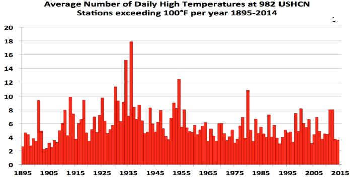
No, we are not having more record highs now than in the past. Here’s a chart for you (thanks to Eric Simpson):
Forgive my density, BCBill, I’m still not quite clear on what specifically you might be asking for, but just to attempt to shed more light, I was looking at the following graph:
… and what I see is a roughly cyclical progression, from warm to cooler, to warm, where each warm stretch seems to be longer and hotter, … which seems to imply that there IS an overall heat build up that is happening faster.
… and if this IS a cycle, then it looks like we might be teetering on the edge of another drop, and this particular drop could possibly be one of the biggest drops we have seen.
If that big drop DID become apparent over the next few years, then I think that this would drive the final nail into the coffin of the warming claim pushed over the past few decades.
I think that this would remove human activity, at its present or foreseeable level, from the equation. I also think that this would vindicate carbon dioxide, not only as a forcing agent, but as any significant agent at all.
Not to mention a basic fact from sampling statistics which basically promises you ‘record’ measurements the more measurements you make: the probability of measuring extreme values is so low that you need many many measurements to hit that extreme value.
Neither satellite record supports NYT. And the surface GAST anomaly isn’t fit for purpose no matter who produced it: on land, UHI, microsite issues revealed by the surface stations project, and global lack of coverage as discussed in this post. Dodgy SST pre ARGO, hence Karlization. Past cooled and present warmed repeatedly since 2000, provable by simple comparisons over time. And the changes are greater than the previousmor present supposed error bars. NYT propaganda.
ristvan
“Neither satellite record supports NYT”
Plenty of satellite records do. UAH V5.6 says hottest by 0.17°C. RSS 4 TLT version has it hottest by 0.17°C. Their news release starts out:
Soo, refer to some obsolete stuff. Then emphasize RSS whose CTO Mears disavowed it before he changed it. As predicted by Roy Spencer. Not good form, Nick. And you know it.
What about the stunningly sharp now 10 month temp decline since the El Nino 2015-16 peak? Got a reply for that natural variation?
Rud,
A bit of cherry picking there. You like UAH6 because it’s shiny new. And you like RSS V3.3 because, well, because. Even though it has carried a use with care label for much of the year, and their latest report reiterates why RSS think it is wrong.
The fact is that the strength of satellite data is thin. It rests now on one index which is in more or less complete disagreement with the still produced prior version.
As for the “stunning drop” of UAH6, it simply echoes the stunning rise. Here’s a plot:
Well, yeah, Nick. It’s an El Nino. It goes up, and then it comes down. Why are you investing anything in it for the long term?
Bartemis,
” It goes up, and then it comes down. Why are you investing…”
Yes, that’s my point. I’m not investing, just telling it as it is.
But, when it comes down, the pause becomes apparent again.
Nick, are you suggesting the sattelite data are not valid? If they are unreliable then they are not valid. So is that your point? We should assign a low credibility weight to the sattelite data ? If so, can you elaborate?
Bart,
“But, when it comes down, the pause becomes apparent again”
The dive in Dec brings it to the pause mean. To bring the trend down it would have to spend time below that equivalent to the amount it has spent above in the last year. About a year around zero should do it. But historically, that isn’t seen. I think that dip won’t last.
RW,
“We should assign a low credibility weight to the sattelite data ?”
If you really need to know the temperature in the troposphere, they are probably the best we have. But beyond that, yes. You need only look at UAH’s release post to see what goes into the sausage. Or listen to Carl Mears, the man behind RSS:
“A similar, but stronger case can be made using surface temperature datasets, which I consider to be more reliable than satellite datasets (they certainly agree with each other better than the various satellite datasets do!).”
But you can quantify this just by looking at the changes to GISS vs UAH, which I do here. You have to down-weight a measure if it says very different things at different times.
“To bring the trend down it would have to spend time below that equivalent to the amount it has spent above in the last year.”
That is why trend lines are not the be-all-end-all of analysis tools. In actual fact, if the temperature goes back to what it was before the El Nino and stays there, then the El Nino blip should not figure in your conclusions.
Trend lines are primarily a method of data compression, not a method of divining truth – it is more compact to provide an offset and slope than it is to present a chart. Your brain can determine patterns that trend analysis does not convey. Don’t let the machinery do your thinking for you.
Bartemis January 20, 2017 at 5:58 am
“To bring the trend down it would have to spend time below that equivalent to the amount it has spent above in the last year.”
That is why trend lines are not the be-all-end-all of analysis tools. In actual fact, if the temperature goes back to what it was before the El Nino and stays there, then the El Nino blip should not figure in your conclusions.
Using that logic you should also eliminate the 1998 El Niño which would make the claim of a ‘pause’ difficult to sustain.
To be consistent, you would have to eliminate both El Ninos and La Ninas.
This has been pointed out to you before.
Nick, thanks for the link. So uah makes adjustments which result in slower (recent) depicted warming.
Considering, though, the apparently high sensitivity (spikes) for the past two super el Nino’s 97/98 and 15/16, I doubt that the satellite measurements are not valid. Compare percent increase from truncated baselines for those two spikes to percent increases in other measures sensitive to the el Nino’s. That would help test validity: is uah and RSS appropriately sensitive to big el Nino’s? If yes, then A+, if no, well then perhaps they are picking up something in addition to temp that is highly correlated with big el Nino’s.
Bullshit = Fake News = Bullshit
You would not believe how hot it was where there are no thermometers around the world however!
In Canada we once had a politician who asserted that the unreported crime was sky rocketing. He had a little trouble coming up with the data to support his claim. Surely the unreported temperatures are sky rocketing?
“2016 was not a record warm year in the USA, 2012 was”
You do realise that the USA is only 1.9 % of the worlds surface area don’t you? I fully agree that there are imperfections in the global temperature data sets. The surface sets are inhomogeneous and in some places poorly sampled either in space or over time and thus require various assumptions – either through extrapolation (e.g. BEST, NOAA, GISS) or simply omitting areas that aren’t covered from present averages (HadCRUT). The satellite sets require large adjustments, cross calibration and careful modeling to account for drift, orbital decay and the limited life span of individual instruments. But there is still a reason why each of these datasets at least attempt (unlike the above statement) to take a global view of climate.
“assumptions”—meaning no data available so some is created to fill in. IE, not really data.
The statement clearly refers only to the USA—what part of “IN THE USA” do you not understand? Global was not part of the statement. Contrary to popular belief, everything does not always have to “global”. Except to a few true believers, it seems.
Reminds me of one of my favorite Dilbert strips. Dilbert explains that one of the QA tests is flawed, and asks if he can fake the data; to which the pointy-haired boss replies, “I I didn’t even know data can be real.”
The north pole doesn’t melt…
The temperatures in the arctic are not yet warm enough to melt candy cane. I believe the north pole is still made of candy cane?
Of course not, it’s stainless steel.
Ahhh, I guess for all intents and purposes then, the north pole does not melt. Nor can it be licked away.
I would not recommend licking. Especially during the winter.
Major headache, (minor head injury…slipped on some damn global warming that accumulated on the street) so could someone explain/clarify/validate:
The L-OTI Anomaly with interpolation is 0.82 and the L-OTI Anomaly without is 0.73. That’s a difference of only 0.09.
Can they actually measure to that accuracy?
What is the error margin on these “estimates”?
And if those two numbers (0.73 and 0.82) are the 2016 “average anomaly” both with, and without interpolation, in relation to the average from 1950-1981, then the average anomaly for the past 30 years is 0.020-0.022 per year and 0.20/0.22 per decade…so where the crap does Robert Rohde get a 1.5C “trend”??? Do these people know the difference between temperature trends and temperature anomalies and trends in anomalies vs trends in temperatures?
Aphan January 19, 2017 at 12:43 pm
My sympathies, mine was the week before Christmas, Sunday morning no snow but very cold wind storm ( n.w AZ.) Did not go at first to emergency , later did they took a bunch of gravel out of my forehead. Hurt for a few weeks. nice scar in the making
michael
Thank you Mike. No stitches, no gravel, just a lot of blood. And cursing. 🙂
This was also in the article…
… Scientists have calculated that the heat accumulating throughout the Earth because of human emissions is roughly equal to the energy that would be released by 400,000 Hiroshima atomic bombs exploding across the planet every day…
How on earth can these people distort the facts, spin & mislead the reader so blatantly?
I like Jo Nova’s Hiroshima widget better-
http://joannenova.com.au/2013/12/sun-dumps-500-times-as-many-hiroshima-bombs-of-energy-as-climate-change/
really appreciate your work done, but you only show data from december. what about every other month of the year or is december the outlier with the “highest overestimation” of the anomaly?
A dataset for every month would better prove your point.
Another question would be, what would the global mean show without interpolation at all?
[try reading better – mod]
Once again the Arctic Ocean shows a hot spot over the Gakkel Ridge, south of the Nansen Basin, where in recent history there have been submarine lava flows creating a vast new province of a volcanic trap similar to the Deccan Traps and the Siberian Traps. Once again submarine vulcanism is totally ignored (disregarded?) as a significant source of heat input to the bottom of the Arctic Ocean.