A single devastating graph shows official climate predictions were wild
By Christopher Monckton of Brenchley
The new global warming speedometer shows in a single telling graph just how badly the model-based predictions made by the Intergovernmental Panel on Climate Change have over-predicted global warming.

The speedometer for the 15 years 4 months January 2001 to April 2016 shows the [1.1, 4.2] C°/century-equivalent interval of global warming rates (red/orange) that IPCC’s 1990, 1995 and 2001 reports predicted should be occurring by now, compared with real-world, observed warming (green) equivalent to less than 0.5 C°/century over the period.
Observed reality
RSS and UAH monthly near-global satellite lower-troposphere temperature anomaly values for each month from January 2001 to April 2016 were assumed to be broadly accurate and were averaged. The least-squares linear-regression trend on their mean was determined and found equivalent to 0.47 C°/century.
Predictions in IPCC’s Assessment Reports
IPCC (2007, 2013) are too recent to allow reliable comparison of their predictions against reality.
IPCC (2001), on page 8, predicted that in the 36 years 1990-2025 the world would warm by 0.75 [0.4, 1.1] C°, equivalent to 2.1 [1.1, 3.1] C°/century. This predicted interval is 4.5 [2.3, 6.6] times observed warming since January 2001.
IPCC (1995), at fig. 6.13, assuming the subsequently-observed 0.5%-per-year increase in atmospheric CO2 concentration, predicted a medium-term warming rate a little below 0.4 C° over 21 years, equivalent to 1.8 C°/century, or 3.8 times observed warming since January 2001.
IPCC (1990), at page xxiv, predicted near-linear global warming of 1.0 [0.7, 1.5] C° over the 36 years to 2025, a rate equivalent to 2.8 [1.9, 4.2] C°/century. This predicted interval is 6.0 [4.0, 8.9] times observed warming since January 2001.
Conclusion
Fifteen years is long enough to verify the predictions from IPCC’s first three Assessment Reports against real-world temperature change measured by the most sophisticated method available – satellites.
The visible discrepancy between wild predictions and harmless reality since January 2001 demonstrates that the major climate models on which governments have relied in setting their mitigation policies are unfit for their purpose. Removing the exaggerations inbuilt into the models eradicates the supposed climate problem.
The real-world evidence shows that global warming mitigation policies are based on predictions now exposed as having been flagrantly and baselessly exaggerated.
All global-warming mitigation policies should be forthwith abandoned and their heavy cost returned at once to taxpayers by way of cuts in energy taxes and charges.
Industries such as coal mining and generation should be fully compensated for the needless loss and damage that ill-considered government policies inflicted on them.
Subsidies for global warming research should be ended and IPCC dissolved.
OK, here it is. The speedometer with the actual data that they were predicting.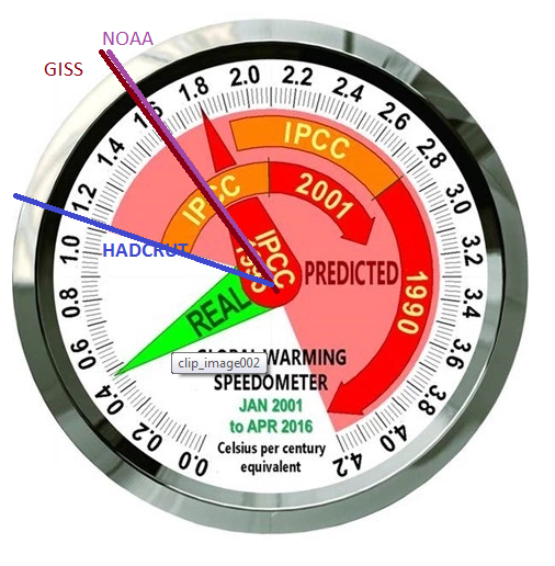
So if that is what they predicted why all the references to 4 degree. Paris agreement is supposed to restrict us to under 2 degree, well that is done according to those predictions. Now you are going to introduce an pre existing offset now aren’t you, it’s your only way out?
The predictions are as cited by Load M and are in °/Century. They are, if cited correctly, for that period 2001-2016. The thing about AGW is that it continues. 3 C/Cen gets us to 4° in 133 years.
Nick, the MEASUREMENTS, cited by Lord M, are compared to IPCC “predictions” made in the past in degrees C/Century. The measurement “mean” from 2001-2016 are, if cited correctly, “was determined and found equivalent to 0.47 C°/century.”
The THING about the current “global warming” is that, if it CONTINUES at it’s current rate, 0.47C/Cen gets us to 0.63C in 133 years. Who does your math for you?
Does it continue? A doubling of co2 gets us to 560 ppm. The next doubling of co2 gets us to 1120 ppm. So for all practical purposes a doubling of co2 is pretty much it for agw. (where am i going wrong here?)…
“Nick, the MEASUREMENTS, cited by Lord M, are compared to IPCC “predictions” “
Well, he compared measurements of something with poredictions of something. But they aren’t at all the same. IPCC was predicting GMST, and it is perfectly possible to compare them with measurements of GMST. That’s what I did, and they are quite good. Lord M chooses to compare them with dubious measures from somewhere else. That is pointless.
Nick Stokes says:
The thing about AGW is that it continues. 3 C/Cen gets us to 4° in 133 years.
—————————-
Are you serious?
Yes, starting in a La Nina, ending in a strong El Nino, and ignoring the failure of the Troposphere to warm per CAGW theory. See you again in 16 months to one year, “He’s back” (Meaning the pause of course.)
Nick– Isn’t it funny how adding heat “adjustments” to GISS, HADCRUT4 and NOAA datasets through: in-filling, removing high-altitude/rural weather stations, over-weighting Arctic temp anomalies, weather stations near hot airports, adding 0.15C to ocean temps (KARL2015), adjustments for changing thermometer equipment, etc., makes the line go up?
It’s also amusing the CAGW hypothesis projected lower troposphere global temps (what satellites measure) should be warming about 20% faster than surface temperatures…
Hmmmm…. I wonder why GISS, NOAA and GISS datasets show warming 3 TIMES that of satellite data when they should be 20% less? Why indeed…
Hint: (read my first paragraph).
Here is the US temperature fiddling NOAA admits to on their own website:
http://www.ncdc.noaa.gov/img/climate/research/ushcn/ts.ushcn_anom25_diffs_urb-raw_pg.gif
How GISS, NOAA and the CRU can get away with this seemingly fraudulent data manipulation is astounding…
Once CAGW is officially disconfirmed, I hope those involved in this blatant data manipulation will be brought to justice, but I’m not naive enough to believe anything will actually happen…
SAMURAI,
“makes the line go up?”
You haven’t been reading the recent posts of Bob Tisdale. That just isn’t true. And it doesn’t get truer however many times you trot out the tired old USHCN graph from 2 versions ago, which show mainly the effect of TOBS.
Nick– Here are just a few examples showing the HUGE impacts NOAA/JISS “adjustments” to raw temperature data have had on raw data vs. “final” temperature datasets:
https://stevengoddard.wordpress.com/data-tampering-at-ushcngiss/
Since CAGW model projections already exceed reality (RSS/UAH/radiosonde data) by 2+ standard deviations for 20 years, CAGW alarmist have been relegated to adjusting raw-temperature data to prevent the CAGW hypothesis from being officially disconfirmed.
That’s not how science works…. “Scientists” don’t get to change inconvenient raw data to get the numbers they need to avoid hypothetical disconfirmation…. In actual science, the HYPOTHESIS is adjusted to match reality, not the other way around…
CAGW has become a joke.
It’ll be comical to see the data manipulation/excuses CAGW alarmists concoct/devise once both the PDO and AMO are in their respective 30-year cool cycles, because global temps ALWAYS fall when this phenomenon occurs.
Nick Stokes
I think that graph is making the same mistake as Monckton’s.
The IPCC projections are for the 35 years from 1990 to 2025. You and Monckton are comparing this with the trend from 2001 to present. But this ignores all the warming that occurred between 1990 and 2001.
The trends since 1990 are
HAD 1.67 C / century
NOAA 1.77
GISS 1.90
BEST 1.67
RSS (v3.3) 1.25
RSS (v4.0 TTT) 1.93
UAH (beta 6) 1.11
UAH (v5.6) 1.83
All are within the IPCC 2001 projections, despite the 20 years of no warming in two of the satellite sets.
Bellman,
“You and Monckton are comparing this with the trend from 2001 to present.”
I don’t endorse the choice of period. I just showed what happens if you use the right data for that period. I think a more serious issue may be what whether even land/sea indices correspond to the earlier predictions. In 1990 they didn’t have either land/sea indices or ocean-linked GCMs, so they would have been projecting air temperatures. In 1995, AOGCMs were still fairly experimental. And there is an objection even now that when you read the fine print, projections are of surface air temperature, which is not quite the same as the land/ocean indices usually quoted as observation.
The IPCC is like the VW and Toyota Gimmicks to get past the emission testing standards and fool the public.
Germany and Japan.
Now there IS the Axis Powers!
Ha ha
Nick,
“All those cited predictions were for surface warming. Lord M as usual compares them with satellite, not surface.”
Nick, Nick, Nick. What exactly are you implying that satellite data is used for? Space temps? Are you trying to get people to believe that the IPCC was concerned over “global warming” that MIGHT occur somewhere BESIDES the surface of this planet? Are you implying that the IPCC DID NOT use GISS, Hadcrut or NOAA satellite data sets when they made their predictions in the past?
Looking at YOUR “speedometer”, the “real” actual, temperatures (taken by RSS and UAH) indicated by the GREEN arrow is still WAY below the first measurement according to your ” actual data that they were predicting!!!”. His point was, and is obvious, the IPCC’s predictive/projection abilities (when using the GISS, Hadcrut and NOAA modeled data) SUCKED completely in 1990, again in 1995, and again in 2001. But they ARE getting closer. 🙂
“Looking at YOUR “speedometer”, the “real” actual, temperatures (taken by RSS and UAH) indicated by the GREEN arrow is still WAY below the first measurement according to your ” actual data that they were predicting!!!”.”
That is a difference between two sets of observations. That is no fault of the predictions – it’s just a fact about the world The IPCC was predicting GMST. There was no general prediction about troposphere – stratosphere was predicted to cool, and it has.
So why do TLT and surface disagree. Two obvious possibilities:
1. They are different places. That’s just the way it is.
2. One set of measurements is wrong.
If 2, which could it be? Well, the surface indices have been fairly steady. UAH has gone within a year from showing more warming 2001-2016 than surface, to showing much less. RSS V3.3, used here, now comes with this caution:
“The V3.3 TLT data suffer from the same problems with the adjustment for drifting measurement times that led us to update the TMT dataset. V3.3 TLT data should be used with caution.”
Nick
Can I just say how much I appreciate your clear explanations. While I tend to whiz past the political and opinion stuff written by others, it is always a pleasure to read the work of a man who obviously has a very good understanding of the data. And you are always so polite despite what is often thrown at you. You must be a patient man. It is clear Mr Watts has a level of respect for you to and I would say, based on the help you have offered him (and he has accepted), it is well deserved.
“… stratosphere was predicted to cool, and it has …”.
=========================
The stratosphere stopped cooling 20 years ago:
http://s11.postimg.org/lxwzon2rn/Volcanoes_and_Lower_Strat_Temps_1978_2014.png
Simon, Nick is being disingenuous, as in insincere. He Knows the stratosphere has paused for twenty years, he knows the surface data has radically changed over the past 40 years, he knows radiosonde in general supports the satellites, and he know the troposphere is supposed to be more sensitive to El Nino, La Nina.
Nick,
I do think you are a rather reasonable “warmist” . . as warmists go, but I wonder if you really believe we are on the brink of climate catastrophe. Whether a pause or a slow crawl, the rise in temps has not been all that alarming for a goodly spell it seems. (nor sea level, major storms, droughts, etc.) . . and there is an apparent “greening” effect one would expect from extra CO2 . . So, are you at least somewhat skeptical of the CAGW hypothesis?
John Knight
“So, are you at least somewhat skeptical of the CAGW hypothesis?”
CAGW is WUWT-style terminology. As I see it, we’ve burnt about 400 Gtons carbon, and seen modest warming. There would be more, even if burning stopped. The GHGs make a sustained increase in flux, and the earth with its oceans takes a while to respond. But the thing is, we could likely burn at least five times more. Is that safe?
“The stratosphere stopped cooling 20 years ago:”
No it did not according to RSS at least…..
http://data.remss.com/msu/graphics/C13/plots/RSS_TS_channel_C13_Global_Land_And_Sea_v03_3.png
“Figure 7. Globally averaged temperature anomaly time series for the AMSU Channel 13, in the middle stratosphere. The plot shows the that middle stratosphere cooled during the most recent 15 years, even as the lower stratosphere ceased cooling. (Click on the figure to go to the time series browse tool.)”
Try it also for other channels covering the Strat here:
http://images.remss.com/msu/msu_time_series.html
Nick,
“But the thing is, we could likely burn at least five times more. Is that safe?”
Could be, if CO2 climate sensitivity is low . . especially given the logarithmic decline in further effect with more CO2. But if it’s even modest, that should become readily apparent long before we could burn five times what we have already, so your question seems rather loaded, in the here and now. So I suppose I could restate my question as; Are you at least somewhat skeptical that the CO2/GHG sensitivity is high? . . such that big trouble is rapidly becoming unavoidable?
To me, it seems dangerous in many ways, to many people, to continue/accelerate the sort of “alarmist” policies I see being pursued currently. Most of the “alternative energy” expenditures seem wasteful, even counter-productive, and that money will not available for mitigation/adaption efforts, if temps do eventually become a problem. “Shackling” economic development, with ineffective remedies, could actually result in us (the non-wealthy us anyway) being less able to deal with serious trouble if and when it does manifest, it seems to me. If we were discussing moving to sound alternatives, this conversation would be different, but at this point we’re simply not . .
Tony B, the level where the Troposphere physics in the model do not predict a 20 year pause is the LOWER stratosphere where it is suppose to cool just above where the troposphere is suppose to warm at a rate faster then the surface, indeed, per IPCC physics, the very cause of the surface warming and LOWER stratospheric cooling is the additional CO2 and w/v feedback.
I find it intriguing how you claim that the models predicted Stratospheric cooling yet the Stratosphere has not cooled at all since 1994 as shown by NOAA here..
http://www.arl.noaa.gov/documents/JournalPDFs/RandelEtal.JGR2009.pdf
Yes the stratosphere cooled from the start of the satellite era to 1994 but this is arguably in steps associated with large volcanic eruptions like Pinatubo.
There has been no significant stratospheric cooling for 22 years with very stable temps.
“Tony B, the level where the Troposphere physics in the model do not predict a 20 year pause is the LOWER stratosphere where it is suppose to cool just above where the troposphere is suppose to warm at a rate faster then the surface, indeed, per IPCC physics, the very cause of the surface warming and LOWER stratospheric cooling is the additional CO2 and w/v feedback.”
Nope:
Models predict cooling optimum around the 50mb level…..
From: http://iopscience.iop.org/article/10.1088/1748-9326/10/5/054007/meta
Which is where the RSS channel C10 shows cooling (and all the channels centred above) …
http://images.remss.com/msu/msu_time_series.html
RSS TLS is below the optimum cooling predicted by models.
(20km ~58mb)
Nick-
Prediction-“a thing predicted, forecast, conjecture, guess”
Measurement-“the action of measuring something, evaluation, assessment”
You just posted your own “speedometer” in which you posted the NOAA, GISS and HadCrut data, which you are arguing should be used to determine GMST correct? So let’s forget UAH and RSS for the moment. Let’s assume that the IPCC made all of their predictions in the past using models programmed with NOAA, GISS, and HadCrut data sets. According to current measurements, at least up to 2016 so far, those predictions have been wrong! That IS the “fault” of the predictions that Monckton is pointing out. He’s pointing out that there is a big difference between what was PREDICTED would happen by this point in time, and the actual MEASUREMENTS of what actually did happened by this point in time.
Following the link you embedded above in the words “fairly steady”, you show that GISS shows pretty much exactly the warming between 2001 and 2016 that the green arrow shows in Lord M’s speedometer. And the balloon data is just a slight bit lower, but it’s close enough.
Now, if the IPCC was indeed predicting GMST, what they predicted in 1990, was that by 2025, the GMST would have warmed in pretty linear fashion-“1.0 [0.7, 1.5] C° over the 36 years to 2025, a rate equivalent to 2.8 [1.9, 4.2] C°/century. This predicted interval is 6.0 [4.0, 8.9] times observed warming since January 2001.”
According to your GISS data chart (your link) currently the world has warmed roughly 0.4 C since 1990. So to meet the 1990 IPCC prediction, in the next 9 years, the GMST must rise by 0.6 C. That would be a large amount of warming.
The IPCC has LOWERED it’s expectations a lot since 1990, but their models are still running way too hot. If the warming is supposed to happen in a steady, linear fashion-as predicted-it might only just barely make it to their LOWEST predicted rate of warming by 2025.
David A May 25, 2016 at 10:04 pm
“Simon, Nick is being disingenuous, as in insincere. He Knows the stratosphere has paused for twenty years, he knows the surface data has radically changed over the past 40 years, he knows radiosonde in general supports the satellites, and he know the troposphere is supposed to be more sensitive to El Nino, La Nina.”
Actually I think you are being rather unfair. I don’t believe Nick is being insincere at all. I think when you read what he has to say, he believes very much in what he writes. If you want insincere, then look no further than the graph Mr Monckton produced at the top of this page, that compares two different concepts (The IPCC’s surface data predictions with the satellite data) saying the IPCC is therefore wrong.
Monckton is no fool, he knows exactly how to muddy the waters, only this time it was a little too obvious and his pants have been caught down (actually I would say on fire).
Simone, actually Monckton helped the models by showing surface warming projections. Your own bias is showing.
The models are hopeless to defend as Steve McIntyre demonstrates in two detailed posts refuting Gavin Schmitt’s attempts at complaint about John Christy’s chart…..
Conclusion:
In the present case, from the distribution in the right panel:
•a model run will be warmer than an observed trend more than 99.5% of the time;
•will be warmer than an observed trend by more than 0.1 deg C/decade approximately 88% of the time;
•and will be warmer than an observed trend by more than 0.2 deg C/decade more than 41% of the time.
see…. https://climateaudit.org/2016/05/05/schmidts-histogram-diagram-doesnt-refute-christy/
Tony, thanks for the 54 year long 1958 – 2012 radiosonde weather balloon estimate which picked “good stations… ” ‘Good’ stations are defined as those whose temperature trend (1958–2012) is no more than two standard deviations away from the median for stations in that latitude band.” which is still not close to what the models predict for the entire atmosphere.
http://jonova.s3.amazonaws.com/graphs/hot-spot/mckitrick-models-observations-rss-msu-uah-radiosondes-flat.jpg
•a model run will be warmer than an observed trend more than 99.5% of the time;
•will be warmer than an observed trend by more than 0.1 deg C/decade approximately 88% of the time;
•and will be warmer than an observed trend by more than 0.2 deg C/decade more than 41% of the time.
see…. https://climateaudit.org/2016/05/05/schmidts-histogram-diagram-doesnt-refute-christy/
David A:
“Tony, thanks for the 54 year long 1958 – 2012 radiosonde weather balloon estimate which picked “good stations… ” ‘Good’ stations are defined as those whose temperature trend (1958–2012) is no more than two standard deviations away from the median for stations in that latitude band.” which is still not close to what the models predict for the entire atmosphere.”
That’s OK. I merely wanted to highlight the fact that there is a problem with Sat temp data post 2000.
Actually RATPAC A radiosonde data is defined as …
https://www.ncdc.noaa.gov/data-access/weather-balloon/radiosonde-atmospheric-temperature-products-accessing-climate
“RATPAC-A contains adjusted global, hemispheric, tropical, and extratropical mean temperature anomalies. From 1958 through 1995, the bases of the data are on spatial averages of LKS adjusted 87-station temperature data. After 1995, they are based on the Integrated Global Radiosonde Archive (IGRA) station data, combined using a first difference method (Free et al. 2004). For analyses of interannual and longer-term changes in global, hemispheric, and tropical means, the team recommends use of RATPAC-A since it contains the most robust large-scale averages. “
The satellites are fine….
Chris Christy says. ”
“The weights applied to the pressure level temperatures are determined by radiation code that has been empirically tested. We’ve tested such results with controlled radiosonde measurements and found them to be virtually identical – this was all published in our papers years ago (see Spencer and Christy 1992a,b, Christy et al. 2003, Table 2 of 1992a and Table 7 of 2003 show regional correlations of 0.95 to 0.98)”
===============================================================
and the models fail at every point in the bulk of the atmosphere…
“… stratosphere was predicted to cool, and it has …”.
====================================
20 year pause, not predicted. Has warmed at about one third of predicted rate.
That is the TLS data which includes some of the troposphere, about half the data is from between 10 and 15 km. As you go higher in the stratosphere the cooling increases, centered on 20km= -0.235ºC/decade, 25km= -0.36ºC, 30km= -0.48ºC, 35km=-0.50ºC, 40km= -0.76ºC.
According to HADCRUT4 data, we’ve enjoyed about 0.82C of total global warming recovery since the end of the Little Ice Age in 1850, for a trend of just 0.0496C/decade or the century equivalent of 0.496C/century…
Moreover, based on the physics and empirical data, CO2 has likely contributed only 0.2C of the total 0.82C ofwarming recovery enjoyed since 1850…. Oh, the humanity…. sarc/off.
Given the logarithmic forcing effect of CO2, we’ll likely enjoy another 0.3C of CO2 induced warming recovery in the 21st century, for a total of just 0.5C of CO2 induced warming recovery between 1850~2100, LESS the possible cooling effects of a potential Grand Solar Minimum (GSM) event expected to start in 2035, and last 50~100 years….
Accordingly, global temps may well be COOLER than they are now by 2100…
Given Leftists’ crazy belief that human’s control the world’s climate through CO2 emissions, should we INCREASE CO2 emissions now to help offset the possible cooling effects of the coming GSM???
Oh, the Immutable Law of Leftist Irony (aka ILLI)…
But, but, Samurai, think of the glaciers! Especially the feminist ones ; )
A metaphor for the “Green” CAGW feminist witches…:
The argument being run is that the observed satellite and radiosonde trends are irrelevant for testing the enhanced greenhouse effect IPCC model predictions because those model predictions were for the surface trend.
But as the satellite and radiosonde observations contradict the very basis of IPCC predictions, i.e. that the troposphere average is warming less than the surface (the predicted ‘hotspot’ is a zone at least 20N – 20S), that argument is void.
“But as the satellite and radiosonde observations contradict the very basis of IPCC predictions, i.e. that the troposphere average is warming less than the surface (the predicted ‘hotspot’ is a zone at least 20N – 20S), that argument is void.”
Nope not true.
Actually Sat and radiosonde contradict each other.
That land stations suddenly warmed relative to the Sat data since the time of the NOAA14 MSU > NOAA15 AMSU changeover is beyond incredible.
(note this is for RSS TTT, as they have yet to revise TLT)
Maybe why RSS brought in V4.0 to address the obvious divergence of sat data from surface.
The correlation is now better but still not eliminated.
We await of course UAH to bring out V7.0 or some such.
yet at RSS they used the term “denialists”
Fail.
all adjustments = global warming trend increase (not temperature increase << the false argument)
From top to bottom the models vs. observations are simply wrong with the model mean running way to warm…
Christopher— Actually, according to the CAGW hypothesis, the lower troposphere should be warming 20% faster than surface temps because that’s where all the supposed CO2 downwelling LWIR occurs….
Unfortunately for the CAGW hypothesis, GISS/HADCRUT4 surface temp datasets show 3 TIMES MORE warming than observed in the lower troposphere as measured by RSS/UAH/radiosonde datasets…
Either the CAGW hypothesis is wrong, GISS/HADCRUT4 data is being manipulated (which they already admit to) or RSS/UHA/radiosonde data is being manipulated downward…..
I’m going for doors #1 and #2…
SAMURAI
“Actually, according to the CAGW hypothesis, the lower troposphere should be warming 20% faster than surface temps because that’s where all the supposed CO2 downwelling LWIR occurs….”
Really? Forgive me for being suspicious… But… Can you please give a direct quote that says this the “CAGW hypothesis”?
OK, my phrasing was clumsy.
Does Simon object to the term CAGW? Which is more accurate, CAGW or C.C.?
Are not the harms (catastrophes) predicted by hundreds of alarmists (all failing to manifest) due to the predicted GMT rise. Is not the cause of the warming suppose to be human emissions.
Simon: wrote, “Really? Forgive me for being suspicious,…but….can you give me a quote…blah, blah, blah”
Sure, Simon.. Here’s a quote for you:
“Christy et al. (2010)
“The magnitude of the trend in recent decades of TLT has become controversial because of differing views on … whether the relationship between the observed temperature trend of TLT and the observed temperature trend of the surface (TS) is faithfully reproduced by … climate model simulations. These model simulations indicate that a clear fingerprint of greenhouse gas response in the climate system to date is that the trend of TLT should be [1.4 times] greater than [that of] TS. There have been essentially two groups of publications on this contentious issue, one reporting that trends of TLT in observations and models are statistically not inconsistent with each other and the other reporting that model representations are significantly different than observations, thus pointing to the potential for fundamental problems with models.”
In fact the only lower stratosphere cooling before the 20 year and ongoing pause appears to be two volcanic induced step changes…
The models are hopeless to defend as Steve McIntyre demonstrates in two detailed posts refuting Gavin Schmitt’s attempts at complaint about John Christy’s chart…..
Conclusion:
In the present case, from the distribution in the right panel:
•a model run will be warmer than an observed trend more than 99.5% of the time;
•will be warmer than an observed trend by more than 0.1 deg C/decade approximately 88% of the time;
•and will be warmer than an observed trend by more than 0.2 deg C/decade more than 41% of the time.
see…. https://climateaudit.org/2016/05/05/schmidts-histogram-diagram-doesnt-refute-christy/
“In fact, the trends since 2001 were:
GISS 1.609°C/Cen
HADCRUT 1.136°C/Cen
NOAA 1.620°C/Cen
All in the pink range of predictions.”
2015-16 are the strongest El Nino years. Try starting from 1997-1998 (another strong El Nino years) and see the trends. If ENSO has significant effect on the trends, then the noise is stronger than the signal. Maybe we should be more worried about the noise (natural variability) than the signal (man’s influence) or even doubt whether the so-called signal is just an artifact of the noise.
By the way, between surface temperature and satellite data, I pick satellite. For more info on surface temperature, satellite data and IPCC projections, read this testimony of Prof. Christy before the House Committee on Science, Space & Technology
http://docs.house.gov/meetings/SY/SY00/20160202/104399/HHRG-114-SY00-Wstate-ChristyJ-20160202.pdf
There is no human signal, period. Only an interpreted one after adjusting data, cool pre 1960 hey presto warming
Then the concealment of uncertainty, which is fraud
“2015-16 are the strongest El Nino years. Try starting from 1997-1998 “
It’s Lord M’s “single devastating graph”, not mine. His argument is that the prediction period starts in 2001, the year of AR3.
Yes, but nick, you seem to be making this subjective argument and then claiming it’s an objective one. (maybe your not drinking the kool aid, but you’re getting a little too close to the vat…)
“For more info on surface temperature, satellite data and IPCC projections, read this testimony of Prof. Christy before the House Committee on Science, Space & Technology”
Or read this from Mears et al 2011…
“Examination of the differences between TMT from MSU channel 2 on NOAA-14 and AMSU channel 5 on NOAA-15 shows a long-term trend difference, with NOAA-15 cooling at a rate of 0.2 K per decade relative to NOAA-14 over the July 1998 to December 2004 period of overlap. This trend difference is not present for the other channel pairs, including, to our surprise, TLT, and is more than 2.5 times larger than the trend difference for any pair of MSU satellites with more than 18 months of overlapping observations. This trend difference is too large to explain using the difference between the MSU and AMSU TMT weighting functions. It is about 100 times larger than the trend difference simulated using HadAT data over the overlap period. The cause is not known and could be a drift in calibration in one or both of the satellites that is not explained by our calibration error model (equation (3)). Since we do not know which satellite is closer to being correct, we treat this drift as an additional source of uncertainty. It is unlikely that the drift is caused by errors in the diurnal adjustment because the magnitude of the drift is similar for land-only and ocean-only averages, which is unlikely to be the case for errors in the diurnal cycle.”
Now I seem to remember that Mears did not testify. I wonder why?
Global average temps are most certainly not “the best data we have” (J Curry).
And since then RSS has gone to V4.0.
What a fantastic debate! We have fist fights over data, preachers, name calling, trolling – all extremely entertaining but sadly everyone has picked sides and no one is listening to each other.
Politics and religion aside, we will have our answer! One side or the other will be wrong.
My question to all on this thread… What is the consequences of your being wrong? Choose wisely, friends because someone will be wrong and our judge will be our grandchildren.
For the sake of argument, let’s say there is 10% chance climate change could cause even a fraction of the predicted repercussions are realized. Are comfortable with this? What about 5%?
What if the climate change believers are wrong?
Personally, as an engineer, I am in favor of taking advantage of opportunities to encourage innovation within the Energy sector. The US’s greatest export is innovation and I would hate to see us play second fiddle to other countries particularly on energy.
Ted, the atmospheric carbon dioxide growth rate has been tracking temperature for over half a century since the inception of the mauna loa observatory data set. If this correlation holds true (meaning that if the past half century is any indicator of the future), then IT DOESN’T MATTER WHO IS RIGHT AND WHO IS WRONG !!! If the carbon growth rate continues to track with temperature, then human emissions will (continue to) not impact the growth rate. Thus, even if agw is real, there is nothing we can do about it…
http://woodfortrees.org/graph/plot/esrl-co2/from:1958/mean:24/derivative/plot/hadcrut4sh/from:1958/scale:0.31/offset:0.09
No matter what you do with the base satellite data, it is going to be argued that the person is cherry picking. The only way to avoid that is to correct for the natural variations like ENSO and volcanoes. We can see those results here:
http://www.nature.com/ngeo/journal/v7/n3/images/ngeo2098-f1.jpg
There’s little doubt there has been no warming since around 1993. What Monckton should have done is extended this graph to the present. I think I understand where Christopher is going. He realizes this trend is going to get lower and lower over the next 2-3 years as the current El Nino upward influence is eliminated by the coming La Nina. I still prefer to remove the influence completely.
I like this wag at GMT but do not think it properly accounts for the AMO. We will see, but if we follow the past AMO and it continues to go negative over the next decade plus, and the PDO reverts to negative after the blob dissipates, full ocean cycles in sequence may well erase most of the .4 degrees warming we have had in the past 37 years.
Could you please explain exactly how you remove volcanic and El Nino / La Nina influences from these data sets. I would like to see the actual numbers involved. This “removal of influences” occurs widely in climate literature, but I have yet to see a numerical demonstration of the processes involved.
Thanks!
Nick Stokes
May 25, 2016 at 6:45 pm
According I need to document that under the AGW hypothesis the troposphere should warm before and more than the surface? On your planet GHGs in the atmosphere should warm the land and sea “surfaces” before the air in which they float?
Please explain to me how that works. Thanks.
I’m not confused with the non-existent yet predicted tropical tropospheric hot spot at all. I’m stating what should be obvious under the man-made GHG warming conjecture. GHGs are supposed to warm the air by retarding escape of heat to space. This warmth is then supposed to heat the land and oceans. Does the speculation operate differently in your world?
The rates of warming shown on Monkton’s graph depend on realistically picking the start and end points.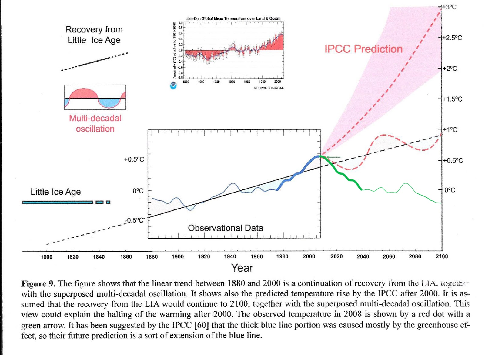
Both the millennial and sixty year temperature cycles peaked in about 2003.This is an inflexion point between the warming and cooling trends. See Figs 1,5,and 5a at
http://climatesense-norpag.blogspot.com/2016/03/the-imminent-collapse-of-cagw-delusion.html
Temperatures rose until 2003 and the earth has been cooling since then. Rates based on straight line projections past the peak really have no physical significance.
Figure 1 above compares the IPCC forecast with the Akasofu paper forecast and with the simple but most economic working hypothesis of this post (green line) that the peak at about 2003 is the most recent peak in the millennial cycle so obvious in the temperature data.The data also shows that the well documented 60 year temperature cycle coincidentally peaks at about the same time.
The cooling trend is truncated at 2015 because it makes no sense to begin or end a trend during an Enso event which is only a temporary aberration,
Climate prediction is reasonably obvious and straight forward on the basis of the millennial and 60 year temperature cycles and the solar “activity” as measured by the neutron count and 10 Be data Figs 7 and 8.There is a 12 year delay between the solar activity peak and the RSS peak in Fig 5. There is a 21 year delay between the solar peak and the Arctic ice volume minimum in 2012.We do not need to completely understand the mechanisms involved in order to make useful predictions.
For a more complete discussion see :
http://climatesense-norpag.blogspot.com/2014/07/climate-forecasting-methods-and-cooling.html
No straight line projection can be anything other than ridiculous when it is a first year engineering undergrad level exercise to show the cyclic nature of the data using Fourier. A best fit curve should be produced and analysed but sadly climate scientists do not even come close to having the level of training required to see this or that linear methods were fine in 1700 but dated by 1750.
“Temperatures rose until 2003 and the earth has been cooling since then.” That is an astounding claim totally ignoring the evidence. If you extend the blue line using the same data set you see it well within the IPCC prediction and diverging in a dramatic way from the green and red lines.
The graph has three “prediction” lines – the IPCC, the red and the green. Since the blue line stops in 2010, we can actually see which of the lines is closest to reality for the last 6 years. The IPCC wins hands down.
It is not often that we get a post that almost literally debunks itself.
Seaice1
“Temperatures rose until 2003 and the earth has been cooling since then.” That is an astounding claim totally ignoring the evidence. If you extend the blue line using the same data set you see it well within the IPCC prediction and diverging in a dramatic way from the green and red lines.”
Ok, granted the second dashed line should have been another color (and not red), but you really need to learn to read charts based upon the informational material that comes WITH the graph, rather than making flawed assumptions.
The blue line ends AND diverges from the IPCC predictions between 2000 and 2008-where the red dot on the green line is…the blue line BECOMES the green line of observed data. The red dashed line with the lighter red “error fan” that continues to go UP is the IPCC prediction “mid point” line with the lighter red background showing both the low end and the high end of the predictions. The red “dashed” line that moves in perfect up and down regularity over the trend line is NOT an “IPCC prediction”….it represents the multi-decadal oscillation according to the chart’s legend. Basically the blue line BECOMES the green line when the temperatures start to drop, and it shows it diverging in a dramatic way away from BOTH the IPCC prediction AND the MDO around 2015.
So…either YOU ignored the data shown in the chart or are making astounding claims about it, because the observational data does not show the blue line extending upwards, which it would have to do, to remain “well within the IPCC prediction”.
The IPCC intentionally supports the climate models which are the necessary tools needed to overstate and exaggerate warming from fossil fuel use.
Why?
I would disagree which those that think they have fundamentally done it to primarily promote any political philosophy. Political aspects would be only a derivative result. Rather I think they are primarily doing it because they have a philosophy of science that allows any kind of subjective influence to exaggerate and to intentionally cause misdirection for any philosophically created purpose (like environmental radicalism or secular theologies or existential emotionalism or social pragmatism) . Objective philosophy of science would not allow what the IPCC has done wrt subjective manipulated warming of the climate model.
John
John Whitman,
“Rather I think they are primarily doing it because they have a philosophy of science that allows any kind of subjective influence to exaggerate and to intentionally cause misdirection for any philosophically created purpose (like environmental radicalism or secular theologies or existential emotionalism or social pragmatism) .”
It seems to me you are generating a distinction between political philosophy and the brute acquisition of political power, which is not real, if a political philosophy is similar to what you describe there as a philosophy of science. Which is to say, if those seeking great political power, seek it not to implement/manifest this or that particular political philosophy, but rather to get into a position that will allow them to implement/manifest whatever will subsequently facilitate keeping that power.
That’s what I believe we are witnessing, in regard to the promotion of the “climate change” meme, and in conjunction scientists who have no problem with adopting “a philosophy of science that allows any kind of subjective influence to exaggerate and to intentionally cause misdirection for any philosophically created purpose”. As in, what could be called “scientist shopping”, with the intent to develop a very “rubbery” quasi-scientific basis for justifying whatever policies and movements and devils the ones in power wish, as the need arises.
I wonder if the figure for real means the unadjusted one or the fiddled one. Real needs two sets, one of urban sites and one of rural ones which should match if the results are to be meaningful as real temperatures. No one in the climate fraternity is trained in real world data acquisition so we really cannot trust even the modest level of warming to be representative of reality given the upward adjustments when the US climate reference network proves the need for a significant downward one.
Anyone remember using a computer in 1995…. Just because they were wrong then does not mean there has been no improvement in models and computing since then….
I’d say there’s been some improvement in computers:
http://americandigest.org/aabuy.jpg
But it’s not computers that are wrong. It’s the models.
I was writing and selling statistical software for microcomputers in1985. Developments of the same underlying programs (much enhanced) still run perfectly, and still get the correct answers and diagrams.
Robin
So many people giving excuses
Satellites =/= Surface.
Chosing starttimes.
Just take their best, modded data, compare it to their predictions. Notice how its still in the lowest end of predictions and go with that? They cant complain about that?!
Nick Stokes says: May 26, 2016 at 12:37 pm
“In 1990 they didn’t have either land/sea indices or ocean-linked GCMs, so they would have been projecting air temperatures.”
How does that tally with section 4.8 – Simulation of Ocean Climate – of the First Assessment report?
Or, more particularly?
“4.9 Validation of Coupled Models
While much has been learned from models of the atmosphere and ocean formulated as separate systems, a more fundamental approach is to treat the ocean and atmosphere together as a coupled system This is unlikely to improve on the simulation of the time-measured atmosphere and ocean when treated as separate entities (with realistic surface fluxes), since the average SST can only become less realistic, however, it is the only way in which some of the climate system’s long-term interactions, including the transient response to progressively increasing CO2, can be realistically studied (see Section 6).
Typical of the current generation of coarse-grid coupled GCMs is the simulation shown in Figure 4.22 from Washington and Meehl (1989). The general pattern of zonal mean temperature is reproduced in both atmosphere and ocean in this freely interacting coupled model, although during the time period simulated the temperature in the deeper ocean is still strongly related to the initial conditions……”
OK, they mention one coarse grid coupled GCM from 1989, and said there is something still not worked out. But it doesn’t seem that they would be using it for prediction of land/ocean GMST. That section ends:
“In summary, coupled models of the ocean.atmophere system are still at an early stage of development…”
The saddest thing of all is all this brain power wasted on a non issue. We could be walking on Pluto by now.