Guest Post by Bob Tisdale
With the publication of the IPCC 5th Synthesis Report, I thought there might be some interest in a presentation of how well (actually poorly) climate models simulate global mean surface temperatures in absolute terms. That is, most climate model outputs are presented in terms of anomalies, with data shown as deviations from the temperatures of a multi-decadal reference period. See Figure 1.

Figure 1
Rarely, are models and model-data comparisons shown in absolute terms. That’s what’s presented in this post after a discussion of the estimates of Earth’s absolute mean surface temperature from data suppliers: GISS, NCDC and BEST. Afterwards, we return to anomalies.
The following illustrations and most of the text were prepared for my upcoming book. I’ve changed the figure numbers for this post and reworded the introduction (the two paragraphs above). This presentation provides a totally different perspective on the differences between modeled and observed global mean surface temperatures. I think you’ll enjoy it…then again, others of you may not.
This chapter appears later in the book, following (1) the preliminary sections that cover the fundamentals of global warming and climate change, (2) the overview of climate models, (3) the introductory discussions about atmospheric and ocean circulation and natural modes of variability, and (4) the detailed discussions of datasets. It would be one of many model-data comparison chapters.
One last note, you’ll find chapters of the book without chapter numbers referenced as “Chapter ___”. I simply haven’t written those chapters yet, or I’ve written them but haven’t placed them in the final order.
[Start of book section.]
THE ELUSIVE ABSOLUTE GLOBAL MEAN SURFACE TEMPERATURE DISCUSSION AT GISS
Some of you may already know the origin of this chapter’s title. It comes from the GISS Surface Temperature Analysis Q&A webpage The Elusive Absolute Surface Air Temperature (SAT). The initial text on the webpage reads:
The GISTEMP analysis concerns only temperature anomalies, not absolute temperature. Temperature anomalies are computed relative to the base period 1951-1980. The reason to work with anomalies, rather than absolute temperature is that absolute temperature varies markedly in short distances, while monthly or annual temperature anomalies are representative of a much larger region. Indeed, we have shown (Hansen and Lebedeff, 1987) that temperature anomalies are strongly correlated out to distances of the order of 1000 km.
Based on the findings of Hansen and Lebedeff (1987) Global trends of measured surface air temperature, GISS created a dataset that uses land surface air temperature anomalies in place of sea surface temperature data. That is, GISS extended land surface air temperature data out over the oceans. GISS has replaced that older dataset with their GISS Land-Ocean Temperature Index, which uses sea surface temperature data for most parts of the oceans and serves as their primary product. They still use the 1200km extrapolation for infilling land surface areas and areas with sea ice where there are no observations-based data.
Back to the GISS Q&A webpage: After answering a few intermediate questions, GISS closes with (my boldface):
Q: What do I do if I need absolute SATs, not anomalies?
A: In 99.9% of the cases you’ll find that anomalies are exactly what you need, not absolute temperatures. In the remaining cases, you have to pick one of the available climatologies and add the anomalies (with respect to the proper base period) to it. For the global mean, the most trusted models produce a value of roughly 14°C, i.e. 57.2°F, but it may easily be anywhere between 56 and 58°F and regionally, let alone locally, the situation is even worse.
In other words, GISS is basing their understanding of global surface temperatures on climate models, specifically “the most trusted models”. And they are saying, based on those “most trusted” climate models, the average global mean surface temperature during their base period of 1951 to 1980 (their climatology) is roughly 14 deg C +/- 0.6 deg C.
The 14 deg C on that GISS webpage coincides with the value listed at the bottom of the webpage for the GISS Land-Surface Air Temperature Anomalies Only (Meteorological Station Data, dTs) data, which is based on Hansen and Lebedeff (1987). At the bottom of the webpage, they write:
Best estimate for absolute global mean for 1951-1980 is 14.0 deg-C or 57.2 deg-F, so add that to the temperature change if you want to use an absolute scale (this note applies to global annual means only, J-D and D-N!)
That’s the same adjustment for absolute temperatures that GISS recommends for their Land-Ocean Temperature Index. See the bottom of the data webpage here.
NOTE: Some people might think it’s odd that GISS uses of the same adjustment factor for both datasets. One of the GISS datasets (GISS dTs) extends coastal and island land surface air temperatures out over the oceans by 1200 km, while the other GISS dataset (GISS LOTI) uses sea surface temperature data for most of the global oceans. (With the LOTI data, GISS replaces sea surface temperature data with land surface air temperature data only in the polar oceans where sea ice has ever existed.) If we assume the coastal and island land surface temperatures are similar to those of marine air temperature, then the bias is only about 0.2 deg C, maybe a little greater. The average ICOADS absolute global sea surface temperature for the last 30 years (1984 to 2013) is 19.5 deg C (about 67.1 deg F), while their absolute global marine air temperature is 19.3 deg C (about 66.7 deg F). The reason for “maybe a little greater” is, shipboard marine air temperature readings can also be impacted by a “heat island effect”, and the ICOADS data have not been corrected for that heat island effect. [End of note.]
THE NCDC ESTIMATE IS SIMILAR THOUGH DERIVED DIFFERENTLY
NCDC also provides an estimate of absolute global mean temperature. See the Global Analysis webpage from their 2013 State of the Climate (SOTC) report. There they write under the heading of Global Highlights (my boldface):
The year 2013 ties with 2003 as the fourth warmest year globally since records began in 1880. The annual global combined land and ocean surface temperature was 0.62°C (1.12°F) above the 20th century average of 13.9°C (57.0°F).
And not too coincidentally, that 13.9 deg C (57.0 deg F) from NCDC (established from data, as you’ll soon see) agrees with the GISS value of 14.0 deg C (57.2 deg F), which might suggest that GISS’s “most trusted models” were tuned to the data-based value.
The source of that 13.9 deg C estimate of global surface temperature is identified on the NOAA Global Surface Temperature Anomalies webpages, specifically under the heading of Global Long-term Mean Land and Sea Surface Temperatures, which was written in 2000, so it’s 14 years old. Data have changed drastically in 14 years. Also, you may have noticed on that webpage that the absolute temperature averages are for the period of 1880 to 2000, and that NCDC uses the same 13.9 deg C (57 deg F) absolute value for the 20th Century. It’s not a concern. It’s splitting hairs. There is only a 0.03 deg C (0.05 deg F) difference in the average anomalies for those two periods.
Like GISS, NOAA describes problems with estimating an absolute global mean surface temperature:
Absolute estimates of global mean surface temperature are difficult to compile for a number of reasons. Since some regions of the world have few temperature measurement stations (e.g., the Sahara Desert), interpolation must be made over large, data sparse regions. In mountainous areas, most observations come from valleys where the people live so consideration must be given to the effects of elevation on a region’s average as well as to other factors that influence surface temperature. Consequently, the estimates below, while considered the best available, are still approximations and reflect the assumptions inherent in interpolation and data processing. Time series of monthly temperature records are more often expressed as departures from a base period (e.g., 1961-1990, 1880-2000) since these records are more easily interpreted and avoid some of the problems associated with estimating absolute surface temperatures over large regions. For a brief discussion of using temperature anomaly time series see the Climate of 1998 series.
It appears that the NCDC value is based on observations-based data, albeit old data, while the GISS value for a different period, based on climate models, is very similar. Let’s compare them in absolute terms.
COMPARISON OF GISS AND NCDC DATA IN ABSOLUTE FORM
NCDC Global Land + Ocean Surface Temperature data are available by clicking on the “Anomalies and Index Data” link at the top of the NCDC Global Surface Temperature Anomalies webpage. And the GISS LOTI data are available here.
Using the factors described above, Figure 2 presents the GISS and NCDC annual global mean surface temperatures in absolute form from their start year of 1880 to the most recent full year of 2013. The GISS data run a little warmer than the NCDC data, on average about 0.065 deg C (0.12 deg F) warmer, but all in all, they track one another. And they should track one another. They use the same sea surface temperature dataset (NOAA’s ERSST.v3b) and most of the land surface air temperature data is the same (from NOAA’s GHCN database). GISS and NCDC simply infill data differently (especially for the Arctic and Southern Oceans) and GISS uses a few more datasets to supplement regions of the world where GHCN sampling is poor.

Figure 2
ALONG COMES THE BEST GLOBAL LAND+OCEAN SURFACE TEMPERATURE DATASET WITH A DIFFERENT FACTOR
That’s BEST as in Berkeley Earth Surface Temperature, which is the product of Berkeley Earth. The supporting paper for their land surface air temperature data is Rohde et al. (2013) A New Estimate of the Average Earth Surface Land Temperature Spanning 1753 to 2011. In it, you will find they’ve illustrated the BEST land surface air temperature data in absolute form. See Figure 1 from that paper (not presented in this chapter).
Their climatology (reference temperatures for anomalies) was presented in the methods paper Rhode et al. (2013) Berkeley Earth Temperature Process, with the appendix here. Under the heading of Climatology, Rhode et al. write in their “methods” paper:
The global land average from 1900 to 2000 is 9.35 ± 1.45°C, broadly consistent with the estimate of 8.5°C provided by Peterson [29]. This large uncertainty in the normalization is not included in the shaded bands that we put on our Tavg plots, as it only affects the absolute scale and doesn’t affect relative comparisons. In addition, most of this uncertainty is due to the presence of only three GHCN sites in the interior of Antarctica, which leads the algorithm to regard the absolute normalization for much of the Antarctic continent as poorly constrained. Preliminary work with more complete data from Antarctica and elsewhere suggests that additional data can reduce this normalization uncertainty by an order of magnitude without changing the underlying algorithm. The Berkeley Average analysis process is somewhat unique in that it produces a global climatology and estimate of the global mean temperature as part of its natural operations.
It’s interesting that the Berkeley surface temperature averaging process furnishes them with an estimate of global mean land surface air temperatures in absolute form, while GISS and NCDC find it to be a difficult thing to estimate.
The reference to Peterson in the above Rhode et al. quote is Peterson et al. (2011) Observed Changes in Surface Atmospheric Energy over Land. 8.5 deg C (47 deg F) from Peterson et al. for absolute land surface air temperatures is the same value listed in the table under the heading of Global Long-term Mean Land and Sea Surface Temperatures on the NOAA Global Surface Temperature Anomalies webpages.
Berkeley Earth has also released data for two global land+ocean surface temperature products. The existence of sea ice is the reason for two. Land surface air temperature products obviously do not include ocean surfaces where sea ice resides, and sea surface temperatures do not include air temperatures above polar sea ice when and where it exists. Of the 361.9 million km^2 (about 139.7 million miles^2) total surface area of the global oceans, polar sea ice only covered on average about 18.1 million km^2 (about 6.9 million miles^2) annually for the period of 2000 to 2013). While polar sea ice only covers about 5% of the surface of the global oceans and only about 3.5% of the surface of the globe, the climate science community endeavors to determine the surface air temperatures there. That’s especially true in the Arctic where the naturally occurring process of polar amplification causes the Arctic to warm at exaggerated rates during periods when Northern Hemisphere surfaces warm (and cool at amplified rates during periods of cooling in the Northern Hemisphere). See the discussion of polar amplification in Chapter 1.18 and the model-data comparisons in Chapter ___.
[For those reading this blog post, see the posts Notes On Polar Amplification and Polar Amplification: Observations versus IPCC Climate Models.]
As of this writing, there is no supporting paper for the BEST land+ocean surface temperature data available from the Berkeley Earth Papers webpage and there is nothing shown for them on their Posters webpage. There is, however, an introductory discussion on the BEST data page for their combined product. The BEST land+ocean data is their land surface air temperature data merged with a modified version of HADSST3 sea surface temperature data, which they have infilled using a statistical method called Kriging. (See Kriging, written by Geoff Bohling of the Kansas Geological Survey.)
The annual Berkeley land+ocean sea surface temperature anomaly data are here, and their monthly data are here. Their reasoning for providing the two land+ocean products supports my discussion above. Berkeley Earth writes:
Two versions of this average are reported. These differ in how they treat locations with sea ice. In the first version, temperature anomalies in the presence of sea ice are extrapolated from land-surface air temperature anomalies. In the second version, temperature anomalies in the presence of sea ice are extrapolated from sea-surface water temperature anomalies (usually collected from open water areas on the periphery of the sea ice). For most of the ocean, sea-surface temperatures are similar to near-surface air temperatures; however, air temperatures above sea ice can differ substantially from the water below the sea ice. The air temperature version of this average shows larger changes in the recent period, in part this is because water temperature changes are limited by the freezing point of ocean water. We believe that the use of air temperatures above sea ice provides a more natural means of describing changes in Earth’s surface temperature.
The use of air temperatures above sea ice may provide a more realistic representation of Arctic surface temperatures during winter months when sea ice butts up against the land masses and when those land masses are covered with snow, so that the ice and land surfaces have similar albedos. However, during summer months the albedo of the sea ice can be different than those of the land masses (snow melts exposing the land surface surrounding temperature sensors and the albedo of land surfaces are different than those of sea ice). Open ocean also separates land from sea ice in many places, further compounding the problem. There is no easy fix.
Berkeley Earth also lists the estimated absolute surface temperatures during their base period for both products:
Estimated Jan 1951-Dec 1980 global mean temperature I
- Using air temperature above sea ice: 14.774 +/- 0.046
- Using water temperature below sea ice: 15.313 +/- 0.046
The estimated absolute global mean surface temperature using the air temperature above sea ice is about 0.5 deg C (0.9 deg F) cooler than the data where they used sea surface temperature data for sea ice. The models presented later in this chapter present surface air temperatures, so we’ll use the Berkeley data that use land air temperature above sea ice. It also agrees with the GISS LOTI data methods.
The sea surface temperature dataset used by Berkeley Earth (HADSST3) is provided only in anomaly form. And without a supporting paper, there is no documentation of how Berkeley Earth converted those anomalies into absolute values. The source ICOADS data and the HADISST and ERSST.v3b end products are furnished in absolute form, so one of them likely served as a reference.
COMPARISON OF BEST, GISS AND NCDC DATA IN ABSOLUTE FORM
The BEST, GISS and NCDC annual global mean surface temperatures in absolute form from their start year of 1880 to the most recent full year of 2013 are shown in Figure 3. The BEST data run warmer than the other two, but, as one would expect, the curves are similar.

Figure 3
In Figure 4, I’ve subtracted the coolest dataset (NCDC) from the warmest (BEST). The difference has also been smoothed with a 10-year running-average filter (red curve). For most of the term, the BEST data in absolute terms is about 0.8 deg C (about 1.4 deg F) warmer than the NCDC estimate. The hump starting around 1940 and peaking about 1950 should be caused by the adjustments the UKMO has made to the HADSST3 data that have not been made to the NOAA ERSST.v3b data (used by both GISS and NCDC). Those adjustments were discussed in Chapter ____. I suspect the lesser difference at the beginning of the data is also related to the handling of sea surface temperature data, but there’s no way to tell for sure without access to the BEST-modified HADSST3 data. The recent uptick should be caused by the difference between how the two suppliers (BEST and NCDC) handle the Arctic Ocean data. Berkeley Earth extends land surface air temperature data out over the oceans, while NCDC excludes sea surface temperature data in the Arctic Ocean when there is sea ice and does not extend land-based data over the ice at those times.

Figure 4
And now for the models.
CMIP5 MODEL SIMULATIONS OF EARTH’S ABSOLUTE SURFACE AIR TEMPERATURES STARTING IN 1880
As we’ve discussed numerous times throughout this book, the outputs of the climate models used by the IPCC for their 5th Assessment Report are stored in the Climate Model Intercomparison Project Phase 5 archive, and those outputs are publically available to download in easy-to-use formats through the KNMI Climate Explorer. The CMIP5 surface air temperature outputs at the KNMI Climate Explorer can be found at the Monthly CMIP5 scenario runs webpage and are identified as “TAS”.
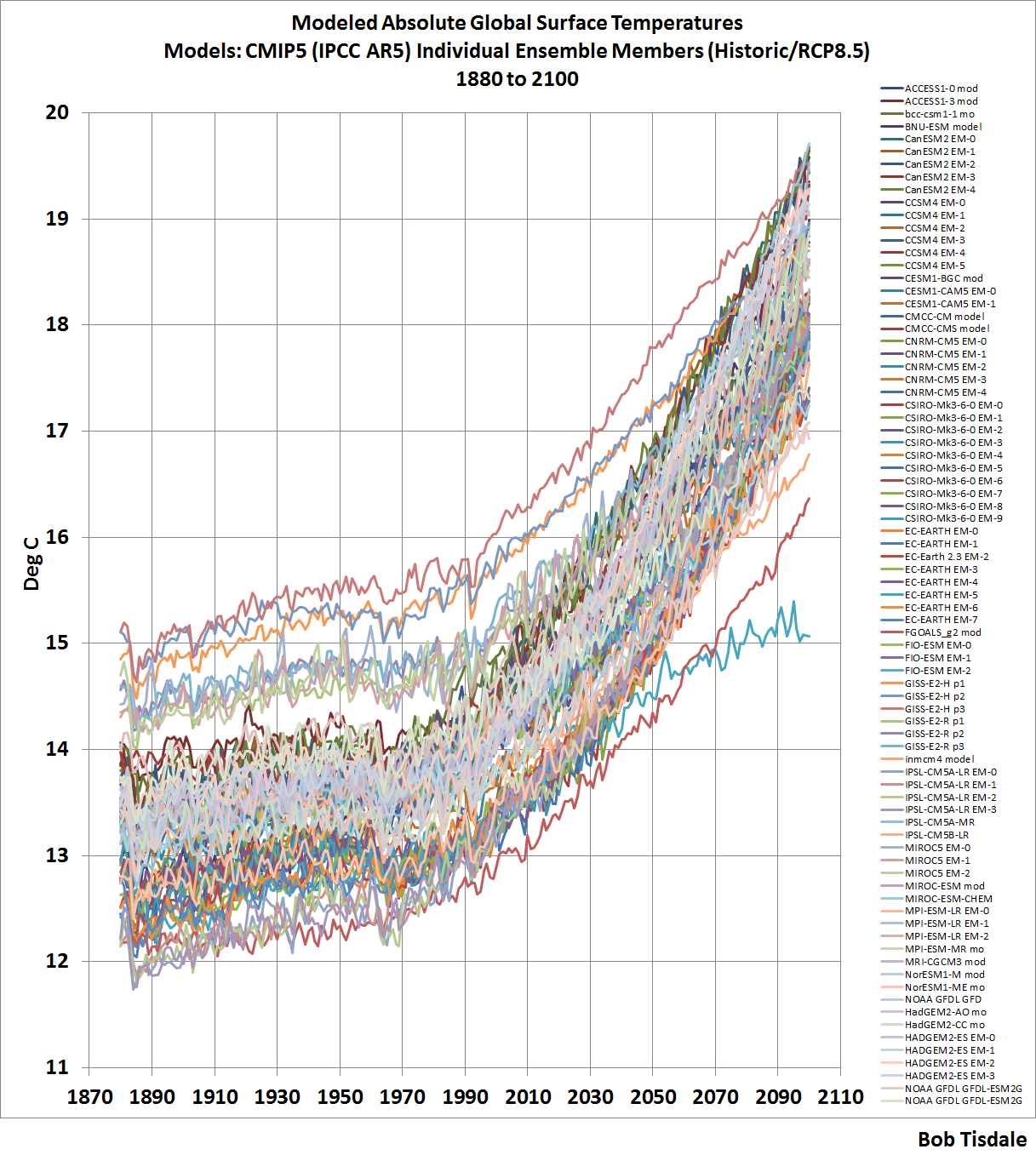
The model outputs at the KNMI Climate Explorer are available for the historic forcings with transitions to the different future RCP scenarios. (See Chapter 2.4 –Emissions Scenarios.) For this chapter, we’re presenting the historic and the worst-case future scenario, RCP8.5. We’re using the worst case scenario solely as a reference for how high surface temperatures could become, according to the models, if emissions of greenhouse gases rise as projected under that scenario. The use of the worst case scenario will have little impact on the model-data comparisons from 1880 to 2013. As you’ll recall, the future scenarios start for most models after 2005, others start later, so there’s very little difference between the model outputs for the different model scenarios in the first few years. Also, for this chapter, I downloaded the outputs separately for all of the individual models and their ensemble members. There are a total of 81 ensemble members from 39 climate models.
Note: The model outputs are available in absolute form in deg C (as well as deg K), so I did not adjust them in any way.
With that as background, Figure 5 is a spaghetti graph showing the CMIP5-archived outputs of the climate model simulations of global surface air temperatures from 1880 to 2100, with historic and RCP8.5 forcings. A larger version of the graph with a listing of all of the ensemble members is available here.

Figure 5
Whatever the global mean surface temperature is now, or was in the past, or might be in the future, the climate models use by the IPCC for their 5th Assessment Report certainly have it surrounded.
Some people might want to argue that absolute temperatures are unimportant—that we’re concerned about the past and future rates of warming. We can counter that argument two ways: First, we’ve already seen in Chapters CMC-1 and -2 that climate models do a very poor job of simulating surface temperatures from 1880 to the 1980s and from the 1980s to present. Additionally, in Section ___, we’ll discuss model failings in a lot more detail. Second, absolute temperatures are important for another reason. Natural and enhanced greenhouse effects depend on the infrared radiation emitted from Earth’s surface, and the amount of infrared radiation emitted to space by our planet is a function of its absolute surface temperature, not anomalies.
As shown above in Figure 5, the majority of the models start off at absolute global mean surface air temperatures that range from near 12.2 deg C (54.0 deg F) to about 14.0 deg C (57.0 deg F). But with the outliers, that range runs from 12.0 deg C (53.5 deg F) to 15.0 deg C (59 deg F). The range of the modeled absolute global mean temperatures is easier to see if we smooth the model outputs with 10-year filters. See Figure 6.

Figure 6
We could reduce the range by deleting outliers, but one problem with deleting outliers is the warm ones are relatively close to the more-recent (better?) estimate of Earth’s absolute temperature from Berkeley Earth. See Figure 7, in which we’ve returned to the annual, not the smoothed, outputs.

Figure 7
The other problem with deleting outliers is, the IPCC is a political body, not a scientific one. As a result, that political body includes models from agencies around the globe, even those that perform worse than (the bad performance of) the others, further dragging down the group as a whole.
With those two things considered, we’ll retain all of the models in this presentation, even the obvious outliers.
Looking again at the broad range of model simulations of global mean surface temperatures in Figure 5 above, there appears to be at least a 3 deg C (5.4 deg F) span between the coolest and the warmest. Let’s confirm that.
For Figure 8, I’ve subtracted the coolest modeled global mean temperature from the warmest in each year, from 1880 to 2100. For most of the period between 1880 and 2030, the span from coolest to warmest modeled surface temperature is greater than 3 deg C (5.4 deg F).

Figure 8
That span helps to highlight something we’ve discussed a number of times in this book: the use of the multi-model ensemble-member model mean, the average of all of the runs from all of the climate models. There is only one global mean surface temperature, and the estimates of it vary. There are obviously better and worse simulations of it, whatever it is. Does averaging the model simulations provide us with a good answer? No.
But the average, the multi-model mean, does provide us with something of value. It shows us the consensus, the groupthink, behind the modeled global mean surface temperatures and how those temperatures would vary, if (big if) they responded to the forcings used to drive climate models. And as we’ll see, the observed surface temperatures do not respond to those forcings as they are simulated by the models.
MODEL-DATA COMPARISONS
Because of the differences between the newer (BEST) and the older (GISS and NCDC) estimates of absolute global mean temperature, they’ll be presented separately. And because the GISS and NCDC data are so similar, we’ll use their average. Last, for the comparisons, we won’t present all of the ensemble members as a spaghetti graph. We’ll present the maximum, mean and minimums.
With that established, Figure 9 compares the average of the GISS and NCDC estimates of absolute global mean surface temperatures to the maximum, mean and minimum of the modeled temperatures. The model mean is reasonably close to the GISS and NCDC estimates of absolute global mean surface temperatures, with the model mean averaging about 0.37 deg C (0.67 deg F) cooler than the data for the period of 1880 to 2013.

Figure 9
In Figure 10, the BEST (newer = better?) estimate of absolute global mean surface temperatures from 1880 to 2013 is compared to the maximum, mean and minimum of the modeled temperatures. In this case, the BEST estimate is closer to the maximum and farther from the model mean than they were with the GISS and NCDC estimates. The model mean averages about 1.14 deg C (about 2.04 deg F) cooler than the BEST estimate for the period of 1880 to 2013.

Figure 10
MODEL-DATA DIFFERENCE
In the next two graphs, we’ll subtract the data-based estimates of Earth’s absolute global mean surface temperatures from the model mean of the CMIP5 simulations. Consider this when viewing the upcoming two graphs: if the average of the models properly simulated the decadal and multidecadal variations in Earth’s surface temperature, but simply missed the mark on the absolute value, the difference between the models and data would be a flat horizontal line that’s offset by the difference.
Figure 11 presents the difference between the model mean of the simulations of Earth’s surface temperatures and the average of the GISS and NCDC estimates, with the data subtracted from the models. The following discussion keys off the 10-year average, which is also presented in red.

Figure 11
The greatest difference between models and data occurs in the 1880s. The difference decreases drastically from the 1880s to the 1910s. The reason: the models do not properly simulate the observed cooling that takes place at that time. The model-data difference grows once again from the 1910s until about 1940. That indicates, because the models failed to properly simulate the cooling from the 1880s to the 1910s, they also failed to properly simulate the warming that took place from the 1910s until 1940. The difference cycles until the 1990s, with the difference gradually increasing again. And from the 1990s to present, because of the hiatus, the difference has decreased to smallest value since 1880.
In Figure 12, the difference between the BEST estimate of Earth’s surface temperature and the model mean of the simulations of it is shown. The curve is similar to the one above for the GISS and NCDC data. The BEST global temperature data show less cooling from the 1880s to the 1910s, and as a result there is not as great a decrease in the temperature difference between models and data. But there is still a major increase in the difference from the 1910s to about 1940, when the models fail to properly simulate the warming that took place then. And, of course, the recent hiatus has caused there to be another decrease in the temperature difference.

Figure 12
CHAPTER SUMMARY
There is about a 0.8 deg C (about 1.4 deg F) span in the estimates of absolute global mean surface temperatures, with the warmer estimate coming from the more recent estimate based on a more up-to-date global surface temperature databases. In other words, the BEST (Berkeley Earth) estimate seems more likely than the outdated GISS and NCDC values.
There is a much larger span in the climate model simulations of absolute global surface temperatures, averaging about 3.15 deg C (about 5.7 deg F) from 1880 to 2013. To put that into perspective, starting in the 1990s, politicians have been suggesting we limit the warming of global surface temperatures to 2.0 deg C (3.6 deg F). Or another way to put that 3.15 deg C (about 5.7 deg F) model span into perspective, consider that, in the IPCC’s 4th Assessment Report, they basically claimed that all the global warming from 1975 to 2005 was caused by manmade greenhouse gases. That claim was based on climate models that cannot simulate natural variability, so it was a meaningless claim. Regardless, global surface temperatures had only warmed about 0.55 deg C (1.0 deg F) between 1975 and 2005, based on the average of the linear trends of the BEST, GISS and NCDC data.
And the difference between modeled and observed absolute global mean surface temperature was yet another way to show how poorly global surface temperatures are simulated by the latest-and-greatest climate models used by the IPCC for their 5th Assessment Report.
BUT
Sometimes we can learn something else by presenting data as anomalies. For Figures 13 and 14, I’ve offset the model-data differences by their respective 1880-2013 averages. That converts the absolute differences to anomalies. We use average of the full term of the data as a reference to assure that we’re not biasing the results by the choice of the time period. In other words, no one can complain that we’ve cherry-picked the reference years. Keying off the 10-year averages (red curves) helps to put the impact of the recent hiatus into perspective.
Keep in mind, if the models properly simulated the decadal and multidecadal variations in Earths surface temperatures, the difference would be a flat line, and in the following two cases, those flat lines would be at zero anomaly.
For the average of the GISS and NCDC data, Figure 13, because of the recent hiatus in surface warming, the divergence between models and data today is the worst it has been since about 1890.

Figure 13
And looking at the difference between the model simulations of global mean temperature and the BEST data, Figure 14, as a result of the hiatus, the model performance during the most recent 10-year period is worst it has ever been at simulating global surface temperatures.

Figure 14
[End of book chapter.]
If you were to scroll back up to Figure 7, you’d note that there is a small subset of model runs that underlie the Berkeley Earth estimate of absolute global mean temperature. They’re so close it would seem very likely that those models were tuned to those temperatures.
Well, I thought you might be interested in knowing whose models they were. See Figure 15. They’re the 3 ensemble members of the MIROC5 model from the International Centre for Earth Simulation (ICES Foundation), and the 3 ensemble members of the GISS ModelE2 with Russell Ocean (GISS-E2-R).

Figure 15
That doesn’t mean the MIROC5 and GISS-E2-R are any better than the other models. As far as I know, like all the other models, the MIROC5 and GISS-E2-R still cannot simulate the coupled ocean-atmosphere processes that can cause global surface temperatures to warm over multidecadal periods or stop that warming, like the AMO and ENSO. As noted above, their being closer to the updated estimate of Earth’s absolute temperature simply suggests those two models were tuned to it. Maybe GISS should consider updating their 14.0 deg C estimate of absolute global surface temperatures for their base period.
Last, we’ve presented climate model failings in numerous ways over the past few years. Topics discussed included:
- Global Precipitation
- Satellite-Era Sea Surface Temperatures
- Global Surface Temperatures (Land+Ocean) Since 1880
- Global Land Precipitation & Global Ocean Precipitation
Those posts were also cross posted at WattsUpWithThat.
Just in case you want to know a whole lot more about climate model failings and can’t wait for my upcoming book, which I don’t anticipate finishing for at least 5 or 6 months, I expanded on that series and presented the model faults in my last book Climate Models Fail.
Time is the warmunist’s ultimate enemy. Day after day, month after month, year after year, the actual data rolls as an unstoppable flow.
Right now, as Bob’s Figure 7 suggests, they are in a race with reality. In the real world, nature of course always ultimately wins and does whatever it is going to do with climate. But it is the perception in the mind’s of masses that the warmunist’s desire.
Time is actually the warmist’s friend, as long as generous paychecks keep coming.
Bob, when you post a ~30 page document, I think it is helpful to add a “contents page”.
I honestly think you are losing readers with long posts that don’t have a defined structure (and I am certainly not the most organized person in the universe).
“If you were to scroll back up to Figure 7, you’d note that there is a small subset of model runs that underlie the Berkeley Earth estimate of absolute global mean temperature. They’re so close it would seem very likely that those models were tuned to those temperatures.”
That would be 100% wrong.
So, please tell us what is 100 percent correct?
Tonyb
Steven, 100% wrong? Only two modeling groups have documented how they tune their climate models. And I don’t believe those two models were among them.
How can you be 100% sure those two models were not tuned to an earlier independent estimate of global mean surface temperature that coincided with the BEST estimate?
Regards
Your argument reminds me about the arguments by John Cleese in the sketch “Argument Clinic” by Monty Python’s The Flying Circus 🙂
http://youtu.be/kQFKtI6gn9Y
I am sure there is more behind your assertion – I would also be happy know more about it.
Tonyb and DHF: It was a typical Mosher drive-by. He failed to understand what I wrote. I didn’t say the two modeling groups had used the BEST data. That would have been impossible because the CMIP5 models were run before the BEST analysis was performed. I simply said values.
Thank you again. I am glad that you are doing this work.
“Indeed, we have shown (Hansen and Lebedeff, 1987) that temperature anomalies are strongly correlated out to distances of the order of 1000 km.”
This is an excellent example of a whopping big lie that has been repeated so long and so often that a lot of people think it is actually true.
If you go back to the actual paper (available e. g. at http://www.snolab.ca/public/JournalClub/1987_Hansen_Lebedeff.pdf) you will find that the average correlation at 1000 km is about 0.5, except in the tropics (40 % of the entire surface area of the Earth) where it is more like 0.3. That is not a strong correlation. And the spread is enormous, particularly in the tropics where a large proportion of stations have zero or negative correlation even at distyances of a few hundred kilometers.
By the way it would be very interesting to see the geographical distribution of actual temperatures for the lowest-running GCM:s. If they manage to simulate arctic amplification they will almost certainly predict large-scale continental glaciation at higher latitudes, while if they spread the cooling more evenly the tropics will probably be too cool for either hurricanes or coral reefs to form.
Nick.
“GAST is an integral. To get a meaningful integral, you have to take the values you know, estimate the values you don’t know (everywhere else), and add it all up. We can’t do that with absolute temperatures because of all the local variations. Microclimates, altitude variation, N vs S hillsides etc. But when temperature varies, it does so fairly uniformly. On a warm day, warm air blows in, and it affects everything. As a matter of measurement, anomalies are correlated between measuring points, and so it is reasonable to interpolate in between. Anomalies can be integrated.”
“We can’t do that with absolute temperatures because of all the local variations. ”
yes you can do it.
Count me amongst those who would love to see a real uncertainty discussion. I’ve been doing that at work lately for some wind tunnels. Dealing with the way things are propagated, a 0.030 psi uncertainty on each of a couple of sensors can easily turn into more than 0.1 psi error on a figure of merit.
Uncertainty propagation is a very big deal, and one that makes me very, very curious. Even assuming best case scenario on a lot of these models, I’d be absolutely floored if any of them could truly show that the expected temperature increases were outside of uncertainty bounds.
For an extremely simplistic case, let’s say the uncertainty of the mean over time is 0.1K and the global temp is 0.1K. The anomaly itself is given by A = Global – Mean. The simplest uncertainty would be given by ((.1K)^2 + (.1K)^2)^(1/2). Thus, the uncertainty is: 0.14K.
That would seem to be really optimistic to me, since so many temperature measurements were only taken to an ideal eyeball accuracy of 0.5K. The full uncertainty buildup would be fascinating to read, though I’m sure the partial derivatives would be painful to perform.
Great, thorough post as usual, Bob. I’ve learned so much from you about ENSO and SST’s.
I think there is a fundamental problem with this analysis because the absolute actual’s happen to be above the models. What triggered my thinking was what was mentioned above a couple times, that the hiatus reduces the actual/model difference. The hiatus produces a divergence from the trend of the two series, and I think it’s fundamentally misleading when it reduces the difference between the two.
Most would agree that the models are heating up faster than the actual’s. If the actual’s are above the models, this difference in trend overall will produce a narrowing of the difference between the value of one subtracted from the other.
I think if this were redone with, say, actual’s minus some constant so that the actual’s were below the models, the points you make in your analysis would remain valid, but be easier to see, and the difference in overall trend would produce a growing difference between the two series, as it should.since the trends are different.
Mi Cro,
I hit reply to your post responding to someone else because for some reason threading isn’t working properly. I can’t tell if that’s a WordPress issue or if it’s just my browser … I can’t respond directly to you now either, so I hope you find this one wherever it lands in the thread.
By way of response, yes, the history of the instrumental record — so far as anyone here trusts it (and apparently you do to some extent) — shows some fairly rapid temperature swings. But globally (I’m looking at monthly GISTemp at the moment) I’m not seeing 2 degrees cooler or 1 degree warmer since 1940, or even 1880. The min anomaly in the past 75 years was -0.43, March of 1951, or 1.35 cooler than the 0.92 max in 2007. Anyway, it’s not the monthly, or even annual fluctuations like we’ve seen over the last 135 years that would be my biggest concern … we already know we can handle a fair amount of wiggles.
Personally, my expiration date is well before the worst of the nightmarish scenarios are proposed to play out. My nephews’ grandkids might not like what 4 degrees of warming does for things though. I think they’ve got a fair chance of finding out, too.
Brandon,
Yes I did find this.
“By way of response, yes, the history of the instrumental record — so far as anyone here trusts it (and apparently you do to some extent) ”
Not really, but if it is good enough to prove AGW, it’s good enough to be used to disprove it.
“But globally (I’m looking at monthly GISTemp at the moment) I’m not seeing 2 degrees cooler or 1 degree warmer since 1940, or even 1880.”
I shouldn’t have used those numbers, I don’t normally, but average temps were the topic and they were “handy” and having to explain what I do with the data set every time I mention it sounds like a broken record.
But, if you follow the url in my name you can find the output, and I explain what I’ve done here http://www.science20.com/virtual_worlds
As long as I know you are responding to me, I will see it and reply.
Mi Cro, you write:
And that’s exactly where the anomaly calculation process begins. Problem at the global level, which is the most meaningful anomaly, is that some stations either go away before, or don’t come online until after, the desired baseline period. So for GISS, the standard baseline is 1951-1980. Any station with fewer than 20 years of data — 2,121 out of 7,280 total found in the GHCN database — in that range either needs to be tossed out completely, or needs to have enough neighbors within 1200km and some significant number years overlap to be reasonably useful. GISS only throws out 1,243 of the 7,280 but still there’s a lot of infilling going on since some of those station years are missing months and because there are, well, lots of places on the planet that have never had a weather station within 1200 km. That’s not GISS being schlocky but a simple reality of the nature of the dataset — for perspective, there are only 108 GHCN stations with continuous annual records since 1880. Does that sound like enough spatial coverage to you? I didn’t think so.
I encourage anyone who doesn’t like how GISS does their patchwork quilting to download the data, raw and/or adjusted since both are out there, and try their own hand at it. A fun game is to see how many stations you can knock out and still get a global trend that reasonably matches the published results.
Sure, I guess but a fat lot of good it would do. That’s not what Frank is talking about though. He’s essentially defined a boundary value problem very narrowly to include only regular (i.e. predictable) cycles and used seasonal variation over the course of a 1-year trip around the sun as an example. What he’s missed is that even a 1st year physics student could tell you that if atmospheric CO2 increased ten-fold tomorrow the oceans wouldn’t boil off in the next decade, there’s simply too much ocean water for an additional 12 W/m^2 to heat up that rapidly. Basic thermodynamics gets that guesstimate, no need for the brain damage of N-S equations.
In fact they probably wouldn’t boil at all … the back of my napkin tells me that at 4,000 ppm CO2, all else being equal, equilibrium temperature would bump 30 degrees — about 10 of it from the increased forcing alone and the balance in water vapor feedback. I assume, of course that clouds are a neutral feedback, a highly contested assumption to be sure, and completely ignore reduced albedo from melted ice sheets. To say nothing of the gobs of methane the arctic tundra would cough up … but those frozen wastes might turn into darn good farmland, hey?
What pure descriptive statistics doesn’t tell us about temperature variability, pretty simple physics does. Those are the boundary constraints on the system. Large uncertainties do exist about where the means are and how long it will take to realize them, but there are pretty good constraints on the edges of the envelope just from observational evidence, esp. including the paleo reconstructions. All this talk of initial conditions is trying to shoehorn weather forecasting into a climate problem. It would never work, and isn’t really appropriate according to my understanding of things. YMMV.
Mi Cro, you write:
I’ll spare you my full pedantry on the topic of “proof” in science. Suffice it to say that proof is for math and logic. Basically my view is this: if you wish to overturn a theory, you need to provide credible alternative evidence against it. By admitting you don’t trust the temperature record, you’ve got no position to argue from in my book, and the best answer you can give me that I’ll accept as rational is an agnostic “I don’t know.” Further, you’ve got to demonstrate to me that you’ve got evidence against the actual theory. I haven’t read the stuff on your blog — I’ll take a look at it tomorrow when I’m fresh — but thus far I’m getting the vibe that your argument is we’ve seen three degree range in transient swings in temperature over the past 150 or so years, therefore AGW = DOA. No. Better might be we’ve seen 0.8 degrees increase since 1850 and haven’t cooked yet, but there you’d be ignoring the ~0.5 W/m^2 TOA imbalance which is good for another 0.4 degrees warming even if CO2 levels flatlined tomorrow. That gets us to 1.2 above the beginning of the industrial revolution, which the mean of the CMIP5 ensemble from AR5 says we’re going to hit around 2025. The magic 2.0 degree demarcation line into the avoid at all costs line doesn’t happen in the models until about 2050. Even at that, no serious working climatologist I’ve ever read is on record as saying that pushing our toe over that line will cause instant calamity — that’s the kind of alarmist crap churned out by activists and politicians via their media lackeys.
What is popular among the consensus science crowd is talk of tipping points and irreversible effects … like WAIS collapse. What gets missed in popular press and Twitter soundbites is that “irreversible” means “not stoppable” in any sort of reasonable planning horizion, and that refreezing those ice sheets would take on the order of a thousand years. All estimates of course, and I’m not shy about calling them very uncertain ones at that. For sake of argument, assume they’re accurate. Miami becomes the new Venice, but it takes half a millenium to get there. Not an extinction-level event. Frankly we’re more likely to do ourselves in via Pakistan corking off a few nukes at India and getting themselves glassed by the retaliation.
My position, which I believe is fairly grounded in the far more sober deliberations of most consensus climatologists is that as temperature rises incrementally so does risk. By how much, we don’t know. Best to not find out for sure, just don’t break the bank trying to avoid the worst of it. Not an easy analysis to do, and certainly not one which calls for binary all or nothing “proof” for or against AGW or its postulated effects.
Brandon Gates
November 10, 2014 at 10:09 pm
“What is popular among the consensus science crowd is talk of tipping points and irreversible effects … like WAIS collapse. What gets missed in popular press and Twitter soundbites is that “irreversible” means “not stoppable” in any sort of reasonable planning horizion, and that refreezing those ice sheets would take on the order of a thousand years.”
The warmist scientists, journalists and politicians have, from the start and without exception, used words in an Orwellian Humpty-Dumptyesque manner – average temperature was never a physical entity, homogenization is in fact invention of data where they have not measured any, anomalies are used to disconnect the “temperature products” further from reality.
So no surprise that they also use “tipping point”, “irreversible” only as marketing terms, not to convey meaning.
Every professor or PhD should be ASHAMED, ashamed to be connected to the field of warmist climate science.
There are two ways to use language, the warmist way and the engineer’s way. Engineers cannot use language the way the warmists do – they would end up in jail.
DirkH: So you’re not a fan of averaged temperature trends. Fine. Tell me how you’d calculate any net change in retained solar energy since 1850 in joules without “inventing physical entities”. Bonus points if your answer does not include anything remotely resembling a thermometer. Double bonus points if you can then explain how to predict phase changes using only measurements of net energy flux. Triple bonus points if you can find a GCM that uses temperature anomalies as an input parameters or in intermediate calculations.
Let’s say you calculate a 25% chance that a heavily travelled highway bridge will collapse within the next 10 years without repairs and the DOT head honcho tells you to sod off. What do you say to a newspaper reporter — if anything — that doesn’t warrant a trip to a federal pen? Bonus question: are bridges known for rebuilding themselves after they collapse? Double bonus question: has anyone ever successfully engineered 2.2 million km^3 ice sheet? Triple bonus question: explain how it is you know for certain that WAIS collapse is not “irreversible” as defined, and therefore why anyone should be ashamed of even so much as hinting such a thing.
I’ve taken their data and can show there’s little evidence of a change in surface cooling.
Really? How enlightened.
I do. But it has nothing to do with the swing in the average of average temps. Those numbers were the average of the average, but the stations were not controlled, so they are basically meaning less, I shouldn’t have posted them. On the other hand the anomaly data I’ve generated I do think is very valid.
But generating an anomaly against some baseline is meaning less. And when you don’t restrict yourself to global anomalies, you find that what’s changed over the last 75 years isn’t max temps, it regional min temps, large swings. My current belief is that they are due to changes in ocean surface temps.
I did, but why would I try to reproduce something that their data (well NCDC’s data) shows is all due to processing?
Clouds do far more to regulate surface temps than Co2 does, this is easy to see with an IR thermometer. I routinely measure clear sky Tzenith temps 100F to 110F colder than air/ground temps, Co2 would change that temps by a few degrees, clouds bottoms on the other hand can reduce that temp difference to 10F colder than air/surface temps.
I think this is a red herring, when you account for the large incident angle of the Sun at high latitudes
http://www.iwu.edu/~gpouch/Climate/RawData/WaterAlbedo001.pdf
, and when you calculate the energy balance with S-B equations it looks like open water in the arctic cools the oceans far more than it warms the water. At this point it is my belief that this is a temp regulation process that occurs naturally. And like the 30’s and 40’s, the open arctic is dumping massive amounts of energy to space.
Why would you do that? Why not assume we’re going to get hit with an extinction level asteroid in the next 100 years? Or a flu(or ebola) pandemic.
I’ll know “warmists” are serious when they all start saying they want to start building Nukes (and yes I know some are doing that, but they waited a long long time to adopt that opinion).
I found one bit of possible evidence in the surface record, and that is a change in the rate of warming and cooling as the length of day changes, but it looks like it might have hit an inflection point and changed direction in 2004-2005, but I don’t have enough data yet to know for sure.
So right now, the only real evidence we have anything we’ve done has impacted climate is GCM’s.
Oh, and BTW I have read Hansen’s paper on GCM’s, and I have a lot of experience in modeling and simulations, so I’m quite aware how you think something works gets encoded into a model. Nothing wrong with this for a hypothesis, but until they can show that Co2 is actually the cause, its just a hypothesis. This is where I will say “we don’t know what’s going on”, but there is plenty of evidence (when you look for it, as opposed to ignoring or deliberately hiding it) that the planet is still cooling like it’s suppose to be doing.
Mi Cro,
y = mx + b. Change b to b’. Tell me why m must also change, and/or why m is any less meaningful using b’ instead of b.
Looking at the first chart in your post, http://content.science20.com/files/images/SampleSize_1.jpg (number of daily observations) I notice a big downward spike circa 1972. Scanning down to the next figure, http://content.science20.com/files/images/GB%20Mn%20Mx%20Diff_1.png which you describe as “Global Stations, This is the annual average of the difference of both daily min and max temperatures, the included stations for this chart as well as all of the others charts have at least 240 days data/year and are present for at least 10 years” I notice big upward bumps in both the DIFF and MXDIFF curves during the same time period. There’s a less pronounced swing in both charts around 1982. When I see such obvious correlations between number of observations and aggregate totals I begin to suspect that n is having an undue influence on y and start wondering if I’ve bodged up a weighting factor somewhere.
What do you propose is changing SSTs? And which direction(s) is/are the trend(s)?
Because if you can get a reasonably similar curve from the adjusted data as GISS, NCDC or CRU does, then you know you’ve adequately replicated their method. That gives you an apples to apples comparison when you pump the raw data through your reverse-engineered process.
Not that cooking up a new method from scratch is a Bad Thing per se, but while I’m talking about it, I did dig into yours somewhat. I’ll start here: “The approach taken here is to generate a daily anomaly value (today’s minimum temp – yesterday’s minimum temperature) for each station, then average this Difference value based on the area and time period under investigation.”
I’m with you on the first step, which basically gives you the daily rate of change for each individual station. I understand averaging the daily result by region, but your plots are generated from annual data so I’m guessing you took your daily regional averages and then summed them by year to get the net annual change?
Mmmhmmm. Clouds are also a highly localized phenomenon, so the observations from your backyard don’t tell you much about what’s going on in Jakarta. As not many places on the planet regularly have 100% (or 0%) cloud cover, your observations need to be very routine over long periods of time, logged and tallied up to have any hope of telling you something other than the current weather. There is ZERO dispute among the atmospheric guys that the instantaneous forcings are dominated by water vapor and clouds, not CO2. As in NO question whatsoever. The perennial uncertainty is on the magnitude of feedbacks from clouds in response to forcings from … wherever (pick one) … and how best to model the damn things.
Props for whipping out a old-school reference from ’79. What I know of S-B law as it relates to sea (and landed) ice is that you’ve got to be really careful about emissivity. GCM programmers have assumed unity, which is looking like a bad call because the models have been understating observed warming in the Arctic. I think albedo is better understood, which does need to account for angle of incidence — but which is completely irrelevant when it comes to a body radiating energy back out.
Well duh. 🙂 “Nobody” is saying that there aren’t natural temperature regulation processes. Assuming your ocean theory of cooling is correct, the only way they could do it is by pumping up warmer water from depth and radiating it out. The data that I’ve been looking at say the exact opposite, especially for the past 20 years — it’s been cold water upwelling cooling off the atmosphere while previously warmed surface water has been churned under and sequestered.
I think we should assume an extinction level rock is going to hit us in the next 100 years. We have the basic technology to deploy a deflection solution, there’s really no excuse to not be actively working on it. It doesn’t make much sense to employ so many resources tracking NEOs if we’re not also concurrently developing a solution to do something about the one with our name on it when it’s detected. But there I go again using logic.
Back to the WAIS. You are aware that the models have been grossly conservative in estimating ice mass loss aren’t you? Perhaps not, since the favorite thing for this crew to do is point out how non-conservative GCMs have been about estimating SATs. Funny how y’all assume that most mistakes climate model related will err on the side of benefit not detriment. But then you say the same about the warmists. Well, some of us definitely do deserve it.
Far too long in my book. I think I mention it somewhere in this post how much it pisses me off. Seriously, it kills me that the anti-Nuke contingent hasn’t put it together that coal power causes 30 and 60K premature deaths per year in the US alone, but that the worst case risk of deaths (based on Fukushima and Chernobyl) would be < 100 per year if nukes replaced the coal plants. The ongoing move from coal to natural gas is a decent enough trade …. bbbbbbut FRACKING! Oh noes!
People make me tired sometimes.
A popular slogan, but every working climatologist I’ve read strenuously disagrees. I’m gonna go with the guys doing the actual work, thanks.
And how exactly would one go about doing that to your satisfaction?
How do you know how the planet is supposed to be cooling?!!? That’s one of them there, how do you say, rhetorical questions … but answer it straight if you wish. I actually am interested in what you’d come up with.
Brandon Gates commented
First, it’s late, and I have to get up in a few hours, so I’m going to start with a couple of the first questions. I’ll look at the rest of your comments when I get some time tomorrow.
If your baseline is a constant, why bother to make the anomaly in the first place? Basically I was interested in how much it cools at night while I was standing out taking images with my telescope. The constant baseline just adds error, where I believe what I do reduces station measurement error to as small as possible.
That was an older chart, further down the page you’ll find this.
http://www.science20.com/files/images/global_1.png
The big difference is that I realized that when I was doing my station year selection/filtering, once a station was selected, all years were included, even ones with fewer counts per year than my cutoff value. That was what got updated in ver 2.0 of my code (2.1 added average temp). That was the main cause of that spike.
And I’d like to thank you for digging into it.
I was going to send your off to sourceforge, but the reports there haven’t been updated to the new code yet, though you might still find them interesting. A few are done, I just need to zip them up and upload them, others need to be rerun and will take longer to get updated.
Brandon, Let me touch on some of the rest of your other comments.
Oceans accumulate energy, causing them to warm. But in generate the bulk of the water is near freezing, Then you have winds, tides, currents that generate self organize into things like AMO, PDO, the gulf stream, the currents that circle Antarctica, and so on. In electronic terms (it’s funny how many physical system have the exact same rules as electronic systems) oceans are a capacitor, they store energy, but unlike a cap the oceans have all of the inhomogenize I mentioned and then some. But all they can do is store and then release energy, which would be expressed as S-B equations. While some claim they know the oceans heat content is increasing, I don’t believe OHC has been monitored at the detailed level, over time that’s required to know this is truly the case, those that think it’s increasing are really just engaging in wishful thinking.
Isn’t WAIS moving from geothermal activity? One of the reasons (that I failed to mention above) for the big swirling mix of thermal energy that is our planet, is the tilted axis compared to the orbital plane (as well as the variation in orbital eccentricity), this also smears the distribution of incoming energy, which also drives circulation. We don’t even understand what the time constants of all of the systems involved to know if we have measurements of thermal energy that cover a single time constant, so melting here or there is an interesting fact, but the meaning is unknown.
There’s lots of interesting facts that the surface climate of the Earth changes over the human lifespan, but it does that whether we’re here or not. But none of that make AGW a fact, nothing, and those scientist are basically lying by omission, sure Co2 absorbs and emits 15-16u photons, that is the sole fact, that’s it, nothing else. They then used that fact and wrote a model that made that fact the key to warming. Where they totally fail is they haven’t been able to tie anything the climate is doing to increasing Co2.
When you take the derivative of 20 some thousand measurement stations, 95 million sample, and the average is -0.00035 what do you think that means? This isn’t some bull$hit homogenized infilled pile of steaming cr@p, these are the fracking measurements. And that’s the derivative of the averge temp, the derivative of min temp is -0.097 which is 95 times larger than the derivative of max temps’s 0.001034, tell me what that means for surface temps!
How are you going to justify how wrong your scientists are once people really understand how little they really know? It’s just like all of us who told everyone how screwed we’d be over Obamacare, oh we were all nut cases, racists, idiots, and now look, we know the President lied (one of the many lies he told to get re-elected), Pelosi lied, Reid lied, Gruber lied, well maybe he didn’t lie, but he admits they knew all of this and wrote the bill in a way to hide the facts, yeah I guess that’d be lying. The same is going to happen to climate scientist, they are going to be outed as idiots, so you can have them.
This is partially incorrect. Textually yes, it depends on the infrared radiation emitted from Earth’s surface, and yes, this is a function of the absolute surface temperature, but NO, it is NOT a function of the AVERAGE absolute surface temperature, which is what the models’ graphic shows. It is in fact strongly affected by how temperature is distributed across the surface, in time and space. Two planets with the same average temperature but a very different temperature distribution can radiate a very different ammount of energy. As a rule of thumb, for the same average temperature, the biggest the temperature diferences across the surface, the more energy is radiated in total. Or put it another way, the biggest the temperature differences, the lower average temperature you need to radiate the same ammount of energy. That’s why the average temperature of the moon is so cold despite being as close to the sun as we are, lack of greenhouse gases is only a tiny part of the effect, the key is the huge differences in temperature between the illuminated and not illuminated parts of the moon, due to the lunar day/night cycle lasting roughly 28 times the terrestrial one. This makes the moon radiate a lot of energy for its average temperature, compared to Earth.
+1 And may I add that on the Earth, half of the surface area is between the 30˚ latitudes and it receives 64% of the solar insolation and has the smallest temperature swings. The tropical ocean is a net absorber and the higher latitude ocean is a net emitter.
Thanks again, Bob.
I now have an article on the Berkeley Earth Land + Ocean Data anomaly dataset (with graphic).
It’s kind of hard to model something that has no physical existence or meaning.
Each of the IPCC scenarios is internally consistent; there are “rules” that take them from the start to the finish. Yet the range gives not much at all in 2100 to absolute disaster. Gore, McKibben, Brune and others make much of the possiblility of the disaster scenario. Yet no scenario has an abrupt change from nothing happening to calamity. So how is the current situation justified in sometime becoming the disaster at 2100?
“How Do We Get From Here to There (Disaster)” may be a good post.
Without ignoring the IPCC analyses, I don’t see how the catastrophe in 2100 can be held within “settled science” any more.
Thanks Bob.Great post as usual .But one question is certainly of importance :the very notion of which is very questionable with our assymetric globe. If radiative forcing is estimated
with absolute temperature (in Kelvin),the failure to estimate the budget of mother earth is certain .I agree with NYLO, IR emitted do not depend on an evenly distributed mean temperature. Moreover losses can be different with global as T^4(16) and T^4(14) differs by about 3.5%.
A quote from…
http://www.pnas.org/content/111/34/E3501.full
“This model-data inconsistency demands a critical reexamination of both proxy data and models”
So while they are “warmist modellers” they admit that don’t understand why their models don’t work.
The science is settled………..hmmmnn
GregK,
No … they identified a discrepancy between model output and observation which suggest that both are wrongly biased in a way that calls for review of both so as to arrive at a hopefully more correct conclusion. I recognize that this is a foreign concept to those who think they already know all there is to know … or who would rather the opposition don’t admit their errors so that it gives more credence to allegations of malfeasance and fraud. Take your pick.
Mi Cro,
The offset is a constant for each month of each station, not across all stations. The slope of any trend for any station will remain the same regardless of where the intercept is.
I still see a big spike circa 1972 which coincides with a dip in observations. That does not give me warm fuzzies.
Sure thing. It’s an interesting approach that seems like should work, but I don’t understand all the calculations you’re making.
Again trend is independent of absolute, so a warming ocean will be ever so slightly less near freezing. Or ever so much closer to freezing if they were cooling. You brought up AMO and PDO; think about what those indices represent.
I was going to ask you if the oceanic capacitor is filling with cool or filling with warm, but it’s difficult to for you to answer given that you don’t know the long term trend.
Perhaps to some extent.
That does make it difficult to predict timing, distribution of energy and effects, etc. One thing we do know is that if incoming flux is greater than outgoing, net energy in the system will rise. If an internal heat source was melting Antarctic ice (and Arctic, Greenland, various other large glaciers, etc.) AND the oceans were losing energy on balance … wouldn’t you expect outgoing flux to be greater than incoming?
I’ve asked you at least once now how someone could demonstrate to you that CO2 is a factor and you have not answered.
Tides come in, tides go out. Nobody knows why.
At present, that there’s an error in how you’re aggregating your derivatives.
Brandon Gates commented
“The offset is a constant for each month of each station, not across all stations. The slope of any trend for any station will remain the same regardless of where the intercept is.”
I didn’t realized this was how they were creating their baseline, I need to ponder on this for a while, but I’m inclined to place the source of the differences between the two methods to infilling and homogenization.
“I still see a big spike circa 1972 which coincides with a dip in observations. That does not give me warm fuzzies.”
I don’t do anything to reduce “weather” in my process, except take advantage of the averaging of large collections of numbers, so a significant reduction of values increases the bleed through of “noise”. For better or worse.
“I don’t understand all the calculations you’re making.”
I create my version of an anomaly, then average them together. I do other things in other fields, but that’s besides the point.
“You brought up AMO and PDO; think about what those indices represent.”
Self organizing pooling of energy. But we don’t know everything about them, particularly the time constants of all of the parts of it. So it’s difficult to nail down the impact to the overall energy balance.
“One thing we do know is that if incoming flux is greater than outgoing …. wouldn’t you expect outgoing flux to be greater than incoming?”
If we do, if we understand all of the time constants of all of the climate systems, but I don’t believe we do yet. But if we did, then yes.
“I’ve asked you at least once now how someone could demonstrate to you that CO2 is a factor and you have not answered.”
I don’t know, he!! I left open they might even be right 15+ years ago when I started looking at AGW, I have become more and more convince they are wrong though.
“At present, that there’s an error in how you’re aggregating your derivatives.”
And if there isn’t?
The math part of the code is stone simple as such things go, and it posted at the url in my name, it’d be pretty easy to prove me wrong, that would shut me up about temp trends, and I’m sure it would make Mosh happy.
Oh, and the Moon causes (or at least most of) the tides : )
MiCro,
I’ve had the GHCN monthly data for some time now. When I replicate the anomaly method (to my best understanding of it) and compare raw to adjusted, I come up with this:
https://drive.google.com/file/d/0B1C2T0pQeiaST082SnBJdXpvTVk
So, NCDC’s homoginaztion process adds on the order of 0.6 C to the trend since 1880 from raw to adjusted (yellow curve), which does not make me happy. At first blush I’d expect such adjustments to be more or less trendless … unless there is some sort of systemic/environmental bias causing long term trends. And there is: UHI. GISS knows this, so their process adjusts (from already upward adjusted data) the trend downward about 0.2 C since 1880 (blue curve). I can make these comparisons because I’ve attempted to replicate the anomaly calculation as done in the final products. Even so, I don’t have it quite right yet, and take my own output with so many grains of salt. However, my conclusion at present is that GISS’ land-only anomaly product has got on the order of a net 0.4 C of temperature trend which is best explained by NCDC’s adjustments to surface station data.
I’m not talking about those kinds of short-term noisy variabilities here. Your curves show rather large deviations which coincide with similarly large changes in number of observations. I’m suggesting that your derivative calculations show artifacts which are somehow sensitive to number of observations. It could be a coding error, or a problem with your method. I can’t tell which, but I can point out what I see.
It would help if you pointed me to a specific file in your SourceForge repo. Even better if you could write up a step by step description of each calculation. Your blog post thus far has not been sufficient for me to understand exactly what you’re doing. Aside from that, you know your code and method best so you’re the best one to answer challenges to their output.
I’m not privvy to your conversations with Mosh, so I have no comment.
Sure, that describes the climate system as a whole. However, indices such as AMO and MEI attempt to describe internal energy fluxes based on anomalies of various meteorological variables. Or, IOW, how energy is moving around in the system in such a way that can be tied to weather phenomena such as surface temps, precipitation, storm frequency/intensity, etc.
The problem with this tautology is that measurements of internal variability don’t speak directly to net energy contained in the system — only (mostly) to energy moving around inside it. I say “mostly” parenthetically because when, for example, ENSO is in a positive phase SST anomalies are higher than average, which tends toward more energy loss from the system as a whole. It’s one of those seemingly counter-intuitive things that most everyone screws up — contrarian and consensus AGW pundits alike.
But I digress. The main point I’d like to make is that our lack of understanding of a great deal about how ocean and atmospheric circulations work is more a problem for short and medium-term prediction. In the long run, such interannual and decadal fluctuations revert to a mean. If you trusted temperature records, you could see how evident it is that the past 20 years of flat surface temp. trends are not at all novel, and do not necessarily signal a natural climate regime change, nor a falsification of CO2’s external forcing role. There are large uncertainties in timing, magnitude and location of effects, but directionality is fairly well constrained … at least for those of us who don’t think that climatologists are part of some nefarious worldwide conspiracy, or to a man and woman, wholly incompetent.
Some of the time constants involved exceed tens if not hundreds of your lifetimes. Fortunately we think we do know something about them because we’ve got hundreds of thousands of years of data on how the planet responds to external forcings in absence of our influences. Uncertainty abounds, of course … we all know how reliable treemometers are.
Over our exchanges I’ve noticed two main themes of your contrarianism: the data cannot be trusted and we don’t know enough to form any conclusions. That kind of position is pretty much unassailable because it leaves very little avenue for debate based on anything remotely resembling quantifiable objective factual information. Given all that we don’t understand about the human body and the health care industry’s love of profit, one wonders if you ever seek medical treatment?
Then you should publish because it means that every single analysis done by multiple independent teams is wrong.
Indeed, but there’s a lot we don’t know about gravity. Or how the moon got there to begin with. Tide prediction tables are routinely in error by a half a foot or more for a number of reasons, including that we can’t predict barometric and wind conditions on a daily basis a year in advance.
Brandon Gates commented
It’s will take me a few days to respond appropriately, but I had a couple questions.
My anomaly method?
And they all feed the data into a surface model prior to generating a temp series.
Ok, the code.
Here’s the readme for the data
Substr starting a 111 is Min temp, 103 Max temp
Here’s the field parsing code
The ‘y’ indicates a saved variable from ‘yesterday’, followed by a usable label.
These are the matching table field name, where the parsed data ends up.
So with this you can trace out how the values in each record is derived.
Then this is the average function on a field
I also sum them
For yearly reports I use ‘Group By year’ where year is the numeric value assigned to each record.
Lastly this uses Mn/Mx Lat/Lon values provided during invocation to select some area.
Since Lat/Lon are text strings, and strings sort by char values, multidigit numbers have to be numbers to sort correctly.
That’s it, some subtraction to create the record values based on the prior day, and then I use an average function on a group of stations. There’s other stuff, to select what year to include, whether a station has enough samples, etc. But the math is avg(diff) by year (or day for daily reports).
I don’t think it’s station count, I’ve been very restrictive (in other testing) to reduce the number of samples to very low numbers, and it doesn’t take a lot of stations(10-20) to push significant digits further out to the right. But I’m sure I have some function that would tell us how much a difference the sample size makes, but I don’t know what I’d need to do to get the db to spit out the right info.
Mi Cro,
No, my understanding of the GISS anomaly method … I was trying to figure out what GISTemp would look like run over the unadjusted raw data from GHCN. Thanks for the code and for pointing me to the specific readme file, I’ll have a go of it over the next few days.