Guest Post by Bob Tisdale
With the publication of the IPCC 5th Synthesis Report, I thought there might be some interest in a presentation of how well (actually poorly) climate models simulate global mean surface temperatures in absolute terms. That is, most climate model outputs are presented in terms of anomalies, with data shown as deviations from the temperatures of a multi-decadal reference period. See Figure 1.

Figure 1
Rarely, are models and model-data comparisons shown in absolute terms. That’s what’s presented in this post after a discussion of the estimates of Earth’s absolute mean surface temperature from data suppliers: GISS, NCDC and BEST. Afterwards, we return to anomalies.
The following illustrations and most of the text were prepared for my upcoming book. I’ve changed the figure numbers for this post and reworded the introduction (the two paragraphs above). This presentation provides a totally different perspective on the differences between modeled and observed global mean surface temperatures. I think you’ll enjoy it…then again, others of you may not.
This chapter appears later in the book, following (1) the preliminary sections that cover the fundamentals of global warming and climate change, (2) the overview of climate models, (3) the introductory discussions about atmospheric and ocean circulation and natural modes of variability, and (4) the detailed discussions of datasets. It would be one of many model-data comparison chapters.
One last note, you’ll find chapters of the book without chapter numbers referenced as “Chapter ___”. I simply haven’t written those chapters yet, or I’ve written them but haven’t placed them in the final order.
[Start of book section.]
THE ELUSIVE ABSOLUTE GLOBAL MEAN SURFACE TEMPERATURE DISCUSSION AT GISS
Some of you may already know the origin of this chapter’s title. It comes from the GISS Surface Temperature Analysis Q&A webpage The Elusive Absolute Surface Air Temperature (SAT). The initial text on the webpage reads:
The GISTEMP analysis concerns only temperature anomalies, not absolute temperature. Temperature anomalies are computed relative to the base period 1951-1980. The reason to work with anomalies, rather than absolute temperature is that absolute temperature varies markedly in short distances, while monthly or annual temperature anomalies are representative of a much larger region. Indeed, we have shown (Hansen and Lebedeff, 1987) that temperature anomalies are strongly correlated out to distances of the order of 1000 km.
Based on the findings of Hansen and Lebedeff (1987) Global trends of measured surface air temperature, GISS created a dataset that uses land surface air temperature anomalies in place of sea surface temperature data. That is, GISS extended land surface air temperature data out over the oceans. GISS has replaced that older dataset with their GISS Land-Ocean Temperature Index, which uses sea surface temperature data for most parts of the oceans and serves as their primary product. They still use the 1200km extrapolation for infilling land surface areas and areas with sea ice where there are no observations-based data.
Back to the GISS Q&A webpage: After answering a few intermediate questions, GISS closes with (my boldface):
Q: What do I do if I need absolute SATs, not anomalies?
A: In 99.9% of the cases you’ll find that anomalies are exactly what you need, not absolute temperatures. In the remaining cases, you have to pick one of the available climatologies and add the anomalies (with respect to the proper base period) to it. For the global mean, the most trusted models produce a value of roughly 14°C, i.e. 57.2°F, but it may easily be anywhere between 56 and 58°F and regionally, let alone locally, the situation is even worse.
In other words, GISS is basing their understanding of global surface temperatures on climate models, specifically “the most trusted models”. And they are saying, based on those “most trusted” climate models, the average global mean surface temperature during their base period of 1951 to 1980 (their climatology) is roughly 14 deg C +/- 0.6 deg C.
The 14 deg C on that GISS webpage coincides with the value listed at the bottom of the webpage for the GISS Land-Surface Air Temperature Anomalies Only (Meteorological Station Data, dTs) data, which is based on Hansen and Lebedeff (1987). At the bottom of the webpage, they write:
Best estimate for absolute global mean for 1951-1980 is 14.0 deg-C or 57.2 deg-F, so add that to the temperature change if you want to use an absolute scale (this note applies to global annual means only, J-D and D-N!)
That’s the same adjustment for absolute temperatures that GISS recommends for their Land-Ocean Temperature Index. See the bottom of the data webpage here.
NOTE: Some people might think it’s odd that GISS uses of the same adjustment factor for both datasets. One of the GISS datasets (GISS dTs) extends coastal and island land surface air temperatures out over the oceans by 1200 km, while the other GISS dataset (GISS LOTI) uses sea surface temperature data for most of the global oceans. (With the LOTI data, GISS replaces sea surface temperature data with land surface air temperature data only in the polar oceans where sea ice has ever existed.) If we assume the coastal and island land surface temperatures are similar to those of marine air temperature, then the bias is only about 0.2 deg C, maybe a little greater. The average ICOADS absolute global sea surface temperature for the last 30 years (1984 to 2013) is 19.5 deg C (about 67.1 deg F), while their absolute global marine air temperature is 19.3 deg C (about 66.7 deg F). The reason for “maybe a little greater” is, shipboard marine air temperature readings can also be impacted by a “heat island effect”, and the ICOADS data have not been corrected for that heat island effect. [End of note.]
THE NCDC ESTIMATE IS SIMILAR THOUGH DERIVED DIFFERENTLY
NCDC also provides an estimate of absolute global mean temperature. See the Global Analysis webpage from their 2013 State of the Climate (SOTC) report. There they write under the heading of Global Highlights (my boldface):
The year 2013 ties with 2003 as the fourth warmest year globally since records began in 1880. The annual global combined land and ocean surface temperature was 0.62°C (1.12°F) above the 20th century average of 13.9°C (57.0°F).
And not too coincidentally, that 13.9 deg C (57.0 deg F) from NCDC (established from data, as you’ll soon see) agrees with the GISS value of 14.0 deg C (57.2 deg F), which might suggest that GISS’s “most trusted models” were tuned to the data-based value.
The source of that 13.9 deg C estimate of global surface temperature is identified on the NOAA Global Surface Temperature Anomalies webpages, specifically under the heading of Global Long-term Mean Land and Sea Surface Temperatures, which was written in 2000, so it’s 14 years old. Data have changed drastically in 14 years. Also, you may have noticed on that webpage that the absolute temperature averages are for the period of 1880 to 2000, and that NCDC uses the same 13.9 deg C (57 deg F) absolute value for the 20th Century. It’s not a concern. It’s splitting hairs. There is only a 0.03 deg C (0.05 deg F) difference in the average anomalies for those two periods.
Like GISS, NOAA describes problems with estimating an absolute global mean surface temperature:
Absolute estimates of global mean surface temperature are difficult to compile for a number of reasons. Since some regions of the world have few temperature measurement stations (e.g., the Sahara Desert), interpolation must be made over large, data sparse regions. In mountainous areas, most observations come from valleys where the people live so consideration must be given to the effects of elevation on a region’s average as well as to other factors that influence surface temperature. Consequently, the estimates below, while considered the best available, are still approximations and reflect the assumptions inherent in interpolation and data processing. Time series of monthly temperature records are more often expressed as departures from a base period (e.g., 1961-1990, 1880-2000) since these records are more easily interpreted and avoid some of the problems associated with estimating absolute surface temperatures over large regions. For a brief discussion of using temperature anomaly time series see the Climate of 1998 series.
It appears that the NCDC value is based on observations-based data, albeit old data, while the GISS value for a different period, based on climate models, is very similar. Let’s compare them in absolute terms.
COMPARISON OF GISS AND NCDC DATA IN ABSOLUTE FORM
NCDC Global Land + Ocean Surface Temperature data are available by clicking on the “Anomalies and Index Data” link at the top of the NCDC Global Surface Temperature Anomalies webpage. And the GISS LOTI data are available here.
Using the factors described above, Figure 2 presents the GISS and NCDC annual global mean surface temperatures in absolute form from their start year of 1880 to the most recent full year of 2013. The GISS data run a little warmer than the NCDC data, on average about 0.065 deg C (0.12 deg F) warmer, but all in all, they track one another. And they should track one another. They use the same sea surface temperature dataset (NOAA’s ERSST.v3b) and most of the land surface air temperature data is the same (from NOAA’s GHCN database). GISS and NCDC simply infill data differently (especially for the Arctic and Southern Oceans) and GISS uses a few more datasets to supplement regions of the world where GHCN sampling is poor.

Figure 2
ALONG COMES THE BEST GLOBAL LAND+OCEAN SURFACE TEMPERATURE DATASET WITH A DIFFERENT FACTOR
That’s BEST as in Berkeley Earth Surface Temperature, which is the product of Berkeley Earth. The supporting paper for their land surface air temperature data is Rohde et al. (2013) A New Estimate of the Average Earth Surface Land Temperature Spanning 1753 to 2011. In it, you will find they’ve illustrated the BEST land surface air temperature data in absolute form. See Figure 1 from that paper (not presented in this chapter).
Their climatology (reference temperatures for anomalies) was presented in the methods paper Rhode et al. (2013) Berkeley Earth Temperature Process, with the appendix here. Under the heading of Climatology, Rhode et al. write in their “methods” paper:
The global land average from 1900 to 2000 is 9.35 ± 1.45°C, broadly consistent with the estimate of 8.5°C provided by Peterson [29]. This large uncertainty in the normalization is not included in the shaded bands that we put on our Tavg plots, as it only affects the absolute scale and doesn’t affect relative comparisons. In addition, most of this uncertainty is due to the presence of only three GHCN sites in the interior of Antarctica, which leads the algorithm to regard the absolute normalization for much of the Antarctic continent as poorly constrained. Preliminary work with more complete data from Antarctica and elsewhere suggests that additional data can reduce this normalization uncertainty by an order of magnitude without changing the underlying algorithm. The Berkeley Average analysis process is somewhat unique in that it produces a global climatology and estimate of the global mean temperature as part of its natural operations.
It’s interesting that the Berkeley surface temperature averaging process furnishes them with an estimate of global mean land surface air temperatures in absolute form, while GISS and NCDC find it to be a difficult thing to estimate.
The reference to Peterson in the above Rhode et al. quote is Peterson et al. (2011) Observed Changes in Surface Atmospheric Energy over Land. 8.5 deg C (47 deg F) from Peterson et al. for absolute land surface air temperatures is the same value listed in the table under the heading of Global Long-term Mean Land and Sea Surface Temperatures on the NOAA Global Surface Temperature Anomalies webpages.
Berkeley Earth has also released data for two global land+ocean surface temperature products. The existence of sea ice is the reason for two. Land surface air temperature products obviously do not include ocean surfaces where sea ice resides, and sea surface temperatures do not include air temperatures above polar sea ice when and where it exists. Of the 361.9 million km^2 (about 139.7 million miles^2) total surface area of the global oceans, polar sea ice only covered on average about 18.1 million km^2 (about 6.9 million miles^2) annually for the period of 2000 to 2013). While polar sea ice only covers about 5% of the surface of the global oceans and only about 3.5% of the surface of the globe, the climate science community endeavors to determine the surface air temperatures there. That’s especially true in the Arctic where the naturally occurring process of polar amplification causes the Arctic to warm at exaggerated rates during periods when Northern Hemisphere surfaces warm (and cool at amplified rates during periods of cooling in the Northern Hemisphere). See the discussion of polar amplification in Chapter 1.18 and the model-data comparisons in Chapter ___.
[For those reading this blog post, see the posts Notes On Polar Amplification and Polar Amplification: Observations versus IPCC Climate Models.]
As of this writing, there is no supporting paper for the BEST land+ocean surface temperature data available from the Berkeley Earth Papers webpage and there is nothing shown for them on their Posters webpage. There is, however, an introductory discussion on the BEST data page for their combined product. The BEST land+ocean data is their land surface air temperature data merged with a modified version of HADSST3 sea surface temperature data, which they have infilled using a statistical method called Kriging. (See Kriging, written by Geoff Bohling of the Kansas Geological Survey.)
The annual Berkeley land+ocean sea surface temperature anomaly data are here, and their monthly data are here. Their reasoning for providing the two land+ocean products supports my discussion above. Berkeley Earth writes:
Two versions of this average are reported. These differ in how they treat locations with sea ice. In the first version, temperature anomalies in the presence of sea ice are extrapolated from land-surface air temperature anomalies. In the second version, temperature anomalies in the presence of sea ice are extrapolated from sea-surface water temperature anomalies (usually collected from open water areas on the periphery of the sea ice). For most of the ocean, sea-surface temperatures are similar to near-surface air temperatures; however, air temperatures above sea ice can differ substantially from the water below the sea ice. The air temperature version of this average shows larger changes in the recent period, in part this is because water temperature changes are limited by the freezing point of ocean water. We believe that the use of air temperatures above sea ice provides a more natural means of describing changes in Earth’s surface temperature.
The use of air temperatures above sea ice may provide a more realistic representation of Arctic surface temperatures during winter months when sea ice butts up against the land masses and when those land masses are covered with snow, so that the ice and land surfaces have similar albedos. However, during summer months the albedo of the sea ice can be different than those of the land masses (snow melts exposing the land surface surrounding temperature sensors and the albedo of land surfaces are different than those of sea ice). Open ocean also separates land from sea ice in many places, further compounding the problem. There is no easy fix.
Berkeley Earth also lists the estimated absolute surface temperatures during their base period for both products:
Estimated Jan 1951-Dec 1980 global mean temperature I
- Using air temperature above sea ice: 14.774 +/- 0.046
- Using water temperature below sea ice: 15.313 +/- 0.046
The estimated absolute global mean surface temperature using the air temperature above sea ice is about 0.5 deg C (0.9 deg F) cooler than the data where they used sea surface temperature data for sea ice. The models presented later in this chapter present surface air temperatures, so we’ll use the Berkeley data that use land air temperature above sea ice. It also agrees with the GISS LOTI data methods.
The sea surface temperature dataset used by Berkeley Earth (HADSST3) is provided only in anomaly form. And without a supporting paper, there is no documentation of how Berkeley Earth converted those anomalies into absolute values. The source ICOADS data and the HADISST and ERSST.v3b end products are furnished in absolute form, so one of them likely served as a reference.
COMPARISON OF BEST, GISS AND NCDC DATA IN ABSOLUTE FORM
The BEST, GISS and NCDC annual global mean surface temperatures in absolute form from their start year of 1880 to the most recent full year of 2013 are shown in Figure 3. The BEST data run warmer than the other two, but, as one would expect, the curves are similar.

Figure 3
In Figure 4, I’ve subtracted the coolest dataset (NCDC) from the warmest (BEST). The difference has also been smoothed with a 10-year running-average filter (red curve). For most of the term, the BEST data in absolute terms is about 0.8 deg C (about 1.4 deg F) warmer than the NCDC estimate. The hump starting around 1940 and peaking about 1950 should be caused by the adjustments the UKMO has made to the HADSST3 data that have not been made to the NOAA ERSST.v3b data (used by both GISS and NCDC). Those adjustments were discussed in Chapter ____. I suspect the lesser difference at the beginning of the data is also related to the handling of sea surface temperature data, but there’s no way to tell for sure without access to the BEST-modified HADSST3 data. The recent uptick should be caused by the difference between how the two suppliers (BEST and NCDC) handle the Arctic Ocean data. Berkeley Earth extends land surface air temperature data out over the oceans, while NCDC excludes sea surface temperature data in the Arctic Ocean when there is sea ice and does not extend land-based data over the ice at those times.

Figure 4
And now for the models.
CMIP5 MODEL SIMULATIONS OF EARTH’S ABSOLUTE SURFACE AIR TEMPERATURES STARTING IN 1880
As we’ve discussed numerous times throughout this book, the outputs of the climate models used by the IPCC for their 5th Assessment Report are stored in the Climate Model Intercomparison Project Phase 5 archive, and those outputs are publically available to download in easy-to-use formats through the KNMI Climate Explorer. The CMIP5 surface air temperature outputs at the KNMI Climate Explorer can be found at the Monthly CMIP5 scenario runs webpage and are identified as “TAS”.
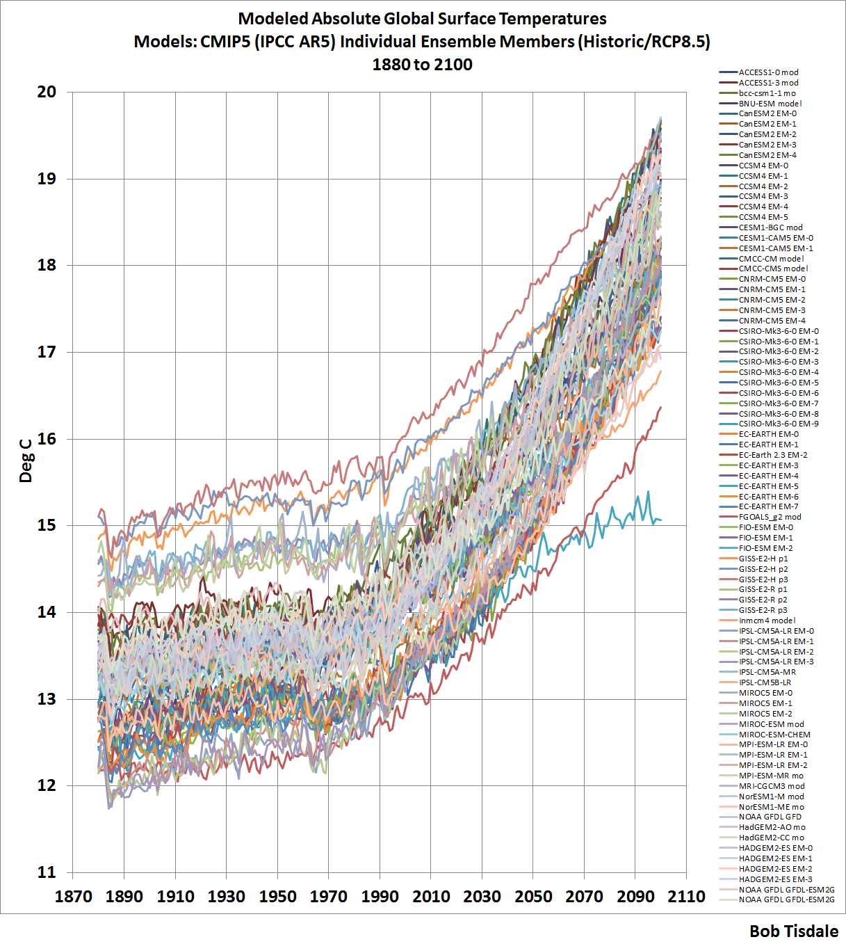
The model outputs at the KNMI Climate Explorer are available for the historic forcings with transitions to the different future RCP scenarios. (See Chapter 2.4 –Emissions Scenarios.) For this chapter, we’re presenting the historic and the worst-case future scenario, RCP8.5. We’re using the worst case scenario solely as a reference for how high surface temperatures could become, according to the models, if emissions of greenhouse gases rise as projected under that scenario. The use of the worst case scenario will have little impact on the model-data comparisons from 1880 to 2013. As you’ll recall, the future scenarios start for most models after 2005, others start later, so there’s very little difference between the model outputs for the different model scenarios in the first few years. Also, for this chapter, I downloaded the outputs separately for all of the individual models and their ensemble members. There are a total of 81 ensemble members from 39 climate models.
Note: The model outputs are available in absolute form in deg C (as well as deg K), so I did not adjust them in any way.
With that as background, Figure 5 is a spaghetti graph showing the CMIP5-archived outputs of the climate model simulations of global surface air temperatures from 1880 to 2100, with historic and RCP8.5 forcings. A larger version of the graph with a listing of all of the ensemble members is available here.

Figure 5
Whatever the global mean surface temperature is now, or was in the past, or might be in the future, the climate models use by the IPCC for their 5th Assessment Report certainly have it surrounded.
Some people might want to argue that absolute temperatures are unimportant—that we’re concerned about the past and future rates of warming. We can counter that argument two ways: First, we’ve already seen in Chapters CMC-1 and -2 that climate models do a very poor job of simulating surface temperatures from 1880 to the 1980s and from the 1980s to present. Additionally, in Section ___, we’ll discuss model failings in a lot more detail. Second, absolute temperatures are important for another reason. Natural and enhanced greenhouse effects depend on the infrared radiation emitted from Earth’s surface, and the amount of infrared radiation emitted to space by our planet is a function of its absolute surface temperature, not anomalies.
As shown above in Figure 5, the majority of the models start off at absolute global mean surface air temperatures that range from near 12.2 deg C (54.0 deg F) to about 14.0 deg C (57.0 deg F). But with the outliers, that range runs from 12.0 deg C (53.5 deg F) to 15.0 deg C (59 deg F). The range of the modeled absolute global mean temperatures is easier to see if we smooth the model outputs with 10-year filters. See Figure 6.

Figure 6
We could reduce the range by deleting outliers, but one problem with deleting outliers is the warm ones are relatively close to the more-recent (better?) estimate of Earth’s absolute temperature from Berkeley Earth. See Figure 7, in which we’ve returned to the annual, not the smoothed, outputs.

Figure 7
The other problem with deleting outliers is, the IPCC is a political body, not a scientific one. As a result, that political body includes models from agencies around the globe, even those that perform worse than (the bad performance of) the others, further dragging down the group as a whole.
With those two things considered, we’ll retain all of the models in this presentation, even the obvious outliers.
Looking again at the broad range of model simulations of global mean surface temperatures in Figure 5 above, there appears to be at least a 3 deg C (5.4 deg F) span between the coolest and the warmest. Let’s confirm that.
For Figure 8, I’ve subtracted the coolest modeled global mean temperature from the warmest in each year, from 1880 to 2100. For most of the period between 1880 and 2030, the span from coolest to warmest modeled surface temperature is greater than 3 deg C (5.4 deg F).

Figure 8
That span helps to highlight something we’ve discussed a number of times in this book: the use of the multi-model ensemble-member model mean, the average of all of the runs from all of the climate models. There is only one global mean surface temperature, and the estimates of it vary. There are obviously better and worse simulations of it, whatever it is. Does averaging the model simulations provide us with a good answer? No.
But the average, the multi-model mean, does provide us with something of value. It shows us the consensus, the groupthink, behind the modeled global mean surface temperatures and how those temperatures would vary, if (big if) they responded to the forcings used to drive climate models. And as we’ll see, the observed surface temperatures do not respond to those forcings as they are simulated by the models.
MODEL-DATA COMPARISONS
Because of the differences between the newer (BEST) and the older (GISS and NCDC) estimates of absolute global mean temperature, they’ll be presented separately. And because the GISS and NCDC data are so similar, we’ll use their average. Last, for the comparisons, we won’t present all of the ensemble members as a spaghetti graph. We’ll present the maximum, mean and minimums.
With that established, Figure 9 compares the average of the GISS and NCDC estimates of absolute global mean surface temperatures to the maximum, mean and minimum of the modeled temperatures. The model mean is reasonably close to the GISS and NCDC estimates of absolute global mean surface temperatures, with the model mean averaging about 0.37 deg C (0.67 deg F) cooler than the data for the period of 1880 to 2013.

Figure 9
In Figure 10, the BEST (newer = better?) estimate of absolute global mean surface temperatures from 1880 to 2013 is compared to the maximum, mean and minimum of the modeled temperatures. In this case, the BEST estimate is closer to the maximum and farther from the model mean than they were with the GISS and NCDC estimates. The model mean averages about 1.14 deg C (about 2.04 deg F) cooler than the BEST estimate for the period of 1880 to 2013.

Figure 10
MODEL-DATA DIFFERENCE
In the next two graphs, we’ll subtract the data-based estimates of Earth’s absolute global mean surface temperatures from the model mean of the CMIP5 simulations. Consider this when viewing the upcoming two graphs: if the average of the models properly simulated the decadal and multidecadal variations in Earth’s surface temperature, but simply missed the mark on the absolute value, the difference between the models and data would be a flat horizontal line that’s offset by the difference.
Figure 11 presents the difference between the model mean of the simulations of Earth’s surface temperatures and the average of the GISS and NCDC estimates, with the data subtracted from the models. The following discussion keys off the 10-year average, which is also presented in red.

Figure 11
The greatest difference between models and data occurs in the 1880s. The difference decreases drastically from the 1880s to the 1910s. The reason: the models do not properly simulate the observed cooling that takes place at that time. The model-data difference grows once again from the 1910s until about 1940. That indicates, because the models failed to properly simulate the cooling from the 1880s to the 1910s, they also failed to properly simulate the warming that took place from the 1910s until 1940. The difference cycles until the 1990s, with the difference gradually increasing again. And from the 1990s to present, because of the hiatus, the difference has decreased to smallest value since 1880.
In Figure 12, the difference between the BEST estimate of Earth’s surface temperature and the model mean of the simulations of it is shown. The curve is similar to the one above for the GISS and NCDC data. The BEST global temperature data show less cooling from the 1880s to the 1910s, and as a result there is not as great a decrease in the temperature difference between models and data. But there is still a major increase in the difference from the 1910s to about 1940, when the models fail to properly simulate the warming that took place then. And, of course, the recent hiatus has caused there to be another decrease in the temperature difference.

Figure 12
CHAPTER SUMMARY
There is about a 0.8 deg C (about 1.4 deg F) span in the estimates of absolute global mean surface temperatures, with the warmer estimate coming from the more recent estimate based on a more up-to-date global surface temperature databases. In other words, the BEST (Berkeley Earth) estimate seems more likely than the outdated GISS and NCDC values.
There is a much larger span in the climate model simulations of absolute global surface temperatures, averaging about 3.15 deg C (about 5.7 deg F) from 1880 to 2013. To put that into perspective, starting in the 1990s, politicians have been suggesting we limit the warming of global surface temperatures to 2.0 deg C (3.6 deg F). Or another way to put that 3.15 deg C (about 5.7 deg F) model span into perspective, consider that, in the IPCC’s 4th Assessment Report, they basically claimed that all the global warming from 1975 to 2005 was caused by manmade greenhouse gases. That claim was based on climate models that cannot simulate natural variability, so it was a meaningless claim. Regardless, global surface temperatures had only warmed about 0.55 deg C (1.0 deg F) between 1975 and 2005, based on the average of the linear trends of the BEST, GISS and NCDC data.
And the difference between modeled and observed absolute global mean surface temperature was yet another way to show how poorly global surface temperatures are simulated by the latest-and-greatest climate models used by the IPCC for their 5th Assessment Report.
BUT
Sometimes we can learn something else by presenting data as anomalies. For Figures 13 and 14, I’ve offset the model-data differences by their respective 1880-2013 averages. That converts the absolute differences to anomalies. We use average of the full term of the data as a reference to assure that we’re not biasing the results by the choice of the time period. In other words, no one can complain that we’ve cherry-picked the reference years. Keying off the 10-year averages (red curves) helps to put the impact of the recent hiatus into perspective.
Keep in mind, if the models properly simulated the decadal and multidecadal variations in Earths surface temperatures, the difference would be a flat line, and in the following two cases, those flat lines would be at zero anomaly.
For the average of the GISS and NCDC data, Figure 13, because of the recent hiatus in surface warming, the divergence between models and data today is the worst it has been since about 1890.

Figure 13
And looking at the difference between the model simulations of global mean temperature and the BEST data, Figure 14, as a result of the hiatus, the model performance during the most recent 10-year period is worst it has ever been at simulating global surface temperatures.

Figure 14
[End of book chapter.]
If you were to scroll back up to Figure 7, you’d note that there is a small subset of model runs that underlie the Berkeley Earth estimate of absolute global mean temperature. They’re so close it would seem very likely that those models were tuned to those temperatures.
Well, I thought you might be interested in knowing whose models they were. See Figure 15. They’re the 3 ensemble members of the MIROC5 model from the International Centre for Earth Simulation (ICES Foundation), and the 3 ensemble members of the GISS ModelE2 with Russell Ocean (GISS-E2-R).

Figure 15
That doesn’t mean the MIROC5 and GISS-E2-R are any better than the other models. As far as I know, like all the other models, the MIROC5 and GISS-E2-R still cannot simulate the coupled ocean-atmosphere processes that can cause global surface temperatures to warm over multidecadal periods or stop that warming, like the AMO and ENSO. As noted above, their being closer to the updated estimate of Earth’s absolute temperature simply suggests those two models were tuned to it. Maybe GISS should consider updating their 14.0 deg C estimate of absolute global surface temperatures for their base period.
Last, we’ve presented climate model failings in numerous ways over the past few years. Topics discussed included:
- Global Precipitation
- Satellite-Era Sea Surface Temperatures
- Global Surface Temperatures (Land+Ocean) Since 1880
- Global Land Precipitation & Global Ocean Precipitation
Those posts were also cross posted at WattsUpWithThat.
Just in case you want to know a whole lot more about climate model failings and can’t wait for my upcoming book, which I don’t anticipate finishing for at least 5 or 6 months, I expanded on that series and presented the model faults in my last book Climate Models Fail.
About time that somebody wrote a post addressing this issue. Excellent job, Bob. This has irritated me for years — we don’t know global average surface temperature itself within one whole degree C either way (as the curves above clearly show) only it is much worse than you present!
You forgot the error bars. Per computation. The true range of the error is at least 50% larger than what you obtain from the spread in the per model averages, as they typically have nearly symmetric error bars and even the anomalies have significant error bars, increasing as one goes back in time.
The one other thing I’d point out is that when one compares the GCMs to the global averages, one is comparing one kind of model to another kind of model. Neither one has been, or can be, validated in the past. In order to validate the GCMs one has to compare to the global anomaly averages produced by the named models (e.g. HadCRUT4, GISSTEMP…) to the GCM anomalies, per model. As we have seen and continue to see, that doesn’t work too well. Neither does comparing the CMIP5 MME mean to the model anomalies.
But then how can one validate the anomalies themselves? They are the results of model calculations also. We treat them as if they are empirical data, but they are not. They are heavily reprocessed, selected, kriged, infilled, and tweaked. And they do not agree! This alone suggests that the error in the anomaly is even larger than is generally acknowledged (where it is for various reasons almost never plotted with the data, even on these august pages).
rgb
rgbatduke, recall Trenberth’s blog post “Predictions of climate” in Nature back in 2007:
http://blogs.nature.com/climatefeedback/2007/06/predictions_of_climate.html
Trenberth wrote: “None of the models used by IPCC are initialized to the observed state and none of the climate states in the models correspond even remotely to the current observed climate.”
In other words, the models used by the IPCC were never intended to replicate Earth’s climate. They, therefore, cannot be validated or invalidated.
Maybe I need to preset that as a separate post.
Cheers.
How come this line (from Trenbeth’s blog post (reference about) isn’t being screamed from the rooftops:
“However, the science is not done because we do not have reliable or regional predictions of climate. But we need them. Indeed it is an imperative! So the science is just beginning. Beginning, that is, to face up to the challenge of building a climate information system that tracks the current climate and the agents of change, that initializes models and makes predictions, and that provides useful climate information on many time scales regionally and tailored to many sectoral needs.”
We do not have reliable or regional predictions of climate. Dear god; there is the money quote that sinks the entire alarmist edifice. Because, as an AGW skeptic, I completely agree with Trenberth: understanding the climatic system and building reliable models – even if only short term models – is something we should be doing.
Instead, as we know, the entire argument was hijacked by the Green anti-progress movement.
Neil, I don’t believe the argument was hijacked by environmentalists. They initiated it, with the foundation of the IPCC, which was only created to add scientific respectability to their agendas.
Cheers.
Bob, you write:
I’d be interested to read it. Bonus points if you don’t reduce Kevin’s post to a single soundbite. Neil put his finger on a particularly poignant quote … were I you, I’d definitely include that one. I have another unsolicited suggestion — his concluding sentence:
In risk management, which this is, greater uncertainty is often perceived as greater risk. One of the great ironies of the AGW political debate is that liberals act more like conservatives and vice versa in terms of risk aversion.
No.
The entire “theme” of the liberal-enviro “control” behind their Precautionary Principle” is the ASSUMPTION that
“There WILL BE Catastrophic Future Damage from iincreasing global temperatures caused by future CO2 levels, therefore we “MUST” limit CO2 levels NOW!”
Rather, the true Precautionary Principle Statement actually is:
“There MIGHT BE future problems due to a POTENTIAL future increase in global average temperatures far in the future that MIGHT be associated with FUTURE increases in CO2 levels, therefore we must BALANCE the known ABSOLUTE and POSITIVE BENEFITS from today’s use of fossil fuel against the ABSOLUTE and totally NEGATIVE PROBLEMS caused by limiting fossil fuel production today and increasing tomorrow’s energy prices.”
However, the way today’s enviro’s apply the Precautionary Principle is to say
” We must absolutely and knowingly kill millions of people today and harm billions in the future order to reduce even the possibility of a much-feared and greatly exaggerated beneficial rise in global average temperatures.”
Just as a note, the average of 95+ million surface stations from 1940 to 2013 is 11.39C, most of the 2000’s averaged ~12.2C, with a number of years in the 40’s and 50’s being ~1C warmer, and the years between averaging ~2C cooler (~10C).
RACookPE1978, you write:
You and I agree more than you apparently think. I’m a big one for preaching that the cure must not be worse than the disease. The first time I was introduced to Bjørn Lomborg via his documentary film Cool It, I literally stood on the couch and applauded because I sensed in his arguments a pragmatism often completely absent in the environmental left when they speak to mitigation policy. I danced a jig on the same couch when James Hansen and several other brave souls broke rank and came out for accelerating development and deployment of nuclear fission plants as a medium term mitigation solution. Now Lomborg’s solutions may ultimately be impractical … hard to tell because he is not much loved in certain political circles which quite likely has tainted the scientific critiques against him, just as surely as the backlash against the open letter from Hansen et al. is based on irrational fear and the momentum of adhering to ideological tradition.
Two things jump out of my anecdotal examples: economics and epidemiology are far more art than science, especially when compared to physics. Even so, some climatologists are, and have been, quite candid about the levels of their own uncertainty. Trenberth has already been invoked on this thread, to that hopper I add this (somewhat infamous) quote from AR5 lead author Richard Betts in the comment thread in this Bishop Hill blog post: http://www.bishop-hill.net/blog/2014/8/22/its-the-atlantic-wot-dunnit.html:
Mr. Tisdale has some commentary that can be found here: http://bobtisdale.wordpress.com/2014/08/26/a-lead-author-of-ipcc-ar5-downplays-importance-of-climate-models/
My favorite quote:
I don’t think it’s odd at all for a scientist to be candid about the limitations of his or her own work. In fact, I call it the expected standard to be forthright and rigorous when it comes to discussing uncertainty. When an IPCC lead author says, “We don’t know” my little ears perk up. That tells me that balancing out the risk/reward analysis is not just going to be next to impossible from an economic perspective, it may very well be impossible from a physical science perspective as well. Faced with that kind of problem, it’s my opinion that going first and foremost with what is known to work is best policy. Nukes top my list on that score, and it pisses me off to no end that the bulk of enviros are still adamantly opposed to them.
OTOH, we don’t know that increased levels of CO2 will have net beneficial long-term benefits either. The ASSUMPTION that it will, or that the effects will be effectively neutral is just as egregious in my mind as the assumption of catastrophe if no mitigation happens at all.
The optimal climate for humanity from a risk management perspective is the one we’ve already adapted to: the one we’ve got right now, not 2 degrees warmer OR cooler. The risk of risk management is that you’ll panic and be overly precautionary. I’m not a fan of alarmism any more than I’m a fan of do-nothingism or — speaking of overconfident hubris — its first cousin, “CO2 is plant food and warm is better than cool.”
Since you highlighted my earlier response (or just hit the reply button in it), I’ll note we’ve recently (last 75 years) lived in 1C warmer and 2C cooler already.
RGB,
“we don’t know global average surface temperature itself within one whole degree C either way”
We don’t. And the real message of what is quoted from GISS and NOAA is, don’t even ask. There is a good reason for that, which I’ll come to.
But we’re used to dealing with situations where we know more about changes to something than we know about the thing itself. Who knows their total worth to within $1000? Trying to pin it down would create definitional problems. Yet we monitor changes to within $1000 sensitively. You don’t know your total wealth, but you know if you are getting wealthier (or not).
GAST is an integral. To get a meaningful integral, you have to take the values you know, estimate the values you don’t know (everywhere else), and add it all up. We can’t do that with absolute temperatures because of all the local variations. Microclimates, altitude variation, N vs S hillsides etc. But when temperature varies, it does so fairly uniformly. On a warm day, warm air blows in, and it affects everything. As a matter of measurement, anomalies are correlated between measuring points, and so it is reasonable to interpolate in between. Anomalies can be integrated.
And they are consistent vertically as well, at least for some distance. Absolute temperature is not. It is taken (on land) 1.5 m above ground, and that matters. The average temperature of a notional membrane 1.5m above the surface is not very meaningful, and of course goes haywire when connected to SST. But anomalies don’t have this sensitivity.
Integrating temperature is important because it is a measure of total heat (coupled with specific heat information). That 1.5m surface doesn’t correspond to any useful volume. But anomalies do. The relation between temperature and conserved heat is of course vital in GCM’s (or any CFD).
Horrible analogy Nick. Please explain how I know my net worth is going up or down without knowing what the total is.
Sure, Nick, but what about drift? What about UHI? What about the fact that you have to model and guestimate and infill and krige and trim outliers and systematize everything you do into an algorithm that supposedly works just as well for 1877 data as it does for 1977 data as it does for 2014 data in spite of all of the many, many changes in just about everything in between.
You cited money as a metaphor. OK, fine. My income is much higher than it was when I was twenty as measured in dollars. But when I was twenty, Duke cost $4000 or so a year in tuition. A nice car cost $2000 to $4000. A house cost perhaps $20,000. Now, Duke costs around $60,000 a year. A nice car costs $20,000 to $50,000. A house costs $200,000. Back then, I could work all summer and make around $2000, roughly half of Duke’s tuition etc. Now my son works all year to make roughly $20,000.
So, is my son’s annual income higher or lower than my summer income in (say) 1974 or 1975? Is it even possible to tell? Would it be any more possible to tell if one monitored the entire “cash anomaly” over the years in between? I’d argue that this is a very difficult question to answer, because even though I cited a couple of points of reference — Duke cost a car a year in 1975 and it still costs a car a year, just a nicer car — that is far from the only referent in a complex economy. How are sales and other taxes now compared to then? What is the relative quality of Duke’s education or a new car now compared to then? How much does it cost to run a house now vs then? How much does borrowed money cost now compared to then?
In just 40 years, the economy and technology have drifted enough that nobody can answer the question. I’m typing on a device that is five or six years old and a bit flaky at this point that contains more storage and more processing power than maybe a billion dollars worth of 1975 computers. In fact, my laptop would have been classified as a munition in 1975. It’s scary to think how much of the eastern US and/or continental US my laptop would be able to outcompute with all of the 1975 resources working at the same time. The television over against the wall — flat panel the size of the “fireplace” it is sitting in — has already depreciated by a factor of four or five in the handful of years since I bought it and would be replaced by far more powerful technology and even bigger size and more features for far less money if I were to replace it tomorrow. But compared to 1975 TVs? Puh-leeze. Music? I can listen to the entire discography of nearly any combination of musicians in the known universe for less money a month than one single album cost in 1975 dollars. Food? Health care? Risk of dying in a war (that’s gotta count for something)?
It is really, really difficult to assess whether or not we are, in fact, getting wealthier even when we can state for certain that our dollar income is rising and falling! And as for my net worth — perhaps you known the market went through a correction of a bit over 10% over the last four weeks, then recovered all of its value and is heading up again. Or not. But if you weren’t watching, and had substantial investments in market securities, you could easily have lost a half year’s income in a week and a half — or more — and never noticed it, any more than you noticed it when the market recovered. Tomorrow the bottom could fall out — the market is arguably increasingly margin-based paper and is ripe for yet another crash. Or not — just try to predict it. You could be as aware as you like about how much you are spending and earning as a salary or for groceries, and utterly fail to account for large scale fluctuations in currency, in the value of money, in the market where a great deal of your hard wealth is invested, in the value of your house that is contingent upon people having enough money to be able to buy it and hence upon the general state of the economy.
To put it bluntly, your example is precisely backwards. It illustrates in no uncertain terms why it is nearly impossible to rationally compare a global temperature anomaly relative to some comparatively modern baseline that was evaluated with modern instrumentation that is comparatively carefully located and still does a terrible job in many well-documented cases of representing even the local temperature variation either absolute or as an “anomaly” and an enormously more sparse grid of thermometers operated with indifferent skill by humans in the 19th century or early 20th century. We do not even know if the circulation patterns in the atmosphere or ocean are comparable then to now. Whole continents were virtually unsampled then. The entire ocean is still poorly sampled now, and it covers 70% of the surface. Comparing the climate now to the climate then is like trying to compare the world economy in 1850 to the world economy now. In 1850 there were still parts of the world where we just didn’t know much about the economy because people that had a word for the economy pretty much had never visited them. Try using patterns of wealth and cash flow from today to model wealth 100 years ago, or 150 years ago. Oops.
Let’s take this one step further. We have a pretty good idea of what the world economy is doing at any given time. We have this idea not because we track and tally the exchange of “money”. In fact, if we took your suggestion and used the amount of money I gain or lose in each day — my net cash “anomaly” — and generalized it to the world, we would make horrendous errors. Why? Because there are so very, very many things that simple bookkeeping ignores or is simply ignorant of. Net return on investment? Taxes? Depreciation? Appreciation? Laundering? Inflation? Deflation? War? Natural Disaster? Invention? New Construction? It’s not a zero sum game, and we simply do not know enough to track all of the flow of money even if it were. People get rich selling pet rocks! Who could have foretold that?
In no possible sense is the net present value of the wealth of the entire world in any possible sense related to the sum of all of the cash flow that created it. Governments just print money. It has no real value. And the money in actual circulation is the constantly varying tip of a veritable iceberg in non-monetary assets.
This indeed is not that different from the problem of climate and a global temperature “anomaly”. In climate science, one has the advantage that it really is a zero sum game — oh, oops, not it’s not, that’s what all of the argument is about. The Earth is an open system. It is an open non-Markovian system. It is an open, non-Markovian system with vast thermal and chemical reservoirs. It is an open, non-Markovian system with vast thermal and chemical reservoirs being fundamentally driven by several sources of “external” energy, the most important of which varies by as much as 100% (from “illuminated at all” to “not illuminated at all both diurnally and annually/regionally, and which varies at the top of the atmosphere by around 7% over the course of a year. We are barely — maybe, possibly — able to start thinking about being able to track even the most elementary part of the global climate bookkeeping — energy coming in relative to energy coming out — and we have absolutely not the slightest clue in the world what this critical balance was or was doing twenty, forty, or a hundred and forty years ago. We lacked creditable instrumentation to be able to measure it even locally until perhaps 50 years ago.
Suppose I want to value my house. Well, no problem — Zillow will do it for me, right on line. It does so by taking its real estate and tax listing at the time of its last sale or refinance, averaging the “cost per square foot” for houses recently sold in my neighborhood, and applying a simple “kriging” formula, as it were — it multiplies my square footage by the cost per foot, maybe tweaks it a bit, and there it is. Basically, it tracks the anomaly in the cost of my house, as a function of the related anomalies in other houses sampled in what might or might not be a representative physically contiguous spatial domain.
Go try to borrow money against the Zillow appraisal.
Oh, wait, you mean the bank doesn’t give a rat’s ass about the computed, smoothed, adjusted, sampled anomaly? They insist on sending a qualified expert to actually look at the house and appraise its actual value, because they are at substantial risk if they finance a purchase of the house for $500,000 and it turns out that Zillow didn’t realize that I’ve got termites, there was a small unreported fire a few months ago (which is why I’m selling), and that my neighbors are a sweet little Mafia don on one side and a drug dealer on the other and it is barely worth $100,000. Or, they don’t realize that I finished my attic in the meantime, replaced all of the furnaces, and that the siding and roof are now new as well so it is worth $600,000. And even then it isn’t simple, because there are limits both up and down (mostly up!) due to the values of neighboring homes. Sometimes, anyway.
Sometimes there really is no substitute for computing the real thing. Indeed, sometimes one has to compute the real thing just so you know what the anomaly is the anomaly of, so that you can work off of a precise and accurate baseline. The anomaly is going to strictly add its own uncertainty to the uncertainty of the baseline in the usual way, after all, in any honest statistical appraisal.
If I went to my local high school and measured the changes in height of every single pupil every year, I would learn that the average increase per pupil is maybe 6, maybe 7 centimeters per year. If I sampled a handful of those students — mostly from one or two classrooms because the others are too far to walk to to do the measurements or the students already went home on the bus — I might conclude that the mean height of the students in the school is (say) 1.5 meters (give or take 0.3 meters, big error sloppy sample).
So, should I go to the school board and say “Look, we’ve got a disaster on our hands. Students in school are a meter and a half tall now, but they are growing 7 centimeters a year! In a decade, they will be well over two meters, and by 2100 they will be approaching seven or eight meters in height! Our buildings won’t hold them! We won’t be able to feed them! We need to pass a law right away forcing all students to undergo a mandatory amputation every year or Catastrophic Average Growing (like a) Weed theory says that they, like whales, won’t be able to move!”?
I don’t think so.
And note well! Over the century, it is entirely possible that the mean height of the students in the school will, in fact, increase, as diet and genetics work their magic on a healthier, wealthier, better fed world. You would never be able to detect this by measuring an anomaly, but you sure as heck can detect it by the simplest and most direct means available. Take all of the students in the school. Measure their height. Divide the result by the number of students in the school.
You could even do a decent job (for a large enough school) just sampling the heights of the students, provided that you rigorously use a blind, random selection process to pick a sample of students and refuse to reject measurements just because some of them appear to be “outliers” according to your preconceived biases of what student height should reasonably be. Yes, those are called “members of the basketball team” and they count as people going to school along with everybody else. Or maybe they are just short people. Short people happen too.
I’m not saying that tracking anomalies is completely without value. I’m saying that it is a process fraught with statistical peril, especially when one asserts that conclusions based on an anomaly smaller than 1% apply to a mean that you cannot measure to within 1%, and assert that the algorithm used to compute the anomaly — relative to some selected, but unknown and completely arbitrary baseline temperature that you just define within the model used to compute the anomaly in the first place — can be applied without fear to data taken with different methods and instrumentation in different locations by different people in a different century.
That’s just silly. You can do it, but do it without fear? In particular, without the fear that somebody will figure out that there is a rather high probability that the result is pure bullshit? Or do it without openly and honestly acknowledging the serious limitations associated with publishing an anomaly of a number that you cannot consistently comput (given that we cannot go into the past and make our past data somehow magically consistent with modern data) or compare to the numerical value of the number it is supposed to be the anomaly of?
rgb
Nick,
Surely, almost by definition, the error bars (as opposed to statistical variation bars) should encompass all of the recognised estimates of global mean temperature; and these same, wide error bars should also apply to anomaly temperatures.
Thus we have an uncertainty over the time spans shown of some +/- 3 deg C. At least.
Geoff,
What are these “recognised estimates of global mean temperature”? Again, what NOAA and GISS are saying, loud and clear, is that the temperature record does not provide such an estimate. Sites weren’t chosen to be representative of topography, for example. Even that 1997 paper said to claim 16.5°C in fact doesn’t. It just has, in parenthesis, a definition:
“(Normal is defined by the mean temperature, 61.7 degrees F (16.5 degrees C), for the 30 years 1961-90)”
Mean would be the average of those readings. They are not claiming a measure of the actual average temperature of the Earth.
I gave an example above of how we can manage our finances accurately with only a fuzzy idea of our total wealth. There are plenty of scientific parallels. Fahrenheit could use thermometers with no concept of absolute temperature at all. Many thermodynamic quantities are expressed as differences. You’ll see lots of data about enthalpy changes due to reaction, and enthalpies expressed relative to some standard state (analogue – basis period). It’s harder to find an accurate absolute enthalpy for, say, a kilo of water at STP. That doesn’t affect normal thermo.
I agree with you entirely Bob good article. Any model trying to pick a way through all the variables and feedbacks of global climate is going to fail fairly quickly after inception no matter what IMO.
However seeing as virtually all of us here would completely dismiss RCP8.5 as a ridiculous scenario, isnt it a bit disingenuous to use this data set to discredit all models. To me it does make the case appear somewhat cherry picked (I did read the para explaining why, but my question still stands)
Thanks Bob, lots of work there, look foreward to the book.
I must agree with rgbatduke. All the models show is that their basis is wrong, time for a total rethink.
johnmarshall, there are some things I’ve discovered about climate models that will even make warmists cringe. Those I’m keeping close to the vest…for now.
Cheers,
Bob,
At the risk of publishing spoilers before the premiere, may I ask if your list includes: Some climate models leak energy, thereby violating the 1st law of thermodynamics. To balance energy at TOA, models are often tuned by arbitrarily tweaking cloud parameters and/or albedo? Or worse, by tweaking unobservable parameters? Those and many others here: http://www.mpimet.mpg.de/fileadmin/staff/klockedaniel/Mauritsen_tuning_6.pdf
An eminently (mis)quotable document if you ask me, but if I were to cherry pick a soundbite from it, I’d start with the first sentence of the abstract:
I’d think that should put a few rumors here to rest. Hope springs eternal.
Starting to get cold again this year in the north, much earlier in the past. Artic is on an upward trend.http://arctic-roos.org/observations/satellite-data/sea-ice/observation_images/ssmi1_ice_ext.png
Very nicely done!
I continue to be fascinated by the “ability” of climate science to begin from “data” with whole degree uncertainties and produce analyses to two or even three decimal places.
I also continue to be fascinated by the apparent confidence of climate science that sensors, once placed, do not change calibration sufficiently over time to impact anomaly calculations reported to two or even three decimal places.
“I also continue to be fascinated by the apparent confidence of climate science that sensors, once placed, do not change calibration sufficiently over time to impact anomaly calculations reported to two or even three decimal places.”
You are kidding. They admit that the calibration is erroneous and must be homogenised upwards recently and downwards back in time. Systematicly.
Digital micrometers read to 1/10,000″ but no one believes that last place. But in the world of climate science and the power of large numbers a millionth of an inch accuracy would probably be reported.
Well you have to differentiate between the accuracy of the micrometer, and the measurability of the part. If the object being measured is not plane parallel to better than 0.0001″ then you can’t expect a micrometer to measure it.
There’s something anomalous about anomalies and all this carry on about going to the umpteenth degree over a fraction of a degree. Exactly by how much is this AGW increasing Earth’s energy level? That surely has got to be the real measure of the effect of AGW on the climate.
Muzz, you wrote:
Well yes and no. Yes because rate of change in total solar energy retained in the system is the best indicator of changing radiative forcings, albeit with a lot of dips, dives and — probably most significant — time lags due to thermal inertia. Actually measuring it “exactly” is the bugaboo. If you think — as many on this thread obviously do — that spatial distribution of surface temperature stations results in an impossible interpolation problem wrt atmospheric surface temperature, going to three dimensions to get an instantaneous scalar value expressed in joules becomes even more impossibe … if there is such a concept. Not that it isn’t being attempted, mind.
No, because change in absolute energy retained does not tie directly to climate effects. Where when and how energy gets shuffled around via circulation affects temperatures, which ultimately affect phase changes. Weather is nothing if not circulation and phase change, and climate is weather averaged over time … right? Right … else the themometer on your porch, thermostat — or your oven — would read in joules.
I’ve long thought temperature anomalies were the wrong metric to be using for a litany of scientific and political reasons. Thing is, there is an even larger litany of practical reasons why energy anomalies haven’t been used as much, and probably will not gain much traction in policy and media circles as the predominant published indicator. The big exception is OHC, which the consensus community prefers to publish for political reasons that are just as obvious as why skeptics prefer to speak in terms of OT. Unfortunately, the scientific merits of why to choose one over the other often gets lost in the shuffle given that nuance and politics are generally not mutually compatible with each other.
Again, Bob, thanks for your enlightening and easy to understand explanations.
Thank you, Thank you, Bob! I am glad this topic has been investigated as it really displays one the many problems with climate models. A couple of points related to your post:
(1) “Indeed, we have shown (Hansen and Lebedeff, 1987) that temperature anomalies are strongly correlated out to distances of the order of 1000 km.”
No, NO, NO!!! I invite everyone to read the original Hanson and Lebedeff paper (available at the NASA GISS site). They only show “strong correlation” for limited parts of the Earth, and even then there is a tremendous amount of scatter in their data. I once asked the question as to what constitutes a “strong correlation” numerically. 0.9, 0.8, 0.5??? No one seemed to know.
(2) “Q: What do I do if I need absolute SATs, not anomalies?”
“A: In 99.9% of the cases you’ll find that anomalies are exactly what you need, not absolute temperatures.”
This response from GISS is puzzling since radiation heat transfer, which is the driving force for global warming, depends on ABSOLUTE TEMPERATURES!! Please repeat this to yourself over and over. And this is temperature in degrees Kelvin and NOT Celsius. Temperature anomalies are meaningless for the actual radiation physics embodied in the models. (Of course the big uncertainty in radiation modeling is the data required to model absorption, scattering, emission, reflection, and diffraction processes upon which the radiation models depend).
Anomalies are only useful for detecting trends, and say nothing about the underlying physics.
(3) Bob’s Figure 6 is an excellent illustration of the fact that climate modeling is an INITIAL value problem in mathematical physics and NOT a BOUNDARY value problem, as is often erroneously stated. It is truly appalling that the modelers can’t even start their models with the same (or even superficially similar) initial conditions (i.e. initial surface temperatures). How can they even hope to compare the results on a uniform basis?
Thank you.
Judith Curry’s testimony to the APS inquiry led by Dr. Koonin made an additional point about the models and actual temperature rather than anomalies. Most of the important feedbacks depend crucially on actual (absolute) temperature. Evaporation, precipitation, clouds, ice in clouds, … So the climate models cannot possibly get future temperature right because they don’t reflect the underlying temperature dependent processes. This is best seen in their tuning period failings hindcasts) concerning clouds and precipitation.
Frank K.,
(1) From page 13,347 of H&L (1987): “The 1200-km limit is the distance at which the average correlation coefficient of temperature variations falls to 0.5 at middle and high latitudes and 0.33 at low latitudes.” GISS says about this paper: http://pubs.giss.nasa.gov/abs/ha00700d.html “The temperature changes at mid- and high latitude stations separated by less than 1000 km are shown to be highly correlated; at low latitudes the correlation falls off more rapidly with distance for nearby stations.” So, “strongly” or “highly” correlated is > 0.5 … on average, as there is a great deal of scatter, increasing as one moves from north to south since station density falls off at lower latitudes.
(2) You make a good point here about modeling the underlying physics, and indeed GCM models spit out absolute temperatures in K. Not only are anomalies only useful for detecting trends, they’re pretty much essential given the nature of the sampled data. In a perfect world, no weather station would ever have been moved, all be at the same altitude, away from population centers in the middle of grassy fields instead of parking lots, never drifted out of calibration, reported every hour every day of every year, and been geographcially equidistant across the entire surface. Unfortunately, the planet is not so homogeneous, so we have to do our best to homogenize the data ourselves, which includes subtracting each station’s data from itself to derive a common baseline and report out the aggregate as a deviation relative to the average zeroed time period. Can you think of any other reasonable way to do it?
(3) You’re appalled at a strawman: GCMs are fully capable of being set to initial conditions based on observation, and constantly are for experimental purposes. For current production output (read: IPCC ARs) they deliberately are not set to initial conditions. By design, as in ON PURPOSE — which is contentious. Judith Curry quite nicely sums up a (somewhat adversarial) debate between Lennart Bengtsson (arguing the intial value problem approach and Andy Lacis (arguing the boundary value problem approach): http://judithcurry.com/2014/05/26/the-heart-of-the-climate-dynamics-debate/
Bengtsson’s arguments more fully laid out here: http://judithcurry.com/2014/05/24/are-climate-scientists-being-forced-to-toe-the-line/
And Lacis going on record three years ago here: http://judithcurry.com/2011/10/09/atmospheric-co2-the-greenhouse-thermostat/
Also going back to 2011, Gavin Schmidt weighs in: http://www.realclimate.org/index.php/archives/2011/08/cmip5-simulations/ The money quote:
If Gavin has written a follow-up (I’d think he probably has) I haven’t read it. But his post raises a number of interesting questions about GCM capabilities, the most important of which (in my mind) is that expecting a GCM to act like a probabalistic weather forecast model based on initial values may be attempting to fit a square peg into a round hole. IOW, such an approach is applying them to a use case outside their design parameters. A little thinking about the definition of climate may shed some light. From the first link, Curry quoting Bengtsson:
A statement which I think should be uncontroversial in this debate. The bifurcation begins in the penultimate sentence of Bengtsson’s quote:
Which is essentially your argument if I’m reading between the lines correctly. It’s also a common AGW skeptic refrain, so perhaps my biases are showing. Regardless, based on my readings of primary literature, I disagree with him — among many things, weather forecasts are concerned with timing down to daily and even hourly resolution. Predicting the chance of inches of rain on July 4, 2050 in Toronto is something that will never happen. Demanding anything close to that time resolution from a GCM that number of years out is an impossible standard and is setting up a condition where 100% failure is guaranteed. I rather suspect that’s the point of invoking weather forecasts in this debate. What Bengtsson leaves out of his reference to chaos theory is the concept of attractors, so not only do I disagree with his argument, I don’t trust that he is making it in good faith. What are Navier–Stokes equations applied to incompressible fluids if not but a classic boundary value problem in physics? You’d think such an accomplished fluid dynamicist would know this.
Thanks for your reply, Brandon.
(1) So a correlation > 0.5 is “strong”? Really??? Hmmm. That certainly is questionable in Hansen’s paper. Of course, they can assume anything they want for their algorithm, but it doesn’t make it correct. In this case, I believe it is grossly incorrect.
(2) “Can you think of any other reasonable way to do it?”
Yes, don’t homogenize! Anything. Present the data as it is, warts and all (outside of corrections for changed locations or obvious data entry errors). If you wish to integrate temperatures regionally, that’s fine as long as you clearly state your assumptions. However, developing a result based on your preferred approach does not necessarily mean that it has any meaningful connection to the underlying physics.
The attempt to simplistically characterize GMST through questionable homogenization techniques is misleading at best, and totally incorrect at worst. Anomalies say NOTHING about the complex thermodynamic/heat transfer mechanisms that govern our atmosphere and climate, but are merely a way attempting to characterize temperature “trends”. Unfortunately, I’m sure you’ll agree that these trends have been abused by the IPCC, government officials, and activists as a means of affecting political change. Fortunately, their efforts are failing.
(2) “What are Navier–Stokes equations applied to incompressible fluids if not but a classic boundary value problem in physics? You’d think such an accomplished fluid dynamicist would know this.”
What are you talking about here? First, please note that the “Navier-Stokes equations” (which, by the way, are a specific set of partial differential equations and in no way resemble the equations GCMs solve) have time derivative terms. The ** steady state ** NS equations are classified as elliptic PDEs and hence only depend on boundary conditions. The unsteady NS equations constitute a Parabolic/Elliptic system and in many cases the solutions depend ** strongly ** on the initial conditions. The only way you can classify it as a “boundary value” problem is if there is in fact a steady or quasi-steady (time periodic) solution towards which the unsteady solution asymptotes in the limit as time –> infinity. With climate, both the equations AND boundary conditions are unsteady and highly non-linear. For some parameters (such as the orbit of the Earth, spin on axis, extent of the atmosphere, solar radiation hitting the Earth, etc.) the boundary conditions are regular in time and impose their cycles on the solutions (e.g. the seasons). However, others are not – for example the evolution of surface temperature on the land and oceans. And the non-linearity of the equations makes predictions of climate evolution very difficult.
And again, for the thousandth time, the equations that climate models solve are formulated as initial value problems!! Why people like Gavin Schmidt wish to misinform people about this point is anyone’s guess, but they are clearly wrong.
Finally, there is nothing wrong with running models and attempting to gain some understanding about the climate system as long as the models are clearly documented and the boundary/initial conditions (and forcings) made known. In many cases, however, these critical details are glossed over and the scientists seem to want to draw unwarranted conclusions from their work in an effort to bolster their pet theories. We could do with many fewer models, and put our money into developing models which have the highest probability for success. Unfortunately, modern climate science is too inefficient and politically connected for this to ever happen.
This is a very interesting comparison of model calculations with data on the annual basis. How does a comparison on a monthly basis look like? The global temperature varies by about 4 °C during a year. How well is this reproduced by the models?
Paul, sorry I didn’t think of that while I was preparing the post. I’ll try to post it this afternoon as an update. Berkeley presented the monthly absolute temperatures for their base period. I’ll compare that to the model mean for the same period.
Paul, I just ran a quick check and there’s nothing really to be seen. For the most part, the two curves run in parallel.
Frank K.,
(1) Correlation strength is relative to the problem domain. One may really want 0.9 or better, but if it just isn’t there all the wishing in the world won’t make it so. We can only use the past data we have.
(2) For the sake of absolute transparency, I personally think it would be a good idea for GISS, NCDC, BEST, CRU, etc., to periodically publish what their anomaly products look like with raw vs. adjusted data. But GMST trend indices don’t, won’t ever, make sense without at least calculating anomalies from a baseline period or limiting the number of stations to those which have contiguous records throughout the period in question and doing a heck of a lot (more) area weighting and interpolation than is already being done.
I do agree with you that anomalies do nothing for the underlying physics. That you’re picking on ST anomalies as the big thing being abused by the IPCC, enviro-leaning pols and climate alarmists seems strange to me. For one thing, I’ve got my own laundry list of abused memes based on scientifically dubious (if not flat out wrong) premises. Temperature anomaly just doesn’t rank; it’s a yardstick, nothing more.
(3) The key to your response on N-S is “towards which the unsteady solution asymptotes in the limit as time –> infinity”. That, in a nutshell, is the crux of of this discussion: how big must t get before you can reasonably integrate out a term or ten(thousand)? One year is too small a t … seasonal variations are not much more than semi-predictable weather. IOW, if you live in a temperate zone in the NH, it’s a safe bet that January is going to be cooler on average than July for the forseeable future. But for the past 10k years, climate has been relatively stable as compared to, oh, the Younger Dryas between 12,800 and 11,500 years ago … which makes the LIA look like a golf divot next to a empty swimming pool. If you’re looking for serious non-linearities in climate, look no further than (geologically) rapid ice melt and note that 1,300 years is considered an eye blink. Therein I think lies a good argument for not radically perturbing the system … but only if your planning horizon goes much beyond 50 years. If not, well, keep on keeping on.
Why do you think you know better than Gavin Schmidt how GCMs work? Have you read his code?
Brandon,
” But GMST trend indices don’t, won’t ever, make sense without at least calculating anomalies from a baseline period or limiting the number of stations to those which have contiguous records throughout the period in question ”
You don’t have to do either (though you do have to limit it to stations that have most of a complete year), you can measure the change of a station against the station itself. This is a meaningful anomaly.
“seasonal variations are not much more than semi-predictable weather. ”
I disagree, you can use it to calculate the rate of change based on the changing length of day.
Great information. There is no way that SST data can be even approximately accurate
for the 1880’s. It is my firm belief that the BEST data(using land station data) is far more
accurate than CRU. Hence, the 1880’s(not 1910) were almost certainly the coldest decade. I also prefer the BEST methodology over CRU, NOAA, and GISS.
Surface Air Temperature or even air and sea surface temperature are beside the point. The earth’s true surface temperature (in absolute terms) resides in the ocean deep. Kevin Trenberth is correct to wonder if there might be missing heat in the oceans. Nobody knows one way or the other because the Argo data is so recent.
It’s depressing and reminds me of Macbeth’s soliloquy.
Climate Science … is but a walking shadow, a poor player
That struts and frets his hour upon the stage… It is a tale
Told by an idiot, full of sound and fury,
Signifying nothing.
The earth’s true surface temperature is not being studied when we discuss air temperatures.
Bob, I commend you for presenting a complicated issue in a way that can be comprehended by climate concerned lay people like myself. Part of my encouragement to others that they should visit this site is the comparative lack of overly-scientific “mumbo-jumbo”, which I have found on IPCC sponsored sites and I suspect is used to cause those of average intellect to feel that if they don’t possess the degree of education that the author has, then the author has automatic authority and is therefore correct. After baffling us with ultra-technical double-speak, they simplify to the masses in the form of ultimatum, keeping with the acronym I coined yesterday, KISASS (Keep It Simple And Sufficiently Scary). I find it is much easier to actually learn something here and Hold Mr. Watts in high regard for his efforts.
I find it ironic that their “proof of the hockey stick” may actually be seen in the rear view mirror as a cryptic symbol of ice that’s to come.
I’d also like to say that if I want to research a ‘myth’ I’ll ask Snopes rather than the IPCC.
Typo before Figure 12?
Should that be “another increase”?
But thanks for the presentation and sorry about being a pedant.
M Courtney, no typo on that one. Check the units on the y-axis. They’re negative. An uptick shows a decrease in the temperature difference.
Cheers.
Sorry, my mistake.
Now I need to reread again and work out exactly when the models deviate most from the observations.
All the tampered data gets warmer and warmer and the boots on the ground keep shoveling deeper and deeper on the sidewalk to where the driveway used to be….earlier and earlier….
and none of it means anything to those outside the reality distortion field….
In the “Green Reich” all are expected to accept that getting colder is part of our punishment for causing it to be warmer…
Oh, and GISS has looked at model derived surface temps vs measured temps at the regional levels and found differences as large as 30C, but since the global average is pretty close, they think they are going pretty good.
http://icp.giss.nasa.gov/research/ppa/2001/mconk/
http://icp.giss.nasa.gov/research/ppa/2002/mcgraw/
So in the actual time period o 1951-1980, what was the best estimate of the mean global absolute Temperature ??
In other words, what did THEY report in 1951-1980, not what they have reconstructed recently??
George,
25 million surface records from 1951-1980 average to 10.64C
Well Mi Cro, those 25 megasurface records are all pre 1980 aren’t they. Now 1980 is about the start of the oceanic surface buoy record, which in Jan. 2001, was reported by John Christy et al, to show that oceanic near surface water Temperatures (-1 m) and oceanic near surface air Temperatures (+3m) are NOT equal, and more importantly are NOT correlated.
Ergo, those 25 million pre 1980 records are sheer junk, rubbish, poppycock, balderdash, whatever.
Are all 25 million of those numbers actually real absolute Temperature measurements, of the complete earth ??
I would think that 25 million samples over the complete earth surface, still barely reaches the proper Nyquist spatial sampling density required, for just a single “measurement”.
Now that is just my opinion of course,
Well a quickie calculation gives me a circle of 2.8 miles radius on the earth surface, and all those temperatures would have to be taken simultaneously. If you took four measurements per day, allowing for at least a second harmonic component in the diurnal Temperature cycle, then the circle would have to be 5.6 miles radius. I don’t believe in 1200 km sampling radius nummers.
George,
I think you’d mentioned 1951-1980, so I created an average using just those values.
So, to the rest of your comment. I use NCDC’s Global Summary of Days data set. These are what they publish as the readings from the surface stations they include (which was a good match to the stations CRU used). It isn’t really meant to be a surface “average”, it is an average of what was actually measured, as opposed to the “trash” that’s published as surface temp averages. GSoD averages are made from the min and max temps that are recorded on that day at a particular station. The GSoD data has a small number of buoy’s included, not enough to alter the results much (IMO, I’ve not done any calculations).
Giving each station a 100 mile diameter of measurement, together they add up to a very small % of the surface, iirc ~10% of the land area, and a couple % of the total area.
Like many have said before, this is the surface data we have, mostly what I was looking at is day over day change at each station to calculate an anomaly (overnight cooling compared to prior day’s warming). From looking at this, the temp for most of the actual stations haven’t changed a lot (as I noted above, basically from the 40’s to 2013 temps have not changed -0.00035F). I think this is important because it shows the warming in published values come from the processing of the data, filling in areas that have not been measured (among other processing), as the measurements do not show such a change.
Even the baseline temp published does not match what’s actually been measured. That was why i mentioned them.
averaging will give you the wrong answer.
No, it gives you an average of the measurements.
But, you’re right there’s no accounting for stations dropping in and out. Which is why I use the stations prior day’s reading to create the anomaly that I use, but that still leaves CRU, GISS, and dare I say BEST who makes up a bunch of data to fill in all the missing spots to create a baseline, to subtract from the station reading to create an anomaly.
You know Steven, after thinking about this for a few minutes, what’s being done(by CRU, GISS and BEST) isn’t much different than using absolute values, it’s just a different baseline figure.Or if you calculate a latitude / altitude based baseline, you’re just stacking uncertainty on top of uncertainty.
The best way of generating an anomaly with the least amount of uncertainty is exactly what I’m doing. The only complaint you can have is that I don’t homogenize and interpolate the data, which BTW is why I get a different answer, I get the measured anomaly for the stations we have not the ones wished we had.
Surface temperature could mean different things to modelers and meteorologists. Modelers need to know the temperature of the earth’s actual surface to determine how much infrared radiation it emits. The sand on a beach on a calm summer day may be too hot to walk on in bare feet (150 degF/65 degC), but modelers should be using temperatures this high to calculate surface OLR from desert regions. Meteorologists measure temperature at convenient locations that are often less useful for modelers: 2 m above the surface on land, marine air temperature, a variety of methods for measuring ocean temperatures (including BEST’s below sea ice temperature), etc. Measuring SST’s by remote sensing from space is the methodology that comes closest to measuring the “surface temperature” a modeler would actually use in a calculation.
When we talk about global warming we are talking about the temperature on the SURFACE of the earth, because that is where we live. So, how do we measure the absolute temperature of the surface of the earth? There is no practical way to do that. Although there are a large number of weather stations dotted around the globe do they provide a representative sample of the whole surface? Some stations may be on high mountains, others in valleys or local microclimates.
What is more, the station readings have not been historically cross-calibrated with each other. Although we have now have certain standards for the siting and sheltering of thermometers a famous study found that that many U.S. temperature stations are located near buildings, in parking lots, or close to heat sources and so do not comply with the WMO requirements (and if a developed country like the USA doesn’t comply what chance the rest of the world?).
It is difficult (impossible) therefore to determine the absolute temperature of the earth accurately with any confidence. We could say that it is probably about 14 or 15 deg.C ( my 1905 encyclopaedia puts it at 45 deg.F). If you really want absolute temperatures then just add the anomalies to 14 or 15 degrees. It doesn’t change the trends.
However, we have a much better chance of determining whether temperatures are increasing or not, by comparing measurements from with the corresponding ones in the pastt, hence anomalies. That is to say, my thermometer may not be accurately calibrated, but I can still tell if it is getting warmer or colder. Absolute temperatures are not important for this purpose and are something of ared herring.
The problem with the way they are calculating the anomaly is they are still comparing the surface measurement to some arbitrary average (say 1951-1980), so they don’t eliminate the issue with using absolutes, because they still use absolutes.
This is why I look at the change against the stations prior day’s value, this has to be the most accurate anomaly available. Average temp anomaly calculated this way for 1940 to 2013 is -0.00035F based on 95 million measurements.
OMG Mi Cro, it took me a bit to figure out what you are doing but I think it is brilliant.
Of course it is 🙂
But the real question is why hasn’t any of the big brained climate scientists figured it out?
I understand the need / desire to use an “anomaly” to describe warming or cooling. Since it’s a comparative analysis, you need the delta for comparison. What I don’t understand, and was noted above by another commenter, is how one can achieve an anomaly of such precision from base data that has serveral times that in variability. Wouldn’t this, in any rational analysis, indicate that the so-called anomaly is just noise?
rip
It would be interesting to see EARLIER model divergencies.
The impression I get is that the models are always tuned to show that the temperature will be pretty flat NOW (whenever NOW is), but will suddenly soar upwards next year. Or in about 5 years time. Where the elapsed time depends on how long their funding is going to last.
If earlier models are ALL much further out of sync with current temps, that would validat my feeling…
I can’t understand why anyone here takes surface measurements seriously considering they are inaccurate, non-global, and too often “adjusted” to get the ‘right curve’ on a chart by people who
get government grants only if they claim a global warming catastrophe is ahead.
.
I would like someone here to direct me to the raw data for 1880, since it is shown on a chart.
If no one has ever seen the raw data, I wonder why it’s included on the chart?
.
I’d like to know the number of thermometers used in the 1800’s, where they were located, and how accurate thermometers of that era were compared with today’s thermometers. Does anyone know?
.
I’ve read that thermometers from the 1800’s that still exist today tend to read low, which would exaggerate warming if measurements start in the 1800’s. Is that true?
.
I also can’t understand why anyone here would put data on charts showing months and years after November 10, 2014, as those are not data at all — they are computer game wild guesses — .at the very least they should be shown as faint dotted lines, as projections often are on a chart.
.
Any focus here on inaccurate surface data, and projections of the future climate, is just falling into the trap set by the warmunists — surface data and projections do not deserve the respect they inadvertently get when they are placed on a chart by people here who should know their lack of accuracy.
.
This is a website where I enjoy seeing useful satellite and weather balloon data. I want to see the results of climate proxy studies. I want to see the lack of logic and accurate data coming from the warmunists ridiculed and debunked.
.
I’ve read enough articles and reports about US weather station siting and “adjustments” to surface data to realize those surface data are equivalent to having no data at all, or worse, since the “adjustments” seem to all have a global warming bias.
.
After reading Saul Alinsky’s two books, and his Playboy interview, this year, I think I understand why the warmunists refuse to debate people who disagree — when you try to debate someone, you give them credibility — implying their ideas are worth debating. That’s why warmunists prefer ridicule and character attacks.
.
If you put climate projections for future decades on a chart in 2014, that means the projections are being taken seriously, and they should not be. They are climate astrology!
.
When I send a friend to this website and he reads this report (or just looks at the charts!) filled with charts showing surface data, and a few charts that look like the infamous “Hockey Stick Chart” , I wonder why? … He could have seen the same charts at a pro-global warming website.
.
(1) According to NOAA (1998), 16.5°C is the average global surface temperature of the earth between 1961 and 1990.
http://www.ncdc.noaa.gov/oa/climate/research/1997/climate97.html
(2) According to Jones et al (1999), 14°C is the average global surface temperature of the earth between 1961 and 1990. This Jones is Prof Phil Jones who created HadCruts 3 and 4 etc.
http://www.st-andrews.ac.uk/%7Erjsw/papers/Jones-etal-1999.pdf
(3) Nobody has even come come close to measuring the earth’s global surface temperature during the instrumental temperature record.
http://data.giss.nasa.gov/gistemp/abs_temp.html
(4) Therefore, it is impossible to verify or refute the claims (1) and (2) above. Therefore, for all we know, the average global surface temperature of the earth between 1961 and 1990 could easily be as high as 16.5°C, or as low as 14°C, or anywhere in between.
(5) According to the July 2014 edition of HadCrut4 (published by the UK Met. Office), of the all the calendar years from 1850 to 2013, the calendar year 1911 alone has the lowest annual global surface air temperature, [Q-0.554]°C, and the calendar year 2010 alone has the highest annual global surface air temperature, [Q+0.547]°C, where Q°C represents the average global surface air temperature of the earth during 1961 to 1990. NB any of HadCrut4’s global surface temperature “anomalies” might change when UKMO up-dates HadCrut4 each month.
http://www.metoffice.gov.uk/hadobs/hadcrut4/
(6) Therefore, for all we know, the average global surface temperature of the earth during 1911 could be as high as (16.5-0.554=15.946)°C, or as low as (14-0.554=13.446)°C, or anywhere in between, and the average global surface temperature of the earth during 2010 could be as high as (16.5+0.547=17.047)°C, or as low as (14+0.547=14.547)°C, or anywhere in between, in which case, the average global surface temperature of the earth during 1911 could be as high as 15.946°C, and the average global surface temperature of the earth during 2010 could be as low as 14.547°C, and consequently, nobody has the foggiest idea of which years have the highest and lowest average global surface temperatures since 1850.
(7) More of this tedious arithmetic at:-
http://the-great-global-warming-swindle.blogspot.
But, I do not advise you to read it, because it really is so very boring, tedious and repetitive. God alone knows why I continue to do it. It’s like an itch that I can’t stop scratching, even though the scratching doesn’t make the itch go away.
Thanks for the links, Nick. 16.5 deg C? Wow!!!
Nick,
As I think about it, the problems you uncover demonstrate the reason for using an anomaly instead of an absolute value. It’s the change (represented by the anomaly) that has the AGW crowd so worried. Thus, whether the average from one set of instruments is 16 or 14 or whatever, it’s the change from this value that is relevant.
Of course, if the reported anomalies are in the same scale as known instrument uncertainty (like, perhaps, tenths of a degree), AND readings are taken over long periods of time, then things like instrument calibration, training on how to read consistently, measurement drift, and etc, all become factors that have to be considered. And frankly, unless you have every single one of these under control, your measurements are highly suspect and become “for information only,” which means, invalid, but mildly interesting.
rip
Fascinating. The problem for climatologists and surface temperatures is that the surface goes from -427m to 8,848m. There is quite a chunk of the surface above 3,000m and there have been and remain very few temperature measurements in this area. The result is a surface temperature biased by the clustering of thermometers within a few hundred meters of sea level. Unlike atmospheric pressure, it is not possible to relate a measurement to some pre-defined datum eg sea level. Hence the use of anomalies which, as someone pointed out above, cannot be related to the physical properties of, primarily, water which changes state at real temperatures, not anomalies. You can imagine the difficulty of attempting to incorporate the phase changes of water into calculations which only use anomalies.
“Unlike atmospheric pressure, it is not possible to relate a measurement to some pre-defined datum eg sea level.”
Actually it is, though only very approximately, since the lapse rate varies from c. 5.5 to 10 degrees per 1000 meters depending on the humidity of the air (drier air has a lower specific heat and hence a larger lapse rate). Usually an average of 6.5 or 7 degrees is assumed.
By the way I forgot to mention that recalculating atmospheric pressure to sea level is not as unproblematic as you seem to think, since this is also dependent on the lapse rate, though less strongly than temperature.
I realise that referring a barometric pressure to sea level is not accurate. Makes you wonder how you can get an ‘accurate’ sea level when you apply the IB correction to measured sea level where there are neither simultaneous pressure measurements nor other measured column properties as the satellite flies over the ocean.
Anomalies are very useful for doing averages, absolutes are not. Typically temperature records cover different periods, so imagine averaging absolutes where polar (cold) stations only start in (say) the last 50 years. The resulting average would have an artificial dip 50 years ago.
However, to get an anomaly you need to average absolute temperatures, correct?
Anomalies are calculated:
T-anomaly(x,y,t) = T-absolute(x,y,t) – T-absolute-tavg(x,y)
where (x,y) is a point on the Earth’s surface at 2 meters altitude (exactly! heh), and t is time. Note that the average temperature T-absolute-tavg varies on the Earth’s surface, and is entirely arbitrarily defined (i.e. you can choose any time period to do the average). Moreover, there is no accounting for any other meteorological variables such as pressure, moisture, ground cover etc. Is a 0.2 C increase in the temperature anomaly at the South Pole the same as a 0.2 increase in Miami? In the Saraha desert? How about in the middle of the Indian Ocean? This is why anomalies are such a useless metric. They may give some fuzzy indication of temperature trends, but whether of not those trends have any meaning for our lives and the future of the Earth is an very open question.
“MikeUK
November 10, 2014 at 8:21 am
Anomalies are very useful for doing averages, absolutes are not. …”
That is profoundly absurd. You can’t obtain an anomaly without an average from which to estimate the deviation. The use of a “baseline” period is there in order specifically to estimate an average from which anomalies can be estimated. The entire problem of “cherry picking” start and end points for base periods is because the inclination and direction of any anomaly trend can be deliberately biased by careful choices in the length and location of the base period.
“That is profoundly absurd. You can’t obtain an anomaly without an average from which to estimate the deviation.”
You can, but I don’t think that is what they are doing.
A proph. at the university where I spent my career once told me “Those who claim the sky is falling are usually located close to an acorn tree”. In 2012 the Midwest (where I live) was hotter and dryer than anytime since the thirties. Everyone locally agreed that global warming was taking it’s terrible toll. Only the 80+ codgers were stoic about it, saying they had seen this come and go all there lives. Now many people here agree with the old farts, because the heat and drought is somewhere else. We are just more aware now that there is always change in the climate, as record cold and rainfall hits us.
I wonder what the demographics are on this, worldwide. I’d like to know how ACGW opinions in the general public are influenced by local weather and track it over time by region. (I suppose that warmunists would also like that data so they could turn up the propaganda when support drops.)
Oops, I meant to type prof. but subliminally must have been thinking prophet
Thanks, Bob, for this very wide look at the arts of measuring and modeling global temperatures.
I especially liked your “Whatever the global mean surface temperature is now, or was in the past, or might be in the future, the climate models use by the IPCC for their 5th Assessment Report certainly have it surrounded.”