Guest Post by WUWT Regular “Just The Facts” 
While the Pause in Earth’s temperature continues, currently 17 years and 10 months based upon RSS satellite data, it is important to note that Fossil Fuel and Cement CO2 emissions are at their highest levels ever.
We have been told by NASA “that carbon dioxide itself is a potent greenhouse gas (GHG)” and by NOAA’s UCAR that “the current spike in carbon dioxide is sure to result in a rapid increase in global temperature”. Anthroprogenic CO2 emissions have increased by over 60% since 1990;

and “the world added roughly 100 billion tonnes of carbon to the atmosphere between 2000 and 2010.”

“That is about a quarter of all the CO₂ put there by humanity since 1750. And yet, as James Hansen, the head of NASA’s Goddard Institute for Space Studies, observes, ‘the five-year mean global temperature has been flat for a decade.’” Economist

In order to make it easier to watch Atmospheric CO2 levels rise;

while Earth’s Temperature does not, we are pleased to introduce WUWT’s newest addition, the WUWT CO2 Reference Page. The WUWT CO2 Page offers an array of graphs on Atmospheric CO2, Anthropogenic CO2 Emissions and Land Use Change Based CO2 Estimates. In addition to the WUWT CO2 Reference Page. if you have not had the opportunity to our other Reference Pages they are highly recommended:
- Atmosphere Page
- Atmospheric Oscillation Page
- CO2 Page
- ENSO (El Nino/La Nina Southern Oscillation) Page
- “Extreme Weather” Page
- Geomagnetism Page
- Global Climate Page
- Global Temperature Page
- Great Lakes Ice Page
- Northern Polar Vortex Page
- Northern Regional Sea Ice Page
- Ocean Page
- Oceanic Oscillation Page
- Polar Vortex Page
- Paleoclimate Page
- Potential Climatic Variables Page
- Sea Ice Page
- Solar Page
- Spencer and Braswell Papers
- Tornado Page
- Tropical Cyclone Page
- US Climate Page
- US Weather Page
Please note that WUWT cannot vouch for the accuracy of the data within the Reference Pages, as WUWT is simply an aggregator. All of the data is linked from third party sources. If you have doubts about the accuracy of any of the graphs on the WUWT Reference Pages, or have any suggested additions or improvements to any of the pages, please let us know in comments below.
Since it has been known since the late 19th century that carbon dioxide absorbs infrared radiation, why wouldn’t the next logical research step be to go out and measure the infrared radiation and quantify the amount coming from CO2? The wave length that CO2 absorbs and radiates has been known for some time. Was such research ever done and is the data available? I found no mention of this in the IPCC reports, but I might have missed it. Since the CO2 in the atmosphere was measured at Mauna Loa since 1958, why wasn’t similar research done to measure the affect of CO2? All I have been able to find is spectrographs showing infrared radiation vs. wave length which highlights bands for different greenhouse gasses for a specific time, but nothing showing change over time. Does such data exist? I would expect that someone would have thought of doing this type of research. Dr. James Hansen, having gotten his degrees at the University of Iowa under James Van Allen and having studied the atmosphere of Venus based on infrared radiation, would have had the background to initiate such as study.
http://www.sonnblick.net/portal/content/view/214/328/lang,de/
Total alarmist CRAP.
Whoever labeled CO2 a ”Greenhouse Gas” has no idea how a greenhouse works. This is BASIC physics.
For a gas to ”hold heat” it MUST be a poor emitter of IR. CO2, along with the other misslabeled gasses is a good emitter, as soon as it adsorbs IR it emits IR. Not good for heat retention. That heat mostly radiates to space that which does reach the surface cannot increase temperatures because that radiation does not have enough energy to do so. (see Planck’s Law).
There are two gasses that do fit the bill, oxygen and nitrogen, both of which are poor emitters.
CO2 it not the problem NASA is.
Anthropomorphic CO2 emissions are way below in the list of producers. Top is the oceans, followed by volcanoes, insects, soil, then human production. The list is produced by NASA.
This is “gobsmacking”!
http://stevengoddard.wordpress.com/2014/08/02/proof-that-us-warming-is-mann-made/
I hope the Heartland Institute, or some other U.S. based organisation, will be pressing for a judicial review of temperature data adjustments made to the USHCN database.
A known sceptic scientist says the following:
“Yes, there is a lot evidence that increasing CO2 has reduced the net rate of IR cooling to space. The question is how much of recent warming has been due to that versus other, natural climate forcings.”
Ferdinand says: “The day/night fluxes of plants are enormous (some 60 GtC in/out), the seasonal fluxes too: again some 60 GtC in and out over the seasons, but the ultimate storage is currently not more than 1 GtC/year.”
Can I just clarify, you are saying 60 GtC in/out in 24h period? Where does that figure come from?
Not saying you are wrong but not having seen it before it is rather surprising.
Richard: “The underlying issue is that so little actual data is available concerning the complex carbon cycle that almost anything can be assumed and modeled”
Indeed, there is more supposition, assumption and bias confirmation than real data. Like so many areas of climate “science”, the answers are determined in advance and data rearranaged to fit.
The “carbon cycle” is one huge handwaving exercise.
Ferdi: “….. completely parallels human emissions:”
http://www.ferdinand-engelbeen.be/klimaat/klim_img/temp_co2_acc_1900_2011.jpg
“completely parallels ” sounds impressive until I look at the graph. Then I realise that “completely parallels ” does not really what it sounds like it means. In fact, what does it mean, scientifically?
richard verney says: “First, Michael Mann’s trees post 1960s did not show that warming was taking place (hence the divergence problem that he sort to ‘hide’ by splicing data sets together). Michael Mann’s trees suggest that the land based thermometer record may have been falsely distorted by issues such as poor station siting, UHI, station drop out and the like”
Firstly it was the post-1960 part of Briffa’s data, not Mann’s data, that Mann decided remove because it did not fit his narrative.( Don’t evah believe what Mann presents, he’s incompetent and a deceitful . )
The divergence problem was more that UHI and was not proof that the entire temperature record was faulty in that temperatures were truly falling not rising. What Briffa’s data clearly showed is that tree rings are not a reliable temperature proxy. That is why Mann removed them and padded then end of the bit he kept with something else, even though valid data existed.
There may be a legal problem with that. climatechangedispatch.com used to be climatechangefraud.com . I assume that the change was forced. The site also had a “No Al Gore” symbol that is no longer there.
Accusing an individual or group of fraud is very serious and, even if you are right, and even if you win the eventual court case, the lawyer fees could break you.
Greg Goodman says: August 3, 2014 at 4:29 am
“completely parallels ” sounds impressive until I look at the graph.
Did you look at his second graph, showing almost perfect linear association between CO2 appearing in the air and emissions? It’s even more parallel if you include land use CO2. I have similar graphs here.
Greg Goodman says: August 3, 2014 at 4:22 am
“Indeed, there is more supposition, assumption and bias confirmation than real data.”
No, there is very simple real data. Just measured CO2 and emissions. Emissions account for the CO2 rise.
justthefactswuwt says:
August 2, 2014 at 9:03 pm
….
“Good point. I’ve replaced the Global Carbon Project,1990 – 2013 Global Fossil Fuel and Cement Emissions graph,, with the same graph excluding the misleading smokestacks”
You have ?? I’m still seeing smoke stacks. Also see my earlier post, I provided the _true_ source for the graph, not a photobucket link !
I would recommend a plot of man-made CO2 emissions, atmospheric CO2 concentrations and global temps starting (ideally) in 1750, all on the same graph. Also the same graph with changes in these quantities. This will give us a better visual regarding whether there is any obvious relationship between these three. [Nick Stokes’ graph (see Nick Stokes at 2:45 AM) suggests that MM CO2 emissions and atmospheric CO2 are correlated, but what about temps?]
“Click the pic to view at source” Photobucket is not the source !
johnmarshall says:
August 3, 2014 at 3:55 am
That heat mostly radiates to space that which does reach the surface cannot increase temperatures because that radiation does not have enough energy to do so.
Completely refuted already over 100 years ago by the famous Tyndall experiment. CO2 traps IR radiation in certain bands and can distribute the energy on neighboring O2 and N2 molecules. That depends on the average times before reradiation and the possibility of a collision.
And never heard of CO2 lasers? They operate at maximum 100°C, yet the CO2 light beam starting at that temperature can melt steel at around 1200°C…
Indur M. Goklany says:
August 3, 2014 at 5:08 am
I would recommend a plot of man-made CO2 emissions, atmospheric CO2 concentrations and global temps starting (ideally) in 1750, all on the same graph.
Same point. I have plotted it since 1900:
http://www.ferdinand-engelbeen.be/klimaat/klim_img/temp_co2_acc_1900_2011.jpg
but there is a small error in it: I zeroed both emissions and increase in 1900, but should have used an offset, as part of the increase and emissions were already from before 1900.
The correlation between total CO2 emissions and CO2 increase is almost perfect:
http://www.ferdinand-engelbeen.be/klimaat/klim_img/acc_co2_1900_cur.jpg
Between temperature and CO2 increase, not so perfect:
http://www.ferdinand-engelbeen.be/klimaat/klim_img/temp_co2.jpg
A huge temperature change over halve the scale has little effect in CO2 levels, but the long term change should give 100 ppmv change?
For me it is clear that temperature is not the cause: warming, cooling, warming, flat while CO2 simply follows human emissions without a visible effect from temperature…
Still wrong, don’t start at the comments. Use http://stevengoddard.wordpress.com/2014/08/02/proof-that-us-warming-is-mann-made/
I don’t get it – My initial take is that Goddard is either being sarcastic with his “This post is not a joke, but is stunning” or is taking himself way too seriously.
Then I see Anthony has joined in with his “A stunning coincidence for certain, what it means is anyone’s guess.” I can’t tell if Anthony is serious, humoring Goddard, or still apologizing for messing up recently. Or maybe he’s encouraging Steve to shout it from the highest mountain tops and look foolish. I wonder why Anthony didn’t rush to write a post about it. 🙂
Then Tallbloke chimes in with “The aberration around 385-390ppm is interesting. You don’t suppose NCDC were trying to exaggerate the 2010 El Nino do you?” and I’m not sure if he’s jumping on the bandwagon or is just trying to point out a reason to not take things so seriously.
I think it’s just some stray coincidence. If you’re going to find some false correlation, I suspect straight line one are easiest to match.
I’d recommend you not add it to the CO2 reference page just yet. 🙂
REPLY: When I wrote: “A stunning coincidence for certain, what it means is anyone’s guess.” I meant that. It is a coincidence, and what it means remains to be seen. I suggested that a couple of tests be run on it first to see if it repeats elsewhere. It may be nothing more than a fluke, like this one:
– Anthony
Greg Goodman says:
August 3, 2014 at 5:04 am
It’s replaced on the reference page, but not replaced on this post. I suggest keeping it here for historical accuracy and less confusion while reading the comments.
Ferdinand Engelbeen:
Your post at August 3, 2014 at 3:19 am says in total
Ferdinand, you make a circular argument and say you fail to understand it is circular when you write
The change over the seasons is the short term variation from processes with short rate constants of days, weeks, and months. The change from the LIA is from processes with long rate constants of years, decades and centuries.
You assume that only the processes of the seasonal variation affect long term changes, and then you apply the effect of only those processes to supposedly show that longer term processes are not involved in long term changes. A more circular argument than that is not possible!
And you apply the same circular argument to obtain the same result from short-lived effects of volcanism.
Furthermore, in your comment at August 3, 2014 at 3:01 am addressed to urederra you admit effects of processes with very short rate constants of minutes and hours can have similar but much more rapid effect to processes with short rate constants when you say
It is not consistent for you to ignore the effect of processes with long rate constants that will have effects over much longer times.
And you admit the processes with long rate constants do have some effect because you say the seasonal and volcanic indications are 4-5 ppmv/°C but the ice core indication is 8 ppmv/°C.
Of course, as the stomata data indicate, whatever variation the ice cores indicate must have been much higher than the ice core indication. And among the several reasons for this is the mixing during ice formation which has similar effect to conduct of an 8-decade running mean on the data.
Nobody knows the effect of temperature rise from the LIA on atmospheric CO2 concentration, and much more information and understanding of the carbon cycle are needed before the effect can be quantified.
Richard
“No, there is very simple real data. Just measured CO2 and emissions. Emissions account for the CO2 rise.” – Nick Stokes
The data is not simple, because the global atmosphere is not simple. It is a myopic view to think the entirety of the atmosphere is static except for human contribution.
Emissions account for the CO2 rise? Finding a simplistic correlation is not the same as understanding relationships which is the necessary basis for so definitively declaring cause and effect.
Ric Werme says: August 3, 2014 at 5:57 am
“I think it’s just some stray coincidence.”
It’s not a stray coincidence. It’s another in the endless series of plots showing that USHCN adjustments (mainly TOBS) increase with time. CO2 in that range also increases monotonically with time, so adjustments increase with CO2.
Of course, SG refuses to calculate the adjustments right. He subtracts the average of one set of stations from that of a different set, and so folds in the fact that places being interpolated are increasingly warmer places. But if he did it right, there would still be some correlation.
The same applies to people asking if temperature correlates with CO2 increase. It’s the same question as asking if it increases with time. Which, of course, some dispute.
Wow, we have people here who say CO2 is not a greenhouse gas, and the Keeling curve is not due to manmade emissions because “the natural sinks do not fill.” Hard to know where to even start with this.
The Keeling curve goes up relentlessly, despite the economic downturn, because it represents the accumulation of CO2 in the atmosphere, not just emissions in a particular year or two. CO2 is estimated to have a lifetime in the atmosphere of 30-95 years, so while emissions may go down slightly in one year, but are still running near all-time highs, and the curve representing the accumulation will continue to go up.
Arrhenius explained the general relationship between CO2 and surface temperatures back in the late 1800s. He believed that human emissions would prevent the next ice age, and in fact would be needed to grow enough food for the rapidly growing population. (Unfortunately this isn’t working out for California.). There really should be a page devoted to him on this blog.
Alx says: August 3, 2014 at 6:17 am
“Emissions account for the CO2 rise? Finding a simplistic correlation is not the same as understanding relationships which is the necessary basis for so definitively declaring cause and effect.”
Cause and effect is very simple. We find more CO2 in the air because we put it there.
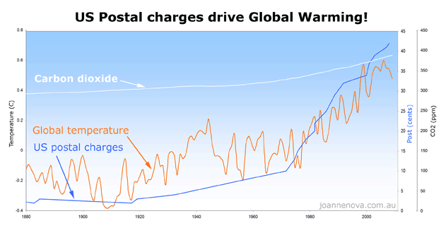
Anthony:
On your US Postal charges you forgot to hide the decline. It won’t work unless you use a trick or two.