 NOTE: significant updates have been made, see below.
After years of waiting, NOAA has finally made a monthly dataset on the U.S. Climate Reference Network available in a user friendly way via their recent web page upgrades. This data is from state-of-the-art ultra-reliable triple redundant weather stations placed on pristine environments. As a result, these temperature data need none of the adjustments that plague the older surface temperature networks, such as USHCN and GHCN, which have been heavily adjusted to attempt corrections for a wide variety of biases. Using NOAA’s own USCRN data, which eliminates all of the squabbles over the accuracy of and the adjustment of temperature data, we can get a clear plot of pristine surface data. It could be argued that a decade is too short and that the data is way too volatile for a reasonable trend analysis, but let’s see if the new state-of-the-art USCRN data shows warming.
A series of graphs from NOAA follow, plotting Average, Maximum, and Minimum surface temperature follow, along with trend analysis and original source data to allow interested parties to replicate it.
First, some background on this new temperature monitoring network, from the network home page:

The U.S. Climate Reference Network (USCRN)consists of 114 stations developed, deployed, managed, and maintained by the National Oceanic and Atmospheric Administration (NOAA) in the continental United States for the express purpose of detecting the national signal of climate change. The vision of the USCRN program is to maintain a sustainable high-quality climate observation network that 50 years from now can with the highest degree of confidence answer the question: How has the climate of the nation changed over the past 50 years? These stations were designed with climate science in mind.
Source: http://www.ncdc.noaa.gov/crn/
As you can see from the map below, the USCRN is well distributed, with good spatial resolution, providing an excellent representivity of the CONUS, Alaska, and Hawaii.

From the Site Description page of the USCRN:
==========================================================
Every USCRN observing site is equipped with a standard set of sensors, a data logger and a satellite communications transmitter, and at least one weighing rain gauge encircled by a wind shield. Off-the-shelf commercial equipment and sensors are selected based on performance, durability, and cost.
Highly accurate measurements and reliable reporting are critical. Deployment includes calibrating the installed sensors and maintenance will include routine replacement of aging sensors. The performance of the network is monitored on a daily basis and problems are addressed as quickly as possible, usually within days.
…
Many criteria are considered when selecting a location and establishing a USCRN site:
- Regional and spatial representation: Major nodes of regional climate variability are captured while taking into account large-scale regional topographic factors.
- Sensitivity to the measurement of climate variability and trends: Locations should be representative of the climate of the region, and not heavily influenced by unique local topographic features and mesoscale or microscale factors.
- Long term site stability: Consideration is given to whether the area surrounding the site is likely to experience major change within 50 to 100 years. The risk of man made encroachments over time and the chance the site will close due to the sale of the land or other factors are evaluated. Federal, state, and local government land and granted or deeded land with use restrictions (such as that found at colleges) often provide a high stability factor. Population growth patterns are also considered.
- Naturally occurring risks and variability:
- Flood plains and locations in the vicinity of orographically induced winds like the Santa Ana and the Chinook are avoided.
- Locations with above average tornado frequency or having persistent periods of extreme snow depths are avoided.
- Enclosed locations that may trap air and create unusually high incidents of fog or cold air drainage are avoided.
- Complex meteorological zones, such as those adjacent to an ocean or to other large bodies of water are avoided.
- Proximity:
- Locations near existing or former observing sites with long records of daily precipitation and maximum and minimum temperature are desirable.
- Locations near similar observing systems operated and maintained by personnel with an understanding of the purpose of climate observing systems are desirable.
- Endangered species habitats and sensitive historical locations are avoided.
- A nearby source of power is required. AC power is desirable, but, in some cases, solar panels may be an alternative.
- Access: Relatively easy year round access by vehicle for installation and periodic maintenance is desirable.
Source: http://www.ncdc.noaa.gov/crn/sitedescription.html
==========================================================
As you can see, every issue and contingency has been thought out and dealt with. Essentially, the U.S. Climate Reference Network is the best climate monitoring network in the world, and without peer. Besides being in pristine environments away from man-made influences such as urbanization and resultant UHI issues, it is also routinely calibrated and maintained, something that cannot be said for the U.S. Historical Climate Network (USHCN), which is a mishmash of varying equipment (alcohol thermometers in wooden boxes, electronic thermometers on posts, airport ASOS stations placed for aviation), compromised locations, and a near complete lack of regular thermometer testing and calibration.
Having established its equipment homogenity, state of the art triple redundant instrumentation, lack of environmental bias, long term accuracy, calibration, and lack of need for any adjustments, let us examine the data produced for the last decade by the U.S. Climate Reference Network.
First, from NOAA’s own plotter at the National Climatic Data Center in Asheville, NC, this plot they make available to the public showing average temperature for the Contiguous United States by month:

Source: NCDC National Temperature Index time series plotter
To eliminate any claims of “cherry picking” the time period, I selected the range to be from 2004 through 2014, and as you can see, no data exists prior to January 2005. NOAA/NCDC does not make any data from the USCRN available prior to 2005, because there were not enough stations in place yet to be representative of the Contiguous United States. What you see is the USCRN data record in its entirety, with no adjustments, no start and end date selections, and no truncation. The only thing that has been done to the monthly average data is gridding the USCRN stations, so that the plot is representative of the Contiguous United States.
Helpfully, the data for that plot is also made available on the same web page. Here is a comma separated value (CSV) Excel workbook file for that plot above from NOAA:
USCRN_Avg_Temp_time-series (Excel Data File)
Because NOAA/NCDC offers no trend line generation in their user interface, from that NOAA provided data file, I have plotted the data, and provided a linear trend line using a least-squares curve fitting procedure which is a function in the DPlot program that I use.
Not only is there a pause in the posited temperature rise from man-made global warming, but a clearly evident slight cooling trend in the U.S. Average Temperature over nearly the last decade:

We’ve had a couple of heat waves and we’ve had some cool spells too. In other words, weather.
The NCDC National Temperature Index time series plotter also makes maximum and minimum temperature data plots available. I have downloaded their plots and data, supplemented with my own plots to show the trend line. Read on.
NOAA/NCDC plot of maximum temperature:
 Source of the plot here.
Data from the plot: USCRN_Max_Temp_time-series (Excel Data File)*
My plot with trend line:

As seen by the trend line, there is a slight cooling in maximum temperatures in the Contiguous United States, suggesting that heat wave events (seen in 2006 and 2012) were isolated weather incidents, and not part of the near decadal trend.
NOAA/NCDC plot of minimum temperature:

Source of the plot here.
USCRN_Min_Temp_time-series (Excel Data File)*
The cold winter of 2013 and 2014 is clearly evident in the plot above, with Feb 2013 being -3.04°F nationally.
My plot with trend line:

*I should note that NOAA/NCDC’s links to XML, CSV, and JSON files on their plotter page only provide the average temperature data set, and not the maximum and minimum temperature data sets, which may be a web page bug. However, the correct data appears in the HTML table on display below the plot, and I imported that into Excel and saved it as a data file in workbook format.
The trend line illustrates a cooling trend in the minimum temperatures across the Contiguous United States for nearly a decade. There is some endpoint sensitivity in the plots going on, which is to be expected and can’t be helped, but the fact that all three temperature sets, average, max, and min show a cooling trend is notable.
It is clear there has been no rise in U.S. surface air temperature in the past decade. In fact, a slight cooling is demonstrated, though given the short time frame for the dataset, about all we can do is note it, and watch it to see if it persists.
Likewise, there does not seem to have been any statistically significant warming in the contiguous U.S. since start of the new USCRN data, using the average, maximum or minimum temperature data.
I asked three people who are well versed in data plotting and analysis to review this post before I published it, one, Willis Eschenbach, added his own graph as part of the review feedback, a trend analysis with error bars, shown below.

While we can’t say there has been a statistically significant cooling trend, even though the slope of the trend is downward, we also can’t say there’s been a statistically significant warming trend either.
What we can say, is that this is just one more dataset that indicates a pause in the posited rise of temperature in the Contiguous United States for nearly a decade, as measured by the best surface temperature monitoring network in the world. It is unfortunate that we don’t have similar systems distributed worldwide.
UPDATE:
Something has been puzzling me and I don’t have a good answer for the reason behind it, yet.
As Zeke pointed out in comments and also over at Lucia’s, USCRN and USHCN data align nearly perfectly, as seen in this graph. That seems almost too perfect to me. Networks with such huge differences in inhomogeneity, equipment, siting, station continuity, etc. rarely match that well.
![Screen-Shot-2014-06-05-at-1.25.23-PM[1]](https://wattsupwiththat.files.wordpress.com/2014/06/screen-shot-2014-06-05-at-1-25-23-pm1.png?quality=75)
Note that there is an important disclosure missing from that NOAA graph, read on.
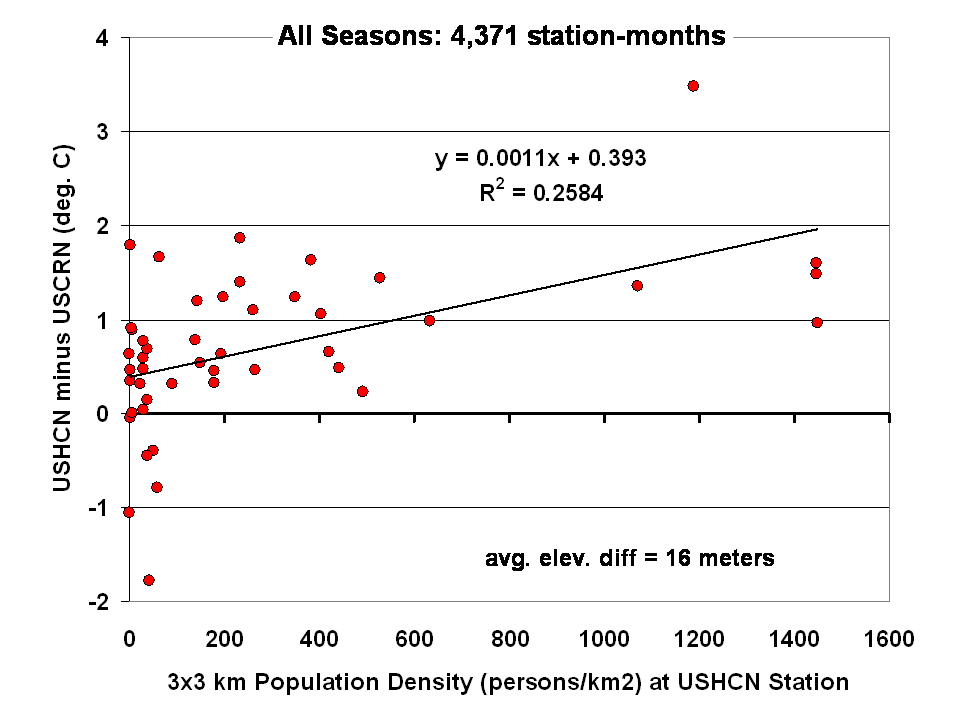
Dr Roy Spencer shows in this post the difference from USHCN to USCRN:
Spurious Warmth in NOAA’s USHCN from Comparison to USCRN
The results for all seasons combined shows that the USHCN stations are definitely warmer than their “platinum standard” counterparts:
 Spencer doesn’t get a match between USHCN and USCRN, so why does the NOAA/NCDC plotter page?
And our research indicates that USHCN as a whole runs warmer that the most pristine stations within it.
In research with our surfacestations metadata, we find that there is quite a separation between the most pristine stations (Class 1/2) and the NOAA final adjusted data for USHCN. This is examining 30 year data from 1979 to 2008 and also 1979 to present. We can’t really go back further because metadata on siting is almost non-existent. Of course, it all exists in the B44 forms and site drawings held in the vaults of NCDC but is not in electronic form, and getting access is about as easy as getting access to the sealed Vatican archives.
By all indications of what we know about siting, the Class 1/2 USHCN stations should be very close, trend wise, to USCRN stations, yet the ENTIRE USHCN dataset, including the hundreds of really bad stations, with poor siting and trends that don’t come close to the most pristine Class 1/2 stations are said to be matching USCRN. But from our own examination of all USHCN data and nearly all stations for siting, we know that is not true.
So, I suppose I should put out a caveat here. I wrote this above:
“What you see is the USCRN data record in its entirety, with no adjustments, no start and end date selections, and no truncation. The only thing that has been done to the monthly average data is gridding the USCRN stations, so that the plot is representative of the Contiguous United States.”
I don’t know that for a fact to be totally true, as I’m going on what has been said about the intents of NCDC in the way they treat and display the USCRN data. They have no code or methodology reference on their plotter web page, so I can’t say with 100% certainty that the output of that web page plotter is 100% adjustment free. The code is hidden in a web engine black box, and all we know are the requesting parameters. We also don’t know what their gridding process is. All I know is the stated intent that there will be no adjustments like we see in USHCN.
And some important information is missing that should be plainly listed. NCDC is doing an anomaly calculation on USCRN data, but as we know, there is only 9 years and 4 months of data. So, what period are they using for their baseline data to calculate the anomaly? Unlike other NOAA graphs like this one below, they don’t show the baseline period or baseline temperature on the graph Zeke plotted above.
This one is the entire COOP network, with all its warts, has the baseline info, and it shows a cooling trend as well, albeit greater than USCRN:

Source: http://www.ncdc.noaa.gov/cag/time-series/us
Every climate dataset out there that does anomaly calculations shows the baseline information, because without it, you really don’t know what your are looking at. I find it odd that in the graph Zeke got from NOAA, they don’t list this basic information, yet in another part of their website, shown above, they do.
Are they using the baseline from another dataset, such as USHCN, or the entire COOP network to calculate an anomaly for USCRN? It seems to me that would be a no-no if in fact they are doing that. For example, I’m pretty sure I’d get flamed here if I used the GISS baseline to show anomalies for USCRN.
So until we get a full disclosure as to what NCDC is actually doing, and we can see the process from start to finish, I can’t say with 100% certainty that their anomaly output is without any adjustments, all I can say with certainty is that I know that is their intent.
Given that there are some sloppy things on this new NCDC plotter page, like the misspelling of the word Contiguous. They spell it Continguous, in the plotted output graph title and in the actual data file they produce: USCRN_Avg_Temp_time-series (Excel Data file). Then there’s the missing baseline information on the anomaly calc, and the missing outputs of data files for the max and min temperature data sets (I had to manually extract them from the HTML as noted by asterisk above).
All of this makes me wonder if the NCDC plotter output is really true, and if in the process of doing gridding, and anomaly calcs, if the USCRN data is truly adjustment free. I read in the USCRN documentation that one of the goals was to use that data to “dial in” the adjustments for USHCN, at least that is how I interpret this:
The USCRN’s primary goal is to provide future long-term homogeneous temperature and precipitation observations that can be coupled to long-term historical observations for the detection and attribution of present and future climate change. Data from the USCRN is used in operational climate monitoring activities and for placing current climate anomalies into an historical perspective. http://www.ncdc.noaa.gov/crn/programoverview.html
So if that is true, and USCRN is being used to “dial in” the messy USHCN adjustments for the final data set, it would explain why USCHN and USCRN match so near perfectly for those 9+ years. I don’t believe it is a simple coincidence that two entirely dissimilar networks, one perfect, the other a heterogeneous train wreck requiring multiple adjustments would match perfectly, unless there was an effort to use the pristine USCRN to “calibrate” the messy USHCN.
Given what we’ve learned from Climategate, I’ll borrow words from Reagan and say: Trust, but verify
That’s not some conspiracy theory thinking like we see from “Steve Goddard”, but a simple need for the right to know, replicate and verify, otherwise known as science. Given his stated viewpoint about such things, I’m sure Mosher will back me up on getting full disclosure of method, code, and output engine for the USCRN anomaly data for the CONUS so that we can do that,and to also determine if USHCN adjustments are being “dialed in” to fit USCRN data.
# # #
UPDATE 2 (Second-party update okayed by Anthony): I believe the magnitude of the variations and their correlation (0.995) are hiding the differences. They can be seen by subtracting the USHCN data from the USCRN data:

Cheers
Bob Tisdale
[snip – we are done on this topic, we’ll have to agree to disagree, if you have valid on-topic comments here, make them, but any more of your Mosher rants will be immediately deleted. Feel free to be as upset as you wish. – Anthony]
Charles Nelson says:
June 8, 2014 at 5:36 am
I desperately do not want to start a scrap between skeptical blogs but I do want some guidance and reference from the folks I trust at WUWT with regard to Steven Goddard…who appears to be regularly posting examples of officially altered data as well as newspaper reports and photographs of climate extremes and catastrophes from times when the Global Temp was much lower than at present.
Now Mosher and Zeke are attacking Goddard on this site…so why don’t we clear the air?
‘Goddard’ is completely unreliable as a source as Anthony has already pointed out.
A recent example is showing a map of the arctic with a large white area marked from 1971, he reproduces it in a resolution that is too small to read the text and asserts that the white area is sea-ice extent. He then plots it over a recent sea-ice extent map and claims that it shows that sea-ice extent is now larger. If you view the map at the original resolution you’ll see that the white area is actually Multi-year ice extent. Deliberate deception.
So it begins.
REPLY: You got off-topic comments snipped, on a topic you’ve been disrupting threads here with for months, now you want to start a war. Think it through. – Anthony
Poptech says:
June 10, 2014 at 12:11 pm
Dang … I must have failed my Offishul Poptech Science Test, I wonder if I can re-take it …
Seriously, Poptech, we know that your definition for scientists includes the requirement that they have an advanced degree in the field and such.
But by that Poptech metric, many great scientists of history wouldn’t be scientists in your book … how do you explain that?
The truth is that a scientist is simply someone who follows the scientific method. In the case of those famous historical scientists that you wouldn’t classify as scientists, they did just what the scientists with PhDs did—they observed the world, formed hypotheses about how it worked, and tested those hypotheses.
Then, and most importantly, they published their results with enough details and data to allow anyone to “suck it and see”, as my Aussie friends say. They put their scientific ideas out in the public arena and invited people to see if they could either replicate their results or poke holes in them.
And that’s why those towering figures in the history of science were scientists despite in many cases having neither credentials nor employment in the field. They were scientists because they followed the scientific method.
Which is why Anthony and Mosher and Zeke and Steve McIntyre and I and many others are scientists despite our lack of whatever it is that you think is so important, credentials or employment or whatever.
We are scientists because we follow the scientific method.
Now, I know you don’t like that. In fact, everyone in shouting distance knows you don’t like that. Heck, you’re demented enough on the subject that you have a whole web page devoted to my failures … which is responsible for a constant, albeit small trickle of folks that come over to read what I’ve written that has you so obviously upset.
So anyhow, Poptech, I do appreciate the additional traffic, and I’m thankful that you don’t seem to have realized in that regard that all publicity is good publicity. And I’m grateful you are acting quite successfully as my unpaid PR man and driving traffic to WUWT. However, despite that, your continuing to shout about the subject here is quite disruptive. We’ve gotten your message. You think scientists have to have PhDs. And wear white coats. And work in labs. And anyone who lacks those things is not a scientist, no, never. Got it.
Now, could you maybe move on to the topic under discussion?
w.
[snip – per Anthony earlier, this is a continuation of your off-topic Mosher theme. -mod]
Is there anyone who can refute the following?
Pauses are part of natural climate variability, and their existence does not refute the long-term trend that climate system is gaining heat energy.
1) ~15 year pauses have been seen before
2) There’s been no pause in sea level rise nor arctic ice mass declines.
3) There’s been no pause in ocean heat content rise.
4) A consistent heat transfer mechanism explains the current hiatus as an effect of natural variability (trade winds) causing an increased transfer of heat to the oceans.
http://www.nature.com/nclimate/journal/v4/n3/full/nclimate2106.html
http://en.wikipedia.org/wiki/Global_warming_hiatus
http://www.livescience.com/28993-warming-ocean.html
katatetorihanzo says:
June 11, 2014 at 3:51 am
Thanks for the question, katate. As far as I’m concerned, “natural climate variability” is just bogus science-speak for “we don’t know”. We don’t know why the climate varies the way that it does, and naming it “natural variability” is merely a sad (albeit successful) attempt to cover up that ignorance.
Mmmm … since we don’t know what caused the pauses, you’re way premature with claims of what a pause does and doesn’t do.
True.
I have no idea where you are getting these claims from, but neither of them is true in the slightest. There has been a pause in both sea level rise and arctic ice declines. Check your data, my friend, you’re well behind the times. You could start here, where Anny Cazenave does her best to explain away the pause in sea level rise … and Arctic ice mass bottomed out in 2007 and has been stable or rising ever since, leading to global sea ice cover currently being above average. And obviously, global sea ice is a much better metric of a global pause than just Arctic ice. See the WUWT Sea Ice page for details.
Unknown, the historical OHC data is far too poor and its errors are too large to come to that conclusion. Here’s the situation:

As you can see, the various OHC datasets totally disagree with each other, there’s no way to say if there’s a pause or not. There’s further discussion of these issues here.
Oh, please. Now we’re back to “natural variability” being the cause?
There are at this point about a half-dozen or more “explanations” of the pause, including the one you’ve happened to pick. Are you willing to go on record claiming that the explanation you’ve happened to alight on is the only real true one? And if so, where is your evidence that the other five explanations are wrong and your explanation is right?
Reality check—nobody knows why the temperature stopped rising, katate, just like nobody knows why the temperature fell to a low in the Little Ice Age, just like nobody knows what brought us out of the Little Ice Age, just like nobody knows why the world cooled from 1945-1975 … and saying “it’s natural variability” is merely a pathetic attempt to cover up our ignorance.
Finally, you cite three sources, which is good, I heartily approve of citations.
Unfortunately, your three sources are Nature magazine, Dana Nuccitelli, and Wikipedia. I doubt that you could find three worse sources for your claims, as all three of them are well-known for producing climate claptrap, bogus “facts”, shoddy studies, incorrect explanations, and false claims at a rate of knots … and as for quoting Data Nuccitelli, well, you might as well just wear a sign that says “I’m clueless about climate” as to quote him. I’d definitely steer clear of him, because once anyone notices that you’re citing Data, your judgement is immediately suspect and your vote will get discounted …
There ya go, all refuted.
w.
Willis Eschenbach says:
June 11, 2014 at 1:56 pm
“Thanks for the question, katate. As far as I’m concerned, “natural climate variability” is just bogus science-speak for “we don’t know”. We don’t know why the climate varies the way that it does, and naming it “natural variability” is merely a sad (albeit successful) attempt to cover up that ignorance.”
You may call me Hanzo. If the above statement were true, then there would be poor correspondence of short term well documented natural heating and cooling events with the surface temperature records. The correspondence is in fact supported by evidence. The link below illustrates the high quality of correspondence in the last ~30 years including natural cooling events (El Cinchon, Pinatubo volcanic eruptions, La Ninas) and natural heating events (minor solar and El Nino).
The longer term orbital forcings match up well with the ice core data.
http://en.wikipedia.org/wiki/Milankovitch_cycles
While there are uncertainties, the statement that “we don’t know why the climate varies the way that it does” is not supported by evidence.
“Mmmm … since we don’t know what caused the pauses, you’re way premature with claims of what a pause does and doesn’t do.”
The following link presents an explanation based on evidence implicating the cool eastern Pacific sea surface temperature with anomalous trade winds and subsurface ocean heat uptake. There may be other heat transfer mechanisms in this short time-frame that may be simultaneously true. The point is that there are self-consistent explanations invoking a short-term natural variable based on evidence. The claim that “we don’t know what caused the pauses” would have to be supported by contra-factual evidence. Please feel free to provide them if such exists.
http://www.nature.com/nclimate/journal/v4/n3/full/nclimate2106.html
“I have no idea where you are getting these claims from, but neither of them is true in the slightest. There has been a pause in both sea level rise and arctic ice declines.”
Long-term trends for sea level show a clear increase with short-term reductions in the trend explained by natural variation related to rainfall due to La Nina events during that time period as Dr. Anny Cazenave explains in her presentation and confirmed by the GRACE satellite.
When the natural variation is removed, there is no observed pause.
“Check your data, my friend, you’re well behind the times. You could start here, where Anny Cazenave does her best to explain away the pause in sea level rise … and Arctic ice mass bottomed out in 2007 and has been stable or rising ever since, leading to global sea ice cover currently being above average. And obviously, global sea ice is a much better metric of a global pause than just Arctic ice. See the WUWT Sea Ice page for details.”
The long-term trend for global ice is on the decline according to Dr. Claire Parkinson (Goddard Space Flight Center) and others.
Furthermore, the obvious arctic sea ice decline as shown in the chart below is NOT consistent with the AGW-contrarian claim that there has been 17-year pause in surface temperature.
http://upload.wikimedia.org/wikipedia/commons/d/d8/Average_Monthly_Arctic_Sea_Ice_Extent_-_September_1979_-_2012.png
Not only is there no pause if you consider time frames over 6 years, the arctic sea ice decline is accelerating. Can anyone cite contra-factual evidence to explain this discrepancy between the WUWT claims and the global declines in land and sea ice?
“3) There’s been no pause in ocean heat content rise.
Unknown, the historical OHC data is far too poor and its errors are too large to come to that conclusion. Here’s the situation:
As you can see, the various OHC datasets totally disagree with each other, there’s no way to say if there’s a pause or not. There’s further discussion of these issues here.”
From your graph of ocean heat content, I see the following.
1) Positive linear trends ranging from +0.21 to +0.31 W m-2 showing increase of sea level
2) The ensemble average trace has a positive linear trend (+0.24 W m-2) over ~50 years with minima between 1980-1990 and no obvious pauses from 1990 on.
3) It is interesting that the minima corresponds well with the cooling effects of El Chichon eruption (1983-1987) seen nicely in the surface temp record.
Here’s another plot of ocean heat content.
http://www.nodc.noaa.gov/OC5/3M_HEAT_CONTENT/heat_content55-07.png
As demonstrated from our discussion above, we know that various datasets have known sources of short-term natural variation (volcanic activity, La Nino and La Nina, anomalous trade winds) that correspond well with the surface land and ocean temperatures. These parallel observations are consistent with a long-term trend of increasing ocean heat content overlaid with explainable short-term natural variations.
“There are at this point about a half-dozen or more “explanations” of the pause, including the one you’ve happened to pick. Are you willing to go on record claiming that the explanation you’ve happened to alight on is the only real true one? And if so, where is your evidence that the other five explanations are wrong and your explanation is right? ”
As far as I can see, all the explanations are based on evidence and all of them may be ‘right’ and additive. I look forward to your contra-factual evidence.
“Reality check—nobody knows why the temperature stopped rising, katate, just like nobody knows why the temperature fell to a low in the Little Ice Age, just like nobody knows what brought us out of the Little Ice Age, ”
http://en.wikipedia.org/wiki/Little_Ice_Age#Causes
“Scientists have tentatively identified these possible causes of the Little Ice Age: orbital cycles; decreased solar activity; increased volcanic activity; altered ocean current flows; the inherent variability of global climate; and reforestation following decreases in the human population.”
“…just like nobody knows why the world cooled from 1945-1975 … and saying “it’s natural variability” is merely a pathetic attempt to cover up our ignorance.”
“Sulphate aerosols”: http://www.nap.edu/openbook.php?record_id=12782&page=207
“Finally, you cite three sources, which is good, I heartily approve of citations.
Unfortunately, your three sources are Nature magazine, Dana Nuccitelli, and Wikipedia. I doubt that you could find three worse sources for your claims, as all three of them are well-known for producing climate claptrap, bogus “facts”, shoddy studies, incorrect explanations, and false claims at a rate of knots … and as for quoting Data Nuccitelli, well, you might as well just wear a sign that says “I’m clueless about climate” as to quote him. I’d definitely steer clear of him, because once anyone notices that you’re citing Data, your judgement is immediately suspect and your vote will get discounted …”
I don’t typically use ad hominem assertions in the analysis because it is simpler and more relevant to refute any particular claim with specific contra-factual evidence. If you have them please cite them.
-Hanzo
Anthony. Some time ago you did a chart with a lot of in the US well sited rural stations that had never missed making their monthly reports. It would be interesting to see how well those match up with the new super duper ones.
Thank you, Hanzo. I’m still waiting for your “evidence”, and I’ll be glad to respond when you present it. Unfortunately, a statement from Dana Nuccitelli is not evidence in any sense of the word. Well, it is kind of evidence, as whatever Dana says has proven historically to be about 180° out of phase with reality.
Nor are the manifold claims about climate on Wikipedia evidence of any kind. And your two-minute video from SkepticalScience about James Hansen’s ever-adjusted GISS dataset is a joke. RSS shows no warming in 17 years. As do all of the temperature datasets … except James Hansen’s pet dataset.
So as soon as you’d like to start presenting actual evidence in place of foolish claims from Wikipedia and Dana Nuccitelli, please do so, and I’ll be glad to respond to them.
You also say:
Sorry, Hanzo, but claiming that “all of them may be right and additive”, while a wonderful wish, is hardly a response. If you think that they are “right and additive”, it’s your job to show it. I’ve falsified one of these excuses, the claim about volcanoes, as have others.
I say nobody knows what caused the Little Ice Age, and you say I’m wrong. Why am I wrong?
Well, you say I’m wrong because Wikipedia says that unidentified “scientists” say that the reason it was cold in the Little Ice Age might be volcanoes. And it might be the sun. And it might be altered ocean currents. And it might be “natural variability”, which means “we don’t know why”. And it might be reforestation … wait a minute, reforestation is claimed to make it colder? I hadn’t seen that claim, and I was unaware of massive reforestation in the 1650’s … Hanzo, please let us know what the “reforestation” claim is all about, since you cited it I’m sure you must understand it.
But in any case, my thanks to you—you’ve definitely proven my claim that we don’t know what caused the Little Ice Age … because if we did there wouldn’t be a laundry list of possible causes, including my favorite, that meaningless catchall term “natural variability”.
Regards,
w.
Hi Kevin I agree with your last point. However, it is just a fact that the grading you refer to is very often regarded as and communicated as a lesson observation grade
hanzo,
You select only those sources that support your belief. Even NASA/GISS states that global warming has stopped. Whether temporarily or permanaently, we don’t know.
Here is a source that contradicts your belief. The red line is global ice cover. As we see, it is currently above its long term average.
Next, you appear to believe that a slight warming of the planet is a bad thing, when all evidence shows that a warmer world is beneficial to the biosphere. And CO2? That harmless compound is also beneficial to the biosphere. The planet is measurably greening as a direct result of the added CO2.
Carbon dioxide is harmless, and beneficial to the biosphere. At current and projected concentrations, more CO2 is better.
That is my testable hypothesis. Falsify it if you can. If not, it stands.
“You select only those sources that support your belief.”
To address confirmational bias, I am consulting a climate-contrarian website to harvest contra-factual (conflicting) evidence.
“Even NASA/GISS states that global warming has stopped. Whether temporarily or permanaently, we don’t know.”
The data suggests a reduced rate of increase of surface air temperature in the last 18 years during a time that is inconsistent with the continued warming of the ocean (no pause) and declines in global ice mass ( no pauses). The inconsistencies has been resolved.
1) Slow downs in the rate of increase of surface temperature have been seen before, but have always been temporary in the 163 year instrumental record.
2) In the last 18 years, the temperature record shows excellent correspondence with short term well documented short-term cooling and heating events (natural variations). The link below illustrates the quality of the correspondence in the last ~30 years of volcanic activity (El Cinchon, Pinatubo) El Nino, La Nina and the very small solar effects.
If you remove the temperature skew by known natural variations, the upward trend is the same as the last ~30 years. No pause in the greenhouse gas forcing.
3) The trend usually cited starts with an 1998 El Niño (heat transfer from ocean to air) and ends with La Nina (heat transfer from air to ocean). This artificially gives the impression of a lower trend. Evidence is put forward for the origin of the natural air/ocean heat transfer mechanisms (Anomalous trade winds) explaining the short ‘hiatus’
http://www.nature.com/nclimate/journal/v4/n3/full/nclimate2106.html
4) Similarly, sea level trend pauses are explained by precipitation variations (increased during El Niño, diminished during La Nina) and was supported by direct evidence.
“Here is a source that contradicts your belief. The red line is global ice cover. As we see, it is above it’s long term average.”
Sea ice extent is ‘spread’, not mass. Direct evidence has documented the reduced thickness of the Antarctica sea ice. Trade winds are spreading the ice apart creating spaces that freeze. The overall mass is lower.
Next, you appear to believe that a slight warming of the planet is a bad thing, when all evidence shows that a warmer world is beneficial to the biosphere.
The effects are complex. The ocean absorbed most of the trapped heat and releases it via El Niño and ice melt. You need only review the economic damage to fisheries related to El Niño. There are other effects related to the release of fresh water to existing ocean circulation patterns due to ice melt.
“And CO2? That harmless compound is also beneficial to the biosphere. The planet is measurably greening as a direct result of the added CO2.”
Negative effects of high CO2 involve ocean acidification. If you calculate the concentration of CO2 in the air from the known industrial emissions you get a value that is higher than the current 400 ppm. The excess CO2 is going into the oceans, lowering the pH and is already impacting coral. If we find that plankton is adversely affected, then an important food chain will be impacted negatively.
“Carbon dioxide is as essential to life on earth as H2O. At current and projected concentrations, more CO2 is better.”
CO2 enhances growth of plants that are unfavorable to agriculture (weeds, increased pollen counts). From plant mmigrations to droughts and floods, the negatives vastly outweigh the positives.
“That is my testable hypothesis. Falsify it if you can. If not, it stands.”
Please provide contra-factual data conflicting with any of the following
1) global ice mass decrease (sea ice extent vs mass)
2) global sea level rise (corrected for El Niño/La Nina precipitation)
3) ocean acidification (damage to sea life)
4) increased El Niño frequency (fish kills)
5) greenhouse effect (physics of CO2 absorbing outgoing radiation, Venus)
6) effect of known natural variation from short term trends (stochastic vs deterministic effects)
katatetorihanzo:
re your post at June 16, 2014 at 6:09 am.
Global warming discernible at 95% confidence has stopped.
Nobody knows why global warming has stopped, and nobody knows if the present lack of significant global temperature trend will end with warming or cooling. Sensible people hope it will not be cooling.
You achieve nothing by repeatedly posting videos and other stuff which try to pretend that discernible global warming has not stopped.
Reality is best addressed and not feared. So, for the benefit of your peace of mind you need to accept reality and to admit that global warming discernible at 95% confidence has stopped.
I hope this post helps to assuage your obvious but unfounded fears.
Richard
Can anyone send any specific conflicting evidence that the total heat energy of the climate (air, ice, ocean) is not rising. I am not looking for short pauses that are easily explained by short term cooling effects in one part of the climate system (surface air). I’m looking for evidence-based explanation, not “we don’t know” or merely an assertion that “we doubt this or that data”. Can anyone refute that the ice mass is decreasing? Can anyone say that heat content in the ocean has paused? Come on folks, give contra-factual evidence.
katatetorihanzo:
It seems that my attempt to assuage your fear failed because at June 16, 2014 at 8:40 am you write.
Nobody needs to provide any of the evidence you request. On the contrary, you need to check the data and to assess its interpretation.
It is the responsibility of those who make assertions to provide evidence to substantiate their claims and NOBODY is required to provide “contra-factual evidence”.
I again post the following but this time in the hope that it will help you to overcome your unfounded fears.
The Null Hypothesis says it must be assumed a system has not experienced a change unless there is evidence of a change.
The Null Hypothesis is a fundamental scientific principle and forms the basis of all scientific understanding, investigation and interpretation. Indeed, it is the basic principle of experimental procedure where an input to a system is altered to discern a change: if the system is not observed to respond to the alteration then it has to be assumed the system did not respond to the alteration.
In the case of climate science there is a hypothesis that increased greenhouse gases (GHGs, notably CO2) in the air will increase global temperature. There are good reasons to suppose this hypothesis may be true, but the Null Hypothesis says it must be assumed the GHG changes have no effect unless and until increased GHGs are observed to increase global temperature. That is what the scientific method decrees. It does not matter how certain some people may be that the hypothesis is right because observation of reality (i.e. empiricism) trumps all opinions.
Please note that the Null Hypothesis is a hypothesis which exists to be refuted by empirical observation. It is a rejection of the scientific method to assert that one can “choose” any subjective Null Hypothesis one likes. There is only one Null Hypothesis: i.e. it has to be assumed a system has not changed unless it is observed that the system has changed.
However, deciding a method which would discern a change may require a detailed statistical specification.
In the case of global climate no unprecedented climate behaviours are observed so the Null Hypothesis decrees that the climate system has not changed.
Importantly, an effect may be real but not overcome the Null Hypothesis because it is too trivial for the effect to be observable. Human activities have some effect on global temperature for several reasons. An example of an anthropogenic effect on global temperature is the urban heat island (UHI). Cities are warmer than the land around them, so cities cause some warming. But the temperature rise from cities is too small to be detected when averaged over the entire surface of the planet, although this global warming from cities can be estimated by measuring the warming of all cities and their areas.
Clearly, the Null Hypothesis decrees that UHI is not affecting global temperature although there are good reasons to think UHI has some effect. Similarly, it is very probable that AGW from GHG emissions are too trivial to have observable effects.
The feedbacks in the climate system are negative and, therefore, any effect of increased CO2 will be probably too small to discern because natural climate variability is much, much larger. This concurs with the empirically determined values of low climate sensitivity.
Empirical – n.b. not model-derived – determinations indicate climate sensitivity is less than 1.0°C for a doubling of atmospheric CO2 equivalent. This is indicated by the studies of
Idso from surface measurements
http://www.warwickhughes.com/papers/Idso_CR_1998.pdf
and Lindzen & Choi from ERBE satellite data
http://www.drroyspencer.com/Lindzen-and-Choi-GRL-2009.pdf
and Gregory from balloon radiosonde data
http://www.friendsofscience.org/assets/documents/OLR&NGF_June2011.pdf
Indeed, because climate sensitivity is less than 1.0°C for a doubling of CO2 equivalent, it is physically impossible for the man-made global warming to be large enough to be detected (just as the global warming from UHI is too small to be detected). If something exists but is too small to be detected then it only has an abstract existence; it does not have a discernible existence that has effects (observation of the effects would be its detection).
To date there are no discernible effects of AGW. Hence, the Null Hypothesis decrees that AGW does not affect global climate to a discernible degree. That is the ONLY scientific conclusion possible at present.
Richard
First let me show you inconsistencies:
http://www.skepticalscience.com/pics/SkepticFrame.jpg
Escalator
http://www.skepticalscience.com/pics/Skeptics_guide_pg1.png
http://www.carbonbrief.org/media/139597/where_is_global_warming_going_infographic.jpeg
Ocean heat content
http://www.carbonbrief.org/media/230368/sksci-graph_550x377.jpg
Sea ice decline
http://static.guim.co.uk/sys-images/Guardian/Pix/pictures/2013/7/17/1374020042661/SkepticView450.jpg A pause in one, should cause a pause in all
In summary I think your analyses are plagued mainly by
1) using too small a sample size to test H0
2) a subtle strawman argument in H1 leading you to a Type Ii error
3) ignoring inconvenient data
Lovejoy completed a statistical comparison of the observed warming (H1) during the industrial epoch against the null hypothesis (H0) for natural variability, without the use of GCM models. Specifically he demonstrated that the probability that the magnitude of current warming (H1) is no more than a natural fluctuation is so low that the natural variability (H0) may be rejected with high levels of confidence (>99%)
http://www.physics.mcgill.ca/~gang/eprints/eprintLovejoy/neweprint/Anthro.climate.dynamics.13.3.14.pdf
I can offer examples to illustrate that the imprecise formulation of H1, H0 and the use of small sample sizes that are skewed with known sources of natural variation, can lead to inconsistencies.
Lets start with the trouble of small sample sizes. For example, a hypothesis is proposed:
H1: Introduction of CO2 (specified rate) into the air should result in an increase of mean global surface temperature (+0.15 C/decade) within a certain confidence interval x
A null hypothesis H0 is proposed that runs counter to H0 and is tested:
H0: Mean global surface temperatures do not increase after the introduction of CO2 into the air, within a certain confidence interval x
Test: add CO2 to the air over duration of test dataset and monitor mean global air and surface ocean temp (<800 m) over that time.
Dataset 1998-2013:
0.0 C per decade; H0 is not rejected
http://wattsupwiththat.files.wordpress.com/2014/03/clip_image002_thumb.png?w=602&h=329
Dataset 1970-2012:
5 sets of data @ur momisugly 0.0 C per decade; H0 is not rejected for each of five datasets within the 1970-2012 timeframe
http://www.skepticalscience.com/pics/SkepticFrame.jpg
Dataset 1950-2005: 0.13±0.03 °C per decade; H0 is rejected
http://en.m.wikipedia.org/wiki/Global_Warming#Observed_temperature_changes
Apparently rejecting the null hypothesis depends on the size of the Dataset or on which Dataset is cherry picked. What if I selected a decadal Dataset that was skewed by short term La Niña at the beginning and El Niño at the end? Would that not artificially augment apparent GHG forcing?
Let's talk about H1 for AGW. It's not as simple as CO2 input into a black box (climate) and then output increasing mean global temperatures. I call that the H1 strawman.
AGW H1 actually has component elements, each of which conformed to statistical null hypothesis testing with rejected nulls. This forms a growing consistent set of evidence.
1) Radiative imbalance governs global heat content (null: it does not)
2) CO2 interacts with outgoing radiation (null: it does not)
3) CO2 with fast water vapor feedback governs global mean temperature if and only if when other known forcings are at or near minimum
4) Volcanic eruptions have a net cooling impact (sulfate aerosol) that is measurable in the surface temps: (null: it does not)
5) Short term weather fluctuations impact mean global temps (La Niña, El Niño), Trade winds: (null: it does not)
6) relative contributions of Solar, orbital, albedo also impact global mean temp (null: they do not)
7) CO2 with fast water vapor feedback governs warming if and only if when other known forcings are at their minimum.
8) part of the added heat should reduce ice mass (null: it does not)
9) ice melting should contribute to sea level rise (null: it does not)
10) part of the added heat should increase sea level rise due to thermal expansion (null: it does not)
11) most of the added heat energy goes into the oceans (null: less than half)
12) GHG forcing stratospheric cooling trend (not tropospheric hot spot): (null: it does not)
13) CO2 is depleted in C14 relative to natural sources.
14) CO2 is entering oceans and pH will decline (null: it does not)
15) if GW stopped would we not see unexplained pauses in derived effects?
hanzo says:
Can anyone refute that the ice mass is decreasing?
I refuted your ice cover nonsense above, so you simply switched to other arguments. A typical climate alarmist redirection tactic, which fools no one here. You simply lost that argument.
Next, Richard Courtney is exactly right. The Null Hypothesis has never been falsified, and without that you have no credible argument. Your preposterous assertion that global warming is continuing apace is nonsense. All credible data bases dispute that belief.
Next, AGW may exist, but if so it is too minuscule to measure. Further, every prediction made by the alarmist crowd has failed miserably. When one side is wrong about everything, rational people will reject their entire premise.
Finally, CO2 is globally harmless. CO2 is a net benefit to the biosphere; the planet is measurably greening due to the rise in CO2. Thus, the basis for the “carbon” scare comes down to nothing more than assertions, like those in your silly videos. There is no empirical, testable, measurable scientific evidence showing conclusively that AGW exists — and after 30+ years of looking, if it was there, some evidence surely would have been found by now.
katatetorihanzo:
Clearly, you have difficulties with reading comprehension (possibly because your fear clouds your thought).
In reply to your daft assertion that climate realists need to provide “contra-factual evidence” to refute anthropogenic global warming (AGW), I wrote saying to you
Your post at June 17, 2014 at 8:30 pm ignores that – and everything else I wrote to you – but provides much irrelevant blather before concluding
There is no evidence of any effects of man-made global warming; none, zilch, nada.
If you were able to provide such evidence then you would certainly gain a Nobel Prize because no such evidence has been obtained by three decades of research conducted world-wide at a cost of more than US$5 billion per year.
Global warming has stopped. All the measurements indicate that.
If you think there are “derived effects” of existing global warming then you have a problem which you need to explain because all the measurements show global warming has stopped.
Richard
Nothing has stopped.
There is a long-time trend which goes up in some 0.01 Degree per decade and there is an overliing wave which is just going down in the last years.
Try the equation y= 0.001*t + 0.0035*sin(2*Pi* t/20).
This is the equation of a sinus function with period 20 and amplitude 0.0035, which is added to a straight line with slope 0.001.
For nearly 10 (suppose years) the line will stay at a level, but then it starts to go up to the next level in the next 10 (years).
There are a lot of variables in the climate system. Most of them are cyclic and have long periods.
So it is not appropriate to look only to the last 10 years, but you should look at 100 years or more.
Then it will be clear, that short time periods can show a plateau at a constant level, but they mask a straight slope.
These are not real measured values, but only functions to show the effect of waves overliing straight lines.
To find real effects we must look for long time periods and compare with data not 10 years agon, but 100 years ago.
In 50 years or so the measurements of NOAA will perhaps show the waves in temperatures.
An other reason for the smaller temperature rise is the melting of glaciers and the stronger evaporation of water from the oceans. This requires a lot of heat, which otherwise would rise the temperature.
But you can see the effect at the north pole. The ice cap was last year in September 30% less than 50 years ago. And not only the area was smaller, the thickness was smaller too. Where has the ice gone? How could it melt without heat? What will happen, if all ice is melted? Then we have lost the heat sink and the temperature will rise at a much faster pace.
Every comparision with data younger than 30 years is irrelevant.
Gerhard
I read your replies very carefully. If I apply the trending techniques in this WUWT article, to shorter datasets throughout the larger 1970-2012 dataset of the instrumental record, then I would have to conclude that global warming ceased at least five times since 1970.
Since the global mean is higher now than in 1970, it’s logical to assume that it must have started up again, at least four times. Since we have some evidence that heat is accumulating in the deep ocean, it’s not hard to imagine where the extra heat is going, at least temporarily.
“In reply to your daft assertion that climate realists need to provide “contra-factual evidence” to refute anthropogenic global warming (AGW), I wrote saying to you. It is the responsibility of those who make assertions to provide evidence to substantiate their claims and NOBODY is required to provide “contra-factual evidence”.
I still see an inconsistency between the assertion that global warming has ceased, as suggested by a (yet another) short-term temp hiatus at the surface, and the following observations:
No pause in the global mean heat content of the deep ocean (1500 m) as determined by Argo clearly associated with a positive trend 2003-2006. http://onlinelibrary.wiley.com/doi/10.1029/2008JC005237/abstract
No pause in the accelerating sea ice loss in the arctic
http://alaska.usgs.gov/science/interdisciplinary_science/cae/images/theme1_fig1_lg.jpg
No pause in the acceleration of glacier melting and calving in Greenland and Antarctica, particularly within the last few years.
No pause in gravimetric measurements of Greenland and Antarctica that show net ice loss. Can anyone explain how global ice mass is declining while global temperatures are presumably steady over 17 years?
I recognize that you are not under any obligation to provide me evidence to resolve these inconsistencies, but if you can direct me to any citations or logical explanation that at least address the inconsistencies above, I would be grateful. If not, I thank you for your time in any case. This helps me hone my questions for contributors to other climate contrarian sites who may have the information readily available.
Gerhard Herres:
Thankyou for providing your model of the global temperature time series in your post at June 18, 2014 at 1:45 am.
Many such models are possible; for example, Akasofu’s model which can be seen here.
I note that your model of the data fails to emulate periods of less than 30 years so you claim
Other models – including Akasofu’s model – do not suffer from the limitation you claim of your model.
Importantly, this limitation of your model means that it cannot indicate as you assert
As Akosofu says, if his (or your) model is correct then global warming has stopped but will resume.
Those of us who await determination of which – if any – model is correct only know that global warming has stopped,and we do not know if it will resume or if cooling will occur.
Richard
katatetorihanzo:
I am replying to your post at June 18, 2014 at 2:48 am.
I tried – and I have clearly failed – to assuage your irrational fear.
You can believe what you like so can cling to your phobia on the basis of it.
However, irrational fear is not helpful to happiness so I say to you with complete sincerity that you are likely to benefit from accepting reality instead of your fear. In reality global warming has stopped and, therefore, global warming cannot harm you (or anybody else).
Of course, I recognise that it is not likely to be productive to tell you to abandon your fear. Fear is not rational so cannot be assuaged by rational argument. For example, some people are afraid of mice and telling them that mice cannot eat people will not help them to desist from screaming at the sight of a mouse.
Similarly, being told the fact that global warming has stopped cannot remove your fear. And I have no intention of addressing any of the other attempts you make to rationalise your fear: it would be a pointless waste of my time because your fear cannot be defeated rational argument.
Your fear would have been removed by the fact that global warming has stopped if facts, information and reality could assuage your fear.
Richard
Hanzo and gerhard are amusing. They are like Jehovah’s Witnesses in their naive belief, making assertions that are not supported by either the planet or the climate Null Hypothesis. Maybe they are more like Dr Festinger’s ‘Seekers’, futilely waiting for the flying saucer that didn’t arrive as promised. So as True Believers, they accept Mrs Keech’s assurance that the flying saucer has simply re-scheduled. Substitute the flying saucer for CAGW, and Skeptical Science for Mrs Keech, and you have the perfect analogy.
Richard Courtney is correct: there are no inconsistencies in the skeptics’ view. Globbal warming stopped quite a few years ago, but the True Believers insist, despite overwhelming evidence, that it continues. That is crazy talk. Global warming has stopped.
Finally, the strange fixation on “ice” avoids the fact that global ice cover is above its 30-year average. The planet is simply recovering naturally from the LIA. Human GHG emissions have nothing whatever to do with it.
Willis Eschenbach says:
June 11, 2014 at 10:56 am
katatetorihanzo says:
June 11, 2014 at 3:51 am
“2) There’s been no pause in sea level rise nor arctic ice mass declines.”
I have no idea where you are getting these claims from, but neither of them is true in the slightest. There has been a pause in both sea level rise and arctic ice declines. Check your data, my friend, you’re well behind the times. You could start here, where Anny Cazenave does her best to explain away the pause in sea level rise … and Arctic ice mass bottomed out in 2007 and has been stable or rising ever since, leading to global sea ice cover currently being above average
Not true Willis, Arctic ice mass did not ‘bottom out in 2007’, as the Piomas data shows:
http://psc.apl.washington.edu/wordpress/wp-content/uploads/schweiger/ice_volume/BPIOMASIceVolumeAnomalyCurrentV2.1.png
Looking at that data it certainly appears to be less stable and falling since 2007.
And pray tell, how can you generalize from the lower 48 states to the entire globe?
I lost all faith in the global warming people after an article was published (don’t make me dig up the reference) in a respected peer reviewed journal regarding long term temperatures in California, after the authors had removed from the data all stations which were badly sited (Like on somebody’s garage, etc.) The authors found no warming. I mentioned this on the Real Science blog site, and said shouldn’t this make us rethink the global warming problem, and one of the blog hosts wrote back, “Where in the article does the word ‘global’ appear?”
He was right. The world “global” wasn’t mentioned. Everything became crystal clear to me at that point. I have seen nothing since to make me revise my opinion of those people.