NOTE: significant updates have been made, see below.
After years of waiting, NOAA has finally made a monthly dataset on the U.S. Climate Reference Network available in a user friendly way via their recent web page upgrades. This data is from state-of-the-art ultra-reliable triple redundant weather stations placed on pristine environments. As a result, these temperature data need none of the adjustments that plague the older surface temperature networks, such as USHCN and GHCN, which have been heavily adjusted to attempt corrections for a wide variety of biases. Using NOAA’s own USCRN data, which eliminates all of the squabbles over the accuracy of and the adjustment of temperature data, we can get a clear plot of pristine surface data. It could be argued that a decade is too short and that the data is way too volatile for a reasonable trend analysis, but let’s see if the new state-of-the-art USCRN data shows warming.
A series of graphs from NOAA follow, plotting Average, Maximum, and Minimum surface temperature follow, along with trend analysis and original source data to allow interested parties to replicate it.
First, some background on this new temperature monitoring network, from the network home page:


The U.S. Climate Reference Network (USCRN)consists of 114 stations developed, deployed, managed, and maintained by the National Oceanic and Atmospheric Administration (NOAA) in the continental United States for the express purpose of detecting the national signal of climate change. The vision of the USCRN program is to maintain a sustainable high-quality climate observation network that 50 years from now can with the highest degree of confidence answer the question: How has the climate of the nation changed over the past 50 years? These stations were designed with climate science in mind.
Source: http://www.ncdc.noaa.gov/crn/
As you can see from the map below, the USCRN is well distributed, with good spatial resolution, providing an excellent representivity of the CONUS, Alaska, and Hawaii.
From the Site Description page of the USCRN:
==========================================================
Every USCRN observing site is equipped with a standard set of sensors, a data logger and a satellite communications transmitter, and at least one weighing rain gauge encircled by a wind shield. Off-the-shelf commercial equipment and sensors are selected based on performance, durability, and cost.
Highly accurate measurements and reliable reporting are critical. Deployment includes calibrating the installed sensors and maintenance will include routine replacement of aging sensors. The performance of the network is monitored on a daily basis and problems are addressed as quickly as possible, usually within days.
…
Many criteria are considered when selecting a location and establishing a USCRN site:
- Regional and spatial representation: Major nodes of regional climate variability are captured while taking into account large-scale regional topographic factors.
- Sensitivity to the measurement of climate variability and trends: Locations should be representative of the climate of the region, and not heavily influenced by unique local topographic features and mesoscale or microscale factors.
- Long term site stability: Consideration is given to whether the area surrounding the site is likely to experience major change within 50 to 100 years. The risk of man made encroachments over time and the chance the site will close due to the sale of the land or other factors are evaluated. Federal, state, and local government land and granted or deeded land with use restrictions (such as that found at colleges) often provide a high stability factor. Population growth patterns are also considered.
- Naturally occurring risks and variability:
- Flood plains and locations in the vicinity of orographically induced winds like the Santa Ana and the Chinook are avoided.
- Locations with above average tornado frequency or having persistent periods of extreme snow depths are avoided.
- Enclosed locations that may trap air and create unusually high incidents of fog or cold air drainage are avoided.
- Complex meteorological zones, such as those adjacent to an ocean or to other large bodies of water are avoided.
- Proximity:
- Locations near existing or former observing sites with long records of daily precipitation and maximum and minimum temperature are desirable.
- Locations near similar observing systems operated and maintained by personnel with an understanding of the purpose of climate observing systems are desirable.
- Endangered species habitats and sensitive historical locations are avoided.
- A nearby source of power is required. AC power is desirable, but, in some cases, solar panels may be an alternative.
- Access: Relatively easy year round access by vehicle for installation and periodic maintenance is desirable.
Source: http://www.ncdc.noaa.gov/crn/sitedescription.html
==========================================================
As you can see, every issue and contingency has been thought out and dealt with. Essentially, the U.S. Climate Reference Network is the best climate monitoring network in the world, and without peer. Besides being in pristine environments away from man-made influences such as urbanization and resultant UHI issues, it is also routinely calibrated and maintained, something that cannot be said for the U.S. Historical Climate Network (USHCN), which is a mishmash of varying equipment (alcohol thermometers in wooden boxes, electronic thermometers on posts, airport ASOS stations placed for aviation), compromised locations, and a near complete lack of regular thermometer testing and calibration.
Having established its equipment homogenity, state of the art triple redundant instrumentation, lack of environmental bias, long term accuracy, calibration, and lack of need for any adjustments, let us examine the data produced for the last decade by the U.S. Climate Reference Network.
First, from NOAA’s own plotter at the National Climatic Data Center in Asheville, NC, this plot they make available to the public showing average temperature for the Contiguous United States by month:
Source: NCDC National Temperature Index time series plotter
To eliminate any claims of “cherry picking” the time period, I selected the range to be from 2004 through 2014, and as you can see, no data exists prior to January 2005. NOAA/NCDC does not make any data from the USCRN available prior to 2005, because there were not enough stations in place yet to be representative of the Contiguous United States. What you see is the USCRN data record in its entirety, with no adjustments, no start and end date selections, and no truncation. The only thing that has been done to the monthly average data is gridding the USCRN stations, so that the plot is representative of the Contiguous United States.
Helpfully, the data for that plot is also made available on the same web page. Here is a comma separated value (CSV) Excel workbook file for that plot above from NOAA:
USCRN_Avg_Temp_time-series (Excel Data File)
Because NOAA/NCDC offers no trend line generation in their user interface, from that NOAA provided data file, I have plotted the data, and provided a linear trend line using a least-squares curve fitting procedure which is a function in the DPlot program that I use.
Not only is there a pause in the posited temperature rise from man-made global warming, but a clearly evident slight cooling trend in the U.S. Average Temperature over nearly the last decade:
We’ve had a couple of heat waves and we’ve had some cool spells too. In other words, weather.
The NCDC National Temperature Index time series plotter also makes maximum and minimum temperature data plots available. I have downloaded their plots and data, supplemented with my own plots to show the trend line. Read on.
NOAA/NCDC plot of maximum temperature:
Data from the plot: USCRN_Max_Temp_time-series (Excel Data File)*
My plot with trend line:
As seen by the trend line, there is a slight cooling in maximum temperatures in the Contiguous United States, suggesting that heat wave events (seen in 2006 and 2012) were isolated weather incidents, and not part of the near decadal trend.
NOAA/NCDC plot of minimum temperature:
Source of the plot here.
USCRN_Min_Temp_time-series (Excel Data File)*
The cold winter of 2013 and 2014 is clearly evident in the plot above, with Feb 2013 being -3.04°F nationally.
My plot with trend line:
*I should note that NOAA/NCDC’s links to XML, CSV, and JSON files on their plotter page only provide the average temperature data set, and not the maximum and minimum temperature data sets, which may be a web page bug. However, the correct data appears in the HTML table on display below the plot, and I imported that into Excel and saved it as a data file in workbook format.
The trend line illustrates a cooling trend in the minimum temperatures across the Contiguous United States for nearly a decade. There is some endpoint sensitivity in the plots going on, which is to be expected and can’t be helped, but the fact that all three temperature sets, average, max, and min show a cooling trend is notable.
It is clear there has been no rise in U.S. surface air temperature in the past decade. In fact, a slight cooling is demonstrated, though given the short time frame for the dataset, about all we can do is note it, and watch it to see if it persists.
Likewise, there does not seem to have been any statistically significant warming in the contiguous U.S. since start of the new USCRN data, using the average, maximum or minimum temperature data.
I asked three people who are well versed in data plotting and analysis to review this post before I published it, one, Willis Eschenbach, added his own graph as part of the review feedback, a trend analysis with error bars, shown below.
While we can’t say there has been a statistically significant cooling trend, even though the slope of the trend is downward, we also can’t say there’s been a statistically significant warming trend either.
What we can say, is that this is just one more dataset that indicates a pause in the posited rise of temperature in the Contiguous United States for nearly a decade, as measured by the best surface temperature monitoring network in the world. It is unfortunate that we don’t have similar systems distributed worldwide.
UPDATE:
Something has been puzzling me and I don’t have a good answer for the reason behind it, yet.
As Zeke pointed out in comments and also over at Lucia’s, USCRN and USHCN data align nearly perfectly, as seen in this graph. That seems almost too perfect to me. Networks with such huge differences in inhomogeneity, equipment, siting, station continuity, etc. rarely match that well.
Note that there is an important disclosure missing from that NOAA graph, read on.
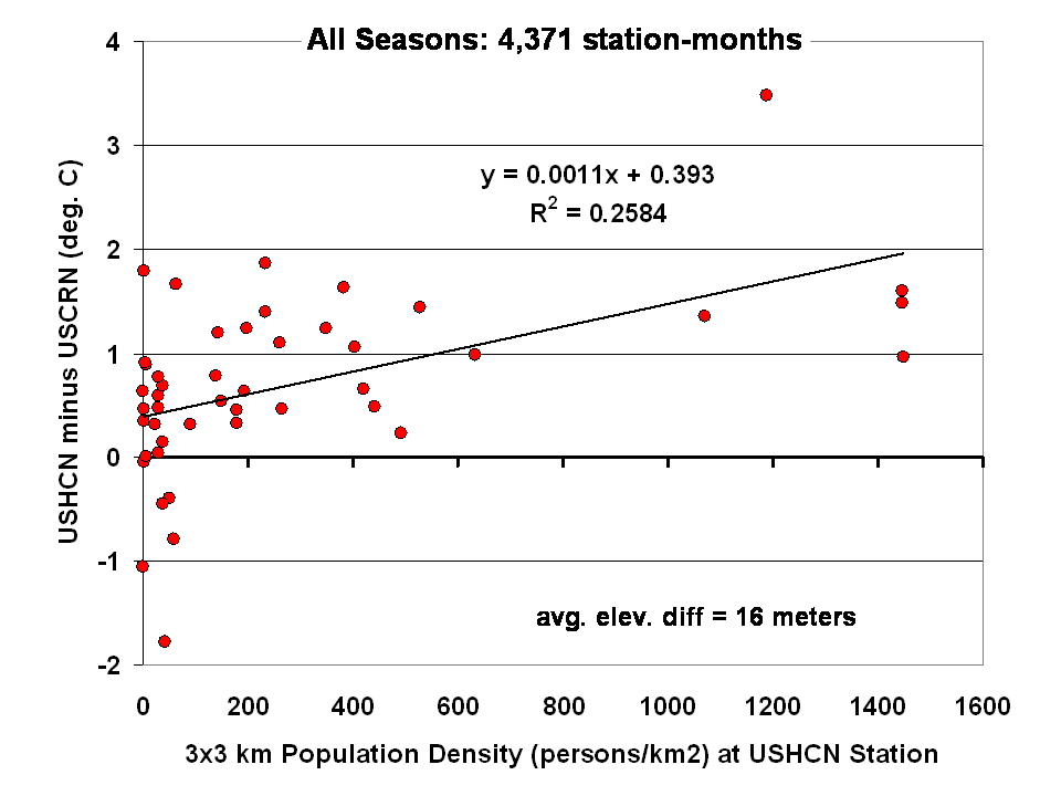
Dr Roy Spencer shows in this post the difference from USHCN to USCRN:
Spurious Warmth in NOAA’s USHCN from Comparison to USCRN
The results for all seasons combined shows that the USHCN stations are definitely warmer than their “platinum standard” counterparts:
And our research indicates that USHCN as a whole runs warmer that the most pristine stations within it.
In research with our surfacestations metadata, we find that there is quite a separation between the most pristine stations (Class 1/2) and the NOAA final adjusted data for USHCN. This is examining 30 year data from 1979 to 2008 and also 1979 to present. We can’t really go back further because metadata on siting is almost non-existent. Of course, it all exists in the B44 forms and site drawings held in the vaults of NCDC but is not in electronic form, and getting access is about as easy as getting access to the sealed Vatican archives.
By all indications of what we know about siting, the Class 1/2 USHCN stations should be very close, trend wise, to USCRN stations, yet the ENTIRE USHCN dataset, including the hundreds of really bad stations, with poor siting and trends that don’t come close to the most pristine Class 1/2 stations are said to be matching USCRN. But from our own examination of all USHCN data and nearly all stations for siting, we know that is not true.
So, I suppose I should put out a caveat here. I wrote this above:
“What you see is the USCRN data record in its entirety, with no adjustments, no start and end date selections, and no truncation. The only thing that has been done to the monthly average data is gridding the USCRN stations, so that the plot is representative of the Contiguous United States.”
I don’t know that for a fact to be totally true, as I’m going on what has been said about the intents of NCDC in the way they treat and display the USCRN data. They have no code or methodology reference on their plotter web page, so I can’t say with 100% certainty that the output of that web page plotter is 100% adjustment free. The code is hidden in a web engine black box, and all we know are the requesting parameters. We also don’t know what their gridding process is. All I know is the stated intent that there will be no adjustments like we see in USHCN.
And some important information is missing that should be plainly listed. NCDC is doing an anomaly calculation on USCRN data, but as we know, there is only 9 years and 4 months of data. So, what period are they using for their baseline data to calculate the anomaly? Unlike other NOAA graphs like this one below, they don’t show the baseline period or baseline temperature on the graph Zeke plotted above.
This one is the entire COOP network, with all its warts, has the baseline info, and it shows a cooling trend as well, albeit greater than USCRN:
Source: http://www.ncdc.noaa.gov/cag/time-series/us
Every climate dataset out there that does anomaly calculations shows the baseline information, because without it, you really don’t know what your are looking at. I find it odd that in the graph Zeke got from NOAA, they don’t list this basic information, yet in another part of their website, shown above, they do.
Are they using the baseline from another dataset, such as USHCN, or the entire COOP network to calculate an anomaly for USCRN? It seems to me that would be a no-no if in fact they are doing that. For example, I’m pretty sure I’d get flamed here if I used the GISS baseline to show anomalies for USCRN.
So until we get a full disclosure as to what NCDC is actually doing, and we can see the process from start to finish, I can’t say with 100% certainty that their anomaly output is without any adjustments, all I can say with certainty is that I know that is their intent.
Given that there are some sloppy things on this new NCDC plotter page, like the misspelling of the word Contiguous. They spell it Continguous, in the plotted output graph title and in the actual data file they produce: USCRN_Avg_Temp_time-series (Excel Data file). Then there’s the missing baseline information on the anomaly calc, and the missing outputs of data files for the max and min temperature data sets (I had to manually extract them from the HTML as noted by asterisk above).
All of this makes me wonder if the NCDC plotter output is really true, and if in the process of doing gridding, and anomaly calcs, if the USCRN data is truly adjustment free. I read in the USCRN documentation that one of the goals was to use that data to “dial in” the adjustments for USHCN, at least that is how I interpret this:
The USCRN’s primary goal is to provide future long-term homogeneous temperature and precipitation observations that can be coupled to long-term historical observations for the detection and attribution of present and future climate change. Data from the USCRN is used in operational climate monitoring activities and for placing current climate anomalies into an historical perspective. http://www.ncdc.noaa.gov/crn/programoverview.html
So if that is true, and USCRN is being used to “dial in” the messy USHCN adjustments for the final data set, it would explain why USCHN and USCRN match so near perfectly for those 9+ years. I don’t believe it is a simple coincidence that two entirely dissimilar networks, one perfect, the other a heterogeneous train wreck requiring multiple adjustments would match perfectly, unless there was an effort to use the pristine USCRN to “calibrate” the messy USHCN.
Given what we’ve learned from Climategate, I’ll borrow words from Reagan and say: Trust, but verify
That’s not some conspiracy theory thinking like we see from “Steve Goddard”, but a simple need for the right to know, replicate and verify, otherwise known as science. Given his stated viewpoint about such things, I’m sure Mosher will back me up on getting full disclosure of method, code, and output engine for the USCRN anomaly data for the CONUS so that we can do that,and to also determine if USHCN adjustments are being “dialed in” to fit USCRN data.
# # #
UPDATE 2 (Second-party update okayed by Anthony): I believe the magnitude of the variations and their correlation (0.995) are hiding the differences. They can be seen by subtracting the USHCN data from the USCRN data:
Cheers
Bob Tisdale
Excellent work, gentlemen. The minimums are of particular interest. It underlines the fact we are forced to heat eight months of the year in Canada.
Its worth pointing out that the same site that plots USCRN data also contradicts Monckton’s frequent claims in posts here that USHCN and USCRN show different warming rates: http://rankexploits.com/musings/wp-content/uploads/2014/06/Screen-Shot-2014-06-05-at-1.25.23-PM.png
I had been wondering about these results, thank you for updating us. Is there a link to the digitalization of the data for your own project? Will we be getting an update on that topic any time soon?
Anthony – this is totally inconvenient, didn’t you get the memo?
Any comment on Goddard’s recent observations that NOAA is deleting cooler stations and infilling with warmer data?
http://stevengoddard.wordpress.com/2014/06/08/more-data-tampering-forensics/
What about Alaska? 8 excellent stations should give us a good picture.
“measured by the best surface temperature monitoring network in the world”
And why isn’t this on the front page of every news paper in America?
Another inconvenient truth that the likes of Gore and the white house will ignore.
So that’s what it looks like without TOBs and GIA. Too bad it doesn’t go back to 1998.
Goddard is wrong.
Let me put it this way.
Ask Anthony what he thinks of goddards work
So where’s the missing heat? Is it at the bottom of the ocean? Or is it stuck in the pipeline?
Indeed, an observation network to be proud of (if you’re American) or deeply envious of (if not). I especially like the triple set of thermometers, since stations in this country, Oz have just the one (well, two, wet & dry) and if they fall over or comms goes offline, bye-bye temp readings.
Wait for it, “but the US isn’t the world!”
While ten years is a very short time, it would be interesting to see CO2 readings graphed for the same period to see if they also backed off (which would be the direct implication if warmist theory is correct)? Or did CO2 continue to rise even though this US temperature trend did not?
Do they still work in deg F at NOAA?
A nearby source of power may mean some type of development is nearby. In site selection power discussions I wonder what has the greatest pull ? AC power or solar collection.storage.? Is cost a consideration?
Over all, the USCRN network seems a solid system for data collection.
When the only comment a Warmist like Steven Mosher puts up (on a piece wherein NOAA clearly admits that there is no surface warming in the USA!!!) is ….’Goddard is wrong’, it surely must be worth taking a closer look at Real Science.
Are any/some/all of those examples Goddard posts of altered graphs/data ‘fakes’?
What about the old newspaper reports and photos of weather extremes and catastrophes from previous ‘cooler’ eras…are any/some or all of those fakes?
Perhaps WUWT should critique Real Science.
Willis Esenbach (who I have seen with my own eyes calculate the number of angels who can dance on the head of a pin) might even be able to verify whether or not Goddard’s claim that the past is being ‘cooled’ is valid.
Oh and before I go…am I the only one who would appreciate it if maybe Mosh could quickly explain to us why all that extra, ‘heat trapping’ CO2 we’ve been putting into the atmosphere doesn’t appear to be well…’trapping heat’ in the atmosphere?
“Any comment on Goddard’s recent observations that NOAA is deleting cooler stations and infilling with warmer data?”
At this point it doesn’t matter. We now have CRN data that require none of these adjustments and infills.
H4 (The Hadley Heat Hidey Hole)
“RokShox says:
June 7, 2014 at 10:23 pm”
I have a vague recollection of the phrase “March of the thermometers” where in the mid-1990’s many rural devices, data and records were dumped out of a dataset (I don’t recall which) which ultimately showed a warming trend.
Well, I’m not particularly into the government spending my tax dollars on trivial things.
But in this instance, it would seem, that we are buying ourselves a very nice piece of apparatus, that will become ever more valuable, as that data records spreads into multiple decades.
And thanks for the blow by blow on this Anthony. Can we just hope that your network farce expose, project, may actually have helped bring this net online.
Charles Nelson says:
“am I the only one who would appreciate it if maybe Mosh could quickly explain to us why all that extra, ‘heat trapping’ CO2 we’ve been putting into the atmosphere doesn’t appear to be well…’trapping heat’ in the atmosphere?”
John says…..
97% of 3 people agree with Steven Mosher therefore there’s a con sensus.
The science is settled – so DON’T ask embarrassing questions.
We all know the current temperature trend is flat for almost 18 years. This includes all the adjustments, corrections, removal of cold stations, reducing historical warms and a multitude of “hide the decline” tricks. If we reverse engineer those, we get lo and behold, actual physical cooling
.
And just what does this new “pristine” data tell us, COOLING>
Q,E.D.
The other measure of Globull Warming also tells a similar story viz:
Free renewable energy leads to the most expensive and unreliable electricity. Do the sums, cost of generation declines, price sky rockets.
“Not only is there a pause in the posited temperature rise from man-made global warming, but a clearly evident slight cooling trend in the U.S. Average Temperature over nearly the last decade:”
.
Meh….it’s just a regional weather pattern……
“As a result, these temperature data need none of the adjustments that plague the older surface temperature networks, such as USHCN and GHCN, which have been heavily adjusted to attempt corrections for a wide variety of biases.”
As Zeke showed above, USHCN, with all these plagues, has essentially identical results. In this post USCRN is shown with a average T trend -0.7113 °F/century, 2005-Apr 2014. For USHCN I get for the same period -0.6986 °F/century. I used the same plotter, just asking for USHCN instead of USCRN.
Some of the NOAA graphs misspell “contiguous”
There seems to be an inconsistency in the trend shown on the second graph (-0,00503 deg.F per month) and Willis Eschenbach’s graph which shows a trend of 0.6 deg.C per decade.
0.00503 deg.F per month is 0.6 deg.F per decade. Should the units on the latter graph be degrees Fahrenheit ?
[Agreed. I work so infrequently in °F I mistyped the units. I’ll fix it, thanks. -w.]
Nick Stokes says: June 8, 2014 at 12:13 am
“For USHCN I get for the same period -0.6986 °F/century.”
Apologies, corerction here. I was comparing intercepts (and giving wrong units). For the trends, I do get a greater difference, with USHCN showing a larger downtrend -0.00727°F/month vs USCRN -0.00503°F/month here. -0.00727°F/month is -0.48°F/decade.
It is long overdue that data only from pristine sites is used without the raw data being adjusted.
Why can’t pristine sites with data going back before Jan 2005, be identified? Surely, there must be some such sites, and what does the data from these sites show?
I do not like straight fit linear lines. My eye balling of the data (eg., the first plot set out) suggests thattemperatures fell during the first 5 years (2005 to 2010), thereafter rose for the next 2 years through to 2012, whereafter once again temperatures are falling.
Of course 10 years of data is far too short. If temperatures are driven by natural factors, at the very least a period encompassing a number of ocean cycles is required, before one can even venture to stick a toe in the ‘game’ by suggesting that the data tells us something important about temperature trends. Hence the reason why an attempt to identify sites with data prior to 2005 is required.
PS. Thanks Anthony, because you have played a substantial role in identifying the shortcomings of the weather station data, and the need to put this on a more scientific standing by upgrading the network. Unfortunately, this has come late in the game, and it is a great shame that this was not addressed in the 1970s when some scientists first considered that there may be concerns about GW. Those scientist have badly let down science, by not taking steps to get their most important data source in order. .
Given that there are proximity stations in the old network and that they can be identified it must be possible mathematically and statistically to back engineer the temperature difference between this kosher and the older and longer data sets. At minimum it would be an interesting exercise even if the error bars were larger the longer you went back.
EPA Central Committee will have a full report on this outrage against the scientific consensus as soon as this faithful comrade has gathered his faculties and can steady his hand enough to hit the keys and generate said report. Meanwhile I shall continue dictating my thoughts to an associate.
Clearly NOAA will shortly be disbanded and its staff sent to a bear infested camp “somewhere in Alaska”.
Re Patrick says:
June 7, 2014 at 11:48 pm
“March of the thermometers”
I think that was Chiefio
Mosher is NOT a scientist ….
he is a propagandist…..
Take whatever he says with a pinch of salt….
What is the base period for developing the anomaly?
Is an actual temperature published?
Lets not miss the forest for the trees. It will have to get warm and stay warm for centuries to top the MWP or the RWP. The real danger is from cooling not warming. The fools had it right the first time.
If Willis is right, then -6 deg C per century – it’s worse than we thought!
“thegriss says:
June 8, 2014 at 1:26 am
Mosher is NOT a scientist ….”
Dr. Tol is not a “scientist” either, so what is your point?
“The fools had it right the first time”: there were only two choices!
thegriss says:
June 8, 2014 at 1:26 am
Mosher is NOT a scientist ….
he is a propagandist…..
Take whatever he says with a pinch of salt….
Richards in Vancouver says:
DON’T !!! Those white crystals might not be salt!
In Willis graph – switch C for F
Anthony
Interesting study. Thank you
As you know I am especially interested in the historic temperature record back to the 17th century and have written a number of articles. This one dated 2011 dealt with the considerable uncertainties involved
http://wattsupwiththat.com/2011/05/23/little-ice-age-thermometers-%E2%80%93-history-and-reliability-2/
I wonder if you have an opinion as to how many of the historic temperatures are reliable to a few tenths of a degree and WHEN we can say with some certainty that they are truly accurate and representative of the relevant location?
I ask this because I carried out a small experiment -which I don’t claim to be rigorous or scientific- whereby I used two reliable max/min thermometer set some 30 feet apart, one at the conventional height and the other 3 feet higher.
I also took the readings at specified times-for example noon, 3pm and at 8am. It was interesting that in only 20% of the readings was the max or min temperature reached, the same as that reached at the specified times.
So how reliable is the global historic temperature and when does it become wholly reliable when all the parameters concerned are consistent ?
Elements that can affect readings and which should be consistent include;
* the use of good quality reliable calibrated thermometers
* all instruments placed at the same height
* All suitably shielded and at the correct orientation
* measured at genuinely the warmest or coolest part of the day
* Used in a pristine non contaminated environment
* consistent like for like basis e.g the reading point did not physically move or become contaminated over time
* the use of the same reliable observer and methodology over protracted time scales, who wrote down the record immediately after the observation
* no political or other overtones-for example temperatures are not adjusted down in order to receive a greater cold weather allowance.
I don’t know if you have ever read Camuffo’s very long and detailed book whereby he examined 7 historic European temperatures and took into account even such things as whether a certain door was in use, or measured the likely effects of growing trees on the outcome?
I suspect that at the least, some inherent variability has been lost and that temperatures-other than in a few well researched cases- should be taken as, at best, merely indicative.
If Mosh wanders along in one of his expansive moods, I would be very pleased to have his take on this..
Tonyb
One aspect of older readings which might not be well known is that they may not have been taken at exactly the specified time. Sometimes the screen was some distance from the observing office, especially at airports, and time had to be allowed to get out off the office and back again in time to compose and send messages around the nominal time of observation. This is not so much of an issue with electronic sensors and automatic message coding, as these perform observations right on observation time, and elements which need to be input manually are done beforehand. The time delay issue was not so important for maxima and minima as these are read from respective thermometers which “freeze” the reading until they’re reset.
On a related issue, I question temperature plots which have little error attached to them, given that even the best quality thermometers have an allowable error, often 0.3 degrees Celcius, which in the “old days” might be compounded by operator error (reading to 0.5 or to the whole degree, for instance). I’m also incredulous that the US still uses Fahrenheit.
Thank you Anthony, this is to be welcomed, not necessarily for the results but for the way the process has tried to present accuracy above anything else.
I am not a scientist, just a humble, retired, tax-payer, but having watched the shenanigans going on for the past few years through the good offices of yours and other blogs and seeing the unseemly behaviour of the so-called scientific community I am happy to be described as a “skeptic”. (The very fact some try to paint people like me as “deniers” with all the baggage that epithet brings says more about the accusers than the accused).
I appreciate this is a 10 year snapshot and given the context of the earth’s history is not something to base a whole mitigation strategy and tax regime on. Nevertheless I’d like to hear from the climate scientists how they view this apparent anomaly in their “predictions” (I know, I know).
I’d actually welcome someone from that community to actually say, “Well really, we have our views but we really don’t know why this has occurred, we need to go back to our models and review our assumptions”. “Perhaps we need to be more circumspect in our future pronouncements”.
If that were to happen then maybe they might start to rebuild some of the respect they have lost from the general community (ie their ultimate paymasters).
If that doesn’t happen, as I sadly expect, then I’m afraid that will only serve to confirm the public’s sceptic stance that all this is driven by politics as we have come to believe. Even the politicians eventually have to take account of the plebs – there’s more of us.
By the way, on a personal note, aren’t you due a holiday?
Keith Minto says: June 7, 2014 at 11:29 pm
Over all, the USCRN network seems a solid system for data collection.
———————-
Not really…
Do the math (typically AGW types want accuracy to the nearest .01 degree; a typical day’s temperature range can be something like 78 to 48 = an absurdly large number of random samples, NOT 3)
http://www.surveysystem.com/sscalc.htm
http://www.research-advisors.com/tools/SampleSize.htm
So, either you realize you can not get your certainty down to .01 or you just make stuff up and pretend you have the certainty you desire, which is what they do now.
Steven Goddard =1, Zeke + Mosher = 0 science value
http://stevengoddard.wordpress.com/2014/06/08/random-numbers-and-simple-minds/
As of today Zeke and Mosher should be considered warmist trolls with entertainment value only. Somewhat similar to William Conolley at most. LOL.
After this is all over in 5 years they will fade away into nothingness just like the famous “Phil” at Lucia’s babbling away about disappearing arctic ice about 5 years ago was 100% wrong. We haven’t heard from him in years LOL
The gist of Steve Goddard’s work shows that the past has been cooled considerably.
As this new USCRN only goes back 10 years, it cannot answer the question as to whether such adjustments are justified.
thegriss says:
June 8, 2014 at 1:26 am
Mosh is indeed a scientist … however, you should still take whatever he says with a grain of salt. Of course, this is true of me as well …
w.
I think the elephant in the room is that none of the datasets seem to agree 100%. How many people do you think believe that there is one, highly accurate, well dispersed source of temperature data going back a century or two upon which all of climate science is based?
Anyone wonder how many people would be shocked to find out how spotty and inconsistent the temperature record is?
Eliza says:
June 8, 2014 at 2:54 am
Say what? At your link, Goddard says:
Note that Steve Goddard has not provided a single quote or citation to back up his claims about what Zeke and Mosher “think”, or what they comprehend, or what their “approach” is. It’s all just mud-slinging, which proves nothing except that Goddard can sling mud with the best of the climate alarmists. And you, Eliza, are mindlessly re-slinging Goddards mud for him, without a single question about his claims.
As near as I can tell, both Zeke and Mosh are scientists and intelligent, honest men. They provide their data and their code for everyone to examine and find fault with. And they apply those same standards to studies from both sides of the aisle. I can’t ask for more than that from any scientist, and most of climate scientists don’t provide anything like that.
So while I may and do disagree at times with both Zeke and Mosh, and although Mosh’s sparse posting style often drives me spare, I would strongly advise that people do not either ignore or dismiss their claims. Neither one is a fool, an alarmist, or a fraud. They, like me, are just honest guys doing the best they know how.
w.
Tonyb
You make some good points in your post. In science, normally, we are forced to past data for what they are. If we understand the measuring techniques and the instruments it may be possible to recreate the data and make a fair comparison against the latest methods and measuring instruments. I do not get the feeling that this is what government agencies do.
Willis Eschenbach says:
June 8, 2014 at 3:08 am
Sea salt, mayhap?
It would be interesting to compare the new, state of the art system with the older monitoring stations over the last 10 years. Also compare how accurate the adjustments for the older stations are.
Unless it’s warming.
Across the pond in another very small part of the world temps have been heading south at an alarming rate. If this continues it will soon match its recent alarming rise.
I vaguely recall that co2 is now (was?) the main driver of climate, swamping natural climate drivers – a new kind of control knob. If the surface temperature standstill continues, it will be interesting to look back into the archives. It will a very important historical lesson for students off Climastrology.
Jimbo says:
June 8, 2014 at 4:00 am
but they started adjusting up when the temps appeared to be going down. They were forced to introduce HadCru 4 to rectify their problem. As we all know, their chief scientist can still see ‘AGW’ in the weather the UK is having or had recently.
Can this data [or even should this data] be compared to the satellite data?
It is bad and unacceptable science to go back to original data and modify it without very good, proven scientific reasons. That means that you should be able to justify your algorythm completely, no fudge, no doubt.
I note in the old thread posted above:
http://wattsupwiththat.com/2011/05/23/little-ice-age-thermometers-%E2%80%93-history-and-reliability-2/
talk of “icebergs at the the walls of Byzantium” which is, well, unlikely given its location, at the eastern end of the Mediterranean Sea. Other aspects of thermometer accuracy were interesting, especially the calculation of “daily average temperature” from observations spread throughout the day and night. That would appear to have huge problems! Australian practice has been for many years to add the max and min and divide by two, which is also not perfect (some locations, especially coastal can have a “spike” in the max or min due to wind changes) but far better than any other method which involves “spot” temperatures.
One aspect of electronic probes is that they read a tad higher than mercurial max thermometers due to, I suspect, to lag in the mercury. Mercurial max thermometers also read a tad lower the next day due to contraction in the mercury column overnight. All this means is that older, pre-electronic max temperatures, that have been adjusted to make them colder, should in fact perhaps be adjusted upwards to account for the difference between the two measurement systems.
So let me get this straight: the trend in average contiguous NA temps shown here is -0.6 deg F per decade, or -3.3 deg C per century. If this turned out to be a global trend, at this rate, by 2100 we’d project a fall of around 2.9 deg C. Now a rise of more than 2 deg C is expected to be catastrophic. But a drop of >2 deg C could be much, much worse.
And it’s clearly an anthropogenic signal. For the sake of the grandchildren, surely the precautionary principle suggests we should immediately abandon the irresponsible and reprehensible adoption of so-called renewable energy sources, establish some form of intergovernmental panel under UN authority, have a review done by a prominent UK Lord in order to establish an uncontested spending policy,…
Sorry, went a bit mad there.
Willis Eschenbach says:
June 8, 2014 at 3:21 am
“So while I may and do disagree at times with both Zeke and Mosh, and although Mosh’s sparse posting style often drives me spare,”
I think this is the main issue with Mosher. His style projects an arrogance and contempt that provokes an agry reaction. It is useless to say that “As near as I can tell, both Zeke and Mosh are scientists and intelligent, honest men” when the perception of their personnas is clearly not that at all.
Mark Twain said ” perception is the truth”
Also, you can hardly critisize Goddard’s comments about them when you fail to back up your own, in this comment, to the same level you demand of Goddard.
Goddard has receive some communications from both of them whether directly or indirectly and has made up his mind based on those. This is something we all inadvertently and for sure I have done so here.
Lastly, Goddard does provide links to some of his data retrieval points and a fair and reasoned criticism from you would be welcomed by me. There seems to be this war breaking out between the skeptic blogs in recent times. It is not beneficial or intelligent.
I do not agree with everything that Goddard writes and similarly with everything that Anthony writes but I am able to agree with everything SteveMc writes. He is VERY precise with his phraseology but few of us are thus gifted.
When we talk of UHI we often think of concrete, metal, AC vents etc. WUWT covered the Armagh Observatory in 2010 and here is a quote.
The US state of the art climate system needs to go global ASAP.
Steven Mosher’s Education
UCLA
Ph.D. Program, English
1981 – 1985
University of California, Los Angeles
English
1981 – 1985
Northwestern University
B.A, Philosophy and English
1977 – 1981
Mosher IS NOT a scientist !!!
he’s a note-taker.
REPLY: Look, enough of this, you assume people can’t learn, grow, and publish. Mosher has done all that. Plus I don’t particularly like your style of throwing denigration from behind a fake name, which is no better than some of the alarmist acolytes do. Don’t post this irrelevant stuff again. – Anthony
A rather contemptuous dismissal of a bloke’s academic achievements. Despite the lack of a scientific background, I’d be happy to have half this bloke’s academic achievements.
Mike T BA (but works in science)
The take away for me from this pristine data set is +/- 3 deg C variation over very short (a few years) time periods is the norm. While 10 years isn’t long enough to see the “global warming” signal, it is quite possible that over a half century of data would be required to break out of the natural variation.
is the pinch of salt taken from water retrieved from the deep oceans ? If so could it be used as a proxy for the hiding heat ?
Lower minimums = crop failures.
Any scientist reporting empirical results is a scientist. Any scientist extrapolating on her/his empiricism might still be a scientist – and might not. Any scientist expressing non-empirical conclusions in support of an action is clearly not.
Jimbo,
“The US state of the art climate system needs to go global ASAP.” I second that motion.
However, the argument will likely be made that it is too late for that. After all, the science is already “settled” and future warming is already “baked in”, but is currently in hiding.
Fortunately, Gaia is blessed with a group of modern day, much improved embodiments of Rumpelstiltskin, able not only to spin straw (bad data) into gold (good data), but also able to spin nothing (missing data) into gold (good data). (sarc off)
It is difficult to comprehend an area of science so focused on temperature and temperature change, yet so casual about its collection of temperature data.
Charles Darwin was NOT a scientist either. Should we have rejected his claims?
http://www.bbc.co.uk/history/historic_figures/darwin_charles.shtml
As much as I find Mosher irritating, and find your claim technically correct, you are barking up the wrong tree. It does not matter whether he is a scientist, what matters is whether he is right. Some Warmists scream that such and such a person is not a ‘climate scientist’. I charge back that Dr. James Hansen et. al. are not climate scientists either.
I desperately do not want to start a scrap between skeptical blogs but I do want some guidance and reference from the folks I trust at WUWT with regard to Steven Goddard…who appears to be regularly posting examples of officially altered data as well as newspaper reports and photographs of climate extremes and catastrophes from times when the Global Temp was much lower than at present.
Now Mosher and Zeke are attacking Goddard on this site…so why don’t we clear the air?
It’s a pretty simple question, and surely a man like Willis (who can confidently make calculations on the basis of a 0.2C Global Sea Surface temperature measured circa 1870) – should be able to answer it quite categorically.
Is Steven Goddard is playing fast and loose with the facts?
Has the past been cooled?
It is important that we skeptics do not find ourselves out on a limb arguing from invalid positions. One of the best aspects of WUWT is its sidebars filled with independent, authoritative data sources. As the Warmist models collapse now is surely the time for confidence and unity.
◾Complex meteorological zones, such as those adjacent to an ocean or to other large bodies of water are avoided.
Why are the Alaskan CRN thermometers all around the coast. Only one is posed in the interier.
Jimbo
“I charge back that Dr. James Hansen et. al. are not climate scientists either.”
Whilst I’m 97% certain that Anthony does not want this thread to develop into a slag fest, Astronomy is a science, english isn’t. Climate is not a science, IMHO. It is much more a mathematical exercise at one level and a somewhat physical science on another level. It seems to me that climate science is an aggregation of several disciplines. This leads to the “apparent lack of honesty”. As you and willis have said these people are probably not liars and cheats but they may just not know what they don’t know. Jacks of trades Masters of none. Climate related studies IMHO, should all be produced by a team of mixed specialist and yes there is a place for an English PhD as well as a good statatistion, a physicist and an IT bod.
Now, I do not believe that a uni qualification is the sole requirement for intelligent analysis but a science based study will provide a better foundation for technical analyses than english. It will provide you with the appropriate tools and method to not make the errors to which some scientific studies have become prone.
I have met geography grads with a better penchant for anaylysis that a science grad. So, if mosh et al make their comments more detailed maybe we could be more confident that they actually are doing science and not english.
Willis: Note that Steve Goddard has not provided a single quote or citation to back up his claims about what Zeke and Mosher “think”, or what they comprehend, or what their “approach” is. It’s all just mud-slinging
====
Willis, not in that one “cherry picked” post…..but he has, many times in other posts
Steve has a rapid way of posting…you have to read them all
Correction to the posting above.
It’s a pretty simple question, and surely a man like Willis (who can confidently make calculations on the basis of a 0.2C Global Sea Surface temperature ‘anomaly’ measured circa 1870) – should be able to answer it quite categorically.
Those are NOT ‘well placed’ thermometers!!!
Two next to Tucson Arizona, one in hot as hell Yuma and only one way up by the Grand Canyon when half of the state is cooler due to elevation???
And NY/Vermont has half as many thermometers than say, similar size areas in the Midwest???
Upstate NY and all of mountainous Vermont has NO thermometers!!! It is considerably colder up here than say, south end of Hudson valley.
I find it is disgraceful that the UN body IPCC, who believe we are heading into catastrophe, could not establish an equivalent global thermometer network. If we are all going to die, wouldn’t funding exist for such a network?! Where are the billions of funding already wasted?
Could it be, that the international powers really don’t want to know, what is really happening to GMT?? It is only the political objectives of forced social change that interest them in this fast approaching… Brave New World!
I pity us all. GK
“Why are the Alaskan CRN thermometers all around the coast. Only one is posed in the interier.”
One thought could be that the interior of Alaska is pristine wilderness, very few roads and a lot of locations can only be reached by plane. I don’t think that type of terrain lends itself to building, powering, and maintaining a state of the art monitoring station. I would think it would be prohibitively expensive.
“Access: Relatively easy year round access by vehicle for installation and periodic maintenance is desirable.”
It is very good that we now have an well-designed station network.
I had to check to see if the numbers were relatively similar to the currently reported USHCN V2 temperatures and they are. I guess there is a good reference to compare to now. But that does not mean the USCRN network database cannot be adjusted. In the future, NCDC is going to do whatever it wants to in the database.
A comparison of USCRN and USHCN V2 (current) and then what the USHCN reported temperature was in October 2009. (I’ve been saving the numbers since this time). I’ve also recalculated the October 2009 USHCN temperature anomalies using the current 1981-2010 base period and surprise, 2004 to 2009 use to be warmer.
http://s2.postimg.org/ftpx3y9ah/Conus_CRN_USHCN_Apr14.png
I also have an earlier version of USHCN from 2002. The average temperatures from 1895 to about 2000 use to be about 0.8F higher than they are reported to be now. Between 2000 and 2002, the difference rises to about 0.2F. This has increased the temperature trend by about 33% compared to what it use to be 2002.
http://s29.postimg.org/473ylf2c7/Conus_USHCN_vs_2002_Version_Apr14.png
The adjustments don’t matter (to some). Maybe the 2004 onward temps will no longer need to be adjusted but that does not mean that pre-2004 temperatures are not going to change downward.
Anyone who thinks Dr Doom’s dead hand is no longer part of NOAA outlook needs to remember that the chances of him not being involved in who was picked has his replacement are as likley has Mann being humble and admitting his mistakes.
Thanks, Anthony. We can add US temperatures to the global warming metrics taking a hiatus from warming. Being forced to warm by manmade greenhouse gases must be very tiring, since so may metrics are taking a break from it.
Hmmm. That sounds like the food for a post. I think I’ll write it.
According to the NCDC/NOAA CLIMATE AT A GLANCE we page , Contiguous Annual US temperatures have been declining at (-0.36 F/DECADE) since 1998. This is happening in 7 of the 9 climate regions in United States. Only the Northeast and the West both of which receive the moderating effect of the oceans had slight warming of 0.2 and0.3 F/decade respectively
Also for Contiguous US ,8 out 12 months of the year are cooling. Only March, June and July are still warming
Clearly there is little global warming in United States. There are regional exceptions but taken as a nation there is no warming . The same can be said of Canada
The reason why the ‘Northeast’ shows ‘warmer’ is due to the fact that there are NO thermometer stations in ANY of the mountain regions like where I live.
The ONLY one for all of this region, which is huge, is in Albany which is in a deep river valley that is a fjord, not a river, and is much warmer than the surrounding mountains and to the north.
There are NO stations near the Canadian border. Say, Niagara Falls, for example. It is much colder there than Albany! My own mountain which is 35 miles from Albany is much colder at an elevation that is 2,000 feet higher.
Albany is SEA LEVEL.
According to Environment Canada records :
Environment Canada does not publish monthly national or regional temperature summaries. They only publish seasonal bulletins for regions and national totals.
Linear temperature departures trend for the last 16-17 years or since 1998 from 1961-1990 averages as obtained from the figures published in Environment Climate Trends and Variation Bulletins show :
Winter trend TEMPERATURES ARE DECLINING
Spring trend TEMPERATURES ARE DECLINING
Summer trend VERY SLIGHT RISE IN TEMPERATURES
Fall trend TEMPERATURES ARE FLAT
Annual trend TEMPERATURES ARE FLAT
It appears that there has been no real global warming for the last 16 years in Canada and the winter temperatures have been declining for 17 years
What’s not to like? Good locations, latest tech, data logging and regular maintenance. It could be quite useful as reference/calibration of satellites day or night. It would only make satellite data more precise and the benefits would give us a picture of the whole planet, even though there may not be good ground locations elsewhere.
Emsnews: the placement of the thermometers is somewhat irrelevant, provided that they are far away from confounding effects such as UHI.they are not looking at absolute temperatures when calculating temperature rise or fall, but at deltas from some arbitrary baseline.
Yes, Tucson is hot, but what we are looking at is is it hotter or colder today compared to a fixed reference? Same applies to Alaska, yes, it will be warmer on the coast than the interior, but that is always true there, so we look at the temperature difference compared to that baseline.
That is what temperature anomalies are – difference from a fixed avaerage temperature.
If we’re playing the “he’s not a scientist” game then Einstein was a patent clerk. And Relativity wasn’t peer reviewed.
Practicing scientists these days tend to be heavily conflicted – carrot, from grants; and stick, see what Macquarie Uni did. Australia’s economy was ruined when we allowed a palaeontologist to dictate economic policy because he was “a scientist.”
I don’t care. I don’t trust anyone any more.
See my update to this post in the body.
Avg Global Temp is an “average” and only one metric. It has a history of ups and downs. You can cherrypick any conclusion you want by choosing your start/end point of “short” periods of time.
The long term trend is clear. The satellite heat gain data is clear. Arctic sea ice melting is clear. etc.
A system can be heating without temperature rise if there is a heat sink (ice phase change, large bodies of water). But it is still gaining heat. Over the longer term, the heat will have an effect.
Thanks for that.
I noticed that first figure of temperatures gives the temperature trend for January.
According to this page, in the Northern Hemisphere over the last 7 years there has been a general downward trend in temperatures for each specified Winter month, while an upwards trend for the Summer months:
October 13, 2013
HADCRUT4 Northern Hemisphere Winter Doom .
http://sunshinehours.wordpress.com/2013/10/13/hadcrut4-northern-hemisphere-winter-doom/
This may correspond to the apparent colder Winters at least the U.S. has seen over the last few years. This trend is particular striking for December where the trend was -0.9° C per decade, or -9° C per century(!)
Can you show the figure for the December temperatures in the NOAA data?
Bob Clark
Damn. I have to take off my rose coloured glasses
@Robert Clark
“I noticed that first figure of temperatures gives the temperature trend for January.”
No, that’s just the tick marks/labels… it is for the 12 month period December to January for each year.
See source link:
http://www.ncdc.noaa.gov/temp-and-precip/national-temperature-index/time-series?datasets%5B%5D=uscrn¶meter=anom-tavg&time_scale=p12&begyear=2004&endyear=2014&month=12
Note well that USHCN and CRN would not be expected to vary from 2005 because the trend is so flat.
Heat sink effect is a trend amplifier. But if there is no trend to amplify, then there will be no departure. When there is a warming trend (as our study period, from 1979 – 2008), the warming is spuriously amplified by a lot.
And the data does sound too close for a fit. Way too close. I have never seen anything agree anywhere near that much. Needs checking to confirm.
Thanks for the USCRN update!
Regard the match with USHCN, as I understand it the standard procedure to homoginization anchors the most recent data and adjusts the previous decades. So a much closer match for the most recent decade should be expected. Homogenization deceptions were caused by lowering the peak temperatures of the 30s and 40s.
rod leman
You could say the opposite thing when ice is forming
EMSNEWS
You said
“There are NO stations near the Canadian border. Say, Niagara Falls, for example. It is much colder there than Albany! My own mountain which is 35 miles from Albany is much colder at an elevation that is 2,000 feet higher. ”
Yes I agree with you . The nearest Canadian region to Albany that Environment Canada reports is the Great Lakes and St Lawrence River Valley and its annual temperature trend since 1998 shows a decline . I will check the Canadian Atlantic coast provinces . It could be that the moderating effect of the Atlantic Ocean which has been positive or warm may have had a warming effect on the North east regional annual temperatures.
Mike T
Icebergs in Byzantium? Yes indeed. There are many contemporary accounts, but page 638 here is a useful reference
http://books.google.co.uk/books?id=sDYXosqZpegC&pg=PA638&lpg=PA638&dq=icebergs+byzantium+city+walls&source=bl&ots=rx1yGB0s9m&sig=rOOEi9ZpdjhsMHs-H_egVEDlGYg&hl=en&sa=X&ei=WnWUU8WmO4GfO4LsgCg&ved=0CD4Q6AEwAw#v=onepage&q=icebergs%20byzantium%20city%20walls&f=false
p638
Tonyb
climatereason
“Icebergs in Byzantium? Yes indeed. There are many contemporary accounts, but page 638 here is a useful reference
Tonyb”
I guess it comes down to a semantic argument about what an “iceberg” is. I’d hesitate to call sea ice piling up in the Bosphorus as “icebergs”. My understanding was that an iceberg is a chuck of ice calved from a glacier, or a piece of ice broken off a floating ice shelf. Neither glaciers or ice shelves would be found in the Black Sea area.
Zeke, something like 40% of the USHCN Final monthly data is “Estimated” from nearby stations.
Fairy tales.
http://sunshinehours.wordpress.com/2014/06/04/estimated/
http://sunshinehours.wordpress.com/2014/06/05/ushcn-2-5-estimated-data-is-warming-data-arizona/
http://sunshinehours.wordpress.com/2014/06/07/ushcn-2-5-how-much-of-the-data-is-estimated/
Just a reminder, we are, and have been for 16,000 years, in an interglacial warm period so one would hope this cooling does not continue or we will be in REAL trouble. Historically, cold is much worse than warm.
rod leman says:
June 8, 2014 at 7:10 am
Wow, those heat sinks are very selective about when they kick in aren’t they? What happened to the Arctic sea ice ‘death spiral’ we heard so much about? The idea that in a world with ENSO, ocean circulation patterns / temperatures that demonstrably oscillate over periods far greater than 30 years, Arctic sea ice was static and unchangeable prior to the satellite era is something that only the most wilfully blinkered alarmist could believe. Are you wilfully blinkered? Or just clutching at straws, attempting a diversion from a story that demonstrates clearly once again that temperatures are not co-operating with atmospheric CO2, levels as ‘projected’?
J Burns
I’ve now answered my question about Alaska (non-contiguous US) upthread. The monthly data lists about 13 Alaska stations, but most have come on line only since 2009. Only 4 stations (Barrow, Fairbanks, Sitka, St. Paul) have data from 2006 on. Regressions are all nonsignificant, as one might expect, with two stations (Fairbanks and Sitka) showing increases and the other two showing decreases of about the same magnitude.

Jim
It won’t be happening in my lifetime, so I frankly don’t care. I don’t have children (or grandchildren obviously). If I did have children then I would hope they have the brains to adapt and survive. Darwinism
Sorry–try this link

Do all GCMs agree that the greatest warming will be in the northern hemisphere over land? If so, this is very interesting.
JJB MKI
Be nice
They know not what they say (biblical reference)
Mike T says:
June 8, 2014 at 4:18 am: One aspect of electronic probes is that they read a tad higher than mercurial max thermometers due to, I suspect, to lag in the mercury. Mercurial max thermometers also read a tad lower the next day due to contraction in the mercury column overnight.
Liquid in glass thermometers do indeed display a distinct and larger hysteresis than PT100s.
This is demonstrated in college experiments every year.
However, unless your time of observation is such that you ‘catch’ the reading before it has reached either max or min, then the ‘lag’ will be just that, a lag of minutes.
If calibrated correctly, it will indicate the same temperature as a PT100.
steverichards1984 says:
June 8, 2014 at 8:09 am
“Liquid in glass thermometers do indeed display a distinct and larger hysteresis than PT100s.
This is demonstrated in college experiments every year.
However, unless your time of observation is such that you ‘catch’ the reading before it has reached either max or min, then the ‘lag’ will be just that, a lag of minutes.
If calibrated correctly, it will indicate the same temperature as a PT100.”
Steve, my point was that in the days prior to the adoption of electronic temperature probes, TMax was read from a mercurial maximum thermometer, which appear to give a slightly lower TMax than probes. The the bulk of records are from mercurial thermometers, and older records appear to be adjusted downwards, opposite to what would be logical given the difference in measurement technique. Probes give a TMax consistently higher (0.1 to 0.3 degrees C) than mercurial max thermometers, and mercurial thermometers “freeze” their highest reading until reset the next day just like a clinical thermometer is reset by shaking (immediately after the reading, naturally, for re-use). As I suggested originally, if the max therm isn’t read on a given day, but done so the next day before resetting, the mercury column may have retracted another 0.1C (at say, a station that does only one obs per day, at 0900 in Australia). At that time max and min are entered, the min for that day, the max for previous day.
EMSNEWS
The annual linear temperature departure trend for the Canadian provinces directly north of the US NORTHEAST states is also positive as the NCDC indicated for the US NORTHEAST. The positive trend in the CANADIAN ATLANTIC coast was mostly due to warm years for the region in the years like 1999, 2006, 2010 and 2012.. Otherwise the pattern is quite flat with average anomalies of about 1 degree C. So it would appear that the warmer Atlantic Ocean did have a moderating effect. The winter anomaly is also flat although the 2014 winter was the 17 th coldest in the last 70 years . AMO going negative since January may have contributed to this as well as did the ARCTIC vortex dip further south. If AMO stays negative for an extended period like it did in the past , expect colder annual temperatures for the NORTHEAST in the future . This pattern once established could last for 20 years.
steverichards1984
I would like to add that pt100 sensors are generally not ‘naked’. So there is a possibility of ‘lag’ anyway.
I know this story is about the USCRN, but this might have some relevance considering the global temperature ‘product’ with the greatest trend is always the one swung around by alarmists. A couple of years ago, out of interest, I tracked the weather stations used by GISS in England throughout the instrumental record via their website, looking up the station locations and noting their contribution to the GISS record over time. I wrote the results down, lost them and have forgotten the details, but they might be worth looking into again for someone with more scientific ability and better organisational skills than me. What I found is an exponential culling of records through time, from multiple dozens in the 1940’s to a mere handful (around 9) in the present day. There was no evidence to assume the lost stations had stopped reporting – just that GISS stopped using them at selected times. Furthermore, this cull was invariably of rural and airfield (grassy) sites in favour of airports and big RAF airbases, to the point where every single site from 2000 onwards is an airport, presumably designed to measure temperatures over runway tarmac, which would be biased towards warmth (and impacted by other factors like jet exhaust). I could not see any reason why GISS would do this beyond the artificial creation of a warming trend for England. It would be interesting to know if this pattern is repeated in other parts of the world, particularly the US.
As I said, rigorous scientific analysis is beyond my ability, and NASA GISS might have good reasons for their selection (I’d like to know what they are), but might be of interest for someone with better analytical skills than me, particularly in quantifying the effect a biased and bottlenecked-over-time selection of stations might have on a reported trend..
So in a mere 100 years or so we will have some indication of the weather trends of that past period.
Lovely the way the improved sites parody the officially adjusted data.
Mosher,
Your cryptic drive by BS, is sufficiently annoying to put you in the Climate Ace class.
As in don’t bother to read past your name.
You have great access and support on this blog, why do you not make your case in a coherent manner?
English writing skills are supposedly part of your skill set.
Or is this drive by threadjacking, the B.E.S.T you can do?
JJB MKI says:
June 8, 2014 at 8:20 am
Its not a conspiracy. Its just a higher up in the food chain, with an agenda, issuing a well worded edict (pc correct of course). People do what they have to do to keep their jobs.
See update #2 by Bob Tisdale above. Presentation is everything.
re Bob Tisdale’s updata #2
It appears that USHCN is cooling quicker than USCRN. Similar difference plots for Tmin, Tmax may also be informative.
Looking to find data from individual stations in AZ, I find that stations near Tucson have data from Sep 2002, but stations near Yuma and Williams only have data from Mar 2008 and Jun 2008. Looking further afield, a significant number of stations don’t have data until 2006-2008. So, how do we get an accurate average from 2005?
Lance Wallace asks What about “Alaska?”
Although the USCRN Alaska data only begins in 2009, it has undergone a cooling trend since 2000.
Alaska was one of the most rapidly warming places on the globe during the 80s and 90s due to the positive Pacific Decadal Oscillation. Still the record for warmth in stations like Barrow and Fairbanks was 1926. When the PDO reversed Alaska became one of the most rapidly cooling regions. Climate scientists reported
“The mean cooling of the average of all stations was 1.3°C for the decade, a large value for a decade.”
Read Wendler et al., The First Decade of the New Century: A Cooling Trend for Most of Alaska, The Open Atmospheric Science Journal, 2012, 6, 111-116
I occasionally look at Steve Goddard’s site and am concerned about his postings and a lack of objective evaluation of his findings by others. I mean OBJECTIVE. I noticed ”
sunshinehours1 says:
June 8, 2014 at 7:44 am
Zeke, something like 40% of the USHCN Final monthly data is “Estimated” from nearby stations.
Fairy tales.” I looked at the links and it would appear that Steve Goddard is right in claiming a large number of estimates and these add the actual warming. I am bothered that nobody would care to investigate this coolly and objectively. A real job for esteemed Willis Eschenbach, for whom I have a high regard. There can be no doubt that Steve Goddard’s haul of old articles showing that “it was worse than we thought” in the past are appropriate to the debate of endless “unprecedented” current weather events the alarmists haul out at regular intervals to claim extreme weather caused by CO2.
Please could we have a post calmly evaluating the sum of Steve Goddard’s assertions that estimated stations have been added. They are numerous and create the actual warming compared with pre satellite times. I am sure that a lot os visitors to WUWT would appreciate such a fact based discussion.
RE
cryptic remark.
Here is Anthony on Goddard..
Quote:
“I took Goddard to task over this as well in a private email, saying he was very wrong and needed to do better. I also pointed out to him that his initial claim was wronger than wrong, as he was claiming that 40% of USCHN STATIONS were missing.
Predictably, he swept that under the rug, and then proceeded to tell me in email that I don’t know what I’m talking about. Fortunately I saved screen caps from his original post and the edit he made afterwards.
See:
Before: http://wattsupwiththat.files.w…..before.png
After: http://wattsupwiththat.files.w….._after.png
Note the change in wording in the highlighted last sentence.
In case you didn’t know, “Steve Goddard” is a made up name. Supposedly at Heartland ICCC9 he’s going to “out” himself and start using his real name. That should be interesting to watch, I won’t be anywhere near that moment of his.
This, combined with his inability to openly admit to and correct mistakes, is why I booted him from WUWT some years ago, after he refused to admit that his claim about CO2 freezing on the surface of Antarctica couldn’t be possible due to partial pressure of CO2.
http://wattsupwiththat.com/200…..a-at-113f/
And then when we had an experiment done, he still wouldn’t admit to it.
http://wattsupwiththat.com/200…..-possible/
And when I pointed out his recent stubborness over the USHCN issues was just like that…he posts this:
http://stevengoddard.wordpress.com
He’s hopelessly stubborn, worse than Mann at being able to admit mistakes IMHO.
So, I’m off on vacation for a couple of weeks starting today, posting at WUWT will be light. Maybe I’ll pick up this story again when I return.”
Willis,
Thanks for the kind words.
.
Anthony,
The presentation of monthly values with a large scale (-4 F to +6 F) does tend to obscure the differences. They stand out a bit more if you look at annual values:
http://www.ncdc.noaa.gov/temp-and-precip/national-temperature-index/time-series?datasets%5B%5D=uscrn&datasets%5B%5D=cmbushcn¶meter=anom-tavg&time_scale=12mo&begyear=2005&endyear=2014&month=4
However, the differences are pretty small, the USCRN is actually warming faster (er, cooling less slowly) than USHCN. I get similar results when I download the station data for USHCN and USCRN from NCDC’s website: http://i81.photobucket.com/albums/j237/hausfath/USHCNAdjRawUSCRN_zps609ba6ac.png
Unfortunately the period of USCRN coverage is too short to tell us much about the validity of homogenization, since there are relatively few adjustments in USHCN after 2004 (unless you believe Goddard ;-p ). But as I’ve mentioned elsewhere, it will provide a good test going forward.
Data are stubborn things. 2014 looks to be yet another cool year!
Some posters have pointed out the different elevation of the sensors. As the atmosphere is three-dimensional how have the locations been chosen in respect of differing elevations? Surely, a set of temp readings at 1,000′ above sea level would be totally different to a set taken at 3,000′, no? And a set of measurements taken at various elevations would be … anomolous?
There’s an interesting anomaly showing currently at the Canadian Egbert station.
The 8:40 DST readings for the three sensors are 17.0, 17.0, and 17.1. The “calculated” temperature shown is 16.98. I don’t know whether the sensors read to more decimals than shown nor the rounding convention used but it does seem odd at first glance. Is the “calculation” more than just simple averaging?
Averaging 16.95, 16.95, and 17.05 does get one to16.98. This suggests that more significant digits are used than displayed.
NOAA probably explains this somewhere.
I have always found making grand statements about the global temperature average disturbing, If you only look a the macro and not the micro you are bound to error, if you look at the non pristine record you have some sites going up while other going down, if alway looked to me that the so called scientist tokl the low road, instead of going through the entire record and do a complete study as to why there was a divergence they just ignored it and they just put all the number in to their wonderful temperature blender and than made grand announcement about it. Never guarded never qualified no they stated this just the way it is, no question allowed. There should have know better we had the same problem in the food industry people were not careful in grinding meat and some fecal mater slipped in and guess what it containated the whole works. I feel data it like food all the grinding of data only distributes the s%&t throughout it does not get rid of it. No one needs to separate out all the number study why the difference are occurring and than carefully blend it back together and than make careful qualified statement about what the number tell us, in climate science that has not happened. I can only hope the new network is properly maintained and the record data is preserved in a pristine state and that were will be careful enough to not make grand statement as why and how the is changing. I would suggest that you do not hold your breath if becomes clear to some people that this system is not giving them the number they want they will work to destroy it.
It pretty good that this is finally available. However, I did rather lose interest once I realised it was blackbox mojo gridded and monthly anomaly data. And we’re still stuck with clunky, unscientific calendar monthly averages.
At least even hourly data is available, albeit not in a particularly useful form for further processing. That’s more than can be said for most european national weather services who are mostly still playing hide and seek with data and/or trying to charge ridiculous “extraction fees” for anything better than monthly averaged data.
Maybe there will be some additions now they have it all on-line.
The “gridding” process requires a full description (preferable with code) that is precise enough to produce the same results from the source data.
When can we tell our climate alarmist friends that this last decade is cooler than the last? When will they accept that data?
I get USHCN and GHCNM data from NOAA’s (very good !) FTP site rather than their web-pages (though I don’t know how long that will last after posting the link at WUWT …).
In “ftp://ftp.ncdc.noaa.gov/pub/data/” there is a “./uscrn/” sub-directory containing A LOT of files.
In particular, the “./uscrn/products/monthly01/” sub-directory contains (what appears to be) individual station records (.txt files from 2 to 19 KB in size), and “./uscrn/products/daily01/ contains yearly sub-directories from “/2000/” (2 station records, both in “NC_Ashville” … NC = “North Carolina” ?) to “/2014/” (~190 to 200 station records).
Note that a complete year’s worth of DAILY data appears to result in a 78 KB (.txt) file …
I don’t have the statistical background to analyse ALL of the data files, but maybe some other readers here do (?).
Q1 : when it’s true.
Q2 : hell freezing over be an indication of weird weather, caused by anthropogenic emissions from fossil fuels. Any “myths” claiming otherwise will be “debunked”. EPA will be mandating “low carbon” fuels be used in hell to torment sinners ( especially D-niers who will of course be present in legion ).
Thanks, Anth*ny, for contributing to the creation of this network. It’s the only surface station network that I trust.
Wonder what the correlation between it and the UAH/RSS satellites and USHCN over the same period would look like?
I presume this is the same Steven Mosher that some are criticizing?
James Delingpole on Moser:
“Few outside the climate skeptic circle have ever heard of Steven Mosher. An open-source software developer, statistical data analyst, and thought of as the spokesperson of the lukewarmer set, Mosher hasn’t made any of the mainstream media outlets covering the story of Climategate. But make no mistake about it – when it comes to dissemination of the story, Steven Mosher is to Climategate what Woodward and Bernstein were to Watergate. He was just the right person, with just the right influence, and just the right expertise to be at the heart of the promulgation of the files.” http://blogs.telegraph.co.uk/news/jamesdelingpole/100022057/steven-mosher-the-real-hero-of-climategate/
In my quest for Truth, it usually comes from the places I don’t want to look. Mr. Mosher, if this is indeed you, thank you.
@Tom Moran
Yes that’s him.
have no information on siting but I do have suspicions that the high spikes in the data are not real. Specifically, I suspect that the 5 degree Celsius jump in January 2006 is phony and does not exist. The other two spikws, in January 2007 and January 2012 are also suspicious. I have come to that conclusion from an examination of temperature records from NOAA, GISTEMP, and HadCRUT on 0the interval from 1979 to 2012. They all show upward spikes like that at the beginnings of most years on that time interval. These spikes are in exactly the same locations in all three, supposedly independent data sets from two sides of the ocean. I have definitely identified more than ten such spurious spikes on this temperature interval and regard them as an unanticipated consequence from computer processing that somehow got screwed up and left its traces in these data collections. The spike in January 2007 of USCRN, in particular, happens to coincide with a spike that exists in the three other mv data sets referred to. To me, this ties the data set to the others carrying spikes, with all that that implies.
Great post Anthony, et al.
Now I’ll go upstream to read the comments 🙂
As I show in this post, you don’t ned a lot of Estimated data to change a trend.
http://sunshinehours.wordpress.com/2014/06/05/ushcn-2-5-estimated-data-is-warming-data-arizona/
However, to the stats:
Using USHCN Monthly v2.5.0.20140509
This is the percentage of monthly records with the E flag (the data has been estimated from neighboring stations) for 2013.
Year / Month / Estimated Records / Non-Estimated / Pct
2013 Jan 162 802 17
2013 Feb 157 807 16
2013 Mar 178 786 18
2013 Apr 186 778 19
2013 May 177 787 18
2013 Jun 194 770 20
2013 Jul 186 778 19
2013 Aug 205 759 21
2013 Sep 208 756 22
2013 Oct 222 742 23
2013 Nov 211 753 22
2013 Dec 218 746 23
Same data by state showing the ones over 35%.
2013 Jun AR 5 9 36
2013 Jul AR 5 9 36
2013 Sep AZ 5 8 38
2013 Oct AZ 5 8 38
2013 Nov AZ 5 8 38
2013 Mar CA 15 28 35
2013 Jun CA 15 28 35
2013 Jul CA 15 28 35
2013 Aug CA 17 26 40
2013 Sep CA 16 27 37
2013 Oct CA 21 22 49
2013 Nov CA 19 24 44
2013 Dec CA 18 25 42
2013 Feb CT 2 2 50
2013 Mar CT 2 2 50
2013 Apr CT 2 2 50
2013 Jun CT 2 2 50
2013 Jul CT 2 2 50
2013 Apr DE 1 1 50
2013 Jan FL 7 13 35
2013 Feb FL 7 13 35
2013 Mar FL 8 12 40
2013 Apr FL 8 12 40
2013 Jul FL 7 13 35
2013 Aug FL 7 13 35
2013 Sep FL 8 12 40
2013 Oct FL 8 12 40
2013 Nov FL 8 12 40
2013 Dec FL 8 12 40
2013 Aug GA 7 11 39
2013 Sep GA 7 11 39
2013 Oct GA 8 10 44
2013 Nov GA 9 9 50
2013 Dec GA 9 9 50
2013 Dec KY 3 5 38
2013 Jun LA 6 9 40
2013 Dec LA 6 9 40
2013 Oct MD 3 4 43
2013 Mar MS 11 18 38
2013 Jun MS 11 18 38
2013 Jul MS 12 17 41
2013 Aug MS 11 18 38
2013 Sep MS 13 16 45
2013 Oct MS 12 17 41
2013 Nov MS 11 18 38
2013 Dec MS 17 12 59
2013 Jan ND 6 11 35
2013 Feb ND 6 11 35
2013 Jun ND 7 10 41
2013 Aug NH 2 3 40
2013 Oct NH 2 3 40
2013 Oct NM 8 13 38
2013 Jul OR 12 21 36
2013 Jun TX 15 24 38
2013 Aug TX 16 23 41
2013 Sep TX 14 25 36
2013 Nov TX 15 24 38
2013 Dec TX 15 24 38
2013 Dec VT 3 4 43
Anthony,
Its pretty unlikely that USHCN is “calibrated” to match USCRN. The USHCN code is all available on their FTP site, and their adjustments are all automated with little room for manual tweaking that would treat one time period (pre-2004) different from another (post-2004).
The more likely explanation is that there are relatively few new biases in the network post-2004. There were relatively few station instrument changes (CRS to MMTS) over the last decade, and few time of obs changes. Thats why, unless you pull a Goddard, you find that adjustments have been pretty flat over that period: http://wattsupwiththat.files.wordpress.com/2014/05/ushcn-adjustments-by-method-12m-smooth3.png
@Zeke point taken. There’s also a bunch of really crappy USHCN stations with a warm bias that were removed post 2007 thanks to the work of the surfacestations volunteers and the best sunlight available: embarrassment for NOAA not doing their job of maintenance and sanity checking.
Zeke, try not to confuse people. The data I am posting is from Final USHCN Monthly. The number of Estimated records is quite large and does have a serious effect on the trend in individual states …. and I am not even considering the difference between Raw and Final.
You can see the effect of Estimated data on Arizona.
http://sunshinehours.wordpress.com/2014/06/05/ushcn-2-5-estimated-data-is-warming-data-arizona/
According to this: http://co2now.org/Know-CO2/CO2-Monitoring/co2-measuring-stations.html
there is one CO2 monitoring station in the continental US, at Trinidad Head, California.
It shows CO2 has increased between 2004 and 2014.
http://www.esrl.noaa.gov/gmd/dv/iadv/graph.php?code=THD&program=ccgg&type=ts
I guess there are two questions.
1. Is the USHCN data from (say) 2004-2011 the same now as it was when presented in 2011? Or was it changed recently, perhaps to better agree with USCRN? I don’t remember ever seeing a NOAA press release mentioning cooling from 2004.
2. I take it you disagree with the claim that 40% of station data is ‘estimated.’ Do you disagree with the 40% (e.g. you think it’s only 22%) or do you disagree that ANY station data used is ‘estimated?’ Which stations shown as ‘estimated’ in Sunshinehours1 ‘s 3rd link are not in fact ‘estimated?’ If the answer is that no station data is estimated, what mistake is Goddard making?
A good predictive model of Steven Mosher’s comments is that of insider opportunism with the assumption that skepticism is not yet profitable or status worthy but building a new hockey stick while bashing the original hockey stick team is very profitable indeed, as previously obscure but now media darling Berkeley physicist Richard Muller has smilingly led the way for, Mosher’s new boss. The resulting data slicing and dicing collaboration now stands as the biggest outlier temperature plot of all, vastly outpacing the warming of other products in the US record:
http://berkeleyearth.lbl.gov/auto/Regional/TAVG/Figures/united-states-TAVG-Trend.pdf
Commenter Carrick demonstrates that Mosher’s highly parameterized black box shows over a thousand percent more US warming than even up-up-re-adjusted NASA GISS made by highly biased Jim “Coal Death Trains” Hansen:
“Here are the trends (°C/decade) for 1900-2010, for the US SouthEast region (longitude 82.5-100W, latitude 30-35N):
berkeley 0.045
giss (1200km) 0.004
giss (250km) -0.013
hadcrut4 -0.016
ncdc -0.007
Berkeley looks to be a real outlier.”
http://rankexploits.com/musings/2014/how-not-to-calculate-temperature/#comment-130088
I note a number of comments about station elevation choices. While it is completely true that stations at a higher elevation will have a different reading than one at low elevation, the idea is to get a solid base of diverse readings that are consistant, replicable, of duration, and accuracy. From this base the temperature anomallies may be calculated.
There is still no global temperature, and there never will be, but there is a comparison of the delta T’s over time. With electronic instrumentation you also have the option of sampling more often, say every ten minutes, as opposed to three times a day. Just like using Anthony’s sensor and driving across the city, or through a orchard, or any one of thousands of other possible experiments, you get a far better view of the daily weather. Over time, you get a better picture of the climate.
Arno: “The spike in January 2007 of USCRN, in particular, happens to coincide with a spike that exists in the three other mv data sets referred to. To me, this ties the data set to the others carrying spikes, with all that that implies.”
All this stuff is “anomalies”: deviation from some hypothetical “climatology” average year. Anything different from a US std month of Jan sticks out like a huge spike.
If there’s a spike in other datasets at the same time it probably was a warm month.
To visualise longer term variation it’s better to filter out the annual cycle. But with such a short dataset as this you’d not have much left in the middle.
Trends are also pretty awful since there is nothing linear in the data so fitting linear models ( which is what a “trend” is ) is not appropriate.
Having said that, the alarmists have trained everyone to respond to “trends” so I suppose you now have to point out that the upward trends are history and we are now facing downward trends.
No seriously , is this the best data format they could come up with?
Date,USCRN
200501,1.75
200502,2.50
200503,-0.88
Comma (not) separated variables.
So everyone who wants the data has to start by parsing 4char+2char or screwing around with integer arithmetic? OH, I know, I’ll write a FORTRAN program , then I can use a field specifier to read in a four char int, a two char int, skip a comma and ….. WTF?
I mean why not bang it all into one string while you’re about it?
I suppose actually separating the year variable using a comma would have been too big a jump of the imagination for someone wondering how to write out a file in comma separated variable format.
Shakes head….
Steven Goddard’s blog has enabled the continued and highly successful slanderous stereotyping of skepticism in general, by becoming an extremist bubble of both crackpottery in comments, and a cheerleading house for Quixotic indulgences, as he regularly posts conspiracy theories along with Holocaust imagery that implies that US liberals intend to gather conservatives into death trains, and that school shootings are government mind control missions to promote preliminary gun control. This helps alienate the few remaining demographics of still open minded people such as widely liberal young working scientists and the bulk of urban professionals who lean liberal. Each week, of his dozen or so regular commenters on what is the *second* highest traffic skeptical blog, several are outspoken crackpots. Pointing out this PR disaster to Steve has resulted in my having various log in options banned there, now completely. Perhaps it was this week’s exposure of his regular poster Harry D. Huffman as I also repeatedly pointed out that his No.1 commenter, Oliver K. Manuel, an original Sky Dragon book coauthor (now removed), is a convicted and registered son/daughter sodomite? Just before being banned altogether, Net legend Jim who runs a shrill ultra right wing forum regularly used to stereotype conservatives, repeatedly accused me of being mentally deranged for asking for more data plots because I was a vegetarian (which I am very much not). So for amusement factor, I copy here my Cliff Notes version of Harry’s self-published books after he claimed he would be immortal in Steve’s blog, as an example of the overall character of Steve’s blog:
“Harry is referring to the immortality of his having made the greatest scientific discovery of all time, that fractal coastlines can be pattern-matched with visible constellations in the sky. I quote his “scientific” claims that were so unfairly rejected by colleagues:”
(A) “Pyramids, the Sphinx, the Holy Grail, and many other fabulous ancient mysteries deemed forever unanswerable by science and religion alike, are here explained by the great design, encompassing not only the Earth but the whole solar system.”
(B) “The Earth, indeed the entire solar system, was re-formed wholesale, in the millennia prior to the beginning of known human history; c. 15,000 BC marked the decisive event, when the Earth first began to orbit the Sun as it does today.”
(C) “Generations of earth scientists have utterly failed to note an anciently famous, mathematically precise and altogether simple symmetry of the landmasses on the Earth that precludes chance continental “drift” and any undirected physical process such as “plate tectonics.””
(D) “[The Design Behind The Mysteries] is an article that was submitted to the Journal of the British Interplanetary Society (upon the recommendation of an astrophysicist at Fermilab). It was rejected by the editor without consideration, with the excuse that its subject did not fit the theme of the journal, “the engineering of spaceflight.” But what better place to tell of the deliberate re-formation of the solar system?”
(E) “Consensus scientists, including Sears et al., will insist that the precise tessellation of the Earth’s landmasses does not prove intentional design by some past superpower. Actually, such scientists as I have tried to inform of the design have not responded, or not confronted the idea and the overwhelming evidence for it. I first came uponthe mantleplumes.org site, and the article by Sears et al. mentioned in the above text, in March 2005 (either March 19th or 20th, as I have a record of e-mailing the site on March 20th, after a quick reading of some of the material on the site). I attempted to communicate to three different e-mail addresses at this time. First, I e-mailed Dr. Sears, informing him of my prior finding ofdesign and trying to explain why in fact his findings indicated a deliberate design rather than an undirected [i.e., not intelligently directed] breakup event.”
(F) “I wrote, in part: … Even further, the universal ancient testimony of mankind was that the world was deliberately designed, according to precise and sacred number and geometry–and the ancient mathematical tradition passed down by the Pythagoreans particularly claimed the Earth was made to a dodecahedron design, which has the same symmetry as the icosahedral tessellation you have recognized. In short, yours is but the latest revelation in precisely the same tradition as the ancient mystery traditions. / That the continental breakup was due to deliberate design is not in fact even an arguable point, from my perspective, for I have already shown that the surface of the Earth was deliberately re-formed, less than 20,000 years ago (according to both ancient records and to the design itself, which tells a coherent ancient story, or history, and can be proved to have given rise to many of the world’s myths about the “gods” of old–and indeed, to have initiated all of the once-sacred ancient traditions that I have yet studied.”
(F) “So Sears et al. have found essentially the same dodecahedral pattern I found, the pattern that is observable and verifiable today. The deliberate design of the Earth I found has been confirmed by scientists who had no idea of my discoveries, and who do not even interpret their finding as evidence of design. The design is thus an objective fact, independent of the observer and of any supposed personal prejudice or subjective agenda.”
(G) “I am not claiming that the Earth’s surface was deliberately reformed, and continents broken up, moved, and reshaped by design, on the sole basis of the above–although I do insist, strongly, that the uniformly upright orientation of the creature-like images on the Earth does in fact prove that they were designed, not randomly formed. But even I did not come to that conclusion by simply observing those images. I first found a symmetric pattern among the stars surrounding the ecliptic north pole (which is in fact the approximate axis of the entire solar system, and can reasonably be taken to be that axis). I found that that pattern was of central, religious importance to the civilization of ancient Egypt, and that it was but the central element of a wider pattern that was the keystone in the most ancient traditions of peoples the world over. I found, in other words, the original sacred images of mankind, in the sky and on the Earth, the common source of all the so-called ‘ancient mysteries’.”
(H) Illustration of ancient gods turning Earth in to a canvas:
http://oi61.tinypic.com/am3b6f.jpg
“These re-formations also left the landmasses with an abundance of creature-like shapes, almost all upright on the globe and hence clearly the work of design. These creature images can be identified with the best known of mythological characters, worldwide (as treated in some detail in The End of the Mystery).”
For only $75 you can buy that big book.
(I) “The designers broke apart, moved, and re-formed whole continents into their present locations and shapes, in order to enable various constellation forms to be matched to various landforms, in a series of mappings of “heaven onto earth” that, together with the myths and other ancient traditions of mankind, tell the story the “gods” wanted to leave behind for man to find, when he had grown enough in understanding to see it. These mappings were undoubtedly the objective origin of the ancient religious tradition, and prime hermetic dictum, of “as above, so below”, or “on earth as it is in heaven.”
(J) “One must dispassionately conclude that the solar system was intentionally re-formed and re-oriented. Such intentional design can and does explain other well-known, improbable observations, such as that the size of the Moon in the sky is so nearly exactly the same size as the Sun (the former averages 0.527 degrees apparent diameter, the latter 0.533 degrees). The intended meaning of this situation — deemed merely a “cosmic coincidence” by modern science thus far — is explained in The End of the Mystery.”
Greg, despite the burst to emergency level funding in climate “science,” all the good programmers are working in Silicon Valley (CA) and Silicon Alley (NY), not to mention Wall Street.
I tried begging Steve Goddard for more graphs when I myself tried wandering into the climate data pool minus R programing skills. He said his code was available, so shut up. Then he banned me when I claimed his latest claim (zombie stations) was on just as shaky ground as the last debunked one (data drop off artifacts due to late station reporting).
Your multi-paragraph diatribe against Harry D. Huffman (whoever he is) has exactly WHAT relation to this topic?
NikFromNYC says:
Greg, despite the burst to emergency level funding in climate “science,” all the good programmers are working in Silicon Valley (CA) and Silicon Alley (NY), not to mention Wall Street.
Thanks Nik, I imagine you are correct, but I would expect a better result from a high school student’s first day in computer programming learning to use a for-loop to print out the numbers one to twelve on a straight line.
We’re not talking about four dimensional numeric integrals here. Just print three numbers on a line without mixing them up.
BTW, the mean of monthly means is not zero so they are being referenced to some other data set’s average. I’d guess USHCN 30 year average. Which implies that is where the climatology is coming from (not from the high quality data).
Reblogged this on gottadobetterthanthis and commented:
Very important. The absolutely best information available, says not only is there no warming over the last ten years, but it is probably cooling. The government folks responsible are not releasing all the data nor how they are showing some of it, which tells me it is probably even worse for alarmism than what they are showing. The fact is now obvious that the urban heat island effects and the forced adjustments to the data made things look worse than reality.
I think a light filter makes it a bit clearer how it’s varying: dropping to 2010, generally flat since.
http://climategrog.wordpress.com/?attachment_id=960
scarletmacaw protested: “…has exactly WHAT relation to this topic?”
(A) The blog owner here, Anthony Watts, wrote: “That’s not some conspiracy theory thinking like we see from “Steve Goddard”….”
(B) As a regular reader of Goddard’s blog I posted a typical example of both conspiracy theorizing there and of related delusions the infest the highly public culture there.
It’s a simple fact that (B) thus has exact and relevant relation to the topic (A) as posted.
Do you see no relevancy to the fact that the second most popular skeptical blog, the one responsible for “Goddard” being mentioned 35 times in this thread before I posted, happens to be a raving conspiracy theory blog full of notorious Net crackpots as he *main* comment pool? I think that quite objectively it’s the most relevant and notable big elephant in the room of discussions about fringe versus mainstream skepticism because it’s a real social signal instead of just obscure noise.
NikFromNYC,
Berkeley is not an outlier for CONUS as a whole; it does get some different regional patterns due to the smoothing during Kriging, particularly in the Southeast.
Here are Berkeley, USHCN, and USCRN through September 2013 (when Berkeley last reported): http://i81.photobucket.com/albums/j237/hausfath/USHCNAdjBerkeleyUSCRN_zps6c4cf766.png
USCRN “consists of 114 stations?”
From 2004, here’s the number of stations during each year for which there is data:
2004: 72
2005: 82
2006: 97
2007: 121
2008: 137
2009: 155
2010: 201
2011: 219
2012: 222
2013: 222
Currently there are 220 stations. (Guntersville, AL, and Tsaile, AZ, stopped reporting in 2013.)
Are only the 82 stations reporting since 2005 being used for plotting?
REPLY: I think your are confusing USCRN stations with regional USRCRN stations – Anthony
Gridding???????
If the data is intended to produce traceable and reliable results it is not wise to perform any gridding.
The only thing that has to be done is to provide the undistorted measured data. Just not add or remove any locations. A reliable and traceable trend can then be produced by taking the average. The average can be reproduced by anyone who can use a spreadsheet.
You cannot possible add any information, or add any precision, by performing gridding. The only thing you can do is to add uncertainty and loose traceability to the high quality measurements.
The temperature will depend on geography, height, longitude and latitude. Without knowing what gridding really is, I expect that it is supposed to estimate temperature where temperature has not been measured. This must mean complex interpolation. Why would anybody try to perform gridding? It must be incredibly complex and also adding uncertainty.
Why make something that is so incredibly easy so incredible difficult?
NikFromNYC, whether you like it or not, USHCN has a lot of infilled data. I think it was great of Goddard to point it out. It appears there are people who feel slighted by him and are using this thread for revenge.
But there is infilling. A lot of it. And it isn’t just because they are slow getting to 2014 and 2013.
12-14% of Final data from 1998 is Estimated (infilled).
Year / Month / Estimated Records / Non-Estimated / Pct
1998 Jan 161 1023 14
1998 Feb 152 1032 13
1998 Mar 140 1044 12
1998 Apr 146 1038 12
1998 May 170 1014 14
1998 Jun 169 1015 14
1998 Jul 170 1014 14
1998 Aug 171 1013 14
1998 Sep 158 1026 13
1998 Oct 162 1022 14
1998 Nov 145 1039 12
1998 Dec 145 1039 12
Anthony:
I don’t think so. Look here:
http://www1.ncdc.noaa.gov/pub/data/uscrn/products/monthly01/
There are data files for 223 stations, 220 of which are still reporting. Only 82 have data for 2005.
REPLY: Yes I am quite familiar with that list. It contains both USCRN and USRCN stations. Look at all the ones in Arizona for example, where they first setup the USRCN for testing.
A bunch in the four corners area are being shut down See: http://www.ncdc.noaa.gov/crn/usrcrn/
map here showing the USCRN and USRCRN stations in the area:
http://www.ncdc.noaa.gov/crn/usrcrn/usrcrn-map.html
There is a difference between the stations, even though they show up in the same folder. I have a master spreadsheet on this, flagging which are USCRN and USRCRN stations. Trust me, you are confusing the two station types.
-Anthony
Enter your comment here…The January spike certainly did occur here in Saskatchewan with an average temperature of -6.4 degrees C compared to the 1971-2000 average of -16.2 C.
http://climate.weather.gc.ca/climateData/dailydata_e.html?StationID=2925&timeframe=2&Year=2006&Month=1&cmdB1=Go#
http://climate.weather.gc.ca/climate_normals/results_e.html?stnID=2925&lang=e&dCode=1&StationName=INDIANHEAD&SearchType=Contains&province=ALL&provBut=&month1=0&month2=12
Correction: 3 stations stopped reporting in 2013, with St.George, UT, being the third.
Zeke Hausfather says:
June 8, 2014 at 12:46 pm
“Berkeley is not an outlier for CONUS as a whole…”
_________________________
That’s a stretch.
DHF,
The U.S. has approximately half the world’s temperature stations. The U.S. doesn’t have half the world’s land area. Simply averaging anomalies without gridding would not be a particularly good way to estimate U.S. temperatures.
Similarly, some areas of the U.S. (e.g. the East Coast) have a lot more temperature stations, especially in the earlier part of the record, than in the midwest. Averaging wouldn’t necessarily give you a representative picture.
Some networks (USHCN and USCRN, for example) are built to purposefully be well-distributed. When working with these, gridding isn’t really necessary.
They used to call it the canary in the coalmine of global warming. I don’t hear it so much now. It did have a heatwave this January caused by an influx of warm air apparently.
http://www.climate.gov/news-features/event-tracker/alaska-unseasonably-warm-january-2014
“Temperature Changes in Alaska”
http://climate.gi.alaska.edu/ClimTrends/Change/TempChange.html
Anthony:
Thanks much for the explanation.
Can I assume, then, that only the 82 stations that were reporting in 2005 are being used for the anomaly ‘visualizations’?
REPLY: Yes
Andrew says:
June 8, 2014 at 7:04 am
If we’re playing the “he’s not a scientist” game then Einstein was a patent clerk. And Relativity wasn’t peer reviewed.
There was no formal peer review in Einstein’s era. The reviewing process was far more vicious than peer / pal. Science was fought over between the different camps ie Newtonian and Einsteinian and Einsteinian and Bohr and quantum mechanics. The elder statesmen of science tended to resist the younger puppies which ensured that no-one brought forward a theory without it being torn to shreds. Those theories that survived are with us today.
Alan Robertson,
For the last 50 years at least (since 1960), Berkeley has been warming slightly slower than USHCN for the CONUS region. The two results are very similar, however: http://rankexploits.com/musings/wp-content/uploads/2013/01/USHCN-adjusted-raw-berkeley.png
NikFromNYC says:
June 8, 2014 at 11:32 am
====
This is why he banned you…….after he had repeatedly asked to you stop for over a week
“In my quest for Truth, it usually comes from the places I don’t want to look. Mr. Mosher, if this is indeed you, thank you.”
yes that’s me.
my principles are pretty straight forward: supply your data as used and your code as run.
if you dont then I have no rational obligation to believe your claims, or even check your claims or answer your questions or explain why you get it wrong. you havent done science. period.
This pisses off people on all sides of the debate. sorry.
My allegiance is to open code, open data and come what may. When Jones refused willis’s request for data, when others refused mcintyres request for code.. i joined their effort. Not because I’m a skeptic.
but because I think openness will lead to a better understanding. that all ended with climategate.
Since I FOIAd Jones, people assume Im a skeptic. Bad assumption. I’m for freedom of information.. period. I dont even like copyright ( yup I built one of the first Mp3 players.. and fought against hollywood)
This is my first phone. we wanted to free your phone as well.
http://en.wikipedia.org/wiki/Neo_FreeRunner
So happy william gibson liked it.
On climategate I was merely lucky to be in the right place. As charles the moderator said I was one of the few people who could read all the mails and determine if they were real. Anthony needed to know, so I didnt sleep.I read.
Any way I know that some people have a hard time figuring out how a believer in AGW could write a book about climategate.
Hmm. when you apply principles consistently you confuse people.
Anthony says:
A bunch [of USRCRN stations] in the four corners area are being shut down See: http://www.ncdc.noaa.gov/crn/usrcrn/
So we are stopping one of the few programs using state-of-the-art instrumentation to measure real temperatures. No doubt we are continuing to support every one of the 45 models that have been failing so dependably for so many years.
Makes sense–this way, if temperatures begin to fall, we won’t know it. CAGW forever!
Lance Wallace,
The budget for the USRCRN was cut in the last budget. I’d suggest writing your congress critter to get more funding for climate observations.
sigh, I am so crushing on Mosher right now..is that so wrong?!? 😉
Anthony,
Congratulations for reporting so thoroughly on the NOAA temperature record and explaining so well on the state of the art system. As an Engineer, I am always suspicious about data that has been adjusted, show me the raw data and let me interpret how any adjustments apply and how they impact the conclusion.
One question I have is if the “pause” continues, how long before adjustments are “needed” to justify the agenda. We know that the message today from our government totally ignores all data in a number of venues but especially global warming and climate change. I once trusted the US government to be reasonably honest; however, that trust has been broken recently since it seems that everything is either spun, distorted, or hidden as it comes out of the government. Even the FOIA as well as congressional oversight is impeded from getting the facts on just about everything.
Again thanks for you diligent effort, I have forwarded it to network which is read by numerous engineers.
Not so fast in claiming success with the USCRN temperature network:
(1) Yes, better weather station siting is a plus (as A. Watts et. al, have shown); and USCRN improvements with multiple sensors and more considered siting are a further advance.
(2) Yet, there is no way (with consideration of Monte Carlo integration) that even 114 “pristine” temperature stations can reliably yield anything approaching the true mean US temperature.
(3) Yes, you may say: but the resulting USCRN data is collected from enlightened, well distributed locations. Yet the truth of this expectation can not be confirmed or proved for obvious reasons. . . the full data doesn’t exist.
(4) Now the actual elephant in the room: None of the above even really matters. . . because it’s unclear what “US land surface temperature” even means. In a forest, does it mean the land temperature at the bed of the forest. . . or does it reference the temperature at the tips of the trees, etc and etc.
I could go onto other examples of indefinite definitions (and associated measurement protocols). . . but enough is enough . . . or maybe even too much! Likely I’m on a fool’s errand!
Dan
Regarding a number of the previous comments: I was involved in the selection, survey, approval and licensing of most of the CRN stations in the Conus, Alaska and Hawaii. The installation process started in 2000 with approx 1/3rd of the stations becoming operational in 2005 or later. The majority of Alaska installs occurred after 2008. Although the network map shows only 8 locations in Alaska with admittedly most of those near/along the coastline, there are currently 16 stations in Alaska, 5 of which were installed in the last few years with a few in the interior, Tok in the Tetlin NWR, and Glennallen in the southeast part of the state. Apparently 3 new stations were installed last month (Deadhorse along the north coast, a site in the Nowitna NWR east of Ruby in the west central interior and another at the Invotuk Airstrip in northcentral AK north of the Brooks Range. Data are not available from these 3 while the engineers ensure transmission quality.
The reason for the delay in locating stations in the Alaskan interior was to ensure that technology was available to remotely power the stations during the cold dark winter months since most stations would have no access to AC power. Tok was the first station to use both solar panels which operated more efficiently during low solar angles and a methanol fuel cell.
One item that has not been mentioned was the deployment, in cooperation with the NWS, of a much denser network of Regional CRN stations to monitor the nation’s regional climate variability, following the completion of the CRN station deployments in 2008. Approx 15 stations were deployed in Alabama as a test bed for the engineers operating out of Oak Ridge TN and an additional 72 in the 4-state region of AZ, NM, CO and UT. However expansion of this network stopped a few years ago. These stations followed the same siting guidelines as CRN with fewer sensors and a smaller station footprint, though temperature still employed 3 sensors. These stations basically replaced the HCN network in these states, though the HCN stations were not discontinued. For some reason the NWS ceased supporting these stations effective June 1, and they no longer report on the CRN Observation website. The Alabama sites were “donated” to NCDC following installation and were not subject to the NWS shutdown. Apparently the NWS expects states to pick up support for the majority of these Regional CRN stations, though John Christy the Alabama State Climatologist is providing maintenance support for his 15 stations for the next year, and their data is still available through the CRN website.
Steven Mosher says:
June 8, 2014 at 9:08 am
> Here is Anth*ny on Goddard..
This was sharable?
Quote:
Really? That’s very annoying. I’ve defended WUWT against alarmist’s claims that posters at WUWT are pseudonyms and said only a very few posts were done under a pseudonym and those were cases where exposing the person’s real name would cause a lot of trouble for him. Very annoying….
I was one of the principals in that discussion, err, debate, err diatribe. I thought we had things under control, but when someone found a Web post from Argonne National Labs saying CO2 frost existed, I hunted down his Email, explained why he was wrong, and he got it fixed in a couple days.
Steve managed to keep that debate going on his blog for a while longer. If anyone is interested in that period, start at http://wattsupwiththat.com/2009/06/13/results-lab-experiment-regarding-co2-snow-in-antarctica-at-113%C2%B0f-80-5%C2%B0c-not-possible/ and work earlier.
Things are much better now that Steve has his own blog. He does some worthwhile stuff, but I keep my distance so I don’t get tempted to correct an error.
Ric Werme says:
June 8, 2014 at 5:53 pm
Steven Mosher says:
June 8, 2014 at 9:08 am
> Here is Anth*ny on Goddard..
This was sharable?
#######################
yes it is on Lucia’s.
“(2) Yet, there is no way (with consideration of Monte Carlo integration) that even 114 “pristine” temperature stations can reliably yield anything approaching the true mean US temperature.”
wrong.
This link concisely refutes the claim that there is a pause in the greenhouse gas contribution to the surface air temperature trend:
[ http://www.youtube.com/watch?v=W705cOtOHJ4&feature=youtube_gdata_player ]
Everyone thinks they are right and seek audiences that agree.
This has been true in all economic, religious and scientific debates since the dawn of time. It is our nature to do this.
The problem here is, looking for data, for information, for certainty is frought with dangers. Most information is inexact and theories can go for centuries unchallenged due to inexact or insufficient data.
When we first got a glimpse of the universe via orbital observatories, the first thing that sprang up was, nearly all the galaxies we saw are, for some reason totally contrary to present beliefs, not spinning away from each other but rather sliding into each other, crashing into each other, whole sectors of space falling towards gigantic ‘attractors’.
We still have no theology in cosmology to explain this and it negates the ‘universe is flying away super fast’ belief system!
So…we debate ‘weather’ which is just as difficult as cosmology. And the one thing we must never, ever forget is: we are in an ice age cycle and this is unique to this era because there wasn’t such a cycle previous to the last several million years.
As a chemist who has monitored noisy yield data to determine the effects of manufacturing process changes, I was mindful that linear trends are very sensitive to the starting or endpoints. Short term trends (<30 years) in climate data can mislead.
For example, to additionally convince myself, I plotted the SAT (surface-air-temps) over the last century using Excel. Excel also plots a linear trend and calculates the slope and correlation coefficient (R^2) readily. All of the data is easily available from NASA.
http://data.giss.nasa.gov/gistemp/graphs_v3/
If the trend is "true", the %change in the trendline slope should not change significantly from year to year.
When I plotted the annual SAT averages for 1960 to 2013 (53 year period), I saw the usual unambiguous upward warming trend and the trendline slope and R^2 did not significantly vary depending on my starting year.
53-year trend start year to 2013
1960: slope = 0.0144, R^2 = 0.85 (0%) Reference
1961: slope = 0.0146, R^2 = 0.85 (+1.4%) Up Trend (1.4% swing)
1962: slope = 0.0150, R^2 = 0.85 (+4.2%) Up Trend (2.8% swing)
In contrast, the shorter 1997 to 2013 (15 year period), revealed a slight upward trend, but the trendline slope and R^2 varied significantly depending on my starting year. If you cherry pick you can "dial in" what ever trend you want.
15-year trend start year to 2013
1997: slope= 0.007, R^2 =0.2 (0 %) Reference
1998: slope= 0.006, R^2 =0.14 (-14%) Down trend (14% swing)
1999: slope= 0.009, R^2 =0.24 (+29%) Up Trend (43% swing)
Monckton's selection also covered 1998, which was an anomalously hot year (due to El Niño weather). I hope I've demonstrated simply that linear trends are very sensitive to the starting or endpoints. Short term trends (<30 years) in climate data can mislead.
While I greatly appreciate the contribution the CRN will make to the subject of climate changing, on a different level, this work and data will never make it to the general public – it continues, and will continue to be “business” as usual here in Western WA and the state as a whole.
The three CRN sites, WA – Darrington, WA – Quinault and WA – Spokane ( Turnbull ) have absolutely NO introduction to the general public, no mention in any media, and no daily reference on local TV / Radio forecasts with regard to “todays high was” or ” our high today, compared to the average”.
In the greater Seattle market, its all about and only about the temp at Sea Tac International airport and that’s the way things will remain. Whether or not the forcast readers have any abilities in the field of meterology, makes no difference – Just a pretty/ handsome face and the temp at Sea Tac.
Great advancement and depressing reality !
Steven Mosher says: (June 8, 2014 at 6:16 pm) “Wrong.”
Thanks for your comment but please explain how/why you are so convinced that 114 temperature stations can accurately and reliably track the average temperature of the contiguous US states. Or simply please tell me why my comment was wrong; it would be much more helpful.
Thanks
Dan
“….anything approaching the true mean US temperature.”
Actually, it’s the land, near-surface air temperature that is being measured. What is derived is “temperature anomalies”, with the idea being not to calculate an average of the actual temperature but the an average deviation in temperature.
The implicit assumption being that changes in a mountain location can be averaged with changes in a low altitude location, more than actual temperatures can be averaged.
It’s a metric of whether the surface air temps are rising.
Lance Wallace says:
And while there’s not enough money to fund USCRN “to ensure the creation of an unimpeachable record of changes in surface climate over the United States for decades to come,” the 2014 budget includes up to $10 million for the IPCC/UNFCCC, $234.5 million for the World Bank’s Climate Investment Funds, and $176.5 million for the EPA’s climate change program.
It appears that USHCN is cooling quicker than USCRN. Similar difference plots for Tmin, Tmax may also be informative.
That would be no surprise. Bad microsite exaggerates trend — in either direction. (Our stats support that, both ways.)
katatetorihanzo,
Complete nonsense.
Even NASA/GISS admits that global warming has stopped. Six data sets show the same thing.
Run along now back to SS, where all the swivel-eyed head nodders hang out. The adults are here. True Religious Believers like you, with your baseless assertions, just don’t fit in.
Greg Goodman says: June 8, 2014 at 7:01 pm
Thanks Greg for your explanation and I do understand anomalies and the supposed logic; but the USCRN network temperatures (over some time period) are (will be) used to calculate a baseline average temperature which is/will be then used to compute anomalies (whether monthly or yearly).
So where does the complementary clean USCRN-like data come from to confirm the “anomaly” assumption, or compute elevation effects, UHI effects, homogenization methods etc. such that these 114 pristine stations (and their anomalies) can be confirmed as truly representative of the US? What am I missing?
Thanks
Dan
Using the manufactured ‘data’ from before 1979 is meaningless. There is essentially no coverage of the 70% of the planet that is oceans (occasional readings by passing ships in shipping lanes), almost nothing in the southern hemisphere land areas other than Australia, and we know the US sites are mostly corrupted by local effects. Those of other countries are unlikely to be any better.
That leaves 35 years of satellite data starting in the 1970s, a decade so cold there was concern about a global re-glaciation. I am certainly glad that it warmed up a bit since then, but the warming stopped about halfway through that era.
There’s no direct evidence that the warming from 1979 to 1998 was caused by CO2. Such warming would mainly affect low temperatures, but looking at the USCRN plots we see that the low temperatures are actually decreasing faster than the highs. There’s something else going on and it’s not from CO2.
“GRACE” are two satellites that detect mass changes by measuring the pull of Earth gravity and how it changes over time. It can measure ice build up and ice mass declines.
Yellow represents mountain glaciers and ice caps
Blue represents areas losing ice mass
Red represents areas gaining ice mass
Can anyone explain how global ice mass is declining while global temperatures are presumably steady over 17 years?
dan
first you have to understand that there is no such thing as a “true mean” for us air temperatures. although when we talk about it it loosely and casually we refer to it as a “mean”.
Instead when you look at the math and methods you see that what people are doing is the following.
they are creating a prediction of what the temperature is at un observed locations.
Let me explain with a simple example using a swimming pool. suppose I have a swimming pool and I put one thermometer at the shallow end. it reads 76.
I now assert that the average temp of the entire pool is 76. What does this mean? It means that Given the information I have 76 is the best estimate for the temperature at those locations where I didnt measure the temperature. it means if you say 77, that my estimate will beat your estimate.
We can test this by then going to measure arbitary locations. as many as you like.
Now suppose i have two thermometers. One at the shallow end and one at the deep end. Shallow reads 76 and deep reads 74. I average them and I say the average temp is 75. Whats this mean? it doesnt mean that the average temp of every molecule is 75. it means that 75 is the best estimate ( minimizes the error) for the temperature at un observed locations. if you guess 76, my estimate will beat yours.
Again we can test this by going out and making observations at other places in the pool. my 75 estimate will beat yours. why? because I use the available data I have to make the estimate.
Then we start to get smarter about making this estimate. We take into account the physics of the pool and how temperature changes across the surface… we increase the density of measurements.. As we do we notice something.. we notice that as we add thermometers the answer changes less and less.
So we report this ‘average’ 74.3777890. Wow, all that precision.. whats it mean? are we measuring that well? nope. What it means is that we will minimize the error when we assert that 74.3777890 is the
‘average’ That is, when we go out and observe more. 74.3777890 will have a smaller error than 74.4
With the air temps we can do something similar. Starting with CRN we can construct a field. The field
is expressed as a series of equations that express temperature as a function of latitude, altitude, and season. this is the climate in a geophysical sense. This field is then subtracted from observations
to give a residual. the weather at the same time we estimate the seasonality as a function of space and time
So, temp = C + W + S
where C = climate, W = weather S=Seasonality
C is deterministic ( a strict function of unchanging physical parameters) and S is as well.
W is random. We then krigg W
The end product is a set of equations that predict the temperature at any x,y,z,t. This estimate is the best linear unbiased estimate of the temperature at arbitarily choosen x,y,z,t.
So, we can build these fields using 10 stations, or 50 or 114 or 20000. If you have good latitude representation and good altitude representation the estimate at say 114 stations wont change much
if you add 500 more stations.. or 1000 more.. or 10000 more or 20000 more. Of course the devil is in the details of how much it changes. But all the data is there for folks who are interested to build an average with 10 stations, 20, 30, 40, etc and watch how the answer changes as a function of N. You’d be shocked.
You can also work the problem the other way. Start by doing the estimate with 20K stations, then decimate the stations. start with 20K and drop 1000, 2000, etc.
First time I did this i was really floored.
Now Siberia is a horse of a different color. But in the US a 100 or so stations will give you a very good estimate .. maybe 300 or so if you want really tight trend estimations..Again, just download all the data create averages and then decimate the stations and plot the change in parameter versus N.
A long time ago nick stokes and other guys did the whole world with 60 stations. Thats the theoretical
minimum for optimally placed stations. Of course a lot of this depends on your method.
So what do you gain by doing more stations. you gain spatial resolution. At the lowest resolution
( the whole country) 100 or so well placed stations will give you an excellent estimate.. if you want to estimate trends.. hmm last time I looked at it you needed more to get your trend errors down to smallish numbers.
First off then. The first mistake people make is assuming that the concept ‘true mean temperature’ has an ordinary meaning. While people USE averaging to create the metric the metric is not really an ‘average’ temperature. ( see arguments about intensive variables to understand) The better thing to call it is the US air temperature Index. Why is this index important ( think about CPI ) does it really represent the average temp of every molecule. Nope. its the best prediction, the prediction that minimizes error.
So when somebody says the Average temp for texas is 18C what they really mean is this.
Pick any day you like, pick any place you like in texas. Guess something different than 18.
The estimate of 18C will beat your guess. You can do this estimate with one station, 2 4, 17, 34
1000.. you’ll see how the estimate changes as a function of N. Thats a good excercise.
Hmm you see the same thing with canada. CRU has something like 200 stations. Env canada like 7000.
for the pan canada average.. 7000 stations wont change the answer much. it just gives you better resolution.
so.. the wrong part of your thinking is thinking that there is a thing called the true average. Doesnt exist.
all there are are estimates. you can make the estimate with one thermometer ( big error) 2 thermometers, 6, 114, 20000. as you increase N you can chart the change in the metric. the average will go like 18.5, 18.3, 18. 25, 18.21, 18.215, 18.213, 18.213, 18,2133, etc etc. and you see “hey, adding more stations doesnt change the answer” And you can do the same thing with trends.
What this forces you to do is to make a decision. How much accuracy do I need? Well depends what you
want to do.
Steve: I used 100 stations and the average for conus was 62.5. i used 1000 and it was 62.48. I used
10000 and it was 62.45. and 20000 stations was 62.46.
Dan; whats the true average?
Steve: No such thing, averages are not physical things.
Dan: well 100 is too few it could be wrong.
Steve; 100 is wrong, 1000 is wrong, 20000000 is wrong. There is no special number that will give you the “true” average because that thing doesnt exist. we just have degrees of wrongness. What do you want to do with the estimate? plant crops? choose wearing apparell? tell me what you want to do and we can figure out how accurate your estimate needs to be? how much wrongness can you tolerate?
Dan; I want the truth.. the true temperature average.
Steve: i want unicorns. Not happening. you will get the best estimate given the data. That will always have error regardless of what you do. There is no true, there is only less wrong. The question is how much error is important to YOU given your practical purpose. Hint the hunt for “true averages’ is an illusion. stop doing that. what is your purpose?
Dan. I want the truth
Steve. Ok, the truth is “mean’ and “averages” dont exist. They are mathematical entities created when we perform operations on data. I stick a thermometer in your butt and it reads 98.4. I say your bodies average temperature is normal. I do it 4 more times its always 98.4, I average them.There is no thing I can point to in the world called your average temperature. What exists are 4 pieces of data. I perform math on them. I create a non physical thing called an average. This mathematical entity has a purpose. I use it to tell whether you are sick or not. But in reality there is no “average” . averaging is a tool. it is not true or false, it is a tool. A tool is useful or not useful. Period. So tell me what you want to do and we can figure out how much error you can tolerate. cause there is no truth, there is an estimate and an error term.
katatetorihanzo says:
June 8, 2014 at 6:45 pm
Are you saying Ben Santer is wrong about his “17 years” is the minimum to be significant? Are you saying that the steep warming trend between the late 1970s and late 1990s is also too short to take seriously?
If you use http://www.woodfortrees.org/ you may find the same data (unlikely with GISS’ previous release, but some sources don’t change backfilled data every month). Also, you can post a link that we can see the graph or build on it.
I agree – 15 years is half the PDO or AMO’s period. If you want to suppress those oscillations, you should use 30 years (one cycle) or multiple cycles. However, then you can’t say anything about the effect of an increase in CO2 emissions over a shorter term.
I look at some of these exercises as play. Santer said 17 years, well, by golly, we have trends longer than 17 years now! You say 30 years is barely long enough, so then shorter term warming should be smeared into an adjacent term of stagnant temperatures. Some people want to see how ENSO behaves, time scales of months have to be used to resolve some of those fluctuations.
It’s all deliciously complex. Thanks for standing in for Ben Santer, he never comes over here. We wish he would.
Oh, and back when people were exclaming “last year was the hottest on record,” where were you in 1998 to remind people that there was a big El Niño in play? Perhaps you can let people know each year how the previous 30 years compared to the 30 years before that, or maybe just the 30 years ending one year before.
My post is intended to suggest that there is no pause in the mean surface air temperature for the temperature contribution due to greenhouse gas emissions.
I think the 30-year rule-of-thumb for discerning climate trends is based on the expectation that short-term stochastic natural variations would largely cancel out and revealing the trend governed by deterministic forcings controlling climate. This attached video suggests persuasively that the natural variations during the 1980-2013 timeframe is largely known and should be separated out;
Some of that natural variation in the last 17 years that had a cooling effect include three La Nina periods that were not completely offset by the El Nino’s. While this short-term effect may give the impression of a ‘hiatus’, no such ‘hiatus’ is observed in other direct and indirect measures of global heat content including oceans, satellite, and reduced ice mass. https://www.youtube.com/watch?feature=player_detailpage&v=-wbzK4v7GsM
Can anyone offer a refutation?
“Steven Mosher says:
June 8, 2014 at 10:09 pm
Now suppose i have two thermometers. One at the shallow end and one at the deep end. Shallow reads 76 and deep reads 74. I average them and I say the average temp is 75.”
Or to use another analogy, if I put my feet in a fridge at 0c and my head in an over at 200c, my average body temperature is 100c. Got it!
Steven Mosher says:
June 8, 2014 at 10:09 pm
*****************************************************************************************************
Thank you for your considered and detailed responses this evening. Pleasure to read your thinking.
@ Steven Mosher says: June 8, 2014 at 10:09 pm
—————————-
Not really. Science ALREADY has methods for performing the operations you mangle in your comment. These methods are called RANDOM SAMPLING WITH ADEQUATE REPLICATES REQUIRED TO ESTIMATE VARIANCE. Until temperature data is collected in this manner, all you are doing is generated anecdotal data for which the degree of uncertainty is ultimately unknown. PERIOD.
3 automated & consistent samples from calibrated equipment in the same non-random grab sample is possibly better than one sample from uncalibrated equipment collected whenever. But not all that much better and how would you know ? Converting the data to delta anomaly does NOT improve the certainty or variance of the original data. There are serious issues in employing such data in stats typically used and the purported degree of precision typically employed is absurd. “Gridding” the data corrupts your supposed improvement of comparability employing delta anomaly.
Shame that your analysis is totally flawed http://tamino.wordpress.com/2014/06/09/a-very-informative-post-but-not-the-way-they-think-it-is/ but then that’s par for the course I suppose
scarletmacaw says: “… the low temperatures are actually decreasing faster than the highs. There’s something else going on and it’s not from CO2.”
Indeed, it has often been noted that the warming period was predominantly a warming of Tmin, it seems the opposite is starting to manifest. CO2 still rising around 2ppm/annum.
Steven Mosher says:
June 8, 2014 at 10:09 pm
Very nicely, thoroughly and patiently explained. I think I’ll mark that for future reference.
Could you explain on a similar level how the uncertainty of each CONUS “mean temp” relates to the individual measurement uncertainty?
For example, one day’s noon temperature from each station creating a CONUS mean noon temp for that day. Thanks.
Uh oh….somebody is in ‘denial’.
Somebody who’s trade name begins with T and ends with O.
The tone is shrill verging on hysterical…
I quote
“And that, ladies and gentlemen, is the truly informative aspect of Watts’ post. His analysis is useless but he still touts is as a clear demonstration of “… ‘the pause’ in the U.S. surface temperature record over nearly a decade.” I’d say it is very informative indeed — not about climate (!) but about about Anthony Watts’ blog — that he (and most of his readers to boot) regards a useless trend estimate as actual evidence of “the pause” they dream of so much.”
That ladies and gentlemen is the sound of cognitive dissonance!
Anthony,
Is it feasible to extract suspect sites sequentially from the U.S. Historical Climate Network (USHCN) dataset and see if the statisticians can create a result which correlates closely with this new U.S. Climate Reference Network (USCRN) data which seems to be gold standard stuff from a technical standpoint.
If a methodology could be developed to bridge this gap, it might then be feasible to extrapolate backwards for some years to cover an Ocean cycle or two, and give us all something to get our teeth into which hangs together logically.
Steven Mosher says:
June 8, 2014 at 10:09 pm
That was clear, detailed and useful. I would nominate you for Sainthood if you could get even 10% of mainstream media talking heads to understand that.
I have already used this to good effect. Gave the cdcn.noaa.gov URL to my climatenaut relative, but she said it was probably fake. So I told her it did show an approximately .4 degree F change over a decade, and she perked right up. After she lectured to me me that .4 degree per decade was significant warming and had to be taken seriously, I mentioned that I said “change” not “increase”, and that it was in fact a decrease. She was briefly flustered, and then started lecturing to me about how .4 degrees per decade is statisically insignificant!
Nice to see Mosher not doing a usual drive by.
I know I’ll get some flak for this from the usual suspects, but it needs to be asked: What was the “average temperature” for each of these years? I would like to know, instead of some easily fiddled with “anomaly”, what was the actual average temperature? You see, I’m pretty sure it changes, as the “adjustments” change. This way, I can keep track of what it was now. And compare that with what is claimed 20 years form now. So… 20 years from now I can go: “Oh look. That ‘average temperature’ in 2014 was actually wrong, because it’s now 3 degrees cooler than when it was measured. Global Warming really is a terrible thing!” So. Anyone want to answer my question? What were the average temperatures for each of these years?
“Spencer doesn’t get a match between USHCN and USCRN, so why does the NOAA/NCDC plotter page?”
They are somewhat different situations. Spencer is calculating the absolute difference between stations (in pairs) that he considers close (30 km and not more than 100 m altitude). NCDC is showing the difference between anomalies..
Bob, your difference graph looks odd. It appears that there was random difference prior to 2012. The change after does not look random to me and has a positive lean at the “knee”. I wonder why.
Mosher: “you see the same thing with canada. CRU has something like 200 stations. Env canada like 7000.”
About 1100 with current data. And for the most part, Canada is cooling.
Ooops. The reference for “Canada is cooling”.
http://sunshinehours.wordpress.com/2014/02/16/canada-is-cooling-at-0-13c-per-decade-since-1998/
And of those 1100, Environment Canada calculates anomalies for 224 of them.
I was wondering. Is there a USHCN simulator? You know, randomly remove 10-15% of all monthly records (and over 50% in some states for some years) and see what trends you get?
I wish there was a 5 minute edit option.
Anyway, after removing the random 10-50% of the monthly data, use the exact algorithm USHCN uses for estimating all the data and see what happens. I bet it would be interesting. And it would show a warming a trend where there isn’t one.
***
Steven Mosher says:
June 8, 2014 at 10:09 pm
But in the US a 100 or so stations will give you a very good estimate .. maybe 300 or so if you want really tight trend estimations..Again, just download all the data create averages and then decimate the stations and plot the change in parameter versus N.
***
OK. How does BEST’s results for the US since 2005 compare with the above USCRN results since 2005?
Is that Gaia’s heart beat? 🙂
That’s not some conspiracy theory thinking like we see from “Steve Goddard”
If GM is a conspiracy to sell cars, climate science is a conspiracy to sell global warming.
Note that Steve Goddard has not provided a single quote or citation to back up his claims about what Zeke and Mosher “think”,
Why would he need to? They repeat it almost every day over here.
Look at the reaction to Steve’s ultra-simple raw temperature average comparisons to public. This just takes all the temperatures, averages them together, then compares to what’s being reported officially to find the adjustments. And guess what, the adjustments add warming to the trend. And guess what, they’ve been adding more and more warming over time.
No one trusts them to make these adjustments fairly. And after ClimateGate, no one should.
Are the adjustments plausible? Sure. But it is entirely possible to build a set of plausible arguments that will add cooling, or warming, or provide a reasonable doubt that OJ Simpson killed his wife. Science demands extreme suspicion when these adjustments align perfectly with the confirmation bias of those performing them.
Steven Mosher says: June 8, 2014 at 9:08 am
None of those links work, so this is dumb as well as petty.
Mosher IS NOT a scientist !!!
There’s no licensing for scientists. Anyone who applies the scientific method is performing science and is therefore being a scientist. Some are better at it than others. Many of those who are paid to do it are much worse than many volunteers (yes, despite the magic of peer review). Mosher’s often not the clearest thinker, but I don’t think you can call him “not a scientist.”
There was no formal peer review in Einstein’s era.
Peer-reviewed studies have found most peer-reviewed studies are wrong. At any rate, Einstein turned out to be wrong on any number of subjects. That’s why “science by burning of heretics” is such a petty and stupid waste of time. Science doesn’t care if you spent the last 50 years promoting the safety of tobacco, the efficacy of homeopathy, and the overall harm done by vaccines — a theory lives or dies by its predictions.
As near as I can tell, both Zeke and Mosh are scientists and intelligent, honest men.
—
Zeke Hausfather says:
June 7, 2014 at 10:16 pm
Its worth pointing out that the same site that plots USCRN data also contradicts Monckton’s frequent claims in posts here that USHCN and USCRN show different warming rates:
—
I believe the magnitude of the variations and their correlation (0.995) are hiding the differences. They can be seen by subtracting the USHCN data from the USCRN data:
Case in point. The workings of the universe don’t care how intelligent or honest you are; intelligence is merely a tool for concocting elaborate rationalizations and honesty doesn’t change your wrong assumptions or false prejudices.
On June 8, 2014 at 3:42 pm
(1) I wrote “. . . Yet, there is no way . . . that even 114 “pristine” . . . (e.g., USCRN) . . . temperature stations can reliably yield anything approaching the true mean US temperature” .
(2) Mr. Mosher wrote at June 8, 2014 at 6:16 pm: “Wrong”; and I responded by asking him what was wrong and why.
(3) Now I get home from work to find a lengthy response from Mr. Mosher (June 8, 2014 at 10:09 pm) and it’s clear that he has misrepresented my initial comment (1 – above) but also inserts me into a fictional dialog.. . . actually a farce in which ironically, he is Falstaff!
As much as I want to respond otherwise, Mr. Mosher is not worthy of a lengthy comment except to say:
(a) My reference to “true mean” was intended to reference the statistical quantity often described as the Greek symbol “mu” in statistics texts, which often is called the “true mean” or “population mean”. According to “frequentist statisticians” the true mean resides within the +/- P% confidence limits of the sample mean (obviously at some stated confidence level, P). I’m a Bayesian so I understand alternative interpretations. I NEVER said I wanted the “truth”!!
And so when I said “temperature stations can’t reliably yield (sic, predict) anything approaching the true mean US temperature. . . I’m saying that my opinion is that the true (full population) data mean likely falls well outside current USHCN and USCRN mean error bounds (say at 95 % confidence). Why do I say this; because all the data infilling, pair-wise comparison adjustment, multi-dimensional site homogenization corrections, and unsubstantiated TOBS corrections. . . any and all of these lead to bias, error, and worse. So to refute Mr Mosher’s false characterization of my thought, I’m tempted to. . . but refuse to descend to his level.
So what do I really think: (1) worldwide temperature measurement is a highly flawed endeavor that fails on many technical dimensions ; and (2) more pragmatically the transition, of a “weather station’s” original purpose to inform citizenry, farmers, and fisherman to new policy wonk’s agenda to aid political forces is an attempt to propel a progressive policy agenda.
And finally and simply….. Mr. Mosher. . . I like to explore alternative ideas, technical approaches, and engage is respectful conversation. . . so what exactly is your problem . . . !!!
Enough. . . enough (I failed my own admonition at the head) . . . but I’m whistling in the graveyard no doubt. .. this blog is likely dying. . . thanks for reading!
Again. . . too long. . . but I am kinda distraught.
It appears a new trend is developing in “science” to announce conclusions about the meaning of observed data but withhold the data itself to assure those conclusions will be shielded from any independent scrutiny.
Steven Mosher says:
June 8, 2014 at 10:09 pm
In your pool example you explained that by increasing the density of measurements by adding thermometers the average temperature will change less and less for every thermometer you add.
That is understandable to me, as the standard uncertainty of the average value is estimated as the standard deviation of all your measurements divided by the square root of the number of measurements. ( Ref. the open available ISO standard: Guide to the expression of Uncertainty in Measurements). I think that it will be much easier to explain the effect of increasing the number of measurements by just referring to this expression.
Further, I consider the average of a number of temperature measurements performed at a defined number of identified locations as a well defined measurand. I also think that a sufficiently low standard uncertainty for average temperature can be achieved with quite few locations.
Let us say that you have 1000 temperature measurement stations. which are read 2 times each day, 365 days each year. You will then have 730 000 samples each year.
If we for this example assume that 2 standard deviation for the 730 000 samples is 20 K.
(This means that 95 % of the samples are within a temperature range of 40 K.)
An estimate for the standard uncertainty for the average value of all samples will then be:
Standard uncertainty for the average value = Standard deviation for all measurements / (Square root of number of measurements)
20 K / (square root(730 000)) = 20 K / 854 = 0.02 K.
However, I would object that to “construct a field» does not seem similar to add thermometers to increase the density of measurements. When you construct a field I believe that you do not add any measurements, I also believe that you must perform interpolation between measurements, hence you cannot reduce the standard uncertainty of your average value. Rather, the uncertainty will increase by your operations. Also I think that you will risk loosing the traceability to your measurements by such operations.
Just wondering some of the charts show zero Celsius and zero Fahrenheit on same line am I reading it wrong
That’s quite a big intercept you have there. Looks like all your predicted anomalies are well above the reference range. Seems that the last ten years really have been the hottest on record.
Dougmanxx says:
June 9, 2014 at 6:26 am
Nice to see Mosher not doing a usual drive by.
“I know I’ll get some flak for this from the usual suspects, but it needs to be asked: What was the “average temperature” for each of these years? I would like to know, instead of some easily fiddled with “anomaly”, what was the actual average temperature? You see, I’m pretty sure it changes, as the “adjustments” change. ”
Fully agree.
In a weather forecast I think it is ok to estimate temperatures where temperatures has not been measured. It is ok for me to know what clothing I should bring when going to to a certain location.
In a temperature record it is not ok to fiddle with measurements.
I regard the average of measurements made at certain times at defined locations is a well defined measurand. Hence I do not expect different data set to produce the same average temperature, that is ok. But is anomaly well defined? If so, what is the definition of the measurand called anomaly?
While I welcome this establishment of a serious set of well thought out (apparently) stations that can be kept pristine, and well calibrated for many decades, I’m still highly suspicious of the whole notion.
First off, I have no mental image of what “gridding” means in this context.
Secondly, I’m quite unhappy with the whole usage of “anomalies”, although I think I have some notion as to why they think it is a good idea.
But here’s why I think it is a bad idea.
Suppose such a network has been established for long enough, to have established a baseline average Temperature for each station. As I understand anomalies, each station is measured against ONLY its own personal baseline average Temperature. Today’s reading, minus the local baseline mean, is THE anomaly. Please correct me if this is incorrect, because if so, then it is even worse than I thought.
But charging along; assuming, I have it about right, suppose our system enters some nice dull boring stable “climate” for some reason.
Presumably, the reported anomaly at each station, would tend towards zero, and also I would have a boring zero, everywhere in the network. So different stations perhaps widely separated, could both be reporting about the same zero anomalies.
I would have a stagnant anomalously flat map of my network, with little or no differences between any points.
This describes a system with no lateral energy flows between near or distant points, like we know for sure, actually occurs on this real planet.
Different station locations could have vastly different diurnal and seasonal temperature ranges, but all are equal, once anomolated.
The validity of this arrangement presumes that weather / climate changes are quite linear with anomaly, so that any location is as good as any other.
Well I don’t think that is true. Eliminating the lateral energy flows, that must happen, with a slope level anomolated map, just seems quite phony to me.
I would tend to believe that information would be more meaningful, and useful, if anomalies are eliminated, and each station reports only its accurate Temperature, that now are all properly calibrated to the same and universal standards of Temperature.
I don’t think computer Teramodels will ever track reality, so long as we persist with anomalies, instead of absolute Temperatures.
“Can anyone offer a refutation?”
Here you go –
http://www.drroyspencer.com/2013/06/still-epic-fail-73-climate-models-vs-measurements-running-5-year-means/
Models don’t just fail over 10 years. They fail over 30 years.
Cudos to Steven Mosher for recognizing that science is a search for the truth and that skepticism is what drives science forward. In my experience it’s much better to see where the data takes you rather than expecting a specific result. Sometimes it’s the result you didn’t expect that leads to the breakthrough. I’ve seen bang on correlations that lasted for years, only to disappear one day and never return. I saved a career once when I caught a mistake in a paper, a misplaced decimal point, which skewed the data. The poor author of the paper had to apologize about the delay and eventually finished the paper. Ok, I confess, it was my paper. That little dot gave me one big headache. Now that I’m long retired and at the ripe old age of 84, i look back at the skinny kid sending up balloons and plotting isobars and isotherms by hand for the USAF and wonder if it was all worth it.
My brother was right. I should have gone into dentistry.
I suspect the same cooling trend will be observed over most regions/continents. The anomalous warming seems to be taking place over the Arctic Ocean and surrounding land masses. I bet a plot of the total Earth´s surface temperature minus the sector from Lat 70 North to Lat 90 North yields a much stronger cooling trend than many suspect.
If I were a climatologist I would recommend gathering a lot more data in that warming Arctic sector, then try to understand in detail what´s happening, and model future regional trends. I have a little experience in the Far North, and it seems to me unmanned drones instrumented to gather information are an ideal solution. They could have drones fly different missions, some would fly close to the ice/ocean surface, others could fly higher to get better atmospheric pressure, temperature, humidity and other data….
You know, I´m starting to wonder, is it possible this is being done? it´s such a no brainer….