We’ve all seen that Arctic Sea ice area and extent has expanded and is back to normal. NANSEN Arctic ROOS just got their web page plots back online yesterday after an outage, and there’s a bit of a surprise when compared to NSIDC’s plot.

Sources:
http://arctic-roos.org/observations/satellite-data/sea-ice/observation_images/ssmi1_ice_ext.png
http://nsidc.org/data/seaice_index/images/daily_images/N_timeseries.png
Here’s a magnified view with the NANSEN graph zoomed and set to match the NSIDC scale, done with the help of my graphics program:

Both datasets use the SSMI satellite sensor, both datasets plot extent at 15%. Yet we have significant differences in the output which would seem to point to methodology. Note that in the magnified view, NANSEN has a peak “normal” of ~15.25 million square kilometers while NSIDC’s “normal” is higher at ~15.75 million square kilometers. You’d think there would be a standard for deciding what is the “normal” baseline wouldn’t you? [Note: The NSIDC average is for 1979-2000, NANSEN’s is for 1979-2006] Maybe the scientists can hammer this out at the next ice conference.
Regarding the plots above.
NANSEN says:
“Ice extent is the cumulative area of all polar grid cells of the Northern Hemisphere that have at least 15% sea ice concentration, using the NORSEX algorithm. Ice area is the sum of the grid cell areas multiplied by the ice concentration for all cells with ice concentrations of at least 15%. Ice extent and ice area are calculated for a grid resolution of 25 km.”
NSIDC says:
“Extent defines a region as “ice-covered” or “not ice-covered.” For each satellite data cell, the cell is said to either have ice or to have no ice, based on a threshold. The most common threshold (and the one NSIDC uses) is 15 percent, meaning that if the data cell has greater than 15 percent ice concentration, the cell is considered ice covered; less than that and it is said to be ice free.”
NSIDC also says:
“Other researchers and organizations monitor sea ice independently, using a variety of sensors and algorithms. While these sources agree broadly with NSIDC data, extent measurements differ because of variation in the formulas (algorithms) used for the calculation, the sensor used, the threshold method to determine whether a region is “ice-covered,” and processing methods. NSIDC’s methods are designed to be as internally consistent as possible to allow for tracking of trends and variability throughout our data record.”
Given that both NANSEN and NSIDC use the same SSMI sensor data, and calculate the extent based on 15% concentration, that half a million square kilometers difference in the “normal” sure seems significant in the context of the magnified extent view NSIDC presents. A half million here, a half million there, and pretty soon we are talking about real ice extent differences.
Another interesting difference is that NANSEN plots Arctic Sea ice area in addition to the extent. Here’s that graph:

Arctic Sea ice area is above the “normal” line as defined by NANSEN. As far as I know, NSIDC does not offer an equivalent plot. If I am in error and somebody knows where to find NSIDC’s area plot, please let me know and I will include it here.
One final thing to note about the difference between NANSEN and NSIDC. I don’t recall the director of NANSEN/Arctic ROOS ever coming out and saying something like “Arctic ice is in a death spiral” or making any sort of press announcements at all. They seem content to just present the data and let the consumer of the data decide.
In contrast, NSIDC has a whole section that addresses sea ice in the context of global warming. I haven’t found a comparable section on NANSEN Arctic ROOS.
Of course we know that NSIDC director Mark Serreze is very active with the press. Perhaps some of our media friends reading this should seek out someone at NANSEN for the next sea ice story so that there’s some balance.
The differences in the way each organization presents their data and views to the public might explain the differences in the way the output is calculated. One might take a “glass half full” approach while the other takes a “glass half empty” approach. Or it may have a basis in science that I’m not privy to yet. The point is that there are significant differences in the public presentation of sea ice data between the two organizations. One showed sea ice extent as normal, the other took sharp right turn just before it was expected to happen.
I welcome input from both of these organizations to explain the difference.
In related news, Steve Goddard writes:
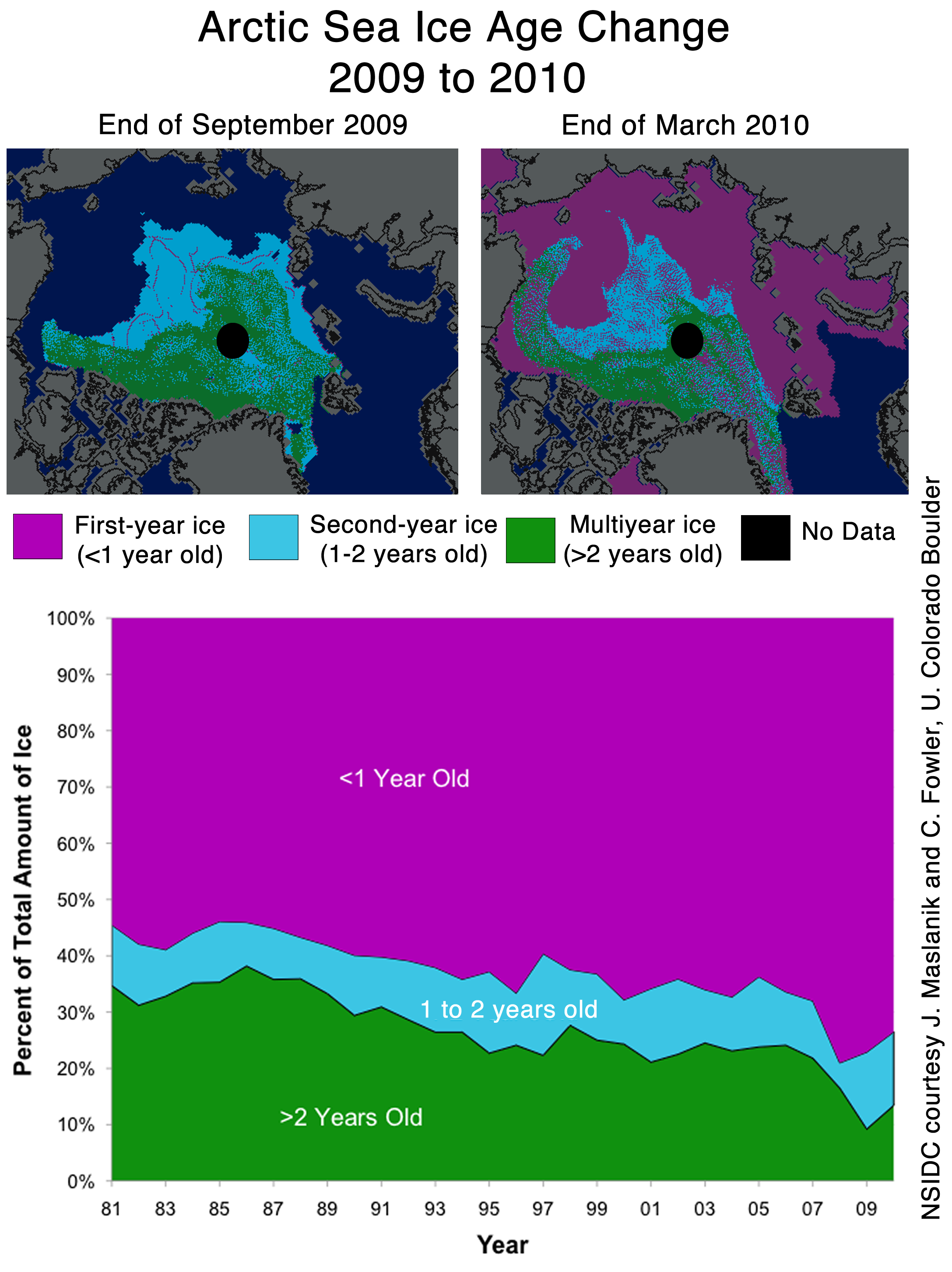
NSIDC seems to confirms the WUWT 12 Month Ice Forecast. Twelve months ago, WUWT forecast that 3 year old ice would increase during the next year, and explained why. NSIDC confirmed the accuracy of the forecast with their most recent Sea Ice News.

Source: http://nsidc.org/images/arcticseaicenews/20100406_Figure6.png
Note that 3+ (>2) year old ice has increased from 10% to about 14% during the past year, shown with the two black horizontal lines near the bottom. That shows an impressive growth of 40% relative to last year.
Ice older than one year has also increased by a substantial amount over 2008 and 2009. The implication being that ice thickness has been increasing for the last two years. Older ice is thicker ice.
So we will leave it up to the readers to do the math. Thickness has increased. Area has increased. What does that tell us about volume? What does that tell us about the “Arctic Death Spiral“?
Don’t be fooled though. “Decreasing ice is climate. Increasing ice is weather.”
R. de Haan (17:53:51) :
Fair is fair. They (alarmists) are getting big bucks for stirring up nightmares and stressing out millions.
That’s it. We should immediately open a clinic for people seeking relief from AGW induced post-traumatic stress disorder.
NSICD probably can’t update their 1979 – 2000 “average” because then the 2007 line in this chart;
http://nsidc.org/data/seaice_index/images/daily_images/N_stddev_timeseries.png
would be mostly, if not all, within 2 standard deviations / “normal”.
If we could look at this for a slightly longer time period, e.g. 100 years, 2007 would probably be well within the “normal” range. 1000 years and the decline in 2007 would probably look insignificant. A small sample exaggerates variances. Note to selves, the planet is 4,500,000,000 years old, a 21 year sample is meaningless…
Phil. (16:23:51) :
geo (11:57:46) :
I do expect that NSIDC will go to a 30 yr baseline *eventually*, reclaiming their scientific self-respect. And it won’t be a sliding baseline (nor should it in my view), but it may or may not start in 1979.
Interesting, do you think that Roy Spencer’s use of 1979-1998 as his baseline undermines his ’scientific self respect’?
Dr. Spencer still has all the scientific self respect he started with.
Read all about it in his book:
“Climate Confusion: How Global Warming Hysteria Leads to Bad Science, Pandering Politicians and Misguided Policies that Hurt the Poor”
http://www.drroyspencer.com/climate-confusion/
T-shirts, mugs and hats also available.
Donations accepted for his website – he takes VISA, Mastercard, AMEX, Discovery and Paypal.
http://irregulartimes.com/wp-content/uploads/2009/02/dr-roy-spencer.jpg
Anu (20:15:57),
Writing books and accepting voluntary donations is something alien to the taxsuckers that infest our world.
Paying one’s own way, without depending on government handouts results in “self-respect.”
The idols you worship have none. They are parasites on society.
David Williams (17:31:22) :
I agree with an earlier poster in that measuring against ice coverage over a 30 year average makes no sense when there are natural climate cycles which span 60 years that could significantly impact the results.
Blaming reduction in sea ice extent to AGW when the majority of the measurement period has been during a “warm” PDO phase seems a little disingenuous to me.
And what, exactly, does a PDO “warm” phase mean ?
The west Pacific becomes cool and part of the eastern ocean warms.
During a “cool” phase, the opposite pattern occurs.
And this would melt Arctic ice because…
http://upload.wikimedia.org/wikipedia/commons/e/e1/Pdoindex_1900_present.png
Additionally, we are currently in a “cool” phase, starting in about 2008.
During a “cool” phase of the PDO, the waters up by the Bering Strait and the Sea of Okhotsk are warmer, leading to more summer ice melt. If anything, the PDO “warm” phase was causing less summer ice melt in the northern Pacific.
http://jisao.washington.edu/pdo/
Notice where the sea ice is in the northern Pacific during near “maximum extent”:
http://nsidc.org/data/seaice_index/images/daily_images/N_bm_conc.png
Your basically taking a measurement at the bottom of the cycle which of course will be less than the average measurement for the whole cycle. Lets see where were at after 20 years or so of a “cool” PDO phase. (or even in 5 years time).
If you are positing a 60 year cycle to Arctic sea ice extent/area (leaving aside for a moment that the PDO would not lead to this), your best bet is to claim that the 30 year decline is merely a peak-to-trough half of a sine wave.
That is, this sea ice decline:
http://nsidc.org/images/arcticseaicenews/20091005_Figure3.png
is really just a section of this type of periodic growth/decline curve:
http://www.dsplog.com/db-install/wp-content/uploads/2008/02/single_sine_wave.png
say from 16 to 48 on the x-axis.
Of course, 5 years from now, you will have to claim a 70 year period. In 10 years, an 80 year period to sea ice extent/area oscillation. Without an actual mechanism to explain this periodicity, the skeptics who will be waiting for the next period to start will be fewer and fewer.
Hey, maybe its a 100 year cycle ! For some reason…
200 years ?
Jimbo (20:48:14) :
From NGU – 20 October 2008
“Recent mapping of a number of raised beach ridges on the north coast of Greenland suggests that the ice cover in the Arctic Ocean was greatly reduced some 6000-7000 years ago. The Arctic Ocean may have been periodically ice free.”
http://www.ngu.no/en-gb/Aktuelt/2008/Less-ice-in-the-Arctic-Ocean-6000-7000-years-ago/
Nothing to see here folks, move along, move along.
What’s your point ?
That maybe the Sun had a few decades of unusual brightness 6000-7000 years ago, and the Arctic ice melted for awhile ?
That this might happen again this century, when we already have CO2 warming the planet, so a freakish Sun brightening would be twice as dangerous ?
Maybe it was a huge volcanic explosion that sprinkled ash all over the Arctic, and this absorbed the sunlight that summer leading to an Arctic sea ice Death Spiral ?
Any point at all ?
Maybe it was the Sumerian gods – they were pretty active about 7000 to 6000 years ago…
I’ll wait till this “beach ridge” finding generates some concrete hypotheses as to why that small region of the Arctic was ice-free before I worry about whatever caused it adding to the current global warming.
Anu, the cool PDO phase causes globally cooler temperatures on average, so despite the fact that there may be warmer water near the Bering Sea, it wouldn’t be a net negative affect . It also lines up decently with the AMO and AO decadal phase, maybe just a few years ahead of those other two, especially the AMO which didn’t switch phases until about 15 years after the PDO. The negative phases of the AMO and AO saw much colder conditions than the positive phases in the last 100 years. The last big positive phases of all three before the 1980s/1990s occurred in the 1930s/1940s when there was significant warming before things cooled again in the 1960s/1970s.
While obviously arctic sea ice is a very debatable science, there have been plenty of studies now done to indicate the Arctic Oscillation (AO) is much more influential to the ice than just temperatures because of wind currents. The AMO has also been linked to the sea ice.
@David Williams (17:31:22) :
Actualy, if you do the math, then if you accurately grab the right 30 years 1/2 cycle of a a 60 year cycle, it does in fact work.
You can argue about “accurately” grabbing the right 30 years, but if you accomplish the feat then the results are equal vs 60 years. if you doubt me, try a countdown of 30-1, evenly spaced vs 30-1 and 1-30 evenly spaced, and I think the results are the same.
@Anu (20:15:57) :
Arm wave all you want. Try to distract attention from the man behind the curtain all you like by pointing at the Lindbergh Baby or whatever strikes your fancy.
You can speculate all you please about others motives.
It won’t change that NSIDC is on record (“on record” –you do know the difference between that and 3rd-party speculation, yes?) as to what they think is appropriate by scientific standards by the own public admisssion, and why they aren’t adhering to those standards they find scientifically appropriate.
The negative AO has been shown in peer reviewed papers to mitigate ice melt. Based on that research, I predict an average ice melt pattern this summer. No excessive melt and no supersized fast ramp out Fram Strait. One of the ways that this may happen is that a negative AO may cause 1 and 2 year old ice to compact and pile up, becoming quite thick in the span of one ice season. Maybe even thicker than multi-year ice.
Slightly OT
http://jeremynell.com/images/2010/04/global-flooding-computer-model.jpg
A South African cartoonist, this parodies computer climate models – enjoy!
There has been some discussion about how the baseline is calculated. To me that appears fairly irrelevant. What matters is the *shape* of the curve in recent weeks. Irrespective of how the baseline is calculated, the actual shape of both curves should be fairly similar, assuming they are both accurate and honest.
We know that the NSIDC curve was heading straight for the average, and then data from previous days was adjusted so that the trend took a sharp downwards turn. There may be valid reasons for adjustments, but it does seem suspicious that this occurred just as it seemed set to touch the average line. Of course, for the ice to be equal to the long-term average would be very embarrassing, particularly for the director of the NSIDC.
So, one organisation, which does not appear to be pushing AGW alarmism, shows the ice at the long term average. The other organisation, whose director is a prominent AGW supporter, shows the ice staying suspiciously below the average. Which organisation would you believe? I know which one I believe!
Chris
>>>R. de Haan (17:53:51) :
>>>Normal people would be glad when they receive good news!
No, these are not normal PEOPLE, these are normal DEISTS – a bıt lıke the old prophet Jeremıah. Don’t quote me, but Jeremıah was fond of sayıng thıngs lıke “to prove that he ıs the one, true and forgıvıng god, he wıll wıpe you all off the face of the earth” etc: etc: etc:
.
Bill Illis,
You said the following:
“I’m okay with the 1979 – 2000 baseline.
First, if you look back to the longer history of guess-timated sea ice extent, the 1979 – 2000 average is pretty close to the average ice extent over the long-term.
Secondly, we are supposed to be measuring the ice extent versus some period which was less affected by global warming (if we are to understand if it is lower now due to global warming).
Third, the satellite data that was specifically designed to measure sea ice extent started at the end of 1978 (although the satellite data actually goes back to 1972 and earlier) so a reasonably long period which is not as impacted by global warming (if there is such an effect) is 1979 to 2000.”
Now explain to me how any of what you said actually makes sense since human-induced global warming has supposedly been going on for 60-70 years now? If human-induced global warming started in earnest with the huge industrial boom following WW2, then we have NO DATA which is free of human influence so we have no baseline data to actually compare to, by your own argument.
Re: Who to believe? … here’s a bit of a surprise
Obviously believe both of them. Since both organisations clearly state what algorithms they use and that the different algorithms give different results there is no surprise. It would be surprising if they agreed on absolute values. It is very clear that they agree on the annual growth trend and longer term trends.
Re “I welcome input from both of these organizations to explain the difference.”
Algorithm comparison is available at Arctic ROOS as pointed out by HR (16:06:52) :
http://arctic-roos.org/observations/comparison-of-algorithms
References for the Norsex Algorithm [Svendsen et al 1983] are also given on this page.
References for the NASA Team Algorithm used by NSIDC are given on this page.
http://nsidc.org/data/seaice/faq.html#2
where they state “The Sea Ice Index products are developed from the NASA Team algorithm and are updated monthly. ” NSIDC also compare the NASA Team and Bootstrap algorithms and explain why one may sometimes be preferred to another.
You could also look at
http://www.dcrs.dtu.dk/research/DCRS/projects/algorithm-report/node4.html
Although I am less sure if this is comparing exactly the same algorithms.
Pamela Gray (22:47:38) :
The negative AO has been shown in peer reviewed papers to mitigate ice melt. Based on that research, I predict an average ice melt pattern this summer. No excessive melt and no supersized fast ramp out Fram Strait. One of the ways that this may happen is that a negative AO may cause 1 and 2 year old ice to compact and pile up, becoming quite thick in the span of one ice season. Maybe even thicker than multi-year ice.
More of your fantasies Pamela, in the meantime on this planet the ice continues to do the opposite i.e. flow out and stretch and fragment!
Time for a reality check for you, here’s the latest ice drift map for the Arctic:
http://i302.photobucket.com/albums/nn107/Sprintstar400/20100328-20100403.jpg
“Ice extent and ice area are calculated for a grid resolution of 25 km.”
Considering that this figure refers to a regular square grid the obvious question is: what cartographic projection is using each Institution?
Even if using proper projections for this sort of analysis, but of different kind (e.g. Azimuthal vs Cylindrical) the results shall have to be different.
Anu both the PDO and AMO have been shown to have an impact on arctic sea ice. Warm waters from a positive AMO from about 1999-2005 contributed strongly to the loss of ice on the atlantic side of the Arctic leading up to the dramatic 2007 loss. The AMO is now turning negative.
The PDO going into a cooler phase sees cooler ocean temps off the alaskan coast which has the effect of “blocking off” the warmer waters that develop in the west pacific from making it into Bering Sea.
So with the both the AMO and the PDO now appearing to go negative, yes I am fairly confident that we will continue to see increasing sea ice extent and the negative Arctic Ice anomalies were related to positive or warm phase of these cycles over the past 30 years. Nothing you have posted indicates otherwise.
Jimbo (20:48:14) :
From NGU – 20 October 2008
“Recent mapping of a number of raised beach ridges on the north coast of Greenland suggests that the ice cover in the Arctic Ocean was greatly reduced some 6000-7000 years ago. The Arctic Ocean may have been periodically ice free.”
http://www.ngu.no/en-gb/Aktuelt/2008/Less-ice-in-the-Arctic-Ocean-6000-7000-years-ago/
Nothing to see here folks, move along, move along.
Answered by:
Anu (22:04:47) :
What’s your point ?
That maybe the Sun had a few decades of unusual brightness 6000-7000 years ago, and the Arctic ice melted for awhile ?
That this might happen again this century, when we already have CO2 warming the planet, so a freakish Sun brightening would be twice as dangerous ?
Maybe it was a huge volcanic explosion that sprinkled ash all over the Arctic, and this absorbed the sunlight that summer leading to an Arctic sea ice Death Spiral ?
Any point at all ?
Maybe it was the Sumerian gods – they were pretty active about 7000 to 6000 years ago…
Without realizing it, you actually made his point. Maybe it was any/all the events you mention. They are as plausible as the data supporting the dubious proposition that CO2 is causing the melt, and that the melt is anything to be alarmed about.
Phil. (06:15:26) :
The sky is falling, hey Phil?
Phil, you need to show an anomaly map to have any credibility, not just what the ice flow is doing the past 6 days. Is what you showed above normal, below normal, or what?
NSIDC has already mentioned in their latest April 6th report that the strong -AO allowed for less ice to exit the arctic than the past few years:
“Although the Arctic has much less thick, multiyear ice than it did during the 1980s and 1990s, this winter has seen some replenishment: the Arctic lost less ice the past two summers compared to 2007, and the strong negative Arctic Oscillation this winter prevented as much ice from moving out of the Arctic.”
Luís (06:53:22) :
Even if using proper projections for this sort of analysis, but of different kind (e.g. Azimuthal vs Cylindrical) the results shall have to be different.
Lo and Behold, Luis, you are correct.
I did exactly as you suggest here: http://www.robertb.darkhorizons.org/TempGr/MarExtentVSArea.JPG
and the result was a Globe that is NOT uniformly warming, though it might be ever so slightly uniformly cooling, for the month of March.
For AGW to be correct, the Energy of Global Warming has to be found as a global budget surplus. March Polar Ice is not showing anything of the sort.
Thrasher (07:54:49) :
Phil, you need to show an anomaly map to have any credibility, not just what the ice flow is doing the past 6 days. Is what you showed above normal, below normal, or what?
NSIDC has already mentioned in their latest April 6th report that the strong -AO allowed for less ice to exit the arctic than the past few years:
Were I attempting to rebut NSIDC’s report you might have a point, however what I was doing was pointing out that Pamela is spouting nonsense as usual. I notice that you don’t require her to support her point with data, something she has failed to do on the several occasions she has made it. Each time I’ve pointed out that her idea is at variance with the current reality by producing data (not just the last 6 days). Of course Pamela doesn’t allow the facts to get in the way of her fantasy, she just ignores them. As you put it she currently has no credibility because of her failure to support her ideas with data.
“One showed sea ice extent as normal, the other took sharp right turn just before it was expected to happen.”
Since the obvious difference between the algorithms is that one sees ice when the other does not we might also infer from this discrepancy that the the conditions exist to exacerbate differences in the behaviour of the algorithms; the ice in question is of marginal visibility, it may be there it may not.
Further more the algorithms introduce a systematic (or rather subjective) error in our measurements of ice extent. We don’t really know which is the most accurate even if both methods appear precise. Our knowledge of the true ice extent is likely to be in error by 500,000 km2 because we have to interpret satellite data rather than poking the sea with a stick. Minor changes or differences in absolute values as highlighted in this article are irrelevant since they are far smaller than the actual errors in knowing the true sea ice extent.
Fortunately we don’t need accurate measurements of ice extent to infer that the extent is decreasing decade by decade. We need precise data consistently interpreted over several decades to obtain an accurate measurement of how the ice is behaving without being fooled by noise. The data collected and published by climate scientists show very clearly the Arctic ice is melting and is not returning to the higher levels seen in the past.
This