We’ve all seen that Arctic Sea ice area and extent has expanded and is back to normal. NANSEN Arctic ROOS just got their web page plots back online yesterday after an outage, and there’s a bit of a surprise when compared to NSIDC’s plot.

Sources:
http://arctic-roos.org/observations/satellite-data/sea-ice/observation_images/ssmi1_ice_ext.png
http://nsidc.org/data/seaice_index/images/daily_images/N_timeseries.png
Here’s a magnified view with the NANSEN graph zoomed and set to match the NSIDC scale, done with the help of my graphics program:

Both datasets use the SSMI satellite sensor, both datasets plot extent at 15%. Yet we have significant differences in the output which would seem to point to methodology. Note that in the magnified view, NANSEN has a peak “normal” of ~15.25 million square kilometers while NSIDC’s “normal” is higher at ~15.75 million square kilometers. You’d think there would be a standard for deciding what is the “normal” baseline wouldn’t you? [Note: The NSIDC average is for 1979-2000, NANSEN’s is for 1979-2006] Maybe the scientists can hammer this out at the next ice conference.
Regarding the plots above.
NANSEN says:
“Ice extent is the cumulative area of all polar grid cells of the Northern Hemisphere that have at least 15% sea ice concentration, using the NORSEX algorithm. Ice area is the sum of the grid cell areas multiplied by the ice concentration for all cells with ice concentrations of at least 15%. Ice extent and ice area are calculated for a grid resolution of 25 km.”
NSIDC says:
“Extent defines a region as “ice-covered” or “not ice-covered.” For each satellite data cell, the cell is said to either have ice or to have no ice, based on a threshold. The most common threshold (and the one NSIDC uses) is 15 percent, meaning that if the data cell has greater than 15 percent ice concentration, the cell is considered ice covered; less than that and it is said to be ice free.”
NSIDC also says:
“Other researchers and organizations monitor sea ice independently, using a variety of sensors and algorithms. While these sources agree broadly with NSIDC data, extent measurements differ because of variation in the formulas (algorithms) used for the calculation, the sensor used, the threshold method to determine whether a region is “ice-covered,” and processing methods. NSIDC’s methods are designed to be as internally consistent as possible to allow for tracking of trends and variability throughout our data record.”
Given that both NANSEN and NSIDC use the same SSMI sensor data, and calculate the extent based on 15% concentration, that half a million square kilometers difference in the “normal” sure seems significant in the context of the magnified extent view NSIDC presents. A half million here, a half million there, and pretty soon we are talking about real ice extent differences.
Another interesting difference is that NANSEN plots Arctic Sea ice area in addition to the extent. Here’s that graph:

Arctic Sea ice area is above the “normal” line as defined by NANSEN. As far as I know, NSIDC does not offer an equivalent plot. If I am in error and somebody knows where to find NSIDC’s area plot, please let me know and I will include it here.
One final thing to note about the difference between NANSEN and NSIDC. I don’t recall the director of NANSEN/Arctic ROOS ever coming out and saying something like “Arctic ice is in a death spiral” or making any sort of press announcements at all. They seem content to just present the data and let the consumer of the data decide.
In contrast, NSIDC has a whole section that addresses sea ice in the context of global warming. I haven’t found a comparable section on NANSEN Arctic ROOS.
Of course we know that NSIDC director Mark Serreze is very active with the press. Perhaps some of our media friends reading this should seek out someone at NANSEN for the next sea ice story so that there’s some balance.
The differences in the way each organization presents their data and views to the public might explain the differences in the way the output is calculated. One might take a “glass half full” approach while the other takes a “glass half empty” approach. Or it may have a basis in science that I’m not privy to yet. The point is that there are significant differences in the public presentation of sea ice data between the two organizations. One showed sea ice extent as normal, the other took sharp right turn just before it was expected to happen.
I welcome input from both of these organizations to explain the difference.
In related news, Steve Goddard writes:
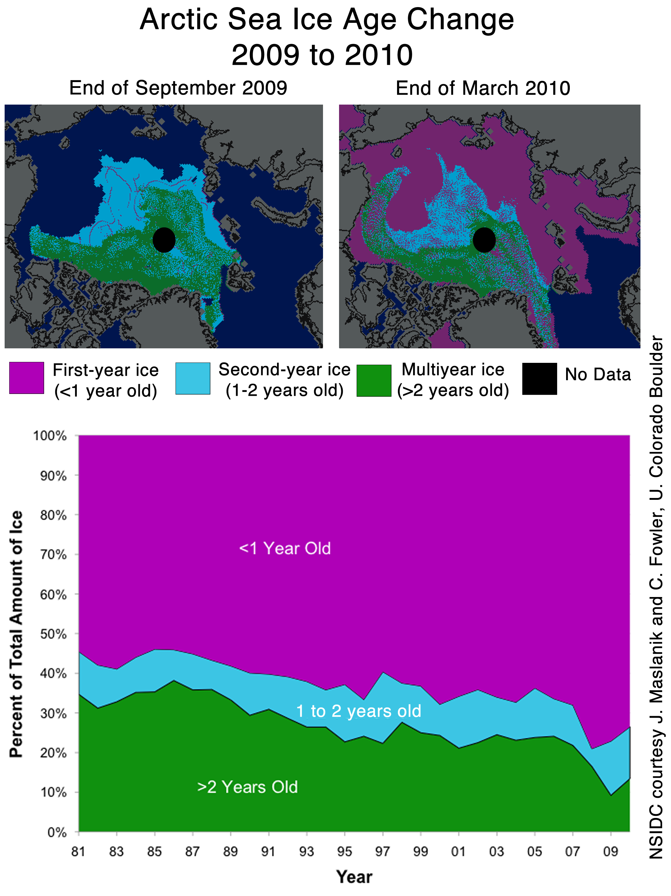
NSIDC seems to confirms the WUWT 12 Month Ice Forecast. Twelve months ago, WUWT forecast that 3 year old ice would increase during the next year, and explained why. NSIDC confirmed the accuracy of the forecast with their most recent Sea Ice News.

Source: http://nsidc.org/images/arcticseaicenews/20100406_Figure6.png
Note that 3+ (>2) year old ice has increased from 10% to about 14% during the past year, shown with the two black horizontal lines near the bottom. That shows an impressive growth of 40% relative to last year.
Ice older than one year has also increased by a substantial amount over 2008 and 2009. The implication being that ice thickness has been increasing for the last two years. Older ice is thicker ice.
So we will leave it up to the readers to do the math. Thickness has increased. Area has increased. What does that tell us about volume? What does that tell us about the “Arctic Death Spiral“?
Don’t be fooled though. “Decreasing ice is climate. Increasing ice is weather.”
franks (14:30:02) :
I love that Guardian article. We are both at a record low and above average.
geo (11:57:46) :
I do expect that NSIDC will go to a 30 yr baseline *eventually*, reclaiming their scientific self-respect. And it won’t be a sliding baseline (nor should it in my view), but it may or may not start in 1979.
I think they believe that the inexorable retreat of the arctic icecap will give them plenty of opportunity to switch to a 30 yr baseline a few years down the road, without creating that “confusion” they cite today, because the baseline line will still be comfortably above the reality at that time. It wouldn’t be today, no question.
It’s true that baselines that include 1979-2008 would be lower than a baseline of 1979-2000, because the Arctic ice is declining, decade after decade.
But that doesn’t mean the even now we aren’t lower than that 30 year, lower baseline:
http://arctic.atmos.uiuc.edu/cryosphere/IMAGES/seaice.recent.arctic.png
http://arctic.atmos.uiuc.edu/cryosphere/IMAGES/sea.ice.anomaly.timeseries.jpg
Any way you slice it, the Arctic is losing ice, decade after decade. For as long as they could measure all of it. If you pick a baseline of 2002 to 2009, you might still get a few days above baseline… but that won’t stop the Death Spiral down to no ice that will come soon enough.
http://arctic-roos.org/observations/comparison-of-algorithms
This seems to explain the difference in the way the different groups make their calculations.
The difference between different groups is irrelevant what matters is the trend found by each group. Those trends have generally been down for the end of season ice for the last 30 years. A downward trend since 1960 if you take the norwegian observational data.
geo (11:57:46) :
I do expect that NSIDC will go to a 30 yr baseline *eventually*, reclaiming their scientific self-respect. And it won’t be a sliding baseline (nor should it in my view), but it may or may not start in 1979.
Interesting, do you think that Roy Spencer’s use of 1979-1998 as his baseline undermines his ‘scientific self respect’?
CRS, Dr.P.H.
‘Quick thought: consider how much computing speed and memory have improved over the time-spans involved in these time series graphics, as well as improvements in sensor technology. Perhaps we are now seeing a more accurate/comprehensive picture of Arctic and Antarctic ice extents?
Back in 2000, the Pentium VI was state-of-the-art, and Pentium III in widespread use.’
Actually it has never had much to do with the hardware. As an example, i386 CPU’s are still in use by NASA. No matter the hardware, crappy software will still be crappy software. Why do you think mission critical hardware has had to prove it self over time? And in space over time against radiation.
—
‘This is an ongoing discussion regarding autism spectrum disorders (is the increase in incidence real, or due to better diagnostics?)’
Is the incidence level real or just perceived?
First and foremost the autism spectra has gone from narrow to become somewhat braodbandish.
Second, peoples’ diagnoses are usually a function of money, either by individual or by society, or both. As in the more people who can afford a diagnosis of autism the more people with autism will live in that society, or reversed the more a society can afford to give the diagnoses…. In Europe this is actually becoming a serious problem, so much so that neighbors get different diagnosis’ for the same autistic ailment just because there’s a virtual line going through the neighborhood, some doctors in some cities, depending only on the city “treasury”, don’t give diagnosis of autism to people over a certain age, and I’m not meaning just 65, or retirement, but rather 25.
I’ve a brother and an uncle who’s autistic to various degrees, if you wondered.
NANSEN says:
“Ice extent is the cumulative area of all polar grid cells of the Northern Hemisphere that have at least 15% sea ice concentration…
***************
NSIDC says:
“Extent defines a region as “ice-covered” or “not ice-covered.” For each satellite data cell, the cell is said to either have ice or to have no ice, based on a threshold. The most common threshold (and the one NSIDC uses) is 15 percent, meaning that if the data cell has greater than 15 percent ice concentration, the cell is considered ice covered; less than that and it is said to be ice free.”
The way I read that is for NANSEN is >=15% While NSIDC is >15%
It might not make a hill of beans difference, but it caught my eye.
Tenuc said:
“Sea ice extent, area, and thickness are the result of climate processes driven by deterministic chaos. During Earth’s warm periods, ice metrics oscillate from year to year in a nonlinear way – always have and always will. Thus linear trends have no predictive power concerning future levels.
This years Arctic maximum is bad news for the ‘warmists’ though:-))”
———
Tenuc,
As a “warmist” (at least a 75% warmist), I don’t really know what you mean by the current state of the arctic sea ice being “bad news” for warmists? Are you implying that we should “want” the ice to be a certain way, as opposed to being simply neutral observers of the phenomenological world, and objectively judging whether a certain condition or event does or doesn’t fit the model suggested by any certain hypothesis?
If this is what you mean by “bad news”, then your suggestion is absurd in itself, but if this was the way “warmists” think, (which of course it isn’t), but if it was, then they would be logical enough to know that a few months of sea ice returing to almost normal conditions (based on 30 years of satellite data) is interesting, but hardly proves or disproves AGW theory. Now IF the “bump” of March 2010, turned in the bump of Summer 2010, which turned into arctic sea ice going into a positive anomaly range for 5 years or even a decade, then that would cause many a “warmist” to need to reconsider how much credibility AGWT has.
As it is, the MOST interesting thing so far about the so far brief return to near the 30 year average seasonal arctic sea ice level is the way AGW sceptics have rallied around it as “proof” against AGWT or a “nail in the coffin” AGWT. This is the same tune they sung this winter when Florida had snow, (though Greenland was having record warmth). It was related to a very negative AO index, but AGW sceptics were saying the next ice age was upon us. In short, the most interesting thing about the current arctic sea ice is from a psychological standpoint in terms of how AGW sceptics are all a twitter about it…
I certainly would if he said he *wanted* to use a 30 yr baseline but didn’t dare because of fear of “confusion”.
And I’d support him doing so, even if his reasons have nothing to do with politics.
Anu (15:52:26) said:
So, that’s your prediction, is it? Does it matter to you that there is evidence that the arctic has been ice free in summer during the last 20,000 years?
I lined up the 2010 NANSEN & NSIDC plots. Watch the blue line:
http://i40.tinypic.com/vnmhoo.gif
JAN (14:26:28) wrote:
“Founding director Ola M. Johannessen retired as of 31-12-2009, and the new director Stein Sandven has not made any similar alarming predictions, at least not as far as I am aware.”
I think you may have missed this article. It seems that they have been busy trying to think up ways to explain away the “lull”.
http://www.reuters.com/article/idUSTRE61O3O820100225
“Melting Arctic ice was evidence for continuing change, regardless of observed temperatures, said Stein Sandven, head of the Nansen Environmental and Remote Sensing Center in Norway.
“The long-term change for the Arctic sea ice has been very consistent. It shows a decline over these (past) three decades especially in the summer. In the past 3-4 years Arctic sea ice has been below the average for the last 30 years.””
This is a case of comparing apples to oranges:
Using this set of data:
N_03_area.txt
at this address:
ftp://sidads.colorado.edu/DATASETS/NOAA/G02135/Mar/
Which has a headline of:
FTP directory /DATASETS/NOAA/G02135/Mar/ at sidads.colorado.edu
I plotted out this graph:
http://www.robertb.darkhorizons.org/TempGr/MarExtentVSArea.JPG
Where the Sea Ice is displayed as
N. Hem. Extent (plunging … the graph we normally see and cited often)
N. Hem Area (flat)
Global Extent /2 (flat)
Global Area /2 (somewhat rising)
S. Hem Extent (rising)
S. Hem Area (rising)
All baselines are computed the same, 1979-2010 inclusive.
If we combine N. Hem extent with S. Hem extent the result is flat.
If we combine N. Hem area with S. Hem. area the result is almost flat (which isn’t saying much other that it’s statistically insignificant).
The dwelling on N. Hem. Extent while ignoring the counterpart in the S. Hem. is disingenious and highly misleading.
If this wasn’t costing the taxpayer unnecessary burden and thowing good money after bad, it would be a joke.
Whom to believe??
I’ll believe the data straight up, on the rocks. ALL of it.
I agree with an earlier poster in that measuring against ice coverage over a 30 year average makes no sense when there are natural climate cycles which span 60 years that could significantly impact the results.
Blaming reduction in sea ice extent to AGW when the majority of the measurement period has been during a “warm” PDO phase seems a little disingenuous to me.
Your basically taking a measurement at the bottom of the cycle which of course will be less than the average measurement for the whole cycle. Lets see where were at after 20 years or so of a “cool” PDO phase. (or even in 5 years time).
What is the cause of the tiny rebound in June every year on the JAXA Arctice Ice extent graph?
Don’t you get sick and tired of those warmists sticking their effort in talking Arctic Ice Extend down only because they get a “feel good” feeling when they can make the lives of others miserable?
That’s exactly where this is all about, making humanity feel guilty and miserable!
Normal people would be glad when they receive good news!
This is food for psychiatrists!
1DandyTroll (16:29:08) :
CRS, Dr.P.H.
‘Quick thought: consider how much computing speed and memory have improved over the time-spans involved in these time series graphics, as well as improvements in sensor technology. Perhaps we are now seeing a more accurate/comprehensive picture of Arctic and Antarctic ice extents?
Back in 2000, the Pentium VI was state-of-the-art, and Pentium III in widespread use.’
Actually it has never had much to do with the hardware. As an example, i386 CPU’s are still in use by NASA. No matter the hardware, crappy software will still be crappy software. Why do you think mission critical hardware has had to prove it self over time? And in space over time against radiation.
–
‘This is an ongoing discussion regarding autism spectrum disorders (is the increase in incidence real, or due to better diagnostics?)’
Is the incidence level real or just perceived?
First and foremost the autism spectra has gone from narrow to become somewhat braodbandish.
Second, peoples’ diagnoses are usually a function of money, either by individual or by society, or both. As in the more people who can afford a diagnosis of autism the more people with autism will live in that society, or reversed the more a society can afford to give the diagnoses…. In Europe this is actually becoming a serious problem, so much so that neighbors get different diagnosis’ for the same autistic ailment just because there’s a virtual line going through the neighborhood, some doctors in some cities, depending only on the city “treasury”, don’t give diagnosis of autism to people over a certain age, and I’m not meaning just 65, or retirement, but rather 25.
I’ve a brother and an uncle who’s autistic to various degrees, if you wondered.
—–
REPLY: Good point on the processors! I was told that the i486 processor was the beginning of the end for the Cray supercomputer, so you have a great point on software. I still have a Pentium 3 that I fire up on occasion, it works well through the Internet via ethernet.
OT….regarding autism, there is much discussion amongst epidemiologists about this. The general opinion is that the increased incidence is real, eg. not only due to better diagnostics and recognition. I have many good friends with children afflicted with Asperger’s and related autistic spectrum disorder.
Why? Not the vaccines, they have been vindicated. I’m reviewing the fairly recent rise in consumption of sushi by pregnant women as a major risk factor….tuna is filthy with organic mercury! I never touch the stuff anymore.
One reason why the AGW stuff ticks me off, we have much more important things to work on and spend time with than these myths and legends. Sorry to wander OT, guys!
jaymam (17:03:01),
Nice work.
Re Leif Svalgaard (09:51:55) :
Did you mean “Hide the incline?”
Anthony,
I think you need to recheck Artic Roos, it would appear that they have seen the error of their ways and have fallen in line.
This statement makes it sound as though the Arctic Ice has been stable at high numbers for all of history and is just now losing ice. The assumption and this statement is absurd. Satelite record is so incredibly short that the only meaningful information that can be garnered is that the ice has declined for the last 30 years. Even if we only go back for 1000 years of climate history (in which we experienced both warm and cool periods) the only scientific thing you could say is that the ice has declined for the 3% of the last 1000 years thats we have accurate records for – and that is nothing compared to the time period of this interglacial.
Arctic Ice decline, as we see it, cannot be attributed to AGW just because the tiny slice we see has been declining. That is attempting to prove the theory because of correlation – and that is bad road to go down. The reason sceptics jump on the increase, is because while the decrease has correlated with AGW to date, a diversion will be hard to explain within the theory. In addition, most sceptics are sick to death of overblown reactions to what we are seeing – such as the “death spiral” and then attributing that to climate change. We have not seen catastrophic climate change. There is not even any evidence that we will see catastrophic climate change. It is also infinitely more likely that if we do see catastrophic climate change it will be us freezing our collective asses off and wishing for the days of “global warming” because the history of this planet shows that almost every catastrophic climate change in history was not hot – it was cold. They don’t call our current time in history an interglacial on a whim.
I’m okay with the 1979 – 2000 baseline.
First, if you look back to the longer history of guess-timated sea ice extent, the 1979 – 2000 average is pretty close to the average ice extent over the long-term.
Secondly, we are supposed to be measuring the ice extent versus some period which was less affected by global warming (if we are to understand if it is lower now due to global warming).
Third, the satellite data that was specifically designed to measure sea ice extent started at the end of 1978 (although the satellite data actually goes back to 1972 and earlier) so a reasonably long period which is not as impacted by global warming (if there is such an effect) is 1979 to 2000.
Close enough for guv’mnt work.
Frederick Michael (09:51:36) :
The NSIDC average is for 1979-2000, NANSEN’s is for 1979-2006. Walt Meyer has explained their choice to stop at 2000 many times (they want an unchanging reference). You can disagree with his choice but it is a choice and nothing’s fishy.
The choice is fishy.
Richard Sharpe (17:02:04) :
So, that’s your prediction, is it? Does it matter to you that there is evidence that the arctic has been ice free in summer during the last 20,000 years?
There’s “evidence” that JFK was shot by three people, if you use the term loosely.
The hard part is proving it.
How about starting with a citation or two ?
It’s not possible to define what ‘normal’ is in the earth with just 31 years of data.
What was the ice like during the Little Ice Age?
What was it like during the Medieval Warm Period?
Since normal variation can explain what has been happening to Arctic Ice since 1979 then Arctic Ice is in the range of ‘normal’ right now and every year going back to 1979.
There is no reason to say anything trepidacious about Arctic Ice. If you are unbiased you must conclude that there’s nothing to see there.