We’ve all seen that Arctic Sea ice area and extent has expanded and is back to normal. NANSEN Arctic ROOS just got their web page plots back online yesterday after an outage, and there’s a bit of a surprise when compared to NSIDC’s plot.

Sources:
http://arctic-roos.org/observations/satellite-data/sea-ice/observation_images/ssmi1_ice_ext.png
http://nsidc.org/data/seaice_index/images/daily_images/N_timeseries.png
Here’s a magnified view with the NANSEN graph zoomed and set to match the NSIDC scale, done with the help of my graphics program:

Both datasets use the SSMI satellite sensor, both datasets plot extent at 15%. Yet we have significant differences in the output which would seem to point to methodology. Note that in the magnified view, NANSEN has a peak “normal” of ~15.25 million square kilometers while NSIDC’s “normal” is higher at ~15.75 million square kilometers. You’d think there would be a standard for deciding what is the “normal” baseline wouldn’t you? [Note: The NSIDC average is for 1979-2000, NANSEN’s is for 1979-2006] Maybe the scientists can hammer this out at the next ice conference.
Regarding the plots above.
NANSEN says:
“Ice extent is the cumulative area of all polar grid cells of the Northern Hemisphere that have at least 15% sea ice concentration, using the NORSEX algorithm. Ice area is the sum of the grid cell areas multiplied by the ice concentration for all cells with ice concentrations of at least 15%. Ice extent and ice area are calculated for a grid resolution of 25 km.”
NSIDC says:
“Extent defines a region as “ice-covered” or “not ice-covered.” For each satellite data cell, the cell is said to either have ice or to have no ice, based on a threshold. The most common threshold (and the one NSIDC uses) is 15 percent, meaning that if the data cell has greater than 15 percent ice concentration, the cell is considered ice covered; less than that and it is said to be ice free.”
NSIDC also says:
“Other researchers and organizations monitor sea ice independently, using a variety of sensors and algorithms. While these sources agree broadly with NSIDC data, extent measurements differ because of variation in the formulas (algorithms) used for the calculation, the sensor used, the threshold method to determine whether a region is “ice-covered,” and processing methods. NSIDC’s methods are designed to be as internally consistent as possible to allow for tracking of trends and variability throughout our data record.”
Given that both NANSEN and NSIDC use the same SSMI sensor data, and calculate the extent based on 15% concentration, that half a million square kilometers difference in the “normal” sure seems significant in the context of the magnified extent view NSIDC presents. A half million here, a half million there, and pretty soon we are talking about real ice extent differences.
Another interesting difference is that NANSEN plots Arctic Sea ice area in addition to the extent. Here’s that graph:

Arctic Sea ice area is above the “normal” line as defined by NANSEN. As far as I know, NSIDC does not offer an equivalent plot. If I am in error and somebody knows where to find NSIDC’s area plot, please let me know and I will include it here.
One final thing to note about the difference between NANSEN and NSIDC. I don’t recall the director of NANSEN/Arctic ROOS ever coming out and saying something like “Arctic ice is in a death spiral” or making any sort of press announcements at all. They seem content to just present the data and let the consumer of the data decide.
In contrast, NSIDC has a whole section that addresses sea ice in the context of global warming. I haven’t found a comparable section on NANSEN Arctic ROOS.
Of course we know that NSIDC director Mark Serreze is very active with the press. Perhaps some of our media friends reading this should seek out someone at NANSEN for the next sea ice story so that there’s some balance.
The differences in the way each organization presents their data and views to the public might explain the differences in the way the output is calculated. One might take a “glass half full” approach while the other takes a “glass half empty” approach. Or it may have a basis in science that I’m not privy to yet. The point is that there are significant differences in the public presentation of sea ice data between the two organizations. One showed sea ice extent as normal, the other took sharp right turn just before it was expected to happen.
I welcome input from both of these organizations to explain the difference.
In related news, Steve Goddard writes:
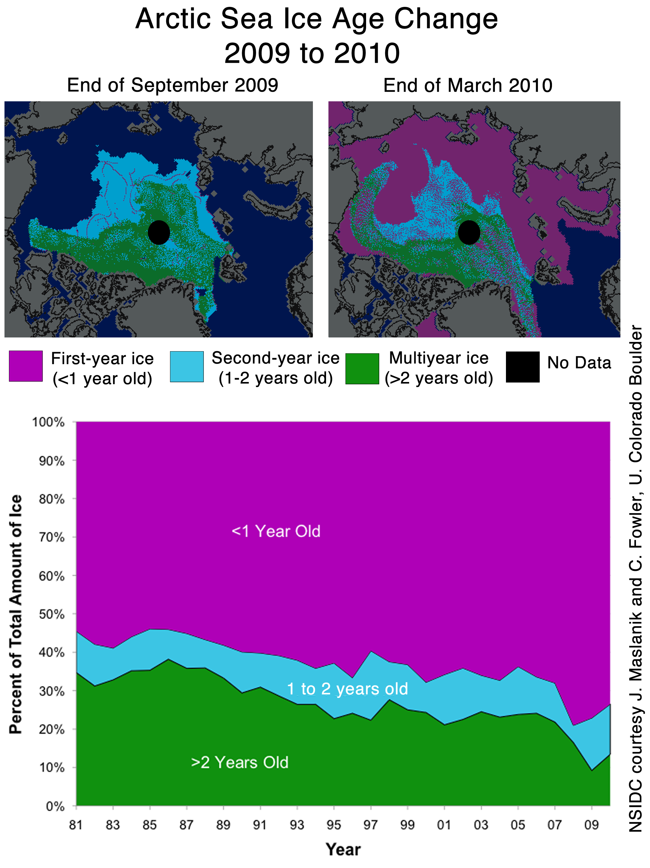
NSIDC seems to confirms the WUWT 12 Month Ice Forecast. Twelve months ago, WUWT forecast that 3 year old ice would increase during the next year, and explained why. NSIDC confirmed the accuracy of the forecast with their most recent Sea Ice News.

Source: http://nsidc.org/images/arcticseaicenews/20100406_Figure6.png
Note that 3+ (>2) year old ice has increased from 10% to about 14% during the past year, shown with the two black horizontal lines near the bottom. That shows an impressive growth of 40% relative to last year.
Ice older than one year has also increased by a substantial amount over 2008 and 2009. The implication being that ice thickness has been increasing for the last two years. Older ice is thicker ice.
So we will leave it up to the readers to do the math. Thickness has increased. Area has increased. What does that tell us about volume? What does that tell us about the “Arctic Death Spiral“?
Don’t be fooled though. “Decreasing ice is climate. Increasing ice is weather.”
KC (10:24:03) :
A bit off topic, but has anyone taken a look at the arctic death spiral propaganda being perpetrated by EDF?
“This is the story of a fictional polar bear family — Aakaga and her cubs Qannik and Siku — as they make their perilous journey in a melting Arctic world.”
http://www.edf.org/page.cfm?tagID=53590
This is hysterical!
I can’t recall the word for it at the moment which attributes human behavior and character to animals.
Using this technique I often find deplorable, particularly when aimed at children.
I watched David Attenborough documentaries when he (and others like him) demonstrated the brutality of life in the animal kingdom. Nowadays, such documentaries, although showing the exact same things from decades ago, always have that political ‘man did this’ undertone – or, more and more, blatant overtone.
So the sea ice this year appears to have the best cover since 2002 and yet the first three months of this year have been some of the warmest on record, especially in the Arctic. Any explanation?
@geo
NSIDC hopped on the AGW bandwagon and now can’t get off and still keep a straight face. Otherwise my guess is that they’d stopped with the screwy semantics in their FAQs a several years ago and hopped on the reality train.
——-
If NSIDC had had 150 years of data then sure jumping over a few years between 2001-2010 wouldn’t have mattered much and could’ve easily been rectified by a proper error bar. But now they have 21 years which they claim is a proper static long term normal…. suddenly those 30 years as a some kind of minimum went out the window.
A problem with their reasoning is of course that today isn’t 2001 but 2010. 2001, and maybe 2002, their arguments were sound, but now they have 10 years to their last entry for their 21 year normal. That’s an almost 50% difference in time length with the result as in comparing 2000 to a normal that was computed for the years 1850-1950, which only is ok if you have a proper context and reason for doing so.
NSIDC doesn’t try to describe reality, which could’ve been ok if they’d had a proper context to go with their stuff.
They now have a proper 30 year timeframe. And if they can take 1979 and compare it with a normal based on 1979-2000, then of course it’s equally ok to take 2009 and compare it with a normal based on 1979-2009.
These difference seem to be such minor short-term issues. Let’s see what the trend is over the next 4-5 years. If we don’t see a new satellite record summertime low for the arctic by 2015, then I’ll start to be suspicious of the AGW models, but right now, these very short term “blips” are just that, regardless of which data set you want to use. These “blips” will only be significant if the start to become a new trend…and that can be seen only over a longer term. We had an extremely negative AO this winter and less flushing of older ice, so conditions should be ripe for some more recovery of arctic sea ice if certain AGW sceptics are to believed, but I don’t see it. I see warmth from Hudson Bay over to Greenland, and then into the central arctic. I see the Bering sea (where most of the March “bump” occurred as having very thin brand new ice that will melt very fast when the summer melt really starts up. I see a summertime low around 4.5 million sq. km (as measured by IJIS/Jaxa). Those calling for a summertime low around 6 million I think are underestimating how warm it has been over much of the N. Atlantic and Greenland into the central part of the Arctic…and yes, warmth matters, not just winds and currents.
DocattheAutopsy (12:32:53) :
FWIW, the posts on this website, and the subsequent discussions, are the reason I come here. It’s a wonderful little conclave of logic and reason, with intellectual arguments thrown in there. Thanks to all the scientists who continue to pursue the discourse of data and reason in a congenial environment.
—
REPLY: Thanks! Join in any time, this is a good bunch of folks!
Quick thought: consider how much computing speed and memory have improved over the time-spans involved in these time series graphics, as well as improvements in sensor technology. Perhaps we are now seeing a more accurate/comprehensive picture of Arctic and Antarctic ice extents?
Back in 2000, the Pentium VI was state-of-the-art, and Pentium III in widespread use.
One of the first rules of epidemiology (my field) is to first ascertain the accuracy of your data….are results real, or the result of better monitoring/diagnostics?
This is an ongoing discussion regarding autism spectrum disorders (is the increase in incidence real, or due to better diagnostics?)
Satellite systems are not my strong suit, any thoughts?
Given that the NSIDC graph hit the average line, then was turned away the following day, more scamming is plainly afoot !
Phil M (13:16:09),
Cherry-picking only the Arctic as usual, I see.
Let’s look at what’s happening in the Antarctic: click
Want more? OK, if you insist: click
See, what matters is global ice cover: click
Nothing unusual is going on in the Arctic. Ice cover is pretty much at the 1979 – 2010 mean: click
Bill Illis made a nice chart he posted above. Here it is again: click
Point out that “death spiral” for us. I don’t see it.
**************
Phil M (13:16:09) :
All this talk about spin…it’s interesting that this figure never gets posted here:
http://nsidc.org/images/arcticseaicenews/20100406_Figure3.png
Enjoy your return to “normal”. Me and my eco-fascist-warmist-greenie-halfwit-tree-hugging-sandal-wearing-dope-smoking-scientist buddies would like to see you all hide THAT decline…
***********************
Dang Phil! If not for you, all us dumb skeptics would have never known the Arctic ice extent is decreasing. You deserve some kind of medal for saving climate science from WattsUpWithThat. Man, imagine that! Arctic sea ice is in decline! Who’d a thunk it??
Phil M (13:16:09) :
All this talk about spin…it’s interesting that this figure never gets posted here:
http://nsidc.org/images/arcticseaicenews/20100406_Figure3.png
Enjoy your return to “normal”. Me and my eco-fascist-warmist-greenie-halfwit-tree-hugging-sandal-wearing-dope-smoking-scientist buddies would like to see you all hide THAT decline…
Thanks Phil, that’s 723.
Sea ice extent, area, and thickness are the result of climate processes driven by deterministic chaos. During Earth’s warm periods, ice metrics oscillate from year to year in a nonlinear way – always have and always will. Thus linear trends have no predictive power concerning future levels.
This years Arctic maximum is bad news for the ‘warmists’ though:-))
Phil M
I would like to see that graph referenced to zero Km squared and then see how precipitous the resulting slope is. The total drop in that graph is only one million square kilometers, a number I don’t find very threatening.
Anthony, you wrote:
“One final thing to note about the difference between NANSEN and NSIDC. I don’t recall the director of NANSEN/Arctic ROOS ever coming out and saying something like “Arctic ice is in a death spiral” or making any sort of press announcements at all. They seem content to just present the data and let the consumer of the data decide.”
This isn’t entirely true. As reported by me last year, the then director of the Nansen Centre made an astonishing prediciton of an ice free Arctic, summer AND winter, by 2100. I found that particularly alarming and unscientific, as that would require increased winter temperatures of about 30K in order to prevent the Arctic Ocean from freezing.
http://www.vg.no/nyheter/utenriks/klimatrusselen/artikkel.php?artid=542650
Also, this is not by any means supported by Nansen’s own data, which show a decline of 2.8% per decade for yearly maximum (winter) ice. Hence, a simple extrapolation of trend would imply it would take 35 decades for winter ice to disappear.
http://arctic-roos.org/observations/satellite-data/sea-ice/total-icearea-from-1978-2007
Johannessen argues that asssuming CO2 increase is responsible for 90% of ice reduction, a further increase to 765 ppm CO2 would be enough to melt all winter ice, and this could happen before 2100.
Founding director Ola M. Johannessen retired as of 31-12-2009, and the new director Stein Sandven has not made any similar alarming predictions, at least not as far as I am aware.
http://arctic-roos.org/Members/webadmin/newsbox/new-director-at-the-nansen-center-in-bergen
REPLY: Thanks, I stand corrected. I knew there had not been anything recently, and I wasn’t aware of the news article you cited. Do you know if it got any press beyond that? – Anthony
“OceanTwo (13:26:29) :
[…]
I can’t recall the word for it at the moment which attributes human behavior and character to animals.”
Animals that look like and behave like humans: antropomorphic.
People that look like and behave like antropomorphic animals: Furrys.
Don’t know why they don’t switch to 30yrs of mean data like Cryosphere did. You have high ice yrs with low ice yrs. Seems you get a good average from that.
I believe the UK Guardian Newspaper who had this headline based on a NSIDC source
“Arctic winter ice recovers slightly despite record year low, scientists say”
Phew, managed to get the “record low” in so presumably we are still on course for a death spiral.
Link is
http://www.guardian.co.uk/environment/2010/apr/07/arctic-sea-ice-recovers-slightly
“R. Gates (13:51:37) :
These difference seem to be such minor short-term issues.”
I’ll use this quote on the next alarming once-in-a-century event caused by global warming. Ooh, unprecedented warming – minor short-term issue. Really catchy. Thanks!
Is it just me, or for the last week NANSEN shows ice still increasing, while NSIDC shows decreasing? Opposite trends?
For the downward trending NSIDC plot, can anyone check to see what the numerical difference is to normal for the last week? Checking numbers might reveal some ‘fixing’ of data.
Although the plot is not continuous, there is a sudden rise in the DMI graph showing the temperatures in the Arctic.
If this is correct, I suspect we will see the slope of the ice extent curve bend downward relative to the “normal”
Is there any reason to believe this is in error?
http://ocean.dmi.dk/arctic/meant80n.uk.php
Maybe we should believe that there is a lot of error involved in trying to figure out how much ice cover there is.
OceanTwo (13:26:29) : {…}
I can’t recall the word for it at the moment which attributes human behavior and character to animals.
It’s anthropomorphism, seeing human traits where there are none. Seems widely used to encourage empathy leading to money donations.
“…Walt Meyer has explained their choice to stop at 2000 many times (they want an unchanging reference)…”
Since somebody referenced the unchanging reference period used by GISS (totally ignoring the WMO’s guideline of using a minimum 30 year period ending at the decade), I won’t mention it again.
Oh, wait…
Has anybody ever put up a spaghetti graph of all the years? They only seem to chose the “lowest” values in their chart. Would love to see ALL the years that fell below their “normal” line.
For them to have “error bars”, there would have had to been a FEW years that went below (or do they only want to show the “record” low values).
REPLY: Thanks, I stand corrected. I knew there had not been anything recently, and I wasn’t aware of the news article you cited. Do you know if it got any press beyond that? – Anthony
No, I haven’t seen this prediction getting any further press. Also, to be fair, Johannessen was cited in the press in September regarding increased Ice concentration in the Arctic:
http://www.dagbladet.no/2009/09/16/nyheter/miljo/milj/arktis/8143738/
“Johannessen said that at this time one can conclude that this is due to natural fluctuations in temperature and among other things cloud situation in the area.
– There were many who got overly excited and talked about man made global warming. But here it was clearly a question of a very powerful natural variability, said Johannessen.”
CRS, Dr.P.H. (13:56:10) :
[…] Back in 2000, the Pentium VI was state-of-the-art, and Pentium III in widespread use.
Excellent point!
And considering the great lag between satellite system conception – design and deployment as chips are custom built, I bet most satellites in service today are still on the 386 or maybe 486 level, if that. OTOH, being realistic, even 1900 vintage thermometers, when built and tested by true scientists who cared for accuracy, were extremely accurate, in fact, in many ways they had better absolute accuracy than most modern electronic models when read properly. Electronics tend to drift with age, temperature, and even background cosmic ray noise levels that cannot ever be totally compensated for; even the compensation circuitry falls prey to the same said effects. In some respects we have taken a step backwards in respect to absolute accuracy, don’t you see that sometimes too? You get more coverage with satellites and usually more precision but give up absolute accuracy.
JAN (15:12:18) :
For clarity:
The citations by Johannessen in my last post was comments by him on the extreme minimum ice concentration seen in 2007, which he now clearly attributes to natural variability, not to AGW.
So let me see if I get this right. These bozos can’t even measure the amount of ice in the Arctic region today despite the billions of public dollars spent on satellites and study after study and they want me to believe they have any clue how much ice was there a couple hundred years ago? And still these “climate scientists” insist that 1) the world is headed for doom unless we all drive electric cars and cut down on toilet paper use and 2) if we just give them billions more they can really, really prove it this time?
Bernie Madoff is a piker compared to these guys.