We’ve all seen that Arctic Sea ice area and extent has expanded and is back to normal. NANSEN Arctic ROOS just got their web page plots back online yesterday after an outage, and there’s a bit of a surprise when compared to NSIDC’s plot.

Sources:
http://arctic-roos.org/observations/satellite-data/sea-ice/observation_images/ssmi1_ice_ext.png
http://nsidc.org/data/seaice_index/images/daily_images/N_timeseries.png
Here’s a magnified view with the NANSEN graph zoomed and set to match the NSIDC scale, done with the help of my graphics program:

Both datasets use the SSMI satellite sensor, both datasets plot extent at 15%. Yet we have significant differences in the output which would seem to point to methodology. Note that in the magnified view, NANSEN has a peak “normal” of ~15.25 million square kilometers while NSIDC’s “normal” is higher at ~15.75 million square kilometers. You’d think there would be a standard for deciding what is the “normal” baseline wouldn’t you? [Note: The NSIDC average is for 1979-2000, NANSEN’s is for 1979-2006] Maybe the scientists can hammer this out at the next ice conference.
Regarding the plots above.
NANSEN says:
“Ice extent is the cumulative area of all polar grid cells of the Northern Hemisphere that have at least 15% sea ice concentration, using the NORSEX algorithm. Ice area is the sum of the grid cell areas multiplied by the ice concentration for all cells with ice concentrations of at least 15%. Ice extent and ice area are calculated for a grid resolution of 25 km.”
NSIDC says:
“Extent defines a region as “ice-covered” or “not ice-covered.” For each satellite data cell, the cell is said to either have ice or to have no ice, based on a threshold. The most common threshold (and the one NSIDC uses) is 15 percent, meaning that if the data cell has greater than 15 percent ice concentration, the cell is considered ice covered; less than that and it is said to be ice free.”
NSIDC also says:
“Other researchers and organizations monitor sea ice independently, using a variety of sensors and algorithms. While these sources agree broadly with NSIDC data, extent measurements differ because of variation in the formulas (algorithms) used for the calculation, the sensor used, the threshold method to determine whether a region is “ice-covered,” and processing methods. NSIDC’s methods are designed to be as internally consistent as possible to allow for tracking of trends and variability throughout our data record.”
Given that both NANSEN and NSIDC use the same SSMI sensor data, and calculate the extent based on 15% concentration, that half a million square kilometers difference in the “normal” sure seems significant in the context of the magnified extent view NSIDC presents. A half million here, a half million there, and pretty soon we are talking about real ice extent differences.
Another interesting difference is that NANSEN plots Arctic Sea ice area in addition to the extent. Here’s that graph:

Arctic Sea ice area is above the “normal” line as defined by NANSEN. As far as I know, NSIDC does not offer an equivalent plot. If I am in error and somebody knows where to find NSIDC’s area plot, please let me know and I will include it here.
One final thing to note about the difference between NANSEN and NSIDC. I don’t recall the director of NANSEN/Arctic ROOS ever coming out and saying something like “Arctic ice is in a death spiral” or making any sort of press announcements at all. They seem content to just present the data and let the consumer of the data decide.
In contrast, NSIDC has a whole section that addresses sea ice in the context of global warming. I haven’t found a comparable section on NANSEN Arctic ROOS.
Of course we know that NSIDC director Mark Serreze is very active with the press. Perhaps some of our media friends reading this should seek out someone at NANSEN for the next sea ice story so that there’s some balance.
The differences in the way each organization presents their data and views to the public might explain the differences in the way the output is calculated. One might take a “glass half full” approach while the other takes a “glass half empty” approach. Or it may have a basis in science that I’m not privy to yet. The point is that there are significant differences in the public presentation of sea ice data between the two organizations. One showed sea ice extent as normal, the other took sharp right turn just before it was expected to happen.
I welcome input from both of these organizations to explain the difference.
In related news, Steve Goddard writes:
NSIDC seems to confirms the WUWT 12 Month Ice Forecast. Twelve months ago, WUWT forecast that 3 year old ice would increase during the next year, and explained why. NSIDC confirmed the accuracy of the forecast with their most recent Sea Ice News.

Source: http://nsidc.org/images/arcticseaicenews/20100406_Figure6.png
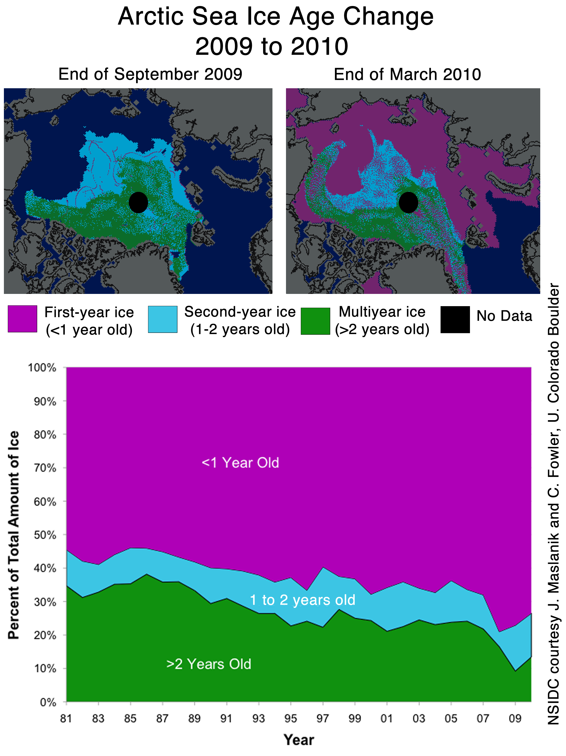
Note that 3+ (>2) year old ice has increased from 10% to about 14% during the past year, shown with the two black horizontal lines near the bottom. That shows an impressive growth of 40% relative to last year.
Ice older than one year has also increased by a substantial amount over 2008 and 2009. The implication being that ice thickness has been increasing for the last two years. Older ice is thicker ice.
So we will leave it up to the readers to do the math. Thickness has increased. Area has increased. What does that tell us about volume? What does that tell us about the “Arctic Death Spiral“?
Don’t be fooled though. “Decreasing ice is climate. Increasing ice is weather.”
I don’t think there is any significance in this approach/crossing of the normal line at all which is being repeatedly referred to in this article and other recent posts here and on other sites.
The aveage is not useful as baseline to measure an anomaly nor to suggest an anomaly no longer exists. It is very misleading to suggest this.
It is difficult to know what the normal ice extent is in the Arctic due to a lack of records of the quality of recent satellite data. It would be a pretty good guess that is not the same as the mean of the 79-00 average and more than likely given the records of ice melt that normal will be higher than than that seen in 79. So the ice has not returned to anything like ‘normal’ even for this short period of a few days.
Also the curve presented as an average over the last 30 years is not useful for direct comparison since ice extent has been decreasing for the last 30 years. Had the extent been varying about a constant value it would be a sensible as a baseline to suggest normality had returned. The average does tell us something about when typical magnitudes, when we expect the ice to be growing , how fast and when the maxima and minima are expected to occur.
rbateman (08:46:46) :
Rbateman, you are a lighthouse in the current Dark Ages.
” Phil. (09:48:07) :
Were I attempting to rebut NSIDC’s report you might have a point, however what I was doing was pointing out that Pamela is spouting nonsense as usual. I notice that you don’t require her to support her point with data, something she has failed to do on the several occasions she has made it. Each time I’ve pointed out that her idea is at variance with the current reality by producing data (not just the last 6 days). ”
So you believe that what happened in the last 6 days must also happen in summer 2010? And that Pamela should show the DATA for summer 2010? Her guess is at least as good as the prognosis of Serreze in August 2009 for September 2009 (in other words: it might be nonsense, too).
But she will forgive you for not knowing what a “gentleman” is.
Chris Wright (03:19:49) :
There has been some discussion about how the baseline is calculated. To me that appears fairly irrelevant. What matters is the *shape* of the curve in recent weeks. Irrespective of how the baseline is calculated, the actual shape of both curves should be fairly similar, assuming they are both accurate and honest.
We know that the NSIDC curve was heading straight for the average, and then data from previous days was adjusted so that the trend took a sharp downwards turn. There may be valid reasons for adjustments, but it does seem suspicious that this occurred just as it seemed set to touch the average line.
Data from previous days were not ‘adjusted’, both plots use a smoothing algorithm to display the data. NSIDC uses a 5 point running average whereas Arctic-ROOS uses a Rloess smooth, this doesn’t make much difference to the body of the graph but it does effect the end of the graph. The end condition of the 5 point running average tends to continue the slope of the last three points, so when a datapoint diverges from the direction of the previous few points the change in the smoothed curve appears more dramatic. Remember that the previous day’s smoothed curve was exaggerated the other way.
Of course, for the ice to be equal to the long-term average would be very embarrassing, particularly for the director of the NSIDC.
This is a very strange mindset you have, attributing your emotional attachment to data that supports your POV to others perhaps?
At this time of year that has come close to occurring for the last three years on the area plot (CT), I’m sure that Chapman isn’t embarassed.
http://arctic.atmos.uiuc.edu/cryosphere/IMAGES/seaice.recent.arctic.png
So, one organisation, which does not appear to be pushing AGW alarmism, shows the ice at the long term average. The other organisation, whose director is a prominent AGW supporter, shows the ice staying suspiciously below the average. Which organisation would you believe? I know which one I believe!
Chris
For the record, I get (via some serious number-crunching) that the 2010 plot on the right is actually closer to 400k higher than the one on the left (plus a little more in Feb and early Mar). The difference doesn’t look like a scaling factor, just a bias. Apparently that bias changes somewhat over time, since the “average” peak was noted to be more like 500k different.
Alexej Buergin (13:24:21) :
Phil. (09:48:07) :
So you believe that what happened in the last 6 days must also happen in summer 2010? And that Pamela should show the DATA for summer 2010? Her guess is at least as good as the prognosis of Serreze in August 2009 for September 2009 (in other words: it might be nonsense, too).
But she will forgive you for not knowing what a “gentleman” is.
Pamela predicted an average ice melt pattern this summer based on her idea that that a negative AO may cause 1 and 2 year old ice to compact and pile up, becoming quite thick in the span of one ice season. Unfortunately for this theory this isn’t happening and hasn’t been happening (your fixation on the last 6 days despite my rebutting this theory since at least January on here is a sign of desperation). Her theory has the compression of the present ice as a necessary precursor to her prediction for the summer, that isn’t happening.
My idea of how the summer melt will be is based on the present and recent state of the ice and may well not occur but at least it is based on what is actually happening at present!
By the way it’s not a gentleman/lady issue, it’s science, you make your case and back it up, if you can’t stand the heat get out of the kitchen. This is polite discourse, you should try making a presentation to a room full of Russian academicians!
NSIDC use a baseline they’ve been running with for a few years. ROOS have a different one. NSIDC had no way of knowing how things would turn out the past week or so and therefore can’t be can’t be suspect for a decision made years ago.
On the same page cited in the top post, NSIDC explain their consistent use of the 1979 – 2000 baseline:
This is consistent with the excerpt quoted in the article at the top of this thread:
They then helpfully provide links to a number of other data sets, including ROOS.
More info here: http://nsidc.org/arcticseaicenews/faq.html
Phil,
Cryosphere Today ice area data from 1979 to the present (updated daily) can be found here:
Arctic: http://arctic.atmos.uiuc.edu/cryosphere/timeseries.anom.1979-2008
Antarctic: http://arctic.atmos.uiuc.edu/cryosphere/timeseries.south.anom.1979-2008
Global: http://arctic.atmos.uiuc.edu/cryosphere/timeseries.global.anom.1979-2008
The 1979-2008 refers to the baseline for the anomaly calculations.
Also, the 1979-2000 data is still there too. Just delete the ‘.1979-2008’ from the URL’s.
Regarding the 60-year PDO cycle, see Dr. Syun-Ichi Akasofu’s paper, “Two Natural Components of Recent Climate Change,” here (as a 50-Mb PDF):
http://people.iarc.uaf.edu/~sakasofu/little_ice_age.php
For those who follow such triva:
The arctic sea ice has lost about 400,000 sq. km of ice since it’s annual peak on March 31, (even though as late as April 5th Rush Limbaugh continued to report that the arctic was gaining sea ice). But such trivia such as THE FACTS may not matter to certain folks…
Is this a “one-off” problem where >=15 is not equal to >15? One of them includes grid where ice content is exactly 15% and the other does not.
I’ve re-read the NSIDC statement several times and cannot glean at all whether grids exactly equal to 15% are included.
Phil – {This is polite discourse, you should try making a presentation to a room full of Russian academicians!}
are they like macadamians? you know, nuts?
🙂
Academia nuts.
What a bunch of baloney.
Why are you focused on sea ice EXTENT rather than sea ice VOLUME?
It’s very dishonest the way you manipulate people… garbage in garbage out as proven by the following :”Both data gives about the same absolute amount of sea ice …” No, the above has nothing to do honestly looking at the “amount of sea ice”
REPLY: I always get a chuckle out of comments like these. A disagreement over presentation elevated at first contact to the “dishonest” presentation is a sure sign of a closed mind driven by dogma. Looking at your website strengthens that observation. -A
John Cook just fleeced you
http://www.skepticalscience.com/Has-Arctic-sea-ice-returned-to-normal.html
Once again another Skeptic shows only the part of the story that fits his narrative.
REPLY: eh. not worried about what John Cook has to say. Especially when he pulls tricks like switching from a statement about extent to making it about volume. Heh. -A
Robert (12:22:10),
“Skeptical Science” is not a skeptic blog. Cook has zero credibility. Why even bother with someone who misrepresents his blog like that? He disingenuously pretends to be a skeptic, when he’s only another climate alarmist blogger.
‘Skeptical Science’ is to science as astrology is to astrophysics.
Cook already has 13 comments. Very unimpressive. And several of those posters made more than one post. That’s what you call an echo chamber of True Believers.
To test Cook’s credibility, why don’t you send him the link to this page? See if he posts it. Be sure to remind him that WUWT is the “Best Science” site; 42 million hits and counting…
And citizenschallenge (10:40:00) is even more pathetic. ZERO comments on ALL of his ramblings. He probably still lives in his mom’s basement. I wonder if she still does his laundry?
Anthony,
Cryosphere Today data is sea ice area and they cite the NSIDC as their source (you asked if the NSIDC had area data at the start of this blog). As Dewitt pointed out, Cryosphere Today shifted their baseline from 20 years to 30 years earlier this year. If the NSIDC shifted their baseline their old press releases could not be compared to current ones. Cryosphere Today only lists data so it is easier to change the baseline (it was still confusing when they switched for a while, you get used to it). Cryosphere Today shows area data going back to around 1900 which show that the ice area was fairly constant from 1900 until around 1990, when it began to decline. Of course that is not satalite data until 1979.
“Thickness has increased. Area has increased. What does that tell us about volume? What does that tell us about the “Arctic Death Spiral“?”
You’re the one who made the erroneous statement. You know very well you could clearly find out “what this tells us about volume” but you decided not to because the answer (shown by cook) would not support your narrative.
So Cook has zero credibility because he named his blog inappropriately? And because he doesn’t have enough comments right now? Of Course this blog has so many views, are you kidding me, there are tons and tons of people out there wandering the internet willing to jump on bandwagons without the scientific integrity to actual look up the core literature and make their minds for themselves. Look up conspiracy theories about UFOS and you’ll get just as many “views” on those websites.
Good strategy though regardless, attack and debate the credibility of someone when you have no response to the science.
This blog can be a good thing, a good way to investigate real scientific issues, but disingeniousness does not help advance the scientific understanding or method.
It is clear that there are far too many people who comment here without being willing to read up the actual literature. Individuals who are so eager to disprove what they are told by one side that they blindly follow the other.
Skepticism is healthy to scientific debate, but it has to be on both sides.
“eh. not worried about what John Cook has to say. Especially when he pulls tricks like switching from a statement about extent to making it about volume. Heh. -A”
Really? What about…
“”So we will leave it up to the readers to do the math. Thickness has increased. Area has increased. What does that tell us about volume? What does that tell us about the “Arctic Death Spiral“?””
Don’t you think that statement is very disingenuous considering you lead people to believe that the volume is increasing and yet as Cook points out, the volume is still decreasing. You can attack his credibility all you like, but the truth is you shaped your argument to envoke skeptcism not true scientific thought. If you had, you would of clearly pointed out that the Volume for March 2010 was the lowest ever recorded for March? Once again, lets not let facts get in the way of science.
Smokey,
Because someone has a blog named Skeptical science doesn’t make him not have any credibility. Neither does the amount of comments or views. I could check a UFO conspiracy site and find just as many views and comments as this site, does that make their credibility higher than both bloggers?? Your argument is faulty in every sense.
-Actually there was already a link to this website on his post, whereby he refutes Watts argument quite easily.
-Finally with regards to calling me pathetic, the only thing that’s pathetic is people who are so eager to be skeptical of AGW and disbelieve everything they’re told about it, and yet these very same people don’t bring the same skepticism towards what they are told by skeptics. It’s Like when loehle came out with a flawed paper in 2006 and it was hailed by the folks at Climate audit who go to great lengths to refute AGW papers, and yet this paper turned out to be so flawed that Loehle even thanked RC for pointing out all his errors…. where was the “climate audit” on that particular paper. Skeptics want so much skepticism towards any proponent paper and no accountability for baseless skeptic claims.
michael sweet (14:38:44),
I’ve noticed the same shenanigans with NSIDC. They are constantly moving the goal posts. Their funding depends on alarming the populace, so their lack of ethics may be understandable, but I still don’t condone their re-jiggering the data.
***
And relax, Robert, I didn’t call you pathetic. That was a reference to the Alarmist Science blog. Read my post again.
Three points: first, any dispute you have with Climate Audit should be taken up with them, not here. I have a feeling you would be set straight if you took your arguments there.
Next, Anthony’s questions are not contradictory, as you imply, while Cook’s are certainly questionable. Did you question Cook, as I suggested? Didn’t think so.
Finally, I agree with you about skepticism. Everyone should be skeptical about wild-eyed claims, eg: that the Arctic is melting due to human influence. Currently it has been melting [although it has rebounded strongly this year], but it is well within normal climate variability. Nothing to be worried about. The climate is well within its natural historical parameters, so what’s the problem? The change in Antarctic ice extent hasn’t mimicked the Arctic, so the cause can not be global.
When you can falsify the null hypothesis, you will get everyone’s attention. Until then, it’s like worrying about a black cat in your dark bedroom — but when you turn on the light… there’s no cat. And there never was a cat. So relax, CO2 isn’t gonna getcha. The climate naturally fluctuates, and people exaggerate for grant money. That’s the truth. Deal with it.
First of all Smokey,
Watts did insinuate with his sentence “What does this tell you about volume?” that volume was decreasing whereby it has been shown that it is not. He could have easily said, Volume however continues to decrease but that would not fit the “scientists are alarmists” narrative he was trying to sell.
Secondly, I did not question Cook’s usage of Volume rather than extent because as anyone who studies glaciology would know the winter extent is not as important as the winter volume. The summer extent however is very important because if the extent drops too far then you have an arctic ocean with a much lower albedo which can set in place positive feedback mechanisms. It is like picking a glacier which has advanced but is thinning and then saying, Hey look everyone global warming isn’t happening, this glacier has advanced since 1970 but yet its volume has significantly decreased thus making it a faulty argument.
Thirdly,
pertaining to Antarctic sea-ice, you very well know that the increase in Antarctic sea ice is due to increased winds around Antarctica (and if you don’t you should). These winds are being caused by Ozone depletion in the region which has caused stratospheric cooling. This has been known for a couple of years now… so once again another faulty argument because the Ozone Depletion is our fault thus making the increase unnatural in itself.
Finally,
to say that arctic sea ice losses are within the natural variability is a bit disingenuous, although some regions have had decreases within natural variability, many regions are outside of the natural variability such as the western Arctic, see
Macias M., A. Grinsted, S. Helama, J. Moore, M. Timonen, T. Martma, E. Isaksson, M. Eronen, Unprecedented low 20th century winter sea ice extent in the Western Nordic Seas since A.D. 1200. Accepted into Climate Dynamics 2009.
We all know the climate fluctuates and we all realize that it is likely that the pre-1960s warming was likely part of some natural cycle for the most part, but it has become increasingly clear that post-1960 has had anthropogenic forcing which is significant. You can see Harries et al. 2001 for proof that the infrared absorption from Greenhouse Gases is increasing and you can see Wang and Liang (2008) for proof that the downward LW flux is increasing too. Until you can refute that actual empirical evidence of an anthropogenically enhanced greenhouse effect then you have no validity to your argument.