Guest Post by Willis Eschenbach
Drought is measured in several ways. One of them is the Self-Correcting Palmer Drought Severity Index (scPDSI). There’s a clear description of it here. As with the original Palmer Drought Severity Index (PDSI), positive values reflect wetter weather, and negative values reflect dryer weather.
I thought I’d take a look at the trends in droughts to see if an oft-repeated claim is true. This claim is that due to increasing CO2, wet areas will get wetter and dry areas will get dryer. Here’s a typical version of this mantra, from the University of Maine.
In a warmer world, expect the wet to get wetter and the dry to get drier
So I got the scPDSI data from the marvelous KNMI website. Figure 1 shows the areas subject to frequent droughts and frequent wet spells.

Figure 1. Average self-correcting Palmer Drought Severity Index (scPDSI), 1950 – 2020. Positive values are wetter, negative values are dryer.
Next, I calculated the decadal trend of the 71 years of the scPDSI data for each of the 1° latitude x 1° longitude gridcells in Figure 1. I then graphed the decadal trend, gridcell by gridcell, against the average scPDSI value shown in Figure 1.
But before I show that result, let’s consider what we should find. If the wet is actually getting wetter and the dry is actually getting drier, when the drought average gets larger so should the drought trend, and vice versa. It should look something like the imaginary result shown in Figure 2 below.

Figure 2. Expected result if the wet gets wetter and the dry gets drier.
However, here in the real world we don’t find that kind of sloping pattern at all. Instead, the actual result shown in Figure 3 is random—as has happened since the start of time, some areas are getting wetter and some drier, but there is no pattern to it.

Figure 3. Scatterplot, drought trend versus average drought, 1° latitude x 1° longitude gridcells, 1950 – 2020.
As you can see, there’s no statistically significant trend in the data. So if the wet is getting wetter and the dry is getting dryer … the Palmer Drought Severity Index didn’t get the memo.
Finally, this result is supported by looking at the same situation with regards to rainfall. Here’s that data.

Figure 4. Scatterplot, gridcell rainfall trend versus gridcell rainfall, 1950 – 2020.
Once again, there’s no sign of the claimed “wet getting wetter and the dry getting drier”. Another climate myth busted …
My warmest regards to everyone,
w.
For Clarity: When you comment, please quote the exact words you’re discussing. This makes it perfectly clear who and what you are talking about.
Watch out. Andrew Dessler might find a correlation coefficient of 0.01 for that plot.
Dessler was extremely unconvincing on Rogan. His only reference to science was that he could not dispute any of the scientific assertions Koonin made. The rest of the 2+ hour show (99%) was Dessler talking about areas in which he is clearly not an expert or even well read: economics, law, energy, etc.
I’m now looking at his 2010 debate with Lindzen – what Dessler says is the last debate he engaged in with a denier.
Data when collected and analyzed honestly is very powerful and informative. Thanks Willis!
Wish more people would see it that way.
There’s one thing that I learned personally about experimental data – it frequently tells you nothing significant. It can be very frustrating as a young scientist to realize this. And, even when you think it’s telling you something you often realize later that it’s not telling you what you thought it was telling you. This all conspired to make me exceedingly cynical about data. And that was long before being exposed to all the dubious data “re-calibration” going on in the climate sciences…
it’s all about good experimental design so you get the right data and the right amount of it so it can be studied statistically- then it takes a smart scientist to understand what it all means and how to proceed with further experiments and tests, blah, blah, blah- hard work
So true, so true. I had the pleasure in grad school of implementing a particle counting system using an old IBM PDP mainframe and a CAMAC crate with a “kluge” card. We had a simple scheme, laser on, count particles, laser off, count particles again. Do that 30 times a second. Collected lots of data, as we changed laser frequency, and thought we were seeing what we expected and publication was in our future! Then we discovered that the data changed the next day, then changed back the following day, then…you get the idea. Turned out that there was a 60 Hz-derived ripple on the science building’s power so that the signal level superimposed on that would be different depending on when, on any given day, you first turned on the equipment. Took us a month to figure that one out.
Being older than dirt, I cut my teeth on an IBM 360 mainframe computer and also a Digital Equipment Corporation (DEC) PDP-11S “desktop” computer. So, to me, there’s a difference between IBM and PDP (unless there’s an IBM model name that I’m not aware of).
The PDP-11S was quite a PC. It had an astonishing 4K of core of 12-bit memory and could directly connect with a teletype paper punch unit for “permanent” storage. Software came on rolls of paper tape. The true “bootstrap loader” was only 17 instructions long and could be ‘easily’ entered from front panel switches, one bit at a time. Since the software could easily overwrite the loader, I had to do this so many times that I had the instructions memorized. It was hardly portable, though, it must have weighed well over 50 lbs.
Yes, the PDPs (Programmable Data Processors) were DEC products. However, the PDP11 was a 16 bit byte addressable machine (and maybe the nicest computer I ever programmed). DEC’s 12 bit computer was the PDP8 and the PDP7/9/15 were 18 bit. Distant history for me but great memories.
If I remember correctly, the ‘S’ stood for ‘serial’.
The CPU was a shift register, clocking each bit of a result on at a time.
I may be thinking of the PDP 8S.
A critical part of experimental design is to predetermine the statistical test to be used to interpret the data. To do otherwise is to bias the results. Today, it seems that nobody is concerned about bias. You obtain an experimental data set, then subject it to a plethora of statistical tests until one of them yields a significant inference that supports your hypothesis.
not being a scientist- I didn’t know that the statistical test is predetermined or should be – makes sense- a good point to keep in mind when reading nonsense from alarmists
In the Spring of 2016, I was updating a North Dakota water resource presentation, which contained a Palmer Hydrological Drought Index (PHDI) chart from April of 2013. I was replacing an older NOAA PHDI chart (May 2005 to October 2013) with an updated NOAA PHDI chart (May 2005 to March 2016). These charts are simple screen captures from the NOAA web site. Then, something caught my eye. I noticed that the summer of 2011 was wetter in the 2016 dataset than in the 2013 dataset, and the summer of 2013 was drier in the 2016 dataset than in the 2013 dataset. I scaled both charts on the Y-Axis to check my first visual impression. This comparison showed that there were several years where the newer 2016 dataset was different from the older 2013 dataset, both wetter and drier. Obviously, NOAA had modified the historic data.
This prompted me to look more closely at previous Palmer Drought Index data I have collected over the years. In 2006 I wrote a report using the Palmer Drought Severity Index (PDSI) and had downloaded the PDSI data from the NOAA website for the time frame of January 1977 to September, 2006. This 2006 dataset was for all nine NOAA climate divisions in North Dakota.
Using my historical download of 2006 PDSI data as the time frame reference, I downloaded (in May 2016) the PDSI dataset from the NOAA website. I then plotted the two dataset downloads (2006 & 2016) as bar charts for each climate division and also plotted the differences between the two datasets for each climate division. These charts provide a nice visual comparison for how NOAA has modified the newer 2016 dataset, in comparions to the historical NOAA PDSI data I downloaded in 2006.
I discussed this analysis with my hydrologist colleagues and none of them were aware of the differences between the older PDSI data and the newer PDSI data. They agreed with my analysis, that the PDSI data had been changed. We then contacted the regional NOAA office for an explanation, and they were unaware of any changes made to the PDSI data. The regional NOAA office then contacted the national NOAA office. The national office said they had made changes to the algorithm used to calculate the PDSI. They also stated that the changes made to the PDSI algorithim had been peer reviewed.
The resulting charts of my analysis can be found at:
http://www.urbanhi.net/pdsi.html
Damn, sounds like you caught them dead to rights. And yet the slither away, like the slugs they are.
I asked if the Regional NOAA Office could find out when the changes were made to the data/algorithm. Obviously, sometime between the years of 2013 and 2016. I never received an answer to my question from NOAA.
“They also stated that the changes made to the PDSI algorithim had been peer reviewed.” let me fix that for you. They also stated that the changes made to the PDSI algorithim had been pal reviewed. You cannot change data period what is, is what is. Only slim balls think data can be changed to fit a narrative.
I would agree with you MAL. I am just providing the narrative that took place when I discovered the changes made to the PDSI by NOAA. For the details, see my web site links provided in my original comments.
Willis – I don’t get here as often as I’d like. But when I do, your posts are my go to read. I just want to say “thank you”.
My pleasure, Paul.
w.
Guessing you drink Dos Equis.
A single failed prediction is sufficient to invalidate a hypothesis.
Einstein himself recognized this and made 3 non trivial predictions for Relativity. He said at the time if any prediction was false, Relativity was as well.
Unless the experiment that ‘demonstrated the failure’ was itself deficient.
You are, of course, correct which is why it is good to be in an environment that encourages open inquiry and genuine debate as opposed to one that is prone to ad hominem and simplistic dismissal of contrary opinions.
In the situation you describe, proponents of the tested hypothesis get to explain why/how the test results do not invalidate the theory while the “other side” gets to explain why/how it does.
Meanwhile, others are free to offer their own hypotheses that are consistent with the experimental results and/or alternative experiments that they assert will better either demonstrate or contradict the hypothesis.
As I regularly reminded my younger colleagues . . . think “Formal not Final.”
Sometimes it takes a lot of work to find the experimental error that caused the “failed” result. Replication efforts are valuable in both directions way
Within 48 hours, a strong wave of Arctic air will reach California.
Yes, we know !!!
This is seriously impacting my deck project. First I had to put on long pants, then a long sleeve shirt, now we’re predicting 2″ of snow … you don’t have to go rubbing it in!
[that was intended as sarcastic ranting humor]
Wetter getting wetter and dryer getting dryer is but one case of the general climate alarmist assertion that global warming causes more weather extremes.
Nice job debunking it, WE.
The general assertion was debunked by IPCC SREX in 2012. It was made again in 2014 by the US National Climate Assessment Chapter 1. I debunked each of its specific examples in essay Credibility Conundrums in ebook Blowing Smoke.
Other versions of this notional alarm include:
Thanks, Rud, always great to hear from you.
I collected a whole bunch of such things and put them into my post “Where Is The Climate Emergency“. Like “Blowing Smoke”, it’s great ammunition for discussions with alarmists.
w.
I have posted that in several forums, warmist/alarmists can’t handle it as they come out with insults fallacies and deflection, they have not once actually addressed the CONTENT of your post is THE fly papers post I have searched for, well done!
Me too
Every name in the book but not one piece of data refuted
Many places do get wetter and, it seems, even more get dryer, over extended but not eternal time frames. The point here, it seems to me, is that the total amount of rain, globe wide, doesn’t change much.
How many failed prediction will it take to recognize the AGW hypothesis is false.
Look at the CO2 concentrations for the past million years. When CO2 levels peak, temperatures start falling. When CO2 levels reach a minimum, temperatures start rising.
We have a million years of that pattern, which is the exact opposite of the hypothesis that increased CO2 leads to increased temperatures.
Failed predictions specific to global warming since 1988 (Hansen July hearing):
8. Food production would decline.
9. Coral would die off.
10. Polar bears would starve.
11. Hurricanes would increase in frequency and intensity.
12. Another mass extinction event would begin.
13. The ability of the ocean to absorb CO2 would decrease.
14. People would get stupider because of the increase in CO2. Well, maybe this last one is happening, but It’s not because of CO2 – more likely caused by MSNBC, CNN, BBC, NYT, Grauniad, etc.
I look forward to and enjoy your posts. I trust your efforts to educate your loyal readers that you are not neglecting your “gorgeous ex-fiancee.”
In the UK we’re being told – in between griffs warnings on increases in rain and floods – that we’re running out of water,
“ England could run short of water within 25 years”
https://www.theguardian.com/environment/2019/mar/18/england-to-run-short-of-water-within-25-years-environment-agency
It depends on which bit of doublethink they’re concentrating on
Running short of water in the UK is more than likely. But is has nothing to do with rainfall and climate, but everything to do with the lack of investment in water infrastructure. Farming out water supply to foreign companies doesn’t hep. They do the minimum at maintaining to 100+ year old infrastructure, milk it for what it is worth, then sell up or declare bankruptcy.
Thames Water is a very leaky affair
Just very recently ##, when accused of same, they laid the blame on Illegal Immigrants
They said that they’d found properties, supposedly only housing one or two people, with 15+ inhabitants and it was they who were using all the water.
It wasn’t leaking hardly at all
When challenged, the water company simply replied:
“We have to handle all the waste water”
## It was a story to do with the compulsory fitting of water meters – that should get a handle on it
Yes, but griff has reliably informed us that according to the Met Office, rain in the UK is now 6% wetter, so that will go a long way to compensate for the shortfall.
Another climate myth busted …
_________________________
Speaking of myths, it would be great if someone would bust the insane Global Warming Potential Numbers that the IPCC puts out for methane. At this point in time I don’t know what the IPCC’s AR6 says, but the AR5 made the claim that Methane is 86 times more powerful than CO2 at trapping heat.
I constantly bring this up because legislation is actually being passed based on this myth.
Covered in a previous post comment, and by a WUWT post 8 years ago. Measured in the lab in dry air in a long tube, methane is 84x CO2 using same method. BUT methane IR absorption spectra almost perfectly overlap water vapor, so in the real world with humidity it has no GHE at all.
Thanks for the reply to my unmarked off topic rant. Oh the 84 times using the IPCC’s method is certainly true, but it’s misdirection.
Misdirection [mis·di·rec·tion] noun:
The action or process of directing someone’s attention away
from certain facts so that they arrive at the wrong conclusion.
And what we are being directed away from is the question of how much methane will actually run up global temperature? As you point out in less than dry air it shouldn’t be an issue. I’ll add that in dry air it probably isn’t much of an issue either. Less than than a tenth of a degree or in other words, essentially nothing by 2100.
Yes that six year old WUWT post was a good one and bears a reread every so often. So does Willis Echenbach’s “Where Is The “Climate Emergency”? LINK
There’s a saying about how lies spread quickly and the truth doesn’t. I’ve sort of stopped my daily news search to comment on methane and sea level stories that spread B.S. because depressingly I all too often run up against the cancel culture, and my comments disappear.
Thanks, Rud. Per the standard formula, CH4 doubling from 1.7 to 3.4 ppmv gives an additional 0.31 W/m2. MODTRAN presumably includes the CH4 decomposition products of H2O and CO2:
CH4 + 2 O2 = CO2 + 2 H2O, both greenhouse gases.
So it gives 0.88 W/m2 for that doubling.
BUT we’re a long way from doubling methane, and even if we did it’s still a tiny component.
w.
PS — for math geeks like myself, the “standard formula” involves
• M, the ending methane level (ppb),
• M0, the starting methane level
• N0, the N20 level.
The formula is:
fCH4 = function(M, M0 = 697, N0=270) {
.036 * (sqrt(M) – sqrt(M0)) – (fMN(M,N0) – fMN(M0,N0))
}
This involves a subsidiary function, fMN:
fMN = function(M,N) {
0.47* log(1 + 2.01e-5 * (M * N) * 0.75 + 5.31e-15 * M * (M * N) * 1.52)
}
“log” is the natural log, base e
So I used
fch4(3400, 1700, 331)
since 331 ppb is the current N2O level. Having said that, using 331 instead of the default value of 270 gives a difference of only 0.005 ppmv …
Quoting from Wikipedia….
“An exact definition of how GWP is calculated is to be found in the IPCC’s 2001 Third Assessment Report.[21] “
And Ref 21 has been deleted at the UN server. If anyone has a link to where it might now be found, please post in a comment here. Inquiring minds would like to know.
Ahh, found…https://archive.ipcc.ch/pdf/assessment-report/ar4/wg1/ar4-wg1-chapter2.pdf
And it can be shown by some facts and figures that a Piper Cup will fly 85 times farther on a gallon of gas than a Boeing 747.
But is does not follow that American Airlines should scrap it’s fleet of 747s and replace them with Piper Cubs.
AR6 has a set of “Emission metrics for selected species: Global Warming Potential (GWP), Global Temperature-change Potential (GTP)” in Table 7.15 on page 7-125.
My biggest question is why they have separate lines for “CH4-fossil” and “CH4-non-fossil”.
How the [bleep] can a CH4 molecule leaked from a pipeline (e.g. Nord Stream 2) have different RF properties than those of a CH4 molecule released by melting permafrost (e.g. in Siberia) ?!?
– – – – –
A “zoomed-in screenshot” of the first 4 lines of Table 7.15, which includes entries for both CH4 options, should be “attached” to this post below.
It has “GWP-20 [year]” values of 82.5 (fossil) and 80.8 (non-fossil, +/- 25.8 in both cases), falling to “GWP-500” values of 10 and 7.3 (+/- 3.8) respectively. Do they still count as “insane” ?
Where is the Tropospheric hot spot? This is a central prediction of AGW. Without this feature there is no AGW.
What I find surprising is that many people remain in the Luke Warm camp.
Accepting that some CO2 warming will occur due to back radiation. Just not as much as the IPCC says.
But for my part I reject this explanation for post 1950 warming, because AGW cannot explain the almost identical pre 1950 warming.
Given the failures of AGW predictions it is time for the Luke Warm camp to re-evaluate their position.
The missing link in all this is degrees of freedom. The climate system is not constrained in how it responds. Even a tiny change in ocean circulation will vastly outweigh air temperatures. Why even use air temperatures as a metric.
The entire theory of forcings and feedbacks smells of quackery. When not simply use established physics? Why re-invent the wheel.
How do we know forcing and feedbacks are an accurate description, given that current temperatures are used as the zero point. The use of variances magnifies what is a remarkably stable system in absolute terms. Perhaps climate science has simply fooled itself. Such errors are common in the history of science.
What I find surprising is that many people remain in the Luke Warm camp.
Accepting that some CO2 warming will occur due to back radiation. Just not as much as the IPCC says.
Well, you’ve come to the right place as Willis is the protagonist of the back radiation junk science movement.
Try, like I have, and request evidence for the surface warming properties of back radiation from greenhouse gases and see where it will get you. Plenty of abuse, plenty of criticism, sometimes some appreciated support, plenty of claims that evidence has been supplied in the the past but ….. no actual evidence.
The lukewarmists here actually believe that the planet heats the atmosphere and then ghgs in the atmosphere (which have just gained energy from the planet surface) heat the planet surface by passing some of that energy back to it.
And they call that science.
What’s the temperature of a black body that radiates at 15µ?
A block of dry ice would probably be close.
So the back radiation as you say isn’t going to warm anything. BUT it will cancel out up-welling 15µ radiation from the surface. In other words it impedes cooling and the system responds by warming up. And it’s the SUN at 5000K that does the warming, not the back radiation.
What’s the temperature of a black body that radiates at 15µ?
It’s about 193K or -80C according to Wien’s displacement law. Are you sure you want to go down this route?
In other words it impedes cooling and the system responds by warming up.
Impeding cooling does not warm something up. Something that cools slower does not warm up.
And it’s the SUN at 5000K that does the warming, not the back radiation.
Hey! So you’re not a lukewarmist. Congratulations!
Heat flows from hot to cold because “higher temperature” just means more higher energy photons are emitted per unit area by the hotter object. Some of those photons are offset by photons emitted by the lower temperature object. We can calculate it by the very simple SB equation. Leit, try doing some calcs to get a feel for it. There are several good lectures and sources on the ‘net.
So you think the SB equation can be applied to gases?
And you think gases can heat the solid and liquid masses below them?
Interesting theory. Reminds me of statistical mechanics.
Unicorns, anyone?
It is quackery.
There is all this nonsense about “greenhouse gasses’. What about the ice?
The water below 1m of sea ice will be at -271K but the radiating temperature of the surface is typically 220K. The ice is far more powerful than “greenhouse gasses” in reducing heat loss. And with 17% of the surface covered in sea ice, it is not trivial.
Then what about the ice in the sky over tropical oceans. It is able to prevent 90% of the incoming sunlight from even getting into the system. In fact its persistency is surface temperature controlled so the water surface never exceeds 30C. Clouds are waved away in the the GHE as reducing a steady 30% of the incoming sunlight with no dependency on surface temperature.
So the “greenhouse effect” can be whatever people want it to be but one certainty is that it has no influence on Earth’s energy balance or climate. Formation of sea ice at -1.8C and persistency of cloud over 30C ocean surface regulate the energy balance.
Apologies for OT, but this is
the largest ever solar eruption that was caught on video.
took place on February 15 and was caught on camera by the Solar Orbiter’s ‘Full Sun Imager’ (FSI) of the Extreme Ultraviolet Imager (EUI).
https://dlmultimedia.esa.int/download/public/videos/2022/02/041/2202_041_AR_EN.mp4
It was pointed away from Earth, but part of it glanced the planet just after midnight yesterday (20/2/20222) raising KP index to 5 and causing minor solar storm (ap index ~40) lasting about couple of hours.
Imagine if there was a direct hit on Earth!
It could have shut down Canada’s electricity grid as it did on 13/03/1989 or even worse.
Wikipedia: “This geomagnetic storm caused a nine-hour outage of Hydro-Québec’s electricity transmission system. The onset time was exceptionally rapid.”
My daughter is visiting Alaska and was able to view the auroras last night.
She sent pictures taken with her cell phone, lots of greens and some reds visible.
Thanks for this OT video from the ‘Full Sun Imager’. Remarkable.
Solar eruption! That is something to worry about if you want to worry.
Alfred E. Newman said: “What, me worry?”
There is now an observed decrease in galactic radiation.
With increased solar activity, the polar vortex becomes more powerful.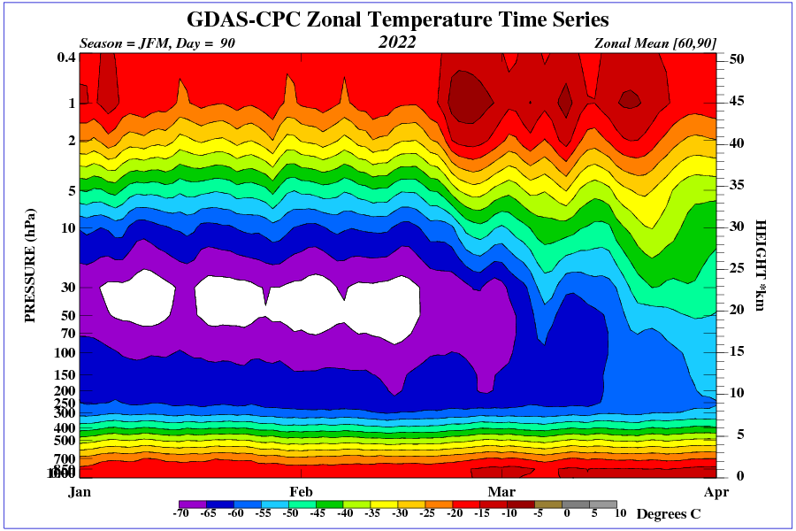
Very low ozone levels between 30 and 70 hPa.
Even more powerful? It’s been strong all (NH) winter.
With the increase in solar activity, the 30-day SOI index rose to over 10.
https://www.longpaddock.qld.gov.au/soi/
These are all ‘shotgun’ graphs, even Fig. 2, depends on the angle of the target and the competence of the choke. I just ran through this, as when you have an order of magnitude difference, it’s quickly obvious it ain’t science. NOAA has a problem!
“The United States Sea Level Rise Task Force is projecting that sea levels along United States coastline will rise somewhere between 10 and 126 inches in the next 30 years or by 2050, relative to those today….All models suggest that the Gulf Stream system will slow down in a warming world and, if so, it’s going to cause more or less permanent changes along the East Coast, higher than global [sea level….. I’m not just a scientist, I’m a citizen of a coastal community. What the data is telling us is that sea levels are rising, and we’re starting to flood more often, and that is the pattern — and the tell-tales are all pointing to more — and I want us to be ready. ” NOAA’s Senior Advisor for Coastal Inundation and Resilience– https://oceanservice.noaa.gov/podcast/feb22/nop52-sea-level-rise.html
The extremes are plausible but not probable or actual, and the correlation with anthropogenic carbon dioxide emissions is frivolous and fleeting.
Couple of years I had look at the California rainfall, concentrating on the data from Los Angeles and San Francisco.
Number of important observations can be made by even a brief look at details of the graph attached.
Thanks Vuk
When I was at school, in geography class nearly 50 years ago, we were taught that that sort of graph is what you’d expect from recording data in a desert
You’d get a similar shaped graph for temperature, also wind speeds.
~
~
It’s just dawned – we Do Not Need to be averaging those graphs.
We need the exact opposite.
viz: We need the (time) Differential, not the (time) Integral, to highlight the spikes and then see if they’re getting ‘worse’ (spikier)
That would tell you if the desert is getting stronger or weaker = greening or browning.
Repeat for Australia, Sub-Sahara, all round The Med & Eastern England (where temps have risen these last 20 yrs)
And still nothing to do with CO2 as the cause – CO2 is the symptom.
I thought it was “hot and crappy!”
Good presentation of reality, Willis. The standard for drought severity, the Palmer Drought Index, has been weaponized, at least by the Oregon Climatologist, by a new index called “the Evaporative Demand Index”. This is an estimate of the tendency for near-term evaporation to modify the currently observable soil moisture. The catch is that future temperature trends are getting rapidly hotter, because, you know, CAGW-We’re All Going To Die In a Burning Hell On Earth. So, western Oregon, to include the Cascades at a current 108% of normal snowpack, recent flood warnings, etc, is actually in a “Severe Drought” category, because, you know,…
Is there a dataset which tracks what temperature rain fall or storms occur at for any area?
I ask because although warmer air can hold more water vapor (7% more per degree C), I don’t believe it can be proven our storms are carrying more rain potential without showing that storms are occurring at different temperatures than they used to.
For example, in the tropics, Willis has shown a max temperature is reached before a rain event occurs and cools the effected area. I would expect if there is additional precipitable water available, the rain storms would occur at a lower temperature because the air is saturated and can hold no more. Another possibility with more precipitable water available is rain events would affect a large surface area.
Rephrasing the original question, is there a datase which tracks the temperature at which rainfall occurs at for a given region? Or a dataset which tracks the surface area affected by rain fall?
“Because of rising CO2 levels and rising atmospheric temperatures, wet areas get wetter and dry areas get drier.”
Or in other words, “Heads I win, tails you lose. No matter what happens, under my theory of global warming, cannot simply be falsified.”
Or, in other, other words, the earth’s climate always reverts to the mean, and all that changes is the variance.
Except, per the analysis above, nothing really has varied, because in a purely random process, there is no variance that can be determined statistically.
W,
You convinced me a few years ago with this: https://wattsupwiththat.com/2018/12/25/the-dryer-gets-wetter/
The last two years in Australia, the drier has been getting wetter and Lake Eyre is filling up again. When Lake Eyre is full, it is Australia’s largest lake.
Nicholas
There is no Australian Climate. The country is made up of multiple climate regions, each impacted by a combination of different drivers.
Any generalisation about floods or droughts is meaningless.
Alarmists must make a specific hypothesis for each region.
Just as there is no “normal” temperature for a region, there is also no “normal” rainfall for a region.
I have an interesting situation. I am finding that it gets warmer where it gets greener and cooler where it gets less green. See here
https://breadonthewater.co.za/2022/01/10/global-warming-due-to-ehhh-global-greening/
See also my comments there.
How strange. What do you think about that Willis?
Thanks Willis
Nice graphs over the global situation.
Convincing me.
But You still have local situations with drought problems.
Can that be likewise analysed?
Fame in Ethiopia or the California drought as examples.
Maybe the faculty at the University of Maine should read AR6, which appears to be gradually coming around to your point of view.
When looking at the “near-term” projections for precipitation they write, in section 4.4.1.3 on page 4-41 :
For the “Mid- to Long-term Global Climate Change” they “project”, in section 4.5.1.4 on page 4-60, that :
NB : It is too early to say whether (or not …) their “in the tropics” is related to your “equatorial thunderstorm daily regulator” conjecture.
In a variant of the “the crowd only regains sanity one person at a time” observation, baby-steps now may lead to large strides relatively soon.
Australia is a land of droughts and floods , has been since ever recorded . CO2 hasnt changed anything except to be blamed for everything particularly bushfires in gov controlled forests etc . .No doubt similar scenarios are found world wide .
If only MR. Willis Eschenbach could have been a lecturer or tutor for the youngsters of todays universities who cant look or see outside the square .
I see a butterfly. or maybe a lobster.
I am not a psychiatrist, but I urge you to curtail your use of sharp objects. Clearly, it’s a bunny rabbit.
Severe frost in the central US. Snow in California.
One might have called this excellent fact checking.
If there had been any facts to check.
But it’s more like myth-busting.
Or just more proof that stuff you make up is usually wrong.