From the “Deja vu all over again” department comes this claim we keep knocking down again and again.
You have probably noticed that dozens of media outlets are parroting a news release from NASA, the National Oceanic and Atmospheric Administration (NOAA), and other federal agencies. Headlines such as Sea level to rise one foot along U.S. coastlines by 2050, government report finds and Seas could rise up to a foot by 2050, posing ‘a clear and present risk’ to U.S. have been common in the media during the last week.
The February 15th report, titled Global and Regional Sea Level Rise Scenarios for the United States, concludes that sea level along U.S. coastlines will rise between 10 to 12 inches on average above today’s levels by 2050.
The report makes forecasts for sea level rise to the year 2150 and also makes near-term projections for the next 30 years.
But when you examine historical sea level data and analyse the trends, this report falls far short of the projections they claim.
In the press release, they say:
This report supports previous studies and confirms what we have long known: Sea levels are continuing to rise at an alarming rate, endangering communities around the world. Science is indisputable and urgent action is required to mitigate a climate crisis that is well underway,” said NASA Administrator Bill Nelson.
NASA is steadfast in our commitment to protecting our home planet by expanding our monitoring capabilities and continuing to ensure our climate data is not only accessible but understandable.
[The] “Science is indisputable…” Riiight. Maybe only in the mind a government employee like Bill Nelson, but disputing existing science is a cornerstone of the advancement of scientific knowledge.
The problem is that projections of significant, even catastrophic sea level rise have been made before, and they never happened. The most famous sea level claim came from a United Nations (U.N.) official, published in the Associated Press.
As we’ve pointed out in WUWT before, in 1989, a senior U.N. environmental official claimed, “entire nations could be wiped off the face of the Earth by rising sea levels if the global warming trend is not reversed by the year 2000.” Obviously, those nations are still there.
Also, in 2005, the U.N. claimed, “Rising sea levels…will create up to 50 million environmental refugees by the end of the decade.”
Neither of these predictions, both based entirely on computer model projections similar to the most recent report this past week, came true. The refugee projection became such an embarrassment for the U.N., it tried to “disappear” the claim. Of course, we were on it and showed the world just how lame the U.N. was in the disappearing attempt.
So with that kind of track record, why should we believe the latest claims of a foot of sea level rise in the next 30 years? We shouldn’t, and there are two good data-based scientific reasons not too believe the projection.
First, the data we have so far does not support the claim when you look at observed sea level trends so far. Much of the areas that could be affected by a foot of sea level rise are in the Northeastern U.S. But, an examination of every NOAA tide gauge in the Northeast U.S. show the observed rate of sea level rise is at or below NOAA’s lowest scenario. Watch this animation in Figure 1 that cycles through several cities in the Northeast:

Secondly, to get to the 1 foot of rise predicted, sea level rise would have to accelerate over what has been observed in the data so far. And so far, there’s very little evidence of it.
As we have noted time and again on WUWT, global sea level has been rising at a relatively steady pace of approximately one foot per century since at least the mid-1800s. Coastal cities, such as New York City, have been managing the sea level rise just fine. As shown in Figure 2, New York shows a steady increase since 1856 with no discernable acceleration.

In NOAA’s own words on their Tides and Currents website that provides Figure 2 above they say this about the New York City data:
The relative sea level trend is 2.88 millimeters/year with a 95% confidence interval of +/- 0.09 mm/yr based on monthly mean sea level data from 1856 to 2020 which is equivalent to a change of 0.94 feet in 100 years.
NOAA’s own tide gauge data doesn’t even support the claim in their most recent report. The data suggests it will take 100 years, not 30, to reach one foot of rise.
There has been very little recent acceleration in sea level rise. Our own Willis Eschenbach has shown again and again how there’s just no acceleration in the data. Even when the scientists claim they’ve found it, Willis points out it is nothing more than an artefact of switching satellite data sets.
But, playing Devil’s advocate, lets assume all of the modest acceleration in sea level rise is due entirely to alleged human-caused global warming, that amounts to an acceleration of only 0.3 inches of sea level rise per decade on top of the preexisting 1.2 inches of sea level rise per decade measured from historical data.
At 1.5 inches per decade, that puts us at 3 decades x 1.5 inches/decade = 4.5 inches
That falls well short of the 12 inches that has been forecast for the next 30 years.
Given the track record of predictions, the observed data, and the disparity of the observed data compared to climate model predictions, there no impending “alarming” crisis of sea level rise, and cities like New York will continue to manage it as they have for over 150 years.
There’s no need to worry, the data tells you so.
Models are their reality.
Its not just the models…its the measurements. Here is a graph of Wismar. The 12 month mean is plotted in dark blue, and the NASA claimed sea level rise is red.
You can see that they match extremely well throughout the 20th century, but, after 1993, the red line starts to diverge from the tide gauge.
Inspection of the 10 year slopes confirm that sea level rise rate has not materially changed over the past 35 years.
Heres a graph of the 10 rise rate at Wismar. The fact that there is no change in behavior over the past 35 years is significant because the behavior from 1925-199 matches that claimed by NOAA/NASA for that time period.
That is, NASA is claiming that for over 50 years sea levels rose globally in unity with levels measured at Wismar, but in 1993, they began to rise faster than Wismar….coincidentally with the change in their methodology.
Per three previous posts on Jason 3 and Sentinal-6, the NASA satellite altimetry is not fit for purpose. And per the post ‘SLR, acceleration, and closure’ it doesn’t close either. QED.
Its not just the models…its the
measurementsstatistical manipulationIn this case the measurements aren’t the problem. The red line is; an artifact of statistical manipulation to fool the eye into seeing a trend that isn’t there.
Climate
scientistsalarmists have a big bag of tricks they use to make measurements tell a story that isn’t real. And sometimes they also manipulate the measurements, like cooling past temperature data to produce a steeper warming trend, or tossing measurements that don’t fit the preconceived narrative. Their torture of data is a crime against humanity.You’re right.
Wismar has an a very long, very high quality sea-level measurement record. Since 1860 the measurements there have recorded no detectable acceleration in the trend:
Interactive: https://sealevel.info/MSL_graph.php?id=Wismar&c_date=1860/1-2024/12&boxcar=1&boxwidth=3
(To see precise values, hover your mouse cursor over the graph traces, or touch the graph on a touch-screen.)
The linear trend is 1.482 ±0.099 mm/yr (which will total 1.6 inches by 2050). That’s a very typical trend, BTW.
At 0.0022 ±0.0048 mm/yr², the acceleration is statistically indistinguishable from zero.
To me, this says it all. I think most would be shocked, given all the propaganda they have heard, that the graph is this banal.
This is exactly the same data relationship happening in Australia today, in the national temperature records. Our NOAA is the Bureau of Meteorology (BOM) and they have the same problem of recently measured temperature data not following the model-predicted AGW temperature rise.
But our BOM are well down the track on this one – they have adjusted the historical temperatures downward to make the recent temperatures fit the modeled trend. They have done it three times, at regular intervals, withouout any serious reconciliation of the historical data with precise measurements taken at the time.
And they will have to keep adjusting the historical temperatures downwards at regular future intervals, as that pesky current data refuses to follow the AGW trend and their narrative. Where Australia finds itself now is with a heavily adjusted official temperature series that is not fit for use.
Watch out for adjustments to the historical sea level data!
The sea level data is almost never shown in the form I have just done. In general, the only data ever presented to the public is cooked data…..cooked and seasoned to the tastes of the bureaucracy.
Thankfully John Kerry is on the job and will save us … https://www.youtube.com/watch?v=h6J4l3g4ygc
This, of course, because The Ketchup Man follows “The Science” (The Personalized Political Science variety) rather than the data driven Scientific Method brand of science. You will be saved once his committee declares that you have been saved and the Bureaucrats rubber stamp it. But you and I know this will never happen because our feeling safe is the very opposite of what “The Science” strives to accomplish.
Perhaps Kerry could ask James Taylor to sing us a sad love song.
In God we trust. All others, bring data.
Sea levels have been increasing for the last 16,000 years. The current rate of sea level rise is 2.2 mm per year, or 220 mm per century, or 8.7 inches per century. The sea level rise rate today is actually much slower than the rate at the end of the last glaciation, about 16 thousand YA, as the current rate would result in total SLR over 16 thousand years of 116 ft, whereas we know that as of today sea level is more than 300 ft higher than it was at the end of the last glaciation.
Which makes perfect sense, sine most of that SLR took place as the result of melting of the ice caps that at one time covered at least half of the world’s land area. What slow SLR there is today is likely not due so much to melting ice but due to accumulation of sediment (eroded land) in the world’s oceans.
And, while alarmists get their knickers in a knot over 2.5 mm per year, and worry about what will happen to those living in Martha’s Vineyard, the tectonic plates are moving (on average) 10X as fast! The plates define the boundaries of the oceans, hence their volume. Yet, nothing is said about that. Except, some have attempted to make the situation look worse by theorizing how isostatic adjustment is increasing the size of the basins. However, if that is something that always happens, then it is just part of the process that limits how much the oceans can rise.
One of the IPCC reports “looked” into other causes of sea level rise. I say looked, but ended up with “outside the scope of this report”.
The main causes are river deposition, airborne deposition and tectonic movement. Somewhere on a hard drive I’ve got the studies showing the estimated volumes of river deposition which is a very considerable amount of ordinary sea level rise.
The amount blown into the ocean from Africa is also considerable and I’ve attached a photo showing a fairly good volume of dust which part of the massive amount that is blown into the sea each year.
Tectonic movement is also a VERY major cause. The thing is that it’s proved very difficult to quantify the impact of that movement. The general consensus (love that word) is the OVERALL the ups and downs balance out. I would say that is quite likely true. BUT, that balance cannot be immediate and must balance over a considerable period of time. Look at east africa. Moving east as it separates from the rest of africa and in doing so is creating a rift valley that is not yet filling with water. While it does that it is reducing the basin that is the indian ocean and must therefore increase sea level. But, as I say, those who have looked at it can only say that eventually it averages itself out.
“Eventually” is just a few eons short of the Twelfth of Never.
To be fair, when considering the possibility of future catastrophes, when “eventually” the East Africa Rift Valley communicates with the oceans, the rift valley will be filled with water and the world’s port cities will be left high and dry.
Nothing is forever, even if alarmists would like that to be true.
There are oodles of ways the volume of the ocean can increase.
Ground water extraction, draining of seas/surface waters, erosion, tectonic effects, changes in ice volumes…
No one has a very good handle on any of these to the extent that would allow precise and accurate quantification and attribution to sea level changes.
Besides for everything else, I do not trust the sea level tide graphs either.
They are not levels, but anomalies that are obtained by highly modeled processing.
Note on every one of the tide gauge charts on the Tidesandcurrents.noaa.gov page linked above, show the following disclaimers:
“The plot shows the monthly mean sea level without the regular seasonal fluctuations due to coastal ocean temperatures, salinities, winds, atmospheric pressures, and ocean currents. The long-term linear trend is also shown, including its 95% confidence interval. The plotted values are relative to the most recent Mean Sea Level datum established by CO-OPS. The calculated trends for all stations are available as a table in millimeters/year and in feet/century (0.3 meters = 1 foot). If present, solid vertical lines indicate times of any major earthquakes in the vicinity of the station and dashed vertical lines bracket any periods of questionable data or datum shift.”
Monthly means?
With all those variables “removed”!
How?
By whom?
Using what algorithms? (Another Al Gore Ism?)
Then this:
“Relative to most recent Mean Sea Level Datum…blah blah blah…”
Say what?
How is it everyone ignores all of that?
We know none of these people can be trusted to report measured data, and here they go right ahead and say in black and white that these are not measured values…they are adjusted…by who knows who…ten different ways, then reported as an anomaly vs a mysterious “mean”!
Imagine using one global mean to adjust all temperature data?!
What value would that have?
And that is just one possible problem, besides for deliberate fudging.
How can we be sure their process for doing this stands up to scrutiny?
Again, we know these guys have the statistics prowess of an 8th grader who cheats on science fair projects.
I do not trust any of those numbers.
What can we trust?
I think we ought to be able to trust the place where the ocean actually is relative to long established landmarks.
And every time this is done, the amount of sea level rise able to be discerned, going back well over 100 years, is exactly zero!
There are scads of old photos, old water lines, etc…and none show anything like a steady rise over the past 150 years like the Battery Tide Gauge or any of the others.
Nor do old graphs and charts from prior to the era of global warming alarmism.
Look at just the blue line on the graph, which is what was published as of the days when data was just reported as measured.
It can be seen that sea level changed in cycles, alternating periods of cycling in a range with other periods of increases.
For example, there was a peak around 1904 or so that was matched about ten years later, but then sea level decline substantially, and the previous 1904 peak was not reached and exceeded again until after 1940. The level then increased rapidly until the mid-1950s, then the trend went sideways again until the late 1970s.
Check it out:
Here is the original version sans the mark-ups done by Tony Heller.
It also has a blurb describing where the graph comes from, which is an eyebrow-raiser all by itself.
Those cretins lie about everything, and have corrupted every data set and methodology.
This is just one more example, as demonstrated by the fact that they just make up blatant lies about the trend, and ascribe a global warming cause to non-existent/minimal sea level rise, not to mention make up wild stories about the way the planet is being ravaged thereby!
I dare say over eighty percent of the world population in developing countries don’t care what happens to the sea level at for instance The Hamptons and the developing world represents 99% of world population growth.
I am so sick and tired of my government lying to me. Is there anything that the government says that I can believe? Lying by government officials is not okay. It is past time to start arresting people like Nelson. You can prove he deliberately lied to the American people. He needs to pay.
The new congress needs to pass a law stating declarations by bureaucrats and political appointees of this sort are equivalent to testifying to congressional committees and are subject to perjury prosecution. The statute of limitations to be at least 12 years to make it almost certain to have to answer to an attorney general of a different political party.
Such prosecution to NOT be defended with government funds unless found not guilty, in which case all funds are to be paid by the government.
That’s a pipe dream… at best!
Whether it is a pipe dream or not, it is more honest than what Nelson is putting out. I am sick and tired of being lied to. The time has come to hold these rascal to account.
I like the idea of prosecuting bureaucrats for spreading blatant falsehoods. It’s long overdue.
I’m with you JR.
Those of us who live in the area know that the tidal gauges such as the one at Kiptopeke actually overstate the amount of increase as it does not take into consideration subsidence, which is considerable in the Chesapeake Bay watershed.
Yes, East coast is no good. The subsidence is well-known.
‘All models are wrong, some are useful.’
“The British statistician
George Box has become famous for his brief but invaluable
aphorism: ‘All models are wrong, some are useful.’ This pithy
statement was based on a lifetime spent bringing statistical
expertise to industrial processes, which led Box to appreciate
both the power of models, but also the danger of actually
starting to believe in them too much.”
From The Art of Statistics by David Spiegelhalter
A restatement of general semantics’ Alfred Korzybski’s, “The map is not the territory.”
Liberals seem to not be able to make that distinction. That is why they are so focused on symbolism and the words used to describe social conditions. They have often passed laws that were impossible to enforce, and when challenged on it, remarked how they were making a statement. I’ve always appreciated Shakespeare’s thorny line, “A rose is just a sweet by any other name.”
This prediction is a good thing. It requires an immediate tripling of the rate of sea level rise. Or a more gradual acceleration to a much higher rate. In either case it’s testable within 2 years, unlike previous eschatological claims. Most if us should still be alive to point this out.
Beyond the actual sea level data versus models ‘glitch’ this post points out lies another SLR alarm fantasy, irreversible tipping points. I wrote about them generally in essay Tipping Points in ebook Blowing Smoke, showing geologically that none actually exist. Greenland is bowl shaped. Antarctica’s WAIS Ronne and Ross are both anchored. Amundsen Embayment’s Thwaites doesn’t have enough ice.
The most egregious attempt to prove there was a past SLR tipping point during the Eemian was by O’Leary in Nature Geoscience 2013. Except the SI enabled me to prove the paper was a blatant case of academic misconduct in essay ‘By Land or by Sea’.
I gave up on trusting seal level rise claims when one report showed sea level rises for different east coast cities … all on the same ocean, some only 100 miles apart … and all different. Obviously they were showing relative land-sea differences at best, and not absolute sea level rise. If they couldn’t even admit that, what point was there in trusting anything they said?
The US is not a good source of tide gauge data. The East is subsiding and the West is seismically active.
Tide gauge data has to be used with some care. I chose the data I did because it was stable and the data came from gauges whose overall slope was near the median.
And in most cases, the alternative to an increasing volume of sea water has more impact on sea level.
Those weaknesses do not apply to Hawaii. Honolulu’s tide gauge is arguably the best-sited GLOSS-LTT gauge in the world.
Hawaii, in the middle of the tropical Pacific, is a nearly perfect place for measuring global sea-level trends. Unlike the north Atlantic and Baltic (where the longest measurement records are), it’s not appreciably affected by Greenland’s gravity. Unlike the U.S. Pacific coast and the western Pacific rim it’s not much affected by ENSO slosh. Unlike the U.S. Atlantic coast it’s not affected by the Gulf Stream and AMO.
Honolulu has 117 full years of continuous sea-level measurements, without even a single month gap. It is also a site with small tides, and little or no vertical land motion (though the whole island chain is moving NW about three inches per year). Here’s what it looks like graphed (and juxtaposed with CO2 measurements):
Interactive version: https://sealevel.info/MSL_graph.php?id=Honolulu
(To see precise values, hover your mouse cursor over the graph traces, or touch the graph on a touch-screen.)
Here’s NOAA’s version:
https://tidesandcurrents.noaa.gov/sltrends/sltrends_station.shtml?stnid=1612340
The linear trend is 1.550 ±0.207 mm/yr.
There’s been no detectable acceleration; quadratic regression yields 0.00103 ±0.01371 mm/yr².
The sea-level trend at Honolulu has been almost perfectly linear for 117 years, unaffected by GHG emissions.
The most stable place on the surface of the planet, tectonically speaking, is the center of the Pacific Ocean, away from spreading centers or subduction zones.
At these places, we have millions of years old seamounts that have long gone dormant and eroded away, and now exist is atolls of coral far above the igneous rocks of the seamounts.
At the gauges at the atolls?
Most show very little or zero rise.
Figure 1 isn’t animated for me.
Tried 2 different browsers, turned addons off, but all it shows is Kiptopeke, VA
Try now, updated the post. Click on the image.
Do they care? No. Drive fast and scare people, that is their operating principle, keeps the money flowing.
I guess Obama and Pelosi don’t plan on passing their oceanfront properties down to their offspring since it’ll be underwater in less than thirty years.
Selfish bastards 😉
A sea level rise of 1 foot by 2050 is not exciting, I really need more to get excited about.
Bach around 2014 or so, the claim of 10 feet of SLR by 2100 was making the rounds. Now, that is something to get excited about. This exciting claim was picked up and amplified by no less than National Geographic and Scientific American. Then the story was picked up by US Public Television (PBS) and broadcast widely. With such august scientific bodies as these fully supporting the prediction, is became impossible to doubt the veracity of the claim. It would hardly be better if even Wikipedia got on board. Such is the strength of the claim.
So in time, I plotted up the Boston SLR data and the 10 feet of SLR running from 2020 to 2100, just to see what it looks like. Boston specifically was mentioned in the PBS story and so is most relevant.
Here I plot the 10 feet of SLR in two ways. First a simple linear calculation, then a constant acceleration rate. The linear is simply 12.5 ft/century. The constant acceleration is rather different. It starts off as 0.0 in 2020 and goes to a jaw-dropping 24.1 ft/century.
Does everybody know what this means? That’s right, It’s Worse Than We Thought.
As of late, the actual cause of the glacial melt causing all this has been revealed. I present this new factor which is causing the situation clearly labeled on the plot.
Everybody remember when Al Gore said “The planet has a fever”? As it turns out, he was not speaking as allegory.
Anyway, here is the plot. (As usual, click to embiggen)
here.
Tony: To get the NASA/NOAA 12″ SLR in 30 years would require a constant acceleration of 7%/year. That would make SLR over 6 mm/y in 10 years and over 11 in 20 years. Considering it’s been ~3 mm for the last 100 years, just what do they think will cause this sudden onset of continuous acceleration? With all the claimed AGW that we’ve supposedly caused since 1950, how come there has been no SLR acceleration already? Answer, it’s just alarmist BS.
I would note that sea level rise is the only consequence of predicted global warming that can be directly related to future economic harm. Without the threat of substantial SLR, its hard to argue for any mitigation policies.
“just what do they think will cause this sudden onset of continuous acceleration?”
COVID!!!! Just as I show on the graph. And as Al Gore said “The Planet has a fever”.
You never suspected that a virus could affect a glacier, cause it to get a fever and melt.
*************************************************
Sometimes all this Global Warming stuff is To Much. There are days I just can not take it seriously. It is the same alarmist nonsense over and over again. And for repetitive nonsense, there is nothing worse than SLR panic porn. Sometimes I just feel like putting out a bit of nonsense myself.
What the chart does show is how utterly implausible the “10 feet by 2100” claim really was. A second look shows the “constant acceleration” curve hitting an astonishing 24 feet/century. Such a rate if SLR is not even possible with the Earth in it’s current state. Now we see that such a claim needs to be mocked and ridiculed as much as we possibly can.
It was COVID. It was the virus what done it.
Sure.
More like at least 6 thousand years.
Yes even if you allowed a greater than ever known rise you are talking a couple of thousand years. What coastal cities and civilization even looks like then is the stuff of sci-fi.
Excellent post – thanks Anthony.
There is something else in this sea level propaganda announcement that is very strange.
In the prior study releases by the same folks in 2012 and 2017 there are reams of qualifications regarding the huge uncertainty of sea level rise models with specific regard to sea level rise scenarios having no probabilities attached to their outcomes
This results because both the global emissions assumptions and sea level rise increases due to future melting of the polar regions cannot be definitively defined.
Additionally there is no method to translate GMSL with any defined accuracy to regional or local coastal sea level rise results or to accurately address coastal height changes as well.
All of these issues are flagged in detail in the 2012 and 2017 reports but completely absent from this latest propaganda baloney.
Therefore use of deterministic terms that future sea level rise outcomes “are expected to increase by”, will increase by”, “will climb by”, etc are completely erroneous because the sea level rise scenarios are incapable of being supported by deterministic science.
This latest sea level rise report is deliberately deceptive because the sea level rise science can’t support deterministic outcomes and these people know that and have concealed it from view to try and achieve political objectives.
These reports are a complete farce.
This is another example of the Biden administration playing fast and loose with the truth in connection with the “catastrophic climate change hoax.” Like when they recently cut about 90 years of forest fire data (before 1983) out of any analysis of trends in forest fires acreage burning, on the premise that “reporting was done a different way” prior to 1983. This is why the Biden administration claims that forest fires have increased in recent years due via to “climate change,” while if you check the data that was cut out, it appears that there was C a LOT more acreage burned back in the early years of the 20th century, such that there is now no real “trend” compared to back then.
So I question everything this senile old scumbag and his leftist minions put out about environmental issues – their agenda is not about “the science,” it is all about power and control.
what little trust i had in government has evaporated these past 2 years.
Larry and Larry,
Yup.
It is all lies, all the time, from the people responsible for this malarkey.
They do not even bother to qualify the lies or give any evidential justification for their outlandish predictions.
Why should they?
They have people believing there is a present day “climate crisis” ongoing, even though no such thing is occurring, whatsoever.
They have billions of people who hate cold weather completely, gaslighted into accepting uncritically the notion that our ice-age-having planet is in grave peril from an amount of warming that is imperceptible to a human being.
deliberately definitively defined, deterministically deceptive…d^5…good ‘un…
Seas could rise up to a foot by 2050
______________________________
That comes to 11 mm/year
The overall rate of sea level rise according NASA is 1.7-1.8 mm/yr. LINK, so when will this miraculous increase of over six times the current rate going to begin to happen? Will we hear trumpets and a giant clap of thunder?
But Steve it’s getting warmer 🤓
Yup, the data says so: http://coolwx.com/record/usamovie.day.php
The Thwaites glacier is going to do it.
It’s going to collapse and cause umpteen feet of sea level rise in just a few years.
Honest. An expert says so.
https://www.sciencenewsforstudents.org/article/antarctica-thwaites-glacier-ice-shelf-collapse-climate-5-years
Yes BS from climate stupids it would take thousands of years to melt that even if it collapsed.
Thwaites glacier melting isn’t caused by the CAGW but by a subglacial volcanic activity. Warmunists are dumb on this.
It also defies basic physics you have constrained surface area above and in some case below. Even an iceblock placed in a frying pan takes some melting.
The new NOAA et al. report is at odds with the IPCC’s AR6 “four of the five available tide gauge reconstructions that extend back to at least 1902 showed a robust acceleration (high confidence) of GMSL rise over the 20th century, with estimates for the period 1902-2010 (-0.002 to 0.019 mm yr-2)” That’s from less than 1 in to 4 inches in a century of extra SLR due to acceleration.
“
That tidal sea rise rate of 2.88 mm/yr you quote for New York City is not all sea rise. About 1.3 mm/yr is caused by land subsidence.
When government employees feel it is their task to tell people what they need to do, they are acting above their pay grade and need to be fired for insubordination. It is not their place to form any policy, that task is decided solely by the electorate.
Or those who are supposed to be their representatives.
You are right: There’s no need to worry about sea-level, the data tells us so. Based on measured current coastal sea-level trends, the world will see an average of only about ((1.5 mm/yr) × 28 yrs) = 42 mm = 1.7 inches of sea-level rise by 2050.
New York has two long, very high quality sea-level measurement records: The Battery at the southern tip of Manhattan, and Kings Point, on the northern shore of Long Island.
As seen in the slight upward curve of that NOAA graph of sea-level at The Battery, the sea-level trend there accelerated slightly, mostly in the 1800s, but also a little bit more recently. My sealevel.info site uses quadratic regression to compute it:
Interactive version: https://sealevel.info/MSL_graph.php?id=Battery&c_date=1930/1-2024/12
The linear trend there since January, 1930 is 3.193 ±0.186 mm/yr (12.6 inches/century), which is about twice the globally averaged trend.
The acceleration is barely statistically significant, at 0.0141 ±0.0156 mm/yr².
An acceleration of 0.0141 mm/yr² continued for 100 years would add 2.8 inches to sea-level.
Using the high-end of the confidence interval, an acceleration of 0.0141+0.0156 mm/yr² continued for 100 years would add 5.8 inches to sea-level. Ho hum. In 28 years an acceleration of 0.0141+0.0156 = 0.0297 mm/yr² would add just 12 mm = 0.5 inch to sea-level.
What’s more, both the linear trend and the acceleration are greater at The Battery than at most other locations, perhaps because the weight of the buildings constructed on Manhattan Island is causing subsidence there.
Kings Point (about 20 miles from The Battery) tells a different story. The linear trend there is smaller, and there’s been no acceleration at all:
Interactive version: https://sealevel.info/MSL_graph.php?id=Kings+Point&g_date=1930/1-2024/12
The linear trend there is 2.332 ±0.194 mm/yr (9.2 inches/century).
There’s been no detectable acceleration; quadratic regression yields -0.0022 ±0.0166 mm/yr² (slightly negative, but not statistically significant).
The highest quality measurement record from the tropical mid-Pacific is from Honolulu. Hawaii, in the middle of the tropical Pacific, is a nearly perfect place for measuring global sea-level trends. Unlike the north Atlantic and Baltic (where the longest measurement records are), it’s not appreciably affected by Greenland’s gravity. Unlike the U.S. Pacific coast and the western Pacific rim it’s not much affected by ENSO slosh. Unlike the U.S. Atlantic coast it’s not affected by the Gulf Stream and AMO.
Honolulu has 117 full years of continuous sea-level measurements, without even a single month gap. It is also a site with small tides, and little or no vertical land motion (though the whole island chain is moving NW about three inches per year). Here’s what it looks like graphed (and juxtaposed with CO2 measurements):
Interactive version: https://sealevel.info/MSL_graph.php?id=Honolulu
Here’s NOAA’s version:
https://tidesandcurrents.noaa.gov/sltrends/sltrends_station.shtml?stnid=1612340
The linear trend is 1.550 ±0.207 mm/yr.
There’s been no detectable acceleration; quadratic regression yields 0.00103 ±0.01371 mm/yr².
The sea-level trend at Honolulu has been almost perfectly linear for 117 years. There’s no sign that GHG emissions are affecting the sea-level trend.
Over the last decade sea-level rise has accelerated sharply along the U.S. southern Atlantic coast, but that’s probably due to Gulf Stream variations (it wanders around a bit):
● https://sealevel.info/MSL_graph.php?id=Key+West
● https://sealevel.info/MSL_graph.php?id=Wilmington
It obviously hasn’t affected New York, probably because the Gulf Stream is much farther from shore, there:
The longest sea-level records are from northern Europe, but that’s close enough to Greenland that when Greenland loses ice the slight shift in gravity reduces the effect on sea-levels in northern Europe. Some long, high-quality European tide gauge records show a slight acceleration, others don’t. None of them exhibit either noticeable influence from GHGs, or enough acceleration to be worrisome. Here are two of the best:
● https://sealevel.info/MSL_graph.php?id=Harlingen&boxcar=1&boxwidth=5 (perfectly linear)
● https://sealevel.info/MSL_graph.php?id=Swinoujscie&boxcar=1&boxwidth=5&c_date=1890/1-2024/12 (slight acceleration)
The “global” (average) sea-level trend is so slow that in many other places it is exceeded by local factors, like vertical land motion, sedimentation, and erosion. Manhattan is one such place. Greta’s hometown of Stockholm is another:
https://sealevel.info/MSL_graph.php?id=Stockholm
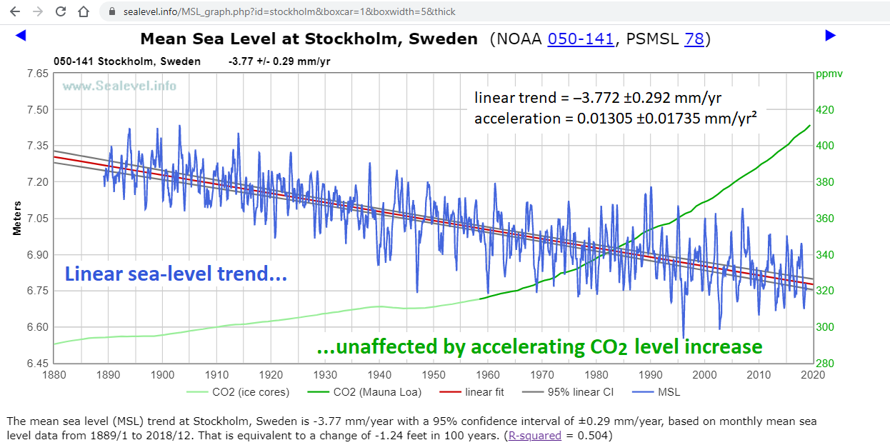
(If sea-level rise accelerated, it would help with Stockholm harbor’s dredging expense.)
Minor correction: 0.0141 ±0.0156 mm/yr² acceleration (at The Battery) is almost statistically significant, not “barely statistically significant.”
NB : On this side of the Pond, “12 inches” = “30 centimetres”.
It took me a lot longer than it should have, but after the initial media releases about this report came out I eventually came up with the graph below.
Notes
1) “LLHI” = AR6’s “Low-Likelihood, High-Impact” scenario, as detailed in “Box 9.4” (from page 9-122) and illustrated in “Figure 9.27” (on page 9-249).
NB : The new report’s “Intermediate” scenario is higher than the median LLHI line.
2) The “Colorado SLR” lines are from Colorado state’s satellite altimetry sea-level data, offset to “2020 = 7cm”.
NB : Here I am assuming, “for the sake of the argument”, that their dataset, including the “Glacial Isostatic Adjustment (GIA)”, is an accurate representation of reality (since 1993, at least).
3) I used a quadratic fit to the satellite data, instead of a linear one, to ensure that an “accelerating” projection would be made into the future.
– – – – –
Conclusion
Whoever came up with this hysterical pile of male bovine excrement are “nukking futz” …
The top couple are unrealistic other world fantasy.
No problem , we’ll just build lots of Noah arks , just no climate scientists allowed on .
“AbstractThe absolute and relative rates of rise of the sea level are computed for the New York City area by coupling global positioning system records of the position of fixed domes nearby tide gauges, with the tide gauges’ records. Two tide gauges are considered, one long-term trend, more reliable, The Battery, in lower Manhattan, and one shorter, less reliable, Sandy Hook, in New Jersey. The relative rates of rise of the sea level are +2.851 and +4.076 mm/yr. The subsidence rates are -2.151 and -3.076 mm/yr. The absolute rates of rise of the sea level are +0.7 and +1.0 mm/yr. The relative sea-level acceleration, reliable only in The Battery, is about +0.008 mm/yr². This acceleration is about the same as the world average long-term trend tide gauge, as well as the average long-term trend tide gauge of the East Coast of North America. The absolute rate of rise of the sea level by 2050 in the lower Manhattan area will be likely less than 30 mm, and the absolute rate of rise of the sea level by 2100 likely less than 80 mm. The relative rate of rise of the sea level by 2050 in the Manhattan area will be likely 85 mm, and the relative rate of rise of the sea level by 2100 likely 228 mm, because of the overwhelming subsidence contribution”
It is incredible that we accept the satellite measurements as accurate within a millimeter. Nobody has recalibrated the instruments, not ever. New satellites have had offsets compared to the old ones, which were simply “corrected” after investigation as to “why” was inconclusive. They just aren’t that accurate. Why do we assume the accuracy to the wavy ocean surface exceeds the accuracy to the DORIS ground stations used to determine the satellite location ? We take millions of wavelength readings of both per second, yet are convinced the large number of readings to sea level are accurate to a mm per year….only a very bad statistician would believe that…..