Polar Amplification: Observations versus IPCC Climate Models

Guest post by Bob Tisdale
We’ve illustrated and discussed polar amplification in a few posts in the past. See here and here. Wikipedia has a short blurb about it:
Polar amplification is the greater temperature increases in the Arctic compared to the earth as a whole as a result of the effect of feedbacks and other processes[1] It is not observed in the Antarctic, largely because the Southern Ocean acts as a heat sink and the lack of seasonal snow cover.[2] It is common to see it stated that “Climate models generally predict amplified warming in polar regions”, e.g. Doran et al.[3]. However, climate models predict amplified warming for the Arctic but only modest warming for Antarctica.[2]
Many discussions about polar amplification around the climate-related blogosphere have similar definitions, leading readers to believe polar amplification is a phenomenon that only occurs in a warming world. But if we divide the trends of the global surface temperature anomaly data since 1917 into its cooling period (1944-1976) and two warming periods (1917-1944 and 1976-2011), and present the surface temperature linear trends on a zonal-mean (latitudinal) basis, Figure 1, we can see that polar amplification works both ways. That is, during a period when global temperatures cool, like 1944-1976, there is greater cooling in the Arctic than elsewhere. Note also that, according to the GISS Land-Ocean Temperature Index (LOTI) data, the rate at which the Arctic warmed was higher during the early warming period (1917-1944) than it has been during the current warming period (1976-present).
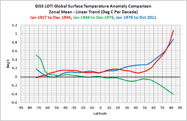
Figure 1
If you’ve never seen a zonal-mean plot before, they’re not difficult to understand. The y-axis (vertical) is temperature in deg C, just like a time-series graph. But the x-axis (horizontal) is latitude, with the South Pole to the left at -90 degrees and the North Pole to the right at 90 degrees. In Figure 1, and in the other zonal-mean graphs in this post, we’re illustrating trends in deg C per decade. Note: I have not included any data south of 75S (the Antarctic) because the data there starts in the 1950s and it is sporadic early on.
Many of you will find it odd that global surface temperatures warmed at such similar rates during the early and late warming periods—especially when we consider that the net effective forcings during the late warming period rose at a rate that’s about 4.5 times greater than during the early warming period. See Figure 2. The GISS net forcing data is available here.

Figure 2
That’s one of the ways the surface temperature record contradicts the hypothesis of anthropogenic global warming. According to the net effective forcing data (and the model simulations presented later in this post), the rate at which surface temperatures warmed during the late warming period should much higher than during the early warming period. But it’s not. The two periods warmed at similar rates. This was discussed in more detail in Section 2 of my book. In fact, Figure 2 above is an updated version of Figure 2-17from the book.
HOW WELL DO THE IPCC’s CLIMATE MODELS HINDCAST AND PROJECT POLAR AMPLIFICATION?
One-word answer: poorly. I’ll leave it up to readers to come up with a two-word answer.
We’ll compare linear trends (deg C/decade) of the GISS Land-Ocean Temperature Index (LOTI) data and the simulations of global surface temperature by the multi-model ensemble mean of the CMIP5-archived coupled climate models that have been prepared for the upcoming 5th Assessment Report (AR5) of the Intergovernmental Panel on Climate Change (IPCC). I’ve used the RCP 8.5 scenario hindcast/projection since it was simulated by the most models and since it is similar to most of the other scenarios during these periods. See Preview of CMIP5/IPCC AR5 Global Surface Temperature Simulations and the HadCRUT4 Dataset. And again, we’ll use the zonal-mean graphs.
As shown in Figure 3, the models do a good job between the latitudes of 30N to 70N of simulating the rates at which global surface temperatures warmed during the later warming period (1976 to present). They underestimate the warming north of 70N and, for the most part overestimate the warming south of 30S. For example, at the equator, the models are hindcasting/projecting warming that is about 1.6 times higher than the rate that’s been observed since 1976 [(0.186 deg C/decade)/( 0.113 deg C/decade)] .

Figure 3
During the mid-20thCentury “flat temperature” period, Figure 4, the models do reasonably good job between the latitudes of 60S-60N, but fail to capture the observed warming of the Southern Ocean and the polar-amplified cooling over the Arctic.

Figure 4
And for the early warming period, Figure 5, the models are not simulating any polar amplification. They missed the boat during this period too.
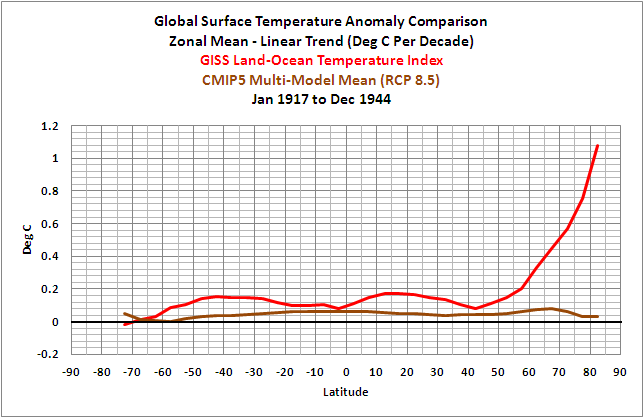
Figure 5
And for those interested, Figure 6 compares the trends of the simulated warming rates for the three periods on a zonal-mean basis. The brown curve of the early warming period should be similar to the purple curve of the late warming period.

Figure 6
CLOSING
This post was just another way of illustrating that the climate models employed by the IPCC show no skill at being able to simulate the surface temperatures experienced over (nearly) the last century. We’ve illustrated and discussed these failings numerous ways in past posts. Refer to the other IPCC model-data comparisons at my blog or in my book.
MY FIRST BOOK
As illustrated and discussed in If the IPCC was Selling Manmade Global Warming as a Product, Would the FTC Stop their deceptive Ads?, the IPCC’s climate models cannot simulate the rates at which surface temperatures warmed and cooled since 1901 on a global basis, so their failings on a zonal-mean basis as discussed in this post come as no surprise.
Additionally, the IPCC claims that only the rise in anthropogenic greenhouse gases can explain the warming over the past 30 years. Satellite-based sea surface temperature disagrees with the IPCC’s claims. Most, if not all, of the rise in global sea surface temperature is shown to be the result of a natural process called the El Niño-Southern Oscillation, or ENSO. This is discussed in detail in my first book, If the IPCC was Selling Manmade Global Warming as a Product, Would the FTC Stop their deceptive Ads?, which is available in pdf and Kindle editions. A copy of the introduction, table of contents, and closing can be found here.
SOURCE
The modeled and observed surface temperature data presented in this post are available through the KNMI Climate Explorer:
http://climexp.knmi.nl/selectfield_obs.cgi?someone@somewhere
Related articles
- If the IPCC was Selling Manmade Global Warming as a Product, Would the FTC Stop Their Deceptive Ads? (wattsupwiththat.com)
- Another GISS miss: warming in the Arctic – the adjustments are key (wattsupwiththat.com)
- Guest Post Titled “Decadal Prediction Skill In A Multi-Model Ensemble” By Geert Jan van Oldenborgh, Francisco J. Doblas-Reyes, Bert Wouters, Wilco Hazeleger (pielkeclimatesci.wordpress.com)
- Comments On The Paper “Skillful Predictions Of Decadal Trends In Global Mean Surface Temperature” By Fyfe Et Al 2012 (pielkeclimatesci.wordpress.com)
As always, thanks, Anthony.
I haven’t checked the CMIP5 hindcasts myself, but for this type of analysis to be useful you need to show error bars and model spreads, and discuss the large forcing/internal variability uncertainties in the earlier part of the record, and even today (aerosols). Even observations in the Arctic are sparse in the early period, and different forcing/internal variability will can lead to different structures in the spatial distribution of temperature change. That said, there is still some issues in underestimating Arctic amplification (at the LGM for example).
The rest of this stuff about the expected forcing response being incompatible with obs or the junk about El Nino capable of explaining the long-term trend is ridiculous. It’s not too difficult to understand why either.
Elegent Bob! What a simple way to show how the ‘forcings’ are no greater than the pre-‘forcing’ period, and the inability of the models to replicate reality at the same time. My answer as regards your query:”HOW WELL DO THE IPCC’s CLIMATE MODELS HINDCAST AND PROJECT POLAR AMPLIFICATION?”, would be: not well.
Note in figure 2 the 2 spikes down for the El Chicho and Pinatuba eruptions in the model forcings. The models over-estimate volcanic cooling by a factor of 2 or 3, and without the exaggerated cooling from these eruptions the model projections would be even further away from reality.
Your charts show less than one degree change. That looks more accurate. The alarmists have been talking several degrees. They are also likely using the extrapolation which in my opinion are not real measurements.
Chris Colose says:
April 24, 2012 at 1:51 pm
It always amuses me when the model defenders appeal to the uncertainties.
Philip,
I don’t know why that would surprise you, or what you think proper scientific protocol is when you have error bars. If we didn’t take into account uncertainties, WUWT would have a post up about how we overestimated confidence (Willis just put up a post the other day on “An Ocean of Overconfidence”).
If there is some event in the past where we neither have good observations or good understanding of the forcings, it doesn’t make much sense to just compare two lines and see if they match up or not. The actual forcing may be different than what is imposed in the model, or the observations may not reflect reality. Moreover, by taking a mean of all models you lose information into the spread of the models and the structure of their variability.
Not that tough to grasp.
Mr Colose,
Your pleading for bigger error bars and greater uncertainties is revealing. Perhaps you have not noticed that making the error bars and uncertainties greater may make your models match the new, fuzzy, reality, but at the same time it makes them useless for any practical purpose. You may not be surprised that I feel your enthusiasm for greater permissable error to be less than helpful.
Give me a big enough spread and I can encompass the whole world.
JF
Given that the warming periods and cooling periods track the AMO, it does not surprise me that the more northernly latitudes are effected more greatly during both the warming and cooling phases. Any model that does not taken into account the 70 odd year AMO cycle is simply garbage.
Err, you’ve forgotten that polar obs are very very sparse in the early days. Without proper accounting for that, this is worthless. Thanks for quoting my wiki-words though. At least some of your post has value :-).
You might also like this old post.
Chris Colose says:
April 24, 2012 at 3:00 pm
Philip,
I don’t know why that would surprise you, or what you think proper scientific protocol is when you have error bars.
Uncertainty is never a defence of anything in science.
You start out with the model uncertainties and then morph that into a critique of Bob’s analysis. I could go on about how the modellers deliberately keep the error bars wide enough to say observations are still within the range of projections, but its all been said before.
The point is that the models in the wider world stand or fall on their utility. And Bob has shown they have little utility in climate prediction.
Chris Colose says: I haven’t checked the CMIP5 hindcasts myself, but for this type of analysis to be useful you need to show error bars and model spreads…”
Feel free to replicate the post with error bars if you choose. We have discussed why I present the model mean, and not the model spread, numerous times in my posts, and I elected not to discuss it once again in this post. Refer to the discussion under the heading of CLARIFICATION ON THE USE OF THE MODEL MEAN in this post:
http://bobtisdale.wordpress.com/2011/12/12/part-2-do-observations-and-climate-models-confirm-or-contradict-the-hypothesis-of-anthropogenic-global-warming/
To sum up that discussion, we’re illustrating and discussing the model mean because the model mean provides the best representation of the forced component of the climate model ensemble.
Chris Colose says: “The rest of this stuff about the expected forcing response being incompatible with obs or the junk about El Nino capable of explaining the long-term trend is ridiculous. It’s not too difficult to understand why either.”
Ridiculous? Junk about ENSO?
You appear to be broadcasting your misunderstandings of both topics, Chris.
First, I didn’t use the word incompatible anywhere in my post, Chris. I assume you’re referring to my statement, “That’s one of the ways the surface temperature record contradicts the hypothesis of anthropogenic global warming. According to the net effective forcing data (and the model simulations presented later in this post), the rate at which surface temperatures warmed during the late warming period should much higher than during the early warming period. But it’s not. The two periods warmed at similar rates.”
Contradicts is not the same as “incompatible”. Maybe that’s why you believe it’s ridiculous, Chris. You’re confusing the words contradict and incompatible.
I linked the GISS net forcings through 2000 in the post, but here it is again:
http://bobtisdale.files.wordpress.com/2012/04/figure-2-2-17.png
As you will note, the trend of the forcings during the late 20th century warming period of 1976 to 2000 is significantly higher than the trend of the early 20th century warming period of 1917 to 1944. Assume for example that all of the climate models use similar net forcings. The multi-model ensemble mean of the CMIP3 climate models presented in the IPCC AR4 Figure 9.5 shows a similar curve for simulated global surface temperatures, and again the trend of the climate model simulations of global surface temperature show a significantly higher trend during the late warming period.
http://i45.tinypic.com/14kg011.jpg
But the HadCRUT3 data, which the IPCC presented in its Figure 9.5 shows similar warming rates during both warming periods:
http://i46.tinypic.com/125t649.jpg
The warming rate of the late warming period should be the significantly higher than the early warming period, Chris. But it’s not. The rate at which the forcings increased is significantly higher during the late warming period, and the forced component of the models represented by the model mean is also much higher during the late warming period, but the observed trends are basically the same during the early and late warming periods—and those two warming periods were loosely defined by the IPCC. The temperature record contradicts forced component of the anthropogenic greenhouse gas-driven climate models, Chris. The rate at which the surface temperatures warmed during the early warming period is about 3 times higher than hindcast by the models. That indicates to any reasonable person that there is an unforced component during the early warming period, and that the unforced component is capable of warming surface temperatures at a rate that’s two times faster than the forced component.
With respect to your apparent misunderstandings of ENSO, Chris, maybe, like the CMIP5 data, you also haven’t checked the ENSO-related data yourself. If you’re not aware, I have been presenting for more than 3 years the ENSO-related processes that cause most, if not all, of the 30 year rise in global sea surface temperatures, using the satellite-based Reynolds OI.v2 SST data. I have presented, discussed, illustrated, and animated a multitude of climate metrics that confirm my understandings of the processes of ENSO. These include sea surface temperature, sea level, ocean currents, ocean heat content, depth-averaged temperature, warm water volume, sea level pressure, cloud amount, precipitation, the strength and direction of the trade winds, etc. And since cloud amount for the tropical Pacific impacts downward shortwave radiation (visible light) there, I’ve presented and discussed that relationship as well.
So if you would, please present your best argument(s) as to why the process of ENSO cannot be responsible for the rise in global sea surface temperature since 1982. In other words, present why you’re stating the discussion of ENSO in my posts and in my book is “junk”. I certainly hope your argument will be something better than the likes of “ENSO is noise that can be removed from the global surface temperature record through linear regression,” or “La Nina events counteract El Nino events over the long-term”. I’ve addressed those arguments here at WUWT so many times and for so long that I simply link past posts. The data confirms my understandings, Chris. But maybe you’ll come up with something new that will warrant a different presentation of the processes of ENSO.
wmconnolley says: “Err, you’ve forgotten that polar obs are very very sparse in the early days. Without proper accounting for that, this is worthless.”
Maybe you missed the fact that I discussed why I did not present data in the post south of 75S. It was precisely for that reason. There’s little to no Antarctic surface temperature data prior to the 1950s. Scroll back up; you’ll find that sentence. And if you’re not aware, it’s common practice for GISS, the surface temperature product supplier for this post, to present trend data on a zonal mean basis as far north as 89N over the periods I used in this post. The GISS zonal mean plot for the 1917 to 2011 trends is below the map in the following link:
http://data.giss.nasa.gov/cgi-bin/gistemp/do_nmap.py?year_last=2012&month_last=3&sat=4&sst=1&type=trends&mean_gen=0112&year1=1917&year2=2011&base1=1951&base2=1980&radius=1200&pol=reg
And here’s the link to the corresponding zonal mean data:
http://data.giss.nasa.gov/work/gistemp/NMAPS/tmp_GHCN_GISS_HR2SST_1200km_Trnd0112_1917_2011/GHCN_GISS_HR2SST_1200km_Trnd0112_1917_2011_zonal.lpl
Bob, excellent article, Great charts as always.
And making a fool out of a pompous crank is always appreciated.☺
Nice work Bob. It’s so simple it’s genius.
Chris. We need all sorts of excuses when observations don’t match theory, but from your point of view it’s never the obvious one. Just try considering that the theory might lack something.
Bob, the burden’s not on me here with ENSO, publish your results…
Chris Colose says:
April 24, 2012 at 6:09 pm
Bob, the burden’s not on me here with ENSO, publish your results…
He has. You just commented on them (rather ineffectively).
PS They’ve probably had a wide audience too.
I am halfway through your book Bob. Most interesting and compelling. This post adds nicely to my rudimentary understanding of what you obviously conceptualise clearly inside your voluminous brain.
And all this using the “official” data, that is likely to be biased against your thesis.
Please keep the pressure on – the more sqeaks coming from the plank the more likely it is getting close to breaking point!
Chris Colose says: “Bob, the burden’s not on me here with ENSO, publish your results…”
Actually, Chris, the burden had been resting clearly on your shoulders. You called my work about ENSO junk. Yet you apparently had NOTHING to substantiate your claim since you returned with NOTHING of substance. If you had understood ENSO you would have been able to return with an educated discussion. But you chose to present the tired old not-peer-reviewed argument. Come back when you’re able to discuss the matter at hand. You’ve turned out to be a typical AGW proponent with little to offer.
Adios.
Bob, I’m curious, if you believe the multil-model ensemble mean provides a reliable estimate of the forced component, I could then argue that 50% of the observed decline in Arctic sea ice cover is externally forced. Do you agree with that type of assessment? Why or why not? Remember too that the model spread provides a measure of natural climate variability. We cannot expect any model to be in phase with the observed record of natural climate variability. Thus the timing of ENSO events in the models is not expected to match that observed. Multi-model ensemble mean provides a robust metric for which to compare against the observations, because the inherent noise in each model simulation is uncorrelated from one simulation to the next, and therefore averaging over many ensemble members reduces noise levels and improves estimates of any overall forced trend.
If you are trying to assess if the models have different trends than observed, why not instead show the trends and standard deviation (after accounting for autocorrelation in the time-series) of the individual ensemble members together with the observed trends? That way you can test the hypothesis whether or not the models have statistically different trends than what is observed.
And what models did you use in your ensemble mean? How did you assess continuity in the historical and future scenarios?
A lot more detail on your analysis, model selection, etc. is needed. Arctic amplification is apparent in the observational record and using the GISS data, the amplification of the last decade is greater than at any other time in the GISS record. While there is reduced sea ice cover during the 1940s in the CMIP5 models (which would results in arctic amplification), the last decade has stronger negative trends (and less sea ice than in the 1940s) and hence the arctic amplification signal is greater.
using the GISS data, the amplification of the last decade is greater than at any other time in the GISS record. © J Hansen
No-skill: clumsy, bumbling, inept, incompetent, ineffectual, unqualified ==> worthless.
Terrific job Bob!
Great stuff Bob! I am much bette informed both on the short-comings of the pretentious models and modelers and the importance of ENSO in explaining hemispheral temp anomolies.
Your detractors connelley and colose (the two combined are not so far from an anagram of ‘colostomy’) are full of hot air aren’t they. All bloat and splatter. Never anything solid…
Thanks Bob.
> Bob Tisdale says:> Maybe you missed the fact that I discussed why I did not present data in the post south of 75S.
No, saw that, but that doesn’t make data to 70S reliable. And of course it isn’t, unless used with care. Which you haven’t done.
> GISS, the surface temperature product supplier for this post, to present trend data on a zonal mean basis as far north as 89N over the periods I used in this post
You can make their website present the data. However the issue is how they use it. I very much doubt that any paper would use it as crudely as you’ve done, and for the obvious reason, which I’ve already said.
Julienne Stroeve says: “Bob, I’m curious, if you believe the multil-model ensemble mean provides a reliable estimate of the forced component, I could then argue that 50% of the observed decline in Arctic sea ice cover is externally forced. Do you agree with that type of assessment?”
Julienne, you’ve slightly modified what I wrote above. I wrote, To sum up that discussion, we’re illustrating and discussing the model mean because the model mean provides the best representation of the forced component of the climate model ensemble.
Your statement assumes the models are correct. I haven’t made that assumption.
Julienne Stroeve says: “Remember too that the model spread provides a measure of natural climate variability.”
Actually, it does not. The model spread represents the range of the noise of the ensemble. Some of the noise results from the poor portrayal of ENSO and other natural variables by models, but much of the noise is simply that, noise internal to the models.
Julienne Stroeve says: “Thus the timing of ENSO events in the models is not expected to match that observed.”
The modeling community needs to raise their expectations. The reason: the natural variation in the frequency, magnitude and duration of ENSO events dictates the amount of heat released and redistributed from the tropical Pacific and dictates the rate at which temperatures remote to the tropical Pacific vary in response to ENSO-caused teleconnections. During multidecadal periods when the frequency, magnitude and duration of El Niño events exceed those of La Niña events:
1. more warm water than “normal” is released from the Pacific Warm Pool,
2. the tropical Pacific releases more heat than normal into the atmosphere,
3. teleconnections cause surface temperatures outside of the tropical Pacific to warm more than normal, and
4. more warm water than normal is redistributed toward the poles and into adjoining ocean basins.
As a result, global surface temperatures rise. The opposite holds true when the frequency, magnitude and duration of La Niña events exceed those of El Niño events.
Julienne Stroeve says: “And what models did you use in your ensemble mean? How did you assess continuity in the historical and future scenarios?”
The source of the data (KNMI Climate Explorer) is linked toward the end of the post:
http://climexp.knmi.nl/selectfield_obs.cgi?someone@somewhere
Click on the “Monthly CMIP5 scenario runs” in the “select a field” menu toward the right. That brings you here:
http://climexp.knmi.nl/selectfield_cmip5.cgi?id=someone@somewhere
I selected “TAS” under “CMIP5 mean” using the “rcp85” scenario. That should represent all 21 models listed thereafter, which include 60 ensemble members. KNMI provided any merging of the historical and future scenarios. If there had been an obvious discontinuity as there is for sea surface temperature data (TOS), I would have ended the presentation before the shift and noted it in the post.
Julienne Stroeve says: “Arctic amplification is apparent in the observational record and using the GISS data, the amplification of the last decade is greater than at any other time in the GISS record.”
How are you defining Arctic amplification? The reason I ask: The following graph compares running global and Arctic (65N-90N) 120-month surface temperature anomaly linear trends based on GISS LOTI data. The Arctic decadal trend was much higher in the 1920s according to the GISTEMP data than it is today, while the corresponding global temperature trends were slightly lower at that time than they are today.
http://i47.tinypic.com/2a9nvyh.jpg
Should I divide the Arctic trends by the global to represent Arctic amplification?
Regards
wmconnolley: Regarding your April 25, 2012 at 12:55 am comment, I and the majority of the visitors here understand the source for the HADISST sea surface temperature data is very scarce in the Southern Ocean prior to the satellite era and that the HADISST data is infilled. We’ve discussed the dataset a number of times here at WUWT. But just as long as GISS treats it as a spatially complete dataset, I will do the same.
And to help you cast aside your doubts as to whether or not GISS would present Arctic and Southern Ocean surface temperature data as “crudely as [I’ve] done”, I suggest you take a look at Hansen et al (2001):
http://pubs.giss.nasa.gov/docs/2001/2001_Hansen_etal.pdf
Scroll down to page 23, and notice the zonal temperature change (trends) plots below the maps. Similar time periods, similar graphs. They even showed the trends seasonally.
Wanna try again?
armidalehigh62to67: Thanks for buying my book. I’ve started writing a new one just about ENSO and need some direction from readers. When you get to the Section on ENSO (Section 6), note where you think I need to make the explanations more detailed or easier to understand. Where can I add more illustrations–graphs, maps, cartoons? And what did I fail to discuss? I know I need to discuss the differences between minor ENSO events and the major ones, but what else? Should I add cartoons that show the transition from El Nino to La Nina events and vice versa?
Bob Tisdale says: April 25, 2012 at 4:36 am>
Much better, well done. The paper is a good ref, but theirs is a different (longer) period, and they don’t over-interpret it.
> Wanna try again?
Not really. But I’d add that comparing one world to the multi-model mean is probably wrong, too.
The reason IPCC models cannot correctly reproduce polar amplification is that there is no polar amplification. Polyakov et al. attempted to detect it observationally in 2002 and came back empty handed. There is Arctic warming indeed but no thanks to polar amplification as IPCC pseudoscience would have it. Arctic warming is not greenhouse warming at all but is caused by Atlantic Ocean currents carrying warm water from the Gulf Stream into the Arctic. Proof of this is available in this article: http://curryja.files.wordpress.com/2011/12/arno-arrak.pdf . The article also works out the consequences of this fact to the rest of the climate system.
Bob: Hansen and his pals at GISS keep calling theoretically calculated absorption changes in CO2 via concentration a forcing on temperature. This is nonsense.The only way to know whether there is ANY effect from the absorption of CO2 on earth surface temperature is to calculate the spectrally integrated outgoing long wave radiation, or the OLR. It has not been done. My bet is that because of the earth’s hydro cycle, there has been no change, meaning water vapor has adjusted accordingly because of the increased emission from CO2 near 15 microns that causes upper tropospheric cooling. Miskolczi’s work computed a decrease in water vapor column amount by .649% of just over 2.5 prcm’s. Hansen has the water vapor/CO2 relationships wrong. The vapor is not a positive feedback on the system, it is negative. That was demonstrated years ago through the founding works of Emden who showed the absorbing and emitting properties of water vapor alone are sufficient to generate an enormous hydro cycle and define tropopause temperatures near 10 Km from the ensuing convective overturn just from water vapor alone. It is no surprise the modeling is dicked up.
Arno Arrak says:
April 25, 2012 at 8:57 am
The reason IPCC models cannot correctly reproduce polar amplification is that there is no polar amplification. Polyakov et al. attempted to detect it observationally in 2002 and came back empty handed. There is Arctic warming indeed but no thanks to polar amplification as IPCC pseudoscience would have it. Arctic warming is not greenhouse warming at all but is caused by Atlantic Ocean currents carrying warm water from the Gulf Stream into the Arctic. Proof of this is available in this article: http://curryja.files.wordpress.com/2011/12/arno-arrak.pdf . The article also works out the consequences of this fact to the rest of the climate system.
Arno, Arctic amplification has been detected in recent years and several papers have been published on this topic. Note that the amplified warming is something you see in autumn and winter, not in summer as surface temperatures are constrained near 0C as the energy from the sun is used to melt the ice. Dr. Screen’s most recent estimates are that 50% of the autumn warming in the Arctic is a direct result of the increases in more open water during the summer and that the rest is an increase in heat transport to the Arctic. Note that you can see evidence of this by the positive anomalies in latent and sensible heat transfer from the ocean to the atmosphere as the ocean freezes up and releases the heat it gained during summer. You also see positive anomalies in sensible and latent heat transfer in the North Atlantic, which is likely a result of warmer SSTs.
During spring you can also see an effect from reduced winter sea ice cover in the Eurasian sector, but you also see a strong signal from increased heat transport as well as a signal from earlier melt of the snow cover over land..
Arctic amplification is not a psuedo-science, it’s a direct result of losing snow and ice cover.
Bob I do find it curious that figures I’ve seen at the IPY meeting in Montreal differ from what you are showing. Perhaps you could show a hovmoller plot by time (on x-axis) vs. lat on the y-axis of temperature anomalies from GISS. I saw a plot like that today which does counter what you are showing. Both show enhanced warming during the same time-periods, but the warming in the last decade is larger than that during the 1940s. I tend to work with the reanalysis data sets which also show different results than you presented.
You could look at deriving an amplification factor, the arctic temperature relative to the global temperature.
Also, note that arctic amplification is a feature mostly during autumn and winter.
Finally if you want to make the argument that the models are not getting the temperature trends right then you really need to look at the individual ensemble members, their standard deviation (after taking into account autocorrelation in the time-series) and testing the hypothesis of whether or not the models show statistically different trends than the observations. If I were to compare the multi-model ensemble mean sea ice extent to the observations, I would conclude that the models remain conservative in regards to the observed ice loss. But, if I include the 2 sigma variance, that is not the case.
Julienne Stroeve says: “Bob I do find it curious that figures I’ve seen at the IPY meeting in Montreal differ from what you are showing. Perhaps you could show a hovmoller plot by time (on x-axis) vs. lat on the y-axis of temperature anomalies from GISS.”
I wish I had the capabilities to create Hovmollers, Julienne. They are a wonderful way to present data–very enlightening.
Do you have a link to the figures from the IPY meeting? Maybe they used different timeframes.
Regards
Bob, I don’t have a link to the plot but I saw the hovmoller in the presentation listed below.I agree that hovmollers are great ways to view variability both seasonally, interannually and by latitude.
G. Lesins1, T.J. Duck1, J.R. Drummond1
1Dalhousie University, Halifax, Canada
Surface and upper air radiosonde measurements starting from the 1950s are presented for Canadian Arctic stations to show that surface warming trends are enhanced compared to the global average (Arctic Amplification) in the presence of a surface-based boundary layer temperature inversion. The high static stability suppresses boundary layer turbulence and prevents the sensible and latent heat fluxes from transporting the positive surface forcings to the free troposphere. The perturbation form of the surface energy balance equation is used to show that Arctic amplification has three contributing factors: 1) the total surface forcing, 2) changes in the latent and sensible heat fluxes that respond to the forcing, and 3) the skin temperature which determines the response of the upward longwave irradiance. The predominance of very strong surface-based temperature inversions during the polar night helps to explain why the recent warming trend is highly seasonal. The enhanced sensitivity of the surface temperature as a result of the inversion will operate regardless of the feedback mechanisms that are operating. The analysis can be applied equally well to amplification from melting sea ice, increases in the meridional heat flux or changes in the local cloud and aerosol properties.
A new measure of Arctic Amplification is presented that is defined as the ratio of surface to upper air monthly averaged temperature anomalies linearly regressed over the entire instrumental record of the station. The Arctic Anomaly Amplification (AAA) is shown to produce similar values to the conventional definition of amplification but with the advantage of being independent of a particular warming period and independent of using a global average as a reference. Hence it will characterize the enhanced amplitudes of Arctic surface fluctuations regardless of whether it is cooling or warming. The geographic variation of the AAA, which can be applied to any station world-wide, provides further confirmation of the importance of the static stability of the boundary layer in determining the sensitivity of the surface temperature to various climate forcings.
Julienne Stroeve: Thanks for the exchange.
Regards
Remember too that the model spread provides a measure of natural climate variability.
Models and the spread between models aren’t a measure of anything. Measures come from measuring real things. And I thought we were repeatedly told the models don’t simulate natural climate variability.
Multi-model ensemble mean provides a robust metric for which to compare against the observations, because the inherent noise in each model simulation is uncorrelated from one simulation to the next, and therefore averaging over many ensemble members reduces noise levels and improves estimates of any overall forced trend.
There is no noise in a model. The models may simulate noise (and I’ll skip over climate science’s abuse of the term ‘noise’), but I’ve never heard that they do. I have seen many times that variability between model runs (what you call ensemble members) results from differing initial conditions.