by Toby Young
Temperatures will climb to a record-breaking 38C next week as a ‘heat dome’ is set to hit Britain, with the Met Office issuing a new four-day warning for extreme weather. The Mail has more.
Record highs of 38C – or more than 100 degrees Fahrenheit – have been forecast for Wednesday and Thursday by the national weather service – breaking June’s highest-ever recorded temperature of a blistering 35.6C in Southampton in 1976 and Camden Square in 1957.
In London, temperatures will rise to a scorching 38C across the two days, while Birmingham will see similar highs of 35C on Wednesday and 37C on Thursday.
Amber extreme heat warnings have been extended by the Met Office from Monday and Tuesday to include Wednesday and Thursday, covering much of southern England and Wales, the East and West Midlands, the South West and South East England, as well as the East of England.
The heat is expected to remain sweltering throughout next week as tropical nights have been predicted in areas where temperatures remain above 20C.
Dew points – indicative of the air’s humidity – are also forecast to be around 22C on Wednesday and Thursday, surpassing the record-breaking July 2022 heatwave, when they remained unusually low, mostly in the single figures, meaning the heat was oppressive.
The new alerts, issued on Sunday, have raised concerns about the potential health impacts for people vulnerable to extreme heat and heat-related issues for the wider population, as well as a possible increase in water safety incidents.
The UK Health Security Agency (UKHSA) has released a separate heat health alert amid the soaring temperatures, which includes most of England from Monday morning until Friday night.
A UKHSA yellow heat alert is also in place for North East England during the same period.
Met Office Deputy Chief Forecaster, Tom Crabtree, said the ongoing heatwave is “developing into an impactful severe weather event, with record breaking June temperatures and very high humidity”.
Mr Crabtree said: “The combination of heat and humidity will be oppressive and bring impacts across society from public health and infrastructure, to power and water supplies.
“As well as very high daytime temperatures, there will be consecutive nights where temperatures do not drop below 20°C, which is called a Tropical Night.
“This will make it very hard for people to recover from the daytime heat, exacerbating the heat stress impacts.”
The scorching temperatures will coincide with rising pollen levels across the country next week, with the Met Office predicting ‘very high’ counts from Sunday.
Worth reading in full.
In Australia, our national broadcaster, the ABC, does this shtick where it makes sensational predications about a ‘record-breaking’ heatwave or a record hot day in the coming week, and when it doesn’t happen, which is more often than not, they don’t say a word.
They did it again just recently.
And it really makes quite a difference where the temperature is measured. !
Met-Office has very few decent, untainted sites left…
… certainly none they will use for their “heat wave”.
I have posted temperatures measured at 850mb by radiosondes.
So your usual go-to of siting and UHI is a non-starter
So what?
“Met-Office has very few decent, untainted sites left…”
850mb temps aren’t measured at MetO sites is what.
They are measured in the free atmosphere by radiosonde.
“So your usual go-to of siting and UHI is a non-starter”
They still used it anyways….
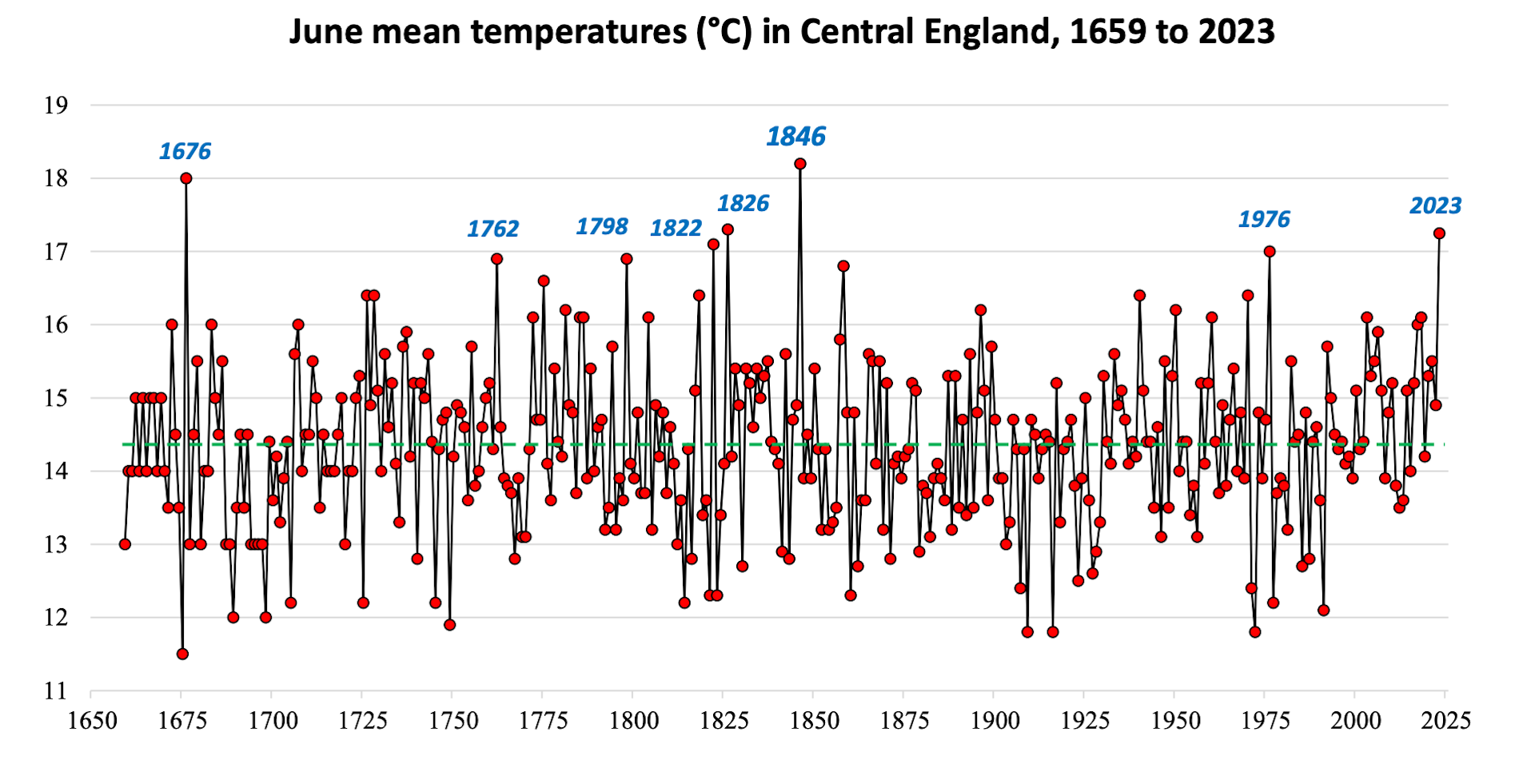
It may be a surprise says UK meteorologist Stephen Burt that “very warm or hot Junes [in UK] have been almost absent within the last 150 years, although they were much more common up to the middle of the 19th century.”
 ?ixlib=rb-1.1.0&q=45&auto=format&w=1000&fit=clip
It may be better to focus on seasonal trends, as they tend to be more reliable (the more data available, the stronger the analysis).
Quite the trend…
Meanwhile I have had 2 weeks below normal temps. Quite the trend
Quite a match to sunshine (which Pommies hate 😉 ), isn’t it.
Even with the farcical sites it is measured at.
This could be nothing more than an artifact of not properly handling spikes in time series, similar to GAT. Spikes that are not properly damped result in a stepped plot. A zero slope from 1940 to 1970, another zero slope from 1970 to 1990, and another one from 2000 to today.
Knowing how climate science statistics from temperature data are trash, ignoring variances and measurement uncertianties, I am not convinced this graph actually tells us anything about reality.
Look at the sunshine duration graph Bnice displayed above. It captures both the year to year variability and the long-term trend in UK mean summer temperatures remarkably well.
Given that these two independent datasets corroborate each other so closely, invoking measurement uncertainty as a blanket objection seems superficial.
Unless you can show that the relationship between sunshine duration and temperature is largely spurious, the agreement between the datasets is evidence that the observed trend is real rather than a measurement artifact.
[deleted]
I actually found the data for sunshine duration during UK summers (bnice is showing annual):
It does appear to explain a good deal of the year-to-year variation in UK summer temperatures, although I don’t know if it can explain the long-term upward trend in average temperature.
That said, the point from my 10:14 a.m. comment still stands.
How is it that variations in sunshine duration and variations in temperature correspond so closely? These are independent datasets, and their relationship is exactly what basic physics would lead us to expect: more sunshine generally produces warmer summers, and less sunshine cooler ones.
So even if sunshine duration does not account for the long-term warming trend, its close correspondence with temperature variability provides independent support for the reliability of the temperature record.
If measurement uncertainty were large enough to substantially distort the temperature data, it would be surprising to see such a consistent physical relationship emerge between the two datasets.
It explains nothing other than a correlation.
Have you heard the adage that correlation does not show a causal relationship. Each dependent variable might be caused by separate causes.
More data:
https://wattsupwiththat.com/2026/06/22/temperatures-to-hit-record-breaking-38c-as-heat-dome-heads-for-britain/#comment-4210032
That’s called correlation…correlation is not corroboration.
Again, you have it completely bass-ackwards. Nobody has any burden to show that a correlation is spurious…That’s the default assumption. the burden is on you to prove that the correlation is OTHER THAN spurious.
There is no relationship. There is a correlation in time only. No idea what the actual functional relationship is.
Unless you have a graph with an independent value that is used in a functional relationship to predict a dependent value, it is impossible to say they are related.
Deniers deny the relationship between sunshine and temperature. What a shock.
Also Bnice2k thinks there is a relationship…:
https://wattsupwiththat.com/2026/06/22/temperatures-to-hit-record-breaking-38c-as-heat-dome-heads-for-britain/#comment-4209696
Why not argue with him?
What do you think these graphs show?
Do you think sunshine (insolation) is has a direct effect on atmospheric temperatures? Is there a subsystem sitting between insolation and atmospheric temperature? How do you account for what that system does in the relationship with surface and atmosphere?
As pointed out, all you have is correlation, no functional relationship. That’s not science, it’s crystal ball gazing by statisticians – which seems to dominate in climate science.
“Increased sunshine appears to affect the variance of minimum temperatures far more than it does maximum temperatures”
June 23, 2026 6:23 pm
We should base our interpretations and arguments on what the data actually shows before drawing conclusions.
Funny, I’ve been pointing out that the relationship between the rise in sunshine and temperatures does not prove the sunshine caused all the warming. But that doesn’t mean you can just dismiss the effects of sunshine on the year to year summer, and spring temperatures. It may be that warmer weather causes more sunshine, and that different weather patterns effect both. But I do think it’s reasonable to point out that the obvious correlation is at least partly the result of sunnier weather causing higher temperatures – common sense for one.
One compelling point I note is that for all seasons the correlation is much stronger for maximum temperatures than for minimums. Another is that it’s much stronger in the seasons with the longest day lengths, Spring and Summer.
However I don’t think increased sunshine can explain all the warming seen.
Here’s the graph showing sunshine verses both maximum and minimum summer averages. The correlation is pretty clear, and it’s also clear that the slope is shallower for minimum temperatures.
This is data from 1910 to 2025.
Incidentally, the point on the far right is the summer of 1976.
For TMAX the slope is 0.014 °C / hour, and the adjusted r^2 is 0.77.
For TMIN the slope is 0.004 °C / hour, and the adjusted r^2 is 0.20.
This implies that for every extra 100 hours of summer sunshine the max temperature increases by 1.4°C, but the min temperature only by 0.4°C.
If sunshine was the only cause of warming, you would expect maximums to be rising about three times faster than minimums, but whilst in fact, since 1977 they have been rising about 50% faster. (1977 chosen as start point to avoid the 1976 outlier).
Summer temperature trends since 1977.
TMAX: +0.45 ± 0.19°C / decade
TMIN: +0.32 ± 0.09°C / decade
Here’s the comparison since 1910, using a loess smoothing.
Final couple of graphs for now – this one shows TMAX summer temperatures as black dots, and the summer shine as a red line. This uses the fitting taken from the linear regression.
One thing that stands out to me is there are a number of recent summers that are somewhat above what would be predicted just by sunshine, and more in the 1950s – 70s which are somewhat below the predicted value.
And now the same for minimum temperatures.
This makes the lack of correlation with minimum temperatures clear, with the sunshine line being much flatter.
One technique I think is a little revealing, is to compare the slopes between temperature and sunshine, splitting the data into 20th and 21st century. This is a purely arbitrary split, but it allows us to see what differences may have occurred in more recent years.
Below are my graphs summer, both for TMAX and TMIN. 20th century is in blue, and 21st century in red.
Both periods show similar slopes, but in both cases the 21st century is somewhat warmer, a bit less than 1°C warmer in fact.
It’s also interesting to note that whilst there has been an overall increase in sunshine, the sunniest summers all occurred during the last century.
The main point of this is it does demonstrate that sunshine cannot be the only factor in determining temperature, or else you would expect there to be a closer fit.
The other point, though I’m not going to illustrate, is that this difference is present in all seasons. Regardless of the strength of the correlation, the 21st century is always that bit warmer than the 20th.
Actual sunshine hours are determined by the rotation of the earth. Pretty much 12 hours on and 12 hours off.
Sunshine hours have more to do with clouds than anything else. Clouds control how much insolation is absorbed by the earth’s surface which then controls the temperature of the atmosphere.
For June through the 23rd here are the highest 5 minute data for insolation.
1114 1044 1020 1186 1172 1033 1187 543 1218 1113 1153 974 1285 1164 1053 1108 1176 1239 1013 1140 1112 1230 1208
Here is a graph for June 23. As you can see the average insolation is far below the maximum due to clouds. Be careful using averages because the hide pertinent information.
“Actual sunshine hours are determined by the rotation of the earth.”
Sunshine hours here are the number of hours of recorded sunlight, that is the number of hours when the sun was shining and and not covered by clouds. You should understand this as you mention it in the next paragraph.
” Pretty much 12 hours on and 12 hours off.”
Do you live in the equator? The sun is up for far more thann12 hours a day in England during the summer.
” Clouds control how much insolation is absorbed by the earth’s surface which then controls the temperature of the atmosphere. ”
Yes that would be a more useful figure, but that’s not what we have. What we do have is the MO’s data going back to 1910 estimating how many hours of sunshine there were each month.
I’m really not sure what point you are trying to make here. It seems to be a common tactic with you to ignore the actual argument and just try confuse the issue with irrelevant details.
No, but the equator of an ideal sphere is the easiest to use because all insolation is normal and a cosine adjustment is not needed.
We do have it. Did you not look at my graph?


Did you not the the soil temperature graphs I just posted?
The information is available. Climate science has ignored it and hoped it would stay hidden so they could use the correlation between insolation and atmosphere temperature as science.
USCRN has all the data in its files. You just need to put it in your spreadsheet instead of temperatures.
“No, but the equator of an ideal sphere is the easiest to use…”
Huh? How does imagining England is on the equator make it easier to compare summer temperatures against sunshine?
“We do have it. Did you not look at my graph?”
You said yourself that’s a graph for a single day. It does not go back to 1910, nor is it for England.
“Climate science has ignored it and hoped it would stay hidden…”
You are living in your own conspiracy fueled world.
“USCRN has all the data in its files.”
Then do your own analysis using that. This question was specifically about how much variability in sunshine can explain variability in summer temperatures – in the UK.
You can not show that sunshine has a functional relationship with atmospheric temperature. You may show a correlation but that is all.
A functional relationship does exist between the surface and the atmosphere. Why don’t you display that in a graph?
Searching for correlation is not science. It is psuedoscience.
“You can not show that sunshine has a functional relationship with atmospheric temperature.”
I can show you very easily it does not have a functional relationship. That’s your obsession. Nobody thinks you have to have a functional relationship for there to be causation.
“Searching for correlation is not science. It is psuedoscience.”
Do you tell bnice2000 this every time he claims all warming is caused by increased sunshine? Did you object to Paul Homewood’s article about increased spring warming being caused by sunshine
https://wattsupwiththat.com/2026/06/06/sunny-springs-linked-to-warmer-weather/
More fun with graphs. All you have to do to take a mild trend and make it look “Scary” is to narrow the range shown on the ordinate (y-axis). Human habitation exists in places where the average summer temperature ranges between 0°C and 40°C., roughly 10 times the range shown here on this graph. In other words, if the range were to fit something physically real, in this case, the range of human habitation, the trend would visibly shrink by a factor of 10 to the point that it is barely discernible.
In practical terms, no living person in the UK can realistically claim that he can sense a gradual increase of 1°C in average temperature spread over his lifetime.
On the other hand, many Britons and many Americans happily move south to warmer climates for vacation and retirement. For the Britons, that is often to Spain (notably the Costa del Sol around Malaga) and southern Portugal (the Algarve around Faro), a voluntary 5 to 8°C increase in summer and year-round average temperatures. In the U.S., which sees Northerners moving to places such as Miami, Tampa, Houston, Brownsville, and the Gulf of America coast, retirees happily opt for an even greater temperature difference in the range of 9 to 17°C. These differences are substantially greater than even the worst, implausible projections of the climate modelers.
These are of course averages, and with few temperate zone exceptions (e.g., Southern California), practically everywhere experiences, natural variability well above and below these averages, with occasional extreme events. Thus we have the popular and sometimes humorous truisms such as:
“If you don’t like the weather, just wait a minute”
“Texas has two seasons: summer and winter—usually alternating within the same day/week.”
“Climate is what we expect; weather is what we get.”
“Human habitation exists in places where the average summer temperature ranges between 0°C and 40°C., roughly 10 times the range shown here on this graph. In other words, if the range were to fit something physically real, in this case, the range of human habitation, the trend would visibly shrink by a factor of 10 to the point that it is barely discernible.”
That “0°C–40°C human habitation range” doesn’t really make sense in this context. We’re talking about UK summer temperatures, which sit in a much narrower band, so dragging in a global “habitable range” is just an arbitrary rescaling.
“In practical terms, no living person in the UK can realistically claim that he can sense a gradual increase of 1°C in average temperature spread over his lifetime.”
An increase in average temperature doesn’t simply mean every day becomes uniformly warmer. Instead, it shifts the entire temperature distribution, making extreme heat events more likely.
Heatwaves like the one seen in July 2022 reflect not only natural variability in the far end of that distribution, but also the fact that the whole range is moving toward higher and more frequent temperature extremes.
Whenever there’s a UK heatwave, the inevitable 1976 summer reference pops up, as if one especially hot summer from half a century ago somehow cancels out the broader warming trend. It’s a familiar routine at this point, less an argument than a reflex.
Maybe the blog could retire that particular refrain. It’s so transparent it’s pathetic.
Your chart starts at about 1880 which is at the tail end of the LIA, that 300 yearlong running cold…thus warming is to be expected…., the other chart you pretended to respond to starts at 1659…..
Try being honest it will make you feel better.
“thus warming is to be expected”
Not this much. We live in unprecedented times.
Thank you. Haven’t seen the word “unprecedented” in a long time.
Not really it warmed just as fast other times in the past without all that bubbly CO2 you are so afraid of.
“Not really it warmed just as fast other times in the past without all that bubbly CO2 you are so afraid of.”
It depends on how far back in the past you’re referring to. If you’re talking about the Holocene, then that claim would be quite mistaken.
https://www.pnas.org/doi/10.1073/pnas.1616287114
Global warming is so scary.
He called it ‘Flaming June’ – not ‘Flaming July’ or ‘Flaming August;!
Flaming idiot.
And therre will be torrentiall rainns of locusts evverywherre.
“…breaking June’s highest-ever recorded temperature of a blistering 35.6C in Southampton in 1976 and Camden Square in 1957.”…
Which begs the question: What caused the 1957 and 1976 record highs that they were records? It apparently wasn’t CO2. And, you know, when records are begun to be kept, eventually they are going to be broken – that’s the nature of records.
For example, didn’t Michael Phelps break several swimming records in 2017. And he broke the records when CO2 levels were high and rising, and the air at the Olympic venue city was arguably the most polluted air in the world at the time. <– This record breaking suggests that as CO2 levels continue their wonderful (more food production to feed the masses) rise, we should expect more and more records in ALL intense aerobic sports; i.e. there is apparent causation; rising CO2 levels causes more Olympic record breaking. Graph the two metrics (Increasing Olympic records and Rising CO2 levels) against each other, and I bet one line will cover the other.
Rising CO2 levels causes more Olympic records. Who wouldn’t want more Olympic records?
Nice extrapolation of their techniques. 😀
https://www.torro.org.uk/extremes/date-records/max-temp
link to British temp records for June , shows 30 + C every day of the month , some records go back to 1800s
And nothing remotely near 39/40C which is on the cards Wed/Thurs.
UHI + mild overall warming. Next question.
BBC have changed their predictions for where I live in NW London from 39C to 35C and 34C. Which says they are either playing games or they don’t know what they are talking about…to get it that far wrong makes a mockery of calling it a ‘weather forecast’.
Weather Guessers
Let’s see what actually happens
On Wednesday peak temp was 36.1C in Hampshire previous record 50 years ago in Hampshire was 35.6 C no 40C
Records are to be broken. My favorite 17 year old track star isn’t finished and there are others.
Cooper is amazing!
But borrowing a line from obama, Cooper didn’t do that, CO2 did, because as I illustrated above, CO2 is the cause of faster track times.
All extreme heat events in the UK occur because hot air is drawn northward from the Sahara over Spain and France or The Bay of Biscay with subsiding air aloft under High pressure.
The difference between this coming event and previous record temp producing ones is that the inherent airmass is several degrees hotter.
These are charts of temperatures at 850mb (5000ft) – which is indicative of potential surface temps via adding 15C to them (DALR of 3C/1000ft) and then depending on the strength of the surface wind there will need to be a surface super-adiabat value added (up to 3C usually).
1957:
1976:
2026 (Forecast);
This is a more detailed version of the above forecast 850’s from the ECMWF:
21 +15 +3 =39C
Gotta luv that 22C is coloured bright red ! 😉
Such an intelligent, inciteful reposte.
bnice when the usual b****ks eludes him.
You love your JUNK data, and bright red colours for cool temperatures.
The Met-Office way !!
It correlates 97% to your posts.
That’s because you’re a denier (of AGW) and dont understand, or more likely don’t want to understand, meteoroogy else it explodes your cognitive dissonance.
BTW: I take the comment as a compliment as the choir peeps here will always disavow evidence that challenges their world view.
Any other inciteful comment?
No, it is because you insult the intelligence of many here who see the dishonest bullshit you promote in every post, meanwhile your numerous error prone posts are showing up because you assure the rest of us by accident…….
THE SKY IS ON FIRE!
RUN AWAY!
Re-Analysis. When the original analysis didn’t do what you wanted it to do. 😉
Interpretation:
I don’t believe data becasue it’s not what I want it to be.
This isn’t reanalysis ….
SkewT balloon ascsent from Herstmonceux E Sussex 00Z 28th Jun 1976.
Compare with above 850mb chart ( it’s actually 16.4C ….
—————————————————————————–
PRES HGHT TEMP DWPT RELH MIXR DRCT SPED THTA THTE THTV
hPa m C C % g/kg deg m/s K K K
—————————————————————————–
1009.0 144 21.0 15.0 69 10.68 90 1.0 293.4 324.1 295.3
1003.0 196 26.4 14.4 48 10.33 88 1.2 299.3 329.8 301.2
1000.0 223 26.2 14.2 48 10.22 87 1.3 299.4 329.5 301.2
957.0 610 24.4 11.4 44 8.88 75 2.5 301.3 327.8 302.9
943.0 739 24.4 8.4 36 7.35 70 2.9 302.6 324.8 303.9
850.0 1638 16.4 8.4 59 8.16 40 5.7 303.3 328.0 304.8
This is Herstmonceux at 23Z 23rd Jun 2026 ..
850mb temp = 20.0C
3.6C warmer than that pertaining for the 1976 event.
And Camborne at the same time (20.2C )…..
Then why are the top two labelled as such from NOAA/ NECP?
The SkewTs are actual observations. The charts are reanalysis.
Wow! What do you think might be causing it?
But cheer up. Greenland is not going to melt this June.
The Arctic and Antarctic are actually unseasonably COLD as we speak. As is much of Western Russia. AS is Argentina, Australia and New Zealand.
Global weather is not the same as Western European weather by a long shot.
It just seems like that when cold events are never reported but hot ones become politically charged incidents.
So on average everything is normal………Hot in one spot cold in another. On average your comfortable.
“Extreme” 😉
1976 Temperatures are at midnight (0:00) while 2026 temperatures are at 14:00 (locally) :
Moreover the last picture is constructed from a forecast while the previous two are constructed from observations.
Flawed comparison.
Also 1957 was at 1200 Zulu+1, 1 hour before solar noon at 1300.
“Flawed comparison.”
The temperatures are for 5000ft, where there much less radiative cooling ( there is for the surface as that is a radiative surface (can only radiate to space and not all around – which means LWIR will have no route back to that level form below)).
What there is, is advection which may or may not overcome that lesser cooling. it seems between 00Z and 12Z and even 18Z.
This is the ECMWF forecast for 15 hrs the ECMWF chart I posted above.
See any shange? …. continued advection
Whereas this is the 15hr difference beteen surface temps this oncoming event ……
VS
If you have the charts for midnight on those dates, presumably you also have the charts for 14:00. Let’s see them.
Personally I would argue that daytime maximum temperature is not the metric that should be used but the overnight minimum.
Also, is the comparison of temperatures at altitude as presented really meaningful? If there’s a heat dome caused by a high pressure system above the surface air system and the temperature at the surface increases due to adiabatic processes, then isn’t a more meaningful metric the pressures involved?
Which charts?
The temperature charts that you have shown above for midnight and compared to 14:00. Show us the charts for 14:00 on those dates. Or have you run out of red crayon?
Surface or 850mb ?
BTW: There are no 1400 surface data available on reanalysis charts just 00, 06, 12, 18Z.
Same for 850s.
Here are reanalysis 12Z surface temp charts for 1957 and 1976 events, and as a bonus – the zoomed-in versions:
“Or have you run out of red crayon?”
Oh, how I larfed
Bunter’s starting to sound a little cranky. Is bnice2000 getting to him?
No, I’ve long realised he is beyond any reason that would be put to him here …. Just a little jocularity to see how much I can provoke him.
Never lets me down.
Banton you really do love your extreme arrogance!
Yes, this is indeed the cause, and cold air from the Arctic is similarly the cause of UK extreme cold episodes.
But the question to ask about the UK is a different one: its about the justification of what the political and media class thinks of as the country’s climate+energy policy. Its about priorities and how best to enhance national well being.
Recent statistics from the National Health Service.
By March next year there will be 2 million people waiting for a diagnostic test, and about a quarter of them will wait longer than 6 weeks. The current number is 1.95 million. The waiting list for treatment is 7.22 million. In 2025 953,000 people gave up and paid for private admission, despite in theory being fully covered by the NHS and entitled to prompt free treatment. This is crazy. No private organization could survive providing this level of service.
Meawhile, here in real time is the cost of Net Zero for electricity generation:
https://subsidyclock.co.uk/
The question is, whether, even if you accept the view that this weather is due to global warming and reprsents some kind of crisis, this is a sensible set of priorities. You can ask similar questions about the defence spend. You can also ask whether its sensible to be spending this amount on alternative energy generation, rather than, for instance, more moderate sums on adaptation to weather that is going to happen regardless of Net Zero.
Every time there is a hot day the UK is told that this is unprecedented and a desperate emergency and due to global warming. And the implication, explicit or implicit, is that in some way the Net Zero program is justified by the alarm about UK hot temps. But it isn’t. It will have no effect whatever on UK weather, and it won’t even power the country properly.
The climate activists would much prefer to keep arguing about whether this weather is or is not unprecedented and due to global emissions, and never argue about what Net Zero will actually achieve on the supposed problem. Because it diverts attention from the increasingly obvious fact that even it it is unprecedented and problematic, the wind+solar agenda is completely the wrong response to it.
If you look at the pressure system for January to March 1963, there was a high pressure system over the U.K. leading to our extended cold winter.
“Yes, this is indeed the cause, and cold air from the Arctic is similarly the cause of UK extreme cold episodes.”
Except the cold outbreaks are not increasing nor getting more extreme.
“But the question to ask about the UK is a different one: its about the justification of what the political and media class thinks of as the country’s climate+energy policy. Its about priorities and how best to enhance national well being.”
It may surprise you – but I agree.
Milliband is a zealot.
The world will keep on burning FFs.
And the UK’s response will make no difference.
Anything done needs to be affordable.
“Except the cold outbreaks are not increasing nor getting more extreme.”*
Just what you’d expect when STILL emerging from the coolest period in the last 10,000 years.
*Neither are the hot ‘outbreaks’ btw:
June 5, 1950 – The Flying Scotsman train derails at Tollerton, Nottinghamshire due to heat-buckled track.
2 June 1975, A cricket match in Buxton, Derbyshire. between Derbyshire and Lancashire, had to be postponed due to a freak snow storm.
It’s called “natural variability”
Not forgetting the winters of 1947, 1963 and more recently 2018.
Eh, 2018 was NOT (edit!) a significantly cold winter, nothing like 47 or 63.
There was certainly a cold period https://en.wikipedia.org/wiki/2018_British_Isles_cold_wave
I commented that it occurred exactly 55 years or 5 solar cycles after the 1963 winter.
“It’s called “natural variability””
Get away!
Cept the “natural variability” is producing more extreme heat plumes, well, since we can know…..
And not forgetting 2020, 2022 and 2025.
Measured at Met Office sites…
The data is meaningless because such a large percentage of sites are basically JUNK sites, and not fit for any comparison of temperature over time.. !
Did you not look?
Heck, wot a surprise.
I show 1976 as measured at 850mb in the free atmosphere 16.4C … which was 3.6C cooler than the 850temp at midnight last night.
He’s really stupid.
You’ll often see Charles Rotter step in and moderate his own posts because of that.
I know – did you see when he was abusive and posting in CAPS here?
Charles eventually came down on him, and has kept on him on a least civil behaviour since.
I find it sadly illuminating that many in the choir don’t challenge him.
Mind, they will have seen the futillity of it via his responses here.
“I find it sadly illuminating that many in the choir don’t challenge him.”
It’s an echo chamber thing. If you question the narrative here, the digital pitch forks come out.
That happened to Richard Greene.
He had the absolute audacity to suggest that maybe, just maybe, the “CO₂ can’t warm the planet” idea wasn’t airtight… and shocker, that didn’t exactly go down well.
You are stupid as well so there is that
His love affair with the MET office has reached legendary status.
The man would have said the same crappola from 1920-1941 when it was warming significantly then….. they fail to realize that near the end of warming trends will naturally be among the highest or the highest of the short time periods they scream in fear over.
That is why I know he isn’t credible.
measured with your junk MO sites of course.
Glad to hear it! The two topics are totally independent, but its rare to find people who evaluate them independently.
Everyone: give Mr Banton credit. He is often criticized as if he were simply following the usual party line. But he is not. He may be right or wrong, but he’s thinking.
“He may be right or wrong, but he’s thinking.”
Thank you.
Yes, thinking using my met knowledge.
Well, using MET data is thoughtless.
Wot a stupid comment.
But then it is made by Mr Sparta
Then cancel your next holiday flight as the data the pilots fly with on their briefing charts will have come from the UK MetO.
After all, I wouldn’t want you to crash into the Med or whatever.
“the data the pilots fly with on their briefing charts will have come from the UK MetO.
”
yet another stupid comment.
Do you really intend to be that dumb or is it a MO condition??
ie.
More than likely metar data for an international flight DO NOT come from the UK MetO.
Of course on your little island you can’t think the rest of the European union still matters….but hey carry on in your little island “group think”!
“Except the cold outbreaks are not increasing nor getting more extreme.”
And that’s a very good thing. It means fewer cold deaths, which still outrank heat deaths 9:1. Warmer is better.
With the more than $15 trillion we’ve thrown away on the energy transition, yes, we could have provided infrastructure to developing countries: air conditioning, fans, the implementation of dike construction projects with Dutch participation (who have some of the best hydraulic engineers in the world, because, as everyone knows, necessity is the mother of invention); worked on irrigation systems to make agriculture possible in arid regions (some of which are actually beginning to turn green again, much to the delight of the local populations); built seawater desalination plants; drained swamps teeming with those damned mosquitoes that spread malaria to everyone (though I know environmentalists who refuse to kill a mosquito because “it’s a mother feeding her young”); conducted research into GMOs (but those same environmentalists believe we should not “profane living things”—even though Golden Rice was designed to prevent blindness among severely deficient populations), and countless other highly useful initiatives that would have had the extraordinary advantage of serving humanity.
I am both appalled and terrified. We ought to coin a portmanteau word to capture this subtle and painful blend of dismay and anxiety in the face of this widespread intellectual decline and this rejection of progress (which has been rather foolishly rebranded as “technosolutionism”).
Since you mentioned mosquitoes, I’m going to go off-topic ever so slightly and give an update of CO2 as the magic molecule:
It was reported on the radio this morning (so it must be true) that mosquitoes detect humans by sensing the CO2 that they exhale, and fly toward that CO2 source, eventually detecting their target with their sweat and other things. The upshot of the article was that CO2 causes mosquito “bites”. It’s because of Climate Change.
I just googled that information, and indeed! It hardly surprises me coming from those little creatures. I’m lucky not to be very attractive to mosquitoes, unlike my mother, who, when she was young, used to get the area around her eyes sucked dry every summer. I think that if they don’t like whatever it is you give off, they leave you completely alone.
The host of the program you were listening to this morning at least had the decency not to claim that breathing is what causes mosquito bites! Tired of being bitten?… Forget citronella and all those other remedies. Stop breathing—it’s more effective (and better for the planet)!
Whether it’s the wrong response or not depends upon whether you are one of the masses paying for it or one of the lucky ones filling their pickets with massive subsidies.
“The difference between this coming event and previous record temp producing ones is that the inherent airmass is several degrees hotter.”
The “local” airmass. Please be specific. Some people might think you are talking about the whole world.
No, Obviously, I am talking about the airmass advecting over the UK.
So, one takes a computer-predicted temperature at 850mb, then “corrects” it by adding the assumed temperature difference to sea level using a constant lapse rate, and then one corrects it again using the surface super adiabat difference.
Oh dear, oh dear, oh deary me. We’re all going to die. From the endless caterwauling about fine summer weather.
Yes, it’s going to be about 100F (38C) at the end of this week. Nobody is panicking around here In Oklahoma.
I suppose it boils down to what someone gets used to weather-wise.
It Is – but more imortantly what our infrastructure is built for.
Funny I lived through plenty of 100+ f days in the 60s and 70s with no AC or frankly anything. Worked 120 degrees in a factory with high humidity. Still didn’t die. Got really tired, had to take lots of breaks, cold showers but still found time to go hit the pitch.
what?? don’t tell me the poor islanders don’t have infrastructure than can handle a little extra heat??
Oh, I forgot of course 2 flakes of snow in the UK and the entire country comes to a halt!
Keep on hyping Banton!
Yes. In SoCal, people put on their parkas when it’s 60F.
Not all of us, Jeff! But, OMG, the forecast (guess) for the next week for the Southern California Coastal Plain is a couple days with highs in the 90’s. (about 34C – and hardly unprecedented). How will we survive? How did anyone survive before air conditioning was invented and residential and automobile air-conditioning were developed?
19C in Hastings today.
Here in rural Chertsey, Surrey it’s 28ºC.. well, it isn’t, but that’s what they would like you to believe. Since they surrounded the site with a solar farm and sent readings through the roof, they now re-direct you to Europe’s busiest airport for your ‘local’ weather:
https://weather.metoffice.gov.uk/observations/gcpsk6tuw#?date=2026-06-23
UK Met office. Never knowingly understanding of UHI.
forgot to post the screenshot..
It may surprise you Kew/Heathrow didn’t feature yesterday, peak heat was further west for a change.
Temps at 11Z …
25C+ currently, heading for 32C.
It was a bit drizzly earlier.
We shall see. The storms yesterday seem to have taken all models by surprise. My guess is that the more unusual the weather is, the more difficult it is to predict.
No, some were predicted … but as you say difficult (mesoscale events).
That might be the case. I should have said I hadn’t noticed any forecasts for rain, but that might be because I hadn’t looked too closely.
I looked at the BBC website weather for my locale and it had wall-to-wall sunshine for a week. So when the rain came at 9.30pm, it was NOT in the forecast. Temperature forecasts have now dropped 4-5C for later in the week, peaking at 35C.
No one has ever been “good” at predicting the weather. Some are luckier than others.
Hi Bellman,
Do you happen to have the correlation coefficient between UK summer sunshine duration and UK mean temperature residuals?
I’d like to download the data from the Met Office UK temperature, rainfall, and sunshine time series here:
https://www.metoffice.gov.uk/research/climate/maps-and-data/uk-temperature-rainfall-and-sunshine-time-series
However, I can’t seem to find a direct download link for the dataset.
“However, I can’t seem to find a direct download link for the dataset.”
I think you want
https://www.metoffice.gov.uk/research/climate/maps-and-data/uk-and-regional-series
That allows you to download the data for any series and region.
As far as the correlation, I’ll have top check for the UK. For England Summer I have adjusted R-squared values of
TMEAN: 0.54
TMAX: 0.72
TMIN: 0.20
Summer naturally has a higher correlation than any of the other seasons.
Thank you very much.
Fortunately the forecasts for the next few days have dropped by a few degrees for me. Still above 30°C which is too hot, but not the higher 30s that had been forecast previously. I think this is more to do with changes in position than with the intensity.
There’s a really strong difference of opinion for other areas between the MO and BBC. Looking at Brighton, the MO forecast maximums of 36°C for Wednesday and 38°C for Thursday, whilst the BBC say maximums of 29°C for both days. But again, I suspect this is to do with were the models put the edges of the heat.
Provisional record June temperature of 36.1°C set in Gosport on Wednesday. Beating the previous record of 35.6°C set in 1976, in Southampton, about 20km away.
The record has now been beating three days in a row, with a provisional record of 37.3°C at Santon Downham in Suffolk today.
There was also a record for warmest June minimum with 23.5°C set in Cardiff.
All of this is provisional and some results may be ruled out – but regardless I expect there will lengthy posts here explaining why none of them count.
Personally I don’t put too much store in these individual records, especially when they are for a calendar month. But it is clear the forecasts were pretty good. The idea that it’s just luck is preposterous.
Additionally – note the difference in humidity between the Jul 19th 2022 event and this ….
VS
The reason is that the airmass track has been over biscay rather than France.
Refreshing to read a post and comments all about some ever-present weathers instead of “THE” climate.
OMG !
That’s as bad as Chicago or New York !
101 _iota
i 40 -i .. i>f c>f ,L fmttbl| 5 _partition s" || " fmttbl | c>f TABLEOMG !
That’s as bad as Chicago or New York !
101 _iota
i 40 -i .. i>f c>f ,L fmttbl| 5 _partition s" || " fmttbl | c>f TABLEThe post at notrickzone of 22 June 2026 by Kenneth Richard reports that lack of clouds has allowed “widespread increase in sunshine duration (SD)”.
I have it on good authority that sunshine tends to warm things. One can also assume that if the mean of a distribution of data is moved to the right, that is higher, then the probability of breaking “high-records” will increase and the probability of breaking “cold-records” will decrease.
So, answer me this: Why has there been a widespread increase in sunshine duration?
Gemini sez:
When evaluating sensational headlines like “Temperatures to Hit Record-Breaking 38°C as ‘Heat Dome’ Heads For Britain,” a critique of cherry-picking a limited time frame requires separating weather events from climate trends.
Media reporting frequently uses narrow parameters to manufacture “record-breaking” narratives.
To declare a “new record,” headlines often narrow the window of comparison so strictly that the record becomes a statistical inevitability rather than an anomaly. Declaring a “June record” isolates a single calendar month from the broader summer season. If 38°C occurs on June 24th, it is framed as “unprecedented history,” whereas the exact same temperature occurring three weeks later in mid-July would simply be called “a hot summer day.” Isolating data by arbitrary human constructs (like the calendar month of June) splits a continuous natural cycle to find a window where the data point looks extreme.
A short-term heat event driven by a transient meteorological feature—such as a “heat dome” or a temporary influx of hot air from North Africa—is an expression of localized atmospheric dynamics, not a structural shift in baseline climate. For a record to have true climatological meaning, it must be evaluated against long-term baselines, deep-time data, not 30 years. Confusing a 48-hour spike caused by synoptic weather patterns with a fundamental macro-climate shift over-indexes on “noise” while ignoring the long-term trend.
Sensational reporting often treats a modern digital reading at a single localized station as directly comparable to historical records, ignoring fundamental changes in instrumentation and surroundings. The long-standing UK June records being referenced (35.6°C in 1957 and 1976) were taken with different historical equipment. Furthermore, modern weather stations are increasingly subject to the Urban Heat Island (UHI) effect—where expanding asphalt, concrete, and jet exhaust (in the case of airport stations like Heathrow) artificially inflate local temperatures. Comparing a 2026 reading from a paved airport runway to a 1957 reading without adjusting for localized landscape changes is an apples-to-oranges comparison.
Media outlets frequently use a short-term, high-temperature event to validate sweeping, multi-decadal models. A specific weather event cannot be used as a standalone proof of a long-term geological or atmospheric trend. Extreme highs and lows are inherent to natural, short-term multi-variable systems (driven by solar cycles, sea surface temperature anomalies like El Niño, and jet stream patterns). Isolating the peak of a short heatwave while ignoring the surrounding average seasonal temperatures is a classic manifestation of confirmation bias.
Metrology is not a discipline followed in climate science. Statistics are all calculated with 100% accurate data since the 1700’s.
The use of AI images for head posts is getting really silly. Was there really a need for AI here??
Yes it is now ubiquitous on YT.
It is a complete off-put and as a result I skim over most stuff rather than view.
Maybe someday it will dawn that it is counterproductive.
I want credible not fake to consume.
Indeed. YT is especially odious, along with all the fake AI thumbnails, the giant red arrows pointing to the obvious, people putting their faces on there with stupid expressions. The video becomes about them and not about the subject. Narcissists.
“people putting their faces on there with stupid expressions”
I saw an especially egregious example of that yesterday. I skip over them, too.
I agree. I skip over AI, too. I want real life, not make believe.
What’s YT?
YouTube. or… Yam Tapioca?
Let’s revisit this next week and see what the temperatures actually were.
As a thought for the day I offer my pleasurable experiments in beer tasting to cool the innards. I advise some ice cold Italian or Spanish beers, light on the tongue, very refreshing and then late at night followed by a cool Chardonnay or Chenin. No thunderstorm will wake you up.
Ah. Look. A weather report. This time, at least, it is not dressed up as a climate disaster.
Warm in summer? Proof that it is summer?
Guess we need to impoverish ourselves and give up whatever vestige of liberty we have to the elites.
Having paid billions to prevent climate change Britain gets a heat dome. Time to ask for your money back.
Where I live in NW London, the BBC predictions have dropped 4-5C during the day. I was out this morning after overnight rain and the air was fresh and the ground was damp. It’s rare to have record temperatures two days after heavy rain, after all.
Time will tell, but I’d be surprised if it’s just in my little neighbourhood that temperatures would drop 4-5C.
So either this has been scaremongering or the BBC are playing games with weather predictions through today, Tuesday 23rd June.
How is this heat affecting the population? Are there more deaths? More medical emergencies? And if the previous records go back as far as a half-century, how did people manage to survive them then? In addition, are these heat waves occurring more often, or have the average temperatures for this period remained largely the same for decades now? There’s nothing to worry about since people will make the necessary adjustments for a few days; then everything will return to normal with no mention of the fact. The only ones to make a big deal of the issue are the alarmists who can hardly wait to blow such events out of proportion.
I dunno, sounds like a typical week in August in the Mid West. 100 degrees and 100% humidity.
“There’s been a rare summer warning from Britain’s electricity grid operator as the heatwave puts more pressure on our power system.
The National Energy System Operator (NESO) has put out what’s called an “Electricity Margin Notice” for this evening, which means it is asking those generating electricity to make extra capacity available.
Such notices are normally seen in the winter, when our demand for electricity ramps up as we warm our homes on those cold, dark evenings.
Seeing one during a heatwave is unusual.
The pressure comes from both the supply and demand sides during the hot weather.
The warm, still conditions tend to suppress wind output, while high temperatures reduce the efficiency of solar panels and conventional power plants.(my italics)
At the same time, demand can rise due to the extra electricity needed for air conditioning.
NESO stresses that this does not mean that blackouts are likely, or that there is too little power to keep the lights on, and it will review the situation through the day.”
From the BBC Website.
so much for renewables.